
by MIlenA bIondI


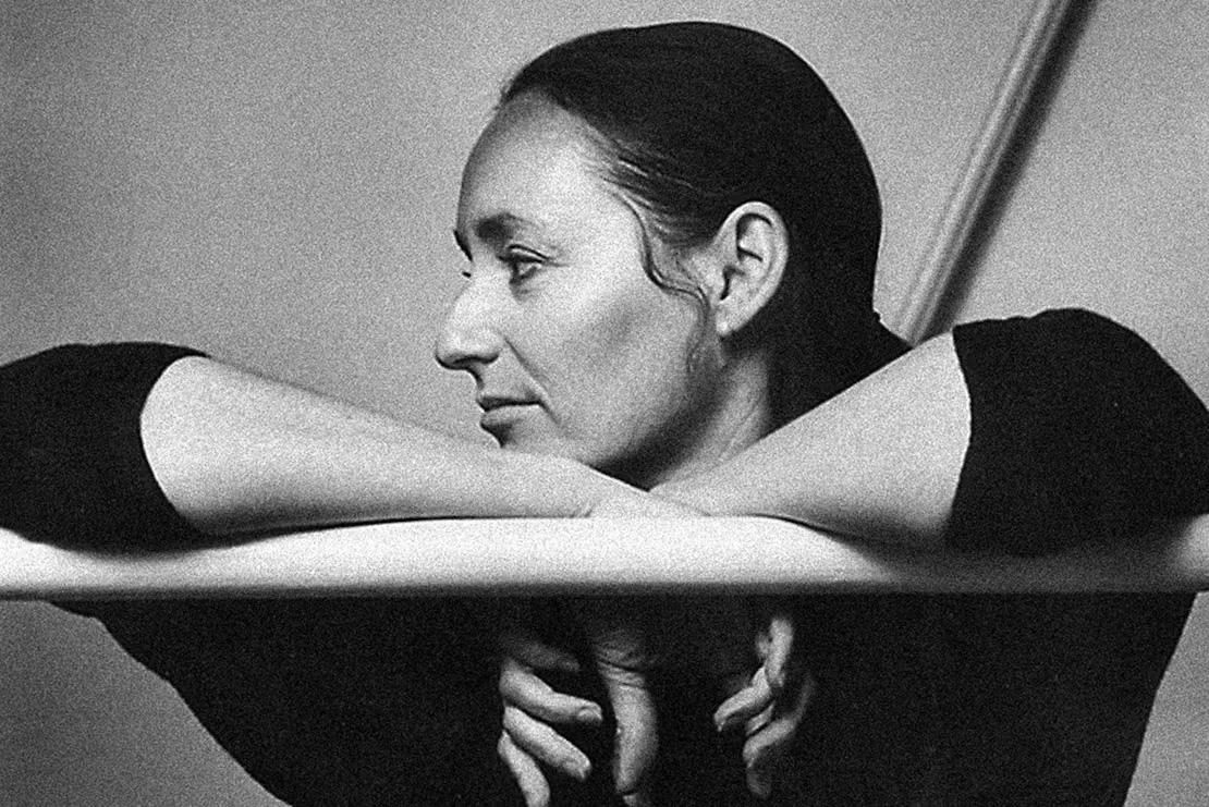
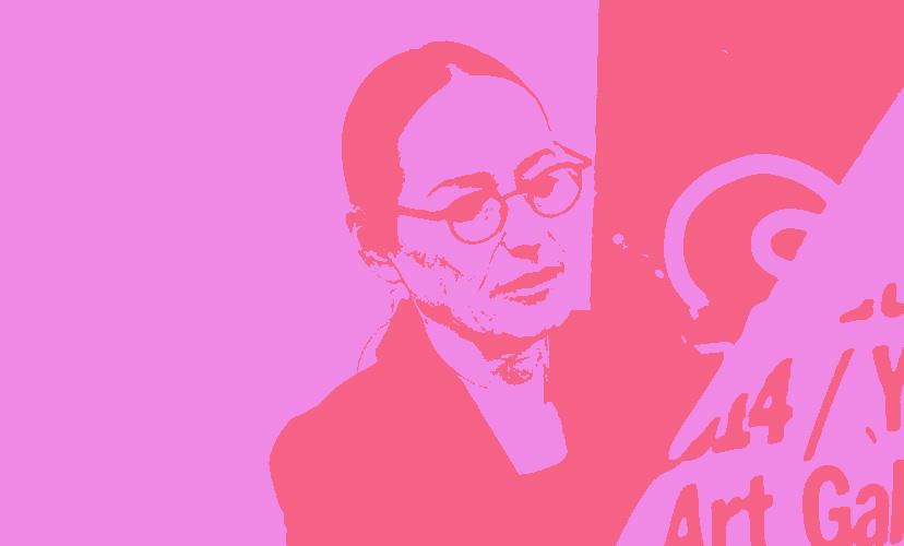
Sheila Levrant de Bretteville is a pioneer in female art and design. Born to Polish immigrants in the 1940s, she finds herself working out of Brooklyn, New York. She has always had a heart and soul in art. As a proud member of the Lincoln High School “Art Squad” in the 1950s, she was mentored by Leon Friend,

another Polish graphic designer and teacher at her high school, who encouraged her art work. As she got older, she studied at the Barnard College of Art and Design and then went on to get her MFA at Yale Universi - ty. She also has many other honorary degrees and awards.
Along with Judy Chicago and Arlene Raven, Bretteville is seen as one of the most influential women in modern design. She lets her work speak for her and her values; which include but are not limited to, feminist principles, social activism, political activism, and integrating interactive public art and spaces. On top of it all she has a passion for education and teaching young artists all around to spread their message through communal art.


“I wAnted to Go to the best schools — thAt’s the elItIst pArt of Me.”

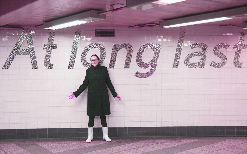
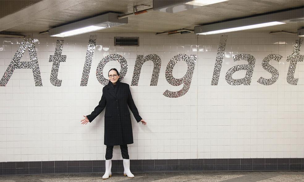
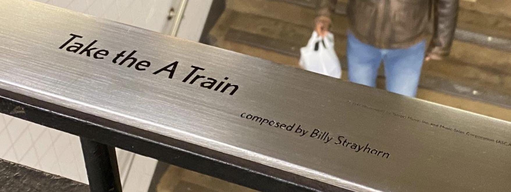
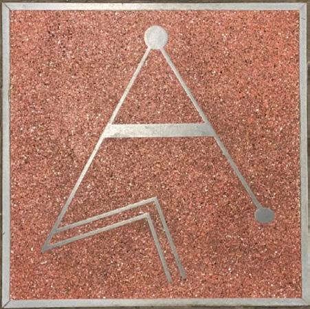
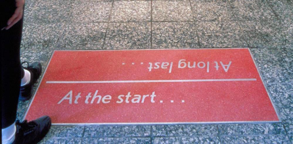
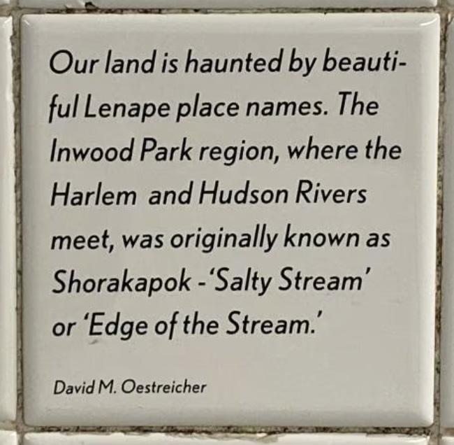
Being from Brooklyn, NY Sheila de Bretteville has a deep connection with creating for her community. She has sunk her teeth deep into public art and has been able to spread that communal love across a multitude of places. But, that didn’t go without building in her own backyard. In 1999 Sheila was commissioned by the New York MTA to do a piece in the Inwood-207th street subway station. This has been one of her most notable, and likely one of her most viewed works in her career. You know due to the nature of a train station .
This piece represents some of her core values as a designer and artist. Sheila often uses bold typography in her public art pieces in attempt to create an easy-to-follow layout and informative structure.
This project follows and reflects Inwood’s diverse cultural community. Through the use of many materials such glass, terazzo tiles, granite tiles, and the actual subway station itself .
This piece was created with culture in mind. It not only beautifies am old train station, but it encapsulates the voices of local commuters that have made this neighborhood their home.
One of Sheila’s philosophies when designing is to make the invisible, visible.
By using local narratives and materials native to the New York environment, this piece is more than just art in a train station. It allows commuters to reflect and appreciate what is around them; and much like Sheila herself, it educates those on the neighborhood they find themselves in.

“I hAve trIed to support And MAke publIc the voIced needs And lIved experIence of people In the neIGhborhoods wherever My work hAs been InstAlled”
It is no secret that when designing, Sheila leads with feminism in mind. She is a pioneer for women in graphic design and often integrates feminist ideals and principles within her work. In the 1960s, when she first stepped into the design world, it was – as most fields are –male dominated. She has been a woman of many “firsts” throughout her career. She was the first woman to graduate from Yale University and later teach the Graduate Graphic Design program at that same school. She moved to California during her early career where she created the first women’s design program at the California institute of the Arts (CalArts), where she, again was the
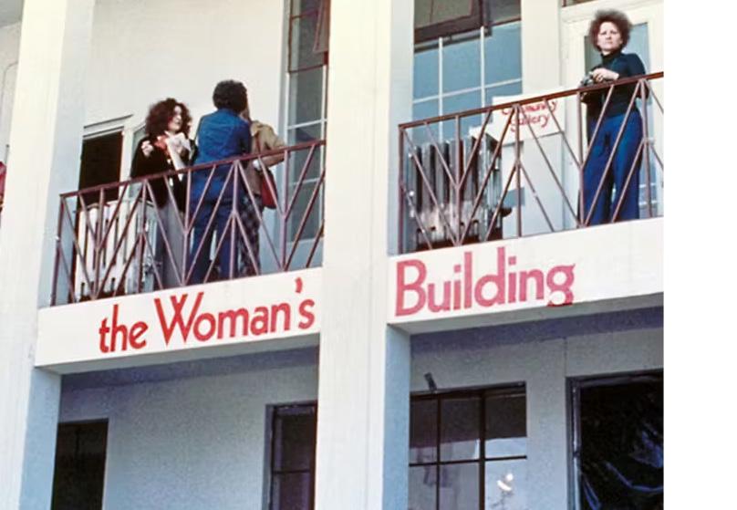
first female faculty member of said department. Here, she also co-founded the Women’s Building with fellow artist Judy Chicago and art-historian Arlene Raven in Los Angeles in 1973. This was a space for female artists to create and design, as well as learn in their time there. There were sponsored programs, artist groups, and classes here that women could take advantage of to expand their knowledge and passion for the arts. From this building the Feminist Studio Workshop was also founded; it allowed women to not only develop artmaking skills but also encouraged them to focus on women’s identity and how to translate that into art.
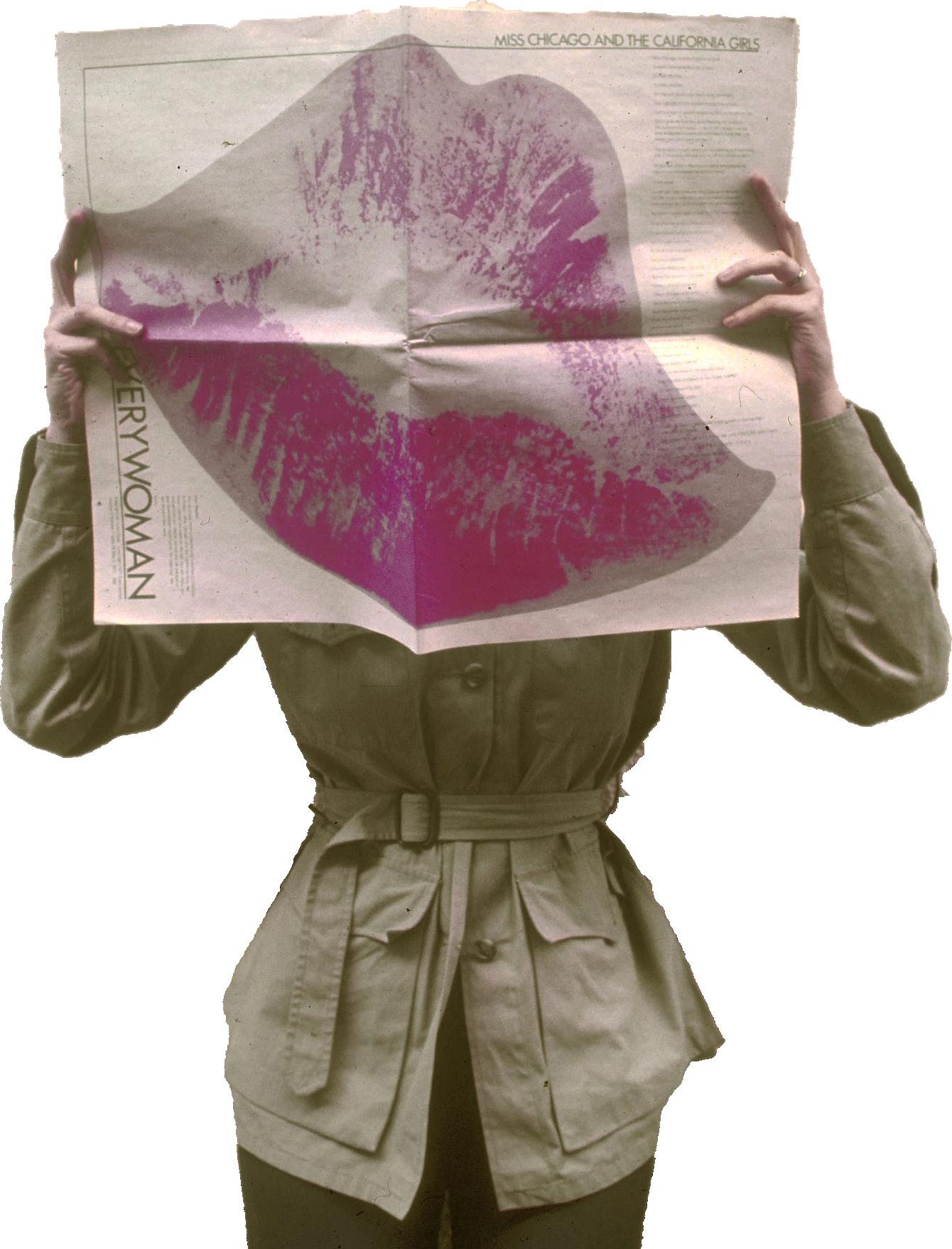
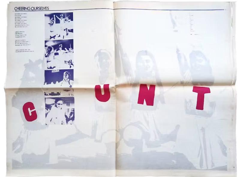
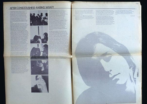
Sheila’s femininity is not hidden within in her art by any means, she wants her presence known. In a special issue of Everywoman– a feminist newspaper (pictured on the left)–she was commissioned by Miriam Shapiro to design some spreads based on what she and Judy Chicago were teaching at Fresno College at the time. For this project, she gave each student and teacher equal times to speak and designed a two-page spread per speaker. She calls this a “conciousness-raising” model.


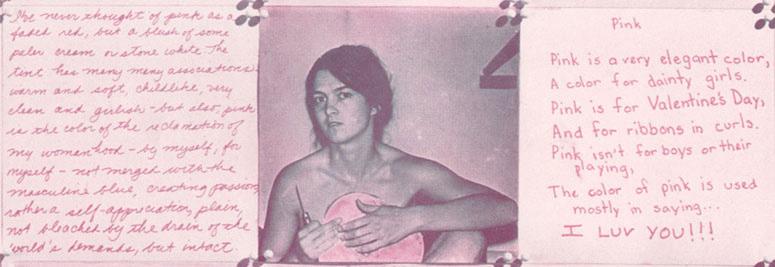
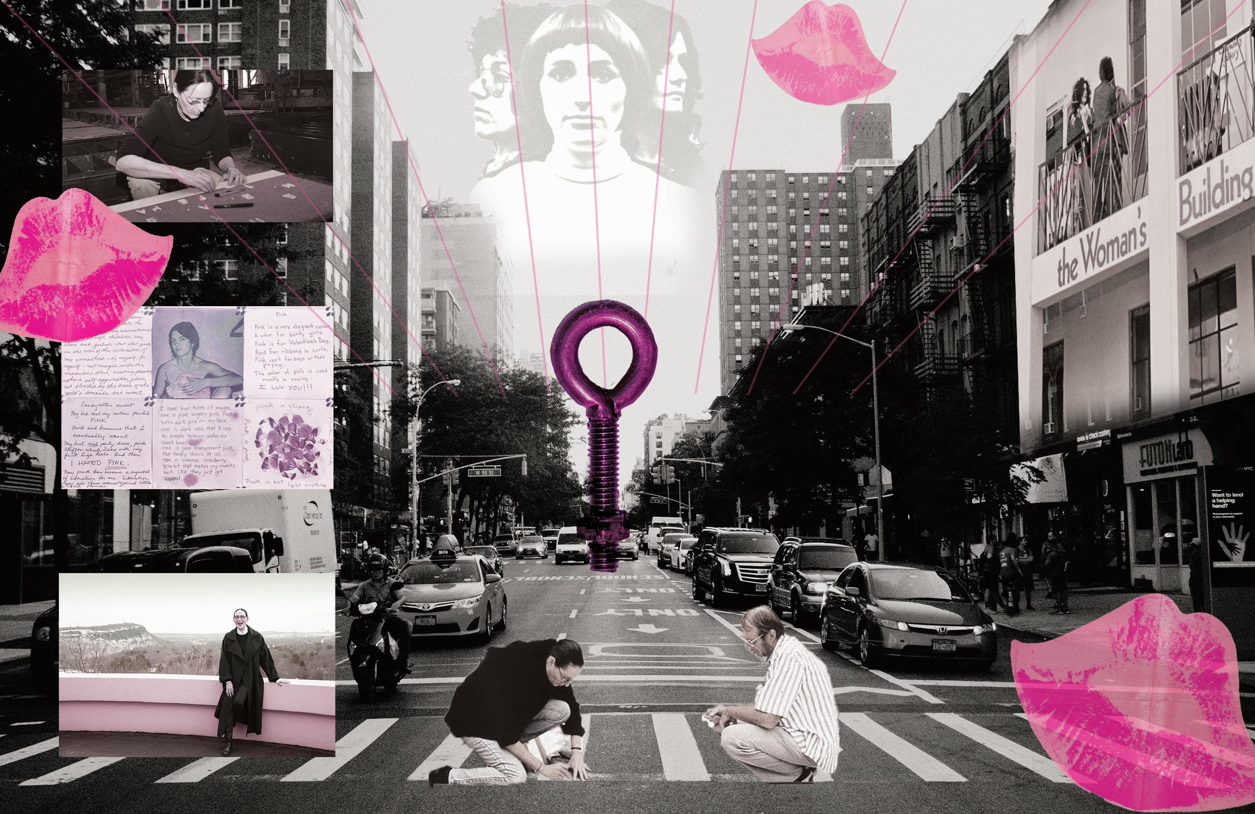
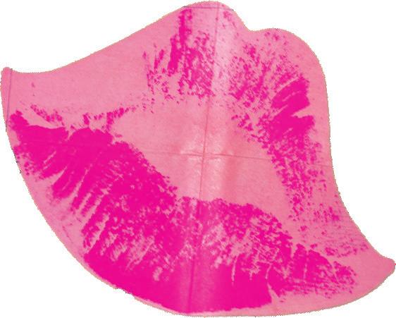
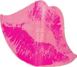
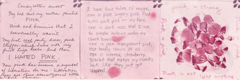
Pink is another project that Sheila worked on to represent her and others’ femininity. What started as a commissioned artwork, soon became a bit more of a passion project. Bretteville, along with 99 other designers, was asked by the American Institute of Graphic Arts to create a project around a color of their choosing. She chose the color pink and wanted to explore the notions of gender associated with the color and try to combat the stereotype of pink as a “girly” or “sweet” color. By asking the women that attended programs, had studios, or worked within the Women’s building she was able to gather different stories and perspectives on what the color means to the individual. Through these stories, she created a quilt-like
30x30in poster using squares of information, imagery, and some blank squares to imply a greater meaning. While her work was not chosen to be apart of the poster project originally created by the AIGA, it was still greatly appreciated as it hung in the Whitney Museum.
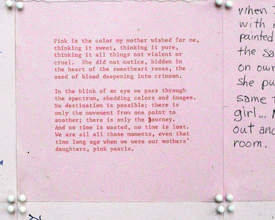
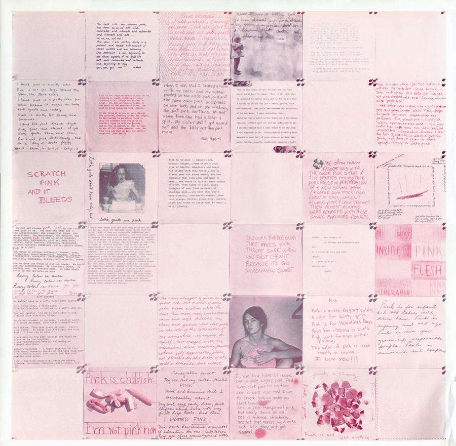
There were also 500 prints made of the poster within the Women’s Graphic center at the Women’s Building in LA and were distributed to sell in feminist bookstores, given away to people, and hung up all around Los Angeles. This allowed people to add their own thoughts and comments about pink in the blank squares. This really showed Sheila’s love for integrating the public in her art and even deeper, allowed people to express their thoughts on gender conformity – or lack thereof.

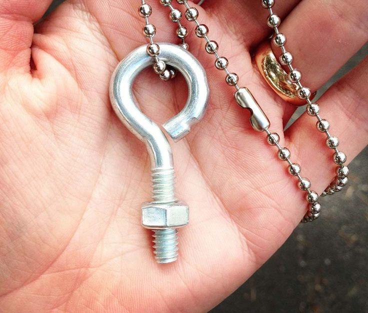

A symbol you will often see asscociated with Sheila Levrant de Bretteville is this eye bolt. She had designed a necklace using the hardware and stated that it was to represent “strenghth without a fist”. The bolt also highly resembles the biological symbol of women. She gave the firsts of these necklaces to her co-founders Judy Chicago and Arlene Raven when they first began the Feminist Studio Workshop. She has continued giving these necklaces out to those who share the common interest of empowering women. It has become a symbol of her work and emphasized her principles of feminism and communal art.

“I AM A feMInIst who belIeves there Are MAny More wAys to be A woMAn And to MAke feMInIst Art thAn hAve been AcknowledGed. I belIeve thAt we should stIll be questIonInG the cAteGory nAMed woMAn Much lIke the wAy I questIoned the MeAnInG of the color pInk. neIther pInk nor ‘woMAn’ belonG only to those desIGnAted feMAle At bIrth. nor do woMen hAve yet equAl respect And opportunIty wIthout ActInG In the nArrow forMAt thAt Is requIred stIll of Most Men. AddItIonAlly I suGGest thAt woMen do And Are pArt of As Much evIl As Good Acts thAt hAve occurred And keep hAppenInG.”