E-mail: miguelgarmenendez@gmail com Linkedin: www.linkedin.com/in/miguelgarmen
A B O U T M E
I am an architect with more than 3 years of experience in different projects raging from minor renovations to landscaping, residential and conceptual projects, always focused in design and construction, I have played within different design teams and I have participated in a diverse range of architecture competitions My professional objective is to develop myself in significative and meaningful projects meanwhile I continue to learn from those around me, putting the best of my abilities to the service of others
A residential project located on the outskirts of the city of Puebla, this design and subsequent construction was led by the premise of maximizing inner space within few square meters.
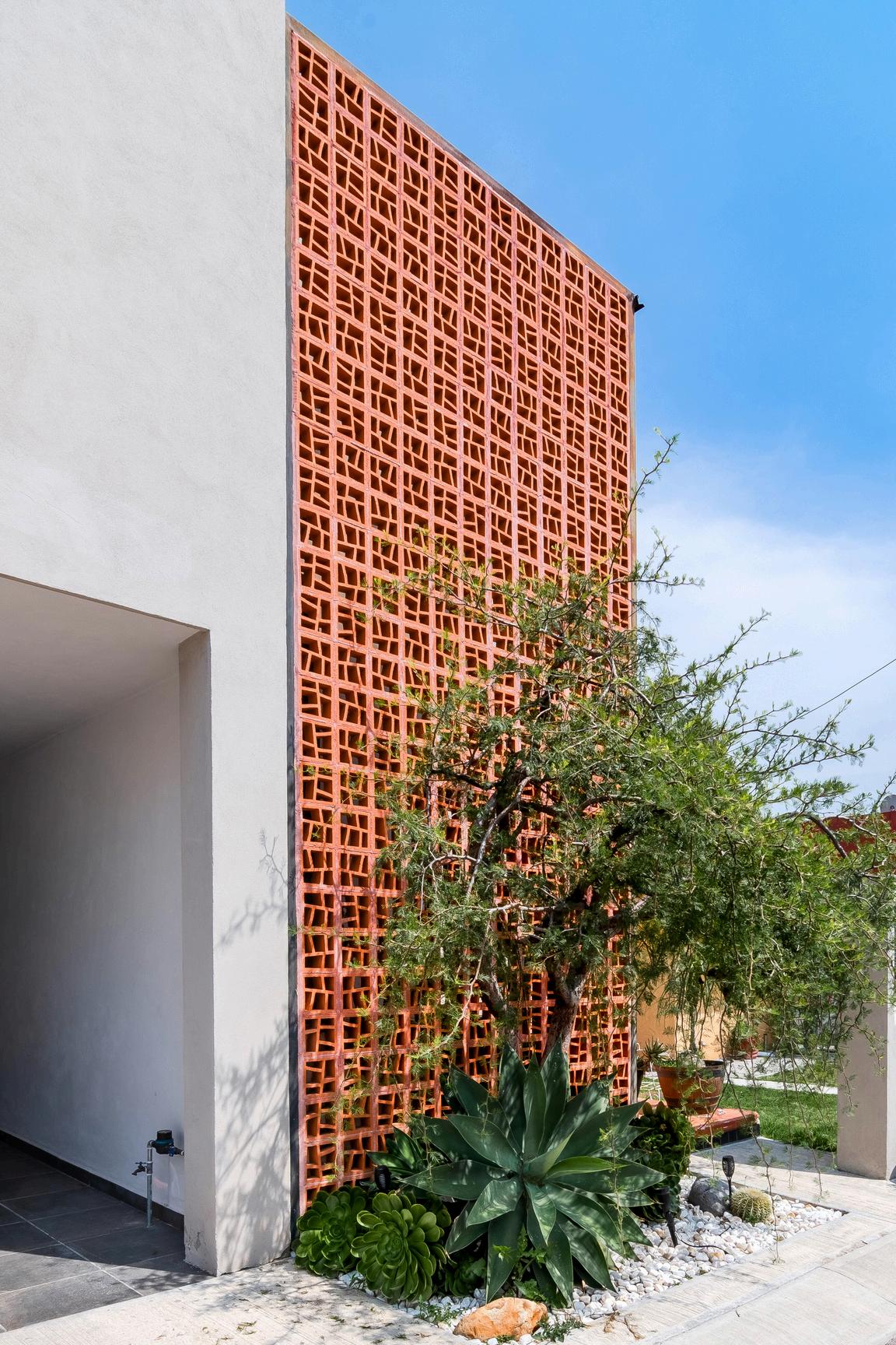
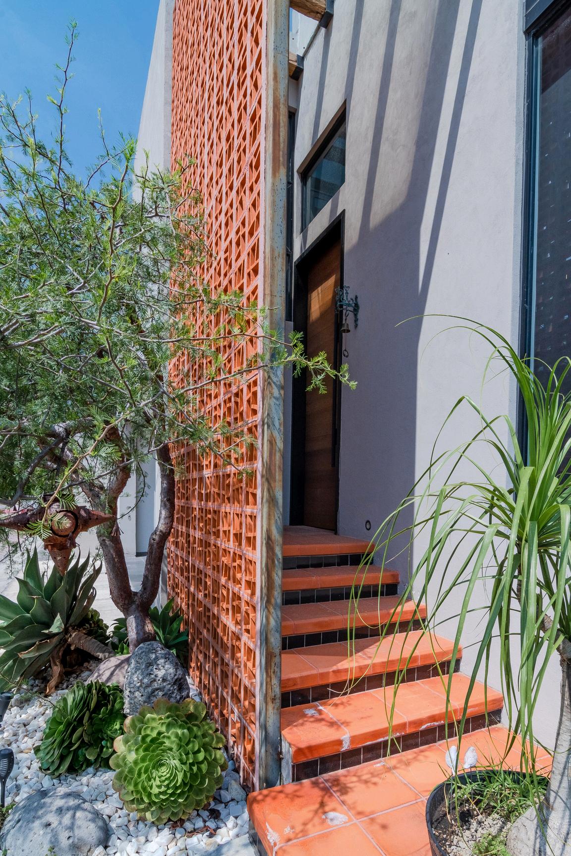
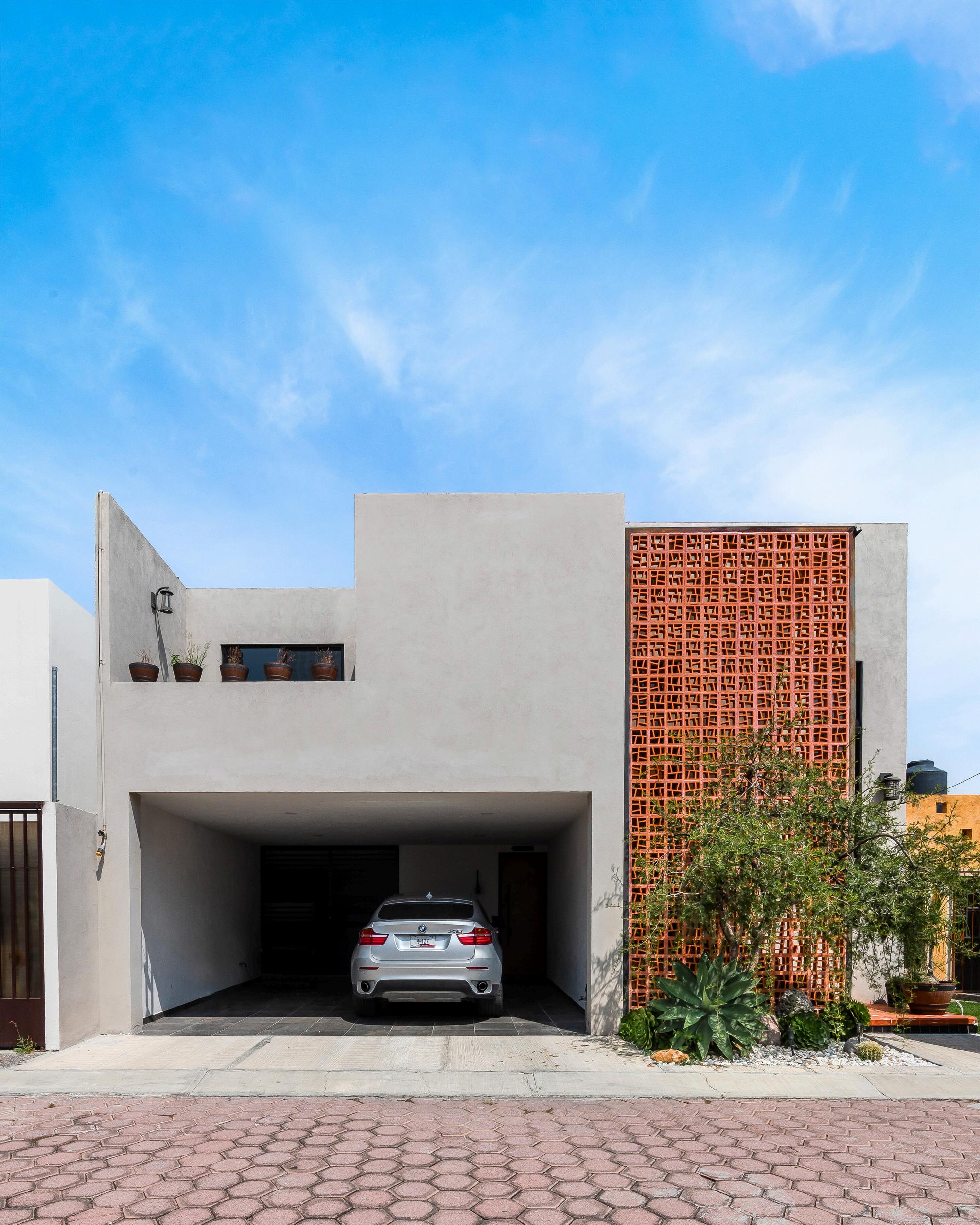
The existing site demanded a squared and closed facade due to the building restrictions in the area This need was accentuated by the goal of creating a new structure that rather tan competing and denying its context would be capable of standing out by itself without converting into a "white elephant" in the area Yet, the apparent opening of the facade does not disown the search for closeness. Materials were chosen to lighten the mood and maintain a low profile at the same time that they pop out the shapes and forms, functioning as elements of a bigger picture.
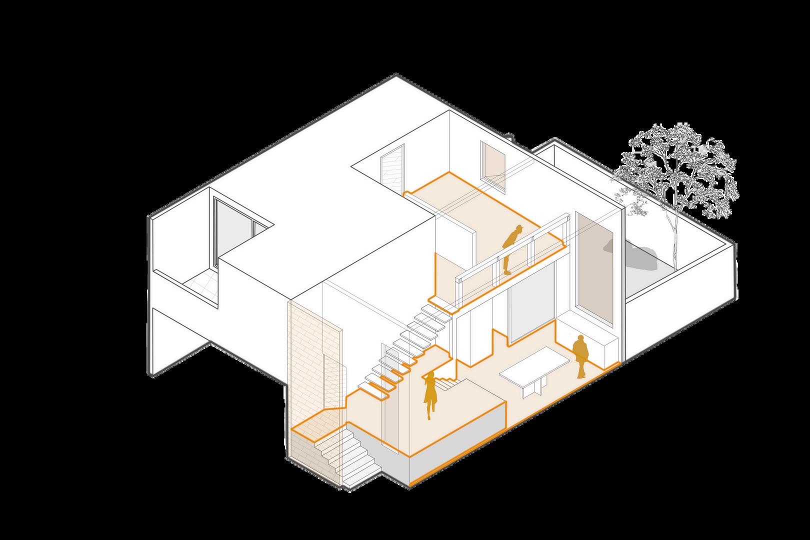
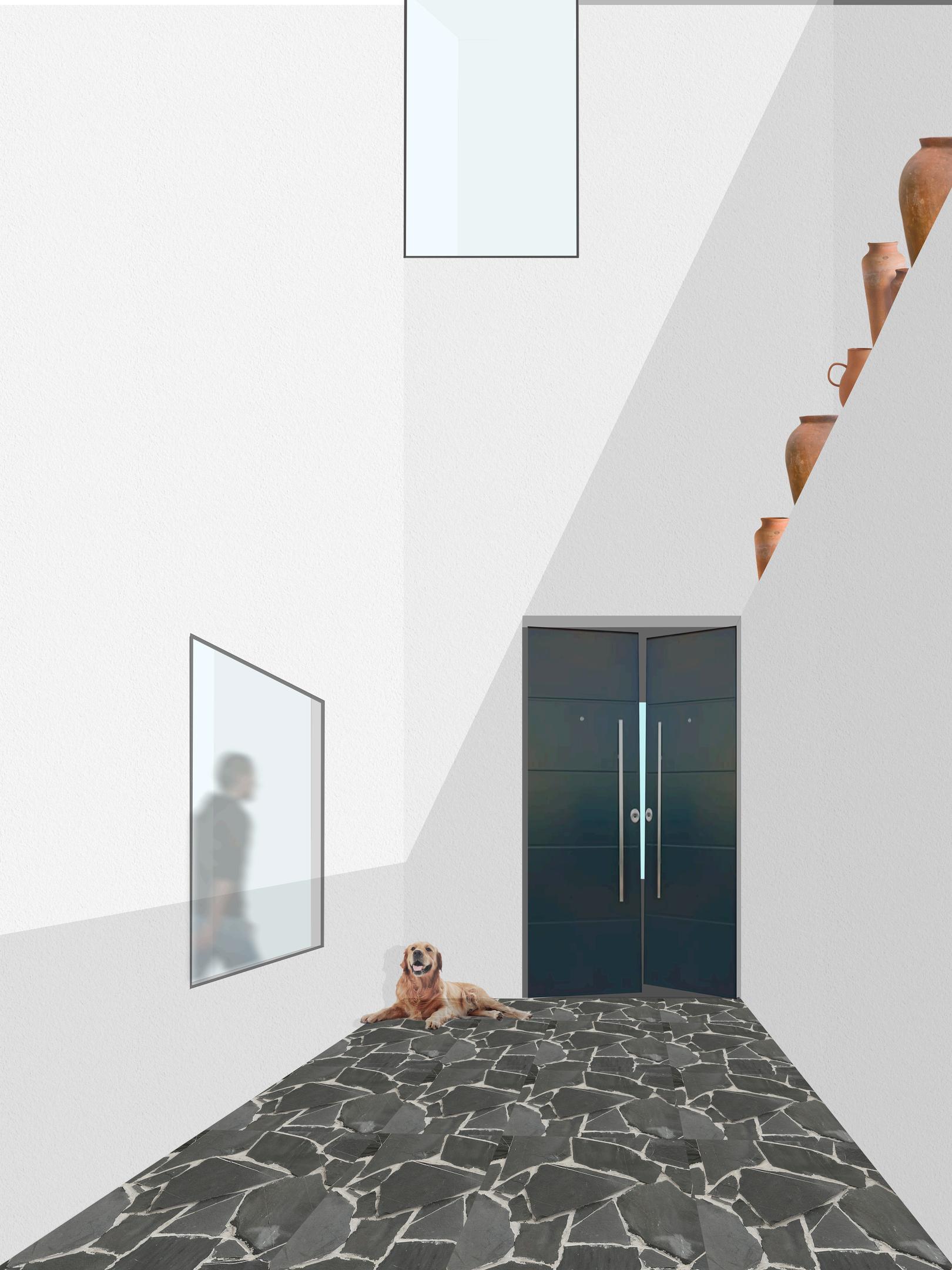
The design process turned around one premise overall: to enlarge the feeling of a wider space. With only 82 square meters to use, the task was one to enjoy The design reached uses a double height space, located right from the entrance of the house to connect all of the public or common space of the house Crowned with a double height window facing north-east in order to bring in a soft, even light to the space, this idea of circling around the common areas makes the space feel bigger than what it actually is.
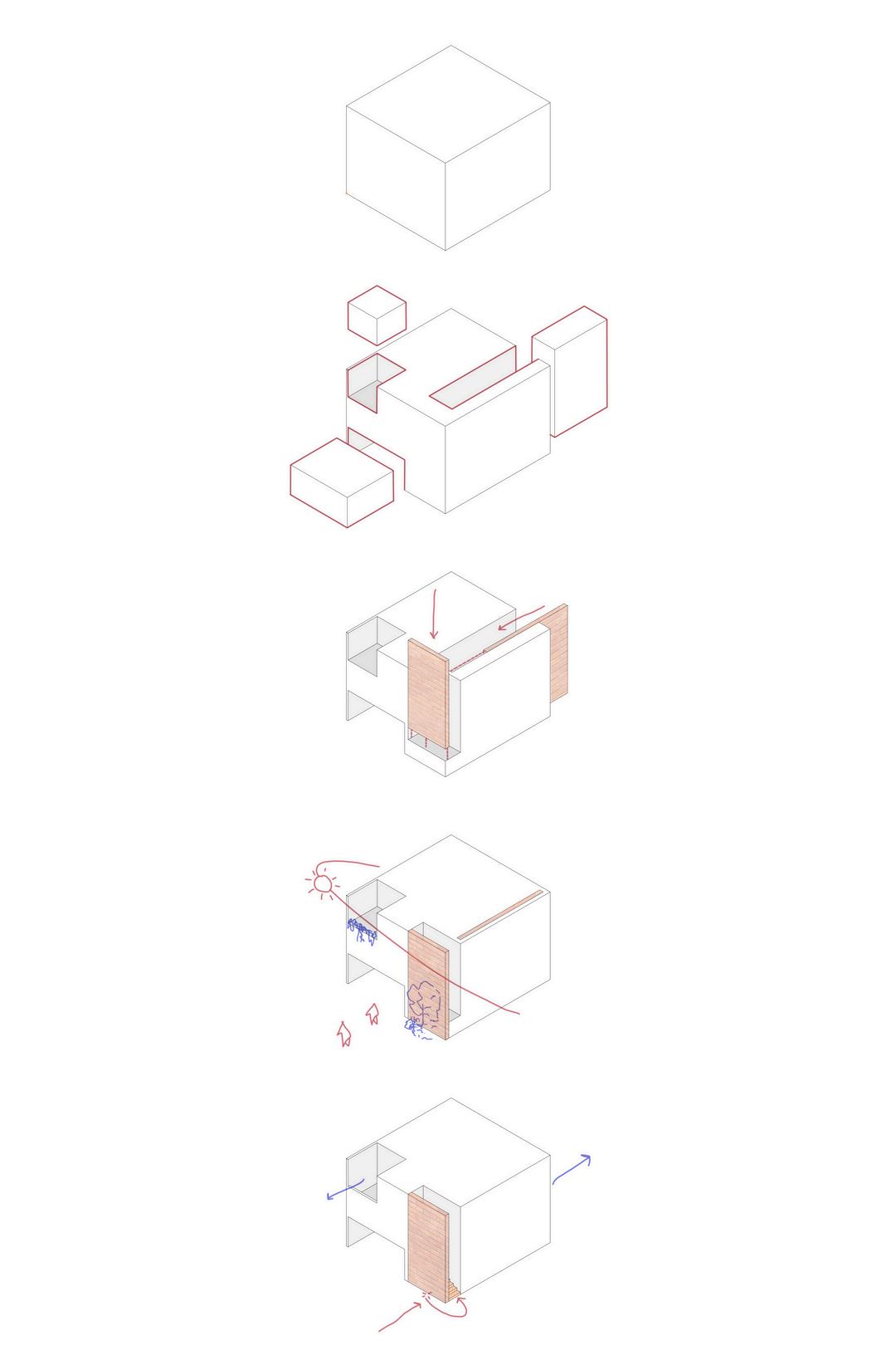
1 A white cube to start with, in order to fit the restriction asking for a "clean facade"
2.Insertions and extractions were made to let light in an ensure a flow of fresh air The solid appearance is maintained
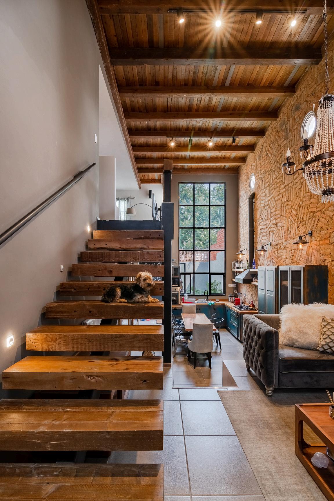
3.Light elements such as thinner brick walls were brought in to give life and warmth, also meeting the client s wish for a "Mexican industrial look"
4.The sunlight is dimmed and filtered through the facade and vegetation is added to refresh the materials Also, this helps to block the views from outside
5.Through this techniques, we were able to ensure a spacious interior without compromising the functionality and beauty of the outside, all while keeping within the area ´ s building code
Z A Y A S H O U S E
2021
Role: Designer Architect
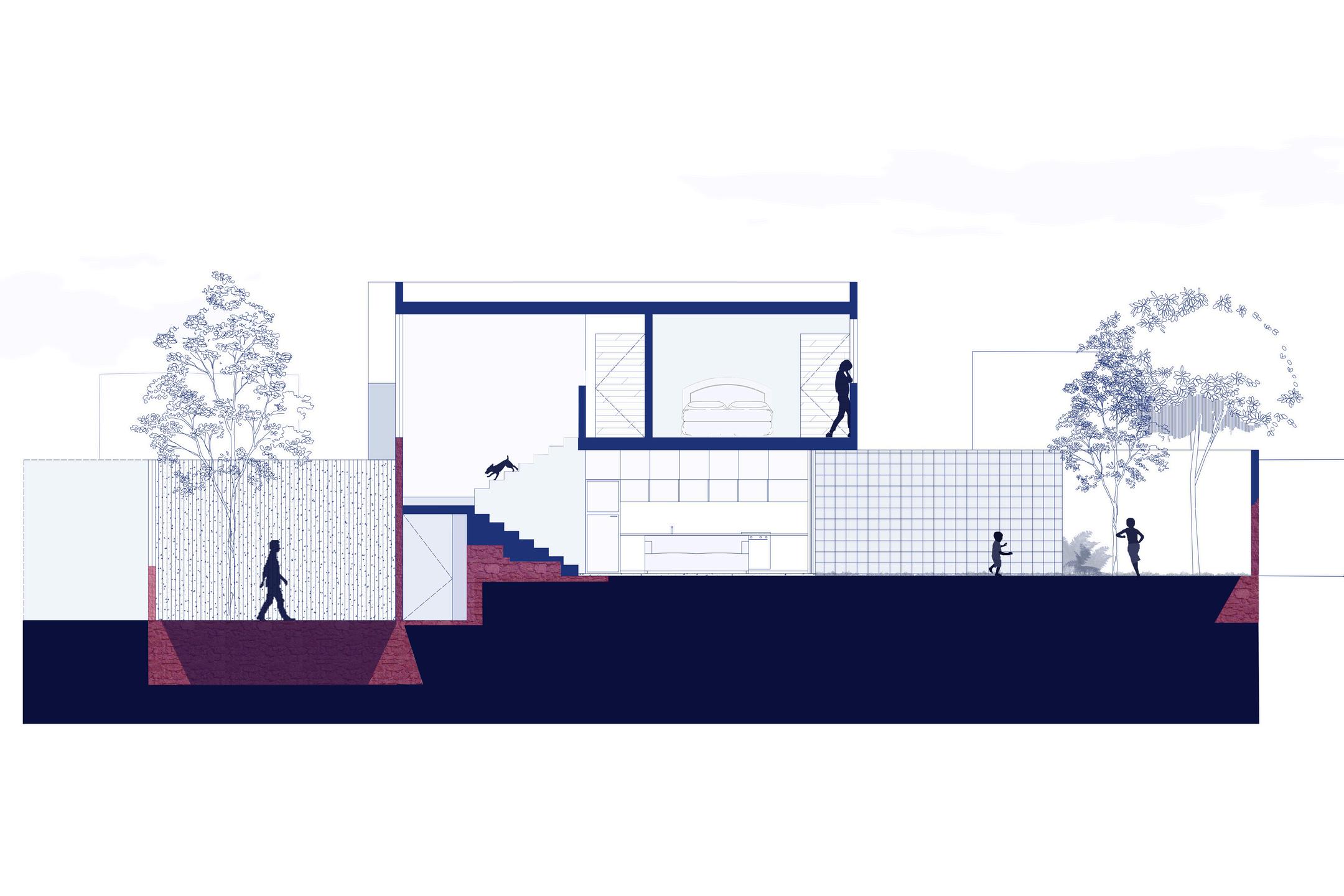
Houses are the core and heart of everyday life For this project, a small family asked for a space were they could grow, play and live freely, with good and open views. The location of the project was not ideal, given the closeness of a noisy highway, so the design aimed to become a soft, elegant shaped building, yet capable of providing intimacy and privacy to the family, all while keeping budgets low.
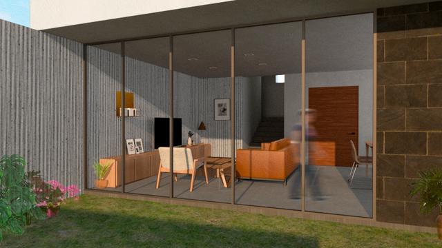
Once one enters the house, passing through the high and solid white block, which appears to be held jus by the two concrete walls of the exterior, the space opens itself to a big backdoor garden which dominates the whole house.
The living room shares an open floor plan with the dinning room and kitchen to create a more familiar and welcoming sense, while the upper floor has views directly to the garden and front yard, thus reinforcing the sense of intimacy without loosing contact with the exterior and the surroundings.
The design began with the analysis of the existing grounds, where a 1 meter slope gave some interesting idea of how to proceed. Additionally, the terrain had already a pre-existing construction from years before, so the limit walls and the stairs were forced to stay as they were in order to cut expenses to the construction. To create the sense of privacy, the main facade was decided to be closed, following the robust shapes of a stereotomic design.
PATIO EFÍMERO CONTEST
2023
Role: Project Manager
A HAIKU FOR THE WATER
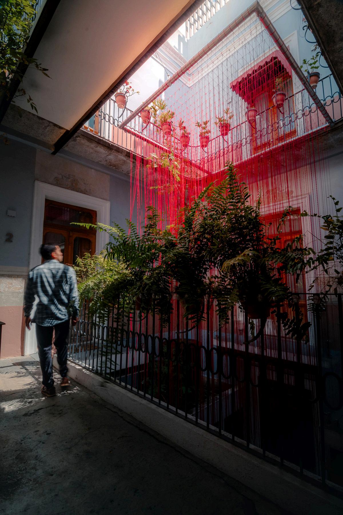
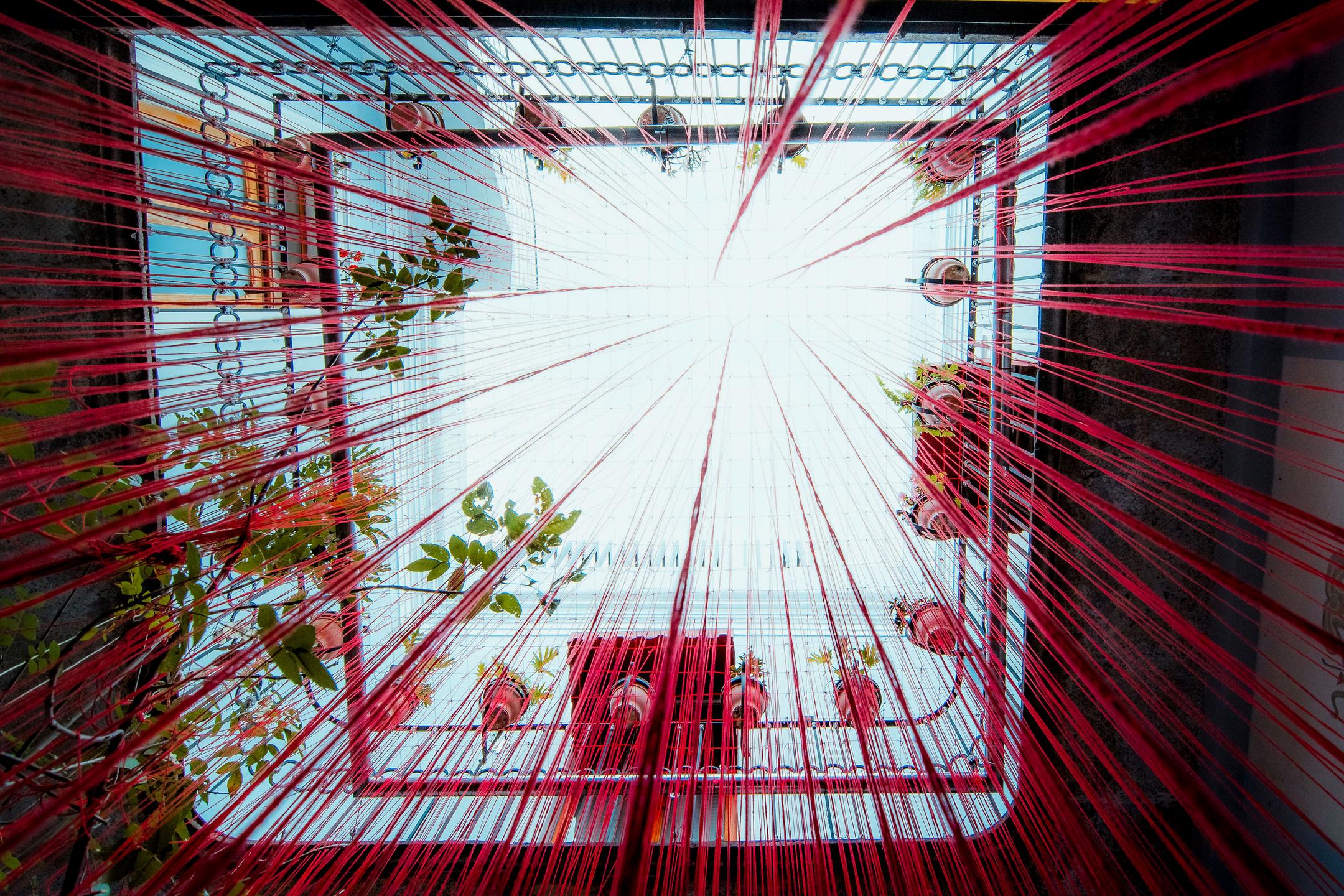
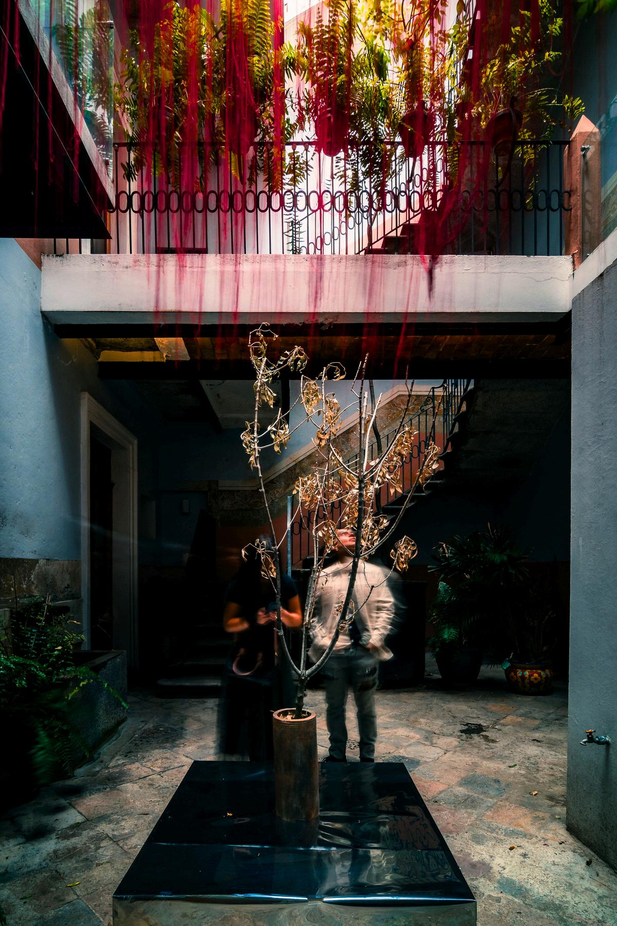
Patio Efímero is an art and architecture contest that takes place every year in the city of Puebla. For it, participants are tasked with the goal of creating an ephemeral public installation, with a low budget, that reflects and talks about the year s topic For 2023, said topic was the use of water in the world
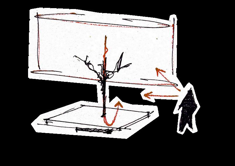
Our installation, which was chosen as one of the seven finalist, aims to be an invitation to think and ask the right questions about water treatment Instead on focusing on delivering an answer, we thought about igniting questions that could trigger action To do so, we needed to abstract the idea, to condensate it in as little words, elements and materials as possible, yet clear enough, so that everybody could understand it regardless of their context The more elemental the idea is, the more chances it has to be understood.
Patio
"Ocaso" re-imagines the traditional Japanese poetry style known as Haiku: a three lined poem which encloses a deep message in few words. This kind of poems are ideal to transmit a concrete idea and invite to reflection as well as being timeless. Our installation then needed to be precise, beautiful and timeless
Composed by only three elements (rain falling down, a dead tree standing in the middle and a mirror on the bottom), our physical haiku can be red from any point of view, always having the same message: What will happen when water is no longer clean and who can fix this? The answer may lay in the haiku itself
A HOUSE IN TONANTZINTLA
2021
Role: Designer Architect
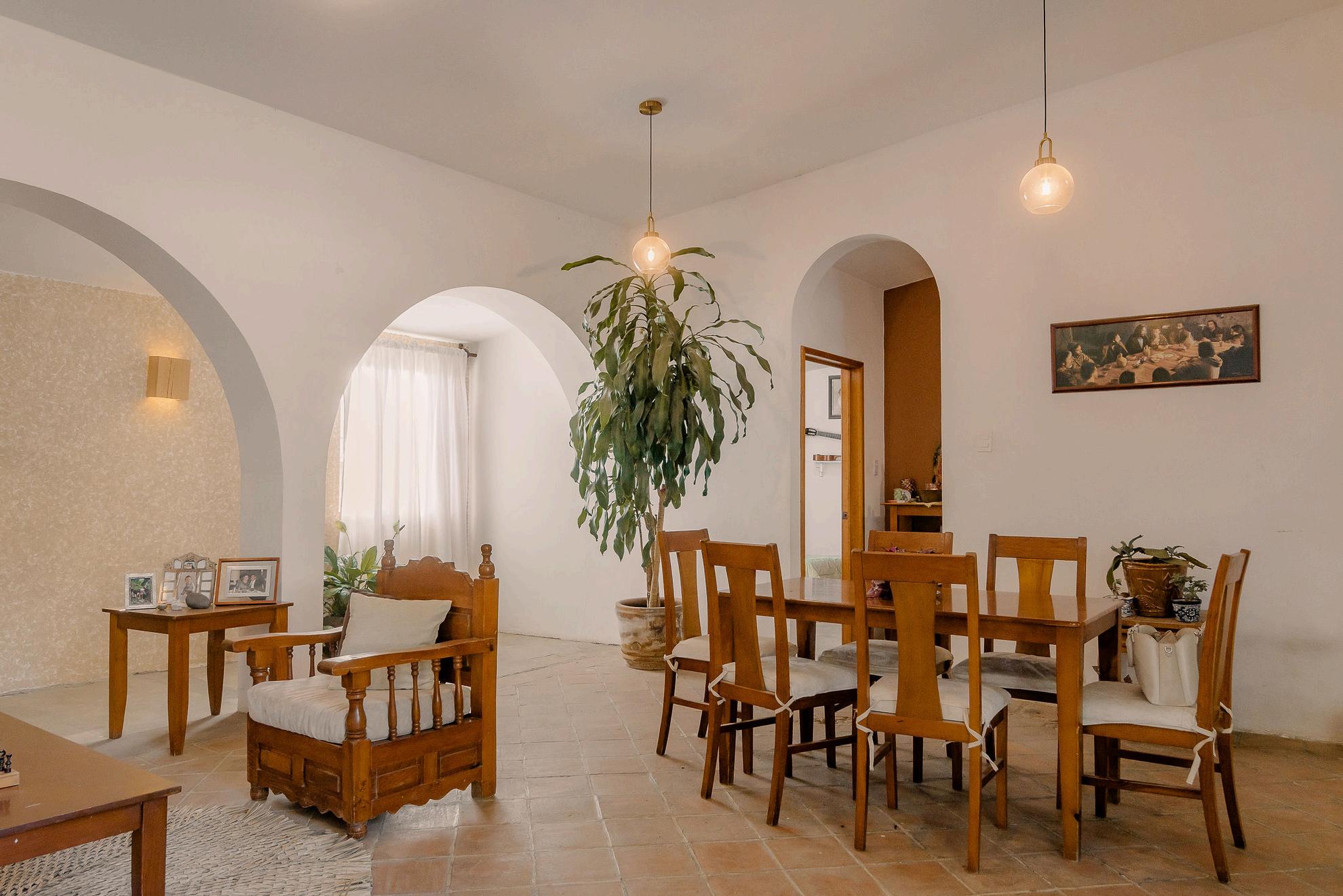
Architecture and interior design have a clear and advantageous quality of turning unfamiliar spaces into one ' s own
For this project, the client contacted us requesting assistance in remodeling her existing house, with a minimal budget and a tight timeframe.
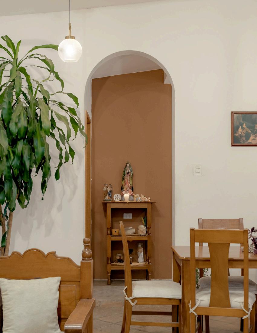
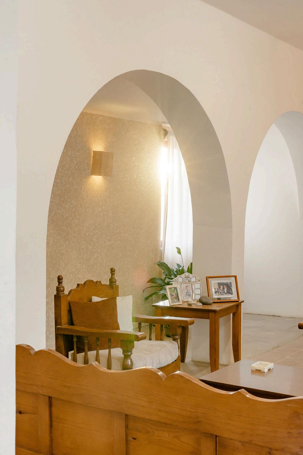
The house, located in Tonantzintla, a historic town on the outskirts of Puebla, featured a beautiful old clay floor, as well as a large living area that served as both a living room and dining room
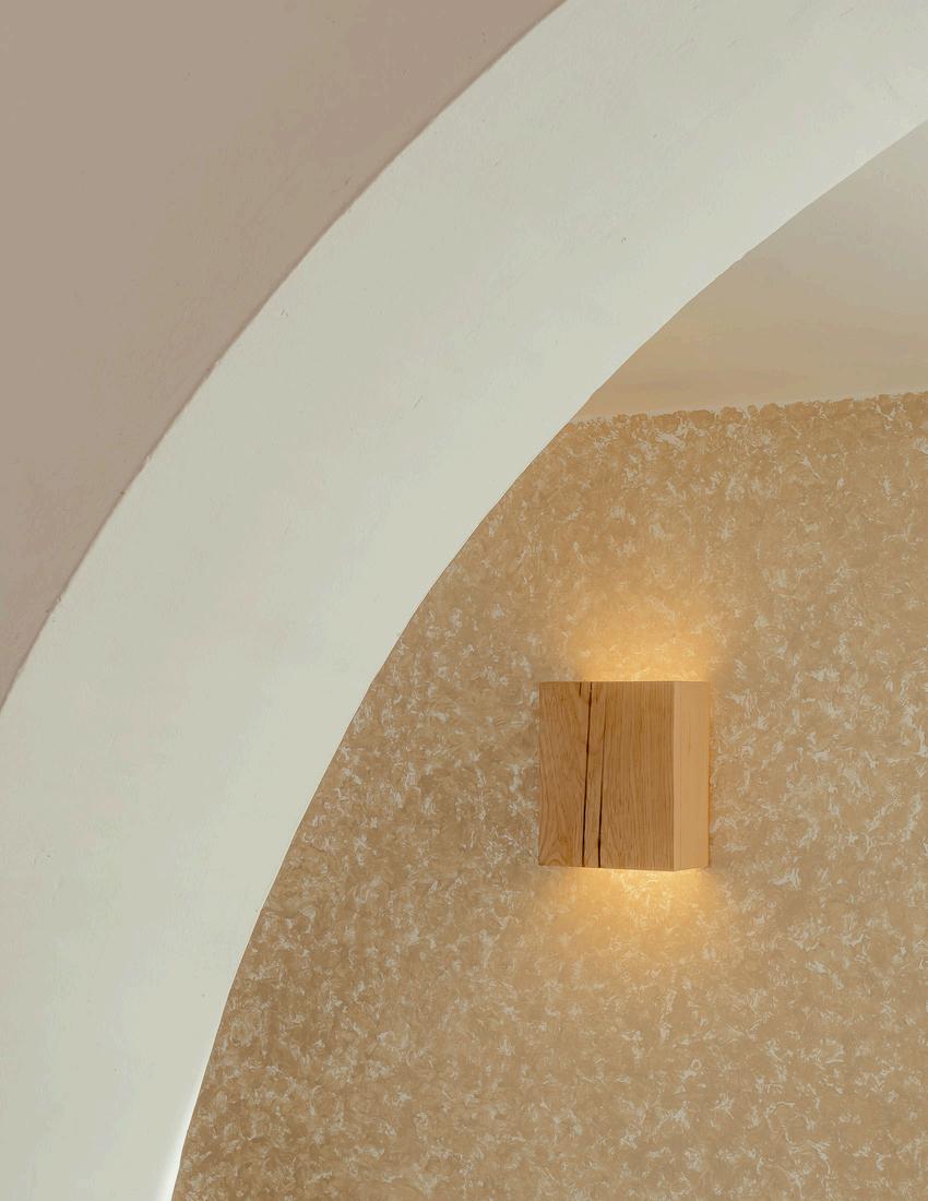
With the instruction not to demolish or replace the furniture, efforts focused on accentuating the qualities of the existing space: a rigid frame with columns that divided the room was adapted as an archway framing the textured wall, lighting, and windows to enhance the warmth of the space Walls with color accents were added, along with specially designed lighting fixtures, and the space was rearranged for better use
The objective of the remodeling was to adapt the space to maximize the entry of light, by opening a window under the third arch, and beautify a previously generic space through the use of simple forms that are mindful of their context.