MIGUEL CALADO
GRAPHIC DESIGN - 2023
HEY THERE!
My name is Miguel. I’m a Graphic Designer from Lisbon, Portugal. I obtained my Design degree through Universidade Europeia, after that I started my professional career by working in agencies and doing the ocasional freelance gig. Design and the Arts have intrigued me for a long time. Ever since I was a kid, I would spend hours upon hours drawing on anything I could find. As I grew up I became increasingly fascinated with music, film and the History of Art. The interest in Design came, in part, from its problem solving aspect and the dance from juggling form and function. The beauty of an aesthetically pleasing text composition, of a geniously crafted illustration or pattern. I also just enjoy staring at pretty pictures.
PHOTOSHOP ILLUSTRATOR INDESIGN AFTER EFFECTS PREMIERE FINAL
TEAMWORK PRESSURE HANDLING
SOLVING ORGANIZATIONAL SKILLS
CUT
PROBLEM
BRANDING 01. OʼROURKE PAINTING | P. 02 ADVERTISEMENT 03. WEDDING INVITATION | P. 08 04. HOLI PARTY POSTER | P. 10 05. PALADIN | P. 14 06. SMART CONSULTING | P. 19 EDITORIAL 02. BOOKLET | P. 05
07. SOCIAL MEDIA POSTS | P. 14 08. FACEBOOK BANNERS | P. 18
SOCIAL MEDIA
02
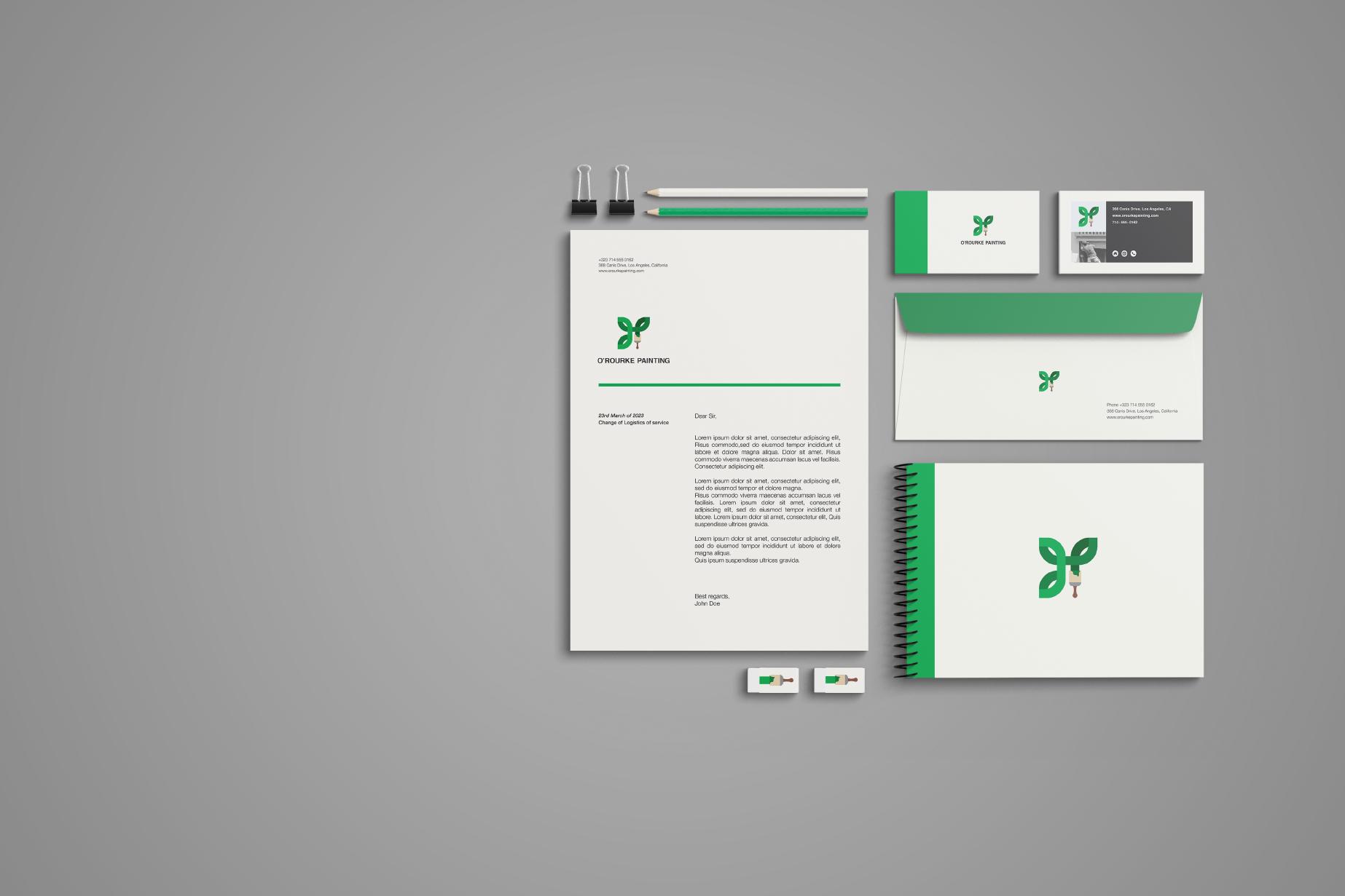
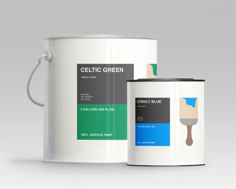
O’ROURKE PAINTING
BRANDING
A Visual Identity, Branding Project I made for a friend’s family brand. The Company specialized in house painting Projects.
O’ROURKE PAINTI NG
CONCEPT
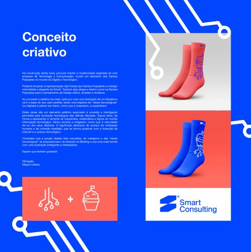
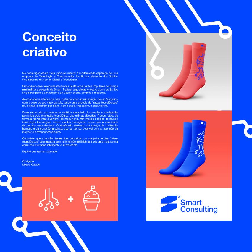
I created a Logo inspired by the Irish ancestry of this American family, by mixing the four-leaf clover with the paint brush, symbolic of the business type. The color pallette of the creamy white and the bright green work well, creating an appealing combination.
03
Here’s a few mockups I made afterwards to bring the brand to life. Hope you like them.
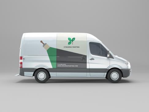
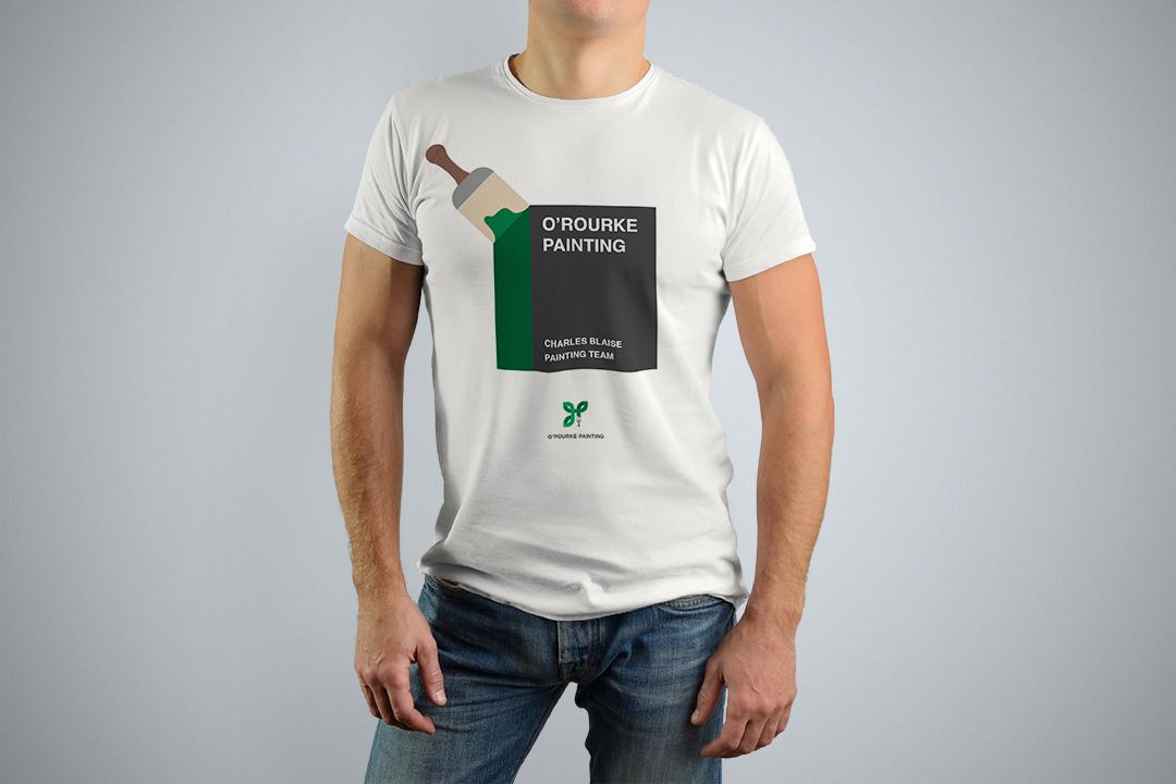
MOCKUPS
04
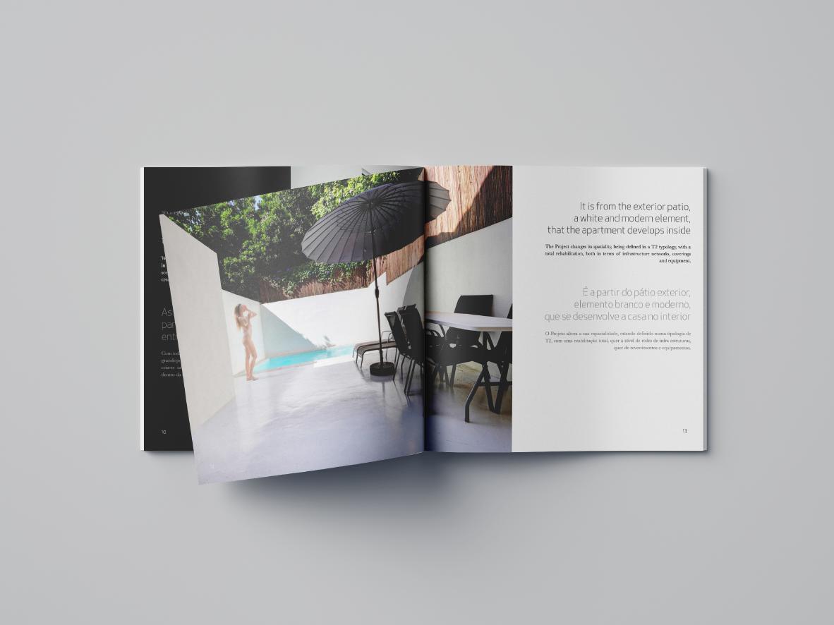
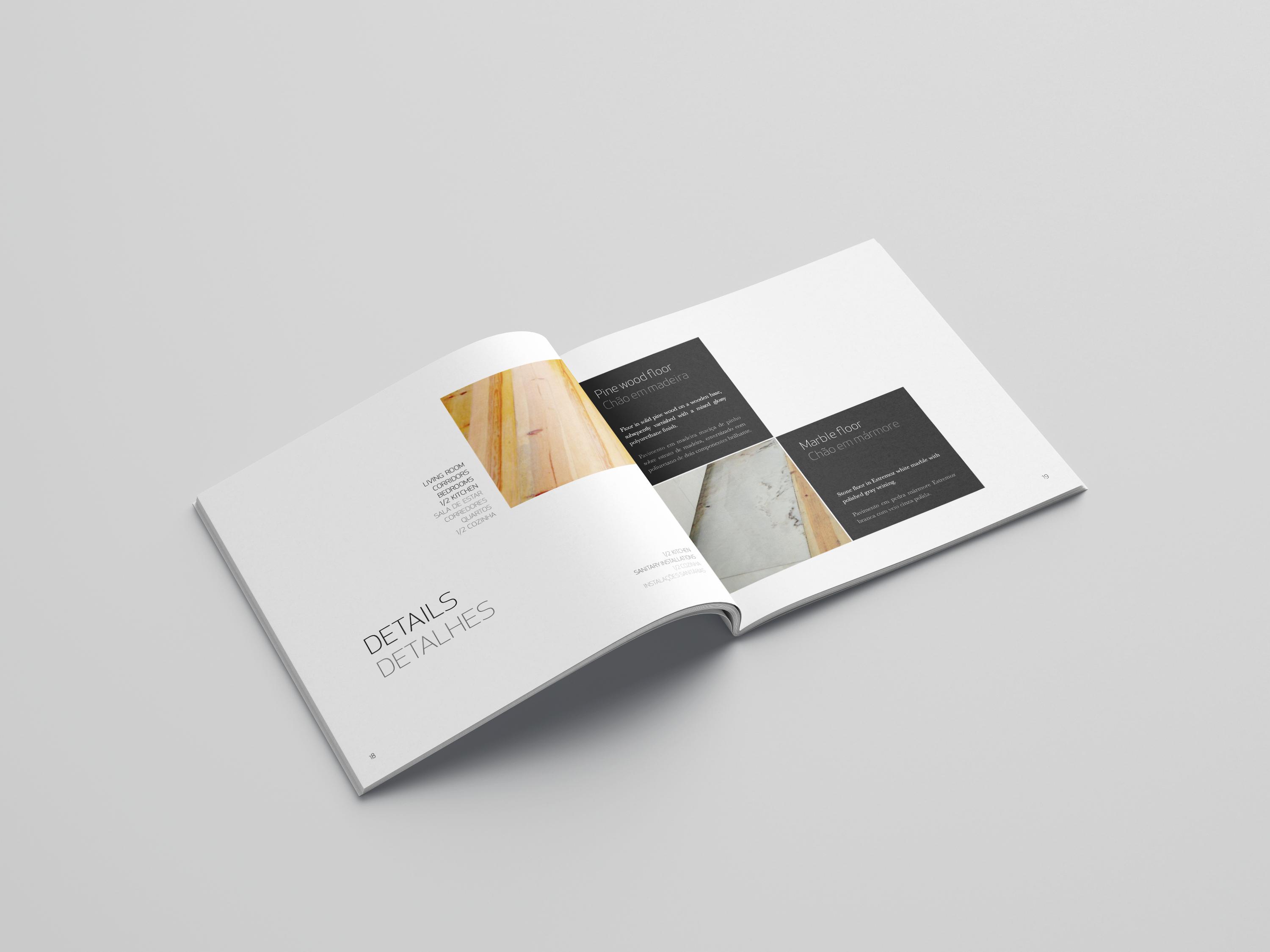
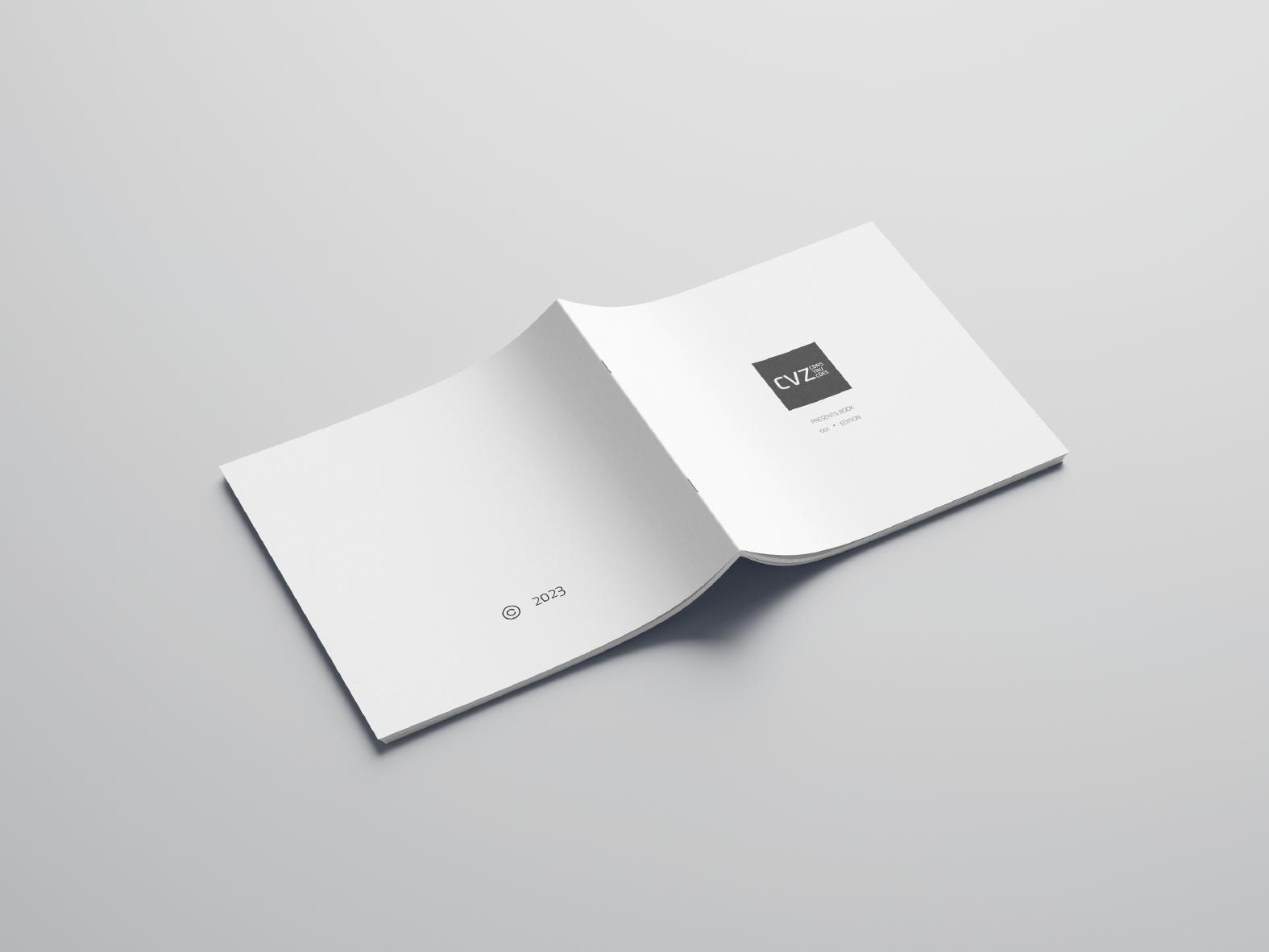
BOOKLET
I made this booklet for an Architecture Atelier I worked at. It’s in a square, 20 cm x 20 cm, measurement.
05 EDITORIAL
CONCEPT
The idea was to make an aesthetically apealling piece, that fit the visual identity of the Atelier, which could be shown to current and potential clients, whenever they visited the Company’s Workspace. Each edition highlights a specific Architectural Project the Atelier has made.
06
07
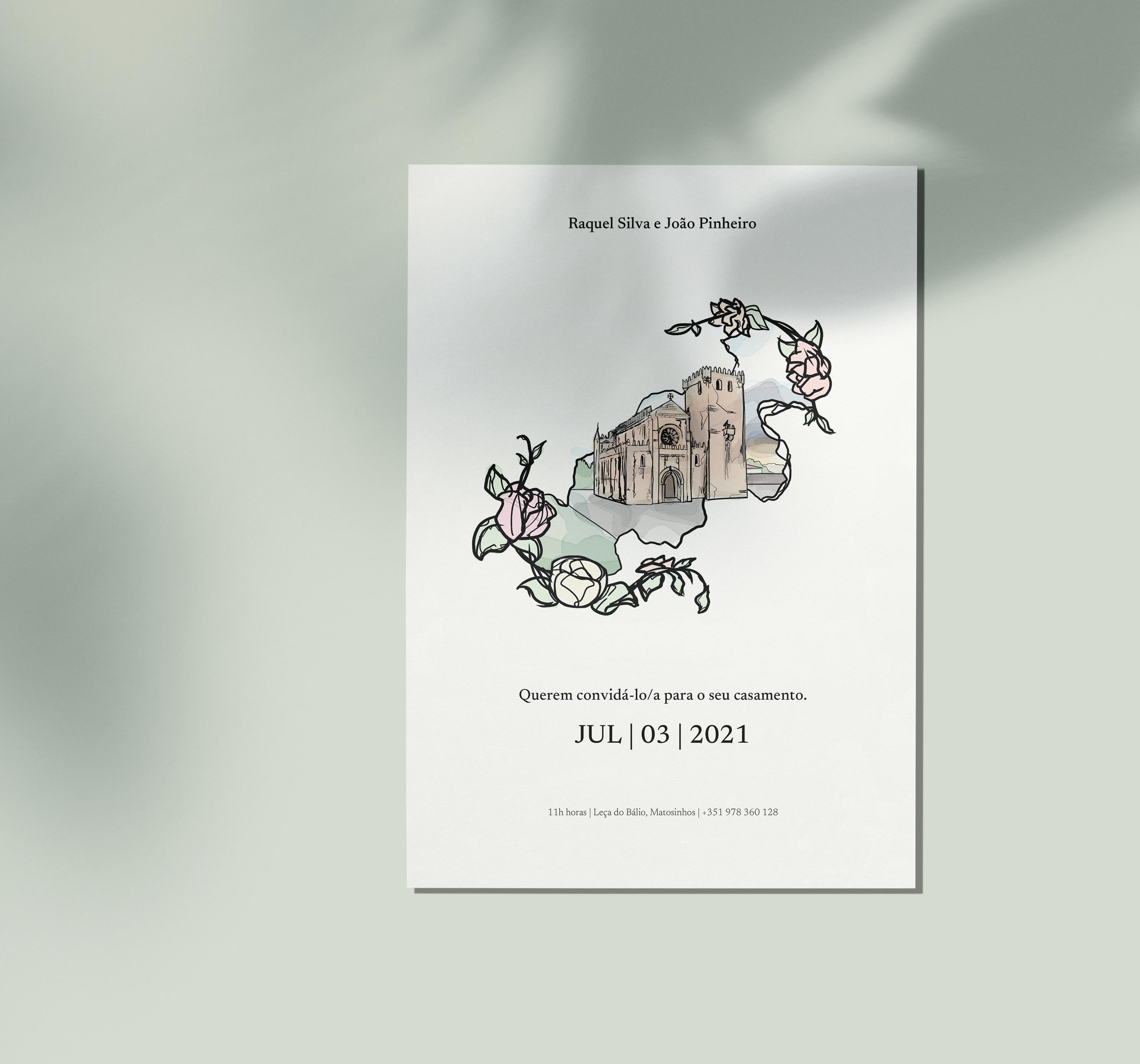
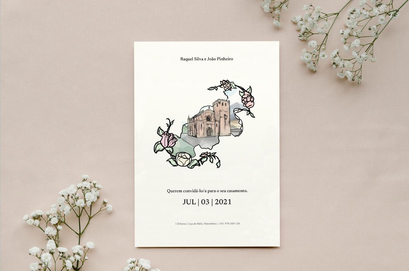
WEDDING INVITATION
This is a wedding invitation I designed for the wedding of friends. I thought of a classic, minimalistic “foundation” of an invitation, contrasted by the presence of a stricking illustration I would create.
ADVERTISEMENT
08
CONCEPT
The Illustration was made digitally by me, on Artrage. I decided for the style to be a mixture of a brush simulating watercolor accompanyed by the overlaying of a pen-like brush stroke. The final image shows the wedding’s church, highlighted in between a ripped paper effect, with stylized flowers surrounding the picture in a frame-like fashion.
09
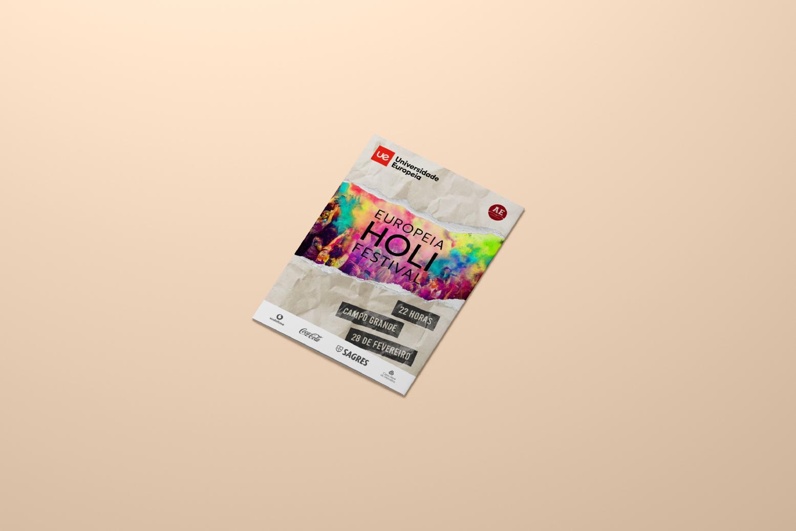
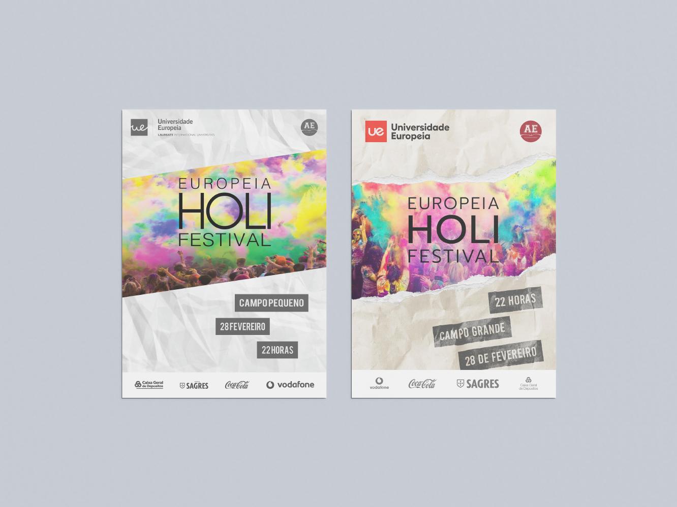
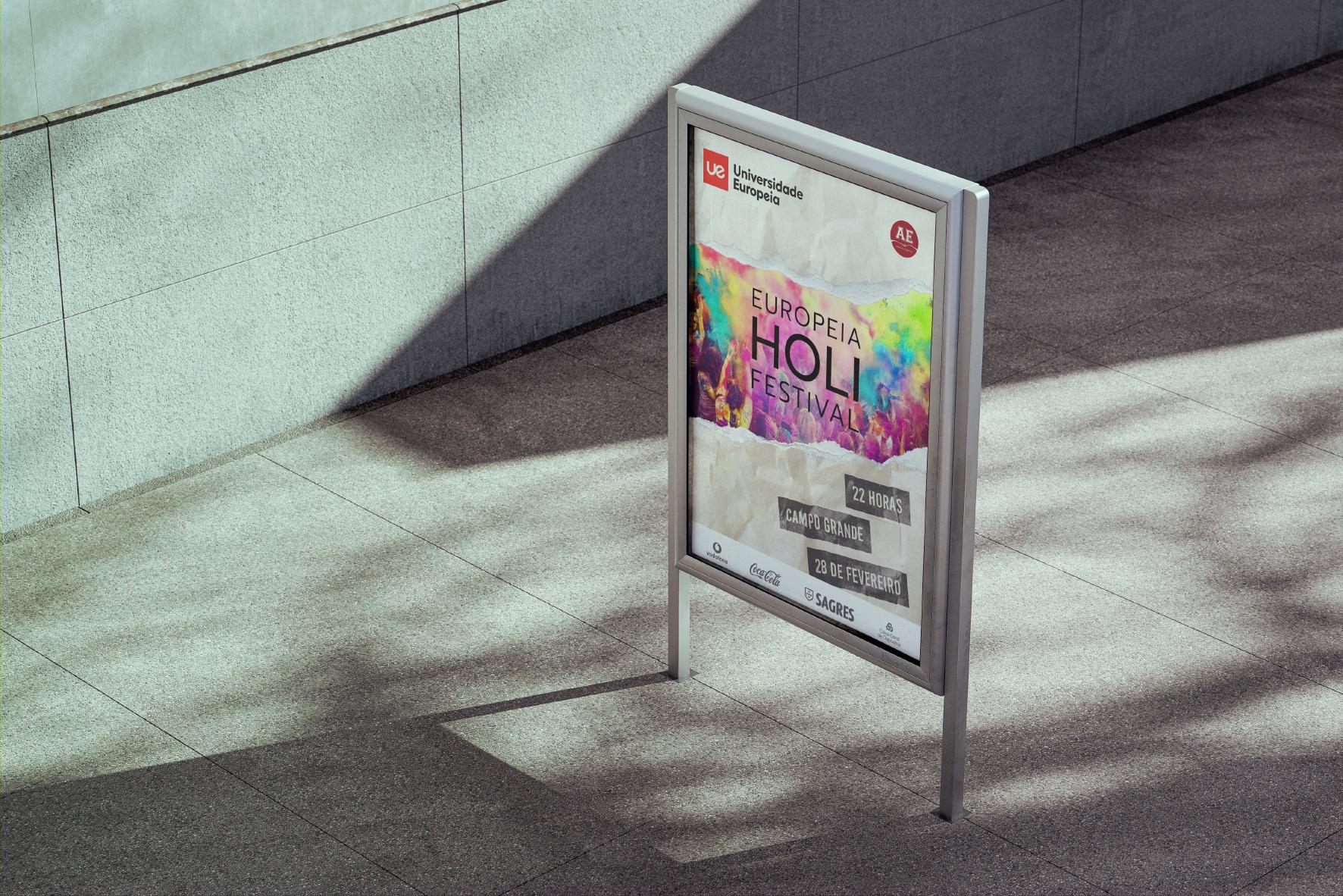
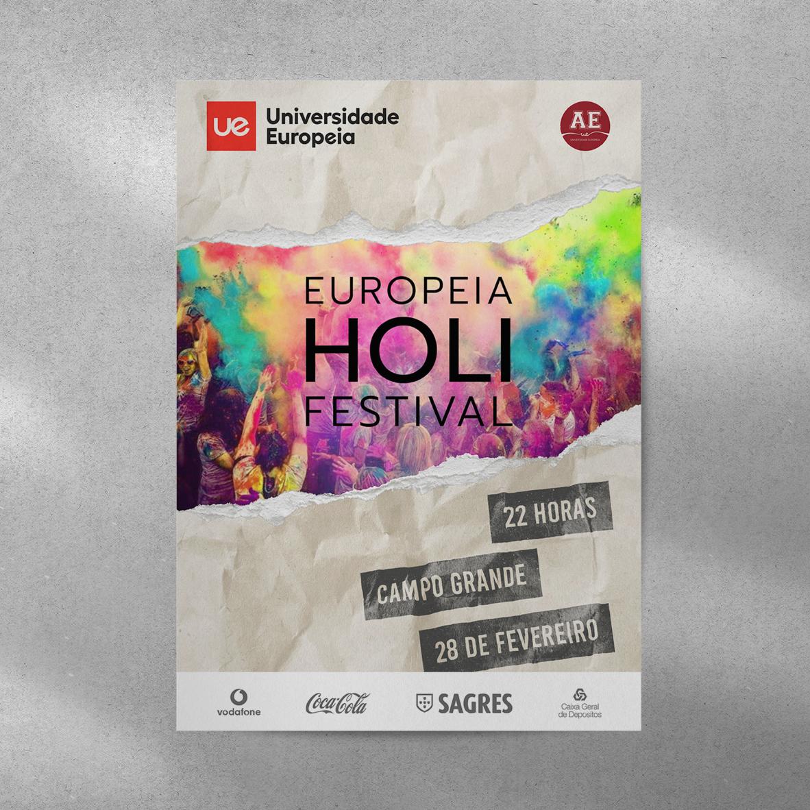
HOLI PARTY POSTER
10
This one I made in college. It’s a would be poster for a Holi festival party produced by the university itself. The project had to contain the shown company logos and written information about the time and place of the event. The rest was up to the student.
10 YEAR CHALLENGE
This piece was actually a remake of a poster I did in college. I always thought I could do better than what I came up with back then. The poster was completely remade with the intention of maintaining the original’s (the one on the left) spirit. Hopefully you enjoy the result of the skills and knowledge I adquired through the years.
11
THE CHANGES
Besides clear Design problems of the original, I wanted the new version to have a more visceral, energetic and fun aesthetic. All the classic elements that you’d expect from a college party poster.
12
13
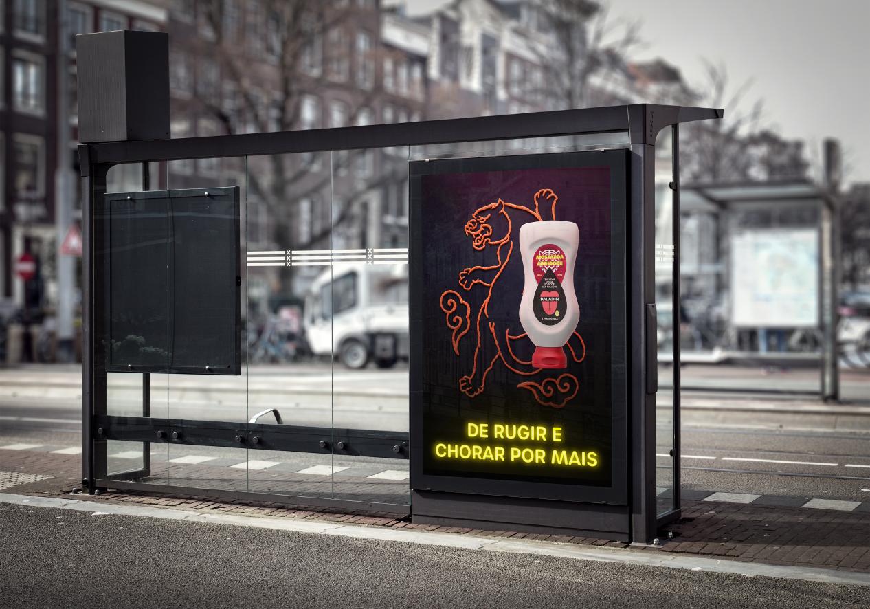
Through the collaboration I did with my friend, 3D expert, Pedro Fortunato, I created two advert posters. They announce the fictional creation of two new flavours for the Portuguese sauce company, Paladin.
PALADIN
14
SOUR CREAM MUSTARD
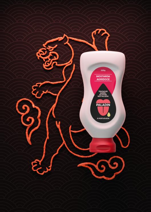
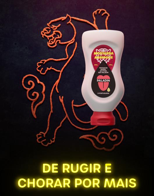
The first image he gave me was the “sour cream mustard” flavour concept. He made the image on the left, I transformed it to the one of the right. My friend decided to reference the Asian origin of sour cream through the image of a tiger created by the sauce itself. the slogan is an appropriate Portuguese play on words.
15
1 - FRIEND’S 3D IMAGE
1 2
2 - MY EDIT
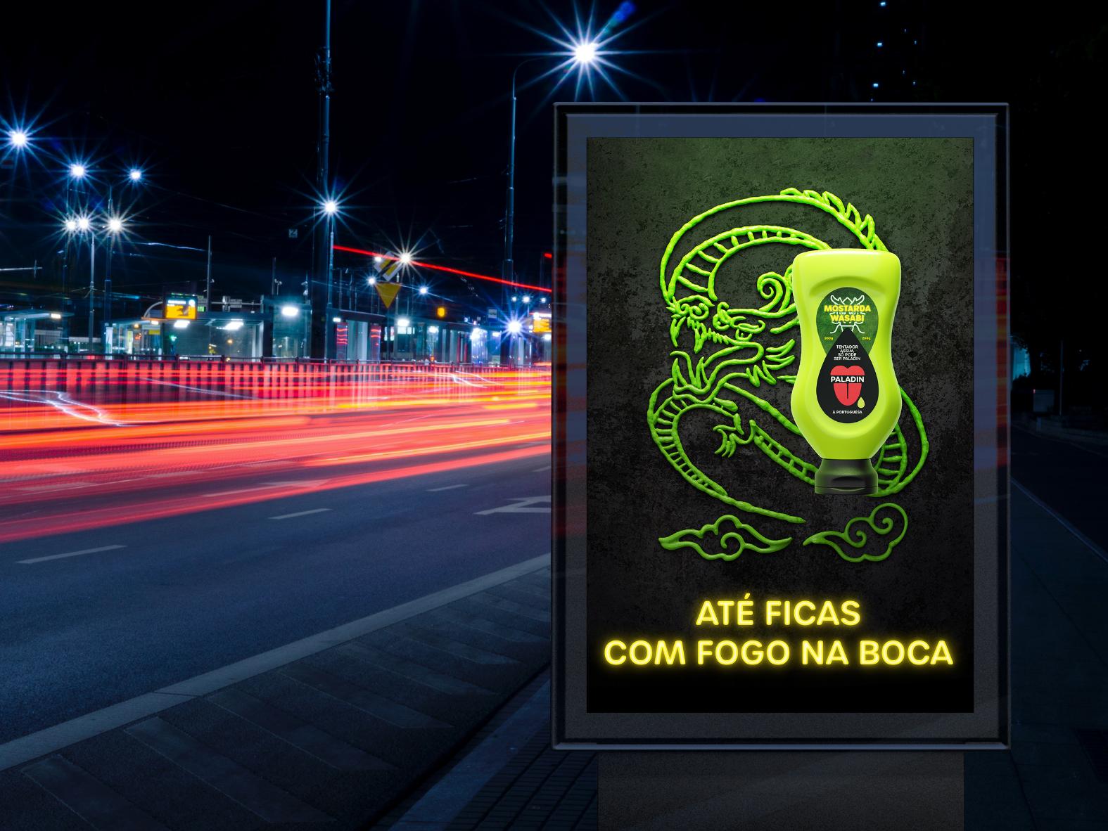
WASABI MUSTARD
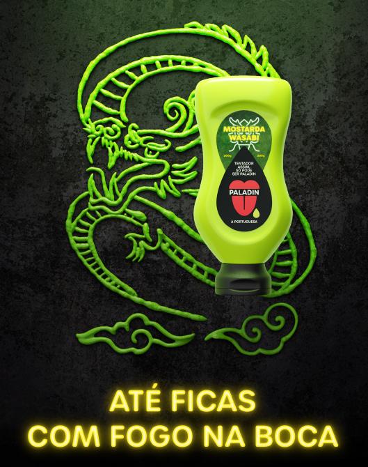
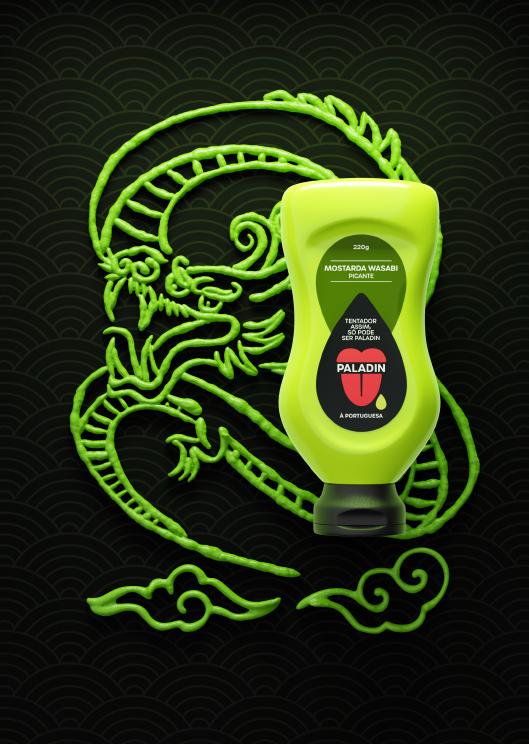
This one brought to life the famous “wasabi” Japanese flavour. To emphasize the bitterness of the flavour, my friend designed a dragon to accompany this image. The slogan is also a quirky message based on the dragon.
16
1 - FRIEND’S 3D IMAGE
1 2
2 - MY EDIT
CAROUSELL POST
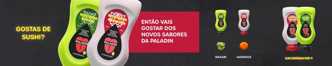
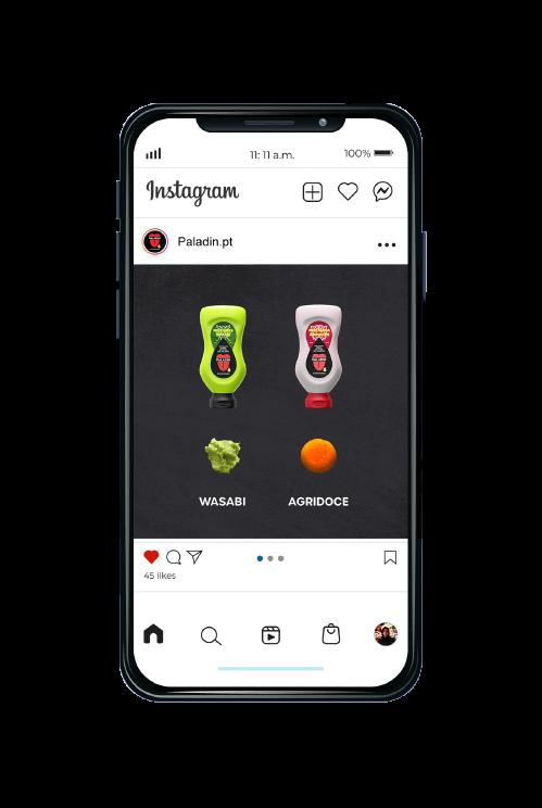
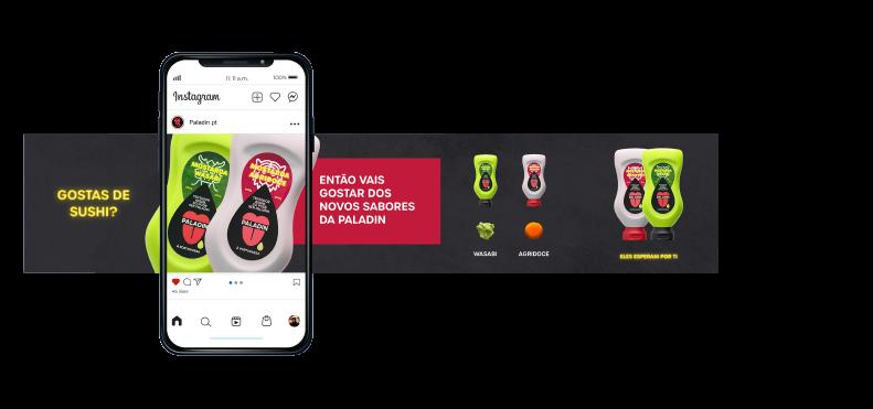
I made this carousell post as well. A classic Social Media post to expose and promote the new products. Five sliders for people to slide across.
18
SMART CONSULTING
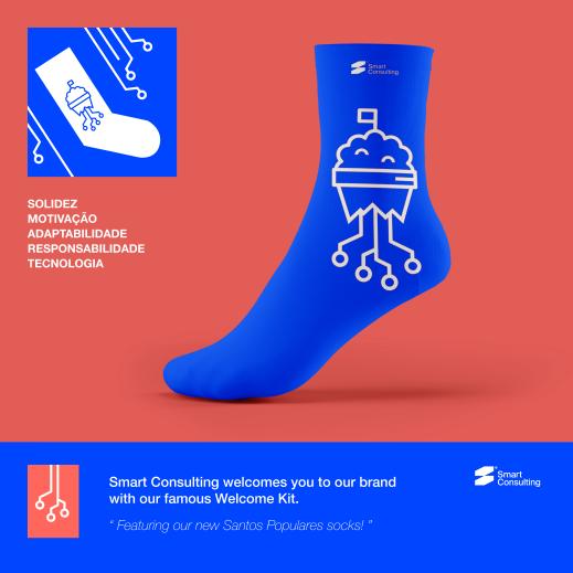
I made this square digital advert for the IT company Smart Consullting. This was a challenge the company sent out. The objective was to create a Portuguese holiday themed sock which would be part of a welcome gift kit for new costumers. Designers were tasked with creating and explaining their sock’s concept through a small PNG file. This double-sided image was my proposal.
19

20
21
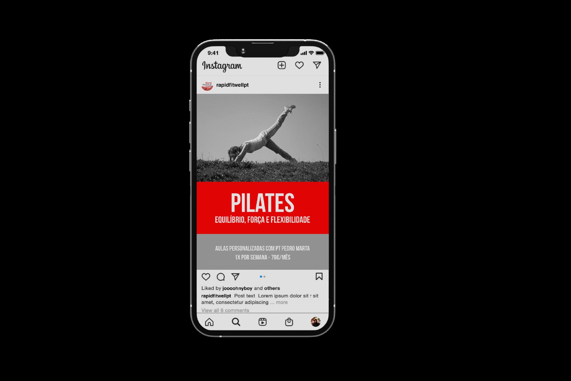
Here’s a collection of Social Media posts I conceived, during my time working at an Advertising Agency. I was responsible for the social media image creation for the company’s clients. Hope you enjoy some of my favourites.
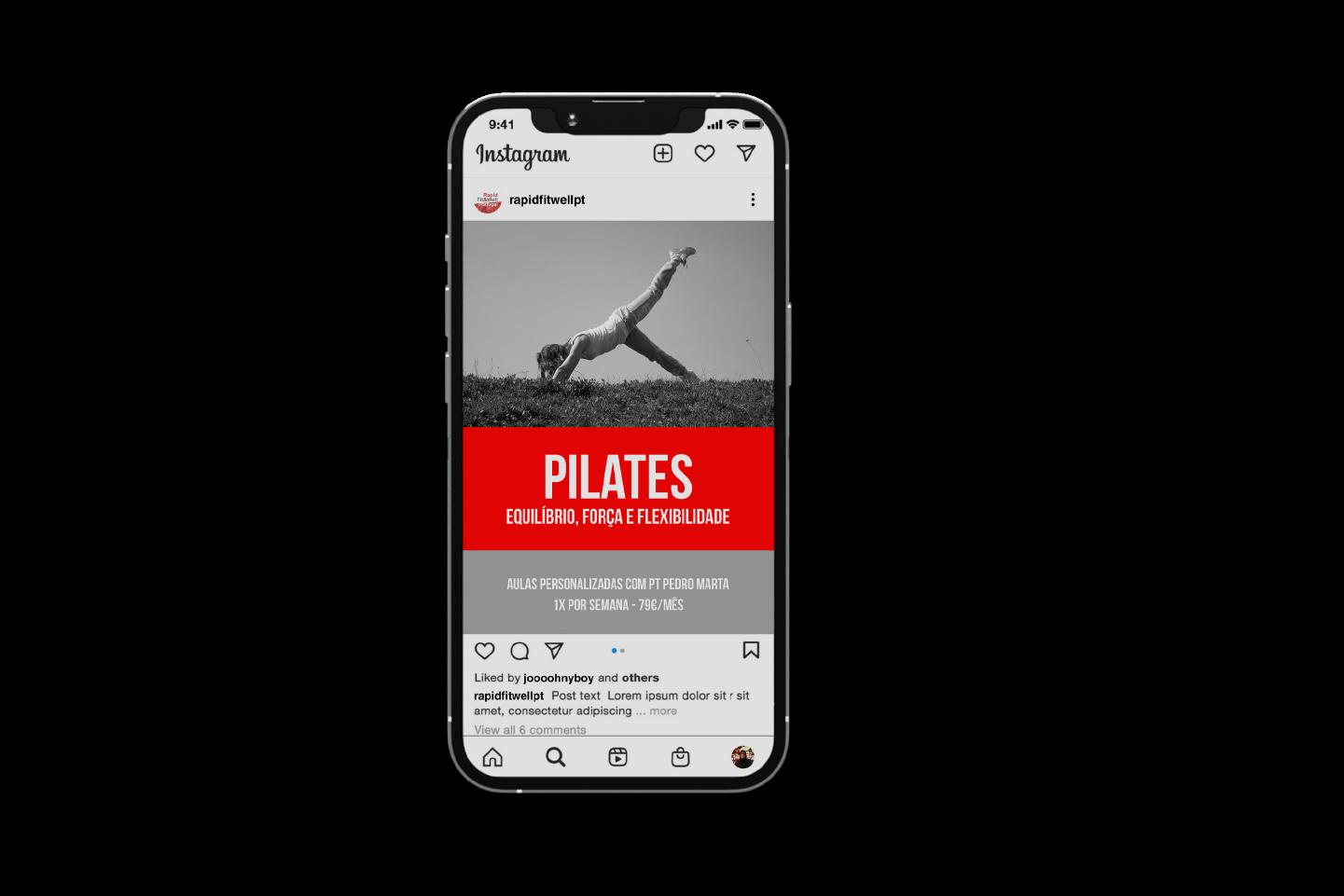
22 SOCIAL MEDIA
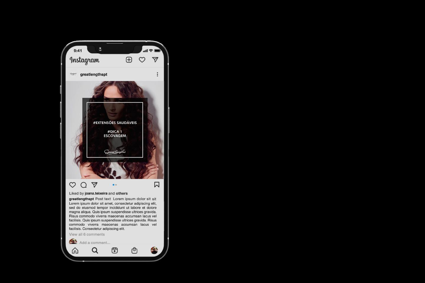
SOCIAL MEDIA POSTS
FACEBOOK BANNERS
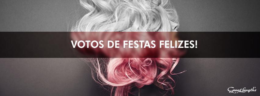
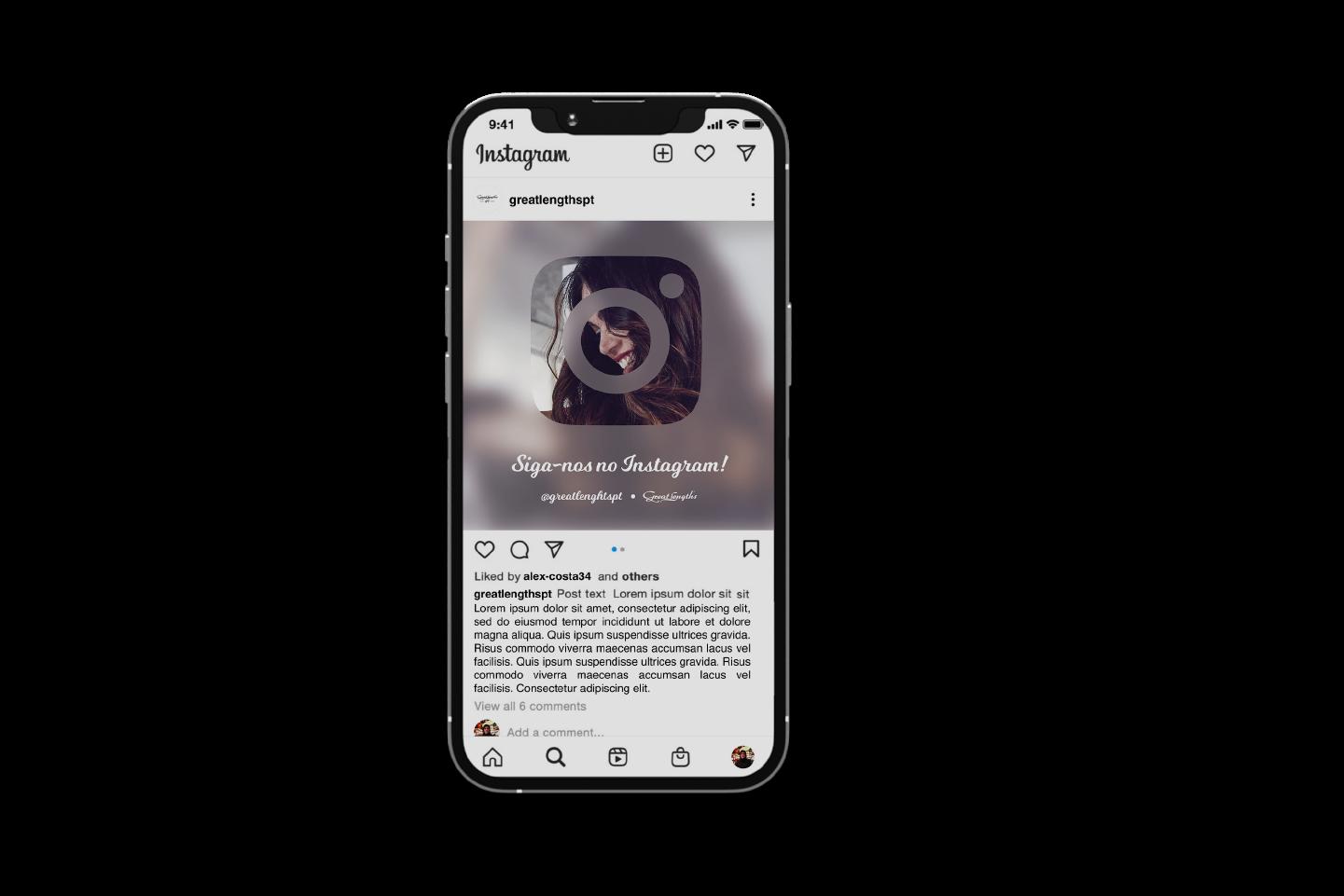
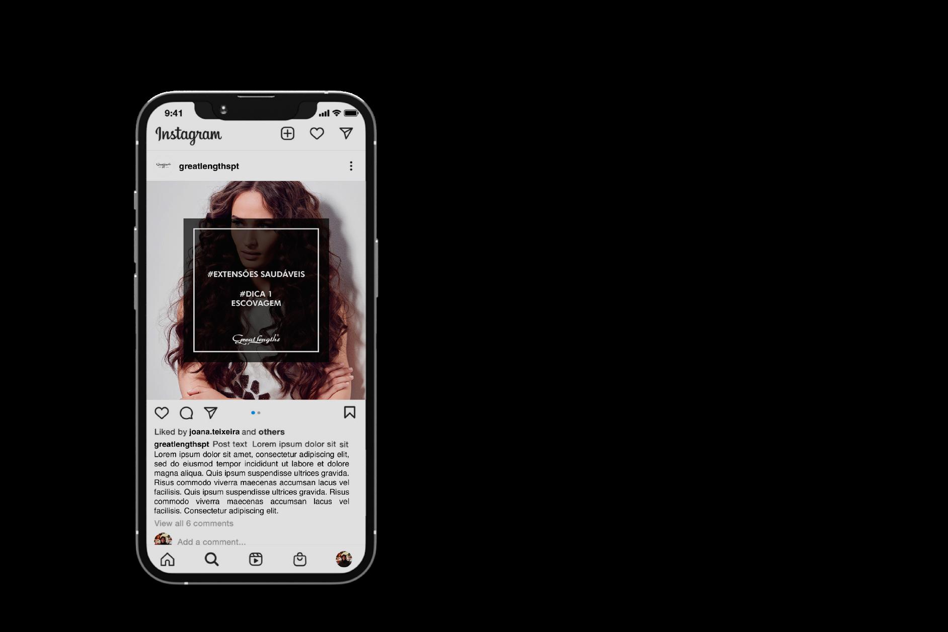
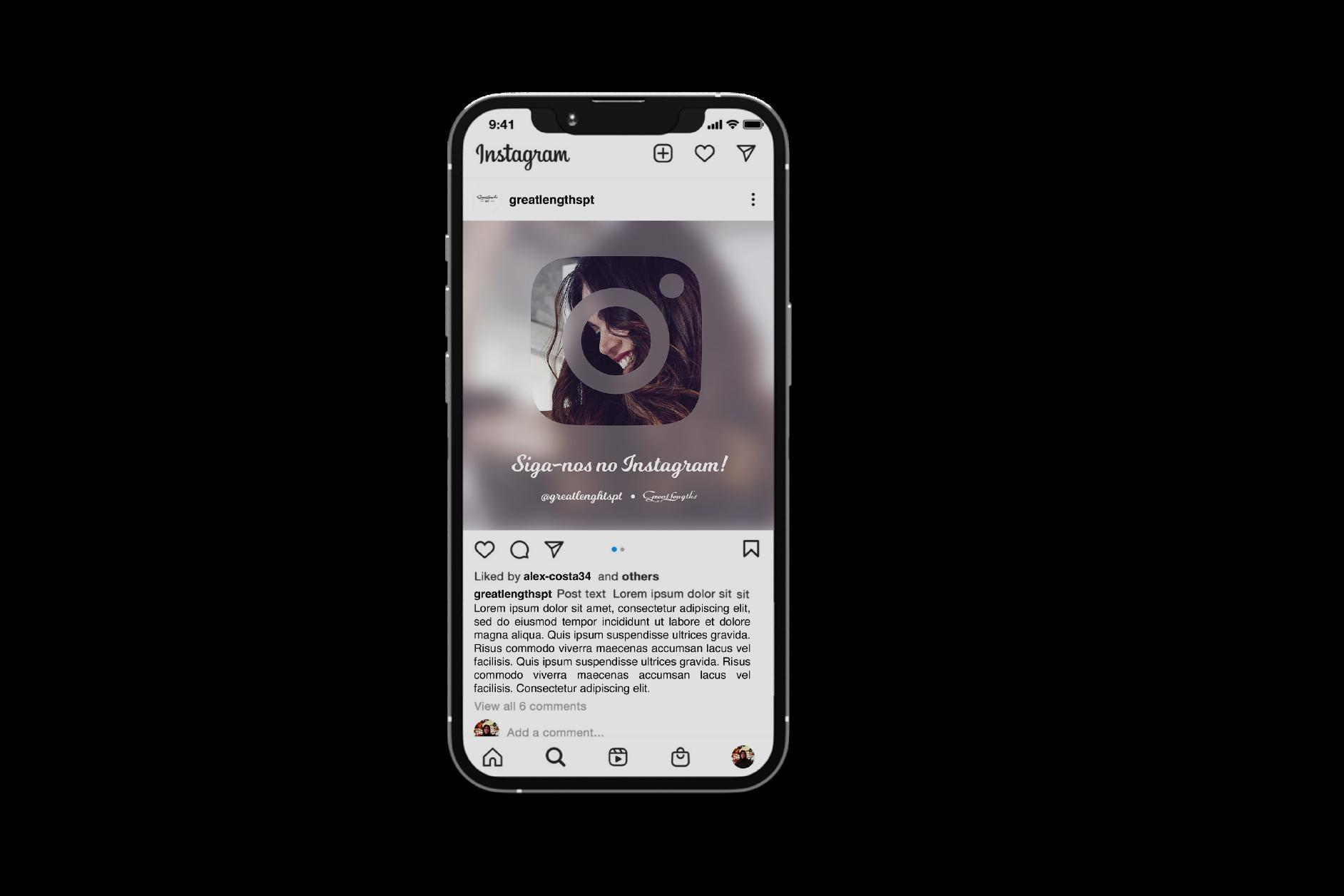
Here’s also two Facebook banners I made for Great Lengths.

miguelcalado1994@hotmail.com
967 371 040 miguel.calado.33 LET’S TALK
+315
2023