Brand Guidelines
MID-AMERICA CHRISTIAN UNIVERSITY
MID-AMERICA CHRISTIAN UNIVERSITY

About Brand
Brand Mission & Vision
Christian isn’t just a word in our name — it’s part of who we are.
At MACU, we’re training students to Dream Bigger and Do Greater for the glory of God. Our high-quality education prepares you to go out and impact the world for Christ in the career of your choosing, whether you’ve been called to the ministry or the marketplace.
Here, you’ll gain the skills, knowledge and Biblical values you’ll need for success in every aspect of life — no matter if you’re coming to us as a recent high school graduate, a transfer student or an adult who is returning to or starting school for the first time.


Mid-America Christian University prepares students through a Wesleyan perspective to create, collaborate, and innovate to solve local and global problems for the glory of
God through Jesus Christ and the good of society.
Mid-America Christian University is “Preparing People to do Greater Things for God and His Kingdom.”
“Very truly I tell you, whoever believes in me will do the works I have been doing, and they will do even greater things than these, because I am going to the Father.”
(John 14:12)
• Our Brandmarks
• Clear Space
• Variations • Tagline
Seal
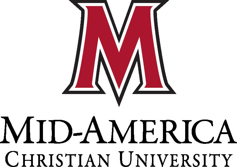
The Mid-America Christian University logo features the MACU Mark, or "M," and the serif-set wordmark. It is to be used in all mainstream advertising as the forefront of our brand. The traditional logo should be used in traditional settings, such as academic certificate printing and paid sponsorships.
The modern variation of our logo should be used in mainstream advertising, social media and in-house promotional materials.
To ensure our brandmark has optimal readability and impact, there must be a measure of clear space around it.
The brandmark clear space area guideline uses the MACU "M" at a quarter of its size, equidistant from each side. For example, the "M" should never be cut off. Leave enough space around the University name so it is clear and not blocked by other images or graphics.
NOTE: Do not stretch, cover, cut off or distort logo.
When using any MACU logo, it is imperative that the integrity of the logo is maintained. Please use our brand elements the way they were intended to be used, and avoid these common mistakes.
Don't stretch.
Don't crop.

Don't squish.

Don't add a border.

Don't rotate.
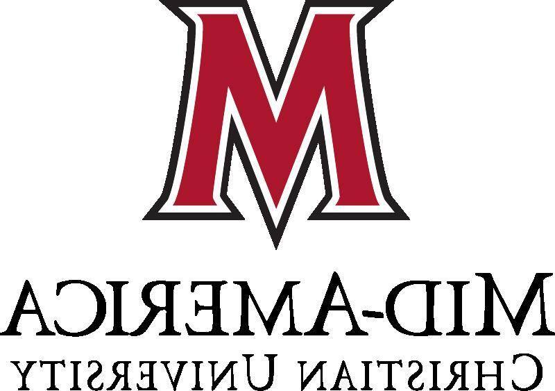
Don't flip.
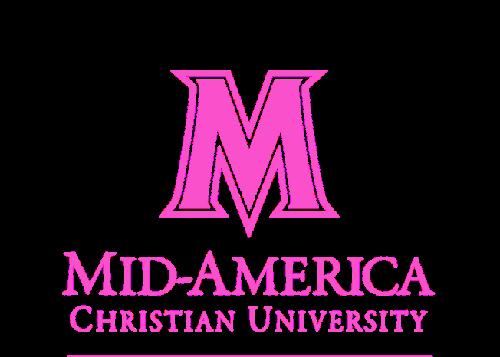
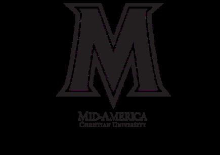
Don't use unapproved colors. Don't change proportions.

Don't add a bevel or emboss.

Don't add a shadow.

Don't add a glow.
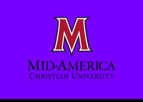
Don't put a color logo on a color background.

The horizontal brandmark features the mark and wordmark in a horizontal format. This brandmark is only used when the main logo does not fit the space allotted.
Like the traditional and modern logos, the "M" mark always should be fully visible with appropriate clear space around it, and not blocked by other images or graphics.

NOTE: Do not stretch, cover, cut off or distort logo.

The mark, or "M," is the most recognized element of the MACU brand. When the mark is on its own, the outer stroke is made in either black or white, whichever has the most contrast in design.
Leave plenty of clear space around the "M" so it is not blocked by other images or graphics.
For optimal readability and visibility, the following background and "M" color combinations should always be used:
White and light backgrounds:
Red "M" with a black outline
Red background:
Black "M" with a white outline
Black and dark backgrounds:
Red "M" with a white outline
The mark, or "M," is the most recognized element of the MACU brand. When the mark is on its own, the outer stroke is made in either black or white, whichever has the most contrast in design.
Leave plenty of clear space around the "M" so it is not blocked by other images or graphics.
For optimal readability and visibility, the following background and solid "M" color combinations should always be used:
White and light backgrounds:
The tagline “Dream Bigger. Do Greater.” is always formatted with alternating adjectives set in bold, as seen here. The tagline color should always match that of the mark "M" color.
The tagline may also be used with the mark "M," using the proportions and spacing shown here.
The tagline is never combined with the horizontal logo. This is to maintain clear hierarchy within the brand.
NOTE: Do not use with horizontal logo.
Slogans are short, memorable phrases that reflect MACU’s heart, energy, and message. While they don’t replace the official logo or mission statement, they support key marketing and enrollment initiatives with warmth and clarity.
These phrases are often used to emphasize a specific campaign, event, or outreach push. They aim to connect with prospective students, families, and the MACU community through approachable, inspiring language.
Approved Slogans
• Where Purpose Meets Possibility
• The Place to Be
• You Belong Here
• Welcome HoMe
Usage Guidelines
• Use slogans to support—not replace—MACU’s core visual identity.
• Slogans should be used consistently and never rewritten or rearranged.
• Do not combine multiple slogans within a single piece unless designed as part of an approved campaign.
In some instances, the University Seal should be used instead of either the traditional logo or the modern logo. Acceptable uses should be limited to formal communications such as:
Invitations
Citations
Awards
Diplomas
Transcripts
Elegant Mementos
Official Documents
Certificates
Event Programs – Official University Ceremonies
NOTE: Alternate variations for color.
• Primary Brand Colors
• Secondary Colors
CMYK 22/100/89/15
RGB 170/24/44
HEX #aa182c
Always prioritize our brand red for primary brand applications in advertising.
CMYK 00/00/00/100
RGB 000/000/000
HEX #000000
CMYK 00/00/00/00
RGB 255/255/255
HEX #ffffff
CMYK 22/100/89/54
RGB 109/3/16
HEX #6d030f
Our secondary color variations must be used in moderation in support of our primary brand color palette.
CMYK 06/12/27/14
208/193/166
Secondary colors are to be used to support, NOT to REPLACE
CMYK 10/07/04/00
#d0c0a6 CMYK 73/62/45/28
225/228/234
#e1e4ea
74/80/95
#4a505f
76/15/36/0
44/164/167
#2ca4a7
• Primary Mascot
• Primary Mascot Head
• Cartoon Mascot
• Torch
• Mascot Colors
The primary mascot logo is the full-color version and should be used in official communications, merchandise, and marketing materials where the full color is appropriate.
The primary mascot logo must not be altered in any way. This includes, but is not limited to, changes in color, aspect ratio, rotation, flipping, mirroring, or any additions that are not part of approved alternate versions.
Ensure there is sufficient clear space around the mascot logo. The minimum clear space should be equivalent to the height of the mascot’s head and top and bottom wings.
The mascot logo should never be reproduced smaller than 1 inch in height to ensure legibility and impact.
Only one version of the mascot logo should be used within a single document, design, or piece of collateral to maintain visual consistency and avoid brand confusion.
The primary mascot head-only logo is a simplified version of the full primary mascot, designed for use in contexts that require a balance between formality and versatility. It maintains the formal character of the primary mascot while offering flexibility in layouts that cannot accommodate the full-body version. It should not be used in place of the full primary mascot for official communications that require the complete design.
The head-only logo must not be altered in any way. This includes, but is not limited to, changes in color, aspect ratio, rotation, flipping, mirroring, or any additions that are not part of approved alternate versions.
Always maintain sufficient clear space around the mascot head logo. The minimum clear space should be equivalent to the height of the mascot’s head to ensure it remains distinct and unobstructed.
Only one version of the mascot logo should be used within a single document, design, or piece of collateral to maintain visual consistency and avoid brand confusion.
The cartoon mascot logo is a more playful and energetic version of our mascot, ideal for athletics, campus events, student life, and other lighthearted or informal settings. It should be used when a casual, spirited tone is appropriate and should not replace the primary mascot logo in official or formal communications.
The cartoon mascot logo must not be altered in any way. This includes, but is not limited to, changes in color, aspect ratio, rotation, flipping, mirroring, or any additions that are not part of approved alternate versions.
Always maintain sufficient clear space around the cartoon mascot logo. The minimum clear space should be equivalent to the height of the mascot’s head, ensuring the logo remains visually distinct and uncluttered.
Only one version of the mascot logo should be used within a single document, design, or piece of collateral to maintain visual consistency and avoid brand confusion.
The torch icon is a secondary brand element derived from the primary mascot logo. As a symbol of light, leadership, and transformation, it reflects MACU’s mission to illuminate paths, ignite purpose, and equip students for lives of service and impact.
This icon is intended for symbolic, high-conviction applications—most often in contexts that highlight the University’s heritage, values, and spiritual foundation.
The torch should never replace the full mascot logo as a primary brandmark. It is a complementary element and should be treated as such.
The torch must not be altered in form, color, or orientation. Clear space should be maintained around the icon, equivalent to the height of the flame to preserve visibility and impact. Do not combine the torch icon with other mascot elements unless part of an approved composition.

As always, the primary MACU colors (p.17) should dominate all branded materials and mascot representations.
These colors should be used to complement the primary colors and may only be used in supporting roles within mascot logo designs.
CMYK 24/52/90/7
RGB 185/125/56
Hex #b97d38
CMYK 18/42/80/1
RGB 208/151/77
Hex #d0974d
CMYK 4/24/60/0
RGB 243/195/121
Hex #f3c379
• Typeface
• The Hierarchy
Bebas Neue is a clean, bold, sans-serif typeface chosen for strong, impactful headings. Its modern, all-caps design conveys confidence and clarity, making it ideal for high-energy applications within the brand.
Bebas Neue should only be used for headings and short phrases—not for body text or long passages—to maintain readability and visual balance.
Roboto is the University’s primary typeface. Any of the 12 weights may be used in any application.
Think of Roboto as the workhorse of the brand.
AaThe quick brown fox jumps over lazy dog Light Text
Regular Text
Medium Text
The quick brown fox jumps over lazy dog
The quick brown fox jumps over lazy dog
Bold Text
The quick brown fox jumps over lazy dog
The quick brown fox jumps over lazy dog
THE QUICK BROWN FOX JUMPS OVER LAZY DOG Black Text
The quick brown fox jumps over lazy dog
Black Diamond is a brush script typeface chosen for proud, personalized statements. It adds an expressive, personal touch to MACU’s brand language. Black Diamond, which comes in a singular weight, is best used for keywords in a headline or subheader, rather than for long text runs.
Black Diamond should not be used in all caps or for complete sentences.
A B C D E F G H I J K L M N O P Q R S T U V W X Y Z
a b c d e f g h i j k l m
n o p q r s t u v w x y z
Light Text
The quick brown fox jumps over lazy dog
Regular Text
Black Text
The Revista font family is the formal typeface for Mid-America Christian University. Usage of this font is reserved for official academic ceremonies, including Commencement. Revista, in its varying weights, may be used for section headings in formal invitations and programs, while Revista Script should be used sparingly for titles and names. Revista Script should not be used in all caps or for complete sentences.
ARegular Script
The quick brown fox jumps over lazy dog
Bold Script
The quick brown fox jumps over lazy dog
Black Script
The quick brown fox jumps over lazy dog
The quick brown fox jumps over lazy dog
The quick brown fox jumps over lazy dog
This heading consists of Roboto Slab Bold and a Black Diamond keyword
This is a sub-heading using Bebas Neue Bold
Hierarchy refers to the overall structure of a document and the relationship between elements within the text. A heading placed above a paragraph gives meaning and context to that paragraph and implies a hierarchy to the text as a whole.
This is a sub-heading using Roboto Bold
This is a sub-title using Roboto Regular
Within the University, there are many special groups and organizations that have their own logos and typefaces. These brand assets are to be professionally produced and used by their specified groups to promote activities and formalities.
Note: University-affiliated groups must go through an approval process before establishing their own logo.

Group Hashtag
#EvangelCorner
Group Typefaces
ROBOTO CONDENSED BOLD (All Caps)

Group Hashtag
#ScraperCenter
Group Typefaces
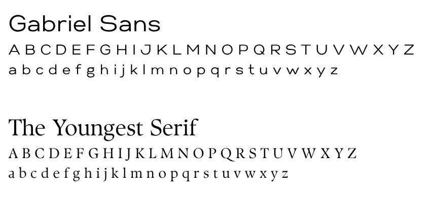
Group Logo



Condensed (All Caps)

Group Hashtag #DefendTheM

Group Hashtag #MACUFamily
Varsity Logo Typeface
MARSHAL CONDENSED (All Caps)



All: #MACUProud
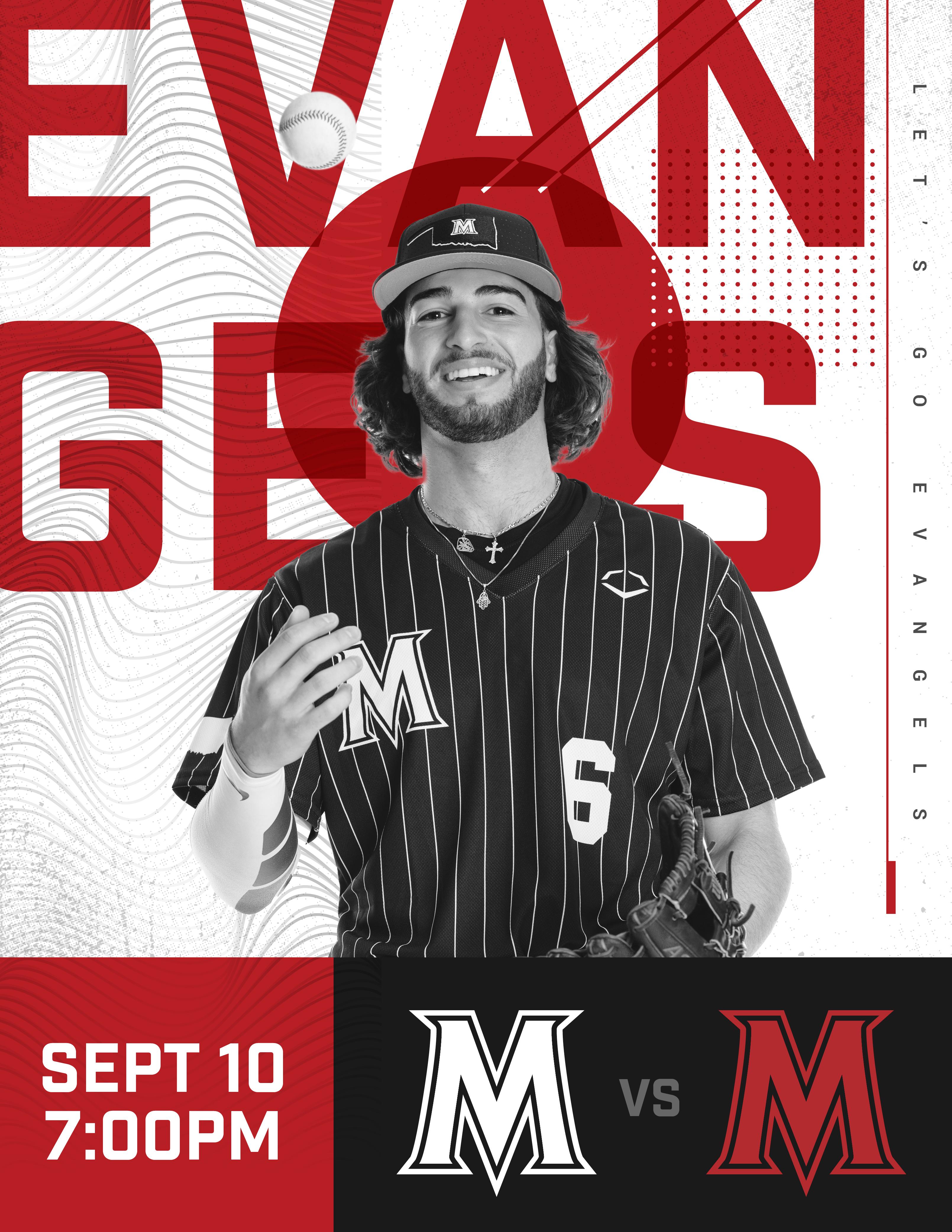
Baseball: #DefendTheM
Men’s Basketball: #TheBrotherhood
Women’s Basketball: #MACUFamily | #RockTheM
Cross Country: #MACUXC
Esports: #MACUEsports
Men’s Soccer: #MACUFamily
Women’s Soccer: #MACUProud
Softball: #GoAllM
Track: #MACUTrack
Volleyball: #MACUProud
• AI Usage in Marketing and Communications
At MACU, we want our marketing and communications to reflect the authenticity, mission, and excellence of our brand. Generative AI can be a helpful tool for brainstorming, drafting, and supporting creative work, but it cannot replace the human judgment needed to maintain our tone, accuracy, and Christ-centered identity. Any AI-assisted text must be thoroughly reviewed and edited to ensure it aligns with MACU’s voice and avoids the generic, artificial style that often appears in AI-generated content.
In visual work, MACU prioritizes real students, real stories, and real campus experiences. For that reason, AI-generated images should not be used to depict people, our mascot, campus settings, or anything that could misrepresent who we are. Our logos, marks, and photography should never be uploaded into AI tools. All AI usage must protect the integrity of our brand and respect privacy by ensuring no confidential or internal information is ever entered into an AI system.
These guidelines allow us to thoughtfully incorporate AI into our workflows while preserving the authenticity and trust that define MACU. When questions arise, the Communications team (communications@macu.edu) remains the central resource for maintaining brand consistency and approving any AI-generated content intended for public use.
Enhance MACU brand promotions with supporting visual elements to provide a more contemporary, vibrant look and feel.
Use only one texture or visual element at a time.




Contact Ashley Gotcher
VP of Alumni Engagement & Strategic Communications
P: 405.703.8236
E: ashley.gotcher@macu.edu
Whitney Knight
Website and Publications Manager
P: 405.703.8211
E: whitney.knight@macu.edu
Anna-Kate Weichel-Owens
Assistant Director of Communications
P: 405.703.8293
E: anna-kate.weichel@macu.edu