 Michelle Urrea Graphic Designer Portfolio 2024
Michelle Urrea Graphic Designer Portfolio 2024
Michelle Urrea Graphic Designer Portfolio 2024
MICHELLE URREA
GRAPHIC DESIGNER & ARCHITECT
linkedin.com/in/michellecurreac/ coralines__
behance.net/michelleurreagd
Moncton, NB, Canada
https://issuu.com/michellecarolineurrea/docs/ portfolio_michelleu_2024
EXPERIENCE HIGHLIGHTS

Auxiliary Architect
Catalytic SAS
Cali, Colombia
July 2021- July 2022
• Redesigned and updated 100% of Brick-Soft’s interface using HTML, CSS and WordPress (DIV builder) to make it coherent with the brand’s visual identity and easier to understand for the user.
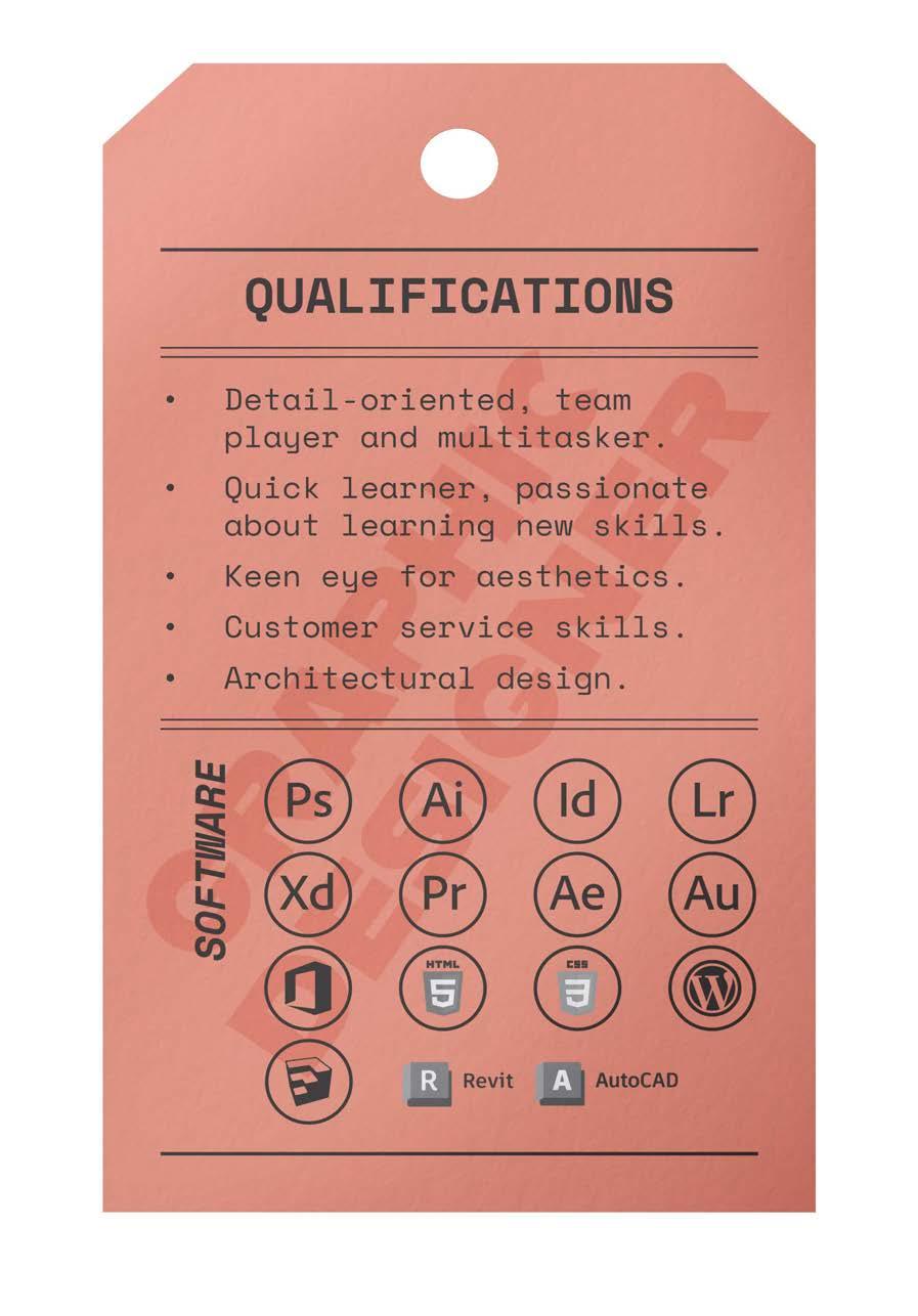
• Use of the Adobe Suit to generate graphic pieces and content, as well as Revit and AutoCAD.
• Generated base budgets for BrickSoft, an online tool to manage construction budgets.
• Created video tutorials and educational content about BrickSoft’s functionality.
Graphic and Communication Design
NBCC
2022-2024 Moncton, Canada
Bc Architecture
Universidad del Valle 2014-2022 Cali, Colombia
Auxiliary Architect
Morales Ceballos Arquitectura e Ingenieria
Cali, Colombia
July 2020- July 2021
• Collaborated in the design process of residential, multi-family and commercial buildings in Cali.
• Translated architectural designs into blueprints to present to clients and get building permits.
• Drafting of architectural and structural plans with technical specifications for construction.
• Use of AutoCAD, SketchUp and Photoshop.
VOLUNTEERING
PAW- People for Animal Wellbeing
Animal Attendant Assistant & Graphic Design Oct. 2023-2022 | Moncton, NB
ACADEMIC EVENTS
DAAD Scholarship
Leader of Study Visit for Groups of Foreign Students to Germany
Oct. 2019 | Germany
Michelle Urrea PortfolioMICHELLE URREA
GRAPHIC DESIGNER & ARCHITECT
linkedin.com/in/michellecurreac/ coralines__
behance.net/michelleurreagd
https://issuu.com/michellecarolineurrea/docs/ portfolio_michelleu_2024
CONTENT
° Visual identity- Rebranding
1. Q-NIS
° Brand creation- Branding
2. REDOOS
° Tea Package- Packaging & branding
3. Strange Brew Tea
° Logo redesign
4. Oaklawn Farm Zoo
° Milk Carton- Packaging & branding
5. Tidehead
° Magazine- Editorial Design
6. Glammed
° Branding
7. Enregatos
° Book design
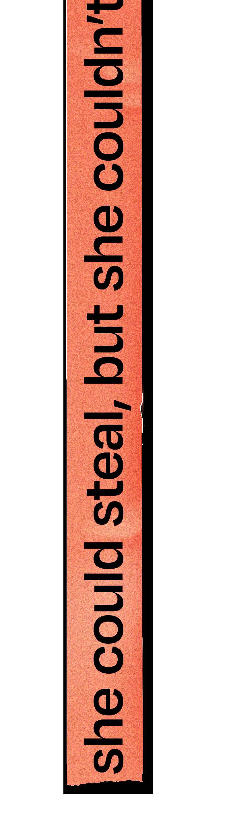
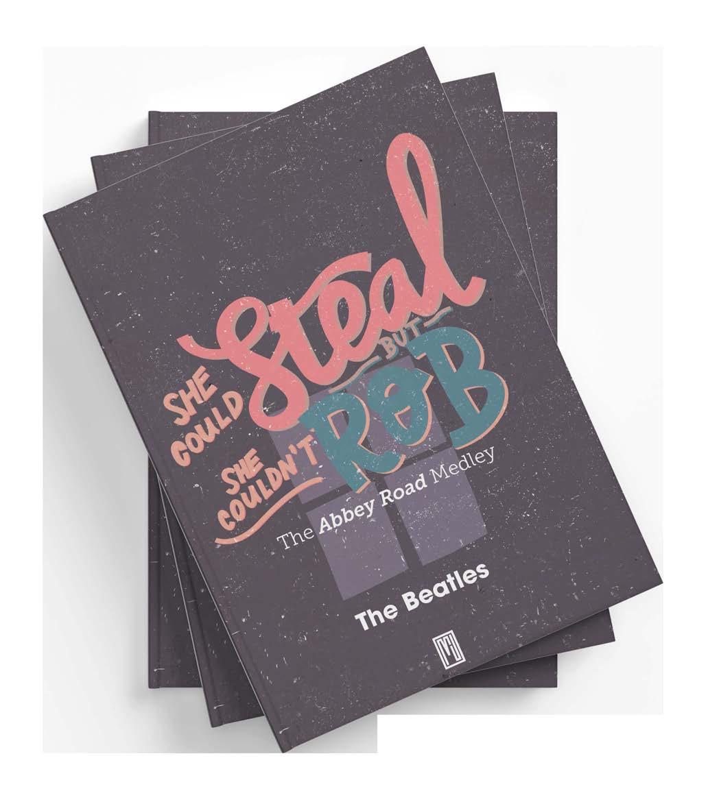
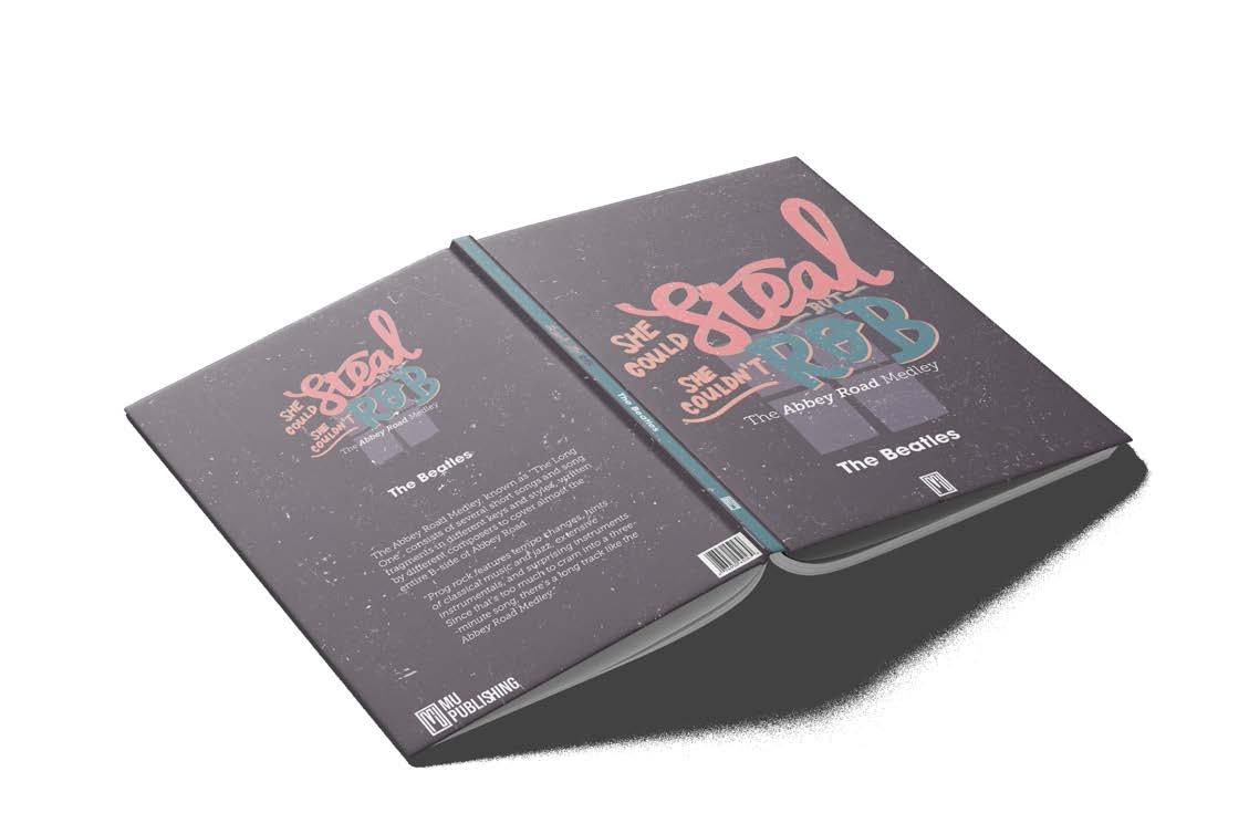
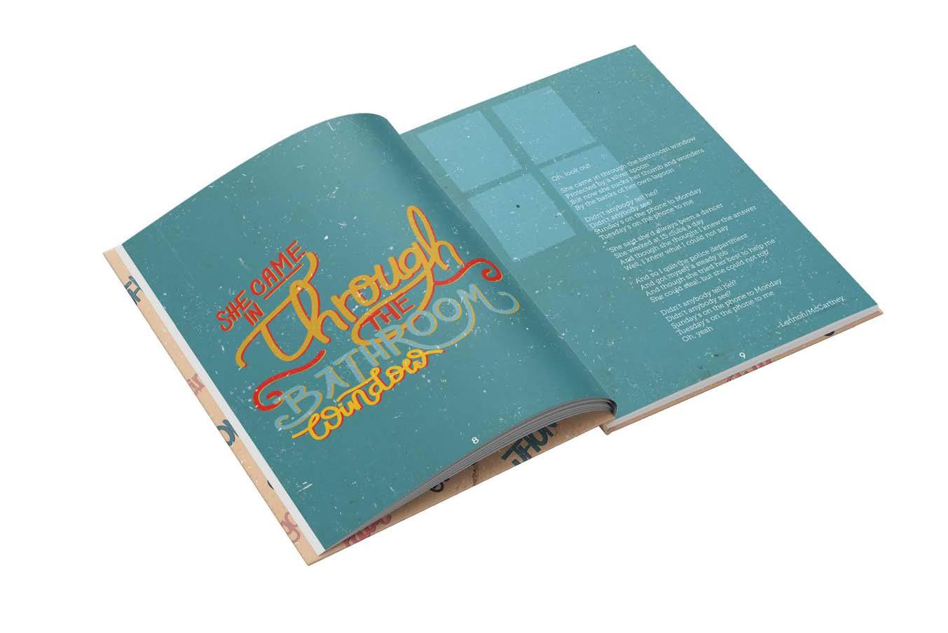
8. She could steal, but she couldn’t rob
° Label Design
9. Phantom Ship
° Branding- Packaging
10. La Patata Clásica
° Visual identity- Branding
11. OLYV
Michelle Urrea Portfolio Moncton, NB, Canada
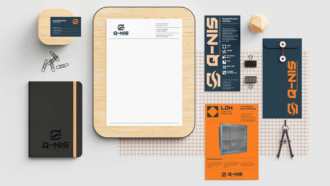
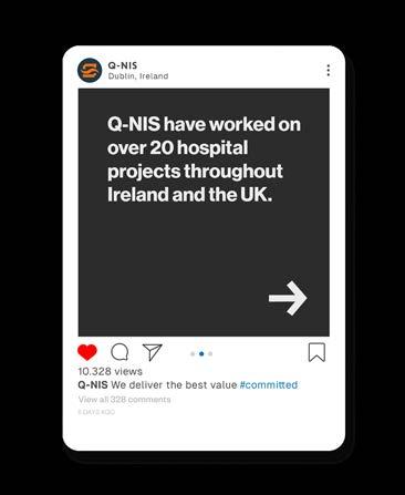
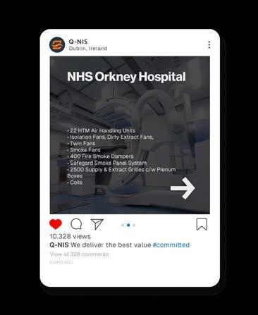
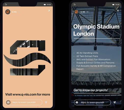
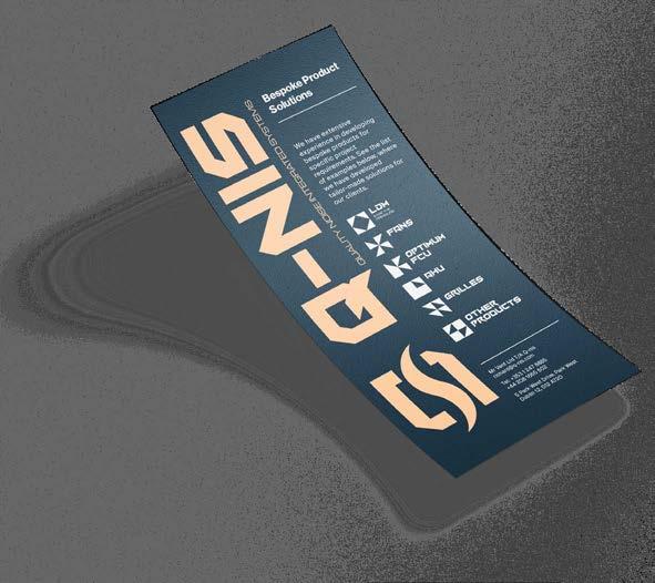
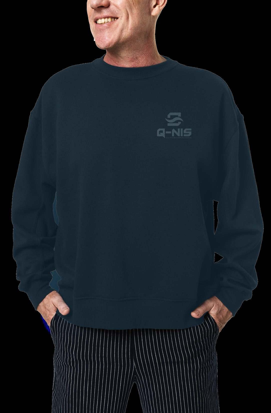
Q-NIS is a company manufacturing ventilation equipment across Ireland and the UK. It has been on the market for 12 years, delivering tailor-made solutions for its clients and becoming one of Europe’s leading suppliers of high-profile projects.
This company is evolving rapidly, and its positioning requires that the brand conveys a trustworthy, bold and modern feeling to its potential clients, mainly in the technology, healthcare and stadia sectors.
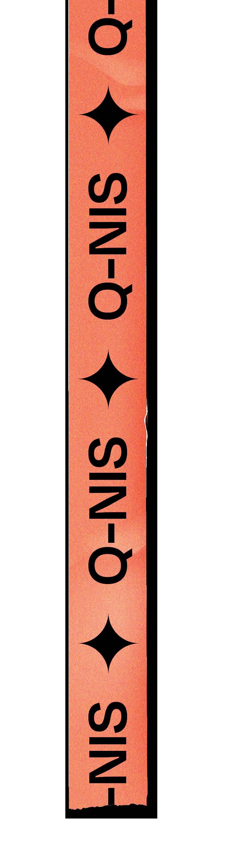
The proposed logo combines key words extracted from the research stage to represent Q-NIS properly. These words are modular, grids, bold, technology and air.
The colour palette aims for reliability and trustworthiness with blue, innovation and confidence with orange, and a sophisticated and balanced feeling with black, gray and white tones.

 Michelle Urrea Portfolio
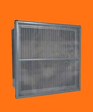

The construction of Data Centres face so many challenges from planning, energy crisis, running costs and timescales. The LDM Module is designed to ‘Ease the Pressure’ By reducing the Pressure Drop by up to 50% when compared against other traditional methods. By reducing Energy Consumption by up to 50% when compared against other traditional By just in time deliveries planning and installation.
Mesh (LDM) Range Ease the pressure...
Louvre Damper
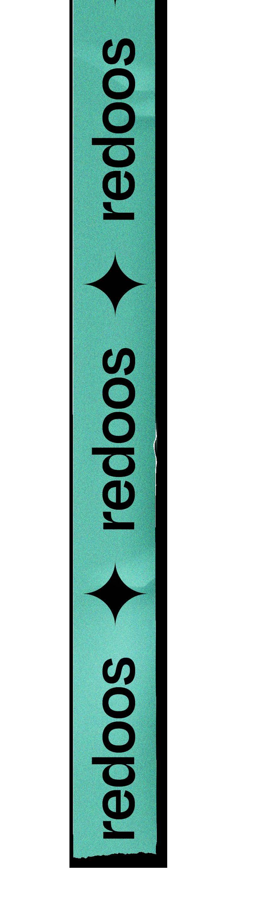
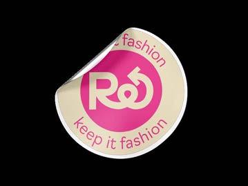
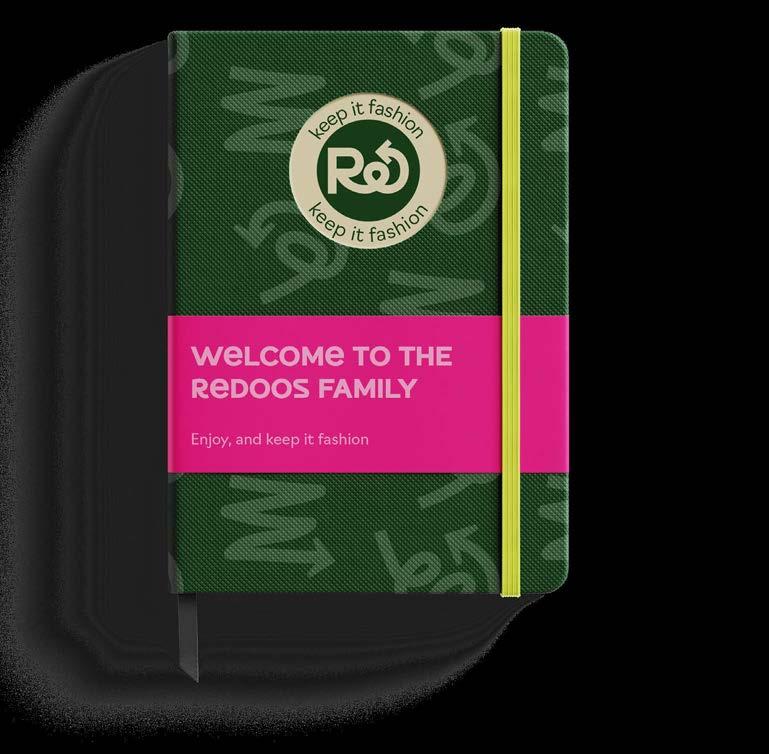
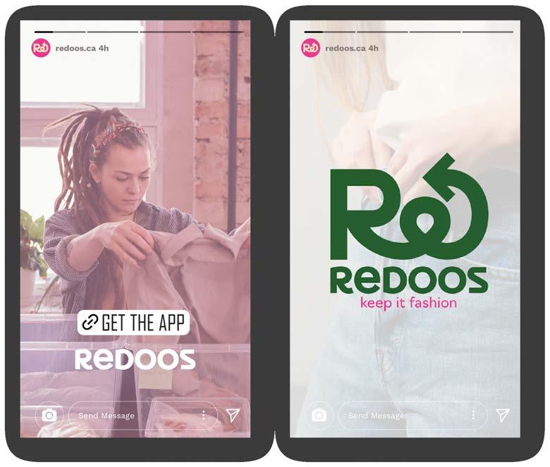
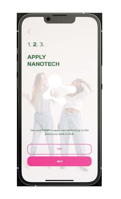
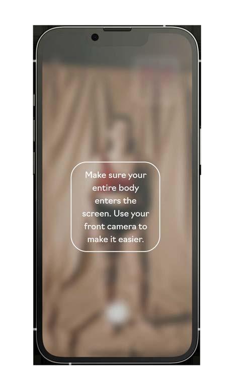
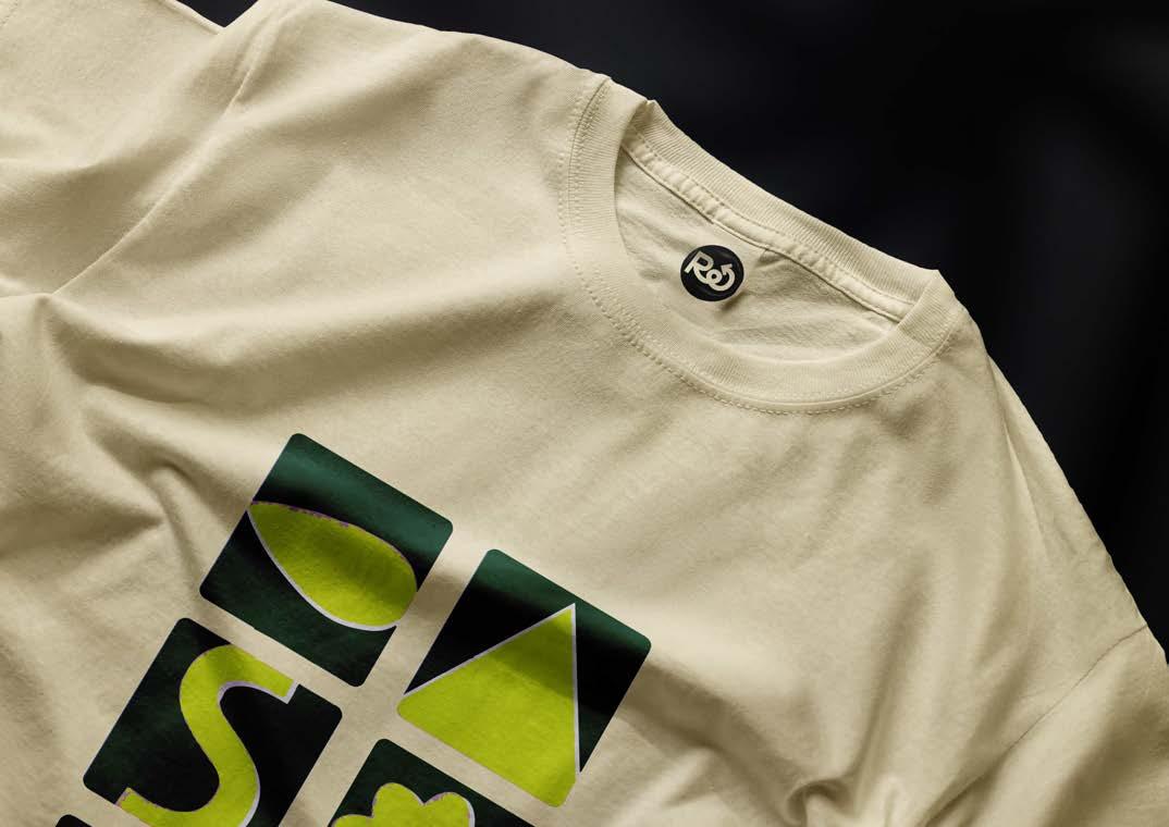
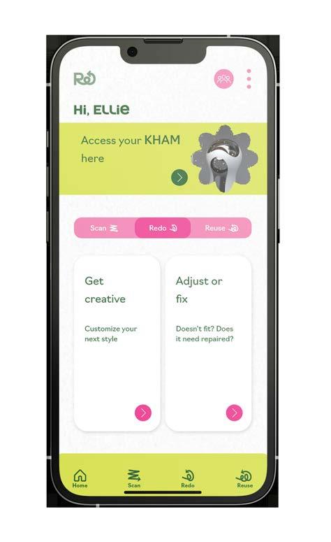
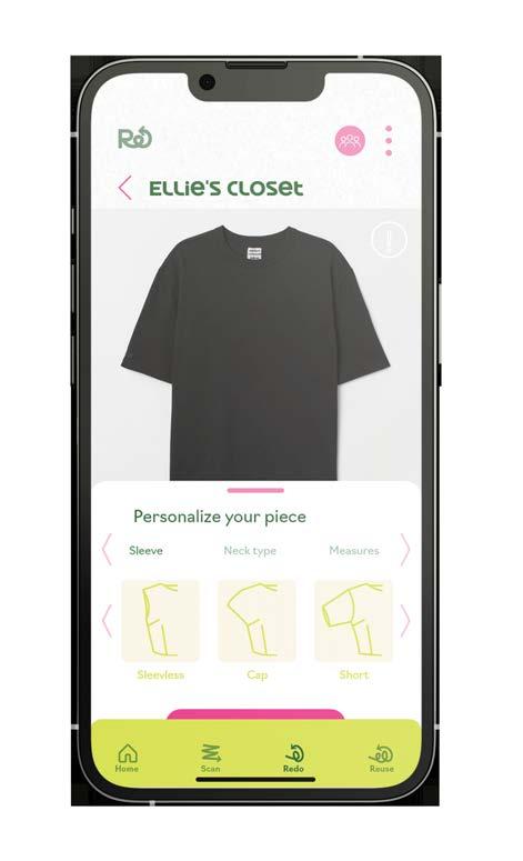
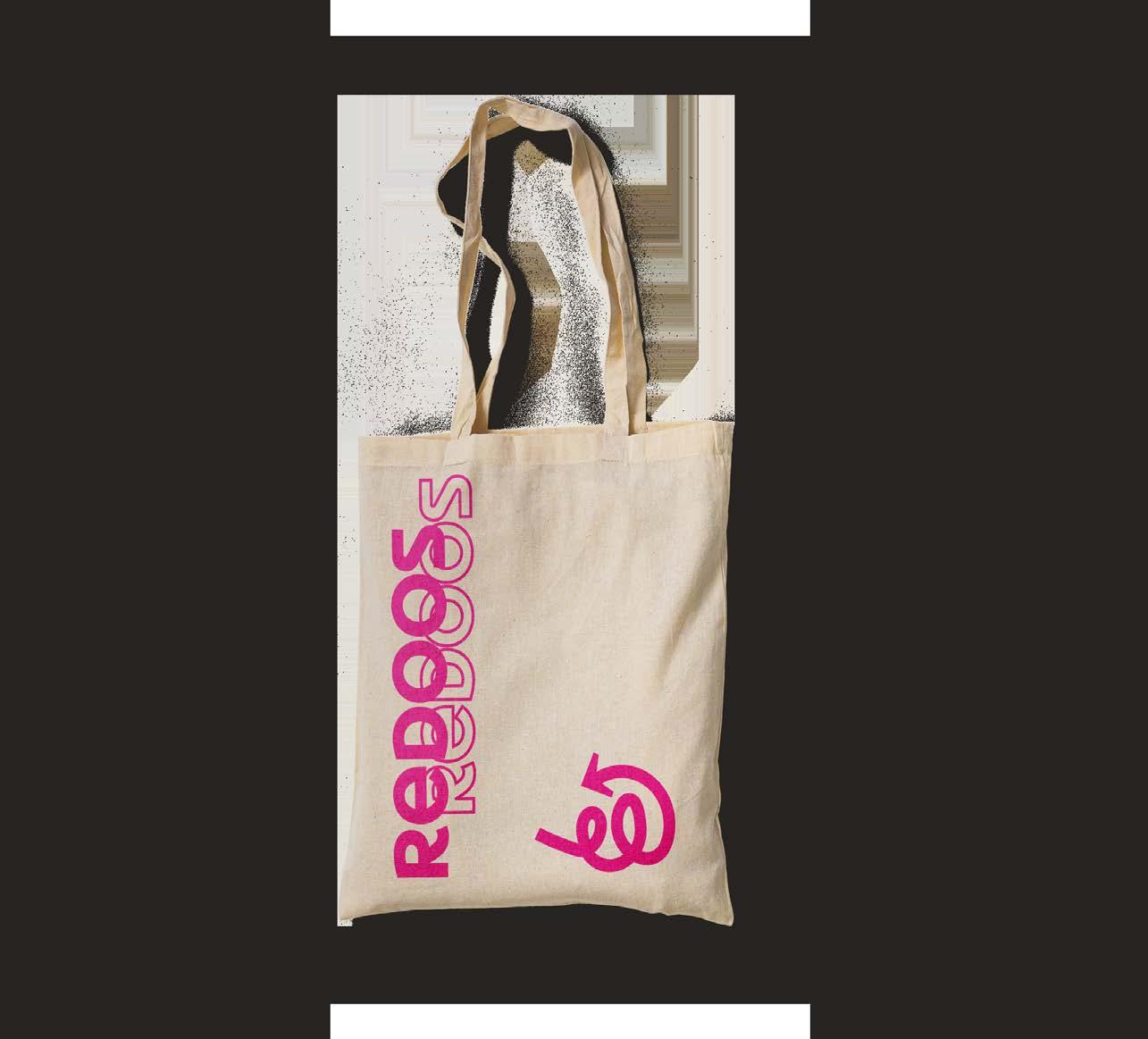
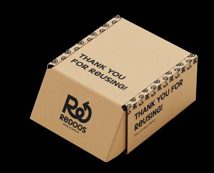
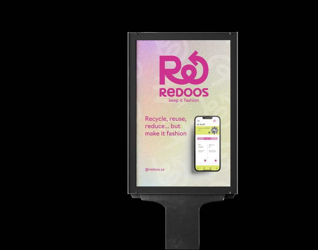
REDOOS was born to allow people to restore, adjust, and redesign their garments to make them timeless so they never have to throw them away. Creating a circular economy is vital to keep this planet going.
We want to make circular fashion the best option, providing people with the tools and technology to make their garments timeless.
Our tone and voice are confident, casual, authentic, intimate and optimistic voice. A bold, straightforward but charming attitude. Clean and simple imagery.
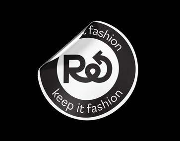
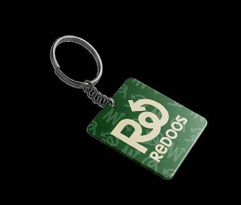
The REDOOS logo represents the duality of the brand: the environment (RE for recycle, reuse, redo, reduce) and the fashion. It aims to be friendly, reliable and organic.
REDOOS has 2 main colours and 2 secondary colours. The green and the pink are representing the duality of the brand: the environment and fashion.
 Michelle Urrea Portfolio
Brand creation &
or the video!
Michelle Urrea Portfolio
Brand creation &
or the video!
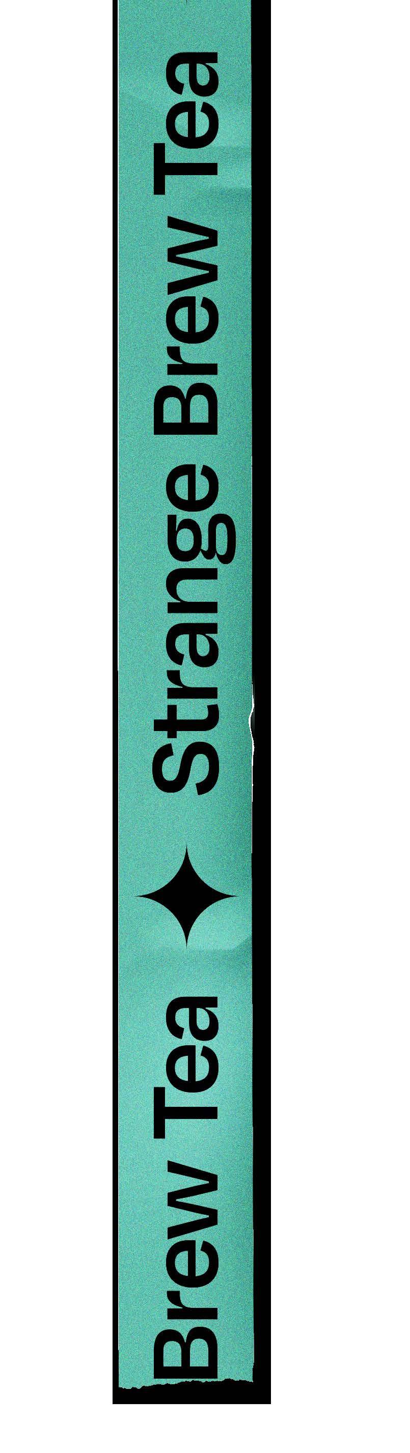
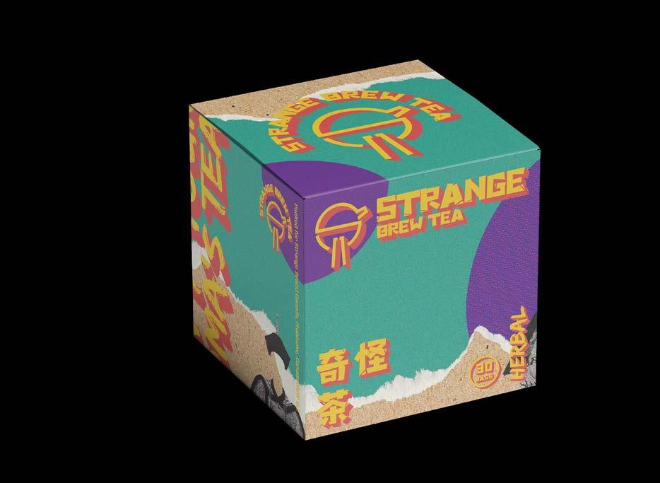
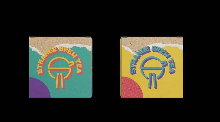
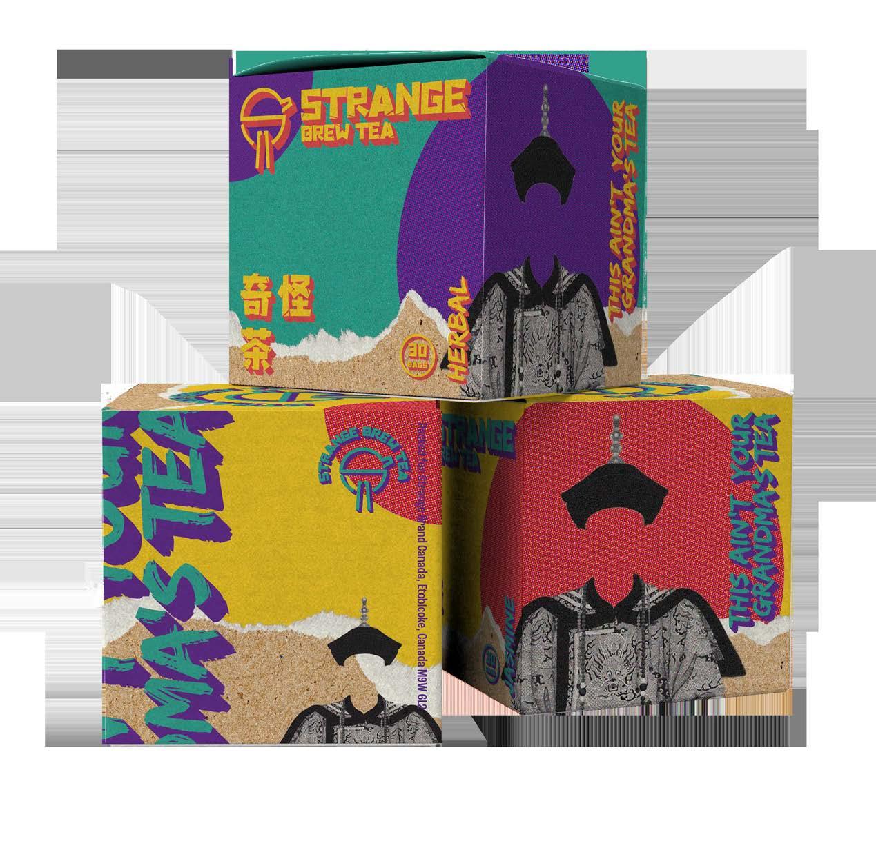
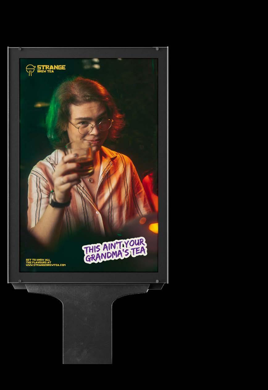
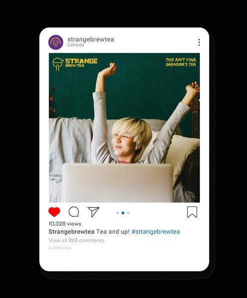
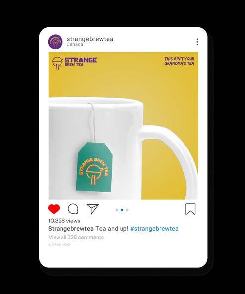
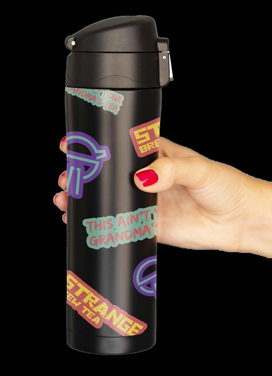
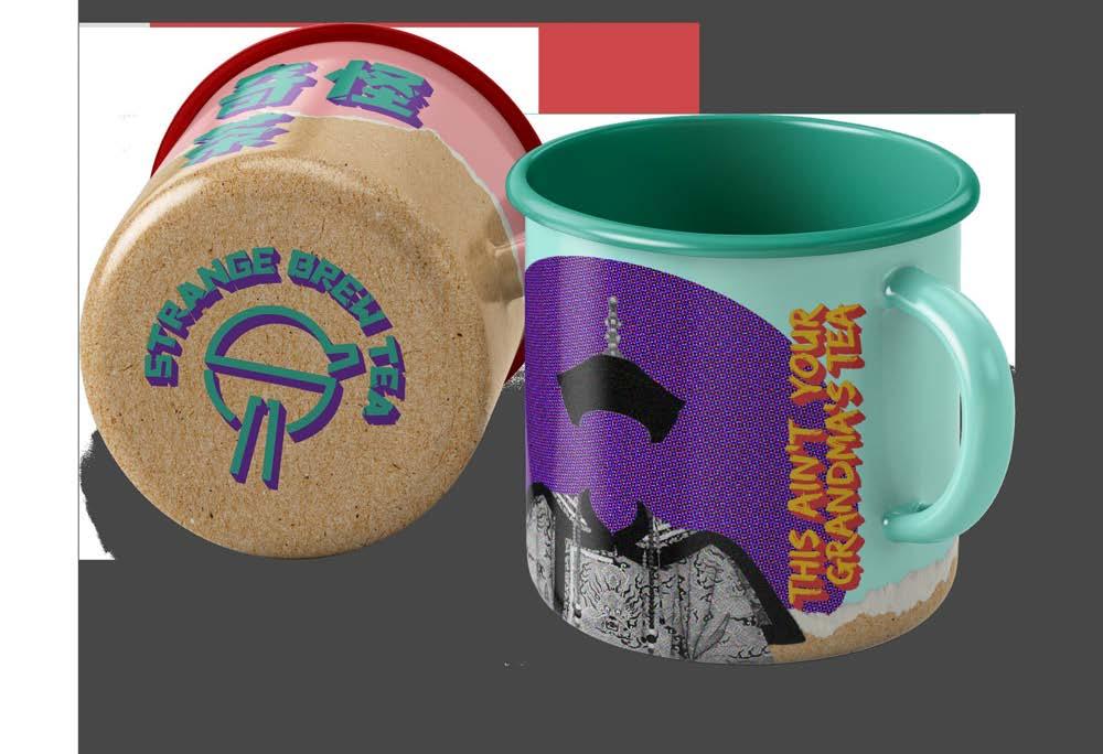
Strange Brew Tea is an alternative to coffee for 18+ consumers. For this reason, the client aims to convey a bold package, unlike the tea options available in the market, which portray a calm look.
We are talking about young people looking for exciting and fun activities. This statement translates into the design with vibrant and bright colours, bold and eye-catching typography, interesting graphic elements and a dynamic layout.
Tea’s origin begins in China, and some of our target audience is attracted to oriental or Asian trends, be it anime, skincare or K-pop. Some elements of this culture were taken to represent this feeling in the brand modernly.
The proposed Strange Brew Tea package aims to attract the target audience by representing their interests in a visually appealing tea box and standing out in the selves.

Portfolio


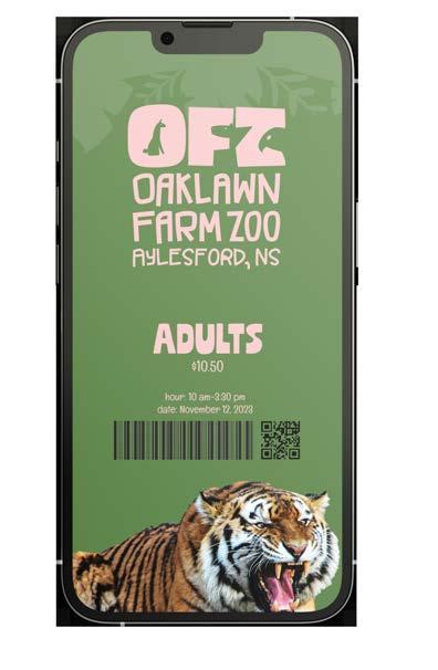
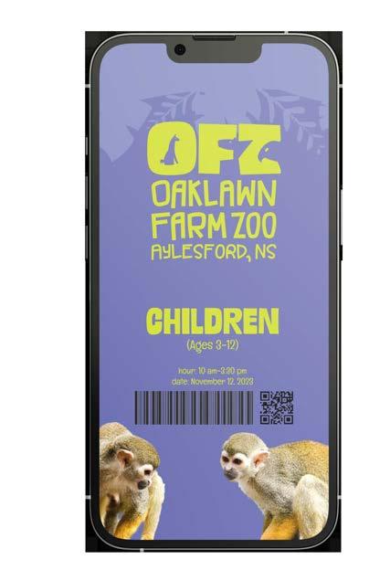
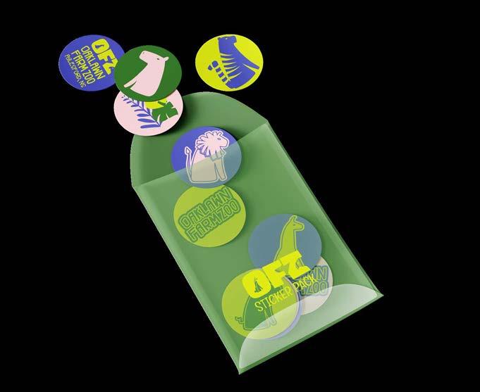
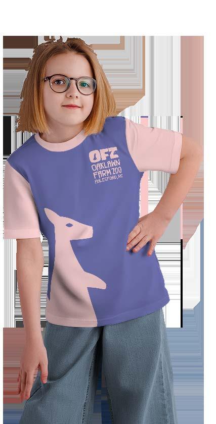
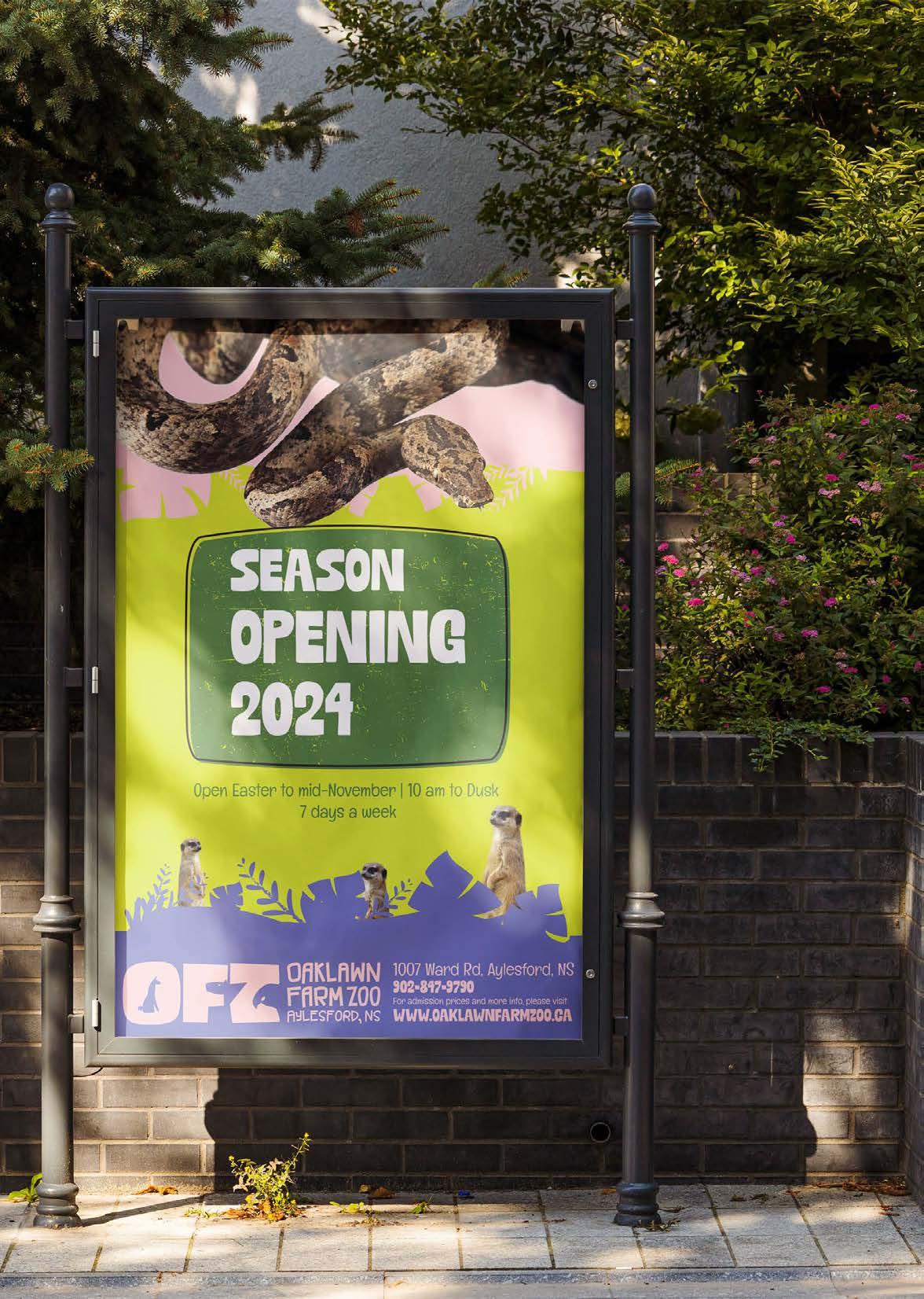
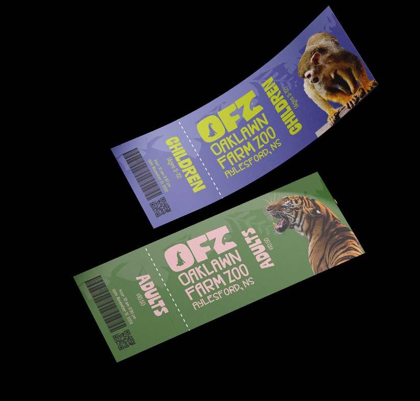
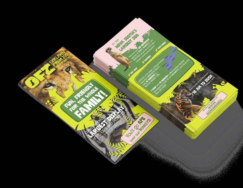
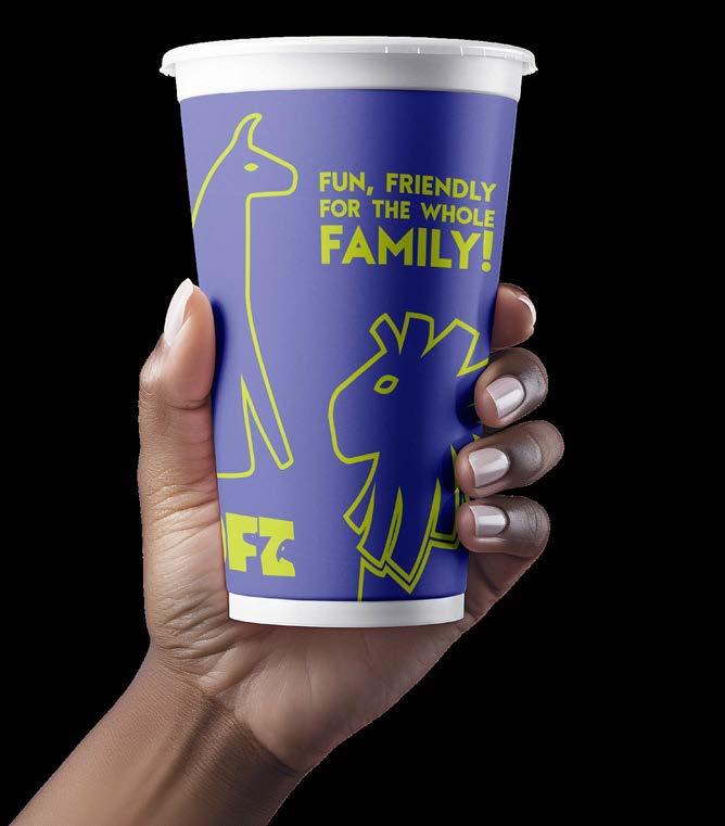
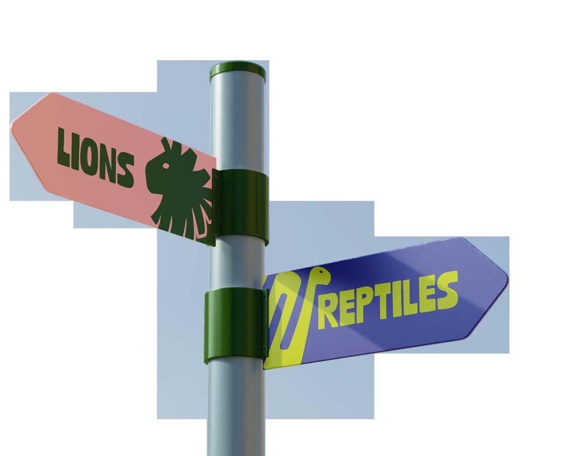
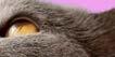
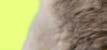
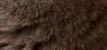
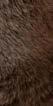
Oaklawn Zoo RebrandRebranding
The Oaklawn Farm Zoo located in Aylesford, Nova Scotia, focuses in conservation, education and strong commitment to fun for the whole family. They asked for a rebrand that can be integrated across signage and advertising. The desired look and feel is modern, visually eye-catching and friendly.
The approach for this project was to target a family friendly look, using a colorful but calmed colour palette contrasting the strong patterns and fur of the animals inside of the Farm Zoo.
The concept of ‘Farm’ contrasts with ‘Zoo’: the first conveying a sense of cute and domestic animals, versus the feeling of adventurous, excitement and wild animals. This duality was intented to be shown in the colour pallette, patterns, textures and the logo.
A lettermark logo was used in this rebrand, integrating shapes of animales in each letter of the name.
 Michelle Urrea Portfolio
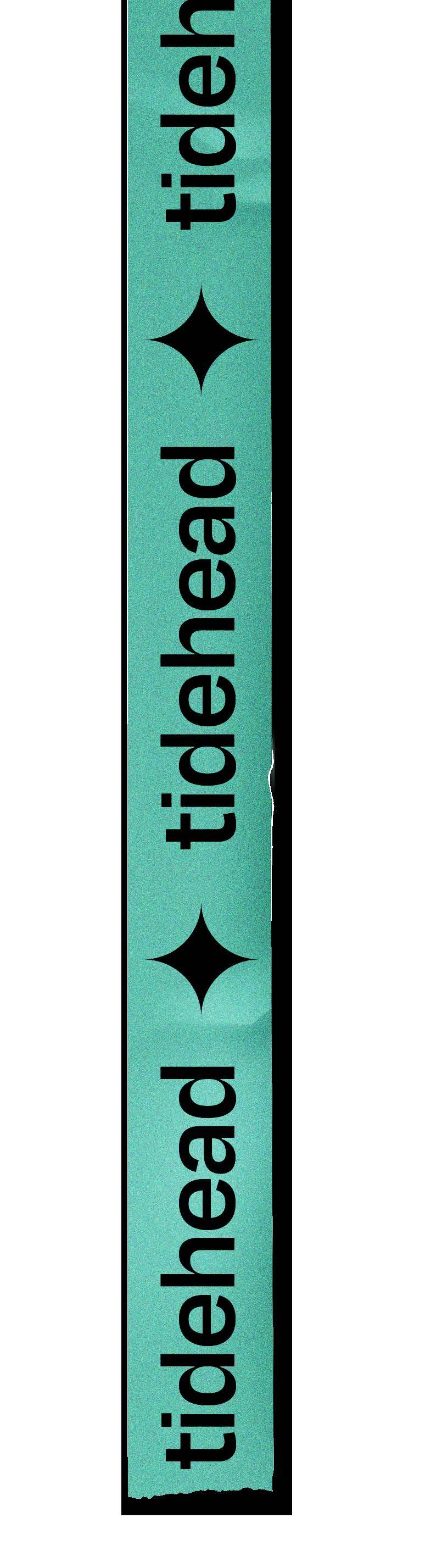
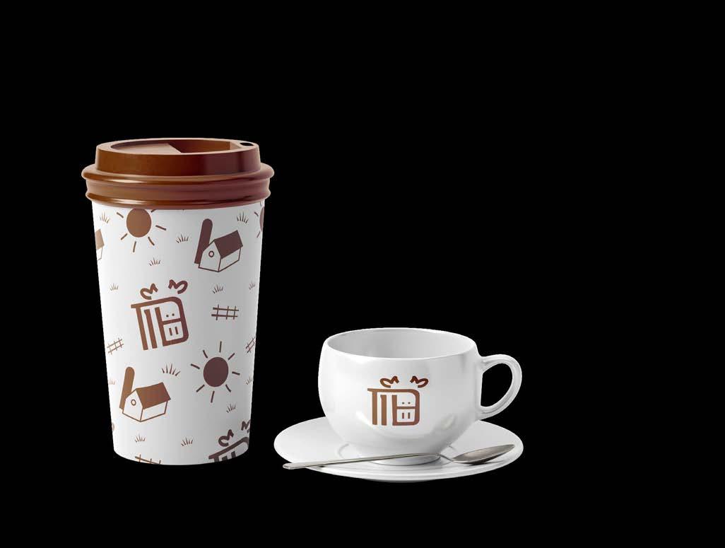
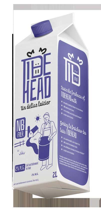
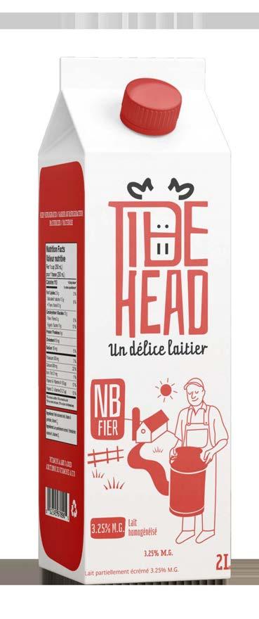
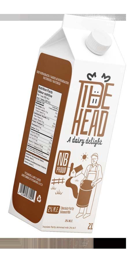
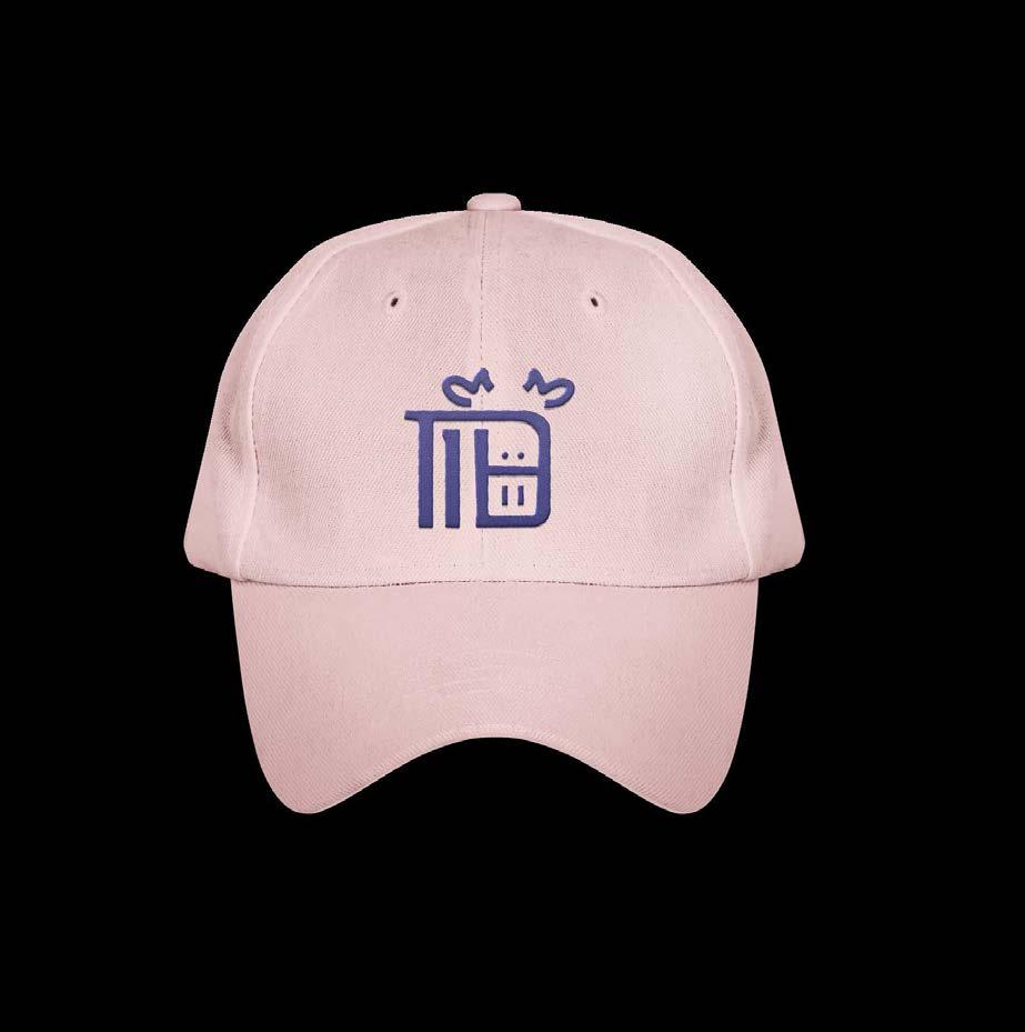
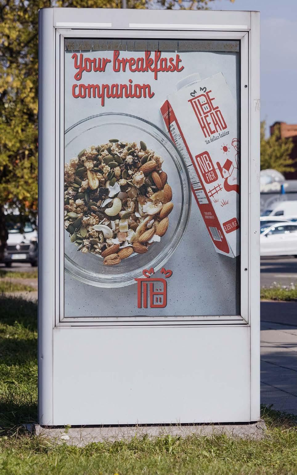
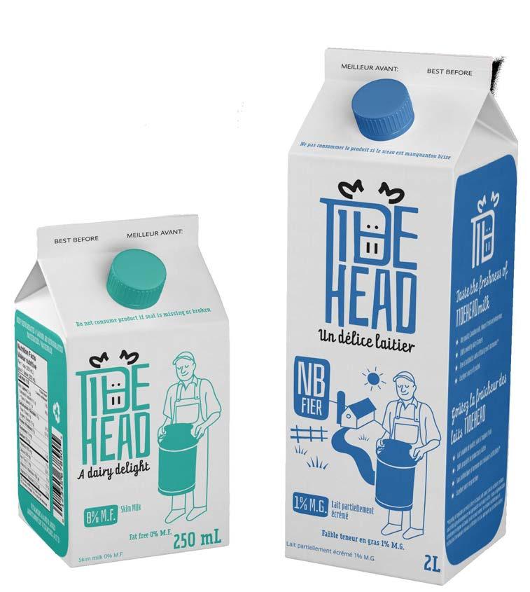
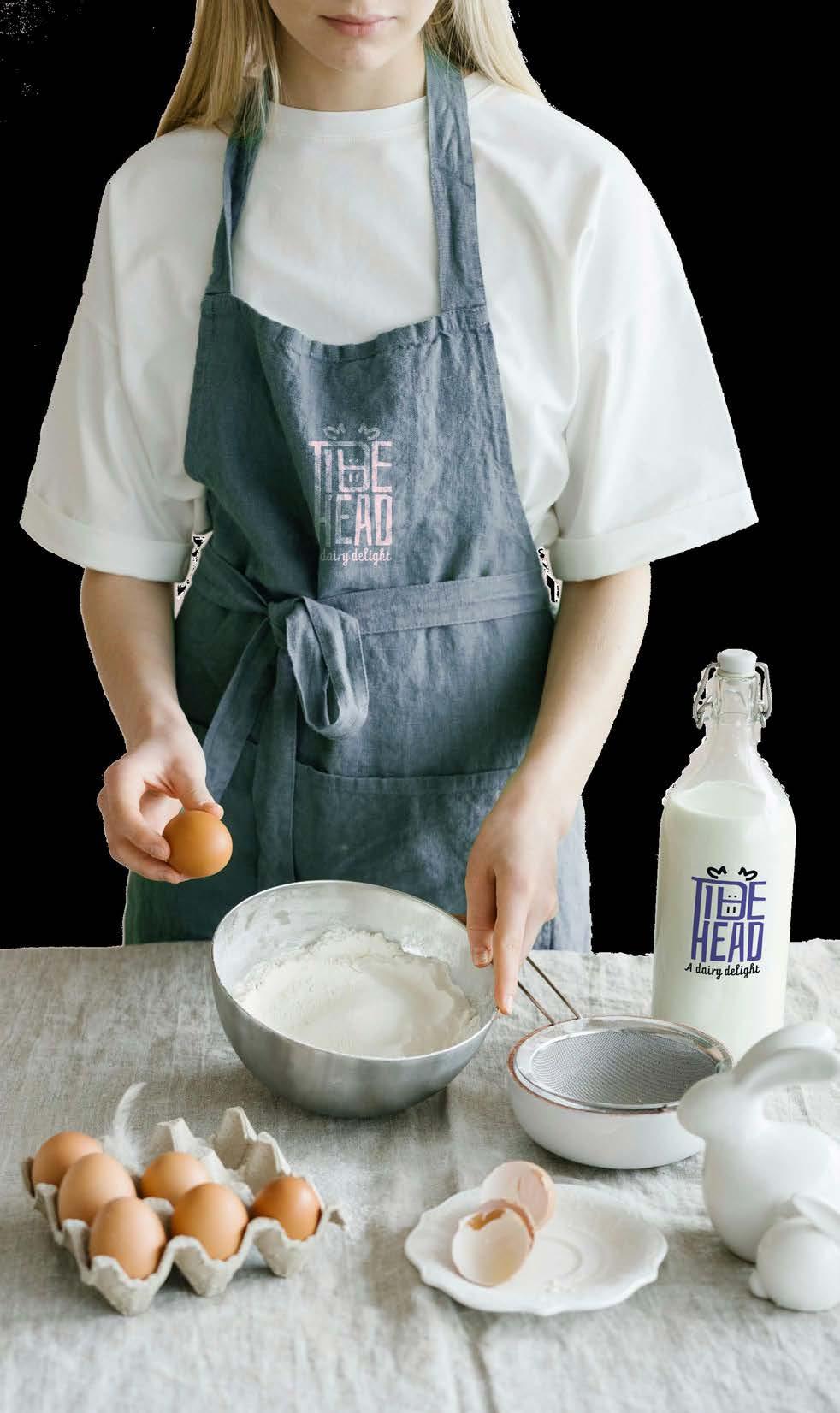
Tidehead is a startup company from New Brunswick that is launching into the dairy market. They are proud to be NB-owned and looking to compete with Baxter and Northumberland brands.
Their target market is pretty general, but their modern design aims to attract a younger consumer.
The logo tides the name’s T, D and H and adds a cow’s head on the D, referencing the brand’s name. The typography used for the brand is a modern san serif font with a script and slab serif variations to convey a more fun and friendly approach towards the audience.
The colour choices are traditional shades of blue, red, and brown, which are used and stuck in the customer’s mind, indicating what kind of flavour the milk has. Although the shades of the blue are a little different, to make it stand out from their competitor.
 Michelle Urrea Portfolio
 Michelle Urrea Portfolio
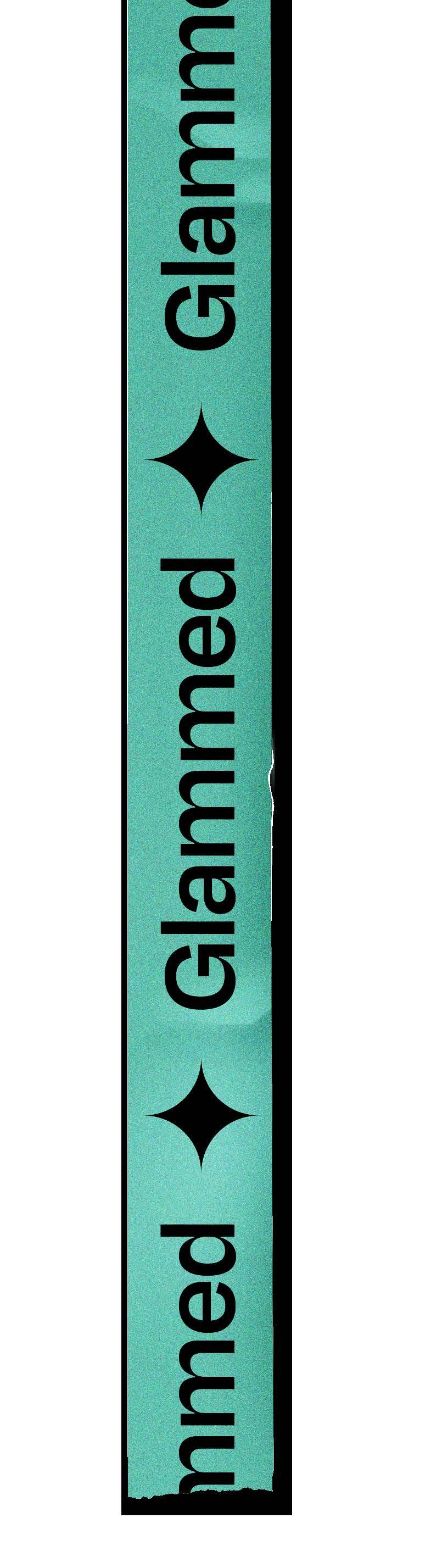
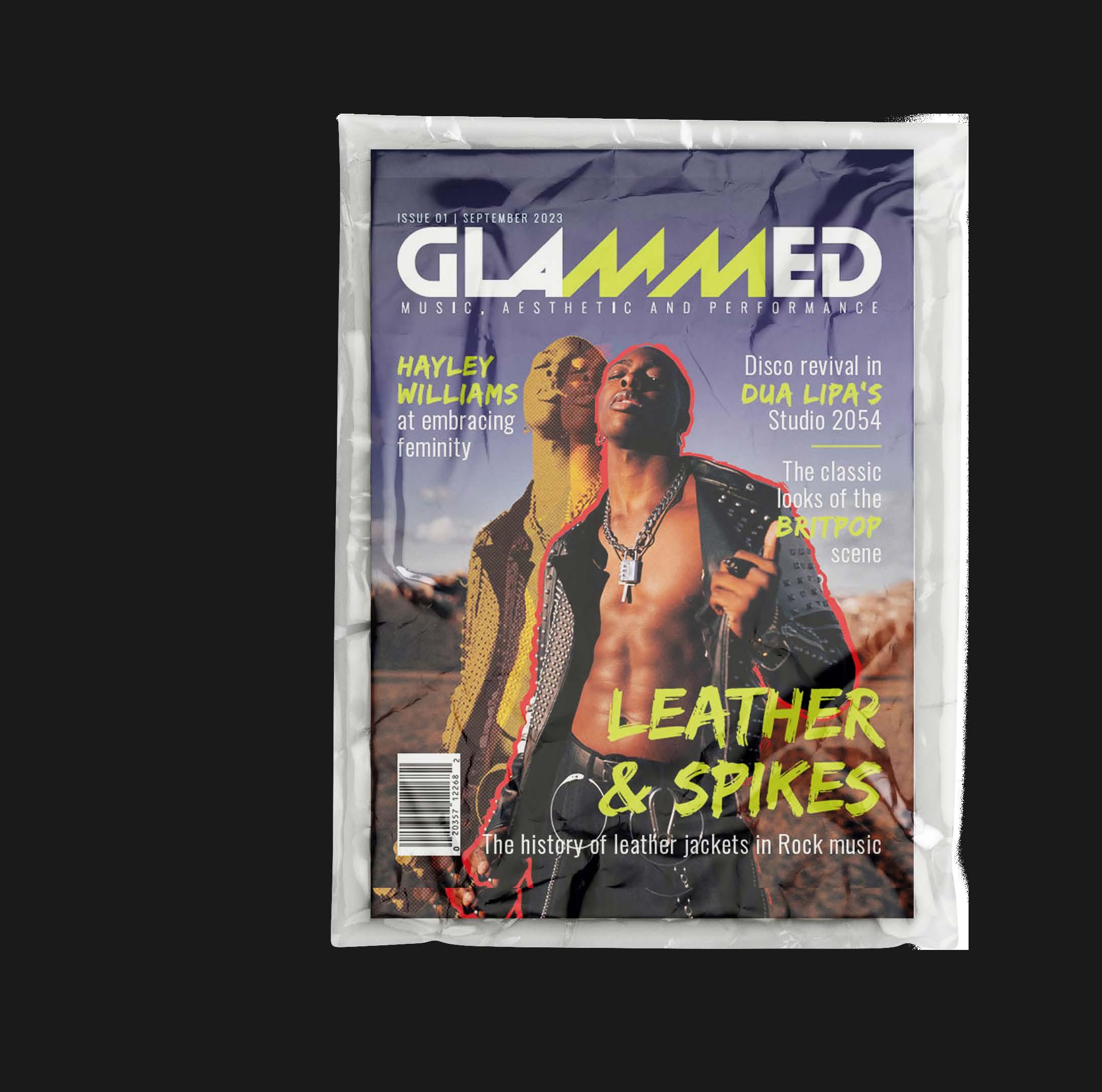
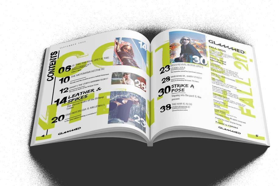
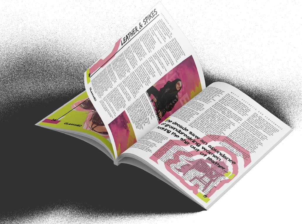
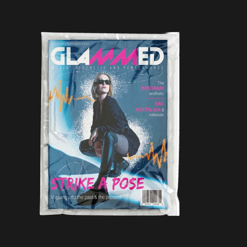
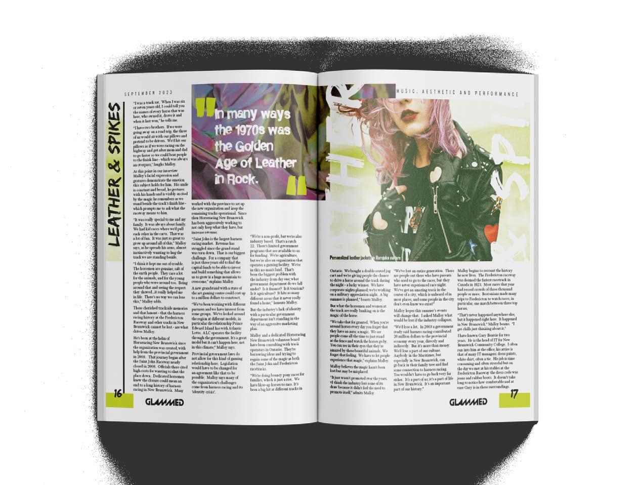
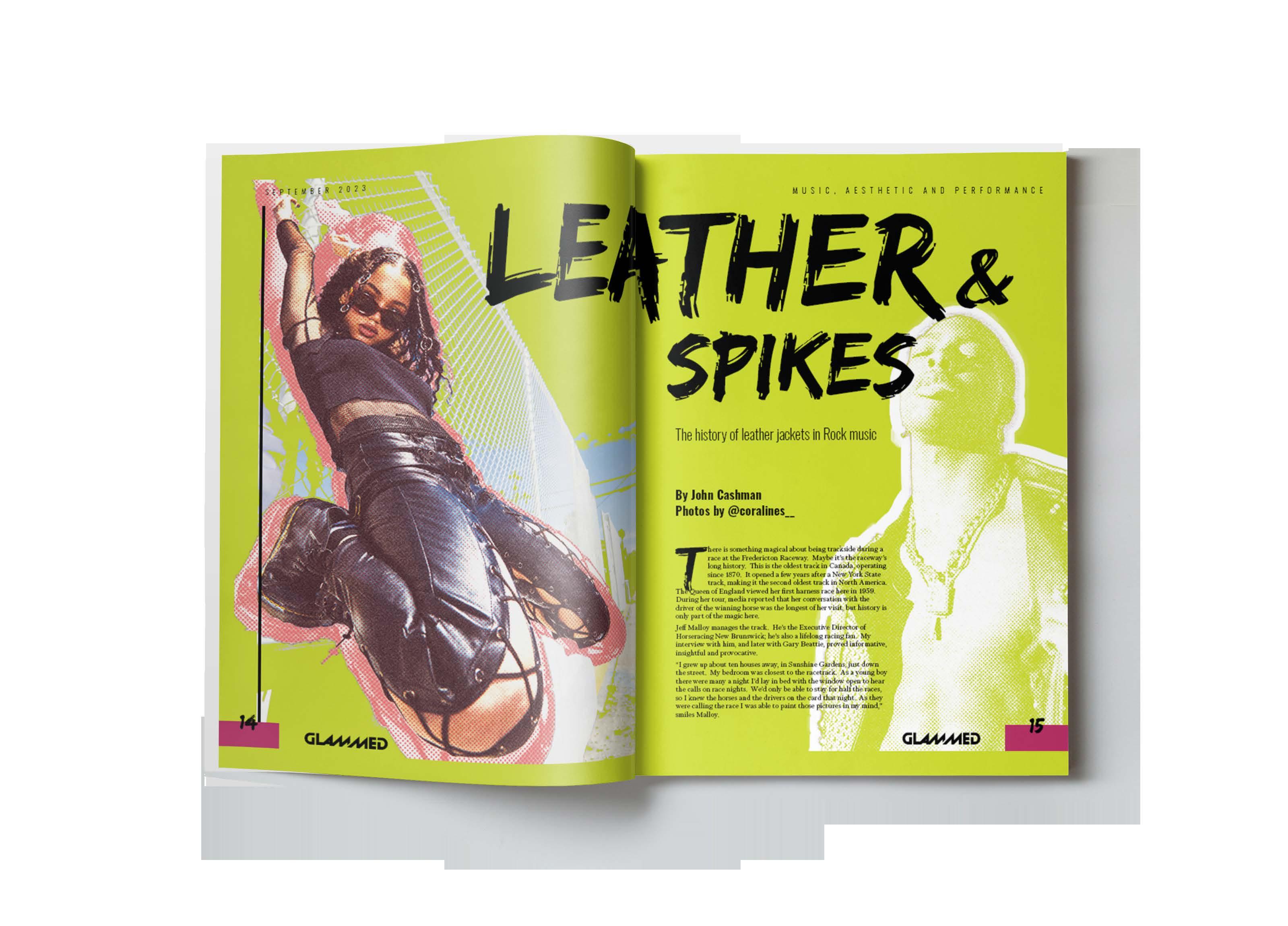
For this concept I got inspired in everything I like: music, fashion, aesthetics... and trying to express myself through my graphics.
GLAMMED references the iconic glam Rock style from the 70’s and finding its visual style around the performance and stage world in music.
There is a lot of photo edition in a collage style, implementing vibrant colours and textures that gave personality to the whole magazine and ties properly to its theme.
 Michelle Urrea Portfolio
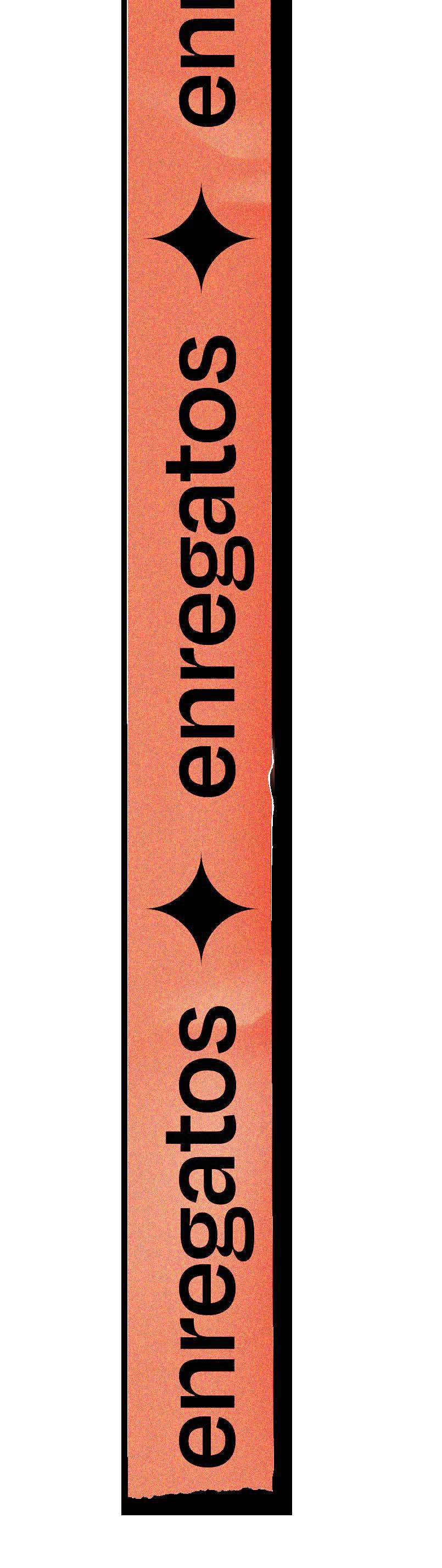
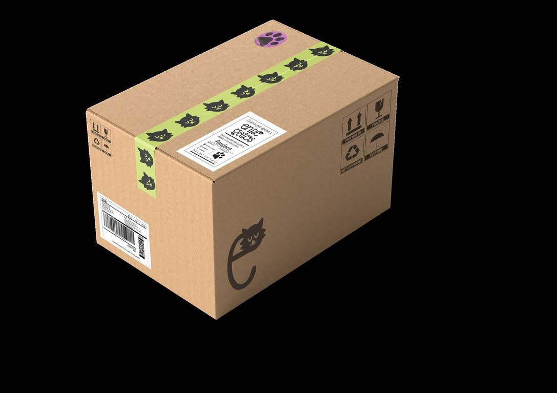
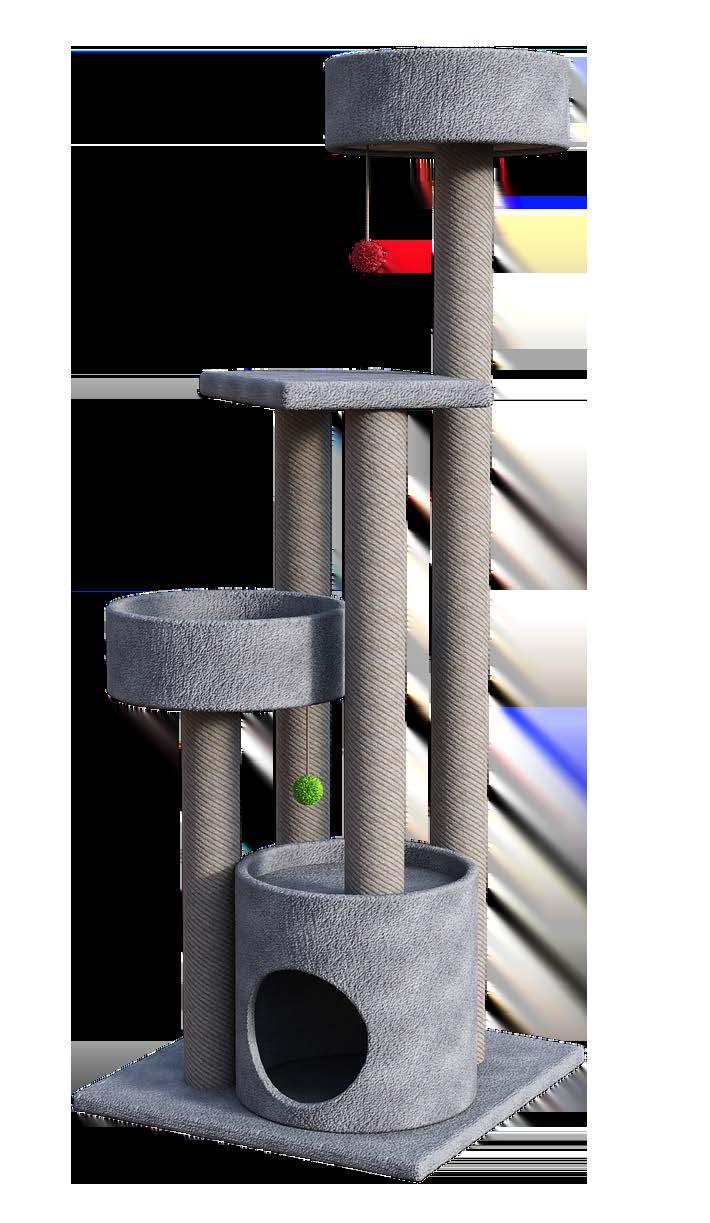
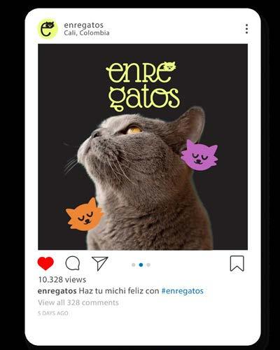
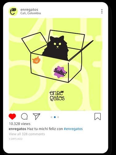
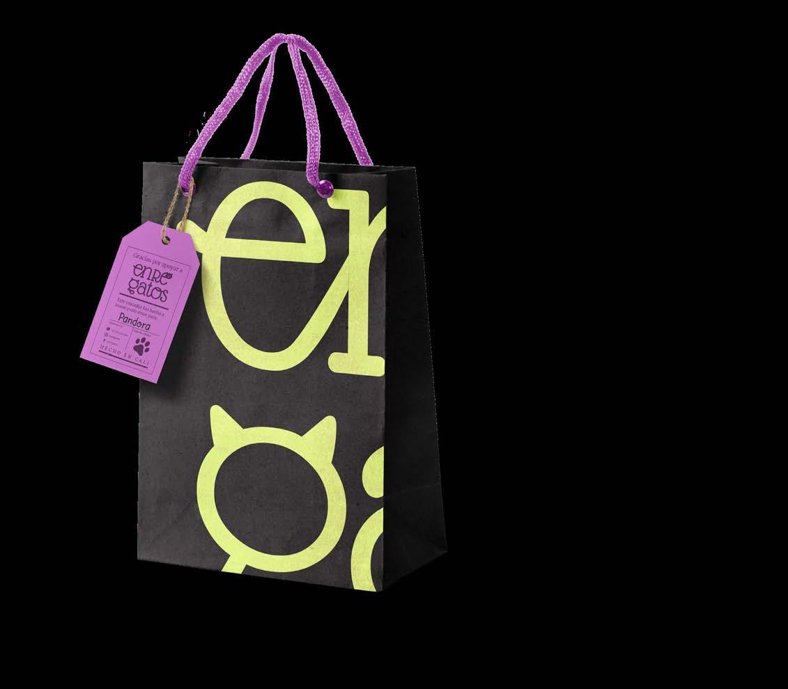
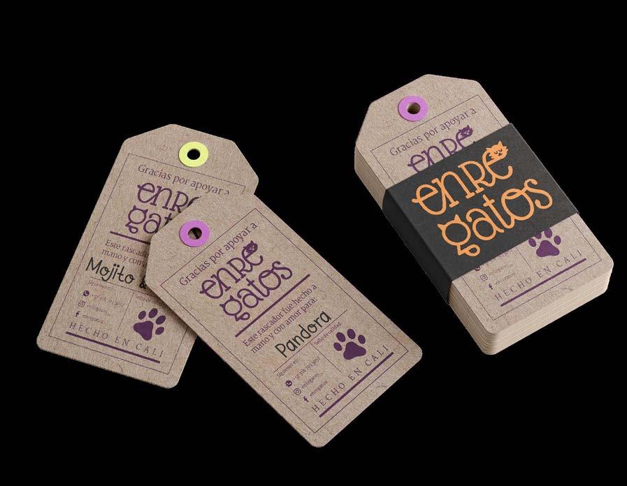
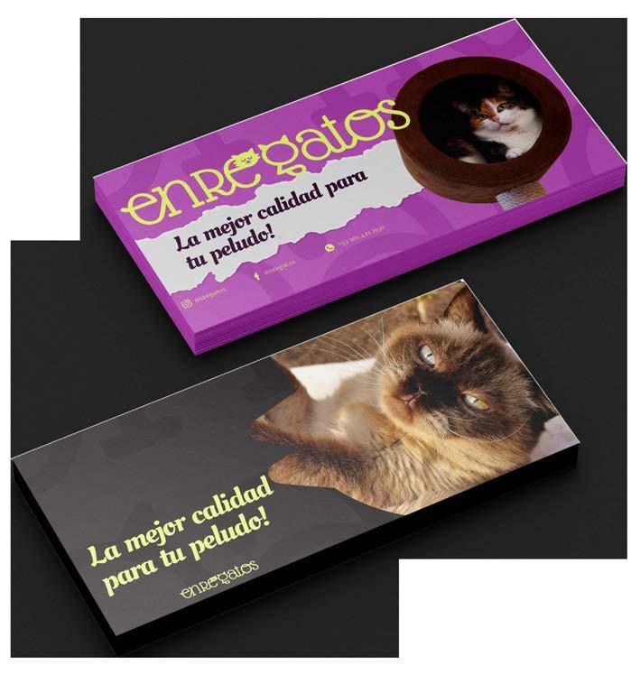
Enregatos is a brand born out of the love for our cats but, most importantly, the need to eliminate scratched furniture.
Our scratchers are handmade with recycled materials and are thought to be easily disassembled for future repairs/maintenance because we love durable and reusable furniture.
We want our scratchers to be part of your home, we want cat parents (mostly millennials) to have something to match their furniture, and we want them to be stylish and durable.
Aesthetics and decoration are essential for our target. The colour choices are fun and vibrant with a touch of elegance, as well as our typography choices.
The handmade touch is given in touchpoints such as tags and other visual assets across social media to have a more reliable approach with our customers since there is always an option to make personalized scratchers that match their needs.


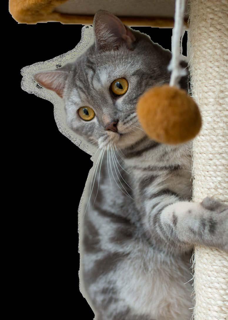
Rascad ero s por naturaleza enregatos 4h
Michelle Urrea Portfolio
enregatos 4h
La mejor calidad para tu peludo Salta!
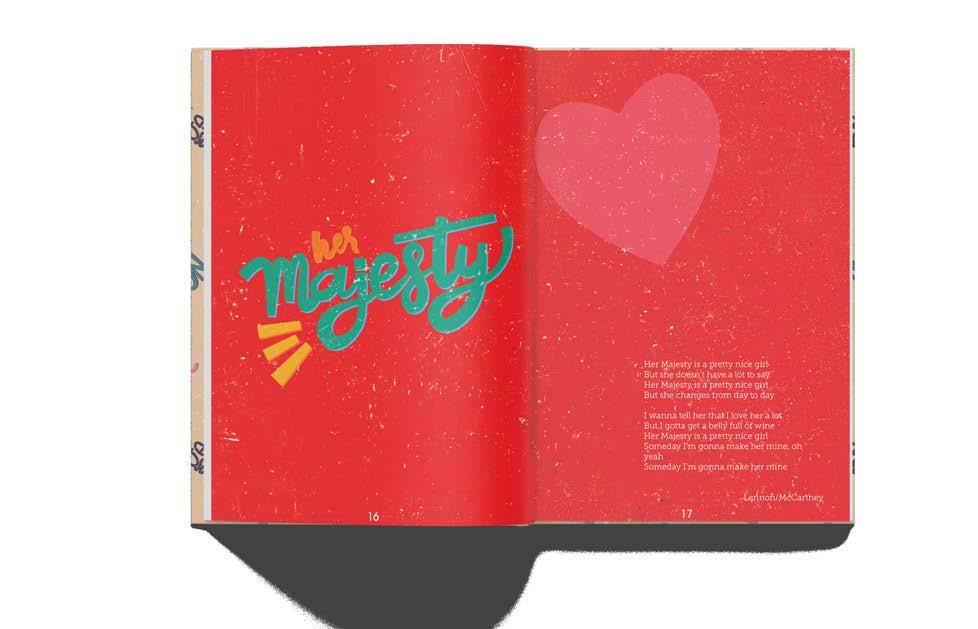
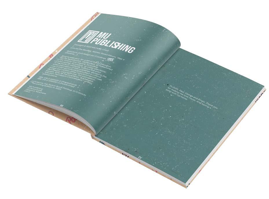
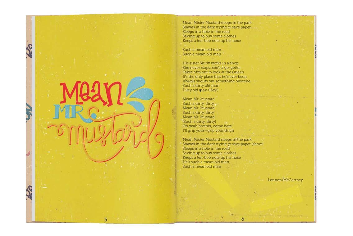
Chap book- Book
The Beatles have been a big part of my life and I wanted to pay tribute to this. I chose to do the B-side of the Abbey Road album, which are short songs that tell a story that I wanted to illustrate.
First, I did the lettering of the song’s names, trying to match the vibe and mood of each one, as well as choosing a colour palette appropiate for the theme. Then, I vectorized and colorized them on digital.
With textures and colours, I wanted to convey a handmade and vintage feeling since we are talking about songs made in the 60’s.
 Michelle Urrea Portfolio
 Michelle Urrea Portfolio
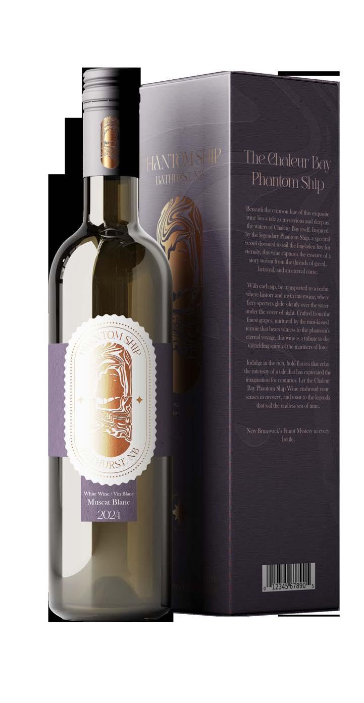
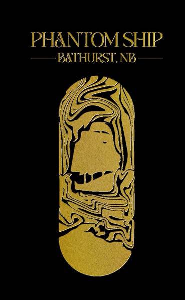
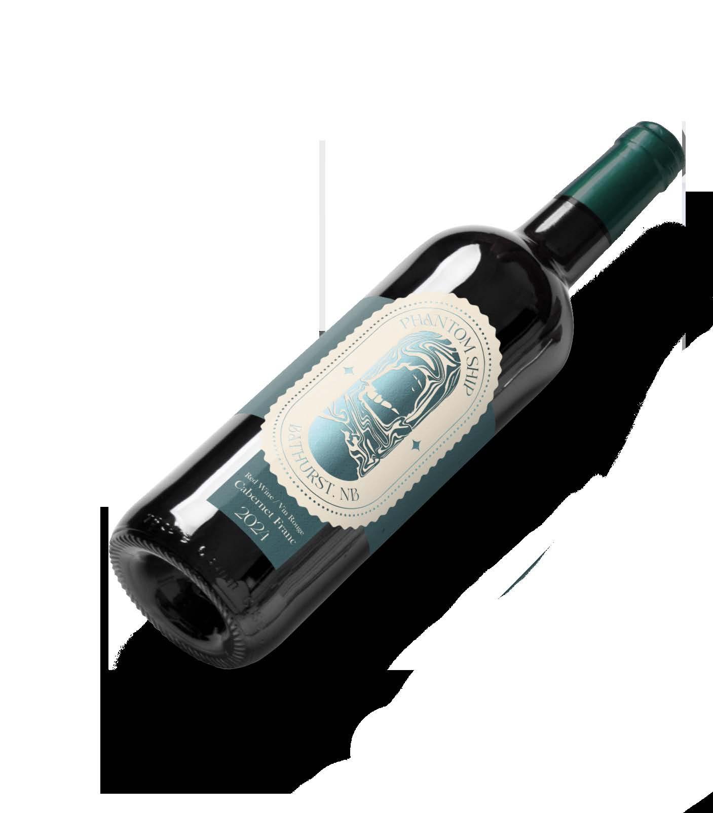
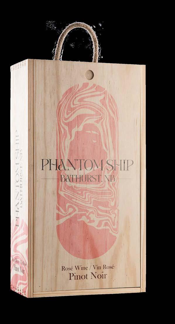
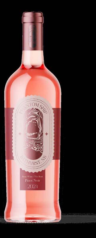
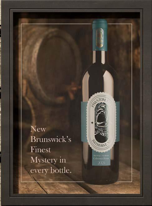
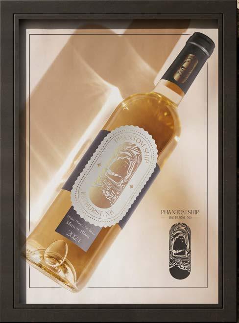
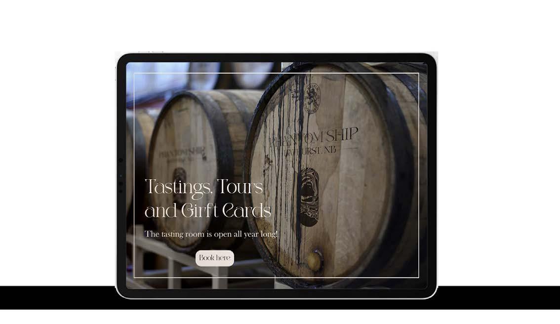
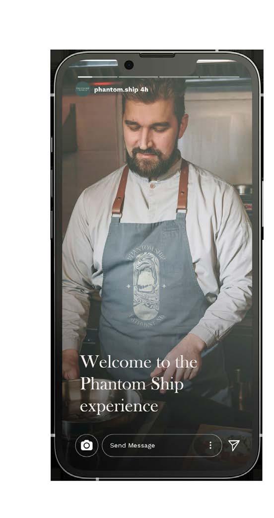
Packaging- Label
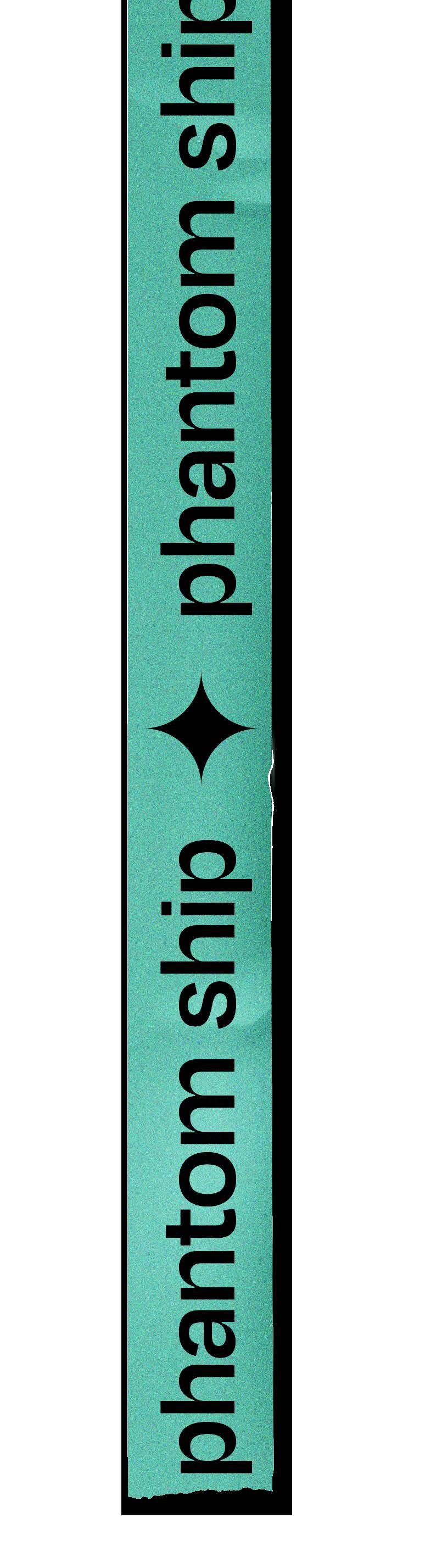
North Shore Estates is a new Winery/Brewery located in Bathurst NB.
The company’s beverage line is called Phantom Ship. It gets it’s name from the legend of the Phantom Ship that people have claimed to see floating on the bay of Chaleur The packaging and label are designed to be perceived as elegant, clean but also bold, and different.
The logo merges the ship and the smoke from it due to the ship burning down. At the bottom, the shoreline of Chaleur Bay is included in the logo.
In the packaging and label, golden foil is added to showcase the high-end and exclusive nature of the product.
The chosen typography evokes the organic lines of the smoke and contrasting strokes that boost the elegant design.
The colour palette brings the brand’s bold side to life, with deep dark colours that identify the products’ varieties: red, rosé and white wine.
 Michelle Urrea Portfolio
 Michelle Urrea Portfolio
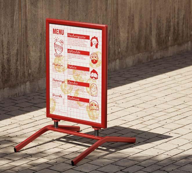
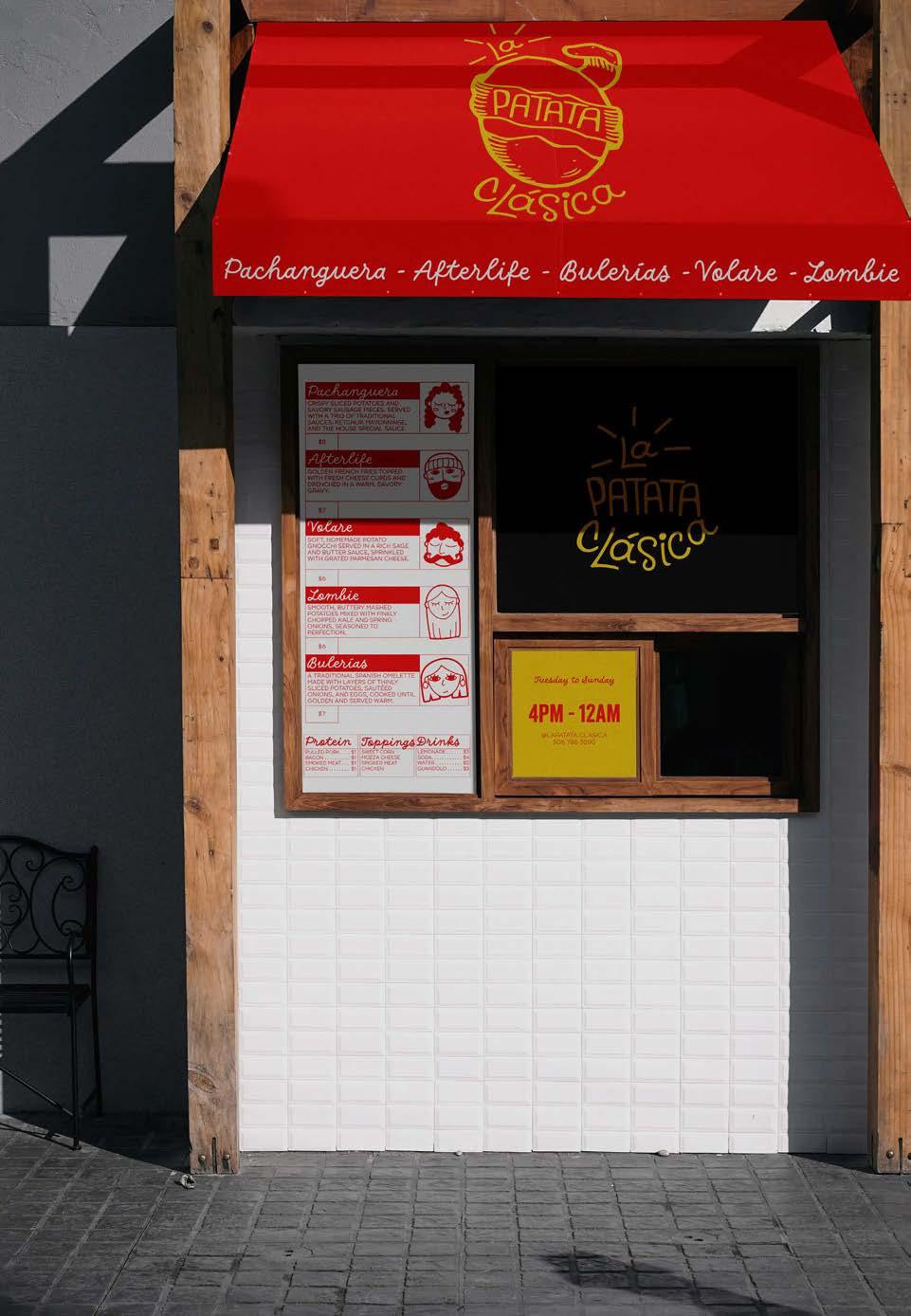
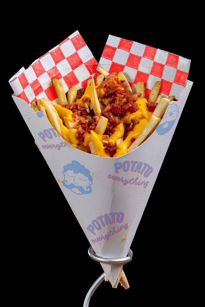
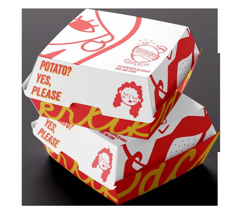
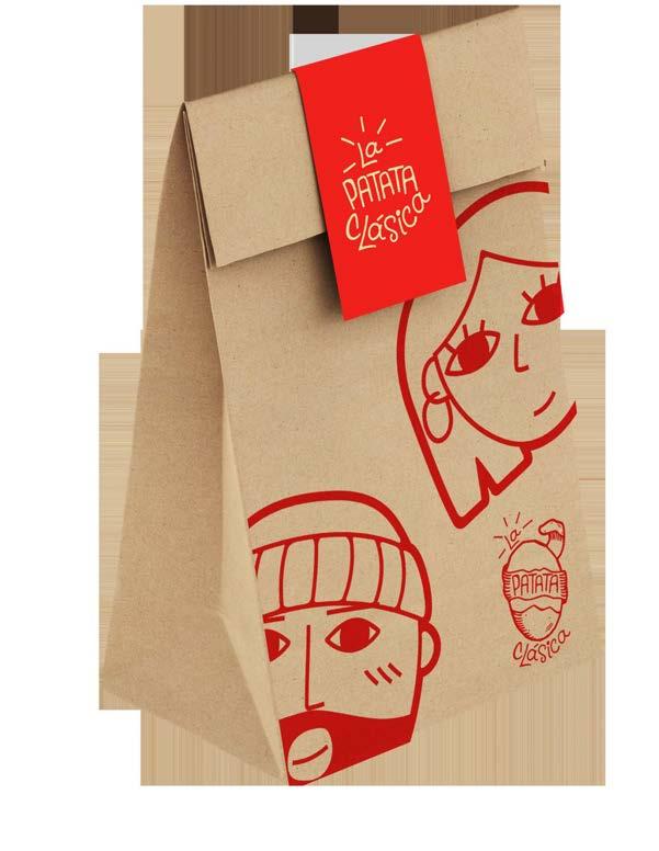
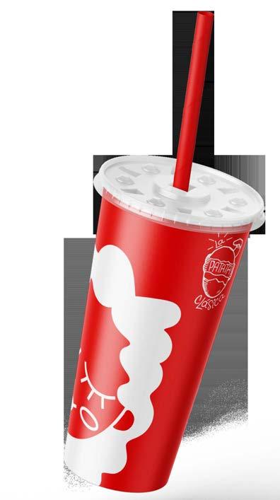
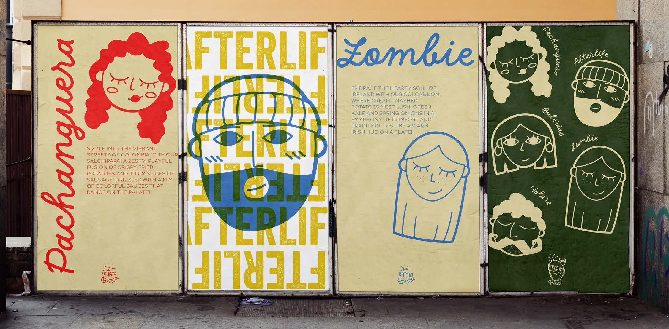
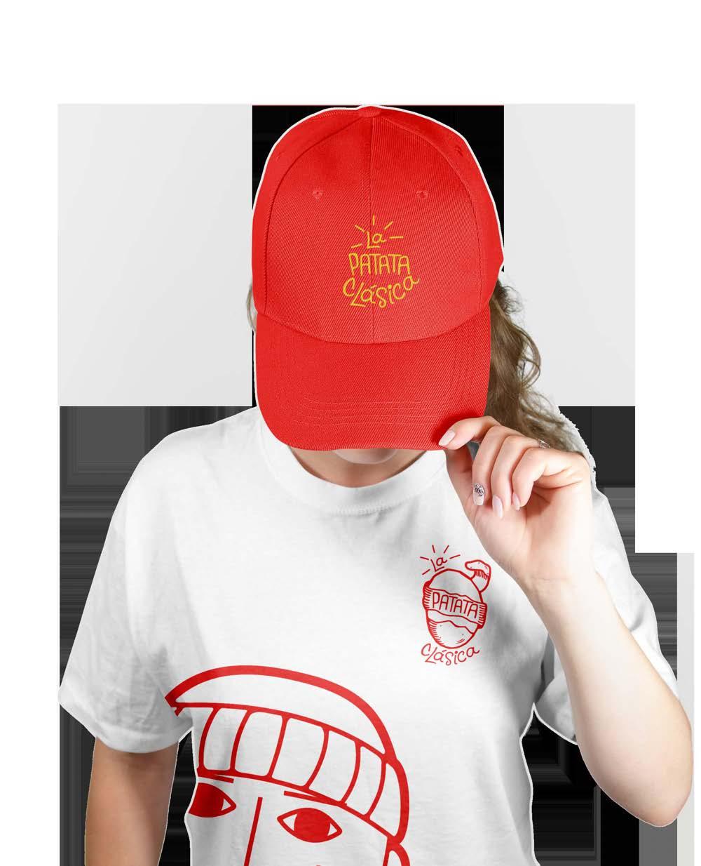
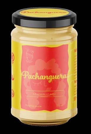
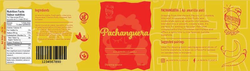
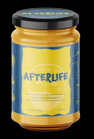
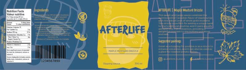
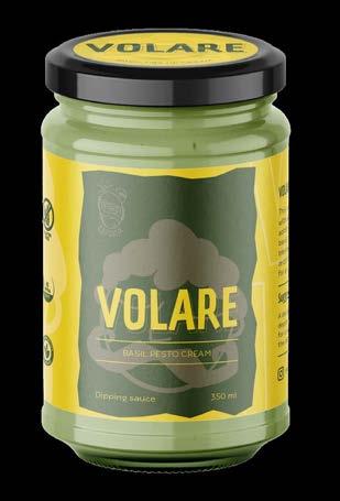
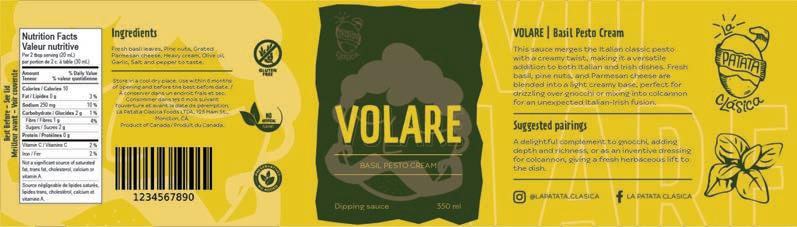
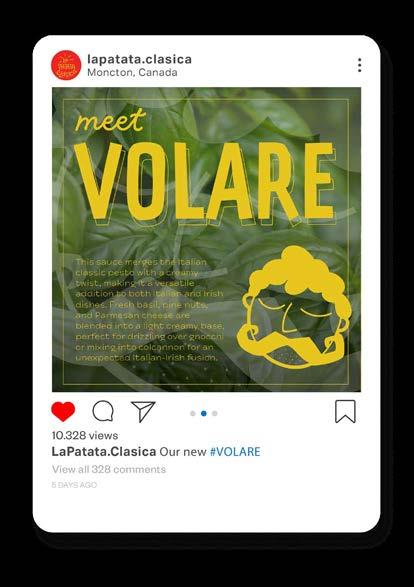
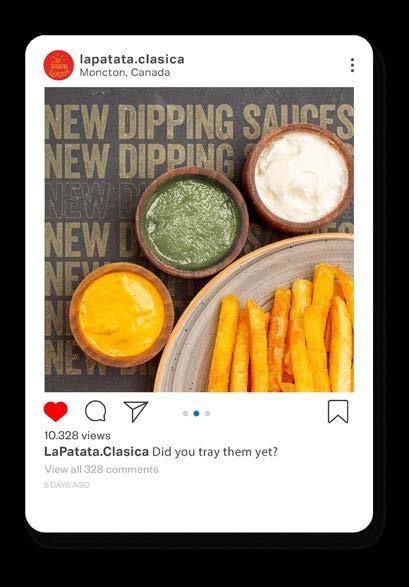
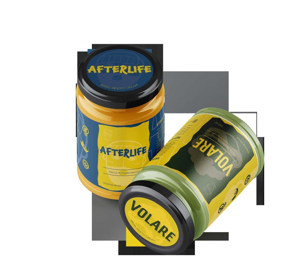
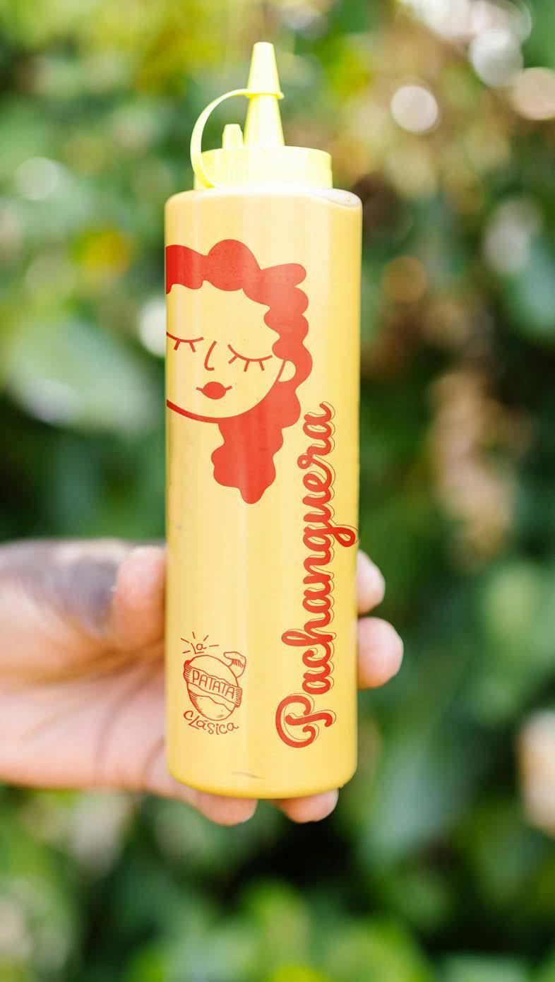
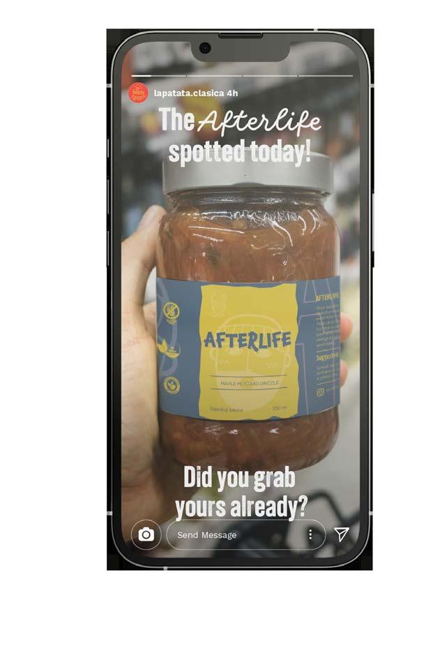
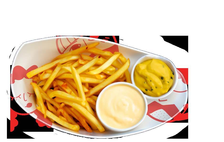
La Patata Clásica is a trailblazing restaurant that specializes in delivering a unique dining experience, rooted in the universal appeal of potatoes.
With a menu featuring five distinctive dishes from five different countries, each dish is ingeniously named after classic rock/pop songs that resonate with the dish’s country of origin. La Patata Clásica aims to blend the world of international cuisine with the rhythm and soul of classic rock/pop, creating an atmosphere that’s as unforgettable as its food.
 Michelle Urrea Portfolio
 Michelle Urrea Portfolio
 Michelle Urrea Portfolio
 Michelle Urrea Portfolio

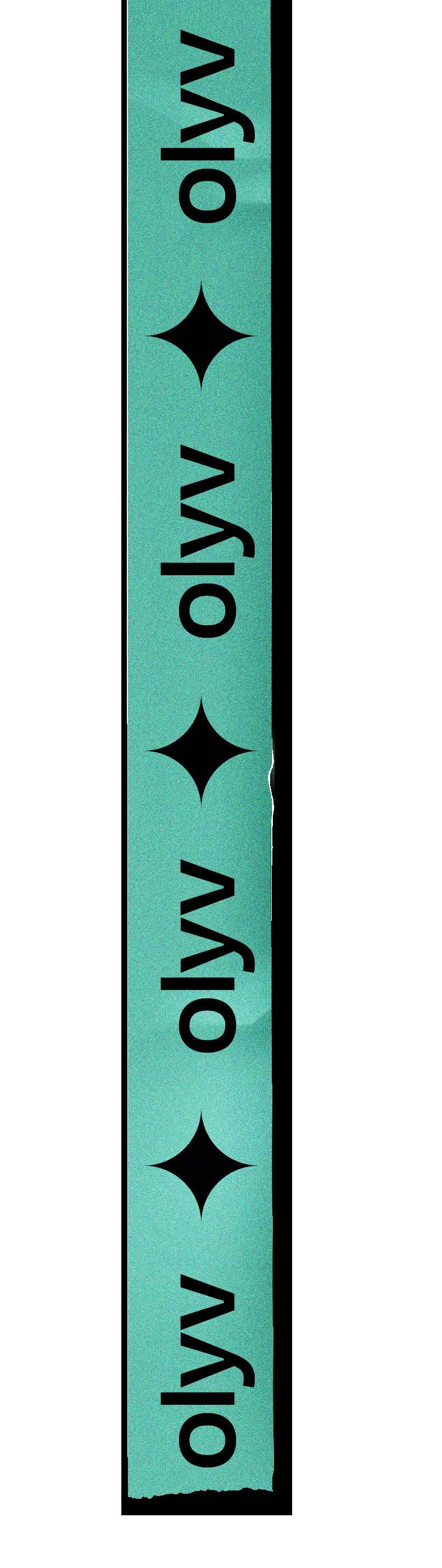
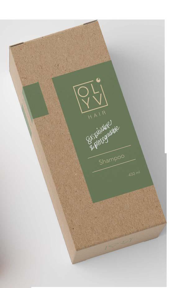
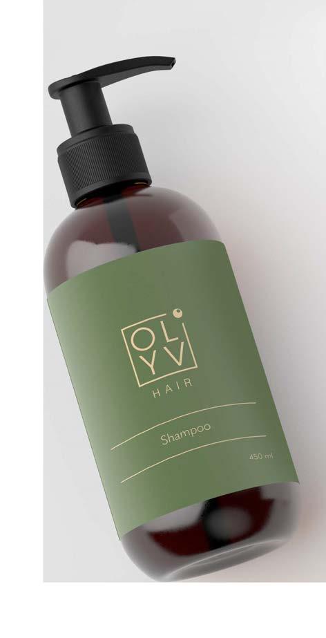
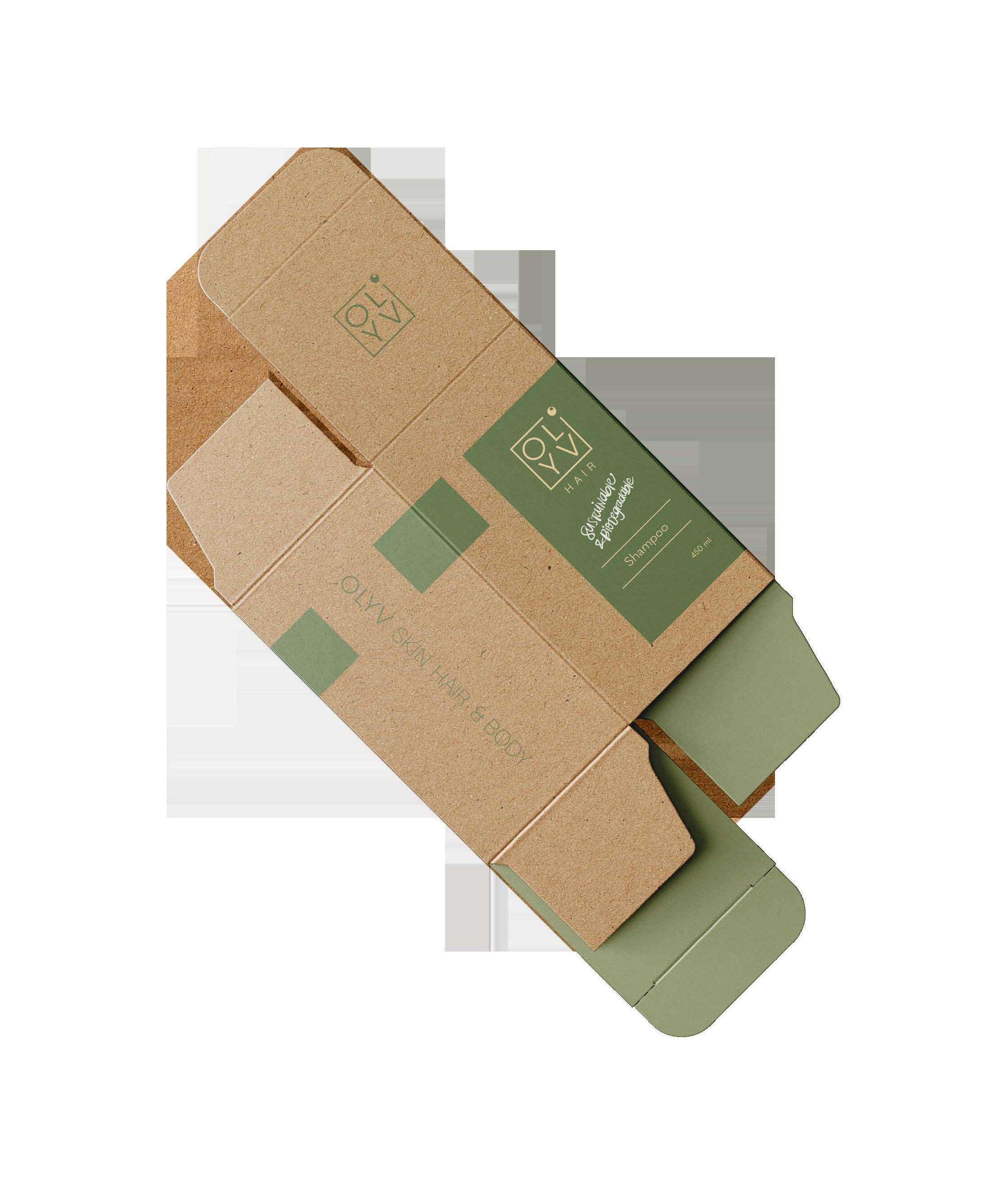
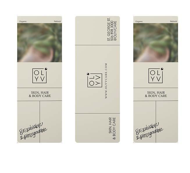
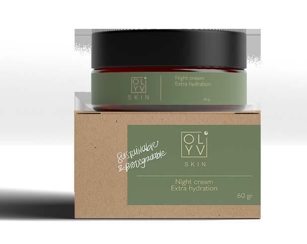
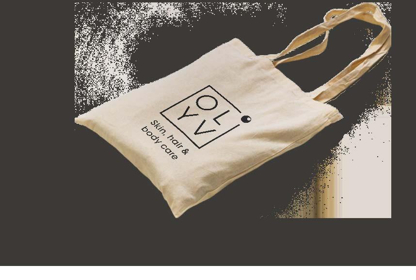
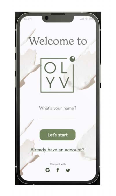
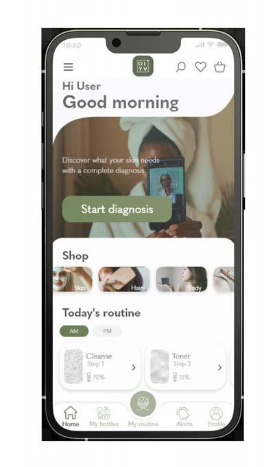
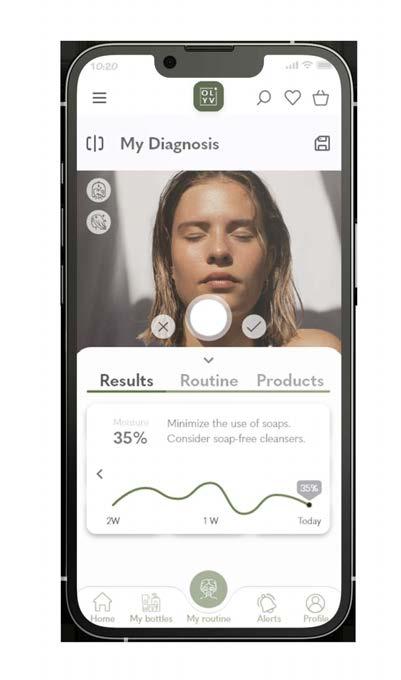
OLYV is a global skincare company that creates and sells organic face, body and hair care derived from the earth- organic oils, herbs, tea leaves, fruits and vegetables.
Everything they do is sustainable and biodegradable.
Their target audience is women (32-45 years old) who shop organic. They required a logo, business card and merchandise with a green, beige and white colour palette. Their preferred style for the logo is modern, simplistic and botanic.
The new logo conveys exclusivity, minimalism and a mature approach. Being an organic brand, OLYV wants to let their customers know that less is more when it comes to organic ingredients, that a personalized experience is key for this brand, and that OLYV knows a person with a busy life needs peace of mind and a minimalist skincare routine.
L VY
Click on the app!
 Michelle Urrea Portfolio