BALLMAN www.michelleballman.com michelleballman8@gmail.com
MICHELLE
Hello, welcome to my portfolio! Please, take a seat.
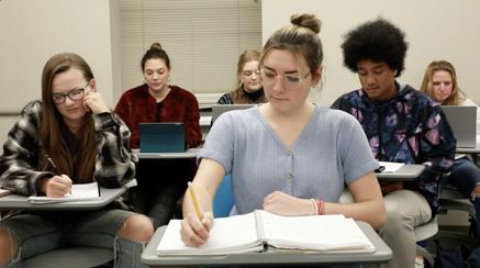
My name is Michelle Ballman. What you’re about to see is a showcase of work from my four years as a visual communications major at the University of South Carolina, but it’s really more like a lifetime in the making.
I grew up editing videos I filmed in my backyard and designing magazines detailing the happenings of the Ballman household. Now, while I’ve upgraded from pencil on paper to the pen tool in Illustrator, I’m still spending my days doing what I’m passionate about: creating.
But enough talking, go take a look for yourself.
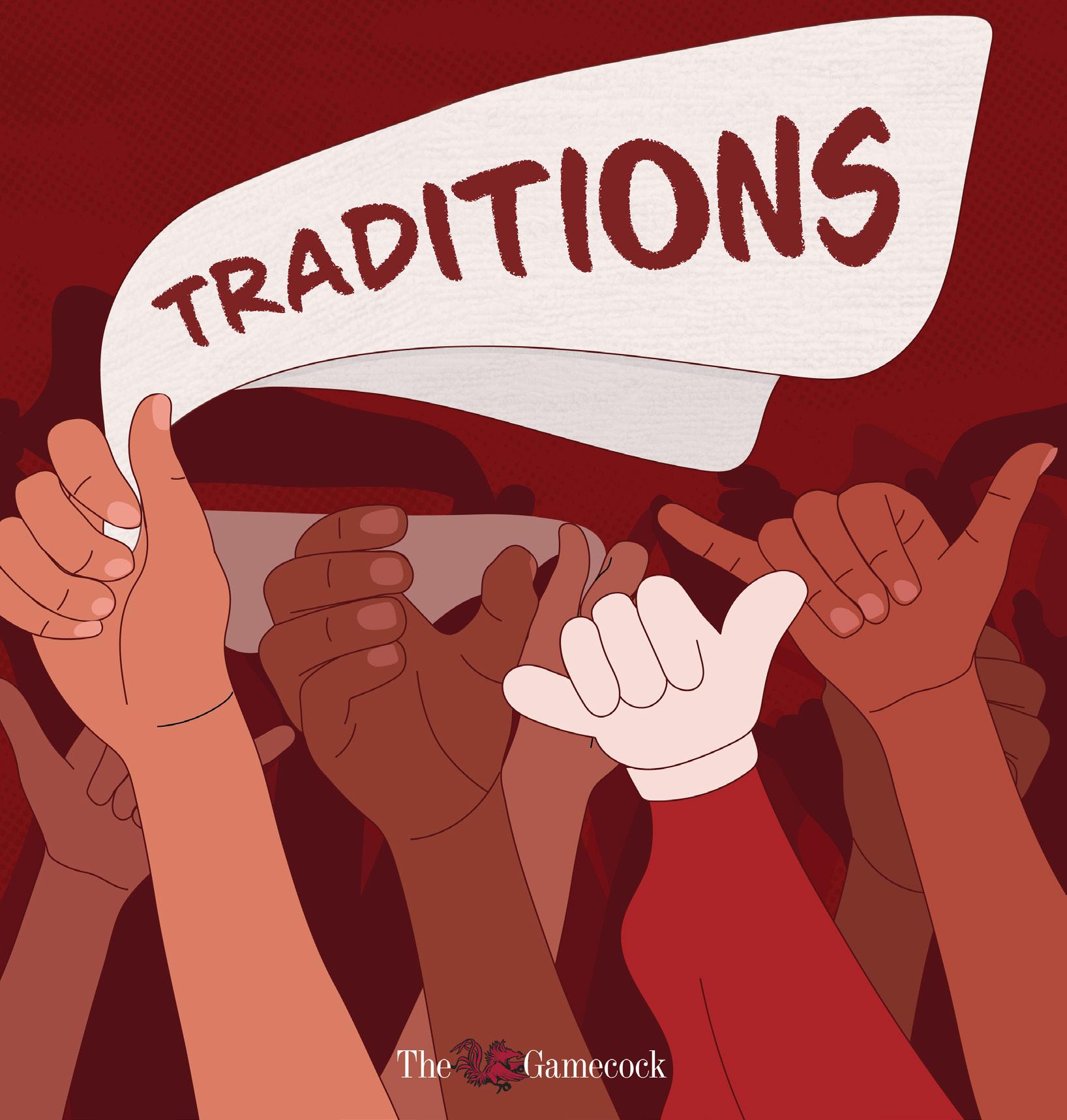
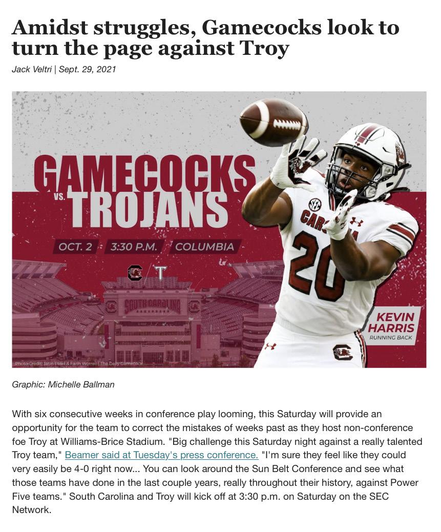
Cover design, illustrations, and layout created while serving as CoDesign Director of The Daily Gamecock, UofSC’s student run newspaper.
In order to capture the theme of this print edition, Traditions, I illustrated a rally towel, the “here’s a health, Carolina” and the “spurs up” hand symbols, and the Cocky mascot’s hand. All of these represent school spirit traditions at UofSC. The garnet color scheme is also representative of the university.
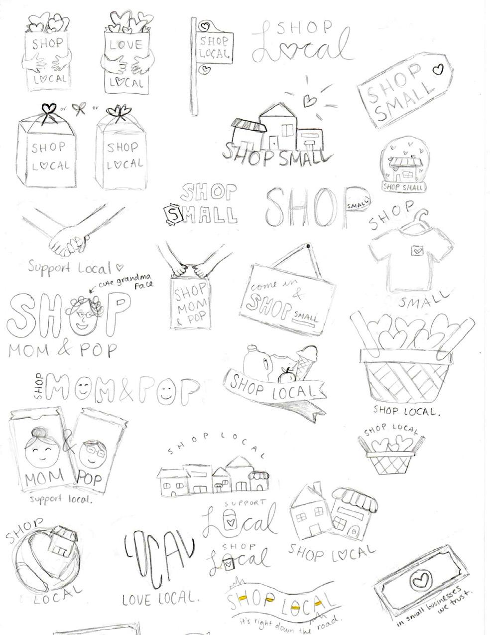
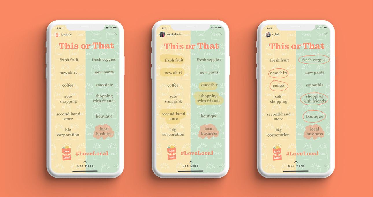
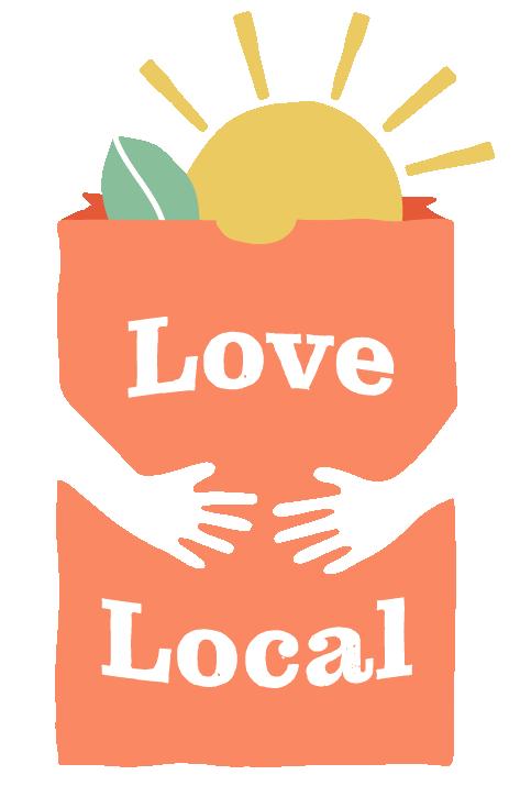
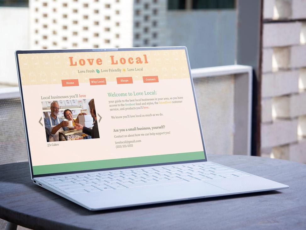
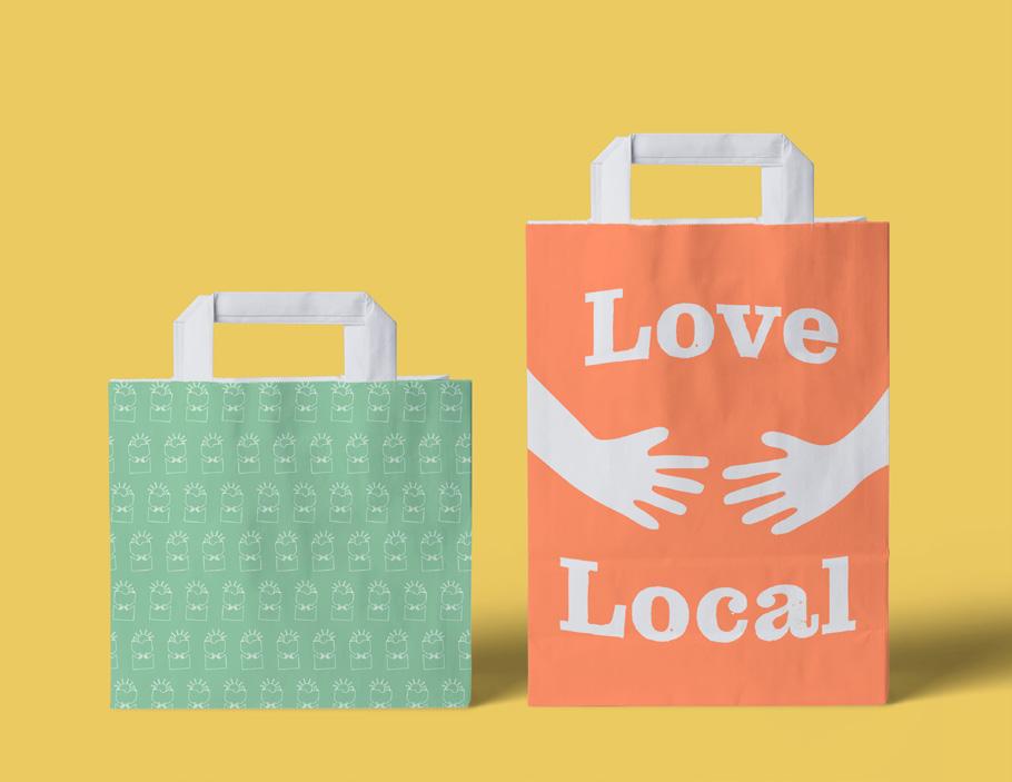
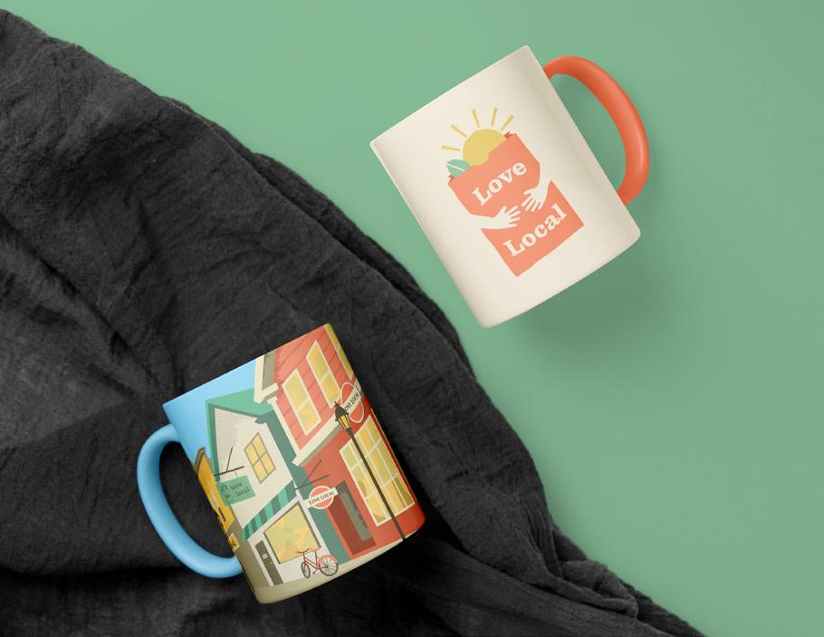
Love Local brand design from conception to completion, including creation of an identity system, poster, brochure, logo, and social media content.
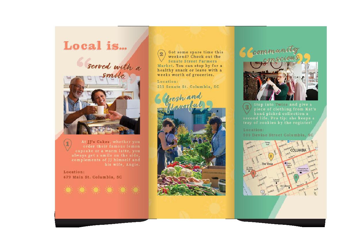
Love Local is the winner of a Silver Addy for Integrated Brand Campaign in the American Advertising Awards.
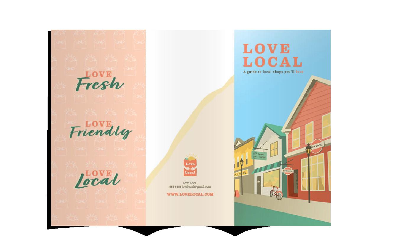
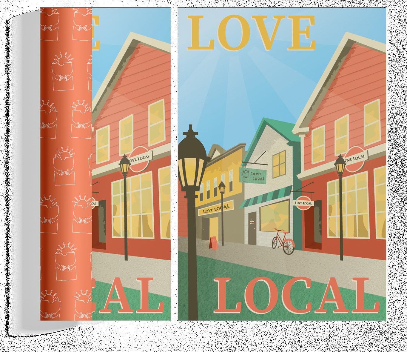
The campaign supports local businesses by informing consumers of the benefits to them of shopping small and partners with local businesses to provide them with advertising support.
I began the brainstorming process by sketching 30 logo options before landing on my final design.

It uses warm colors and leaf and sun iconography to represent the main benefits of shopping local to consumers: fresher products and friendlier service.
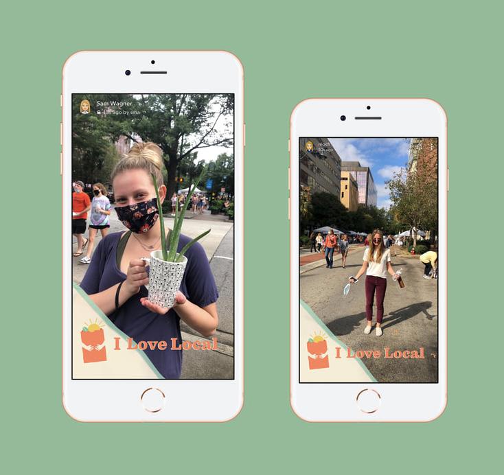
The hands serve both to hold the bag and to resemble a hug, further encapsulating the warm feeling of shopping local.
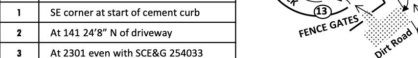
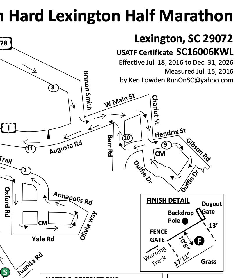
Redesign of the race route map for a half marathon in Lexington, SC.
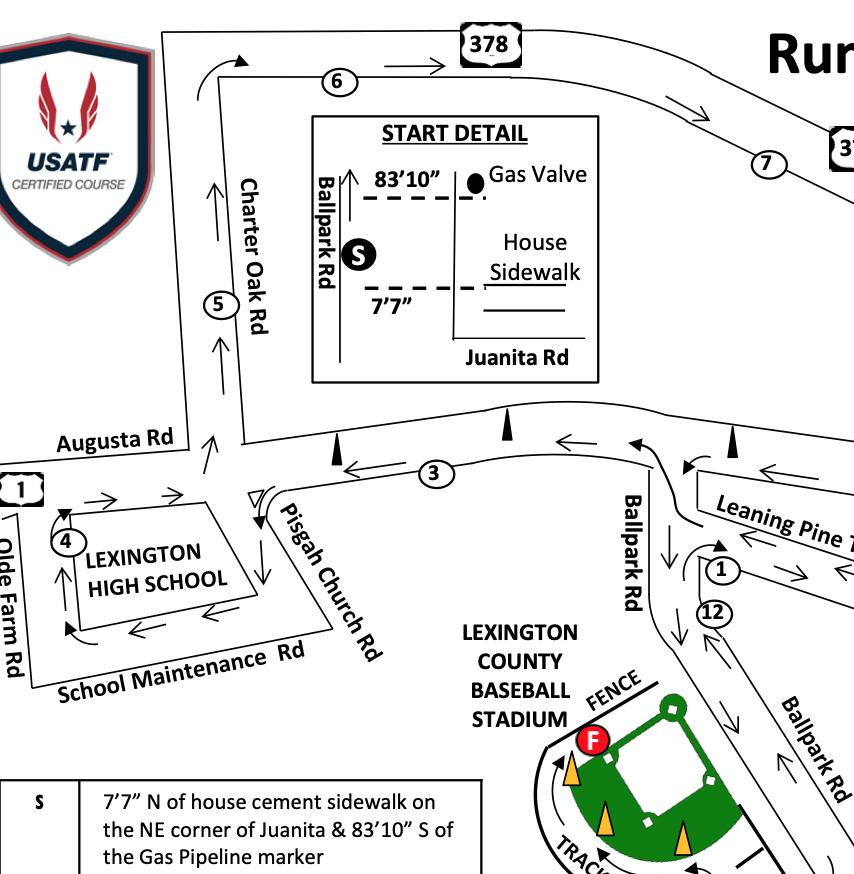
To the left is the former half marathon map used by Run Hard.
Run Hard is a nonprofit children’s program that teaches kids how to lead a healthy, active lifestyle. I was tasked with redesigning the map for a half marathon race that would raise money for the program.
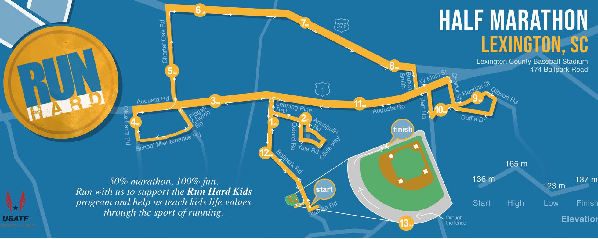
One of the organization’s biggest concerns was that the roads were not to scale on the current map, something I was sure to fix in my redesign.
I wanted to make the map more identifiable with the Run Hard brand, so I used the blue and yellow brand colors as well as their logo. I overlayed the race route in yellow, while showing neighboring streets in blue to improve readability.
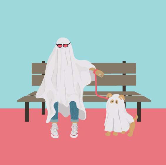
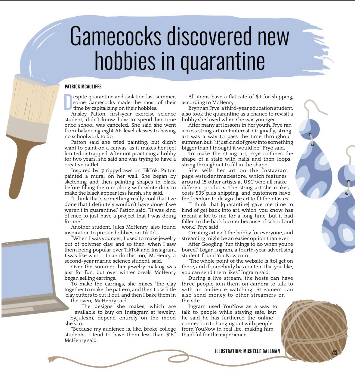
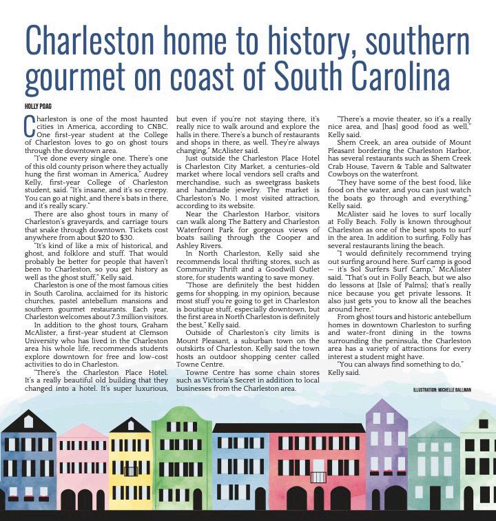
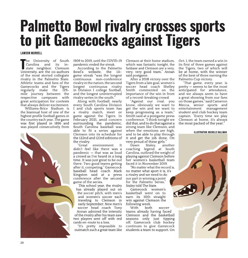
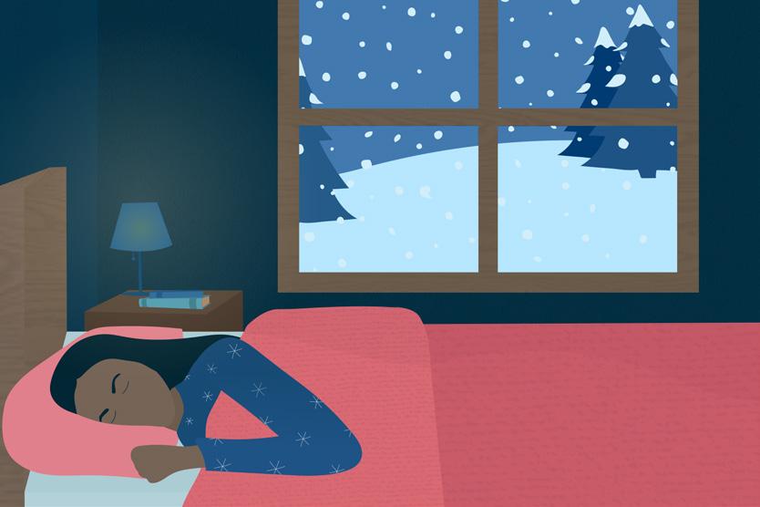
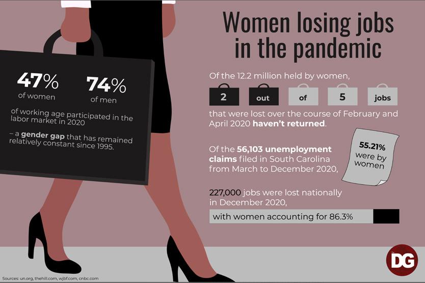
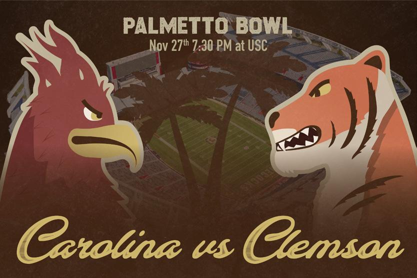
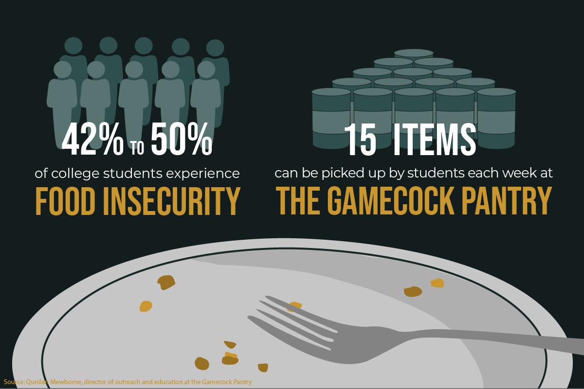
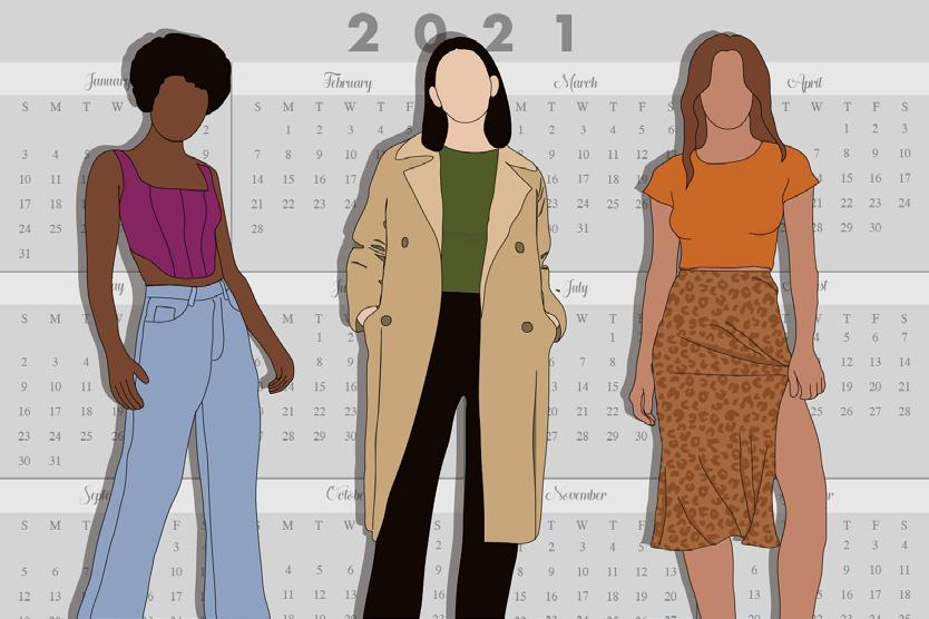
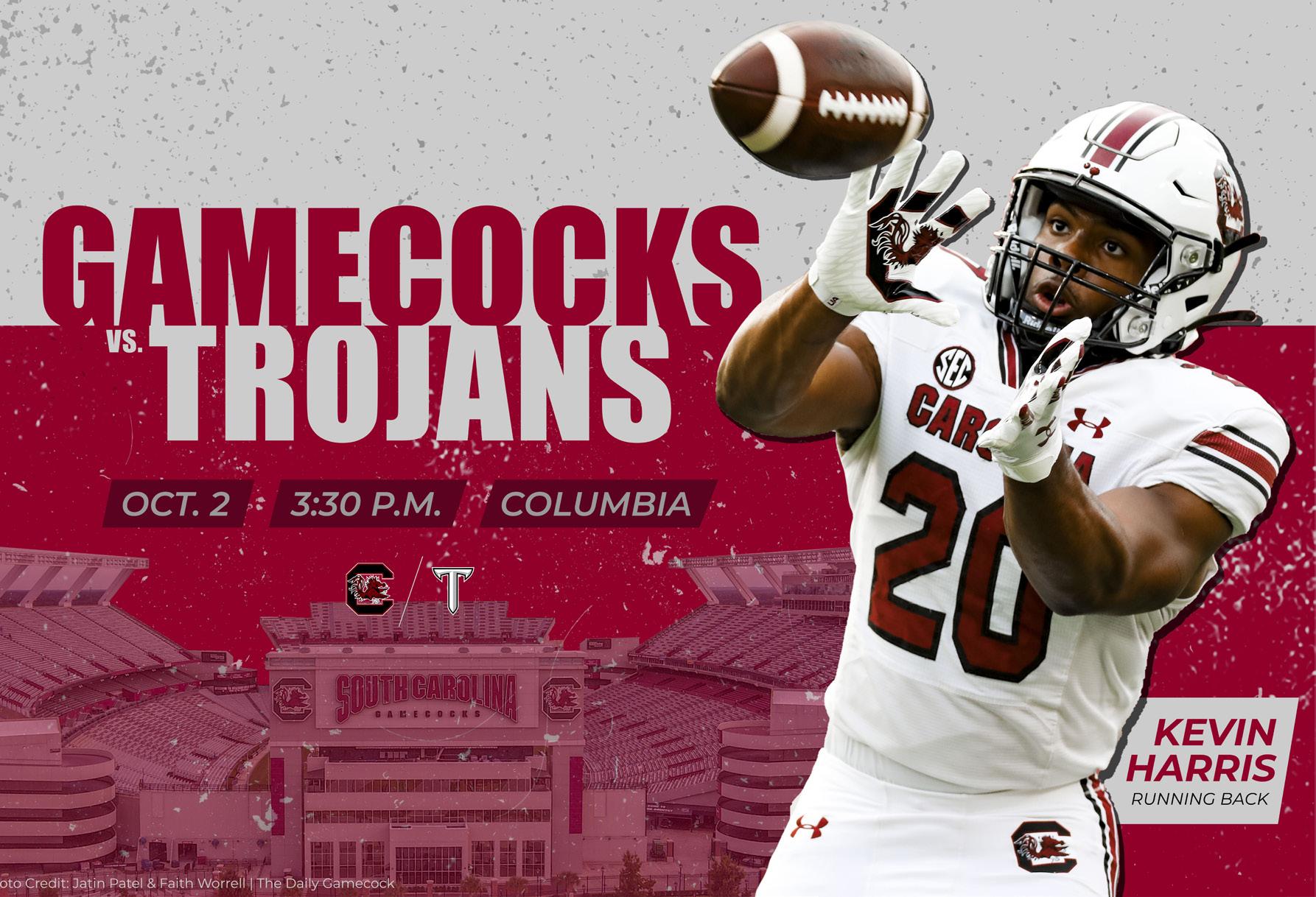
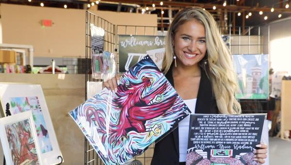
Infographics and illustrations created to accompany Daily Gamecock online articles sent out to over 35,000 people.

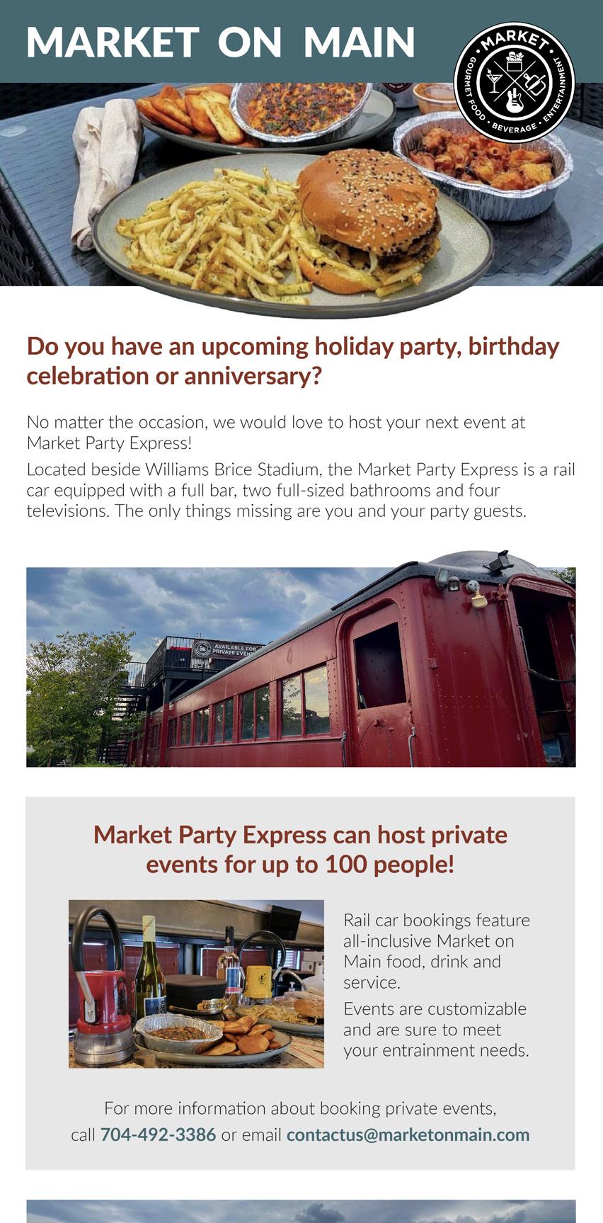
Created while working as a Creative Specialist for The Carolina Agency.
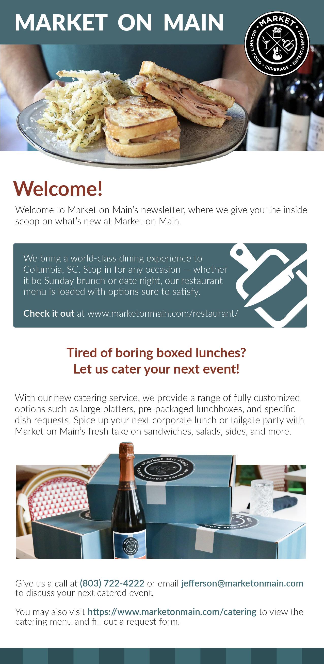
I was responsible for crafting all of the email newsletters for Market on Main, a local restaurant. I created a basic template using their existing branding, and customized it weekly to fit each newsletter topic.
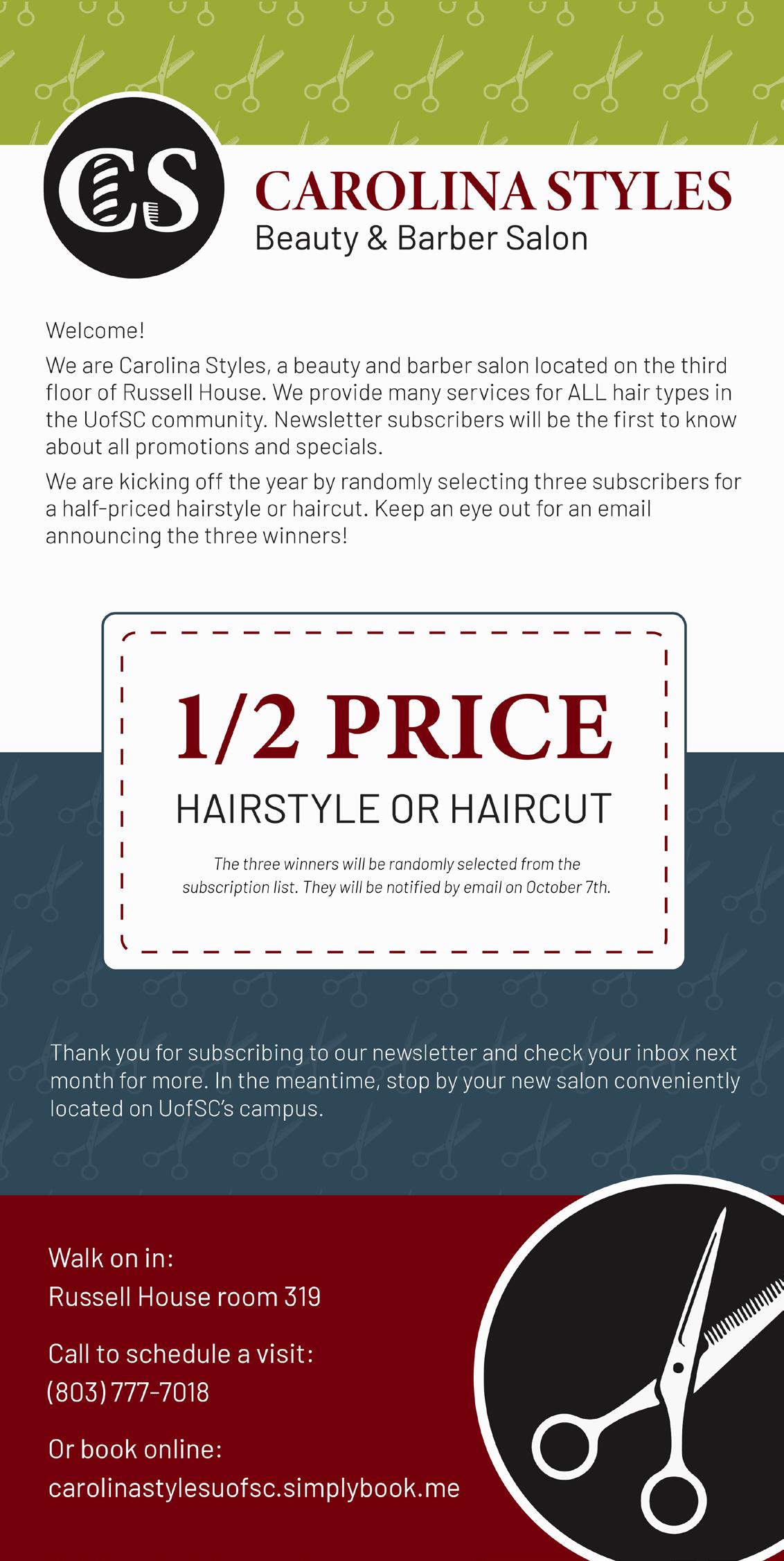
I was also responsible for all advertising for Carolina Styles Beauty and Barber Salon. In addition to print flyers and TV advertisements, I created monthly email newsletters for them to highlight current promotions.
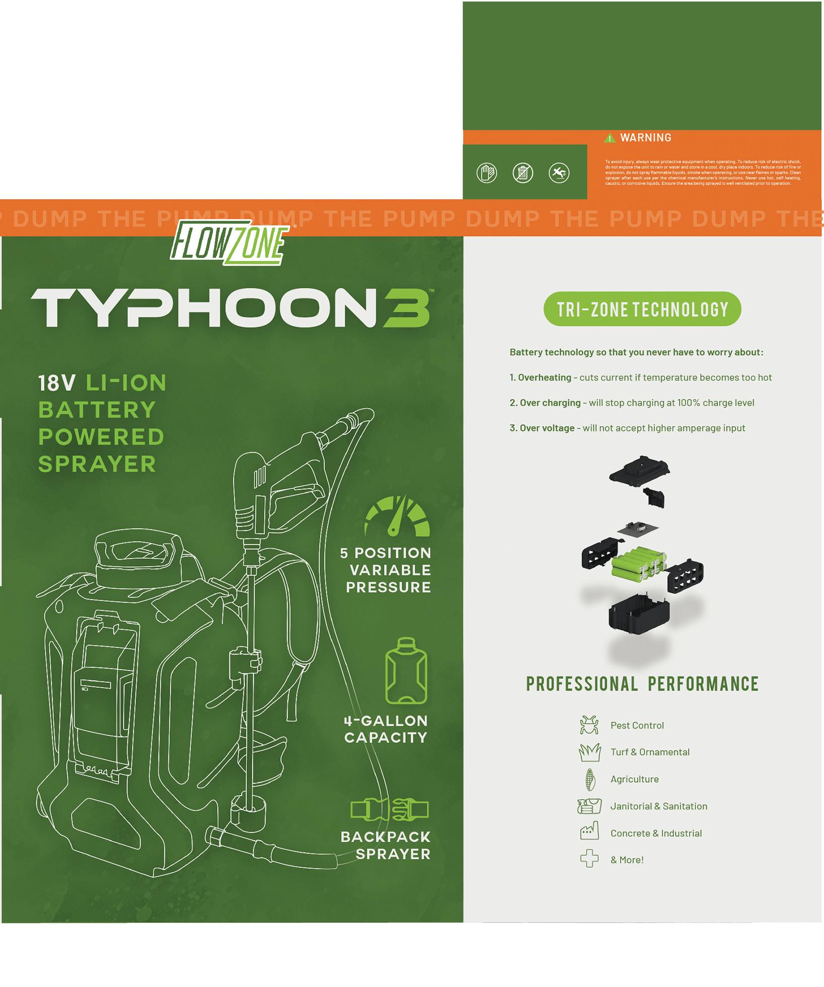
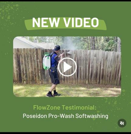
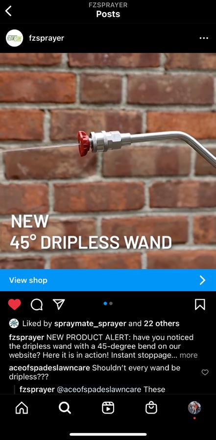
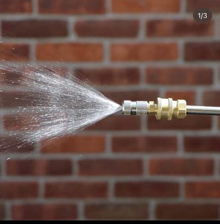
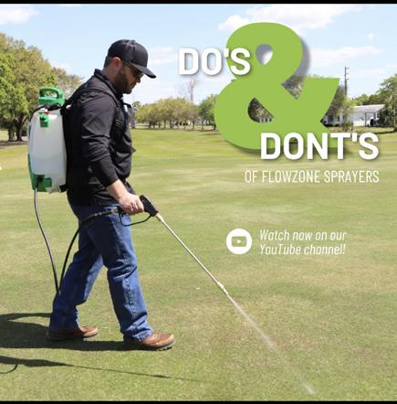
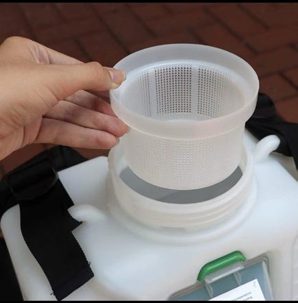
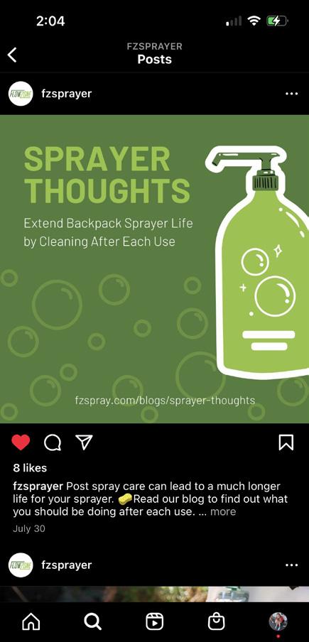
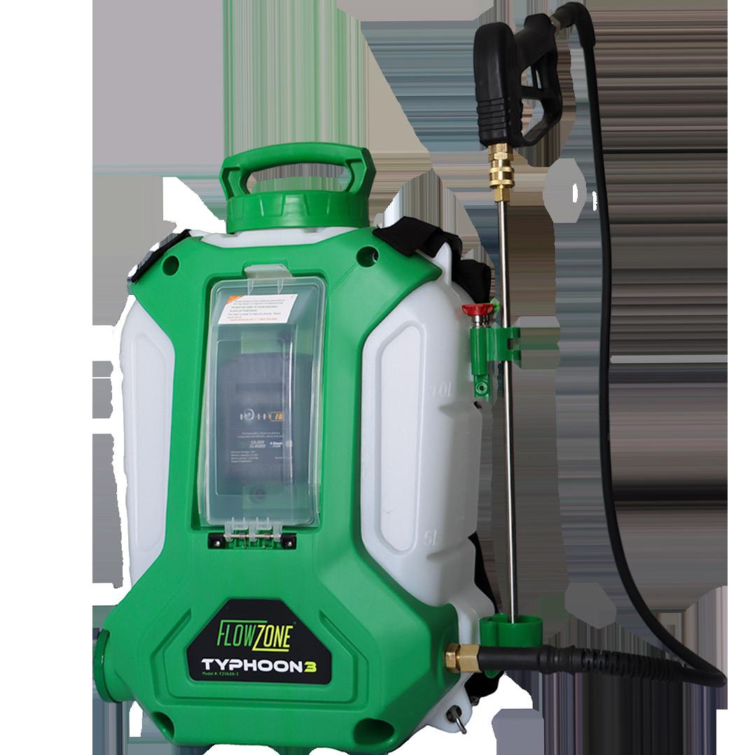
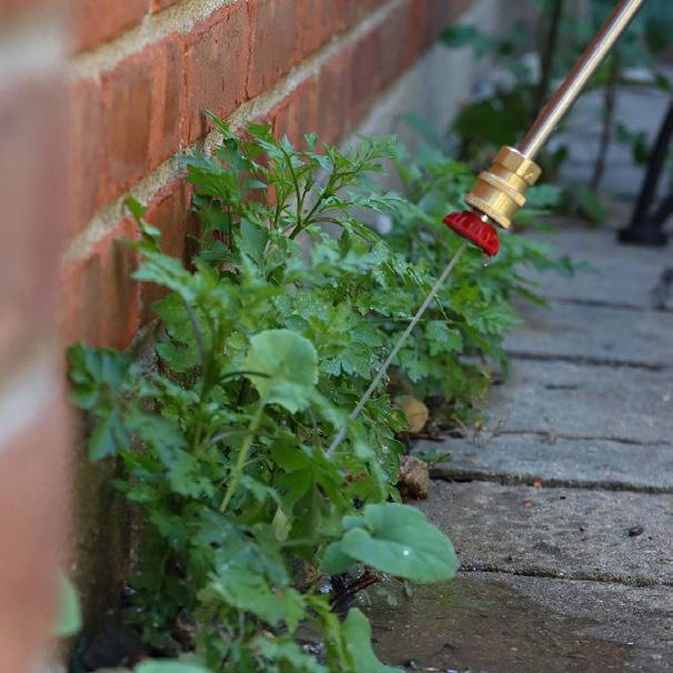
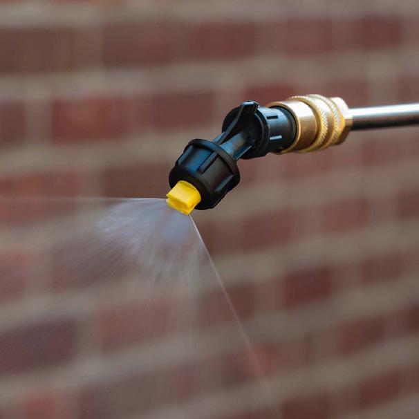
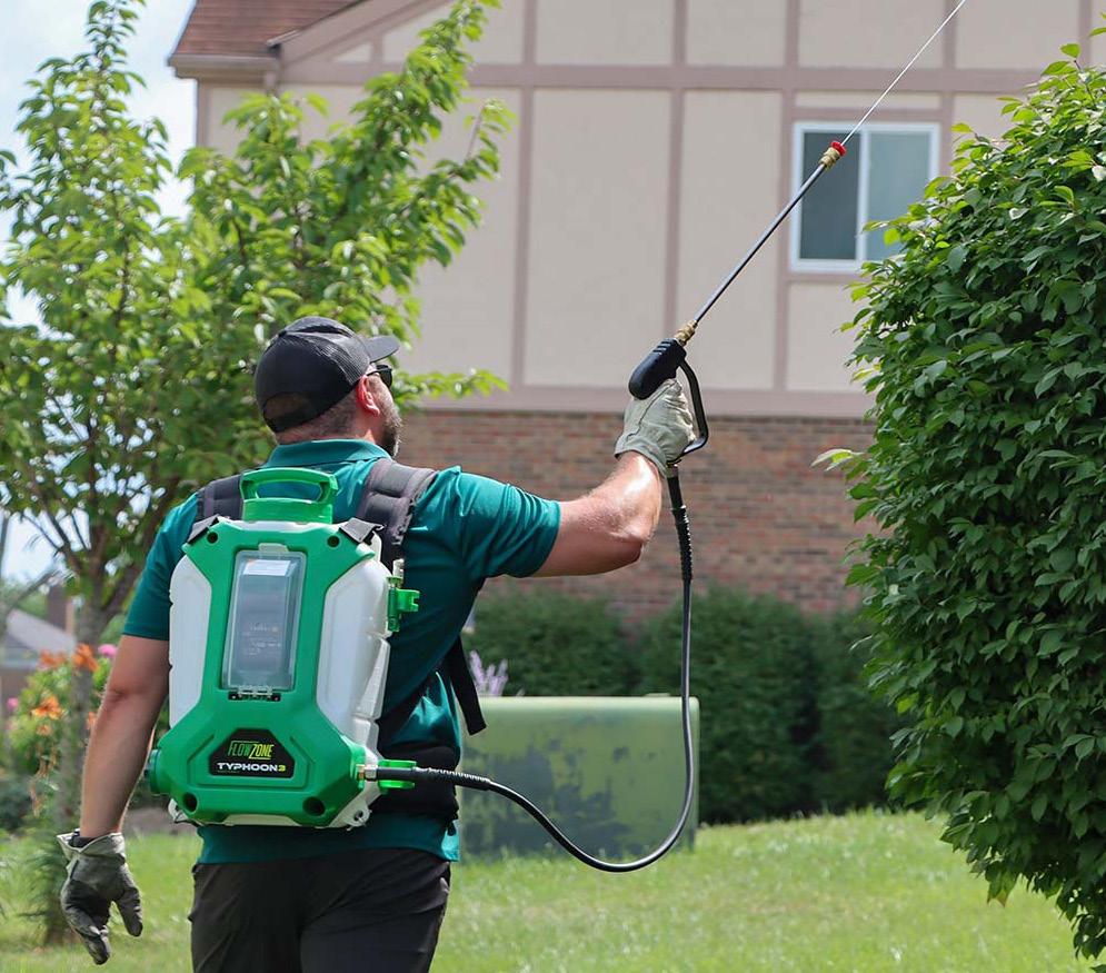
Design for FlowZone’s new generation of sprayers, created during my time as a Digital Marketing Intern for WESSOL.
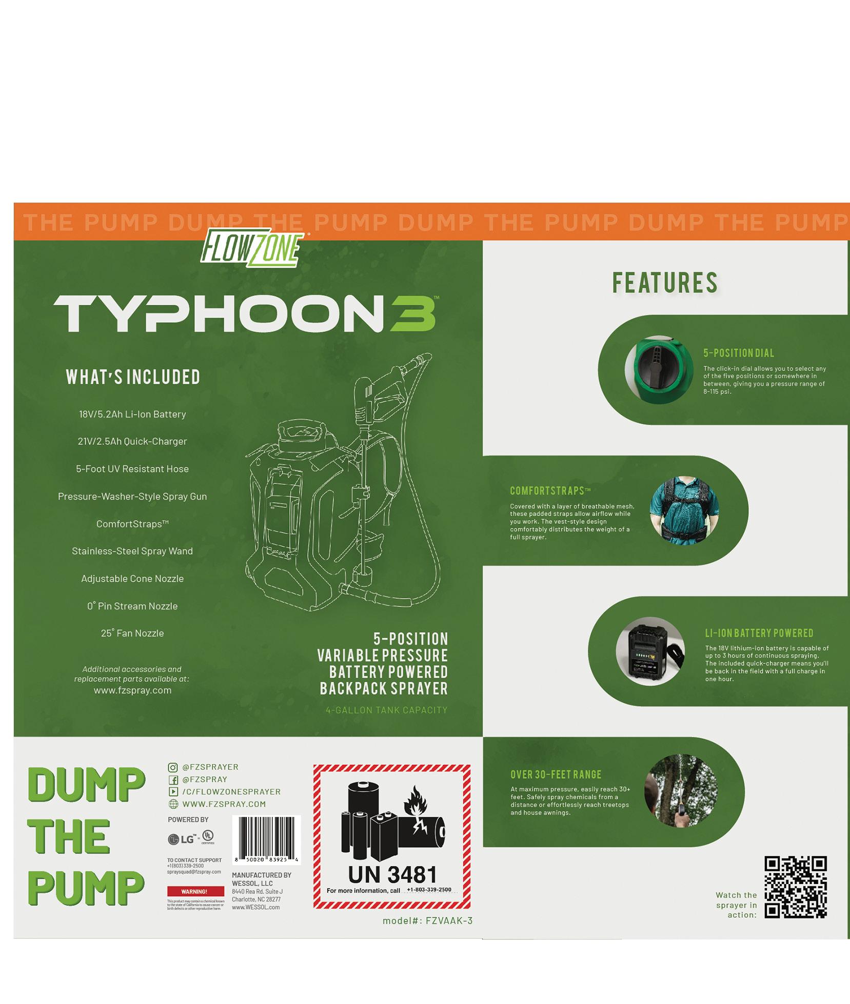
For the Typhoon 3, FlowZone wanted new and improved packaging design for their sprayer box that still tied into the past model’s look. I wasn’t able to use photos of the sprayer itself as production wasn’t finished, so I featured line drawings on the packaging instead.
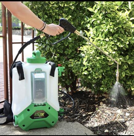
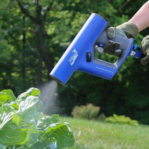
Social media content for brands in order to raise awareness and drive sales.
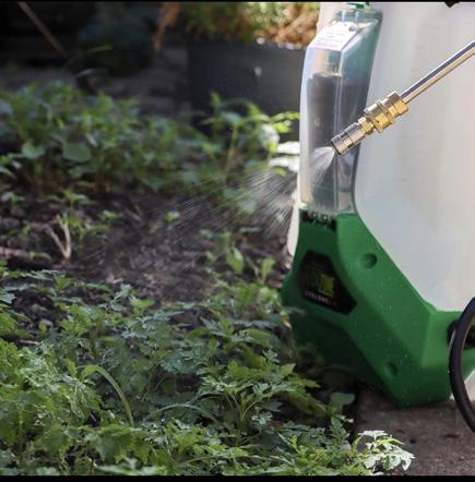
I shot lifestyle photo and video content for all FlowZone products and created graphics and animations to post on Instagram. I assisted in creating a social media calendar to ensure an even spread of promotional and informational posts.

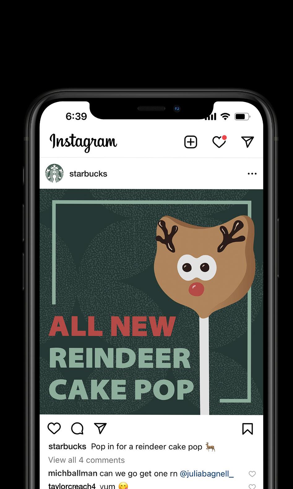
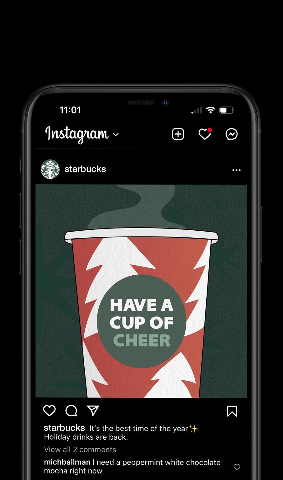
I designed this Instagram content to promote Starbucks’ holiday drinks and treats.
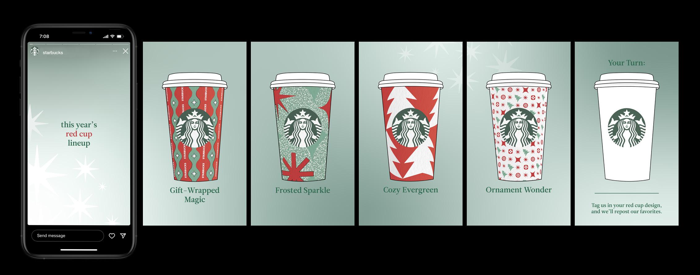
The cup design challenge is an Instagram story post that aims to increase awareness beyond Starbucks’ current follower list by prompting people to post about Starbucks on their own Instagram stories.
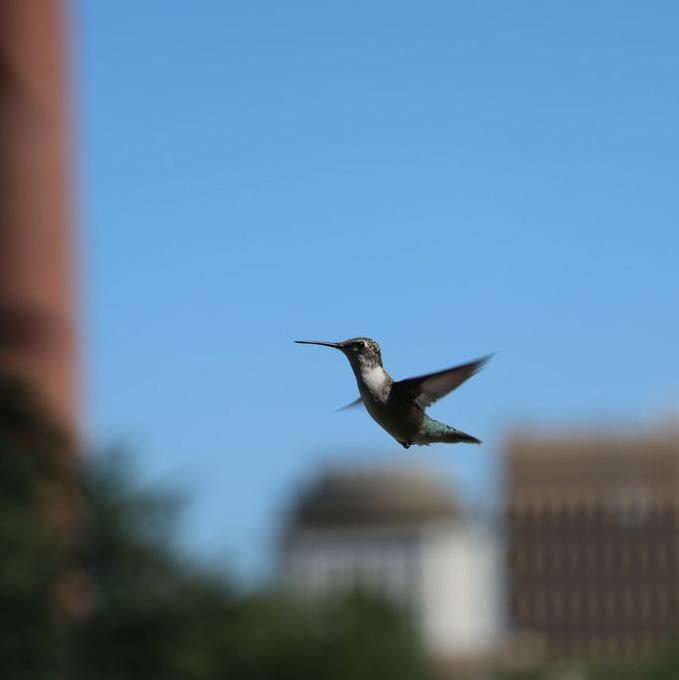
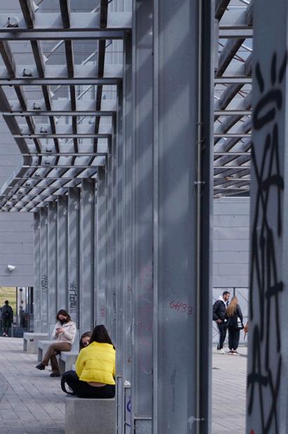
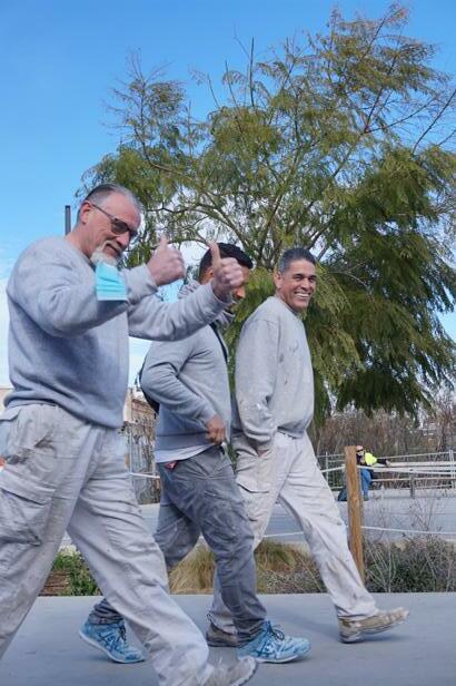
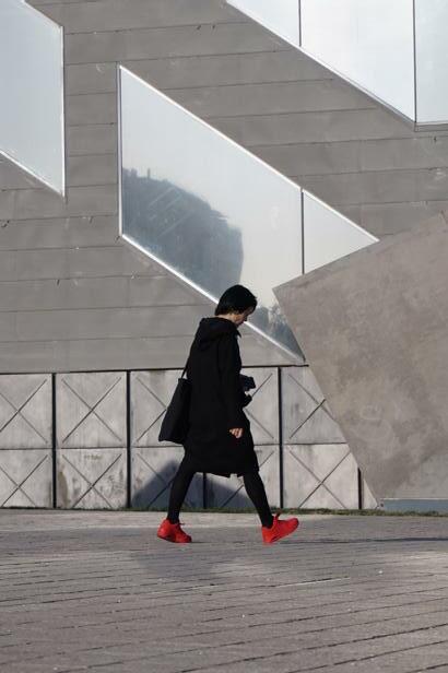
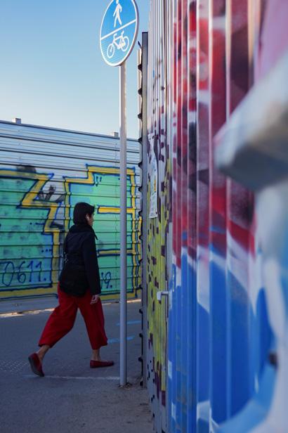
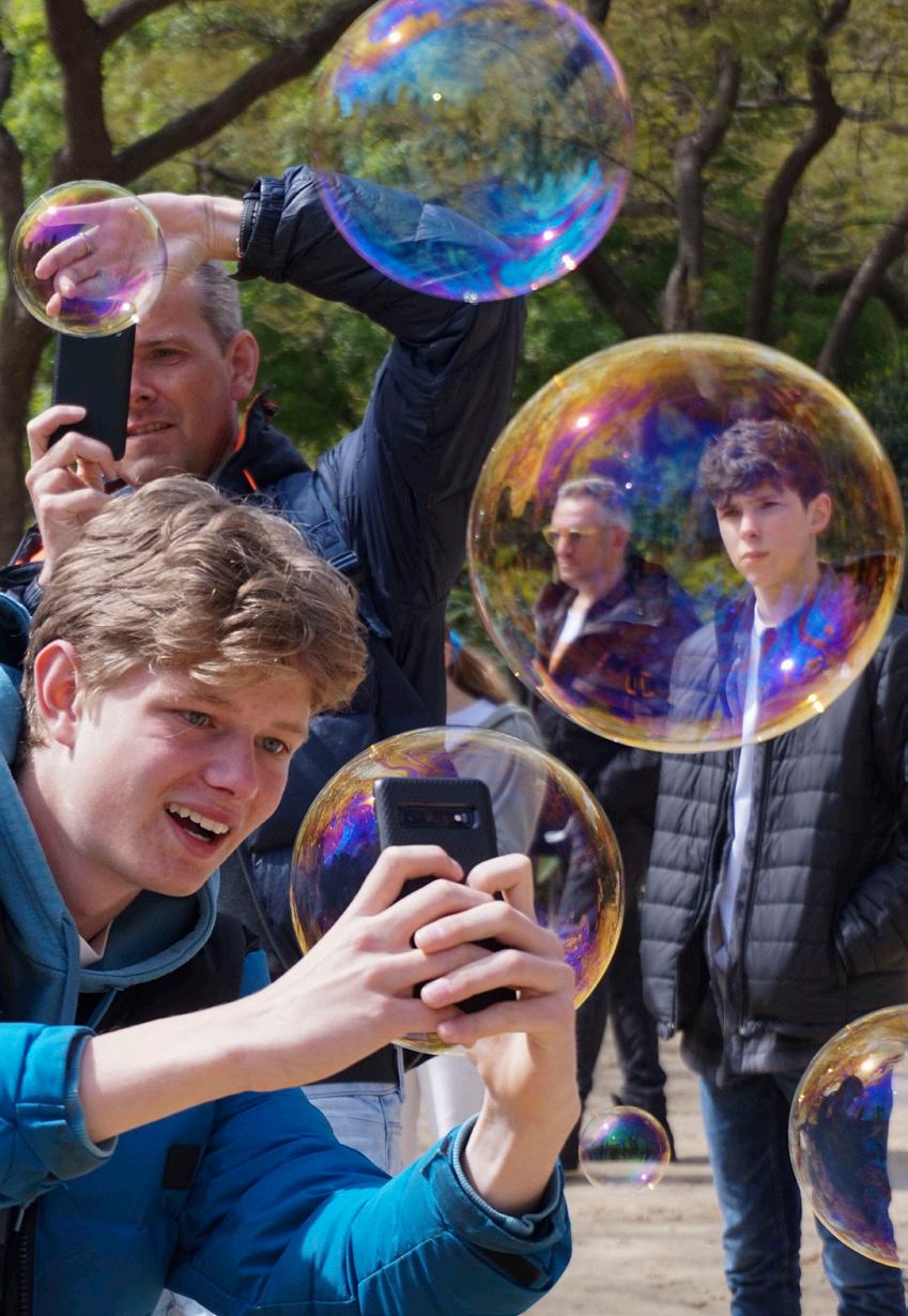
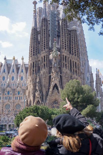
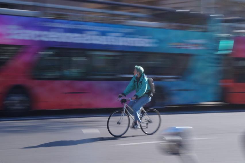
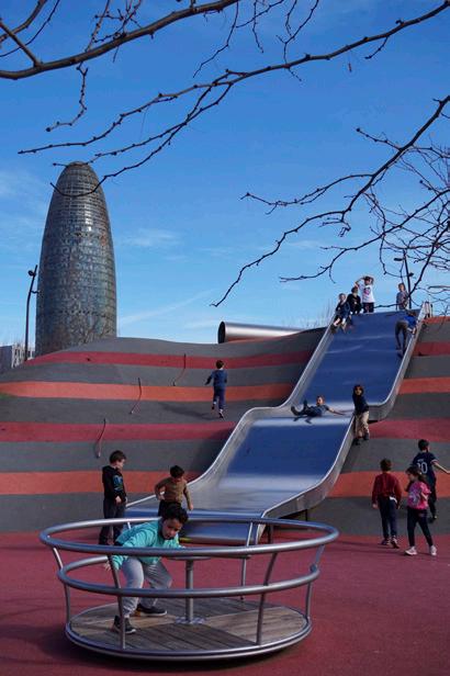
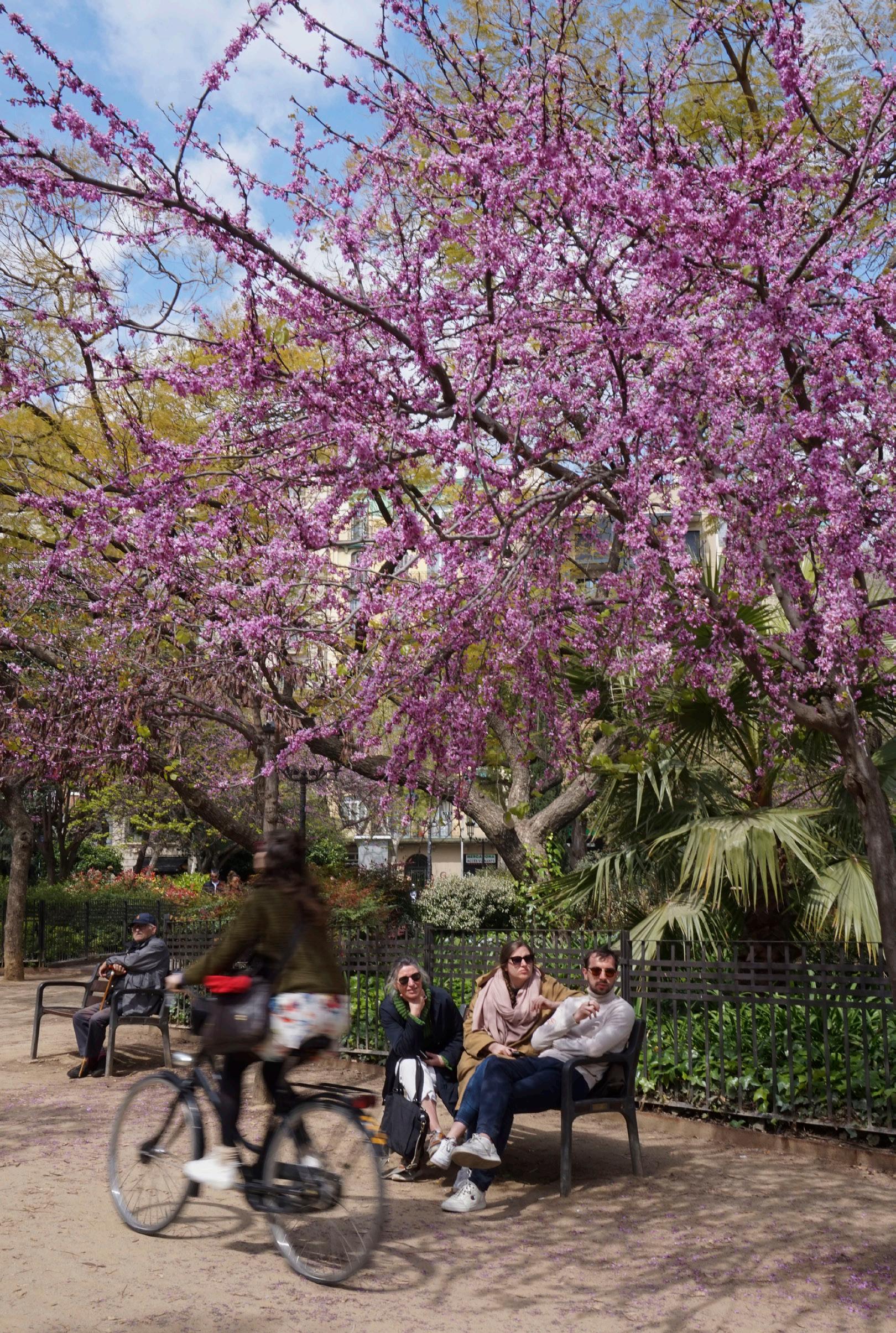
I spent a semester abroad in Barcelona, Spain where I studied photography, art, and architecture. Here are some of the moments I captured on the Spanish streets.
A sampling of my studio photography, freelance graduation photography, and photography practice as a member of the Executive Team for Gamecock Photo Club.
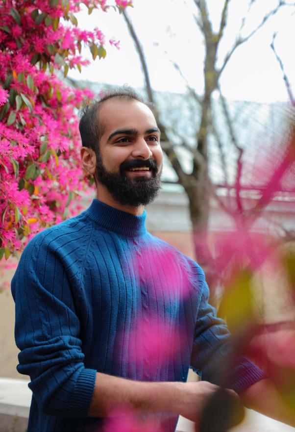
1. Grad student Shreyas Saboo poses between the blooms. I composed the shot with flowers in the foreground to provide visual interest.
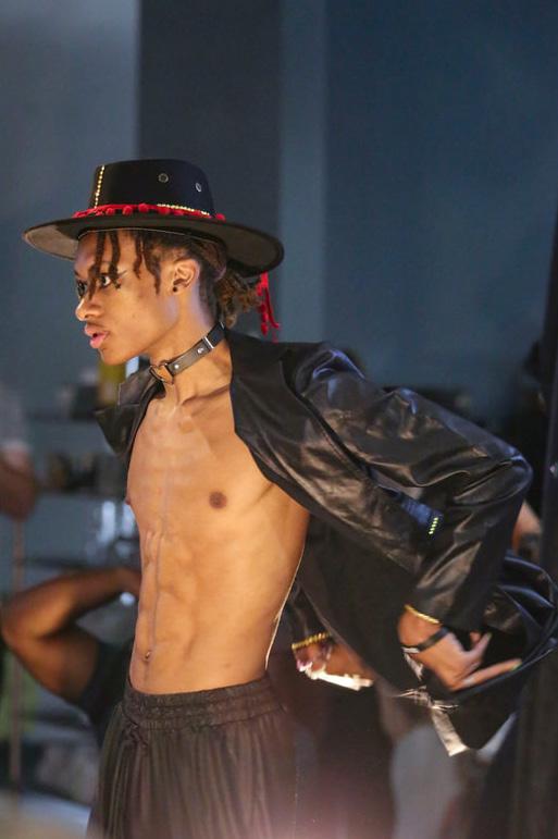
2. The Event fashion show model waits outside before the show.
3. The Event fashion show model strutting the runway.
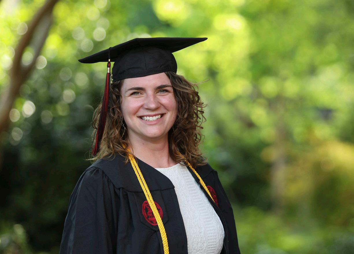
4. 2021 graduate Sydney Womack smiles in her cap and gown.
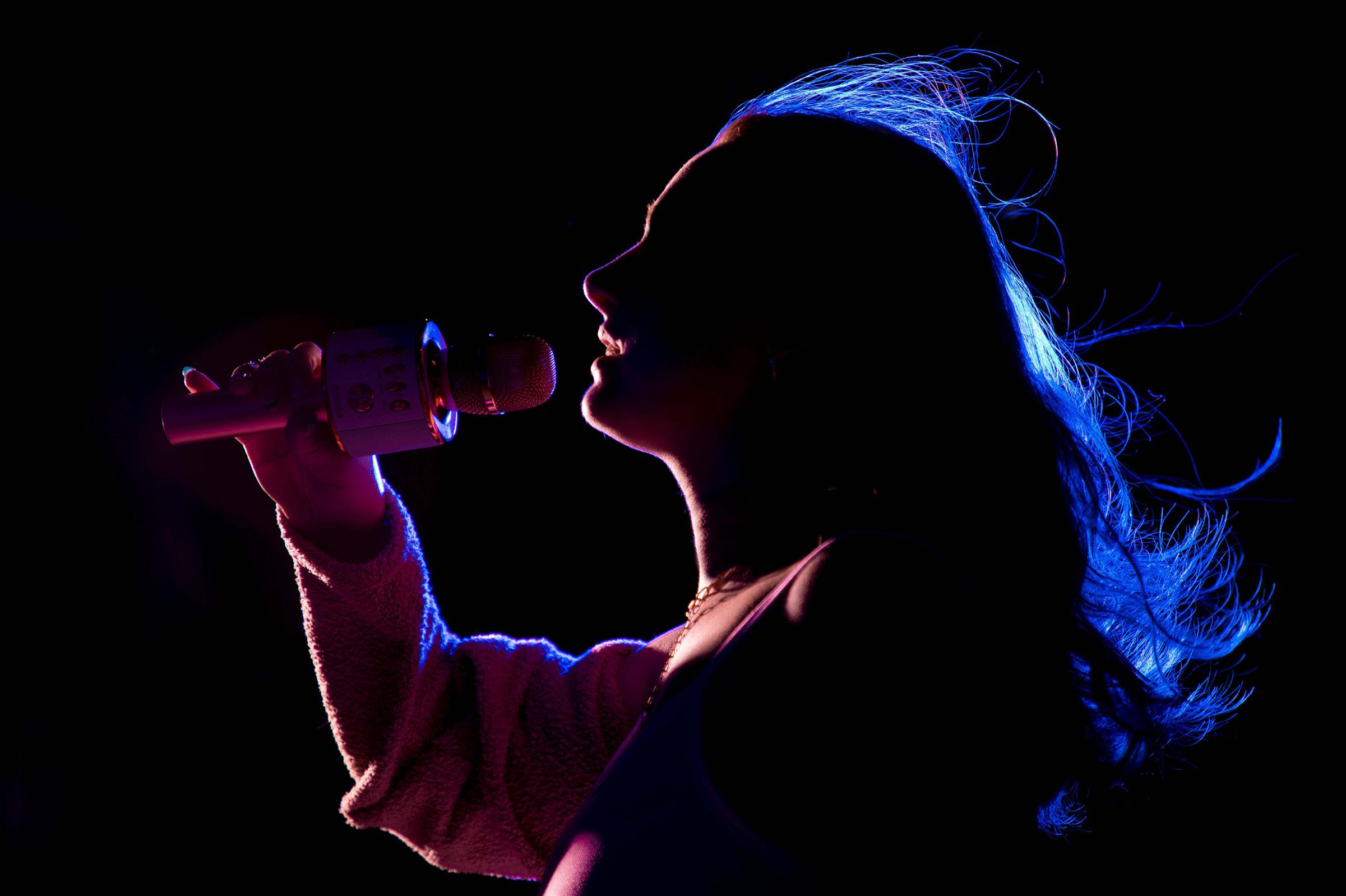 UofSC Student Gracie Gotberg sings into the microphone. I used colored gels to create a silhouette and a fan to blow her hair to give this studio shot a concert feel.
As a Digital Marketing Intern for WESSOL, I photographed and edited product and lifestyle photos for the websites of their brands, FlowZone, prunz, and SprayMate.
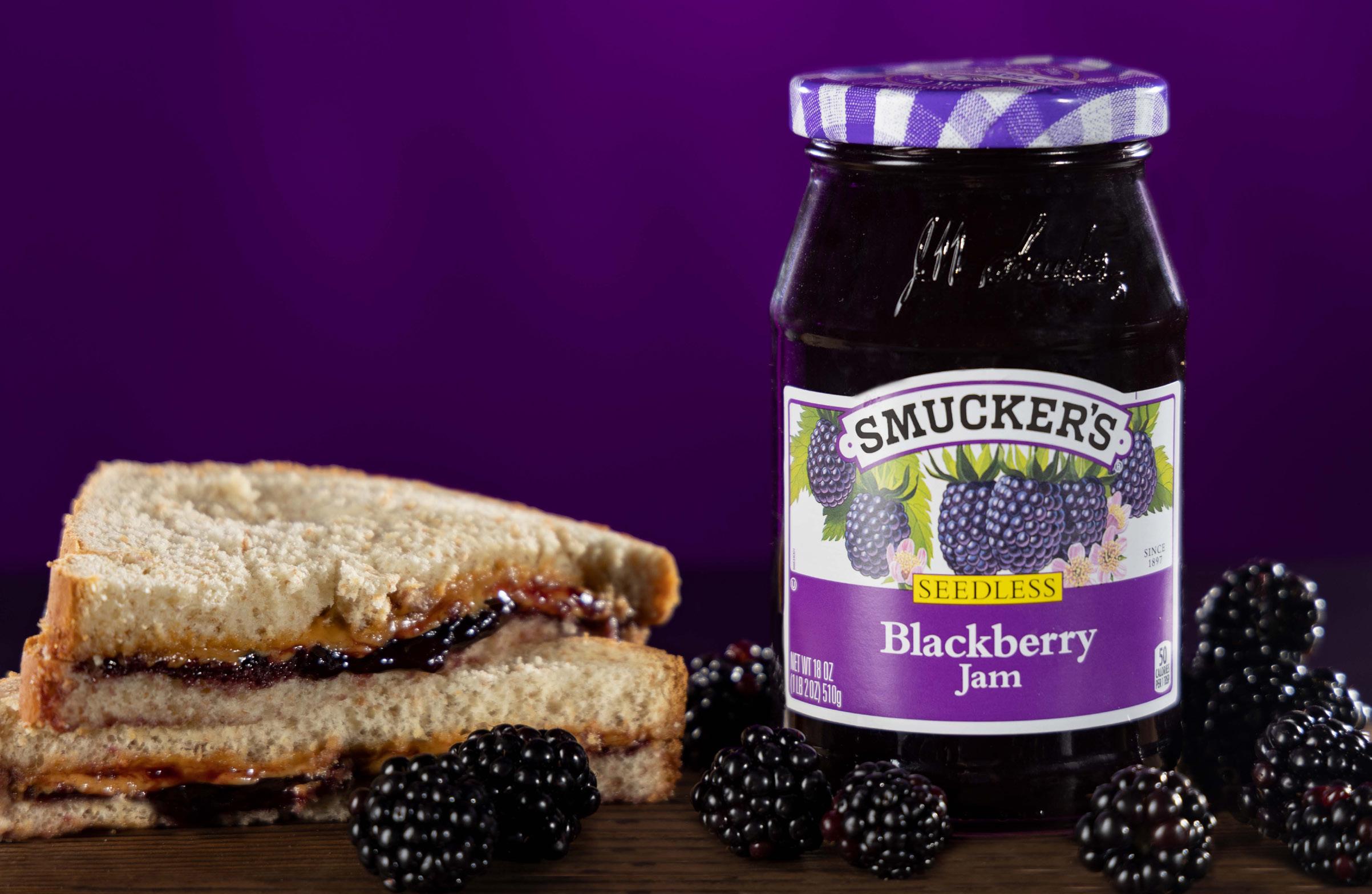
A studio product shot of Smucker’s blackberry jam. I used rim lighting on the glass jar to get reflections on the edges and add depth to the image.
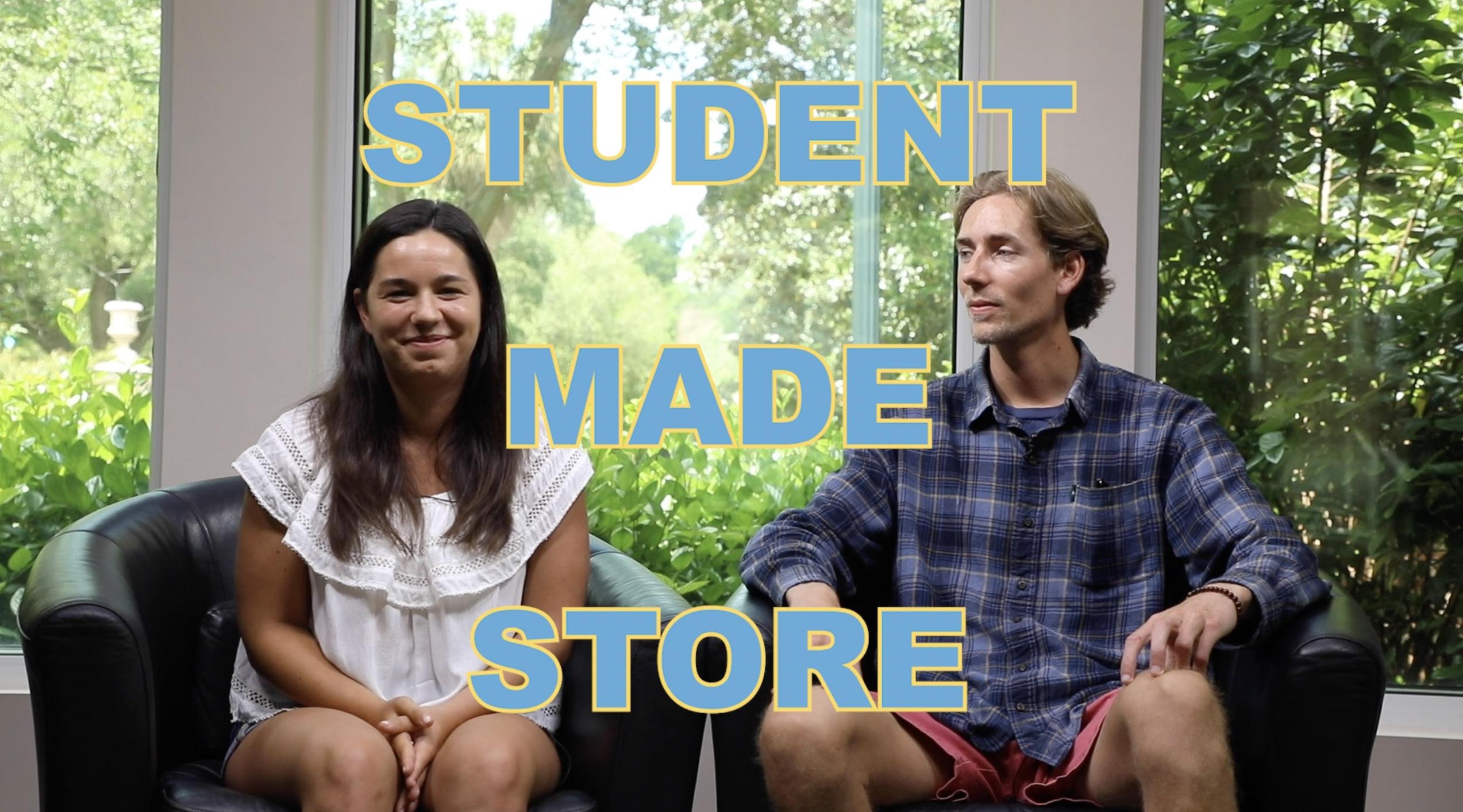
Over 70 minutes of interview footage and plenty of b-roll condensed into a 6 minute mini-doc. Scan the QR code in the corner of the video to watch.
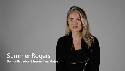
Student Made Store (and the Students who Made it) features founders Lindsay Reeth and Ryan McElhinney, several student artists, and entrepreneurship professor, Dirk Brown. It weaves together studio interview footage with b-roll of the artists creating and selling their products in order to showcase how much work it can be to run your own business while also a full time student.
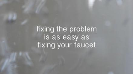
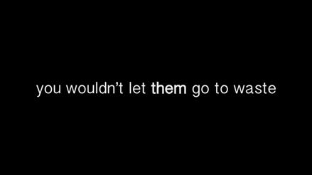
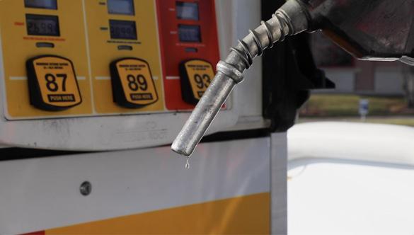
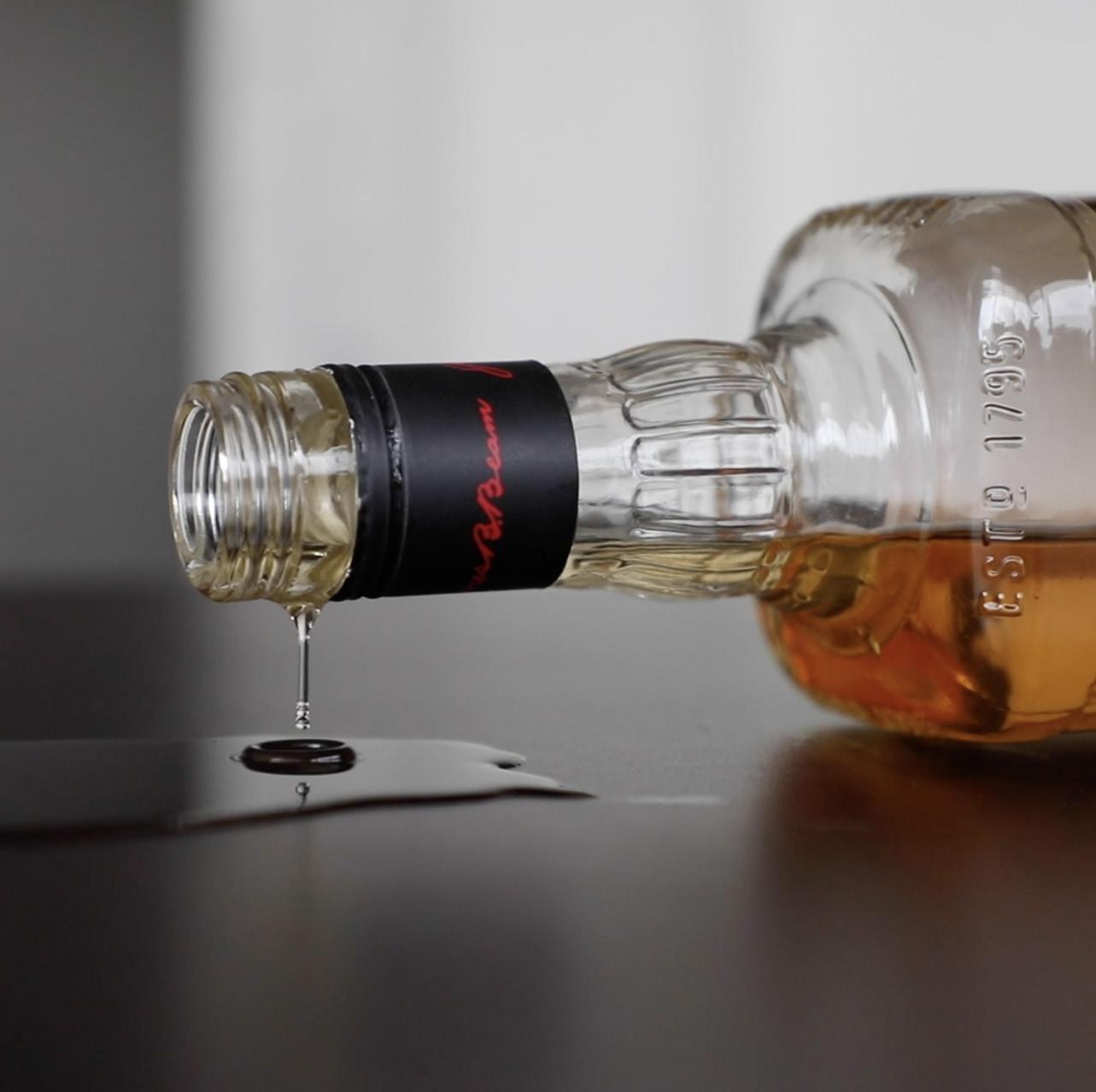
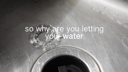
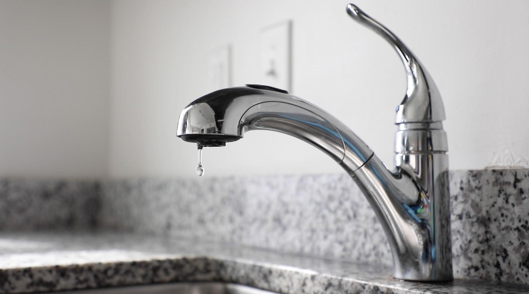
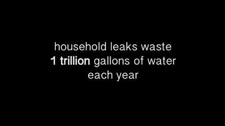
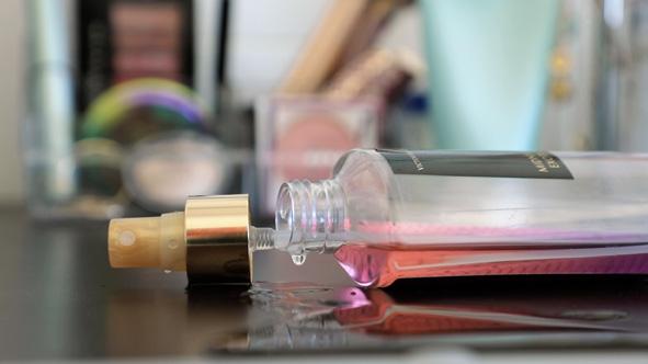
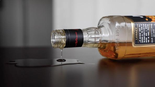
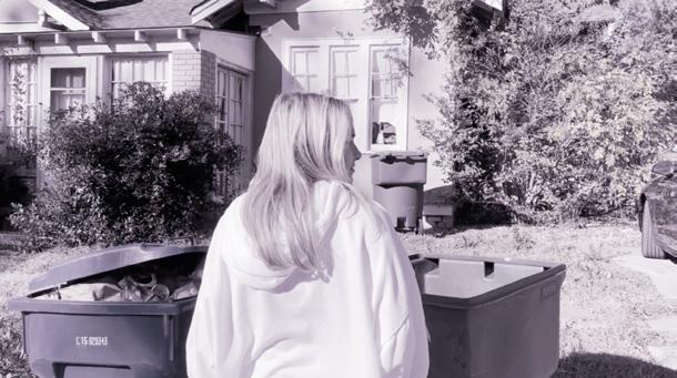
Because household leaks waste so much water each year, I created Drop the Drip to make viewers think about their leaky faucets differently. It begins by showing more highly valued products being wasted --liquor, gas, and perfume-to elicit a negative reaction from viewers and make them realize they should have the same reaction to wasted water.
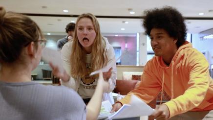
A comedic short film in which anything that could possibly go wrong, does. You know the drill, scan the QR code in the corner to watch.
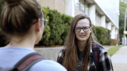
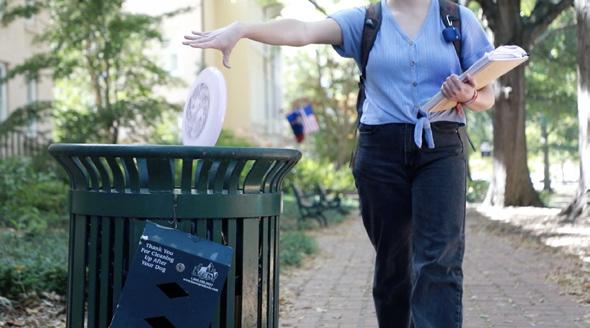
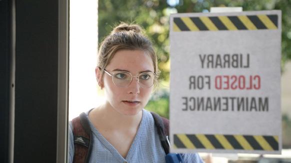

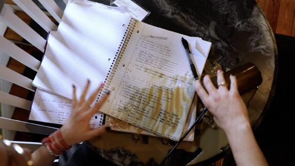
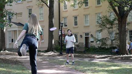
A Quiet Place to Study follows a college student on the day before a big exam while she searches for, you guessed it, a quiet place to study. I wrote, directed, filmed, and edited this video with Ashley Bushman. We spent considerable time storyboarding for this project in order to create match on action transitions between every scene and add to the fast paced flow of the film.


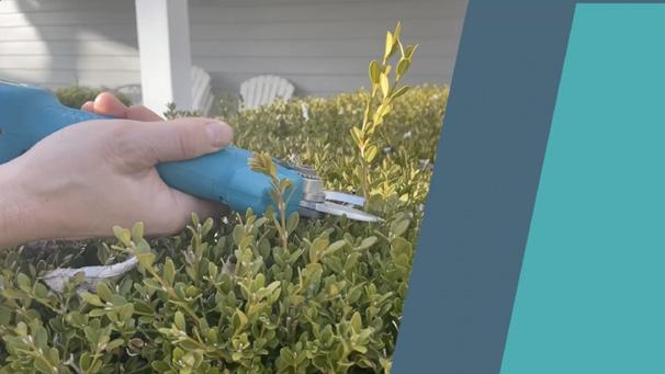
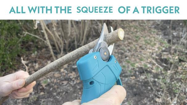
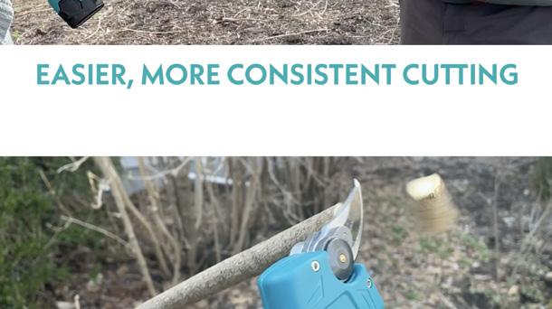
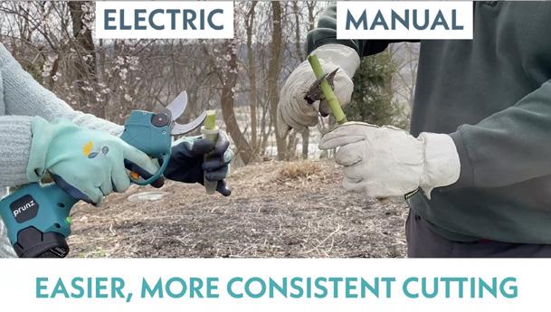
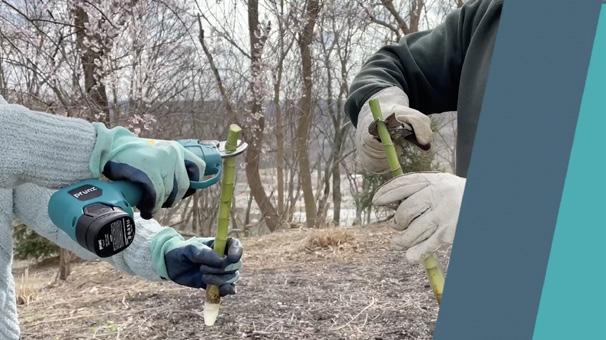
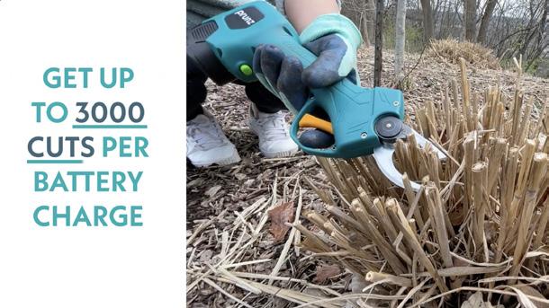
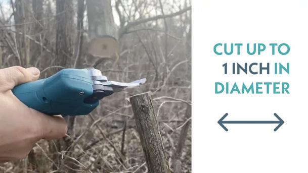
A hype video to promote SprayMate’s latest product, prunz Electric Pruning Shears. It showcases all the most important features of the tool.
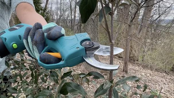
I did not film the footage for this project, but instead was provided with a few shots and told to edit them into a promotional piece. I did, however, film the opening shot and created a logo animation to go on top of it. I utilized smooth text and video transitions throughout the video to keep people watching until the end.
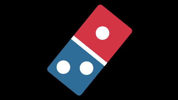
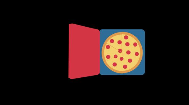
I was tasked with creating a logo animation for a company that transformed an item into a logo in under 3 seconds.
What better item to transform into the Domino’s logo than a pizza box. My animation shows a pizza box opening, pizza slices disappearing, and the box morphing into the Domino’s logo. It makes you want to grab a slice yourself.


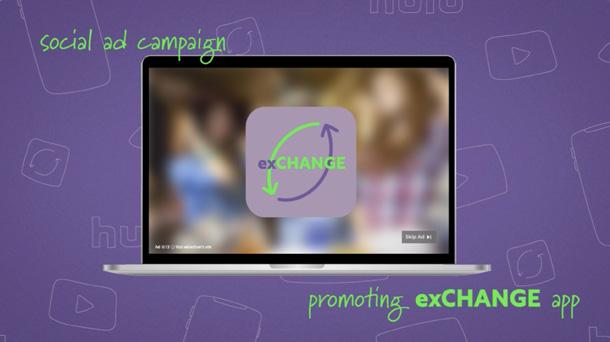
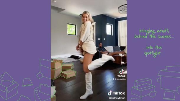
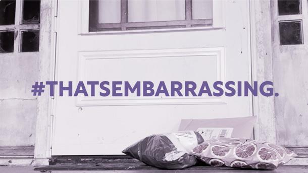
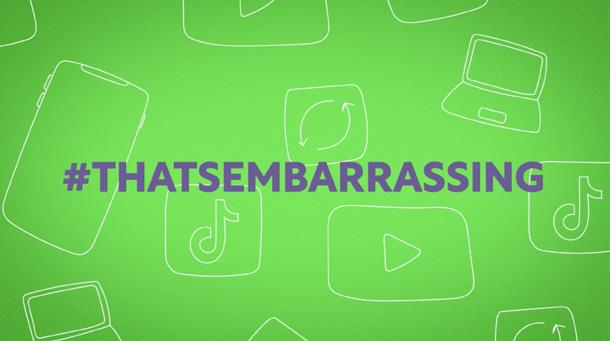
Do the Green Thing, an environmental social initiative, was in need of a new campaign focusing on fast fashion.
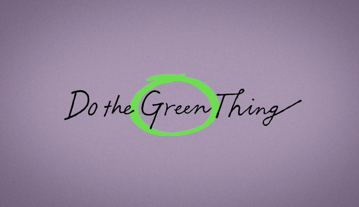
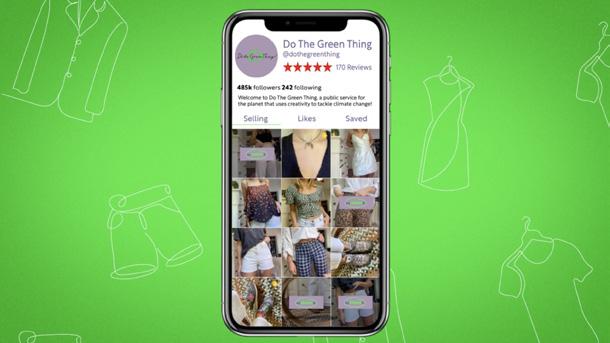
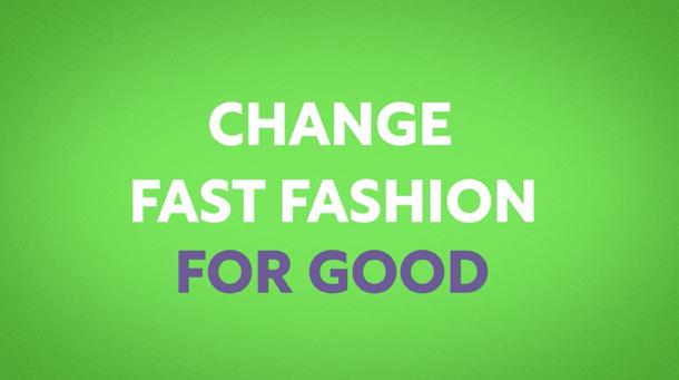
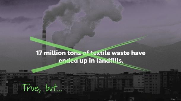
We created #ThatsEmbarrassing, a social media based campaign to convince teens that fast fashion hauls aren’t cool, but quite the opposite. We used Do the Green Thing’s green color in combination with purple to create a bold, attention grabbing look. I worked with Jaye Rachel Johnson and Lia Petramale on this project and was responsible for all animation and editing.