Michel Dei-Cont : Design & Photography Portfolio 2024
The contents of this portfolio represents a small selection of work spanning a career of over three decades with international advertising agencies, boutique design agencies, freelance design and photography.
Logos & Corporate Identity
Brand Campaigns
Brochures & Fliers
Annual Reports
Brand Manuals
Corporate & Retail Advertising
Outdoor Branding
Marketing & Competitions
Wetsuit & T-Shirt Design
Studio & Product Photography
People & Reportage Photography
Sport & Recreation Photography
OVERVIEW
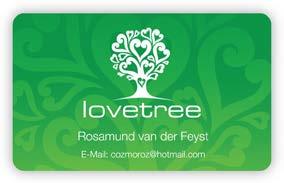
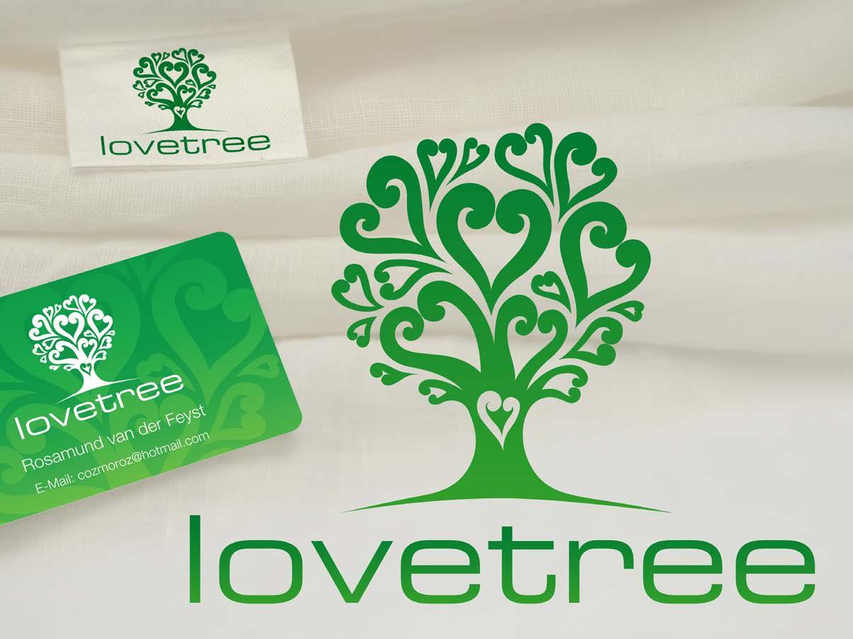
LOVETREE CLOTHING
A clothing brand specialising in the use of natural fabrics tailored for comfort and style. Clothing includes garments for infants, toddlers, children and yoga students.
The client was very specific about using a tree and was equally insistent on using Eurostile as the logo font.
The design was created from a freehand ‘doodle’ and later converted to vector format by hand so as to retain the freeform of a drawing.
The logo is intended to convey the ideas of community, love and sharing whilst being steadfast and vital.
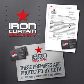
Iron Curtain Security is a company that specialises in CCTV installation and monitoring.
The client wanted an update on their trading logo. Their brief was to retain the star, representative of the old ‘cold war Russia / Iron Curtain’. They wanted their logo to look like the hull of a submarine but without looking battered and worn.
Included in the brand identity was vehicle branding, stationery and electronic presentation tools and a website.
IRON CURTAIN SECURITY
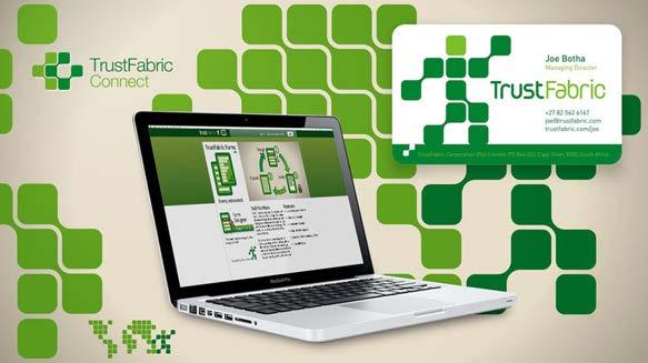
TRUST FABRIC
Personal data management systems
An online data management system created to facilitate the security and distribution of personal information used in daily commercial application such as banking and accounts.
The brief was to create a figure that resembles a butler. Someone who manages your daily affairs. At the same time we decided to create a system of ‘building blocks’ that represent the various connections. These could be used almost infinitely to create additional icons, logos and illustrations which would form part of the growing brand.
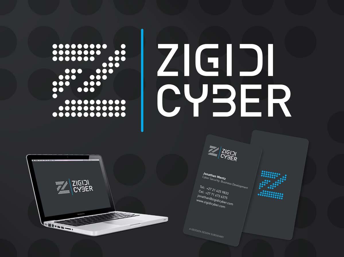
Zigidi Cyber is a company that specialises in geospacial data analysis, supply and presentation.
The brief was to use the Z of the name and illustrate it as movement of data from one place to another in in a very formal and and stacked manner.
ZIGIDI CYBER
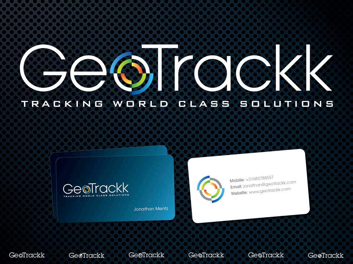
GEOTRACKK
Geo-Data Collation and Extrapolation
Geotrackk is a software solutions company which specialises in the collection, collation and extrapolation of geographic data.
The client wanted to show that the data comes from satellites orbiting earth. The concentric circles represent the data which is collected on multiple layers. By subdividing the circles into quadrants and colours the symbol can be viewed as the crosshairs of a target or the focussed detail of a maginfying glass.
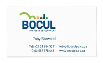
BOCUL
Property
developers specialising in the renewal of urban fringe properties.
The logo was to reflect the environment in which these partners conduct their business. Their main focus of growth was located at the foot a hill where old industrial buildings and warehouses were being converted to residential spaces.
In addition they had plans to demolish some of the buildings which had fallen into more serious disrepair to make way for taller office buildings.
The request was to create a bold, strong identity which is still not aggressive in appearance.
Urban and peri-urban property development
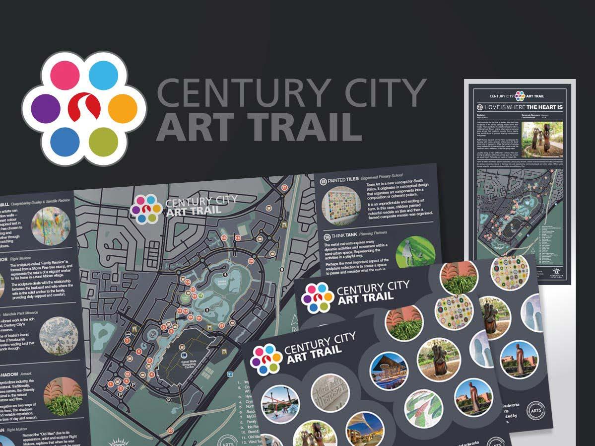
ART TRAIL - CENTURY CITY
The Century City Art Trail is a collection of installations situated throughout the precinct to personalize and beautify the area.
The logo design is loosely based on an artist’s palette using bright primary colours to reflect the cheerful nature of the majority of installations.
Various applications include corporate stationery, way-finding totems & signs, information brochures, a map and an online component.
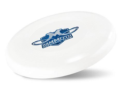
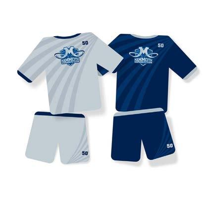
Mammoth Ultime is an ultimate frisbee club in Australia..
The design uses the tusks of a mammoth as the descenders of the letter M. It also symbolises the flight path of a frisbee.
MAMMOTH
Utimate Frisbee Club
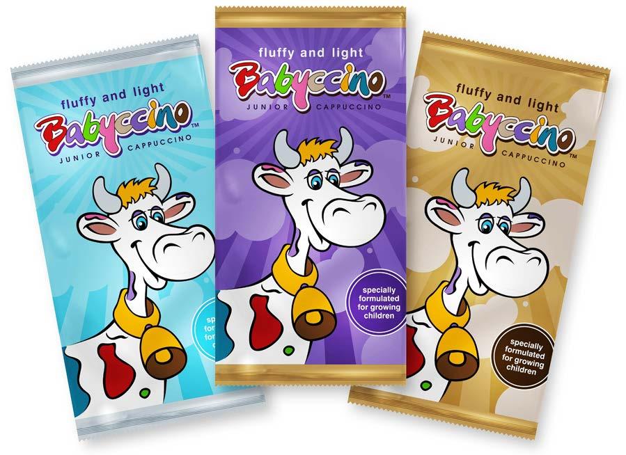
BABYCCINO
Branding and packaging
Babyccino is a instant cappuccino formulated for toddlers who want to “drink what mommy is drinking”.
The design brief was to create a playful, fun-loving design with two elements. The logotype should be able to stand on its own where corporate branding is applicable. The brand character had to be fun and have instant appeal with children and feature as the dominant packaging element.
We explored two options for the character; the monkey was the ‘mischievous’ character and the cow was developed as the more peaceful, nurturing character which would tie the product back to milk, reinforcing the origin of the instant drink.
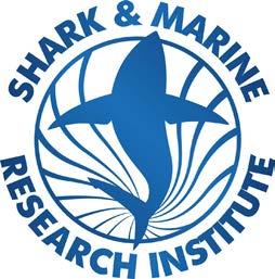
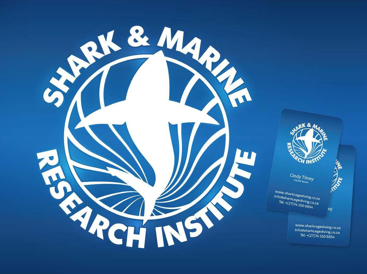
Shark & Marine Research Institute promotes the conservation of sharks and the environment through eco-tourism and conservation research projects
This design was created to highlight the beauty of the Great White as the apex predator it is and its effect on the ecosysten within which it lives. The shark is shown in silhouette to outline its powerful form and gliding grace. The radiating lines hint at the yin-yang symbol of the duality and balance of the ecosystem as well as the play of sunlight and water when viewed from beneath.
SMRI
White Shark Diving Company - Envornmental Responsibility
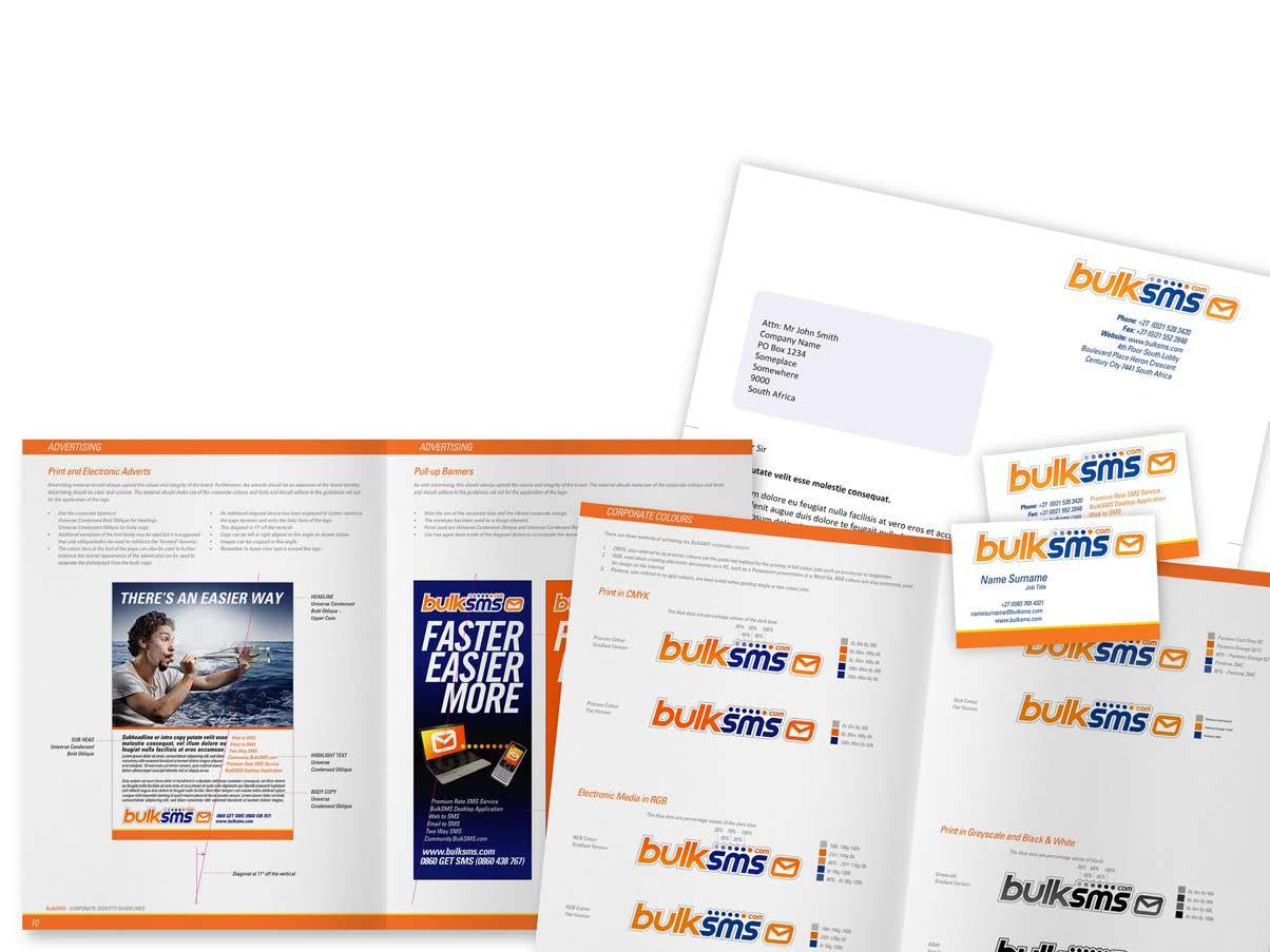
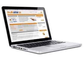
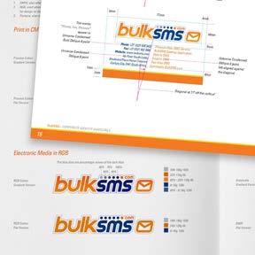
BULKSMS
Logo design and corporate branding
BulkSMS was one of the first commercial web based messaging platforms launched globally.
The brand had been growing since its inception in 1997 and in 2010 it was decided to take stock of the various elements both online and in print and to revamp the design as well as creating a cohesive brand identity.
At the core was the update of the logo. A brand identity manual was created to incorporate the many varied elements from the website to the stationery, vehicle branding and marketing material in both print and electronic formats.
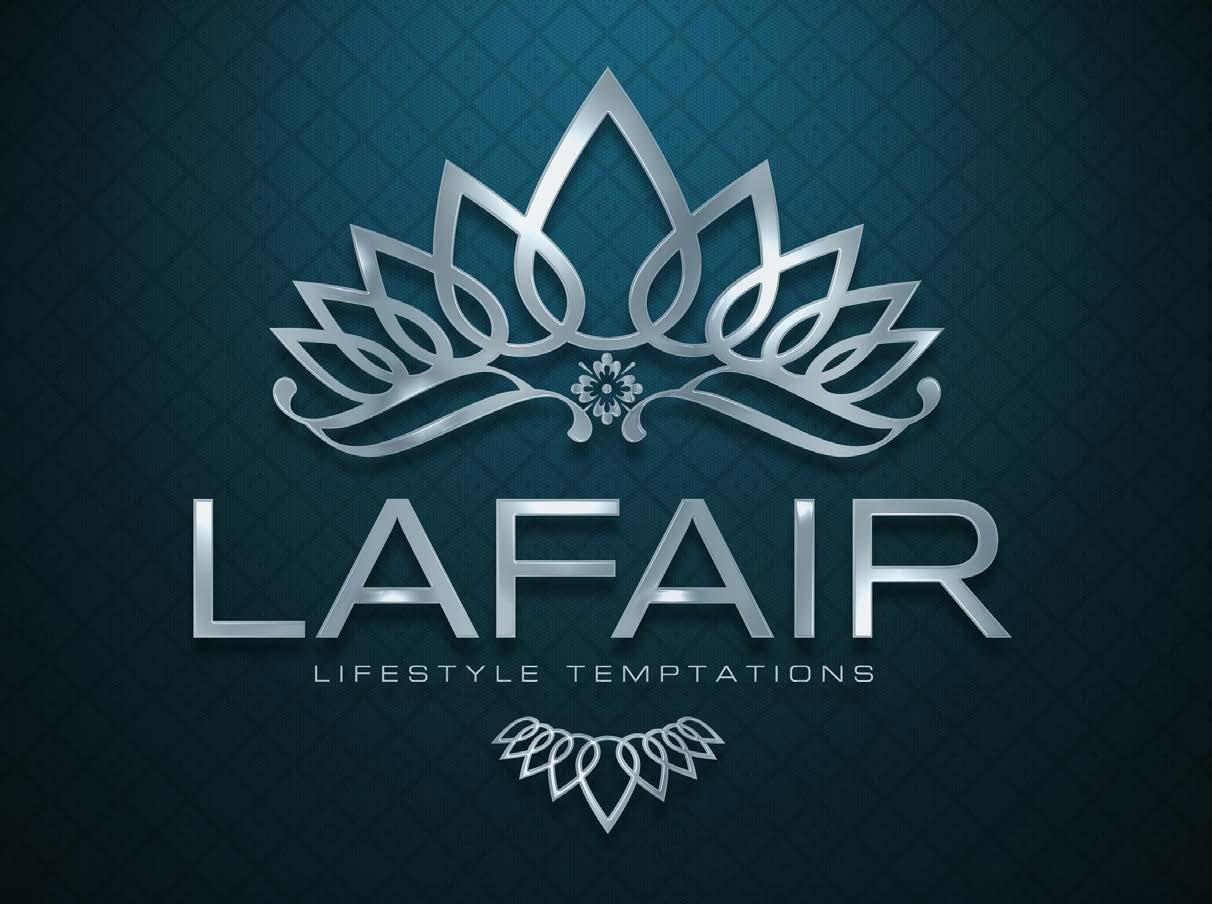
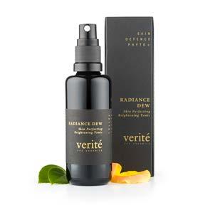
LaFair specialises in the sourcing and supply of high end gifts with particular focus on skin-care and skin-rejuvenation products.
The request was to create a logo with a luxuriant feel using the illusion of crafted silver in 3D.
The logo was designed to incorporate elements of the skin treatment products. Drops were incorporated to illustrate how the product permeates through to the deep layers of the skin. The drops where then stylised to create a regal crown and necklace to balance the overall design and add a sense of esteem.
LAFAIR Lifestyle Temptations
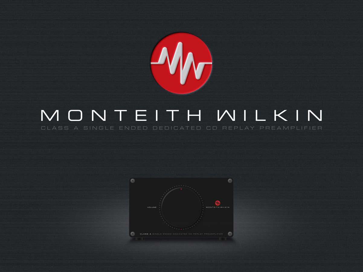
MONTEITH WILKIN
High Fidelity Amplifiers
Monteith Wilkin is a high end amplier manufacturer.
The logo symbolises the partnershio of the two collaborators’ initials to form a sound wave and is designed to be extremely simple, echoing the priciple of the amplifier which is designed to give the purest form of audio amplification.
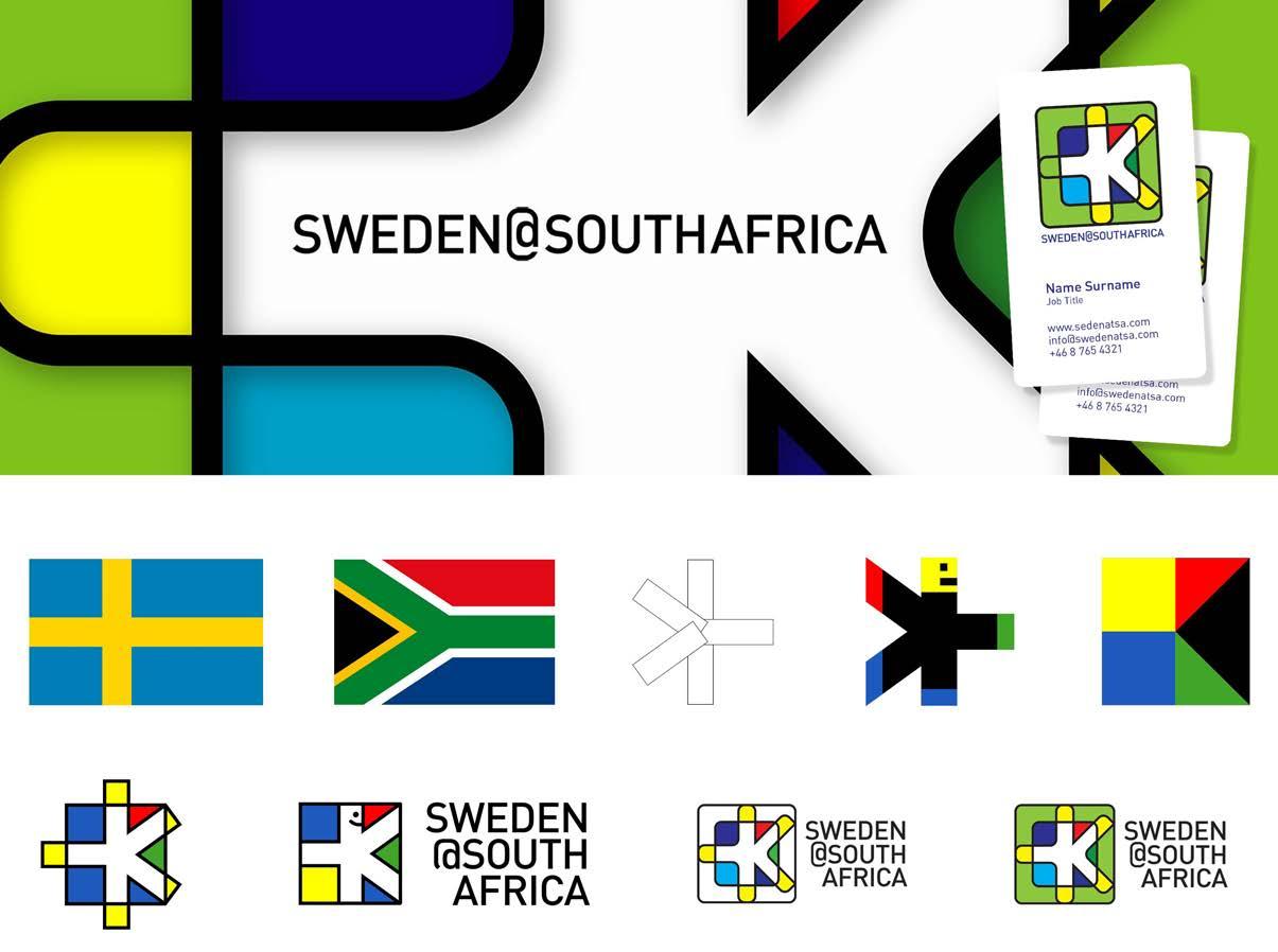
Sweden@SouthAfrica aims to improve cultural exchange between the 2 countries. The logo seeks to combine the two flags to form a friendly figure moving between the two cultures.
SWEDEN@SOUTHAFRICA
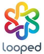
LOGO EVOLUTION
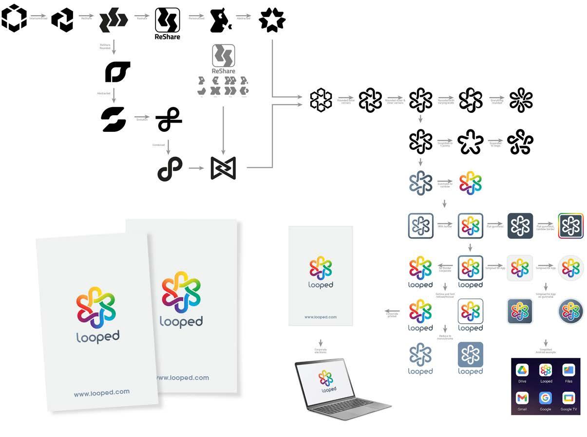
and the demise of one
Looped never made it into the real world. A fanciful idea to compete with social media giants.
The brand started as ReShare and the request was to create a logo that had an element in it that could be repurposed for all the other symbols used on social media platforms: share, like, forward, comment, reshare etc.
Then the client changed their mind and decided they wanted to call the brand Loop or Looped and wanted a logo to symbolise this and the interconnectedness that their platform users would experience, to show infinity but not to use the infinty symbol.
And then the client vanished without payment and was never heard from again.
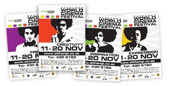
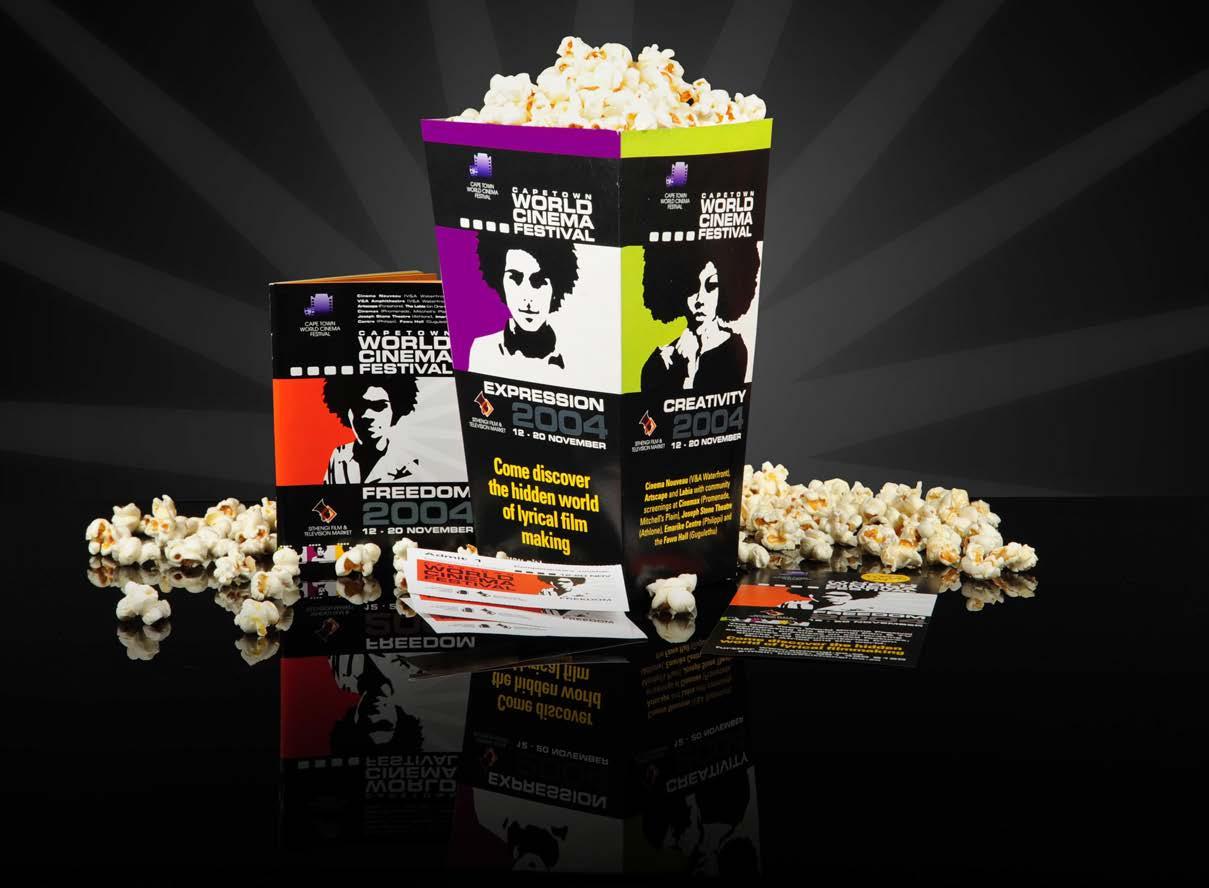
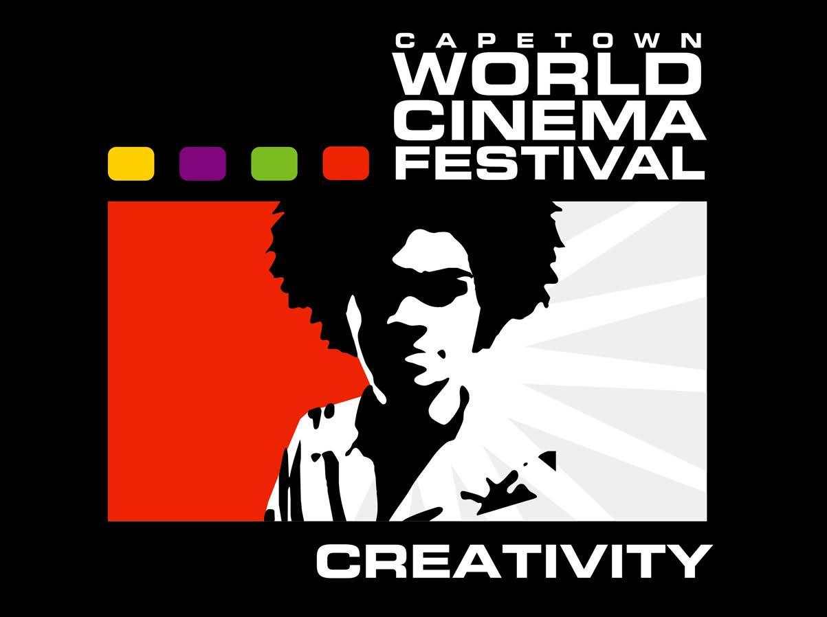
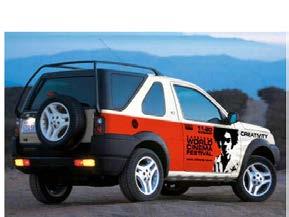
Sithengi World
Cinema Festival is an annual event held in Cape Town to showcase African film talent.
The market for this project is very varied as attendance is largely dictated by which films are screened.
The organisers had been struggling with falling attendance and an erratic identity. We wanted to create an iconic emblem which could be used on anything from a tie-pin to a gigantic drop down banner.
The client wanted an African face to carry the identity of the brand almost like a revolutionary leader. Each of the four images is a combination of at least a dozen different faces, distilled and overlayed to create a single identity. The client was very keen not to show any specific ethnic characteristics in the faces and to have their expression open and inviting.
The branding was further colour coded to reflect the additional workshops, film market for industry insiders and sales.
SITHENGI
World Cinema Festival - Branding & Advertising
WORLD CINEMA FESTIVAL
With this marketing and advertising campaign the audience attendance was increased from a little over 4000 seats sold the previous year to almost 17 000 seat sold. The organisers were so satisfied with the results that the imagery was used again for 2 more years.
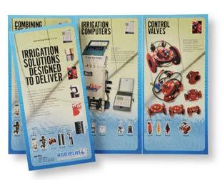
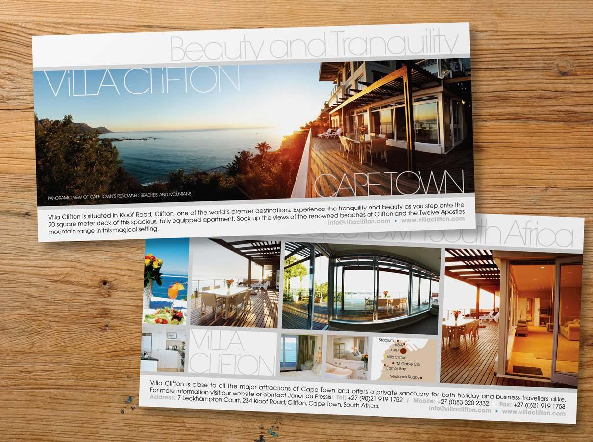
Few marketing materials are as varied as the DL leaflet. Ranging from retail ‘knock and drop’ to upmarket jewellery, boutique guest apartments, through to industrial irrigation and fast food promotions.
LEAFLETS
Irrigation photos supplied by client
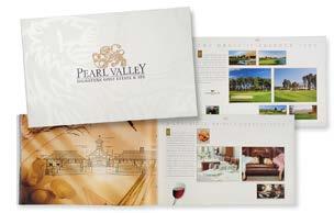
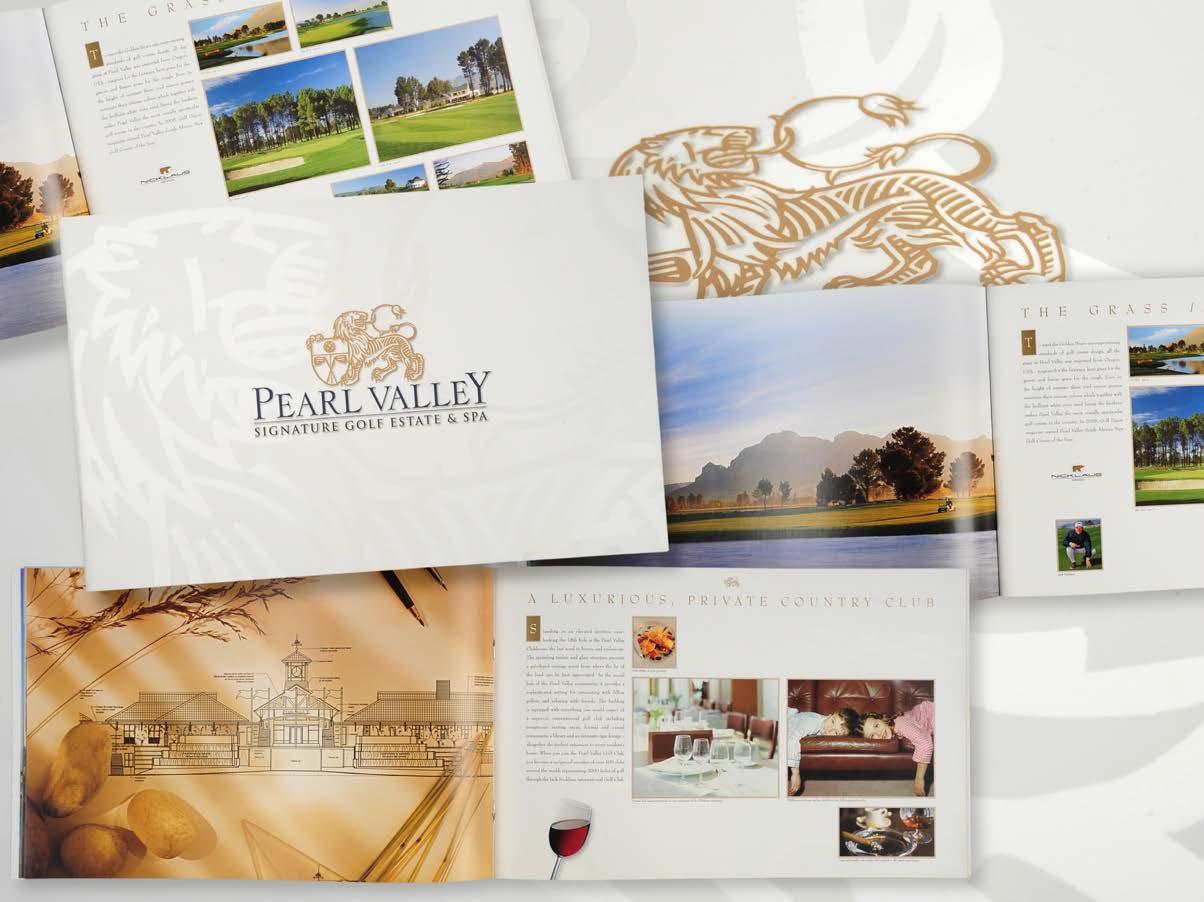
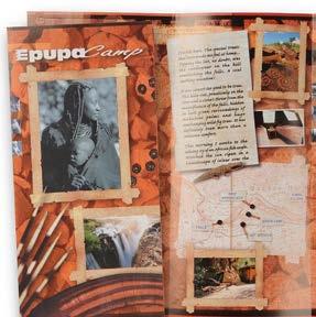
BROCHURES
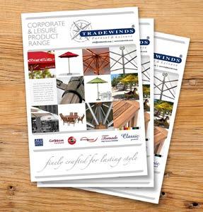
Brochures and pamphlet designs from golf estates to parasol manufactures and private guest lodges.
supplied by client
Photos
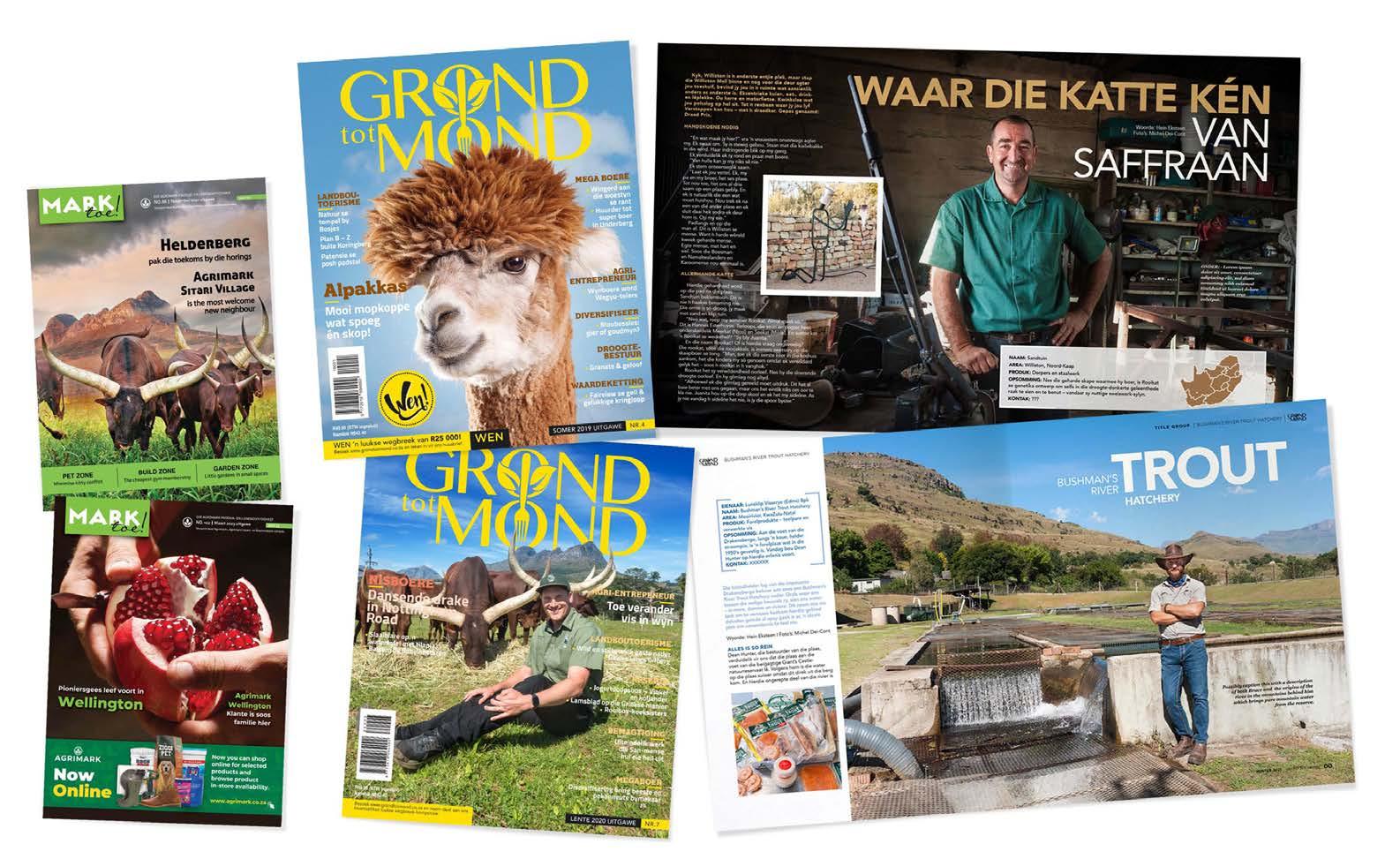
MAGAZINE LAYOUT
Covers and feature pages for both commercial and inhouse clients.
Photographs: M Dei-Cont
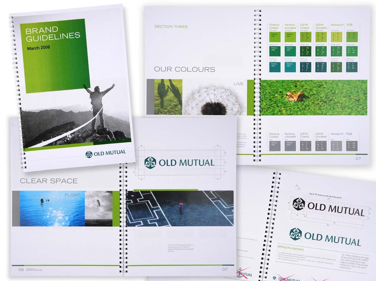
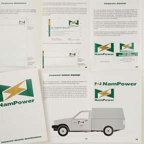
BRAND MANUALS
Comprehensive manuals have been produced for a variety of clients such as Old Mutual, NamPower, BulkSMS, Air Namibia, KaapAgri as well as many smaller manuals.
Stock images supplied by clients
RETAIL MARKETING
Design & Photography
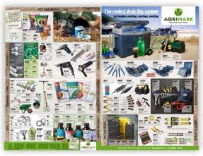
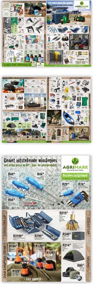
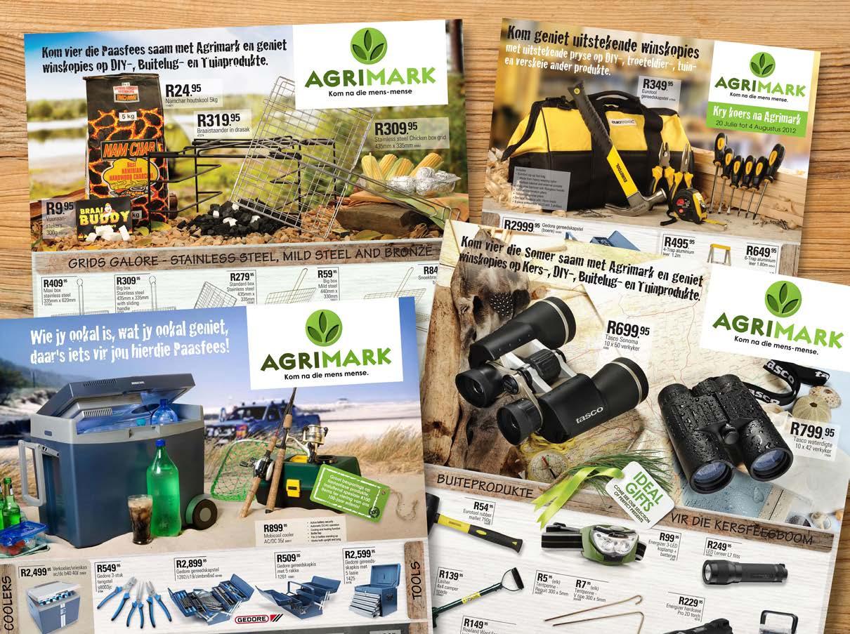
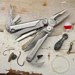
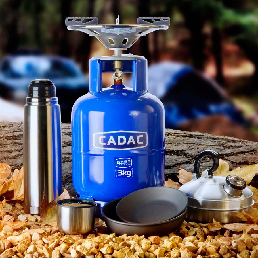
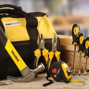
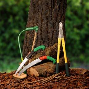
AGRIMARK
Outdoor and lifestyle retail chain
Agrimark is a group of retail stores specialising in outdoor, DIY, gardening and camping equipment.
Agrimark began as a farming co-op and still has strong support from farming and rural communities. Both design and photography styling has been approached to maintain this customer perception of the stores.
Marketing material was styled to reflect typical outdoor scenarios from camping to fishing, home improvement to gardening and irrigation.
Four national promotions as well as at least six additional branch promotions were run annually with between 40 and 250 products per promotion.
Work included concept, photography, styling, design, layout and print ready artwork of 8 page A3 leaflets, posters, loose-leaf direct mailers and online advertising.
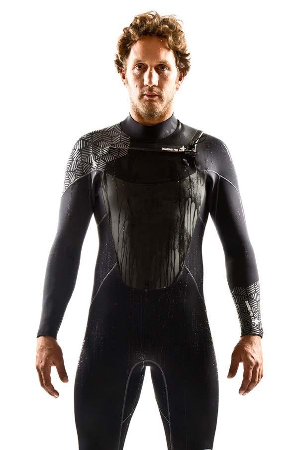
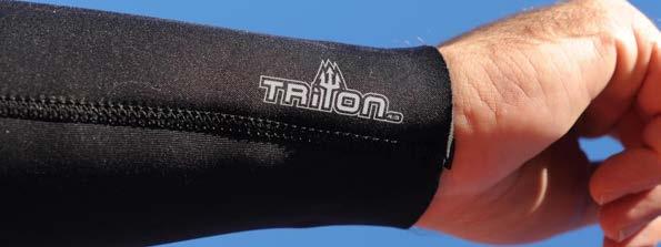
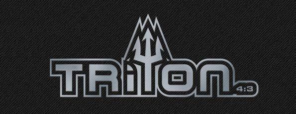
Reef South Africa manufactures and distributes wetsuits and ocean apparel.
The Diamond Pro 4:3 is the top of the range surf wetsuit featuring a unique diamond pattern fleece lining for improved warmth and drainage.
The Triton 4:3 is the mid-range hard wearing wetsuit in the Reef range, named after Poseidon’s son, Triton with the trident being used as the identifying marker.
WETSUITS Reef South Africa
Photo: Craig Kolesky
T-SHIRT DESIGNS Reef South Africa
Reef Wetsuits South Africa also produces t-shirts and apparel.
These T-shirt designs are the fruits of several years of collaboration with Reef, introducing new designs with each new season.
The brief was usually open with the only pre-requisite being that they had to be printed on black, feature the brand name and had to have a broad appeal for both surfers and tourists. Their logo did not have to feature in the design as this would be printed on the sleeve.
These designs reflect a small selection of t-shirts produced over the years. They reference a wide variety of elements ranging from waves to rock paintings, mythological figures, classic surf movie iconography, surf safaris, South African cultural icons and pirates.
In addition, Reef Wetsuits sponsor surf and bodyboard contests of which the designs also feature on T-shirts or caps.
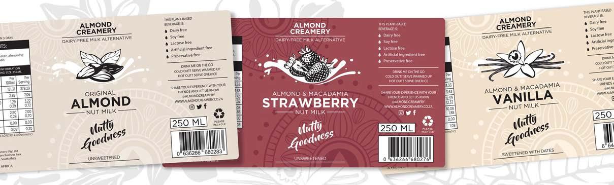
Almond Creamery produces almond milk for the vegan market.
A revitalisation of the packaging retaining the original logo and using it to create additional depth to the packaging. Illustrations are also incorporated to easily identify the flavours.
PACKAGING Almond
Creamery
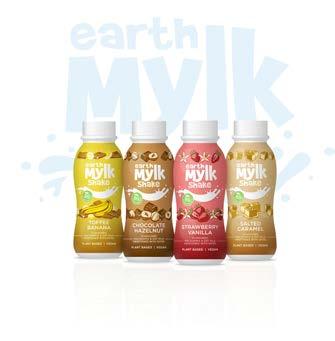
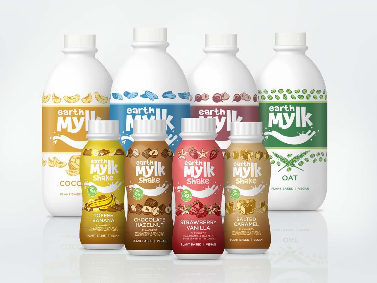
PACKAGING
Earth Mylk, a division of Almond Creamery
Additional products for bulk and on-thego consumers.
2 liter bulk milk containing pure almond milk, coconut milk, oat milk and Macadamia milk.
Flavoured 300ml with added protein for customers on the go.
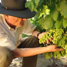
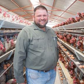
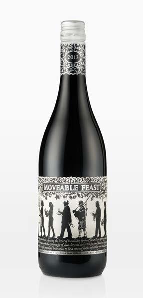
Work boasts a client range from an international insurance agency to retail outlets, beverages to interiors, portraits to landscape, sport and recreation to editorial and reportage.
The photographs reflected in the following pages illustrate the diversity of photographic assignments over the past few years.
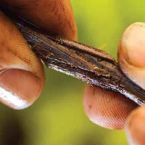
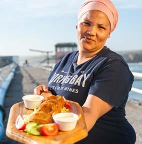
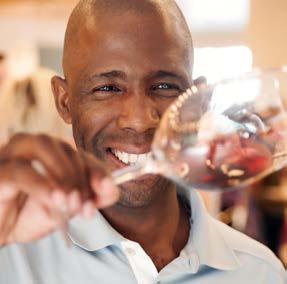
EDITORIAL PHOTOGRAPHY
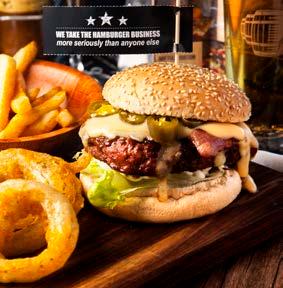
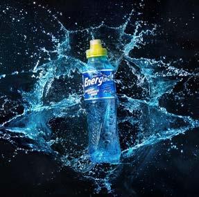
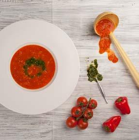
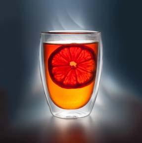
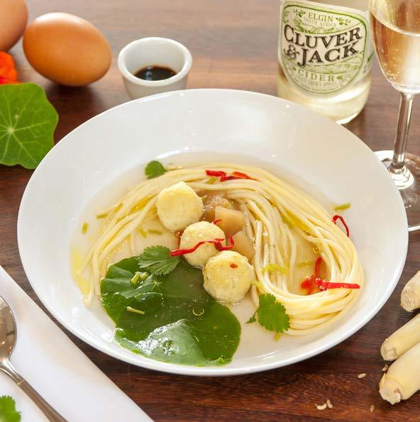
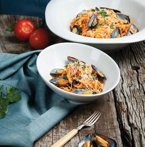
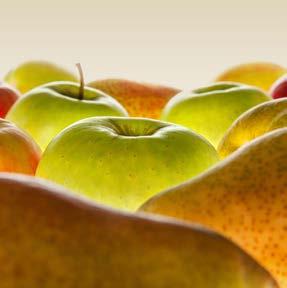
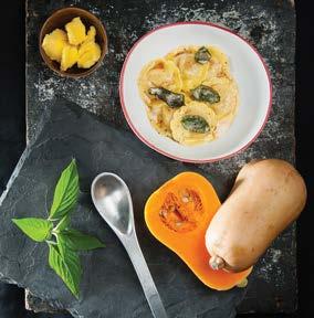
FOOD & BEVERAGE
Location & studio
Shot with either natural or artificial light in studio or on location.
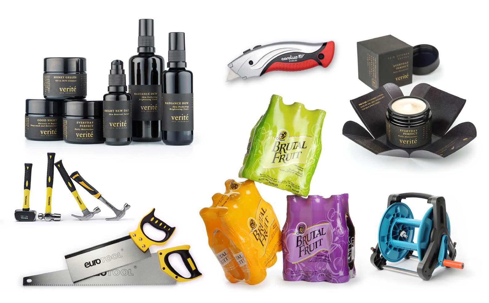
STUDIO
Isolated products
STUDIO
Styled products
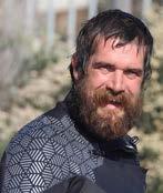
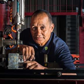
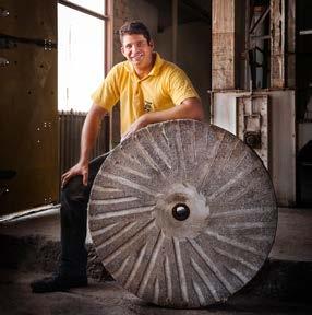
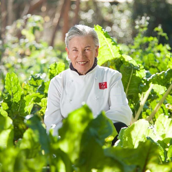
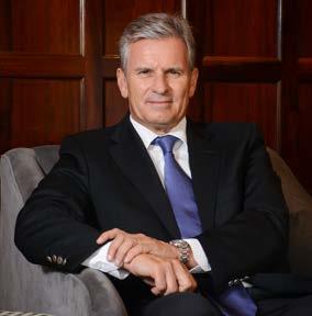
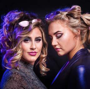
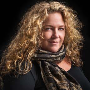
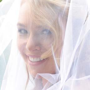
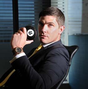
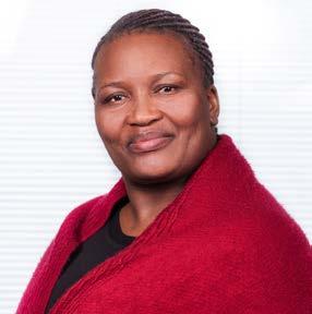
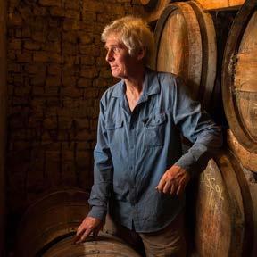
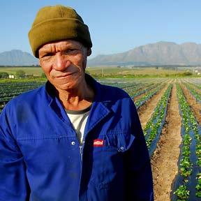
PORTRAITS
Photographed on location
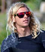
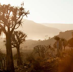
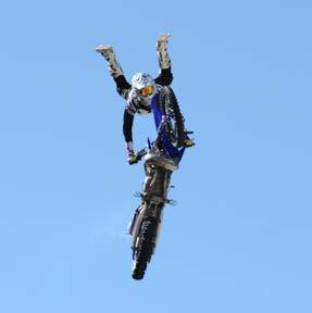
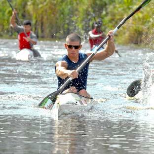
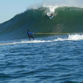
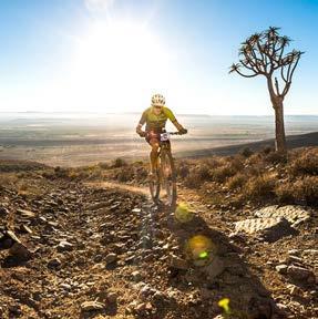
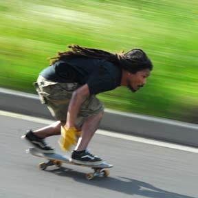
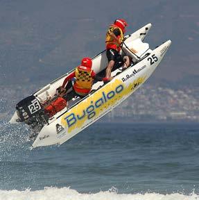
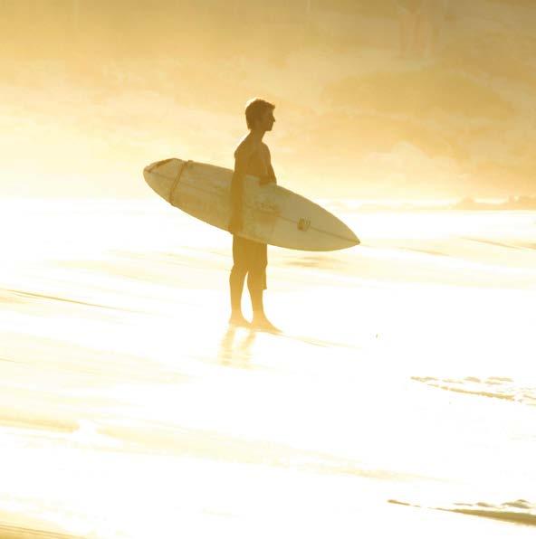
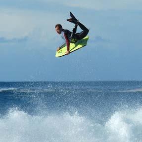
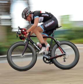
RECREATION AND SPORT
A love for the outdoors, sports and recreation caught on camera.
Whether commissioned or out of personal ambition, outdoor and sport activities have taken me to a variety of arenas whether they be the high flying adrenaline kicks of Ultimate X or weekend paragliding off the local peaks.
The images have been published in a variety of media from front page newspaper articles to magazine features. Images have also been used as billboards and exhibition stand backdrops and full wrap-around vehicle decals.