•EMaIL aNd SMS caMPaIGNS, aMazoN dELIvERaBLES, SocIaL MEdIa GRaPHIcS, 3-dIMENSIoNaL PRoduct IMaGES.
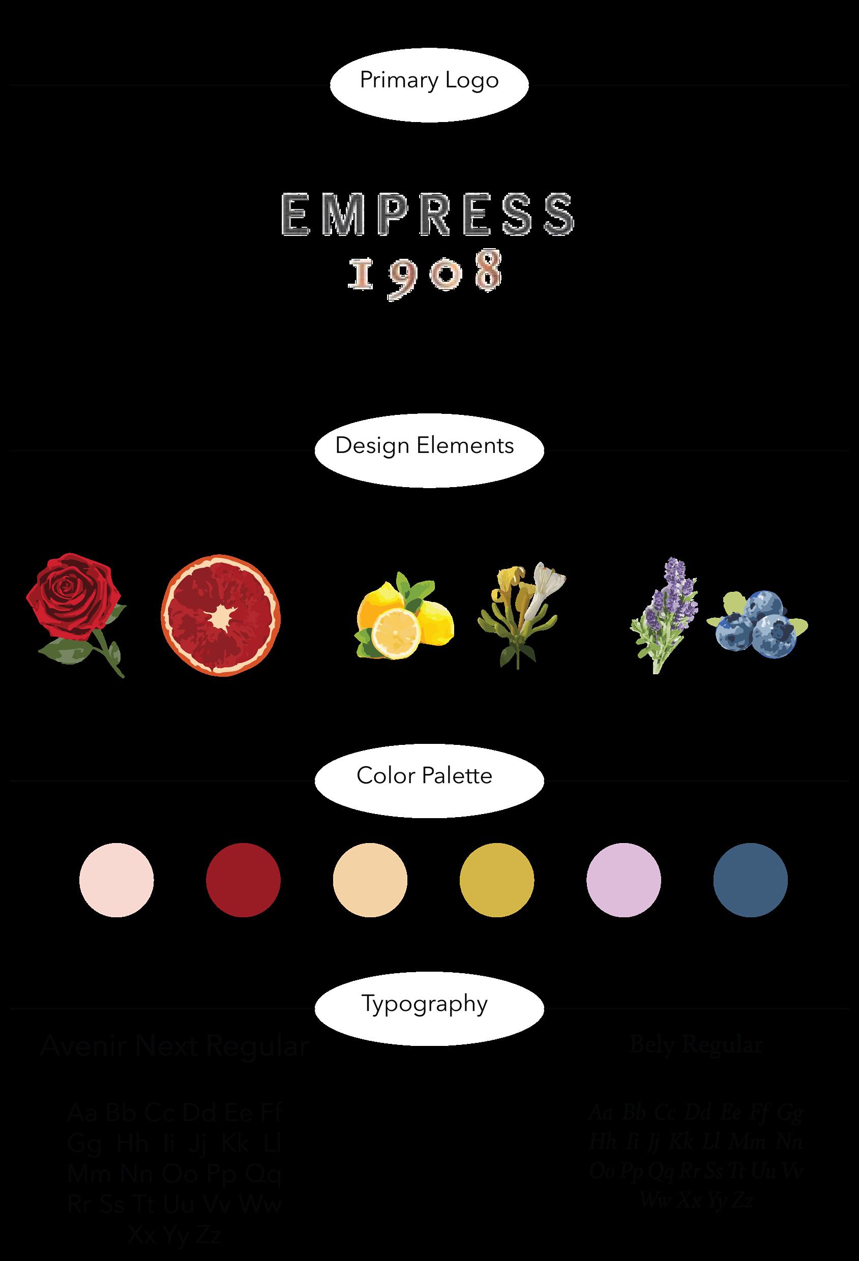
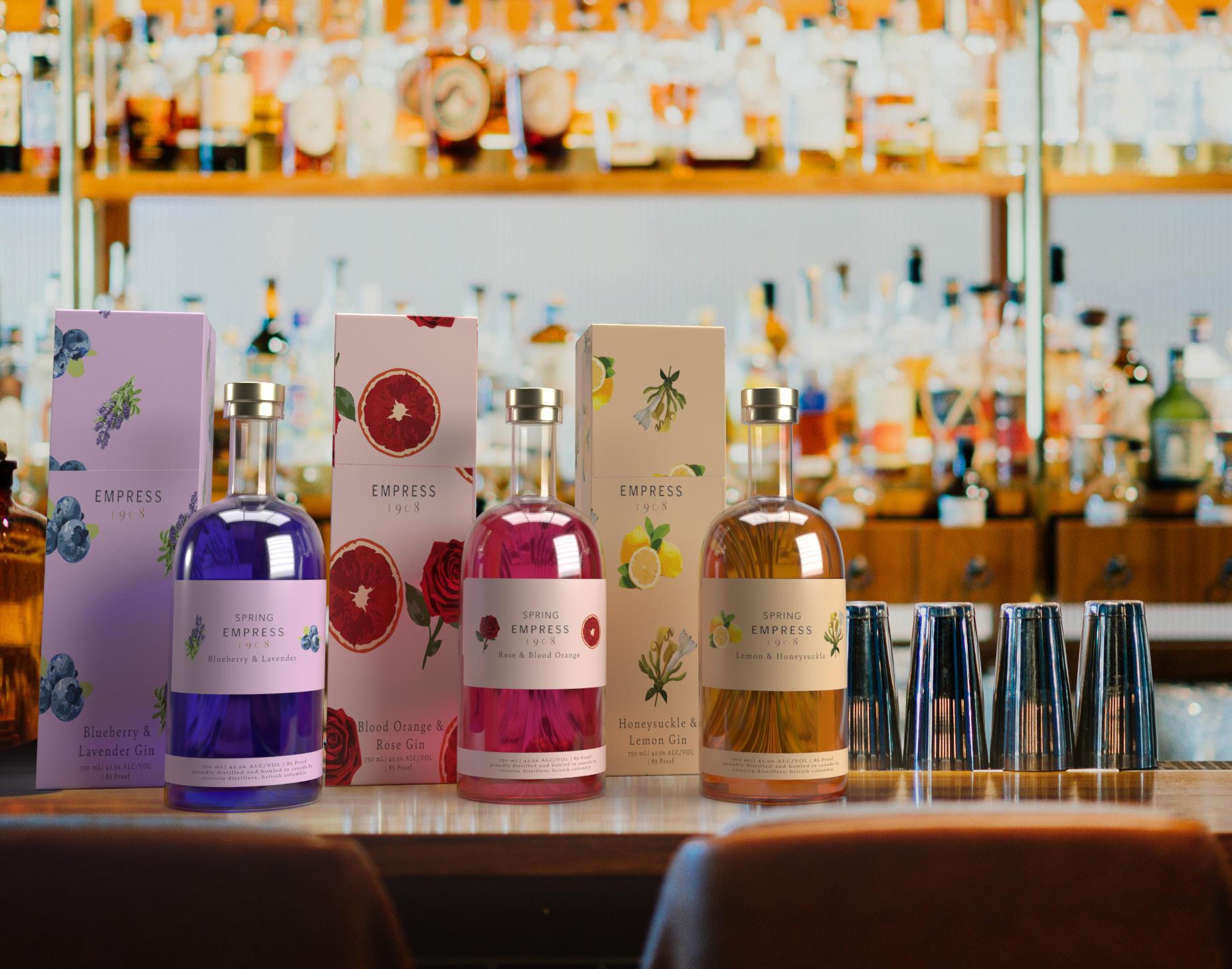
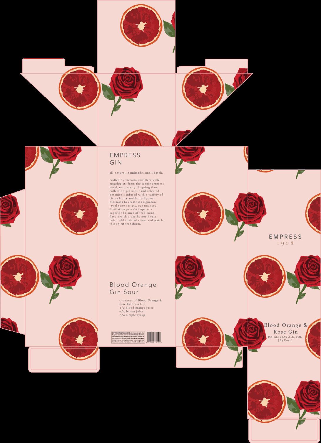
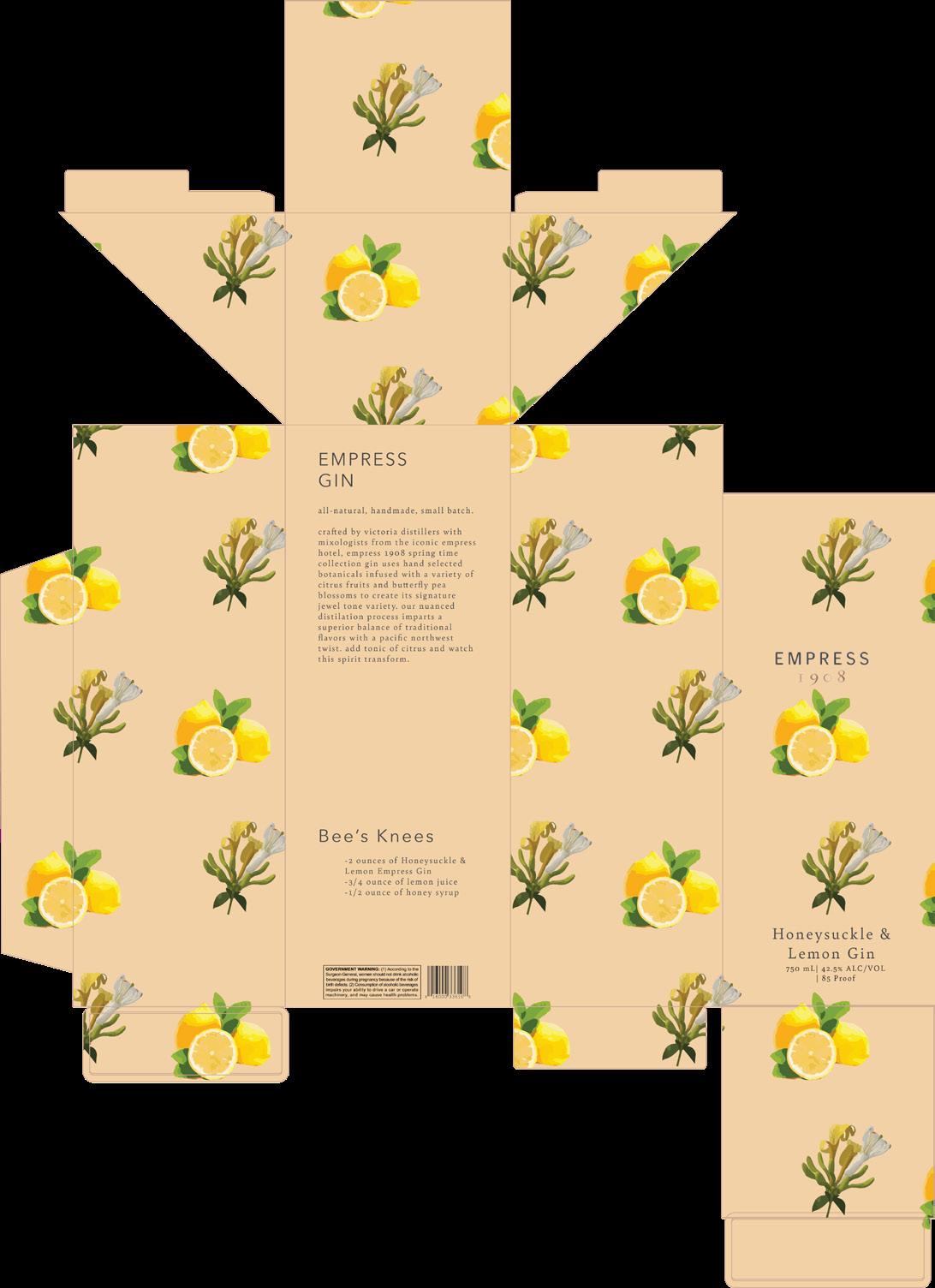
EMPRESS GIN SPRING COLLECTION
PackaGE dESIGN, SocIaL MEdIa, 3-dIMENSIoNaL Mock-uPS.
Design narrative
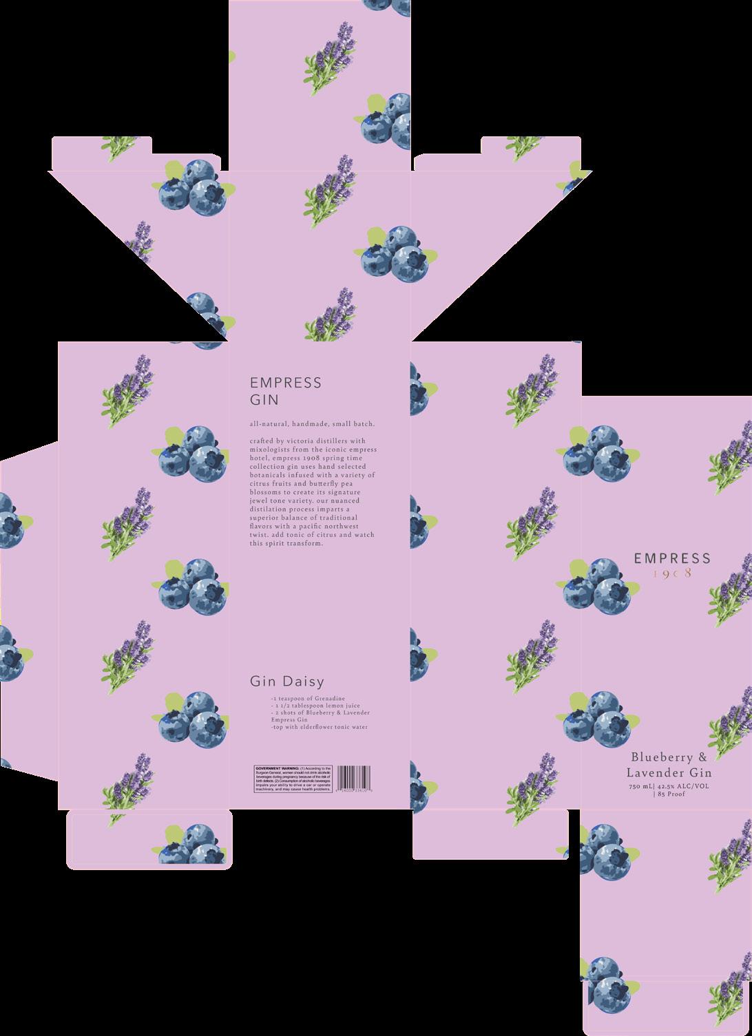
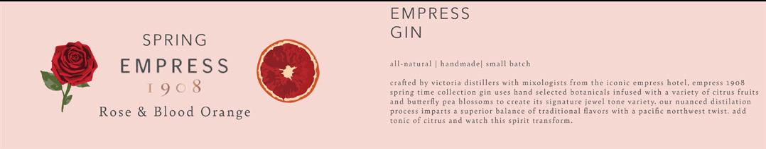
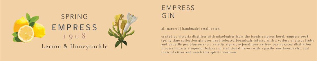
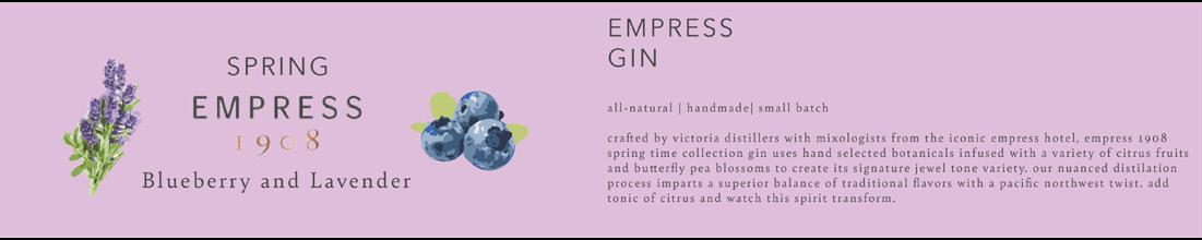
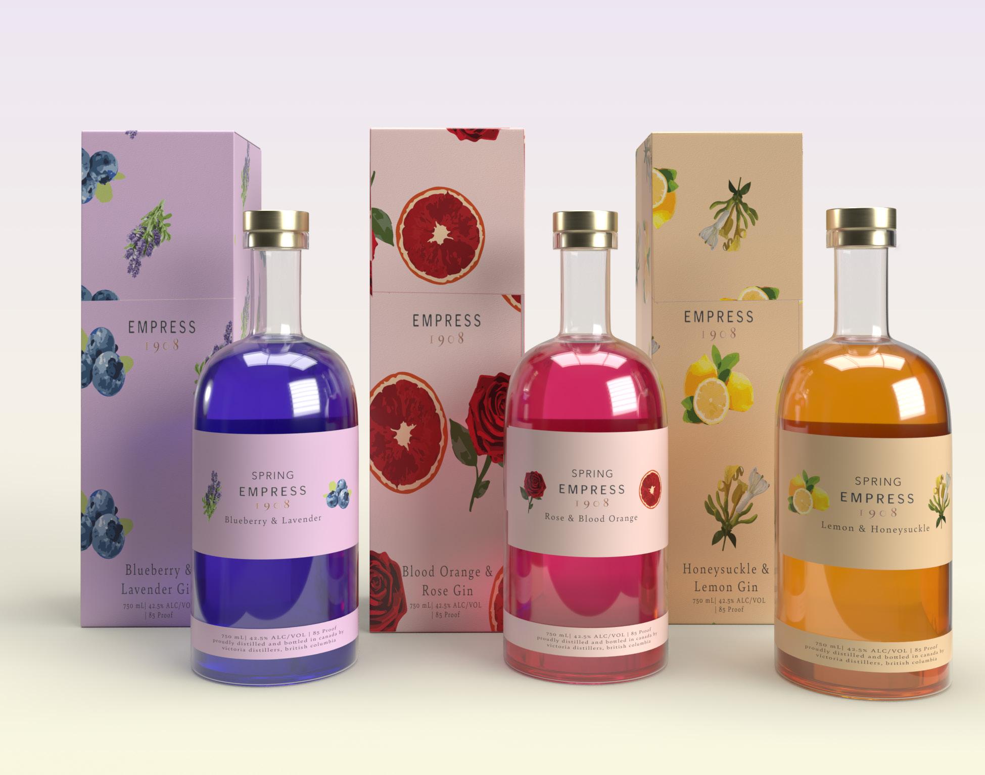
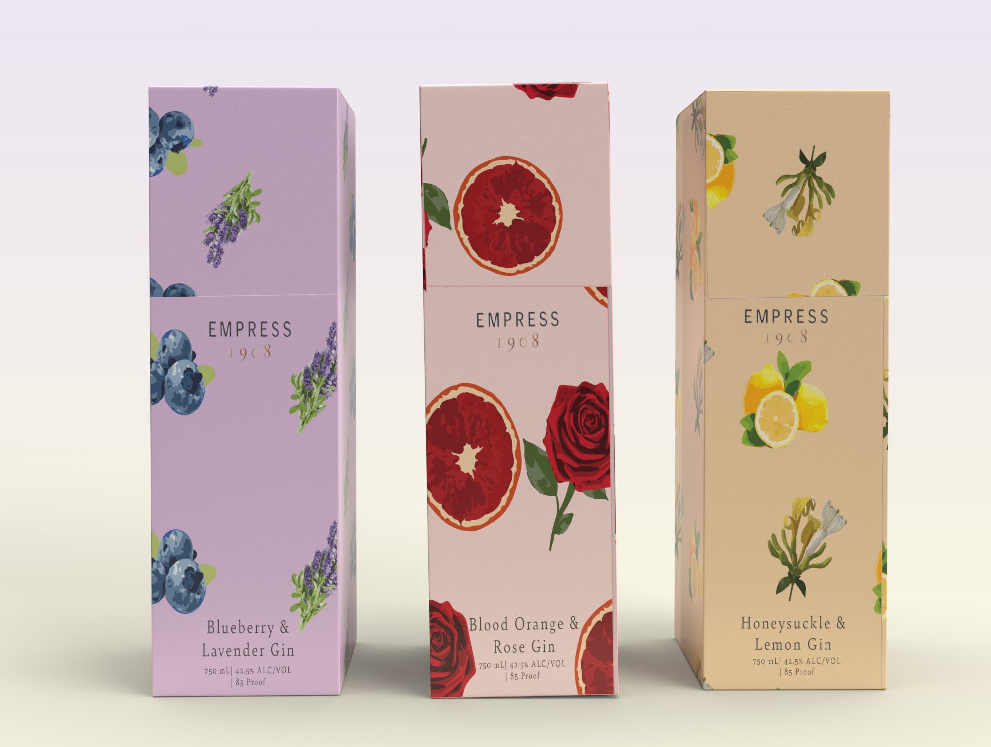
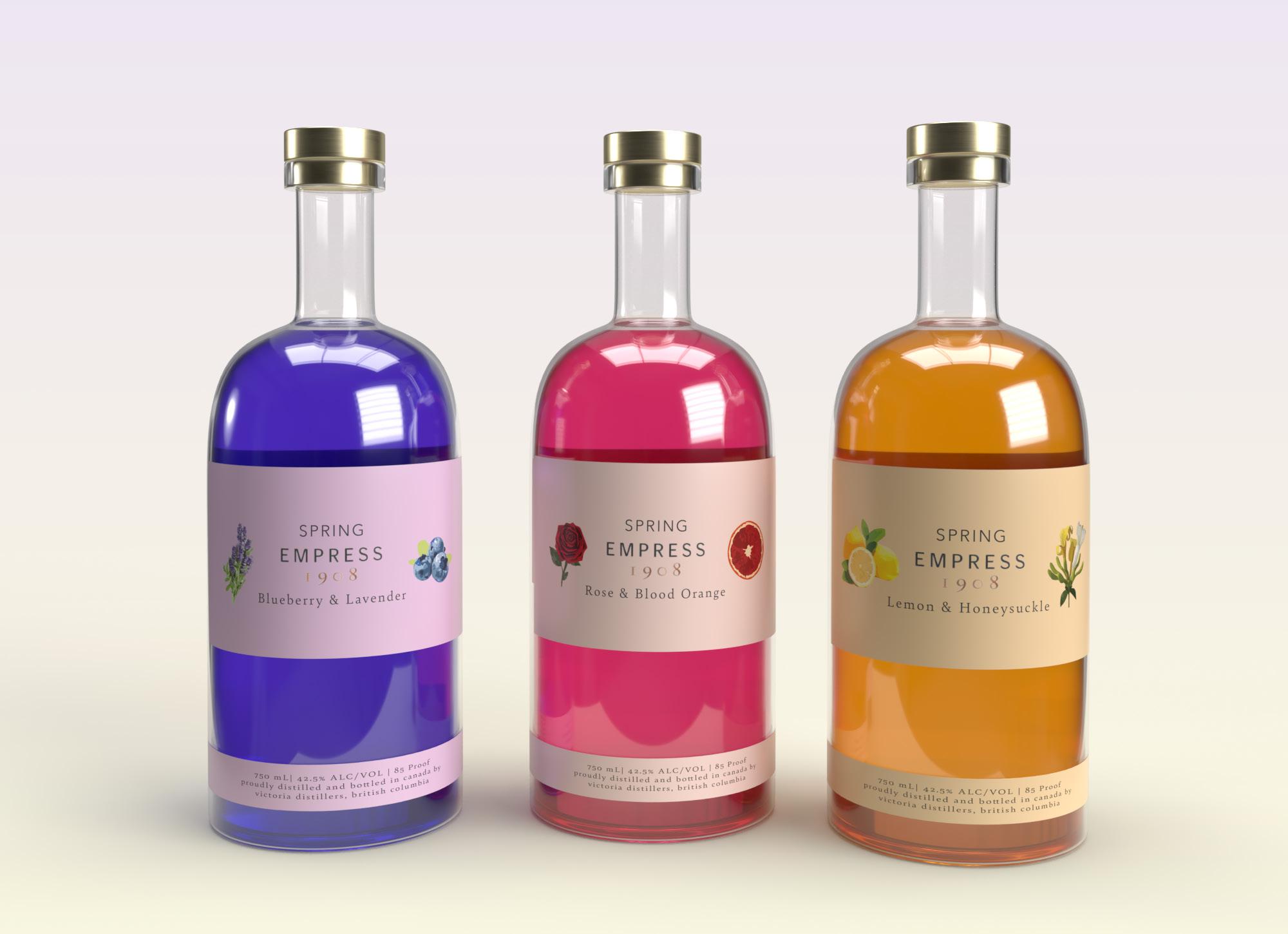
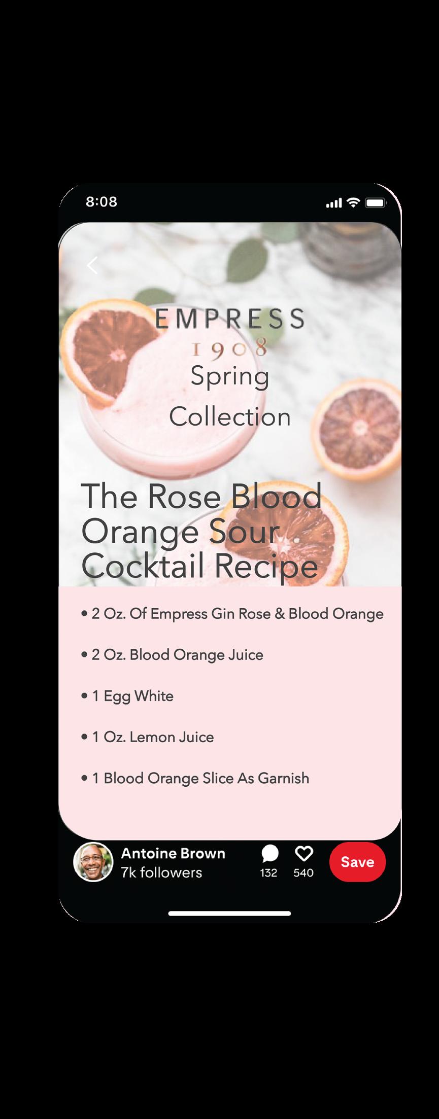
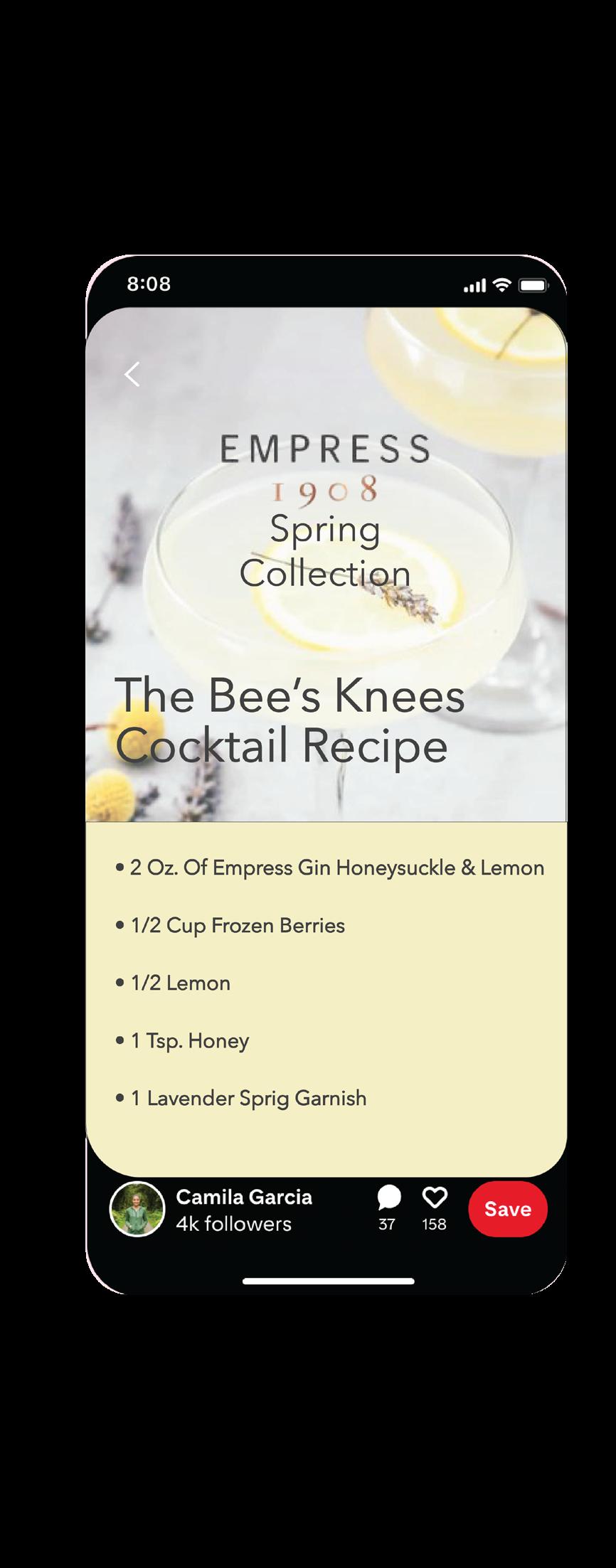
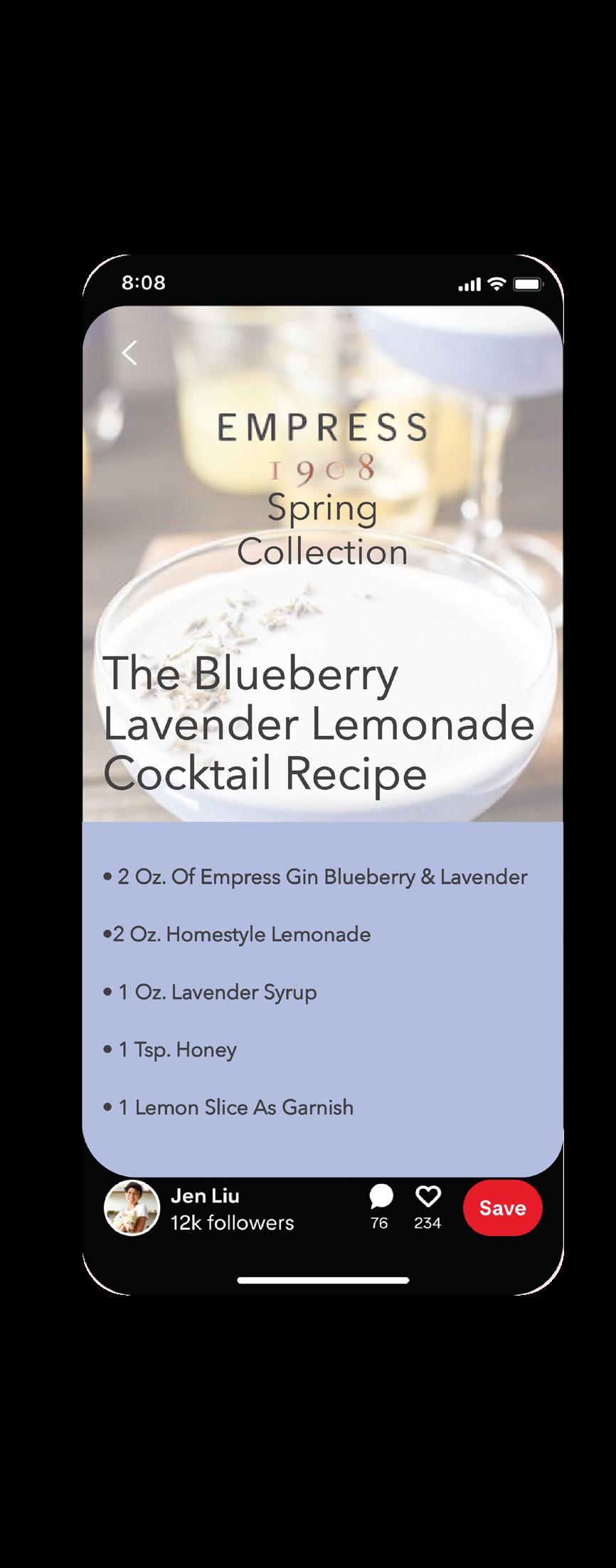
Empress is a brand that only provides one product of an iconic hand-crafted gin. This product is distilled with butterfly pea flowers which gives the product a long-lasting impression on its consumers. The design challenge of this product line is to create a line of differentiation and variety to their brand by releasing a spring line of ‘spring flavored’ gin. The main concept is to build upon the existing brand by giving them a variety of products as opposed to one single product, and seasonal at that. The color choices within these products are meant to feel light and airy. The typefaces chosen for the packaging on these products are Avenir Next Regular and Bely Regular which both match some similarities to the original branding of Empress Gin. The target audience of this product is those who are of age to drink alcohol (21+), and those who enjoy artistic patterns and designs on their packaging for products. There is not a specific age, nor income for these products. The design goal for this project is to create a more vibrant and expressive package design for Empress Gin while also aesthetically following some of their brand guidelines. The package design will have an expressive pattern that includes the ingredients and flavors that each Spring Edition of Empress Gin includes. The ingredients used in these products will primarily be focused on florals and fruits to embody the essence of springtime. 3D mock-ups were created to show what each bottle and box would look like as a packaged set. Empress Gin’s Spring Collection is promoted primarily on Pinterest by sharing recipes that can be created using this new line of flavored gin.
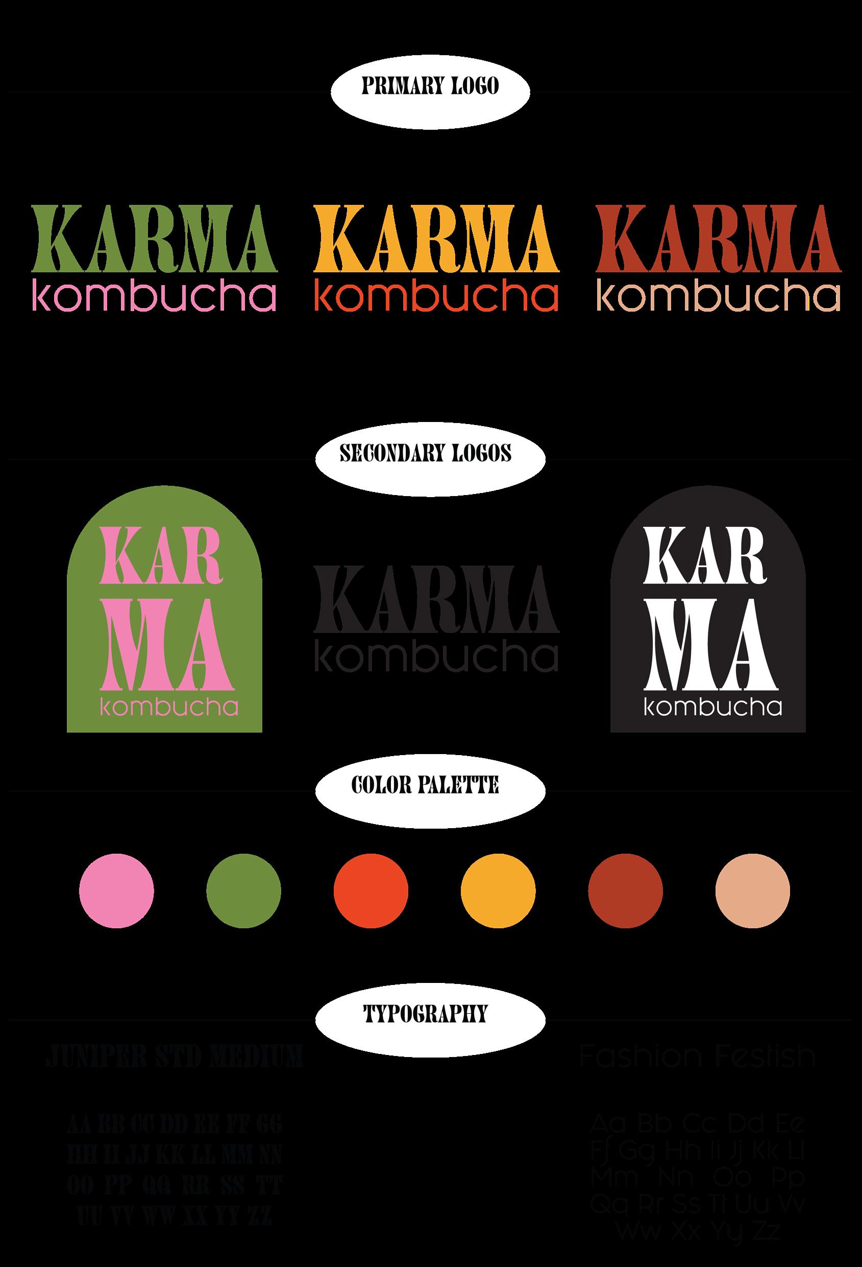
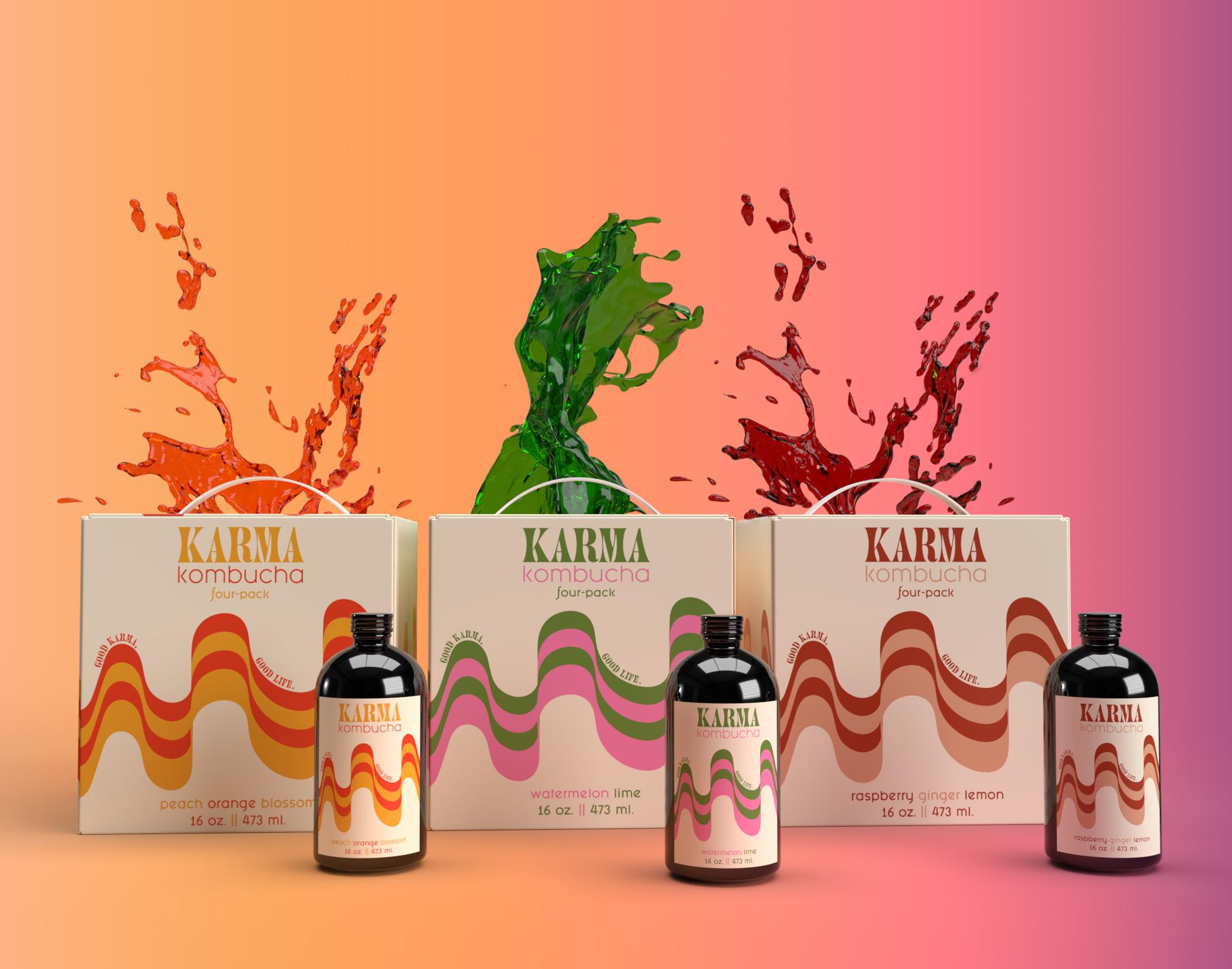
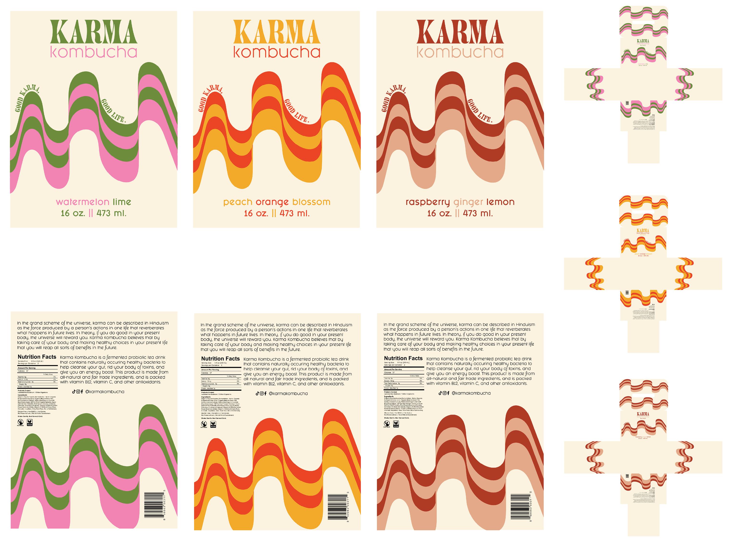
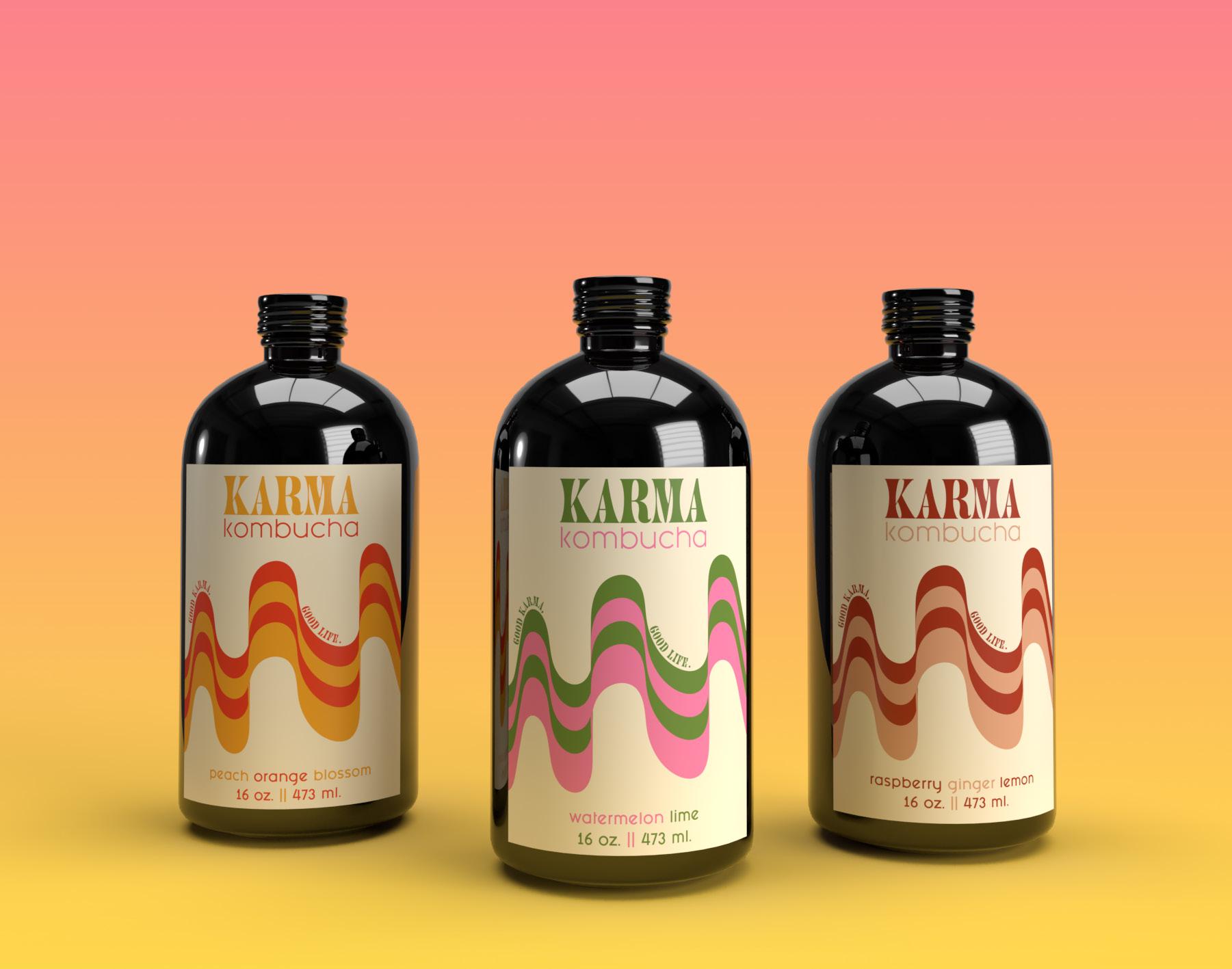
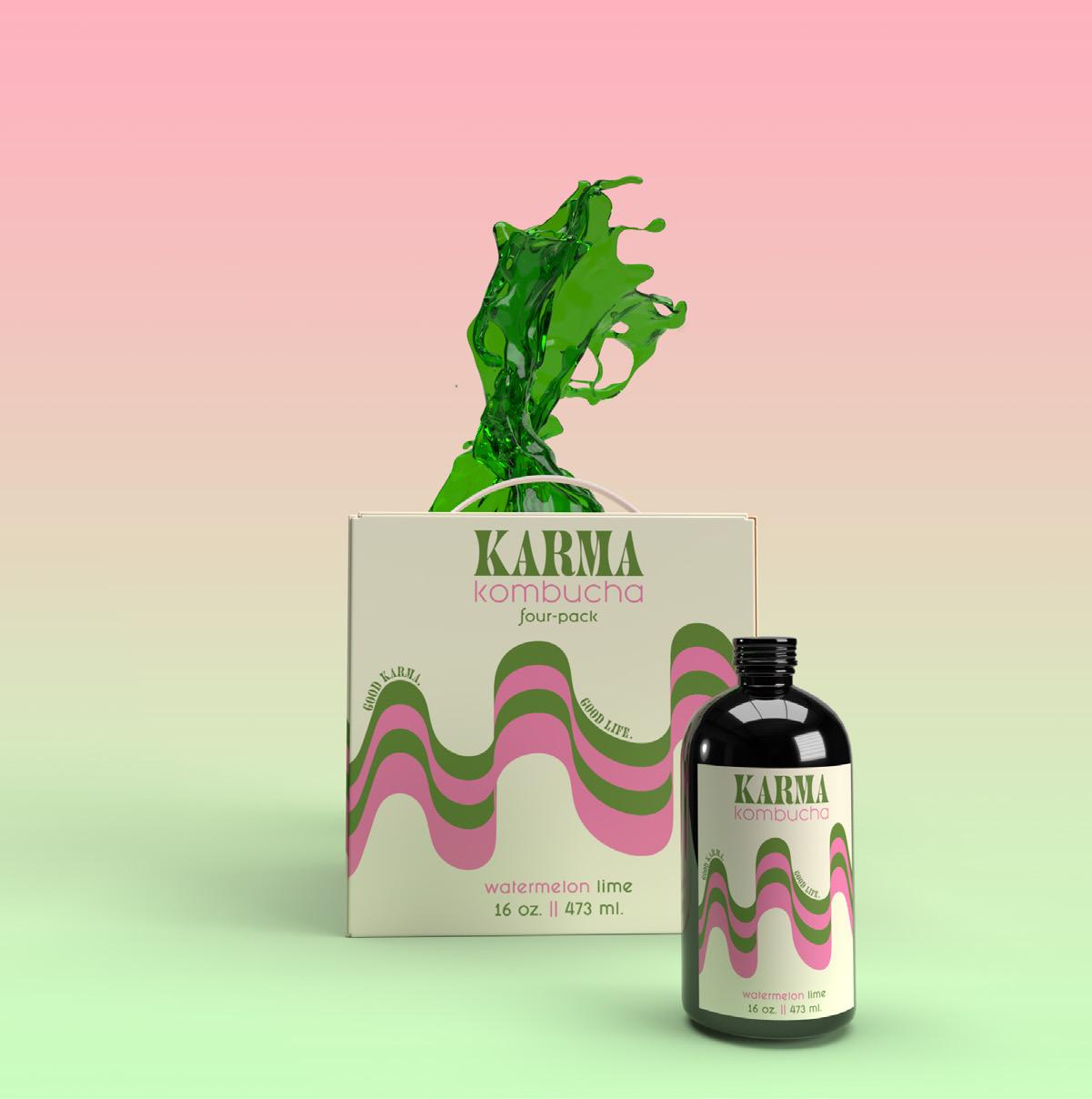
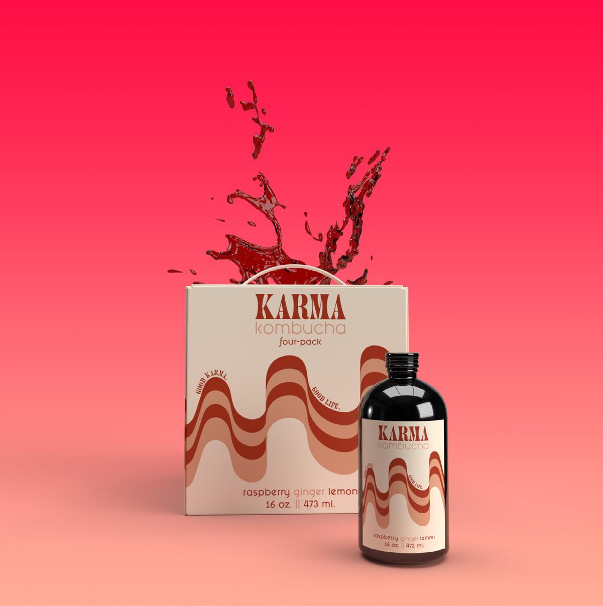
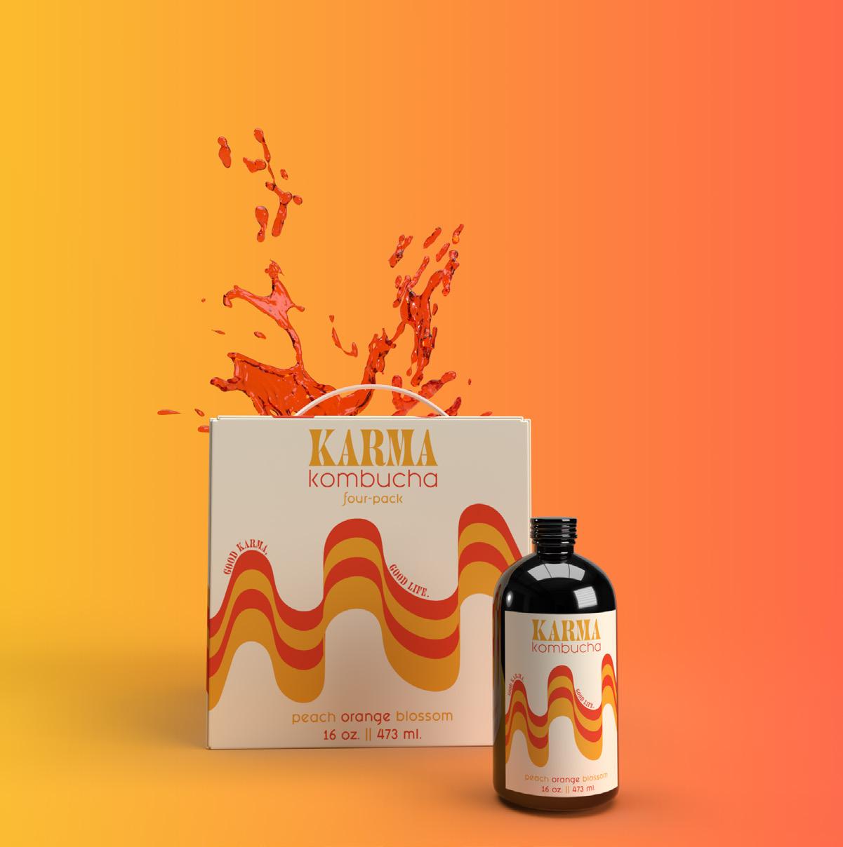
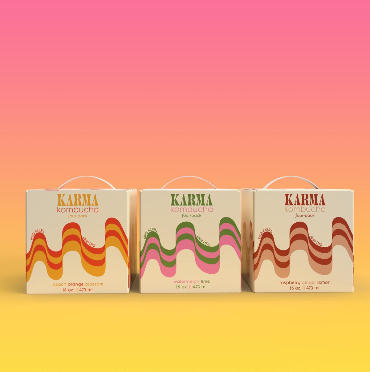
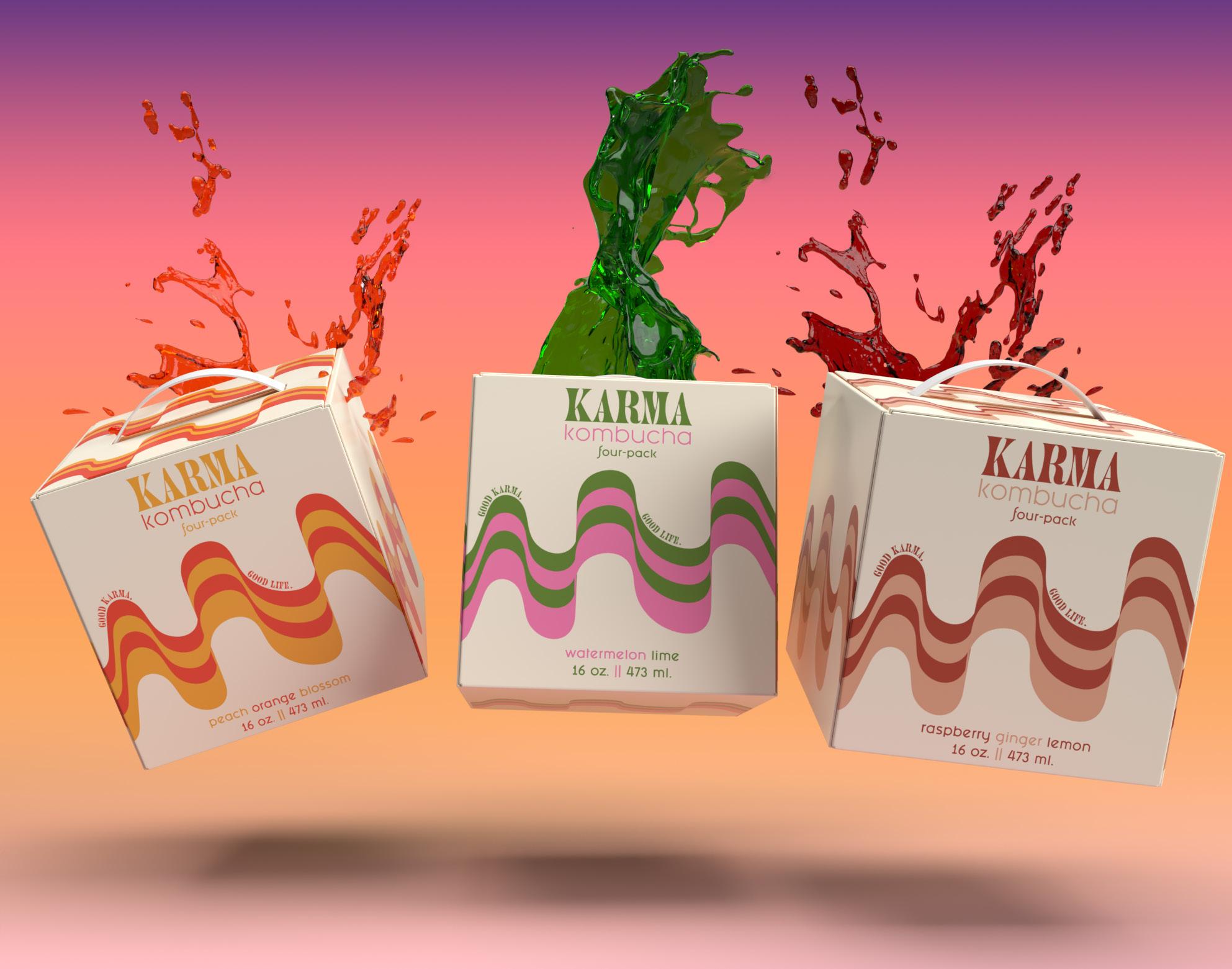
Karma Kombucha is a fermented pro-biotic tea drink that has a wide variety of health benefits. The main goal for this product is to create a brand identity and design packaging for kombucha bottles and four-pack boxes. Karma Kombucha believes that by drinking their products that each consumer will be rewarded with the health benefits of their products. Karma Kombucha offers three flavors: Watermelon Lime, Peach Orange Blossom, and Raspberry Ginger Lemon. All of these flavors can be bought separately and are sold in a four-pack of each flavor. This brand of kombucha prides itself by being 100% vegan, and uses all-natural and fair trade ingredients. The target audience of this brand is for people between the ages of 16-35, and for people who are invested in taking care of their bodies. The designs for the label and box packaging were inspired by 60’s-70’s design elements combined with minimalistic typeface choices. The typefaces chosen for this brand are Juniper Std and Fashion Fetish Bold and Regular. The colors chosen for this project are meant to be bright and eye-catching, but also feel grounded and earthy. Karma Kombucha’s Brand Statement:”In the grand scheme of the universe, karma can be described in Hindiusm as the force produced by a person’s actions in one life that reverberates what happens in future lives. In theory, if you do good in your present body, the universe will reward you. Karma Kombucha belives that by taking care of your body and making healthy choices in your present life that you will reap all sorts of benefits in the future...”
Project title
Project title Karma KombuCha
KARMA KOMBUCHA
Package Design
3-Dimensional mock Design narative
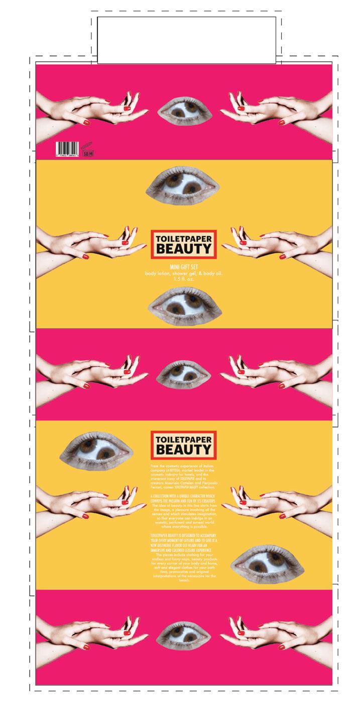
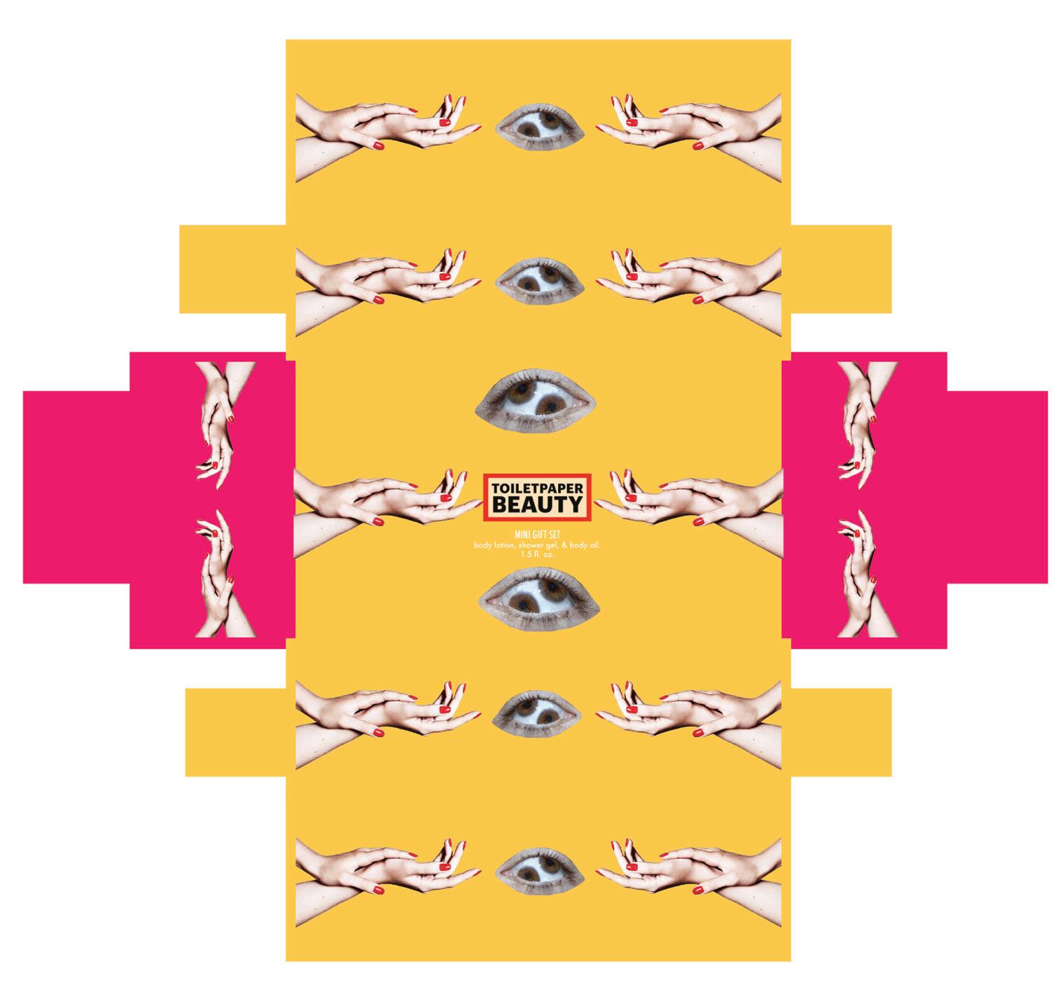
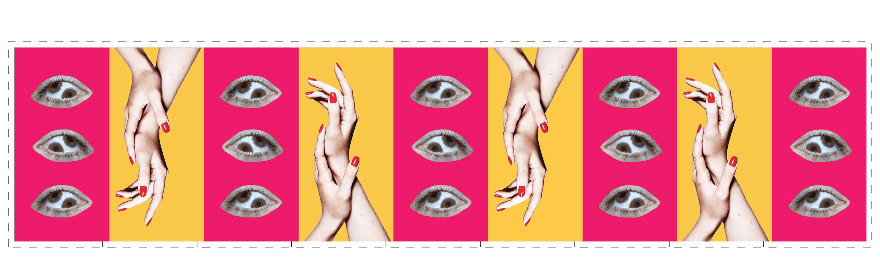
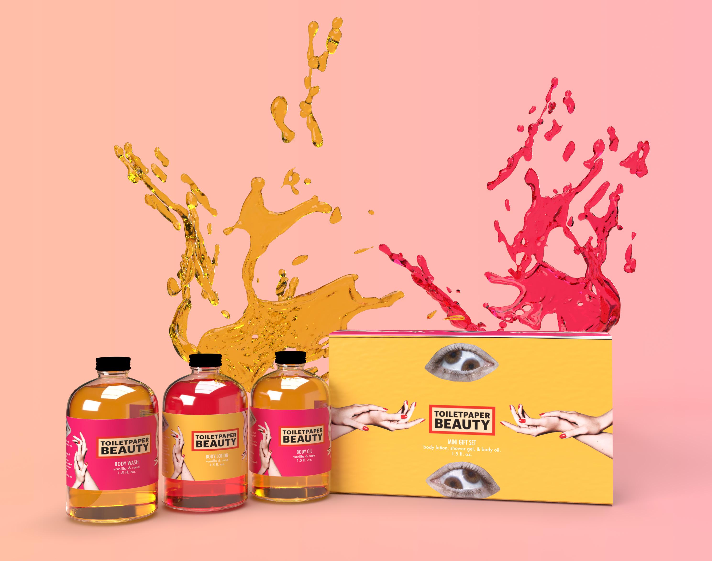
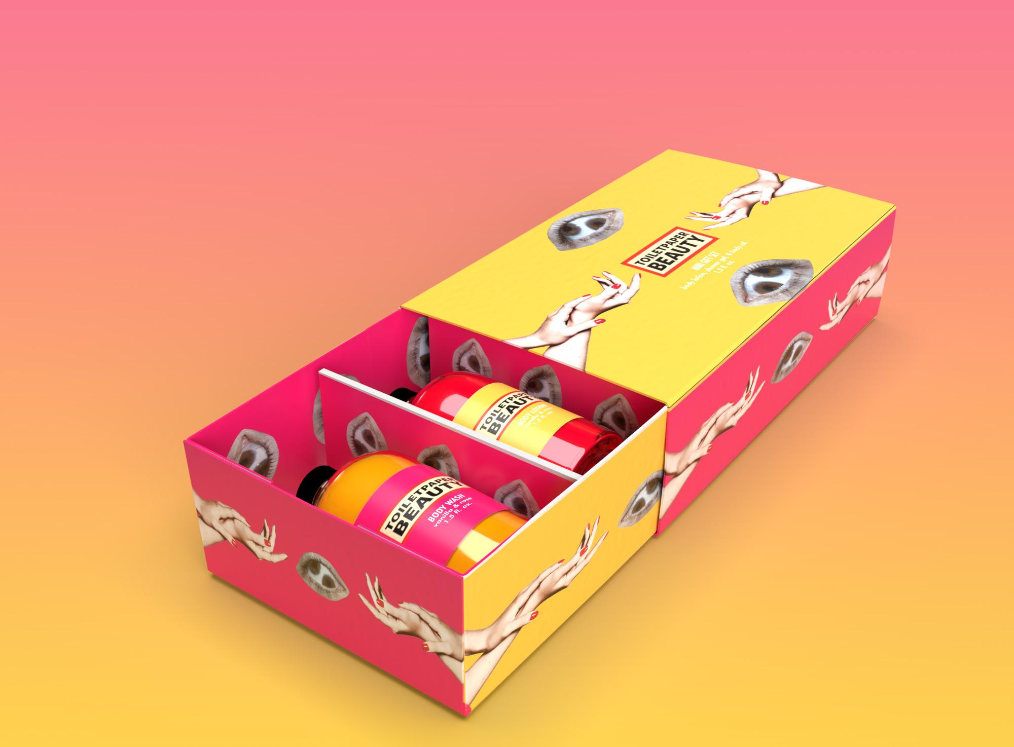
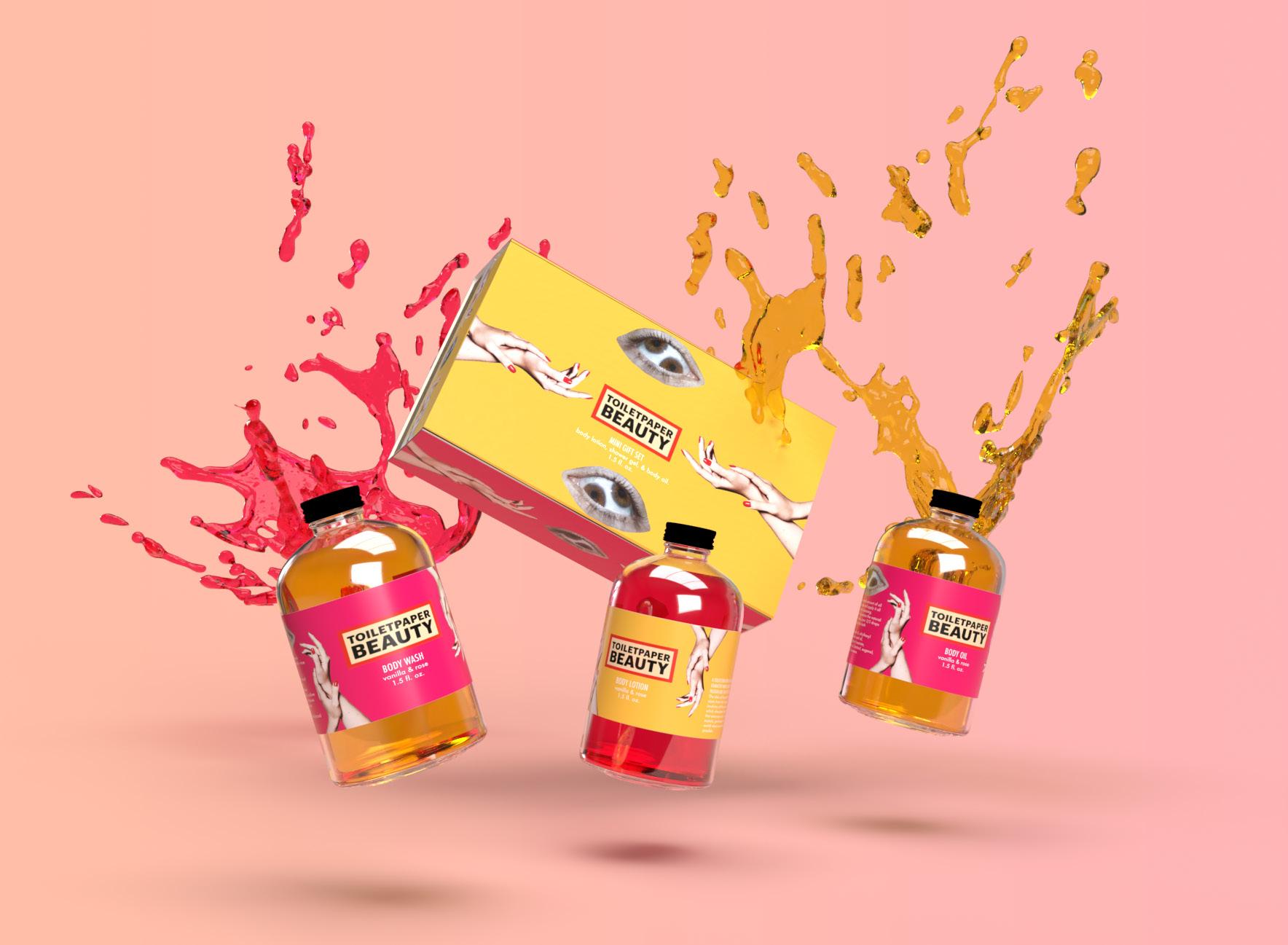
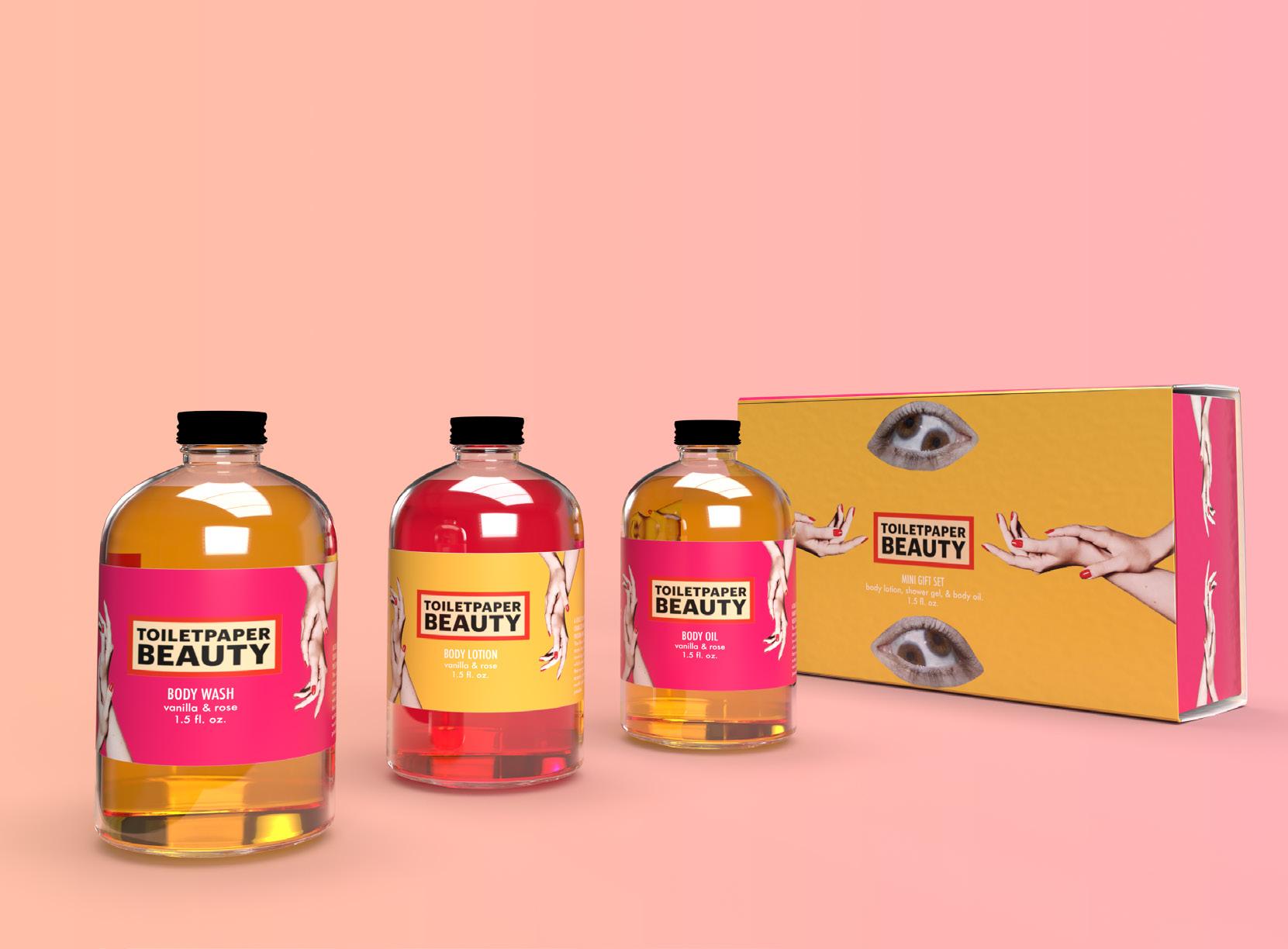
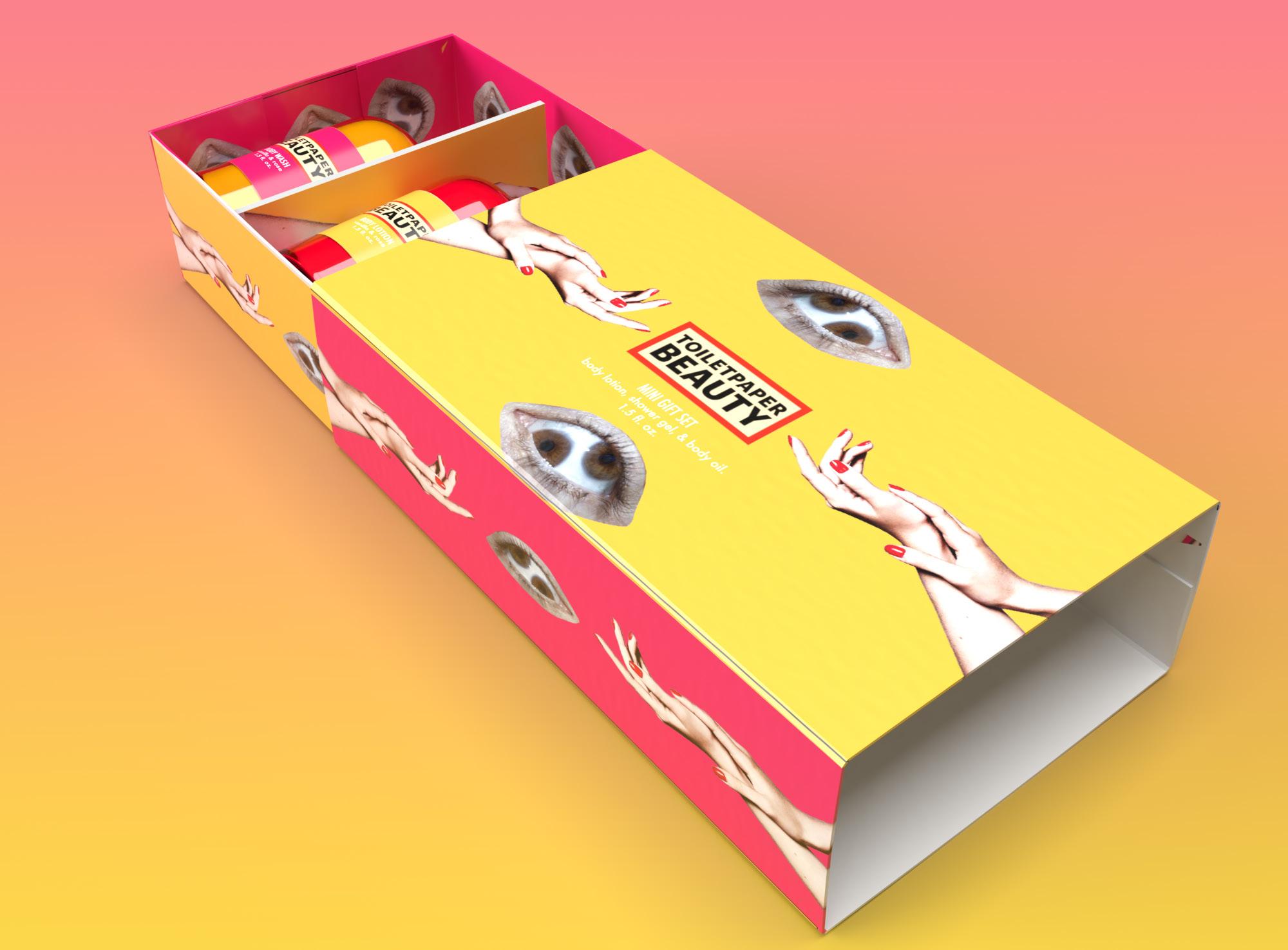
The main goal of creating this rigid box structure is to create a mini gift set for Toilet Paper Beauty’s line of bath products. Many of this brand’s product set for their bath and beauty products come in pairs of two, and are full size bottles. This rigid box structure contains three mini bottles for their consumers to try multiple products from their brand. This mini gift set includes a body oil, a body lotion, and and a body wash that are all vanilla and rose scented. The packaging design follows a similar surrealistic style and combination of randomized items. The majority of the branding for Toilet Paper Magazine and Toilet Paper Beauty include bright colors such as the hot pink and bright yellow chosen for the packaging on this gift set. The two typefaces chosen for this packaging are Futura Medium for main titles and Avenir Next Regular for body text. The glass bottles inside the box were originally clear glass with silver caps. The caps were painted with black paint, and the glass was coated internally with clear glue and ink in order to look like colored glass bottles. Overall, this package design turned out to be very consistent with the existing style of Toilet Paper Beauty’s branding and was just as vibrant and eye-catching.
Project title
Karma KombuCha
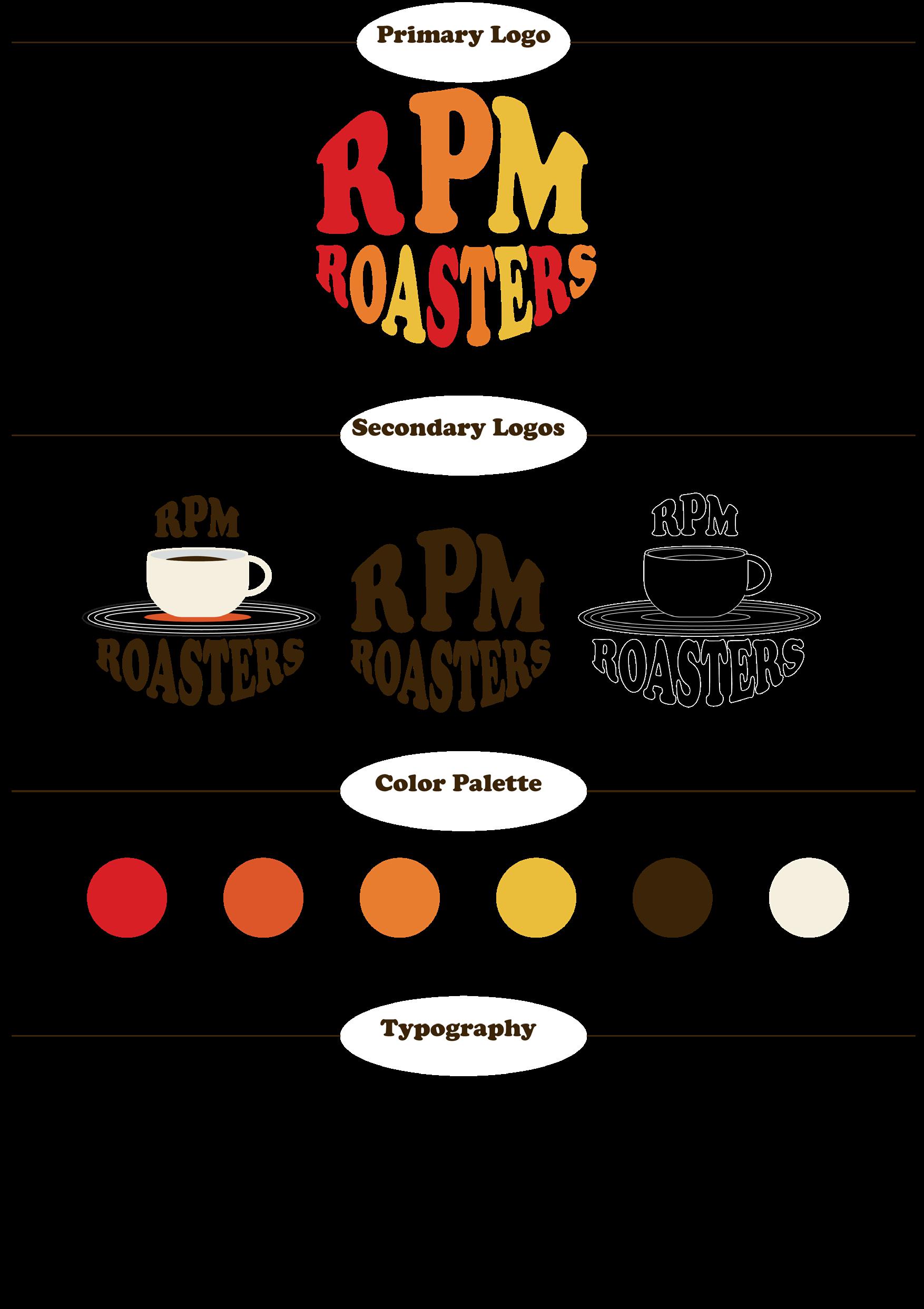
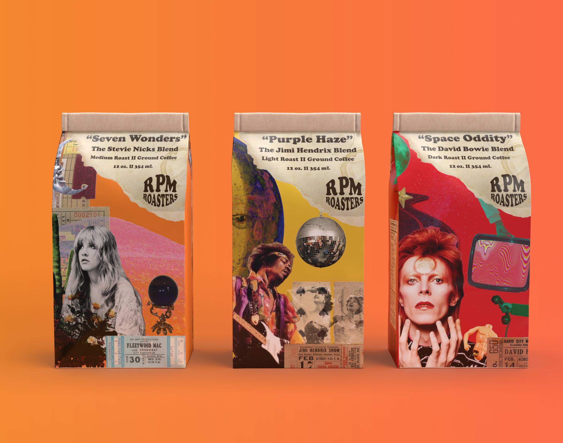
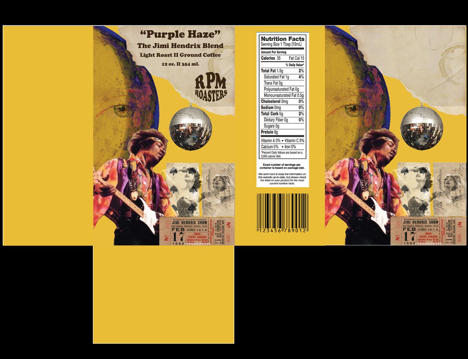
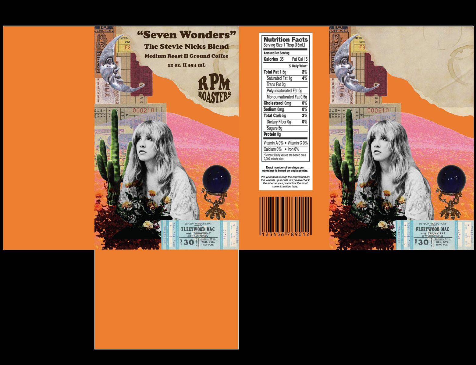
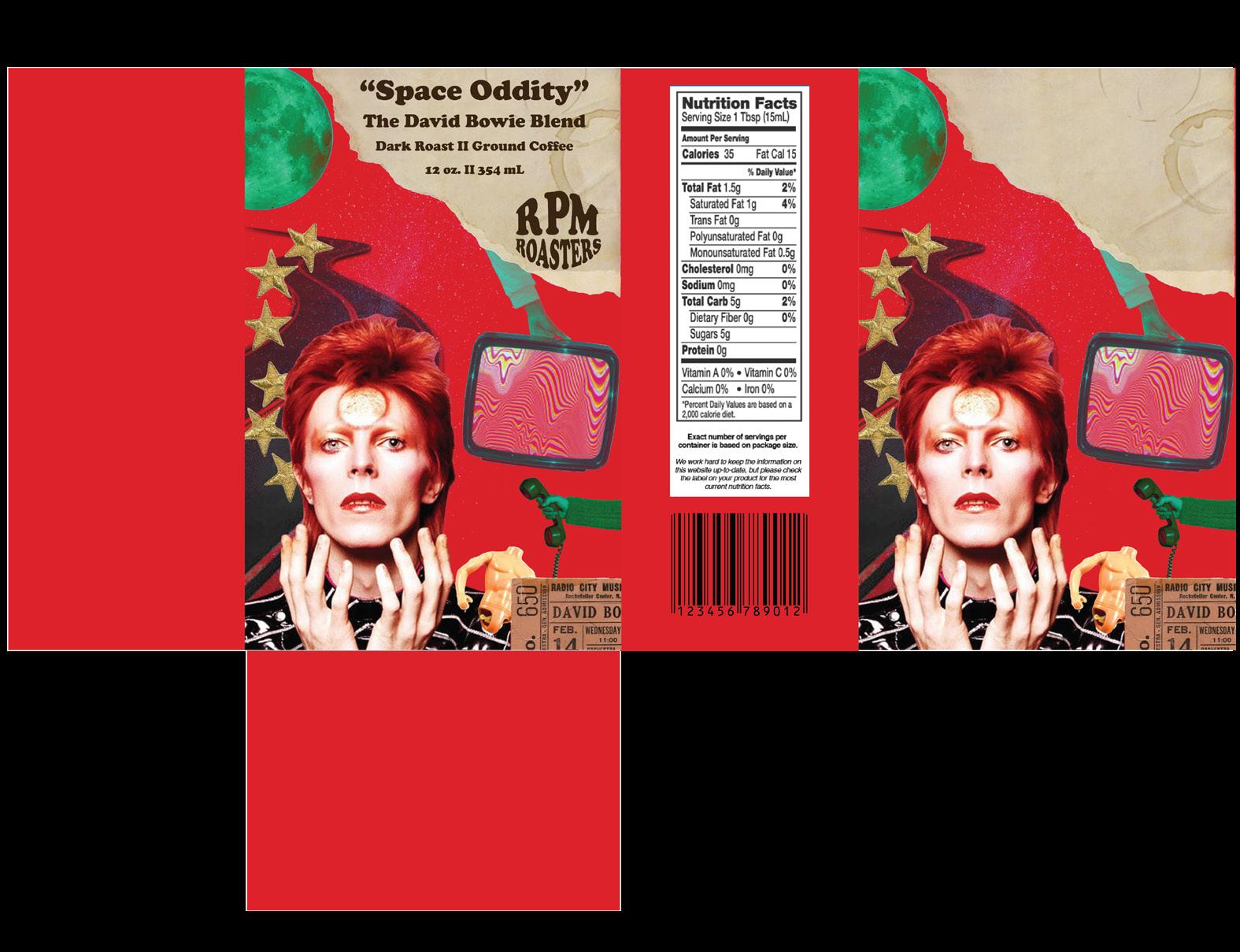
RPM ROASTERS
BRaNdING IdENtIty, PackaGE dESIGN,
ENvIRoNMENtaL aNd 3-d Mock-uPS.
Design narrative
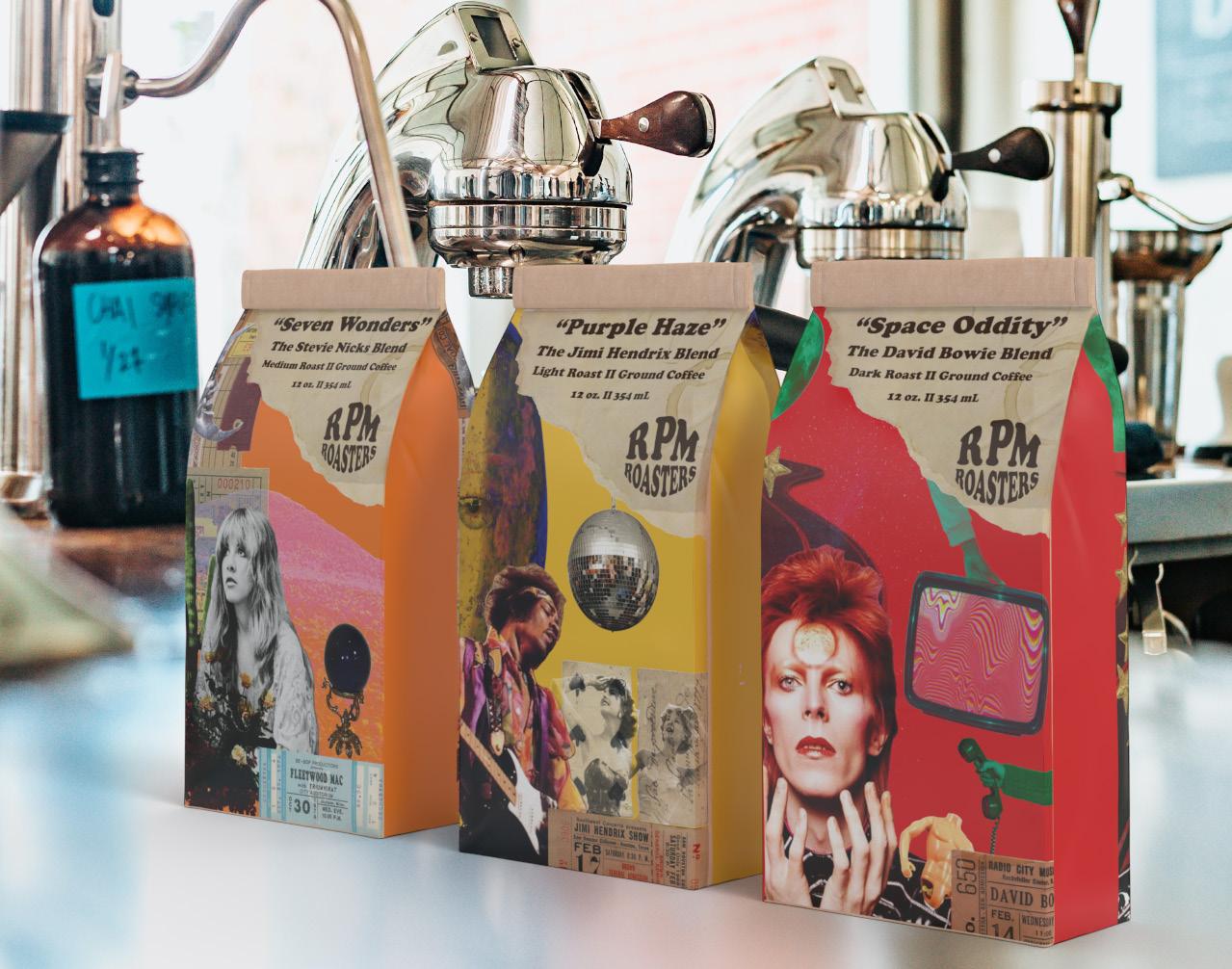
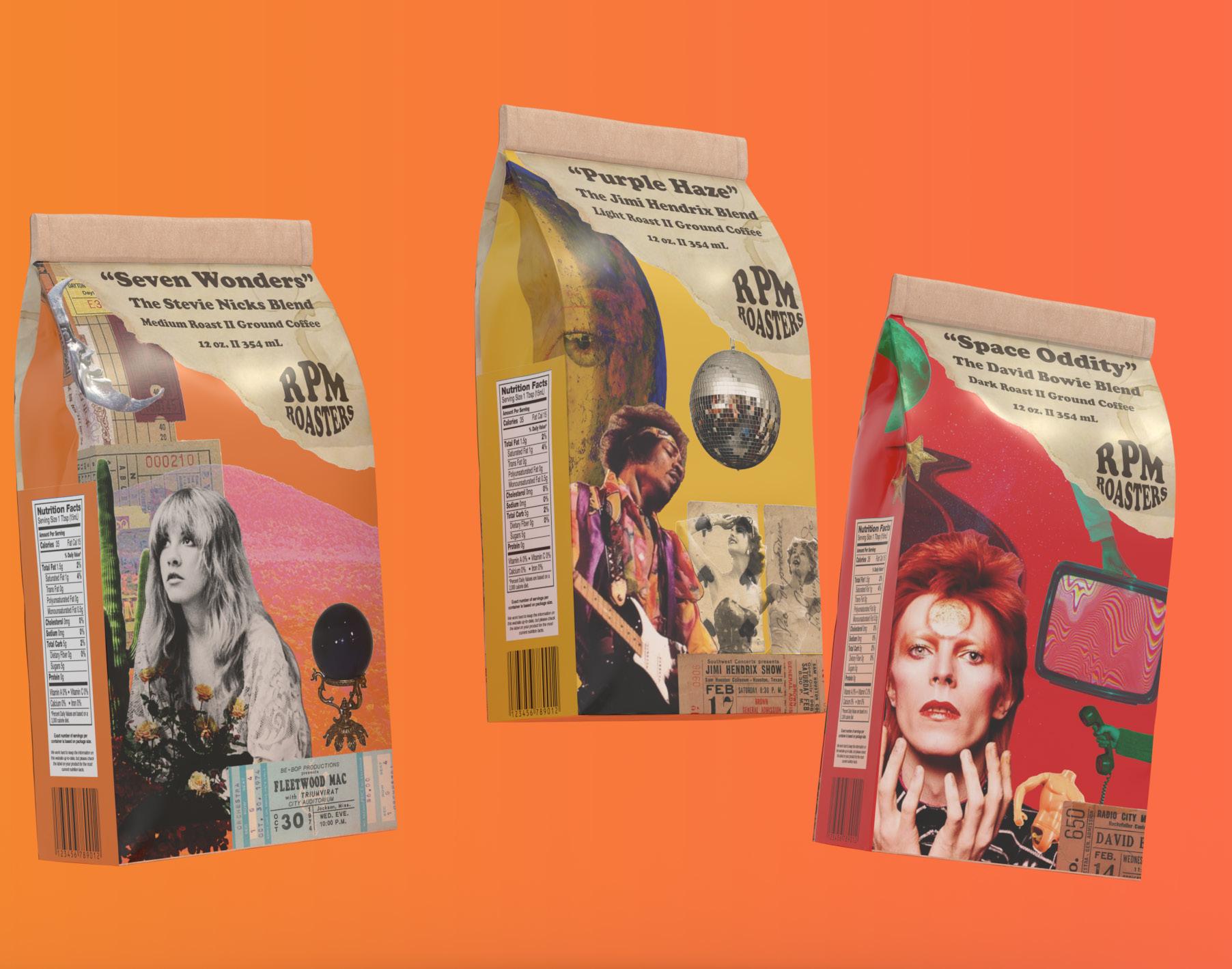
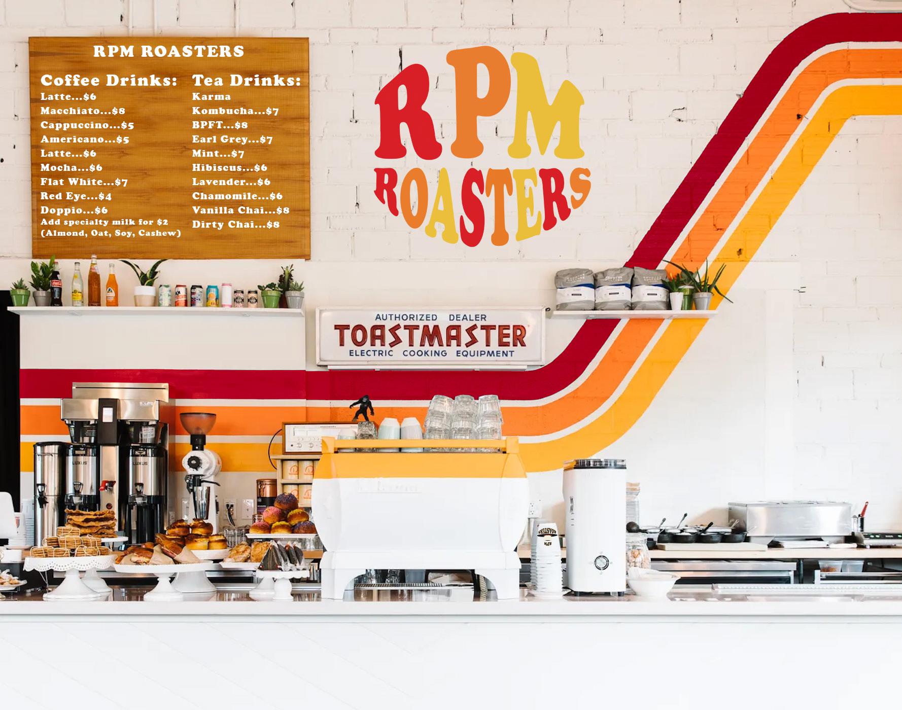
RPM Roasters is a coffee and vinyl shop that is not the typical coffee shop experience. This brand offers its customers a wide variety of vinyl music to listen to and shop for while enjoying their favorite caffeinated beverages. Coffee packaging was created for this brand that is in line with RPM Roasters love for coffee and music. Each of the three coffee packages were created with a collage style of art that are focused on musical artists like Stevie Nicks, David Bowie, and Jimi Hendrix. Each of the specific coffee packages were created around the artist and the song chosen for each product. These coffee packages would only be sold in the shop. An environmental mock-up was created of what the inside coffee counter might look like for RPM Roasters. The design challenge with this business is to create a brand identity that entices music and coffee lovers from all over and create an environment that feels warm and inviting. The brand’s main theme focused of influences from the 60’s and 70’s era of music and design. The color palette chosen for this project is centered around 60’s and 70’s design influences. The typography chosen for this brand are Cooper Black for main titles and headings, and Futura Condensed was used for body text. The target audience for RPM Roasters is for ages 16-35, of all occupations and genders. This brand was created and tailored to attract those who are creatives, dreamers, and for those who appreciate good music. RPM Roasters would like to be known as a vibrant and lively brand that is inclusive to people from all different backgrounds. Another goal of this brand is to create a warm and inviting space that people will want to continuously come back to, and have many regular customers come in as a way to make connections with their local community.
Project title
rpm roasters
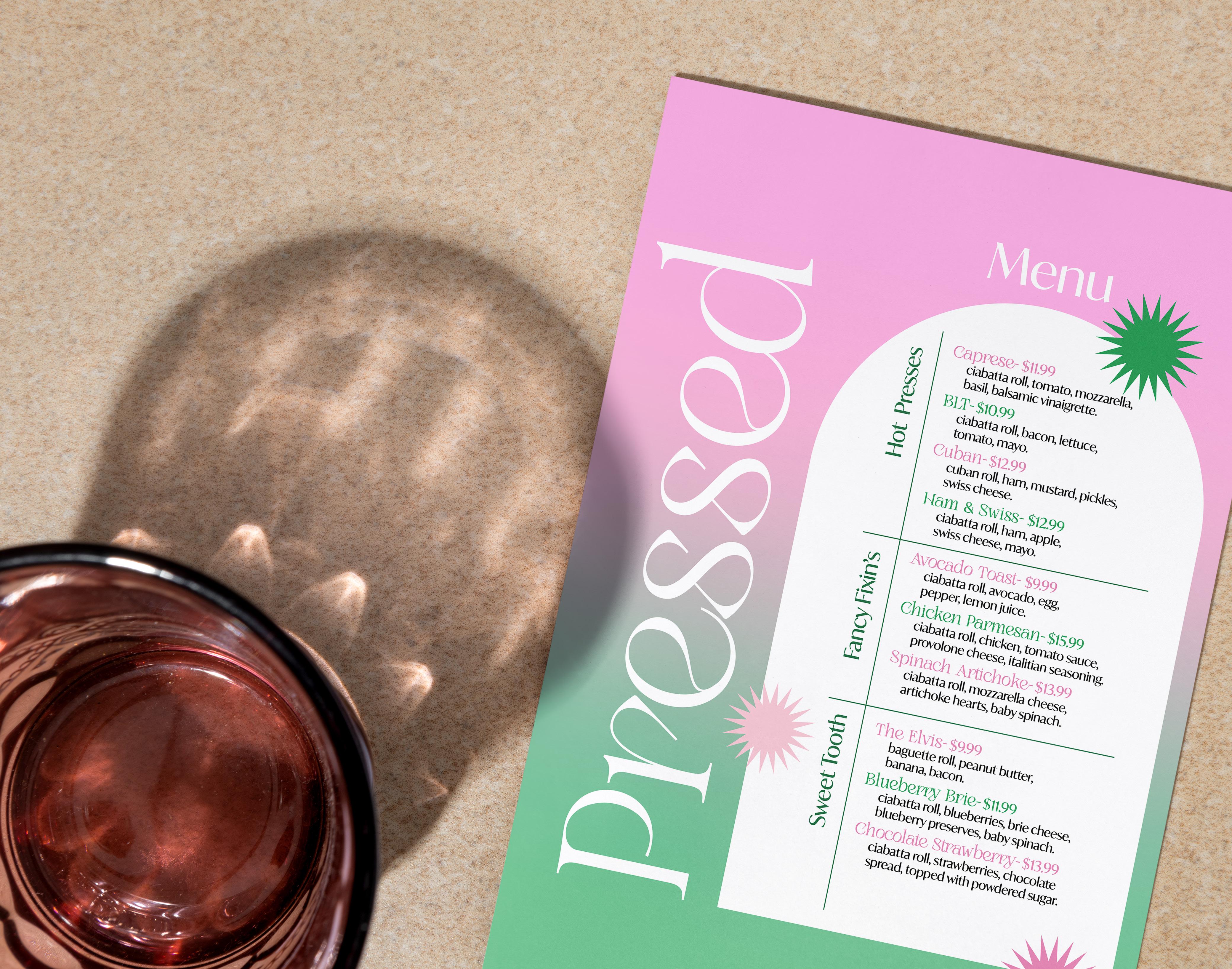
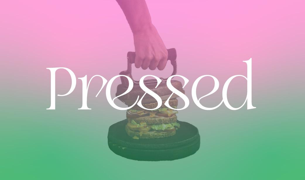
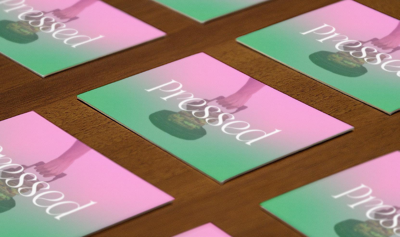
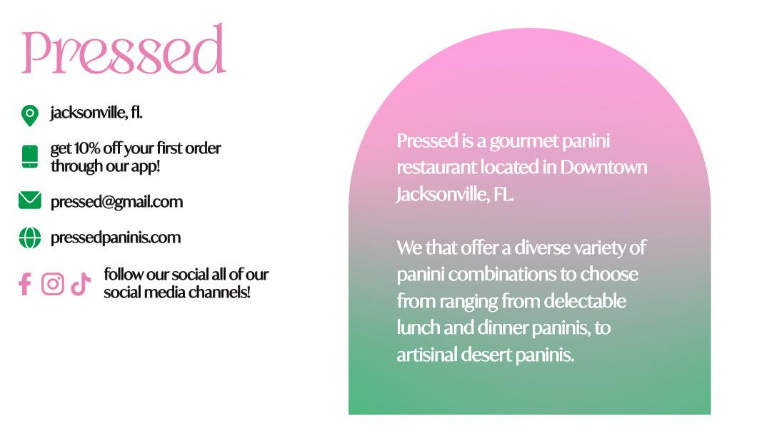
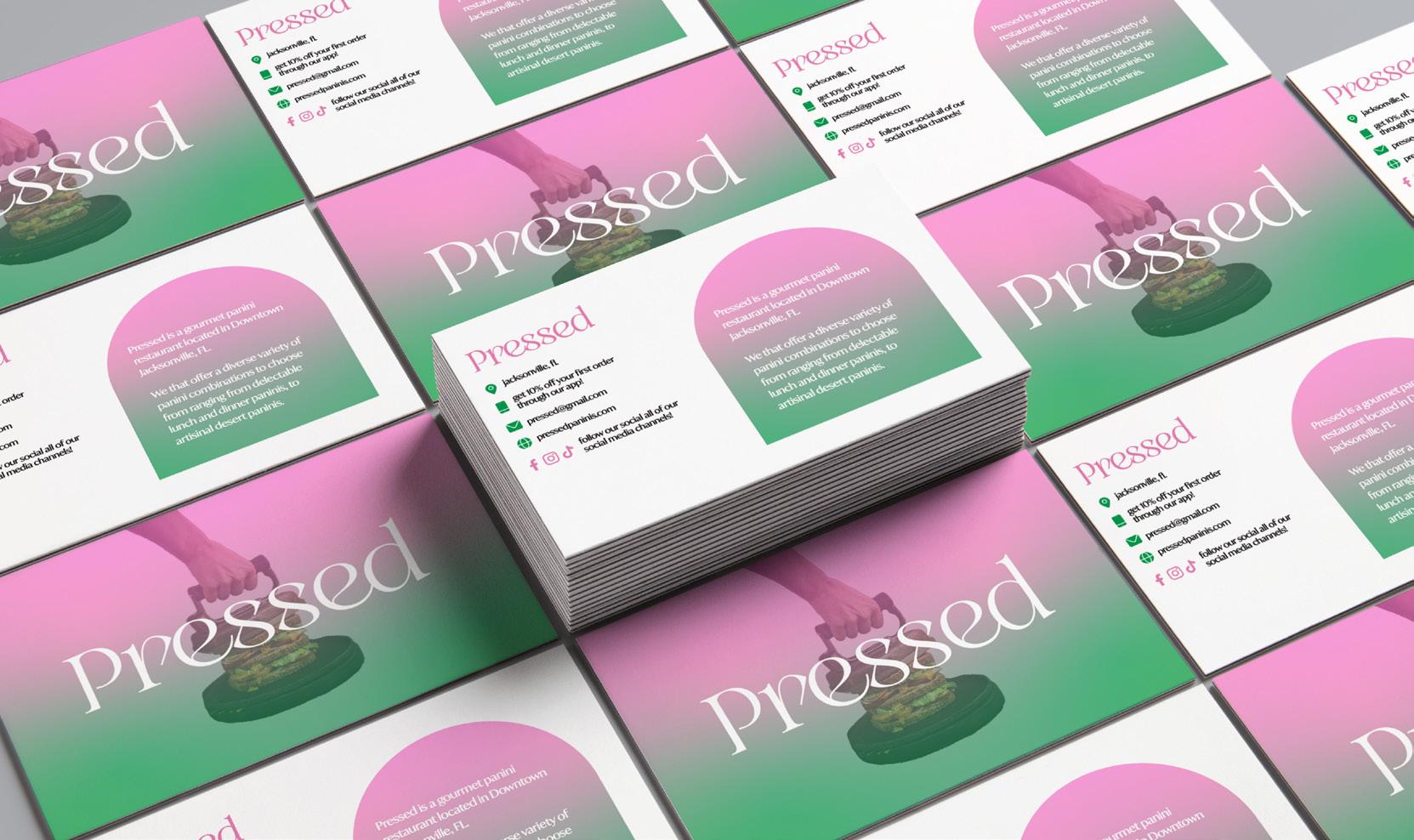
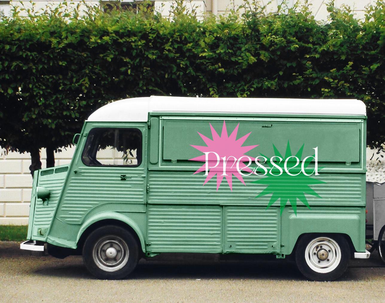
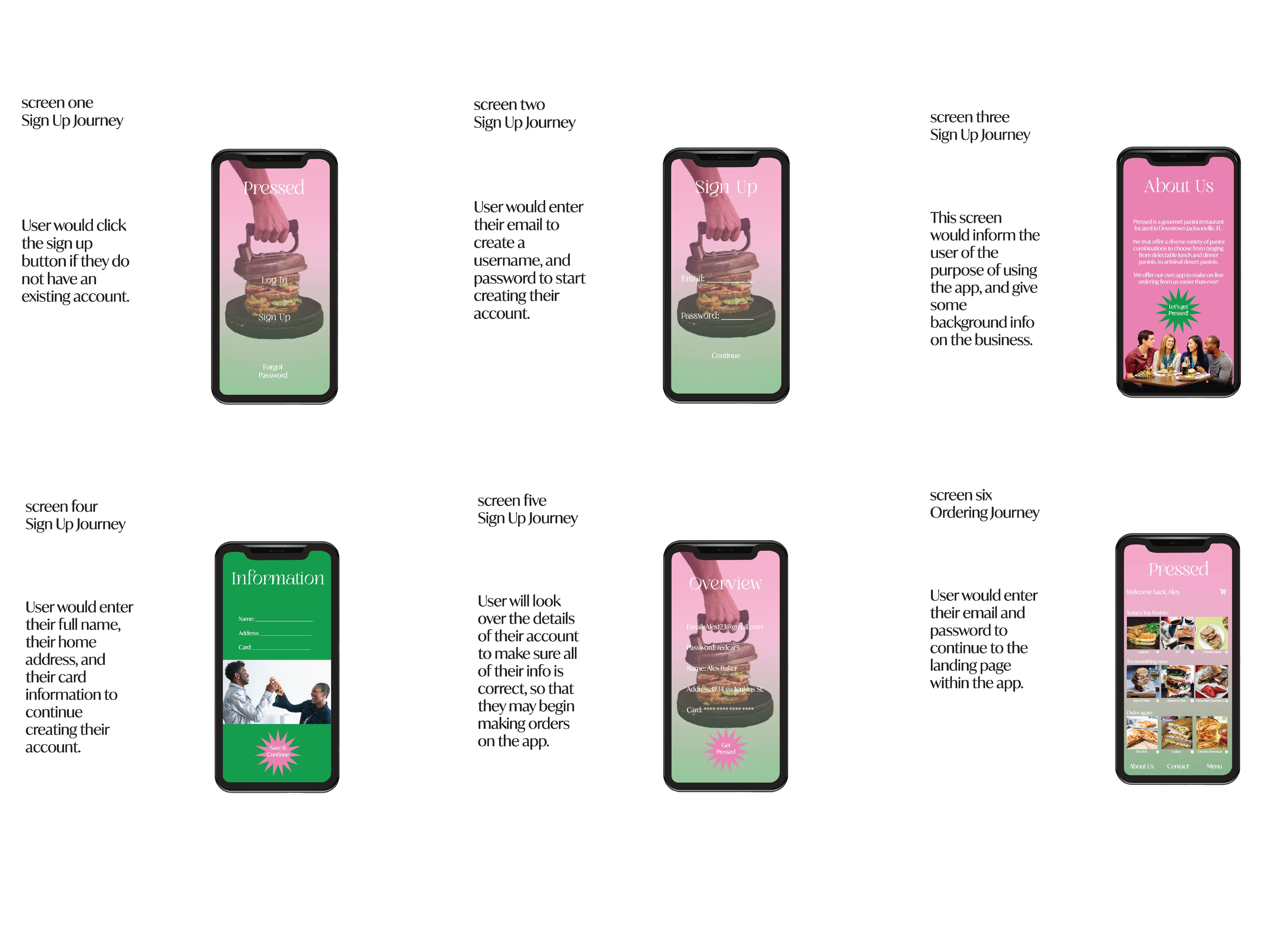
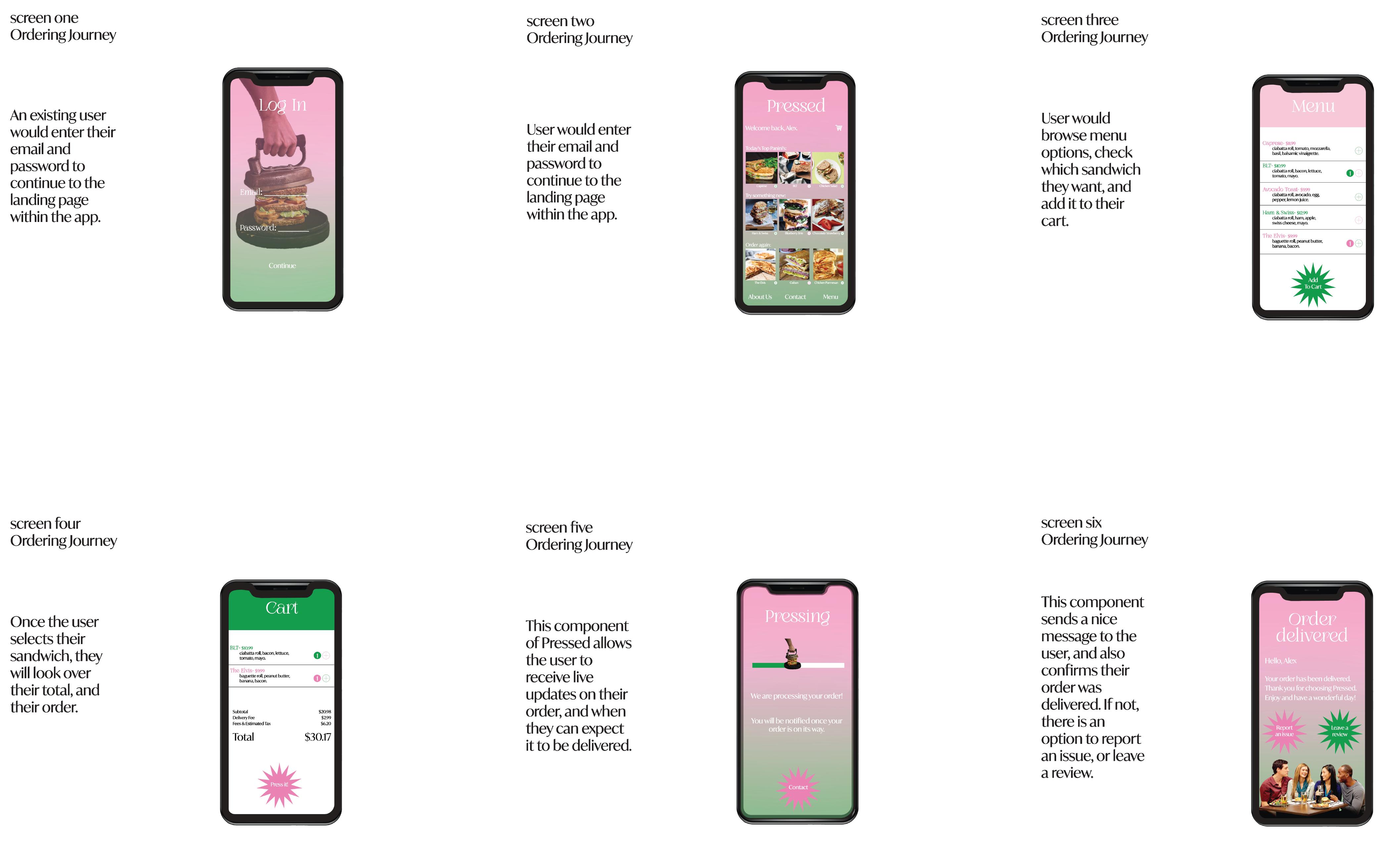
PRESSED
aPP dESIGN, BuSINESS coMPoNENtS, ENvIRoNMENtaL Mock-uPS.
Design narrative
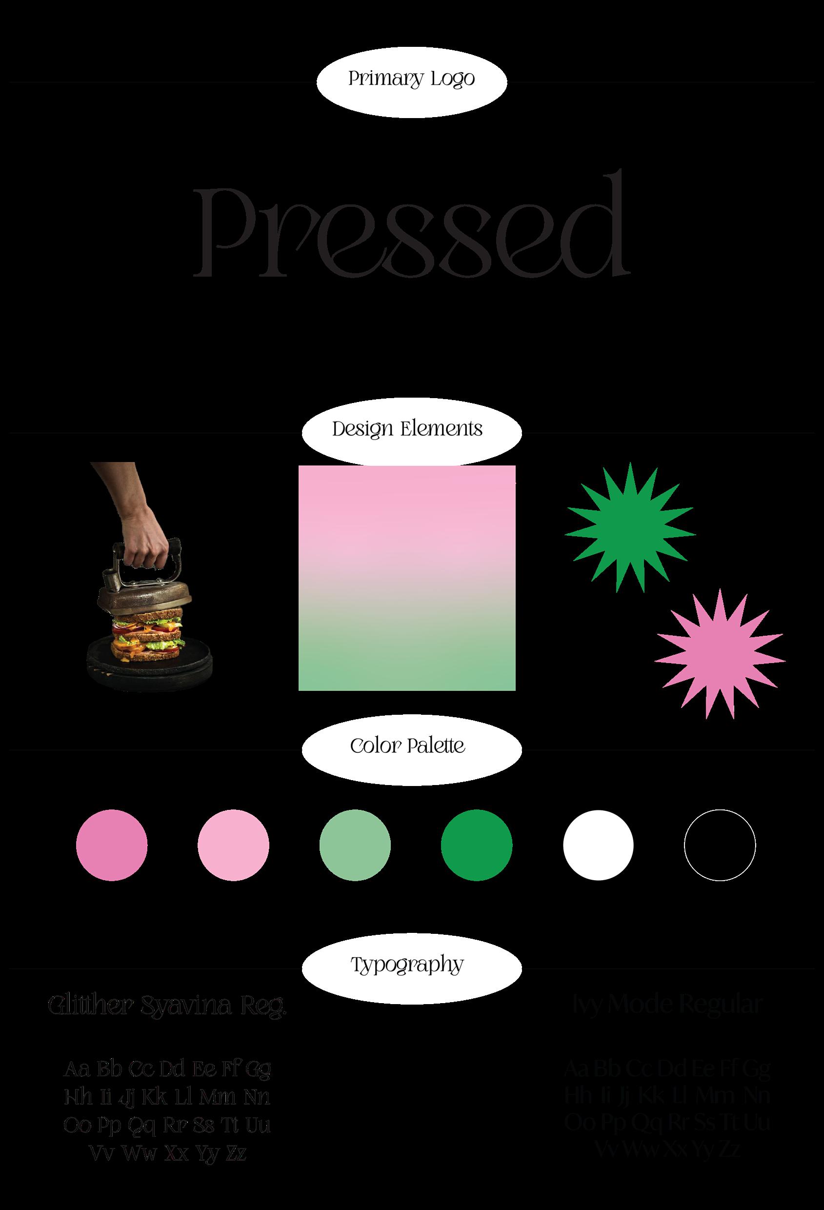
Pressed is a gourmet panini restaurant located in Downtown Jacksonville, FL. They offer a diverse variety of classic every-day sandwiches and also offer delectable lunch-time & desert paninis. This business is different from competing sandwich restaurants because they have a unique selection of sandwiches to sell. All of the ingredients that go into each panini are made in-house or are locally sourced ingredients. Pressed has their own app in order to allow their customers to make pick-up and delivery orders directly through their business. This brand specializes in selling gourmet paninis through their store location and through their app, but Pressed also is able to sell paninis through their food-truck. The Pressed food truck allows this business to sell their delicious sandwiches in local pop-up markets and event catering as another outlet to connect with their community. The design goals with this business is to create a fun, and sophisticated branding identity for every-day food items like sandwiches. The target audience for this brand is primarily geared towards people between the ages of 20-30 of a middle-to-high class income. Another attribute of this brand’s target audience that it aims to focus on is those who care about community outreach events such as local markets and supporting the local business community. The colors and design elements that were chosen for this brand are meant to emulate a sense of healthy locally sourced ingredients in the customer’s food, but also keep a sophisticated and vibrant look. The typefaces chosen for this brand are Glitther Syavina for main titles and headings, and Ivy Mode for body copy throughout the branding for this business.
KARMA KOMBUCHA
Package Design, branDing iDentity,
colors such as the hot pink and bright yellow chosen for the
Project title
presseD
Project title presseD
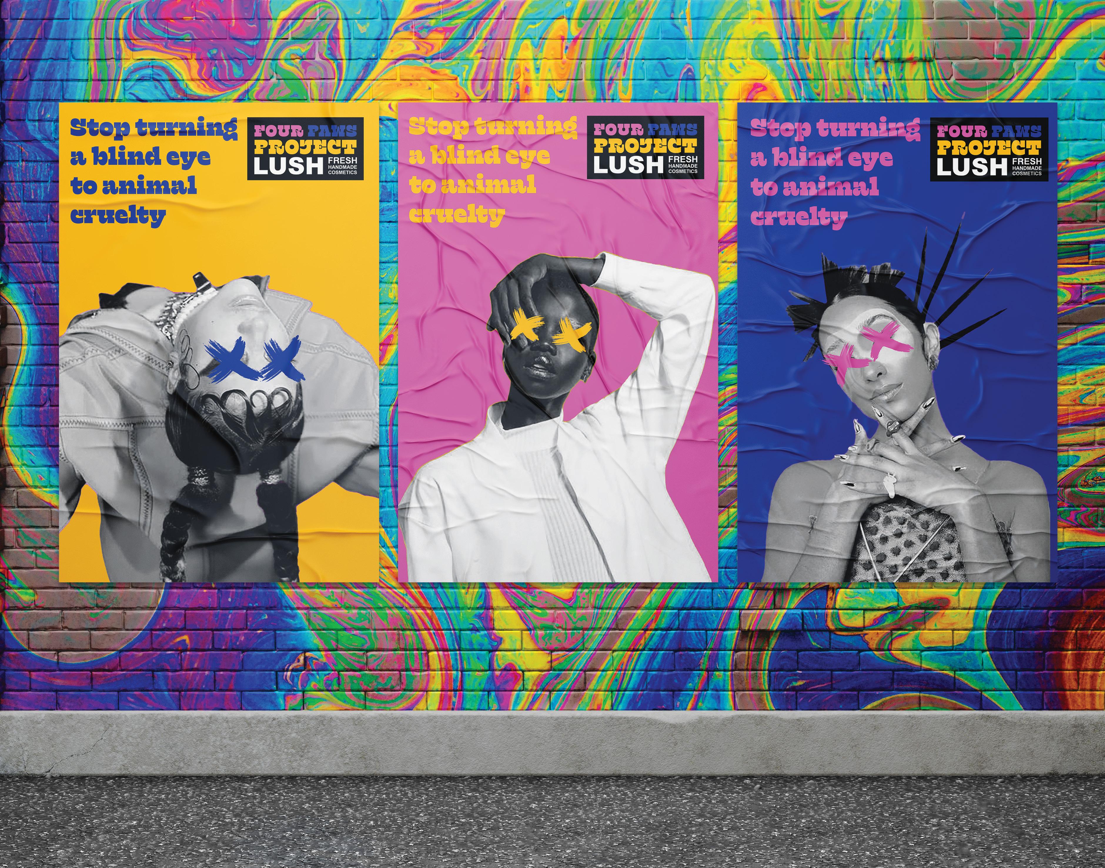
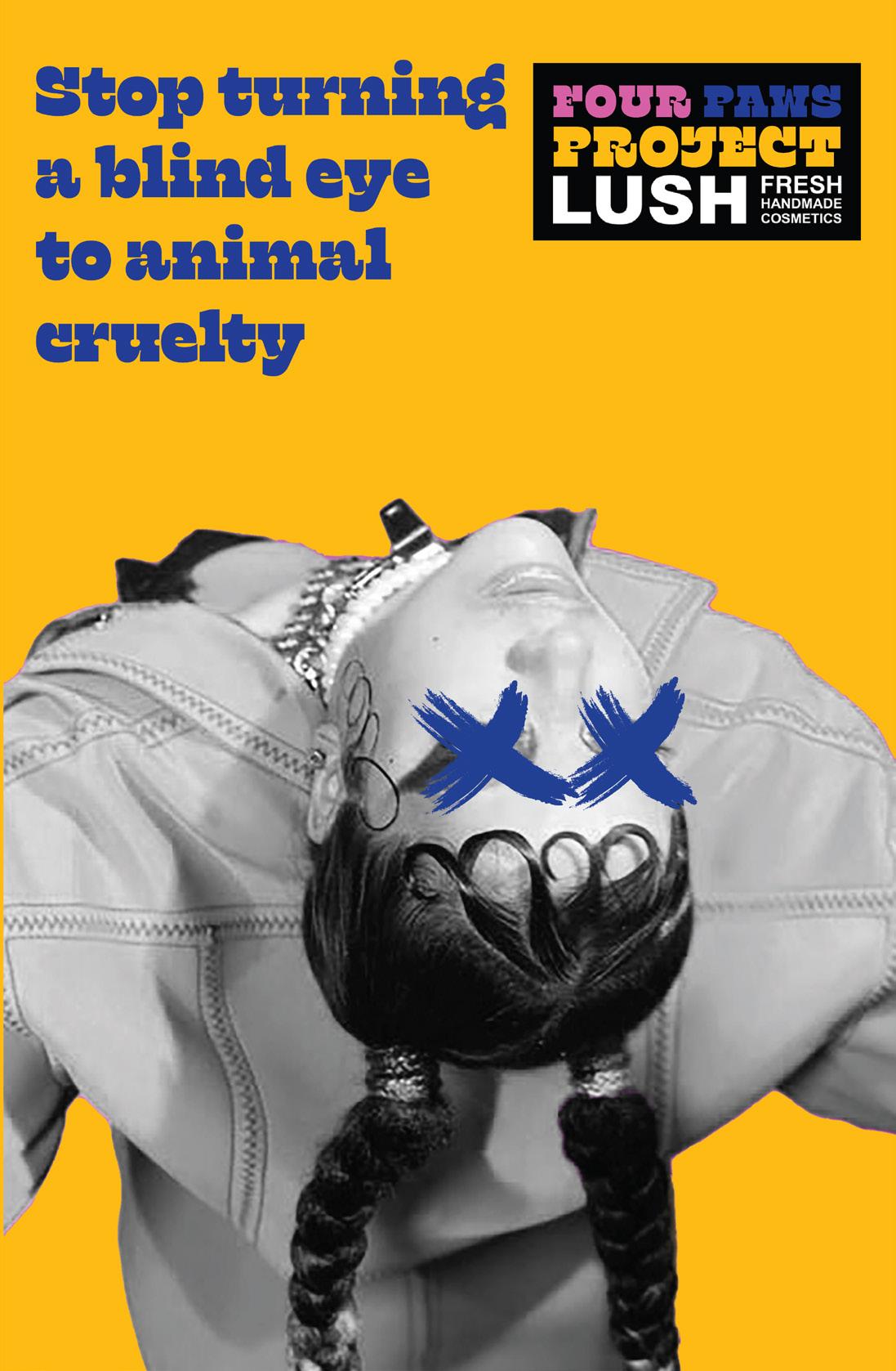
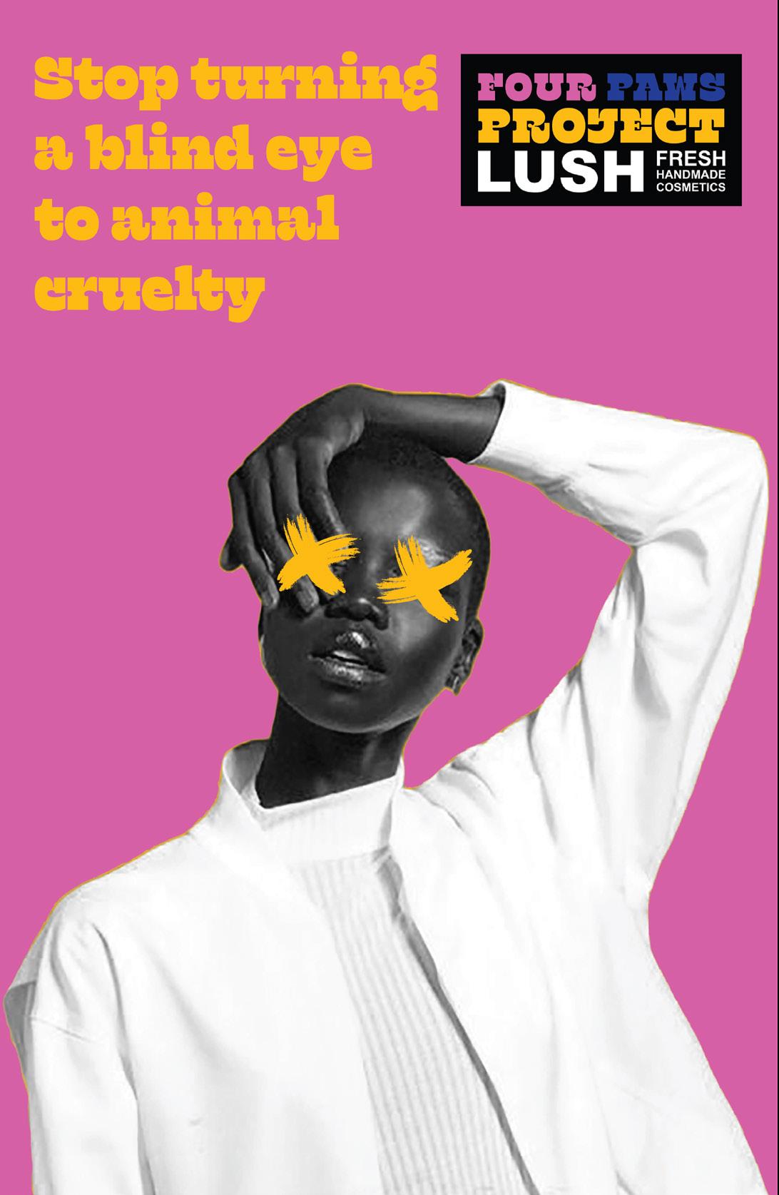
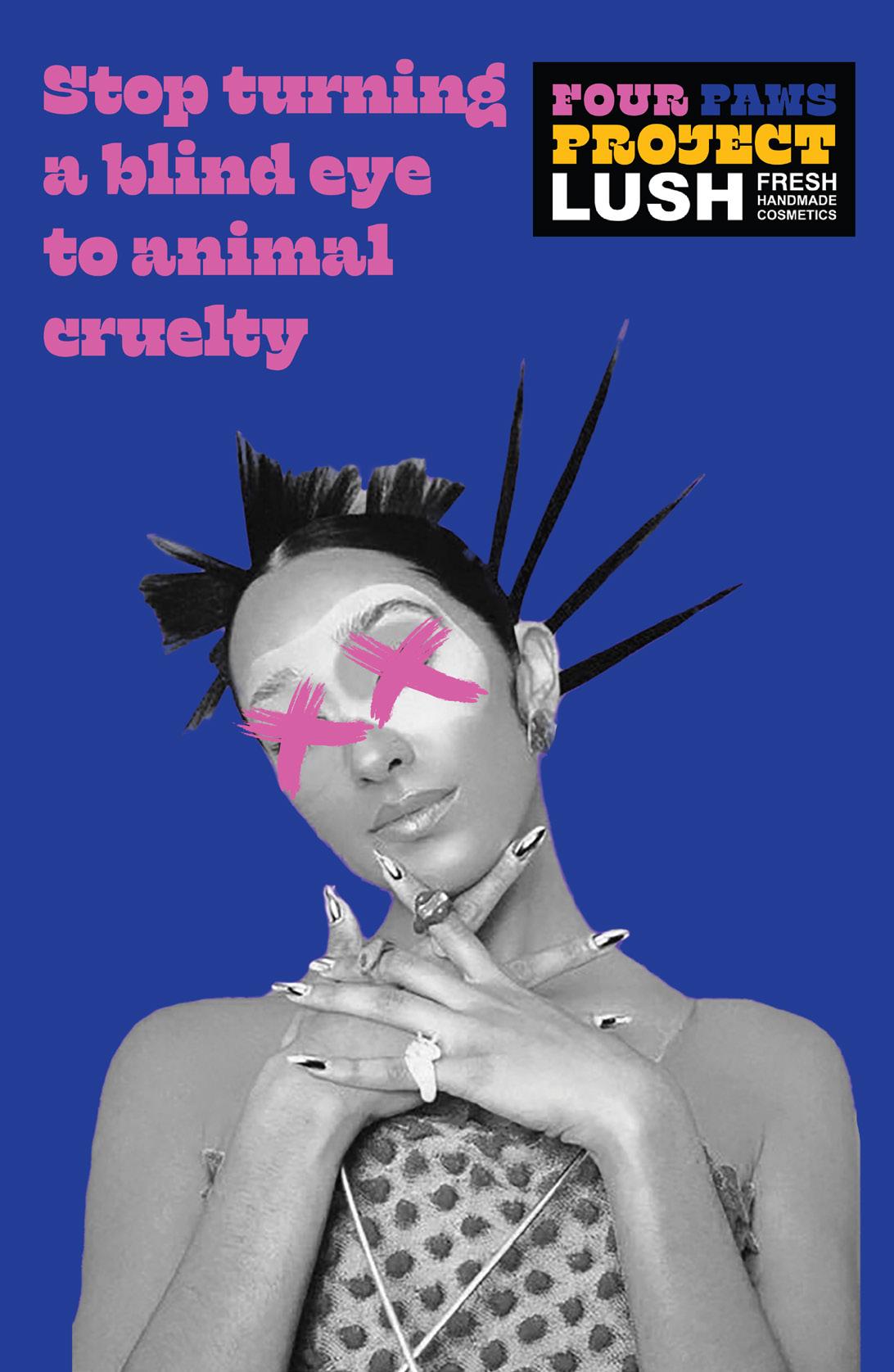
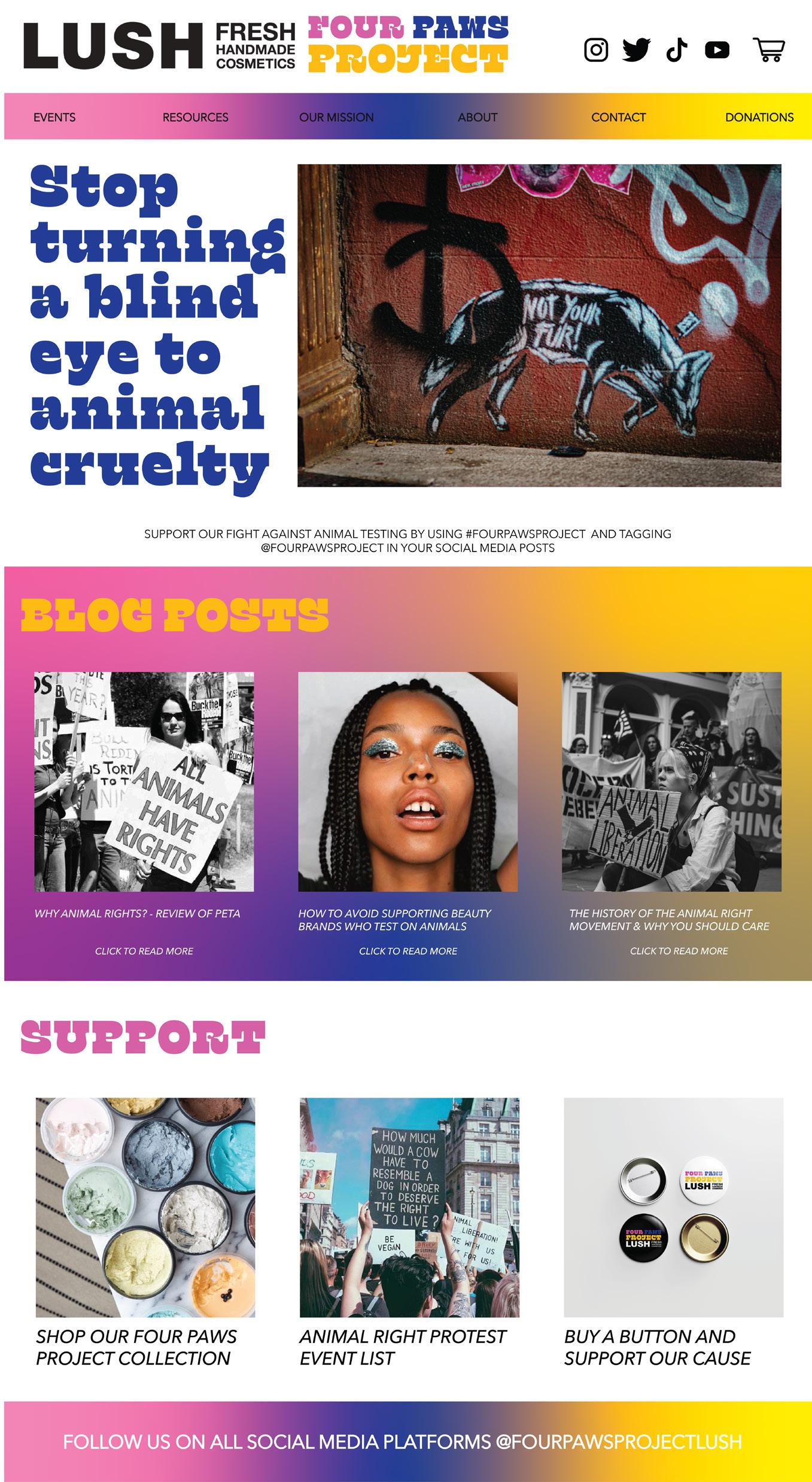
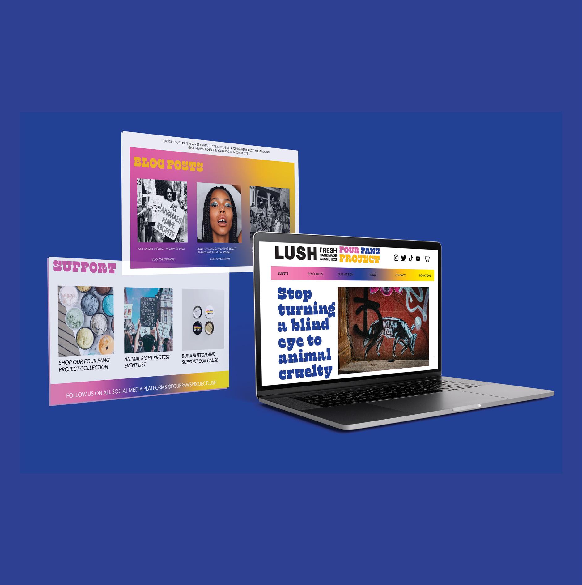
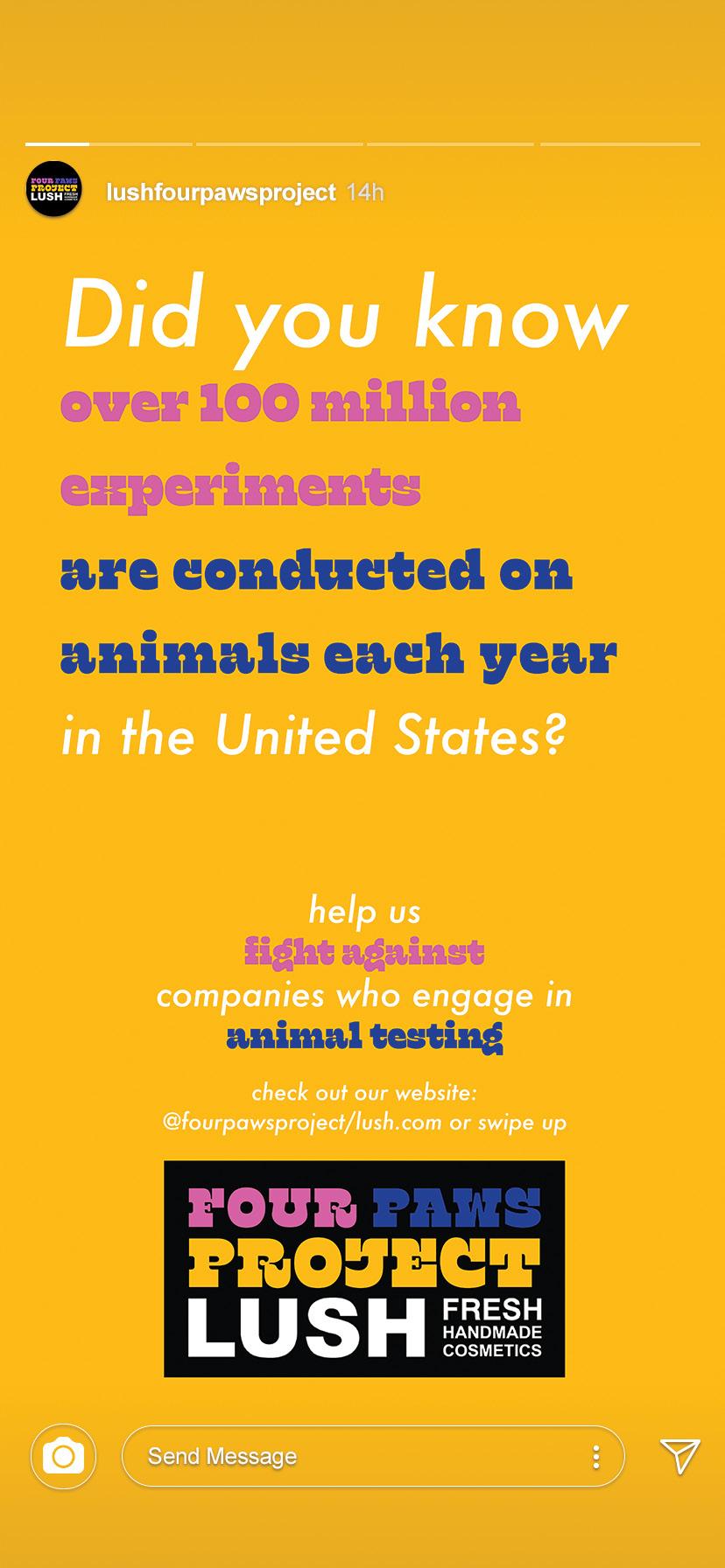
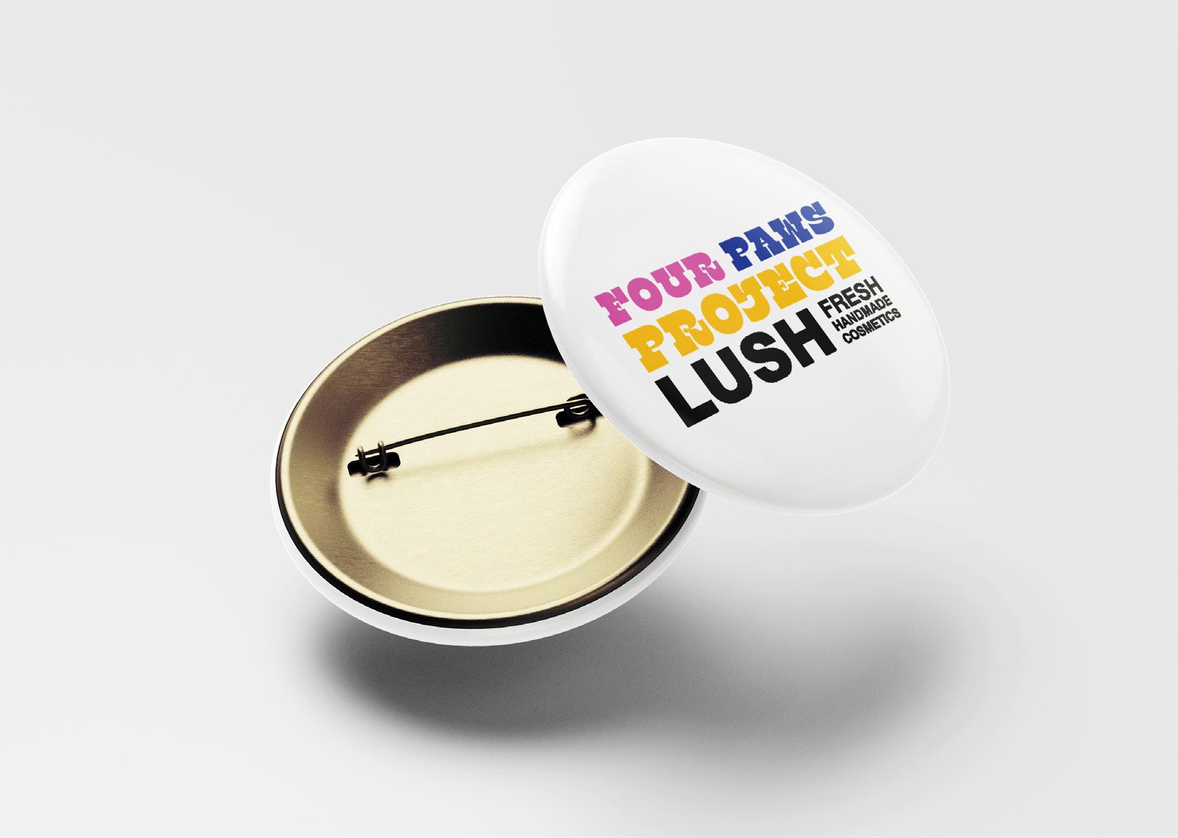
FOUR PAWS PROJECT
advERtISING dESIGN, SocIaL MEdIa,
WEB
INtERFacE, ad caMPaIGN coMPoNENtS.
aaF SILvER aWaRd WINNER
Design narrative
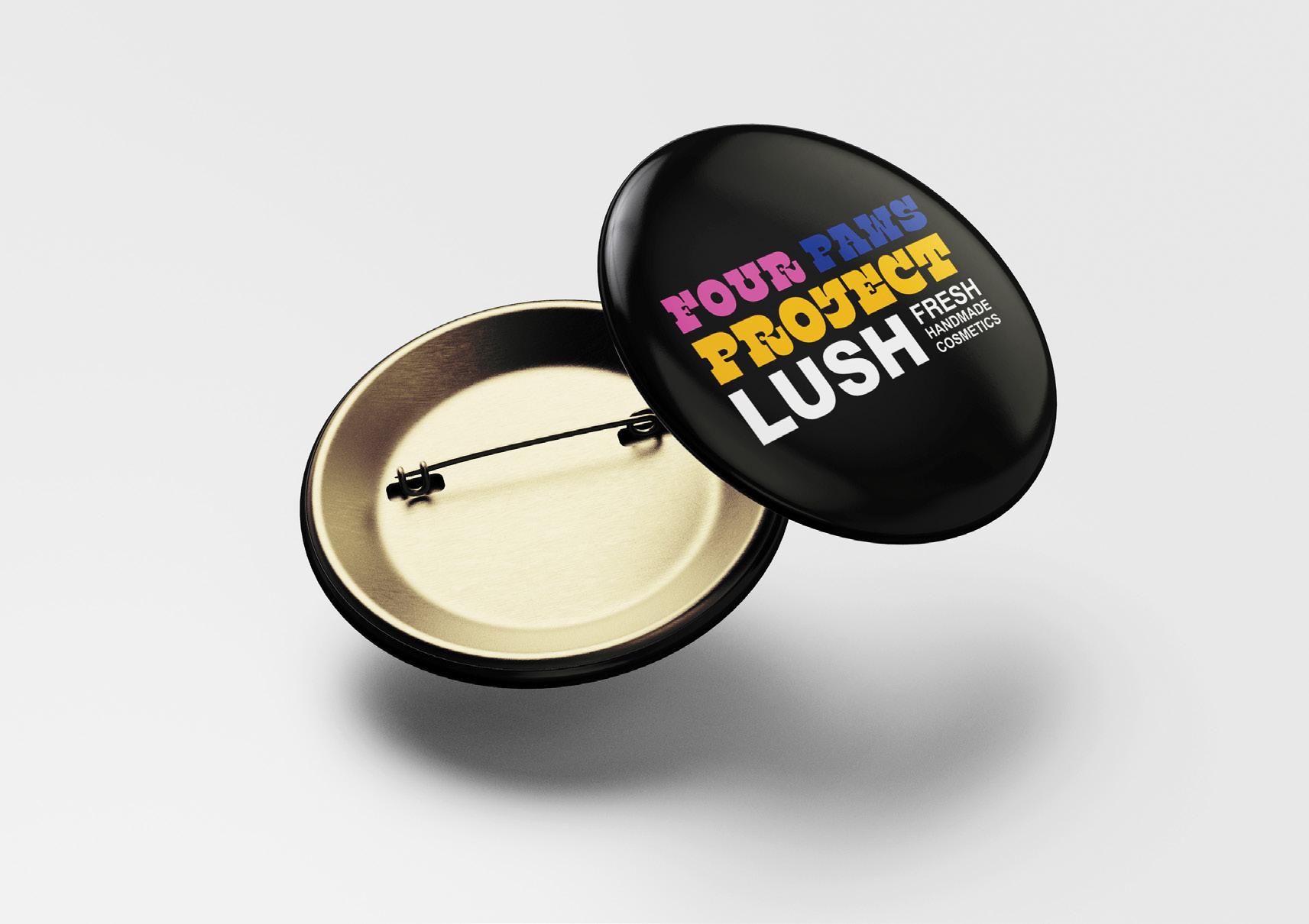
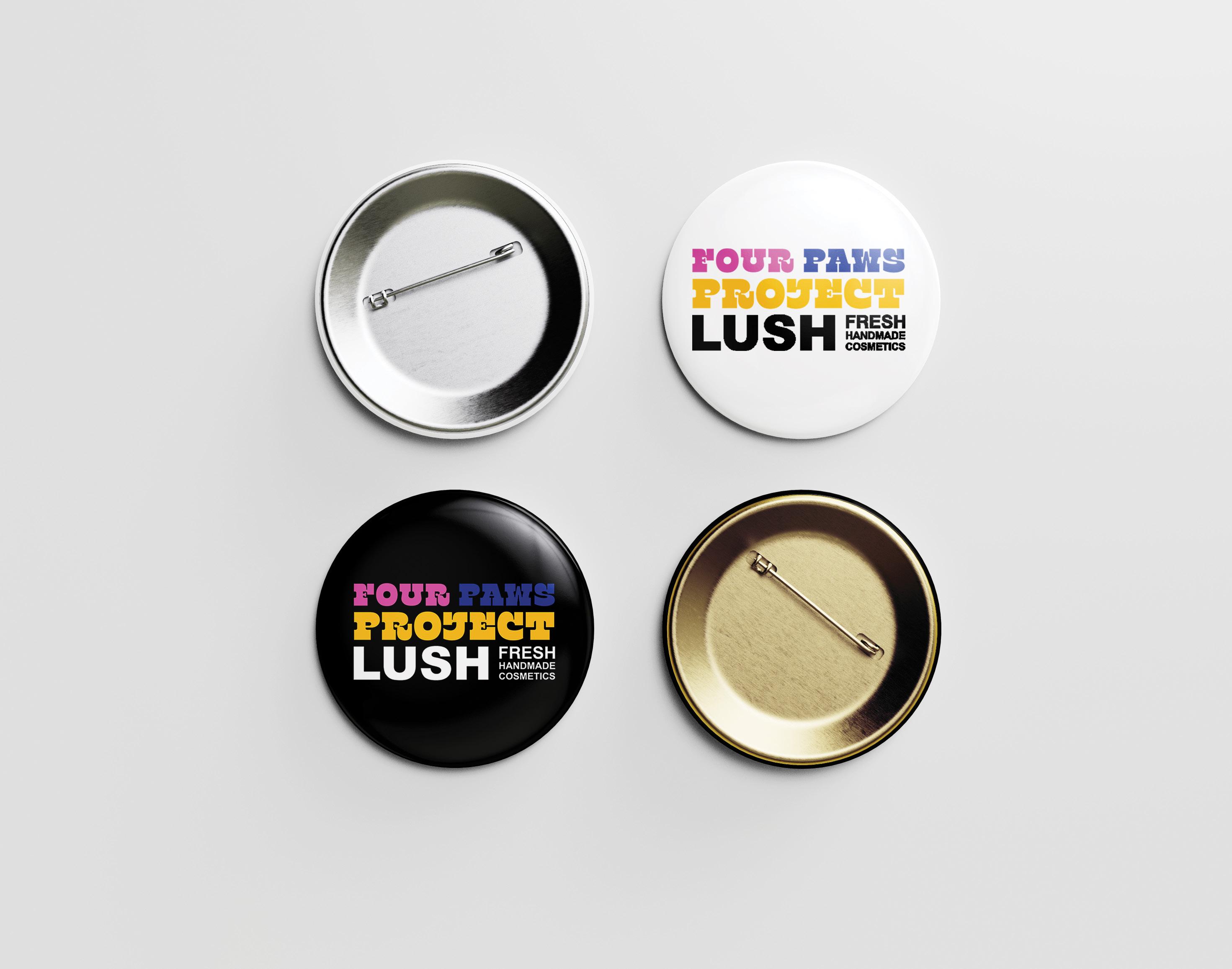
Lush Cosmetics is a colorful beauty brand that is cruelty-free and uses all vegan products in their cosmetics line. Their company primarily targets a younger, more youthful and bubbly audience. They strive to create options for beauty that are clean, safe, but most importantly fun. This ad campaign uses print and social media ads to promote their campaign and to educate people on how the beauty industry plays a role in animal cruelty. Within this campaign’s Instagram story ad there is a link to connect to their campaign website where the consumer can donate to the campaigns selected animal rights charities. The target audience could also purchase merchandise like branded buttons through the campaign website where all of the proceeds are donated to ASPCA (American Society for the Prevention of Animal Cruelty).
The main message in this ad campaign is to spread awareness of animal violence and abuse to their audience. The target audience of this ad campaign is between the ages of 14 to 24 and can be any gender. There is no specific income or occupation for the target audience in relation to this ad campaign. The majority of the target audience are people from all different backgrounds. The big picture is to raise awareness of the affects animal violence and consumption can have on a persons health and how it affects the environment. The goal of this ad campaign is to promote the awareness of animal violence and how consuming animal products can be harmful to ourselves and our environment. Since this advertising campaign is trying to reach a younger audience, this campaign focuses on using bright colors, fun and whimsical typography, and striking photography to grab each consumers attention. The typefaces chosen for this project are Klose Regular for titles and main headings and Futura Medium Italic for body text.
Project title
Four paws projeCt
Four paws projeCt
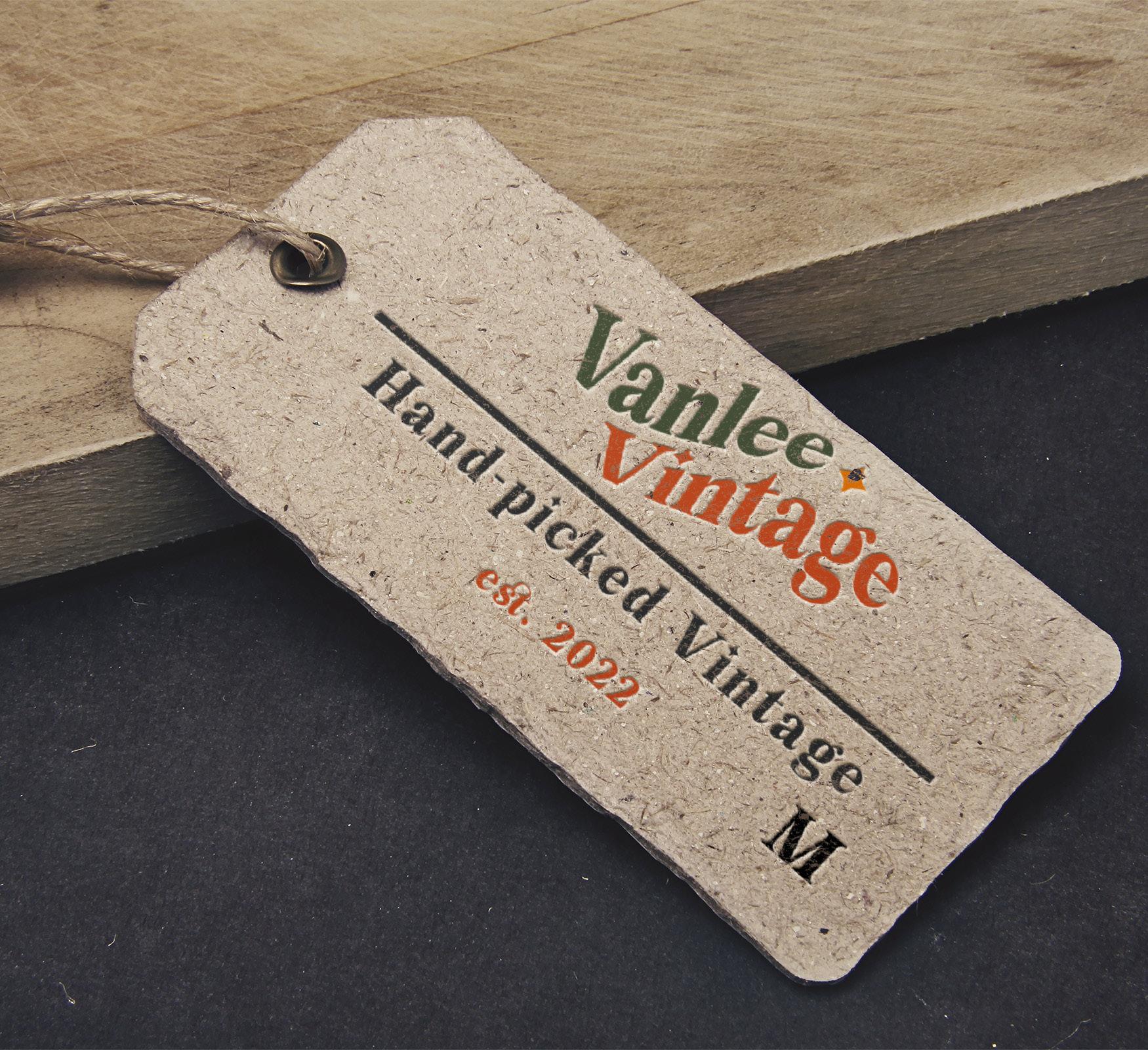
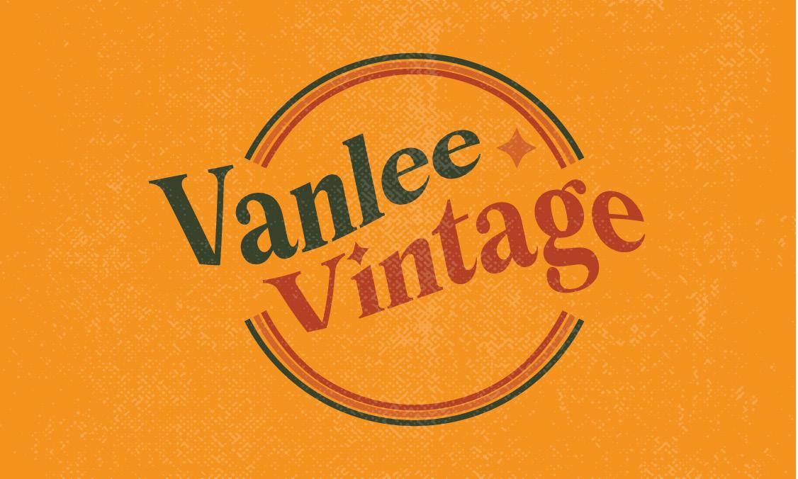
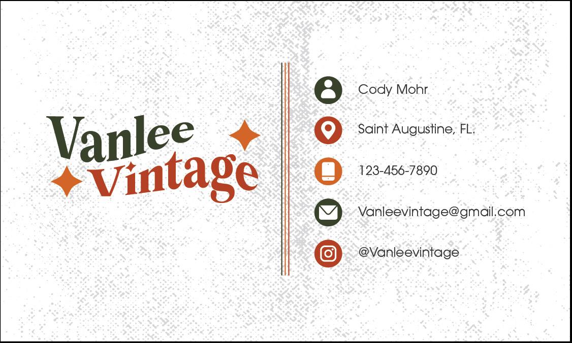
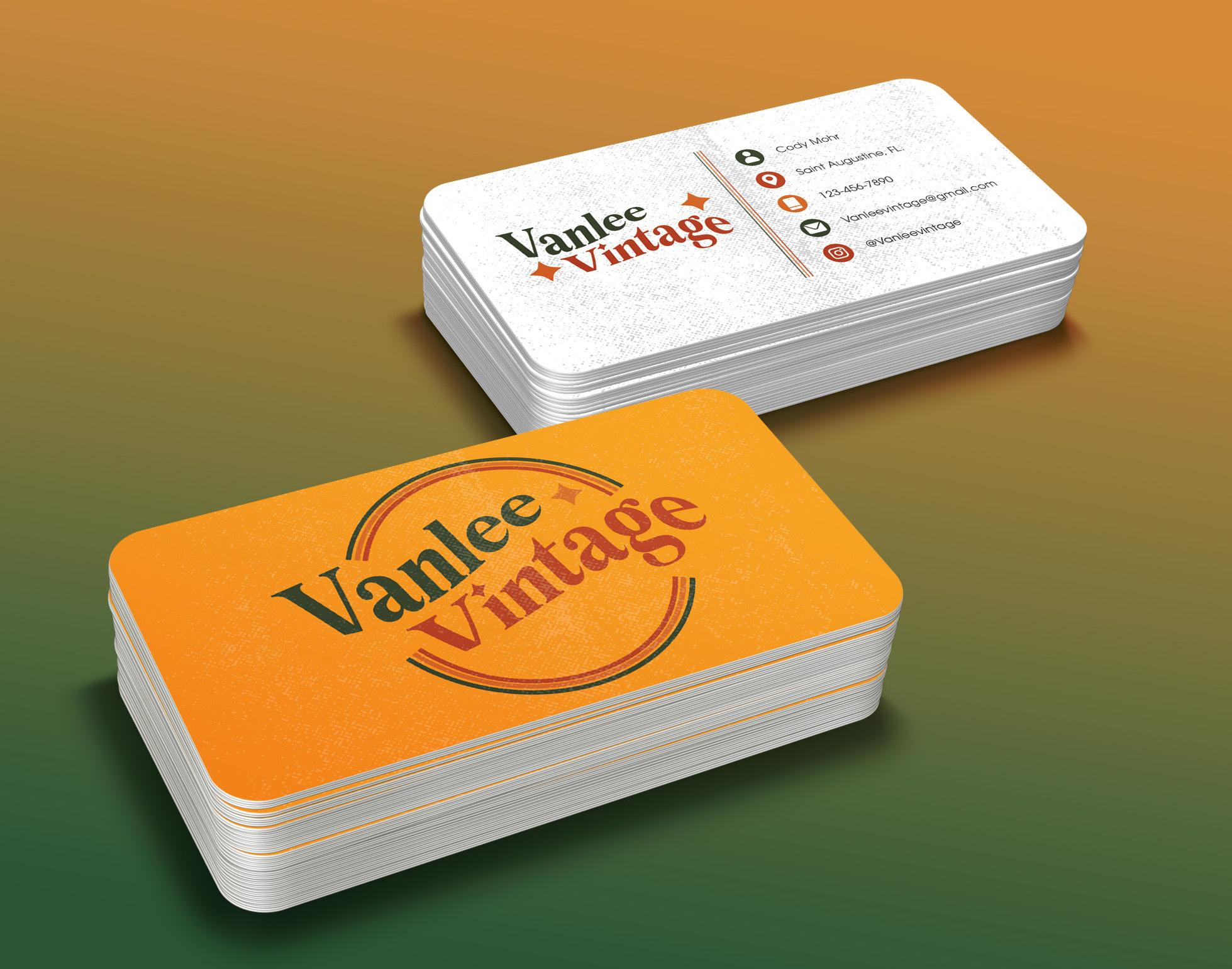
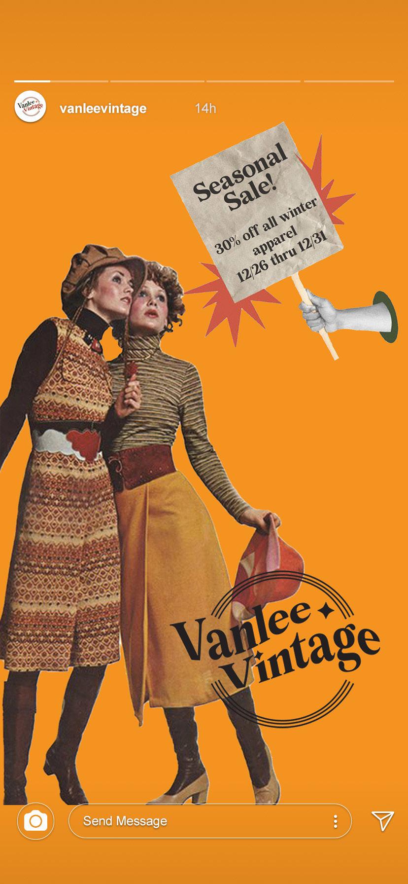
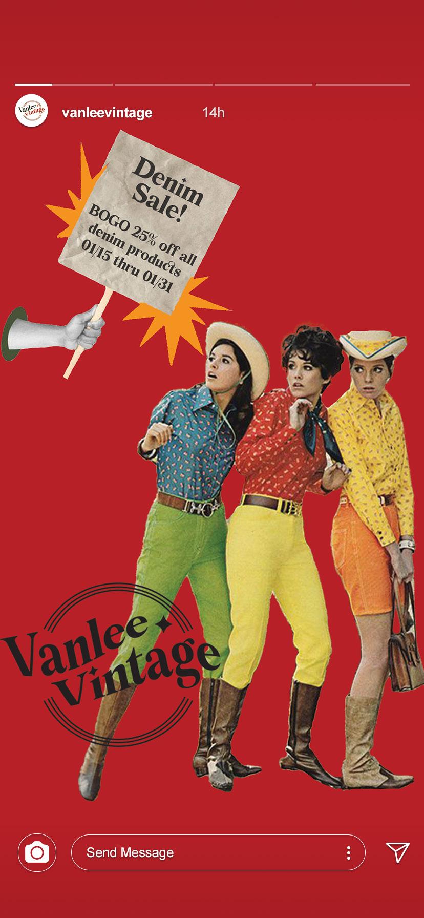
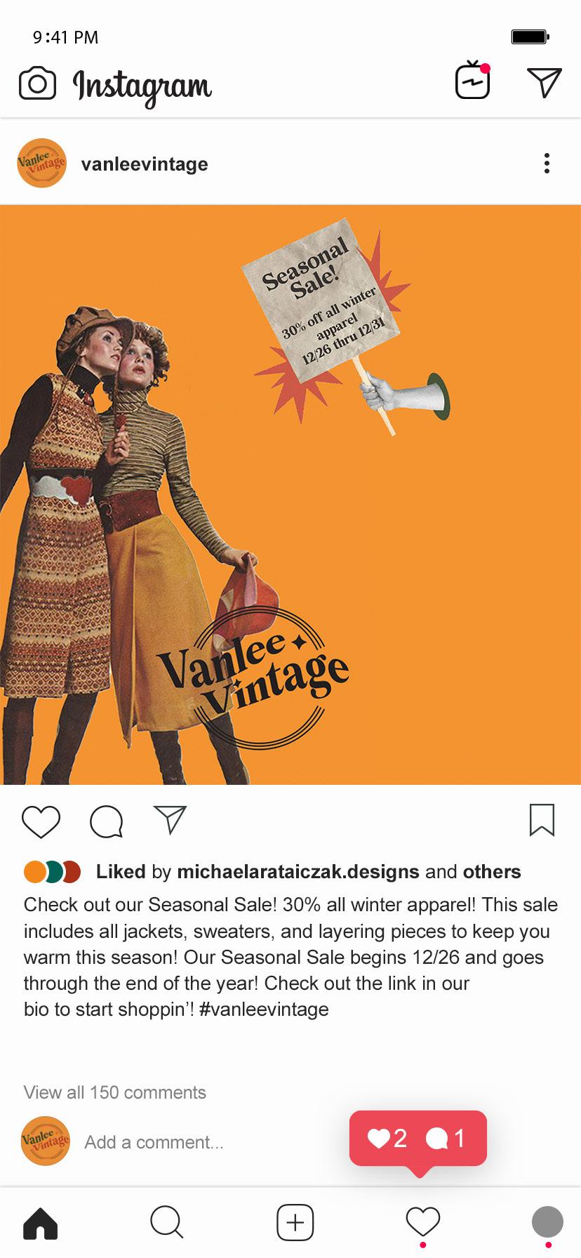
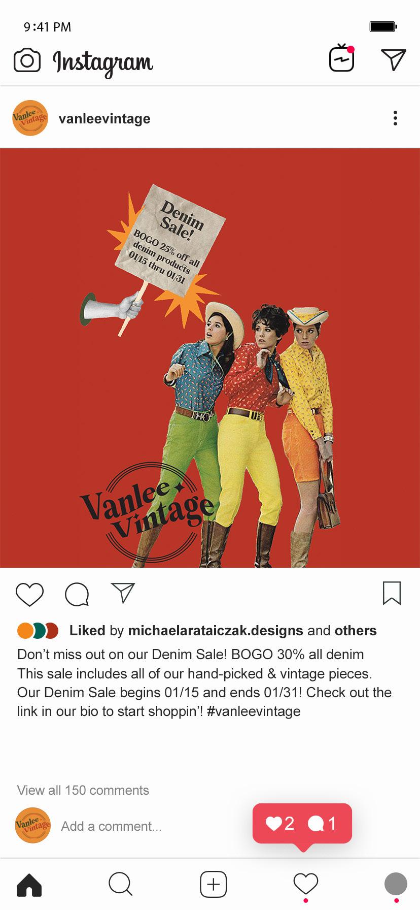
VANLEE VINTAGE
BRaNdING IdENtIty, SocIaL MEdIa, BuSINESS
coMPoNENtS, ENvIRoNMENtaL dESIGN.
Design narrative
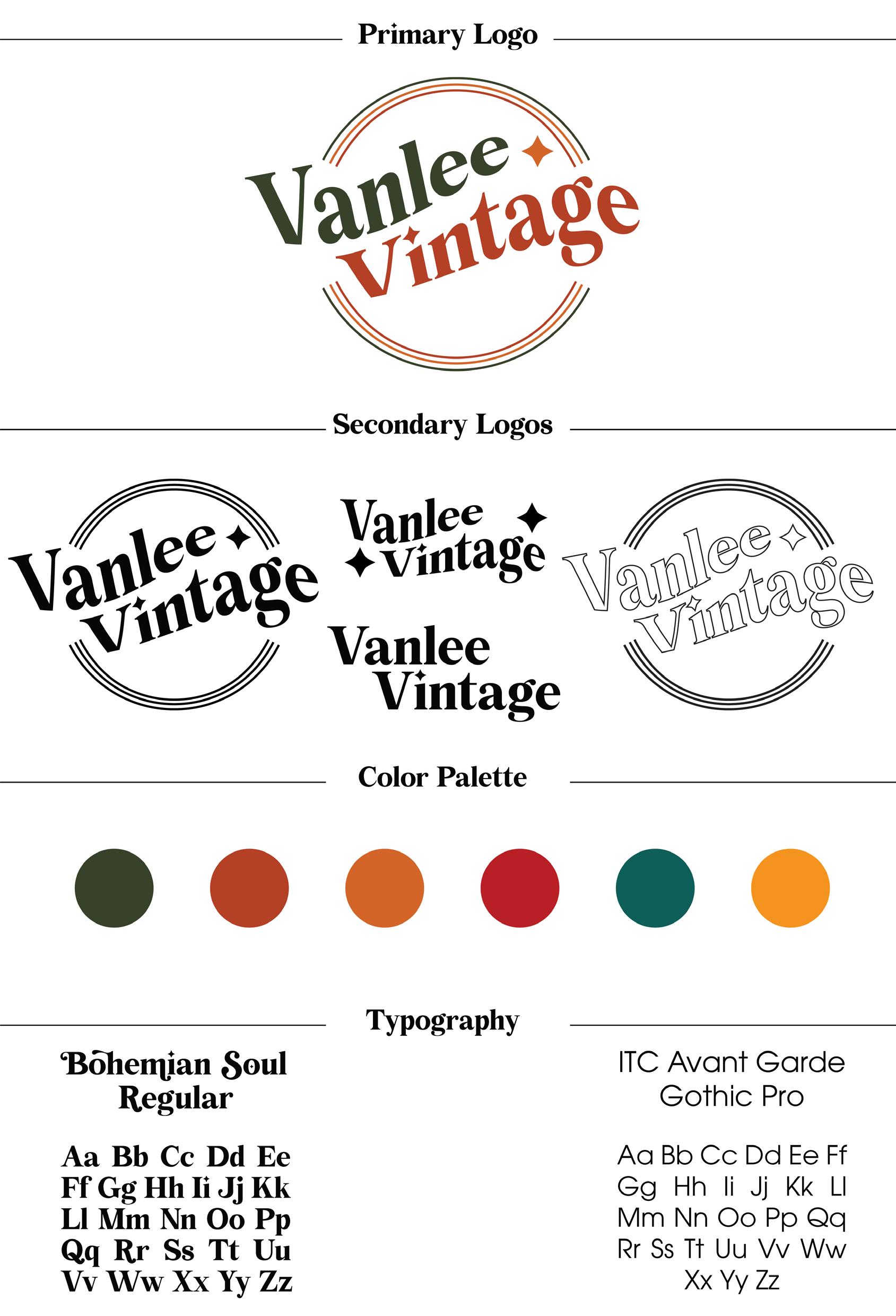
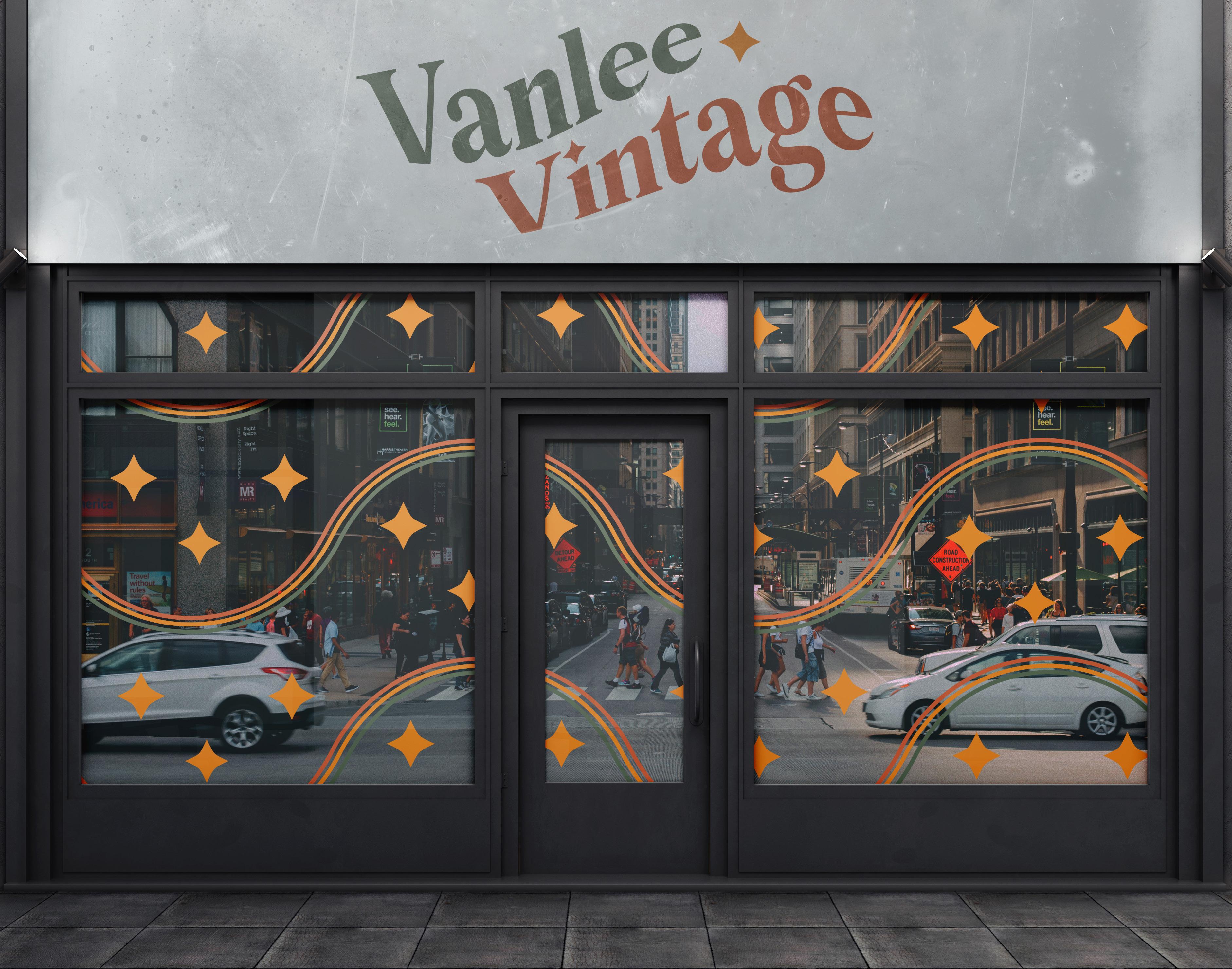
Vanlee Vintage is a vintage clothing reseller of hand-picked and authentic quality brands of clothings that will be located in Saint Augustine, FL. The main goal of this project was to create a branding identity for a vintage clothing brand, and to create other components that this type of business might need. This brand’s target audience is people from the ages of 20-40 who appreciate hand-picked vintage clothing. The client had a specific vision in mind for their brand. They wanted to create a spin on vintage reselling brand by combining American Traditional tattoo art influences to combine with a modern western vintage style of clothing. The client wanted the brand to have a rugged feel, so textures were added to some elements of the brand, such as their business card. Social media advertisements were created in the for of Instagram posts and stories for this brand to help promote special deals and sales, and to reach its target audience more clearly. An environmental mock-up of a store front was created that includes fun and illustrative window art, and a sign with the brand’s logo with a textured sign. Branded Clothing tags were also created for items that this vintage reselling brand would use on their inventory. The color palette chosen for this brand is meant to feel earthy, grounded, warm, and inviting to its audience. The two typefaces chosen for this packaging are Bohemian Soul Regular for titles and the logo, and ITC Avant Garde Gothic Pro for body text.
vanlee vintage
vanlee vintage
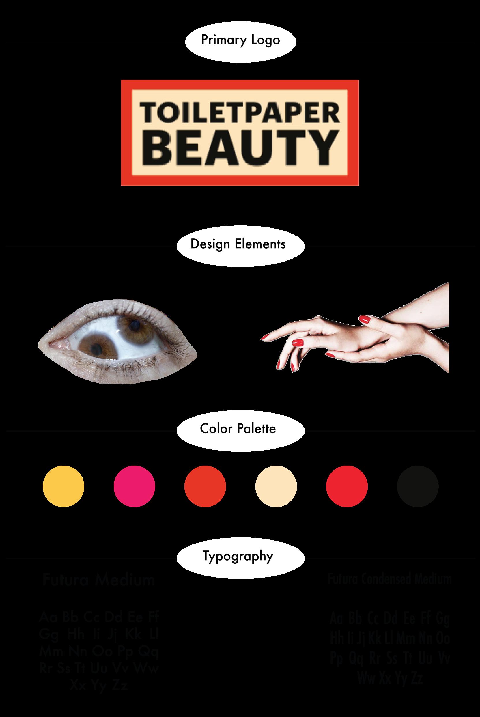
TOILET PAPER BEAUTY
PackaGE dESIGN, PoINt-oF-PuRcHaSE
dISPL ay, ENvIRoNMENtaL dESIGN.
Design narrative
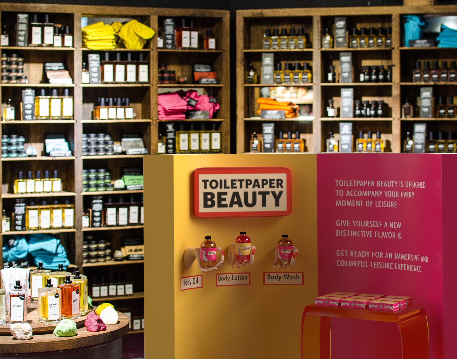
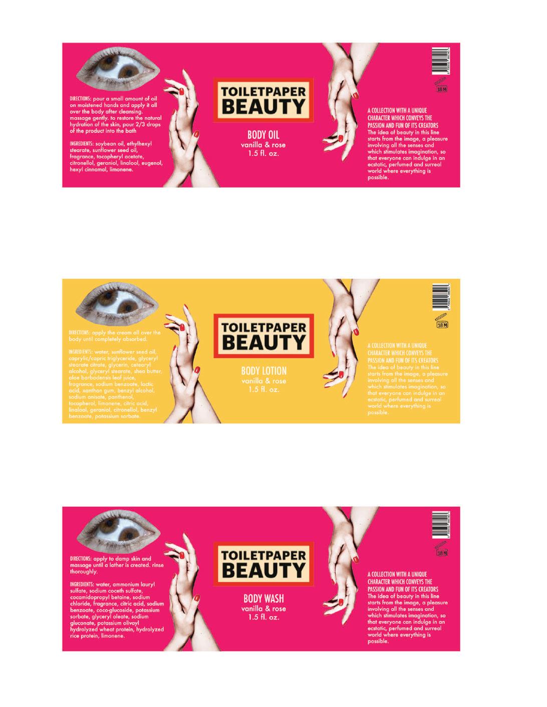
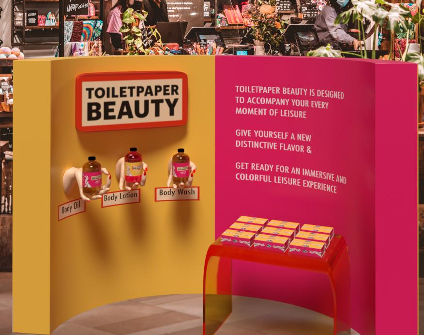
Toilet Paper Beauty is a bath and cosmetics line that branches off from Toilet Paper Magazine, which is a photography based magazine. The main goal for this brand was to create a packaging system within a box structure that acts as a mini gift set for Toilet Paper Beauty’s line of bath and beauty products. The majority of this brand’s product sets come in pairs of two, and are full size bottles. This packaging system contains three mini bottles for their consumers to try multiple products from their brand. This mini gift set includes a body oil, a body lotion, and a body wash that are all vanilla and rose scented. The packaging design follows a similar surrealistic style and combination of randomized items. The box structure is a sliding drawer box with a paperboard covering. The inside required an insert design, so that it matches the branding even when the consumer opens the box to try each product. A PointOf-Purchase Display was created for this product to show how the product could be sold in a retail setting. This display contains a backdrop with a little blurb about the brand and their product and an acrylic table with the products on top of it. On one side of the backdrop there are hands that look like the packaging holding tester bottles for customers to try the product before buying it. The majority of the branding for this existing brand include bright colors such as the hot pink and bright yellow chosen for the packaging on this gift set. The two typefaces chosen for this packaging are Futura Medium for main titles and Avenir Next Regular for body text. Overall, this package design turned out to be very consistent with the existing style of Toilet Paper Beauty’s branding and was just as vibrant and eye-catching.
Project title
KARMA KOMBUCHA
The main goal of creating this rigid box structure is to create a mini gift set for Toilet Paper Beauty’s line of bath products. Many of this brand’s product set for their bath and beauty
This rigid box structure contains three mini bottles for their consumers to try multiple products from their brand. This mini gift set includes a body oil, a body lotion, and and a body wash that are all vanilla and rose scented. The packaging design follows a similar surrealistic style and combination of randomized items. The majority of the branding for Toilet
colors such as the hot pink and bright yellow chosen for the packaging on this gift set. The two typefaces chosen for this packaging are Futura Medium for main titles and Avenir Next
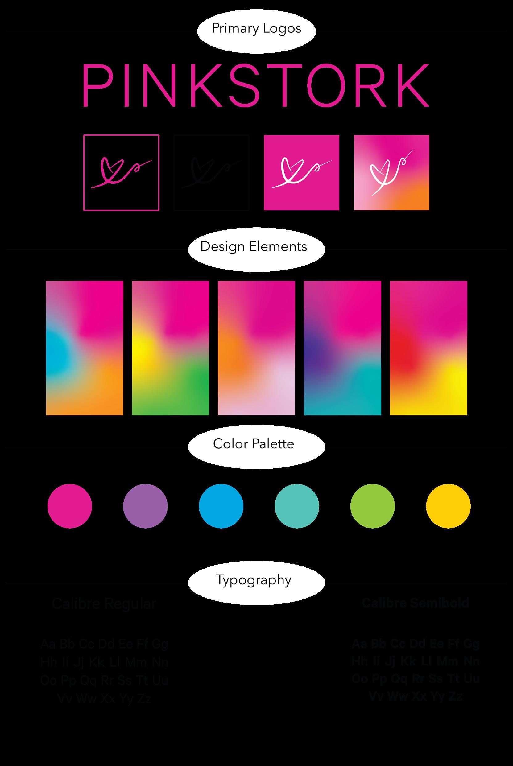
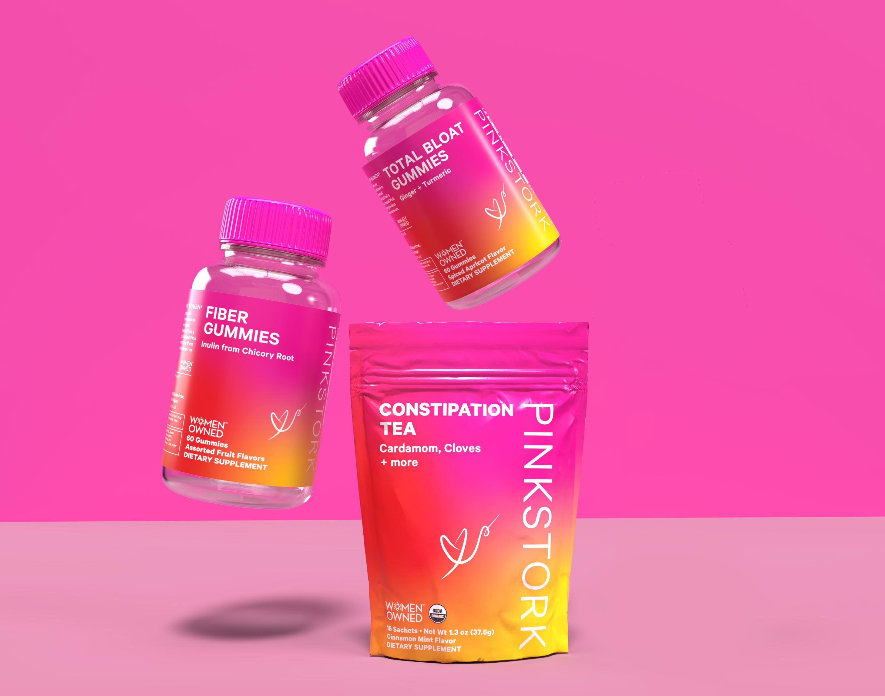
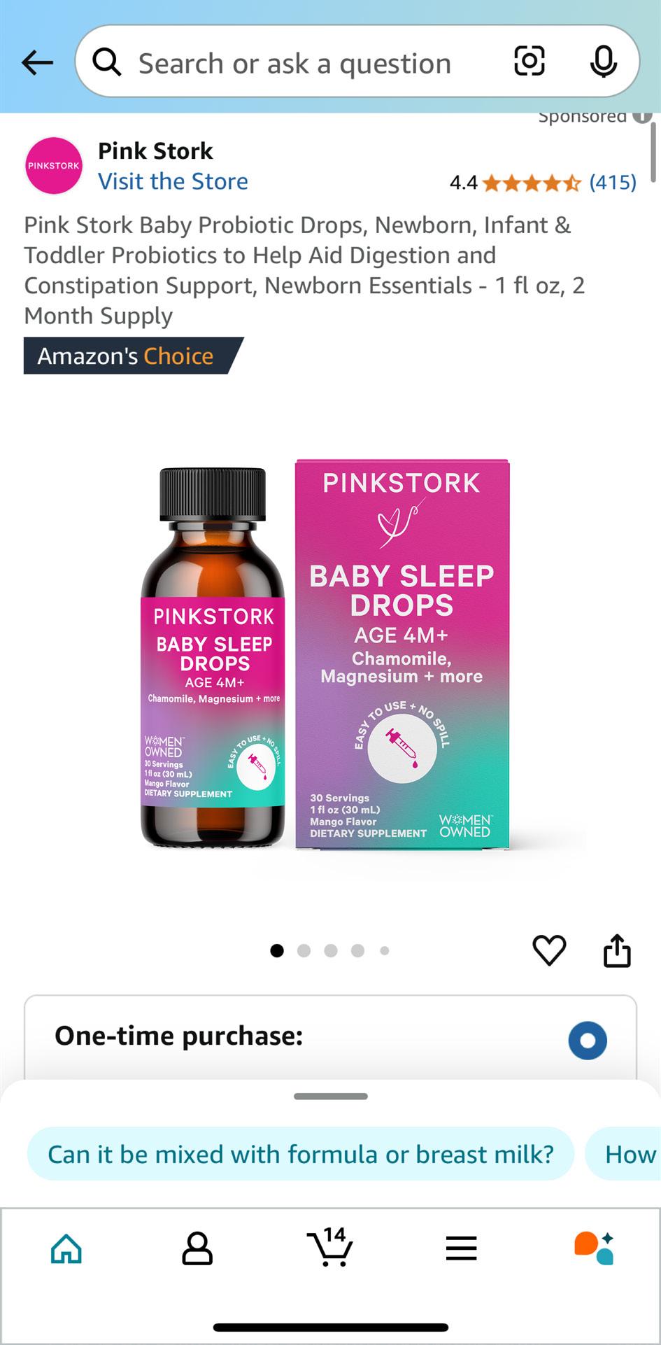
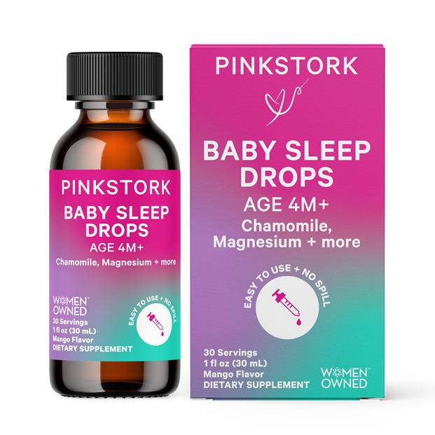
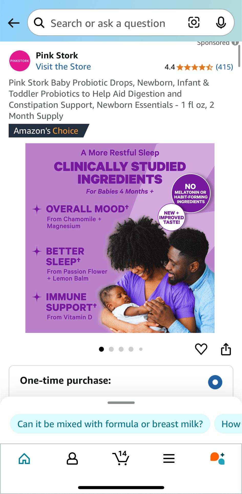
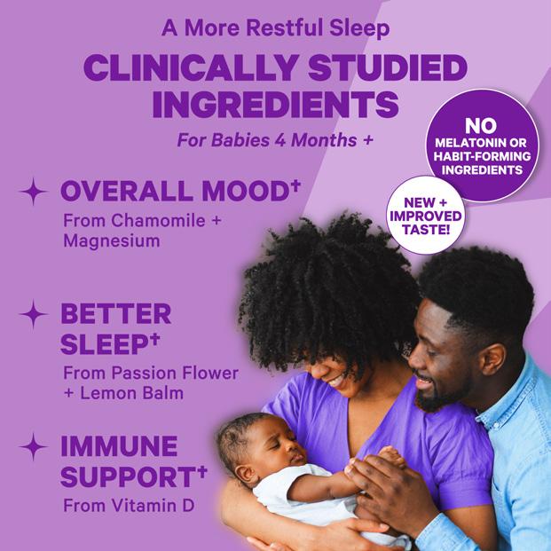
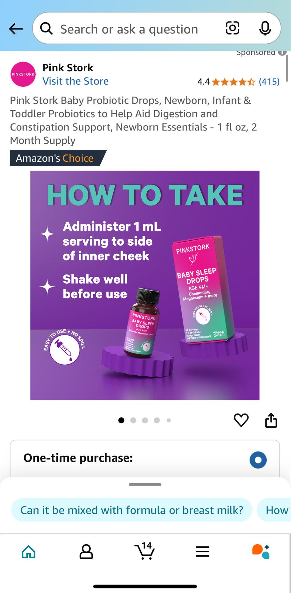
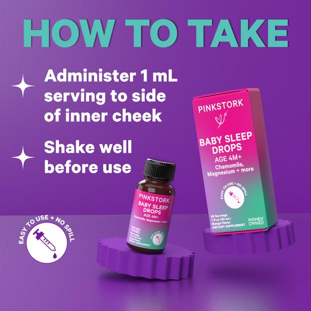
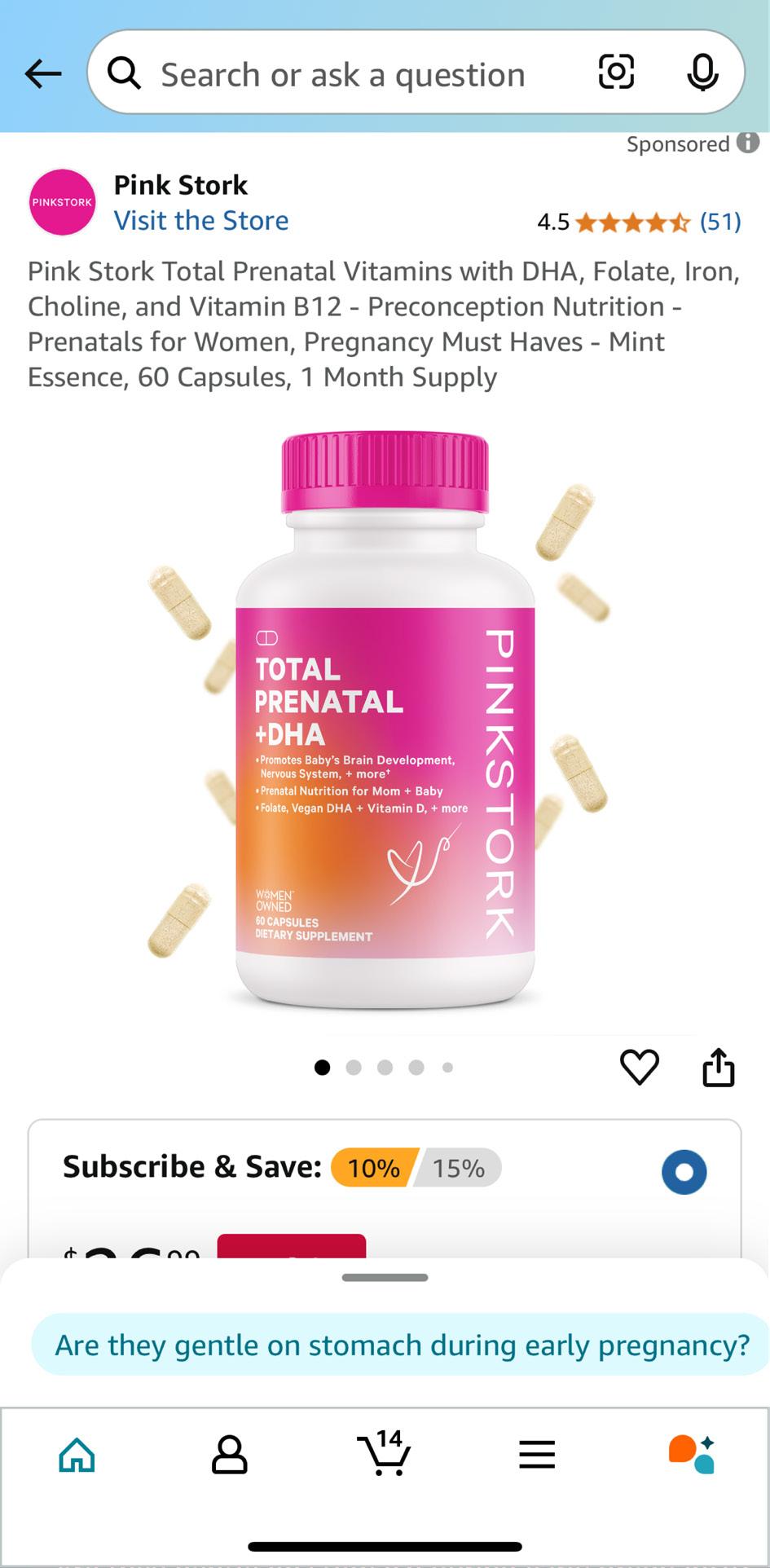
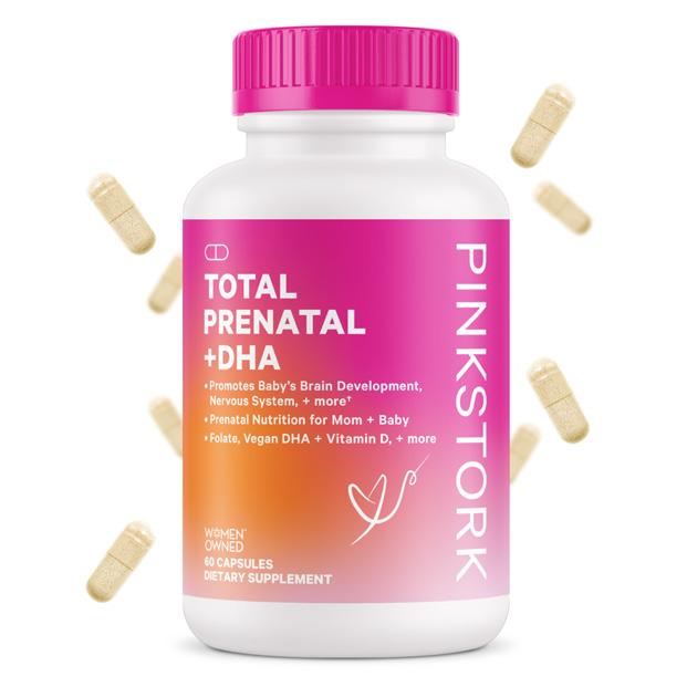
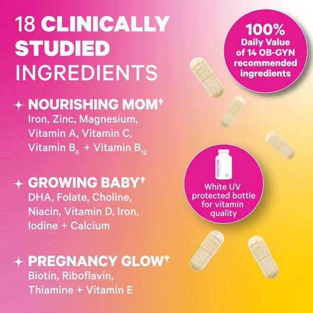
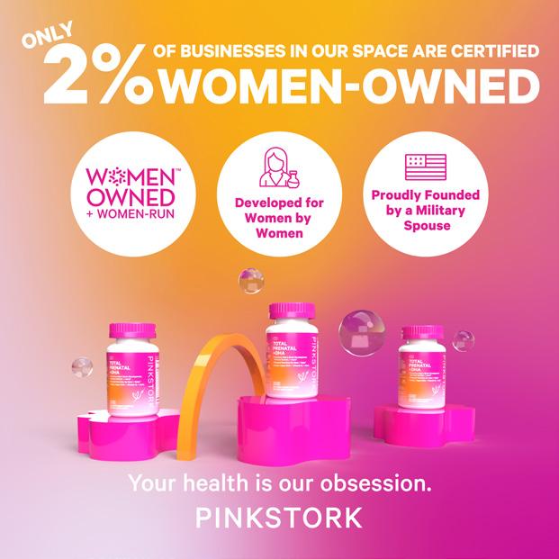
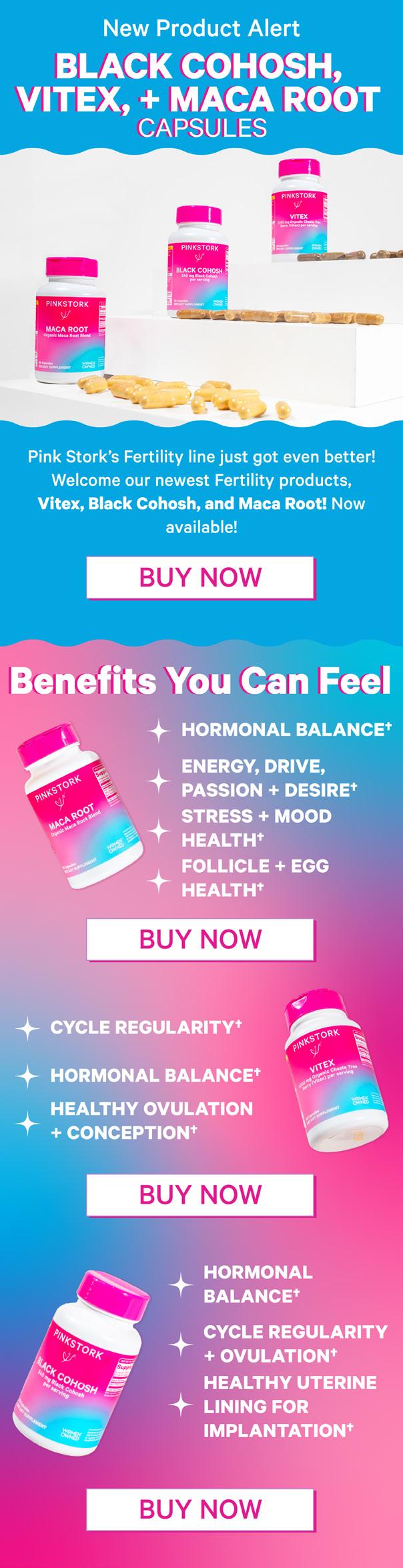
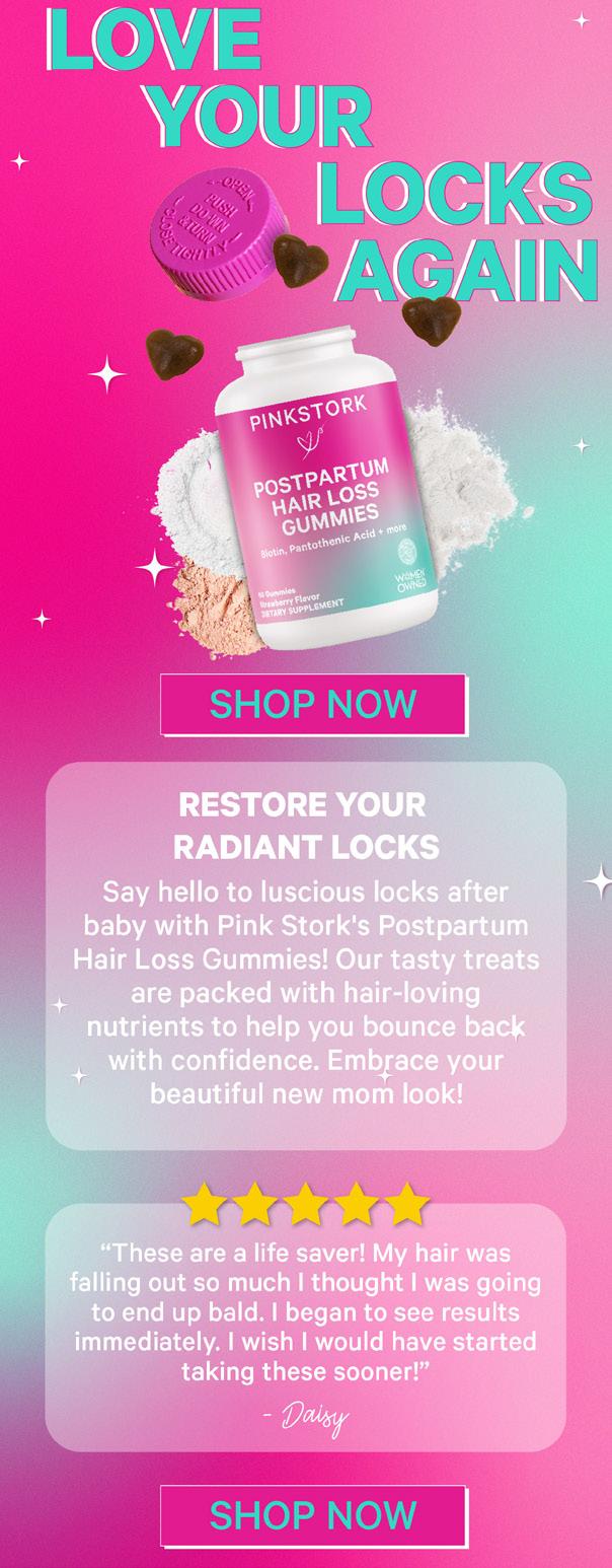
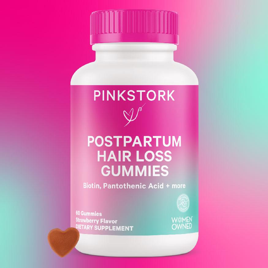
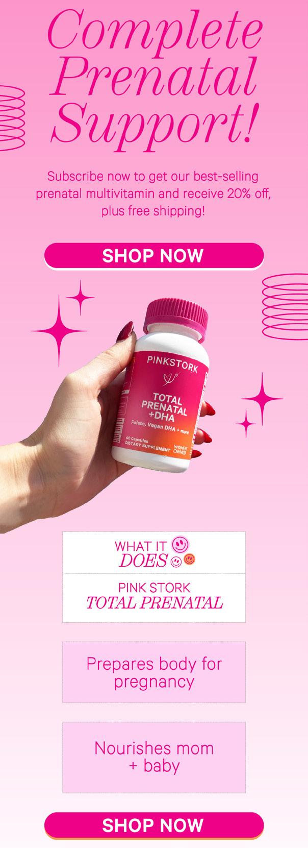
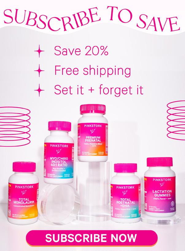
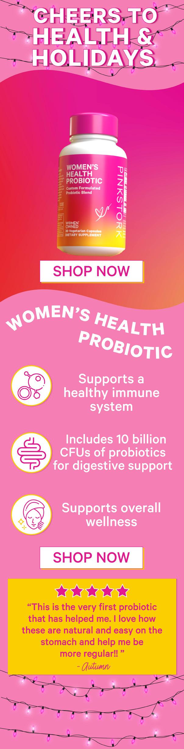
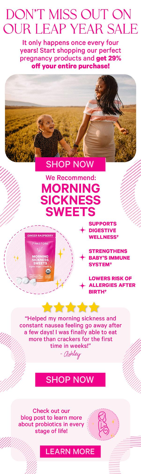
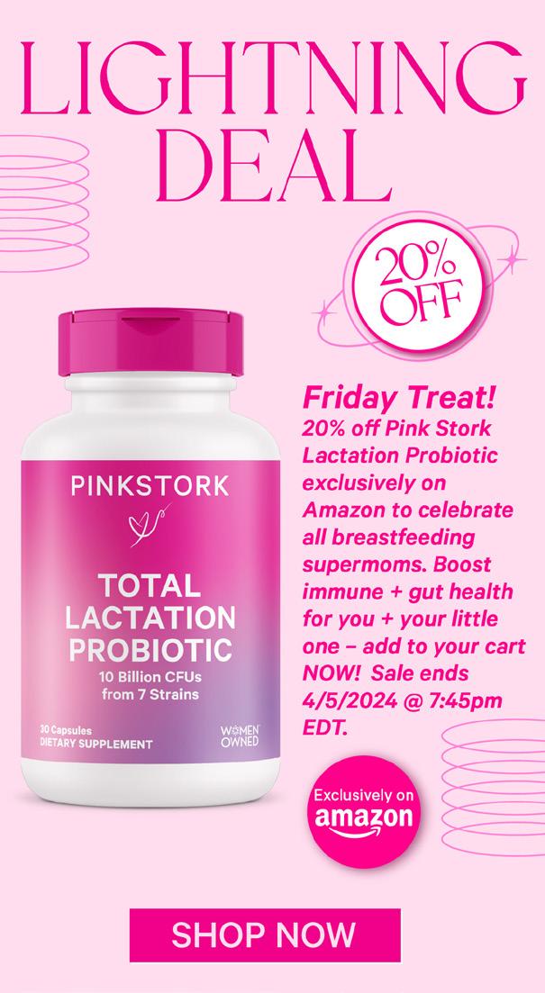
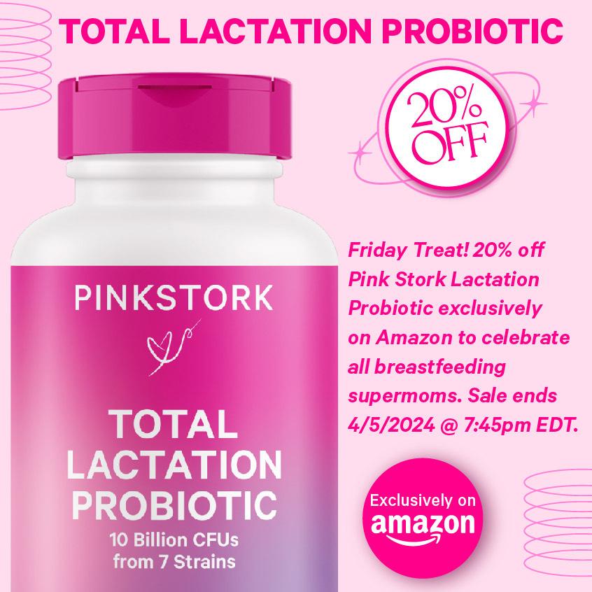
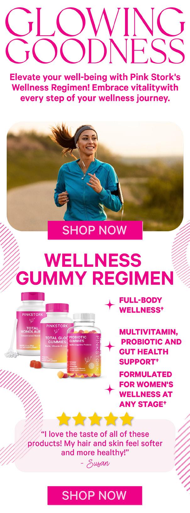
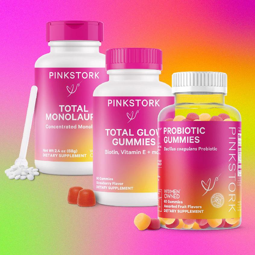
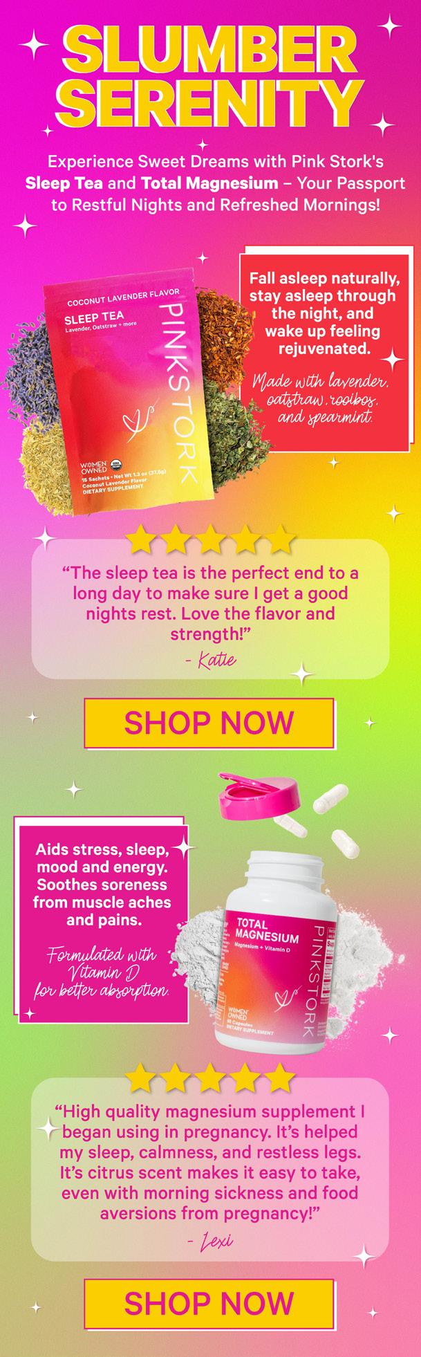
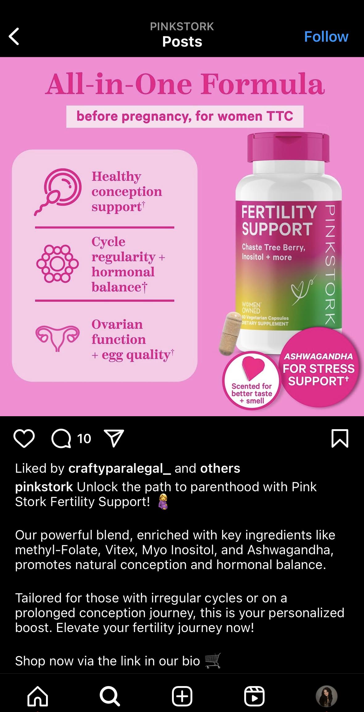
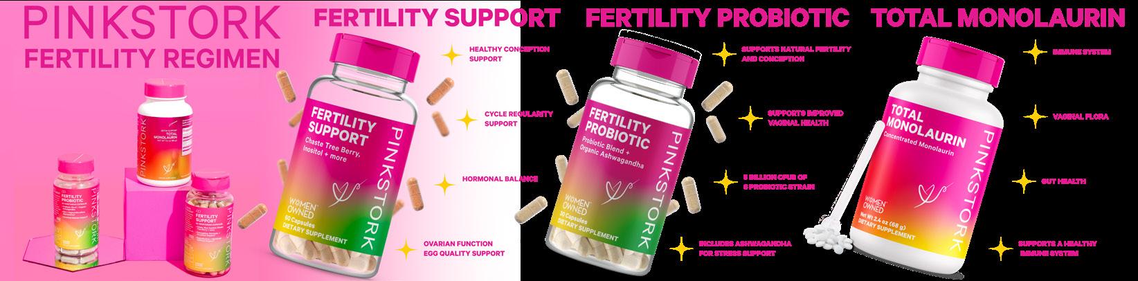
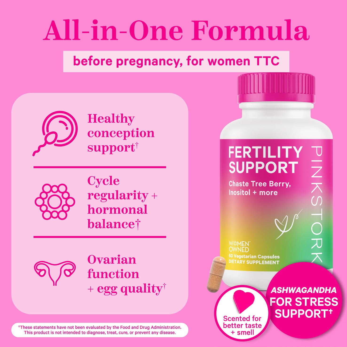
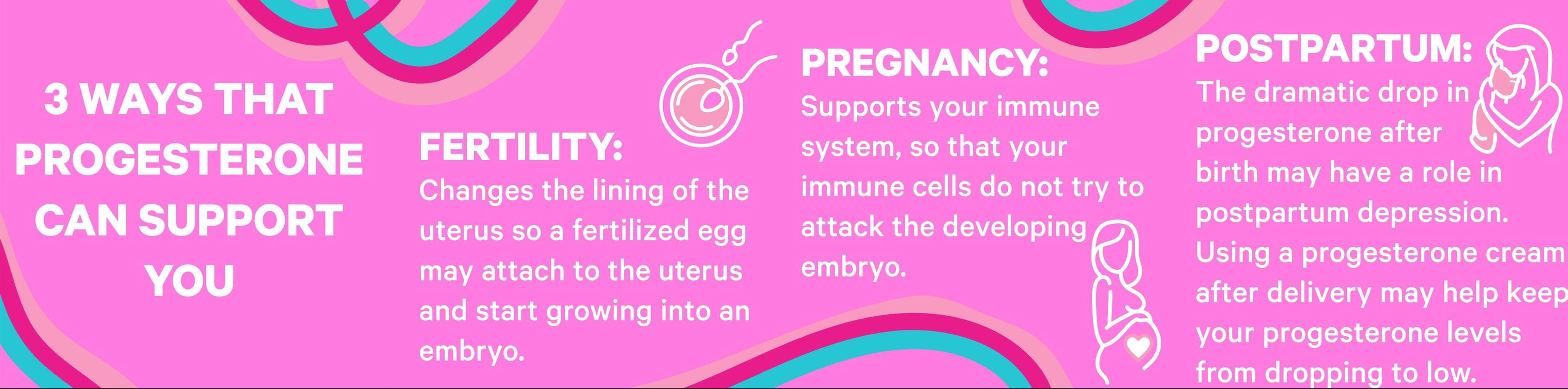
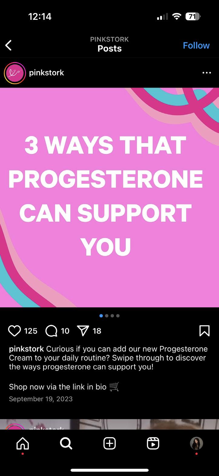
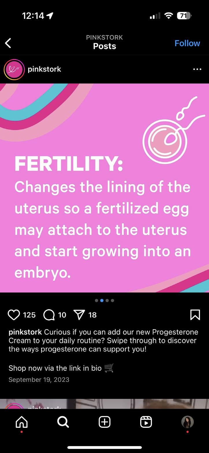
PINK STORK
EMaIL aNd SMS caMPaIGNS, aMazoN
dELIvERaBLES, SocIaL MEdIa adS, 3-dIMENSIoNaL PRoduct IMaGES.
Design narrative
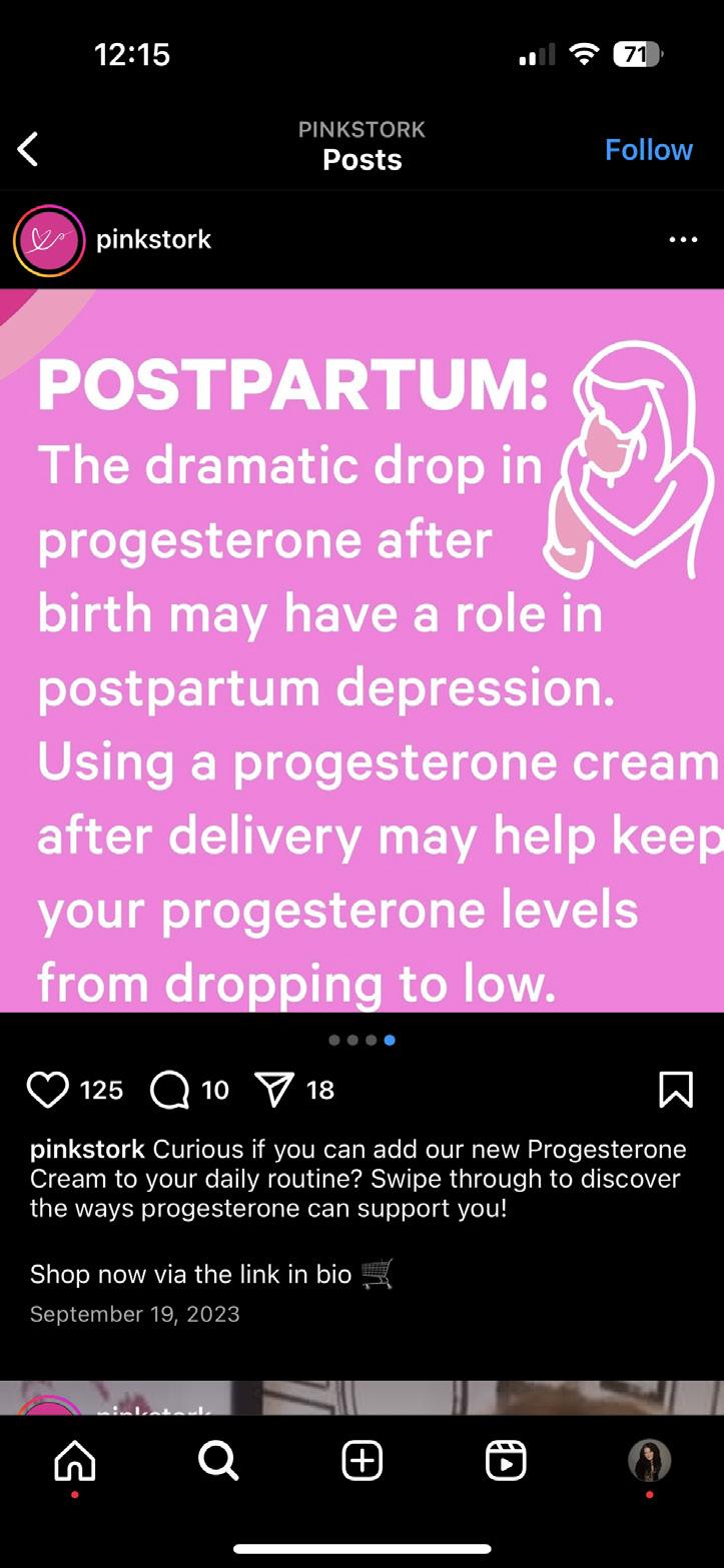
Pink Stork is a wellness brand created by women, for women, dedicated to supporting every stage of a woman’s life— from fertility and pregnancy to postpartum, nursing, and overall wellness. With a mission to provide high-quality, clean products that empower women through these critical life phases, Pink Stork offers supplements, teas, and more, all designed to nurture and support women’s health. The brand’s visual identity plays a crucial role in ensuring a seamless and engaging customer experience across multiple platforms.
Design execution for Pink Stork focused on creating compelling and cohesive graphics that reinforced the brand’s nurturing yet modern aesthetic. A universal and unified look and feel was achieved across various digital touchpoints, including email and SMS campaigns, social media ads, 3D product imagery, and Amazon content. Each asset was strategically designed to maintain brand consistency while engaging and informing customers at different stages of their journey. Email and SMS campaigns were crafted to be visually engaging and conversion-driven, incorporating eye-catching layouts, thoughtful typography, and strong calls to action. Social media advertisements followed suit, leveraging dynamic and scroll-stopping visuals to boost brand awareness and drive traffic to key products. 3D product imagery played a vital role in elevating the online shopping experience, providing hyper-realistic renders that highlighted product details with precision and clarity. Additionally, optimized Amazon squares and enhanced content were developed to ensure a polished and professional e-commerce presence, reinforcing Pink Stork’s credibility and trustworthiness in the wellness space.