Gill Sans
1 9 2 6
A Sans-serif typeface based on Roman Monumental Captials created for headlines and displays.
Designed by Eric Gill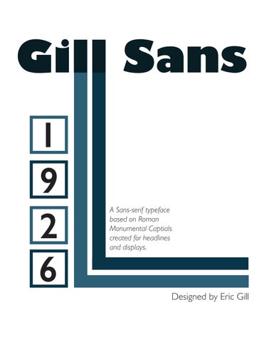
1 9 2 6
A Sans-serif typeface based on Roman Monumental Captials created for headlines and displays.
Designed by Eric Gill


A B C D E F G H I
I J K L M N O P Q R S T U V W X Y Z
J K L M N O P Q R S T U V W X Y Z
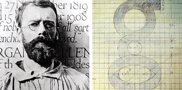
Gill Sans was created in 1926, but the roots can be traced back to the typeface that Gill’s teacher Edward Johnston designed for London Underground Railway in 1913.
The “O” is a perfect circle, and the oblique and vertical strokes as well as upstrokes and downstrokes have a consistent thickness.
Eric Gill was not fully satisfied with Johnston Sans, he wanted to create a typeface that is perfect legible.
Only “a,” “e” and “g” have thinner strokes at the openings of the small eyes.
Gill Sans typeface uses a double storey lowercase “g”. This has a distinctive eyeglass shape, which is easily recognisable.
Noticed by Stanley Morison of Monotype company for its commercial potential, Eric Gill was given the job to design a font that could be the British counterpart to Futura.
The tail of the “Q” does not extend into the counter
The font was then released by Monotype in 1928 as Gill Sans.
Based on Roman character shapes, the design maintains a warmth and humanity not typically associated with sans serif typefaces. While each character shape shares design attributes with the others, the individual characters have their own organic uniqueness and are not derivative of a single design.
“C,” “e” and “f” have vertical stroke ends, creating the effect of the strokes thinning towards the ending.“Lettering is a precise art and strictly subject to tradition. The New Art notion that you can make letters whatever shapes you like, is as foolish as the notion, if anyone has such a notion, that you can make houses any shape you like. You can’t, unless you live all by yourself on a desert island.”
-Eric GillGill Sans Light
Gill Sans Light Italic
Gill Sans Regular
Gill Sans Italic
Gill Sans Semi Bold
Gill Sans Semi Bold Italic
Gill Sans Bold
Gill Sans Bold Italic
Gill Sans Extra Bold
Gill Sans Ultra Bold
Gill Sans Condensed
Gill Sans Bold Condensed
Gill Sans Ultra Bold Condensed