
RUDY VANDERLANS Breaking the Rules of Design
by Mercy KaskorkisCONTENTS Early Design Emigre: The Beginning Critique of Modernists Illegibility Does Not Exist Range of Subjects The End: Emigre No. 69 No Longer an Emigre Onward Opinion Sources 2 4 8 10 13 15 17 18 20 24
TABLE OF
EARLY DESIGN
Rudy VanderLans was born in Voorburg, Netherlands in 1955. He studied graphic design at the Royal Academy of Art in The Hague, graduating in 1979 (“Rudy VanderLans”, Wikipedia). He began working as a design apprentice and junior designer at agencies such as Total Design, Tel Design, and Vorm Vijf (“Rudy VanderLans,” Emigre). Although much of his studies focused on Dutch modernists, characterized by simplicity, grid layouts, and sans serifs typefaces, he was more interested in experimental, playful styles (Armstrong).
VanderLans moved to California in 1981, just two years after graduating from KABK. In a 1992 interview with Eye Magazine, VanderLans expressed his disappointment in European design at the time. He wanted to go back to school and decided to go to the United States because he felt that there was less tradition restricting design than there was in the Netherlands, saying that he felt as if there was “this big, black shadow that was the Dutch or Swiss tradition of design…always looming over you” (Thrift). This pushed him to move to California, where he attended University of Califor-nia, Berkeley, in their graduate photography program. Berkeley is also where he met Zuzana Licko, his wife and co-founder of the Emigre magazine and type foundry (“Rudy VanderLans”, Wikipedia) (Figure 1). They connected over their shared interest in graphic design, despite VanderLans studying photography and Licko studying architecture (Dover).
VanderLans was first introduced to type design at KABK through a program made by Dutch type designer Gerrit Noordzij (“Rudy VanderLans”, Wikipedia). Licko was drawn to VanderLans’ work from KABK as it was a very traditional approach to design and more structured than what was taught at Berkeley (Dover). After finishing school at Berkeley, the two started the Emigre magazine in 1984.
2 1984
“There was this big, black shadow that was the Dutch or Swiss tradition of design…always looming over you.”
Early Design
They connected over their shared interest in graphic design, despite VanderLans studying photography and Licko studying architecture.

3
Figure 1: VanderLans and Licko in their home studio in 2010.
EMIGRE: THE BEGINNING
The Emigre magazine began as a quarterly publication by VanderLans, Licko, and two of VanderLans’ friends. It was named after the word “émigré” because VanderLans still felt like an outsider in California, but he was also beginning to feel like an outsider when he visited the Netherlands. His two friends, who were also Dutch, wanted to start the magazine as a way to publish their work that other publications wouldn’t take (Thrift).
In the last issue of the Emigre, VanderLans writes about the experiences associated with each issue. It was difficult to find stores willing to put it on their shelves, let alone get people to buy the magazine. In VanderLans’ reflection of the first issue (Figure 2), he writes that after dropping a few copies off at a store, he came back the next day to see if they had been sold.
Emigre: The Beginning

4
Émigré because VanderLans still felt like an outsider in California, but he was also beginning to feel like an outsider [in] the Netherlands.Figure 2: The front cover of the first issue of the Emigre.
He was excited to see that they weren’t on the shelves anymore, only to be disappointed when finding them behind another magazine on the stand. The next few issues are much of the same until Issue 5. VanderLans opens by writing that “Zuzana has found a new best friend. It’s the Macintosh computer” (Emigre, no. 69).
The Emigre began with varied content and no distinct audience, publishing works of poetry, photography, short stories, architecture, and more.
It did not have its specific focus on graphic design until VanderLans and Licko began working with the Apple Macintosh computer that was released the same year as the Emigre’s first few issues (Thrift) (Figure 3).
The Apple Macintosh marked a turning point in design that changed the way designers worked with layout, type, printing, and more. Unlike most designers who hated the new technology, VanderLans and Licko were excited to see the new possibilities it could offer. VanderLans stated in a 2012 interview that “most designers were telling us the Macintosh was a fad without any use for serious graphic design so at the time we felt very isolated within the design community. We weren’t taken seriously at all” (Heller).

5
“Zuzana has found a new best friend. It’s the Macintosh computer.”Figure 3: The earliest of the Macintosh computers that the Emigre was made on, featured in the 56th issue.
Their first work with the Macintosh was with the magazine MacWorld that was looking for people to create illustrations on the computer. They reached out to many designers in the San Francisco area, including VanderLans and Licko, to learn to work with the computer for design. Through this work, they discovered that they could make typefaces, and that was their most important reason for getting one for themselves. Before the Macintosh, VanderLans and Licko were not specifically interested in type design, but it allowed them to experiment with typefaces in ways they couldn’t
Emigre: The Beginning
do before. The first few issues of the Emigre were set using a typewriter (Figure 4), and the layout is drastically different and much simpler compared to what was made on the computer in the issues following (Thrift) (Figure 5). VanderLans stated in an interview that the Macintosh “was an incredible, ugly, primitive little machine that could do almost nothing but
render very coarse, low resolution stuff. But we thought it was amazing” (Thrift). This low resolution limitation led to many of Licko’s most well-known typefaces, including the bitmap typeface Oakland, which was made in 1985 (Clifford).

6
Figure 4: A spread from the first issue of the Emigre.
“the Macintosh was an incredible, ugly, primitive little machine that could do almost nothing but render very coarse, low resolution stuff. But we thought it was amazing.”
Because of this new technology, VanderLans and Licko decided to establish the Emigre as a design magazine, giving it a clear audience of graphic designers. Licko would design typefaces, and VanderLans would design the magazine layout, which was largely influenced by the commentary they were making on design at the time. Because he knew designers would look at the pages and typefaces before actually reading the content, he wanted to push the visual design as far as he could in challenging legibility

(Thrift). Jefferey Keedy, a frequent writer for the Emigre, wrote about the “illiterate graphic designer” in 1993. He made the distinction that designers often asked if you had seen the latest issue of the Emigre, not if you had read it. The layout and design choices of VanderLans sometimes made the magazine more difficult to read, but not impossible (Keedy). VanderLans said that he wanted the design to be reasonable enough for people to not skip over it, while also making the piece memorable (Thrift).

7
Figure 5: A spread from the eighth issue of the Emgire, created using the Apple Macintosh.
Figure 6: One of Zuzana Licko’s first bitmap typefaces made on the Macintosh: Oakland.
“Designers often asked if you had seen the latest issue of the Emigre, not if you have read it.”
-Jefferey Keedy
CRITIQUE OF MODERNISTS
When VanderLans was working on the Emigre, he knew that his work was not comparable to things that had to be easily read by their audience, like highway signs. He wanted to challenge the modern design styles he had learned at KABK, which drew the attention of said modern designers, including well-known designer Massimo Vignelli (Thrift). Vignelli is known for his Modernist works, especially for his design of the New York City subway map (“Massimo Vignelli,” Wikipedia) (Figure 7). In the early 90s, Vignelli described the Emigre, both the magazine and typefaces, as “garbage, lacking depth, refinement, elegance, or a sense of history” (Dooley).
This criticism was not uncommon for the Emigre, and VanderLans has said that he thinks a lot of Modernist designers feel threatened by the Emigre’s emphasis on experimentation (Thrift). There was a disconnect between young and old designers, and many Modernist designers felt uncomfortable with the changing landscape of design (Heller, Merz to Emigre and Beyond).

8
The Emigre is “garbage, lacking depth, refinement, elegance, or a sense of history.”
-Massimo Vignelli
Critique of Modernists
Figure 7: Massimo Vignelli’s map of the New York City subway system.
Despite this disconnect between generations, in 1996 VanderLans and Licko decided to reach out to Vignelli to design a typeface specimen for their new font Filosofia (Figure 8), which was based on the modern typeface Bodoni (Dooley). This followed Licko’s design of the typeface Mrs. Eaves (Figure 9), which was inspired by Baskerville, and they made a point to explain to Vignelli that their work was more refined at this time than it had been previously. VanderLans acknowledged the past criticism Vignelli had of the Emigre in his letter to Vignelli, saying that although “this might be a longshot, I decided to write you anyway with the following request.” Vignelli wrote back, surprised but accepting, and designed the specimens for Filosofia (Vignelli Center).

A few years later, Licko commented on this collaboration, saying that “Massimo’s willingness to collaborate on our announcement reflects Emigre’s ability to bridge different approaches” (Dooley). Licko continued experimenting with type after creating these two typefaces.

9
There was a disconnect between young and old designers, and many Modernists designers felt uncomfortable with the changing landscape of design.
“Massimo’s willingness to collaborate...reflects Emigre’s ability to bridge different approaches.”Figure 8: Licko’s typeface Filosofia, based on the modern typeface Bodoni. Figure 9: Licko’s typeface Mrs. Eaves, based on Baskerville.
ILLEGIBILITY DOES NOT EXIST

In terms of experimentation with their typefaces, VanderLans says you cannot change the shape of a letter, but you can strip it to its skeleton and stretch the visual boundaries from there. He and Licko knew typefaces like theirs would never be produced by larger companies, so they made fonts that they liked and assumed there were others who would also like it (Thrift).
Issue 15 of the Emigre focused on this aspect of type, challenging legibility and traditional uses of fonts. The issue begins with a headline saying “letters are legible. If some things are not legible, then they are not letters. Illegible letters do not exist. Illegibility does not exist.” The entire issue breaks traditional design rules, such as using typefaces that are just barely resembling their “skeletons.” There is an entire page set in Licko’s latest typeface, Totally Gothic (Figure 10), defined by its irregular, blocky
shapes and sharp corners (Emigre, no. 15). When asked about this page, VanderLans said that although most designers would reserve Totally Gothic for a short headline, he still used a point size large enough to be read, saying that although it was around 13 lines long, the entire section is just one very long headline (Thrift). The quote itself is from Licko, stating that a “reader’s familiarity with [type]faces accounts for their legibility. Studies have shown that readers read best
10
Illegibility Does Not Exist
Figure 10:
A page from Issue 15 of the Emigre, set entirely in Zuzana Licko’s typeface Totally Gothic.
“Readers read best what they read most”-Zuzana Licko
what they read most.”
She continues by comparing how blackletter typefaces of the 14th and 15th century are difficult to read today, but they were the most common typefaces used in that period (Emigre, no. 15). This comparison is also made in a New York Times article about type from 1992, saying that Licko was challenging the functionality of type similar to how medieval illuminated manuscripts had elaborate first letters that were often nearly impossible to read.
By pushing the boundary of legibility in her type design, Licko paved the way for designers to create fonts without the “worry of readability and reproducibility” (Veltman). VanderLans expands this comparison, saying that people struggled with typefaces like Baskerville and Helvetica when they first came out, but “now these are the most neutral typefaces imaginable” (Thrift). Licko’s message challenges what fonts can be used for headlines and what can’t be, and VanderLans’ presentation of the layout reinforces it.
Because of Licko’s many type explorations, the two founded Emigre Fonts in 1985. After just the first two issues, the Emigre magazine was
made entirely with typefaces by their foundry (Armstrong). As more designers began using the Macintosh, they asked if VanderLans and Licko could send their typefaces on disc. This prompted VanderLans and Licko to start selling their fonts, and officially creating Emigre Fonts (Thrift). The type foundry funded the magazine, and they advertised their fonts in every issue (Heller, The Atlantic).
11 1985
“Letters are legible. If some things are not legible, then they are not letters. Illegible letters do not exist.”
A yin and yang relationship: Licko was more methodical, while VanderLans was more intuitive.
VanderLans and Licko worked alongside each other for the type foundry, with Licko creating the typefaces and VanderLans creating the type specimens (“Rudy VanderLans”, Wikipedia). Licko described their work together as a yin and yang relationship: she was more methodical, while VanderLans was more intuitive (“Zuzana Licko,” Wikipedia). The Macintosh technology influenced them both but in very different ways. Licko was able to create a system for making typefaces and VanderLans was able to branch out with more creative layouts. VanderLans explained in an interview that they didn’t do the same work, but the “computer provided a working environment that allowed each of us to do work that complemented the other perfectly” (Dover).
In the same interview, Licko explained that their work was very individualized, but they are always giving each other feedback when one gets stuck or isn’t pushing their creative boundaries enough. She also explained that because they did not work for clients, their work is purely their own, which is why having each other is helpful (Dover). When asked about how they influence each other’s practices, VanderLans said that because “we know each other’s work and abilities so well, it’s easy for each of us to recognize when the other is not working up to their potential. You can’t pull a fast one on your spouse.” The two of them are grateful that the field of design has allowed them to work side by side and integrate their work into their lives (Dover).
12
“We know each other’s work and abilities so well, it’s easy for each of us to recognize when the other is not working up to their potential.”
“You can’t pull a fast one on your spouse.”
Illegibility Does Not Exist
RANGE OF SUBJECTS
Because VanderLans and Licko’s work is very individualized, the Emigre spans many different topics and each issue’s focus is chosen by chance. The earliest issues spanned from photography to poetry to architecture and did not have a design focus, but later issues featured the Emigre’s typefaces, posters, photography, and profiles and essays written by various designers.
When the Emigre magazine began in the mid-eighties, it was marking a new age in design with the advancements of technology, but also a broader cultural change was taking place. The 60s and 70s were characterized by pushing boundaries of what was shown in media and arts, but as stated in Steven Heller’s Merz to Emigre and Beyond, “by the mid-eighties, it was increasingly difficult for alternative publications to be truly unacceptable” (Heller, Merz to Emigre and Beyond). This was a period where things that were offensive a decade ago were now mainstream,
and periodicals that used to be considered alternative were now common. Heller explains that “the essence of experimentation had changed.” With the new technology of the 80s, experimentation in design was able to focus on layout, composition, and type. The Emigre was at the forefront of this change, and VanderLans and Licko took advantage of the changing technology to do so. Although the alternative publications of the 60s and 70s challenged culture and politics, the Emigre took the approach of challenging design, through the writings in the magazine but also the visual design (Heller, Merz to Emigre and Beyond).
essense of experimentation had changed.
13
The
Each subject of the Emigre’s issues “all happen by accident”
Because of this, VanderLans and Licko took chances with whose work they put in each issue, finding designers that were still developing their style or trying new things. VanderLans said that each subject of the Emigre’s issues “all happen by accident” and that trying new things is exciting (Thrift).
For example, while running the Emigre, many of the designers and writers that VanderLans and Licko worked with sent over other work they had done, including music. The couple wanted to find another way to showcase the work of the people they worked with, and their openness to trying new things led them to create the Emigre Music Label in 1990. Its latest release was from 2002, with a sample package made in 2009 of various artists they’ve worked with (“Emigre,” Discogs). VanderLans and Licko gave these creatives a place to release their music through their company because they found enjoyment in showcasing work that would otherwise never be experienced by others, in both the record label and the magazine (Thrift).
By showcasing new opinions in the Emigre magazine, VanderLans and Licko were able to create a publication that stayed relevant for decades. Jeffery Keedy stated that “what the magazine lacks in refinement, it makes up for in being relevant” (Keedy). However, this changed in the early 2000s with the rising popularity of the Internet and a faster paced culture.
Range of Subjects
14
“What the magazine lacks in refinement, it makes up for in being relevant.”
-Jeffery Keedy
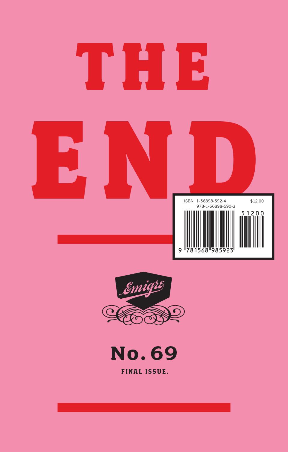
THE END: EMIGRE NO. 69
After over two decades of publishing the Emigre, VanderLans and Licko decided to make the 69th issue in 2005 its last. The issue, simply titled “The End” (Figure 11), was a sentimental look back through each of the issues, with writings from VanderLans about each one. Some are about the designers that were featured in the issue, others were about his own feelings or conversations associated with it.
2005
At Issue 65, he writes about how he imagined publishing 100 issues of the Emigre, but is content with stopping after four more. At Issue 66, he writes that the sales of the magazine are declining, but “the news [felt] strangely inconsequential,” as he had been awaiting the end of the magazine. Issue 68 simply says “one more issue to go,” ending with Issue 69 saying “thanks for reading Emigre.”
Thanks for reading Emigre.
The following pages of the issue are letters from friends and colleagues of VanderLans and Licko to “bid farewell” to the Emigre magazine. The letter from Elliott Earls, a graphic designer working at the Cranbrook Academy of Art, explores what he believes to be the death of the Emigre: Internet blogs. He states that on the good side, VanderLans running the magazine was one of its strengths, allowing it to grow and “evolve with Rudy’s interests.”
15
Figure 11: Cover of the 69th and final issue of the Emigre.
However, Earls says that the magazine “failed to adapt to the rise of the blogs,” ultimately leading to its end (Emigre, no. 69). There is an irony to the fact that the Emigre was both born and killed by the changes in technology surrounding it. The Macintosh allowed it to break the bounds of what design was in the 80s, but it did not adapt to the new technology of the 21st century. In the 56th issue, VanderLans takes readers on a walkthrough of all the technology and equipment they had used to make the Emigre thus far. The issue focuses on how technology shaped the making of the Emigre, comparing where it started to where it was at the time of this issue (Emigre, no. 56). The problem was that technology had changed so fast, and it had drawbacks that VanderLans did not like. In 2012, he explained his dislike for blogs, saying that “the
design conversations online were all very instant and short, like snapshots. I like long, drawn-out essays. I like to think about things. I need time to reflect.” The Emigre was known for publishing what VanderLans felt drawn to, but he no longer felt drawn to what the culture was participating in, saying he “felt disconnected from much of it” (Heller, The Atlantic).
16
“The design conversations online were all very instant and short, like snapshots. I like long, drawn-out essays.
The End: Emigre No. 69
I like to think about things. I need time to reflect.”
The Emigre was both born and killed by the changes in technology surrounding it.
NO LONGER AN ÉMIGRÉ
In VanderLans’ opening of the final Emigre issue, he acknowledges the turning point in his life that 2005 is, as his magazine is ending while he is applying for citizenship in the United States. He returns to the origins of the name “Emigre” being based around feeling like an émigré in both the Netherlands and California, but now after over two decades, he writes that he “no longer feel[s] much like an outsider anymore. Perhaps it’s the right time to say goodbye to that idea” (Emigre, no. 69).
VanderLans has acclimated to life in California and has broken away from the shadow of Dutch design he disliked so much in the 80s. Ever since he came to California, he had been photographing the state and around the country, publishing eleven photo books in his career. His book, Supermarket (Figure 12), goes through a journey of California through photos, pointing out landmarks and imagery, making the desert landscape seem calm and inviting (Supermarket). VanderLans was able to get to know his new home and no longer feels out of place in it.
Émigré

17
Figure 12:
A spread from Vanderlans’ Supermarkets, featuring photos of the California landscape.
VanderLans no longer [feels] like an outsider so “perhaps it’s the right time to say goodbye to that idea.”
Although the Emigre magazine had been retired, VanderLans and Licko still run Emigre Fonts, creating new typefaces and variations within their existing families. When the magazine was ending, VanderLans said that he “lost [his] appetite for design discourse and started focusing entirely on [their] typefaces and the design of [their] type specimens.” The typefaces they create have also changed too. Emigre Fonts used to focus on more unconventional typefaces that would be used for headlines, but in the mid 2000s, a lot of other designers were also creating eccentric typefaces. VanderLans and Licko decided to switch their focus to typefaces that could be used for body text, which VanderLans says is a new challenge because it “requires a different set of skills” (Heller, The Atlantic).
In the mid 2000s,
Licko’s typeface Mrs. Eaves now has 96 variations, at the request of Emigre’s customers, with variations that are meant for headlines and others meant for smaller text. VanderLans and Licko know there is more competition in the digital age, as creating typefaces is more common than it was when Emigre began. With the advancements in technology, he says he is impressed and “almost jealous” of younger generations’ ability to create typefaces with such ease compared to his work in the 80s. He is also “struck by how conservative most
18
VanderLans and Licko know there is more competition in the digital age, as creating typefaces is more common than it was when Emigre began.
ONWARD
Onward
VanderLans and Licko decided to switch their focus.
of the work is” saying to younger generations that “you’re only young once, and that’s a great opportunity to experiment, to do something out of the ordinary.” This greatly contrasts how Modernist generations of designers reacted to his work with the Emigre, as VanderLans is impressed by those younger than him and encourages them to break boundaries more (Heller, The Atlantic).
Currently at Emigre Fonts, VanderLans creates the type specimens for Licko’s typefaces. VanderLans says they set themselves apart from other foundries by still creating printed type specimens, which he designs. Although expensive, VanderLans believes that because fonts are still used in print, they should have printed specimens for people to view them (Heller, The Atlantic). The couple enjoys having their work be integrated into their home lives, and working together is something they are grateful to be able to do. In 2010, Licko shared that she sees their retirement to be the same as what they’ve been doing, just at a slower pace (Dover).
19
“You’re only young once, and that’s a great oppurtunity to experiment, to do something out of the ordinary.”
They set themselves apart from other foundries by still creating printed type specimens.
At first glance, the work of Rudy VanderLans’ design in his magazine, Emigre, looks quite chaotic and nearly impossible to comprehend. However, it’s just that–a first glance. When I read Jeffery Keedy’s criticism of the illiterate designer, I realized that is what I had been doing while looking through past issues of the Emigre. I was looking at the visual design, never taking the time to actually read the content, even though it often directly correlated with the reasoning behind VanderLans’ layout decisions.
For example, in Issue 15, I would probably be questioning why VanderLans set over 10 lines of copy in Licko’s Totally Gothic font (Figure 10). Under the typi-
OPINION
cal rules of design, there wouldn’t be a reason to have either an incredibly long headline or to have what is supposed to be body copy set in a font like Totally Gothic. However, the entire issue is about how typography is challenging legibility. The writing itself is about how people get used to reading in certain typefaces and therefore read them faster. The next page at first glance looks like a wall of text with differing weights at random. However, it is an interview with Zuzana Licko, and the varying weights and styles match questions versus answers.
VanderLans also utilizes scale, leading, and tracking to make some areas more prominent than others. He matched what Licko was saying with the visual design, so reading the copy was half the message itself.
20
Opinion
The content often directly correlated with the reasoning behind VanderLan’s layout decisions.
Although VanderLans’ goal was to push the boundaries of legibility and readability, I do think there are some instances where a reader simply cannot read what is written. In Issue 41, each section takes on the same formula of a photo of a magazine cover and then an essay about it. However, around the middle of the issue there is an interruption in this methodological design. Each page is chaotic, with overlapping and crashing text and warped photography on each page. These pages are filled to the edge and into the gutter, with barely any negative space, contrasting the first part of the issue. There’s a table of contents as well, as if there is a new magazine within the one you were already reading. One of the stories runs horizontally along the bottom of the spreads, so you have to turn the magazine to actually read it.
I know this would be intentional of VanderLans, as he is creating a separation between the writing and everything else above it. However, some lines are caught in the gutter, and some are cut off from the ends of the pages because there is no margin. I know this is intentional of VanderLans, but those few missing lines make the reading experience very disjointed–more than it already is with reading text along the bottom of each page. There are other instances in different issues where multiple bodies of text overlap, but VanderLans uses scale, weight, and spacing to make each area distinguishable, so readers can still make out what it says. This was something where that simply was not the case.
21
Each page is chaotic, with overlapping and crashing text and warped photography.
In terms of typeface design, I loved to see the change in VanderLans and Licko’s relationship with Vignelli and the change in his opinion about the Emigre. In general, I think it is very expected that older generations frown upon new trends because it is changing things in ways they aren’t used to.
VanderLans and Licko took the chance with the Macintosh while most designers were saying it wouldn’t last, and it paid off for them. Older designers would not take a risk like this because they already established themselves in the design world, whereas VanderLans and Licko were just starting out and were able to take the risk. Vignelli learning to respect their craft and be willing to collaborate with them is an unexpected change of opinion, especially after how he criticized the magazine not long before. I think because Licko was specifically making typefaces based on Baskerville and now Bodoni, Vignelli was more willing to collaborate because he already held respect for the original design of the typefaces. I think this is why he was able to say yes to collaborating with them because he could recognize the change in design trends without entirely throwing out older typefaces. This collaboration across generations shows how the Emigre was able to change minds about design trends.
Looking ahead to what is becoming more popular now, I wonder if art and design made with artificial intelligence could advance enough to be the new normal, comparable to the way MacBooks are commonplace today. Things like NFTs have already changed the way people think about buying art, and AI is shifting the idea of what it means to make art. VanderLans and Licko’s explorations on the first Macintosh computer began an expansion of design capabilities, but technology has now advanced so much that it makes one wonder if it could eventually be replacing the need for individual’s designing and creating.
22
Opinion
VanderLans and Licko took the chance with the Macintosh while most designers were saying it wouldn’t last, and it paid off for them.
The collaboration across generations shows how the Emigre was able to change minds about design trends.
I think the Emigre magazine ended under sad circumstances, but it is almost fitting that it started and ended because of changing technology. I’m not sure how the Emigre could have ever adapted to the world of blogs, especially now that there’s new content being made on the Internet much faster than there was in 2005. Even long-form blog posts are not as long as an essay in a magazine, nor do they reach the same depth. Because there is such a wide variety of types of content (blogs, social media posts, videos, posters, etc.), it’s hard to see where the Emigre magazine would have fit into it all had it not ended. The last issue does a beautiful job telling the story of the magazine, starting from VanderLans and his friends’ original idea and reasoning for a magazine. Knowing how influential of a magazine this ended up being, it was interesting to read about how much effort VanderLans put into getting the magazine on shelves in stores and how he watched as the first few copies were finally bought. The perseverance he, Licko, and their two friends had to get the magazine going is the reason they had such an influential hand in design changing with the rise of technology.
I also really enjoyed VanderLans’ photography. Supermarket reads like poetry backed with images. VanderLans goes through different locations in California, pointing them out and explaining what the viewer is seeing. It felt like wandering through the desert trying to find my way somewhere. A few times VanderLans writes “and if you lived here / you’d be home now,” but then continues through more of California.
VanderLans also has a few Still Lives books, specifically of California and then also of various cities in the United States. In Still Lives, USA, VanderLans takes photos of things that would never get a second glance if he wasn’t photographing them–things like the walls of old brick buildings, or road signs welcoming you to a new town. By making these mundane locations and things into photography, VanderLans was able to give them more meaning than they would otherwise have.
Thanks for reading Emigre.
23
[The Emigre] started and ended because of changing technology.
SOURCES
Armstrong. Digital Design Theory: Readings from the Field. Princeton Architectural Press, 2016.
Clifford, John. “Rudy VanderLans and Zuzana Licko.” Graphic Icons Visionaries Who Shaped Modern Graphic Design, Peachpit Press, Berkeley, 2013.
Dooley, Michael. “Critical Conditions: Zuzana Licko, Rudy VanderLans, and the Emigre Spirit.” Emigre, https://www.emigre.com/Essays/Emigre/CriticalConditionsandtheEmigreSpirit.
Dover, Caitlin. PrintMag. “Design Couples: Rudy VanderLans and Zuzana Licko.” PRINT Magazine, 10 June 2010, https://www.printmag.com/designer-interviews/design-couples-rudy-vanderlans-and-zuzana-licko/. “Emigre.” Discogs, https://www.discogs.com/label/26300-Emigre.
Heller, Steven. “Can the Rule-Breaking Font Designers of Three Decades Ago Still Break Rules?” The Atlantic, Atlantic Media Company, 25 Aug. 2015, https://www.theatlantic.com/entertainment/ archive/2012/11/can-the-rule-breaking-font-designers-of-three-decades-ago-still-break-rules/264958/.
Heller, Steven. Merz to Emigre and Beyond: Avant-Garde Magazine Design of the Twentieth Century Phaidon Press, 2014.
“Jeffery Keedy.” Wikipedia, Wikimedia Foundation, 19 May 2022, https://en.wikipedia.org/wiki/Jeffery_Keedy.
Keedy, Jeffery. “Graphic Designers Probably Won’t Read This . . . but.” Emigre, https://www.emigre.com/ Essays/Emigre/Graphicdesignersprobablywontreadthisbut.
“Massimo Vignelli.” Wikipedia, Wikimedia Foundation, 9 Oct. 2022, https://en.wikipedia.org/wiki/ Massimo_Vignelli.
“Rudy VanderLans.” Emigre, https://www.emigre.com/Designer/RudyVanderLans.
“Rudy VanderLans.” Wikipedia, Wikimedia Foundation, 30 Jan. 2022, https://en.wikipedia.org/wiki/ Rudy_VanderLans.
Thrift, Julia. “Feature: Reputations: Rudy VanderLans.” Eye Magazine, https://www.eyemagazine.com/ feature/article/reputations-rudy-vanderlans.
VanderLans, Rudy, et al. “Do You Read Me?” Emigre, no. 15, 1990.
VanderLans, Rudy. Supermarket. Gingko Press, 2001.
VanderLans, Rudy, et al. “The Emigre Legacy: 15 Years of Graphic Design.” Emigre, no. 56, 2000.
VanderLans, Rudy, et al. “The End.” Emigre, no. 69, 2005.
Veltman, Chloe. “When a Word’s Look Counted as Much as Its Meaning.” The New York Times, The New York Times, 10 Jan. 2010, https://www.nytimes.com/2010/01/10/arts/design/10sfculture.html. Vignelli Center. “Archive: Vignelli.” Tumblr, 6 July 2021, https://vignellicenter.tumblr.com/ post/655996553054519296/emigre-and-vignelli-make-peace-over-bodoni.
“Zuzana Licko.” Wikipedia, Wikimedia Foundation, 19 Sept. 2022, https://en.wikipedia.org/wiki/Zuzana_Licko.
24
Sources