Megan Parker
Architecture & Interior Architecture
Design Portfolio
Megan Parker
Architecture & Interior Architecture Design Portfolio

Architecture & Interior Architecture
Design Portfolio
Architecture & Interior Architecture Design Portfolio
Atlanta, GA | 334.301.9361 | meparker502@gmail.com
Architecture + Interior Architecture
Auburn University Dean’s List Fall 2019 - Spring 2024
Spirit of Auburn Founders Scholarship 2019 - 2023
Charles Mount Study Abroad Scholarship 2022 - 2023
Frank J. Sindelar Endowed Scholarship 2021 - 2022
American Institute of Architecture
Associate Member | Current
Auburn University Panhellenic Sorority
Member - Delta Gamma | 2019 - 2023
Socials Committee Member 2023
- Supervised social events and organized entry protocol
Skills
AutoCAD
Rhinoceros
Lumion
Adaptability
Teamwork
Revit
Adobe Suite
Twin Motion
Communication
Work Ethic
Auburn University | Auburn, AL
College of Architecture, Design and Construction
Bachelor of Architecture / Bachelor of Interior Architecture Dual Degree Program
May 2024 | G.P.A. 4.0
Study Abroad Architecture Program | Aarhus, Denmark
February 2022 - May 2022
Harrison Design | Atlanta, GA
Associate Designer | Jul 2024 - Present
-Communicated and collaborated with the client to assist in determining the project’s intent, priorities, scale, and scope
-Coordinated development of high-level construction document sets and of existing architectural conditions
-Investigated construction methodologies by designing detail wall sections through exploration and iteration
Goodwyn Mills Cawood | Birmingham, AL
Architectural Designer | May - Aug 2022, Aug 2023 - Mar 2024
-Collaborated with team members while designing details, building massings, and floor plans
-Developed a working knowledge of Revit to create construction documents and project proposals
-Designed visual languages while producing informative, diagrammatic imagery for client meetings
Auburn University Architecture Program | Auburn, AL
Teaching Assistant | May - Aug 2021, May - Aug 2023
-Taught students how to efficiently move between 2D (AutoCAD, Illustrator, Photoshop, and InDesign) and 3D programs (Rhinoceros)
-Facilitated and organized meetings, supervised students’ progress, and mentored students
-Sharpened communication and interpersonal skills while collaborating with professors and other TAs


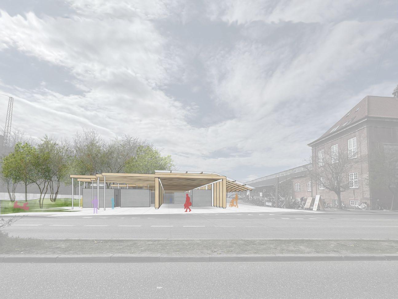
Location
Downtown Columbus, Georgia
Program
Multi-Family Housing
Retail Lobby
Public Courtyard
Square Footage
34,000
Faculty
Christian Dagg
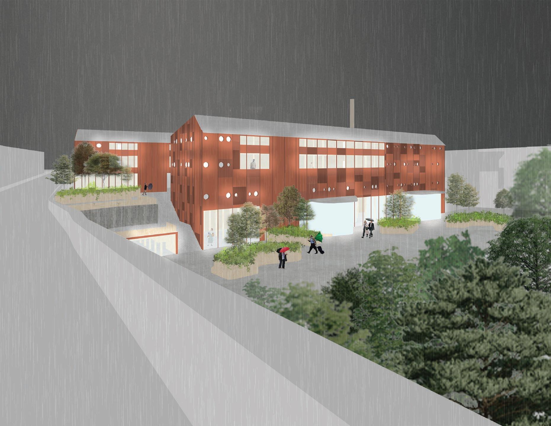
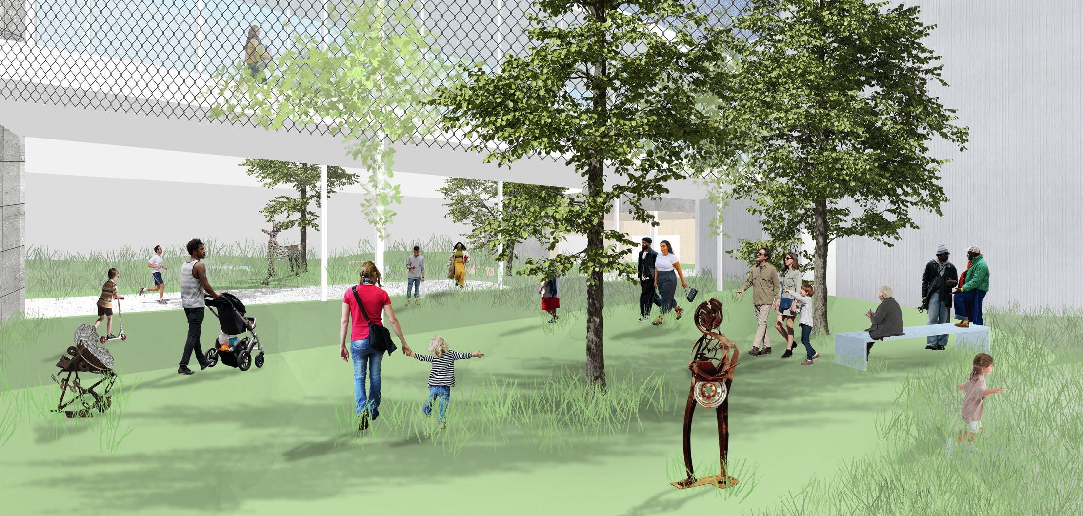
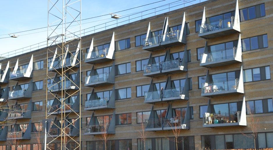
While studying Columbus, there were several site conditions that influenced the direction of the project. First, Columbus has several abandoned, derelict factories that are visible from the major highways leaving and entering the city. The forms and aesthetics of these factories were referenced while designing to produce architecture that is site-specific. Second, the geographical orientation of the given site determined where certain programs were arranged to avoid harsh sunlight. Being a multi-family housing project, it was important not to place housing units that faced the western setting sun. Third, adjacent buildings, landmarks, and sound pollutants helped determine the master planning of the site. With a busy highway to the north and a train track to the south, the designed building’s surface area facing these directions needed to be minimized. The Chattahoochee River and public riverwalk to the west are notable destinations in Columbus; thus, capturing views of these notable attractions was prioritized. With the help of a thorough understanding of the site and specific aesthetic preferences, the project’s design began to embody reactions to all these observations.
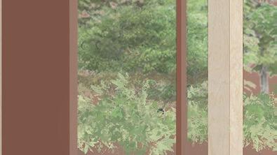
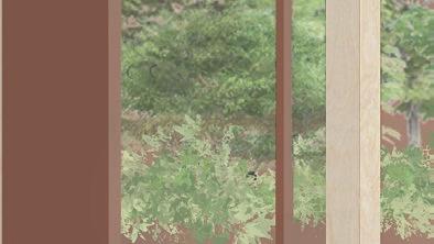
(right) top to bottom sketches created to test different window treatments thinking about the effect to the overall composition and experience
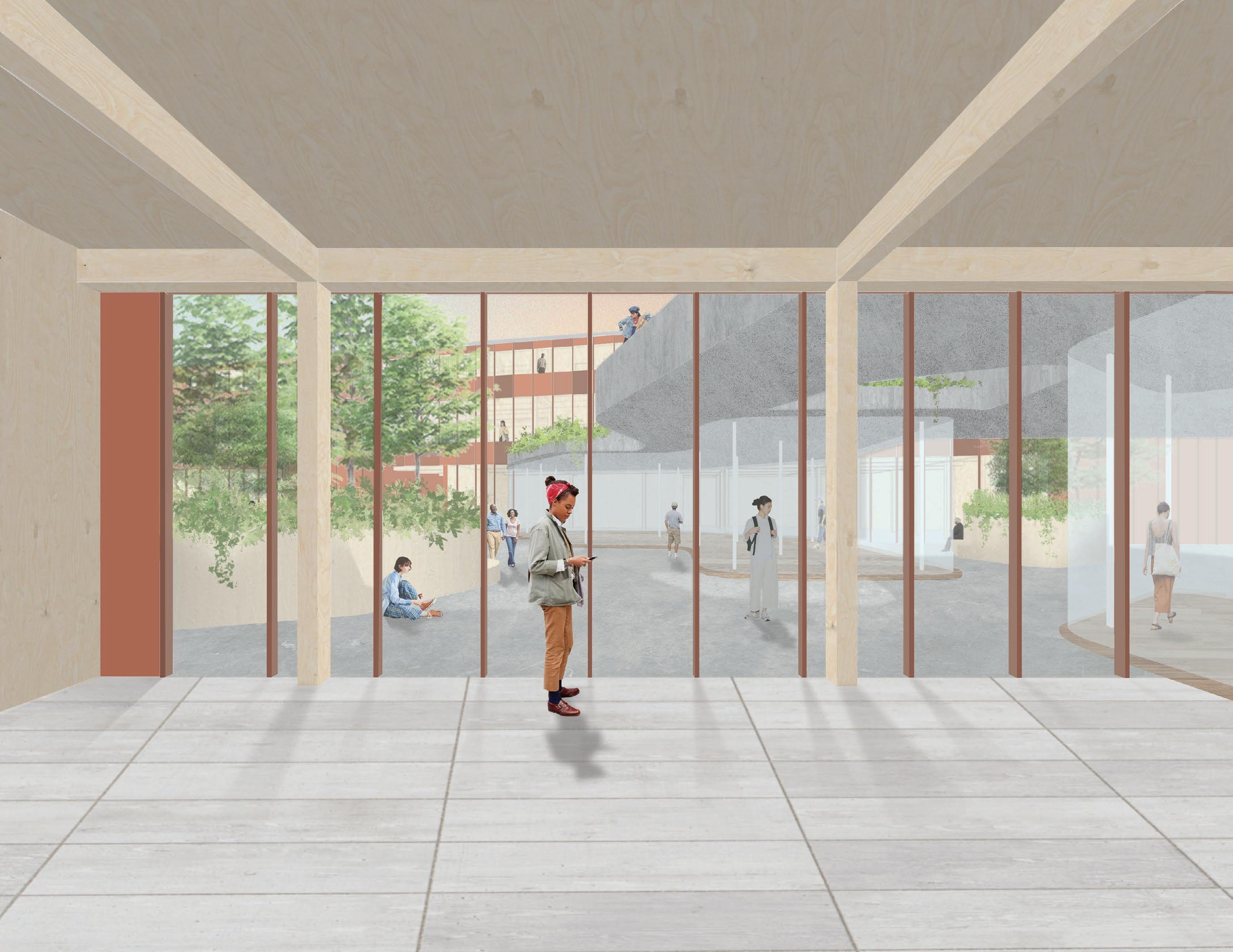
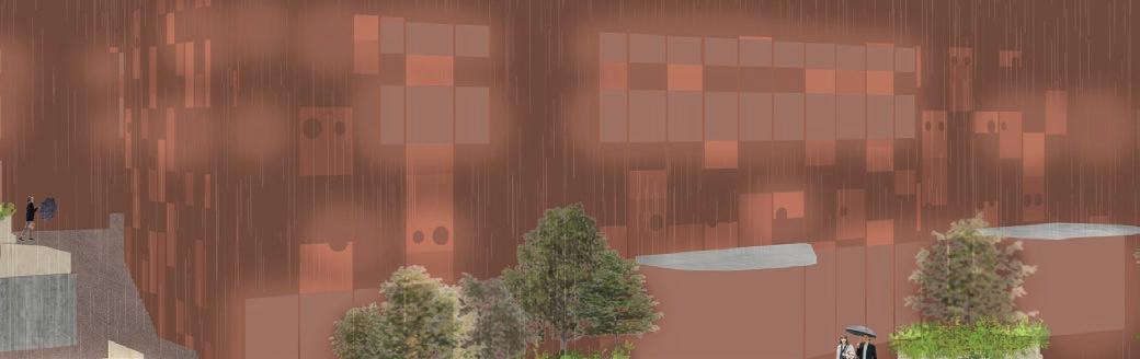
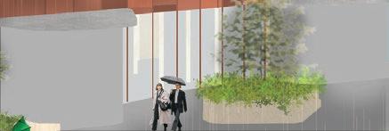
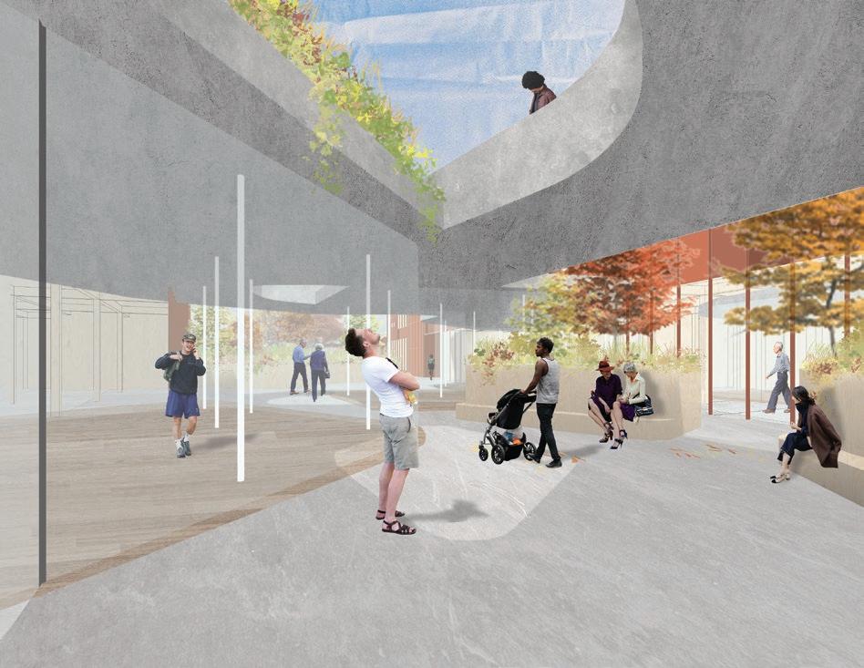
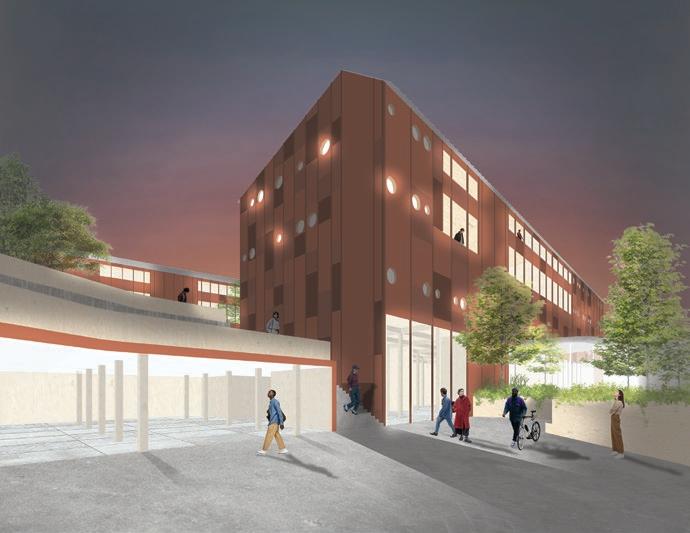
(opposite) clockwise from the top view from busy highway looking onto the project during a rain storm; night time view of building’s relationship to the existing riverwalk; view from inside the courtyard depicting the layers of pavilions and planters
(above) left to right lower plan, ground plan (opposite) upper residential plan
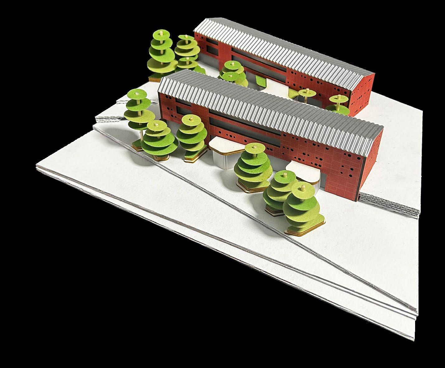
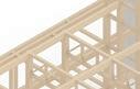
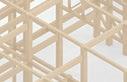
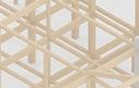
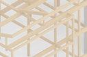
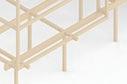
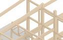
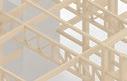
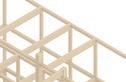
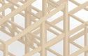
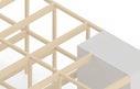
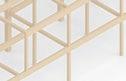
Emulating the factories’ practical aesthetic, two programmatic bars were designed using mass timber structural grids. The result was a rigid, rectilinear structure that houses the residential uses. To counterbalance this utilitarianism, curvilinear interventions in the form of public glass pavilions began to inhabit the courtyard and riverwalk. The geometric forms of these pavilions reference the work of Roberto Burle Marx, a renown Brazilian landscape designer. Many of his designs utilized
controlled curves to create fanciful, sumptuous spaces. Moving between designing in perspective sketches and 2D floor plans, a sense of exploration is established inside the central courtyard space. This manifests as pavilions and planters that are layered in perspective to encourage inhabitants to explore further into the architecture.
When organizing the architecture on the site, conditions such as sun orientation, sources of noise pollution, and notable landmarks were considered. The placement of the two buildings minimized exposure to noise pollution; the building’s short ends face the north highway and southern train track. The long ends face west to capture views of the river and city. However, this meant the longest stretch of the building received harsh Western sun. To mitigate this, most of the apartment units
are placed on the eastern side of the building. Smaller circular windows, while adding playfulness, prevent overheating in apartments.
Being a modern take on the industrial factory shed, the project seeks to reconcile the past with a progressive future for Columbus. With an introverted courtyard and extroverted spaces on the riverwalk, the architecture sets up contrasting conditions that serve both the residents and the community.
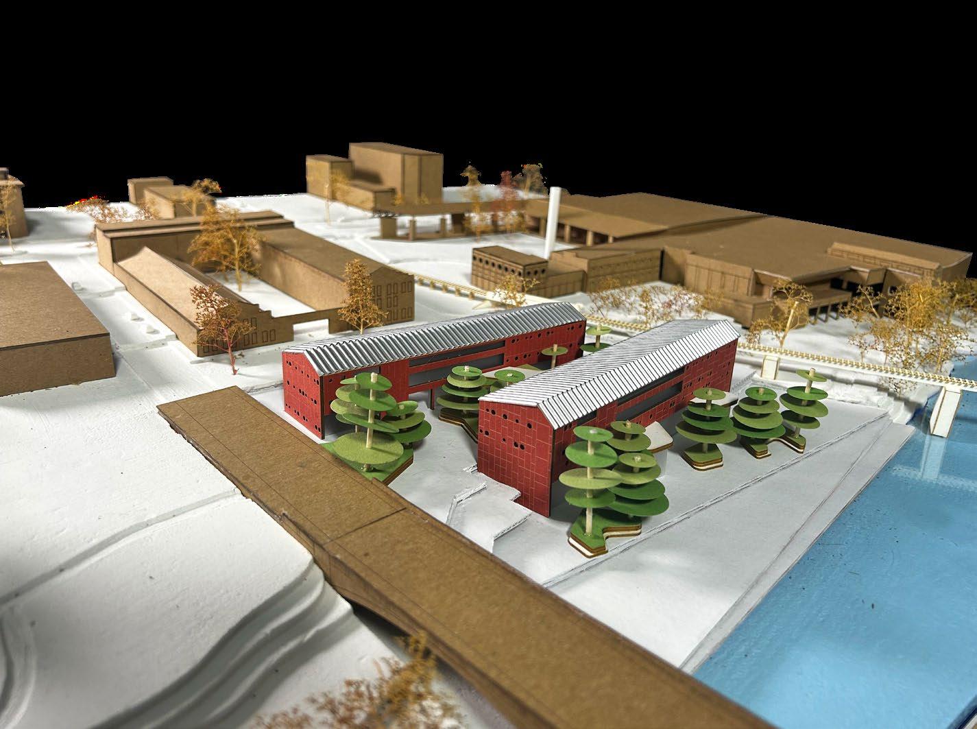


(opposite) model photo showing the project’s relationship to the surrounding context
(right) photo of model plug
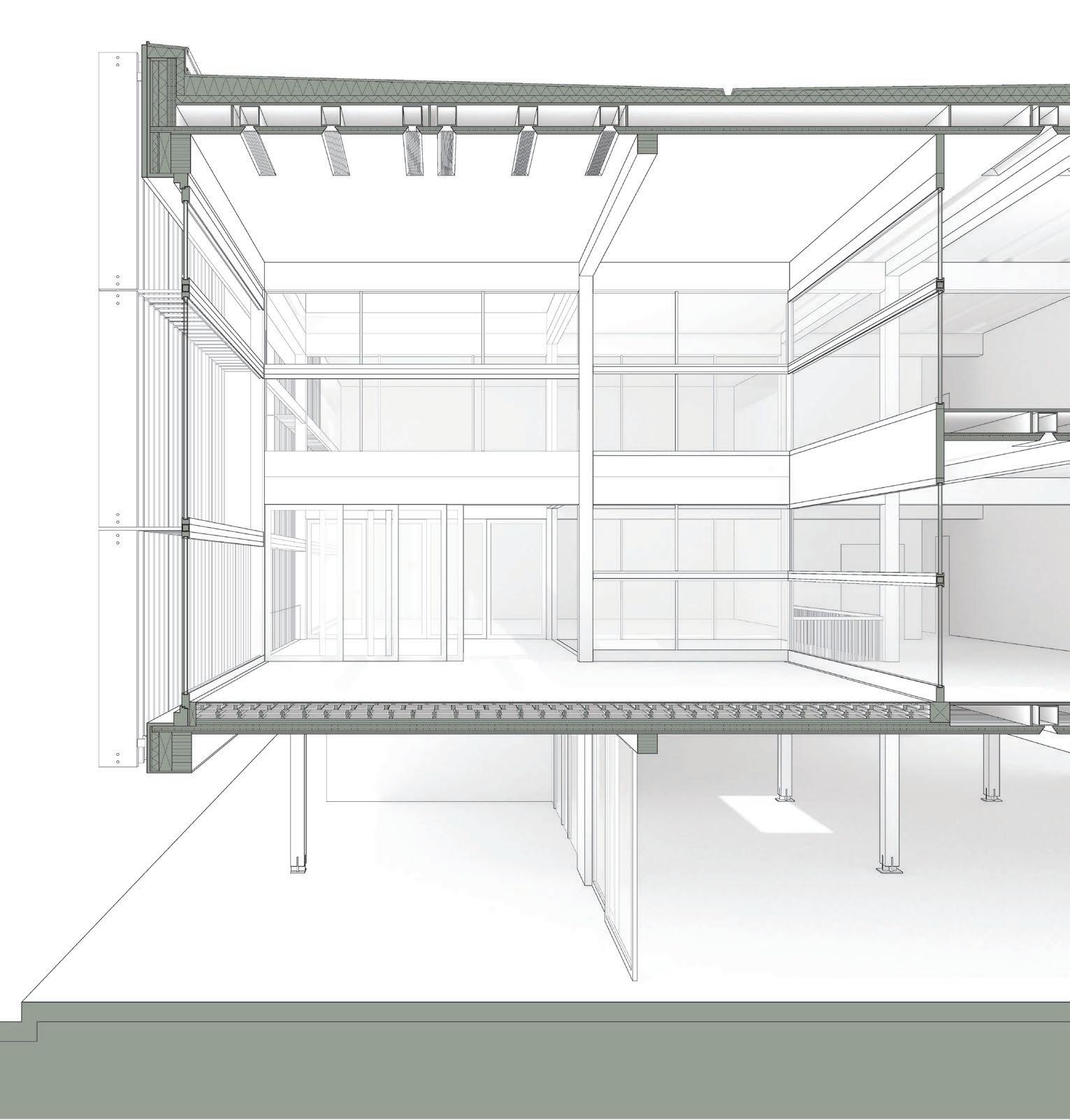
(below) transverse section depicting the relationship between the two apartment buildings and riverwalk


Location
Montgomery, Alabama
Program
Art Galleries
Artist Residence and Studio
Backyard
Public Lobby
Square Footage
72,500
Faculty
Christian Dagg
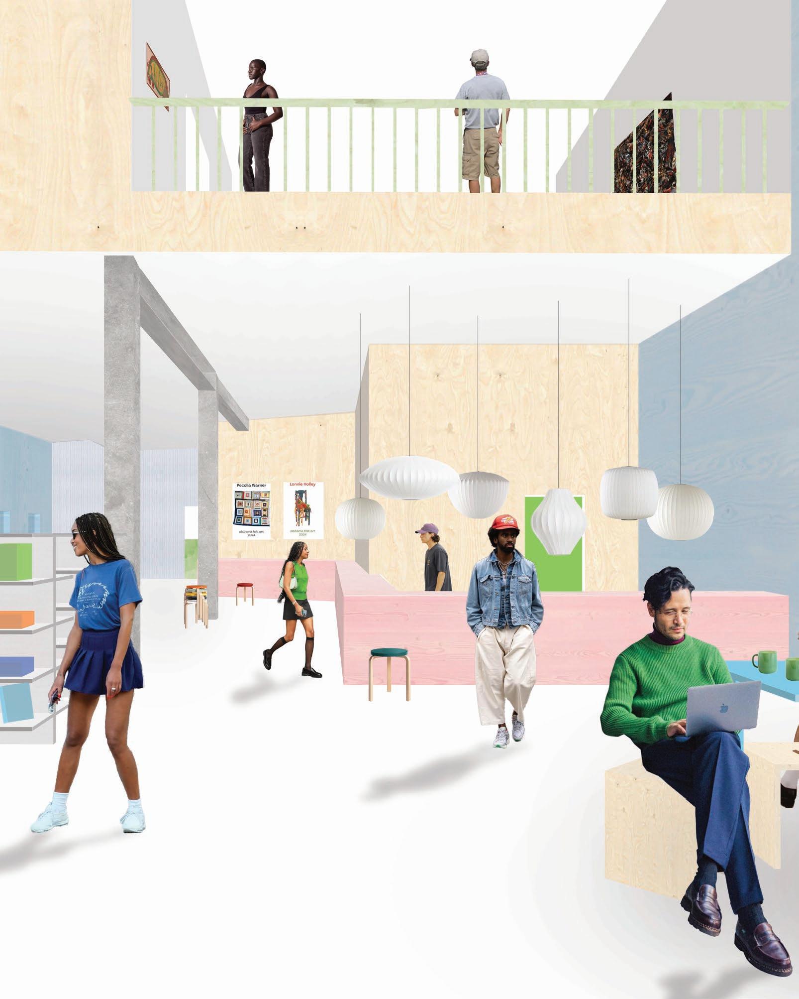
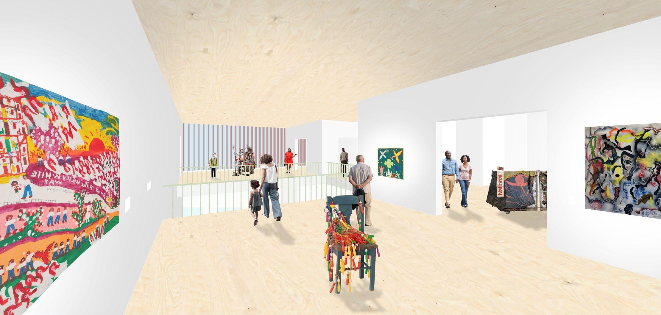
This proposal for a folk art museum in Montgomery, Alabama, captures the themes and ideas found during research, including where and how folk artists created their work, the contradictory ideas of what it means to be Southern, and how yards and landscapes can generate spaces of healing. Oftentimes, in the work done by outsider artists, there is an innovative, deliberate choice in the materials used and how they are detailed. Usually, the materials are objects that are used and seen in
(below) transverse section through both buildings
everyday life. Folk art is also known for having a lot of texture and color. In architecture, there is a similar culture of using materials in novel ways. When creating a building to hold these colorful pieces of artwork, collaging normative materials in layers feels appropriate. However, the architecture should not overpower the artwork. The art should be the focus, and the building should complement and enhance the work. Keeping the materiality tones monochromatic will ensure that the art is
the main focus. The relationship between the building, the art, and the landscape should be complementary, yet blurry at specific opportune moments.
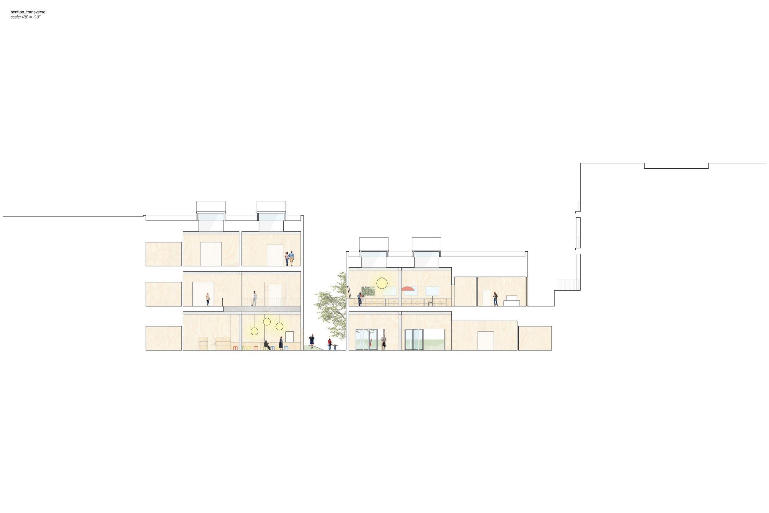


Montgomery has a checkered past, and creating spaces that can cultivate a positive collective memory would be powerful. The city needs a shared landscape to heal. Given the width of the chosen site, it became possible to embed a “backyard” in the program. The overall layout and massing of the site were determined based on several ideas. The first one is the desire to not create a building that felt institutional. Being the capital of Alabama, Montgomery’s architecture feels very institutional and


unwelcoming. The proposal contradicts the existing fabric and introduces the possibility of an architecture that is more broken down and less monolithic. This effect was also achieved by creating a complex of buildings rather than one massive one. The gap between the two facades facing the street creates an alleyway. The surface texture of this alley extends onto the sidewalk, signaling to pedestrians that they are welcome to move into the backyard.


(above) ground floor plan (opposite) top upper floor plan; bottom longitudinal section through artist studio and backyard


There was also the idea of creating a museum that felt like a house in the spirit of connecting how to work was created to how it will be displayed. In the design, the most public program, including a cafe, shop, classroom, and multi-purpose room, will be located on the ground floor. This is a similar organizational strategy that is also found in homes. Moving up through the buildings, private programs such as the gallery spaces, artist studio and residence, and staff offices are located on upper floors. The bridges
that connect the three buildings are accessible on this floor.
The perspectives shown suggest a degree of activity and liveliness that would hopefully be created around the architecture, landscape, and program. Locals and tourists alike could enjoy the experience of learning more about Alabama, its people, and hopefully about themselves.
(below) perspective from the upstairs art gallery that is organized as a series of permeable rooms (opposite) wall section detail axonometric through the downstairs public community space, the upstairs artist studio, green roof, and public alley
Location
Aarhus, Denmark
Program
Public Landscape
Market Hall
Square Footage
140,000
Faculty
Matthew Hall
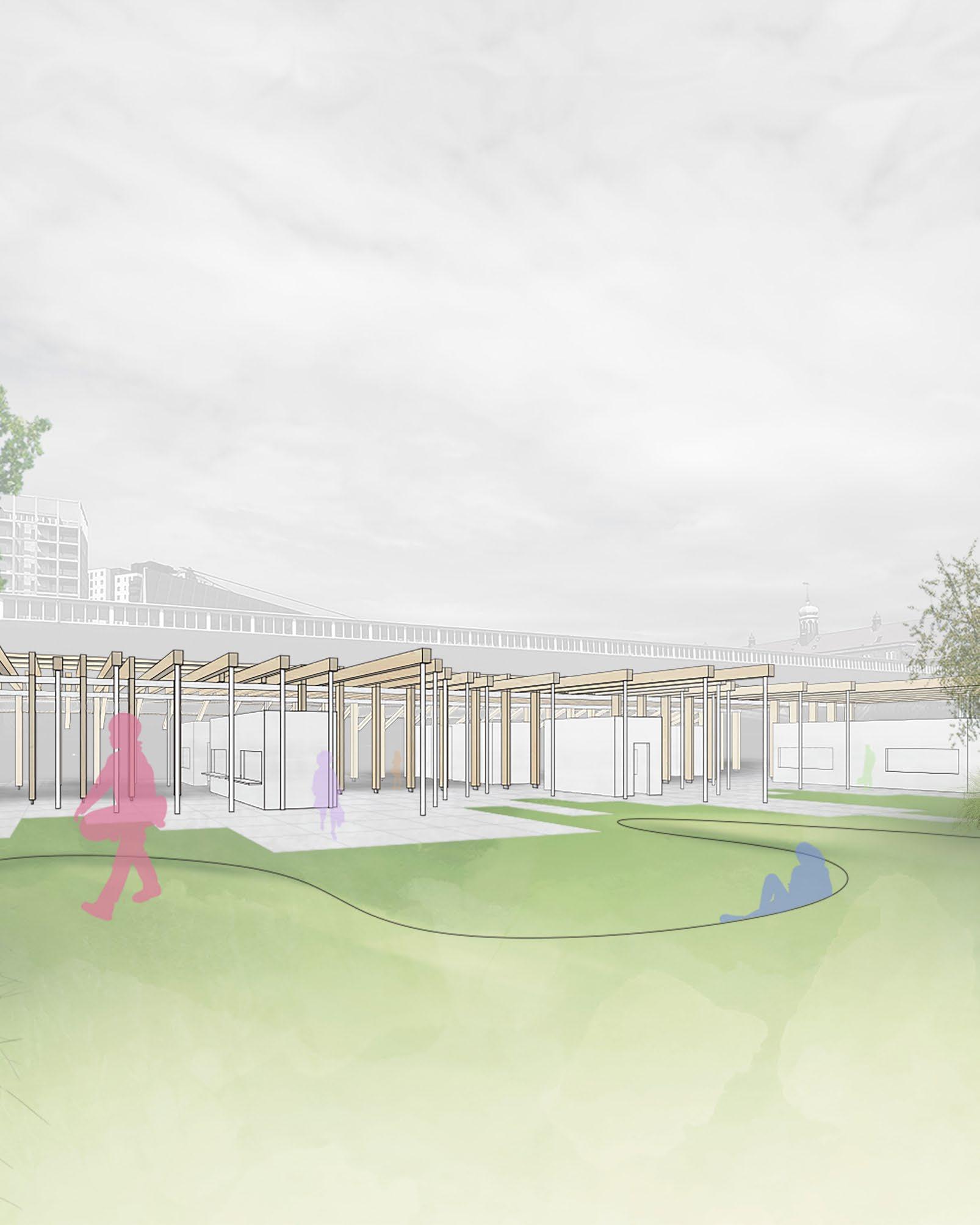
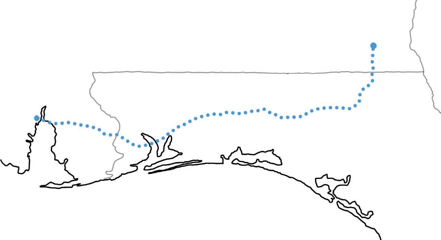
Situated amongst a strange collage of site conditions, this proposal attempts to stitch together two antithetical conditions in order to create a public landscape and outdoor market space. After careful site studies using sketching and photography, the site was evidently bordered on all four sides by differing urban conditions. With each side being unique, there were two edges that were the most dominant and held the most tension: the building edge of Godsbanen (a public arts center to the northwest) and the Scandinavian Convention Center (an empty corporate mall to the southeast with a public throughway that deposits pedestrians into the site).
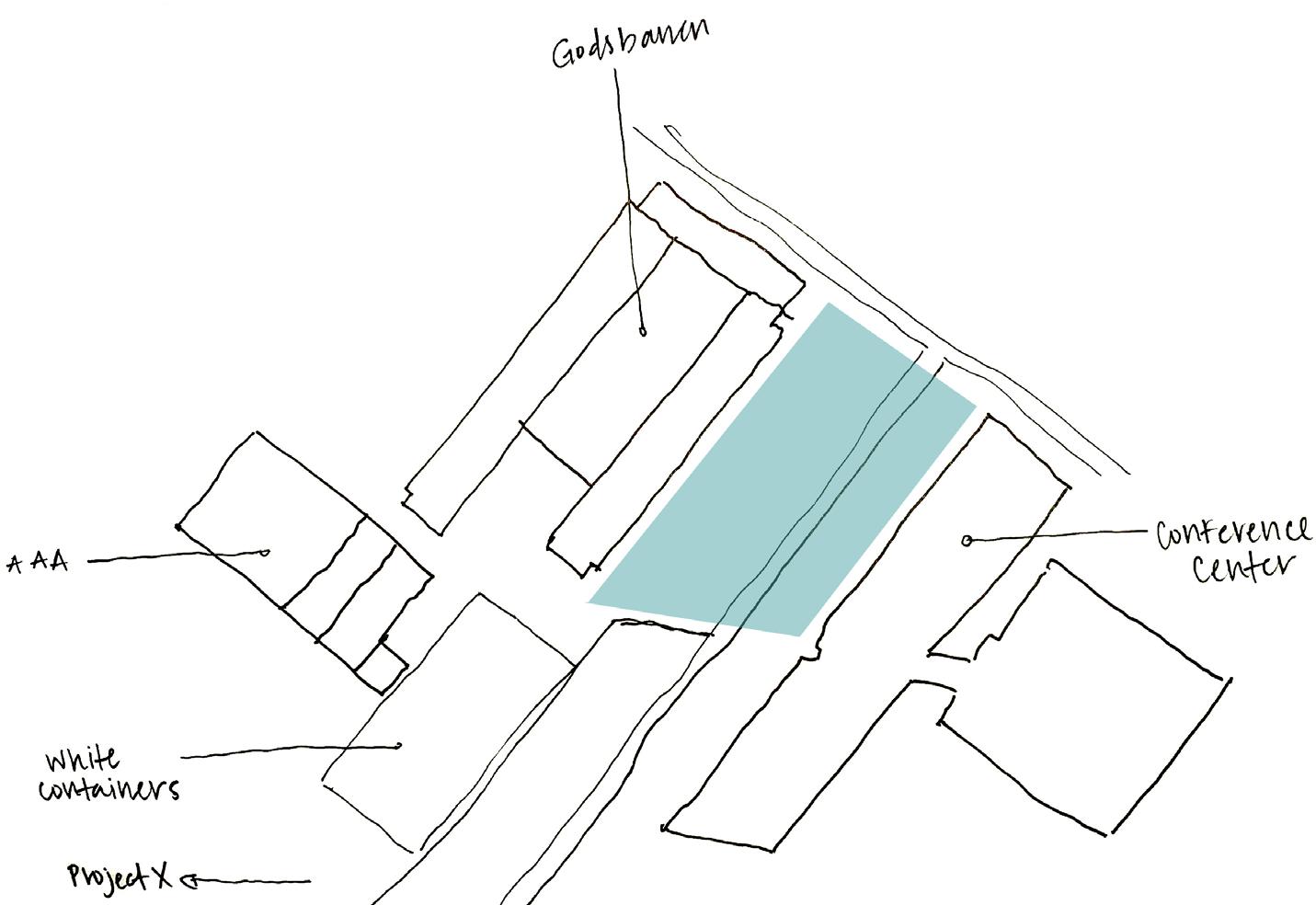
(above) sketch studying adjacent buildings and programs; blue color highlights the given site
(right) early study sketch showing proposal for site plan
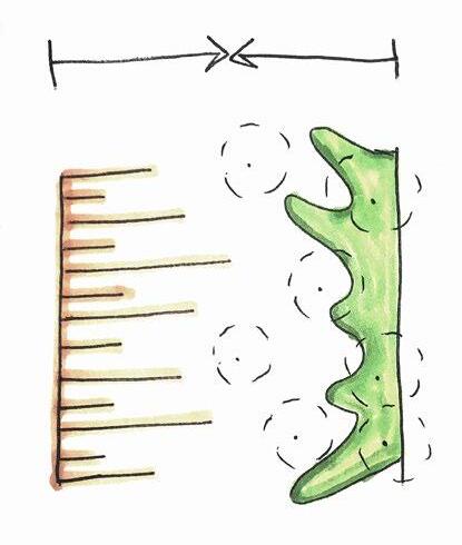
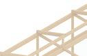
Design priority was placed on Godsbanen because it is an entirely public entity with a more welcoming program and facade than the Scandinavian Center. As a result, the new market space snuggles up to Godsbanen, creating a generous alleyway between the two structures. The actual market stalls sit under the open-air structure that is adjacent to this alley. As the architecture moves further south, long runs of mass timber glulam beams extend at varying lengths into the landscape like fingers reaching out to connect to the distant, corporate Scandinavian center.
(right) view showing the relationship between the existing art house, Godsbanen, and the proposed market place; indicates a respect for the former
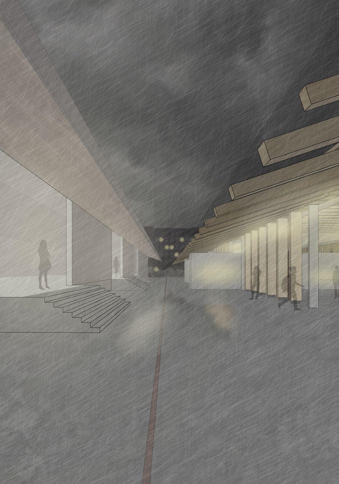
(opposite) top overall site plan; bottom perspective view from opposite street looking into the market hall and landscape


Up against the southeast edge lie a series of hills and a retaining wall that act as a buffer between a busy road and the landscape. This also provides residents at the Scandinavian Center with some privacy. The hills, coming from the southeast edge, stretch north into the landscape to meet with the splindly “fingers” of the market hall. This move is what stitches these two opposing sides together into something—a public place that is harmonious, balanced, and whole. The choice to use mass timber came
from not only an environmental standpoint but also from a contextual one. Inside Godsbanen’s “Råhal,” a large public space, beautiful old, heavy timber beams hold up the ceiling. Additionally, to the southwest lies an ad hoc squatter community called Project X, housed in shipping containers and light wood structures. The proposed market’s mass timber structure plays off these two conditions, creating a sense of lightness and transience.


(above) sectional sketch studying the existing site conditions with the market and landscape proposal (below) final transverse section BB


Location
Mobile, Alabama
Program
Performing Arts Center
Public Lobby
Dance Studios
Staff Offices
Theater Support Spaces
Square Footage
45,000
Faculty
Ernesto Bilbao


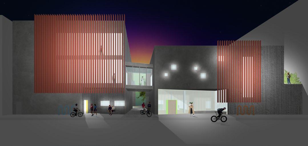
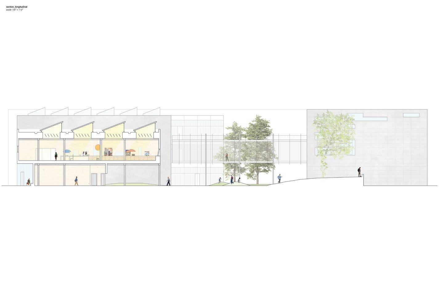
An exploration of the complex building systems found in a performing arts center, including mechanical, environmental, and structural, the project adds to Mobile’s downtown entertainment district. The ground floor holds a large amount of public space, including a café, lounge, and restrooms. Also on the first floor is the back-of-house program that supports the theater space. Careful precedent studies of square footage and organization informed decisions on spaces.


The layout of the plan is organized with the main theater in the center. This decision was made in order to free up the edges to receive sunlight and public entry. On the ground floor, the periphery spaces around the theater are for public use. From the street, entry into the spaces is easily accessible, with multiple entry points creating a porous building when all the doors are open. On this floor, the building even steps back to create a covered entry. This front porch, the lobby, and the ticket booth all create layers in between the public street and the theater. Upstairs, above the lobby, are the two dance rehearsal studios. In between these double-height rooms is a void looking down into the lobby and a shared outdoor space. Also on this floor is another entry into the theater. The theater has multiple levels of seating to accommodate a large number of guests. On the east side of the building, there is outdoor seating and cafe tables for dancers and guests to rest.
As seen in the section, there are several double-height zones that allow for cross-views. Guests in the lobby can look up into the dance studios and catch a glimpse of dancers working on their next performance. Dancers have the opportunity to feel as though they are actually performing. Curtains would be in place if they needed privacy.
On top of these aesthetic architectural decisions, the actual building systems and building codes were taken into considered while designing. Even in the preliminary stages, fire safety was consideration in stair placement as well as the theater design. Having these systems in mind from the start allowed for a more refined project.
A Covered Porch
B Lobby
C Tickets
D Dressing Room
E Shared Patio
F Event Space
G Sound Booth
Theater
Stage
Fly Space
Scene Shop
Costume Shop
Offices
(above) longitudinal section showing relationship between the public lobby, central theater, and back of house spaces


sequester carbon embodied in wood; renewable resource; sustainadvanced prefabrication technologies; smaller construction spaces; little need for interior finishes on structural members members prevents imediate failure of structure; mass timber timber absorbs more sound mass timber is much less invasive and requires less energy
From an environmental standpoint, mass timber construction was chosen as the primary structure material. While states such as Oregon and Arkansas have started using mass timber heavily, Alabama is filled with unrealized potential. Being one of the most heavily forested states in the U.S., Alabama has 12 million acres of land with forests full of trees that are usable in the manufacturing of mass timber. With the project being in Mobile, so close to the only mass timber plant in the state, it made sense to use mass timber. This would be economic and sustainable, financially and environmentally, in terms of travel costs during construction.
MASS TIMBER CONSTRUCTION BENEFITS in the state of Alabama
DESIGN ADVANTAGES
https://www.aces.edu/blog/topics/forestry/cross-laminated-timber-what-it-is-and-its-relevance-to-alabama/
1.Environmental - smaller carbon footprint; while growing trees sequester carbon embodied in wood; renewable resource; sustainable when forest properly managed
2.Construction Efficiency - lighter than concrete; fast to construct with advanced prefabrication technologies; smaller construction teams
3.Aesthetics - implements biophilic qualities and atmospheres into spaces; little need for interior finishes on structural members which saves money and resources
4.Fire Protection - thickness and cross section design of structural members prevents imediate failure of structure; mass timber chars slowly allowing inhabitants time to escape
5.Acoustic Performance - compared to concrete and dry wall mass timber absorbs more sound
6.Less Invasive Extraction - harvesting the materials needed to create mass timber is much less invasive and requires less energy compared to concrete and steel raw material extraction.
1.For
5.Remember
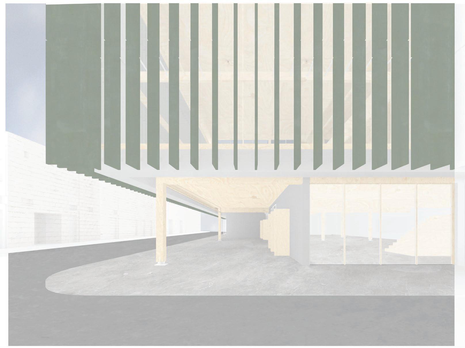
The daylighting strategy of the project is evident in the facade design. Since the side of the site that faces the street, arguably the most important side, was facing south, it was important to mitigate the strength of the southern sun. Important programs, such as the dance studios and public lobby, are receiving all of this sun. The solution was to create a series of fins on the facade. Based on information from Norbet Lechner’s book on environmental controls (Heating, Cooling, Lighting) decisions were made to create a practical, sustainable solar shading strategy.
(Lechner_Heating, Cooling, and Lighting_p. 259).
Location
Downtown Chicago, Illinois
Program
Extended Stay Hotel
Hostel Pods
Lobby
Cafe
Rentable Space
Square Footage
45,000
Faculty
Matthew Hall
Rebecca O’Neal
Jennifer Pindyck
Kevin Moore
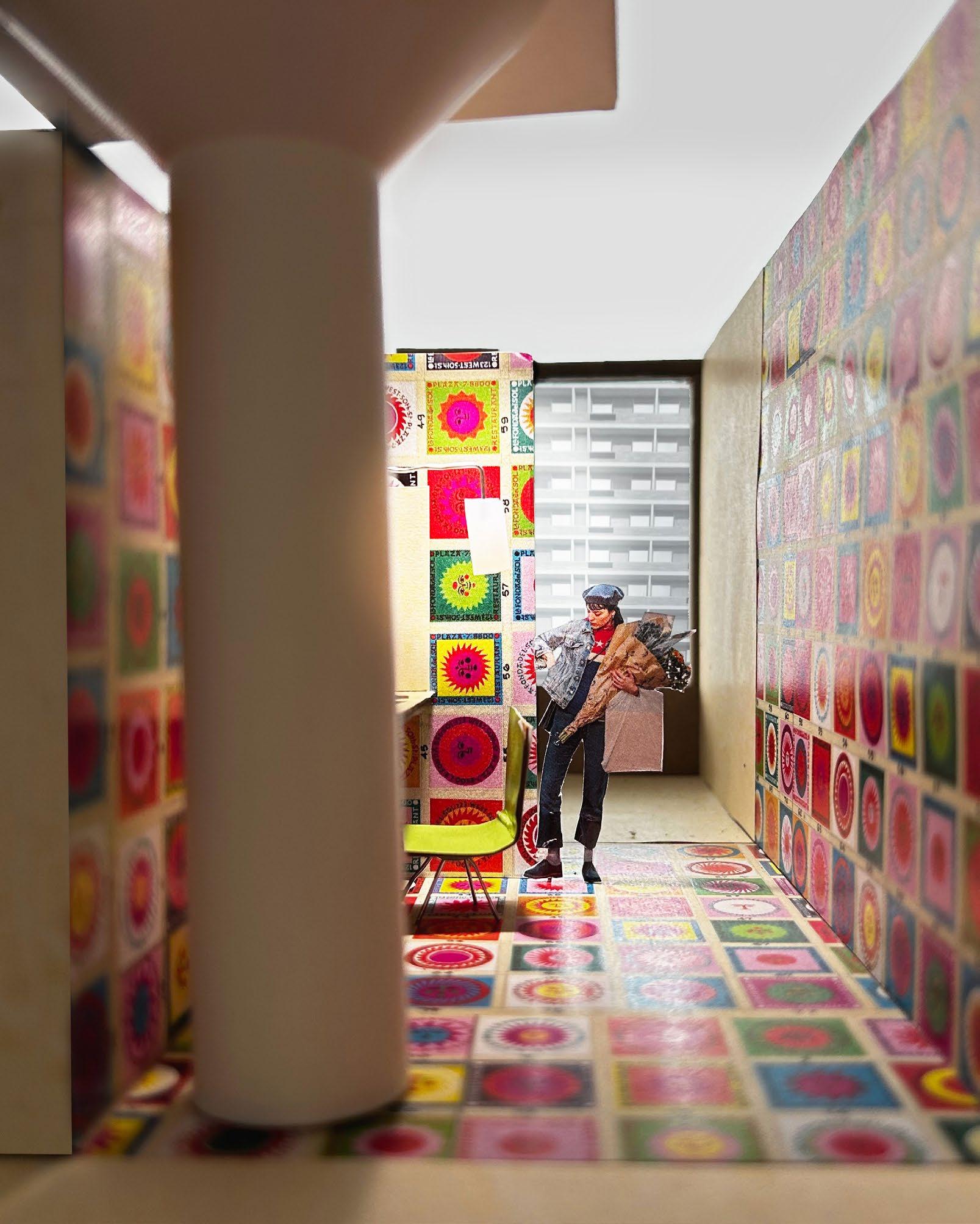
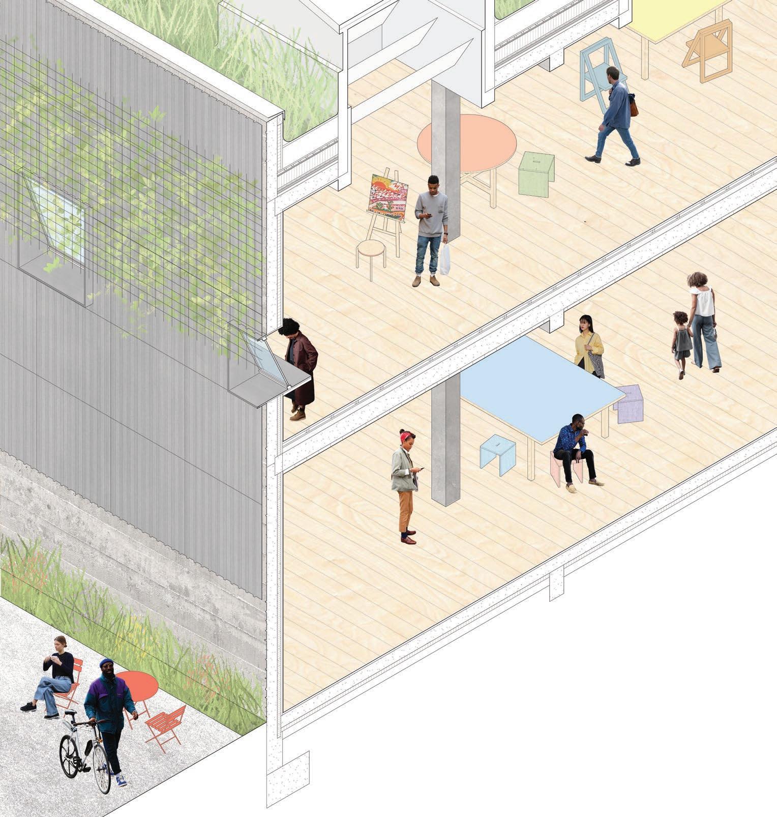
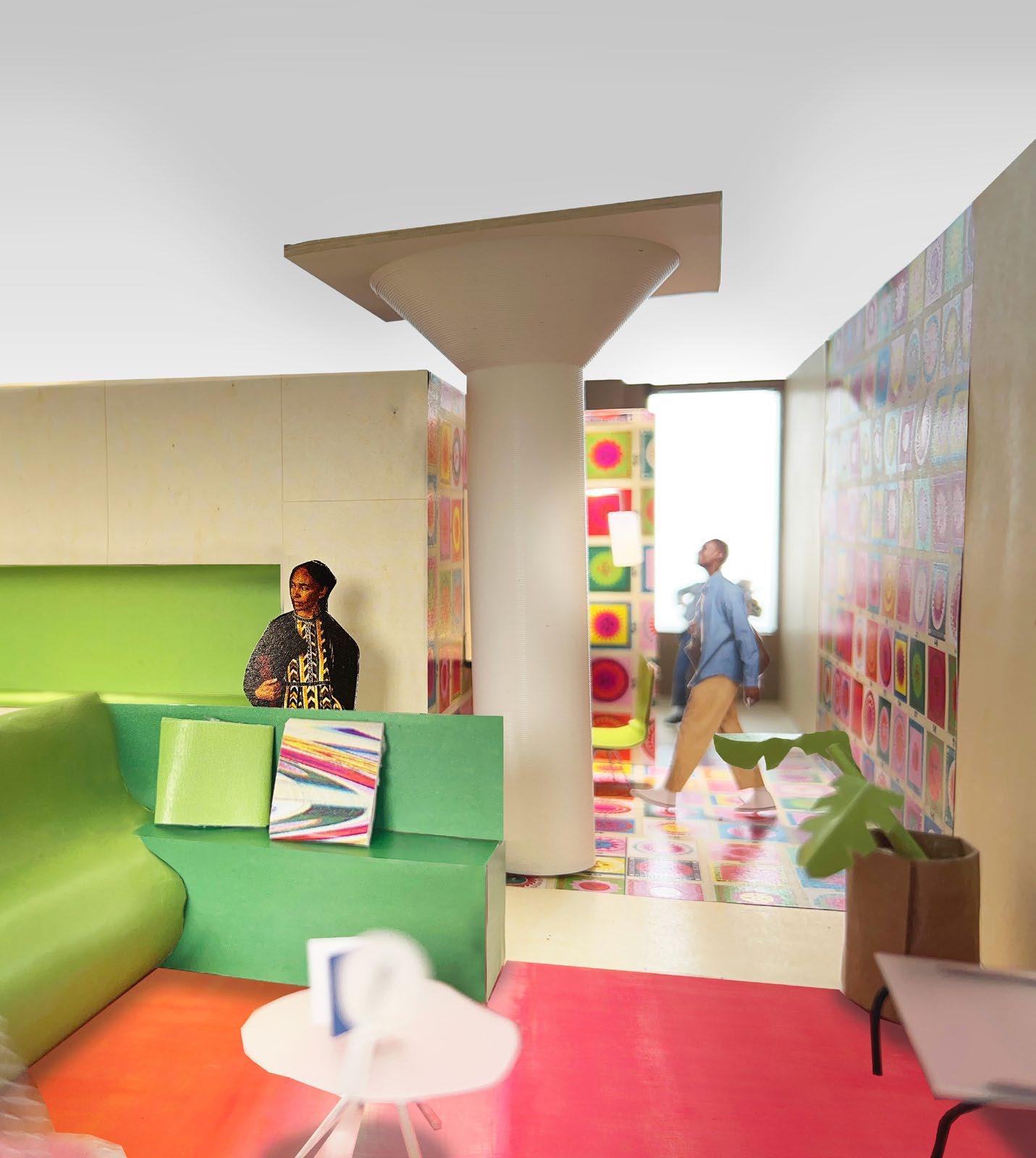
Using color and pattern, this extendedstay hotel attempts to provide variety within a very small room. This allows guests to save money during their stay due to the limited floor space given. However, with patterns and colors applied to walls and floors, the creation of implied zones gives the sense of having more space. Placing the water lines, the bathroom, and the kitchen in the center of the unit contributes to this effect because the room is not wholly visible from any one spot. This gives guests a feeling of privacy despite the unit’s small size. This is particularly clear in the office space that’s tucked away.


relationship between


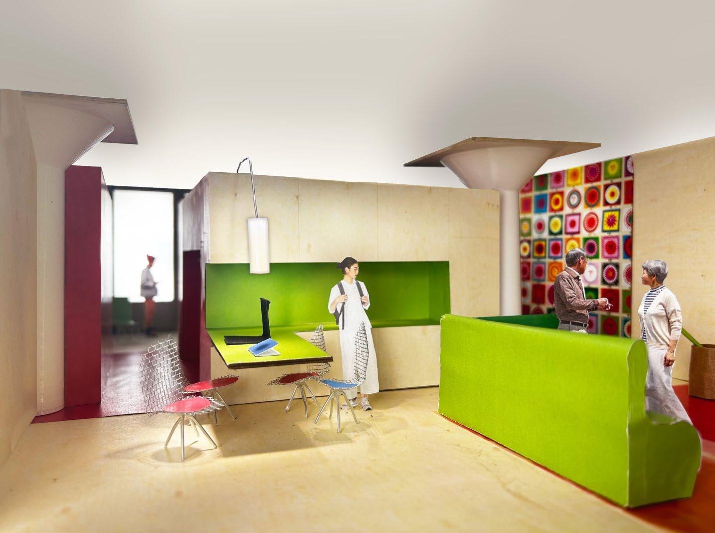
model photo showing how kitchen’s color designates a zone
(left) model photo of bedroom depicting relationship with the city and use of color
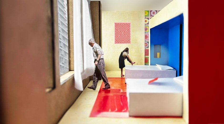
(opposite) model photo of visiting family showing the layers of space created by patterns, color, and furniture
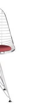
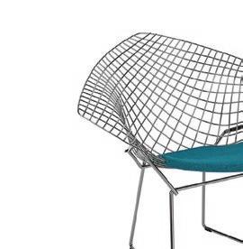
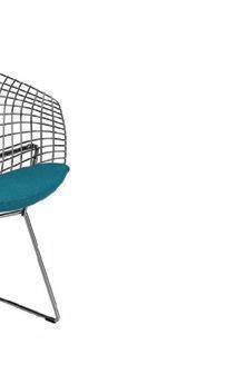
Chair_Harry Bertoia_1952
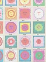
When it came to picking the overall aesthetic and feel of each unit, it was helpful to start with a pattern. Alexander Girard’s design for a Mexican restaurant was chosen for its cheerfulness and playfulness. As a mid-century modern designer, he fits into Chicago well, a city known for its connection to early modernist design and architecture. Colors were then drawn from the bright patterns to be used in the hotel rooms. To contrast with the heavy, cabinetlike box in the middle of each unit, lightweight furniture was chosen. This light quality signifies to guests that they are welcome to move things around. It also allows the color and patterns to stand out as the wire and glass furniture almost disappear. The other half of the typical floor plan is a hostel-type option for adventurous guests who are traveling in groups and could rent out a large space. Shared hangout spaces give this area a communal feel that is especially helpful for school or youth trips. This could also be used by travelers who are on a tight budget and simply looking for a place to lay their heads.


Thank you.