Mechanical Lullaby Arts Portfolio


Summary ● About ……………………………………………………………03 ● Logo ……………………………………………………………..04 ● Avatar …………………………………………………………..07 ● Colors …………………………………………………………..10

Hello! I’m Gii Rog!
While in college, I decided to make a “studio-like” presence on social media. I spended a lot of time thinking of a name, but nothing seemed right for me.
One day, while drawing one of my original characters, I started to sing to myself a song for the movie Coraline, called “Mechanical Lullaby”. It felt right for me.
For some time I kept just “Lullaby”, moving to “Mechanical Lullaby” and finally deciding for “Mechanical Lullaby Arts”.
“Mechanical Lullaby” always reminded me of music boxes, so it was logical to choose this style.
The first logo was simply the word “Lullaby” in the Great Vibes font¹.

The second logo I made was just a simple black gear with “ML” in white stamped in the middle. This one started the idea of the logo being like a stamp. To accompany the “ML” stamp, I made a full name logo with half gears below. ²


Next is a version with the final name in a rectangular organization and gears on the edge.


Thinking in music boxes, I decided to make a version with the name in the middle of a music box. This one, however, wasn't very visible. 4
The final one is a combination of the last two: the name inside the outline of a music box. 5
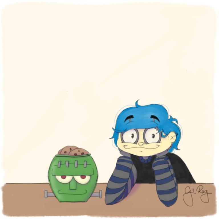
This little friend is a mechanical rag doll. They are approximately the size of a Barbie doll (11.5 inches or 29 cm tall), with a stop motion skeleton and covered in cloth.
As the logo was changed so was the rag doll, but the color was almost the same: black body with gray-dark blue stripes arms and pocket, fair skin, blue hair and gray for the metal parts.

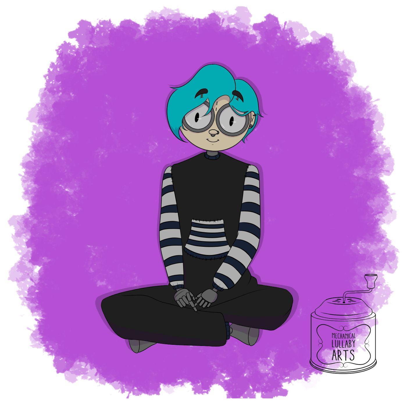


The colors of the mechanical rag doll almost never change 5, but the logo changes with the proposed.
For illustration, I use only the stamp on black ou white, with 50% opacity. 6
For the video intro, I use the white stamp in the black background because I normally put a title and an explanation in white text and black background as well. 7
If necessary, the logo color will be changed to better fit the project’s color pallet. 8
Each color logo is for a different project.
The blue one is for an ice cave. The red one is for a circus. The green one is to represent a character with green hair. the pink one is to represent a character who only dress in pink.

Thanks for reading!
E-mail: mechanicallullabygames@gmail.com
Instagram and Twitter: @mlullabyarts