MEAGAN DAVIS SELECTED WORKS INTERIOR ARCHITECTURE

Smart Sustainable Home
Spring 2022
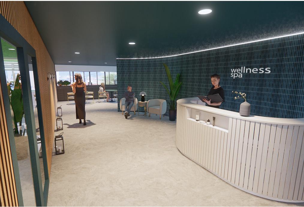
Family Health & Wellness Hotel
Spring 2023
Memory Care Facility
Fall 2022
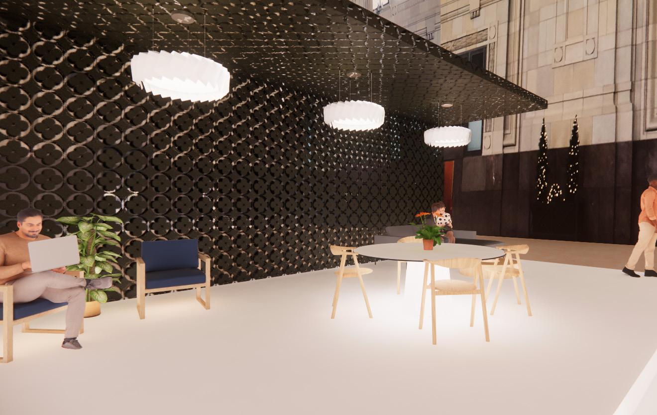
Pattern Cafe
Spring 2022
Co-Working Space
Fall 2021
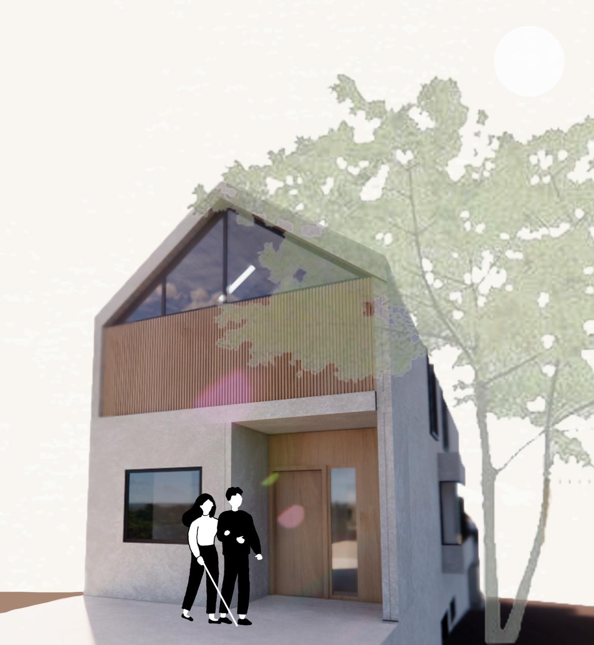
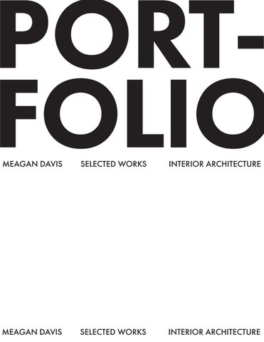
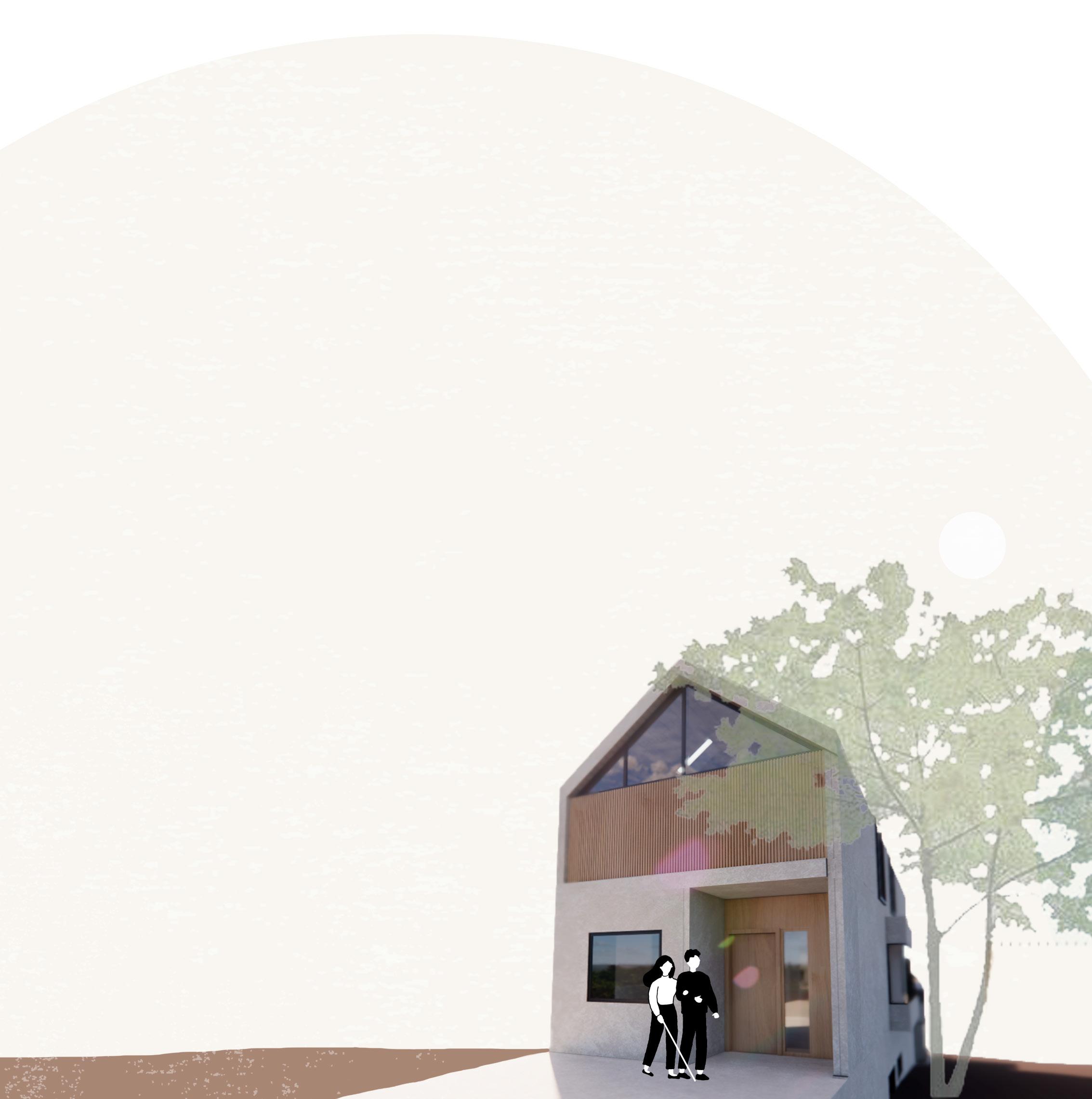
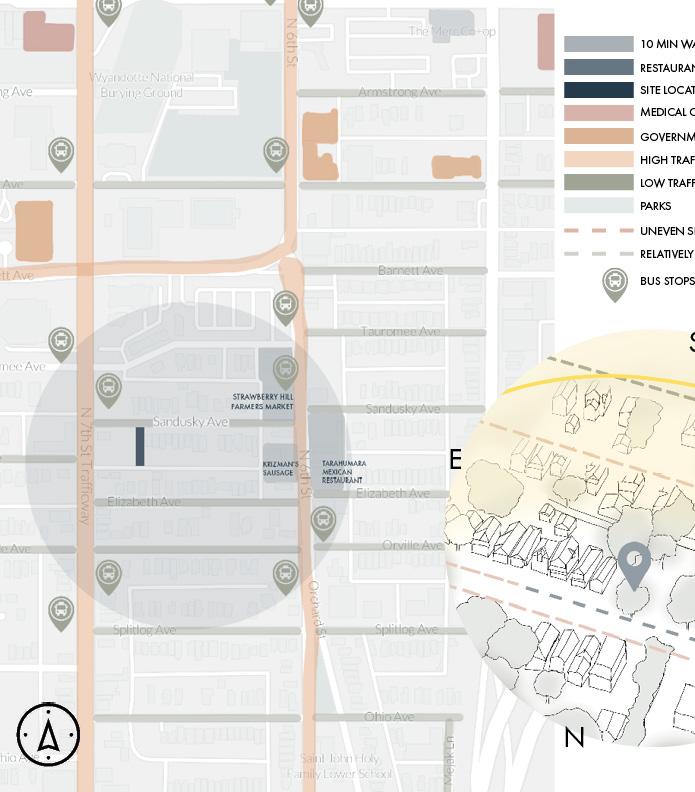
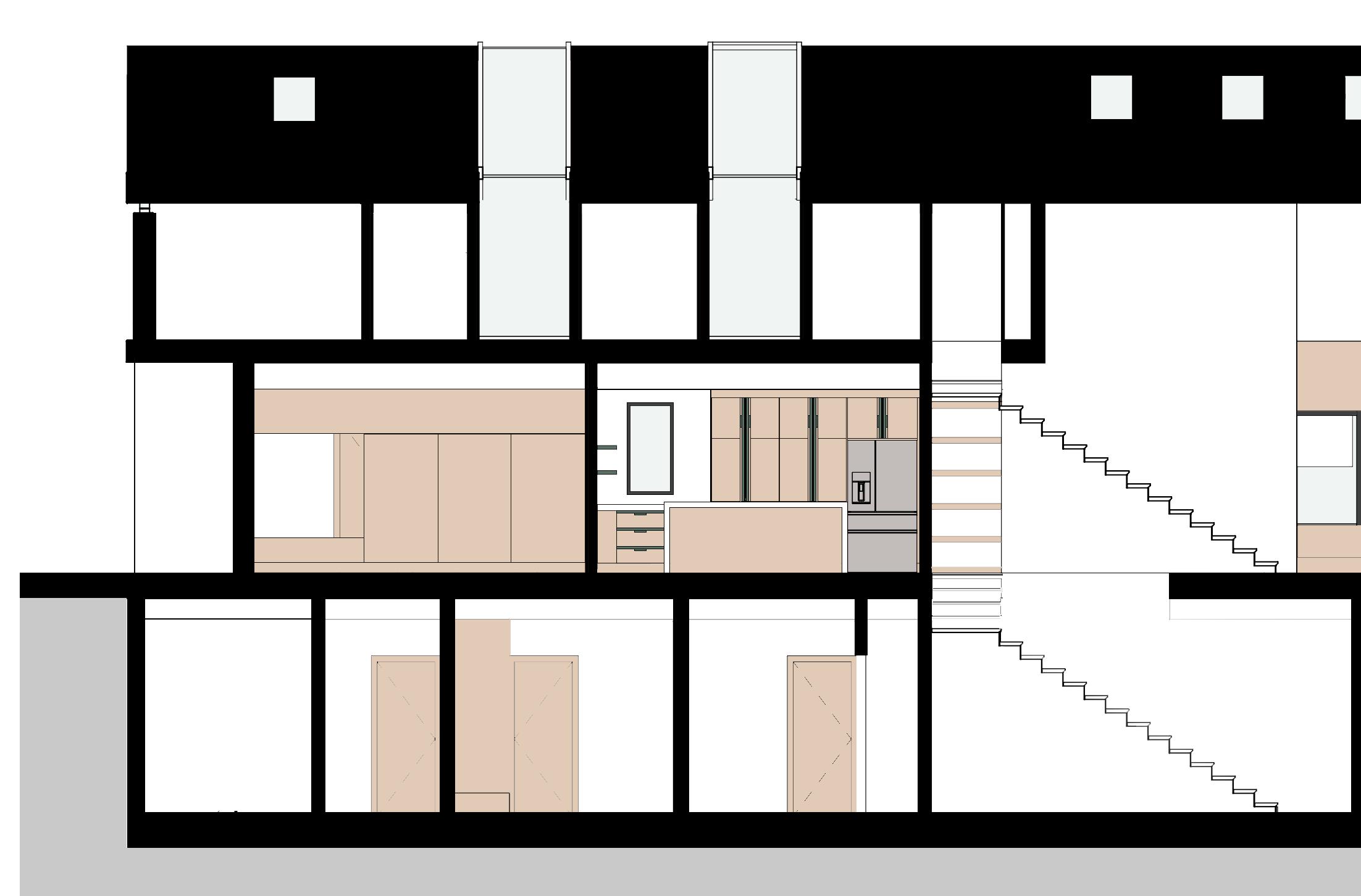
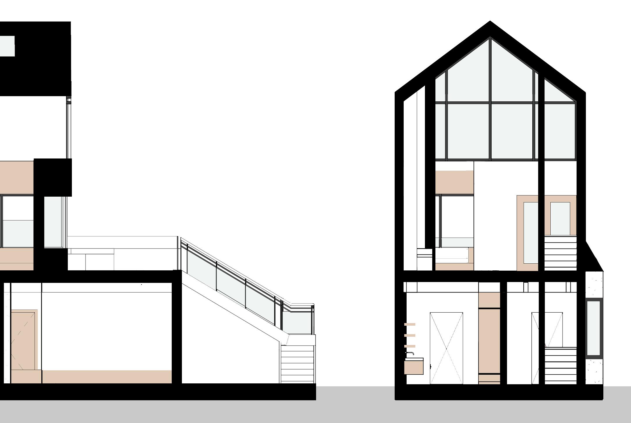
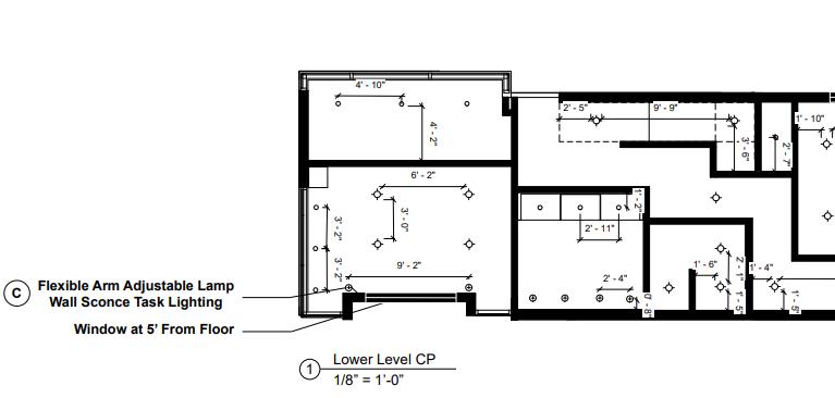
My goal is to create a home where visually impaired individuals can have independence within a space that is inclusive, comfortable, and safe. The home will have features that will aid a visually impaired individual in daily activities as well as include many amenities within the home such as an office, gym and more.


KEY
Direct Access
Relative Access
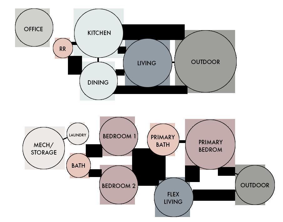
OUTDOOR
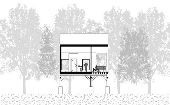
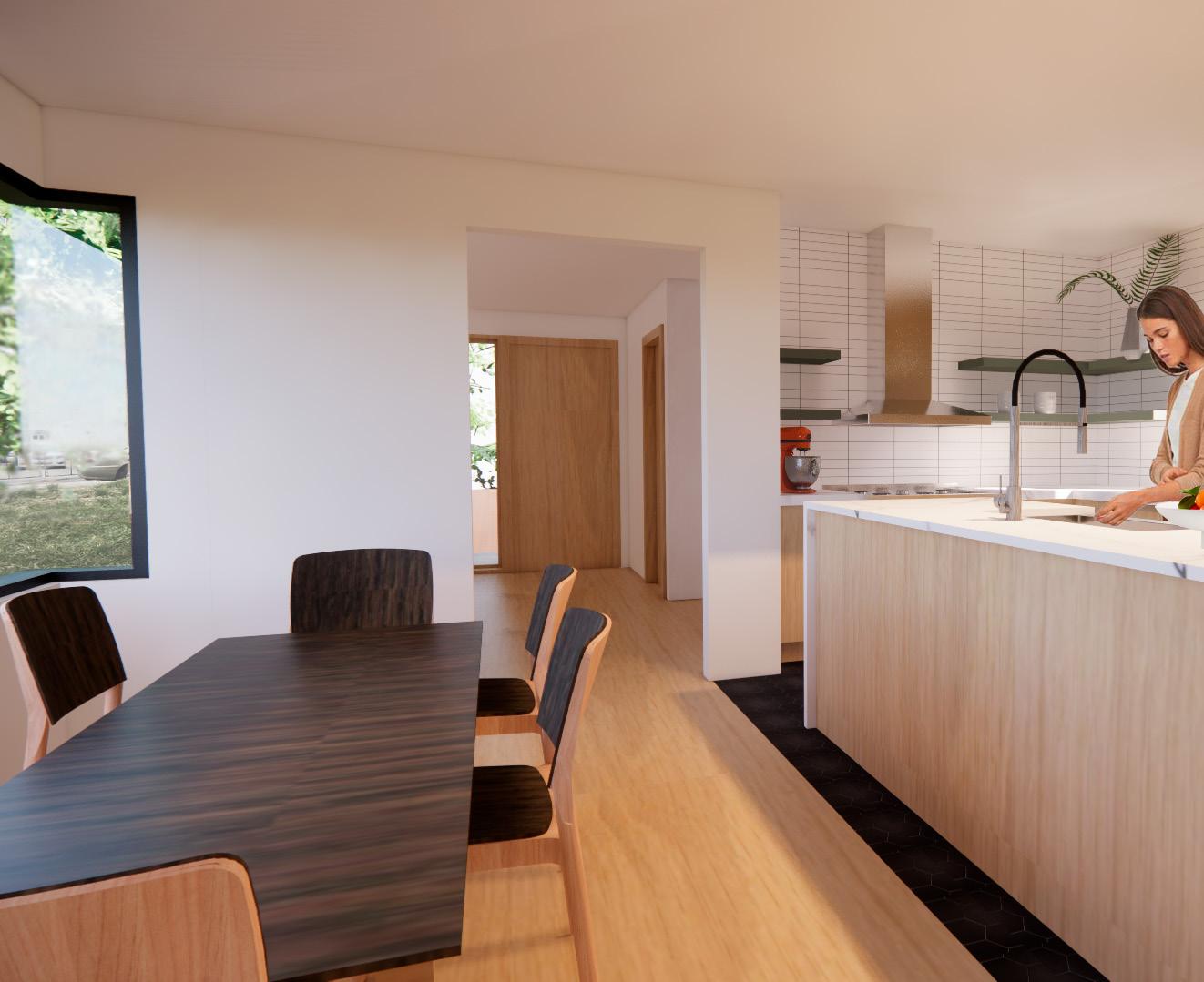
KITCHEN
DINING LIVING OFFICE
BATHROOM
MASTER BATH
MASTER BEDROOM
LAUNDRY
MECH.
BEDROOM 1
BEDROOM 2
OUTDOOR SPACE
BATHROOM
Direct Access
Relative Access Same Floor/Easy Access Undesirable KEY
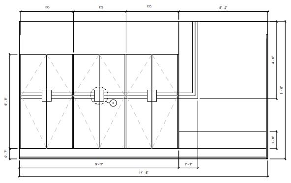
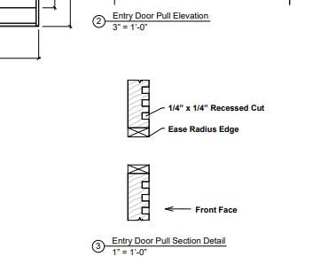
1 Front Door Recessed Entry
Acoustical changed help to recognize different spaces.
2 Front Door Contrasting Entry
Color contrast or material change can help to quickly locate the entrance.
3
Entryway Built-in Tactile Walls
Texture change through datum lines, placed at hand height along the built-ins creates a tactile and visual guide to assist wayfinding and indicate door pulls.
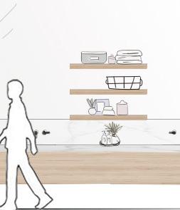
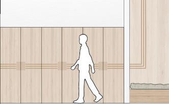
Primary Flooring
Light flooring allows for contrast against furniture while keeping main circulation spaces bright and easy to navigate.
Kitchen Tactile + Color Flooring Change
Tactile change in flooring indicates a change in function. Dark tile floor contrasts indicate change from circulation space to utility space.
6 Skylight Windows + Raised Ceiling
Clerestory windows illuminate the interior with diffused light and decreased glare. Natural light is used to indicate living room spaces and comfortable seating.
7 Kitchen Highlighted Edges
Distinguishing edges of cabinetry through color contrast.
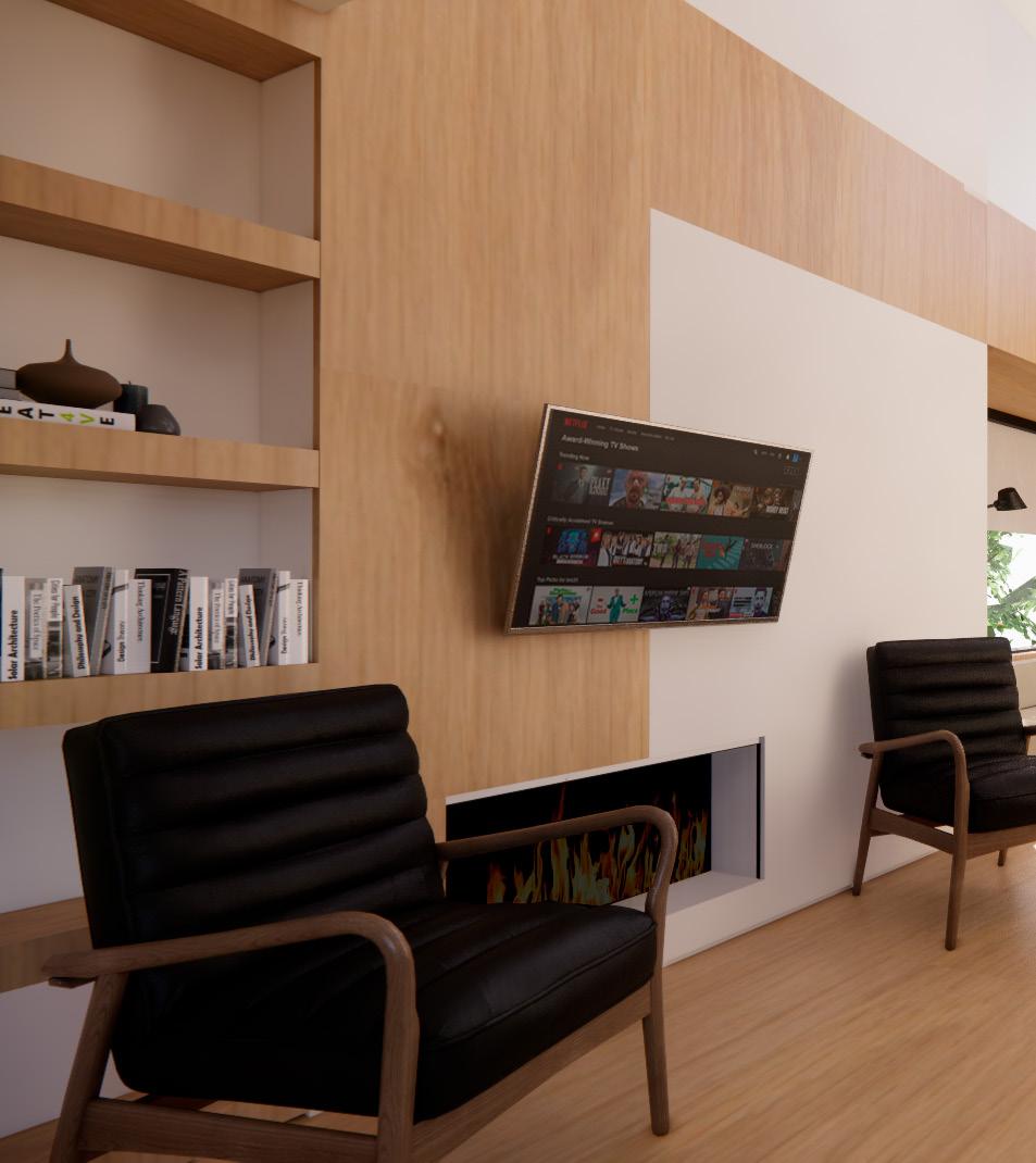
8 Living Room Furniture
Dark furniture to contrast light floor and walls + bright colored accent pillows for contrast between couch seat and back.
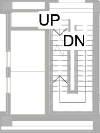
9 Stairs Tactile Change + Color Contrast
Tactile change: Raised strips approaching the stairs to indicate a tripping hazard is ahead.
Color Contrast: Highlighting the edge of each stair helps users with poor depth perception to indicate the edge of each step.
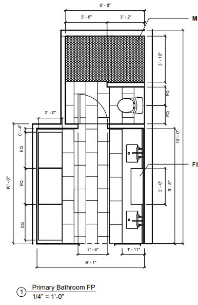
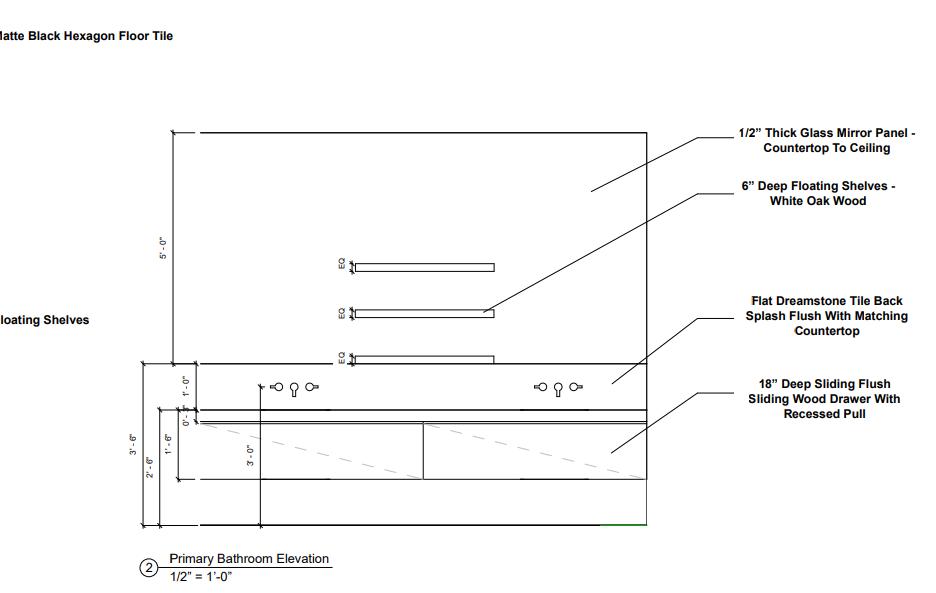
Primary Bathroom Flooring Change
Tactile change in flooring indicates change in function and potential hazards.
Dark tile flooring contrasts the light tile walls in the shower indicating a change in function and a potential slip hazard when wet.
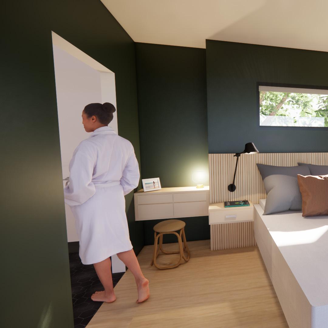
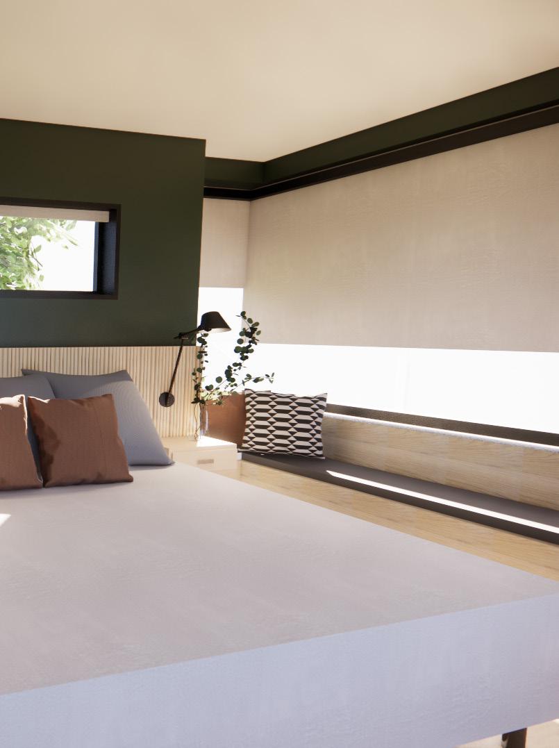
Bedroom Lighting
Creating dark sleeping environments for individuals with circadian rhythm disorders
Bedroom Acoustics
Creating quiet sleeping environments for individuals with heighten hearing senses.
Contrasting Desk Surface
The desk material will have two tones to allow for maximum color contrast against its surface for two different types of uses.
Bedroom Carpet Flooring
Tactile change indicated a transition into a comfortable, cozy environment from the hallway.
Carpet provides acoustical properties that absorb sounds produced in a room.


UPPER DECK

FLEX LIVING
LOWER DECK
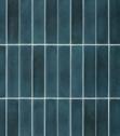
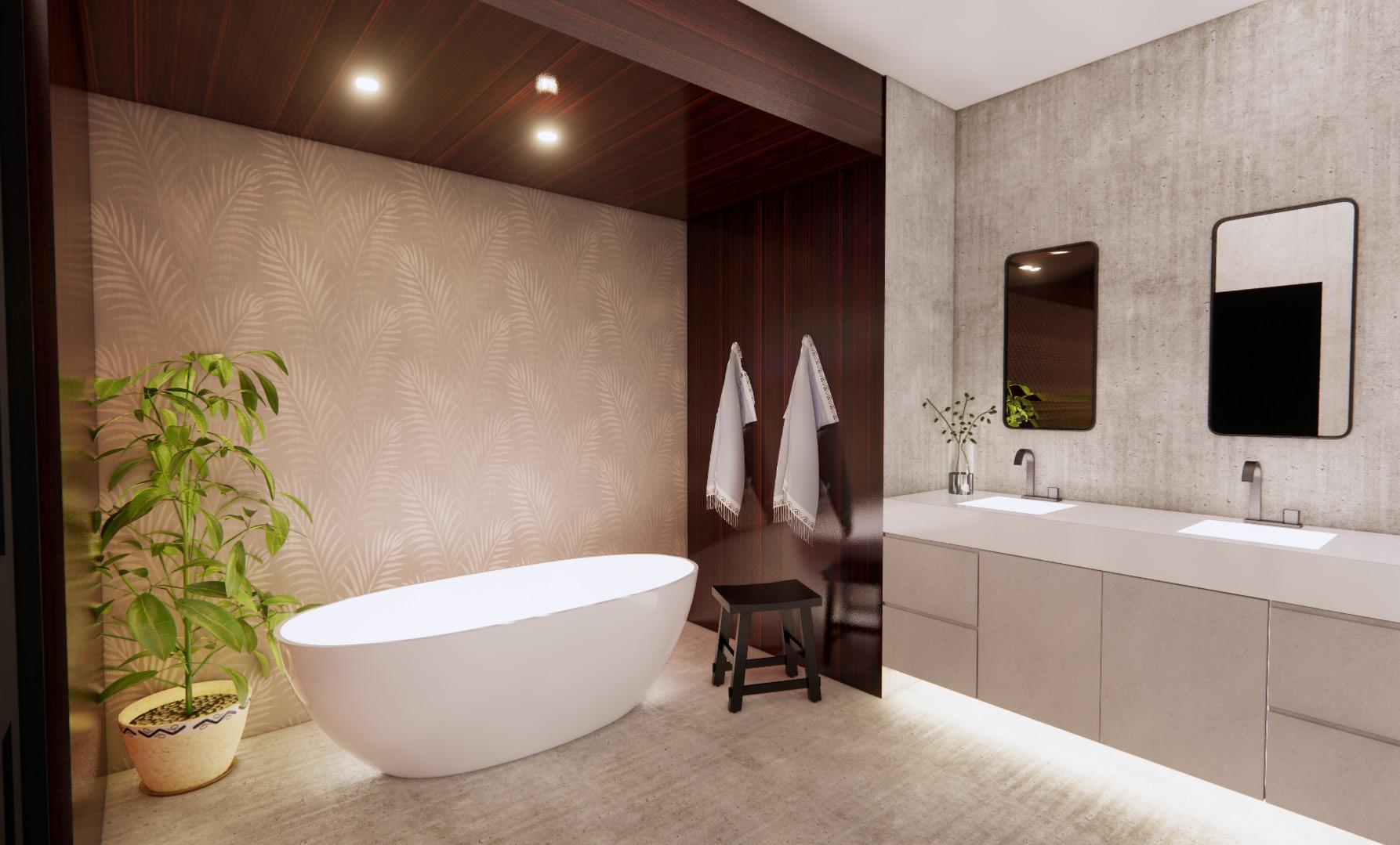
SHOWER TILE
Tile Shop
Matte Black
tilebar
Statuario Venatto Matte
LIVING SPACE
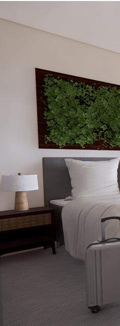
PRIMARY BR
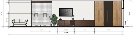
ENTRYWAY ELEVATION
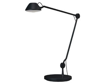
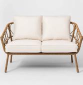
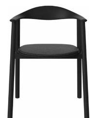
Fritz Hansen Black
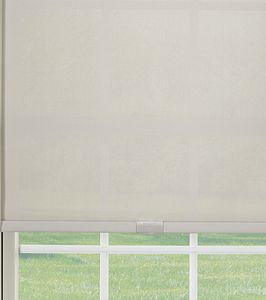
Graber
1% open with blackout channels
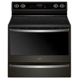
Whirlpool
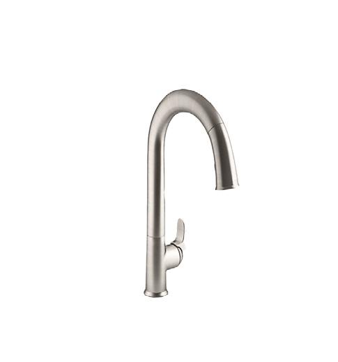
Delta Touch and Voice Activated through Touch2O technology
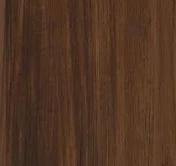
WOOD
Green Building Supply
Royal Oak
SUSTAINABILITY: Green Guard Gold Certification, Europhins EC1 Plus, Biodegradable, Recycled
Design Tex Olivine Green SUSTAINABILITY:
Carbon Neutral, Recycled Content, LOW VOC
Spring 2023
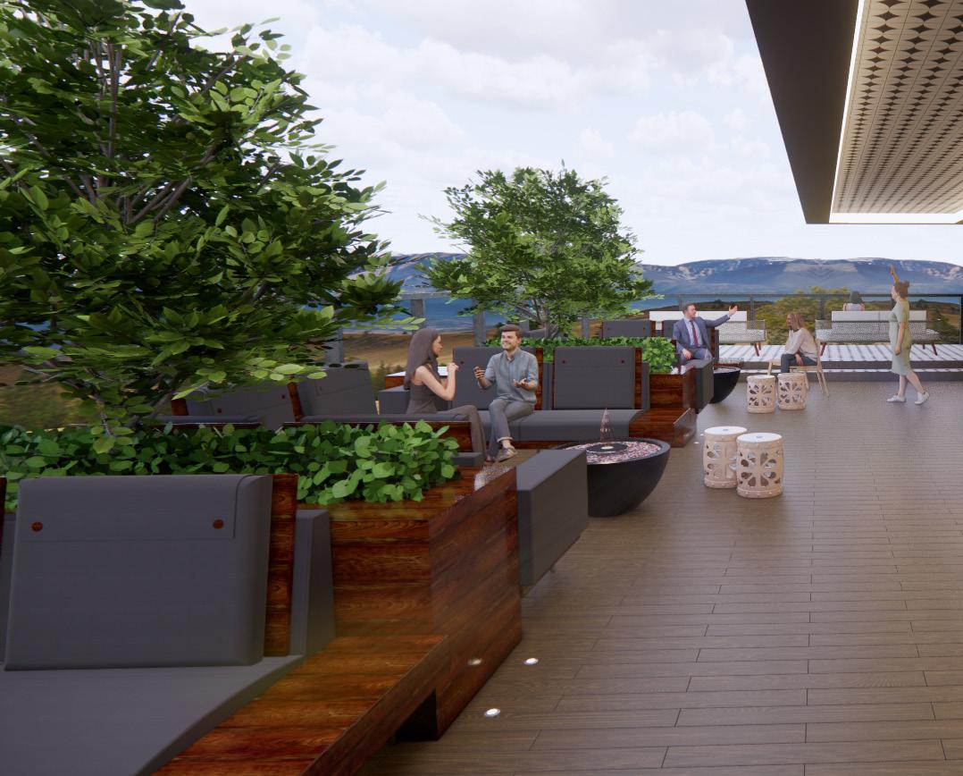
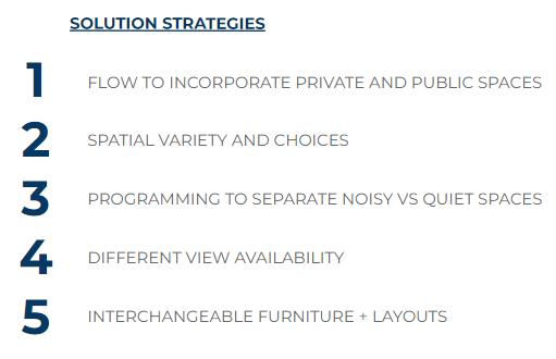
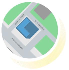
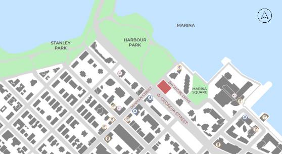
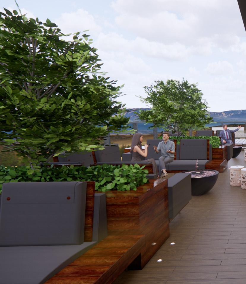
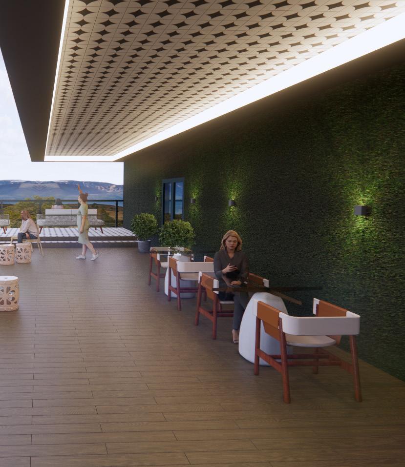
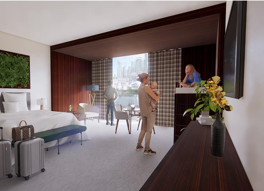
This project was based in a vertical studio where each third year student was paired with a fourth year. We were tasked to create a hotel of our choice. My partner and I designed a Family Health and Wellness Hotel based in Vancouver, Canada. I designed the third floor of our hotel based on our goals, solution strategies, and concept that we agreed upon. Vancouver is an active city and we wanted our users to be able to use our hotel as a sense of recovery space to relax and reflect; an escape from the city and activities by offering a space that embodies the culture of Vancouver and encompasses aspects from the ocean, mountains, and city.
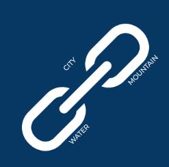
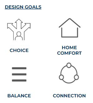
A connection between the ocean, mountains, and city of Vancouver that focuses on the recreation and social balance and freedom to offer a recovery Family Health and Wellness Hotel
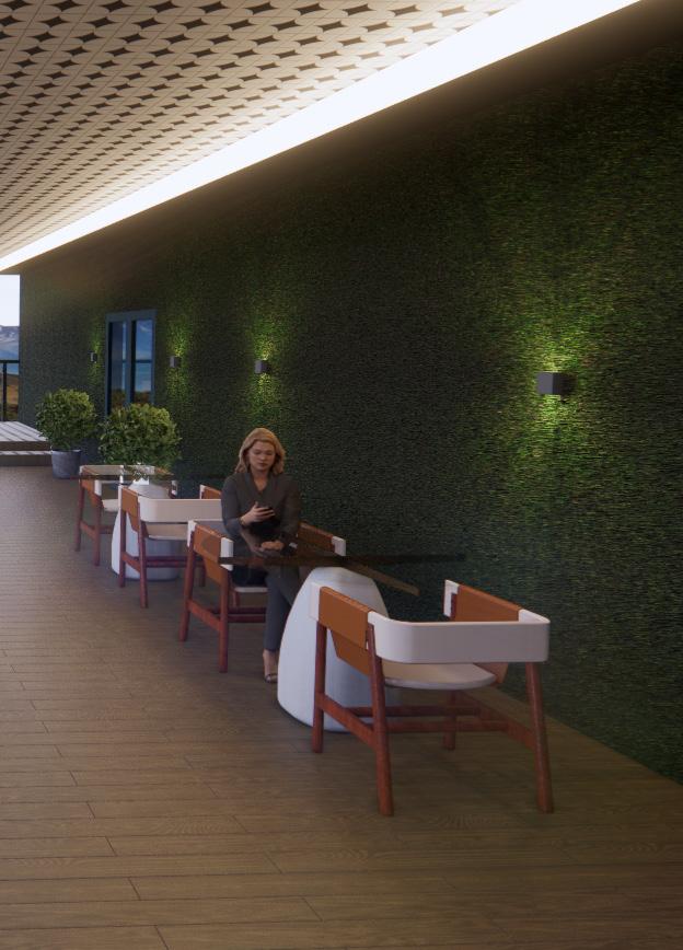
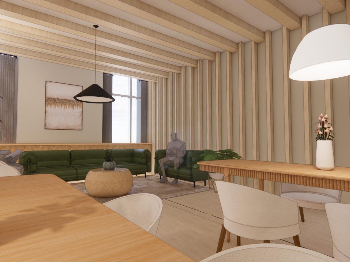
The vertical distribution of space emphasizes balance as most of the large scale public spaces (green) are on the ground floor or right off of the elevators & stairs while more intimate, quiet spaces (blue) are on the third floor.
Stacking staff spaces allows for separation of back of house and admin while still having connection for easy movement. Vertically oriented spaces also allows the ground floor to have double-height areas for added drama.
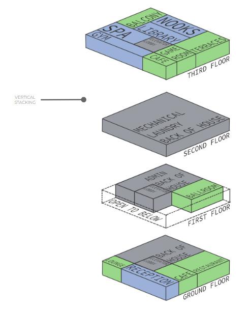
The orientation of the hotel focuses on giving the guest rooms an optimal view of Vancouver.
Guests staying in the northwest area of the tower see the nature of Stanley Park while the southwest gets a view up Denman Street and the English Bay.

PUBLIC SPACES
1. Game Room
2. Cafe
3. Indoor Terrace
4. Outdoor Terrace
5. Restroom
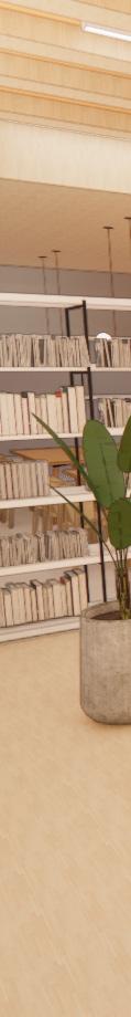
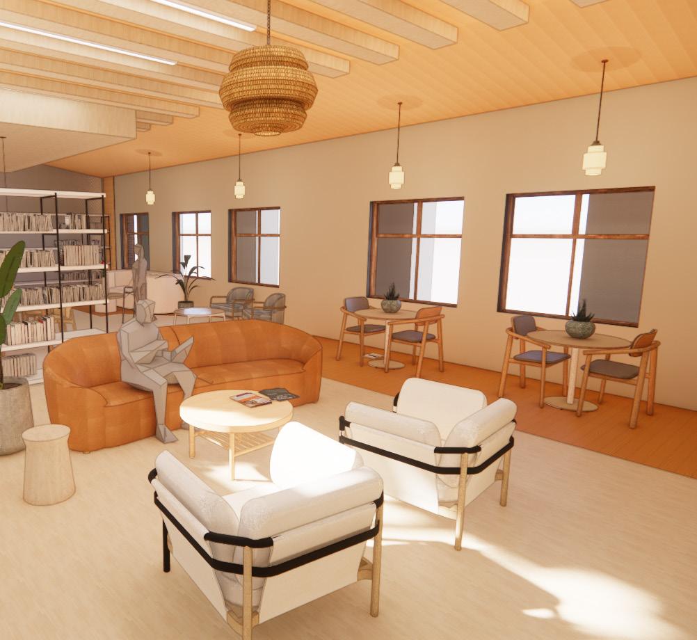
PRIVATE SPACES
1. Gym
2. Locker Room
3. Spa
4. Nooks
5. Library
6. Balcony
7. Kitchen
8. Staff Space
9. Storage


Promotes exposure to light and aims to create lighting environments that promote visual, mental and biological health.

Promotes physical activity in everyday life through environmental design, policies and programs to ensure that movement opportunities are integrated into the fabric of our culture, buildings and communities.

Aims to bolster occupant health and wellbeing through the identification and mitigation of acoustical comfort parameters that shape occupant experiences in the built

Aims to reduce human exposure, whether direct or through environmental contamination, to chemicals that may impact health during the construction, remodeling, furnishing and operation of buildings.

Promotes mental health through policy, program and design strategies that seek to address the diverse factors that influence cognitive and emotional well-being.

Aims to support access to essential healthcare, build a culture of health that accommodates diverse population needs and establish an inclusive, engaged occupant community.


Fall 2022
Creating a space for those living with cognitive impairment can be difficult to do as you don’t want to confuse, trigger, or upset the residents. For my concept, I wanted to simplify their experience into the idea that they were not ending their lives, but instead, starting a new beginning and experience. That is where my concept of ‘New Neighbors’ came about. ‘New Neighbors’ is a concept that focuses on the look, feel, and value that a neighborhood embodies. My goal is to create a functional facility where individuals with cognitive impairment can feel at home within a space that is inclusive, comfortable, and safe. The facility will provide a positive environment that will aid in their journey living with this disease through an environment that can give them the community, independence, and security that a neighborhood provides. ‘New Neighbors’ gives the residents a new home within a new community.
Sliding walls to allow the 3 multipurpose rooms to open up into 1 space
BOARD GAME SPACE
Clear garage doors for ability to open up gallery to the open space
Clear wall to keep separation of spaces but makes hallway feel less long and allows visibility of the bookshelves and library
STAFF SPACE/OFFICES
GALLERY/CRAFT SPACE

OUTDOOR DAYCARE
Gym, yoga, and therapy center all in the same space to keep all active activities in one area, while still allowing for independent use of space
Indoor garden meant to act as a small sensory garden while still being indoors. Large garage door gives access to open up the indoor garden to the outdoor one to connect the two spaces
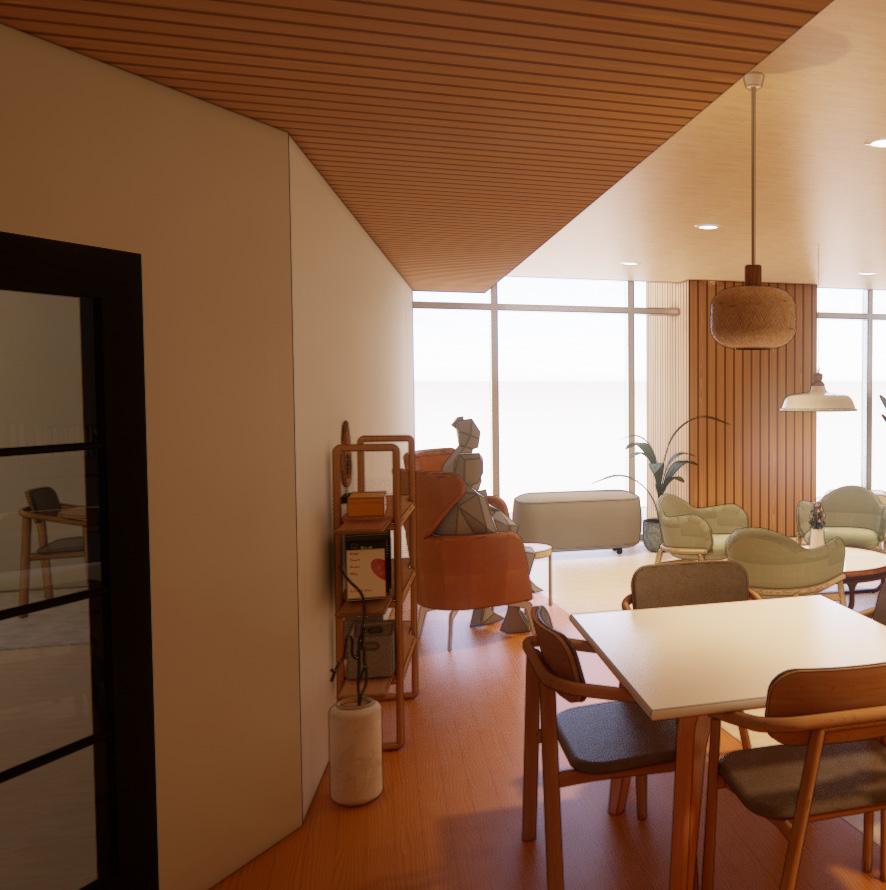
CEILING
Kahrs Avanti
Sustainable Hardwood
Color: European Maple

WALL PAINT
Sherwin Williams
Eggshell Finish
Color: Ivory Lace
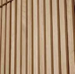
PANELING
Luxewall
Natural Acoustic Wall Panel
Color: Spartan Oak


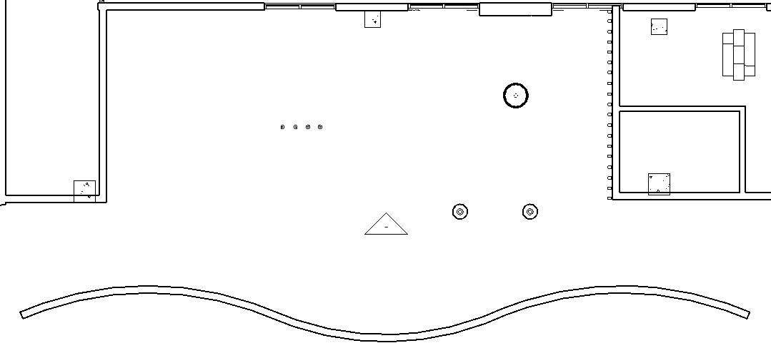
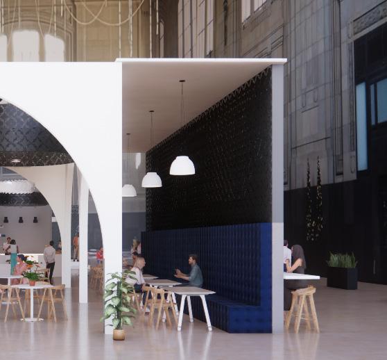
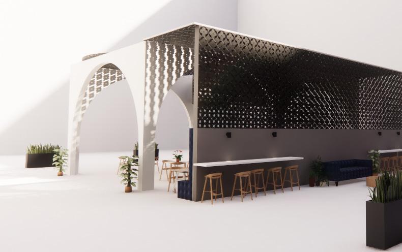
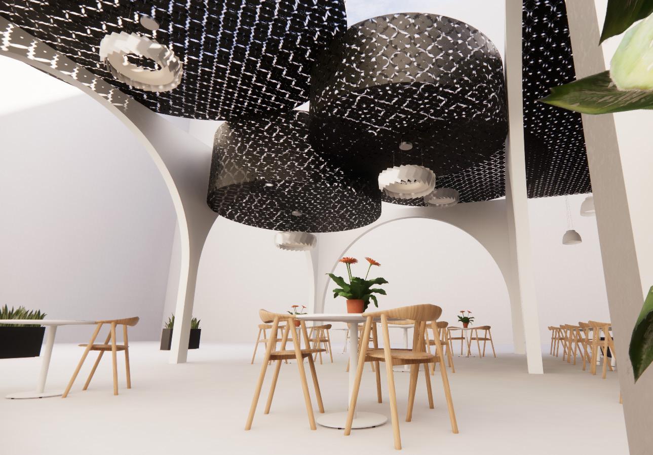
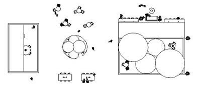
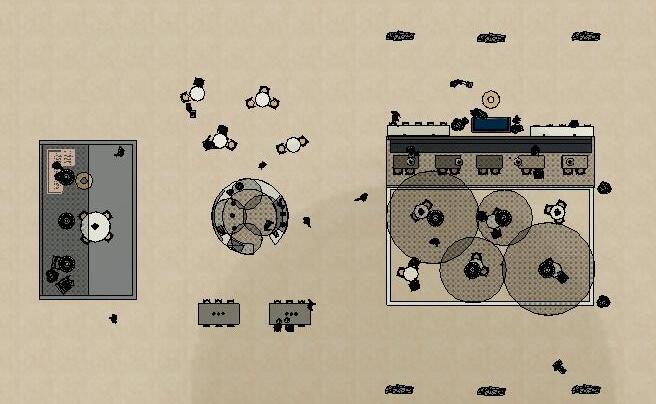
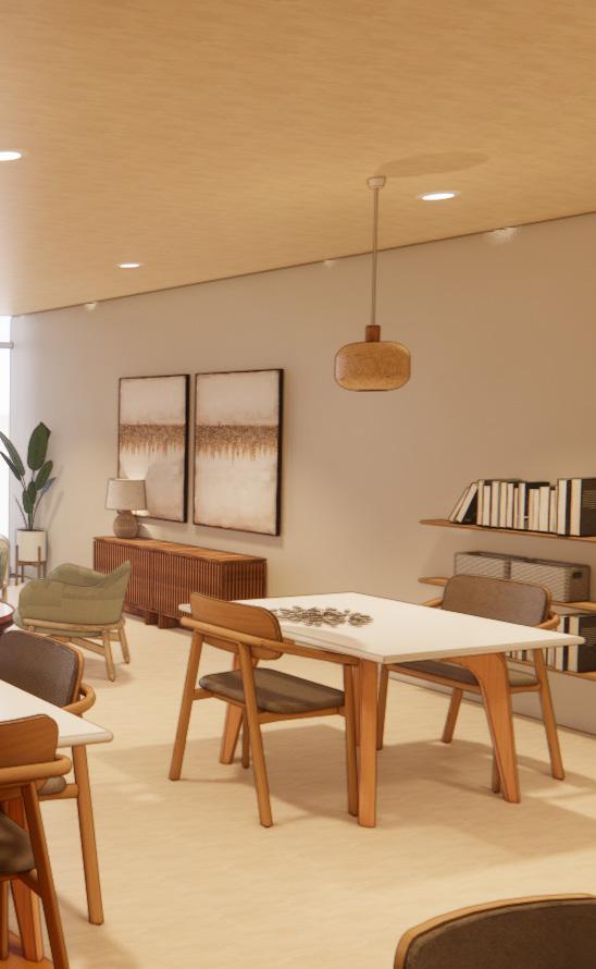
CAFE CEILING PLAN
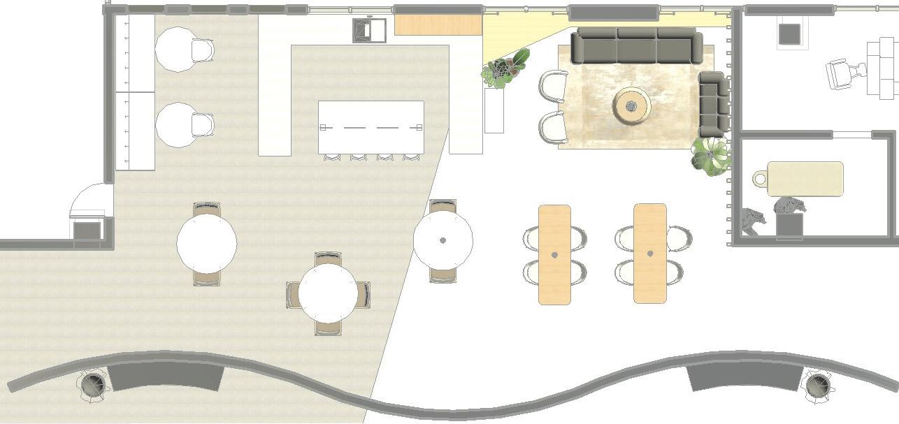
CAFE FLOORING PLAN
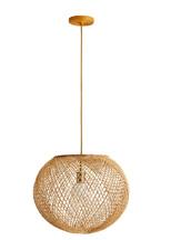
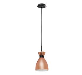
PENDANT LIGHT
Faro Barcelona
Black and Copper
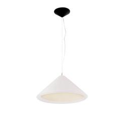
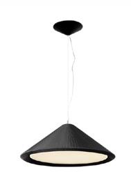
PENDANT LIGHT
OCL
Neo White Dome

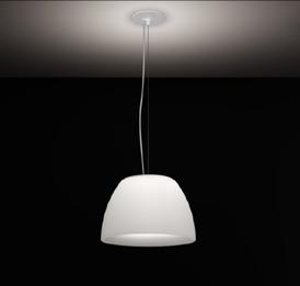
PENDANT LIGHT
Faro Barcelona
Retro Copper

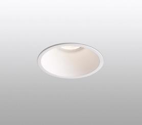
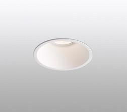
RECESSED LIGHT
Faro Barcelona
White Downlight

Inviting, Soft, Welcoming
Safety, Comfort, Freedom
Social, Community, Connections
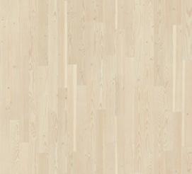
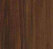
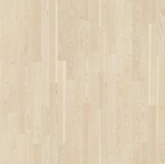
WOOD FLOORING
Kahrs Avanti
Sustainable Hardwood
Color: European Maple

WOOD FLOORING
Wood Color: Beachwood
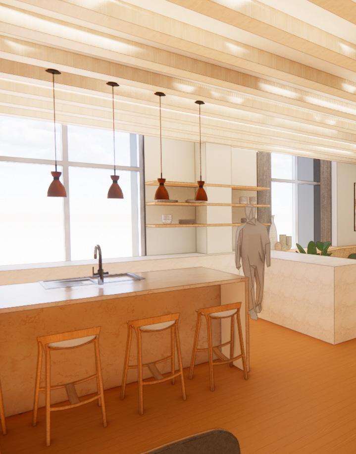
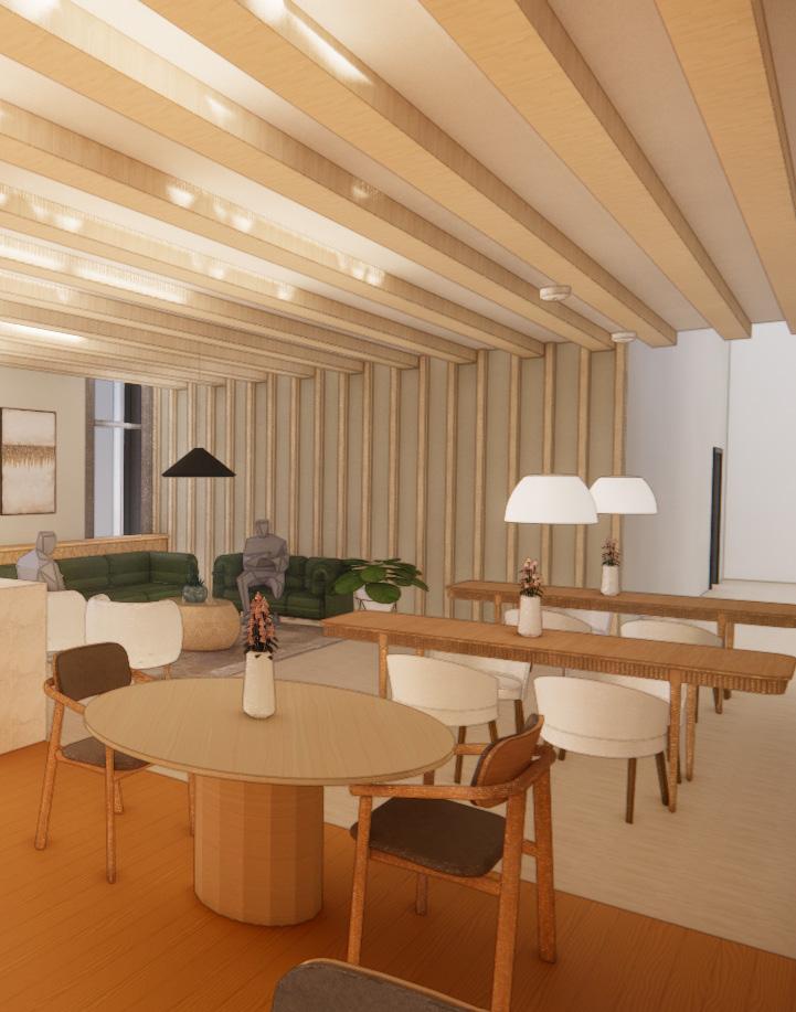
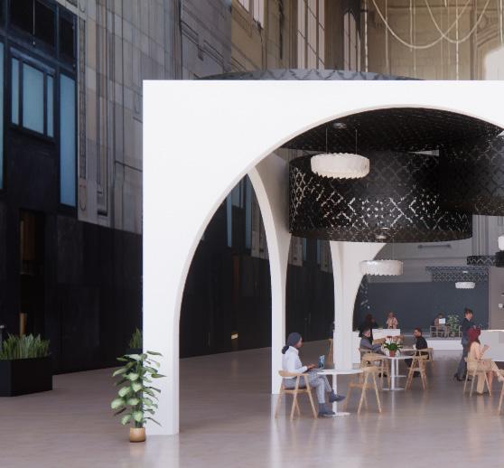
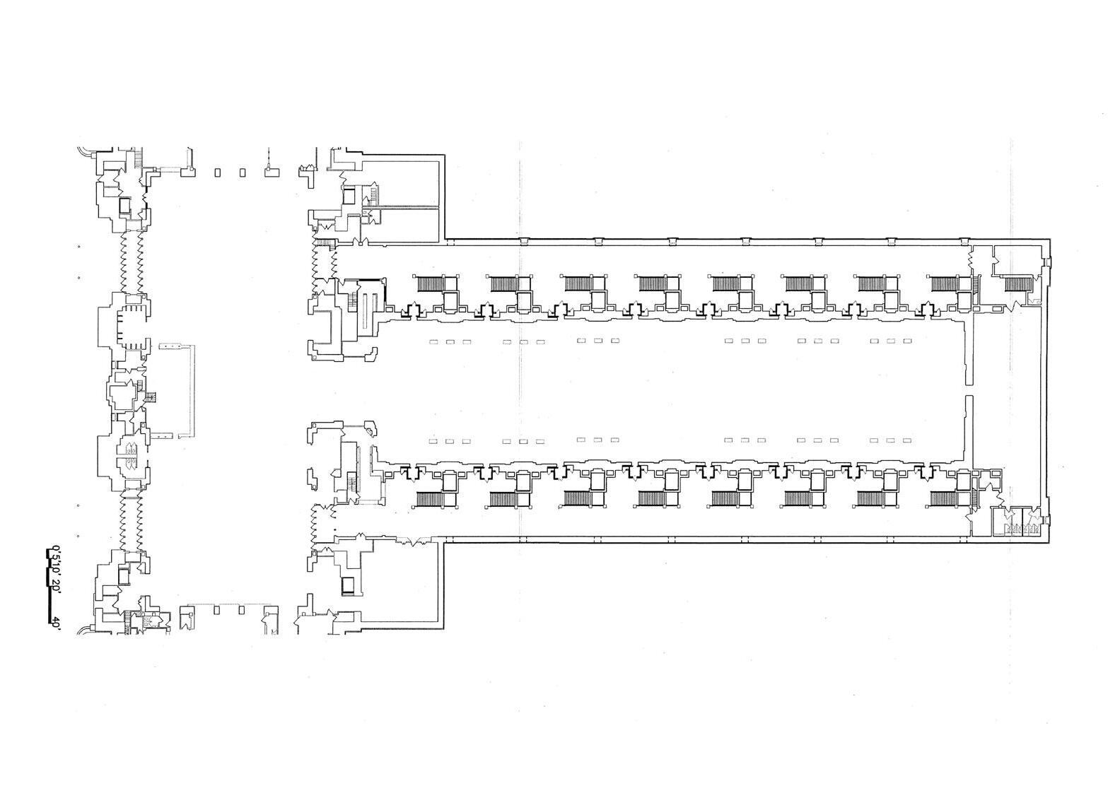
This project is called Pattern Cafe and the goal of this project was to create a cafe based on a culture that we researched and then to explore the spatial potentials of our cafe within Union Station. This project started with the culture and base my design off of their ornate patterns and geometry. We then were required to explore patterns that we created ourselves and then that led to the development of our cafe design and the outcome of our Cafe within Union Station using Revit and creating renderings as well as creating our own physical model.