Maxion Corporate Identity System and Guidelines

The corporate identity of a company provides stakeholders with a sense of its culture and personality through brand imagery.
Maxion's Corporate Identity System and Guidelines is comprised of several components that when used separately or together, and with careful and consistent execution, create a strong brand with a consistent look and feel around the world.
By using the system and adhering to these guidelines, we ensure our visual expression is recognized and remembered, and together build an immediately recognizable brand and valuable corporate asset.
2
1. Brand Portfolio 4 2. Logo Marks 2.1 Business 2.1.3 INFINITY SYMBOL 9 2.1.4 MAXION STRUCTURAL COMPONENTS 11 2.1.5 MAXION WHEELS 13 2.1.7 MAXION ADVANCED TECHNOLOGIES 15 2.1.2 IOCHPE-MAXION 7 2.1.1 MAXION 5 2.2.2 UNIQUE AND UNITED 19 2.2 Internal 2.2.1 PEOPLE MATTER 17 2.2.3 MAXION ACADEMY 21 3. Typography 23 4. Color Palette 24 6. Tagline 28 5. Logo Pairings 25 TABLE OF CONTENT 3
Business Internal
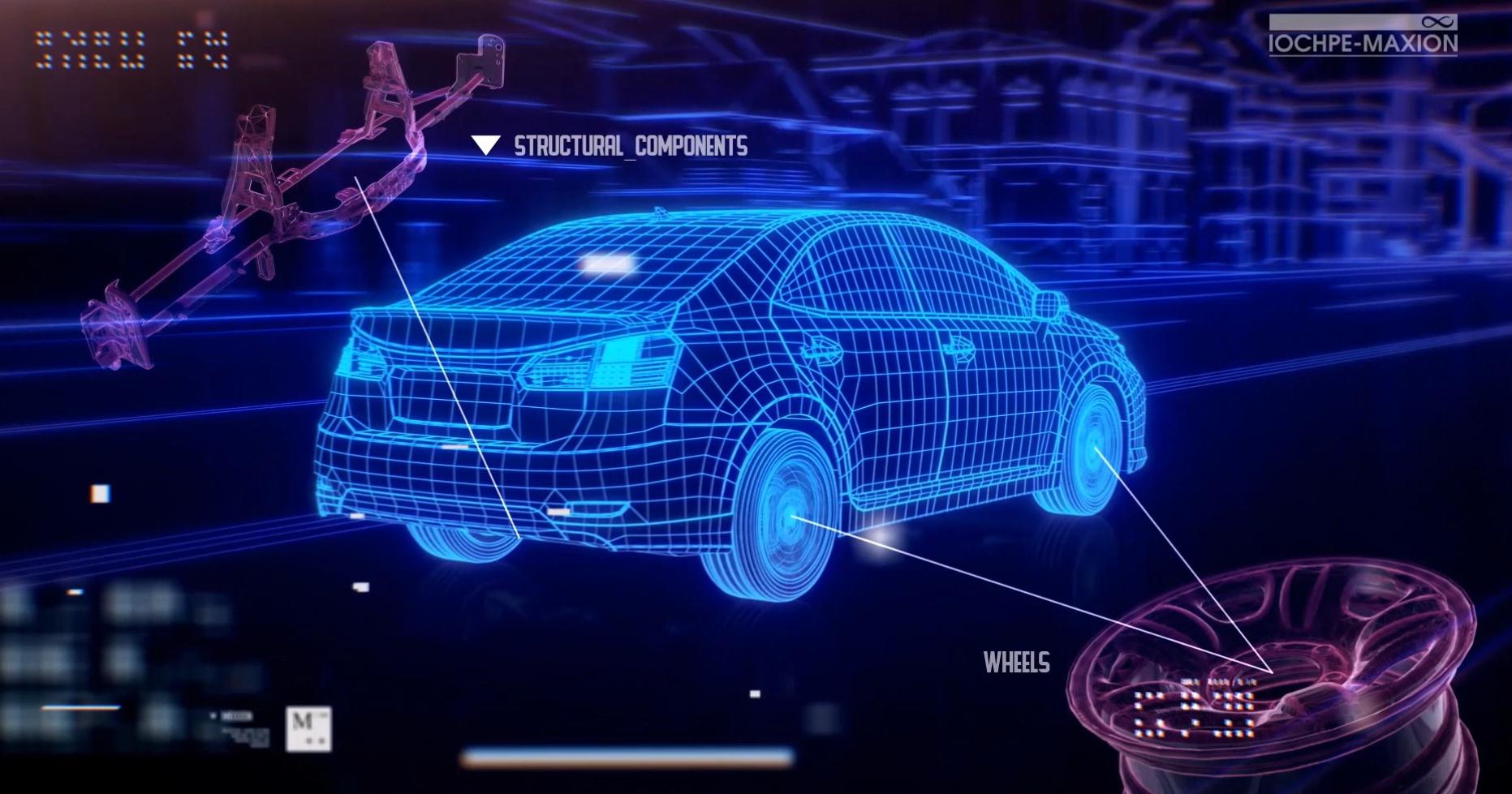
1. BRAND PORTFOLIO
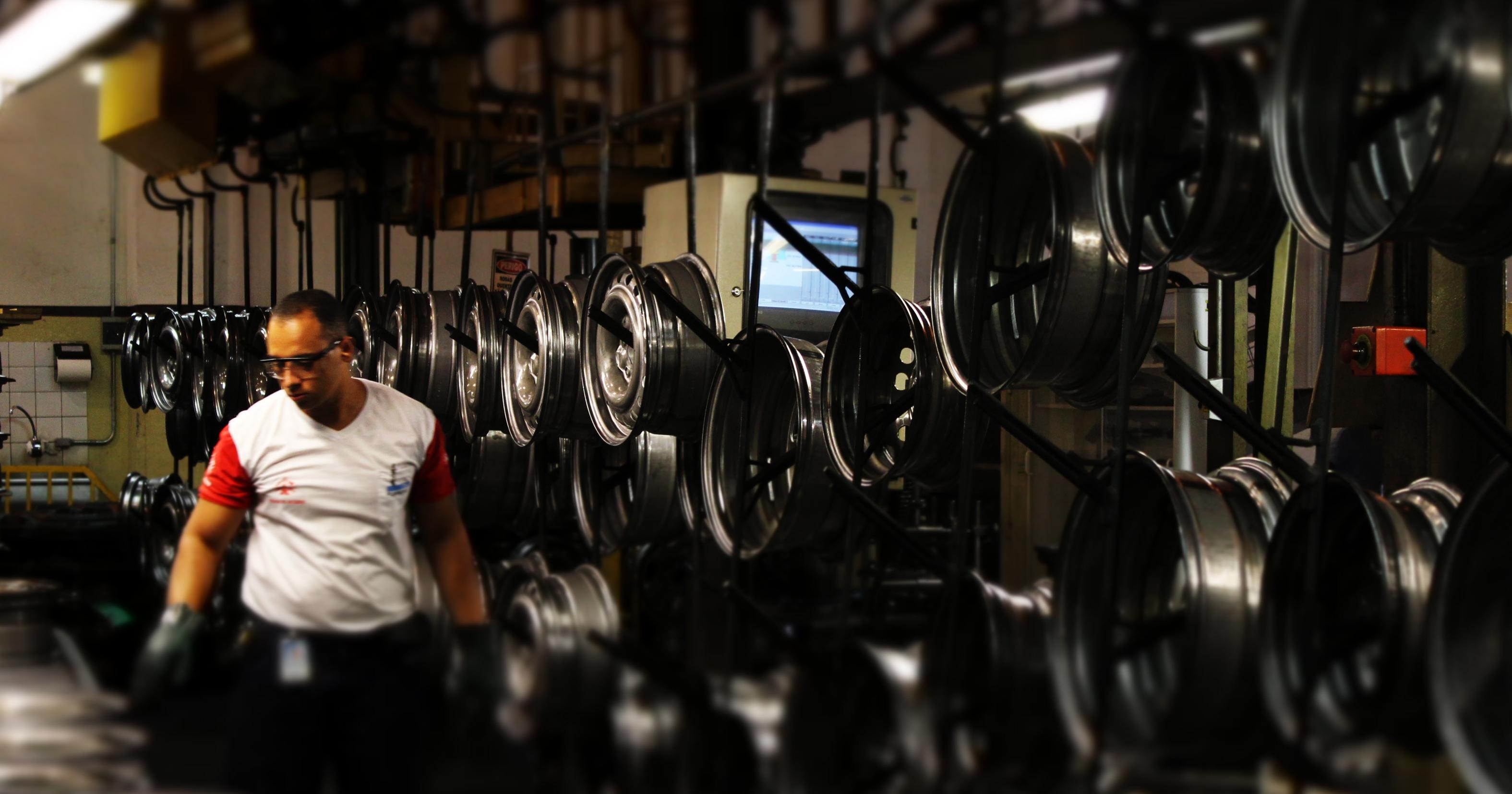
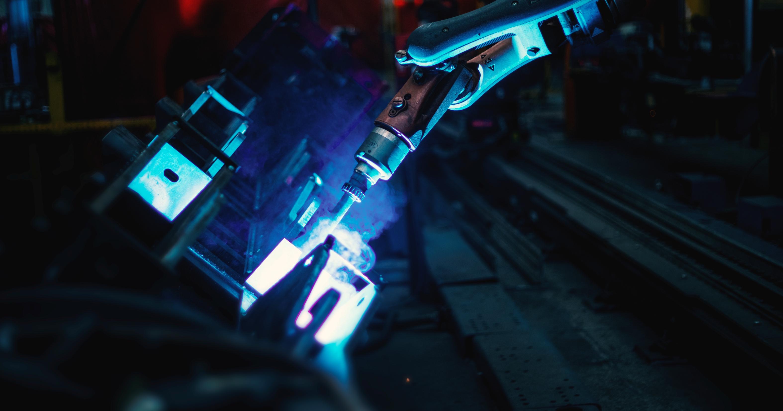
Iochpe-Maxion, a world leader in the production of automotive wheels and a leading producer of automotive structural components in the Americas, operates with a robust catalogue of logo marks that are used at both the corporate level, and within each division.
How and when to use these logo marks is essential for creating a clear and connected experience for our stakeholders.
4
2.1.1 MAXION
When to Use
The MAXION logo mark is used to represent the entire organization as the master brand of all company assets, products and services, including its business divisions (this logo mark is included in each division logo), and important company-wide activities and processes.
Use of the MAXION logo mark has not been prevalent, which, through the development and execution of these identity guidelines will change.
Free Space
In order to achieve readability, a logo mark must include free space between it and all other elements, such as other logo marks, text and images.
Minimum free space is determined as the height and width of the “M” in the application. This defined space becomes the minimum distance between the logo mark and all other elements, to ensure recognition and legibility.

Protected Area Reference 5
2.1.1 MAXION
Application
The logo mark is available in full color, blue, black, and reverse.
Background
Depending on the background, using the correct logo mark version must be based on achieving the best readability. The logo mark is never used on top of a pattern.
Minimum Size
To ensure the quality and readability of the logo mark, a minimum size for print (20mm wide) or digital media (100px wide) is required. Do not ever reproduce the mark smaller than stated.
Incorrect Usage
The correct application of the logo mark is essential for the recognition and strengthening of the brand. Any modification impairs its integrity and lessens its impact.
PRINT DIGITAL 20mm 100px Do not distort the
in any
Do not reverse the
Do not use effects on the
Do not use other colors for the
Do not
the
Do not use sections of the
Do not redesign the
with other sources. MAXION DO NOT 6 PREFERRED
logo
way.
order of the logo.
logo.
logo.
tilt
logo.
logo; the logo must stay intact.
logo
2.1.2 IOCHPE-MAXION
When to Use
The IOCHPE-MAXION logo mark is only to be used by the corporate office in its regulatory financial and Brazilian business press communications for specific corporate audiences such as investors, banks, customers and the general business community.
Free Space
In order to achieve readability, a logo mark must include free space between it and all other elements, such as other logo marks, text and images.
Minimum free space is determined as the height and width of the “M” in the application. This defined space becomes the minimum distance between the logo mark and all other elements, to ensure recognition and legibility.
Protected Area Reference 7
2.1.2 IOCHPE-MAXION
Applications
The logo mark is available in full color, blue, black, and reverse.
Background
Depending on the background, using the correct logo mark version must be based on achieving the best readability. The logo mark is never used on top of a pattern.
Minimum Size
To ensure the quality and readability of the logo mark, a minimum size for print (20mm wide) or digital media (150px wide) is required. Do not ever reproduce the mark smaller than stated.
Incorrect Usage
The correct application of the logo mark is essential for the recognition and strengthening of the brand. Any modification impairs its integrity and lessens its impact.
PRINT DIGITAL 20mm 150px DO NOT Do not distort the logo in any way. Do not reverse the order of the logo. Do not use effects on the logo. Do not use other colors for the logo. Do not tilt the logo. Do not use sections of the logo; the logo must stay intact. Do not redesign the logo with other sources. Iochpe-Maxion 8
PREFERRED
2.1.3 INFINITY SYMBOL
When to Use
The INFINITY SYMBOL logo mark is only used in very rare and corporate-approved applications. You must request and receive permission to use the logo mark from Marketing and Communications.
Free Space
In order to achieve readability, a logo mark must include free space between it and all other elements, such as other logo marks, text and images.
Minimum free space is determined as the height of the “symbol” in the application. This defined space becomes the minimum distance between the logo mark and all other elements, to ensure recognition and legibility.
1x
Protected Area Reference
9
2.1.3 INFINITY SYMBOL
Applications
The logo mark is available in blue, black, and reverse.
Background
Depending on the background, using the correct logo mark version must be based on achieving the best readability. The logo mark is never used on top of a pattern.
Minimum Size
To ensure the quality and readability of the logo mark, a minimum size for print (15mm wide) or digital media (100px wide) is required. Do not ever reproduce the mark smaller than stated.
Incorrect Usage
The correct application of the logo mark is essential for the recognition and strengthening of the brand. Any modification impairs its integrity and lessens its impact.
PRINT DIGITAL 15mm 100px DO NOT Do not distort the logo in any way. Do not reverse the order of the logo. Do not use effects on the logo. Do not use other colors for the logo. Do not tilt the logo. 10
2.1.4 MAXION STRUCTURAL COMPONENTS
When to Use
The MAXION STRUCTURAL COMPONENTS logo mark, including tagline, is used to represent the people, products and services offered by this division.
Free Space
In order to achieve readability, a logo mark must include free space between it and all other elements, such as other logo marks, text and images.
Minimum free space is determined as the height and width of the “M” in the application. This defined space becomes the minimum distance between the logo mark and all other elements, to ensure recognition and legibility.
Protected Area Reference 11
2.1.4 MAXION STRUCTURAL COMPONENTS
Applications
The logo mark is available in full color, blue, black, and reverse.
Background
Depending on the background, using the correct logo mark version must be based on achieving the best readability. The logo mark is never used on top of a pattern.
Minimum Size
To ensure the quality and readability of the logo mark, a minimum size for print (25mm wide) or digital media (150px wide) is required. Do not ever reproduce the mark smaller than stated.
Incorrect Usage
The correct application of the logo mark is essential for the recognition and strengthening of the brand. Any modification impairs its integrity and lessens its impact.
25mm 150px Do not distort the logo in any way. Do not reverse the order of the logo. Do not use effects on the logo. Do not use other colors for the logo. Do not tilt the logo. Do not use sections of the logo; the logo must stay intact. Do not redesign the logo with other sources. MAXION DO NOT 12 PREFERRED
PRINT DIGITAL
2.1.5 MAXION WHEELS
When to Use
The MAXION WHEELS logo mark, including tagline, is used to represent the people, products and services offered by this division. For detailed identity guidelines for Maxion Wheels, please contact the Global Marketing and Communications department.
Free Space
In order to achieve readability, a logo mark must include free space between it and all other elements, such as other logo marks, text and images.
Minimum free space is determined as the height and width of the “M” in the application. This defined space becomes the minimum distance between the logo mark and all other elements, to ensure recognition and legibility.
Protected Area Reference 13
2.1.5 MAXION WHEELS
Applications
The logo mark is available in full color, blue, black, and reverse.
Background
Depending on the background, using the correct logo mark version must be based on achieving the best readability. The logo mark is never used on top of a pattern.
Minimum Size
To ensure the quality and readability of the logo mark, a minimum size for print (25mm wide) or digital media (150px wide) is required. Do not ever reproduce the mark smaller than stated.
Incorrect Usage
The correct application of the logo mark is essential for the recognition and strengthening of the brand. Any modification impairs its integrity and lessens its impact.
Do not distort the logo in any way. Do not reverse the order of the logo. Do not use effects on the logo. Do not use other colors for the logo. Do not tilt the logo. Do not use sections of the logo; the logo must stay intact. Do not redesign the logo with other sources. MAXION DO NOT PRINT DIGITAL 25mm 150px 14 PREFERRED
2.1.6 MAXION ADVANCED
TECNHOLOGIES
When to Use
The MAXION ADVANCED TECHNOLOGIES logo mark, is used by Innovation initiative as an identify for the team located in the Berlin hub office.
Free Space
In order to achieve readability, a logo mark must include free space between it and all other elements, such as other logo marks, text and images.
Minimum free space is determined as the height and width of the “M” in the application. This defined space becomes the minimum distance between the logo mark and all other elements, to ensure recognition and legibility.
Protected Area Reference 17
2.1.6 MAXION ADVANCED TECNHOLOGIES
Applications
The logo mark is available in full color, blue, black, and reverse.
Background
Depending on the background, using the correct logo mark version must be based on achieving the best readability. The logo mark is never used on top of a pattern.
Minimum Size
To ensure the quality and readability of the logo mark, a minimum size for print (25mm wide) or digital media (150px wide) is required. Do not ever reproduce the mark smaller than stated.
Incorrect Usage
The correct application of the logo mark is essential for the recognition and strengthening of the brand. Any modification impairs its integrity and lessens its impact.
Do
Do
Do
Do not tilt the logo. Do not use sections of the logo; the logo must stay intact. Do not redesign the logo with other sources. MAXION DO NOT PRINT DIGITAL 25mm 150px
Do
not
distort the logo in any way.
not
reverse the order of the logo.
not use effects on the logo.
not use other colors for the logo.
18 PREFERRED
2.2.1 MAXION PEOPLE MATTER
The PEOPLE MATTER logo mark is the lead identity for all company-wide communication related to employee experience initiatives.
This logo mark is never used without a pairing with MAXION, or another business mark. See Logo Pairings for examples of when and how to use this logo mark.
Free Space
In order to achieve readability, a logo mark must include free space between it and all other elements, such as other logo marks, text and images.
Minimum free space is determined as the height and width of the “M” in the application. This defined space becomes the minimum distance between the logo mark and all other elements, to ensure recognition and legibility.
When to Use Protected Area Reference 21
PREFERRED
2.2.1 MAXION PEOPLE MATTER
Applications
The logo mark is available in full color, black, grayscale and reverse.
Background
Depending on the background, using the correct logo mark version must be based on achieving the best readability. The logo mark is never used on top of a pattern.
Minimum Size
To ensure the quality and readability of the logo mark, a minimum size for print (25mm wide) or digital media (200px wide) is required. Do not ever reproduce the mark smaller than stated.
Incorrect Usage
The correct application of the logo mark is essential for the recognition and strengthening of the brand. Any modification impairs its integrity and lessens its impact.
Maxion People Matter
PRINT DIGITAL 25mm 200px
NOT Do not distort the logo in any way. Do not reverse the order of the logo. Do not use effects on the logo. Do not use other colors for the logo. Do not tilt the logo. Do not use sections of the logo; the logo must stay intact. Do not redesign the logo with other sources.
DO
22
When to Use
The UNIQUE AND UNITED logo mark is the lead identity for all company-wide communication on Diversity and Inclusion.
This logo mark is never used without a pairing with MAXION, or another business mark. See Logo Pairings for examples of when and how to use this logo mark.
Free Space
In order to achieve readability, a logo mark must include free space between it and all other elements, such as other logo marks, text and images.
Minimum free space is determined as the height and width of the “U” in the application. This defined space becomes the minimum distance between the logo mark and all other elements, to ensure recognition and legibility.
Protected Area Reference 23
2.2.2 UNIQUE AND UNITED
Applications
The logo mark is available in full color, black, and reverse.
Background
Depending on the background, using the correct logo mark version must be based on achieving the best readability. The logo mark is never used on top of a pattern.
Minimum Size
To ensure the quality and readability of the logo mark, a minimum size for print (40mm wide) or digital media (250px wide) is required. Do not ever reproduce the mark smaller than stated.
Incorrect Usage
The correct application of the logo mark is essential for the recognition and strengthening of the brand. Any modification impairs its integrity and lessens its impact.
All recommendations must be applied for horizontal and vertical orientations.
PREFERRED
Do not distort the logo in any way.
Do not reverse the order of the logo.
Do not use effects on the logo.
DO
NOT
Do not use other colors for the logo.
Do not tilt the logo.
Do not use sections of the logo; the logo must stay intact.
PRINT DIGITAL 40mm 250px
2.2.2 UNIQUE AND UNITED
Do not redesign the logo with other sources. 24
UNIQUE & UNITED
M M M M
2.2.3 MAXION ACADEMY
When to Use
The MAXION ACADAMEY logo mark is the lead identity for all company-wide employee training and development, and is managed exclusively by the Human Resources organization. You must request and receive permission to use the logo mark from Organizational Development (OD) leadership.
This logo mark is never used without a pairing with MAXION, or another business mark. See Logo Pairings for examples of when and how to use this logo mark.
Free Space
In order to achieve readability, a logo mark must include free space between it and all other elements, such as other logo marks, text and images.
Minimum free space is determined as the height and width of the “M” in the application. This defined space becomes the minimum distance between the logo mark and all other elements, to ensure recognition and legibility.
Protected Area Reference
25
2.2.3 MAXION ACADEMY
Applications
The logo mark is available in full color, black, grayscale and reverse.
Background
Depending on the background, using the correct logo mark version must be based on achieving the best readability. The logo mark is never used on top of a pattern.
Minimum Size
To ensure the quality and readability of the logo mark, a minimum size for print (20mm wide) or digital media (150px wide) is required. Do not ever reproduce the mark smaller than stated.
Incorrect Usage
The correct application of the logo mark is essential for the recognition and strengthening of the brand. Any modification impairs its integrity and lessens its impact.
PRINT DIGITAL 20mm 150px Do not distort the logo in any way. Do not reverse the order of the logo. Do not use effects on the logo. Do not use other colors for the logo. Do not tilt the logo. Do not use sections of the logo; the logo must stay intact. Do not redesign the logo with other sources. DO NOT Academy 26 PREFERRED
3. TYPOGRAPHY
A key component of the corporate identity system is the consistent use of its primary and secondary fonts.
Primary Font – Gotham
The primary font is mainly used by Marketing and Communications for external communications, and requires a subscription license.
Secondary Font – Century Gothic
The secondary font, which is available in the company's Microsoft Office license, is available for employees use for both internal and external communications.
Gotham ABCD
GOTHAM BOOK
ABCDEFGHIJKLMNOPQRSTUVXYWZ 1234567890
headline example
Lorem ipsum dolor sit amet, consectetur adipiscing elit, sed do eiusmod tempor incididunt ut labore et dolore magna aliqua. Ut enim ad minim veniam, quis nostrud exercitation ullamco laboris nisi ut aliquip ex ea commodo consequat.
Century Gothic
GOTHAM MEDIUM
ABCDEFGHIJKLMNOPQRSTUVXYWZ 1234567890
GOTHAM BOLD
ABCDEFGHIJKLMNOPQRSTUVXYWZ 1234567890
GOTHAM BLACK
ABCDEFGHIJKLMNOPQRSTUVXYWZ 1234567890
ABCDEFGHIJKLMNOPQRSTUVXYWZ
1234567890
Century Gothic Bold
ABCDEFGHIJKLMNOPQRSTUVXYWZ
1234567890
ope
Abgkn
GOTHAM BOOK GOTHAM MEDIUM GOTHAM BOLD GOTHAM BLACK
27
4. COLOR PALETTE
Colors bring our brands to life, which is why they are a fundamental component in the corporate identity system – helping to strengthen the emotional connection between our brands and stakeholders.
PRIMARY COLORS
Pantone: PMS Process Blue
CMYK: 100 35 7 0
RGB: 0 131 191
HEX: #0083BF
SECONDARY COLORS
Pantone: PMS 427
CMYK: 17 12 12 0
RGB: 209 211 213
HEX: #D1D3D3
Pantone: PMS White
CMYK: 0 0 0 0
RGB: 0 0 0
HEX: #FFFFFF
Pantone: Process Black
CMYK: 100 100 100 100
RGB: 32 30 30
HEX: #201E1E
Pantone: 2010 CP
CMYK: 0 35 100 0
RGB: 251 177 47
HEX: #FBB12F
Pantone: PMS 425
CMYK: 65 56 53 29
RGB: 65 87 89
HEX: #565759
Pantone: P 179-15 C
CMYK: 70 65 60 65
RGB: 60 60 61
HEX: #3C3C3D
Pantone: PMS 715
CMYK: 0 50 100 0
RGB: 247 148 30
HEX: #F78D2C
Pantone: PMS 716
CMYK: 3 64 100 0
RGB: 237 122 35
HEX: #EB7923
28
5. LOGO PAIRINGS
With our robust portfolio of logo marks, it is common for several of the marks to be used together.
Managing this “pairing” is essential to avoid competing marks or clutter that only confuses the audience.
As a general rule, there is a natural hierarchy of logo marks within a corporate identity system.
First, identify the correct business mark and place that as the primary logo.
The other logo mark(s) that you need to use it must be visibly smaller than the primary logo.
When use two or more logos, position them so that is clear they are working together and the hierarchy is evident.
29
EXAMPLE EXAMPLE
EXAMPLE EXAMPLE
5. LOGO PAIRINGS
30
EXAMPLE EXAMPLE
5. LOGO PAIRINGS
31
The Division of IOCHPE-MAXION tagline must appear in all Maxion Structural Components and Maxion Wheels logo applications, except for the following exceptions:
If the application of the logo is very small and makes reading difficult, be it digital printed, embroidered, printing on fabrics, or other applications where reading is compromised.
32
6. TAGLINE
For questions about the guidelines please contact your Corporate and/or Division Marketing and Communications department.
IOCHPE-MAXION COPYRIGHT 2022