So!
YOU WANT TO BECOME
A GRAPHIC DESIGNER
A RESOURCE AND GUIDE
Carole Maugé-Lewis, MFA Professor Emerita of Kennesaw State University
“ Design is thinking made visual ”
QUOTE BY SAUL BASS
Introduction ............................................................................................. 1 The Fundamentals ................................................................................. 2-3 Learn The Programs .............................................................................. 4-5 The Value of Joining Design Communities .......................................... 6-7 The Importance of Studying Typography ............................................. 8-9 A fun typography class project on type anatomy ................................ 10 Experiment with creative typography................................................... 11 The Import and Value of the Design Critique .................................. 12-13 A research project on exploring typographic grid systems................ 14 A research project on a notable graphic designer ............................... 15 The Significance of Color in Design and Branding .......................... 16-17 AI-generated color wheels ...................................................................... 18 Explore color palettes & color schemes for design and branding ..... 19 RGB and CMYK color models .............................................................. 20 Notable contributions from color theorists ......................................... 21 Image file formats for print and online .......................................... 22-23 How Important is the Design Process? ............................................. 24-25 The Importance of Research and Thumbnails ....................................... 26 Why is research so fundamental to the design process? ..................... 27 Where do graphic designers get inspiration from? ............................. 28 Sketching and generating thumbnails .................................................. 29 The Importance of the Design Layout ................................................... 30 10 books that cover various aspects of design layout ......................... 31 Layout Design Tips for Design Beginners ........................................ 32-33 The design/client brief ............................................................................. 34 The Re Spa & Gym branding (based on a design brief) ............... 35-37 The importance of realistic and compelling mockups.................. 38-41 TABLE OF CONTENTS
INTRODUCTION
At its core, graphic design merges form and function, bringing together artistic expression with effective communication. Whether you’re designing a logo that captures a brand’s identity, crafting captivating layouts for websites and print materials, or conceptualizing visually striking marketing campaigns, graphic designers play a crucial role in shaping the visual landscape of our world.
To succeed in this dynamic field, aspiring graphic designers need a diverse skill set. Proficiency in design software like the Adobe Creative Suite is vital, but it’s only the beginning.
Creativity is the lifeblood of graphic design, and having a keen eye for aesthetics is a must. In addition to technical skills, understanding the elements and the principles of design, typography, color theory, layout and composition are essential for creating impactful visual content.
Alongside technical and creative skills, effective communication and collaboration are key attributes for a graphic designer. Clients, colleagues, and stakeholders will rely on you to translate ideas into visual language, so being able to listen, interpret, and visualize concepts are crucial.
Are you ready to embark on a journey where creativity and strategy converge, and visual storytelling becomes your language of choice? Becoming a graphic designer is not just about acquiring skills; it’s about cultivating a mindset that embraces continuous learning and adaptation to the ever-evolving design landscape.
So! if you really want to do graphic design for a living, you must LOVE it. Creating great design work should be a positive, JOYFUL feeling, as it still is for me and for several of my professional design colleagues. We agree that yes, it’s hard work, but if you like it and become good at it, it won’t really seem like work. And the best feeling of all is when you know your work is good, the client loves it, it meets all the standards set for the project, you get paid fairly, and and everyone is happy.
Let’s explore the exciting world of graphic design and discover the boundless possibilities that await you. Peruse this comprehensive resource and guide covering topics such as fundamental design principles, software tools, the design process, the design critique, portfolio development, industry insights, and practical tips for career growth.
SO! YOU WANT TO BECOME A GRAPHIC DESIGNER 1
THE FUNDAMENTALS
Learning the fundamentals of graphic design is essential for aspiring designers as it lays the groundwork for their creative journey. Understanding concepts such as typography, color theory, composition, balance, white space and visual hierarchy among others, provides designers with the tools they need to effectively communicate their ideas visually. Mastering these fundamentals not only enhances design skills but also fosters a strong foundation upon which designers can build their unique style and approach. By honing their understanding of the basics, designers gain the confidence and competence needed to tackle more complex design challenges and produce impactful and visually compelling work.
Here are the key fundamentals to keep in mind:
1. Hierarchy: Establish a clear visual hierarchy to guide the viewer’s attention through the design. Important elements should stand out, making the message or information easy to understand.
2. Balance: Achieve balance in your design by distributing elements and creating visual stability. Balance can be symmetrical (even distribution) or asymmetrical (uneven distribution, yet visually balanced), depending on your design goals.
3. Contrast: Use contrast to emphasize differences in elements like color, size, or shape. This creates visual interest and highlights important information, preventing monotony, and drawing attention to key elements.
4. Repetition: Consistently use visual elements such as colors, fonts, and shapes to establish unity and reinforce the overall design theme. Repetition creates cohesion and reinforces the brand or message.
5. Alignment: Proper alignment ensures that elements are logically positioned, creating a clean and organized appearance. Aligning elements establishes a sense of order and clarity in the design.
2 2
THE IMPORTANCE OF STUDYING TYPOGRAPHY
Typography is a crucial aspect of graphic design that greatly impacts a design’s visual appeal and effectiveness. You must study typography and type’s anatomy to be able to understand and become good at it, as it is a visual language that enables communication, expresses emotions, structures information, reflects cultural influences, and fosters universal understanding through visual elements and design principles. According to Ellen Lupton, author of Thinking With Type: “Typography is what language looks like.”
Here are some tips for a beginning graphic designer looking to enhance your typography skillsa;
Understand the Basics: Familiarize yourself with typography terms like serif and sans-serif fonts, kerning, leading, tracking, and hierarchy. Knowing these terms will help you communicate effectively and understand design principles.
Choose Fonts Wisely: Select fonts that align with the design’s purpose and tone. Consider readability and legibility, especially for body text. Try experimenting with font pairings to create visual interest while maintaining coherence.
Hierarchy Matters: Establish a clear typographic hierarchy by varying font sizes, weights, and styles. Headings, subheadings, and body text should have distinct visual differences to guide attention and convey information effectively.
Pay Attention to Alignment: Ensure proper alignment of text elements. Left, right, center, or justified alignments all have their uses, but consistency within a design is crucial for a polished and professional look.
Mind the White Space: Embrace white space to enhance readability and visual appeal. Provide enough space around text elements to prevent crowding and allow breathing room for comfortable navigation.


It is important to study and understand the anatomy of letterforms. Understanding the anatomy of letterforms is essential for achieving consistency, and mastery in typography
SO! YOU WANT TO BECOME A GRAPHIC DESIGNER 8
THE IMPORT AND VALUE OF THE DESIGN CRITIQUE
A design critique is extremely valuable at different stages of the design process. It is usually conducted in a structured manner to maximize productivity, effectiveness, and alignment with the design brief.
Here are the key steps involved in conducting a design critique:
Preparation:
• Select a convenient time and place for the critique that works for all participants.
• Gather all necessary materials, such as design mockups, prototypes, or sketches, that will be reviewed during the critique.
• Determine the focus and goals of the critique. What aspects of the design do you want feedback on? What specific questions do you want to address?
Introduction:
• Begin the critique by introducing the design and providing context. Explain the project goals, target audience, and any relevant constraints or considerations.
• Clarify the purpose of the critique and set expectations for participation. Emphasize the importance of constructive feedback and respectful communication.
Presentation:
• The designer presents the design to the group, walking through key elements, features, and design decisions. This presentation should be concise but thorough, highlighting the main aspects of the design.
• Encourage the designer to explain their design rationale, user considerations, and any specific areas where they are seeking feedback.
Feedback and Discussion:
• Open the floor for feedback and discussion. Encourage participants to share their thoughts, impressions, and suggestions for improvement.
• Focus the discussion on specific aspects of the design, such as usability, visual aesthetics, information architecture, or functionality.
• Ensure that feedback is constructive, specific, and actionable. Avoid personal criticism and focus on the design itself.
• Encourage a diversity of perspectives and viewpoints. Different participants may have unique insights based on their backgrounds, expertise, or experiences.
Facilitation:
• As the facilitator, guide the discussion and keep it on track. Ensure that everyone has an opportunity to speak and that the conversation remains focused on the design objectives.
• Manage the time effectively to allow for thorough feedback without exceeding the allotted time.
SO! YOU WANT TO BECOME A GRAPHIC DESIGNER 12
A research project on exploring typographic grid systems
The typographic systems are similar to what architects call “shape grammars” and they are a part of graphic design studies. Traditionally, many designers focus on using traditional grid systems for designs based on a vertical column structure. However, in a beginning typography course, students studied and explored other variations of the grid outside of the traditional structure. These variations included axial, radial, dilatational, random, modular, bilateral, and transitional grids, as described in Kimberly Elam’s book on Typographic Systems. Designs were limited to black and one other color.
The main objective of the project was to develop variations of the systems, each in an 8” square, using given text related to submitting a portfolio to the Graphic Communication concentration at Kennesaw State University. One creative traditional grid on a well-known designer was also assigned.


SO! YOU WANT TO BECOME A GRAPHIC DESIGNER 14
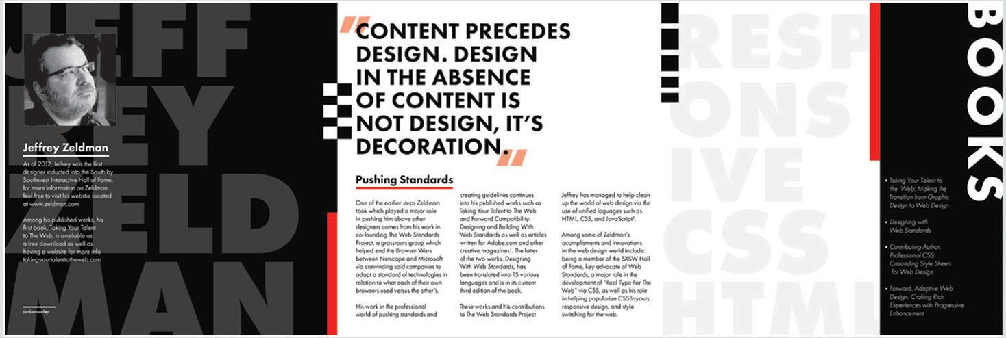
Top: Explorations of six of the Typographic Systems.
Student Designer: Preston Luk / Kennesaw State University.
Below: A creative solution using a traditional grid highlighting the well known designer, Jeffrey Zeldman.
Student Designer: Jordan Costley / Kennesaw State University.
A research project on a notable graphic designer
Researching and studying the work of notable graphic designers are valuable sources of learning and inspiration for graphic design students. It not only helps to enhance their technical skills but also contributes to their creative development, industry knowledge, and professional growth. Each graphic designer has a unique style and technique, and by studying the work of different designers, students are able to gain a deeper understanding and appreciation for various design styles, ranging from minimalist to ornate, as well as different techniques for visual communication.
The main goal of this project was to research and select a reputable graphic designer whose style and approach aligned with the students’ preferences. The students would carefully analyze the chosen designer’s work, focusing on their problem-solving techniques, and historical influences. Furthermore, students would explore their use of typography and design aesthetics. Ultimately, the students would present their research findings in a six-panel brochure. Students were encouraged to utilize white space in their design.

SO! YOU WANT TO BECOME A GRAPHIC DESIGNER 15
A Six-Panel brochure on the well-known graphic designer, Michael Beirut. Student Designer: Sally (Yeusel) Cho / Kennesaw State University.
THE SIGNIFICANCE OF COLOR IN DESIGN AND BRANDING
Color in design and branding
Color is a crucial element in design and branding, playing a significant role in shaping perceptions, creating recognition, and influencing consumer behavior.
Several key reasons highlighting the importance of color in branding:
Brand Recognition:
Consistent color usage builds a strong brand identity, offering a visual cue for instant recognition among consumers.
Emotional Impact:
Colors evoke emotions and influence how a brand is perceived. Each color carries psychological associations, allowing brands to convey specific feelings. For instance, blue signifies trust, while red evokes excitement.
Memorability:
Distinctive color schemes help brands be memorable. Consistent colors create a lasting impression and enhance brand recall.
Differentiation:
Unique colors help brands stand out in competitive markets, aiding visual differentiation, and brand identification.
Brand Personality:
Colors define a brand’s personality and traits, reflecting whether it is modern, traditional, playful, or serious.
Cultural Relevance:
Colors have cultural meanings. Brands must be mindful of cultural nuances to ensure chosen colors resonate positively with diverse audiences.
Communication:
Colors convey messages effectively, especially in today’s diverse, visually-driven digital world.
Consistency:
Maintaining color consistency across platforms is essential for a unified brand presence and identity.
Perception:
Colors influence product and service perceptions, indicating quality and service levels.
Decision-Making:
Color impacts consumer buying decisions by attracting the target audience and creating positive brand associations. Strategic color usage in branding is more than just aesthetics; it is a powerful tool for creating a unique identity, fostering emotional connections with consumers, and influencing brand success and hence consumer purchase.
SO! YOU WANT TO BECOME A GRAPHIC DESIGNER 16
AI-generated color wheels
Color wheels are visual tools that arrange colors based on their chromatic relationships. They are generally presented as a circular diagram that illustrates the relationships between colors that are commonly utilized in art, design, and other visual fields to comprehend color harmony and connections. The concept of “AI Generated Color Wheels” implies that artificial intelligence (AI) plays a role in producing color schemes.
AI applications and tools exist to aid in generating and suggesting colors according to different factors like color theory, user preferences, or current designs. These tools analyze extensive datasets of color combinations and patterns to offer recommendations for visually appealing color schemes.


SO! YOU WANT TO BECOME A GRAPHIC DESIGNER 18
These color wheels are AI generated faces showcasing a spectrum of emotions, arranged to each look like a color wheel. Color wheels categorize colors according to their chromatic properties, which aids in comprehending color harmony and combinations. The standard color wheel includes primary colors (red, blue, and yellow), secondary colors (green, orange, and purple), and tertiary colors (created by mixing a primary and a secondary color). While the placement of colors on the wheel may differ, it generally represents their visual connections, rendering it a valuable tool in art, design, and color theory.
Explore color palettes & color schemes for design and branding inspiration
To explore color palettes outside of color generators and AI models, visit your hardware stores such as The Home Depot, Lowe’s, Sherwin Williams or others, to browse paint chips. Some will allow you to take samples. Explore the outdoors to discover stunning nature-inspired color combinations. Cosmetic and nail polish counters also offer vibrant hues for inspiration. Image banks are some of the best resources to peruse and explore color palettes. Use color wheels to experiment with different schemes, like primary, secondary, triadic, and analogous combinations.
Analyze how competitors or industry leaders present their products or services. While not directly copying, understanding successful approaches can inform your mockup design strategies.
Remember that inspiration can come from various sources, and it’s essential to blend different ideas to create something unique. Keep an open mind, experiment with different styles, and adapt elements that resonate with your project’s goals and target audience.


SO! YOU WANT TO BECOME A GRAPHIC DESIGNER 19
Above: A traditional styled color wheel.
Below: All natural color palettes drawn from nature. To the left is a neutral seascape with rocks at sunrise. To the right is a stunning seascape at sunset. A color palette can be drawn from any image, and sometimes can help provide visual cohesiveness in a design.
BONUS TIP: Align elements with imaginary lines
Use invisible lines to align and organize elements. Aligning text, images, and other elements along horizontal or vertical lines creates a sense of order and cohesion. This technique aids in creating a visually pleasing and well-structured layout.
The effectiveness of a layout depends on the context and the intended audience. Experiment with different layouts, seek feedback, and refine your designs based on the principles of visual hierarchy, balance, and consistency. As you gain experience, you’ll develop an intuitive sense of what works best for different projects and design scenarios.
Strive for each layout to have a focal point that can captures the viewer’s attention, whether it’s a headline, an image, or even just color. Sometimes one isolated element captures one’s attention.
Purposeful Layouts
The first impression in any layout is vital, followed by a purposeful second look, as you cannot control how the third or fourth will be perceived. Understanding your audience is crucial; know what they have appreciated before so you can design a layout that engages them again.
Engage in Design Thinking and The Process
Design thinking is crucial in the layout and the design process as it promotes a human-centric approach, emphasizing empathy, brainstorming, and refinement. By empathizing with the end user, designers gain insights to create layouts that address specific needs and preferences. This methodology guarantees that designs are not just visually appealing but also functionally effective, enhancing user engagement and satisfaction. Design thinking, with its focus on comprehending and solving actual user problems, enhances the overall quality and impact of layouts in the design process.
Remember the aim is to create a layout where the message effectively reaches the target audience by following the elements and principles of design. Be creative with your text and images. Your layout should include a focal point that grabs the reader’s attention, whether it’s a headline, an image, or a color.
SO! YOU WANT TO BECOME A GRAPHIC DESIGNER 33
The Re Spa & Gym Branding (based on a design brief)


These thumbnails represent the first steps in the logo ideation process and display the chosen developed logo, which was approved by the client (positioned at the top right inset). The company’s slogan, “refresh • restore • renew,” was later incorporated. Once the brand identity (logo) received final approval, a master letterhead and envelope were created for three color-coded areas of the Re Spa & Gym branding. To enhance uniqueness and brand recognition, the slogan “renew • restore • refresh” is featured on the back of the letterhead. The logo was subsequently applied to various brand touchpoints, as showcased on the following spread.
Student Design Team: Brieanna Bailey and Lucy Kimundi / Kennesaw State University.
SO! YOU WANT TO BECOME A GRAPHIC DESIGNER 35
The importance of realistic and compelling package mockups
The importance of a package mockup resembling the actual product for client feedback lies in its ability to provide a realistic representation of the final product. This is crucial for several reasons:
1. Visual Realism:
A realistic package mockup allows clients to visualize how the final product will appear on store shelves or in promotional materials. This helps them make informed decisions about the design, color, and overall aesthetics of the packaging.
2. Brand Perception:
The packaging is often a significant part of a brand’s identity. A lifelike mockup ensures that clients can assess how well the packaging aligns with the brand image they want to convey. It allows for a more accurate evaluation of how consumers might perceive the product on the market.
3. Feedback Accuracy:
Clients may have specific expectations or preferences for the packaging. A realistic mockup enables them to provide feedback based on an accurate representation of the final product, leading to more precise and actionable suggestions.
4. Marketing and Promotion:
For marketing and promotional purposes, having a realistic package mockup is essential. It allows clients to see how the product will look in various advertising materials, online platforms, and other promotional channels.
5. Consumer Appeal:
Realistic packaging mockups help clients gauge how the product will stand out on the shelf and attract consumers. Elements like color, typography, and imagery can significantly impact consumer appeal, and a true-to-life mockup ensures that these elements are accurately represented.
6. Cost Savings:
Creating accurate mockups early in the design process can help prevent costly revisions later on. It allows clients to address potential issues or make necessary changes before production begins, reducing the risk of expensive modifications after the packaging is in print.
7. Client Confidence:
A lifelike package mockup instills confidence in clients by demonstrating that the design team understands their vision and can deliver a product that meets their expectations. This can lead to smoother project workflows and more satisfied clients.
In summary, a package mockup that closely resembles the final product is essential for effective client feedback because it provides a tangible and accurate representation. This helps clients make informed decisions about the packaging design, leading to successful product launches and marketing campaigns.
SO! YOU WANT TO BECOME A GRAPHIC DESIGNER 38
Scaled versions of the realistic looking package mockup.

Student Designer: Lucy Kimundi / Kennesaw State University. The inside of the Production Flat (scaled).
SO! YOU WANT TO BECOME A GRAPHIC DESIGNER 40
Top: The Production Key at the top shows fold, trim and slit lines for the eventual mockup of the final Fruit Snacks package. The main image below shows the Production Flat for the package using the Tear Open Box Template from the previous template package research.

SO! YOU WANT TO BECOME A GRAPHIC DESIGNER 41
Full page/poster size creative ad for the launch of the new Fruit Snacks product with time sensitive coupon. Clever use of the QR scanner to access more details of the product. Student Designer: Lucy Kimundi / Kennesaw State University.
STUDENTS SHOWCASE OF CREATIVE DESIGN MOCKUPS
The Design Brief: Create a new brand of home interior paints and a line of products that evoke the style of a recognized graphic designer while still appealing to a specified audience. Reflect the spirit of the designer. Begin with the research for your chosen designer before cresting the brand’s identity (logo) wich will first be applied to the business card, letterhead, and envelope.
Vivid’s brand’s identity was applied to other touchpoints of the brand, as seen on the next spread.


After studying the brief, this student team chose Aaron James Draplin, an American graphic designer, entrepreneur and author based in Portland, Oregon. After brainstorming, each student on the team was assigned to work on a specific area of the bold and colorful product line for the new brand of interior paints called VIVID, which consisted of all things paint, from different size paint cans, labels, sleeves for brushes and rollers, aprons, etc. This presentation of the brand’s identity and system consisted of a cohesive stationery set designed by one student.
Student Designer: Rachel Fred / Kennesaw State University.
SO! YOU WANT TO BECOME A GRAPHIC DESIGNER 43
The Design Brief: Design a 16-page booklet for a consumer product. The booklet must be available where the product is sold. Conceptualize a creative location map for the booklet’s back cover.


SO! YOU WANT TO BECOME A GRAPHIC DESIGNER 46
Cover and page spreads from the 16-page booklet on “All You Need to Know About Coffee.” Spreads shows good alignment, spatial relationships, a thoughtful color palette and overall visual cohesiveness.
Student Designer: Lindsay Muncy / Kennesaw State University.
The Design Brief: Conceptualize new and creative packaging for ONE inexpensive delicate, light fabric item such as men’s ties, scarves, underwear, headwraps, etc., accompanied by a creative ad for the product. The packaging must make the product appear to be more expensive. The ad is to be placed in a consumer publication of the target audience.

Student mockups for the creative packaging and creative ad to be placed in a magazine that would appeal to the specific target audience. Sudent chose to design packaging for a woman’s silk scarf in an unbreakable multi-use glass tube with a light-weight cork cover.
Student Designer: Abigail Showalter / Kennesaw StateUniversity.

SO! YOU WANT TO BECOME A GRAPHIC DESIGNER 50
The Design Brief: Conceptualize new and creative packaging for ONE inexpensive delicate, light-weight fabric item such as men’s ties, scarves, tube top, leggings, underwear, headwraps, etc., accompanied by a creative ad for the product. The packaging must make the product appear to be more expensive. The ad is to be placed in a consumer publication of the target audience.


SO! YOU WANT TO BECOME A GRAPHIC DESIGNER 51
Student mockups for the Roo Wrap project. Student designed packaging for a baby-carrying wrap, with complete instructions on its use. Student design of the logo, ad sturdy box packaging with an accompanying creative ad placed in a consumer magazine of the target audience. Stock images were purchased and used for the ad.
Student Designer: Rachel Fred / Kennesaw State University.
The Design Brief: Create a 12-page magazine for a spa that reflects the spa’s brand and appeals to the target audience by promoting relaxation, wellness, and beauty. This magazine should showcase various spa treatments, services, and packages with visually appealing images and clear descriptions. Examples of these offerings could include massages, facials, body treatments, and special promotions. The magazine should be designed to be a takeaway gift.


SO! YOU WANT TO BECOME A GRAPHIC DESIGNER 56
Top: Spa magazine for natural body with creative envelope. Below: Cover (back and front) for natural body magazine.
Student Designer: Lucy Kimundi / Kennesaw State University.
The Design Brief: Create and mockup a 12-page booklet with an environmental focus, including the cover. Research the theme/topic and hand-draw all content for each spread based on your image research. Digitally layout each spread in InDesign, ensuring bleeds are included where necessary. Prepare all images in Photoshop and/or Illustrator in the CMYK color mode at 300 ppi. Images must be sized correctly in Photoshop to fit the desired areas in the InDesign layout.


Note that during the digital development stage, design revisions to the layout are common for achieving visual cohesiveness.

SO! YOU WANT TO BECOME A GRAPHIC DESIGNER 58
Student Designer: Savannah Winn / Kennesaw State University.
Above: Four spreads of thumbnails for a booklet on coral reefs.
Below: Two page spreads from the Coral Reefs booklet.
A STUDENT’S DESIGN SOLUTIONS FOR A RESTAURANT BRAND
This design problem involved creating a strong and effective well-defined restaurant brand to help establish a unique identity, attract customers, and build loyalty. Though not in Rome, the branding and cuisine are Romaninspired, intended for an audience interested in history and who want their restaurant dining to be an experience, not just another meal.
Here’s how one student created a memorable logo with a distinct and recognizable visual, a color scheme, and chose typography that complemented the brand’s image and voice across all touchpoints of the branding and marketing.
Student Designer: Kyla Resnick - Graduate of Kennesaw State University. Follow Kyla’s design journey to the presentation of the final brand items for the Olympus restaurant branding from the logo and its application to stationery, the restaurant menu, recipe book, and annual report. (A GDUSA Award winner).
The Design Brief
Develop creative branding for a new Italian restaurant Olympus. This new, upscale Italian restaurant is inspired by the temples of the gods and goddesses of Ancient Rome. The name comes from Mount Olympus, believed to be the home of the gods and goddesses.
Process
The process began with thorough brainstorming and research for inspiration followed by numerous thumbnail sketches and design ideation for the design of the restaurant’s branding beginning with the logo which explored ancient Roman architectural columns, statues and buildings. (The actual process is not shown here).
1. the logo
2. corporate business cards
3. corporate letterhead and envelope for printed correspondence
4. restaurant menu
5. annual report
The logo design:
The main idea in creating this logo is that it was to become the key brand mark to use on all the marketing materials for the restaurant. Concepts were explored around the Greek columns in ancient Greek architecture as a part of the brand image and marketing strategy. The image of the Ionic Greek column emerged as the main visual and its implementation became the image and voice for the brand.
The logo is a blend of a fork and a column, taken from the columns in front of the gods’ temples. The dots between the letters in the word “Olympus” are inspired by interpuncts, which were used as word seperators in big lettering on temples. The typeface is reminiscent of Ancient Roman lettering. The grayish blue color is taken from the marble and stone from which the temples and statues are made.
Follow Kyla’s design journey to the final presentation of the brand items for the Olympus restaurant branding.
SO! YOU WANT TO BECOME A GRAPHIC DESIGNER 60
Note that the main brand mark, a vector image, was purchased from an image bank which allowed for the editing of purchased images without attribution. In some instances, the ideal image can be acquired from an image bank during research, as was the case in this instance. The vector image was then converted to outlines in Adobe Illustrator. The designer then edited the outer vertical strokes of the fork shape at an inward angle. The word “MAGNA” was replaced with the restaurant’s name, “OLYMPUS” and the designer explored several options for the background from flat color to imagery. Other elements in the logo could suggest table items.
Three finished ideas were presented for communication with the client to discuss the general directions and approval for meeting the client’s expectations. Once the logo and color scheme were approved by the client, the designer finalized the logo, and its application to other touchpoints of the brand was explored.


SO! YOU WANT TO BECOME A GRAPHIC DESIGNER 61
Presentation of the logo, business card, letterhead and envelope for Olympus restaurant brand. The concept of the image as a fork is clever. Student Designer: Kyla Resnick / Kennesaw State University.

Restaurant Menu design.
The concept of the open door serves as a welcoming invitation to enter to partake of the sumptuous cuisine seen through the cut-outs that suggests the Greek architectural columns at the sides of the door.

SO! YOU WANT TO BECOME A GRAPHIC DESIGNER 62
Olympus
STUDENT DESIGN SOLUTIONS FOR A NEW PERFUME BRAND
The Design Brief:
Develop creative branding for a new scent of perfume, along with a shopping bag specific to the brand. Begin by identifying your target market before research begins. Students brainstormed in teams to help each other identify target markets before selecting one for their perfume product. Create visually cohesive mockups for both the perfume package and shopping bag. These were the steps to help guide the students through the process:
Understand the Brand and Target Audience: Start by getting a clear understanding of the brand identity, values, and target audience for the perfume. Consider the brand’s position in the market, its personality, and the preferences of its target consumers.
Conduct Market Research: Research current trends and competitors in the perfume industry. Analyze popular bottle designs, packaging styles, and branding strategies to identify opportunities for differentiation and innovation.
Sketch and Brainstorm Ideas: Consider how the bottle design can reflect the brand’s identity, evoke emotions, and stand out on the shelf.
Consider Ergonomics and Functionality: Pay attention to the ergonomics and functionality of the bottle design. Ensure that the bottle is comfortable to hold, easy to use, and suitable for the chosen application method (spray, roll-on, etc.).
Select Materials and Finishes: Choose materials and finishes that align with the brand image and product positioning. Consider factors like transparency, opacity, texture, weight, and durability when making your selections.
Integrate Branding Elements: Incorporate branding elements such as logos, typography, colors, and graphics into the overall design. Make sure that the branding is cohesive with the overall brand identity and reinforces brand recognition.
Prototype and Test Designs: Create prototypes for the bottle’s package and the shopping bag. Test the prototypes for functionality, aesthetics, and consumer appeal.
Refine the product: Based on feedback and testing results, refine the package and bag designs to address any issues or concerns and improve the overall design. Make adjustments to the shape, proportions, details, and branding elements as needed.
Prepare for Presentation: Remember to consider the packaging and presentation of the perfume bottle, including outer packaging, labels, inserts, and display materials. Ensure that the packaging complements the bottle design and enhances the overall product experience.
Remember to be mindful of regulatory requirements and industry standards for perfume packaging, including safety, labeling, and environmental considerations.
By following these steps and combining creativity, market research, and technical expertise, you can embark on the design process for a perfume bottle and create a visually stunning and commercially successful product that resonates with consumers.
SO! YOU WANT TO BECOME A GRAPHIC DESIGNER 64
THE IMPORTANCE OF STUDYING GRAPHIC DESIGN HISTORY
Studying the history of graphic design is essential for designers as it offers valuable insights into past innovations, styles, and cultural contexts. By understanding the evolution of design, designers gain inspiration, develop critical thinking skills, and feel connected to a larger design community. Ultimately, this knowledge enhances their ability to create meaningful and timeless designs, fostering creativity and expanding their design vocabulary. Moreover, studying historical design practices helps designers develop a discerning eye and critical judgment. It equips designers with the knowledge, inspiration, and perspective needed to create meaningful, impactful, and timeless designs that resonate with audiences and stand the test of time.
In essence, studying the history of graphic design is not just an academic pursuit, but a vital aspect of professional growth and development. It is also crucial for designers to research, read, and study the work of renowned logo designers, typographers, and illustrators from around the world. If possible, taking a course in the history of graphic design or purchasing books on the topic from the recommended lists that follow, will further foster a mindset of continuous learning for the contributions of those who came before them and the collective legacy of design innovation. This sense of continuity and belonging enriches the designer’s own practice and strengthens the bonds that unite designers across generations and cultures.
Various types of reading materials that graphic design students should consider:
Design History and Theory:
Study the history and theory of graphic design to understand its evolution and the principles that underpin it. Books such as Designing with Type by James Craig. Graphic Design: A New History by Stephen Eskilson and Meggs’ History of Graphic Design by Philip B. Meggs are valuable resources.
Design Books and Publications:
Explore books written by renowned graphic designers and design theorists. Topics can include design principles, typography, layout, color theory, and the creative process. Notable titles include The Elements of Typographic Style by Robert Bringhurst and Thinking with Type by Ellen Lupton.
Design Magazines and Journals:
Subscribe to design magazines and journals to stay updated on industry trends, emerging designers, and critical discussions in the design community. Magazines like Communication Arts, Print, and Eye Magazine offer insightful articles and showcases of contemporary design work.
SO! YOU WANT TO BECOME A GRAPHIC DESIGNER 78

