DESIGN


DECOR
CONNECTICUT NEW JERSEY NEW YORK 2023 ANNUAL SOURCEBOOK $7.99 US/$8.99 CANADA DISPLAY UNTIL 04/17/23 January/February 2023
+


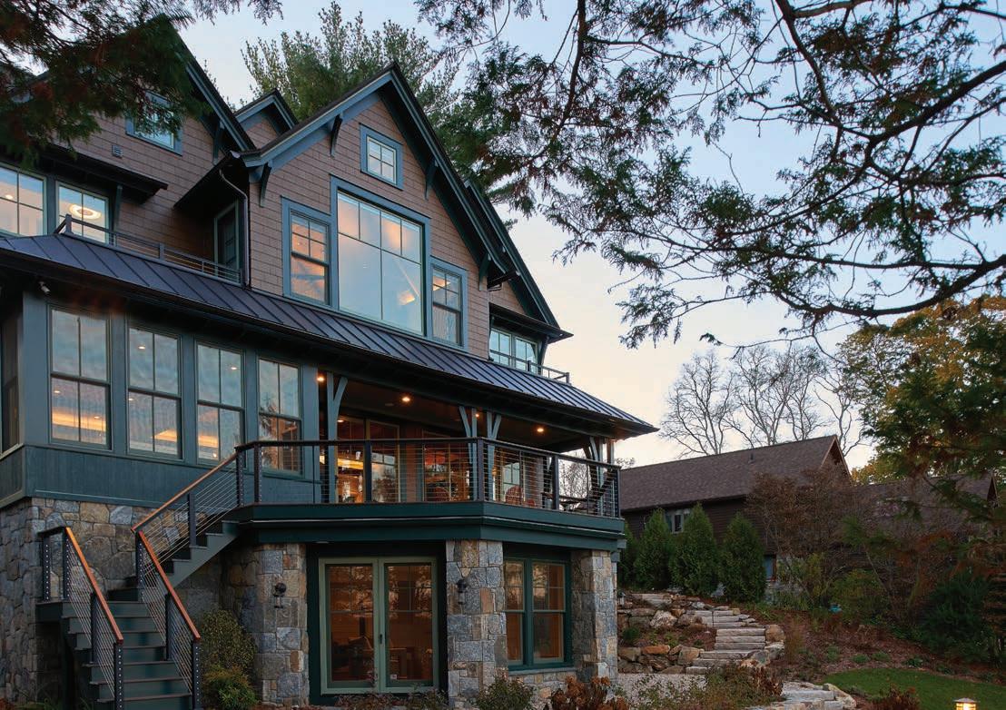


With a robust 75-year history, and over 20,000 homes built, the Acorn Deck House Company designs and crafts one-of-a-kind custom homes. Warm wood, open floor plans, walls of glass, and soaring ceilings are the signature elements of their homes. Exposed post and beam construction creates contiguous open spaces for families to enjoy.
Once designed, they will fabricate your home in their climate-controlled 85,000 sf faciity. The design-fabricating process provides the one-two punch that distinguishes them from others. The Component Package is then delivered to the builder, called the Co-Build Process, achieving the optimal balance between design, quality, schedule, and budget.
Acorn Deck House Company


852 Main Street | Acton, MA 01720
800-727-3325 | AcornDeckHouse.com


DESIGN DECOR +
VOLUME 20 ISSUE 1 | 2023
The Unique Class of Small Home Architecture
Discussing the Sophistication of Designing Smaller Homes.

40
The Beauty in The Building
Top Craftsman of the Field Share Their Secrets
Tasteful Textures
Texture is a secret weapon in the design world; it will really transform an ok space into something amazing..
60
What’s Cooking in the Kitchen?
Industry experts predict kitchen design trends for 2023.

Story by Hunter Powell
70
Creating Intimate Spaces

Using the landscape as a template to create the perfect space for your families needs.

Story by Kathleen E. Syron

CONNECTICUT NEW
NEW YORK
JERSEY
Story by Hunter Powell
Story by Hunter Powell
28 52
Story by Kathleen E. Syron
DESIGN +DECOR
Editor-in-Chief
Matthew J. Kolk
mattkolk@me.com
203-820-1092
Managing Editor
James Eagen
Contributing Writers
Deborah Brannon, Lisa Gant, Susan Heller, Alder Grove, Anna von Stelzer-Worth, Kait Shea, Anastasia Storer
Contributing Photographers
Jane Beiles, Michael Biondo, Phillip Ennis, Tria Giovan, John Gruen, John Hannon, Paul Johnson, Neil Landino, Mark La Rosa, Tim Lee, Daniel Milstein, Durston Saylor, Eric Striffler, Carl Vernlund, Jonathan Wallen, Woodruff/Brown Photography
Copy Editor
Elena Serocki
Ilove this time of year in the Northeast. The weather starts to become warmer on a regular basis, allowing us to spend more time outdoors, the grass is green and the beauty of our area shines.
Graphic & Web Design
This year, we finally get a step back to normalcy: vaccinations are available to all, and we can start packing away those pesky masks. What a fantastic gift to bring in the summer months.
East Coast Home Publishing Group Publisher
Shelley E. McCormick sm@dd-mag.com
203-545-7091
We had a great time putting together this year’s Outdoor Spaces Issue. Our wonderful partners shared some fabulous outdoor spaces with us, and we think these impressive projects will inspire you to take your own home to the next step.
Account Managers
Douglas Oddo
Kelly Ames Smith
Jane O’Reilly Ames
Our feature stories, “A Classic in the Country” and “Modern in Montauk,” are also top-notch. Both projects have that wow factor, and their attention to detail is nothing short of magical.


Design + Decor
349 Forest Hills Boulevard
Naples, Florida 34113
We hope you enjoy this special issue of Design + Decor, and we look forward to sharing our Amazing Transformations Issue—my personal favorite—in July. We’ll be showcasing great projects in a variety of styles. If you’d like your project or firm to be a part of this, please reach out to us.
Best,
Design + Decor is published six issues per year. To subscribe: www.dd-mag.com; Back issues can be purchased at www.dd-mag.com. For editorial inquiries: Editor, Design + Decor, 349 Forest Hills Boulevard Naples, Florida 34113 or e-mail: mattkolk@me.com. For advertising inquiries: Please call Shelley McCormick at 203-545-7091. Reproduction whole or in part without permission is prohibited. All projects described in this publication are for private, noncommercial use only. No rights for commercial use or exploitation are given or implied. The opinions expressed by writers for articles published by Design + Decor are not necessarily those of the magazine.
+ Decor is published six issues per year. To subscribe: www.dd-mag.com; Subscriptions: one year, $28; two years, $50. Back issues can be purchased at www.dd-mag.com. For editorial inquiries: Editor, Design + Decor, 349 Forest Hills Boulevard Naples, Florida 34113 or e-mail: mattkolk@me.com. For advertising inquiries: Please call Shelley McCormick at 203-545-7091. Reproduction whole or in part without permission is prohibited. All projects described in this publication are for private, noncommercial use only. No rights for commercial use or exploitation are given or implied. The opinions expressed by writers for articles published by Design + Decor are not necessarily those of the magazine.
EAST COAST HOME PUBLISHING
349 Forest Hills Boulevard
Naples, Florida 34113
DD-MAG.COM
ISSUE
2023
VOLUME 20
1 -
Matthew Kolk - Editor-in-Chief
EDITOR’S LETTER

Craftsmanship is the foundation to creating a stunning home. And sometimes size truly does not matter.

In my opinion, I would much rather see a home that is simply over the top, “right sized” to cater to the needs of a family and filled with interesting features then a home that in large in size but lacks personality.
Don’t get me wrong, we view homes on an everyday basis that checks all of the boxes and they are truly spectacular I love them as well. But a jewel box simply speaks out to me on in a visceral way.
We made this issue as informative for the consumer as we could by giving them options in all parts of the home and interjected a little insight for the firms that created the spaces to provide different perspectives and maybe give you expanded options in competing your next project. I hope you enjoy these as much as we did creating them.

Our next issue, the color issue, reflects on the bold and the beautiful. If you have a project that you believe that would fit into this catagory, please let me know as soon as possible as space is filling up fast. This issue is a fan favorite from the readers of Design + Decor
Enjoy the issue and also enjoy the weather slowly starting to turn towards spring.
Best,
 Matthew J. Kolk Editor in chief
EDITOR’S LETTER

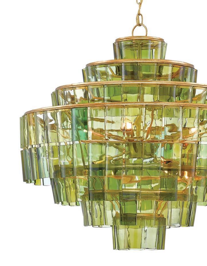
GREEN WITH ENVY
The color green can add a warm, sophisticated tone to any space.


MELANGE
Hip 2B Square Green With Brass Mosaic Gloss Glass artistictile.com
The Sommelier Chandelier curryandco.com
Galileo Club Chair Designed by Patrick Naggar. ralph pucci.com
The DENTON Table Lamp Handsome high goss faux malachite with brass trim detailing makes for a stately rectangular table lamp. madegoods.com


ARCHITECTURE
The Unique Class of Small Home Architecture
Discussing the Sophistication of Designing Smaller Homes.
 Story by Hunter Powell
 Architecture by: Wadia Associates
One might think that having a smaller sized house would mean that you lose out on some of the finer points of architectural design. However, that could no be further from the truth as many designers have proven with some eye-catching small home designs. We spoke with some architects who have a lot to say about the architecture of small homes.


D+D: What are some considerations when creating a smaller home?
Dinyar Wadia, Wadia Associates: The first thing I would comment on here is that each home we design is based on the client’s specifications and requirements–we don’t classify a project by size. But as a general rule, it’s important that smaller homes have balance, and that the spaces within the house are well defined. Smaller homes also require all available space to be considered for storage and utility.
Michael Hawkes, Acorn Deck House Company: When designing a smaller home, it’s important to prioritize how clients intend to use their spaces, and think about what they need, want, and hope to achieve. That prioritization can help edit the overall layout, making efficient use of every square foot. With a smaller home, every detail needs to be more deliberate and thoughtful. Any time you can share functions the better. It can be difficult to edit, but with a smaller home it is even more important to get it right if you can reduce the design to a couple of gestures.
Design + Decor 31
Architecture by: Wadia Associates
Architecture by:Acorn Deck House Company
Peter T. Coffin, Doyle Coffin Architecture: It is critical for a client to have a sense of how they want to live. Smaller homes are generally less formal and more casual. Defining public vs. private spaces becomes more important with less space. In turn this allows you to be more creative in mixing living spaces. Indoor-outdoor spaces are important to making smaller spaces feel bigger.
D+D: How do you integrate unique features in smaller home and what are some of the unique features you have integrated into smaller homes?
Dinyar Wadia: Millwork is an incredibly important feature in every home, and more so in smaller homes. Every profile we use is custom, and the result is a very special look and language that is carried

through the casing, baseboard, crown, railing, and panel moulding in the house.
We also consider the interior elevations carefully and consider how things like cabinetry, shower niches, tile layouts, basins, etc., will look from different entry points and angles in the room.
Michael Hawkes: Integrating unique features in a smaller home cannot be an afterthought. With smaller homes, we have had clients request that we make space for an heirloom piece of furniture, for example. So, space planning needs to be more intentional earlier on in the design process to make sure the layout is ideal. The other ways to address smaller homes is to “double-up” space uses with “flex rooms”. For example, having an office act as a guest room, or a home gym be planned in a way that it can be used as a future nursery, ensures that
32 www.dd-mag.com
Architecture by:Acorn Deck House Company
 Architecture by: Doyle Coffin Architecture
you can adapt your home to different needs without adding single-use spaces.
Peter T. Coffin: Some type of unique feature is very important when designing a smaller home. Whether it is a fun reading nook, an indooroutdoor space, a loft or an unexpected hidden feature, these types of gestures are what make a home special. We like to ask our clients what they like to do and what is important to them. We recently created a piece of millwork with a hidden integrated dog entrance which could
be monitored and secured. On another project we created a private daybed nook with views to a lake. A secret wine room or spa-like bathroom are other types features that create uniqueness depending on the client.
D+D: What materials do you like to use in smaller homes to make them feel more organic?
Dinyar Wadia: The design dictates the materials as well as the client’s

34 www.dd-mag.com
Architecture by: Wadia Associates
One of Connecticut’s oldest building supply companies has opened its newest Window & Door Design Center! Interstate + Lakeland started as a single lumber yard in Greenwich, CT in 1922, and has grown to encompass five building material stores, three window & door Design Centers, and a 100,000 square foot custom millwork facility.

Now in its fourth generation of family leadership, the Interstate Design Center in Westport is ready to showcase the very best in windows, doors, millwork and more to the builders, architects and homeowners of Fairfield County.


36
Architecture by:Acorn Deck House Company
requirements. We like to use different types of wood and stone in our designs, not just because they feel organic, but because they look good.
Michael Hawkes: One way is to use lighter materials, whether natural stained oak or pine interiors, to make a space feel brighter and bigger. Alternatively, we will purposefully use darker stained woods, cedar or mahogany, to make the space feel warmer and more intimate. The direction of which way to go should come from how the client intends to use the space. But, in all cases, using natural materials with their inherent texture and tactility, along with lots of natural light, will help a smaller home feel more organic.
Peter T. Coffin: We use a lot of natural materials like wood and stone. This approach works for both traditional and modern homes.

D+D: Do you feel there is too much sacrifice in building smaller homes?
Dinyar Wadia: Not at all. With the assistance of a good architect, proper design and a good sense of proportion I can make a home of any size look beautiful. The key is understanding the client’s program and making sure everyone is aligned at the onset of the

Design + Decor 37
Architecture by:Acorn Deck House Company
Architecture by: Wadia Associates

38 www.dd-mag.com
project.
Michael Hawkes: Absolutely not. Smaller homes just require more thought upfront to get it all cohesive. Initially, there can be a loss of economies of scale, since smaller homes can cost more per square foot. But the efficiencies and upkeep of a smaller home more than make up for it.

Resources:
Michael Hawkes Acorn Deck House Company 852 Main Street Acton, MA 01720 800.727.3325
acorndeckhouse.com
Dinyar Wadia Wadia Associates 375 S County Road Suite 107 Palm Beach, FL 33480 561.282.9449
134 main street, new canaan ct 06840. 203 966 0048 wadiaassociates.com

Peter T. Coffin, AIA Doyle Coffin Architecture, LLC 158 Danbury Road Ridgefield, CT 06877 203.431.6001
doylecoffinarchitecture.com
Design + Decor 39
Architecture by: Doyle Coffin Architecture
Architecture by: Wadia Associates
The Beauty in The Building

BUILDING
Story by Hunter Powell
Top Craftsman of the Field Share Their Secrets
 Builder: Hobbs, Inc.

Becoming a top builder in the world of interior design requires a fine eye for the little details that that make up a complete and high-quality final product. Staying up to date on modern design trends while ensuring every project is flawless right down to the smallest measurements is no easy task. We caught up with some truly excellent builders to find out how they produce their builds.
D+D: Do you feel in today’s society craftsmanship gets lost in home design? And if so, why?

Michael Hawkes, Acorn Deck House Company: There is an overload of options available that can make it harder for clients to choose the right fit for them. Craftmanship’s distinction among those choices should make it easier to spot, however. For our clients, who see value in quality design and materials, craftsmanship rises above the fray, and is respected for what it can bring to a project.
D+D: What is the definition of Craftmanship to you and how is it applied in your company and the homes you build?
Brian MacDonald, Davenport Contracting: Craftmanship at Davenport Contracting is a multi-disciplined way of operating. Beyond what you “see” there is a level of craftmanship that happens behind the scenes, literally in the building of a home inside its’ walls. Care and attention to detail in the areas that eventually will not be seen is as important as what will be seen on a daily
Design + Decor 43
Builder: Davenport Contracting
basis. The inner structure/foundation is all important to a home’s “final craftmanship” level.
The stunning result of this level of preparation is shown in this entry foyer lined with magnificent interconnecting arches. A wooden framework of intersecting arches was first built along the length of the foyer. Calculations and on-site decisions needed to be made by the craftsmen responsible for achieving the final result. A team measured, cut and fitted a web of wooden slats onto which multiple layers of plaster were applied to arrive at the final finish. Different levels of ability would have been on this team, so that the knowledge base was maintained and passed on to the next generation.
Michael Hawkes: For me, it’s thinking about the person you are creating for. That is applied in our factory every day, as we are fabricating custom tailored homes that are unique to each client. Since nothing is mass produced, there is an inherent care taken into everything we build. Whether it’s a wall panel, or a stair, or a custom door, it is hand made for that specific client, for a tailored design that is suited to their site and their vision.

Ian Hobbs, Hobbs Inc.: Craftmanship is all about a complete process. It begins with thinking through the steps necessary to best construct a detail before starting. Then taking the time to gather high quality materials, that will look great and will hold up over time. Partnering with an experienced and skilled worker cannot be underestimated when going through this process. While new technologies in the

44 www.dd-mag.com
Courtesy of Clearview, Inc.
Built by: Acorn Deck House Company
 Builder: Hobbs, Inc.
 Builder: Hobbs, Inc.
construction industry have allowed craftsmen to prepare their work faster and potentially at a lower cost, there is no substitute for great materials that are assembled and installed by highly skilled mechanics.
In the case of kitchen cabinetry, the shop drawings are completed, revised and approved using CAD. The parts of the cabinetry are cut on a CNC machine. But the real difference between a custom cabinet and a production cabinet is that a skilled millworker who joins all these pieces together to work with each other and assembles them to minimize movement in the future. An installer takes the time to install the cabinets to work with any variations at the actual site, so that they fit perfectly into the space where they are going to live possibly for decades. Lastly, a high-end finisher finishes them to blend any variations in the wood and coat them with a durable finish, so they look as good after 20 years as the day that they are completed.
D+D: What are some modern details in home design? Exterior and Interior.

Michael Hawkes: I am seeing a lot more hybrid assemblies. Siding with integrated rainscreens, or exterior sheathing with weather barriers and insulation combined, for example. I think that these are very useful to our company, because we strive for quality, durability, and efficiency. The end result means a more comfortable and higher quality home for our clients and gives further longevity to what we design and build.
Ian Hobbs: It takes experience to learn that what appears to be simple modern details are extremely complicated to implement. Classical architecture developed many details over thousands of years that cover imperfections. Traditional moldings hide inconsistencies in the framing of a house. Most modern details eliminate moldings and replace them with negative reveals. A negative reveal is essentially a small gap between a change of materials (such as door framessheetrock or sheetrock-floors). So, the key to building in a modern style is that every step from the beginning of construction to completion must meet extremely tight tolerances. There is no way to hide variations in modern construction. If we are building a 100-foot hallway with only reveals and no moldings,
Design + Decor 47
Builder: Davenport Contracting

if there is a 1/16” variation, it really stands out as a mistake. So the concrete, framing, plastering, and painting all have to be built to exceedingly tight tolerances. Every trade needs to take care to be as close to perfect as possible for both interior and exterior details.
Rusty Sheppard, Clearview, Inc.: Many of the details in today’s modern designs are including larger windows and doors with less divided lites. These larger units allow for floor to ceiling views and more natural light and air infiltration into the living space. The use of large sliding or folding doors is an example of how current designs are lessening the divide between interior and exterior. Speaking of lessening the divide between interior and exterior, the use of skylights is helping to open even the fifth wall to the outside. Some of today’s skylights feature automated sensor and smart home integration to make it easy to add light and air flow to the home design.

D+D: Please give us an example of a design detail that was presented to you that seemed impossible and how you made it possible?
Brian MacDonald: A floating cube room in a New Canaan guest house. The guest room in this New Canaan guest house appears to float up in the skylit cathedral ceiling. Accomplishing this feat required a team of professionals, each bringing their expertise to the project. Many homes today require “structural engineering”–needing to be done on a project-by-project basis. The Engineering Firm is an integral part of the team when building today’s sophisticated designs. If you can dream it, it can be built! As the General Contractor on this job, Davenport Contracting worked with a strong engineering group and steel fabricating company to put in place the framework needed to build out this “floating cube room”. The process works from the inside to the outside. Peeling back the layers would reveal-paint, drywall, insulation, wood, glass, and steel, with the steel going in place first.

Design + Decor 49
Builder: Hobbs, Inc.
Built by: Acorn Deck House Company

Courtesy of Clearview, Inc.
Michael Hawkes: We are always presented with new challenges that take hard work and experience to figure out. But, when you have a good team around you, and you start processing the problem as soon as it is presented, you know one way or another, you will get to the optimal solution. We have worked on some very challenging sites, due to topography, geologic conditions, zoning restrictions, etc., but with willing client, consultants, builders, and craftspeople, there are always ways to improvise within those constraints.
Ian Hobbs: In almost every house we have built over the last 58 years there has been a detail that we have never encountered before. We love unique ideas, which is why we are custom builders. Some of the exceptional design details that stick out are creating an elevated glass walkway over a rare book library that is supposed to create the illusion of being invisible. Another uncommon one was constructing an indoor pool where the glass doors that surround the room recess into the floor and transform an indoor pool facility into what feels like an outdoor pool when the doors are lowered. We once built a koi pond outside of the front door of a house with enormous bluestone slabs that serve as a 40-foot walking path over the pond to the driveway. With all these details, and smaller uncommon details too, it is all about the team of owner, architect, engineer, and builder planning the steps required from the beginning to completion of the vision.
Resources:
Michael Hawkes
Acorn Deck House Company

852 Main Street
Acton, MA 01720
978.795.6400
acorndeckhouse.com
Brian MacDonald
Davenport Contracting, Inc.
78 Harvard Avenue Stamford, CT 06902
203.324.6308
davenportcontracting.com
Ian Hobbs
Hobbs, Incorporated
27 Grove Street
New Canaan, CT, 06840
203.966.0726
hobbsinc.com
Rusty Sheppard
Clearview, Inc.
3363 Fairfield Avenue
Bridgeport, CT 06605
203 334-5503
clearviewinc.net
Design + Decor 51
Tasteful Textures
Texture is a secret weapon in the design world; it will really transform an ok space into something amazing.

INTERIOR DESIGN
Story by Kathleen Syron
 Interior Design: Diane Durocher Interiors
Photography by: Peter Radtke
 Interior Design: Diane Durocher Interiors
Texture is an often overlooked element in interior design. Just as color, style, and architecture create the mood of a space, texture can also impact the sentiment of the design. We spoke to several industry leaders about their go-to textures that help them communicate their designs. Here is what they have to say about the value of textures.
Design + Decor: Please explain the importance of bringing texture into a room.
Diane Durocher: This serene retreat is designed with a neutral palette yet it is far from boring due to all the rich textural details. I work with many types of materials and finishes to bring interest to my designs and enhance the architecture. For example, the architecture of the room’s vaulted ceiling is highlighted with molding and pale sky-blue paint. A lush velvet upholstered loveseat is framed with wool panels that give grandeur to the tall window that overlooks the homeowner’s property, for an ever-changing seasonal vision. And the iron bed and walnut furniture create strong silhouettes in the otherwise neutral room.
A more subtle textural design feature that enriches the look of the
neutral room is the damask motifs that are repeated throughout. It can be found in the stencil pattern that was added to the built-in armoires, the trellis wool rug that grounds the room’s furniture, as well as in the sumptuous chenille damask of the Bergere Chair.
Texture is also important when developing color and light. The custom-glazed tiles installed on the fireplace surround, reflect light, and add to the subtlety of this neutral oasis. The silk damask blue and sand pillows as well as the blue and cream striped fabric desk chair and neck roll add the perfect amount of color to the design while allowing the introduction of blue with our artwork and accessories. This design proves that with the incorporation of sumptuous fabrics, chenille, wool, velvet, and silks, a neutral palette can be visually interesting as well as texturally appealing!
Resource:
Diane Durocher Interiors

Diane Durocher
375 South Central Avenue Ramsey, NJ 07446
201.825.3832
dianedurocherinteriors.com
Design + Decor 55
Interior Design: Diane Durocher Interiors
Product: Interstate Design Center

Design + Decor: What are your favorite types of hardware finishes for a room?


George Tsionis: Right now, some of my favorite finishes in the industry are Flat Black & Satin Brass. We really keep our ear to the ground to make sure we’re staying on top of changing trends, and those are really what seems to be dominating the market at the moment.
Design + Decor: What are your favorite types of materials you like to use to bring textures into design?

Frank Bowron : Moulding is a great opportunity to bring style and texture into a room. For a traditional home or architectural style, Interstate’s Greenwich Collection is the moulding for you. The Greenwich Collection is our classic moulding catalog that was made from the most popular profiles our custom mill shop created over our first eighty years of history. It’s a timeless beauty that can’t be beaten.
To meet the needs of modern, minimalist design trends, we also introduced our Westport Collection of moulding. This sleek, modern moulding collection was envisioned by the expert craftspeople at Interstate’s 100,000 square foot custom mill shop in Bethel, Connecticut. These moulding profiles fit the clean lines and open rooms that are so central to modern architecture.
I actually think doors are another way to bring texture into your home. You can find a wide selection of modern interior doors from TruStile. And Upstate Doors’ entryway doors are a phenomenal choice to create a classic front door experience. And we definitely recommend giving a look at barn doors to bring a rustic feel inside your home that can match any aesthetic.
Resource:
Interstate Design Center Frank Bowron
800 Post Road East Westport, CT 06880
203.221.1620
interstatelumber.com
Design + Decor 57
 Design: California Closets
Photography by: Stefan Radtke
Design: California Closets
Design + Decor: Please explain the importance of bringing texture into a closet.

Debra Russo: Closets used to be spaces strictly for storage where the shelves were made out of melamine. Now, closets are becoming actual living spaces that you want to hang out and spend time in. So, people are taking a lot of time, especially during construction to make sure closets get just as much attention as the other rooms in the house. One way to put closets on par with the rest of the house is the introduction of textures. Textures in the closet are a lot more important these days if the idea is to create a living space that is a continuation of the rest of the home and not just a dumping ground for clothing.
Design + Decor: What textures are you using in your closets that create beautiful living spaces?
Debra Russo: The different materials that we offer add depth and interest to the closet just like other rooms. We have wood grain, glass and high gloss faces that we successfully mix and match to give our clients their preferred look. There are just so many options today that you can really create any look you want with our materials.
Lighting is also critical in creating a comfortable living space and LED is an amazing component that we can offer these days. Most closets will have bright ambient recessed light for visibility but at California Closets New York we offer amazing LED decorative lighting for the WOW factor. LED poles and shelving are really pretty when they light up clothing like a highend boutique and the vertical panels have dimmers that can alter the light depending on the time of day. Our frosted resin doors are appealing to hide clutter or clothing that you don’t wear anymore. And although, the client’s clothing color doesn’t alter the design we love it when a closet is color coded.
Design + Decor: What are your favorite types of materials you like to use to bring textures into design.
Debra Russo: I like the lighter finishes we offer especially the linen. The inside of our drawer boxes are fashioned with the linen finish but if you want you can have the entire drawer wrapped in linen. And to make the drawers extra special you can have the glides undermounted so when you open the drawer all you see is the beautiful linen finish.
A lot of the wood grain textures we offer are really very special that you wouldn’t normally see in a closet, especially our Bianca Latte Italian finish. The Bianca Latte is a versatile white wood that allows you to bring other elements into the space that can be changed over time.
We also have an understated yet beautiful white matte cabinet finish that one of our clients paired with an amazing marble stone to create an island. The stone is the element of surprise in the closet and our products were the modern supporting cast.
Resource: California Closets New York

Debra Russo
16 Saw Mill River Road
Hawthorne NY 10532
914.592.1001californiaclosets.com
Design: California Closets
Design + Decor 59
What’s Cooking in the Kitchen?

KITCHENS + BATHS
Story by Hunter Powell
Industry experts predict kitchen design trends for 2023.
The kitchen is the heart and soul of the home. It’s where family and friends gather for nourishment, companionship, conversation and celebration. So it follows naturally that most homeowners want this space to be functional, comfortable and a perfect reflection of their taste and style. Here’s the latest in kitchen design from those in the know.
D +D: Which is more important to your clients today—style or size?
Joshua Doonan, Crown Point Cabinetry
Based in New Hampshire, Crown Point Cabinetry is a family-owned business that handcrafts high-quality, custom cabinetry for clients across the country. Founded in 1979 in a garage by Norm Stowell and his two sons, the firm has grown tremendously over the years, and now has a staff of more than 90 employees. The company offers a wide variety of period styles, including Early American, Shaker, Arts & Crafts, Victorian and Contemporary. Its work has been featured on Bob Vila’s Home Again TV series.
Joshua: I see a balanced mix of projects, including new homes and renovations, ranging from cozy and intimate spaces to expansive and interconnected open layouts.
D + D: Let’s talk style. What are you seeing in 2023—and what is out in 2023? What is the luxury homeowner choosing when it comes to appliances, countertops


Design + Decor 61
Kitchen Design: Karen Berkemeyer Home Photography by: Tim Len
Kitchen Design: Karen Berkemeyer Home
Kitchen Design: Majestic Kitchens & Bath
Kitchen Design: Majestic Kitchens & Bath
 Photography by: Brian Madden
and flooring—and which styles are going away?
Karen Berkemeyer, Karen Berkemeyer Home
Karen Berkemeyer Home has been designing kitchens and baths for over 30 years. Karen’s talented team of dedicated, enthusiastic and creative designers have extensive knowledge of custom cabinetry, tile and stone, plumbing fixtures and countertops, and handle everything from simple upgrades to large, complex projects. The firm is dedicated to providing a true “one-stop” experience to their clients.
Karen: Homeowners are getting away from all-white kitchens. They’re using color with soft brass hardware. Floors are still wood in transitional kitchen, and large-format porcelains that look like limestone or cement are common in modern kitchens. Speed ovens are popular, as are slab doors or flush inset shaker for doors. Quartzite or quartz countertops with full slab splash are also trendy.
Scott Weinlein, Majestic Kitchens & Bath

Majestic Kitchens was a small cabinet shop when it was founded in 1961. In the early 1970s, the company hired Bill Luceno as a cabinet installer. Soon Bill began selling kitchens for Majestic, and purchased the firm in 1985. Bill’s experience from the ground up has enabled Majestic Kitchens & Bath to become the tristate area’s largest kitchen and bath retailer. Still owned and operated by the Luceno family, the company today has a 9,000-square-foot showroom featuring diverse styles in every price range. Its professional designers provide personalized attention to cater to their customers’ needs.
Scott: We are confident and excited to see that 2023 will be the year that all-white kitchens start to ebb. Dark blue center islands have been very popular, but clients are embracing softer, more muted and dustier colors that lend themselves to entire kitchens and not just accent pieces. Luxury appliances are not only popular, but clients are willing to wait months to receive them. One has even added
Design + Decor 63
Kitchen Design: Karen Berkemeyer Home

a sous vide feature! Natural quartzite still dominates the luxury kitchen for counter surfaces, and full-height backsplashes of the same material are on the rise. Larger-than-life, attention-grabbing hardware is a must!
Joshua: I see a wide range of selections. I see wood, marble, granite, soapstone, quartzite and quartz-top materials researched consistently. Similarly, stainless and panel-ready appliances are both regularly considered. More and more homeowners are discovering the advantages to appliances that allow for flush and integrated installation. In some cases, an appliance can be the star of the show and stand out purposely. In others, the countertops or cabinetry can be highlighted as the main event that dominates the “squint test.”
While wood floors are utilized in kitchens more consistently, tile has been selected in a notable number of projects, particularly with heated floors becoming


Design + Decor 65
Kitchen Design: CrownPoint Cabinetry
Kitchen Design: CrownPoint Cabinetry
increasingly common in the colder climates.
Homes under construction now are responding to significant changes over these last few years as homeowners embrace new priorities. Functionally and aesthetically, these spaces are being tuned in for a unique social dynamic and new work-life balance. The goals of one person preparing meals in a kitchen have evolved into a new list of priorities anchored in gathering family and friends, and multiple hands teaming up in day-to-day tasks.
Stylistically, these priorities are echoed in substance. Authenticity and visual interest are common denominators when comparing the many options between a stark, ultramodern space to a heavily detailed and more traditional vernacular. Many successful projects find that perfect balance with clean and crisp lines, juxtaposing texture and detail for a timeless look that represents the homeowner’s and home’s personality.
D + D: Does size really matter in a kitchen—and why?

66 www.dd-mag.com
Kitchen Design: CrownPoint Cabinetry
Joshua: Absolutely yes—and no! Size sets a stage for us to interact both within the space with those around us and outside. Tall and vaulted ceilings with large windows flood a space with light and connections to the outside. Lower ceilings and less or smaller penetrations create special moments and highlight key areas on both sides of the glass. The difference in scale between these two forms a foundation to build on, where the details can complement or contrast the size to achieve the perfect balance. While all this can respond to size, a successful composition can thrive in the smallest and largest of spaces by considering scale, texture, color and many other elements first.

Karen: I don’t think it’s the size that matters as much as
 Kitchen Design: Karen Berkemeyer Home

 Kitchen Design: CrownPoint Cabinetry
Kitchen Design: CrownPoint Cabinetry
Kitchen Design: CrownPoint Cabinetry
the style, color, details, symmetry and lighting.
Scott: I agree with Nancy Davilman of ND Interiors—who we work often with—that when it comes to the cabinetry footprint in a kitchen, bigger is not necessarily better. What is most important is function! We continue to see the rise of secondary areas just off the kitchen, such as a butler’s pantry, walk-in storage pantries or a scullery area. These are just wonderful for storing all the bulk items, small home appliances and other items that might take up valuable space in the working kitchen.
D + D: What are some multi-materials you are using to create contrast that result in being visually and texturally pleasing?
Joshua: Within cabinetry, we play with color, wood grain, transparency, texture and shadow to push and pull at where the casework would best support or stand prominently within a composed space. When curated with every element in a space, these details have a transformative effect. As Aristotle would say, “The whole is greater than the sum of its parts.”
Karen: Mix color with light woods. For example, use soft white with a color, with natural rift-cut oak accents. Consider textured wall tile for the backsplash; large rectangles are still popular as well.
Scott: We love melding mixed medium backsplash tile with metals such as brass, bronze and nickel. The blending of natural polished stone with etched/frosted glass and a pop of metal all combine perfectly to create a beautiful, jewelry-like kaleidoscope.
Resources:
Crown Point Cabinetry

Joshua Doonan 462 River Road Claremont, NH 03743 800.999.4994 www.Crown-Point.com www.CrownSelect.com
Karen Berkemeyer Home
Karen Berkemeyer
175 Post Road West Westport, CT 06880 203.454.0032 karenberkemeyerhome.com
Majestic Kitchens & Bath
Scott Weinlein
700 Fenimore Rd Mamaroneck, NY
914.381.1302 majestickitchens.com
Nancy Davilman
ND Interiors LL www.ndinteriors.com
Design + Decor 69
Kitchen Design: CrownPoint Cabinetry
LANDSCAPES
Landscape Design: Seventy Acres

Creating Intimate Spaces

Using the landscape as a template to create the perfect space for your families needs.
Story by Kathleen Syron
Landscape Design: Seventy Acres
Landscape Design: Seventy Acres
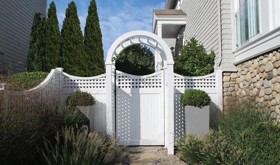
 Wesley Stout Landscape Architects
AAn elegant yet casual beachside residence with intimate spaces for dining, entertaining and relaxing. Separation of public and private space is accomplished at the front entry using crisp white cedar fencing with an arbor and gate to highlight the main entry. Material choices were made to enhance beach life using smooth beach gravel combined with silver travertine pavers with light reflecting qualities. The narrow palette of plantings in shades of green with multiple textures provide calm and intimate privacy and need low maintenance.
Resource:
Seventy Acres Landscape Architecture & Design


Nancy King
27 Glen Road, Suite 303
Sandy Hook, CT 06482 203.491.2405
seventyacres.com
Design + Decor 73
Landscape Design: Seventy Acres
Landscape Design: Seventy Acres
 Landscape Design: Bergen Brick Stone & Tile
Design + Decor: What are some clever ways to blend the building and site?
Todd Zecher: As suppliers, we’ve seen contractors and landscapers use our Outdoor Porcelain Pavers and Copings from our Mountain Hardscaping brand. These porcelain pavers were created to look like natural stone,
wood and concrete products but with little to no maintenance and anti-slip surfaces. Incorporating these pavers into the outdoor designs creates a unique sense of cleanliness and openness to the area while having the same look they would want from natural stone, wood and concrete products. We’ve seen job sites where the contractors blend both natural stones and our outdoor porcelain pavers together. Adding in natural stones like bluestone/limestone steps, reclaimed cobblestones, river jack pebbles

Design + Decor 75
Landscape Design: Bergen Brick Stone & Tile

76 www.dd-mag.com
or colored aggregates give the spaces a warm and inviting atmosphere.

Design + Decor: What are some other design concepts then the “secret garden” that clients are incorporating to their landscape design? Or if not yet discovered what would you like to see?

Todd: When we think about “secret gardens” for outdoor spaces, we envision not only an upscale design but a design that brings a sense of relief and calmness. Our Mountain Hardscaping brand brings stone walls, curbing and other natural stone accessories that complete an outdoor design. We started carrying an assortment of granite products, like large round granite balls, reclaimed planters, millstone, mill rollers, posts, and even stone light fixtures! When working with contractors who are designing Design

77
+ Decor
Landscape Design: Bergen Brick Stone & Tile
Landscape Design: Bergen Brick Stone & Tile
Landscape Design: Bergen Brick Stone & Tile


these types of outdoor spaces, we try to embrace the natural feel of these stones while blending the spaces in with our outdoor porcelain pavers.
Design + Decor: How do you apply spatial-visual landscape design when adding secret spaces in garden design?
Todd: For masonry suppliers like us, we provide contractors and landscapers with materials that let them play around with the outdoor space. We’ve seen contractors use our granite curbing along with bush hammered pavers to create not only a natural looking design but give a contemporary overall appearance. Others use larger slabs, whether that be our outdoor porcelain pavers from our Mountain Hardscaping brand or natural stone slabs like bluestone or limestone. When using larger slabs, not only are we covering more square footage per slab, but we are giving the spaces an open feel to give that sense of peacefulness.
Design + Decor: How do you foster biodiverse landscapes design in your projects?
Todd: Our Mountain Hardscaping brand carried a collection of reclaimed cobblestone products. Some cobblestones are full size and some are cut in half to 3” thick so they may be laid like traditional pavers while the rest are cut 1” thick so those cobblestones would be laid over concrete. Our Mountain Hardscaping brand
also carries a line of natural stone veneers. We encourage our customers to use natural stone veneers and these reclaimed cobblestone products as sustainability has been our goal when creating these collections for our brand. While we do offer outdoor porcelain pavers, these natural stone products give the option to those looking for a long lasting, timeless look for their spaces.
Resource:
Bergen Brick Stone & Tile

Todd Zecher
685 Wyckoff Avenue
Wyckoff NJ 07481
201-891-3500
bergenbrick.com
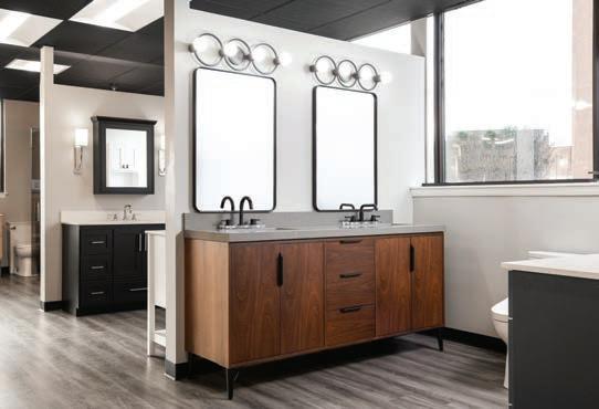
Torrco Design Center
Torrco Design Center has 6 showroom locations displaying decorative plumbing fixtures, lighting, vanities, and hardware. Torrco’s highly trained design consultants will guide you through the entire process, from product selection to after sales service. Customer experience and attention to detail is of the utmost importance.


Displaying the highest end luxury lines, along with moderately priced selections, all brands are of the highest quality. Designers, builders, architects, and homeowners rely on Torrco’s technical expertise, insight on the newest trends and classic design advice to provide the perfect solution to complete your project. Torrco has been in business for over 100 years, and is 4th generation, family-owned company.
Torrco has 14 plumbing and HVAC wholesale locations in addition to the 6 showrooms. Visit Torrcodesigncenter.com to schedule an appointment with a design consultant to make your visions a reality!
Resource:
Torrco Design Center 63 Harbor View Avenue Stamford , CT 06902 203.965.4980 torrcodesigncenter.com
80 www.dd-mag.com
PROFILE
Photos: Red Skies Photography


 Matthew J. Kolk Editor in chief


 Story by Hunter Powell
 Architecture by: Wadia Associates


 Architecture by: Doyle Coffin Architecture


 Builder: Hobbs, Inc.


 Builder: Hobbs, Inc.
 Builder: Hobbs, Inc.


 Interior Design: Diane Durocher Interiors
Photography by: Peter Radtke
 Interior Design: Diane Durocher Interiors


 Design: California Closets
Photography by: Stefan Radtke


 Photography by: Brian Madden


 Kitchen Design: Karen Berkemeyer Home

 Kitchen Design: CrownPoint Cabinetry
Kitchen Design: CrownPoint Cabinetry
Kitchen Design: CrownPoint Cabinetry


 Wesley Stout Landscape Architects


 Landscape Design: Bergen Brick Stone & Tile


