
M thew Kanengiser
BOBBLEHEAD DESIGN
PRODUCT DESCRIPTION
FOCO’s top-selling product, original bobbleheads, are designed by incorporating League brand requirements with my own artistic expressions. Products are hand-carved and painted in designated factories. Limited-run products are made available for purchase to bobblehead enthusiasts around the globe.
APPROVED LEAGUES
• NATIONAL COLLEGIATE ATHLETIC ASSOCIATION
• WOMENS NATIONAL BASKETBALL ASSOCIATION
• NATIONAL BASKETBALL ASSOCIATION
• WORLD WRESTLING ENTERTAINMENT
• NATIONAL FOOTBALL LEAGUE
• NATIONAL HOCKEY LEAGUE
• MAJOR LEAGUE BASEBALL
• MAJOR LEAGUE SOCCER


ICKEY WOODS CINCINNATI BENGALS ICKEY SHUFFLE BOBBLEHEAD
AARON JUDGE NEW YORK YANKEES 3 HOME RUN MINI BOBBLEHEAD SCENE
VICTOR WEMBANYAMA SAN ANTONIO SPURS 2023 IN-SEASON TOURNAMENT BOBBLEHEAD
LEBRON JAMES & ANTHONY DAVIS LOS ANGELES LAKERS BOBBLEMATE DUAL BOBBLEHEAD
MIAMI DOLPHINS CHARLIE BROWN PEANUTS BIGHEAD BOBBLEHEAD
LARRY JOHNSON CHARLOTTE HORNETS GRANDMAMA BOBBLEHEAD
DON LARSEN & YOGI BERRA NEW YORK YANKEES PERFECT GAME DUAL BIGHEAD BOBBLEHEAD
SIDNEY CROSBY & EVGENI MALKIN PITTSBURGH PENGUINS BOBBLEMATE DUAL BOBBLEHEAD


RONALD ACUNA JR ATLANTA
BRAVES BAT FLIP BOBBLEHEAD
MICHAEL HARRIS II ATLANTA BRAVES MONEY MIKE BOBBLEHEAD
NEW HEIGHTS PODCAST WITH JASON AND TRAVIS KELCE TRAVIS KELCE & JASON KELCE KANSAS CITY CHIEFS & PHILADELPHIA EAGLES DUAL BOBBLEHEAD
MYLES GARRETT CLEVELAND BROWNS DINOSAUR BOBBLEHEAD
NICK CHUBB CLEVELAND BROWNS AREA CODE 216 BOBBLEHEAD
BOBBLEHEADS IN PACKAGING ON FIELD DENZEL WARD, NICK CHUBB, AND MYLES GARRETT
AUSTIN RILEY ATLANTA B RAVES CAMO BOBBLEHEAD
PRODUCT DESCRIPTION APPAREL DESIGN
Get ready to gear up for the sports season with some stylish new apparel. Here are a few bold and fun items that include a wide variety of tees, jackets, and caps. Keeping true to the teams brand identity, I have styled unique and creative imagery that captures the eye of any true sports fan.


SKILLS USED
• Adobe Photoshop
• Adobe Illustrator
• Photo Retouching
• Apparel Mock-Up
• Typography


LAMELO BALL CHARLOTTE HORNETS BASKETBALL DESIGN
CHICAGO BULLS JACKET DESIGN
LOS ANGELES LAKERS JACKET DESIGN NEW YORK RANGERS JACKET DESIGN
TRAVIS KELCE AND JASON KELCE “KELCE BROTHERS” FOOTBALL DESIGN
LIONEL MESSI INTER MIAMI CF SOCCER DESIGN
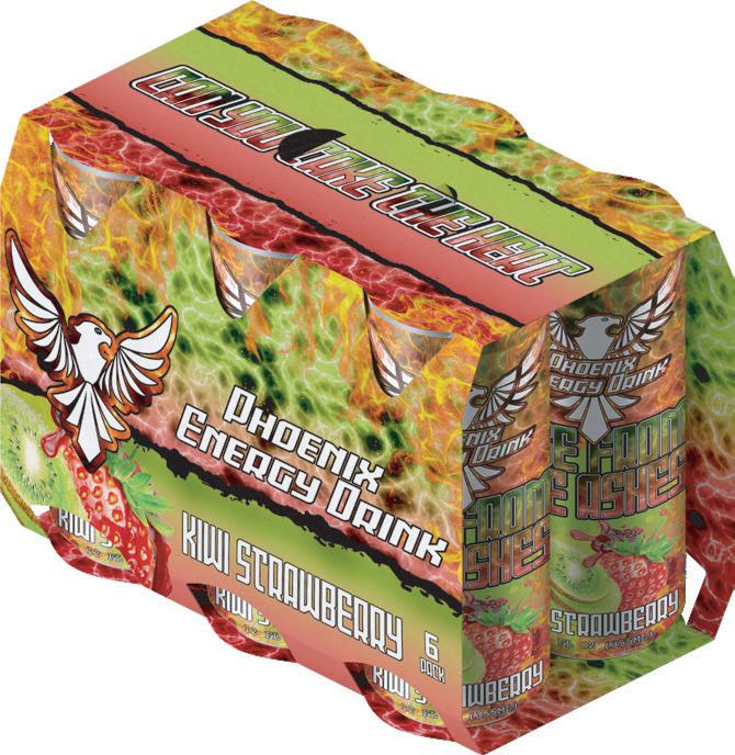
PHOENIX ENERGY DRINK
PRODUCT DESCRIPTION
Phoenix is the newest low calorie, zero sugar energy drink that is sure to turn up the heat. In a class by itself, this flavorful drink will rock one’s tastebuds while providing a quick dose of energy.
Design techniques were utilized with the goal of creating captivating and realistic mock-ups. Sleek and firery product design is meant to pique interest in the heat behind Phoenix, leaving viewers to question if they can handle to heat.


HALO PAPER PRODUCTS
OUR MISSION
We feel strongly that good hygiene is the path to living a healthier lifestyle. Quality and comfort are our top priorities, and we promise the best health-concious solutions avaliable. Our unique line of BPA-free paper products o er customers the ability to make smart choices for the people they care about most. Whether you’re hospital administrator, school superintendent, or a hotel manager, show how much you care.


WHAT THE FUTURE HOLDS
Our vision is simply to improve the lives of people all around the world. Through advanced manufacturing technologies, we will achieve healthier enviorments by preventing the spread of germs, bacteria and communicable diseases in schools and medical facilities, and provide hotel guests with the ultimate in health-concious quality and comfort.


BRAND HIGHLIGHTS
• 100% BPA-Free
• Anti-Viral
• Sterile Medical Grade
• Superior Quality

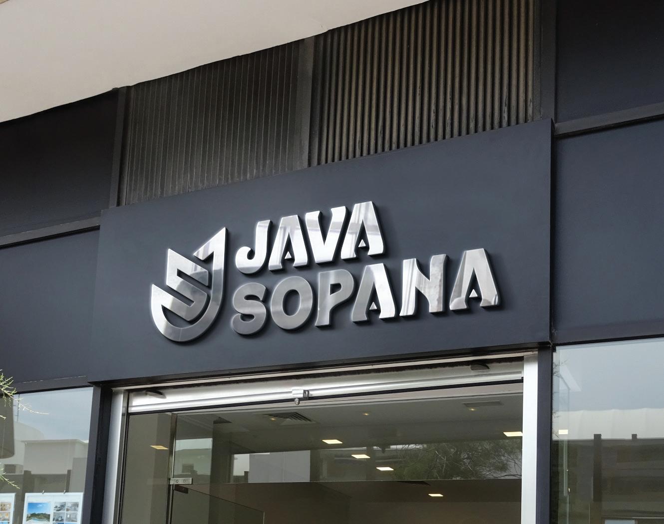
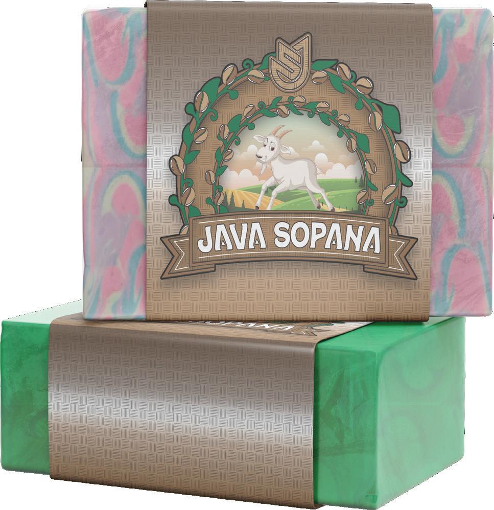
JAVA SOPANA
PRODUCT DESCRIPTION
Hand-poured from pure goat milk, Java Sopana is an innovative dual function bath soap. Co ee grinds are used in the preparation of one half for exfoliation purposes, while the other half is poured with all natural ingredients to promote smooth healthy skin. Packaging and logo were designed to promote the finished product in an eye-catching and memorable way.
SKILLS USED
• Adobe Photoshop
• Adobe Illustrator
• Brand Identity
• Logo Design
• Typography
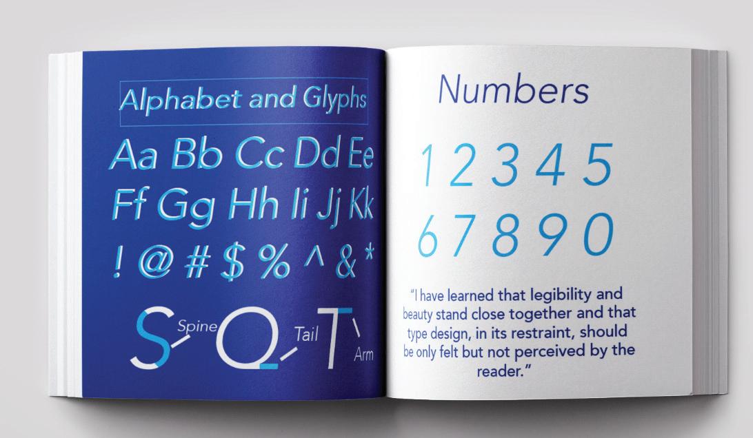
AVENIR MINI MAGIZINE
HISTORY OF AVENIR
When originally released in 1988, Avenir only had three di erent weights. Currently there are now twelve di erent weights. It's fascinating how over time Adrian Furtiger was able to create one of the most commonly used fonts in the design world. Avenir in French means future and uses inspiration from the font Futura. Avenir is known as a geometric sans-serif typeface which is intended to look wholesome and organic.

ABOUT THE MINI MAGAZINE
Using Indesign helps me create a visual hierarchy and define a strong layout that looks professional. I was able to find the appropriate spacing to make a pleasing vertical rhythm. This complimented the font I decided to choose and overall looks very cohesive as a magazine.

COLOR SCHEME
WHAT IS GHEL?
Twenty years ago, Gehl had only one small o ce in Copenhagen. They have since grown into a successful company that is dedicated to developing urban cities for people all over the world. Gehl o ers a wide range of neighborhood design services with a people-first approach. Their strategy is to build diverse cities that will enhance the lives of everyday people. Gehl's end goal to a happy healthy city is developing a community for all types of people with open spaces for socialization.
THE END RESULT
To re-create a high-quality annual report for Gehl, I selected a color pallet that would convey a professional business identity. Using the appropriate tools of InDesign I was able to create a clean, corporate look. I used several Mock-ups to create an updated look and feel for Gehl’s annual report.


SKILLS USED
• Adobe Indesign
• Adobe Illustrator
• Layout Design
• Typography
• Branding


GEHL MISSION STATEMENT
GEHL ANNUAL REPORT
GEHL ANNUAL PAGE #5 & PAGE #6
GEHL ANNUAL PAGE #3 & PAGE #4
GEHL ANNUAL PAGE #1 & PAGE #2
PAW4PAW NON-PROFIT
ABOUT THE BRAND
Paw4Paw is a non-profit organization for pet rescue and adoption. I was tasked with creating a brand that would stand out to a specific target audience and would be appropriate for all ages. My end goal was to develop a cheerful branding element that would evoke a feeling of happiness.
THE FINISHED PRODUCT
Using a bright color palette was intentionally used to draw people in and learn more about Paw4Paw. I selected a perfect font pairing for both products and phone screens. Using several di erent professional looking mock ups I was able to show Paw4Paw as the brand it is meant to be. These products are meant to be used as giveaways or sold for profit that would go only to the organization.


COLOR SCHEME
THE IDEA COLLEGE
For a student-based project I was tasked with coming up with a college acceptance package. I decided to focus on a basketball player's acceptance package because I myself have a great love for the game. I chose Clemson University mainly because I was attracted to the strong color palette and opportunity to create a strong font pairing.
THE FINISHED PRODUCT
The complete package I created includes the acceptance letter and other sports items that an accepted player may receive. Some of the sports items include a sports bottle, draw-string bag, a pennant, game day tickets, and a lanyard. To design this project I used Indesign, photoshop, and illustrator to create di erent unique looks. While staying true to the Clemson University colors and using professional mock ups I was able to create a successful looking acceptance package.
SKILLS USED


MOTION VIDEO CHEF ROSE
ABOUT THE SHOOT
The shoot took place in the home cooking studio of Chef Andrew Rose. Over a three-hour period of time, I took dozens of close-up video clips of the Chef in action. From start to finish, I recorded everything from ingredients used to preparation techniques to cooking methods and finally the art of plate presentation.
PUTTING TOGETHER THE FOOTAGE
The process for creating the final one minute video started with reviewing all footage. I selected clips that best demonstrated each step of the cooking process. After choosing the right shots, I brought them into Adobe Premiere Pro to begin sequencing them in the proper order to tell the story. I included every step of the cooking process, from checking the ingredient list to the final shot showing Chef Rose plating his creation. For the audio I went with an upbeat, recognizable song that would compliment the video, making it engaging and entertaining.
SKILLS USED


https://www.youtube.com/watch?v=2UZxoqU95M8