
ARCHITECTURE PORTFOLIO | 2023
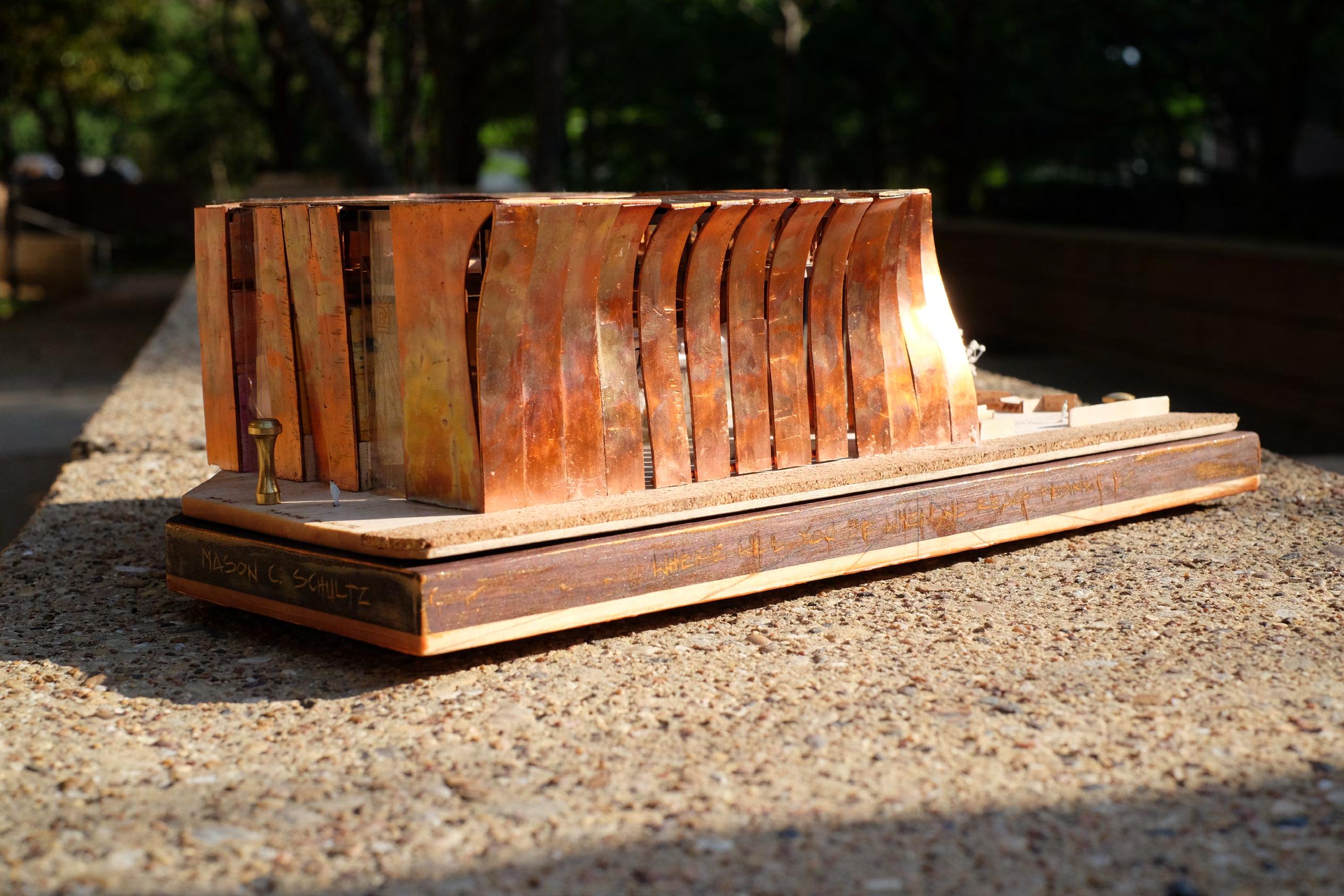
MASON C. SCHULTZ
TABLE OF CONTENTS: 01 - WAAG: PLANET B 15 - JAPANESE EMBASSY


27 - CHESS BOARD YOU TITLE IT
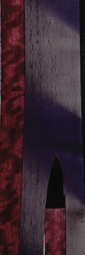
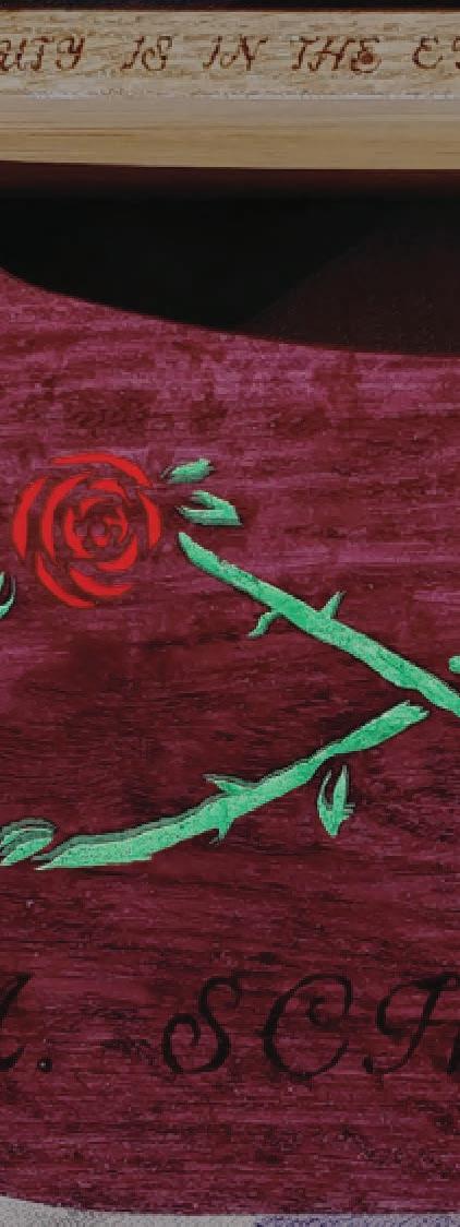
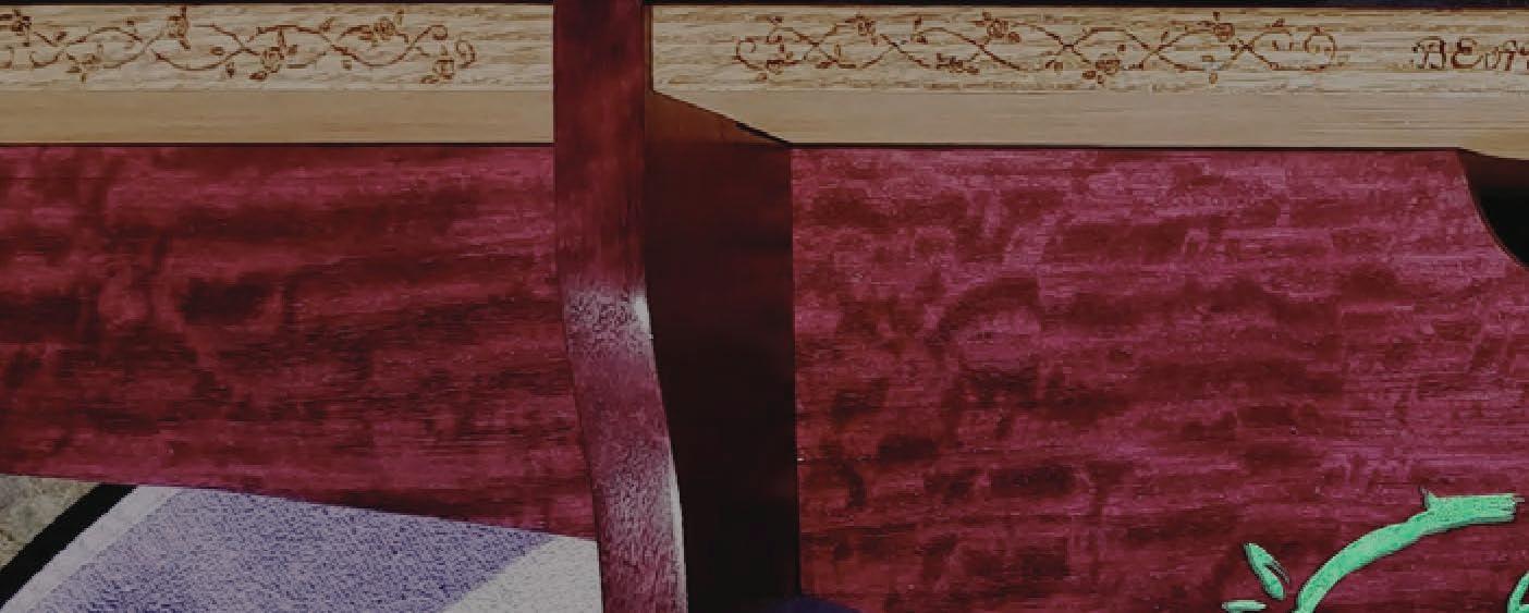
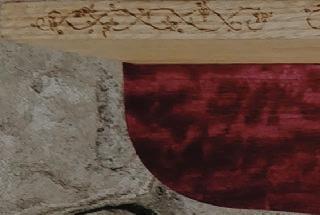
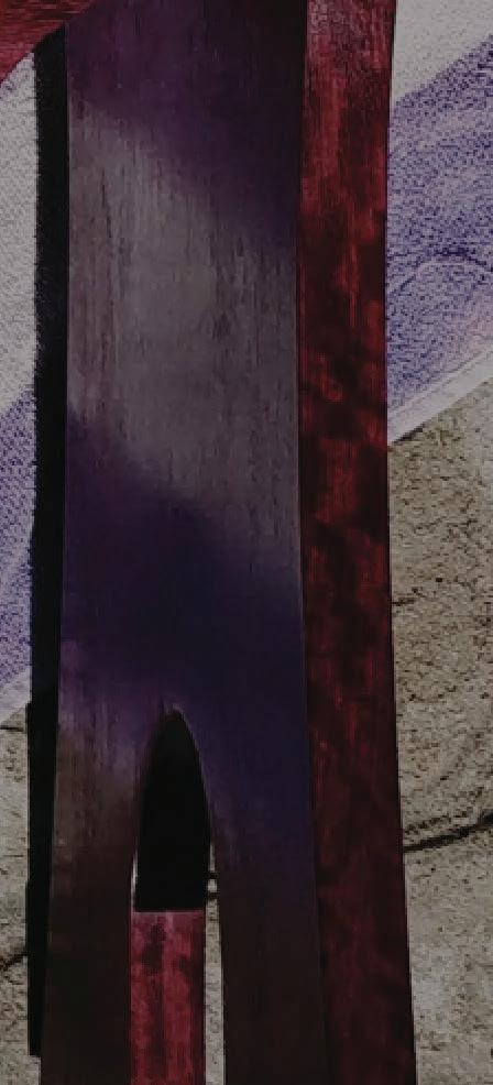
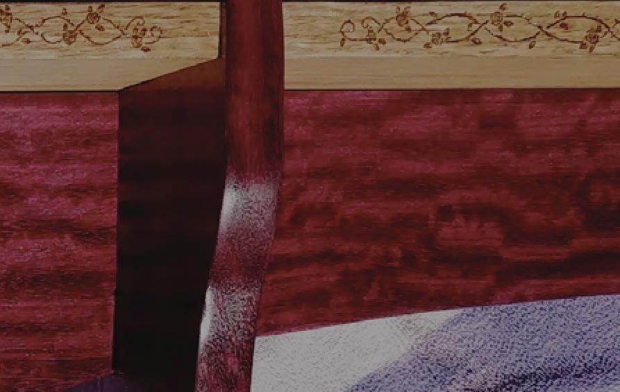
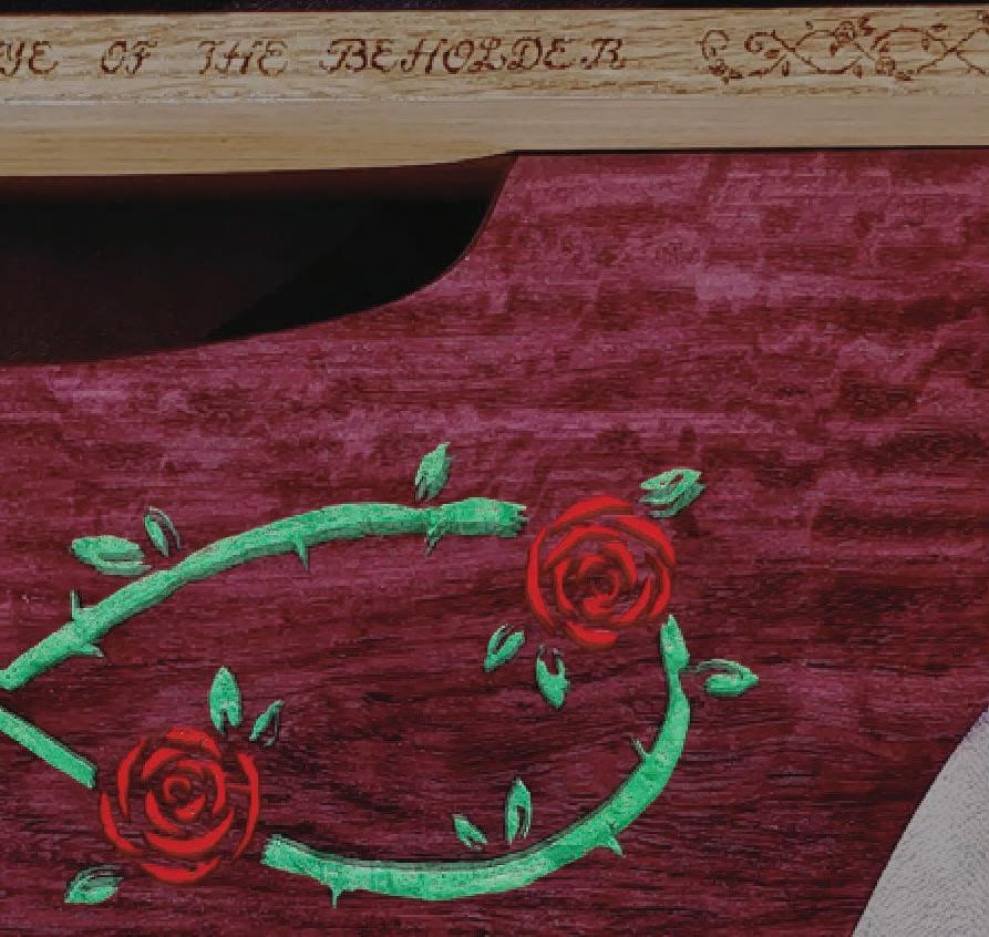
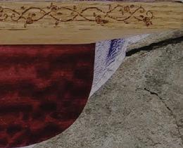
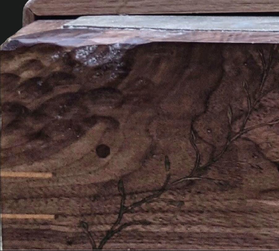
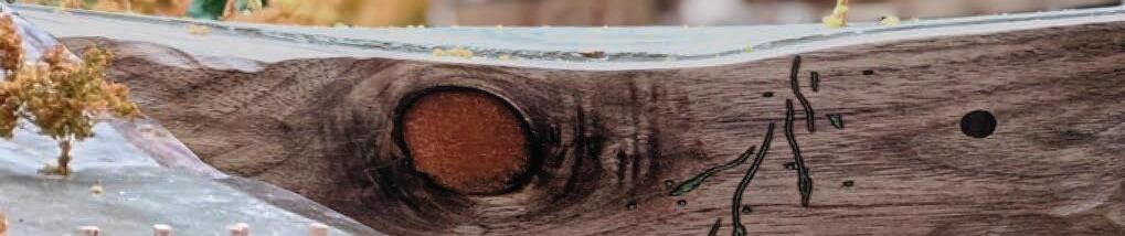
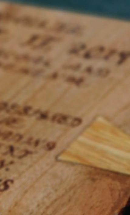
WOODEN ENTRY BENCH
Private Commission | 2019


Red Oak and Purple Heart Wood


00
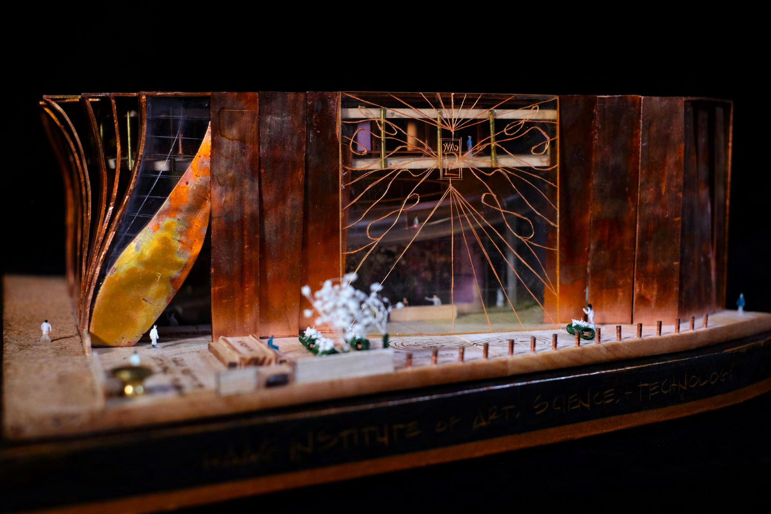
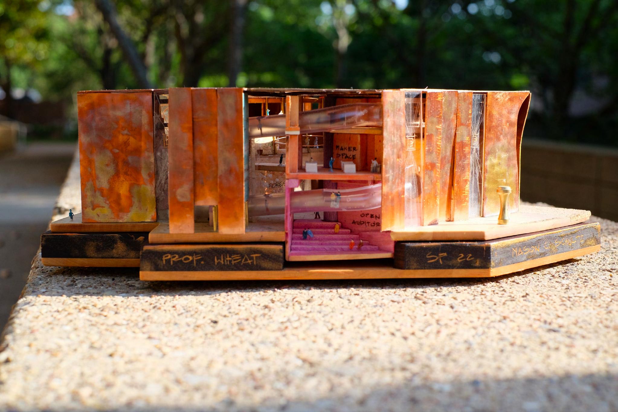
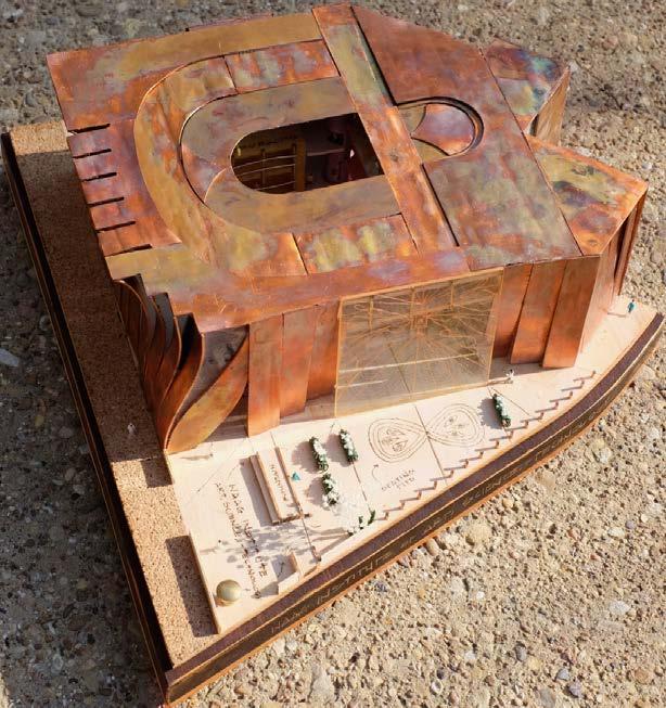
WAAG: PLANET B
01
Design Studio II 3554 | 2022 Professor : Dustin Wheat
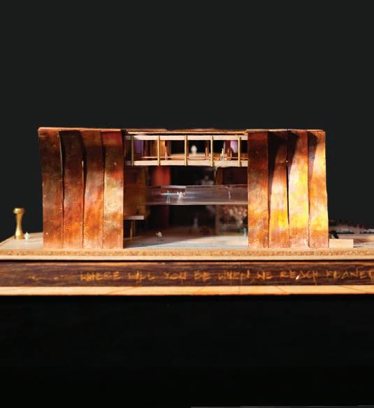
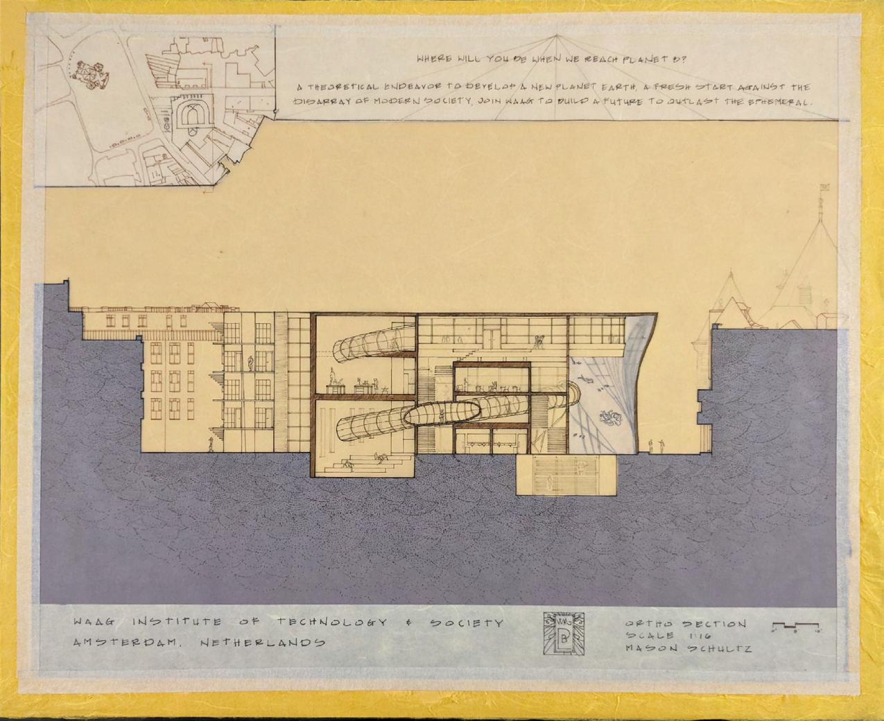
WHERE WILL YOU BE WHEN
02
WHEN WE REACH PLANET B?
03
04
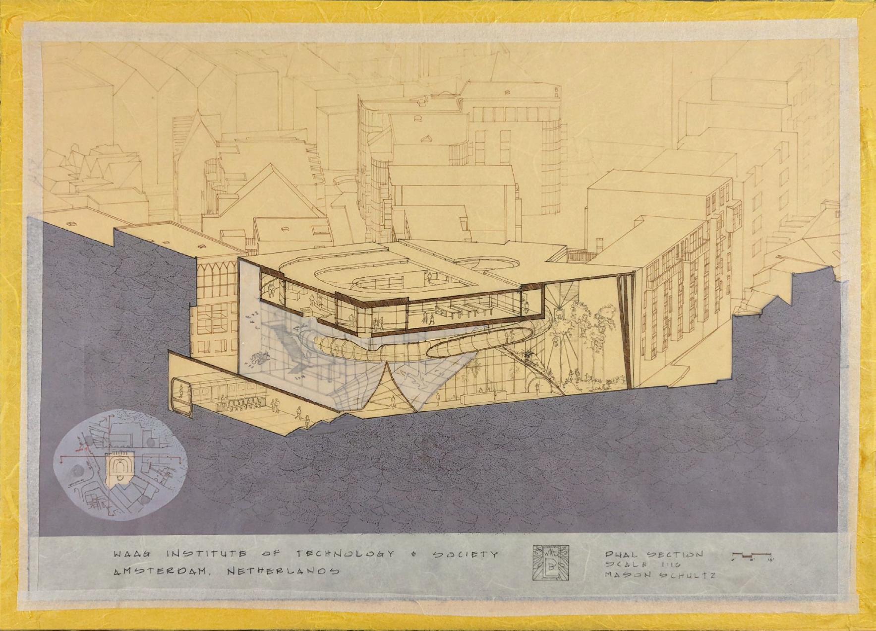
A JOURNEY TO PLANET B
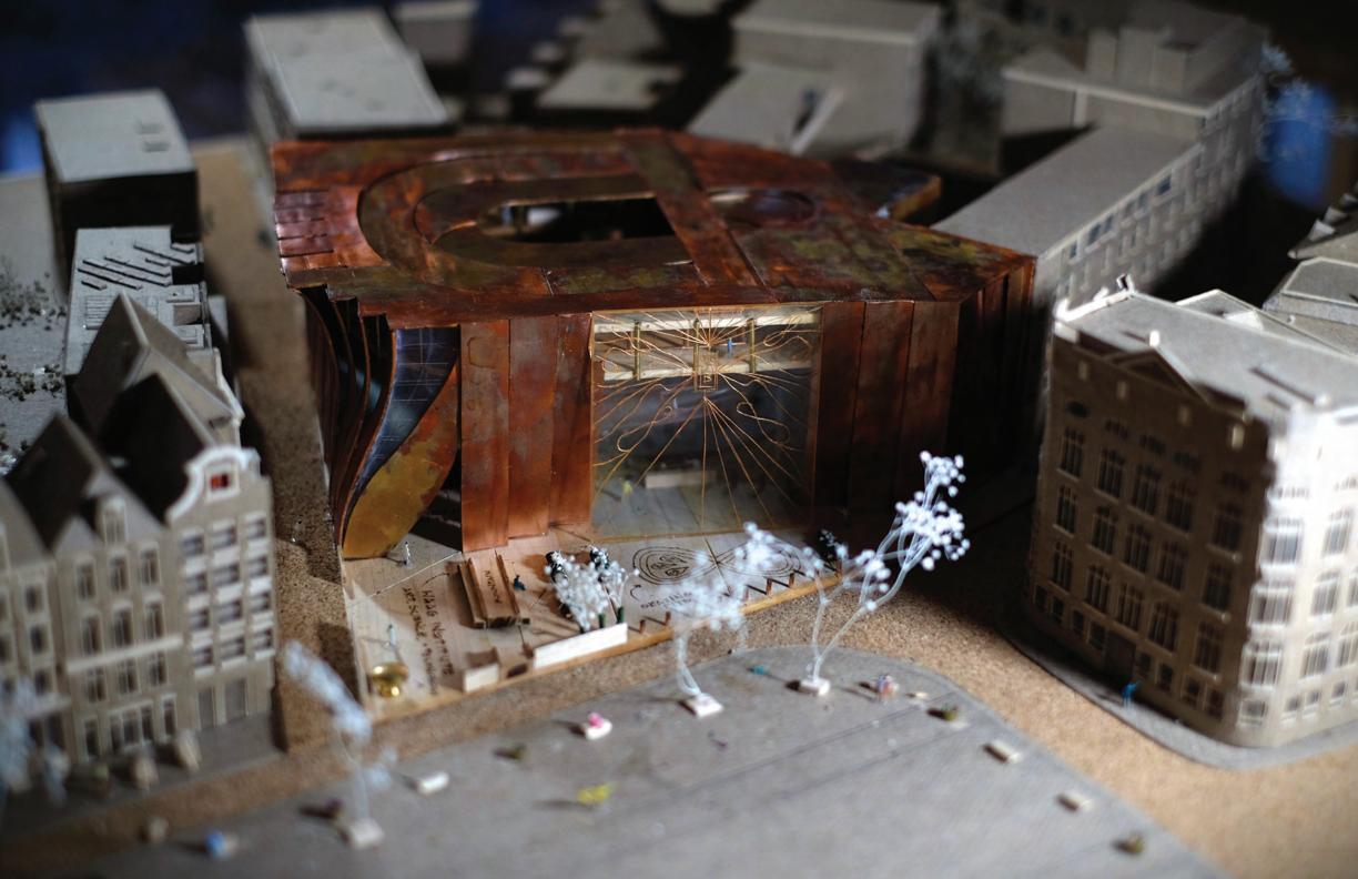
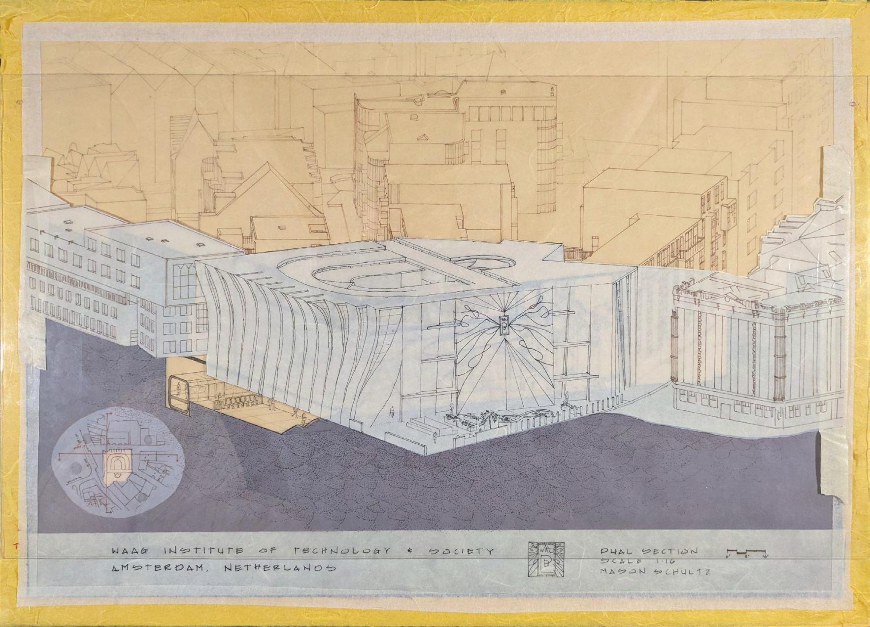
WAAG INSTITUTE of ART, SCIENCE, AND TECHNOLOGY


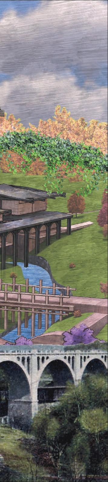
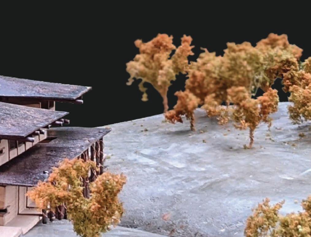
If we had a second chance at constructing the planet over again, what would we do differently? The Waag Institute sets out to answer that question, with a theoretical “Planet B.” Calling upon scientists, artists, and citizens to explore ideas that might better our future.
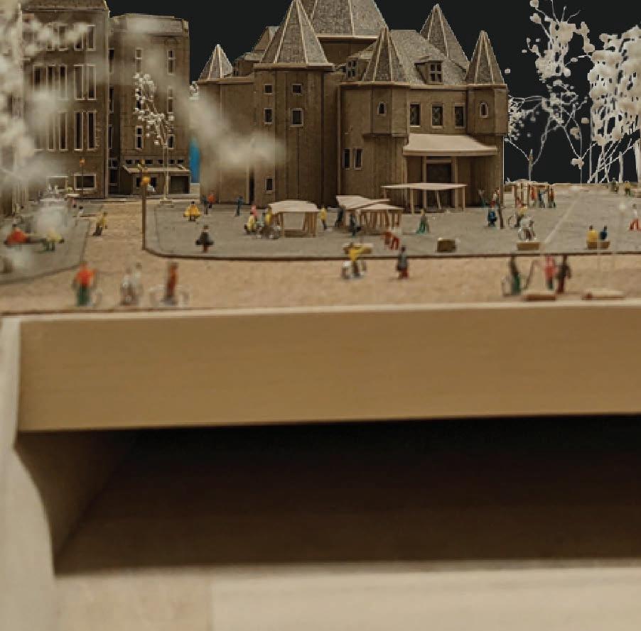
The Waag Institute is a laboratory museum; an interactive lab in which citizens are allowed to walk amongst the research as it takes place, and observe the pursuit of a better Earth. The task was to create a space that does not interrupt the researchers while allowing passersby to have an unobtrusive view. All while considering what the architecture of the future might look like.
WHERE WILL YOU BE WHEN WE REACH PLANET B?

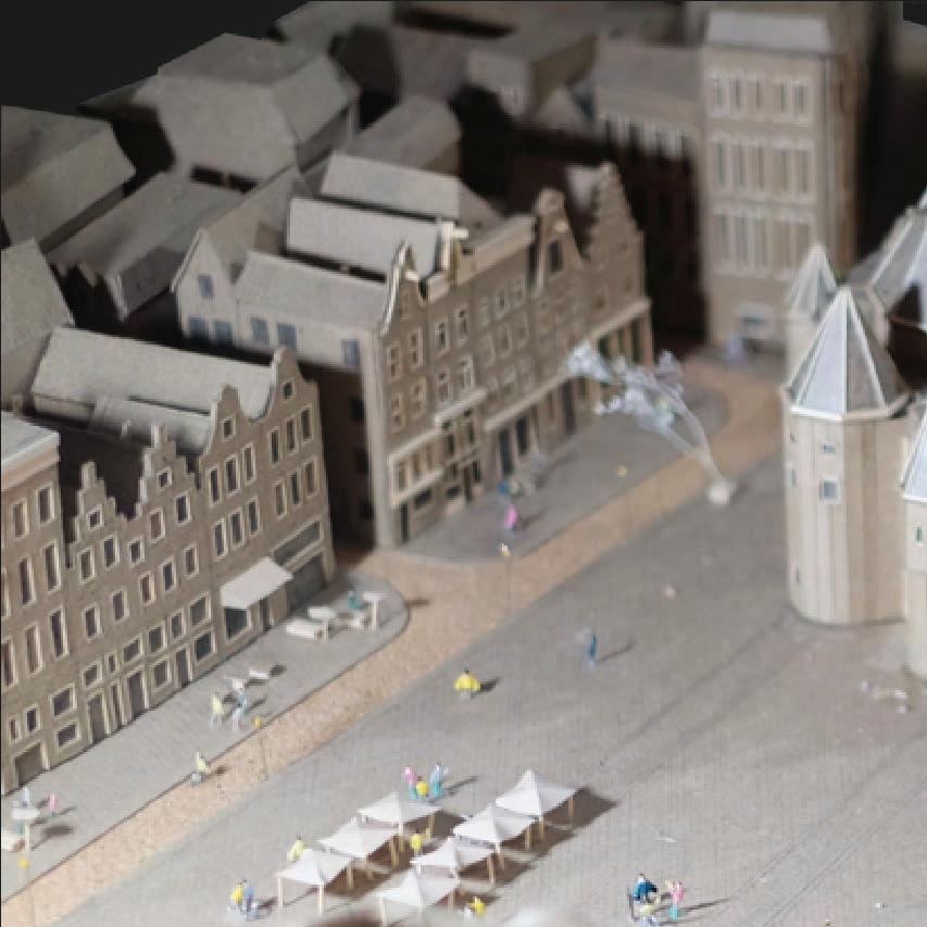
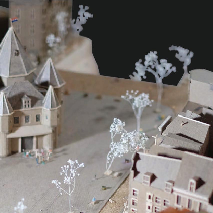
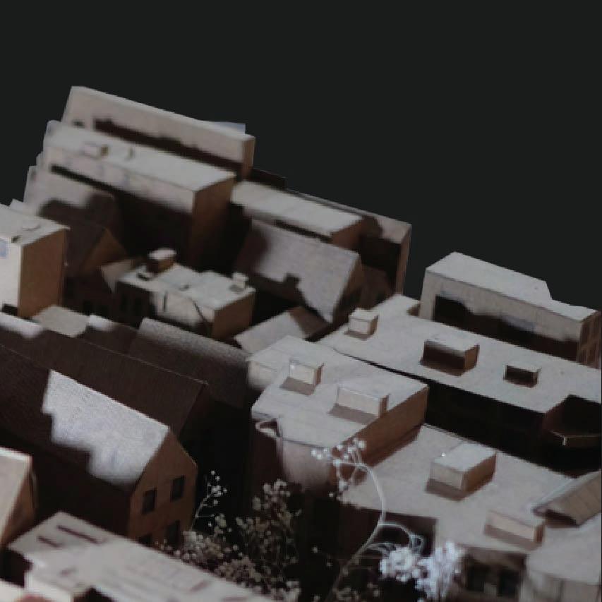
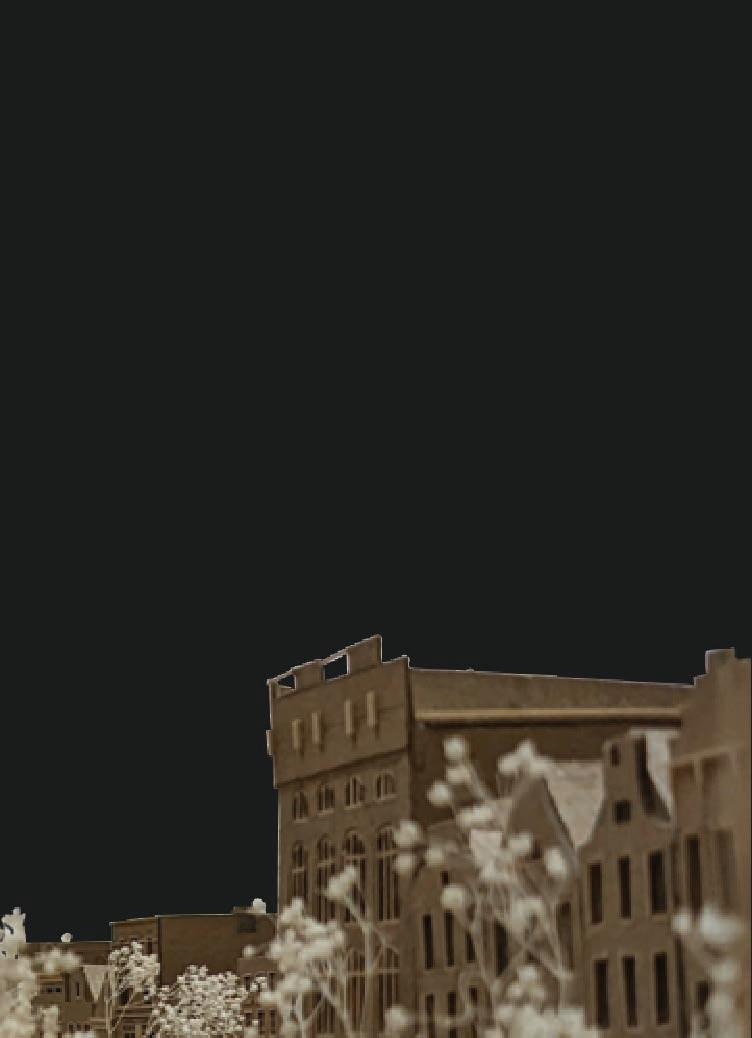
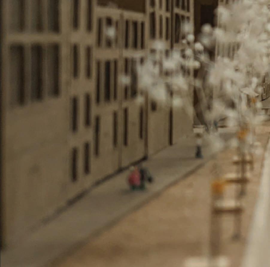
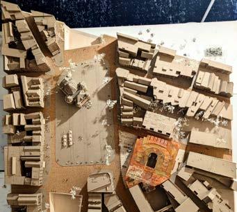
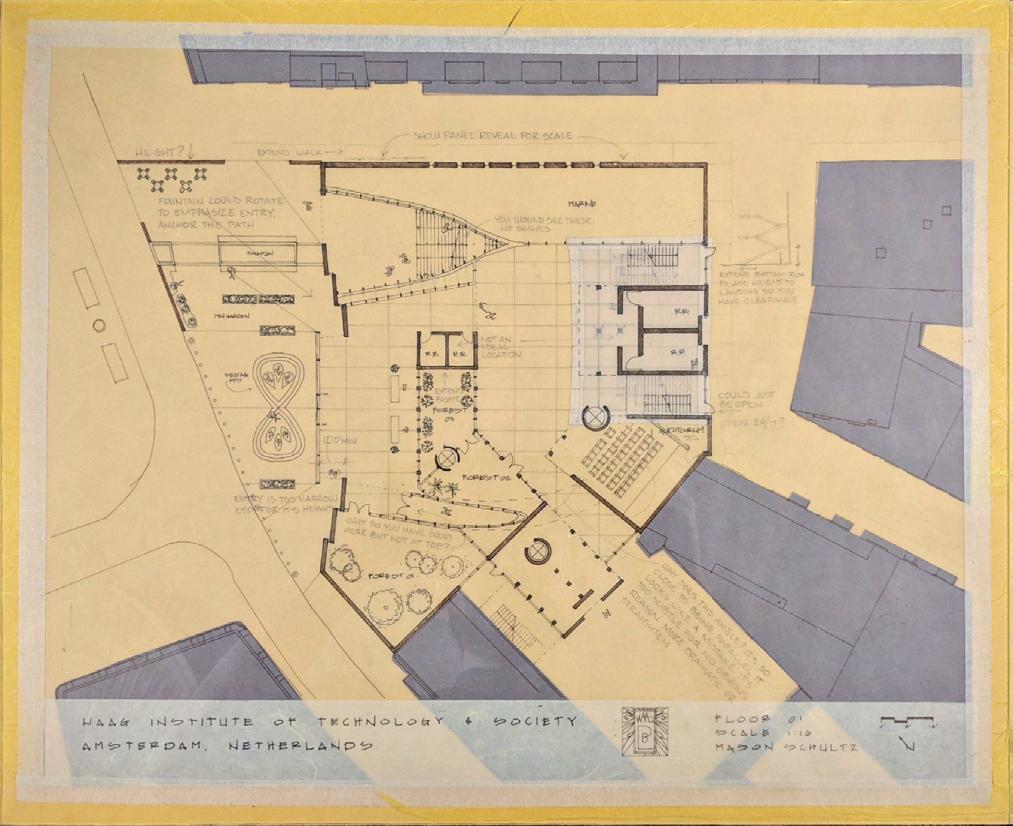
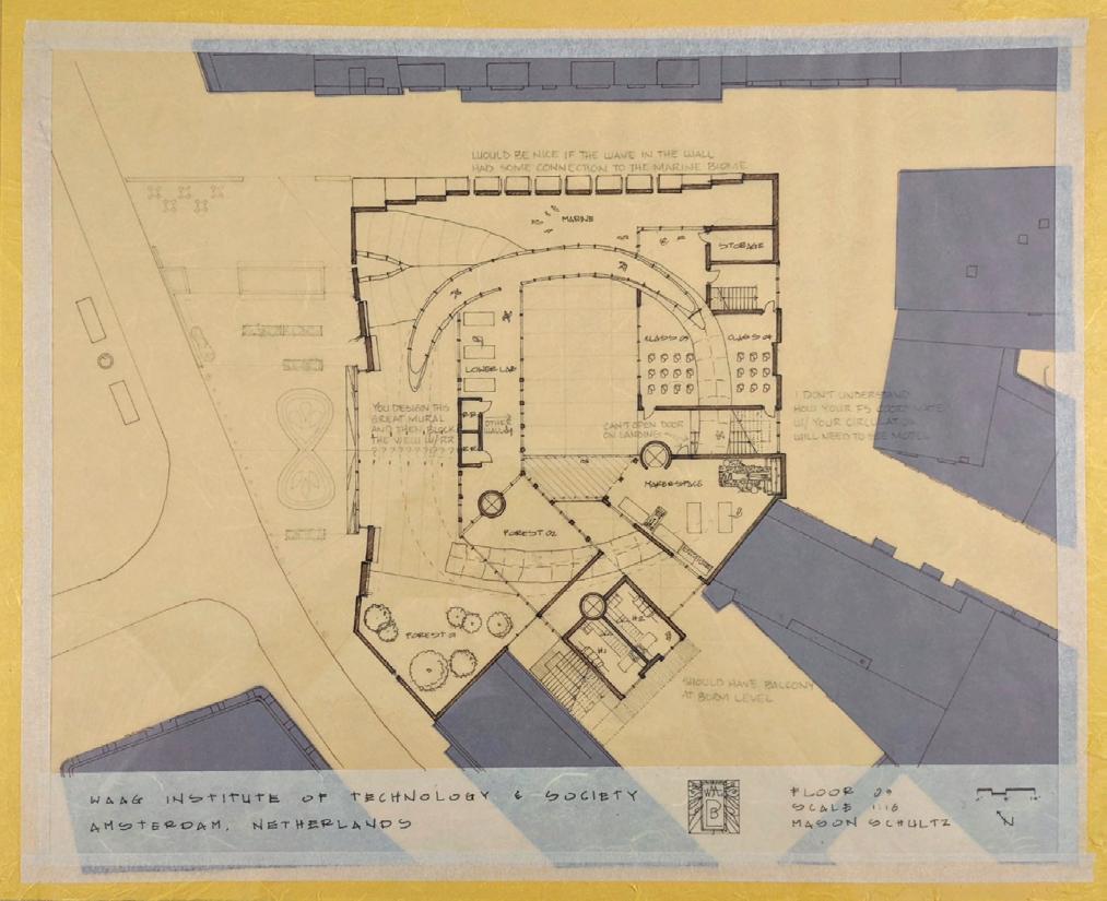
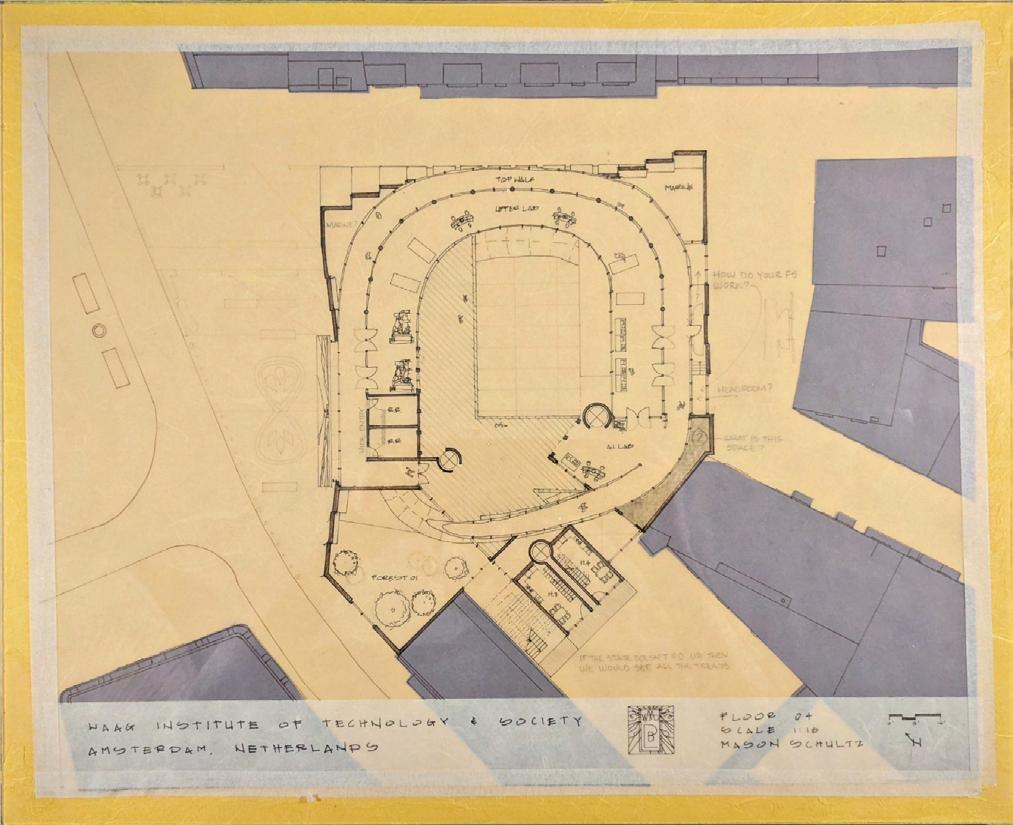
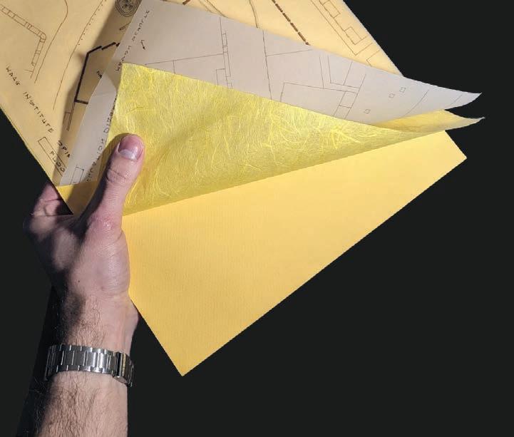
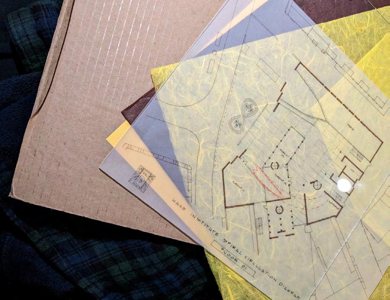
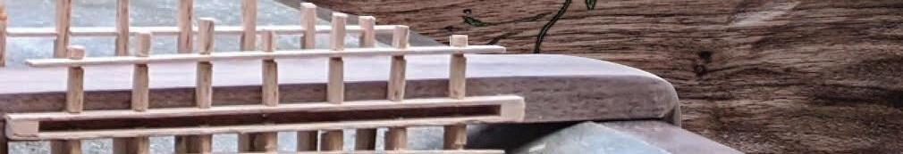
The studio began through constructing a class site model of a Nieuwmarkt square in the city of Amsterdam, Netherlands. The students would then construct their own building to fit in a slot in the site. The entire studio was intended to be an ongoing process, with all submissions considered study models and drawings. All materials used were to be scraps and trace. An exercize in the idea of not settling in design and allowing it free reign to evolve.
05
ARCHITECTURE FROM ANOTHER PLANET
Or rather, for another planet. The design for the institute is intended to feel otherworldly. There is no direct human scale, but rather solid monumental masses pointing upwards towards the sky. This is intentionally done for what is symbolic of a space center. The building is seemingly enclosed from the outside, with the front walls folding in and inviting one into the new world within.
06
THE LANGUAGE OF AMSTERDAM

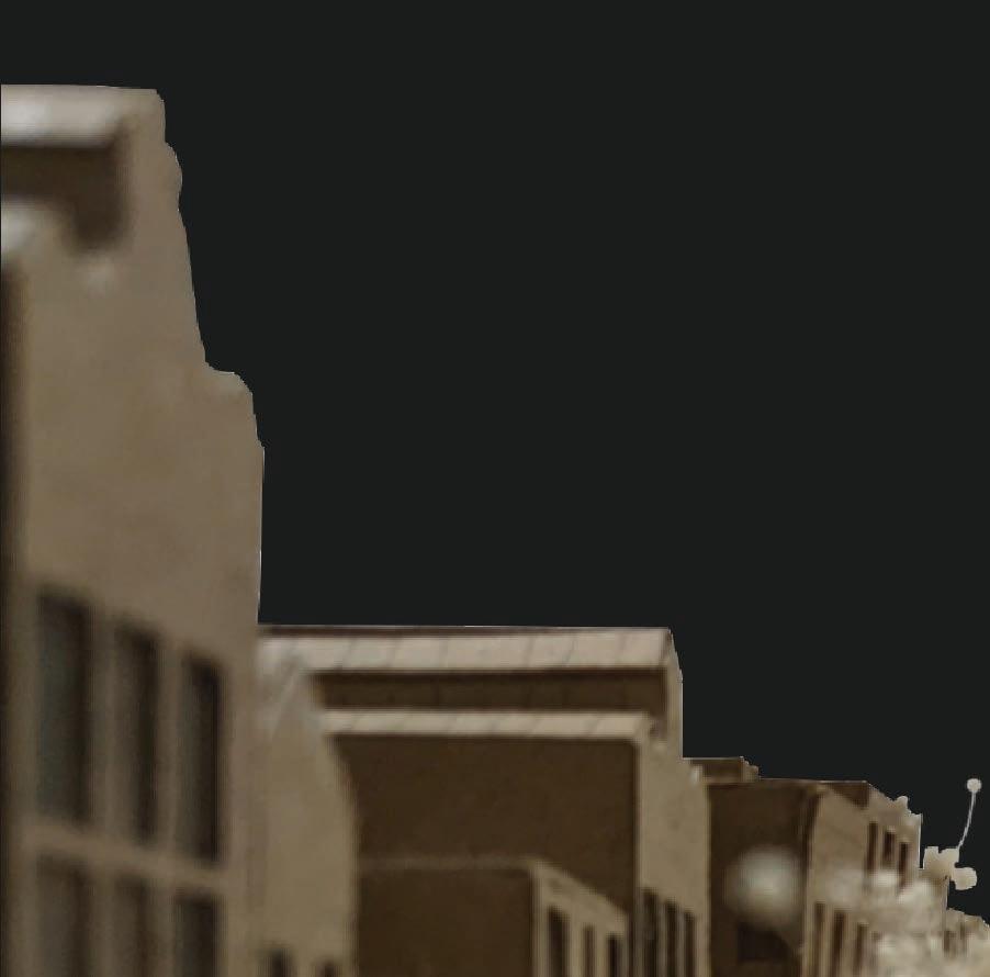
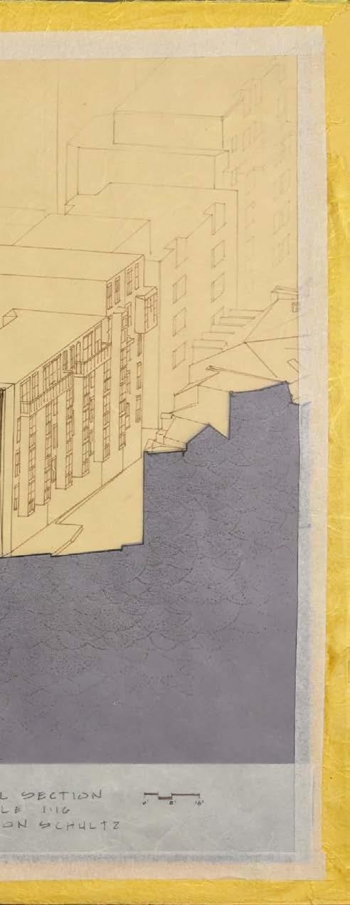
The verticality and repetition of the institute’s design derive from the design language of amsterdam and the surrounding context. Due to the compact nature of the city, buildings are very thin and pull upwards. In this Isometric drawing I have drawn the building adjacent to our slot to the right as it stands, intentionally leaving out the windows to display this effect.
07
A WORLD WITHIN
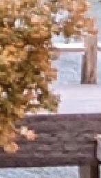
One of the main requirements of the assignment was to advertise the Waag research from the exterior. I have placed the two main research tanks: a marine and forest biome, along the two main axes that cross the building. The exterior walls are designed in a way to resemble the biome they hold, creating curiosity and drawing people in.
08
A QUEST FOR INCLUSION

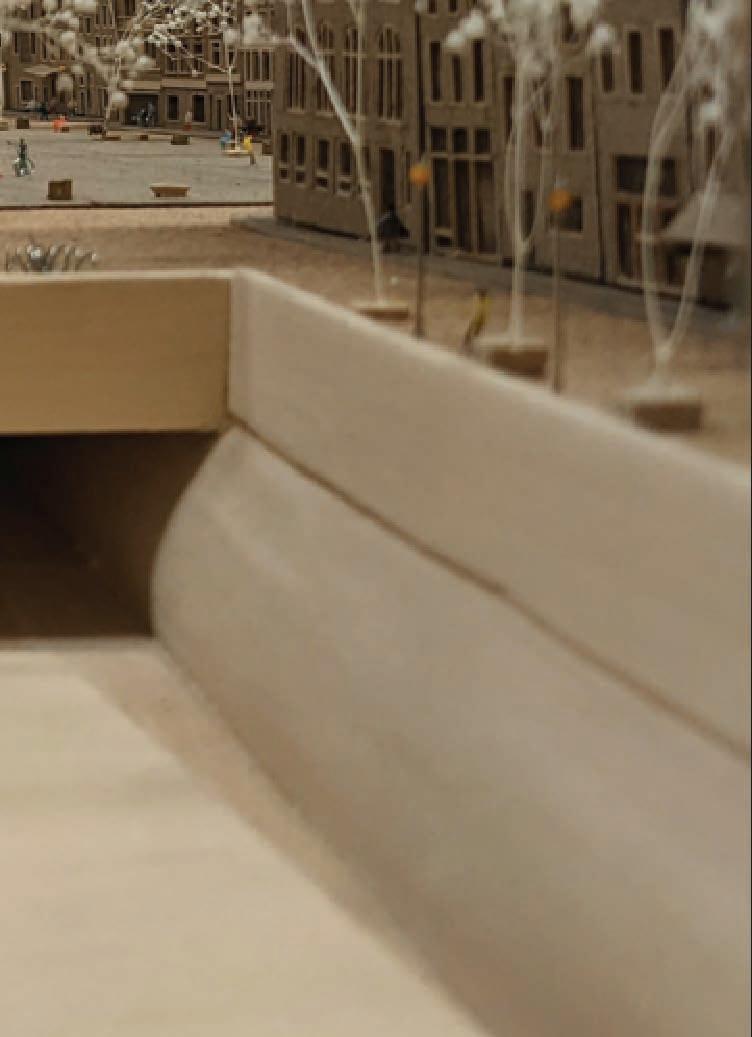
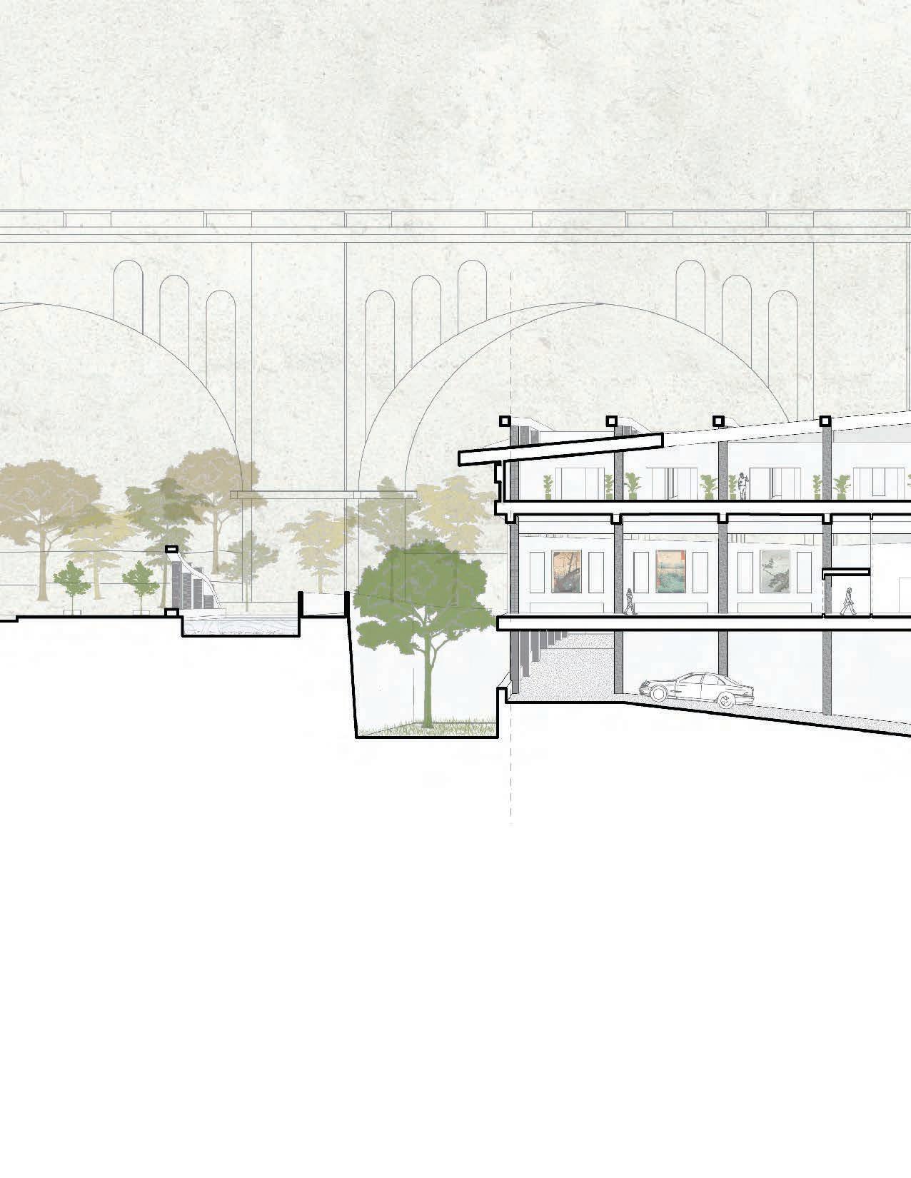
The driving force behind the project was the answer to the question of how to execute the circulation that a laboratory museum deserves. How do we allow people to pass through the space in an engaging, museum like manner without interrupting the researchers?

09
OBSERVATION TUNNEL
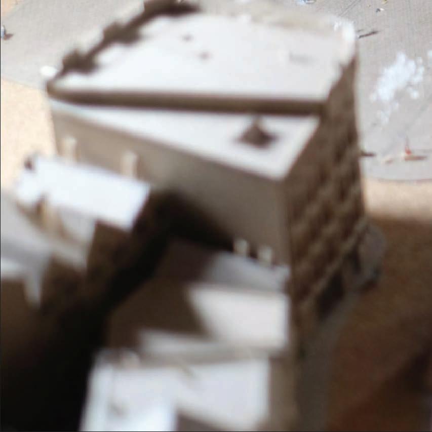
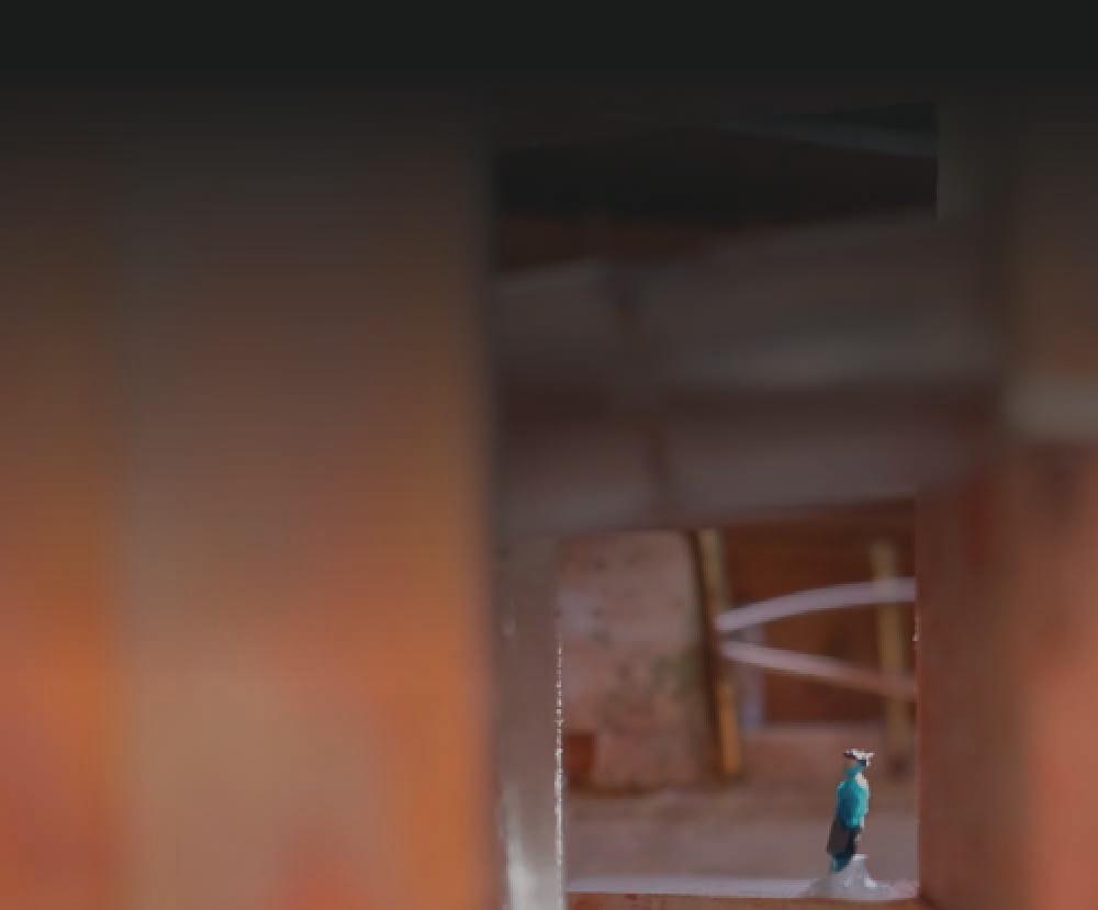
From my early study models I knew I wanted the building to be based around a courtyard. The idea is once one enters the space they have a 360 degree view of all that is happening inside of the Institute, and all rooms open up to the center. This enhances the feeling of a little world within.
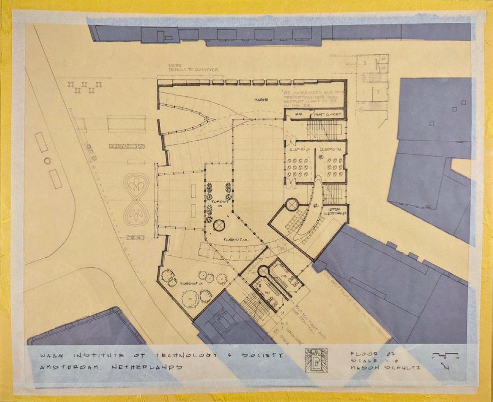
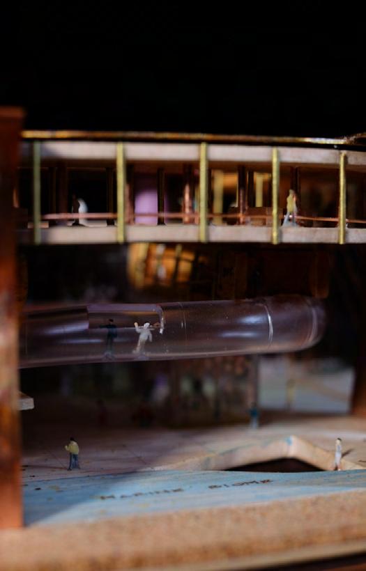
My solution to the circulation is done through a spirling glass tunnel that intentionally cuts through each space. This creates an uninterrupted experience for the guests and maintains a solid working environment for the researchers.
SEAMLESS CIRCULATION SACRIFICLESS INTERACTION
10
11
TRICK OF THE TRACE
While it appears the hand drawings are done on yellow trace, the color is actually achieved through layering several sheets under white trace. The dark brown of the buildings in plan and section are done using a brown sheet behind.
12
Revealing Beauty
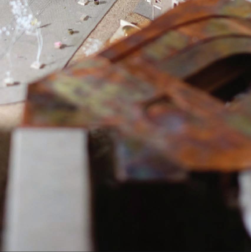
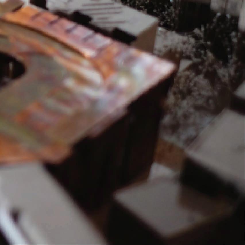
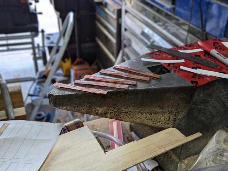
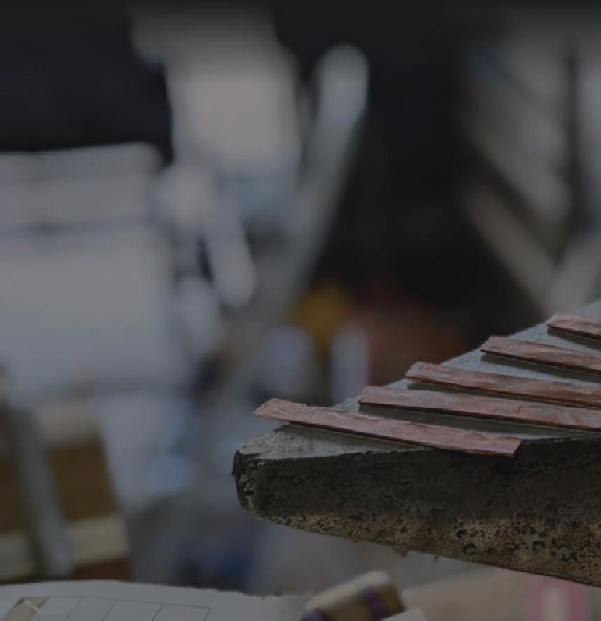
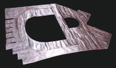
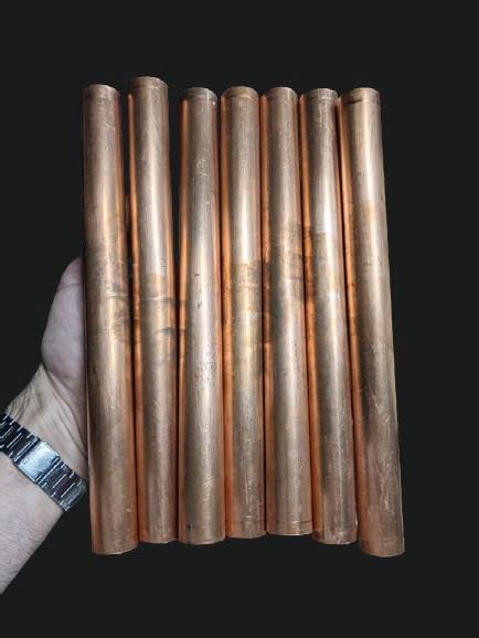
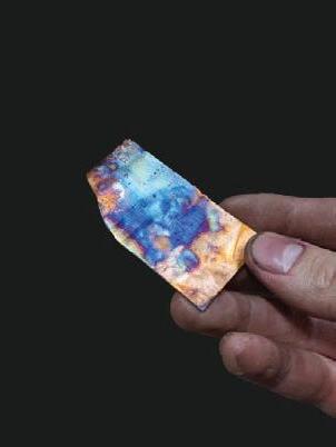
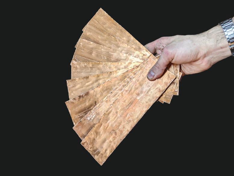
The main material used for the exterior of my model was solid copper pipe saved from the garbage. The pipe was manually cut open and flattened on an anvil into a workable material, maintaining the “scrap” requirement. Each piece was then shaped by hand.


FLAME PATINA


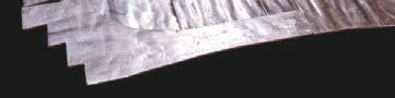

After cutting each piece to size, a special process was applied known as “flame painting,” in which the copper is heated to high temperatures creating a stunning array of colors. The process is entirely natural and each color corresponds with a different temperature range. The copper is then clear coated, subduing the colors slightly and locking them in, preventing further oxidation.

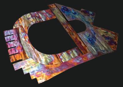
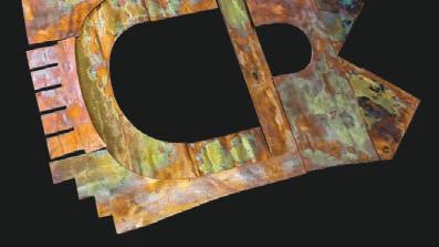
WAAG INSTITUTE
: MODEL MAKING PROCESS
13
14
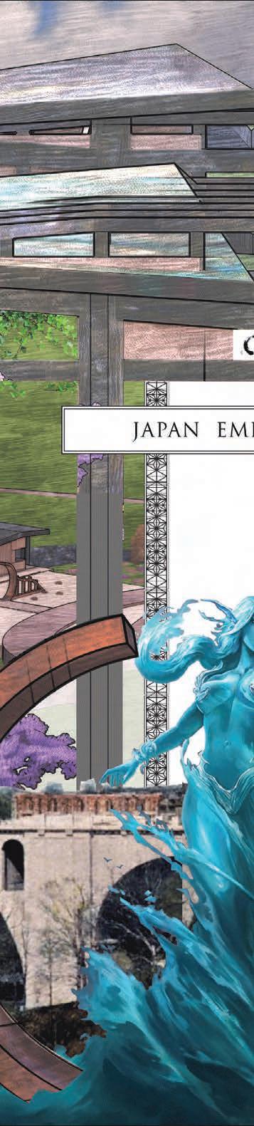
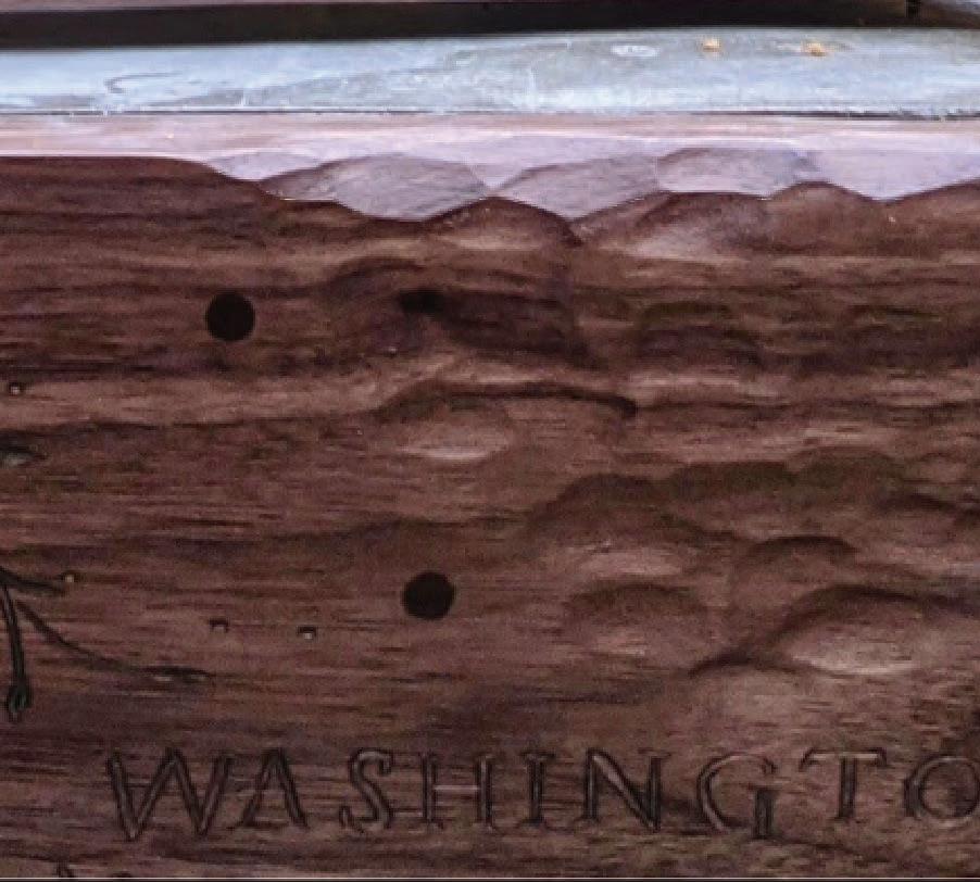
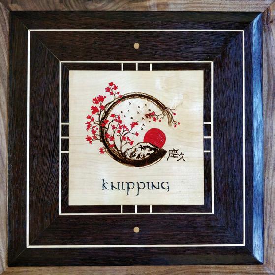
JAPANESE EMBASSY
15
Design Studio II 3554 | 2022
Professor : Dustin Wheat
JAPANESE EMBASSY ROUGH 16
ROUGH INSPIRATION COLLAGE 17
PRECEDENT STUDY: KENZO TANGE
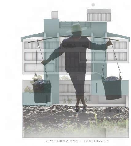
The direction of the project was to “redesign” a foreign embassy located in Washington, D.C. The stuido began with us researching a precedent of our choice, with the intention of incorporating bits of it into our embassy design.
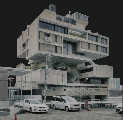
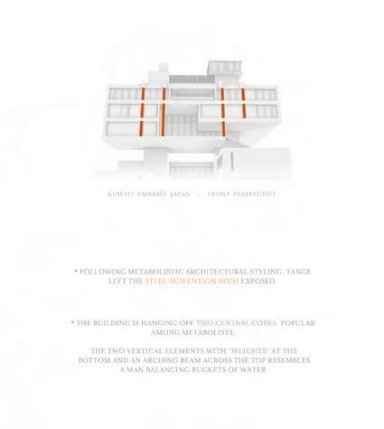
I chose the Kuwait embassy in Japan designed by Japanese architect Kenzo Tange in 1970.
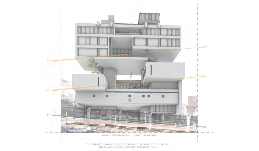
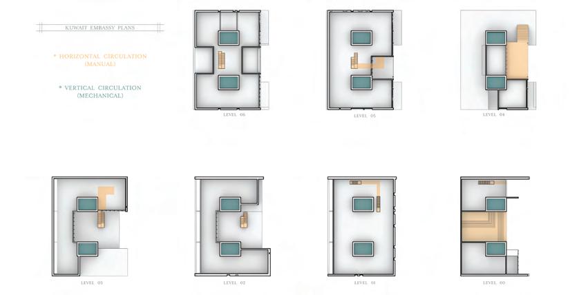
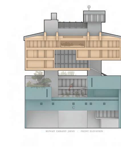
KUWAIT EMBASSY JAPAN : FRONT ELEVATION DESIGN STUDIO KUWAIT EMBASSY JAPAN SPATIAL HIEARCHY LEVEL 00 LEVEL 01 LEVEL 02 LEVEL 03 LEVEL 04 LEVEL 05 LEVEL 06 KUWAIT EMBASSY PLANS * HORIZONTAL CIRCULATION (STAIRS) * VERTICAL CIRCULATION (ELEVATORS) DESIGN STUDIO I WHEAT KUWAIT EMBASSY JAPAN MASON SCHULTZ CIRCULATION DIAGRAM KUWAIT EMBASSY JAPAN FRONT PERSPECTIVE * THE EMBASSY IS BALANCED TO COUNTERACT THE SLANT OF THE STREET. THE MASSING LEANS IN THE OPPOSITE DIRECTION DESIGN STUDIO I : WHEAT MASON SCHULTZ TANGE’S BALANCING ACT KUWAIT EMBASSY JAPAN : FRONT ELEVATION DESIGN STUDIO KUWAIT EMBASSY JAPAN METABOLIST WATER 18
I produced a series of diagrams depicting varying design elements of our precedent after modeling it in Rhino 3D. Through the modeling process I was able to gain insight into some of the intention behind Tange’s movements.
Being an embassy, Tange created a clear hiearchy between public and private spaces by essentially splitting the building in two. The private quarters float above the public suspended on two massive, exposed concrete pillars.
I also began to understand Tange’s attempts to make the building feel balanced, being built on such an aggressive slope. The blocky masses are arranged in such a way to counteract one another and make the building appear stable.
Through these observations and a brief study of Japanese architecture, I began to develop designs for a new Japanese embassy with my studio partner Karla Coronado.
MEGASTRUCTURAS ARQUITECTURA
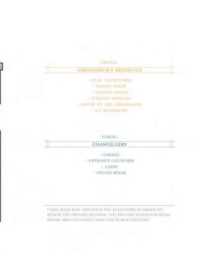
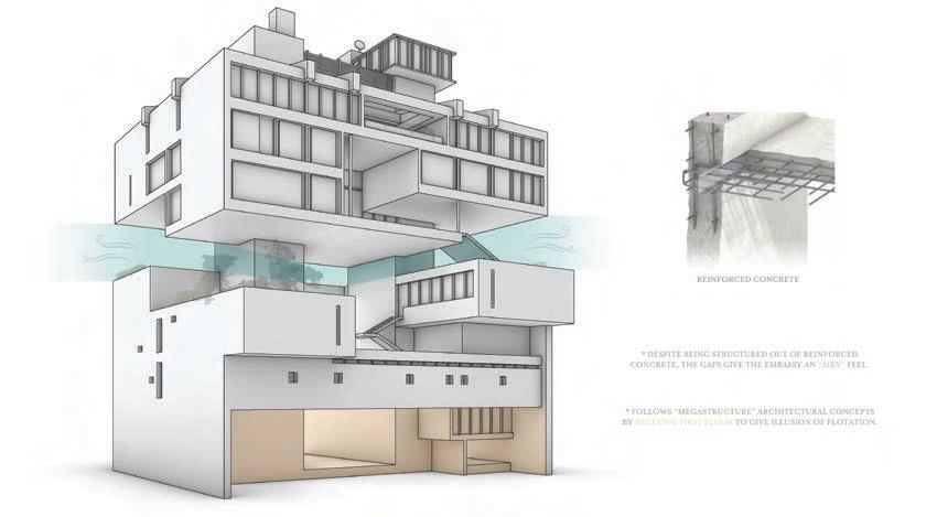
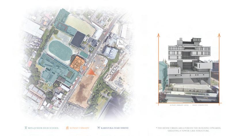
AMBASSADOR’S RESIDENCE PRIVATE: DUAL COURTYARDS DINING ROOM WAITING ROOM • FOREIGN MINISTRY • HOUSE OF THE AMBASSADOR • A/C MACHINERY CHANCELLERY PUBLIC: GARAGE ENTRANCE COURYARD • LOBBY • ENGINE ROOM * ONE MUST RISE THROUGH THE ELEVATORS IN ORDER TO REACH THE PRIVATE SECTION. THE PRIVATE SECTION IS MORE DENSE AND ENCLOSED THAN THE PUBLIC SECTION. I : WHEAT MASON SCHULTZ HIEARCHY MITA JUNIOR HIGH SCHOOL KUWAIT EMBASSY KAMEZUKA INARI SHRINE KUWAIT EMBASSY JAPAN FRONT PERSPECTIVE * THE DENSE URBAN AREA FORCES THE BUILDING UPWARDS, CREATING A TOWER-LIKE STRUCTURE. DESIGN STUDIO I : WHEAT KUWAIT EMBASSY JAPAN MASON SCHULTZ SITE DIAGRAM KUWAIT EMBASSY JAPAN : FRONT PERSPECTIVE * FOLLOWING METABOLISTIC ARCHITECTURAL STYLING, TANGE LEFT THE STEEL SUSPENTION RODS EXPOSED. * THE BUILDING IS HANGING OFF TWO CENTRAL CORES, POPULAR AMONG METABOLISTS. THE TWO VERTICAL ELEMENTS WITH “WEIGHTS” AT THE BOTTOM AND AN ARCHING BEAM ACROSS THE TOP RESEMBLES A MAN BALANCING BUCKETS OF WATER. I : WHEAT MASON SCHULTZ BUCKET STRUCTURE REINFORCED CONCRETE * DESPITE BEING STRUCTURED OUT OF REINFORCED CONCRETE, THE GAPS GIVE THE EMBASSY AN “AIRY” FEEL. * FOLLOWS “MEGASTRUCTURE” ARCHITECTURAL CONCEPTS BY RECESING FIRST FLOOR TO GIVE ILLUSION OF FLOTATION. DESIGN STUDIO I : WHEAT KUWAIT EMBASSY JAPAN
19
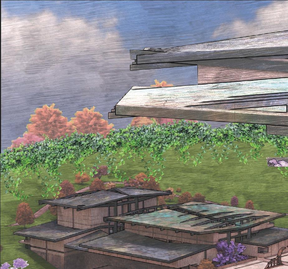
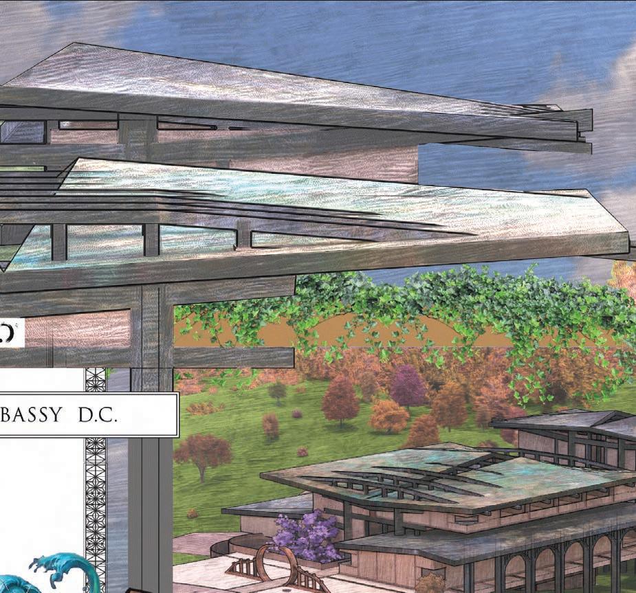
Inspiration was pulled from a large variety of sources, flourishing into a unified design that represents both the site and its context as well as the country that it supports.
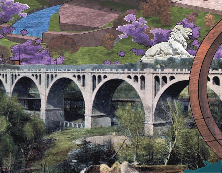
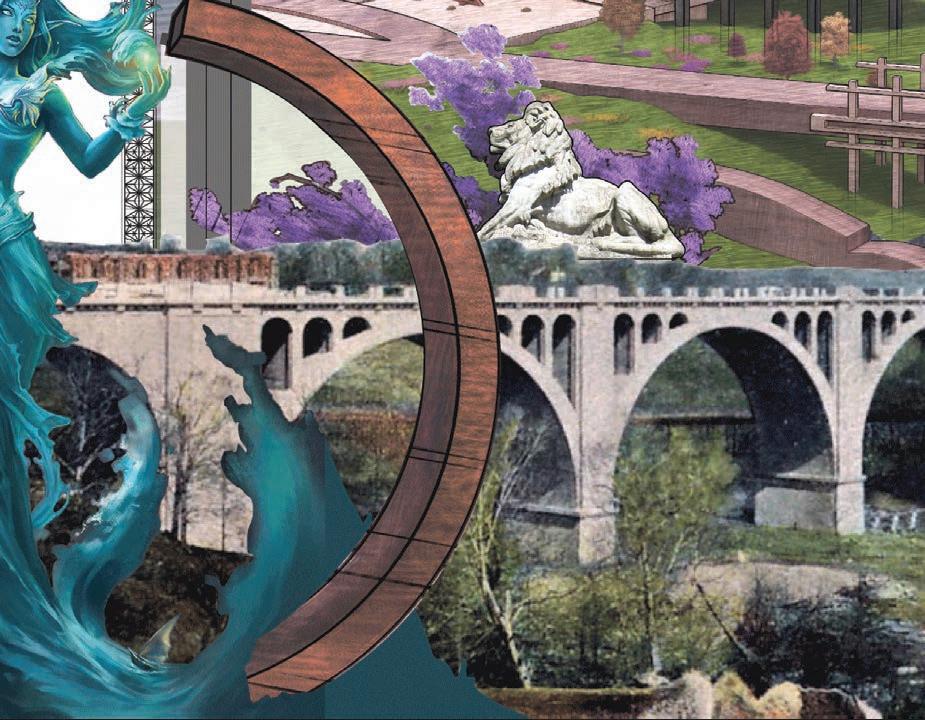
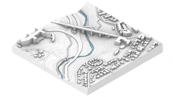
One of the early design influences was the William Howard Taft bridge that sits adjacent to our site. Instead of placing our embassy on embassy row along with other countries, we chose an isolated site near a local park close by. The natural setting and its tranquility suit that of a Japanese inspired design.
SPLIT SECTION
20
Balancing all of these inspiration references in a way that is harmonious and does not overwhelm posed the greatest challenge. The ideas need to blend together as one without loosing their own roots.
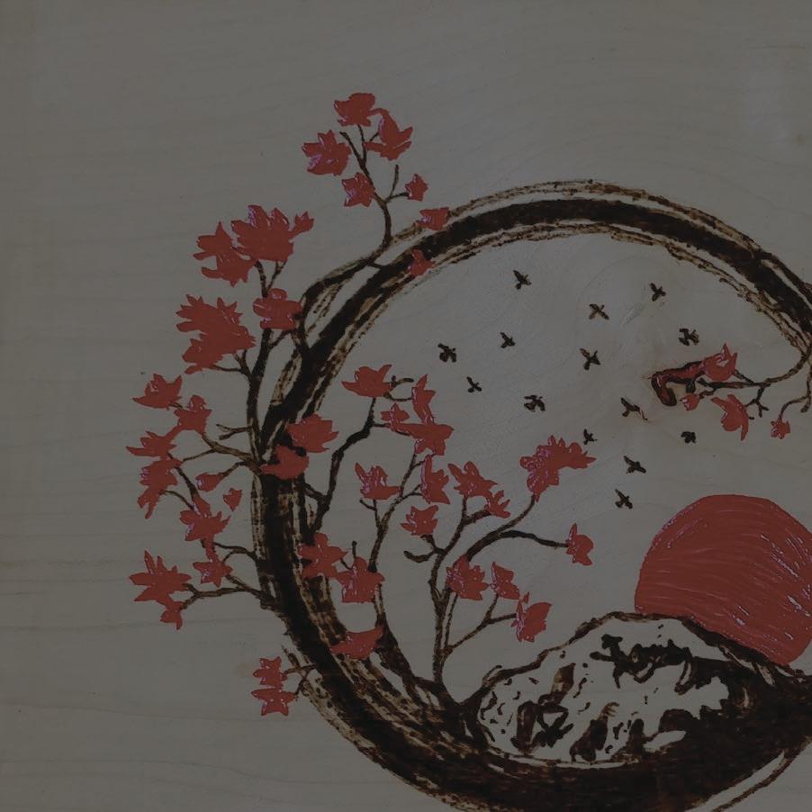
Motifs were pulled from Japanese architecture and traditional Japanese gardens. The circular passageway of a Moon Gate was met with the Japanese symbol Enso, in which a circle is shown incomplete. The design is split into public and private similar to that of Tange’s design, with a circle split clean between them in plan.

KARLA CORONADO MASON SCHULTZ 20 FT. 0 21
NORTH WEST PERSPECTIVE SECTION
SOUTH EAST PERSPECTIVE SECTION
22
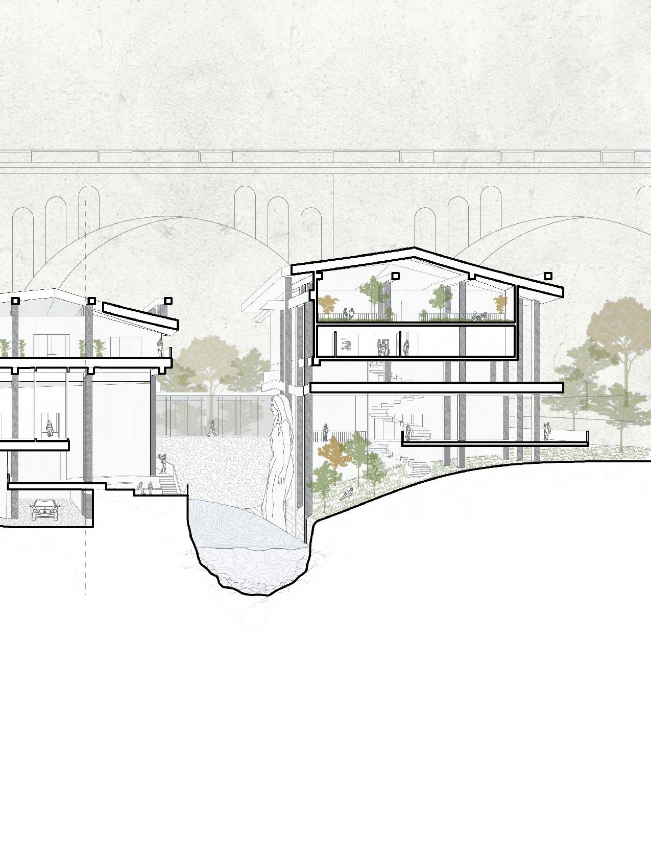
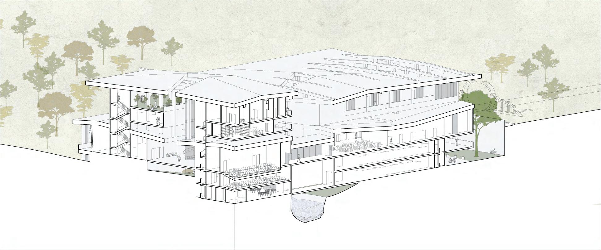
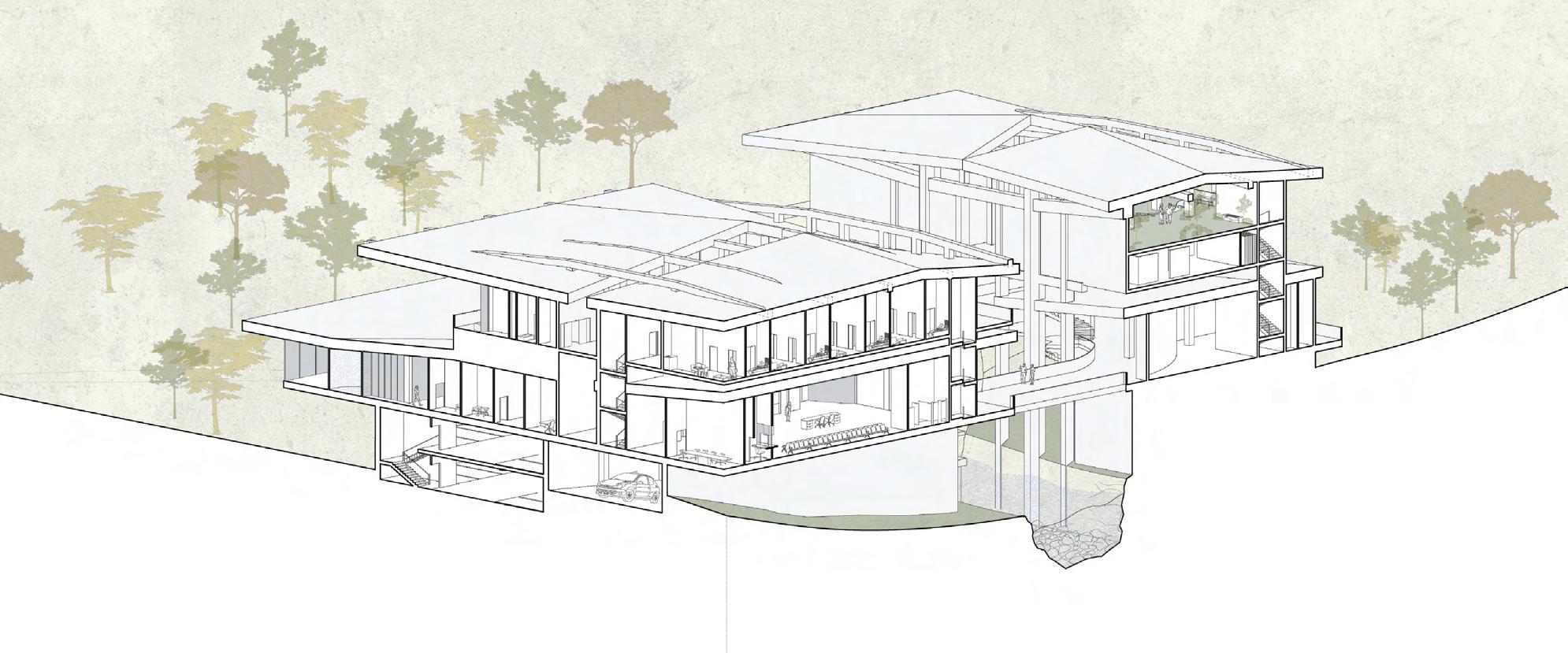
CIRCULATION REVEALED


With such an intricate circulation, it was deemed the best way to display the inner workings of the embassy would be to produce “dual sections,” done in isometric and split twice. Through this one is able to see the connection between the two main masses, as well as the split top and bottom levels inspired by Kenzo Tange’s Kuwait embassy.
A main requirement of our design was that of an exposed structure. The overhanging roof can be seen pulling down, revealing the massive column grid that runs along the building. The roofs split open down the center to allow light in and further the exposure.
NW SPLIT SE SPLIT 23
FLOOR 01
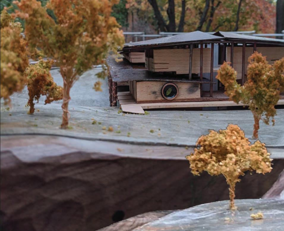
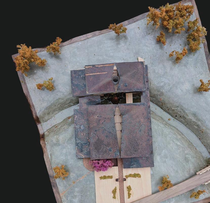
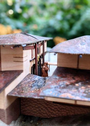
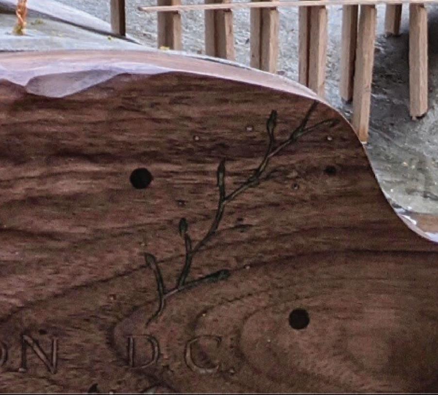
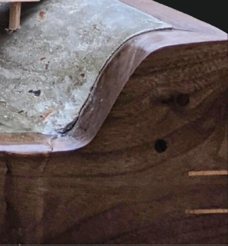
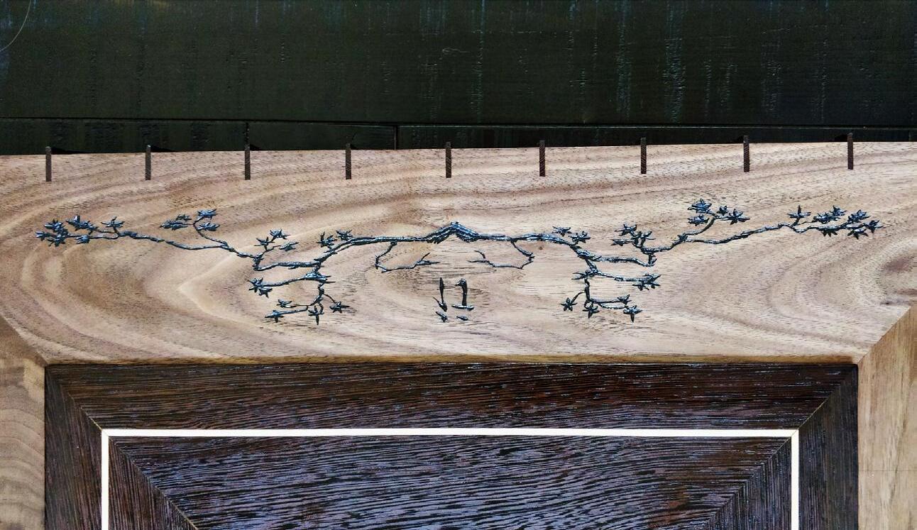
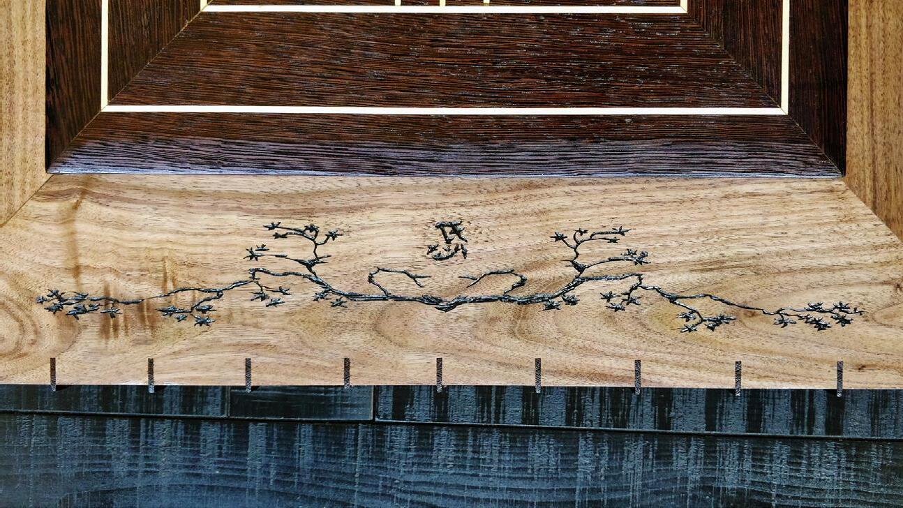
JAPANESE EMBASSY: PHYSICAL MODEL
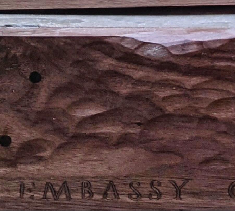
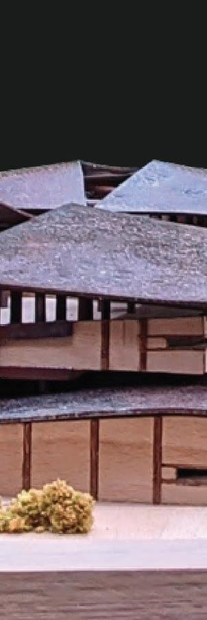
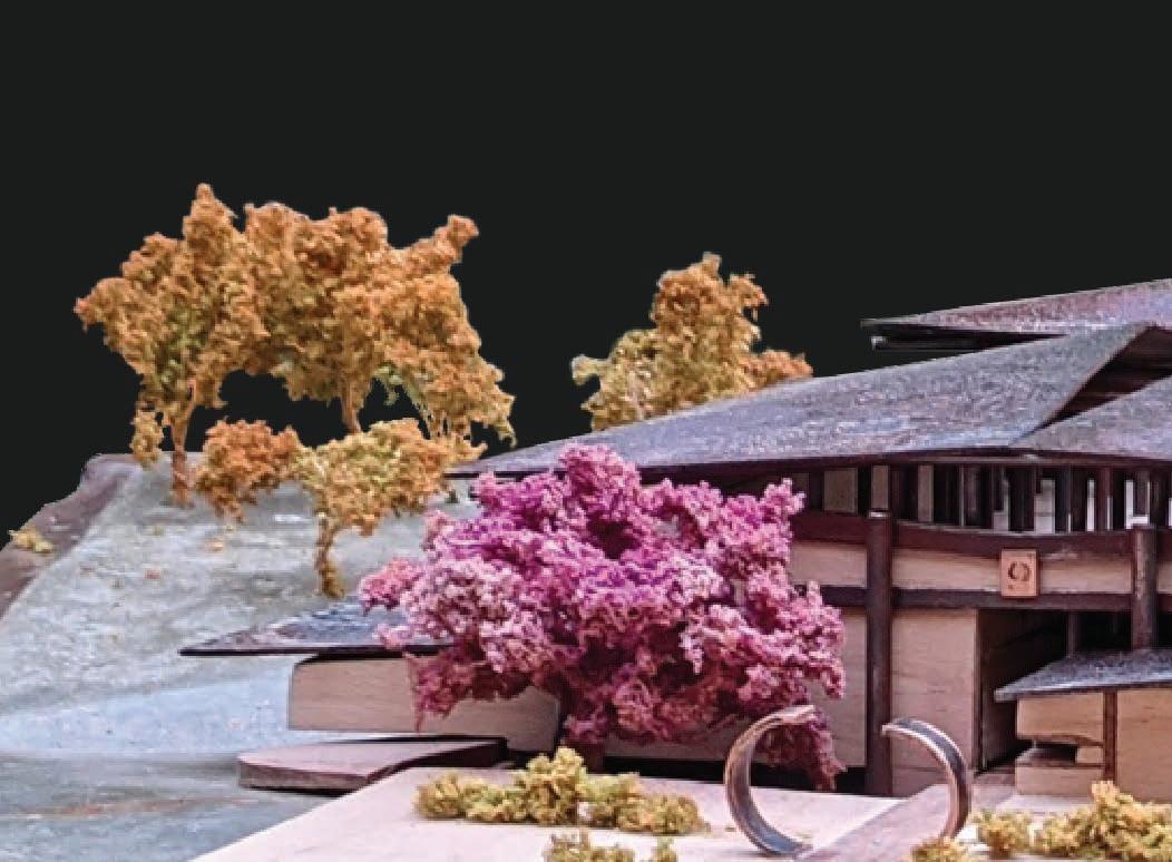
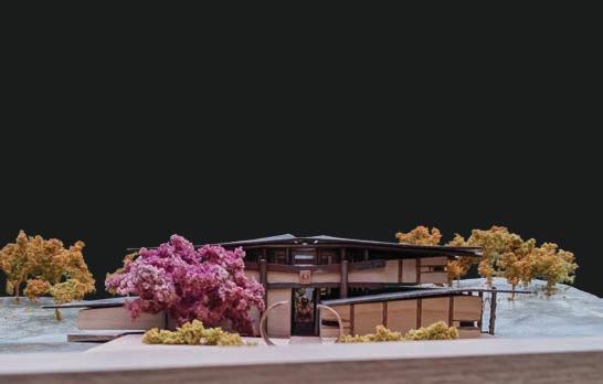
Steel, Concrete, + Beech, Walnut, and Leopard Wood


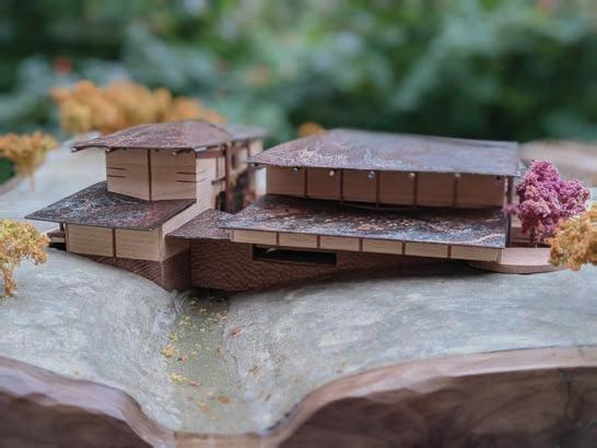
The physical model intended to take on the same ideology of the building design itself, the natural, “Wabi Sabi” way of the Japanese.


The building itself is made out of beech and leopard wood, with a steel rod structure and a solid steel roof. A forced patina was placed upon the steel using vinegar, causing it to rust instantly. The result produces a surprisng natural array of spots and colors.
The trees are hand made using several layers of spray foam and turf with a baby’s breath frame. The base is cast cement that was polished to a high shine and then clear coated and wrapped in walnut wood. The wood was hand carved with a vine design encompassing the entire base. A gouge was used to create undulations around the walnut wrap. The carvings along with all imperfections were filled with epoxy to highlight their impurities, not hide them.
24


25
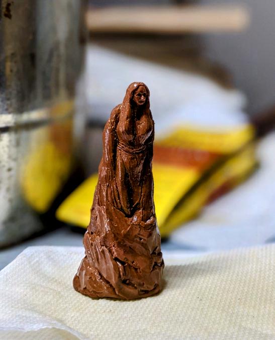
The Hashime statue was the main focal point of the design, being a protector of bridges in Japanese folklore. The model statue was sculped out of air-dry clay.
26
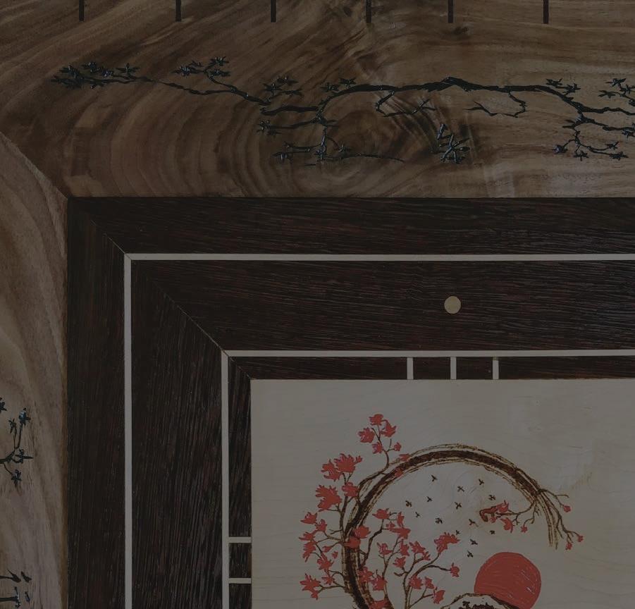
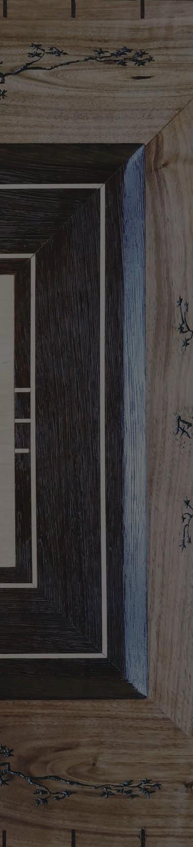
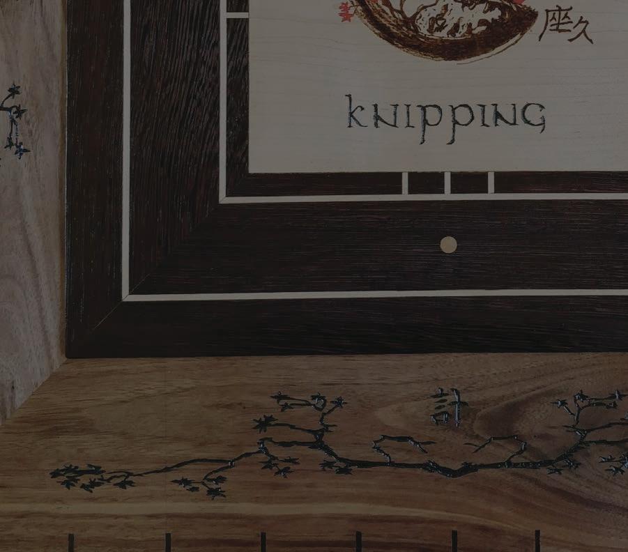
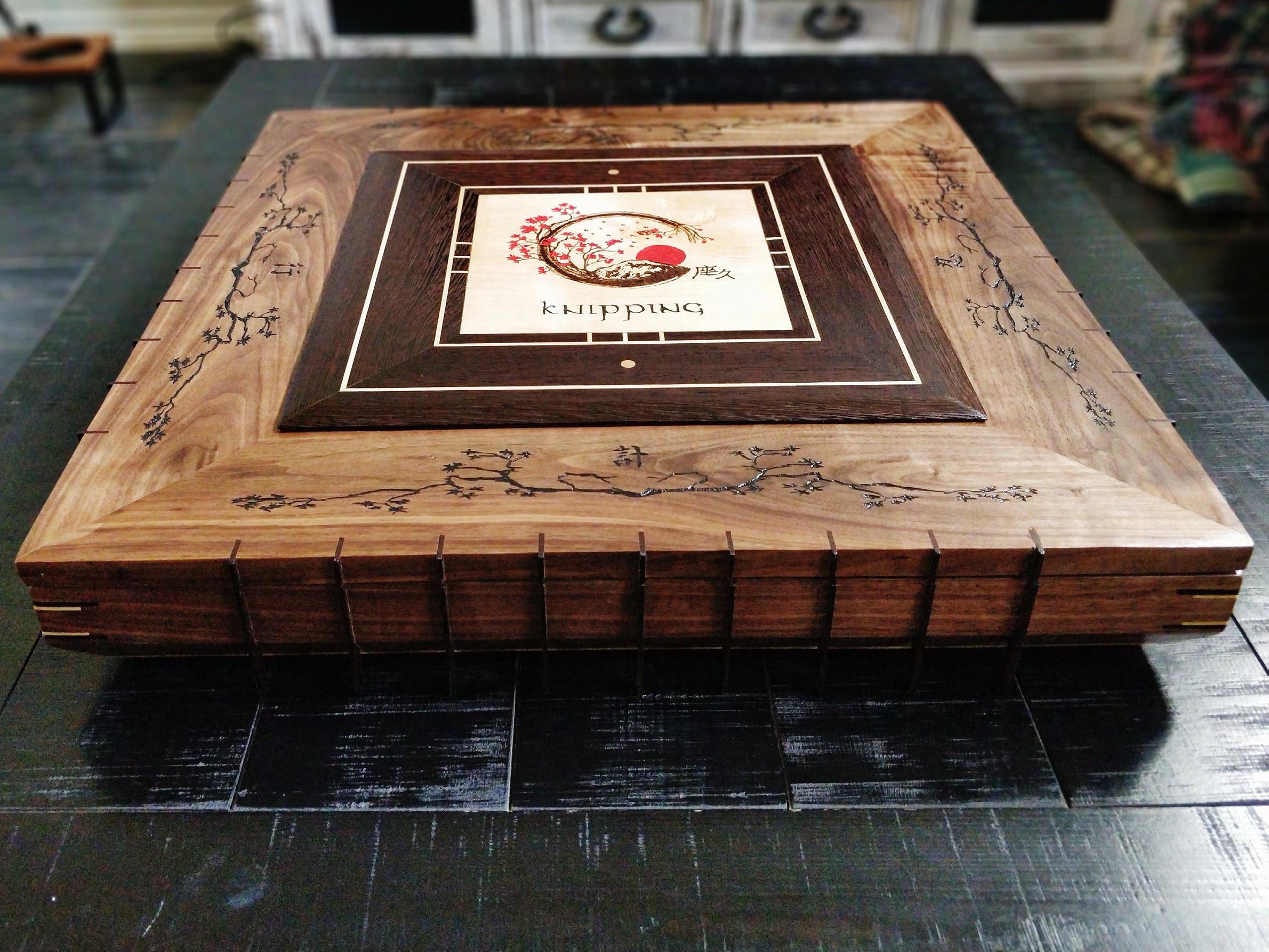
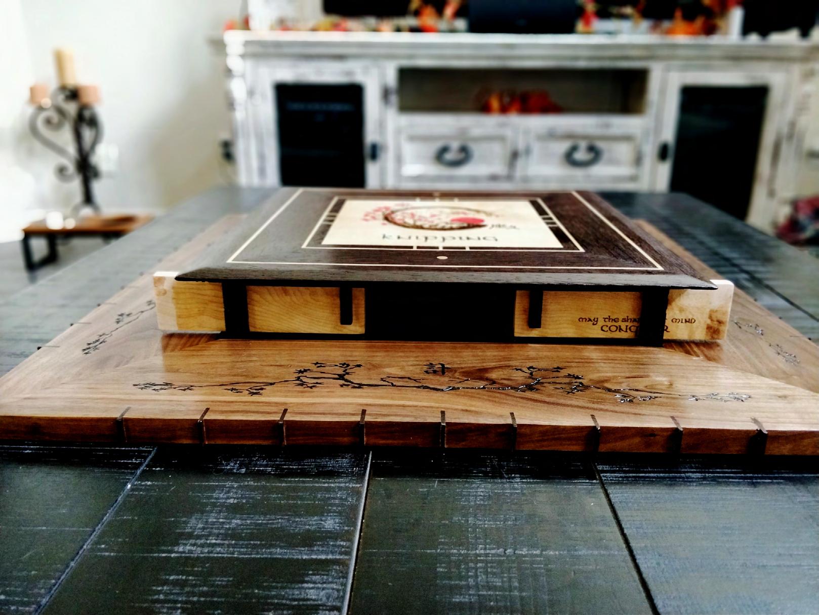
CHESS BOARD
27
28
29
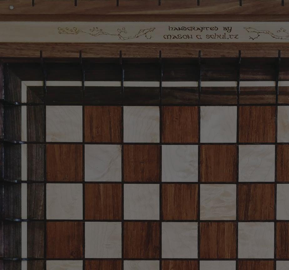
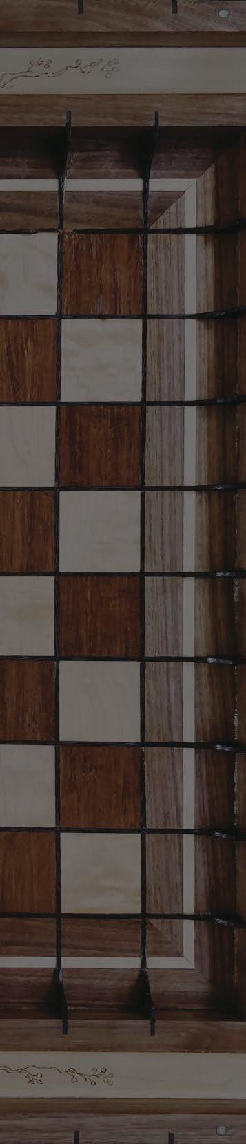
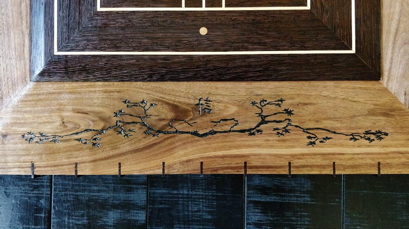
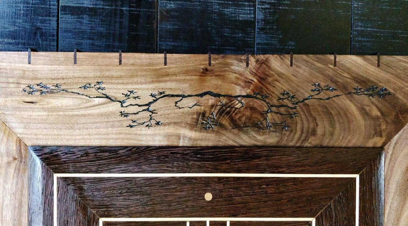
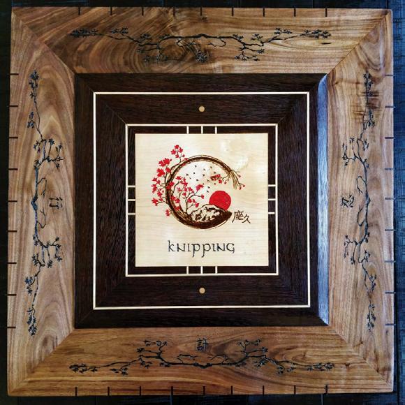
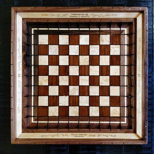
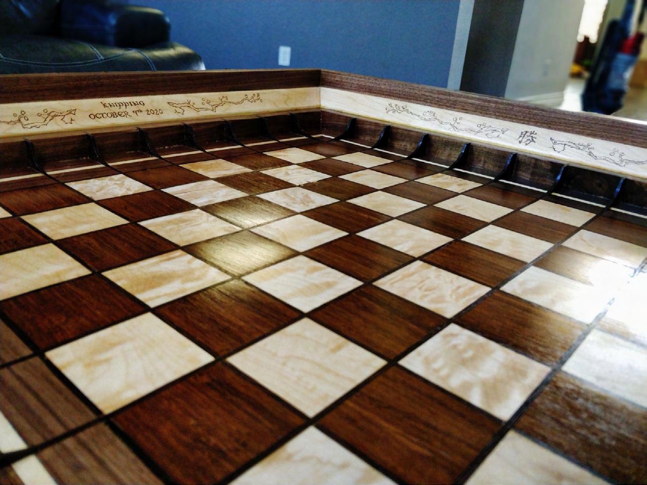
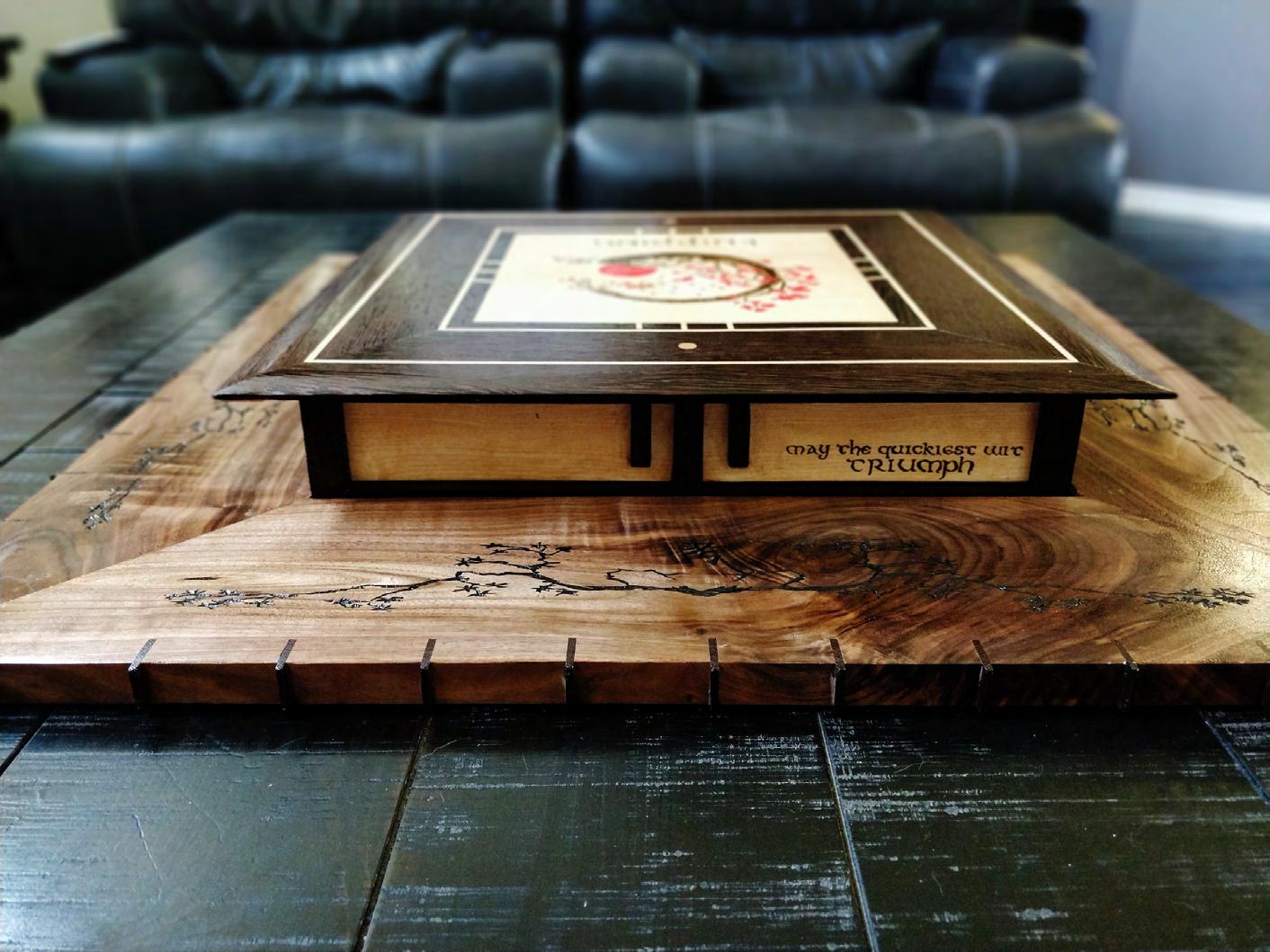
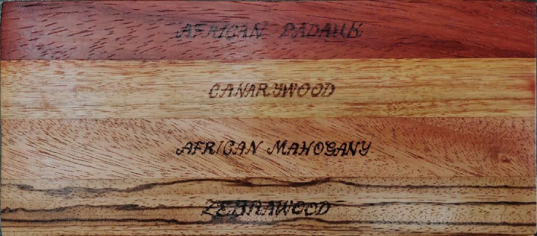
KNIPPING CHESS BOARD
Wenge, Hard Maple, Bamboo, and Walnut Wood Acrylic Filled Carvings
30

31
32
33
34
Ba si c D es ign a nd C om mu ni ca ti on s 1441 | 2019 Profes so r : An ast as iya Chybi reva -Fe nd er
35
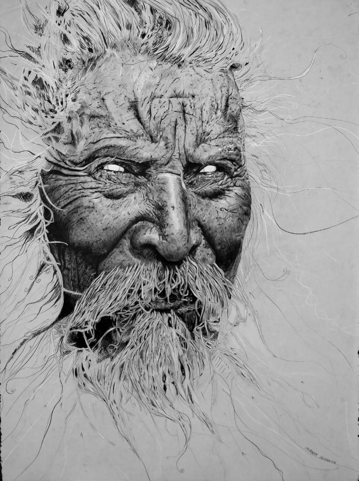
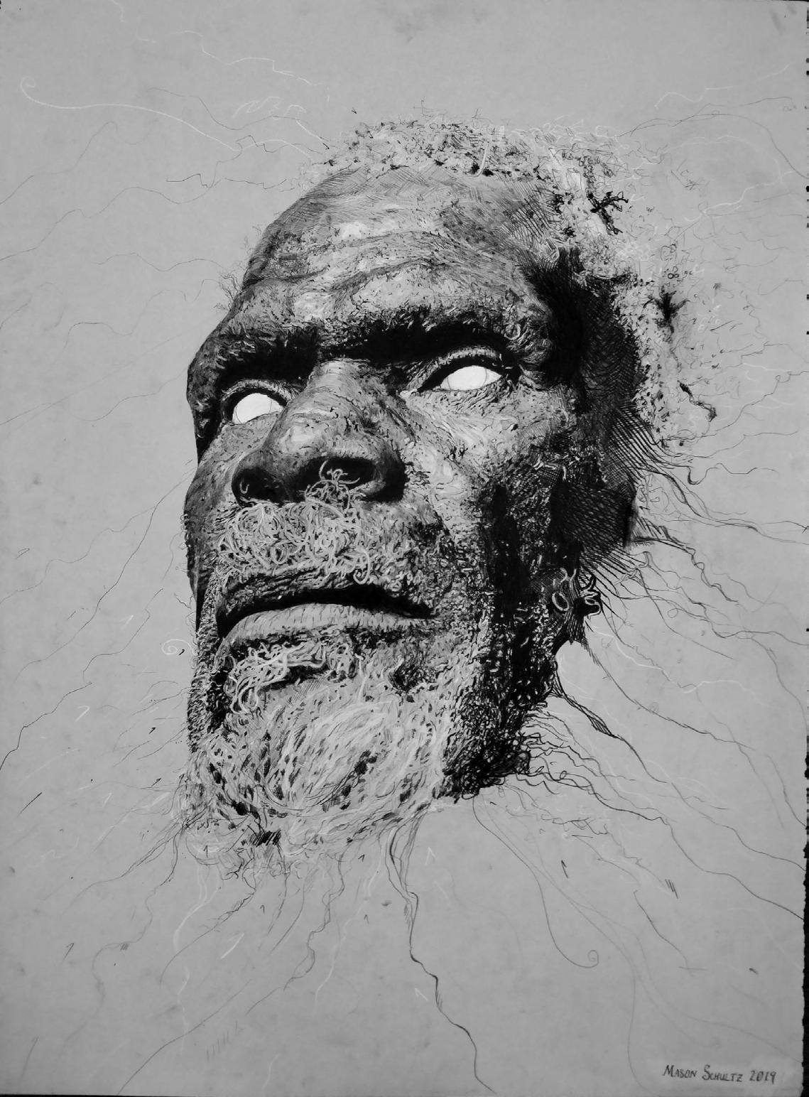
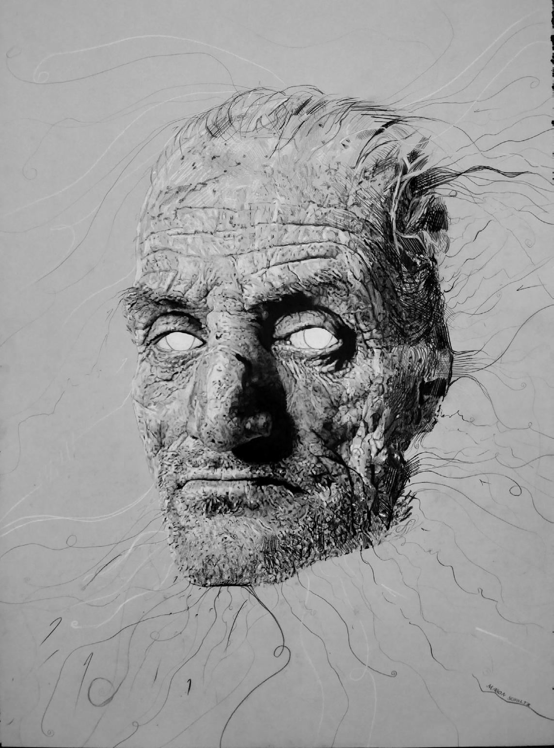
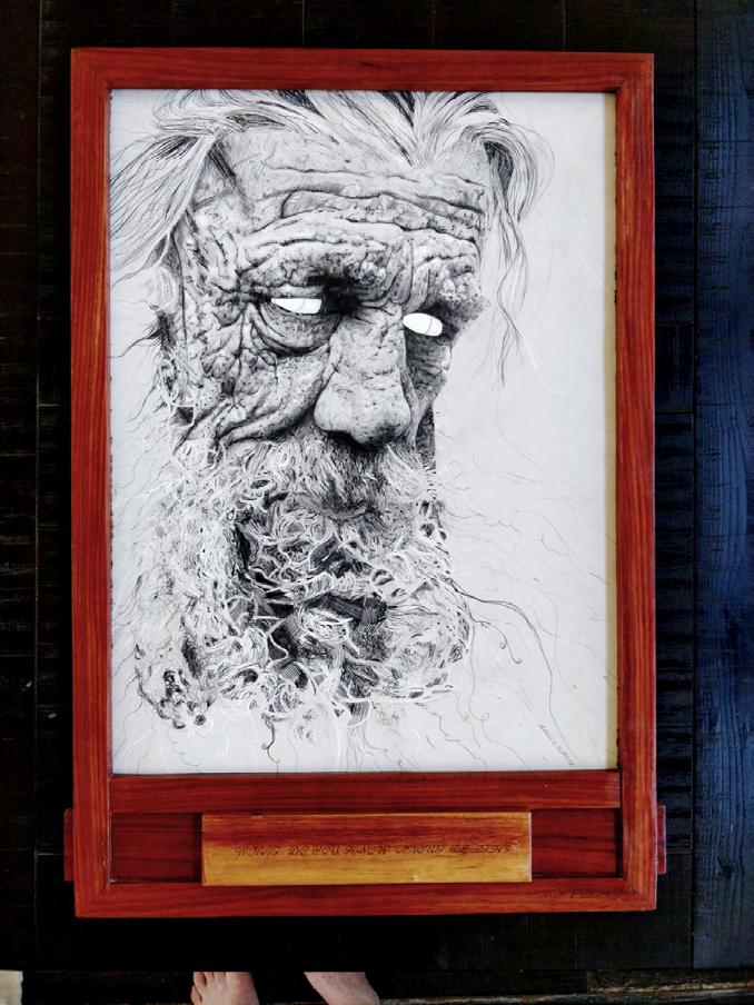
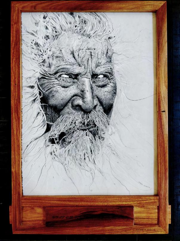
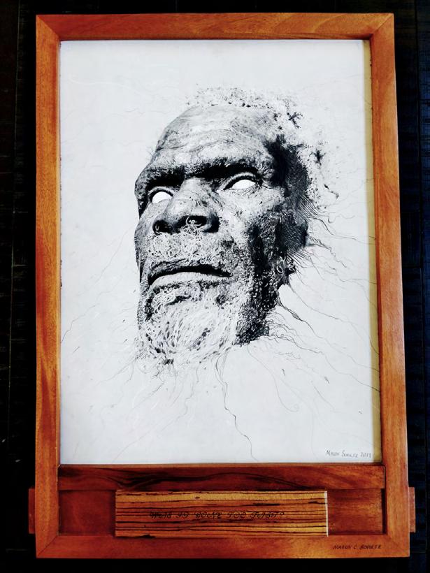
YOU TITLE IT
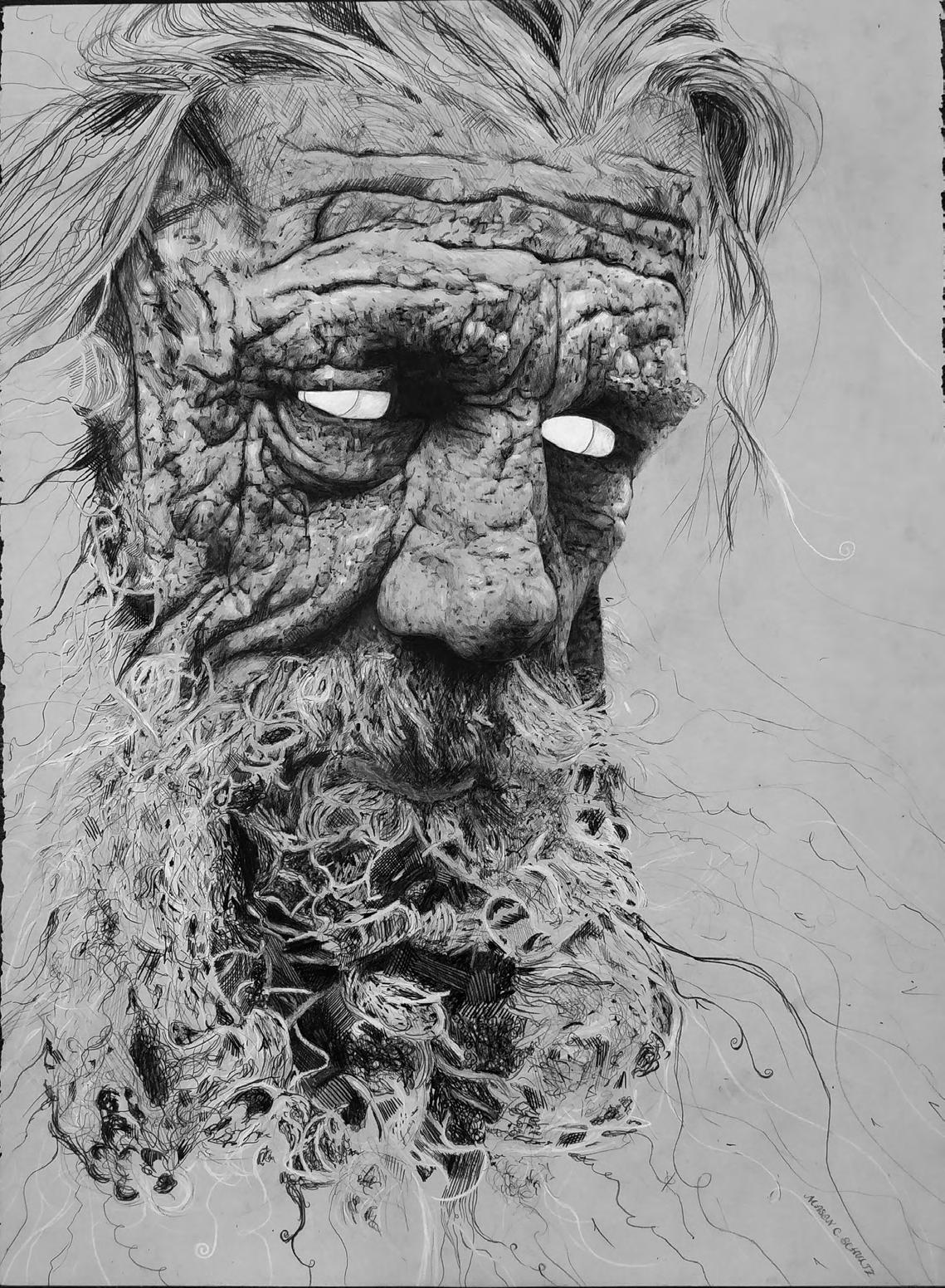
WHAT DO YOU KNOW ABOUT DEATH? 36
WHAT DID YOU LEARN FROM LIFE? 37
38
WAS IT GONE TOO FAST?
HOW ARE WE TO KNOW? 39
40
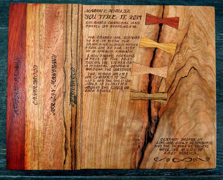
Oil-based Charcoal and Pastel on 30 x 22 Stonehenge
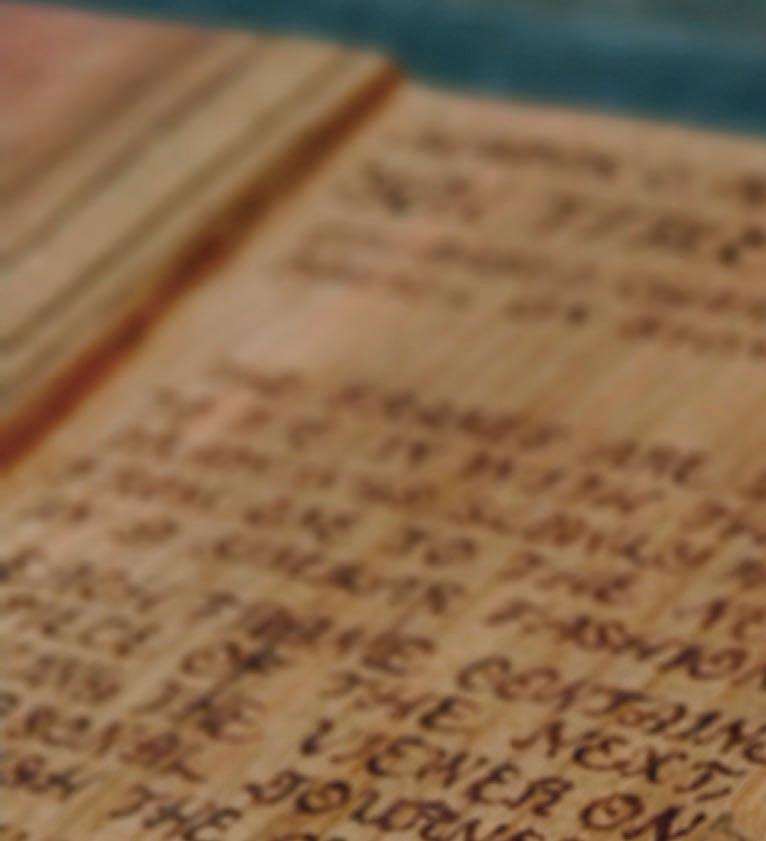
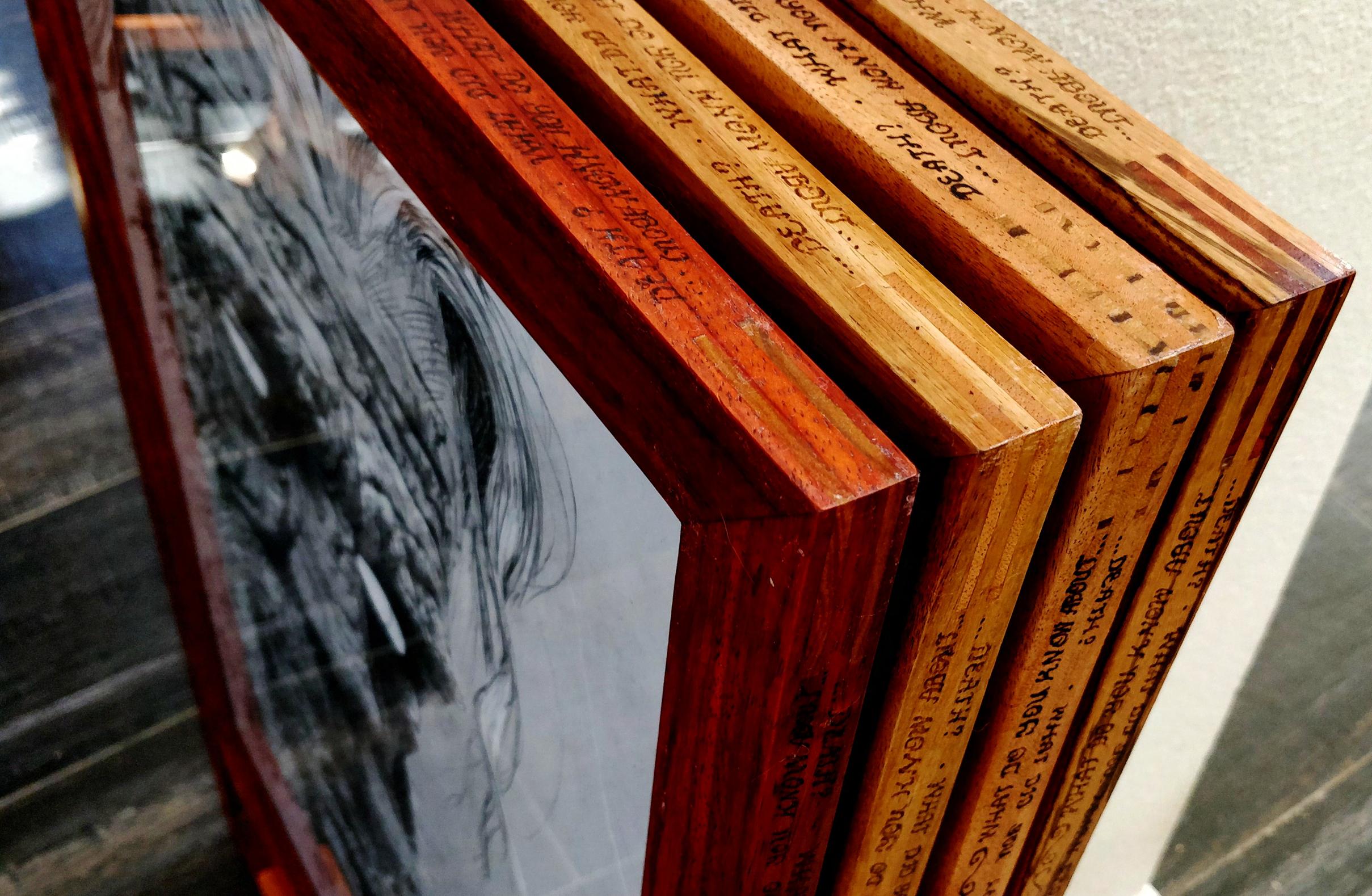
Handmade African Hardwood Frames
For this final we had an open ended prompt, only requiring that 4 full sized 30” x 22” Stonehenge pages be filled with drawings in a style chosen by us. In addition, I made 4 custom wooden frames to tie in with the rather intricate concept surrounding the drawings.
The drawings depict four portraits in an intense moment of fading away. The eyes are hollowed out in the center, creating a focus where the drawings are fully rendered. As each face fades to the edges, the drawings loosen and delve into linework. This intense transitional phase is partnered with four questions, each adorning the plaque at the bottom of the frames.
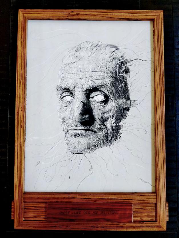
WHAT DO YOU KNOW ABOUT DEATH? - WHAT DID YOU LEARN FROM LIFE? - WAS IT GONE TOO FAST? - HOW ARE WE TO KNOW?
These heavy, open-ended questions are intended to take the viewer on a personal journey through the piece. Everyone has different experiences with these concepts, and each will interpret it differently. Thus the piece is named “YOU TITLE IT”. In contrast with the countless pieces of art that remain “Untitled”, YOU TITLE IT leaves the viewer to decide.
YOU TITLE IT
41
42

43