

DESIGN PORTFOLIO
SELECTED WORKS DESIGN & ARCHITECTURE SINCE 2019
LEONHARD MARGO
MARVIN
MARVIN LEONHARD MARGO
PERSONAL INFO & CONTACT
EDUCATION
SKILLS
ACHIEVEMENTS
Place of birth Nationality Date of birth
Email Phone 2016-2019 2019-2023
2022 2023-2025 BIM 3D 2D adobe visualization
Surabaya
Indonesian August 10, 2001
marvin.Lmargo@gmail.com +628155157157 (Indonesia) +818070149659 (Japan)
VITA high school
Surabaya, Indonesia
Architecture at Petra Christian University
Surabaya, Indonesia
International joint studio program with Silpakorn University Surabaya, Indonesia & Bangkok, Thailand kyoshin language academy Kyoto, Japan
Archicad Rhinoceros, Sketchup Rhinoceros, AutoCAD, jwcad Photoshop, Illustrator, InDesign, Premiere Pro Rhinoceros/3dsMax + VRay, Enscape, Lumion, Photoshop
WORK EXPERIENCE
LANGUAGE PROFICIENCY
2021 2021 2022 2022 2023 2023 2023 2023 Freelance
Part-time
Full-time Indonesian English Japanese
Arcasia Student Competition
Indonesia Landscape Design Student Competition
UPH 72 Hours Live Design Competition
top 3 representative for indonesia 3rd place top 15
Arcasia Student Competition
16th Petra Architecture Festival
12th Asian Contest Of Architectural Rookie’s Award
Numero Uno Best Project Of 7th Semester
Superjury Best Final Project
top 3 representative for indonesia top 15 top 10 2nd place 2nd place
Concept, design, and architectural drawings of a villa June 2023 - July 2023
Alphaville Architects
December 2023 - March 2025
Alphaville Architects
April 2025 - present
Native C2 (native level) N3
2021 2022 2023
2024 2025
CONTOUR EXPLORATION PROJECT
4th semester project
LOKA TERATAI
indonesia landscape design student competition
TUNA SATAK
BATHI SATAK
6th semester project p.4/78
KITARAN
UPH 72 hours live design competition p.24/78
GUIDES, GRID, & SLICES arcasia student competition
p.44/78
DORMITORY DESIGN PROJECT
5th semester project
BAJAU REVISITED arcasia student competition
CHANCE ENCOUNTER
16th petra architecture festival
ALPHAVILLE ARCHITECTS part time
VOID HOUSE solo project p.38/78
COMMUNITY HUB
7th semester project p.12/78
ADAPT, SUSTAIN, OVERCOME
viridi design competition
HONEYBEE
TOURISM FACILITY final thesis project
p.30/78

TUNA SATAK BATHI SATAK / SUPERIMPOSITION OF TRADITIONAL AND MODERN
DESCRIPTION
ACHIEVEMENT
CATEGORY
YEAR
6th semester project
top 10 Architectural Rookie’s Award
solo project 2022

The brief for our 6th studio was to design a building using a symbolic approach based on its location, function, and typology. Alongside having to use a symbolic approach, we were also tasked to study the design method of established architects that we think will fit our project, then integrate that method
into our design. The context of the site revealed that the area is a mix of residential and commercial zoning, combined with the historical context of the site being a commercial marketplace pushes the direction of the building function to be a combination of a traditional and a modern market. The design process
of Tadao Ando was used and his way of thinking and design methods were integrated as part of the design process. As his works makes heavy use of nature, simple geometry, and light, those elements are used in this project as a means to symbolize the movement of time from traditional to modern.
3 Main ideas are implemented in the design as a way to answer the main concept, the symbolism of a journey through time via the
linear circulation, a processional circulation, and a guiding light.
right: market perspective


JOURNEY THROUGH TIME
are gradually taken to the present, ending in a modern supermarket. This linearity symbolizes the movement of time according to the user’s movement EXTROVERT


PROCESSIONAL CIRCULATION


GUIDING LIGHT
to be a “guiding light”, symbolizing how most often nature can be seen as a calming and everlasting guide for humanity in uncertain times. DESIGN CONCEPT
The concept of duality is implemented through circulation throughout the site, where that circulation is meant to symbolize the movement of time. It is designed in a linear fashion so that users are first taken to the “past” in the form of a traditional bazaar, then they
Site circulation is designed so that users are given a view of the end “target”, then hiding that view and showing it again. This approach is used to create a feeling of being lost, symbolizing that feeling of uncertainty when times are changing in life.
Transitional areas are designed to have large skylights and transoms that let in light inside. These venestrations follow the linear shape of the circulation and so then it creates a linear ray of light that changes throughout the day and year. These rays of light are meant


tuna satak bathi satak / superimposition of traditional and modern
PLAN & PROCESS DIAGRAM
layout plan
radial space organization around central garden creates an end point and main vista
section
profile of the building is seen as a non intrusive 1 storey building because of the underground design

1. A strong outside view axis from the intersection of Raya Kertajaya Road is used as a massing guide
The circular shape of the massing can be seen through the plans, as well as the relationship between the outside “extroverted” zone that opens to the
road, as well as the inside “introverted” zone that opens up to the central garden right: exterior perspective


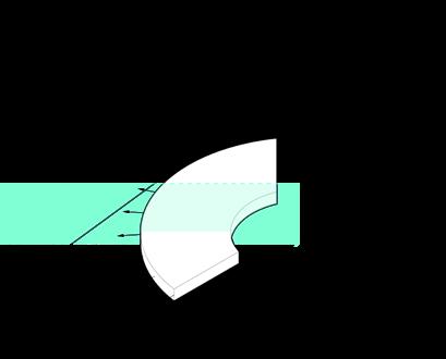
2. The basic shape of an arc is used as a symbolization of an extroverted exterior and an introverted interior

3. Massing is split into 2, creating a physical separation between the extrovert and introvert zone. The space in between becomes a transitional space

4. View from outside into the site is guided and framed using 2 massive walls to look into the outdoor space created in the middle of the site.

5. Outdoor space is put on a lower elevation so as to create a more private space.

CIRCULATION SEQUENCE

ENTRANCE

BAZAAR
The sequence starts at the drop off zone, where visitors are met with a series of parallel walls that frame vegetations on the road island. The placement of these walls conceals the central garden in the middle of the site which is the main vista.
The first indoor area is the bazaar, where there are a row of bamboo curtains used as separators for sellers to display their goods on a “tikar”, without a table. This area is designed to symbolize the most traditional form of a market.

FIRST TRANSITIONAL SPACE
Through the bazaar, visitors are taken to the transition area where they are once again shown the main vista from a higher elevation, but this time without visual obstructions. Visitors can make objective detached observations with their sense of sight.
Since the building circulation is designed in a linear fashion, a sequence is crafted so that visitors can experience the intended concept
of the movement of time as well as the showing and hiding of the central garden.

MARKET
Visitors are then directed to the market area, where traders display their merchandise on stands. Over time, traders in the market began to set up stands to be used as a place to display their merchandise and no longer displayed on mats.

SECOND TRANSITIONAL SPACE
A second transitional space separates the introverted and extroverted space, where visitors are directed to a lower elevation. Gradually being made to feel overwhelmed by the height of the space. Symbolizing the anxiety that people feel in changing times.


OUTDOOR
Visitors are opened to the outdoor area, getting closer to the main vista and central garden. Here they are again taken to a lower elevation however the space is very open, in contrast to the cramped and claustrophobic nature of the previous space.
View of the central garden at the center of the site. Visitors who at the beginning of this journey could only make detached observations objectively can now make direct observations subjectively in this area.
Portable movable stalls, also known as “pedagang kaki lima” in Indonesian, are set up surrounding the main garden. This space is created to evoke a nostalgic feeling of buying food at the side of the road and also provide a proper space for merchants.
SUPERMARKET 1ST LEVEL
View from inside the supermarket looking out towards the outdoor space. Columns offset from the ends of the building allow for floor-to-ceiling ribbon windows to bring in maximum natural light and fully open up the view.
SUPERMARKET 2ND LEVEL
View from the 2nd floor of the supermarket towards the central garden. The ribbon window design from the 1st floor was carried over and applied to the 2nd floor, once again intended to connect the vertical spaces between the garden and the supermarket.
GARDEN
GARDEN STALL

COMMUNITY HUB / KEMBANG JEPUN REDEVELOPMENT PLAN
DESCRIPTION
ACHIEVEMENT
CATEGORY
YEAR
COLLABORATOR
7th semester project 2nd place Numero Uno Best Project
group project 2022
Matthew Aristiphano

Our 7th semester studio was a collaboration between Petra Christian University and Silpakorn University from Thailand, where groups are made consisting of students from both schools, who are then tasked to design an area in surabaya of roughly 30,000 m2. The main goal of our masterplan is to
open up the currently closed lost space of the site so that social activity in the area increases. This is done through the inclusion of a marketplace in the centre, a community hub, a museum, and a condominium. After the group have finished designing the masterplan, a pair of two are then tasked in designing each of the building,
with me and my partner having the task of designing the community hub. The underlying concept of this community hub is as the main attractor of the site, as well as an area where local and outside businesses can open up shop.

The new proposed road can be used as an axis to simplify and organize the orientations of the front street buildings

A grid is established as a means to keep and reorganize the existing typologies, since the existing buildings are quite unorganized and messy

The zone is picked as a community hub since it is located at the main street, giving it full potential to be an introduction space into the site, allowing the mass to be manipulated into attracting pedestrians
Through the layout plans the gridded layout can be seen as well as the relationship between the building/shop interfaces with the open spaces in
between. The circular nature of the open spaces can also be seen where they break the monotony of the grids.
1st floor layout plan
gridded spatial orginazation can be clearly viewed with the relation to the existing arcade at the front
The language of the modular/grid design allows open spaces to be easily integrated with the circulation and the solid buildings

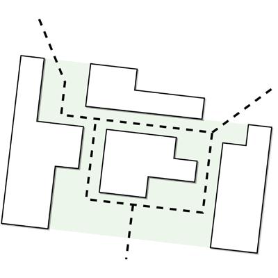
A sequence of vistas and capture points can be used instead of a direct visual connection between the main road and the plaza to create an interesting circulation

3rd floor plan
showcases the slanted 3rd and 4th floor plan as a capture point for pedestrians.

2nd floor plan
relationship between the angular grids and the circular open spaces

DESIGN CONCEPT
An axonometric view further illustrates how the open spaces are designed in such a way that twists and turns in the circulation allow it to become a much
more interesting space rather than just having a linear open space that can be fully seen from the main road.
right: hallway perspective


Initial proposed massing for the building creates a linear open space that does not interact well with the building interface

Open spaces are much more integrated with the building interface and serves a purpose to support the programs

A more interesting pedestrian circulation is achieved using a set of vistas that twists and turns and leads visitors to capture points in the middle of the site
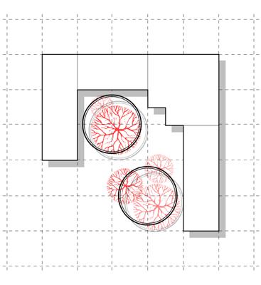
Open spaces use a much more circular typology as a means to break the grid and act as a wayfinding/ signifier for visitors
exploded axonometric view shows the relation between the indoor and outdoor spaces

PERSPECTIVE

Main perspective seen from the entrance, shows how the rotation of the 3rd and 4th floor mass not only serves as a protection from the weather, but it also
creates a dynamic space that combined with the open spaces break up the monotonous nature of the gridded layout.
As this project was selected by the faculty to be displayed at an exhibition, a 2x2 meters scale model had to be constructed. This
model shows the entirety of the designed masterplan. It also highlights the use of the existing arcade on the main 3 buildings at the front.


scale model
INTERIOR PERSPECTIVE
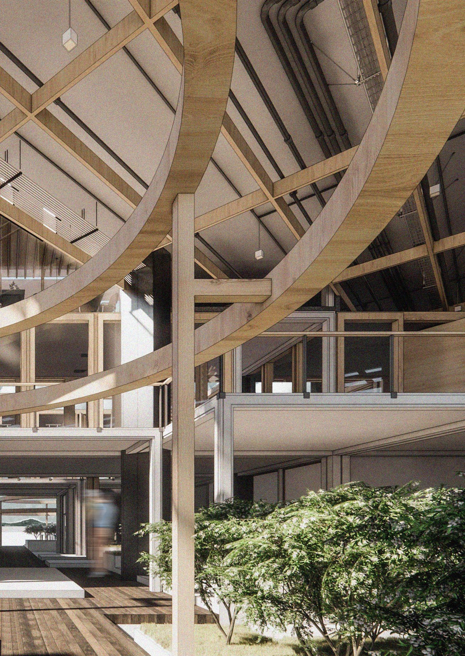
Interior perspectives of the building help illustrate the open and permeable nature of the design. Materials used are mainly wood and earth colored


materials such as concrete as an homage to existing buildings in the area.

left: cafe interior right: skylounge interior
cafe interior


top: cafe interior bottom: co-working interior
cafe interior

KITARAN / JOURNEY THROUGH AN ECHO CHAMBER
DESCRIPTION ACHIEVEMENT
CATEGORY
COLLABORATORS

The competition brief was to create an architectural exploration based on the phenomenon of the echo chamber. An echo chamber is an environment, usually in the form of news and social media, in which individuals are fed news and information that only supports their preexisting beliefs, resulting in a confirmation bias.
This is a dangerous environment since it offers no form of outside perspective resulting in a warped view of reality. Our idea is to then create an installation that symbolizes one’s journey of escaping from an echo chamber, using symbolization of colors and space. Visitors are taken into a sequence that starts in a condition
of total confirmation bias, into a space that is continuously expanding, symbolizing someone’s echo chamber expanding, ending with the symbolization of one breaking free from their echo chamber.

top: exterior perspective
Outside perspective showing the overall shape of the installation and the multicolored fabrics meant to symbolize a person’s warped point of view due to their echo chamber. While this perspective is set in a park setting, the installation is designed to be set up in various other settings.

0. STARTING POINT
The design idea originated from the relationship between 1. News that only confirm our preexisting beliefs and 2. What’s factual. We wanted to create a journey from the a. Foolish stage into the b. Overvalued stage and ends in the c. Undervalued stage.

1. EXPAND
A form of echo chamber and confirmation bias is unavoidable and bound to happen to anyone, but when we try to open our perspective, this echo chamber will expand gradually.

2. MOVEMENT
A symbolization of our journey inside the echo chamber and its expansion outside is used as a guiding block for the installation design


3. GROWTH
A series of walls arrayed around a centre point that grows outwards in size is used as a symbolization of a person’s growth, with the smallest wall used as a starting point and ending on the largest wall

4. OPENINGS
Openings on each wall are used not only practically as access, but also symbolically as a way for someone to “peek” into the next stage of expansion

6. RESULT
Installation separated into 3 stages, a. Foolish, b. Overvalued, c. Undervalued. Visitors are taken into each stage through a linear circulation, symbolizing growth from an echo chamber
FOOLISH STAGE
Symbolizing a person’s comfort zone, the use of a single red color is meant to symbolize confirmation bias and how we view the world through that distorted lens. Visitors that are inside this stage may see the trees outside as red colored, even though in reality the leafs are obviously
OVERVALUED STAGE
This stage symbolizes a person’s growth, starting from a small claustrophobic space which then gradually opens up to the outside. Multi-colored fabric is put up as a symbolization of someone now having multiple perspectives on the world, even though those
UNDERVALUED STAGE
The final stage, outside of the installation, symbolizes someone “breaking free” of their echo chamber, here they can see facts for what they are, the trees are green, the sky is blue, through their own factual observations, not through an
not red, they believe they are because of their warped view on the world. The placement of a circular seating in the middle tempts the visitor to “sit idle” and stay inside their comfort zone.

worldviews might still not be correct, it shows growth and acceptance to other perspectives. In contrast to the foolish stage, no seating is given, forcing visitors to put in the effort and walk out of their echo chamber.

echo chamber of preexisting beliefs. They can also view the echo chamber from outside, seeing the many colored fabrics that warped their worldview.


HONEYBEE TOURISM FACILITY AT BULOH SEUMA, SOUTH ACEH
DESCRIPTION
ACHIEVEMENT
CATEGORY
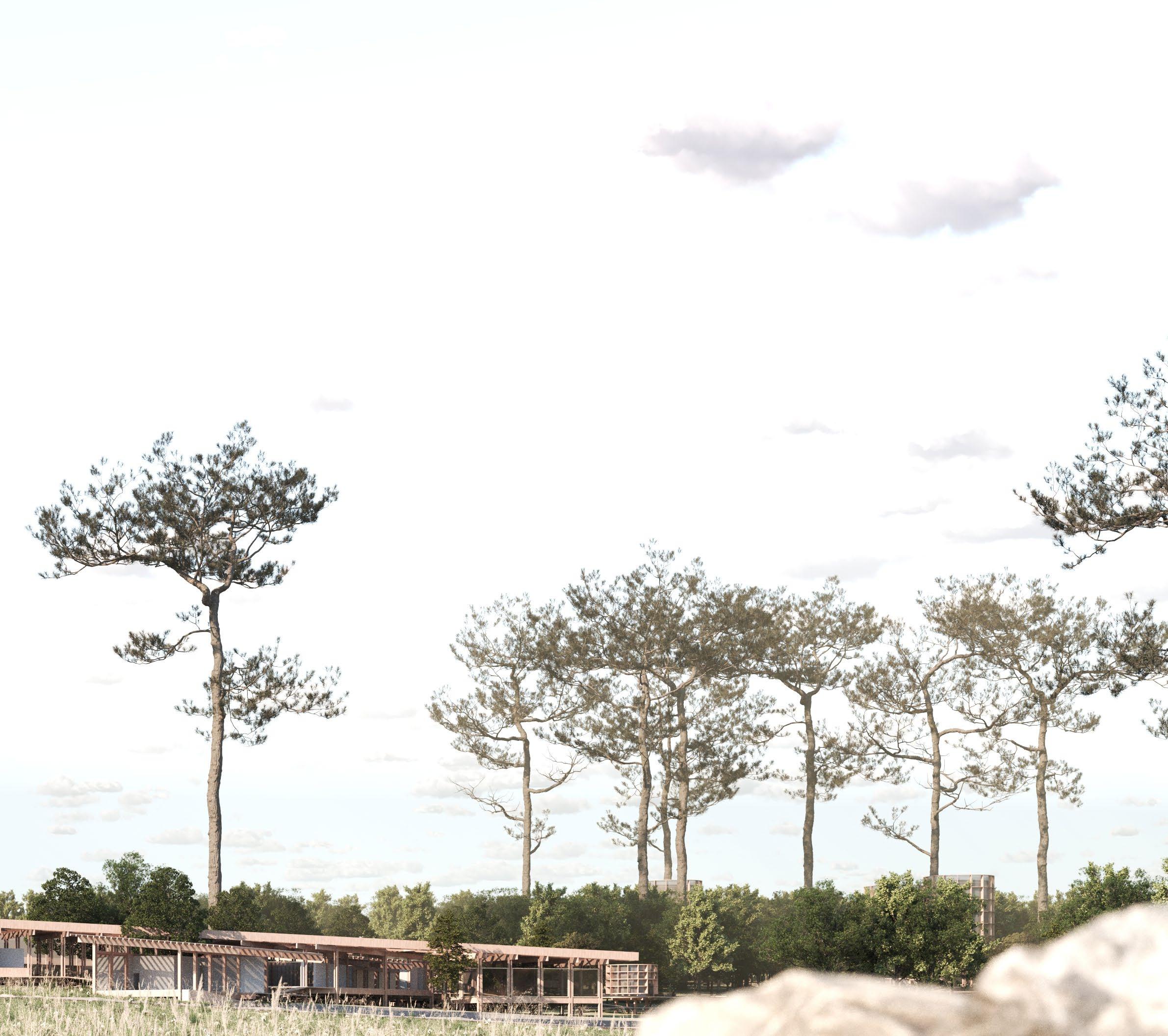
As this was the final thesis project, we were given freedom to choose the function and location of our project, as well as the approach that would be used as a guiding principle for the design. The location of South Aceh, specifically Buloh Seuma, was picked because the area has long been struggling financially as it is an isolated
town (with the nearest town being 21 km away). Despite that, this town has a very interesting beefarming culture that was passed down from generation to generation, where bee farmers and shamans would perform rituals before harvesting, which is then followed by farmers climbing an 80m tall tree to cultivate the honey.
This culture is then utilized in a tourism facility as a means of opening the town to public eyes and open up job opportunities for locals. Since the most important element of the site are the honeybees, the question arises on how to integrate the building with the existing ecosystem and to not disturb the bees. This concern is what ultimately led
to the usage of Ken Yeang’s ecodesign approach.
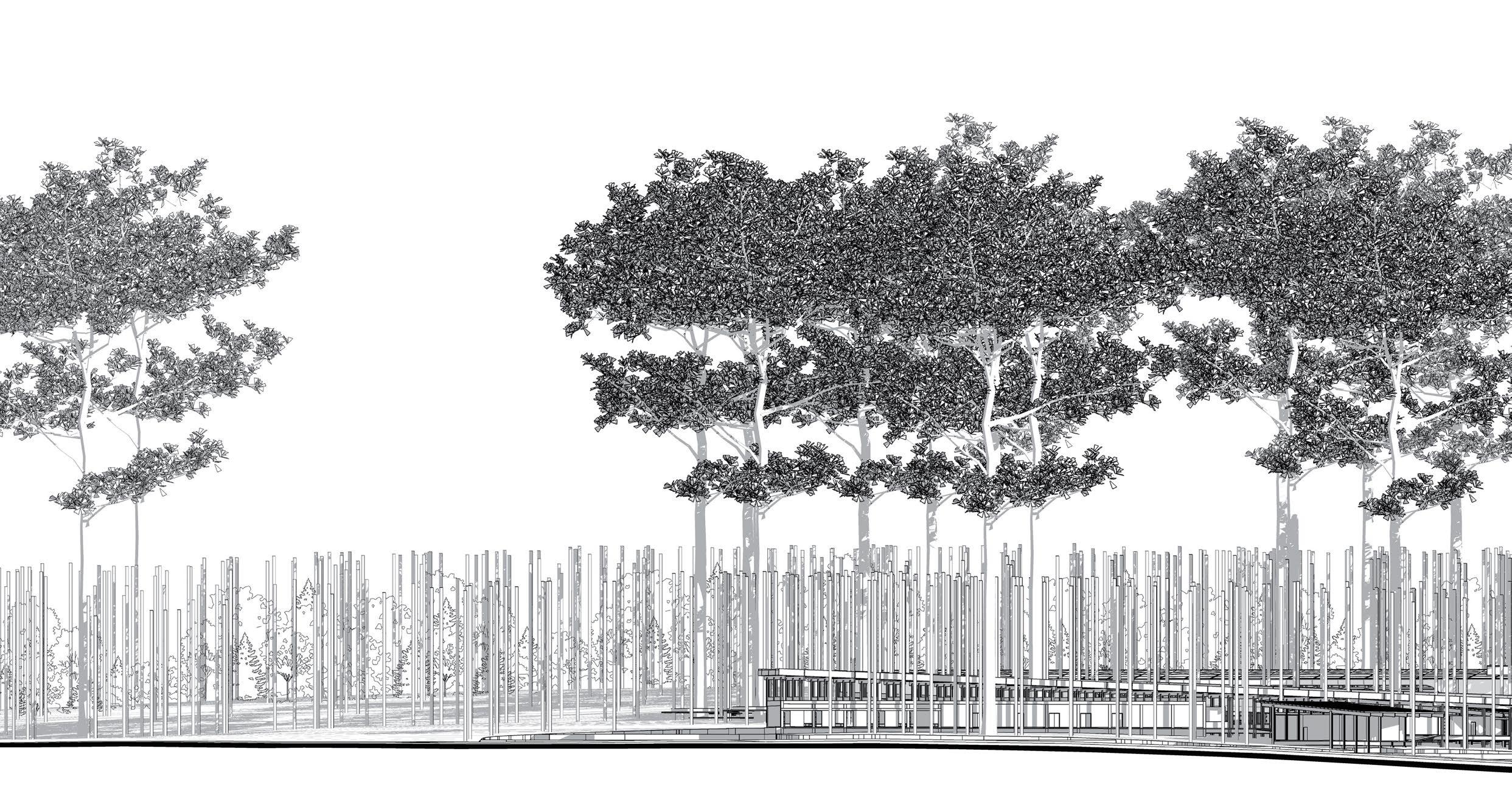
top: site elevation
South view elevation of the whole site shows the beautiful 80m tall Koompassia excelsa trees that are home to the Apis dorsata bees that have been an integral part of the Buloh Seuma culture. The building is designed to “hide” amogst the trees and not be the centre of attention as a form of respect for the site.

1. RAINWATER ANALYSIS
A grasshopper rainwater simulation was done to analyze how the site behaves when rainy season comes. This helps with zoning decisions.

2. BEE’S FOOD & WATER SOURCE
As a result of the rainwater analysis, the centre of the site was determined as a perfect spot to create an artificial retention pool to provide water & food for the bees.

3. EXISTING FOREST EDGE ANALYSIS
Further site analysis reveals that the site is seperated into 2 zones, a grassland on the west and an existing forest on the east.

4. BEE ECOSYSTEM EXTENSION
This existing forest is then extended to the west side as a way to extend the bee’s ecosystem and to create a “bridge” for them to cross over.


5. HIGH CONNECTIVITY
HIGH CIRCUITRY
Ken Yeang’s theory on high connectivity and high circuitry of artificial ecosystems was applied to the extended bee ecosystem.

6. SITE SLANT ANALYSIS & BLOCK MASSING
As the site slants downward from the west to the east, the massing was designed to follow this slope creating different elevations.

7. HONEY PRODUCTION AND LOGISTICS
Honey production and storage programmes cut through the main massing going from the forest to the main road.

8. OBSERVATION TOWERS
Observation towers are placed on the existing forest on the east side along with a nature track allowing visitors to immerse themselves in the bee ecosystem.
1. entrance 2. visitor car parking
bus parking
employee car parking
motorcycle parking
6. exit
7. drop off 8. reception 9. multifunction 10. administration
11. gift shop
12. restaurant 13. service 14. loading

15. gallery 16. farming 17. honey production 18. honey storage 19. lodging reception 20. spa
lodging restaurant 22. lodging
staff lodging 24. observation towers 25. toilets 26. retention pool
flower garden
The site zoning is split into 2 according to its existing conditions, with the east side having an existing forest and the west side a grassland. This results in the west side of the site being used for new programs that require massing, while the east side is used for a nature track.

Perspective from the central garden looking to the east shows how the use of a portal structure system creates a series of vertical elements that blend

well with the forest and helps in keeping a low profile for the building. In contrast to a massive wall that will stand out against the background
courtyard perspective


The goal of the design challenge was to create a small residence that is located in a site with a peculiar l shape. This shape causes it to be neighbouring 3 buildings, all with a clear view inside of the site. The challenge then comes from the client needs, in which they want a house that can protect their privacy from
the neighbours, yet still have access to greenery and nature, and to also have a simple circulation that doesn’t interfere with day to day tasks. To solve these challenges, the approach taken was to design a windowless building so that neighbours cannnot see activities inside. A central outdoor void is then created in
the middle of the building that acts as an ambiguous divider between what’s inside and what’s outside of the building. Since the building is windowless to the outside, the second floor bedrooms are given windows looking down to the living room and central void, creating a connected series of spaces and programs
around nature. The final step was to create a southern facing skylight that allows not only natural lighting but also natural ventilation to occur.

top: central void perspective
A solid mass was created as a means to ensure privacy DESIGN
Perspective showing the central void of the house that cuts through the building and acts as “glue” that connects all the different programs on the first floor but also as a connector for the bedrooms on the second floor.
The shape of the site was used as a guide to create a main axis
Small green spaces are created around the mass, with the north side gradually opening up creating unobstructed view


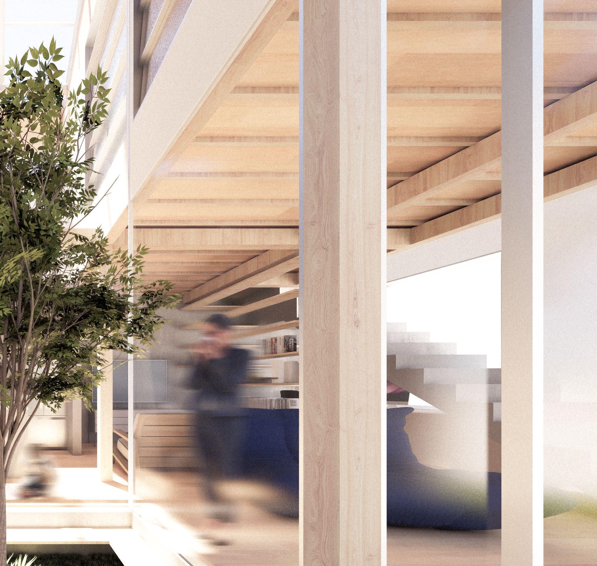


Small openings facing the green space. Plants from the north garden are brought inside the building
A void was opened to connect the first and second floor with the vegetation working as a “green bridge”
Transoms and skylights allow southern sun to come in during the winter
DESIGN CONCEPT
The addition of the central void is not only a means of connecting the space, but from a building science approach this area acts as a chimney
effect. In summer time, the first floor sliding doors can be opened, and the skylight on the second floor will be hit by direct sunlight, making it to rise in
temperature and causing a difference in pressure between the top and bottom part of the building. This pressure difference will then create air movement,
Sectional diagram shows the main concept of the central void design. Perspective drawing on the right shows how the skylight in combination with
the clerestory ribbon window creates a beautiful and naturally lit hallway that connects to the first floor.
right: hallway perspective

naturally cooling the building. Whereas in winter time, sliding doors on the first floor can be closed, eliminating any air unwanted movement, while the southern
facing skylight allows warm winter sunlight to come in.


GUIDES, GRID, & SLICES / A PROPOSAL FOR A MORE WALKABLE CITY
DESCRIPTION ACHIEVEMENT
CATEGORY YEAR
COLLABORATORS
Arcasia Student Competition top 3 representative for Indonesia team competition
Adrian Michael Wahyudi, Aprila Pallas, I Komang Adriel Ramana Putra, Mateus Sampurna Hidayat

The main concern of the competition was on the phenomenon of the 15 minute city and the many ways that we can achieve it in our own city. We then started by analyzing our own city of Surabaya, and what we found was that the existing condition of the city is quite accomodating as a 15 minute city, the only problem is that
sidewalks are terribly underdeveloped.
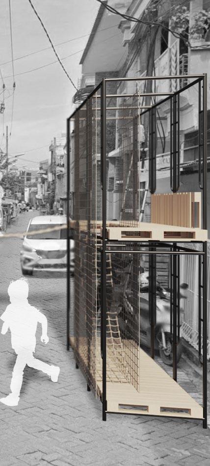
This is then picked as the main concept of our design, where we try to create an installation that can increase the walkability of the city by becoming sidewalks. We achieved this by using discarded scaffoldings are wood palletes, essentially turning them into a modular
sidewalk that can be modified and placed anywhere in the city. Not only does this increase walkability, but because of the modular nature of the design, people can modify them to become a pseudo art gallery, a place to sell street food, playgrounds, etc.


DESIGN CONCEPT
Superimposed collage perspectives showing the different ways that the modules can be utilised. The image on the left shows a children’s playground
alternative, while the image on the right shows a walkway alternative with vegetation planters on the top.

bottom: playground module
right: vegetation module

BOOK STRUCTURE
This book was designed with a baseline grid of 12pt, 5 96pt wide columns with a 12pt gutter in between, and a modular grid of 96pt x 96pt with 12pt gutters around. All texts, images, graphics, diagrams, and everything in between is placed inside this grid with the exception of the main render images at the start of every project and some perspective renders which are extended to the edges of the page for accentuation.
1 Typeface is used, Nimbus Sans, for body text set in 10/12, for caption text set in 8/12, and for title text set in 30/24.
