MARTINA TERRY
VIRGINIA TECH INTERIOR DESIGN PORTFOLIO FALL 2024


Fall 2024 | 12 Weeks
Revit | Enscape | Photoshop
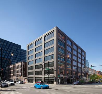
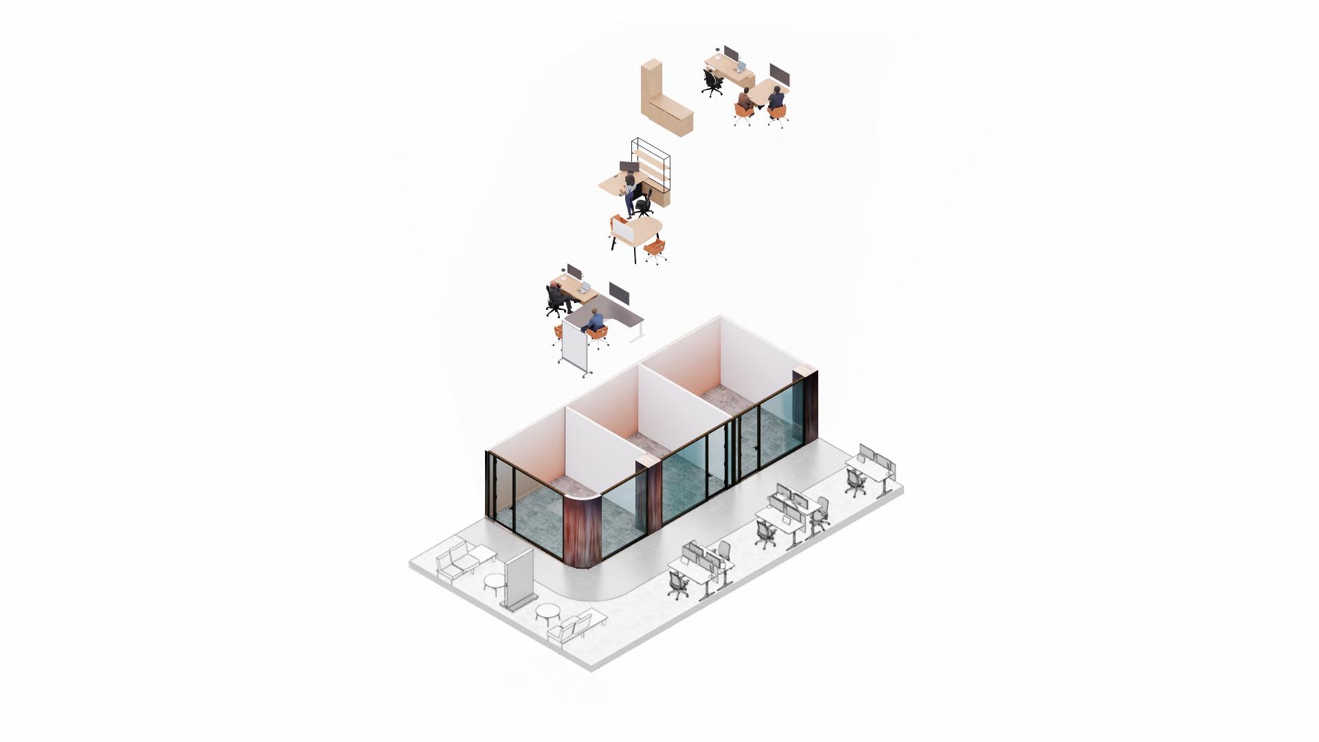
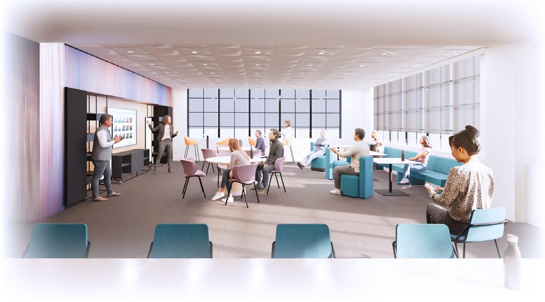
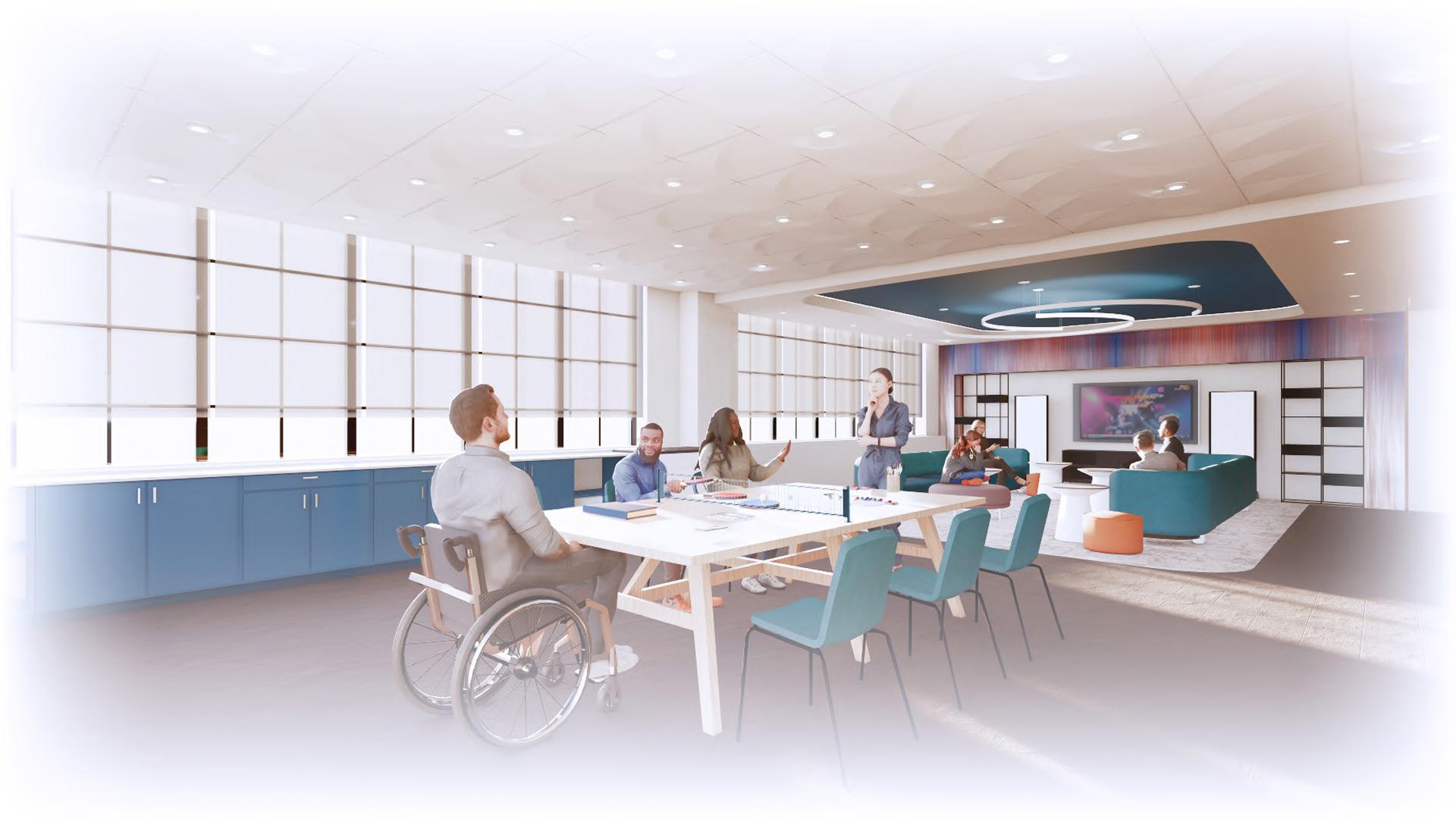
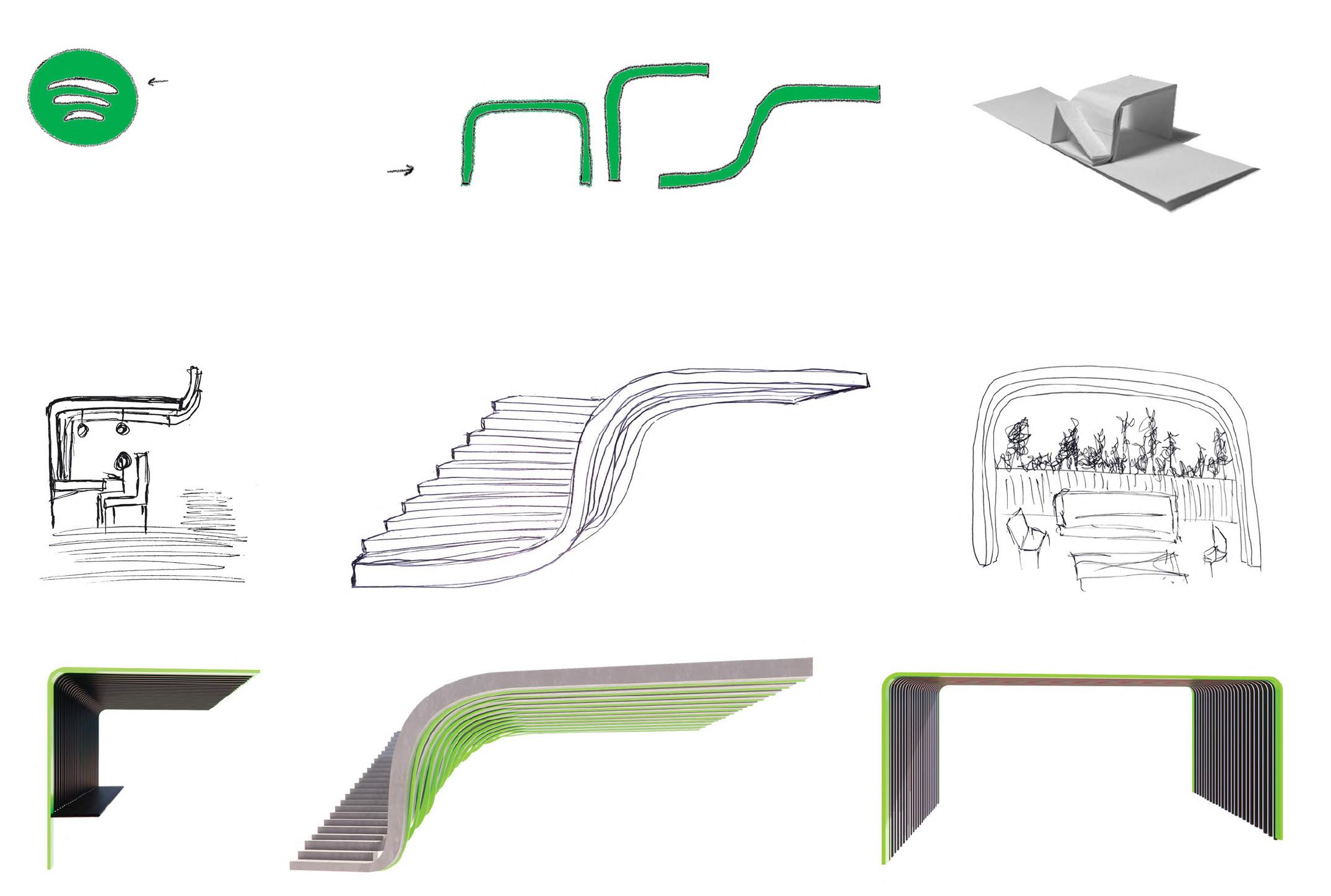
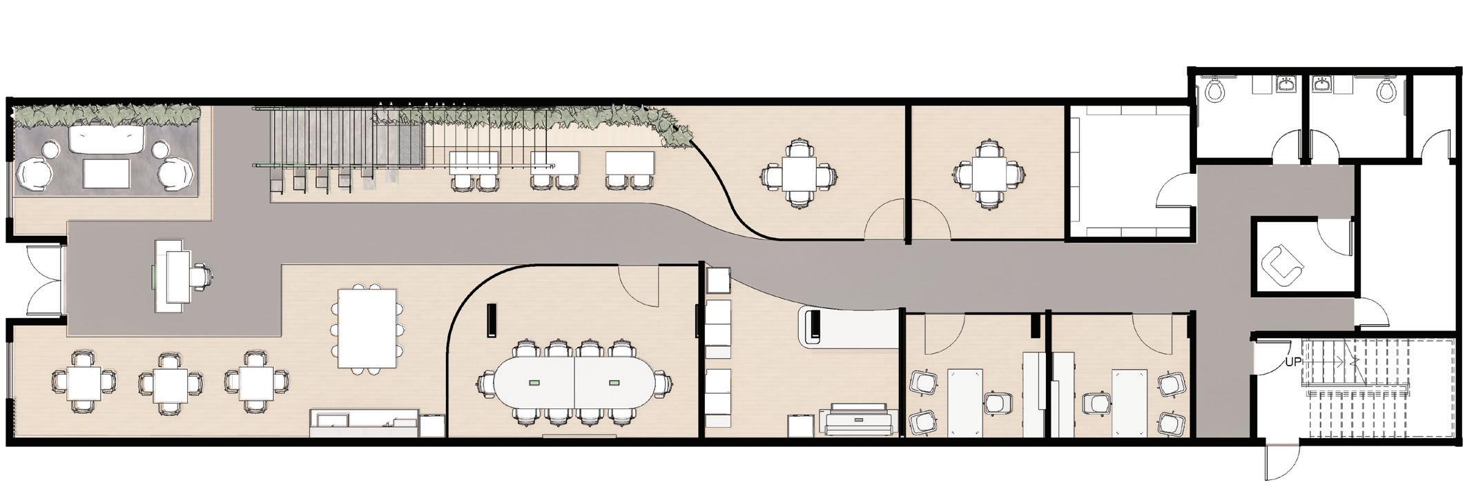
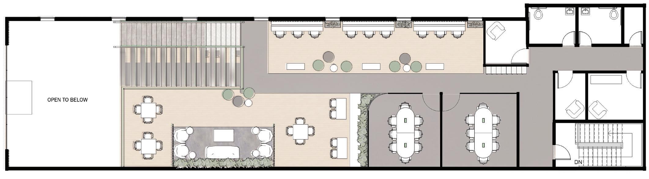
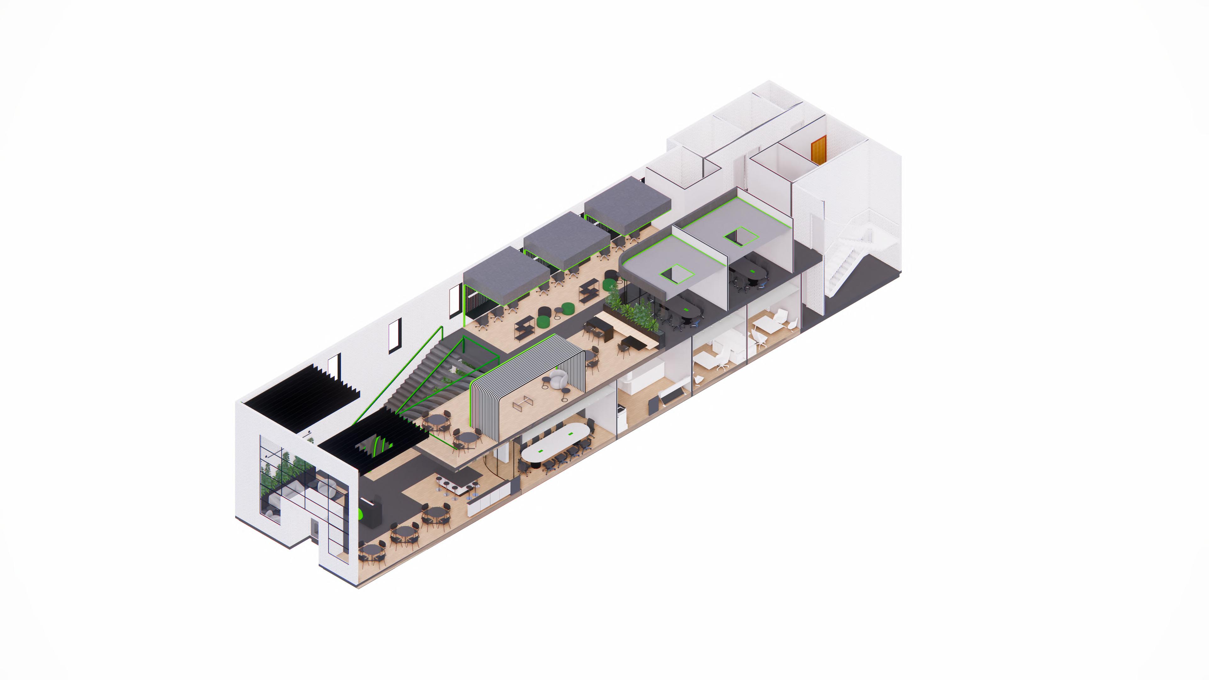
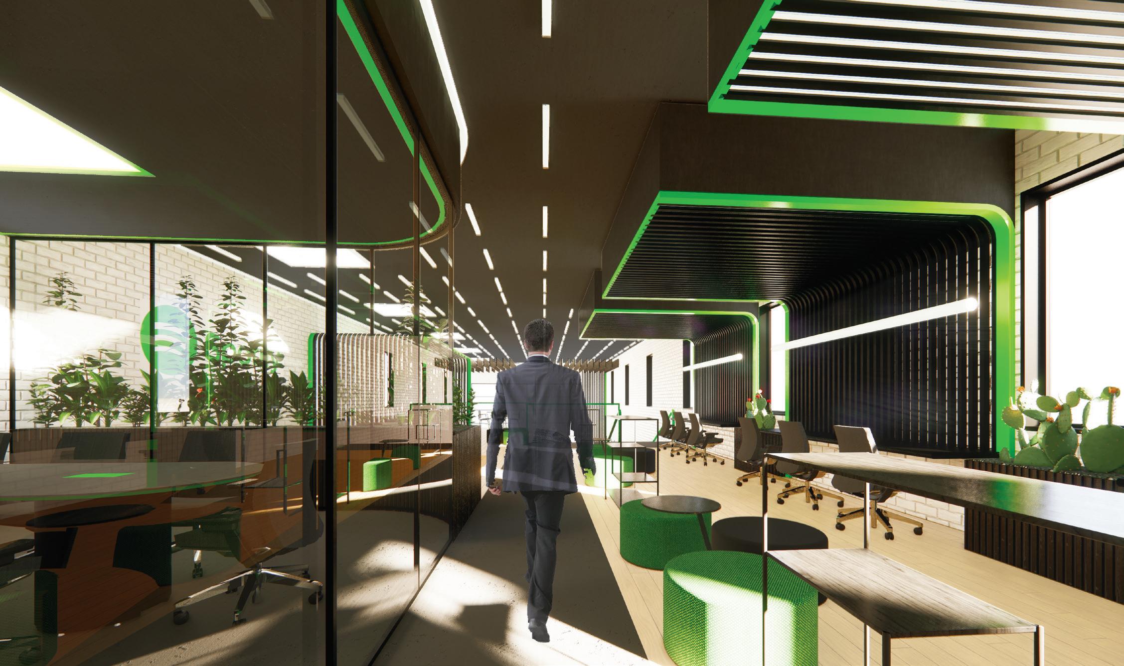
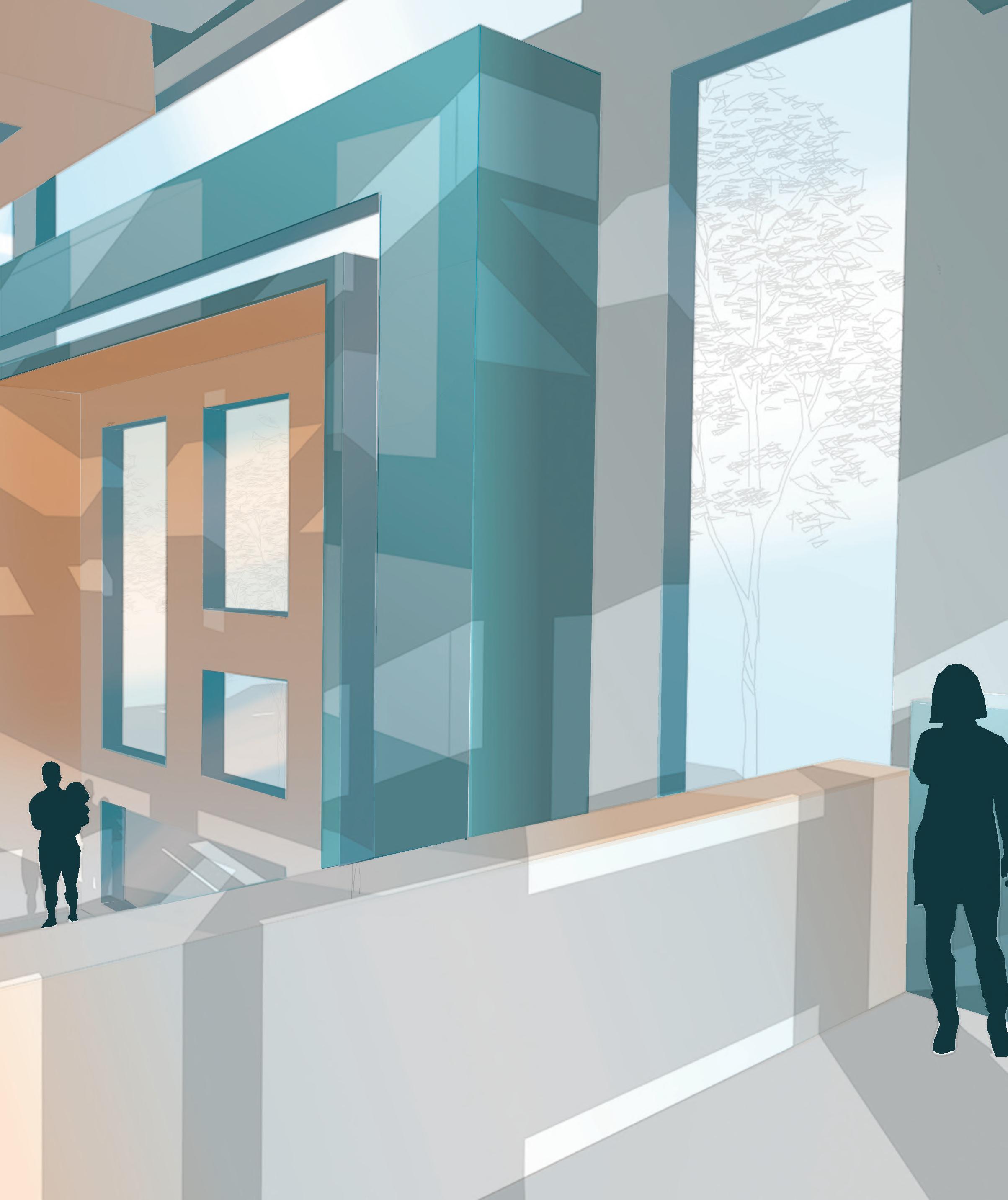
NEXT Advertising Agency, sponsored by Steelcase, prides itself on it’s employee culture and passion for breakthrough creativity. Within this workplace the growth and flow of fire motifs embodies the community and creativity of the employees, as well as, the quality of work provided for NEXT’s clientele. This lively workplace provides top tier amenities, ergonomic settings, and a wide range of user choice to support the well-being of it’s users.
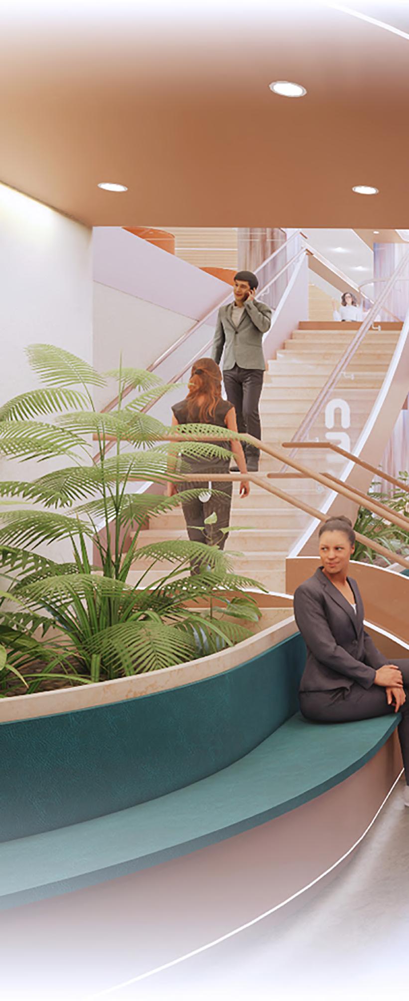
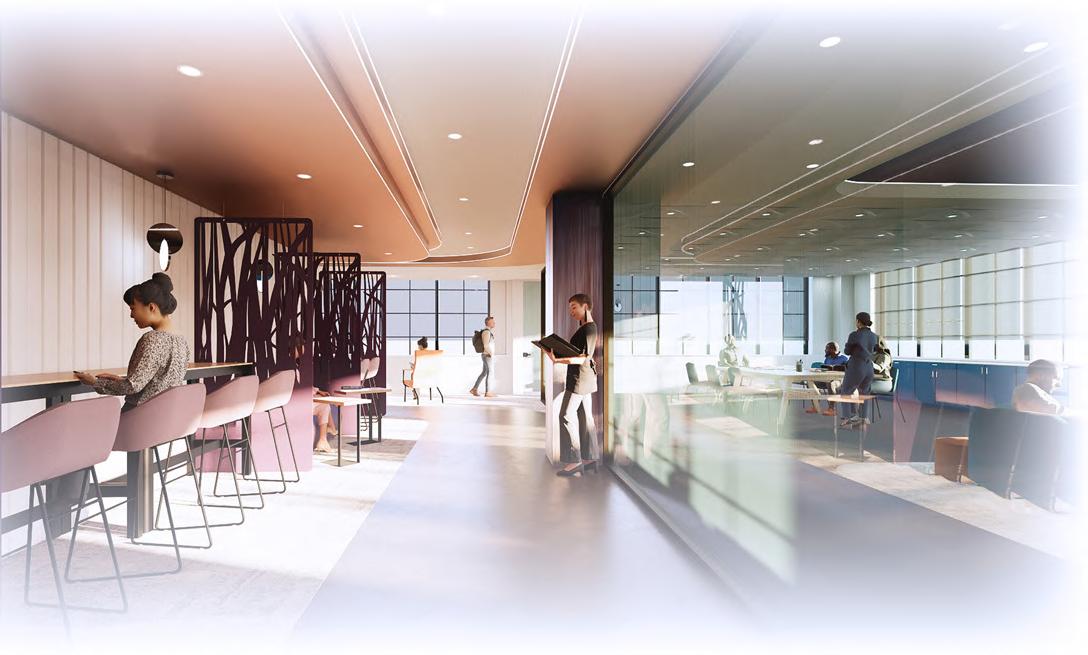
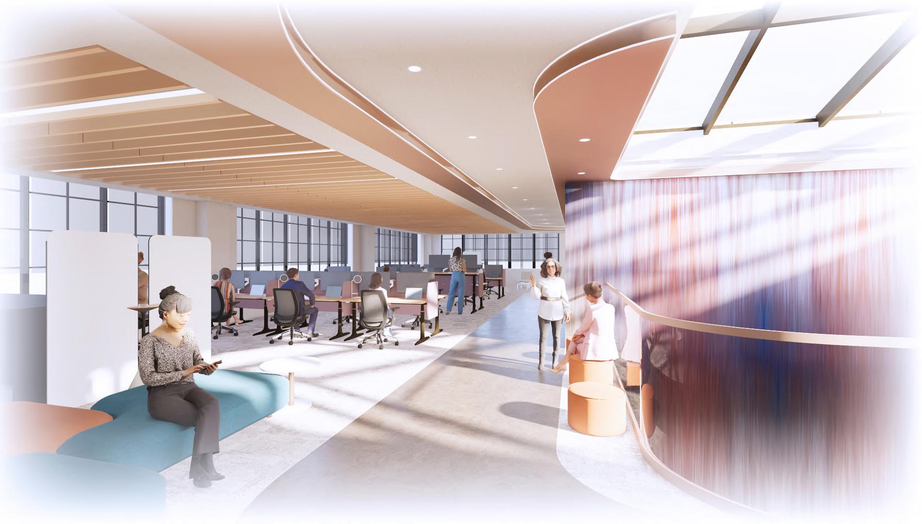
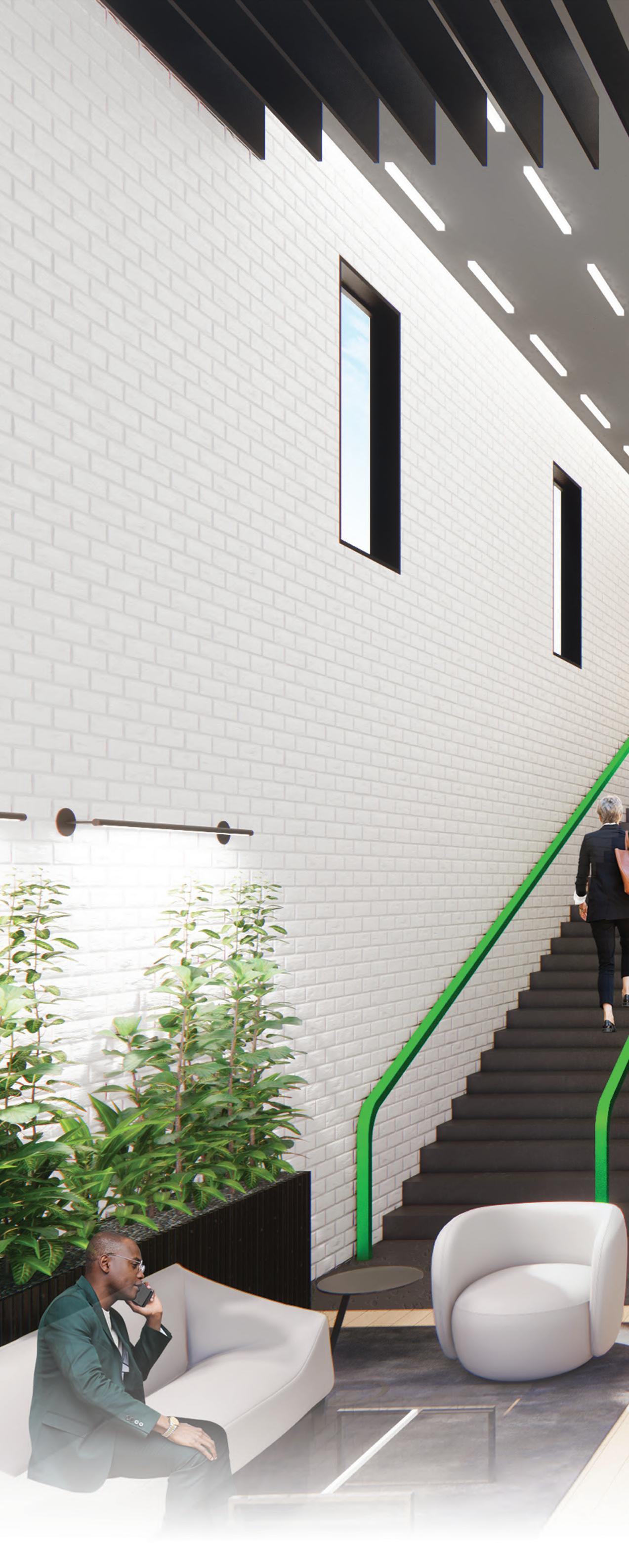
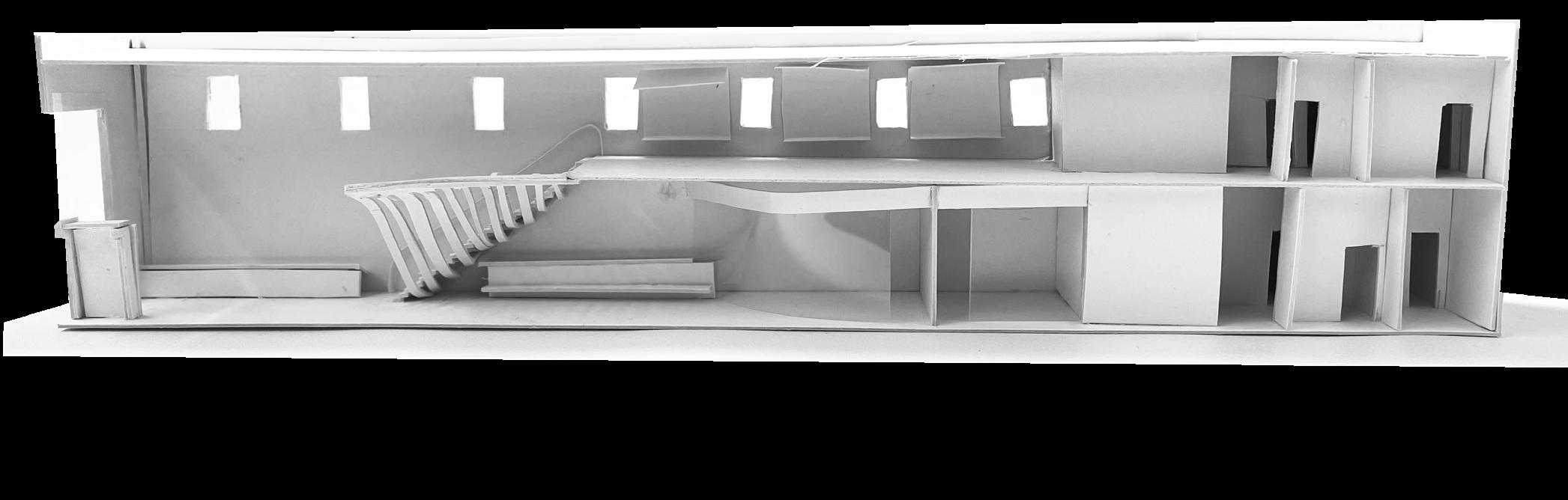
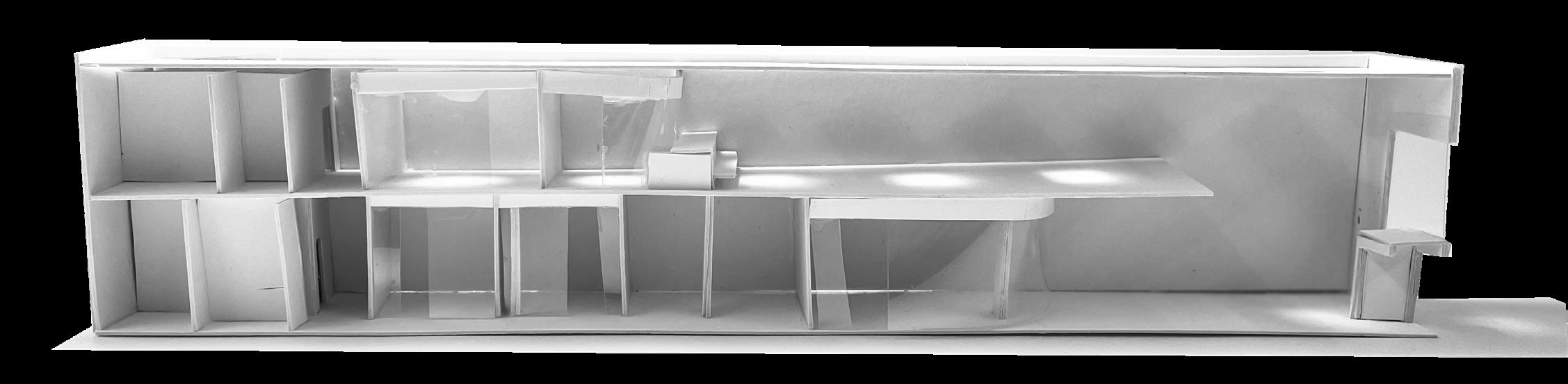
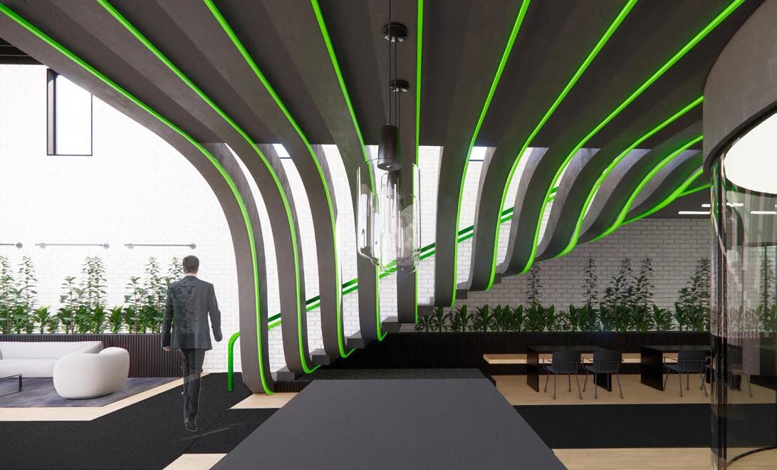
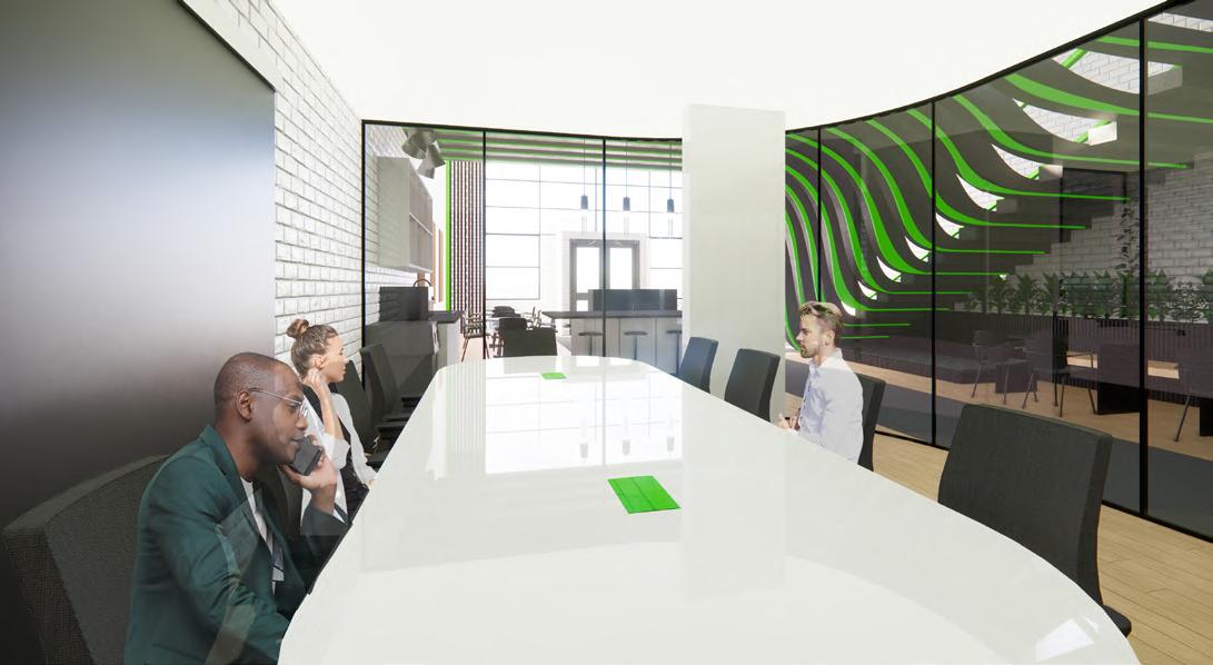
The Great Chicago Fire of 1871, while devastating, acted as a catalyst for major advancements in fire and building code. Much like this event, the growth and flow of fire embodies the path taken by NEXT employees, who have a burning passion for breakthrough creativity, and never fail to push past their limits. Within this workplace, the dynamic energy of fire is represented by multiple elements that feature soft, yet irregular bends. These repeated bends act as way-finding, lighting, furniture, and circulation to allow for the cohesive experience for all. The goal is to pull the users through the space, encouraging collaboration and growth.
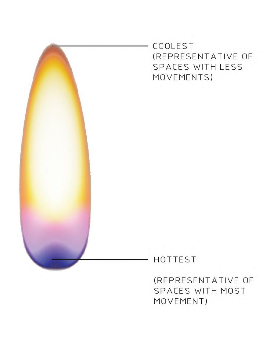
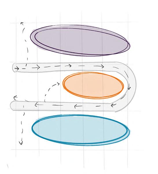
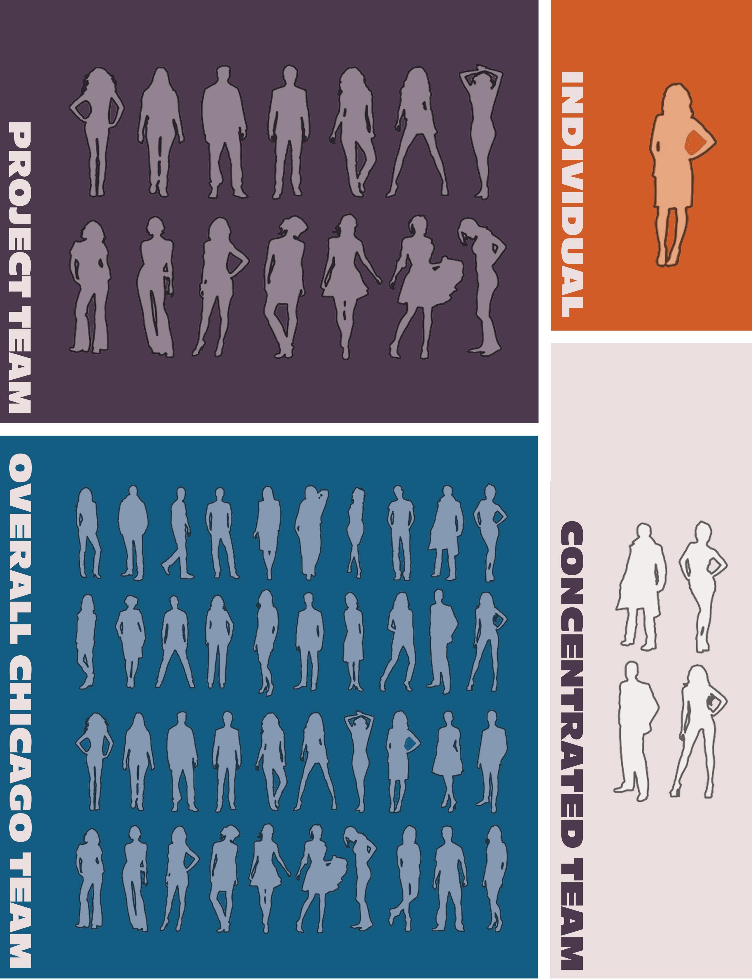
The color scheme is pulled directly from the structure of a flame with teal being the hottest, representing the most collaborative area; orange being the coolest, representing the calmer, individual areas of the interior; and purple being a middle ground for small group settings.
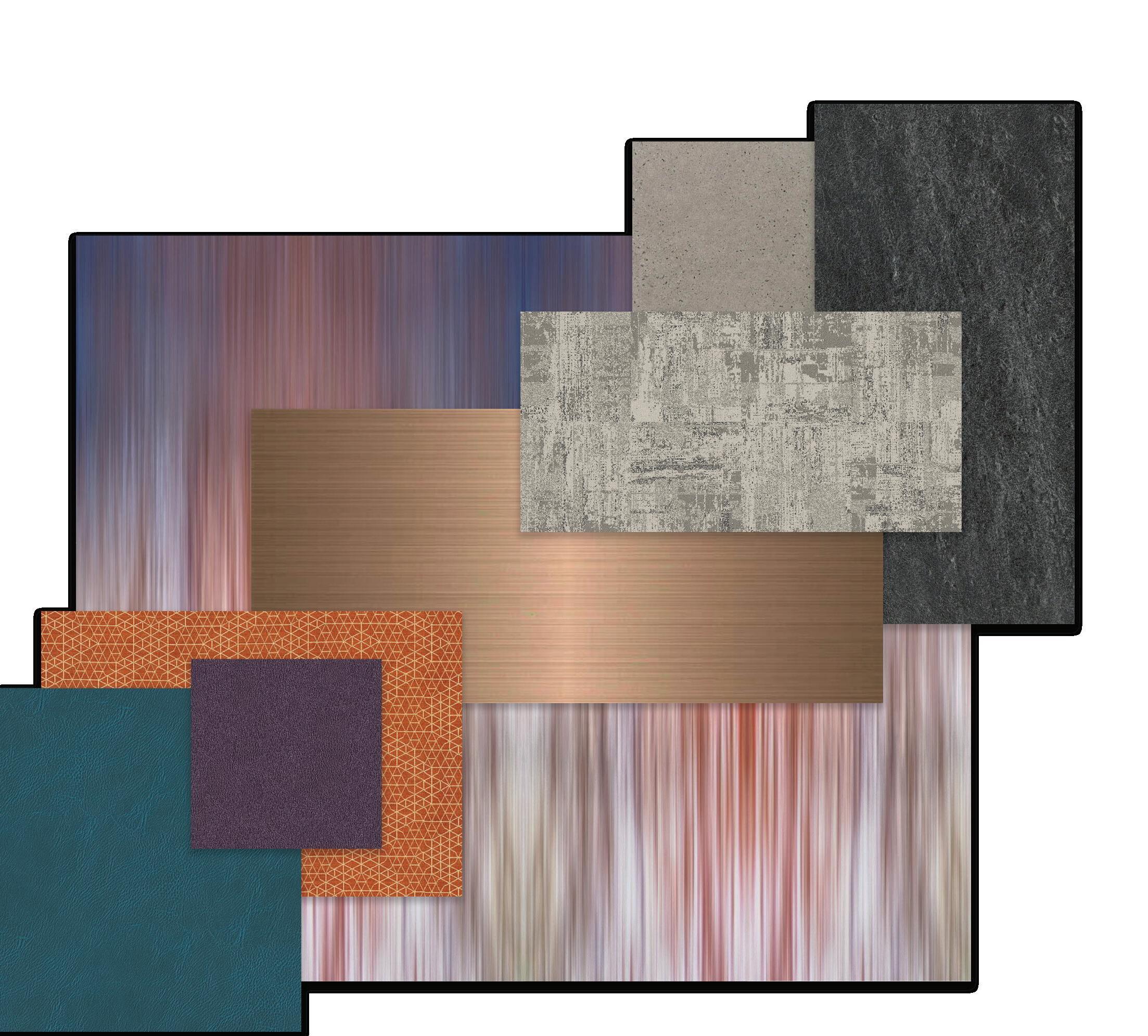


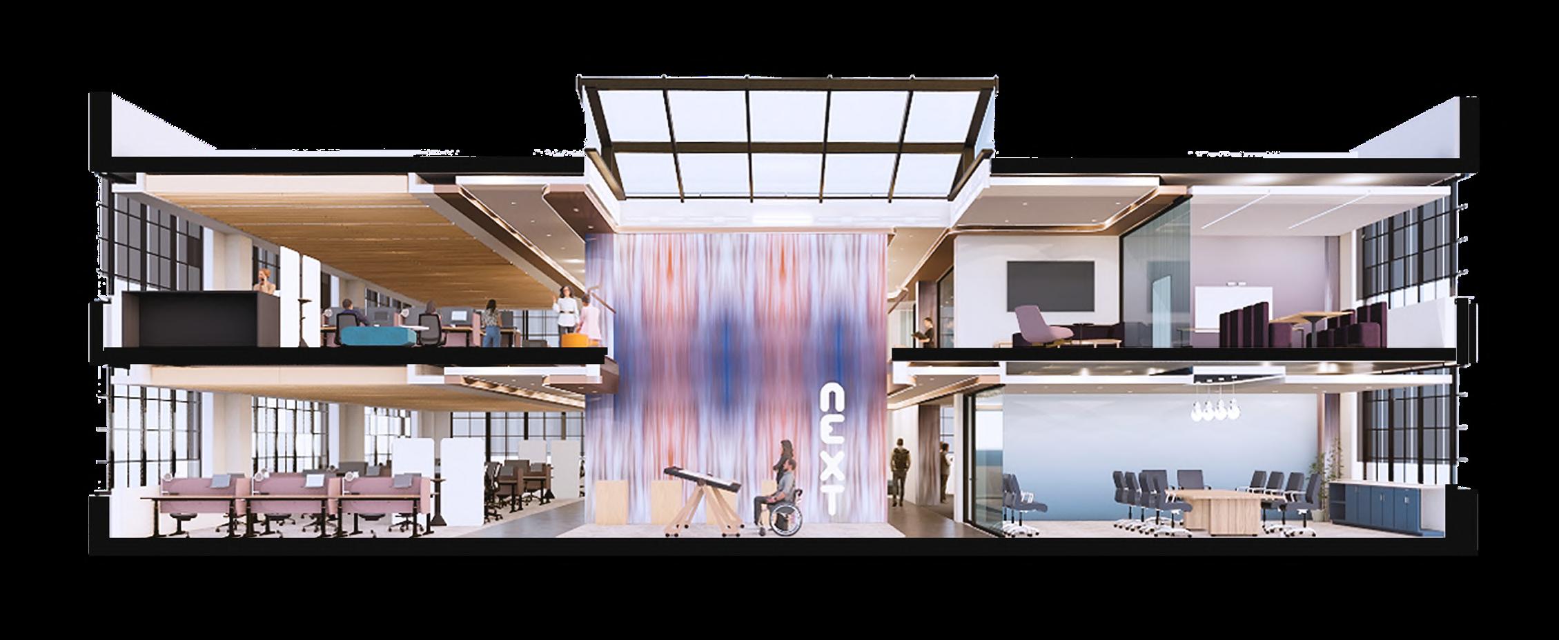
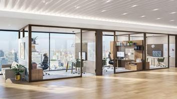
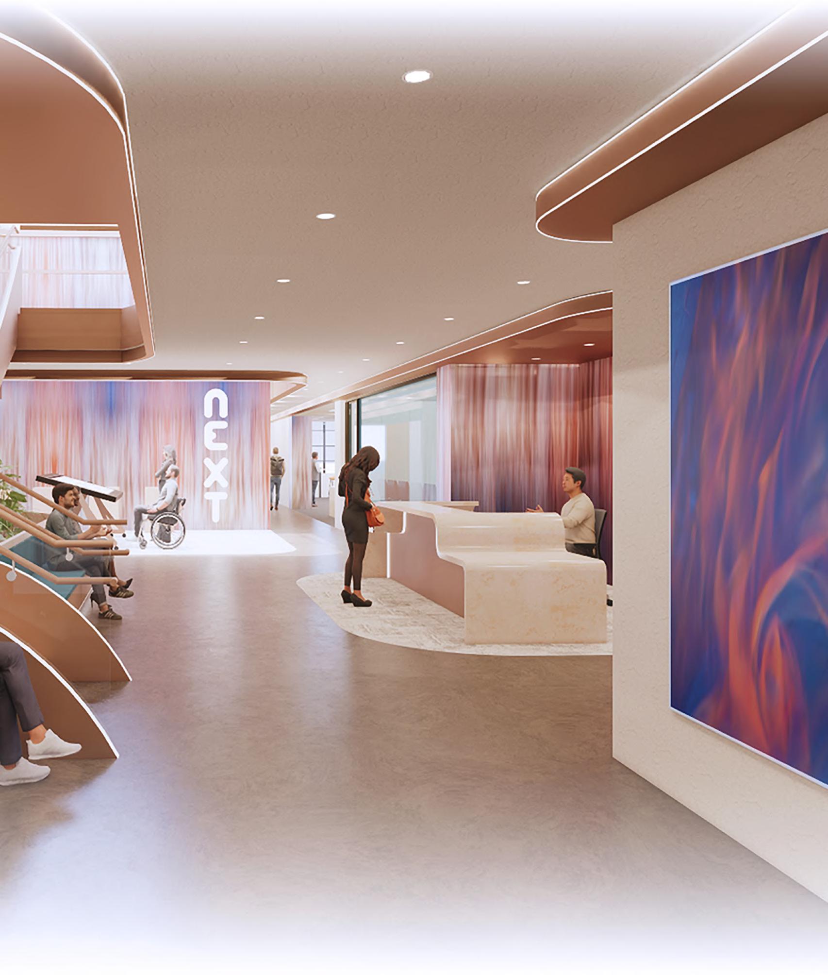
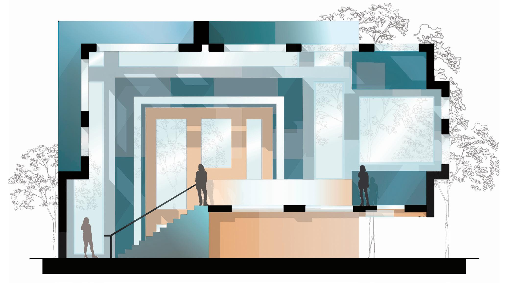
Representing the concept as a whole a bronze soffit with LED lighting engulfs the space with irregular movement. This feature acts as a driver for creativity and invites the user to explore the space further.
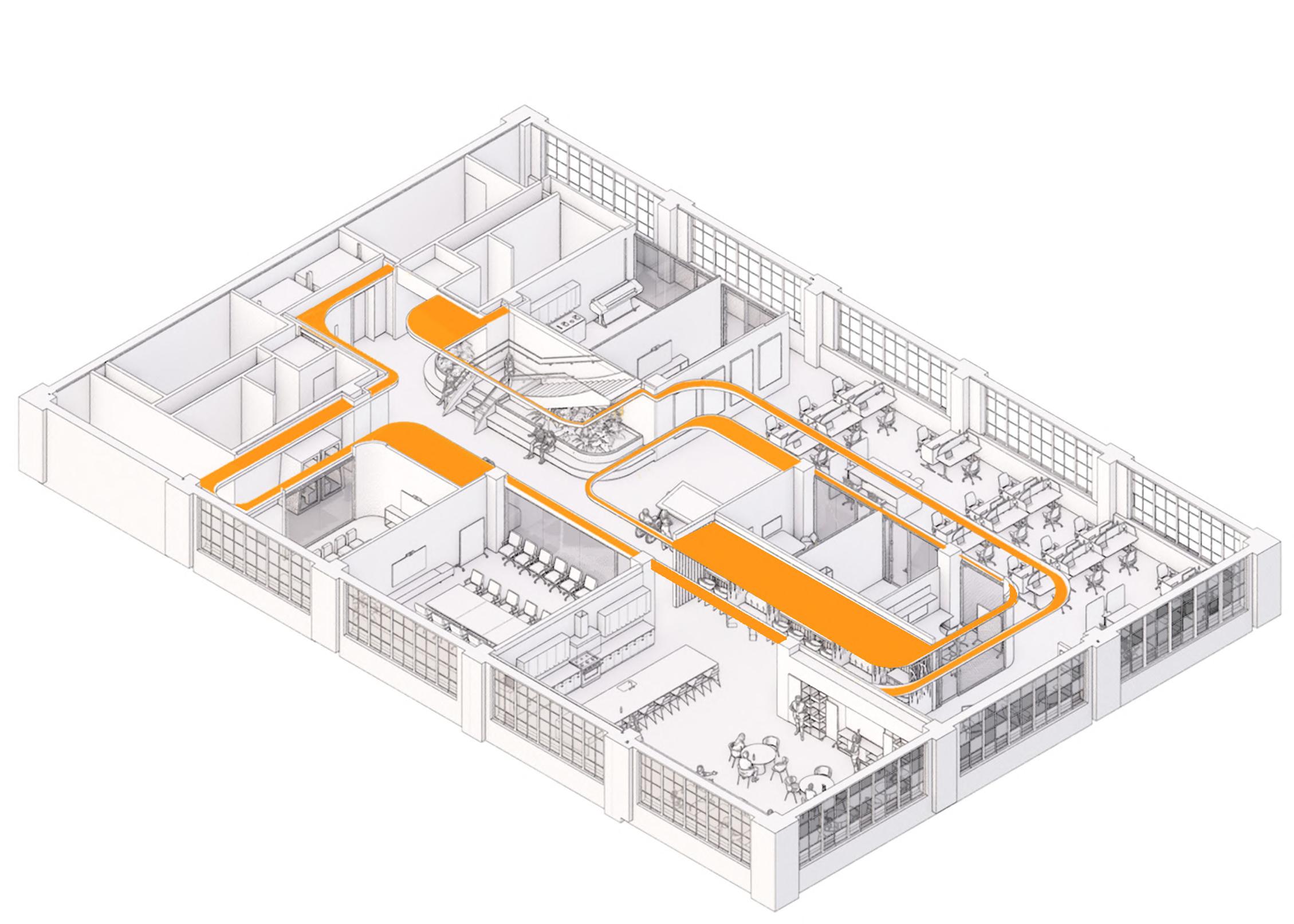

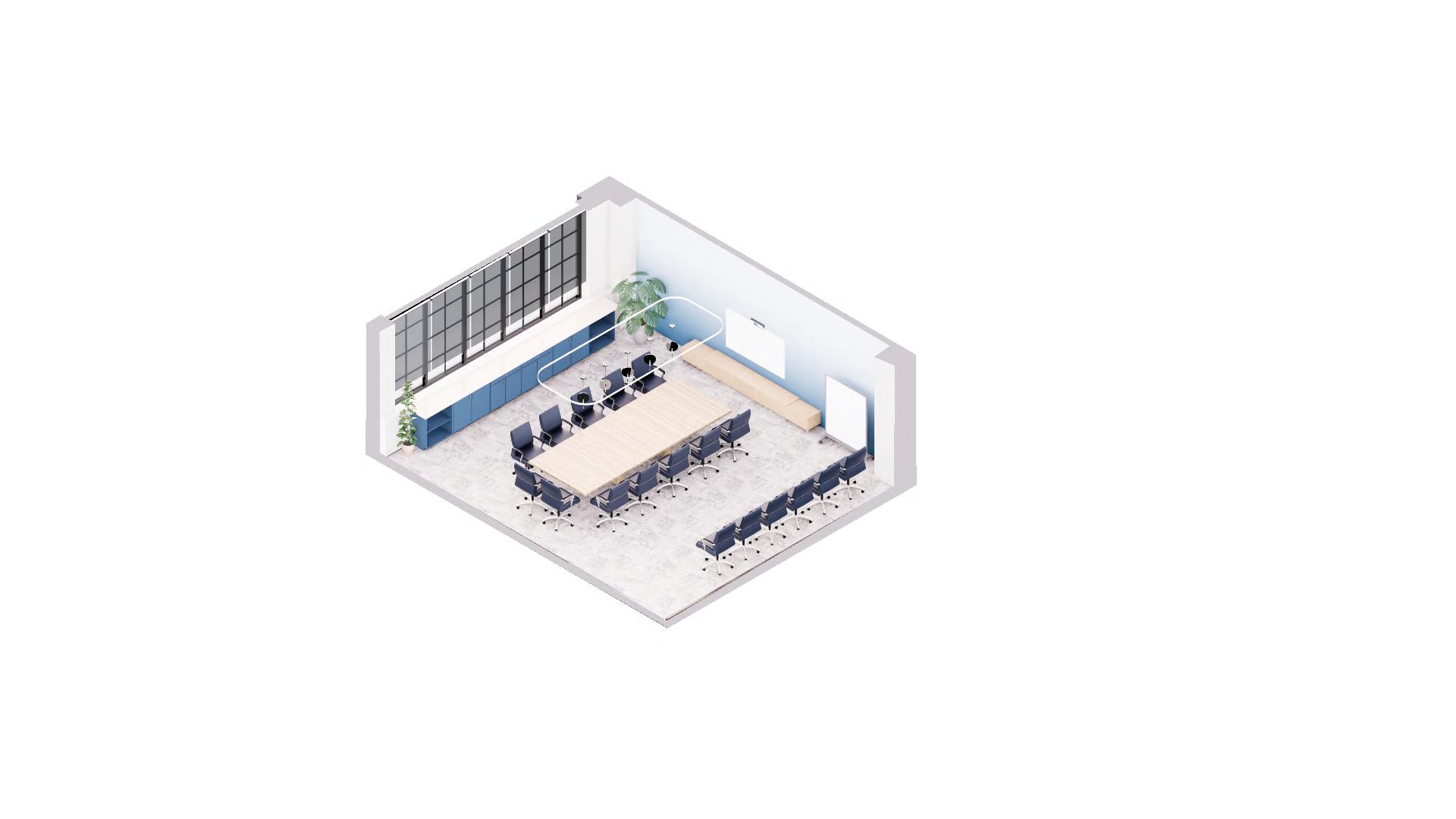
Teal is used in all large group spaces, such as work cafe, client presentation, atrium, and campfire lounge. This signifies that hottest portion of the flame, which holds the majority of activity of collaboration and bursts of creativity.
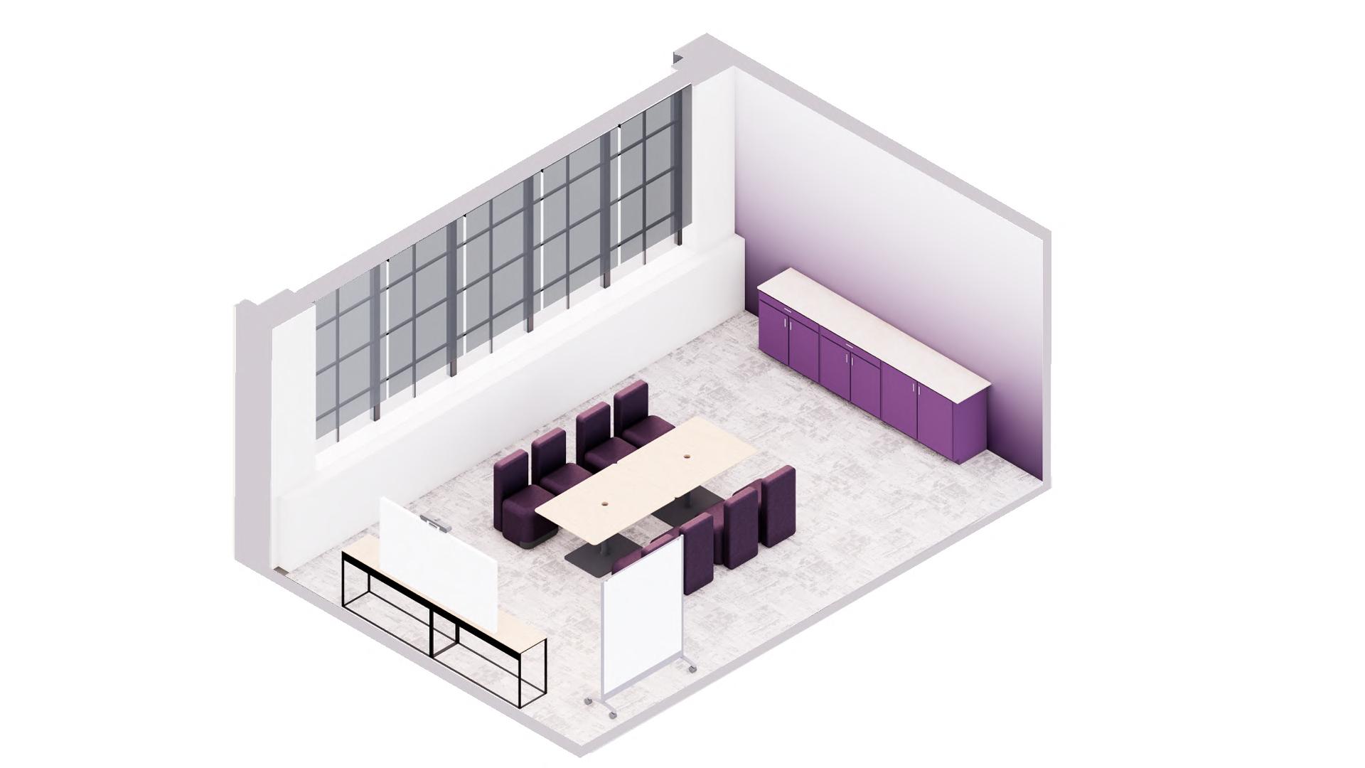
Purple is used in team small team settings, signifying the moderate heat index within the flame as it acts as a driver for creative breakthroughs on a smaller scale.
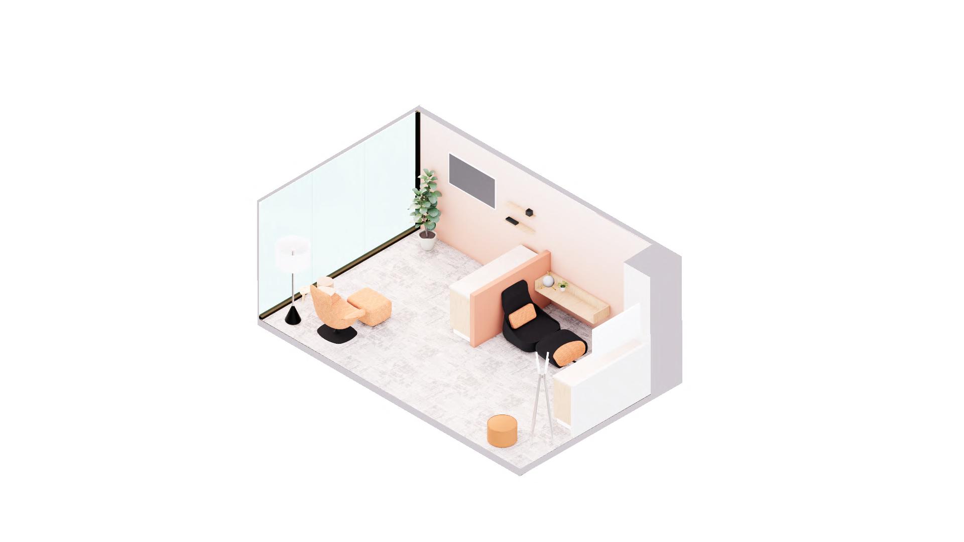
Orange is used within individual and heads down spaces, such as wellness, lactation, and private offices. This color is symbolic of the coolest part of the flame, signifying low movement and high concentration.
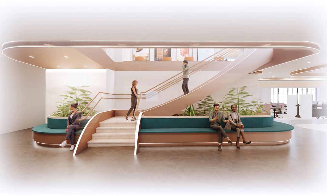
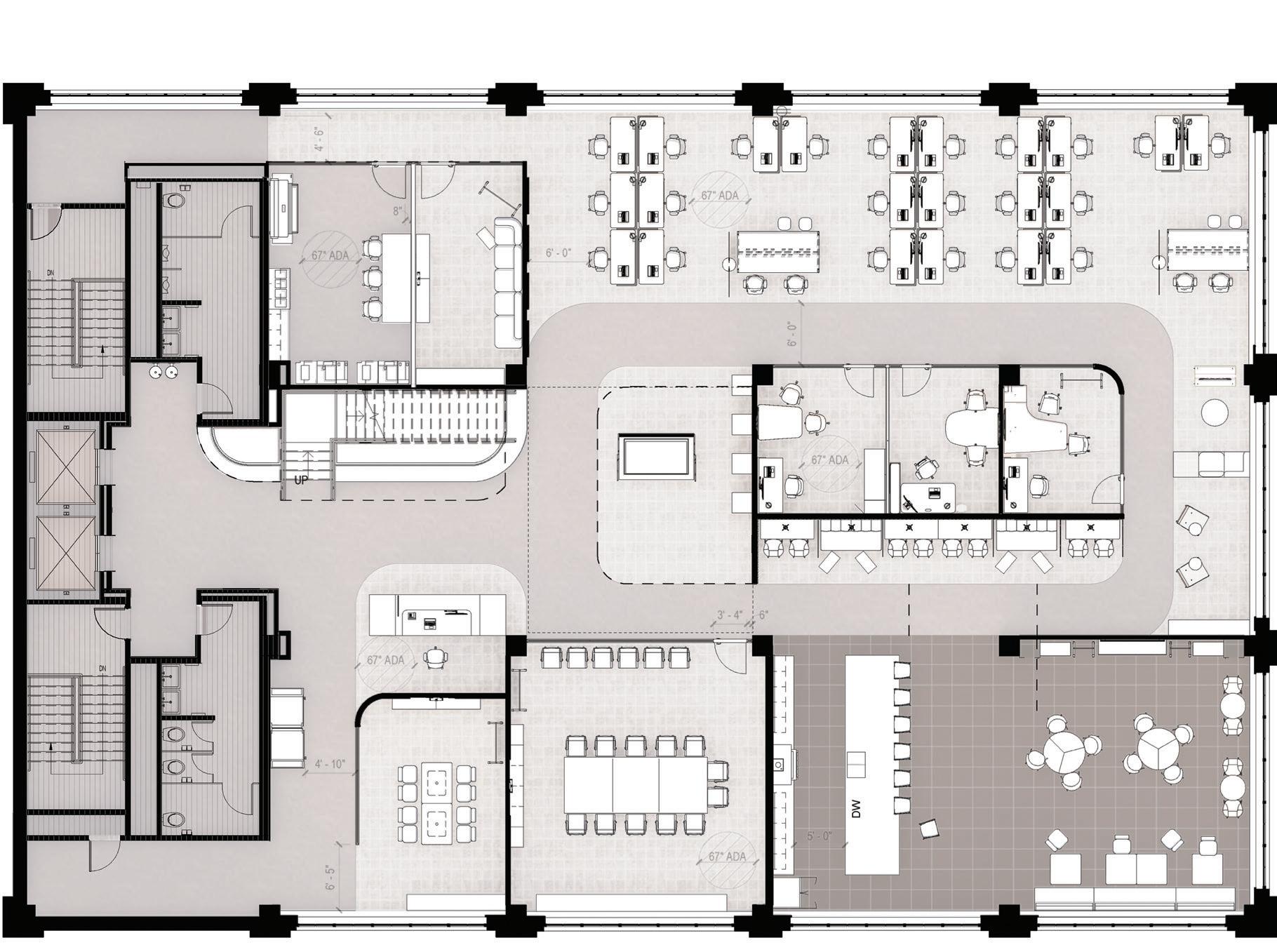
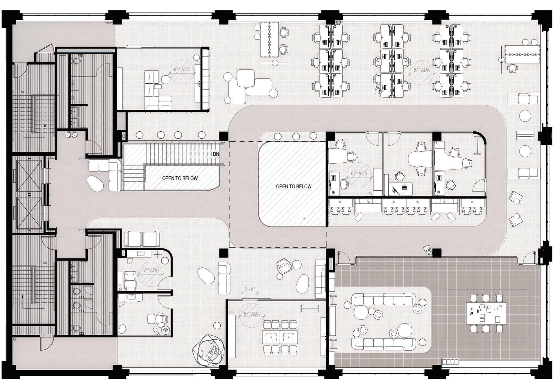
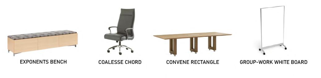
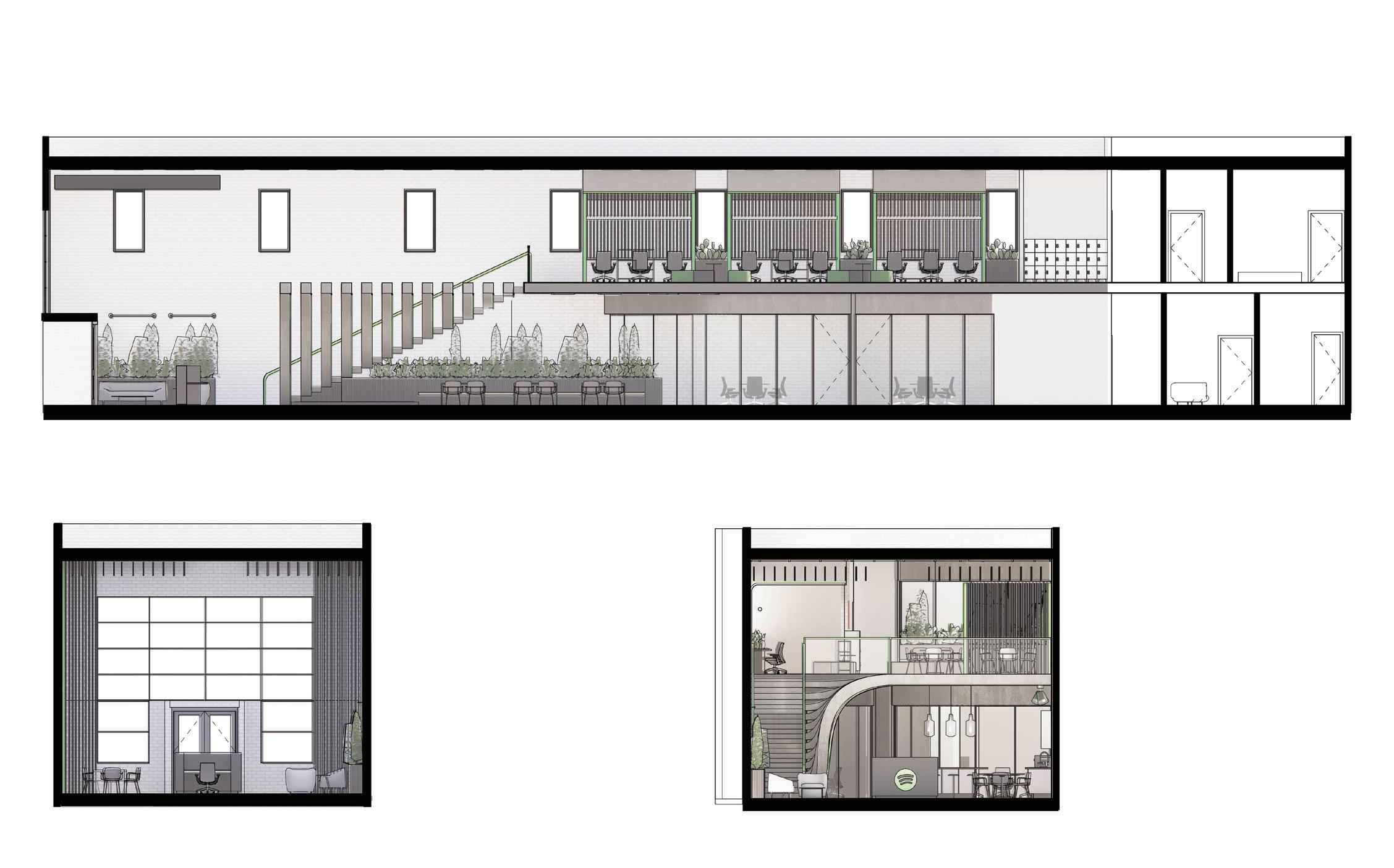
MONUMENTAL STAIR
ABSTRACTLY REPRESENTS THE GROWTH OF FIRE, PROVIDES CIRCULATION, AND SEATING
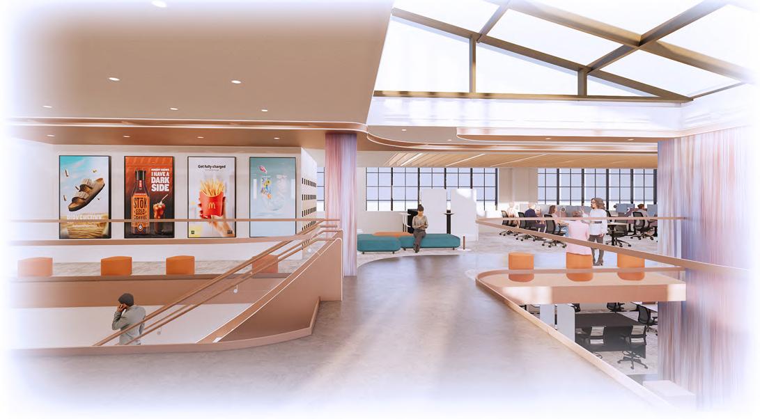
7TH FLOOR CLIENT DISPLAY, LOCKER, AND LOUNGE
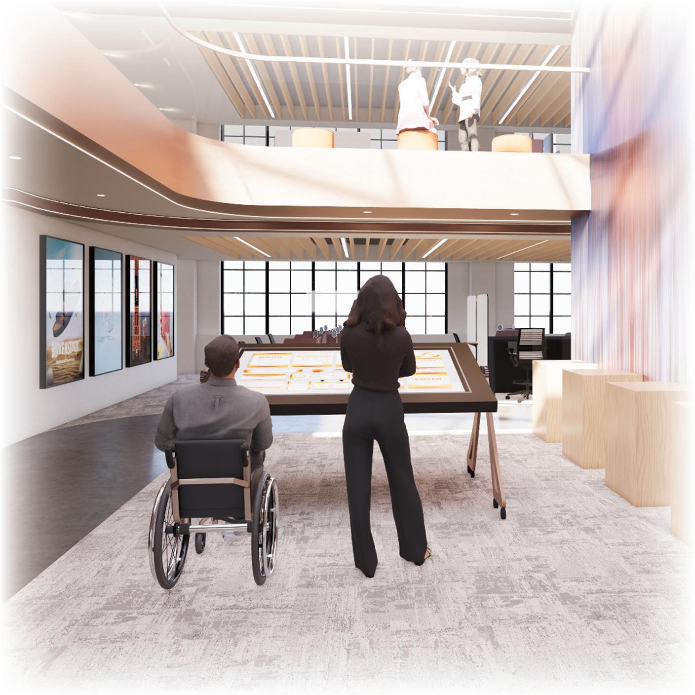
CLIENT DISPLAY
UNIVERSALLY DESIGNED ADJUSTABLE TOUCH TABLE AND SERIES OF SCREENS ALONG WALL


Fall 2023 | 10 Weeks
Revit | Enscape | Photoshop
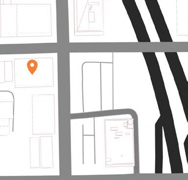
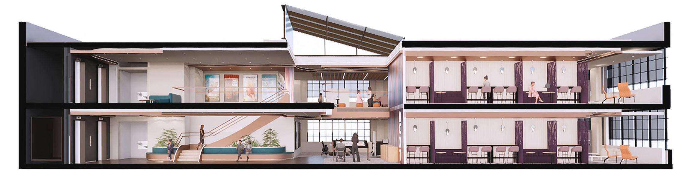
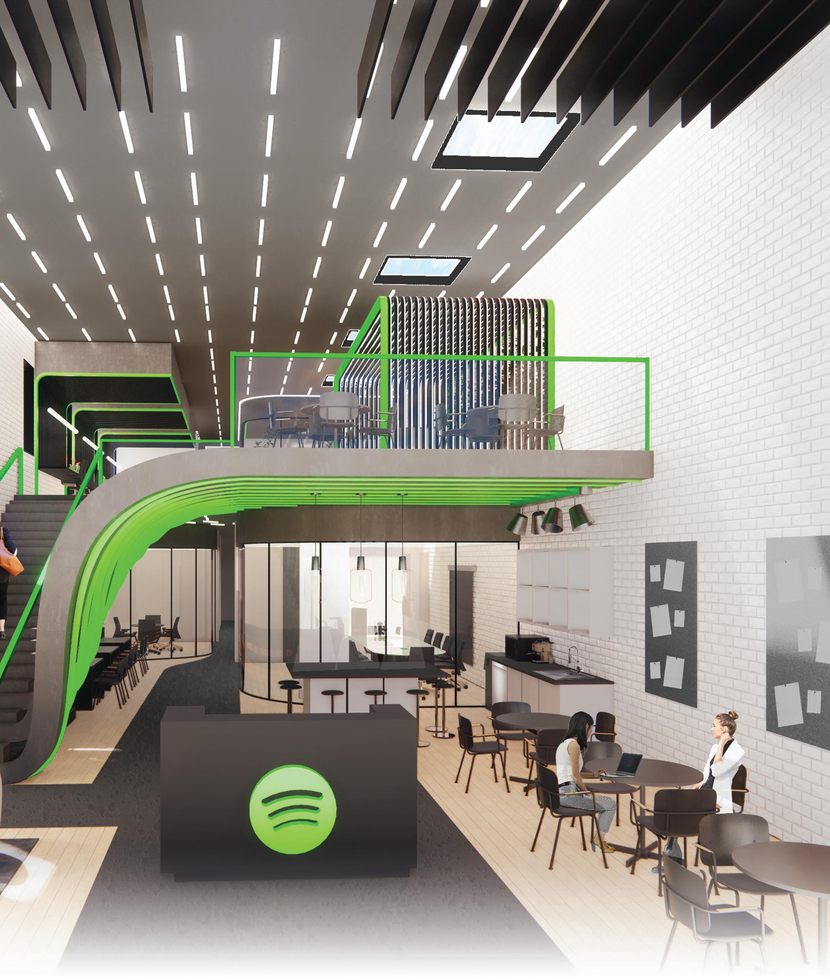
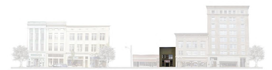
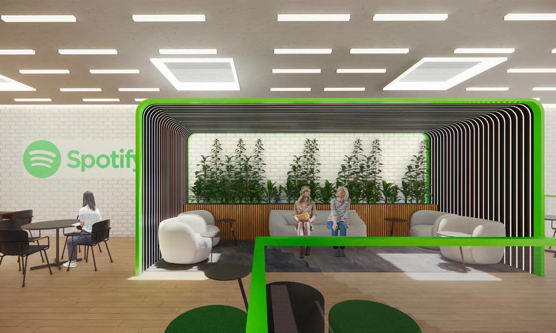
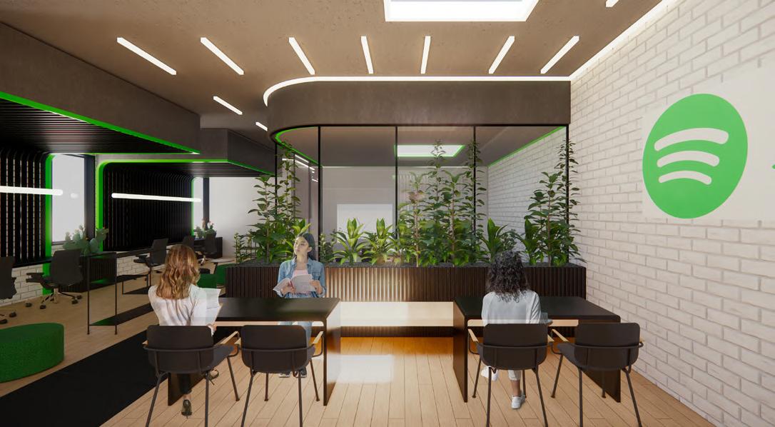
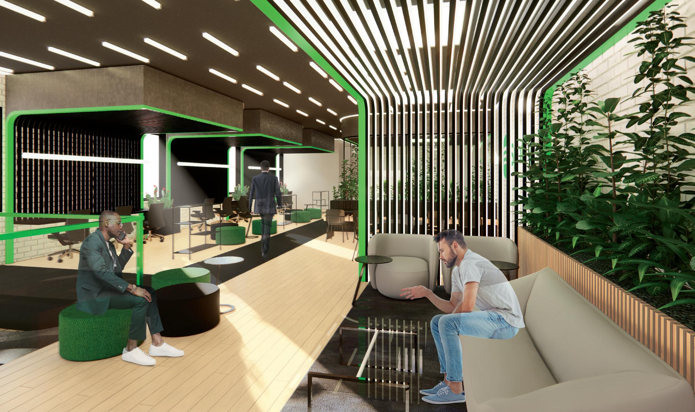
This unique design, for a hypothetical Spotify satellite office located at 410 S Jefferson St, Roanoke, VA, is focused on solving the issue of noise control within the workplace. Through solutions including sound absorbing materials, zoning of spaces based on noise level, and the use of biophillia, noise is effectively controlled throughout the workplace. Noise control throughout Spotify’s workplace is important in order to create an environment that encourages collaboration, while limiting distractions.
leads to lack of concentration, lowered productivity, and misunderstandings
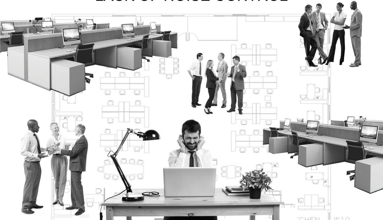
help reduce and control distractions caused by excessive noise in the workplace
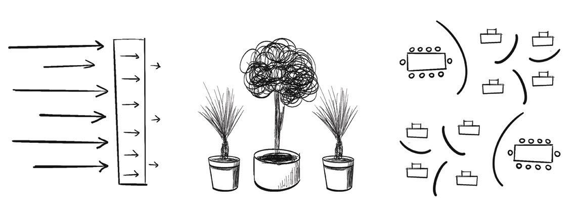
acoustical materials to absorb sound biophillia to prevent reverberation
abstract representation of Spotify logo


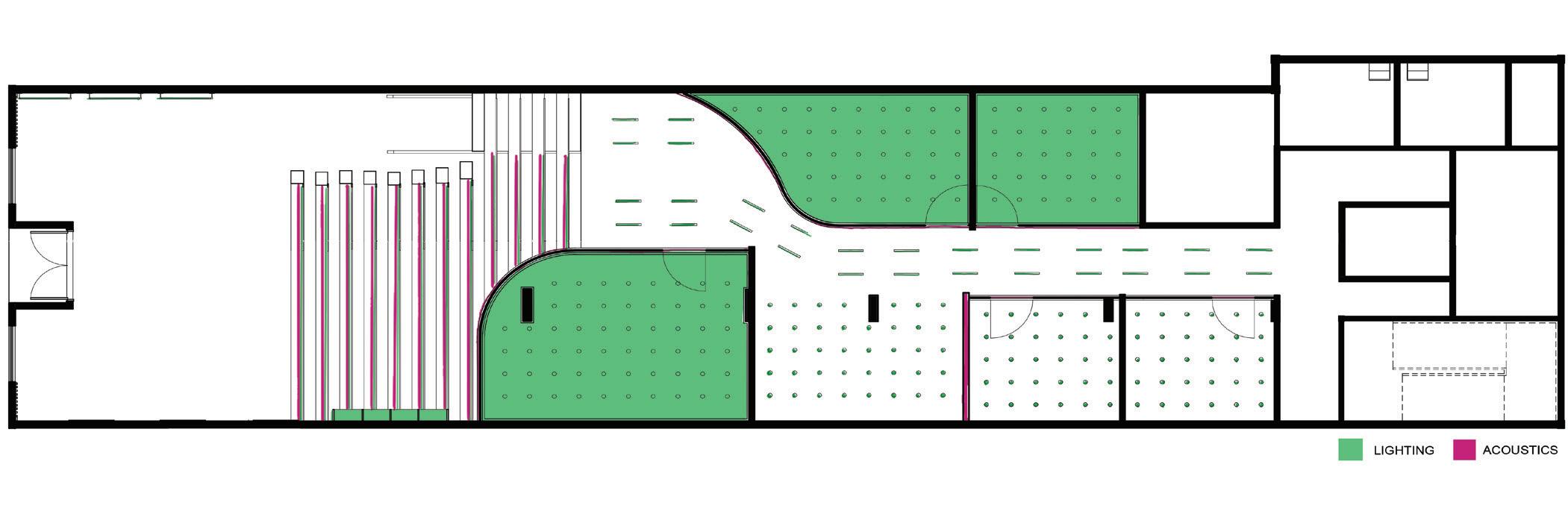
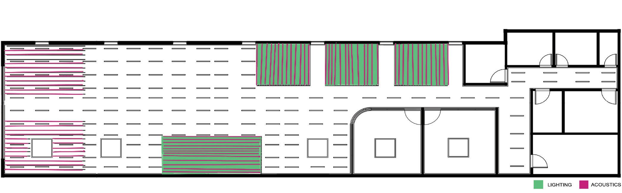

UNIKA VAEV ECOUSTIC FELT VAULT

THE WOOD VENEER HUB BLACK ACOUSTICS WOOD WALL PANELS
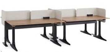
ALLSTEEL STRUCTURE TABLE 54” X 168”
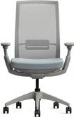
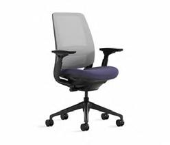
ALLSTEEL EVO TASK CHAIR

OCL ARCHITECTURE DASH
WOOD FLOORING ATELIER 007

MILLIKEN FORMWORK CARPET FWK79 SPAR
Spring 2024 | 2 Weeks
Revit | Enscape | Photoshop
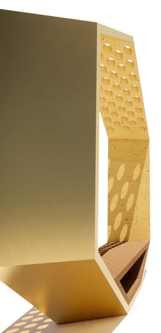
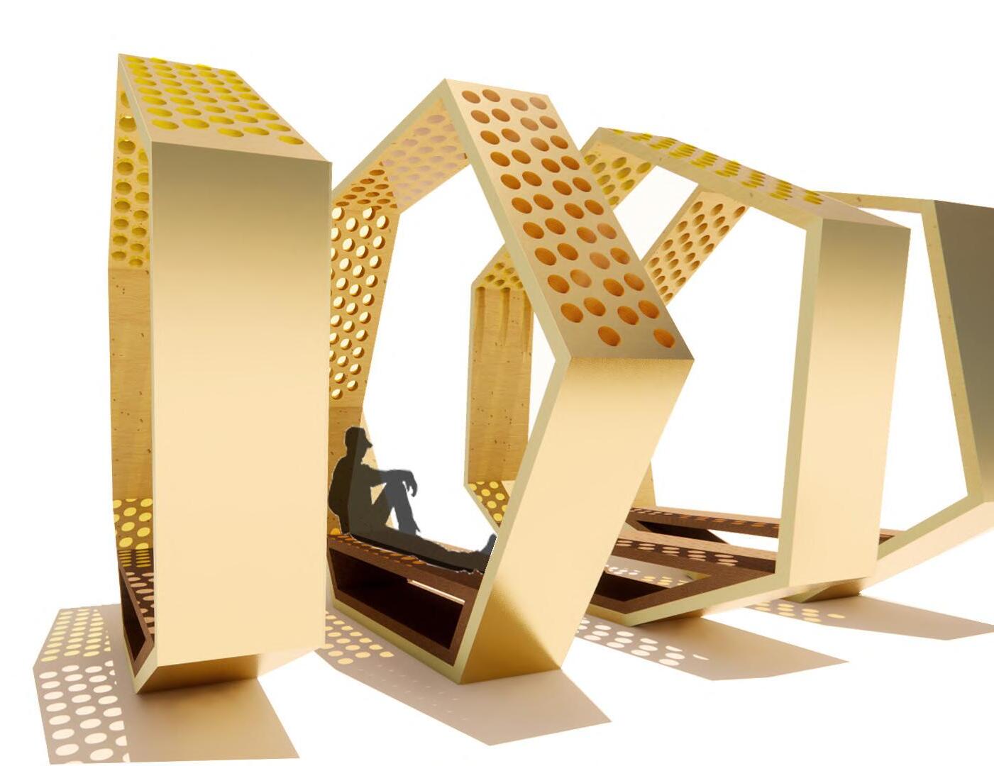
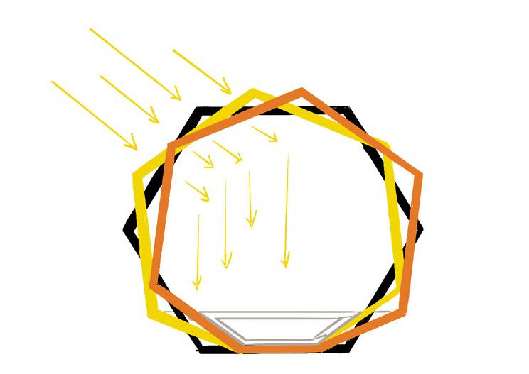
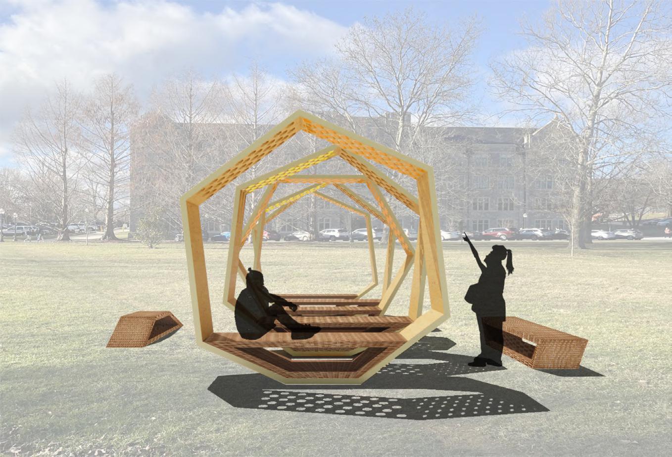
Hex is a temporary restorative outdoor space with a connection to nature. This structure crafts a break from the day-to-day chaos that a college student endures. Throughout this unique outdoor grounding experience, patterned apertures are intended to communicate with the movement of the sun, redirecting the user’s attention to the movement of light and shadow within the enclosure. The five hexagons represent the five senses.
Collaboration with Becca Kemp & Nathan Mathena
My Contribution:
- complied survey and distributed it to students - formed diagrams to explain the design concept - worked within Revit to create hexagonal forms - utilized Photoshop to edit the plans and views
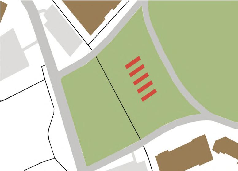
This restoration space is placed in a central location of campus where students coming from the residential and academic buildings of campus have equal access This location is an optimal spot to form a break from the chaos and/or to people watch while grounding oneself.
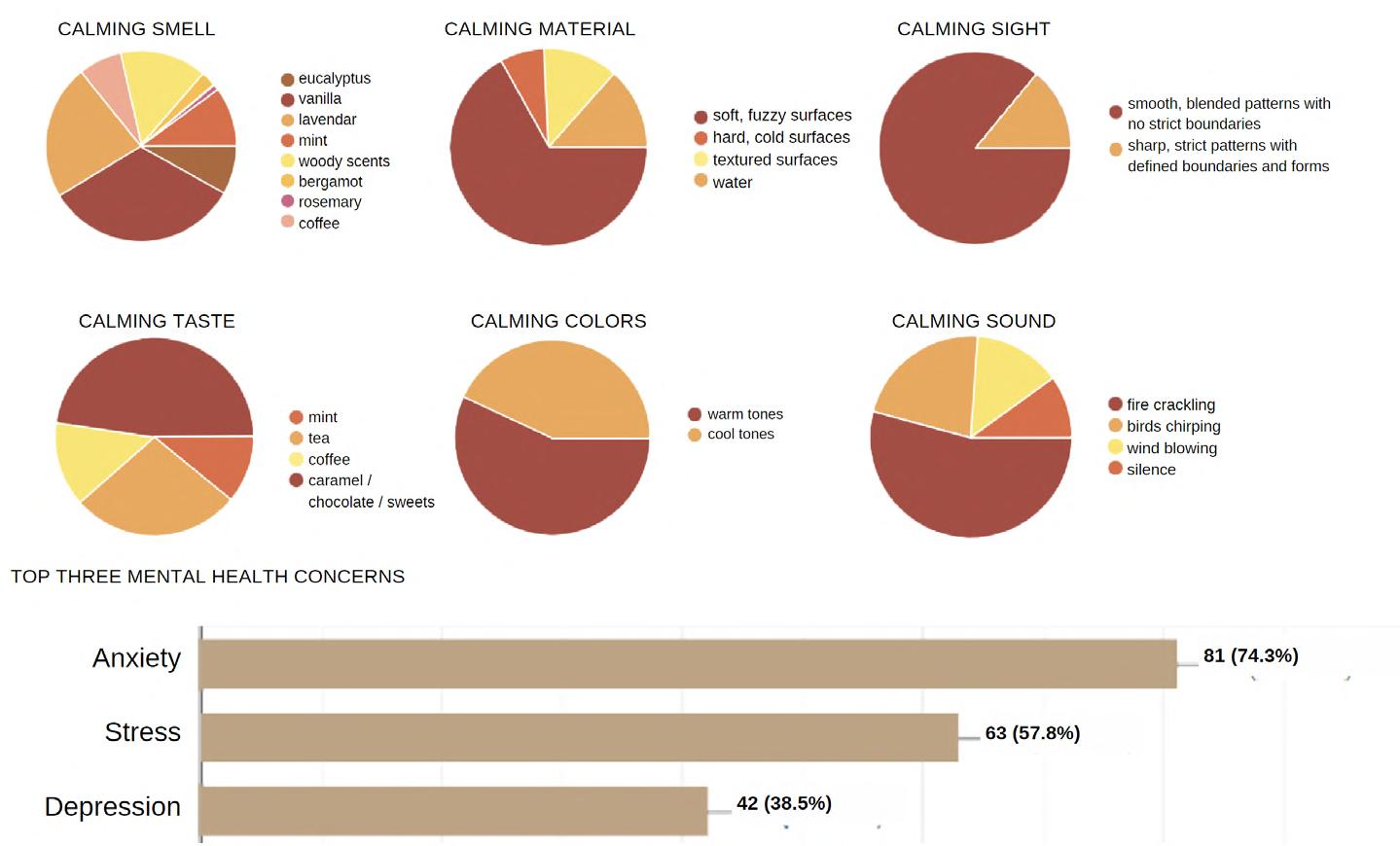
We surveyed 108 college students asking questions related to what calms them in a time of distress with a deep focus on studying the human mind in relation to the five senses
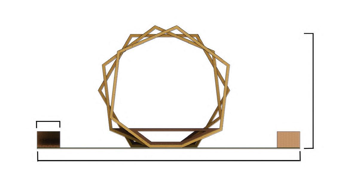
FORM & APERTURE
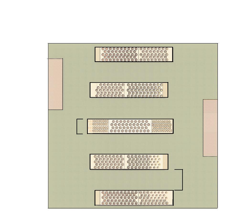
CIRCULATION
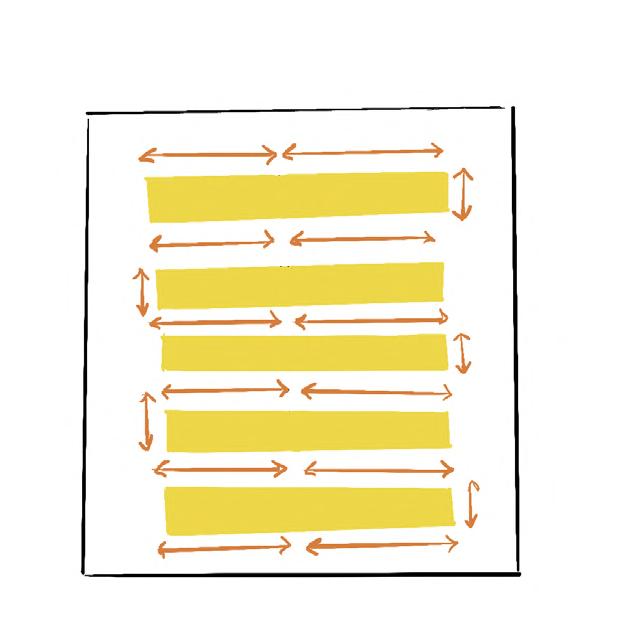
MODULARITY OF SEATING UNITS
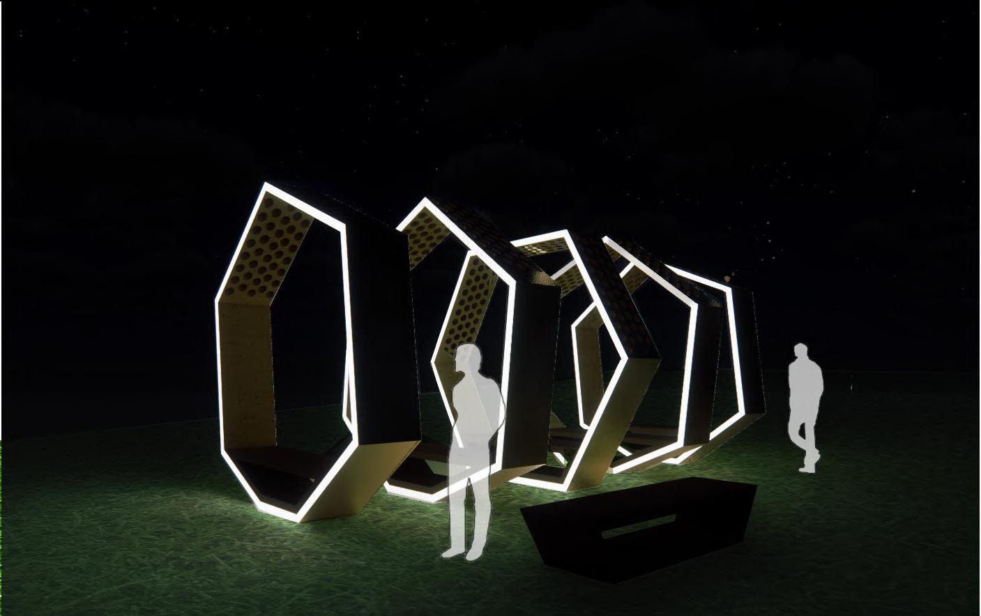
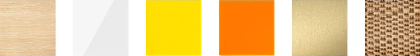
Due to the nature of the space being temporary, materials were carefully considered based on the ease of portability, durability, and cleanliness in mind. The survey results were also considered.
Boutique Spring 2023 / 7 Weeks
SketchUp / Enscape / Photoshop
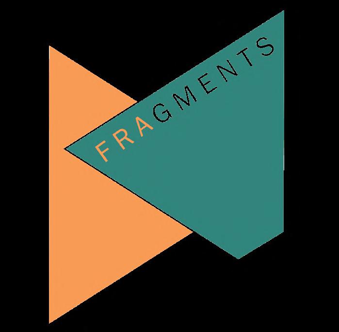
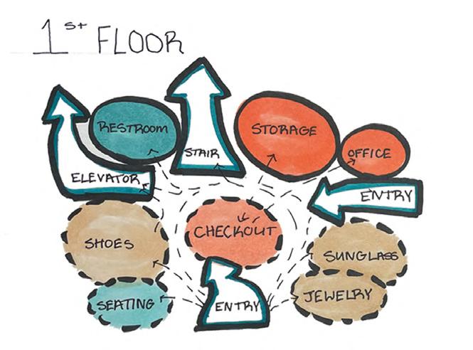
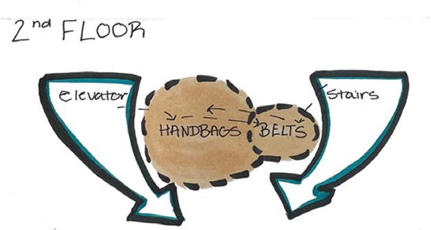
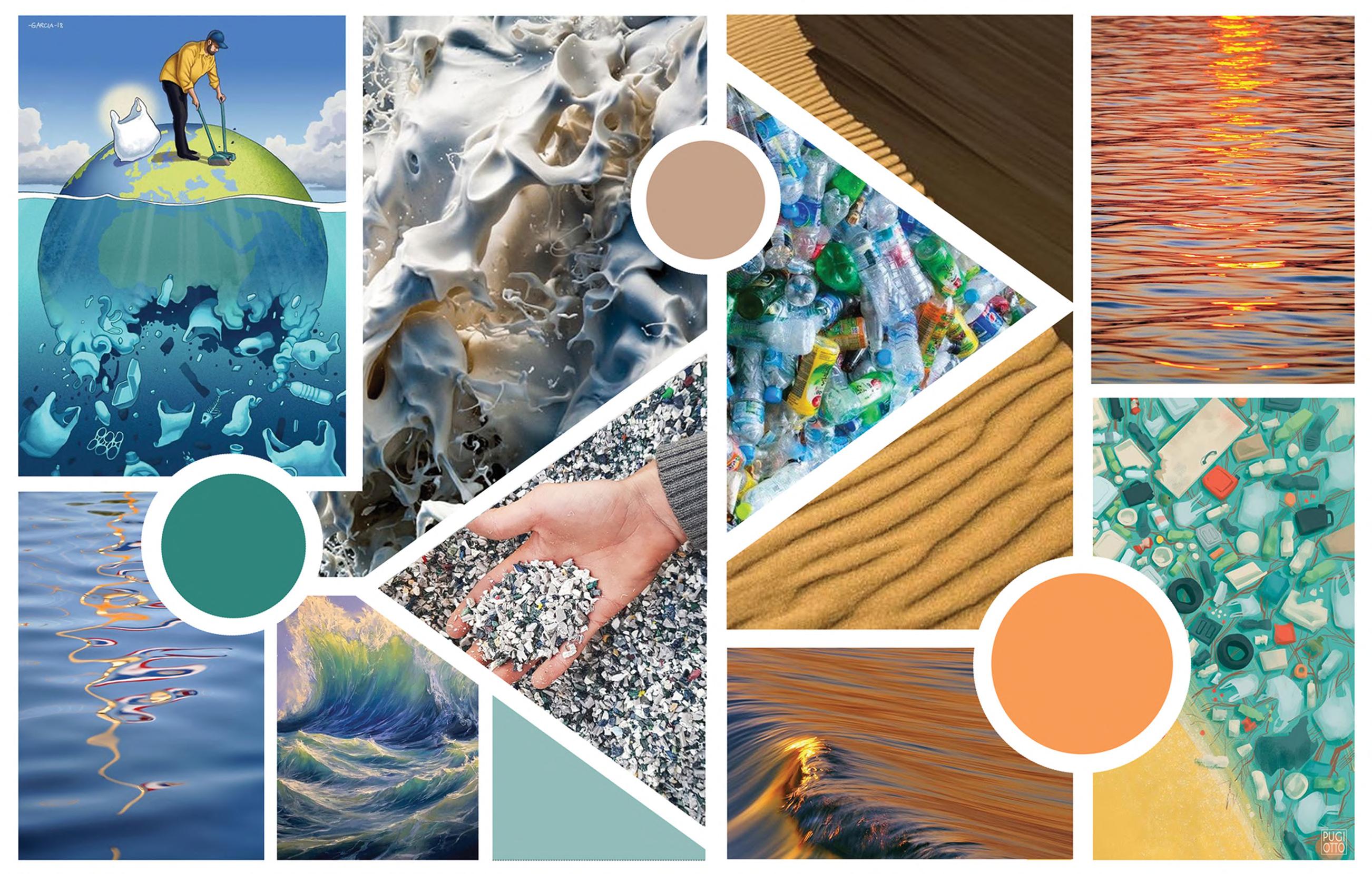
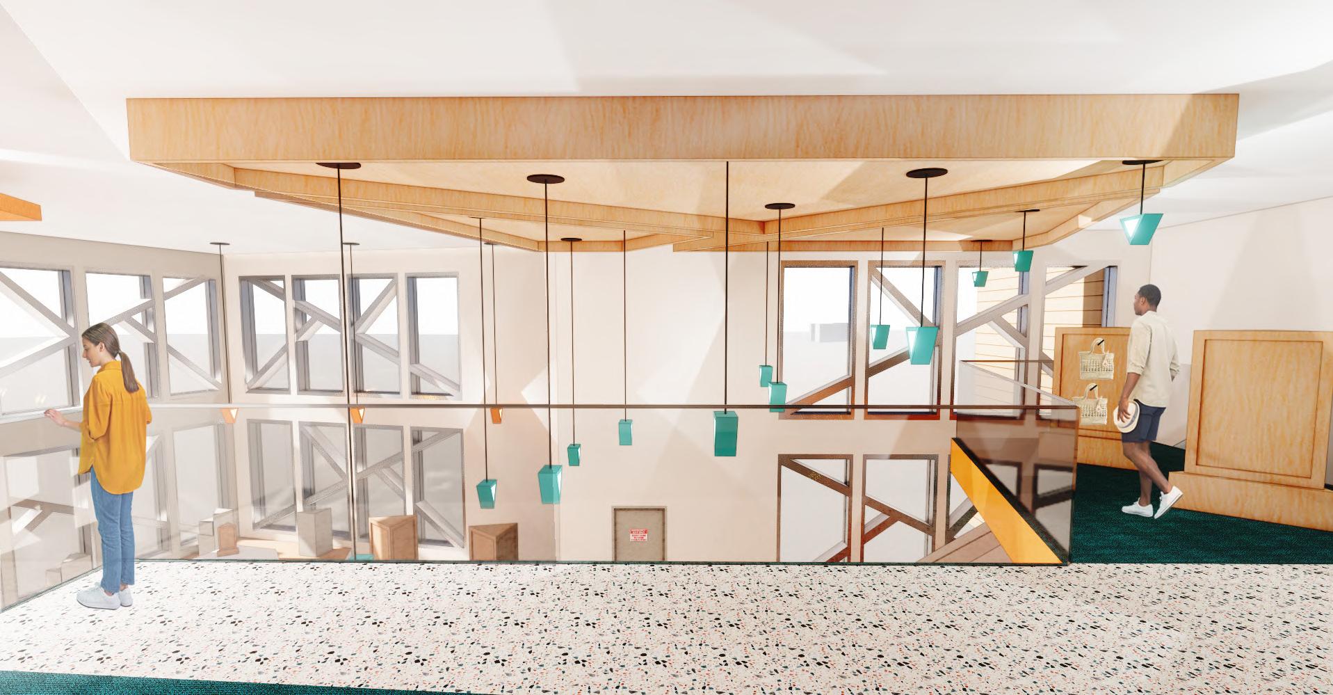
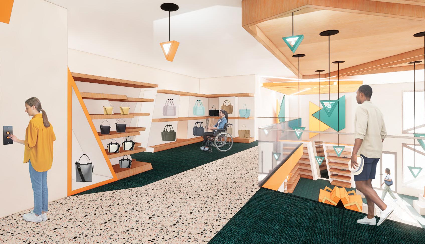
Ocean waves are full of momentum, causing them to come crashing down and collide with pollutants. This collision leaves behind waste fragments As the old saying goes, “one man’s trash is a another man’s treasure”.
Fragmented design features, materials, and merchandise have qualities and provide a nod to the recycling of ocean waste.
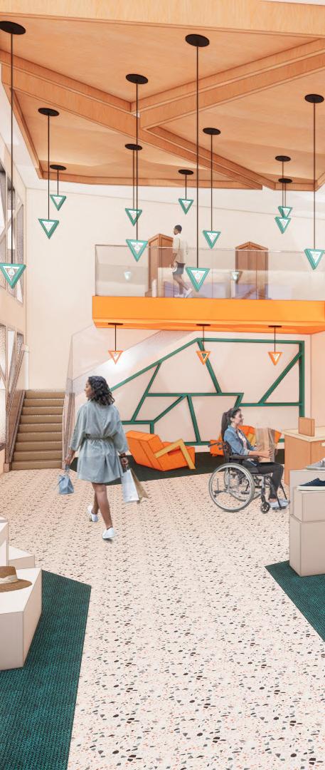
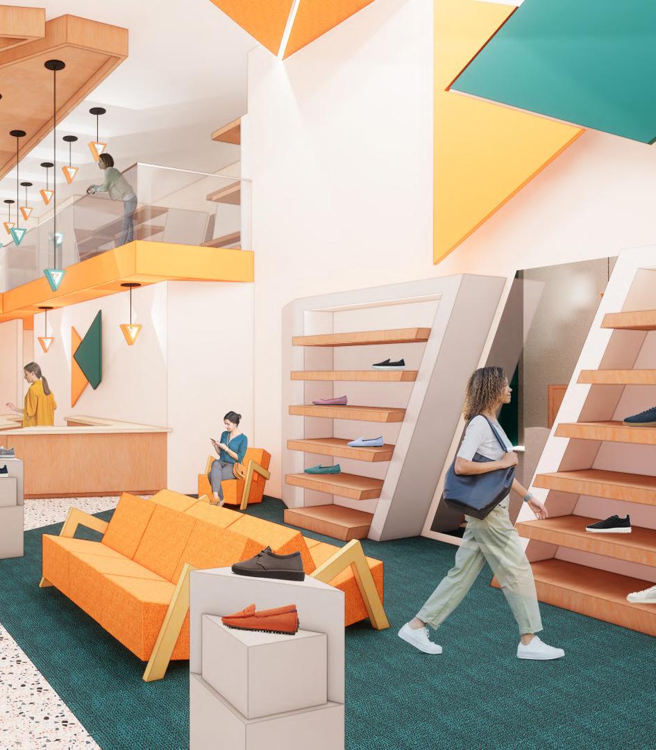


feature wall provides the possibility of the display of product
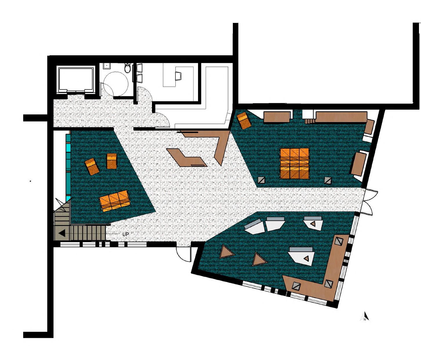
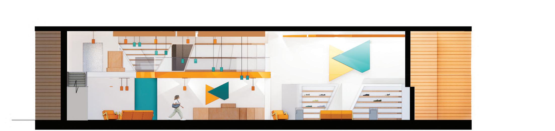
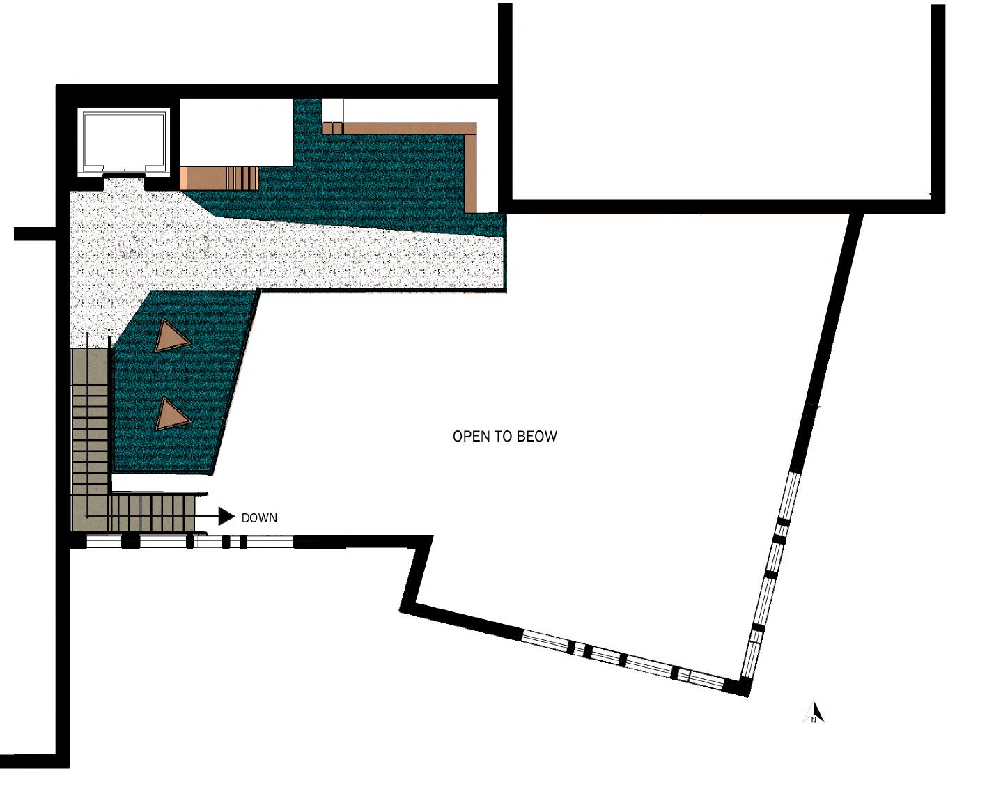
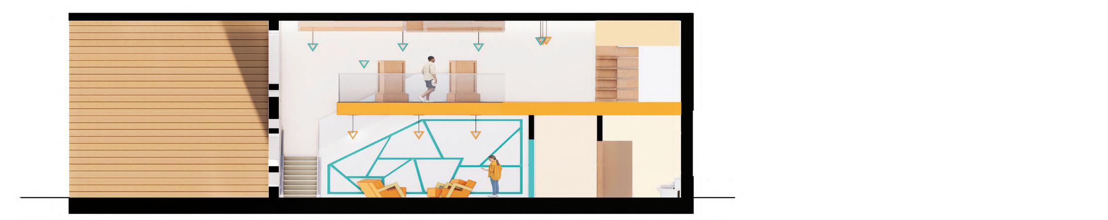
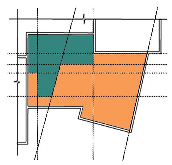
section depicts the ADA restroom and location of stairway
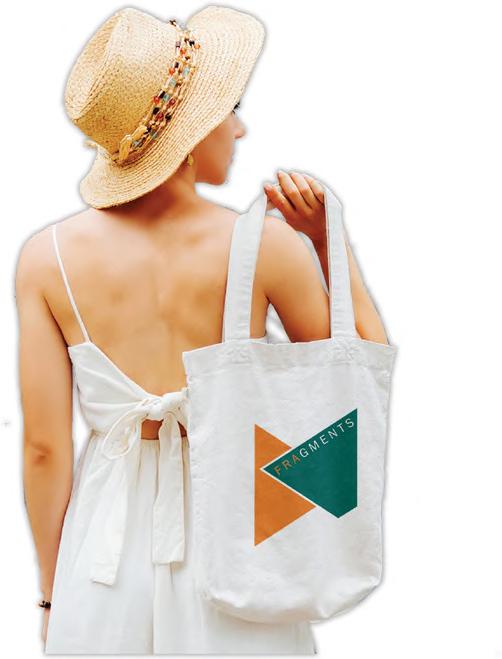
Products within Fragments Boutique include handbags, accessories, shoes, and jewelry. Each product is carefully handpicked for sustainability expectations to be met. Some qualities of Fragments products include the following: natural materials, recycled plastics, and recyclable materials
Space Formation
Fall 2022 / 8 Weeks
SketchUp / Photoshop / Model
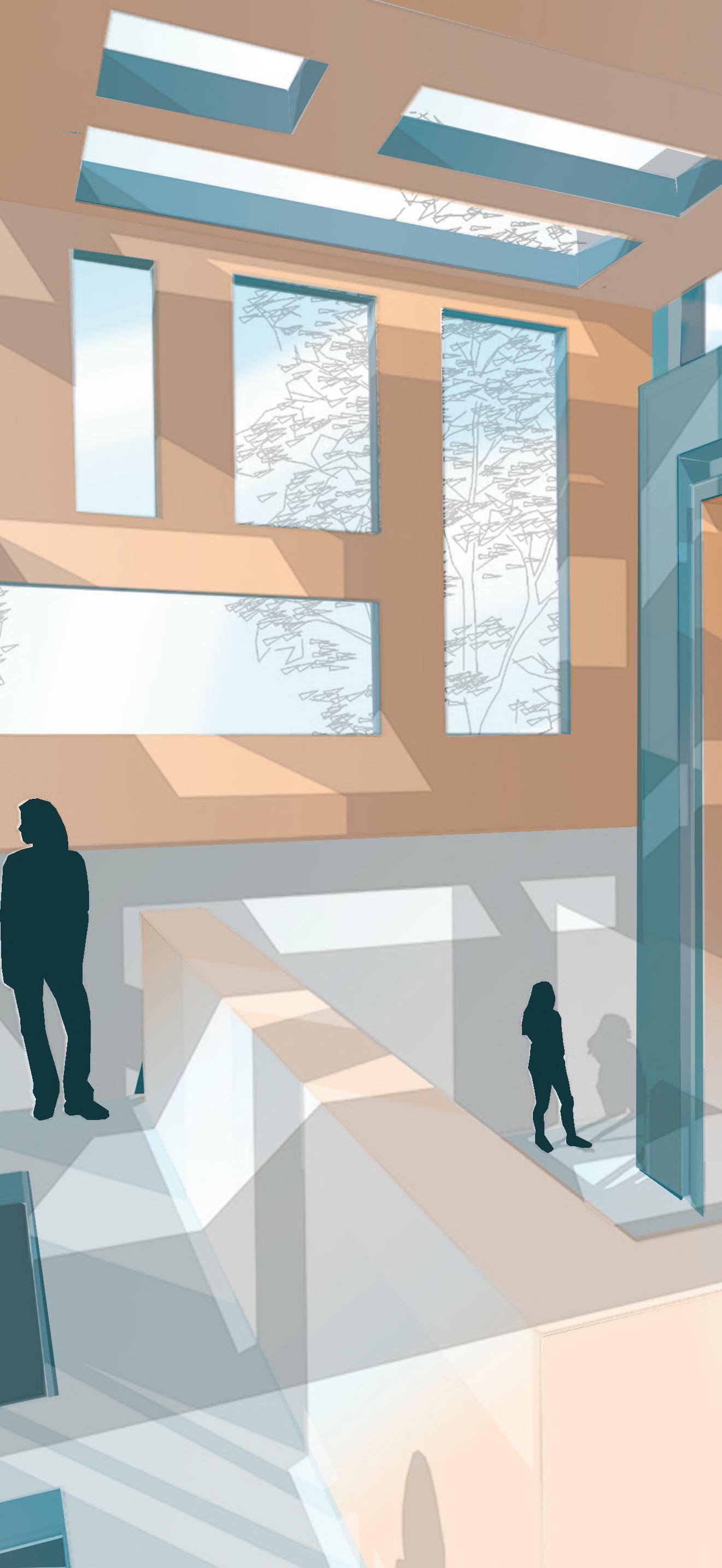
A space to relax, fused with the breathtaking views, of the river bed.
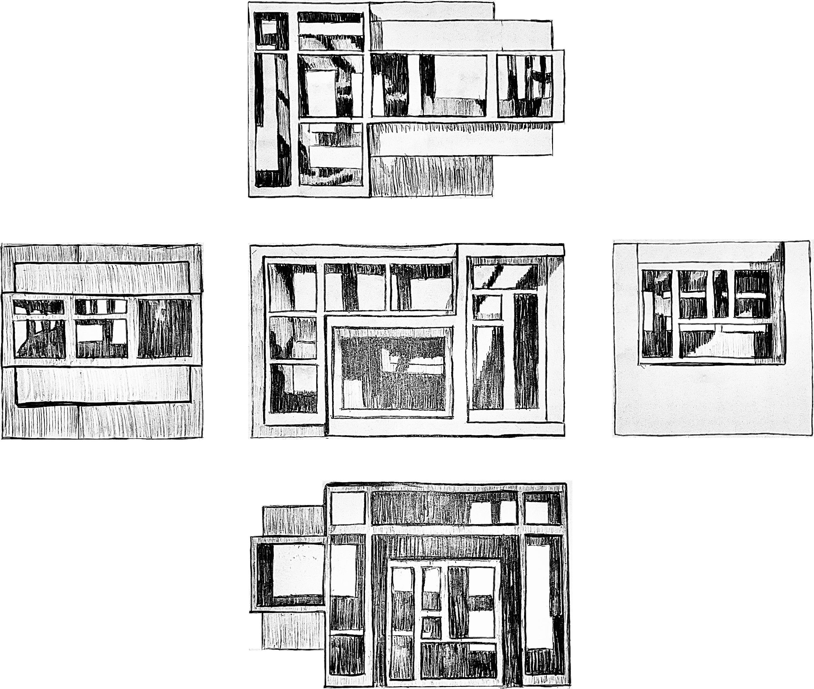
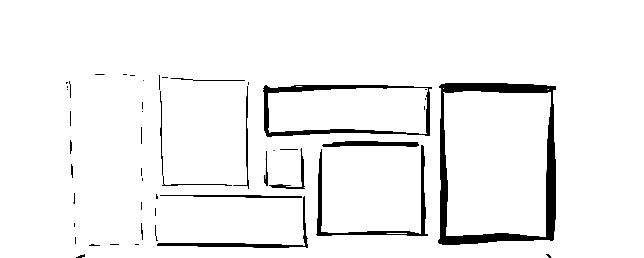
A space case represents five distinct, yet connected spaces that come together to form an experience. In a generous scale, a multitude of apertures and thresholds work to activate all faces of the case. This activation allows for the permeation of light create a sense of movement, transition, and progression throughout the interior. Each aperture and threshold is organized and proportioned heirarchically, with all measurements being divisible by 1” and spaced 1” apart when measured on a 1/2” scale.
ORTHOGRAPHIC DRAWINGS