3 minute read
WAREHOUSE ON WASHINGTON


Blending History And Modern Design In A Breathtaking Loft
Photography by Spacecrafting
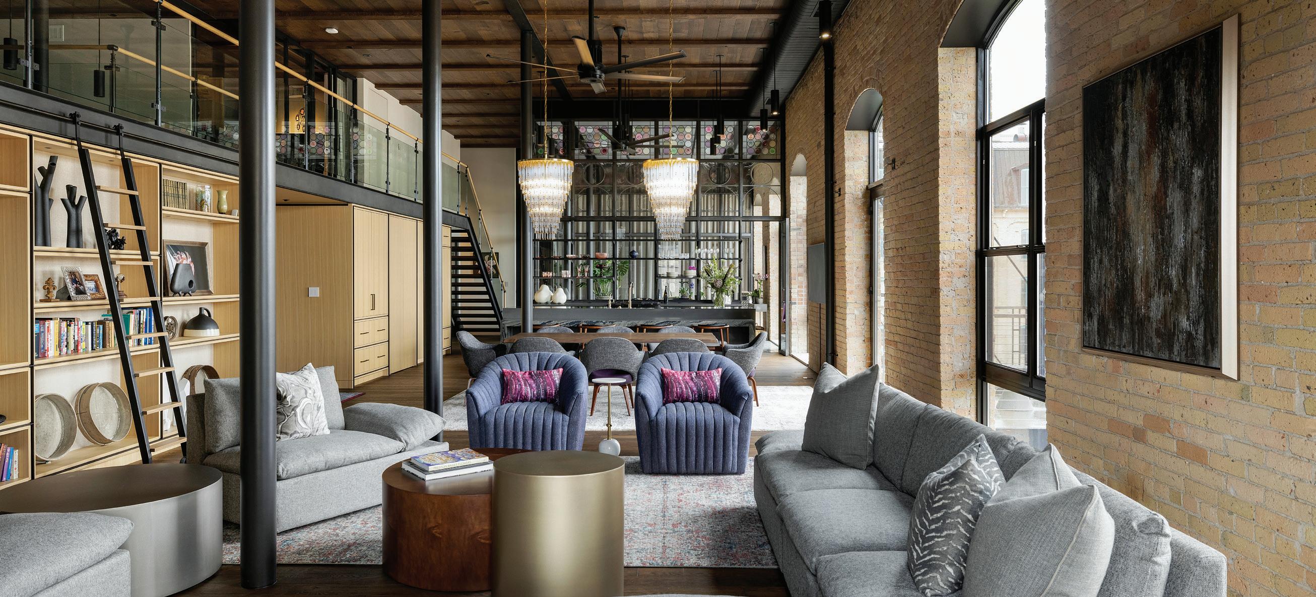
With north-facing windows and views of the Mississippi river, this historic loft is filled with natural light and spacious lounge areas throughout to watch as the seasons change over one of the most iconic views in Minneapolis. From its early days as a warehouse and later a hotel, this unit was packed with history, the client excited to add a modern take to the space, creating the perfect balance of history and design.
We had the opportunity to learn more about the project from Greg Walsh, Proprietor and Senior Interior Designer, who has been specializing in architectural detailing and design for over 35 years. Greg shares his favorite unique elements of the space, as well as the process behind maintaining the historical charm.
CAN YOU TELL US ABOUT THE INSPIRATION BEHIND THIS PROJECT AND HOW IT INFLUENCED YOUR DESIGN DECISIONS?
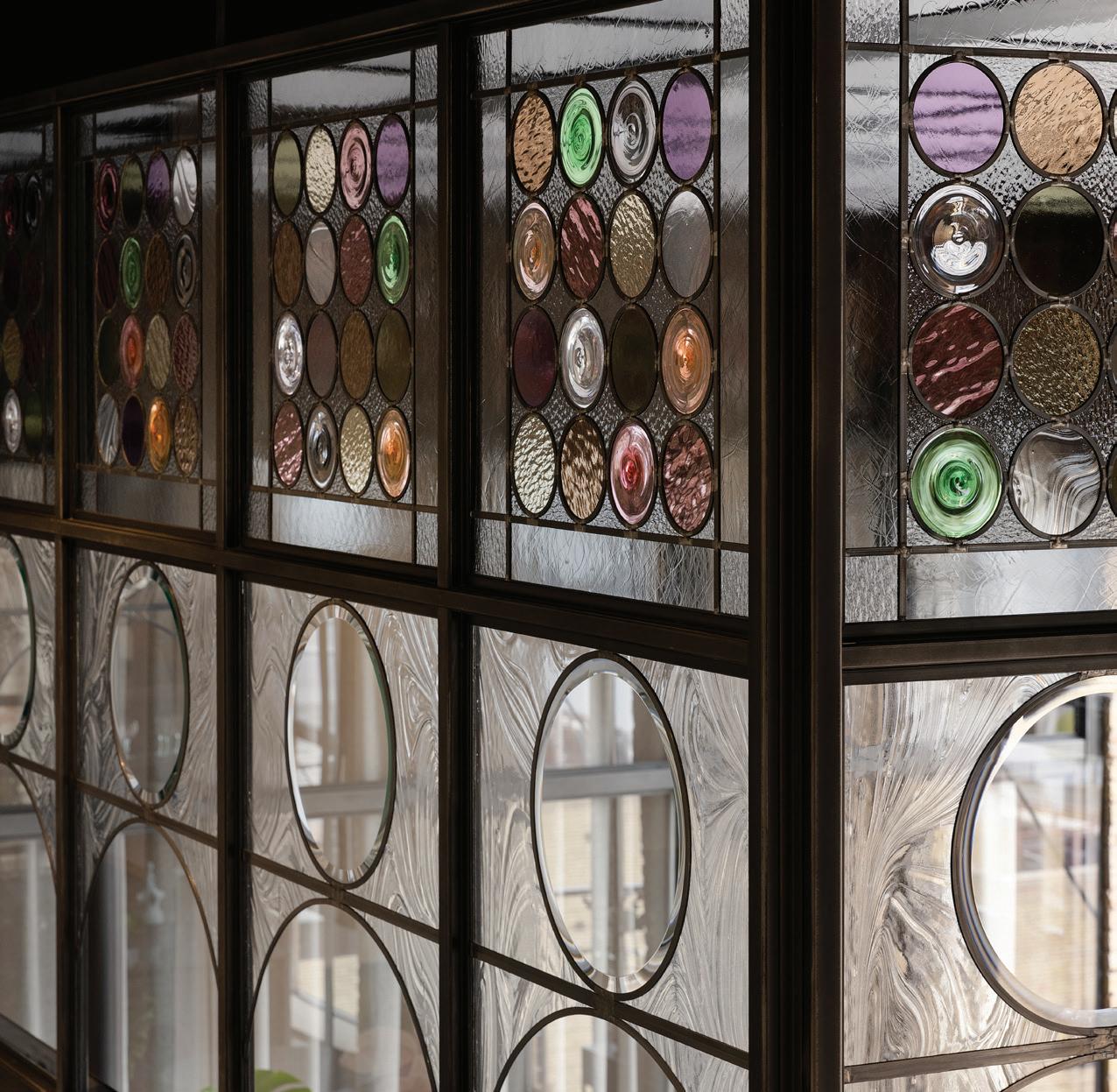
The client bought the raw unit that was filled with history, and wanted to preserve that but also create a modern, luxurious home. The space originally used to be a hotel back in the 1980’s, and was converted into condos in the 2000’s. They combined two of the units to create one, and the client wanted to give the space the feel of air and light. We took inspiration from places the client had traveled, which is why the solarium is such a unique key space in the home. It was inspired by her time in Europe, and is definitely my favorite part of the project. We worked together to create a space with curves inspired by the Stone Arch Bridge, and the upper part and roundels are a balance of the client’s love for color while balancing them architecturally with the solarium as a whole. With so much natural light, it shows off the detail and design of these custom roundel pieces.
BY EMMA GEARY
HOW DID YOU APPROACH THE CHALLENGE OF BALANCING FUNCTIONALITY AND AESTHETICS IN THE SPACE?
A big part of it is the whole design team—working with the architects and builders to create a space that fits the client’s needs for art, while also balancing the historic warehouse feel with modern design. Working with the raw space and the many columns—which was quite a dance in an open concept home.
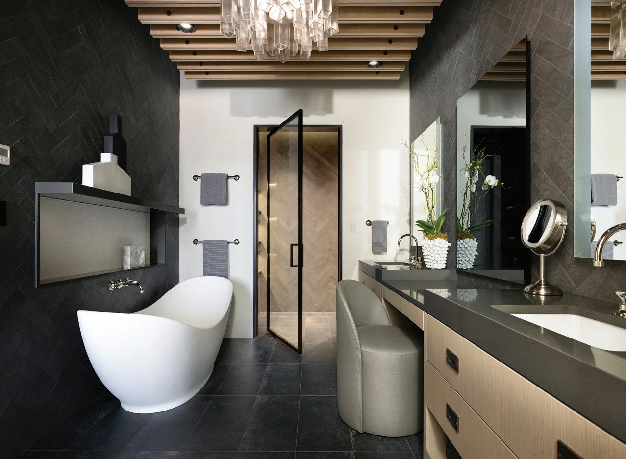
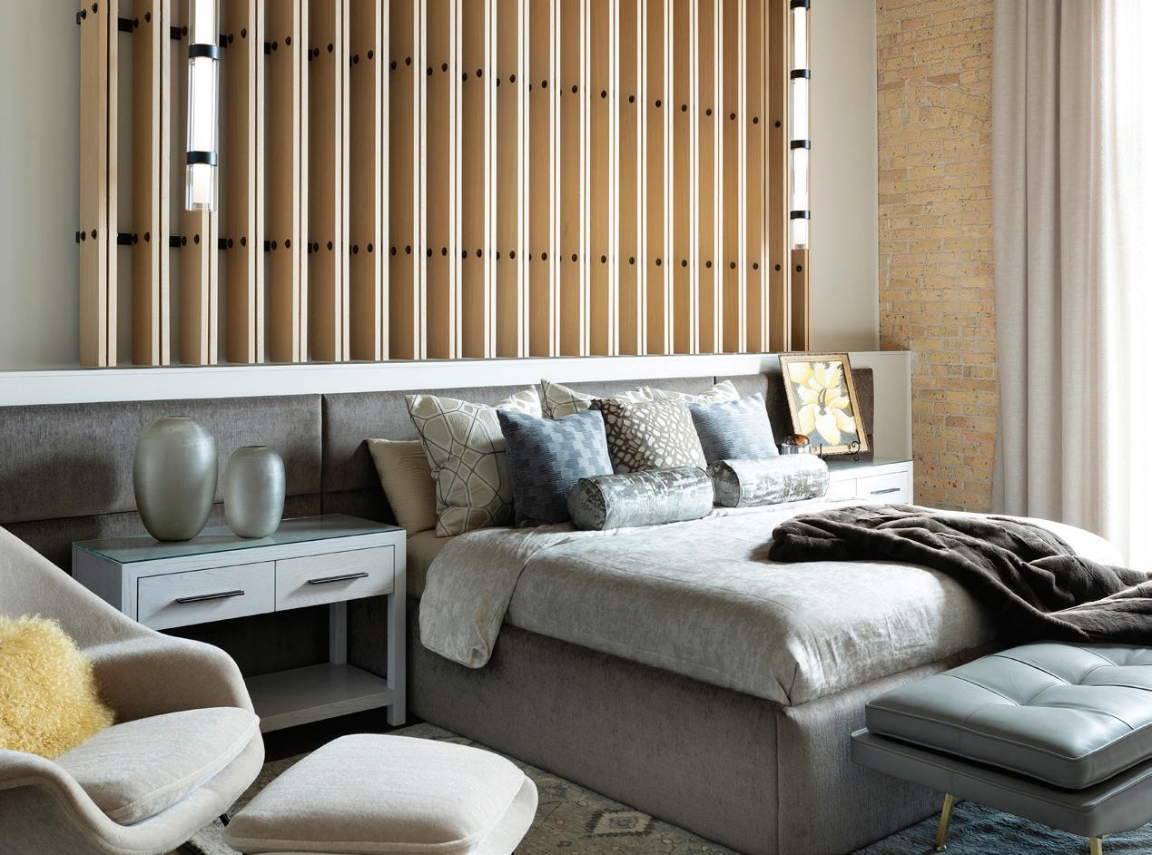
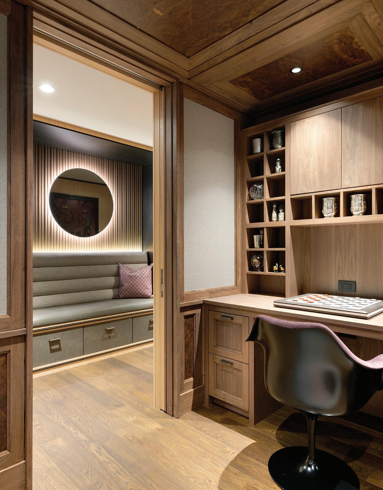
We created a kitchen and butler’s pantry to keep parts of the dining space hidden, and the office can be closed off to create a more separate space when needed. The bedrooms can be closed off as well so that the common living spaces can feel clean and modern, even while allowing privacy in the rest of the house. Our goal was also to maximize storage in every space, from the kitchen to the master closet to the butler’s pantry.
While the space feels full of light and windows, the windows are actually very small and narrow because it used to be a warehouse. Part of what makes them feel bigger than they are is the open concept—you can see almost every window in the space from anywhere.
WHAT ARE SOME OF THE UNIQUE FEATURES OR MATERIALS THAT WERE USED IN THIS PROJECT, AND WHAT WAS THE INSPIRATION BEHIND THOSE?
We wanted to have a strong balance between the historic elements of the building with the new elements of design the client was looking for. The ceilings and floors were all new, but made to look like reclaimed materials to keep that historic feeling alive. The columns were made of steel, and wherever they were left exposed, it gave it a more raw, industrial feel. The solarium glass and roundels were also made to look vintage. They were created locally by Hennepin Made to have a historic edge. The floor in the solarium was designed to feel like an old English ceramic tile with an almost Moroccan feel. We were always working to create a balance between old and new, vintage and modern, and so these materials were a great way to create newness in the space while still giving it that historic feel.
WHAT WAS ONE OF THE MOST CHALLENGING ELEMENTS OF THIS PROJECT?
The biggest challenge was definitely the columns throughout the space, and the team at Peterssen Keller Anderson Architecture were true masterminds at dancing around them and making everything feel intentional. There are some that are buried, some exposed, some right in the middle of the space, so it was fun to play with the function of each one. At the end of the day, it really helped to create that charming effect of truly feeling like you’re in an old warehouse space.
HOW DOES THIS PROJECT FIT INTO MARTINPATRICK 3’S OVERALL PORTFOLIO OF DESIGN PHILOSOPHY AND APPROACH?
I think it’s that blend of modern, historical, and personal elements that pulled together to allow the space to not feel overdecorated or overplanned, but instead evolutionary and curated. There is a real sense of the client—if you spent just a half hour with them, you’d be able to tell right away that this is their space. While I believe in leaning into the historical parts of the building, I think it’s also important to incorporate your personal history into a home, as well.
To learn more about our interior design services, visit MARTINPATRICK3.COM INTERIORS.


