creative portfolio designer maria nanova +46 793547797 miminanova@gmail.com
linkedin.com/in/mariananova
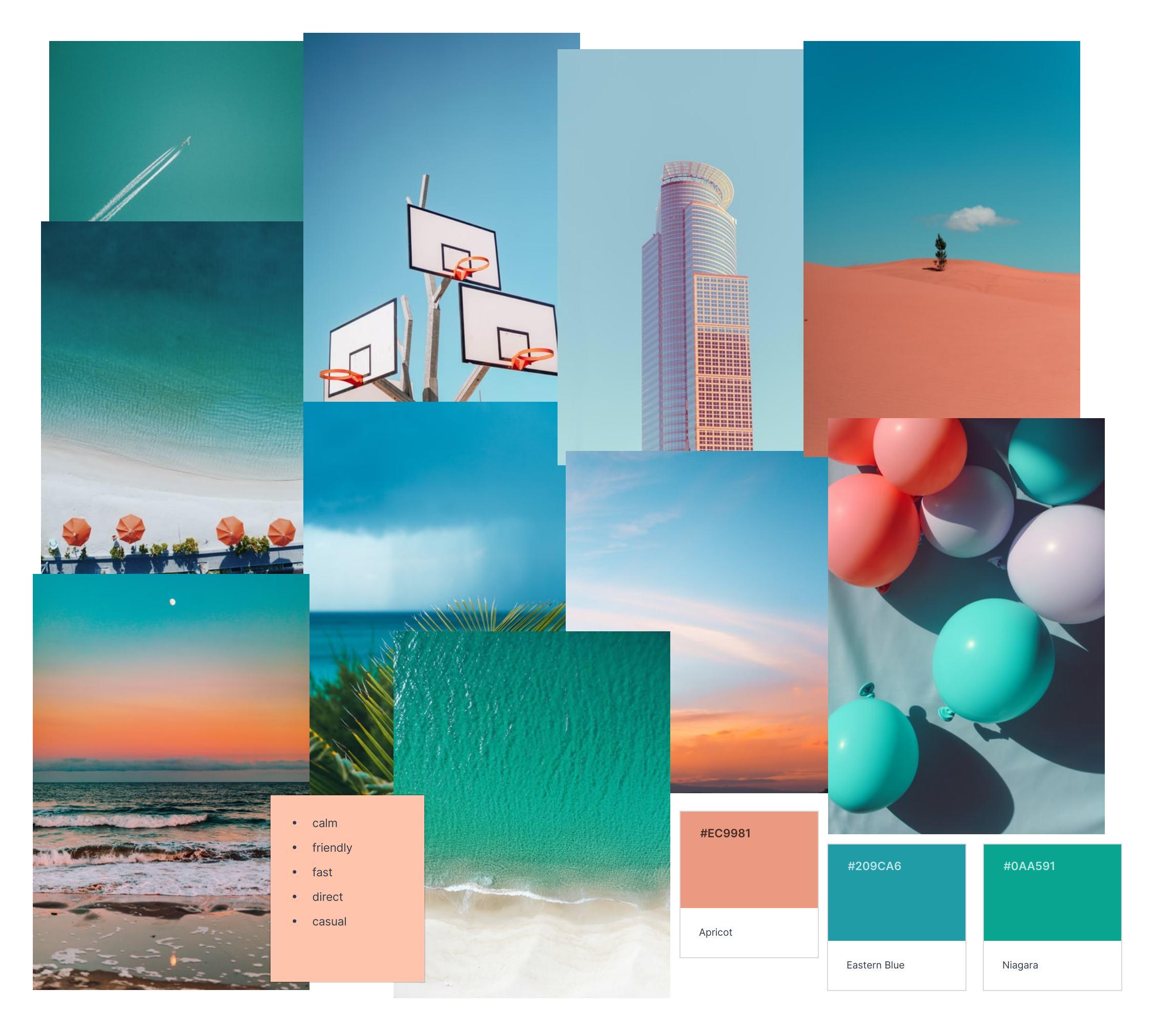
Digital & Service designer with a focus on transforming services through interactive products and a holistic approach.
Service, UX/UI, Branding & Identity, Editorial Design
education experience
MSc Design, Service Design
Linköping University, Linköping, Sweden
BA (Hons) Graphic Design
eesside University, Middlesbrough, UK
Second Class Honours (1st Division)
Higher National Diploma
Prague College, Prague, Czech Republic
Specialization in Art & Design
Graphic Designer
In-hous
UX & UI of mobile & web ap
Brand consistenc
Event stand desig
Social media posts
Web Designer
Working in a tea
Sonohaler, Copenhagen
Ematix s.r.o., Prague
UX & UI of a website prototype for a hair towel bran
Creating website components for desktop & mobil
User researc echnical support
resume
2022
2024 2023 - 2023 2020 - 2020 2021 - 2022 2019 - 2021
-
Digi al & Service esigner wi h a focus on ransforming services hrough in erac ive pro uc s an a holis ic approach.
Service, UX/UI, Branding & Identity, Editorial Design
NORDES 2023 Volunteer
Wor shop assis an Room prepara io Regis ra ion / Info es Wayfin ing
“Fadder” during Welcome Week 2023
Lin öping Universi y
Suppor ing s aff an men ors uring he man a ory roll cal
Serving coffee, answering ques ions, an ma ing new s u en s feel welcom
Assis ing s u en associa ions uring social even
Being a general suppor o facul y s aff an men ors
Note-Taking Assistant
Lin öping Universi y
Creative Skills for Innovation
Grow wi h Google
Design: Creation of Artifacts in Society
Universi y of Pennsylvania
A obe Crea ive Clou
Figm
Microsof Offic
Curren Design S ra egy Analysi
Rapi Pro o ypin
Thin ing wi h Ex ernal Represen a ion
English C 2 (Cambri ge A vance English Cer ifica e
German C1 (Deu sches Sprach iplom II
Swe ish A2 (Beginners Course in Swe ish, level 2
Bulgarian na ive
resume volunteering
skills
2023 2021 2020 2023 2023
courses
& languages
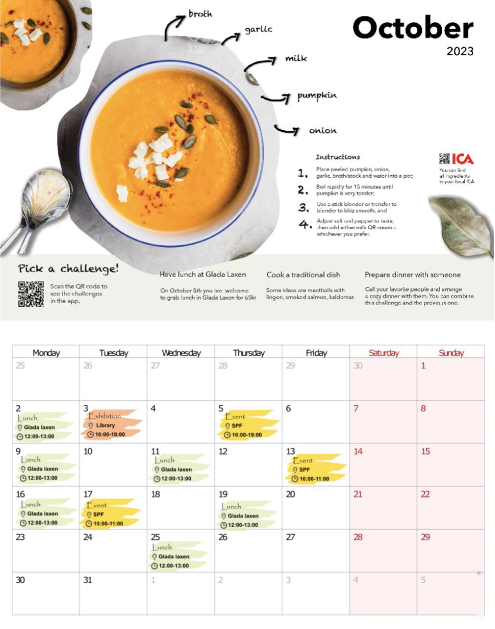
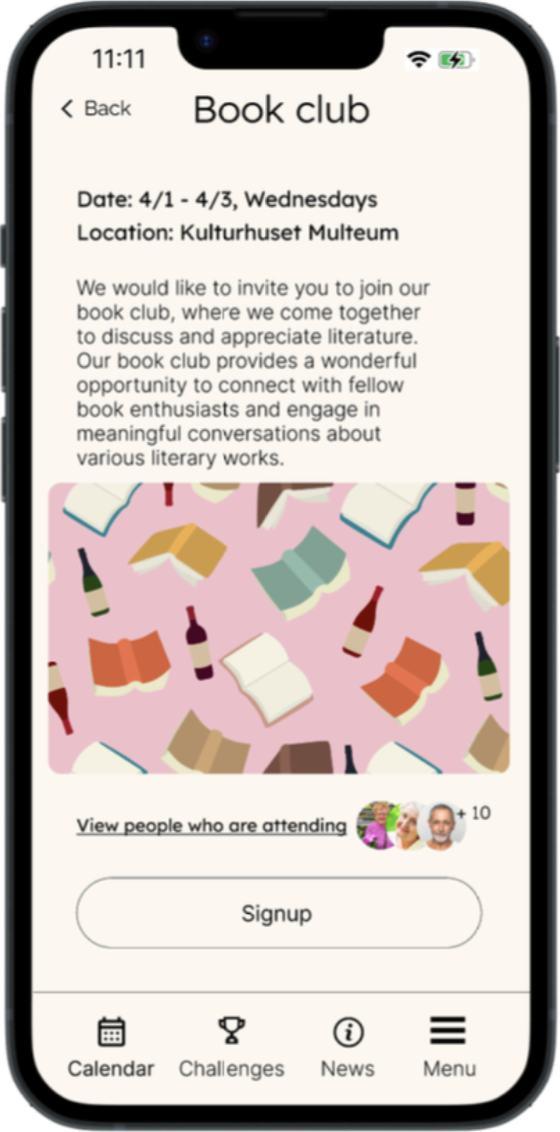
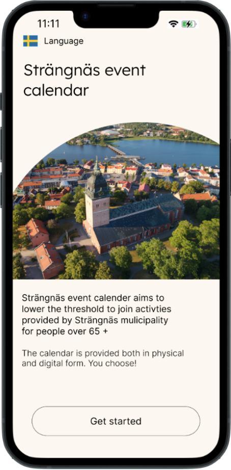
Elderly-friendly and engaging digital & analog calendar with activities
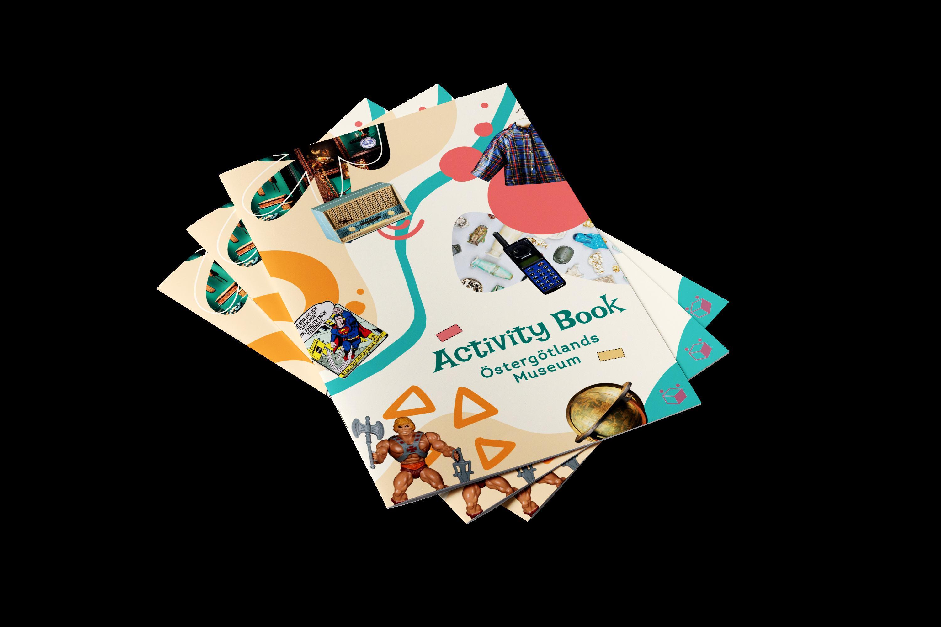
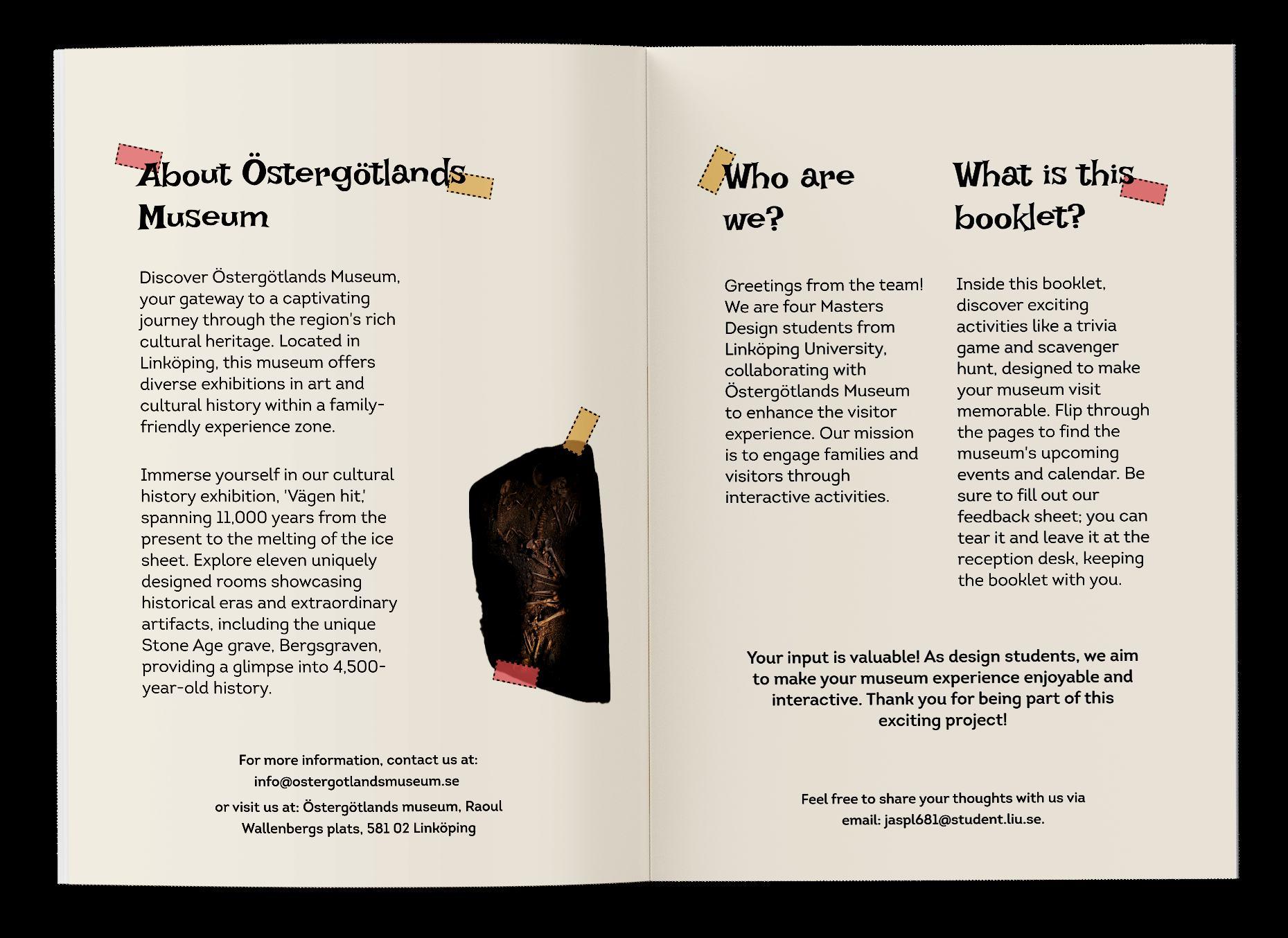
Museum Engagement & Innovation Activity Booklet
Physical booklet with activities for families with small kids during their visit to Östergötlands Museum
Closing experience for a science center
MSc Thesis; transforming a science center exhibition from static to dynamic
New look to a not-so-typical travel agency, focusing on adventure
New look to a contemporary theater with a big
Cover & layout design of a book about war-torn Syria
Design & illustration of a self-authored silent story book about finding yourself
Promotional website proposing a
contents branding editorial 19 25 22 28 31 Adventura Smrt je Drina (Death is Hard Work) Švandovo Divadlo Rock Bottom Concrete & The Long Walk
ux/ui 13 16 Petective The Fat of the Land
that reunites owners with their lost pets through teamwork
App
new way to
fans to explore Prodigy’s iconic 90s music album
interest
personality
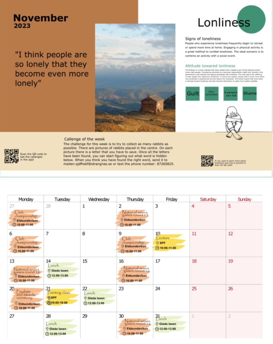
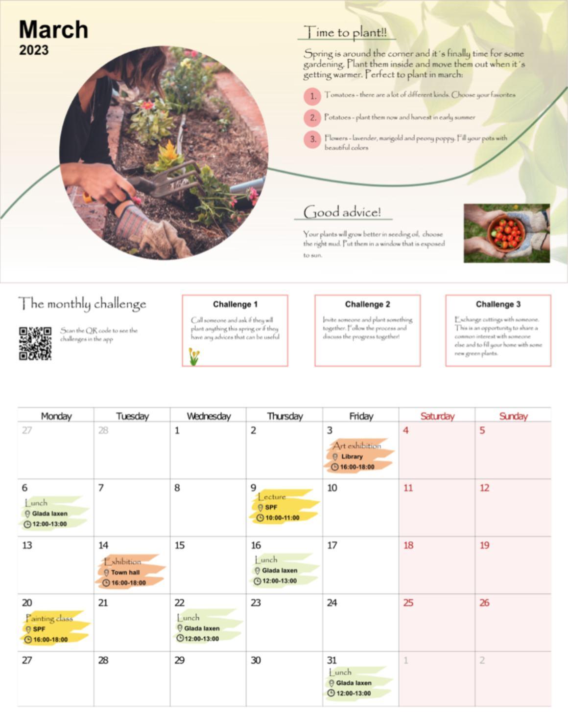
Cover redesigns of my favorite books service 05 07 10 Countering Elderly Loneliness in Strängnäs Municipality

elderly loneliness
in strängnäs
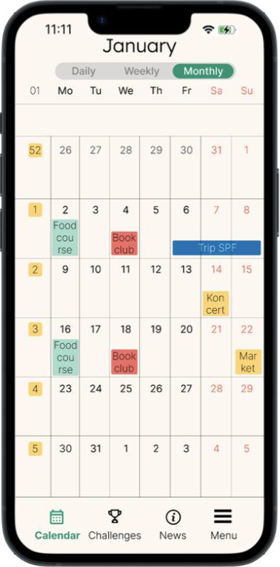
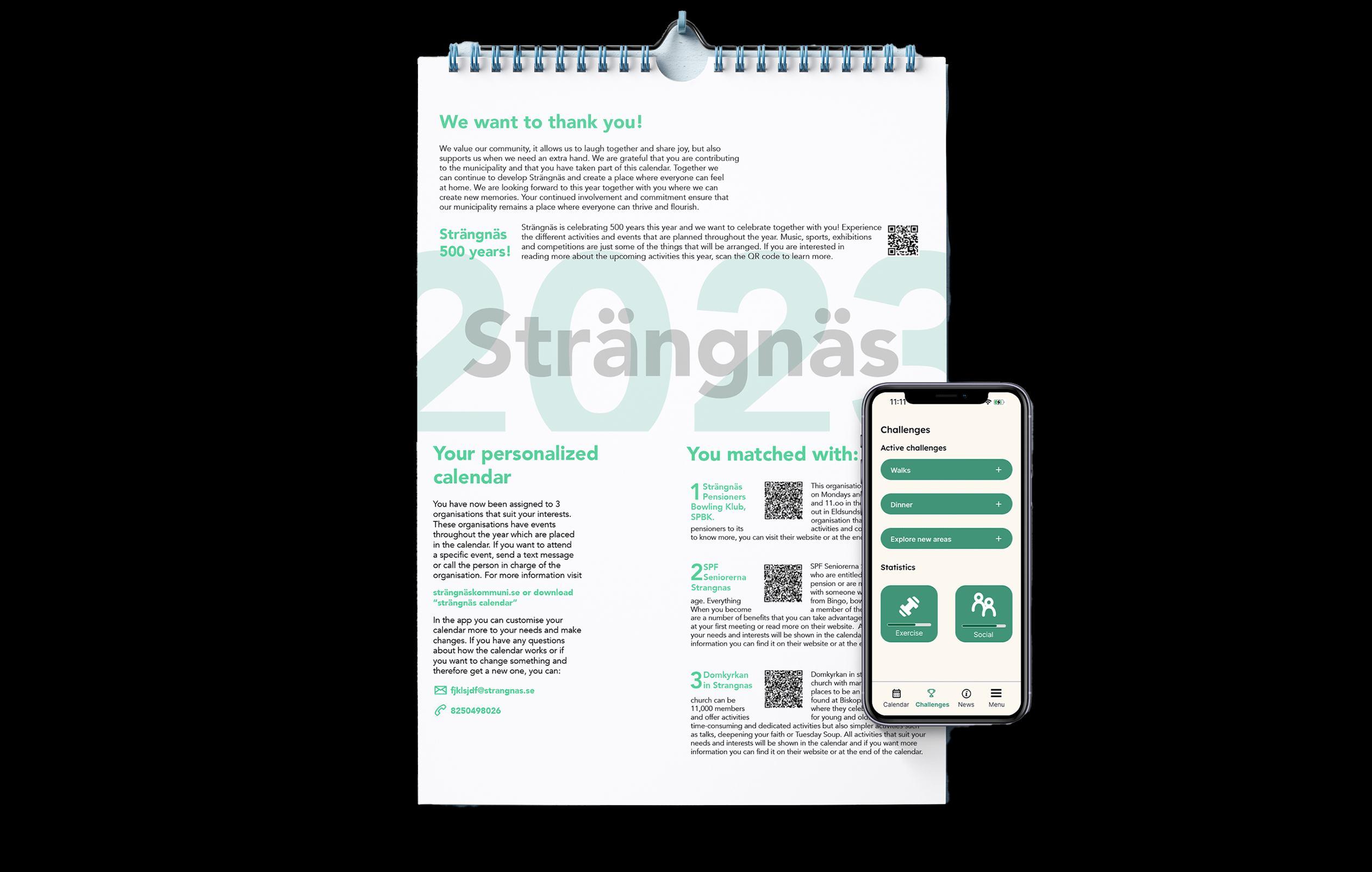
Tackling elderly loneliness with an activity calendar, both digital and physical. The users can see future activities, book them, communicate with each other, connect with elderly organisations and more.
Collaborative project.
Problem
Originally a brief by Strängnäs Municipality, Sweden, elderly loneliness is ranking high there. Despite efforts to mitigate it through social clubs and activities, there hasn’t been much improvement.

Solution
An app and a physical calendar that offer elderly-friendly activities, organized by various organizations in Strängnäs. The app is also a communication channel between the users, and user-organization. The physical calendar complements the app and is intended for the technologically inexperienced.
service 05
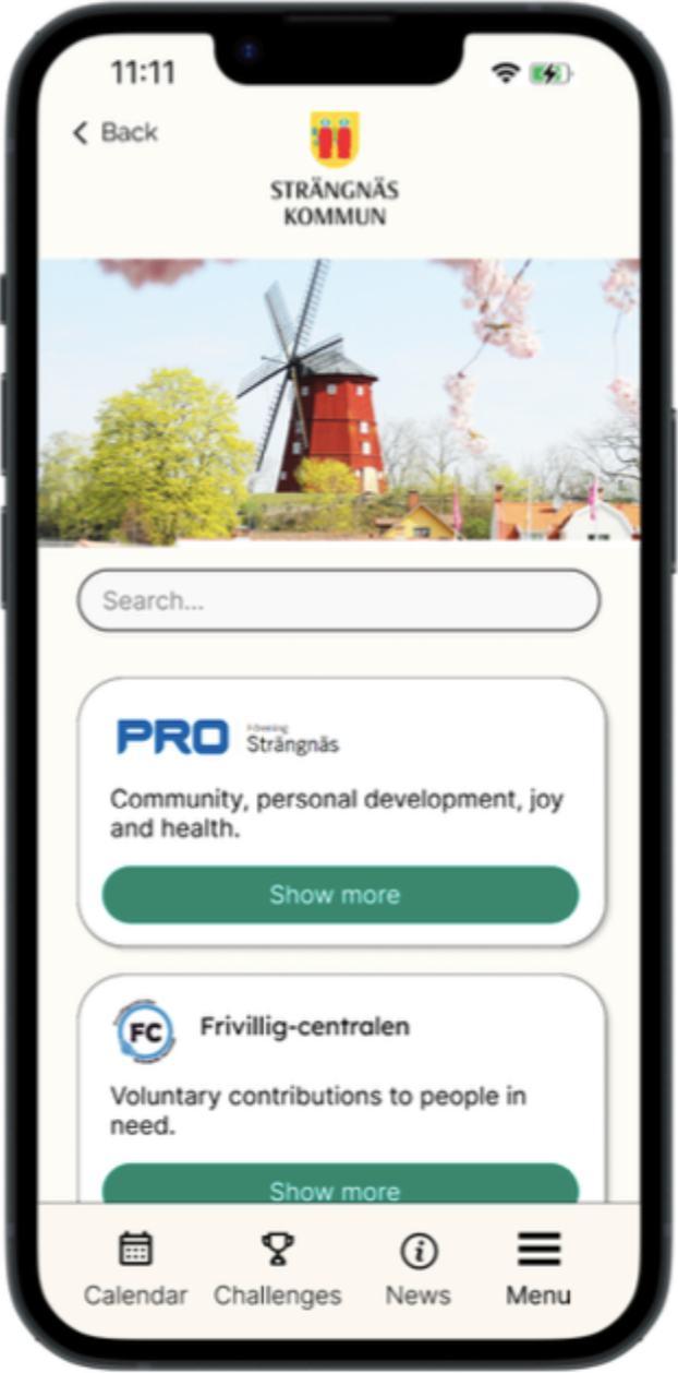
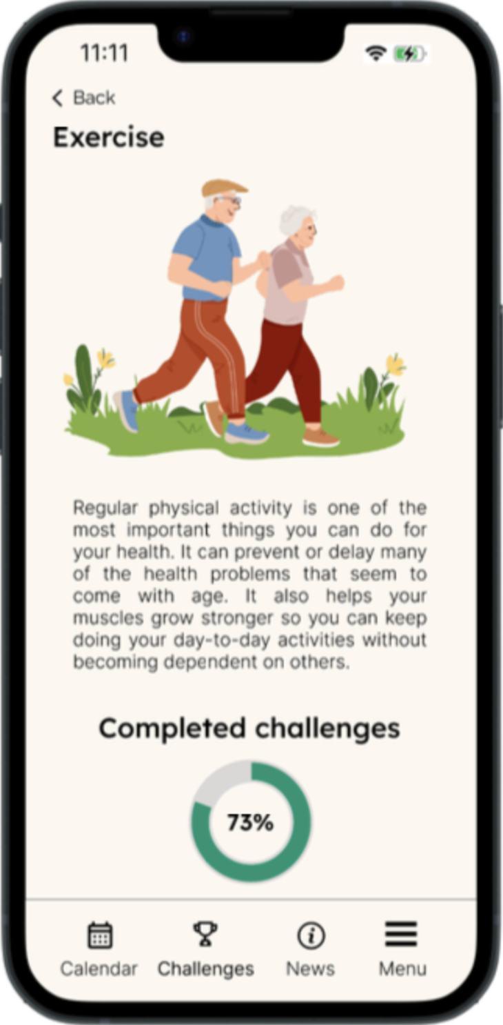

The digital calendar is carefully designed to align with the design principles when the target audience is the elderly. With its user-friendly interface and a range of features, it aims to foster connections, active engagement, and provide easy access to information within the organizations and activities. To kick-start the process, the user must fill out a survey with questions about hobbies, physical capabilities, preferred activity areas, etc. with the aim to personalize the calendar as much as possible based on user needs. The survey could be both digital and physical, depending on preference and it is mailed to the elderly’s homes.
Key features
See all available activities, tailored to preferences from the surve
Sign up for activities
Communication channel for users to chat with other users or with a specific organization
Monthly challenges both in-app and on the physical calendar
M re inf rmati n & insights n ehance

Design team and artifact contribution:
Jacquelline L’Allemand - physical calendar
Jasmína Plškova - digital calendar
Klara Mellqvist - digital calendar
Maria Nanova - physical calendar
Nils Hård af Segerstad - digital calendar
Sanna Ramström - physical calendar
Ville Jonsson - digital calendar
06
Credit: Klara Mellqvist
Credit: Jacquelline L’Allemand


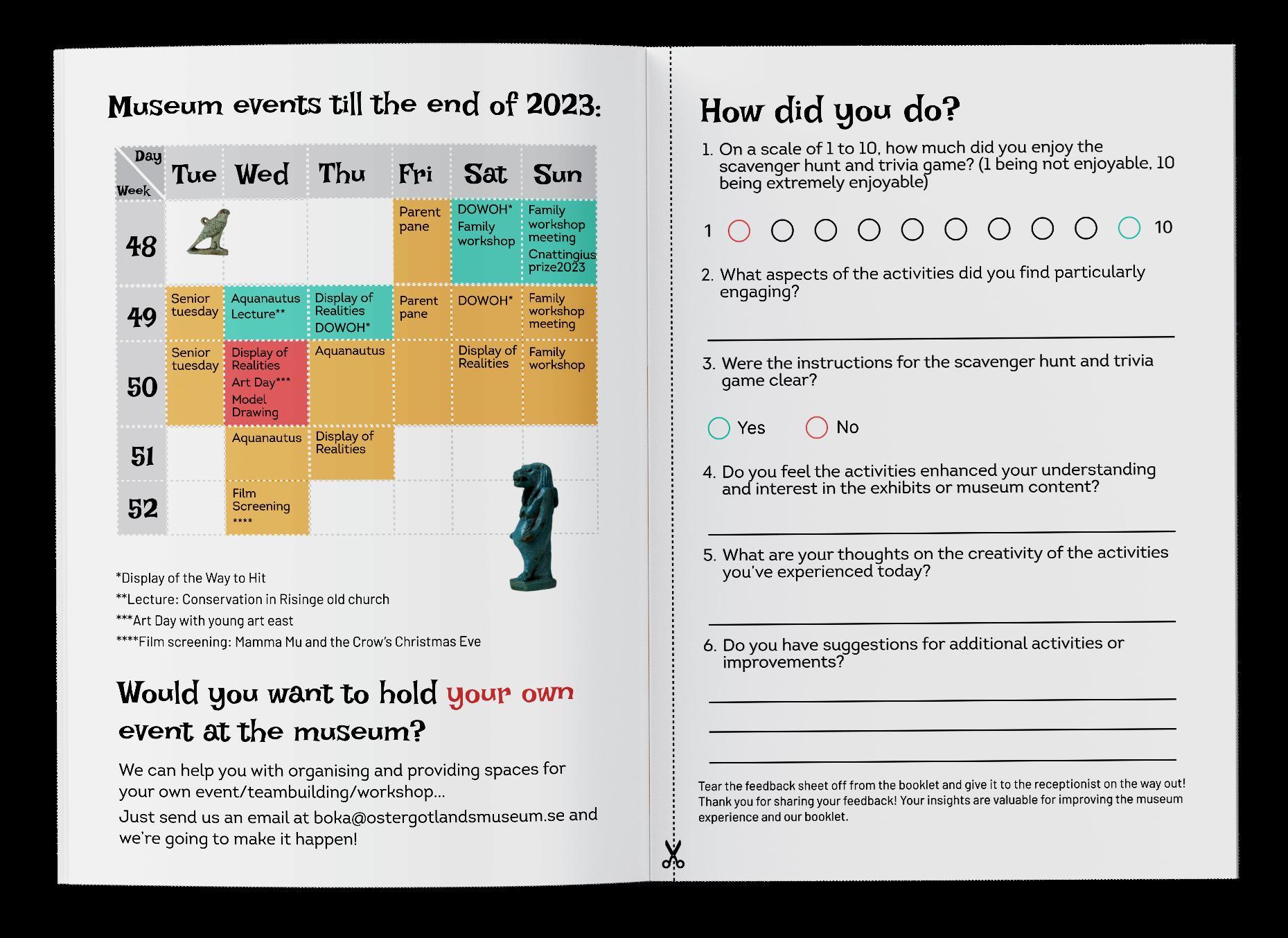
museum
activity book
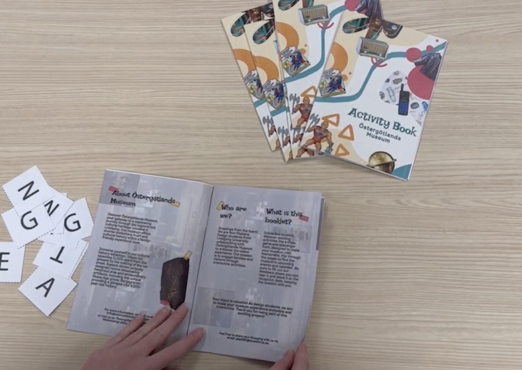
An engaging booklet with various games and activities that complement a family’s journey throughout the cultural exhibition in Östergötlands Museum, Sweden. This edition serves as a pilot.
Collaborative project.
Problem Solution
Östergötlands Museum offers a variety of workshops and events for kids, but not enough to engage them with the exhibits in the cultural exhibition. Since families are their main visitors, they want to engage the whole family in the visit.

An innovative booklet designed through participatory practices, in close collaboration with Östergötlands Museum. Its engaging nature is ideal for families with little kids and promotes crossgenerational collaboration.
service 07


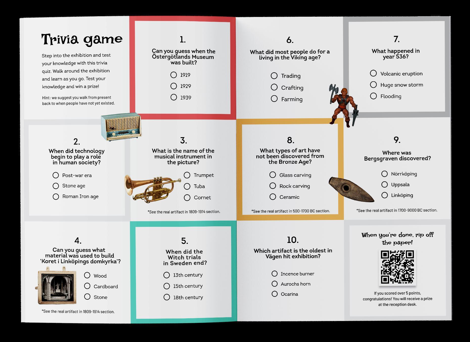
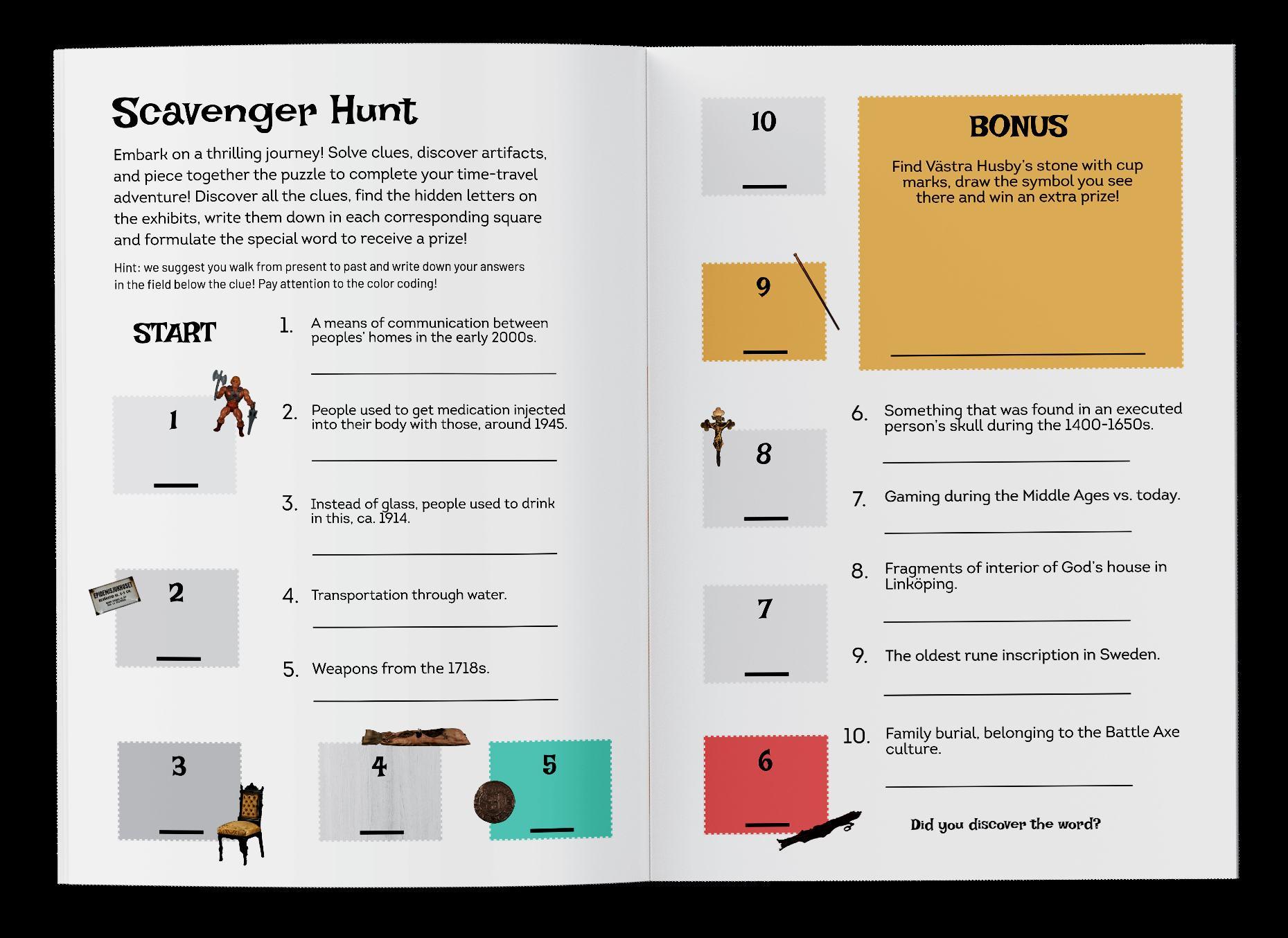
As the time period for this project was approximately two months, only two activities could be implemented in the booklet and it was decided that this iteration serves as a pilot to a bigger booklet to come.
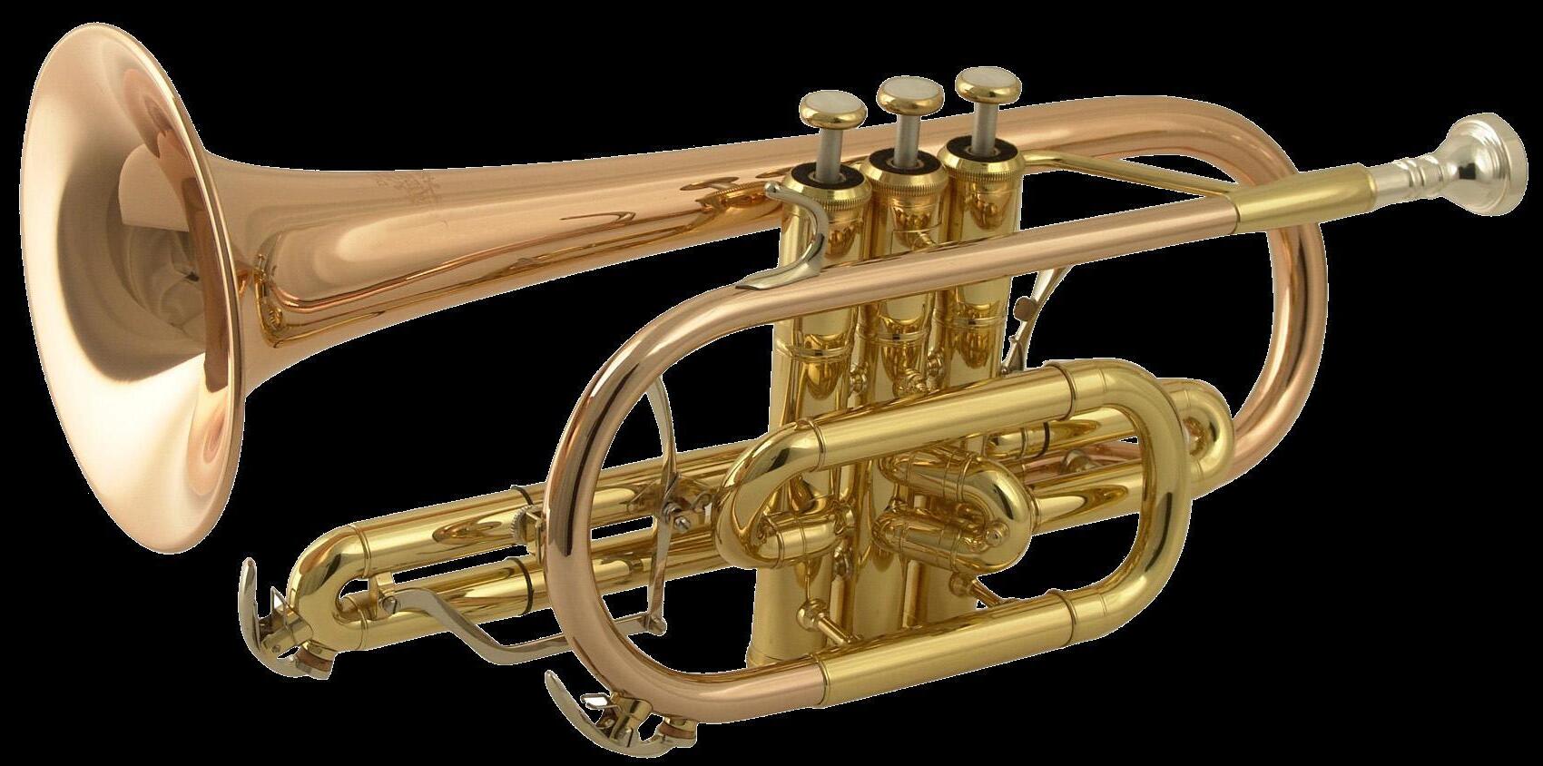
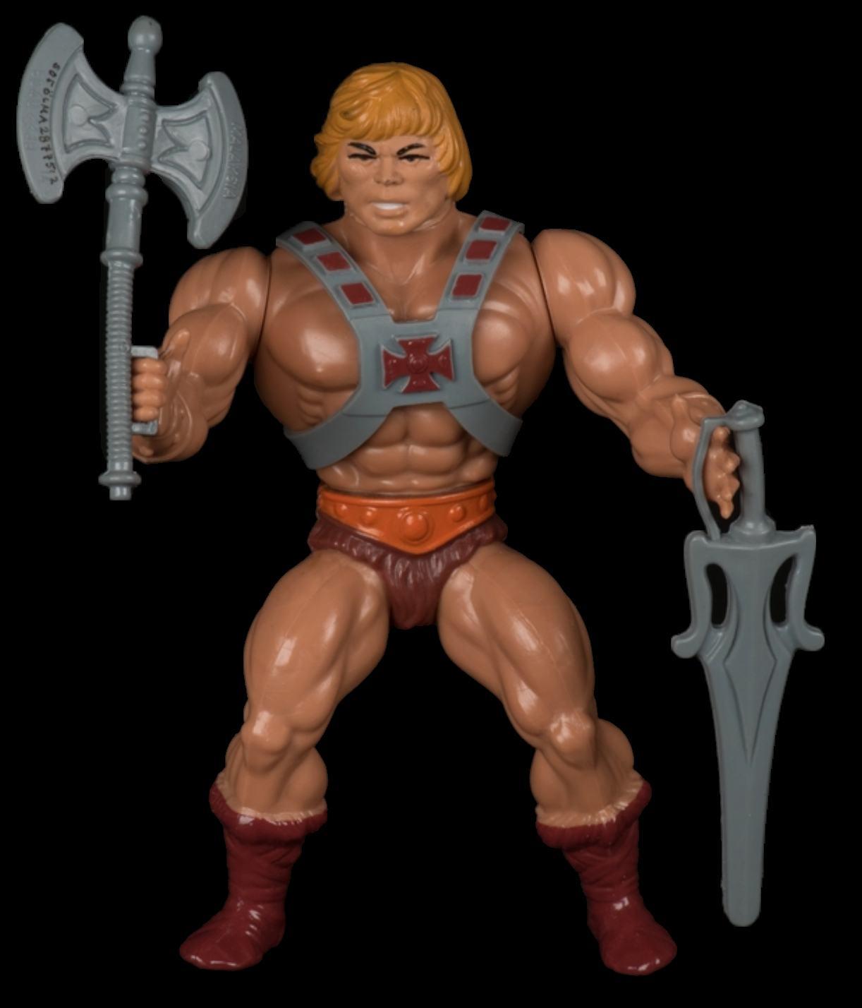
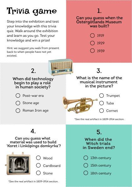
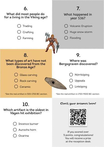
Trivia game: go through the cultural exhibition and find the answers in the supplementary texts to each exhibit
Scavenger hunt: work your way through series of clues to find secret letters close to the relevant exhibits and complete the word. There is a bonus symbol that if the kid finds, they redraw it on the space and receive an extra prize.
There is a calendar with upcoming events at the back of the booklet and a feedback sheet that can easily be torn and given to the reception desk. The museum had mentioned they struggle with feedback collection and this section is meant to alleviate that issue. The back cover of the booklet is the map of level 1.
08
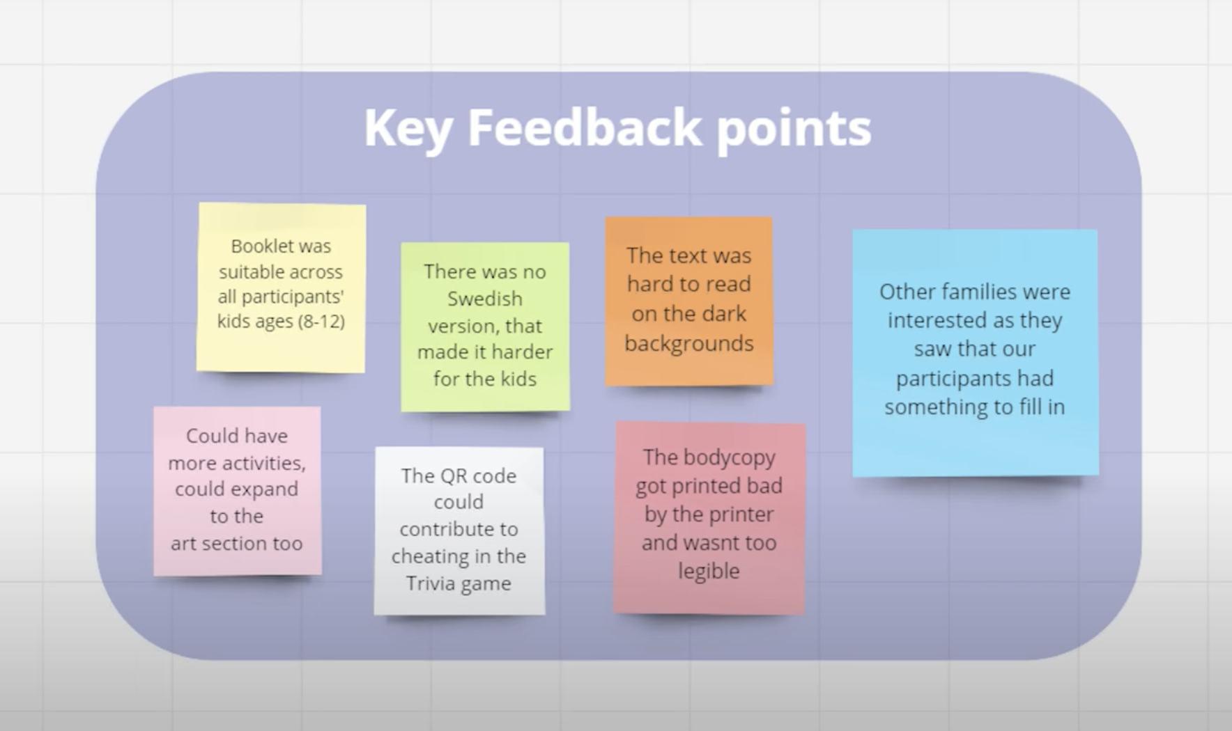
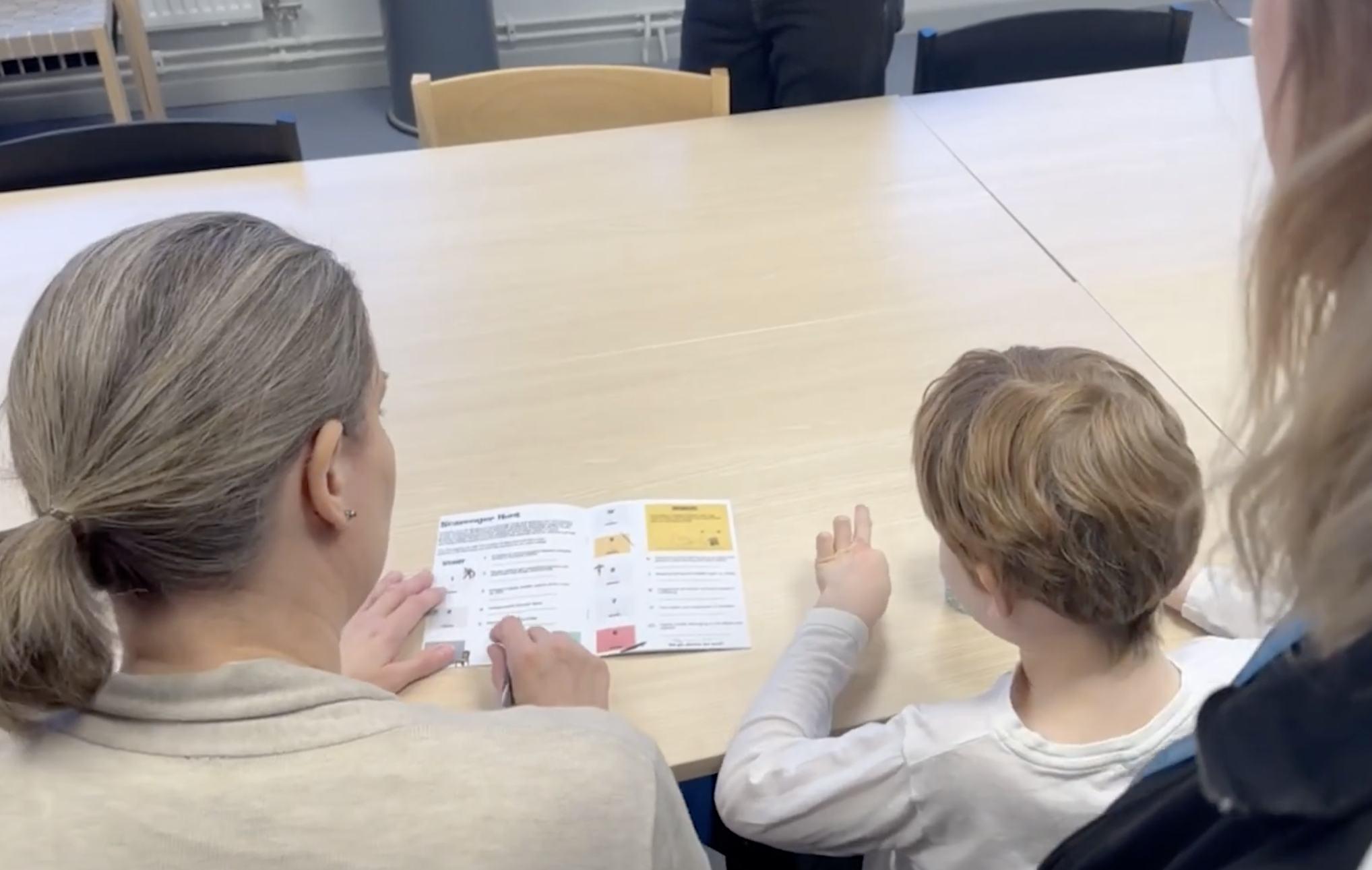
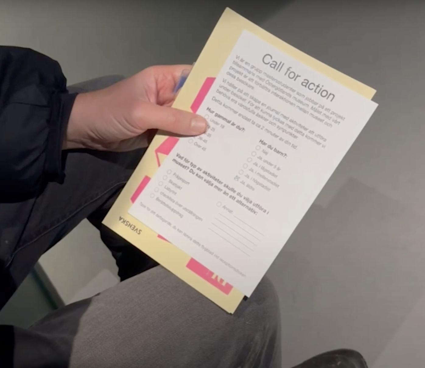
The nature of this project follows the principles of Participatory Design. All planning, ideation and design decisions were made closely with the stakeholder, and multiple workshops for concepting and testing were done. The final workshop included two families, regulars of the museum and they saw the artifact as an initiative for repeated visits.
The deliverables for this project were an artifact and a documentary movie about the process and purpose of the artifact.
Watch the documentary movie on YouTube
Design team & roles:
Jasmína Plškova - video director & designer
Mahsa Ahmadi - workshops & designer
Maria Nanova - scriptwriter & designer
Thitima Dulyapitak - storyboards & designer
09
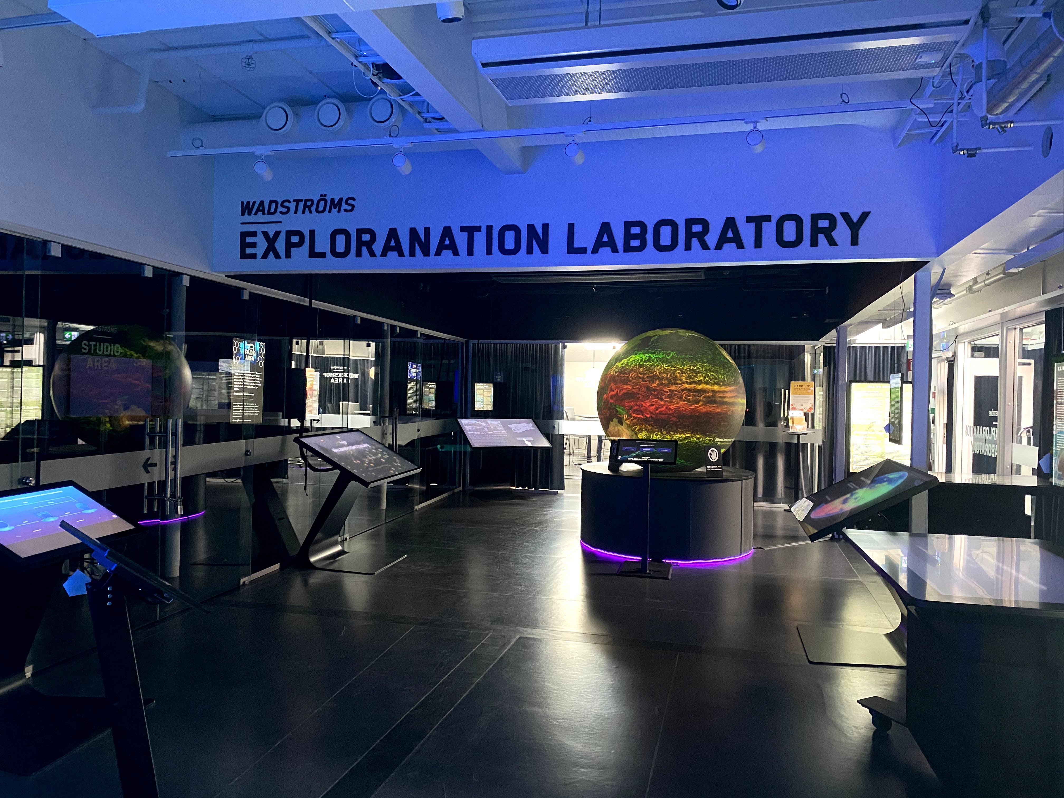


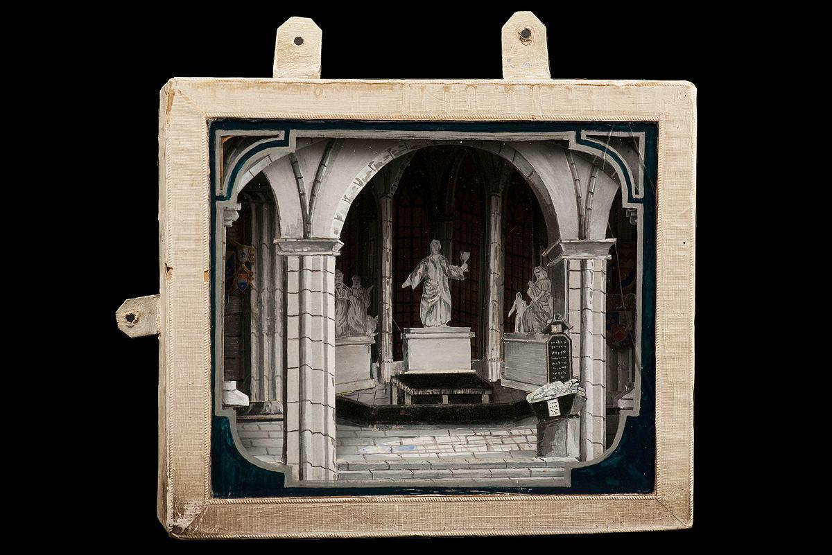
The closing service experience is the final interaction with the service before the users reflect on their experience (known as the post-service period). It is a neglected area of service design and there is a misconception that the closing experience is the feedback/reflection session, but the closing experience contributes to the main service experience, a conclusion to it, rather than an epilogue. Customers tend to memorize sequences of pain and pleasure, highs and lows, and the endings.
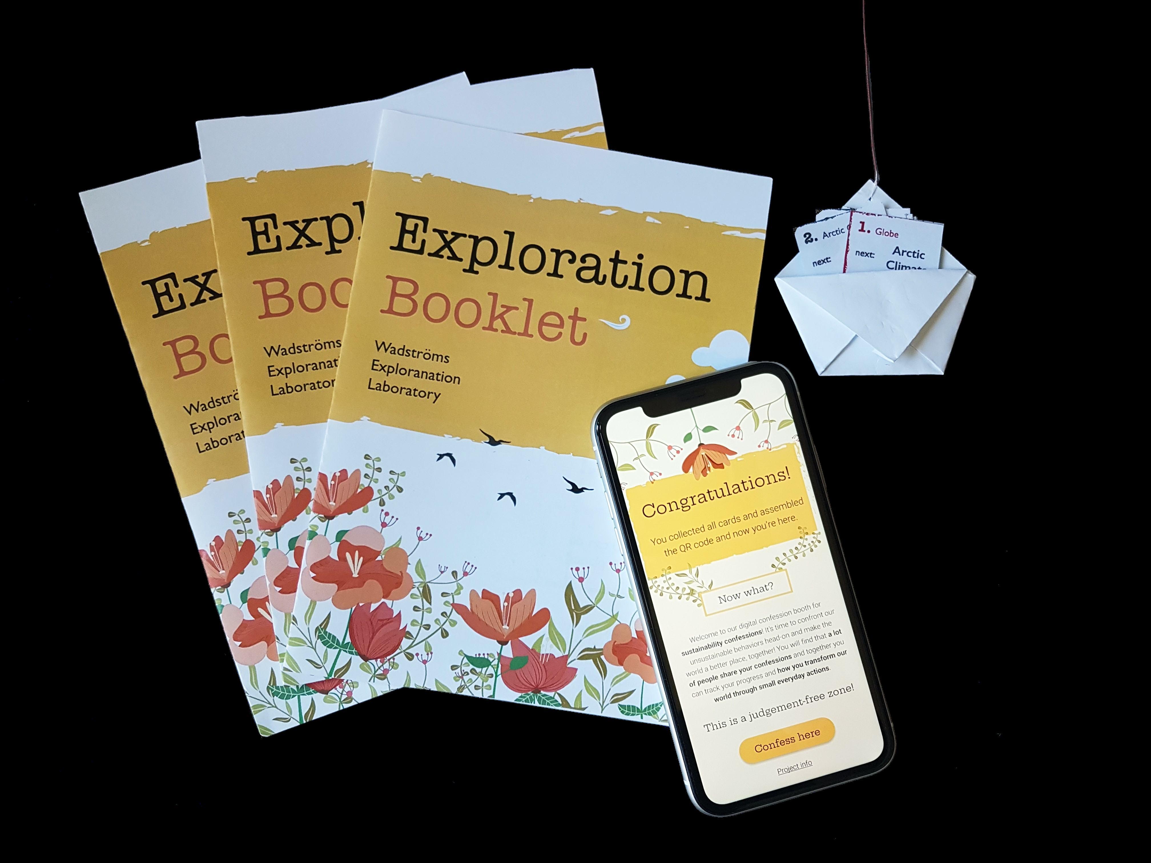
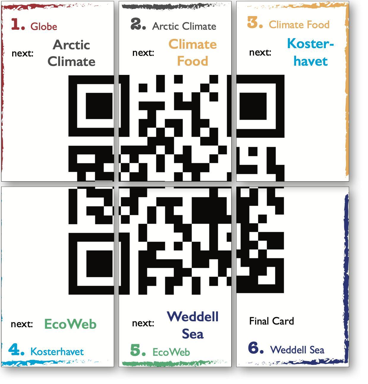
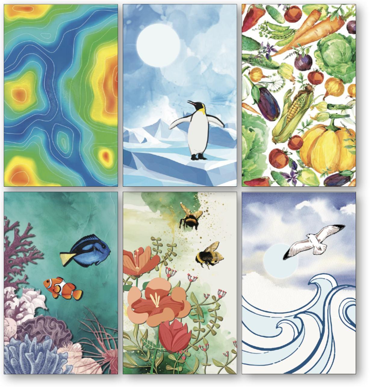
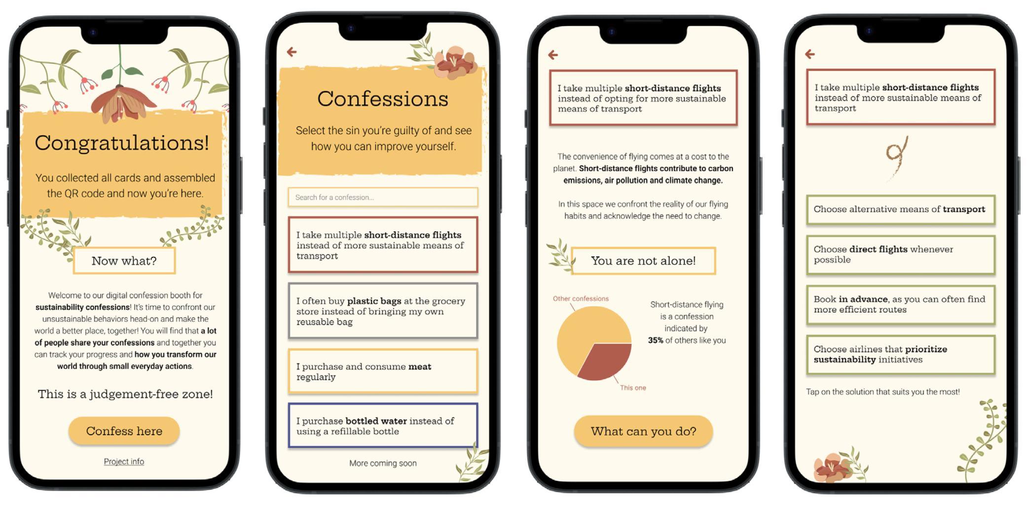
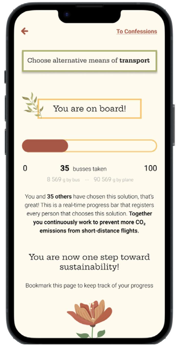
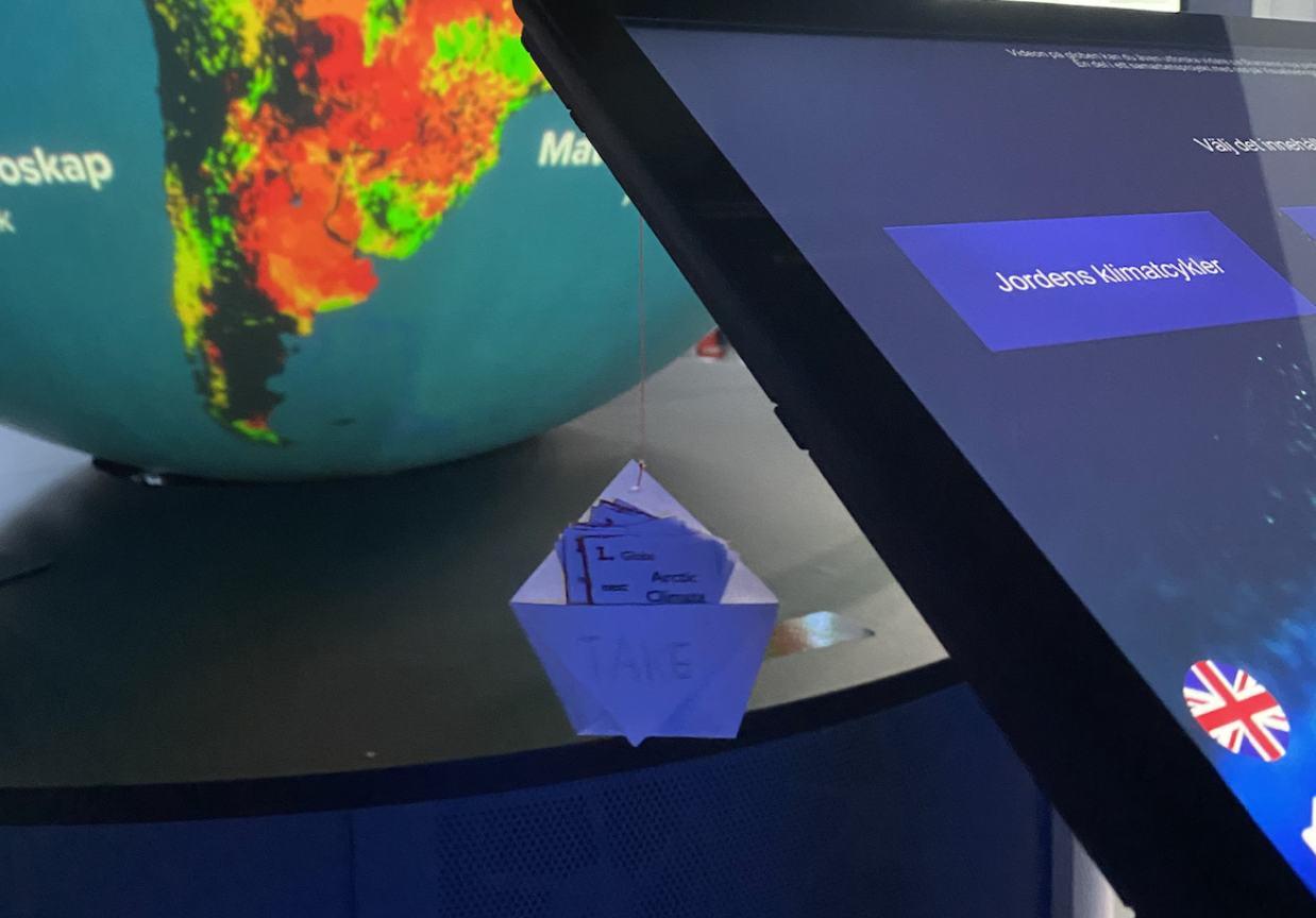
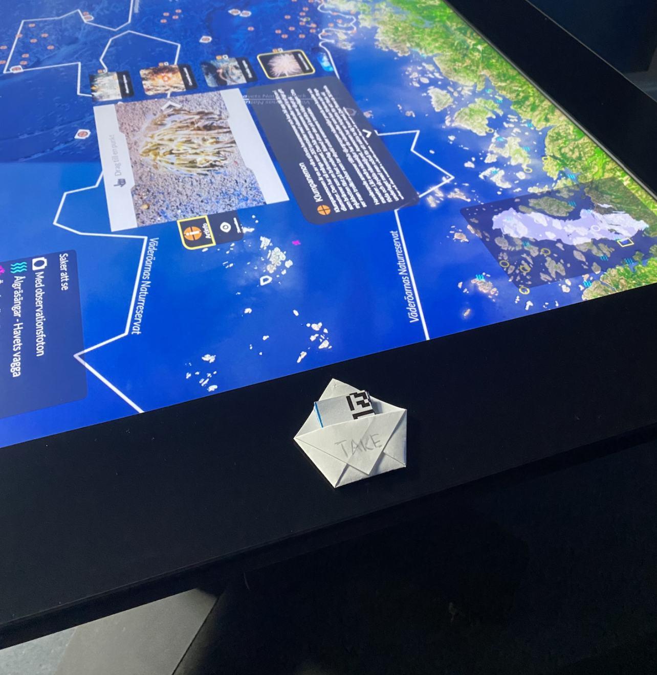
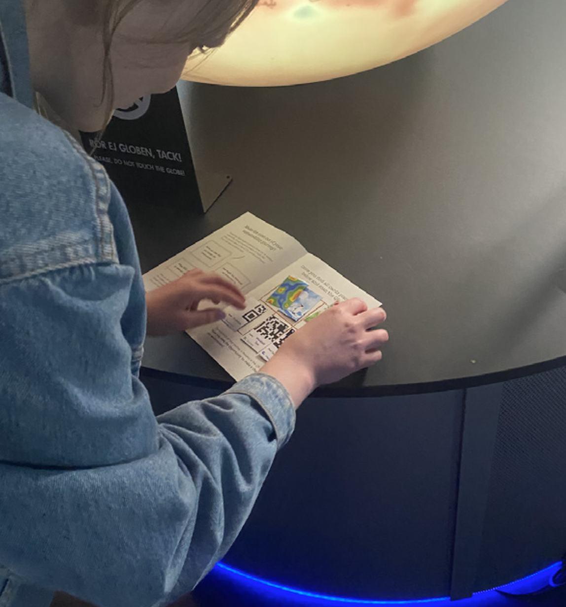
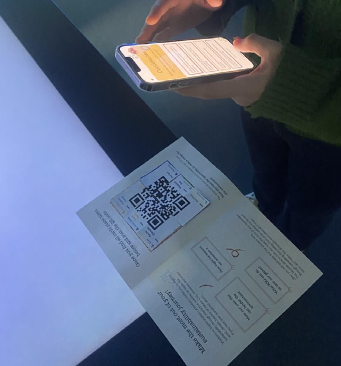
Visitors of the exhibition can pick up a booklet from the pickup station located at the entrance. Then they follow the storytelling path specified on the six thematic cards located at each exhibit. Each card contains a piece of a QR code. Once all cards have been collected, they can be assembled as a puzzle and the QR code is scanned. This leads to the closing experience, a confession booth where visitors can confess their harmful habits and be offered easy to follow solutions for said habits. Each confession is tied to its specific exhibit.
Access the prototype here
11
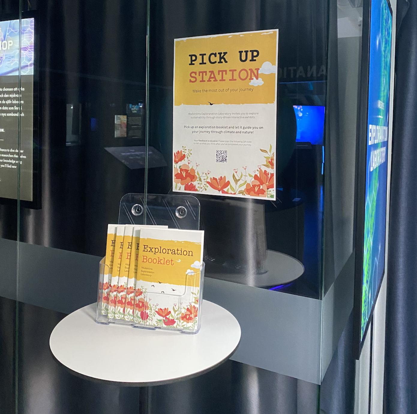
Locate and pick up a booklet, familiarize yourself with the contents
Navigate to the first exhibit, The Globe, and pick up a card
The card shows where to go next, navigate to the next exhibit when ready
Follow the storytelling path using the cards, collect all of them. When finished, assemble all cards into the puzzle
All decisions have been made based on a participatory approach and a Research Through Design (RtD) method. The visitors’ needs were evaluated with workshops and surveys where the outcome was the need for a personal action. The exhibits are data-driven visualizations of climate and nature, and the visitors indicated a feeling of guilt - there was a lot of information on how poorly humans treat the Earth, but no solutions as to what you can do about it. This became the focus of the project.
The nature of this project is theoretical, based on service design strategies and cognitive science knowledge, with results and knowledge outcomes based on the prototype.
Scan the QR code and access the next stage - the Confession Booth; follow the steps and make a confession
12
1. 2. 3. 4. 5.

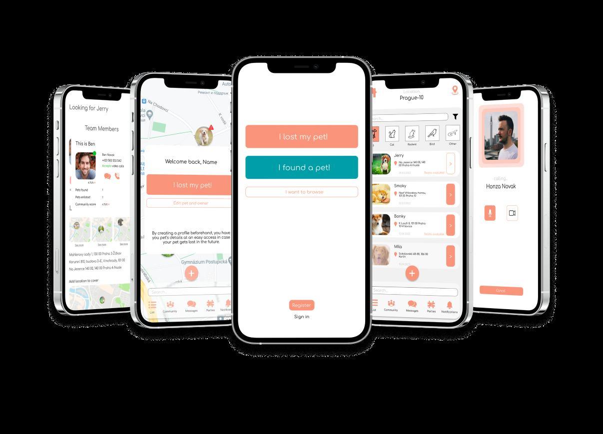
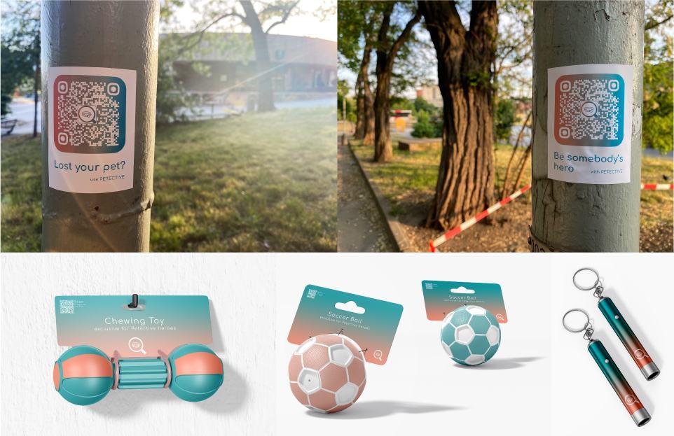
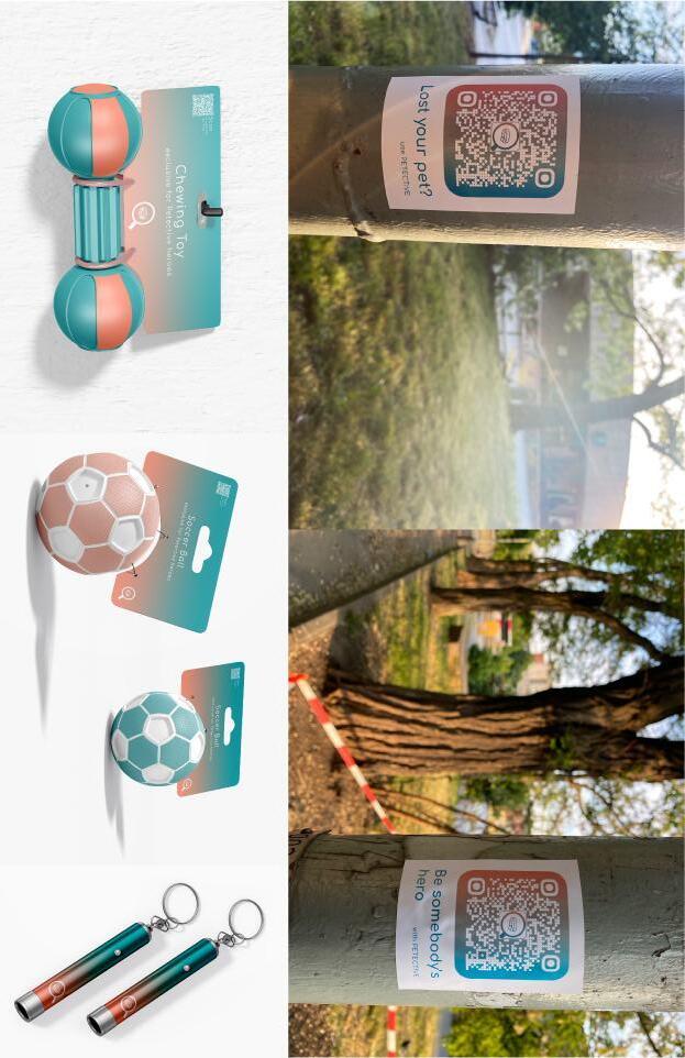
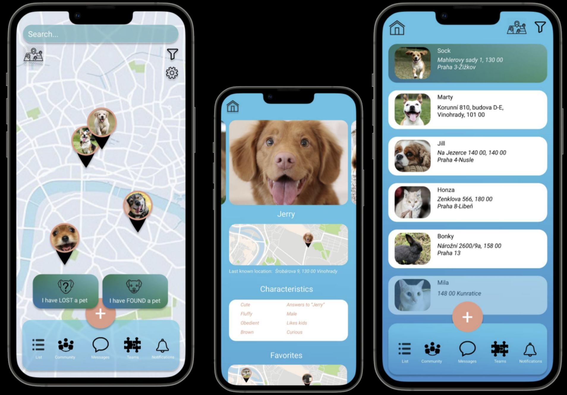
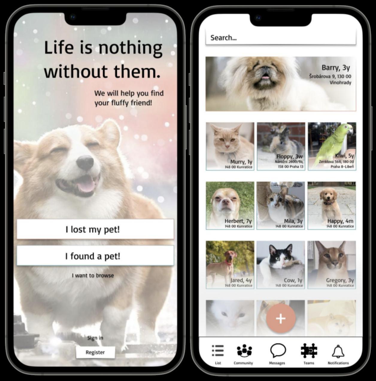
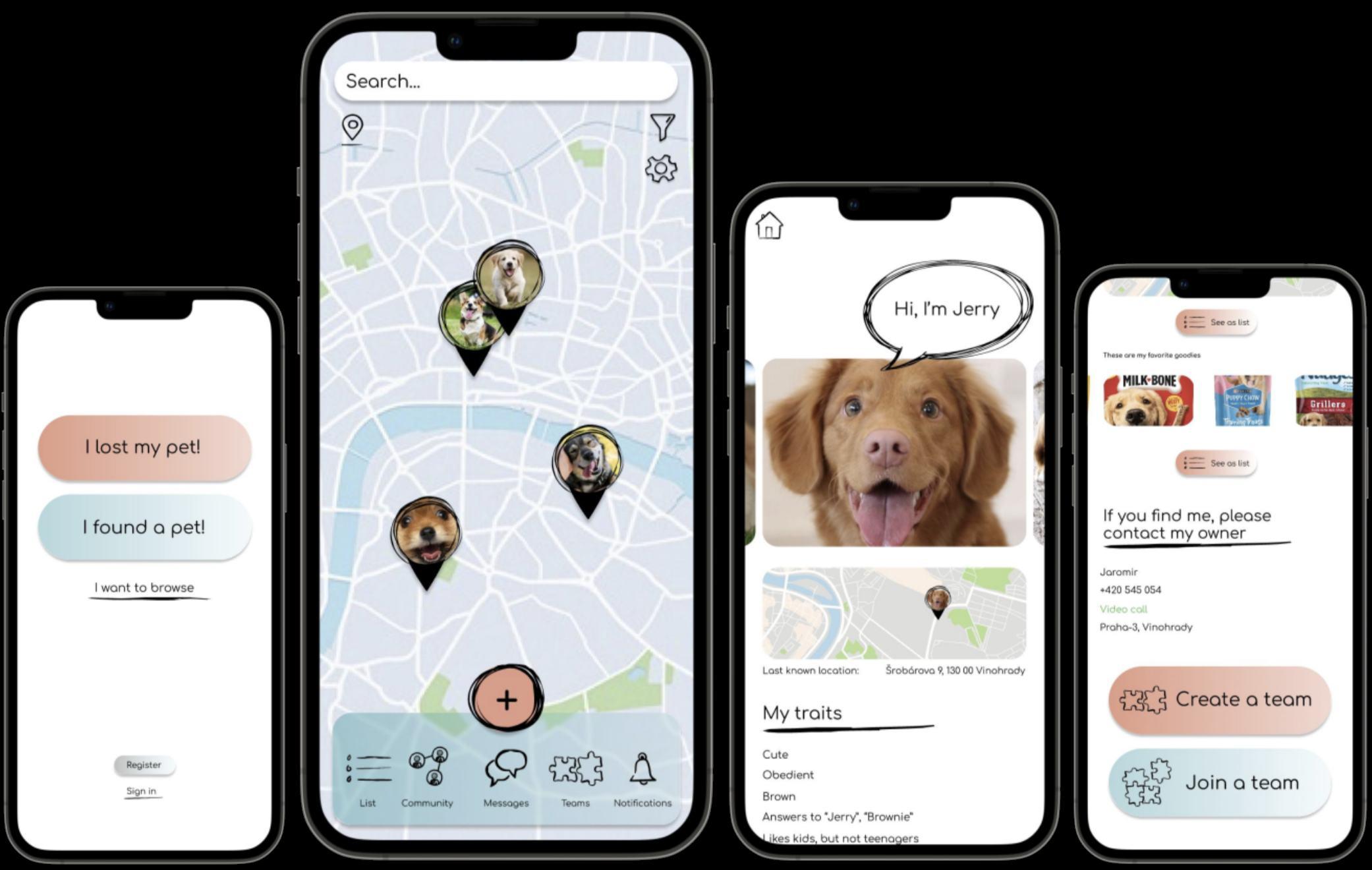
Petective
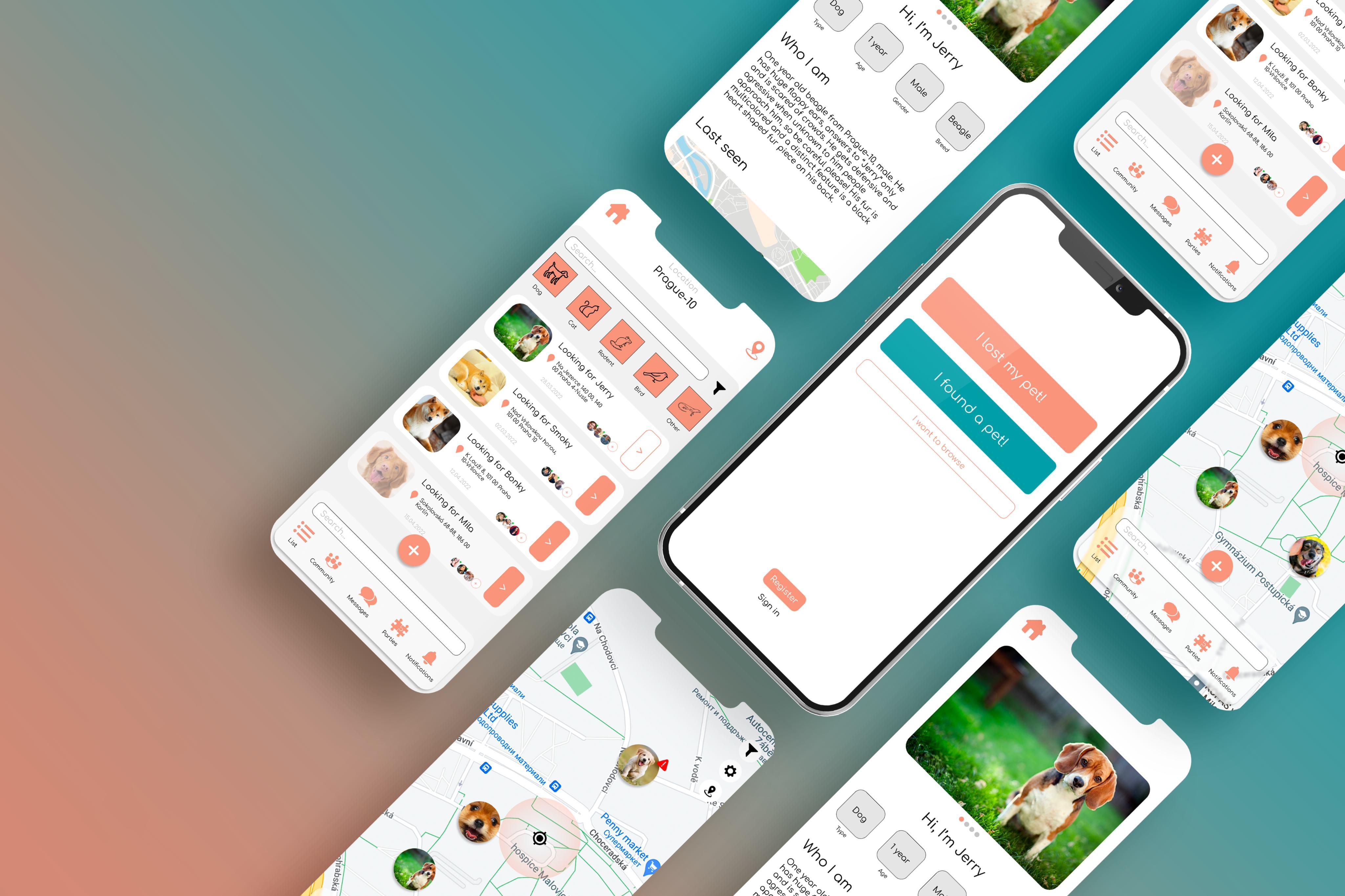
pet owners with their missing pets. Register your pet, assemble search parties, contact shelters and be a part of our community!
Lost pets apps lack important features that could be crucial for finding you pet. Such apps are only used in time of need, after the pet has already been lost, rather than as a preventative measure.
preventative and emergency measure, that utilizes teamwork, engages veterinary clinics and shelters. The created database eliminates the stress of creating and posting “lost pet” messages.
ux/ui 13
Barbora Pokorna
24, lives in Prague, has a dog.
Goes to the park next to her house
twice a day to walk her dog, but doesn’t use a leash, because her dog is docile. Has no friends living in her area and uses smartphone
for all things social. Has never lost her dog before.
Easily anxious
Honza Cerny
Unlike other similar apps, Petective is also used by people who don’t own pets, but would like to offer their help in finding a missing pet. Orange indicates the owner losing their pet, also in the app, while the blue represents the finder and the shelters. Users earn points when working in teams and can purchase merchandise with those points from the in-app store. The following personas were kept in mind while designing the app:
22, lives in Prague, loves animals but doesn’t own one.
Likes to walk in the park regularly, and uses smartphone
for all things social. Honza likes helping the people
around him and has done voluntary work in an animal
shelter before. He would like to connect with like-minded people.
Not anxious and doesn’t panic in stressful situations.
14
CORPORATE
Ea ly n epts a ve
C p ate identity ld Fa e k inspi ati n
Ph t g aphi al natu e ve y simila t its mpetit
O gani , inspi ati n f m handw iting alm and pleasant, l we s st ess levels
The thi d n ept was eated afte the m d a d I had in mind lue s thes the mind and pea h ange mplements it. Staying alm is a key m ment when dealing with l sing a pet and Pete tive’s l palette helps the use with that.
Du ing the n epting a se ies f su veys n luded that mmunity g ups a e useful when dealing with a l st pet, messaging al ne isn’t en ugh and maj ity f them w uld egiste t Pete tive t unl k in app pti ns and even th ugh they d n’t a e a ut ewa ds as mu h, an in app st e with me h is an inte esting n ept.
See the promotional page & launch video on Behance
15
PHOTOGRAPHIC ORGANIC
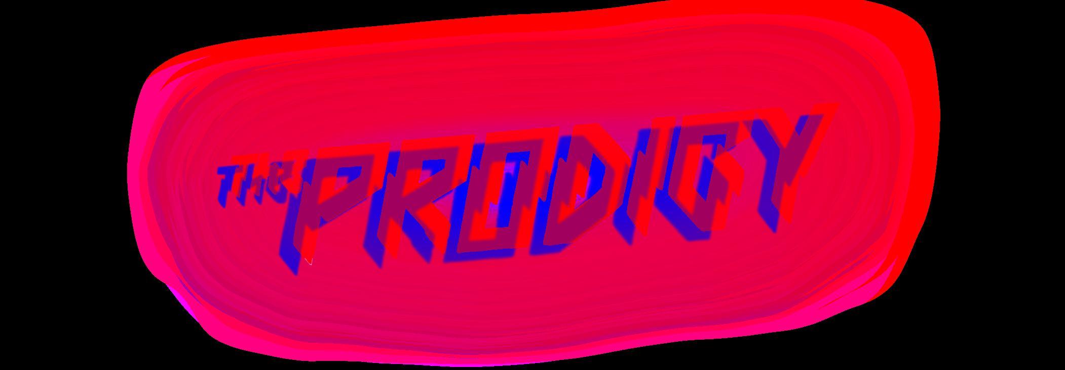
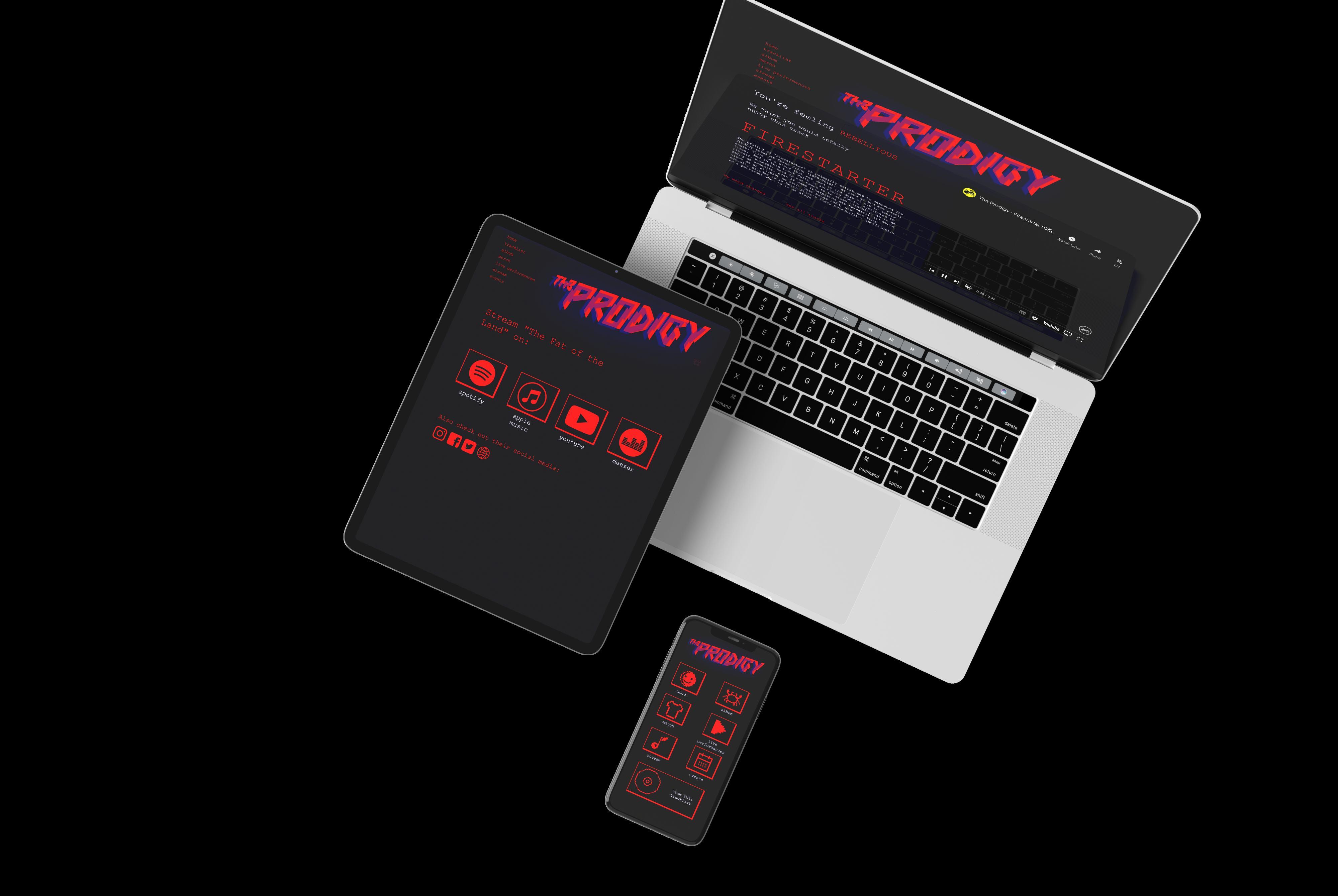
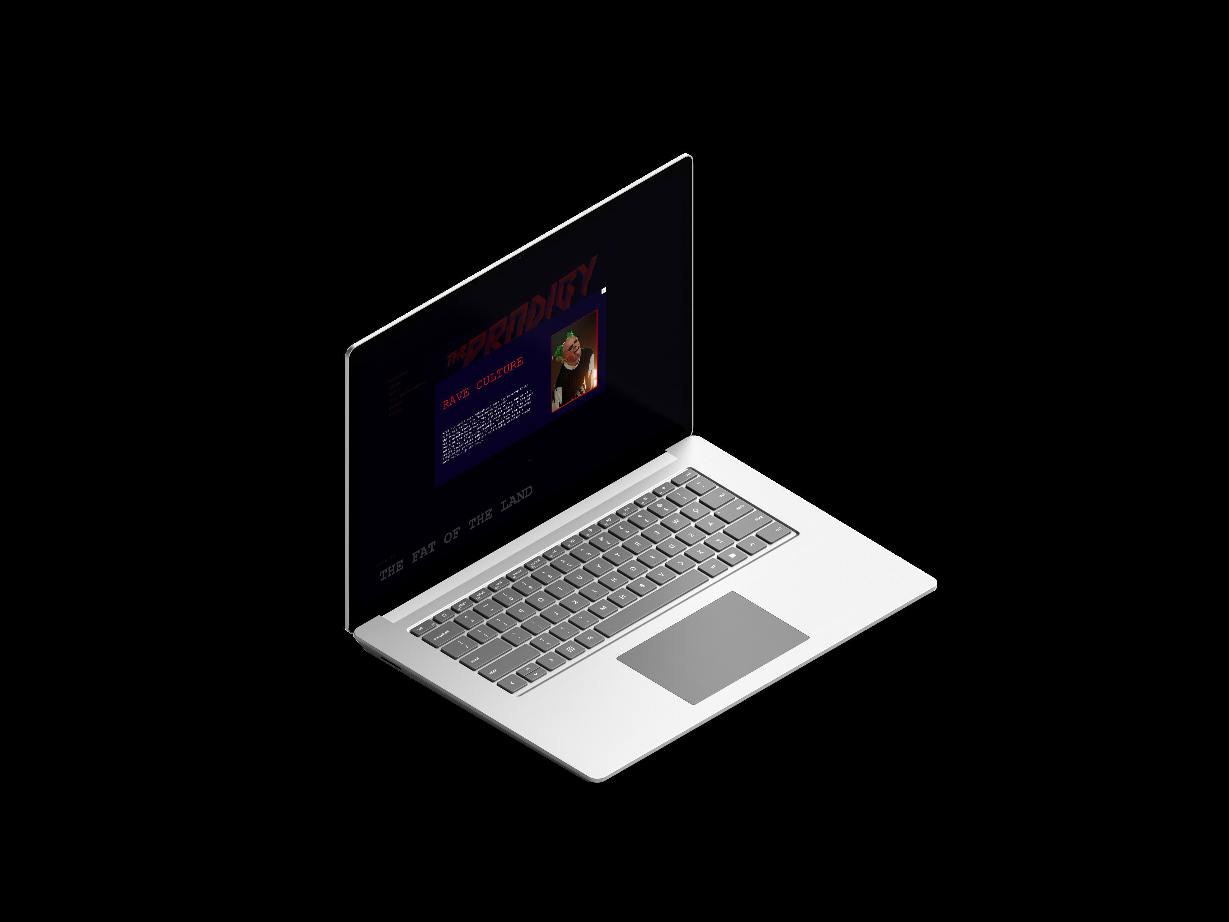
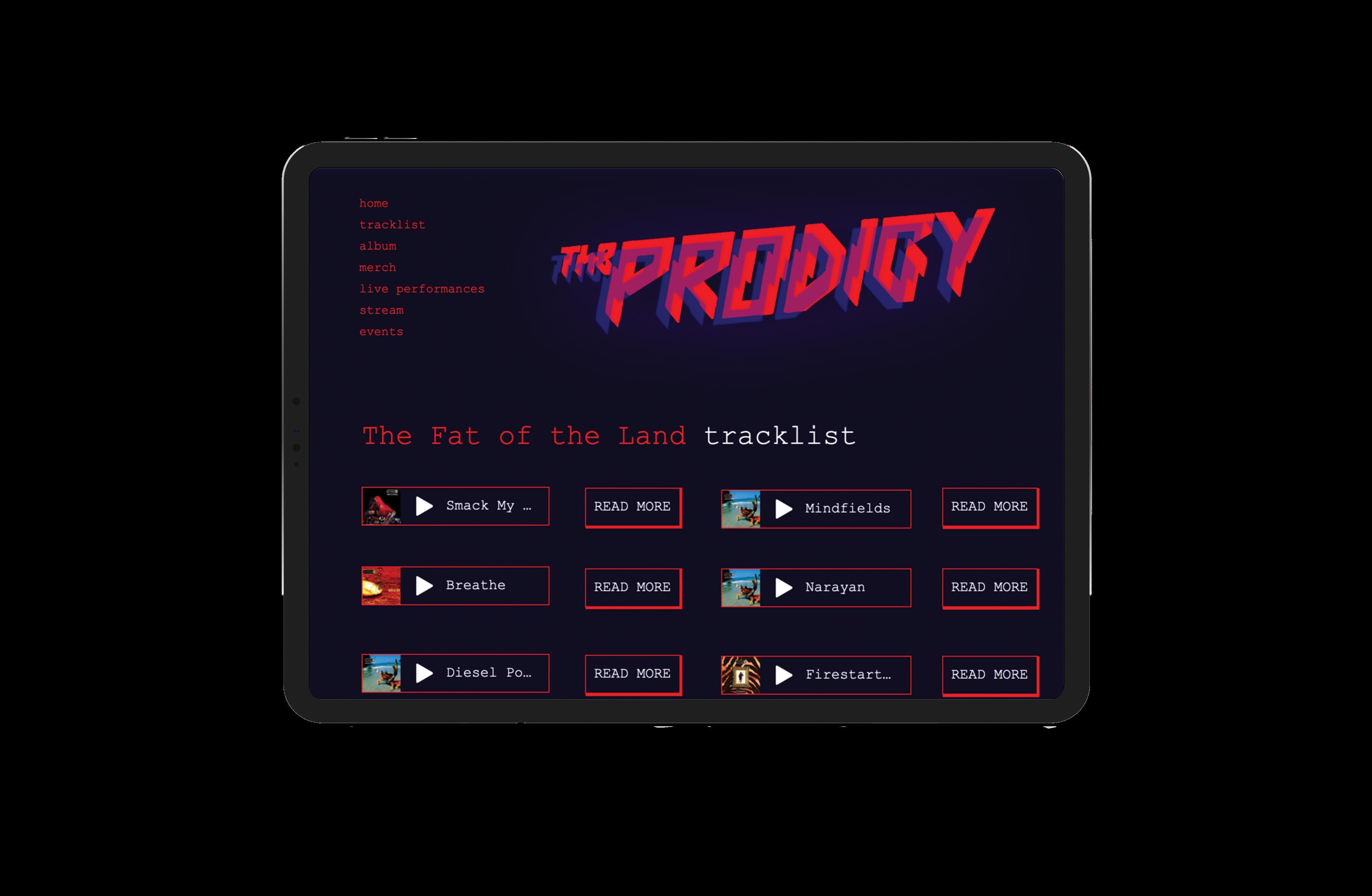
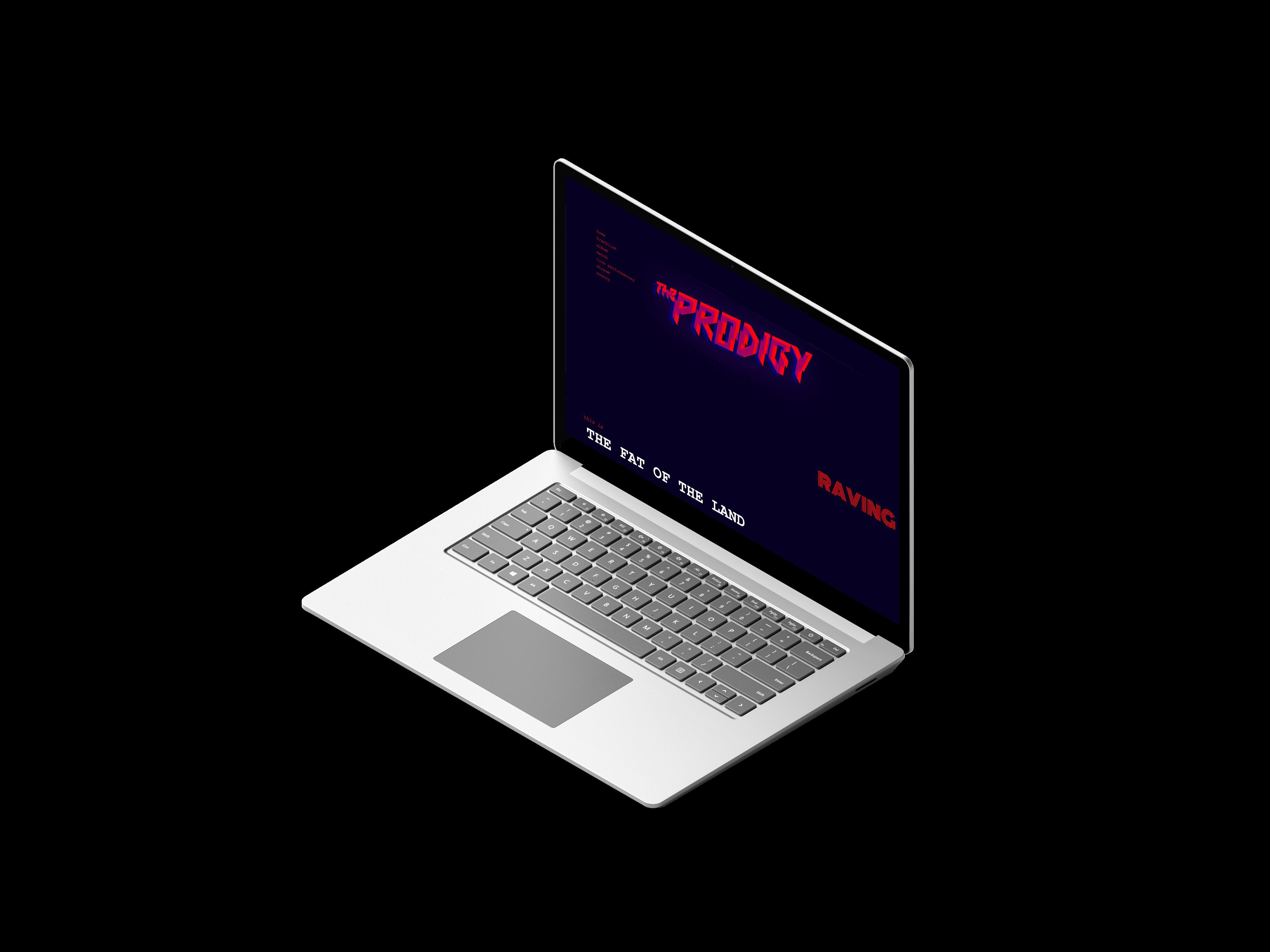
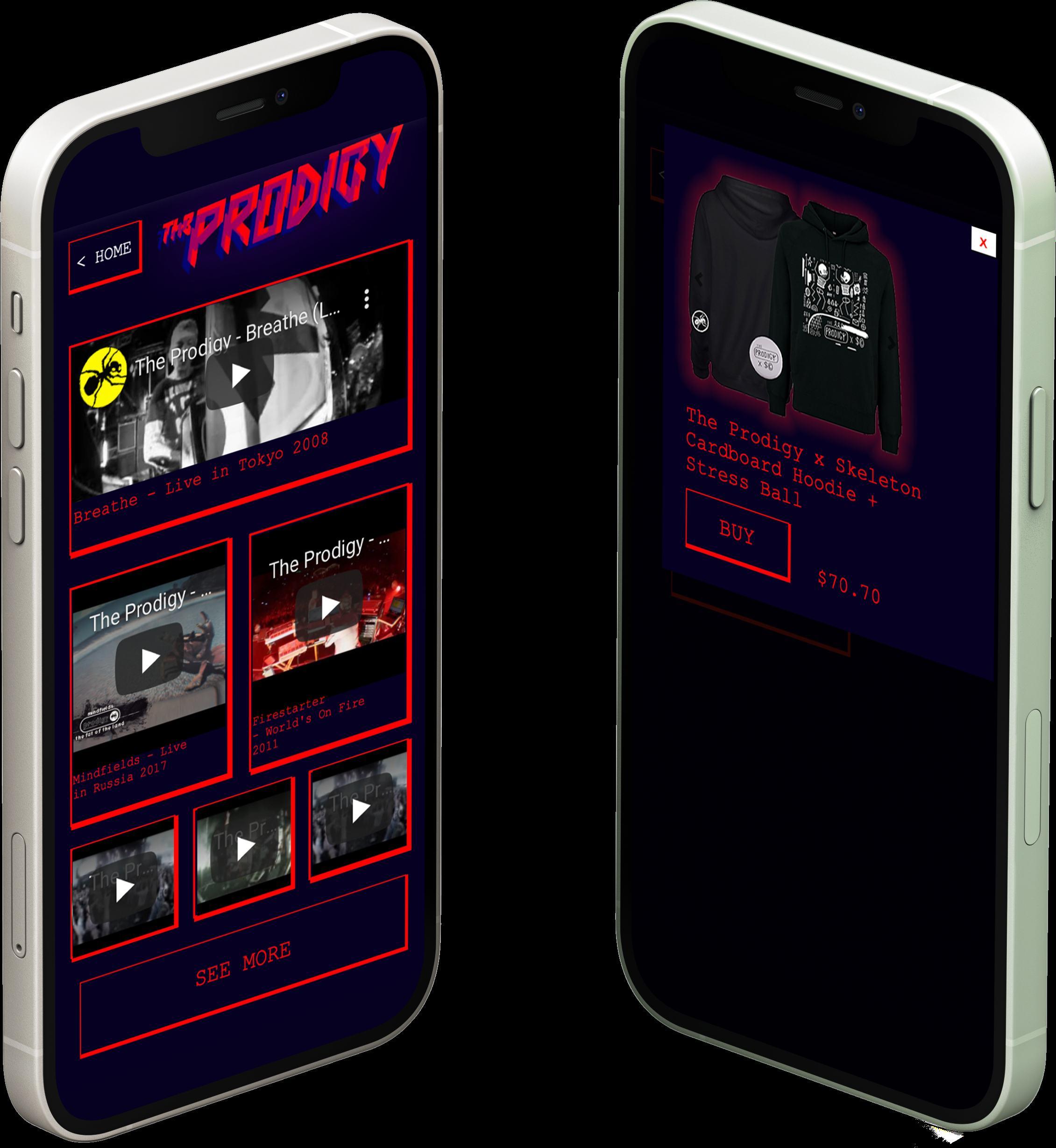
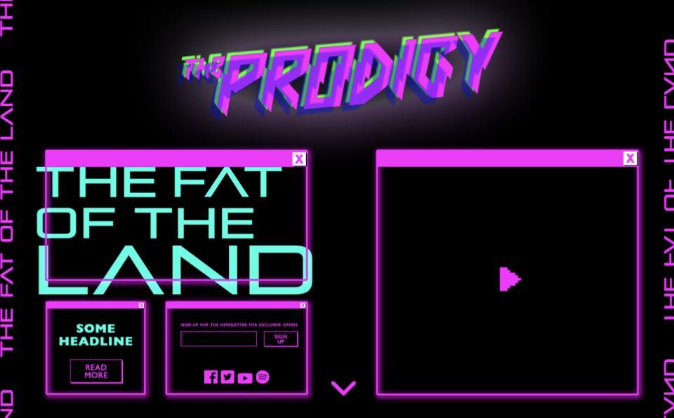
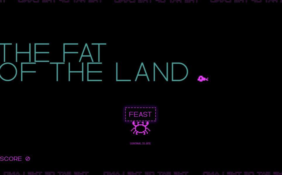
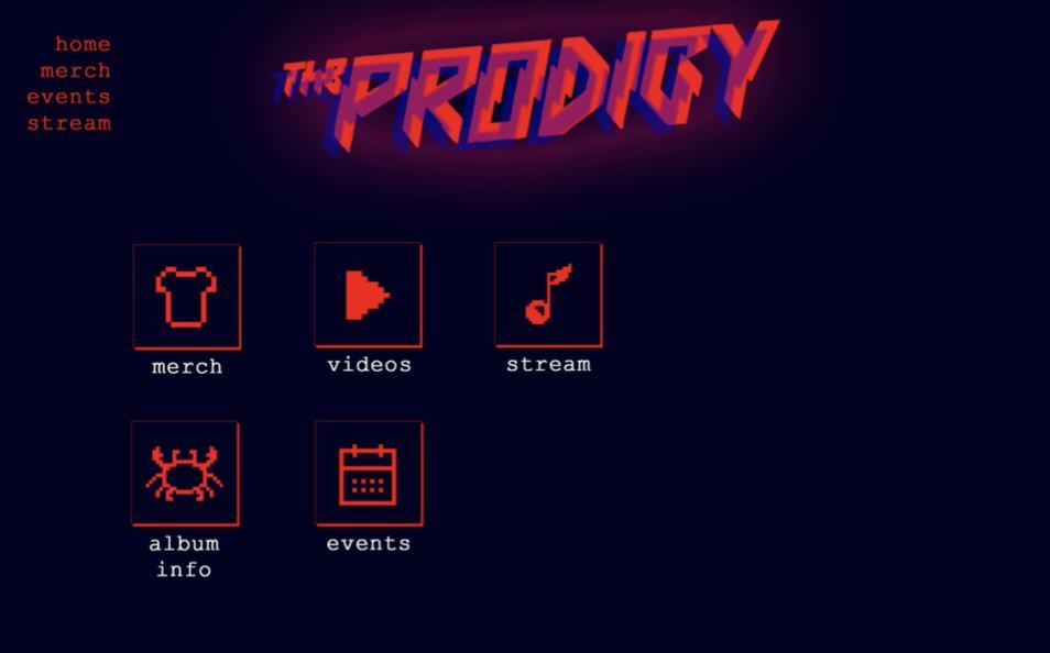
The Fat of the Land
Album Promotional Website
the fat of the land
Problem Solution
Creating a new way to interest existing and new fans to explore an iconic 90s album in a contemporary way while staying true to the era’s visual trends.
Originally a D&AD brief, aiming to reintroduce an old but iconic music album to a contemporary audience using Editor X by Wix as a website builder platform. The choice was between two albums.
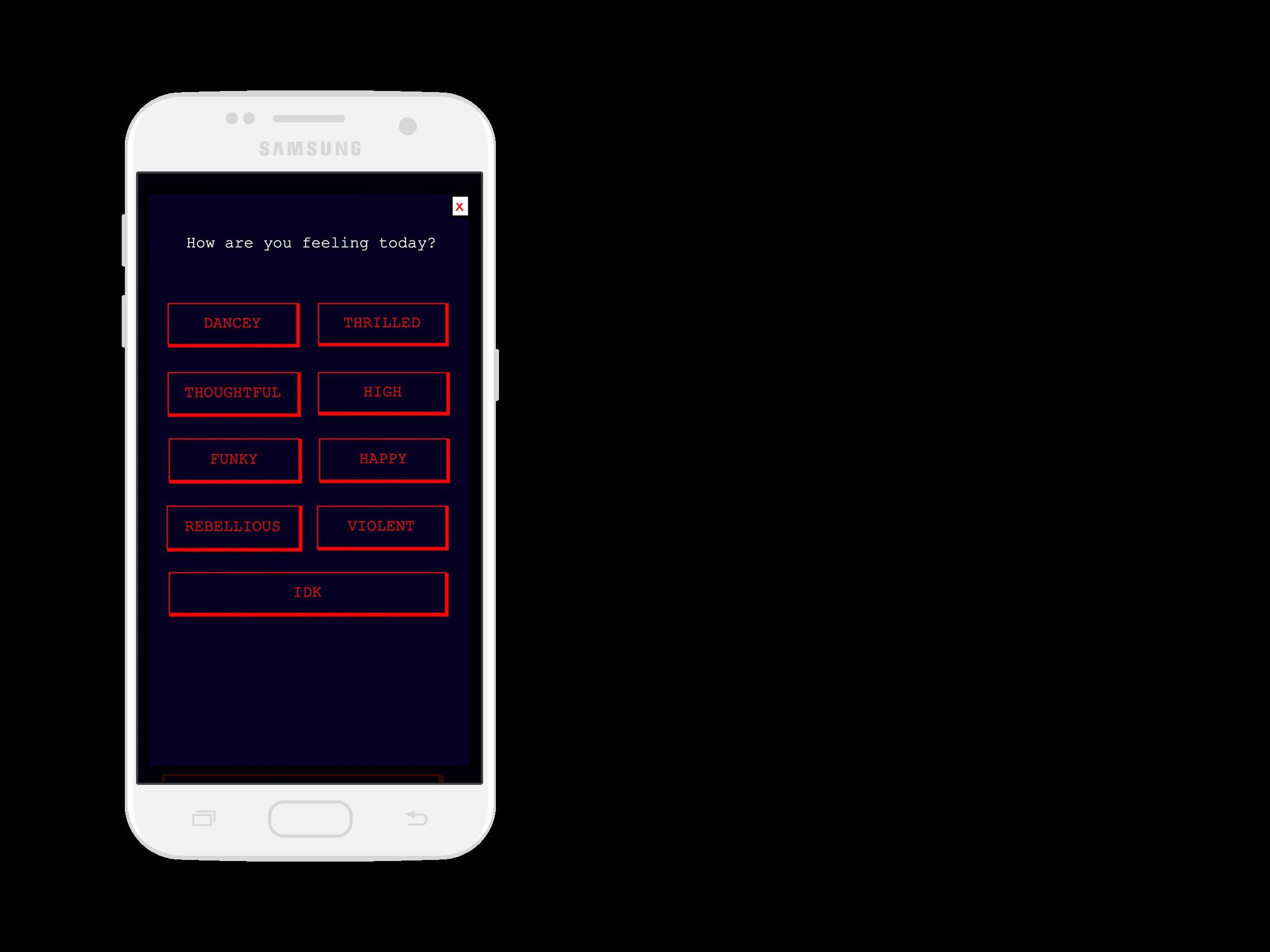
A gamified promotional website including all relevant social links and song tracks, with an interactive way of learning about the album’s history and exploring each song on an emotional level based on the user’s current mood.
ux/ui 16
Concept:
Select your current mood and be redirected to a song, to which you can relate at this very moment. Each song corresponds to a mood, in order to make it easier to get a glimpse of what the album is all about.
How it works:
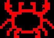
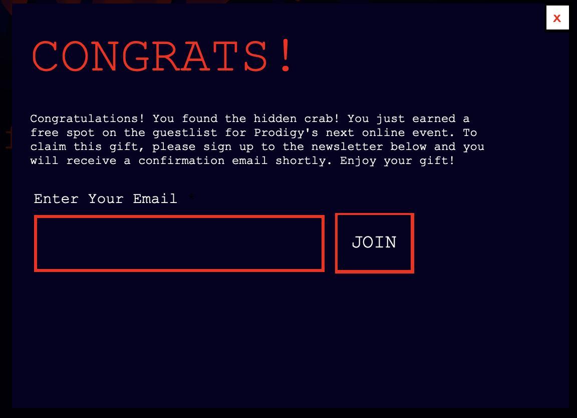
Hovering over a seemingly blank page reveals keywords, which upon clicking elaborate on the keyword and how it is connected to the album. There is also a hidden quest on the page for a big reward upon completion. That would be finding a hidden image of crab, representing the album cover, which grants the user a free meet and greet with the band members.

17
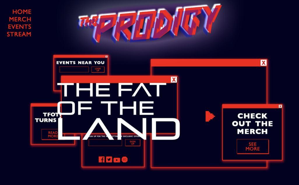
y on epts bove
Ve y fi st design of the homep ge
Sn ke ike g me whe e the use ont o s the b to e t fish, in udes e de bo d Ch oti pop up windows esemb ing o d Windows XP, h nged pu p e to ed fo mo e b ut ist fee
When use oses pop up windows, the e n homep ge esemb es Windows XP desktop with sho t uts
The fin design de ision points 3 & 4) w s m de due to imit tions with the softw e, s dito X w s b nd new nd ked ot of ustomiz tion t the time. A ot of options I h d p evious y onside ed, ike the sn ke g me, ou d s d y not be imp emented.
See the promotional page & walkthrough video on Behance
18
INITIAL GAMIFIED
3&4 - CHOSEN
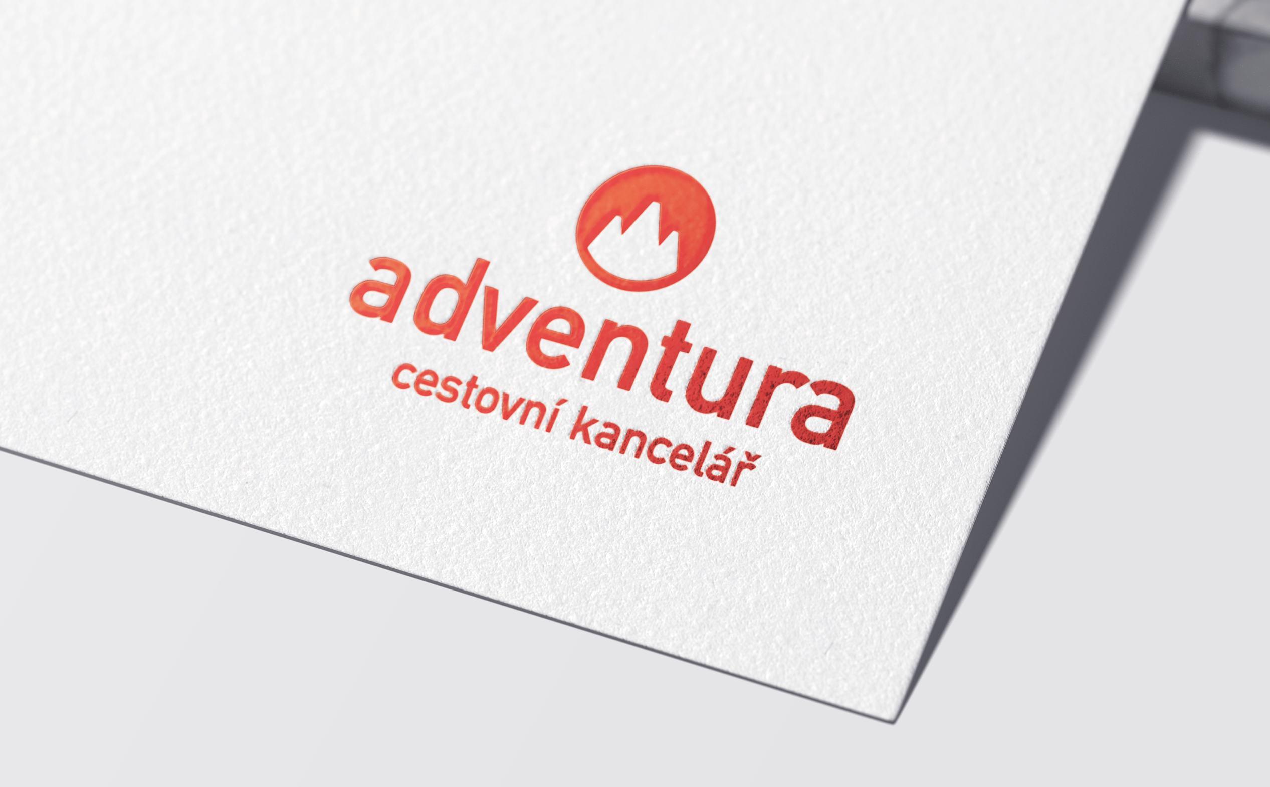
Republic. The agency is known for their daring expeditions and adventurous spirit, just like their customers’ personality.
identity makes it hard for new customers to understand what their values and goals are all about. They want to attract like-minded people for new expeditions. mission and resonates with its target audience. The rebranding eliminates the previous design cliches and introduces the agency in a contemporary way.
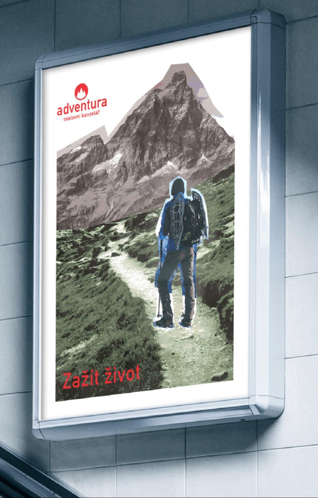
branding 19
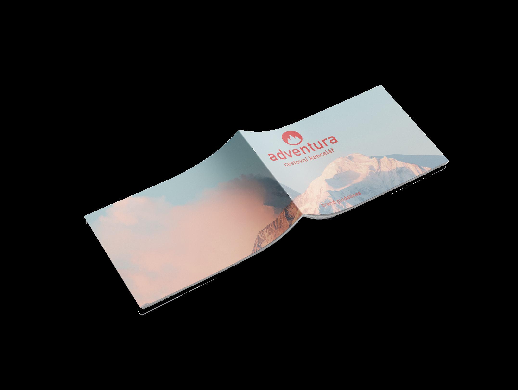
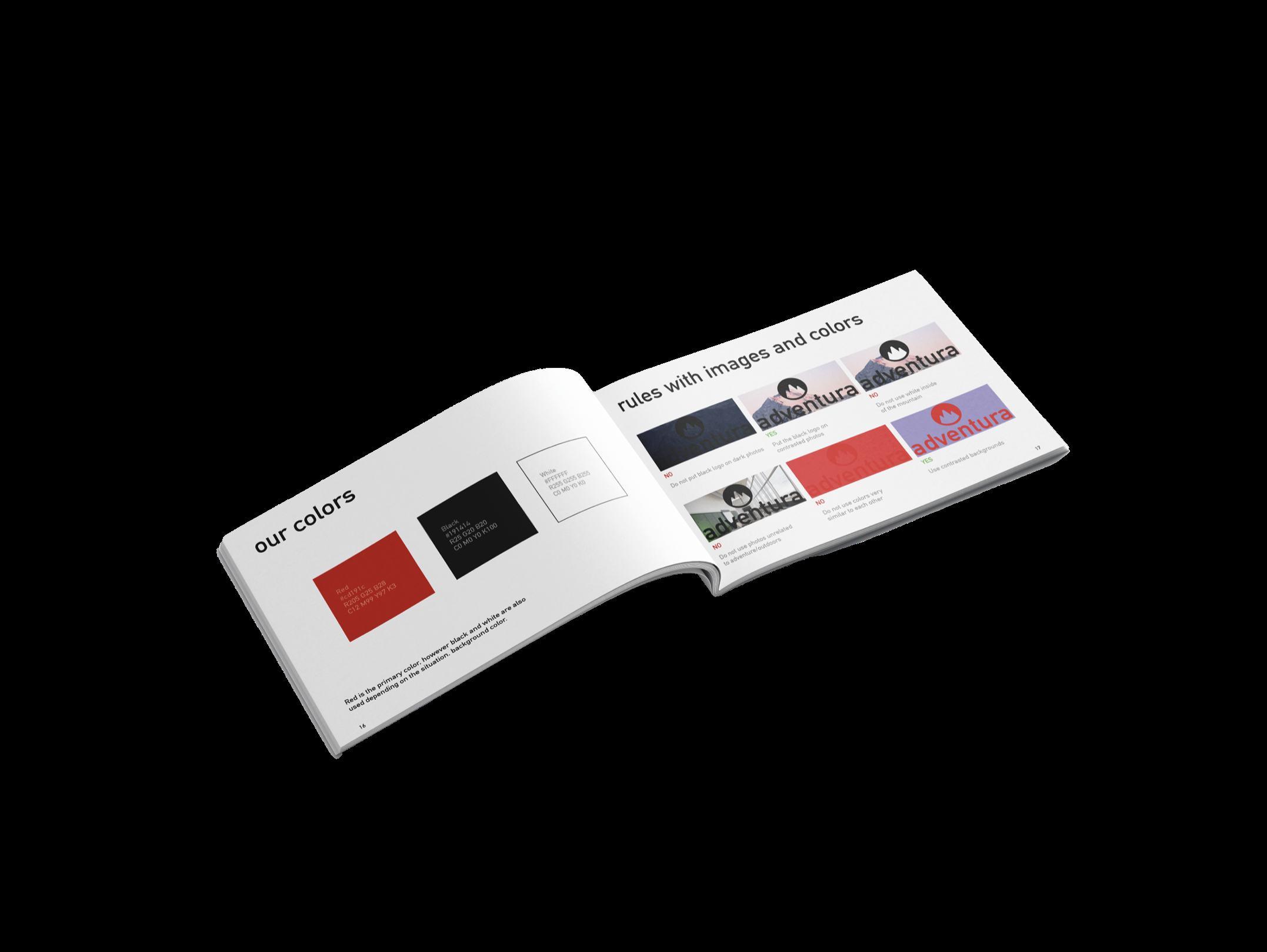
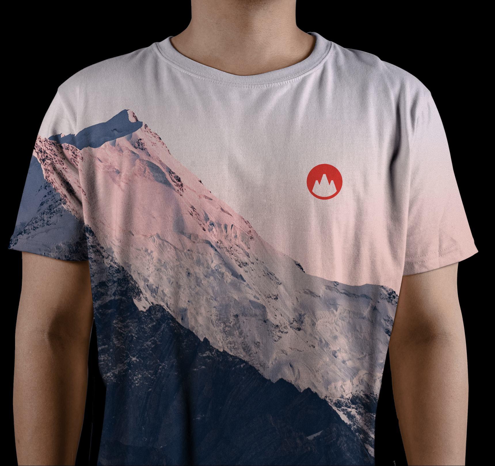
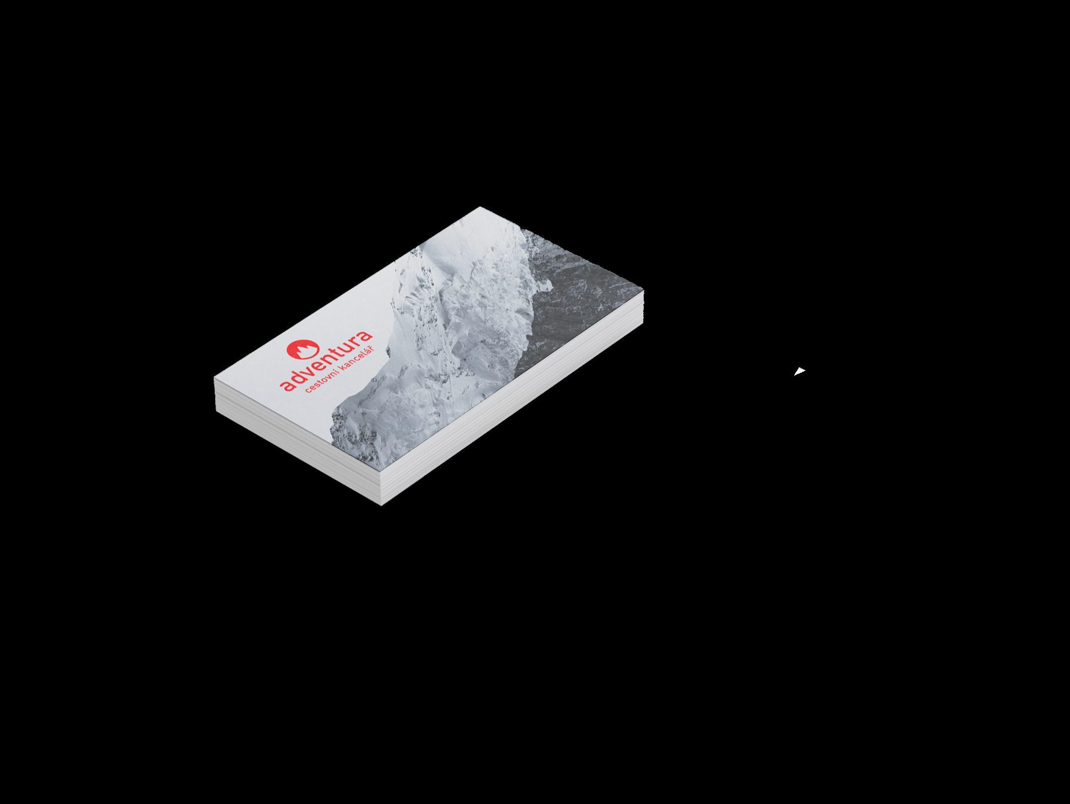
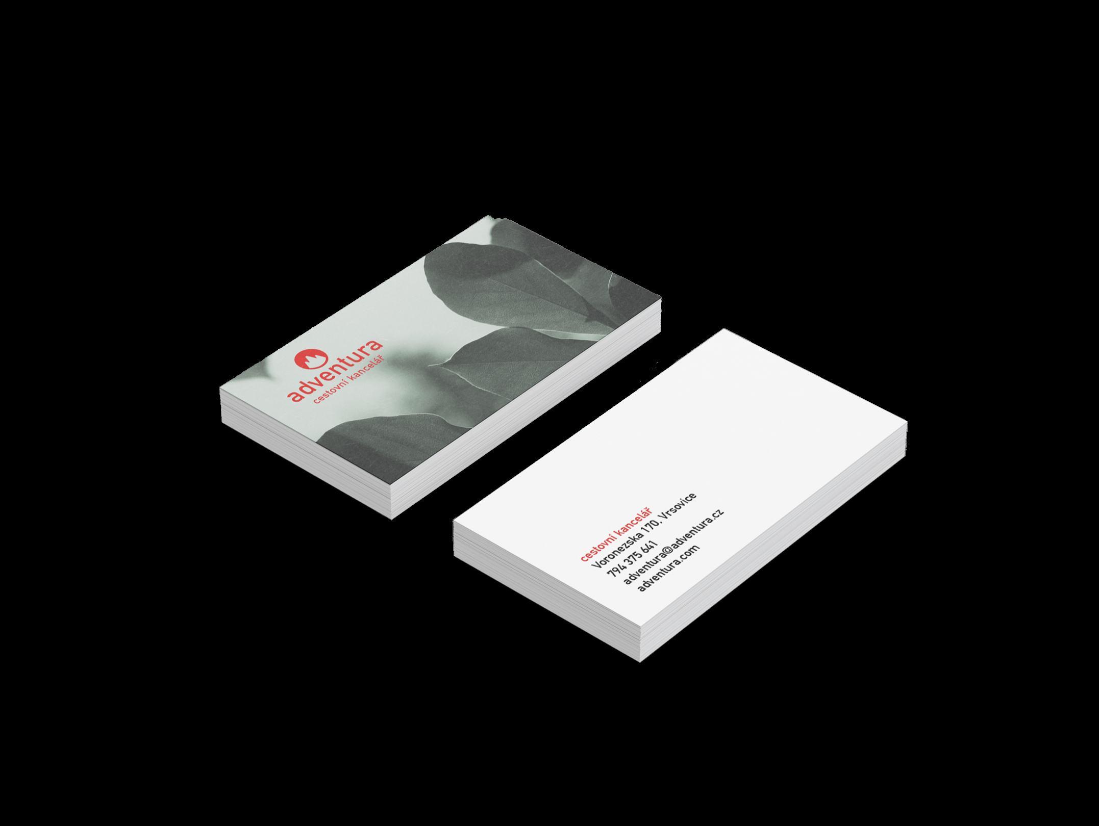
The rebranding includes new merch design, a series of posters, business cards, stationery. All of them take into account the nature of the travel agency - they specialize in hiking and climbing, therefore the mountains are a key point of the new identity. The logo itself is a mountain peak to communicate that with Adventura you can reach the top. The bold red color stands out among competitors and acts as a proof to the risky and daring adventures the customers experience.
A deliverable was also a brand book visually describing the redesign. The full set of materials and the full brand book are available on Behance.
20
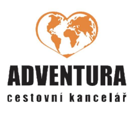
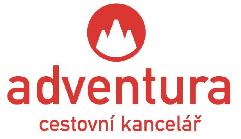
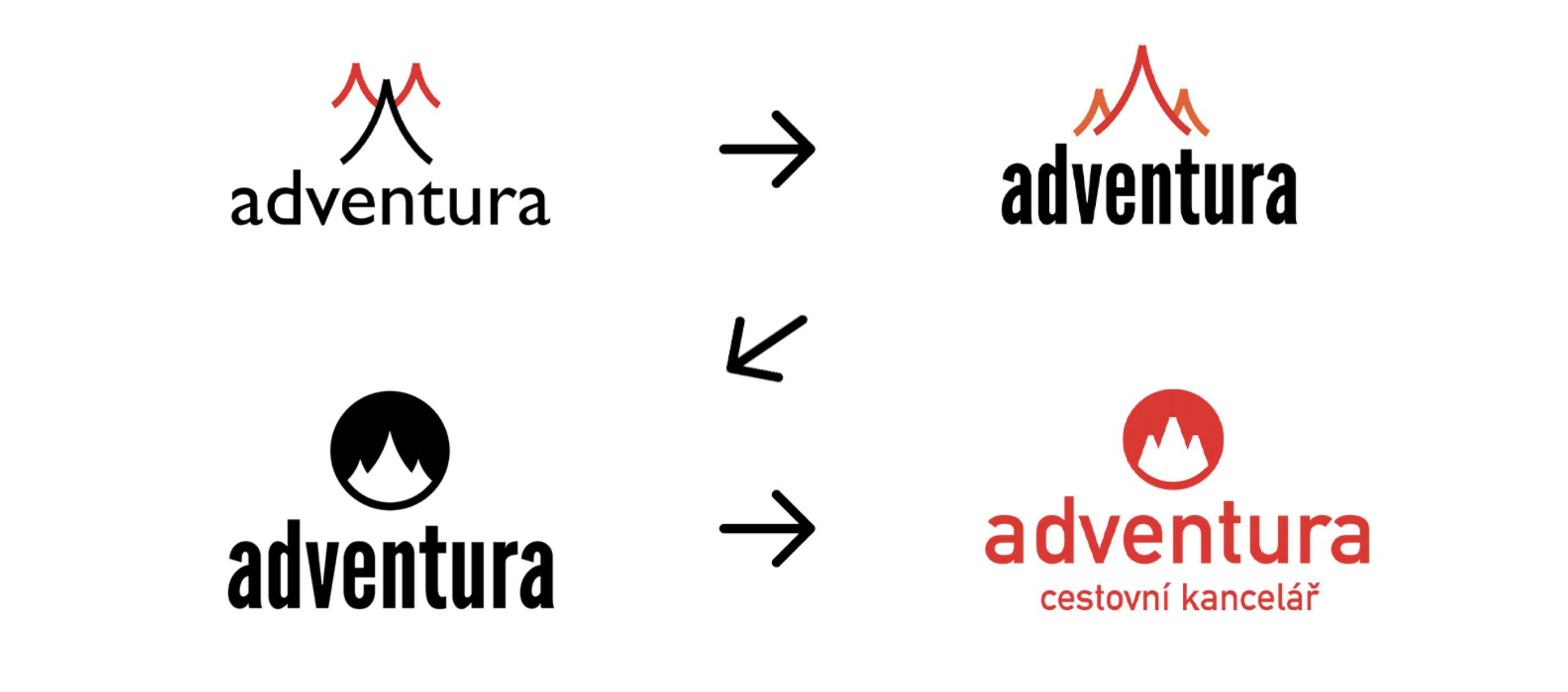
The problem with the old logo: outdated, doesn’t stand out among competitors, the icon is a cliche, doesn’t properly represent the nature and values of the travel agency, looks like any other.
The evolution: what started out as an abstract bird to portray freedom of exploration turned into a fire. Since the fire also looked like a mountain at the time, I went with that concept instead. The fire didn’t seem to encapsulate the values as much as a mountain. From then it was only about refinement. The company had requested to have “cestovní kancelár” meaning travel agency in Czech in the logo.
21
OLD NEW
NEW LOGO EVOLUTION
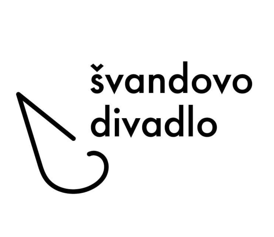
švandovo
divadlo
A rebranding of a Czech theater that “asks questions, invites for discussion, personal statements”. The theater offers a lot of contemporary shows.
Problem
The identity of the theater doesn’t show that its goal to show ordinary situations from an unordinary point of view. It doesn’t stand out and doesn’t show its big personality and values.
Solution
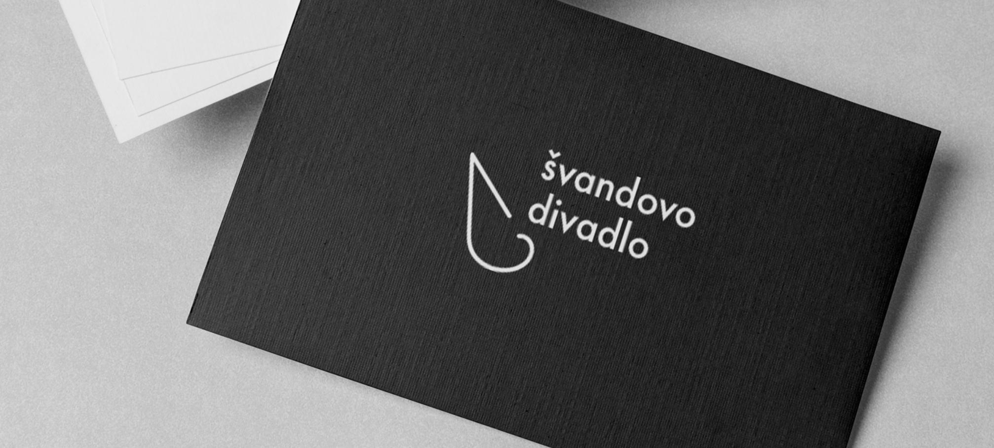
A new visual identity that portrays the theater in a new, contemporary light, transforming ordinary theatrical cliches into an unordinary visual statements. The new logo is a theatrical cliche itself, but portrayed in such way that it’s unusual.
branding 22
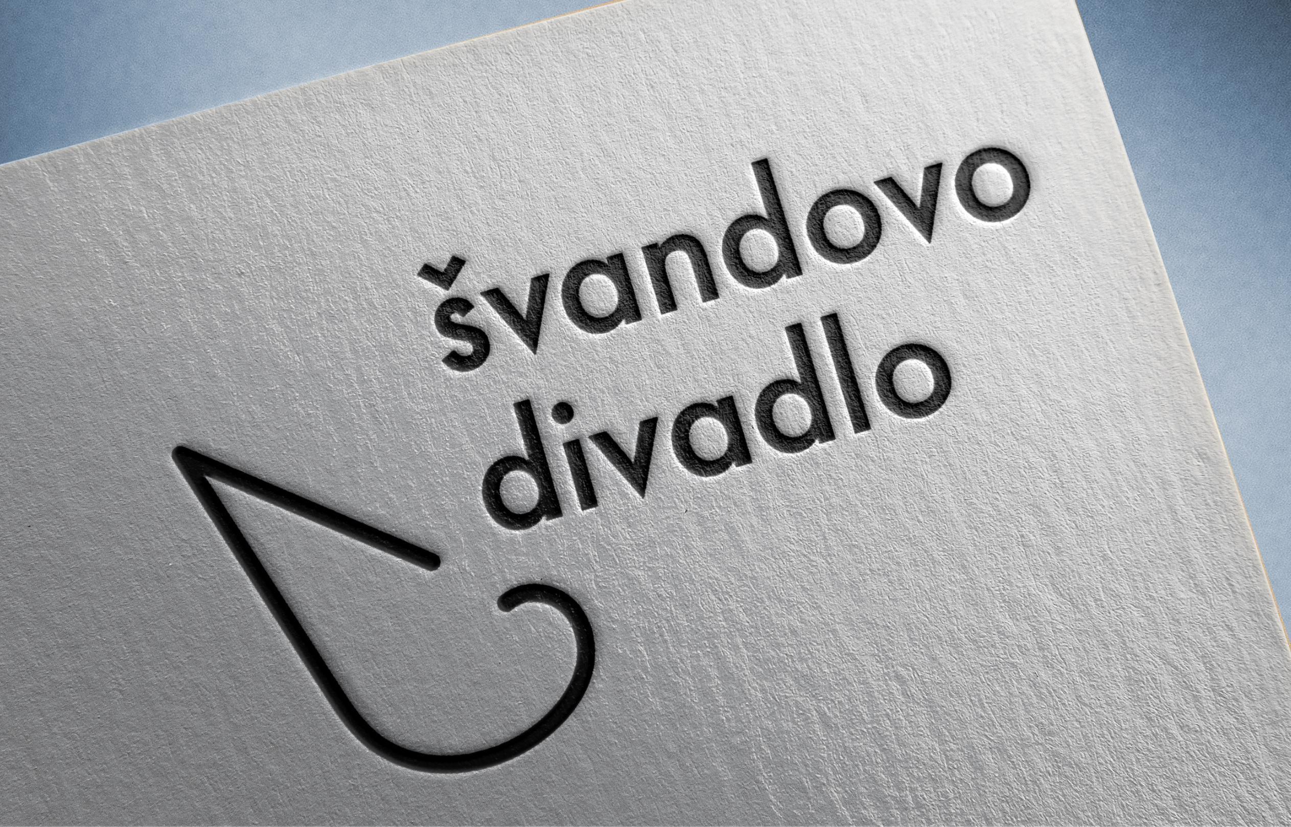
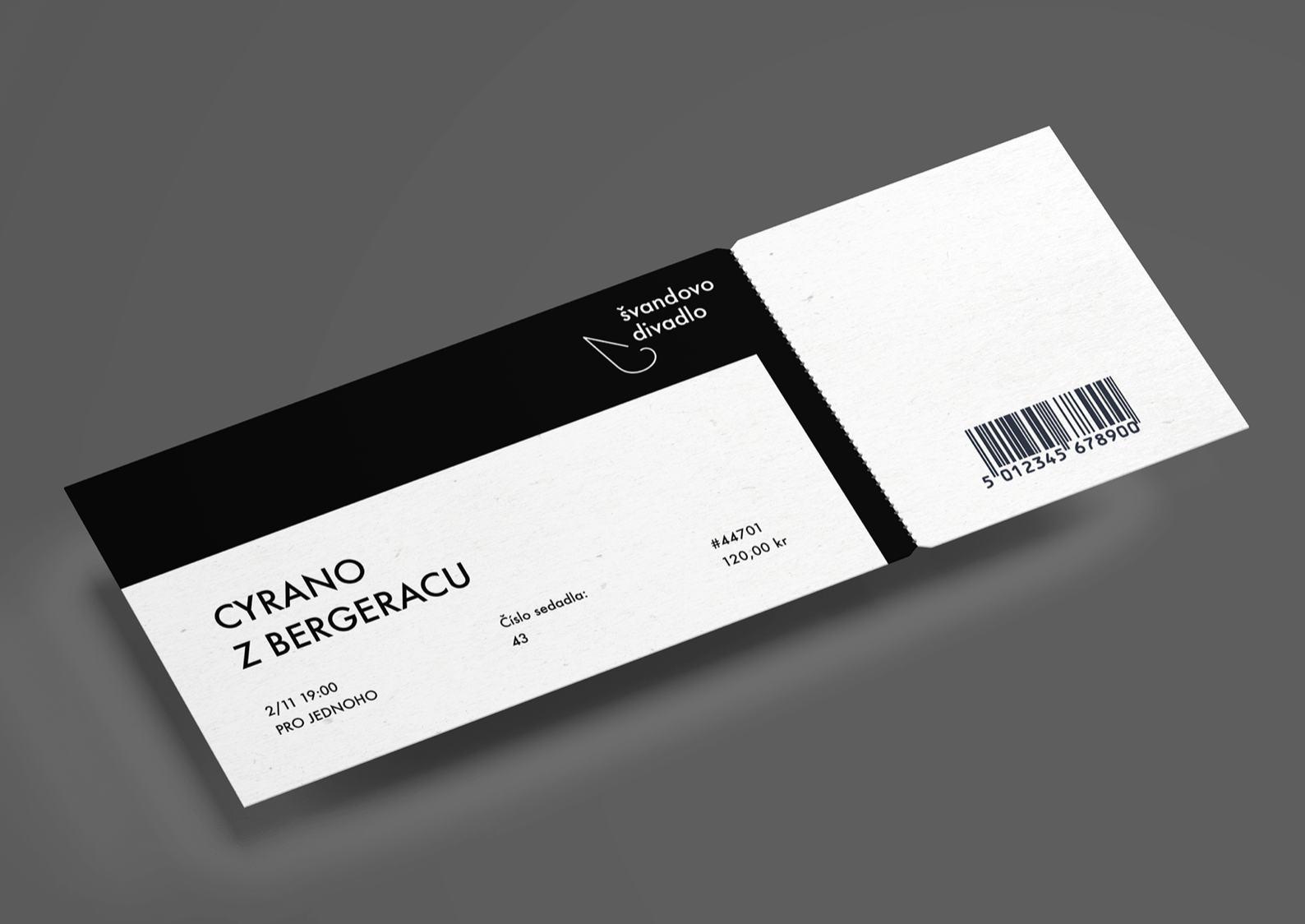
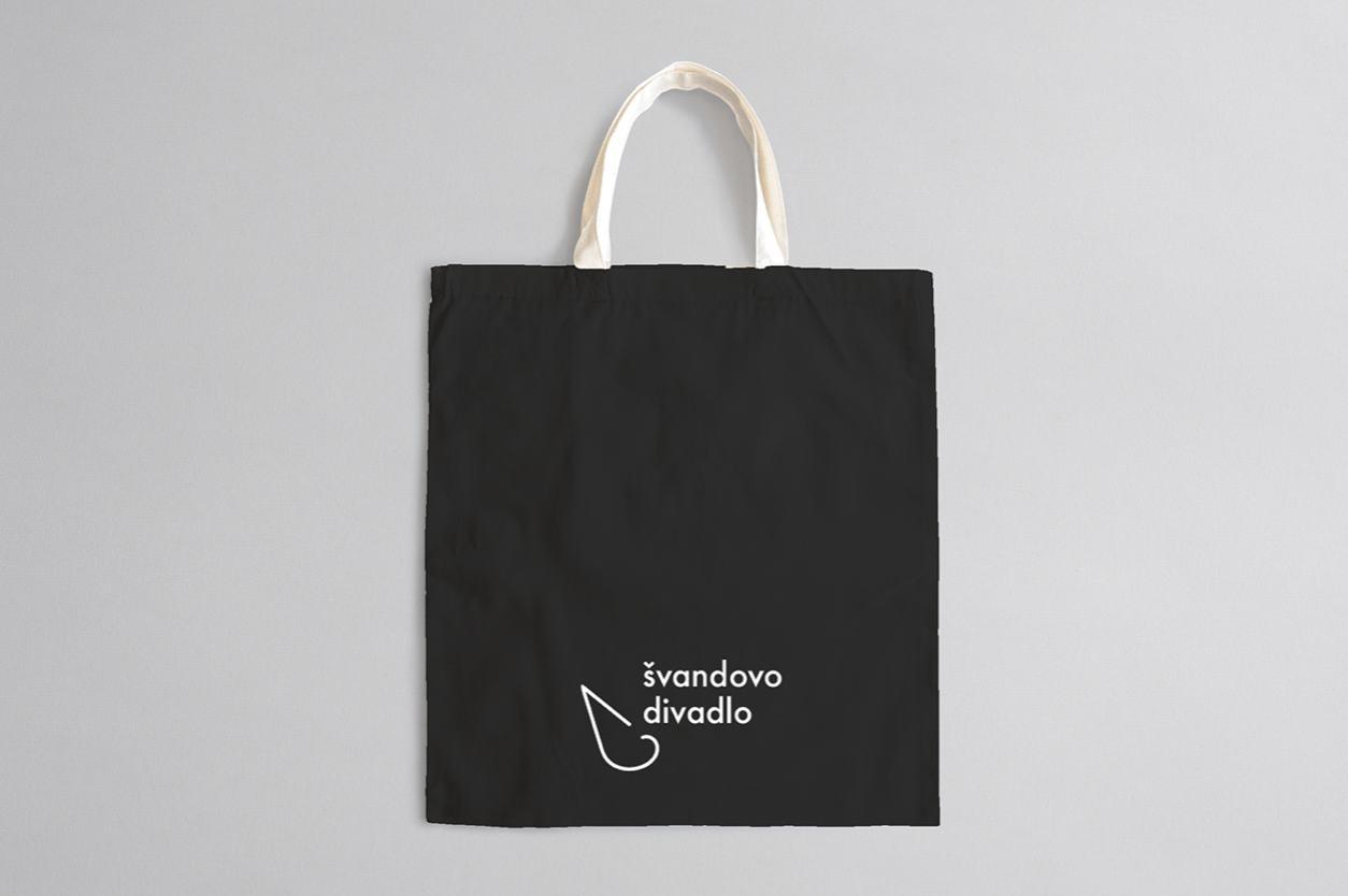
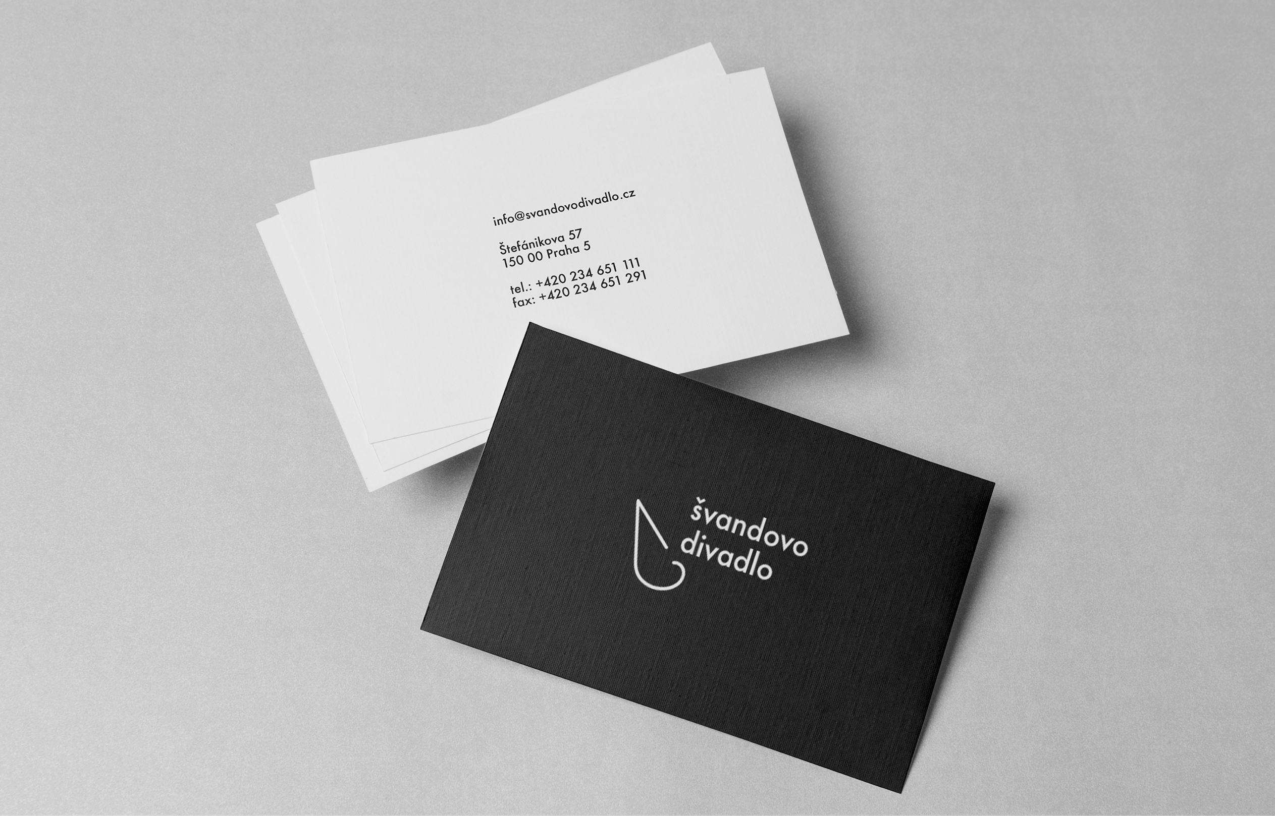
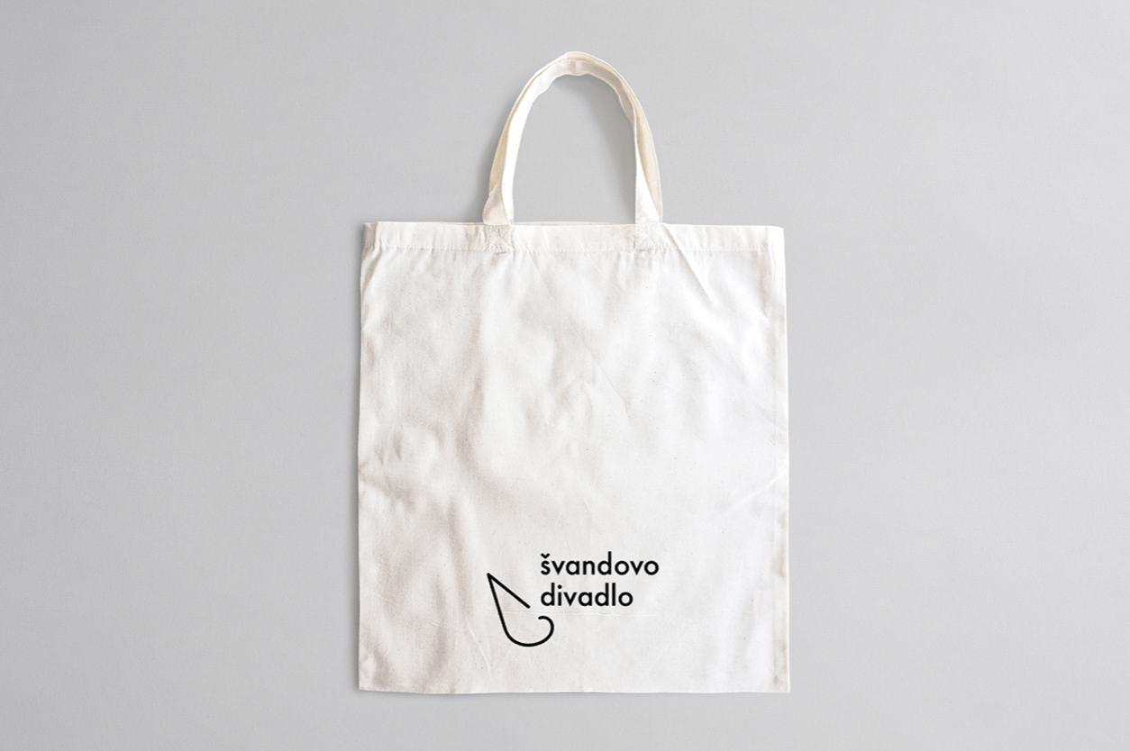
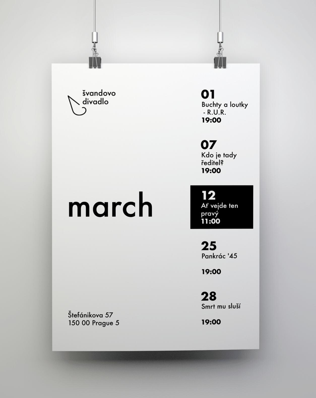
The rebranding includes new merch design, a poster framework for upcoming shows, business cards, stationery, ticket redesign. The simple logo indicates a main component of a theater stage - a spotlight. It complements the typeface seamlessly, harmonizing effortlessly with the stroke style chosen for the icon - the spotlight fits well with the lowercase "v".
The minimalist black and white style could be used on various media, is easily readable and can be applied on colored backgrounds.
23
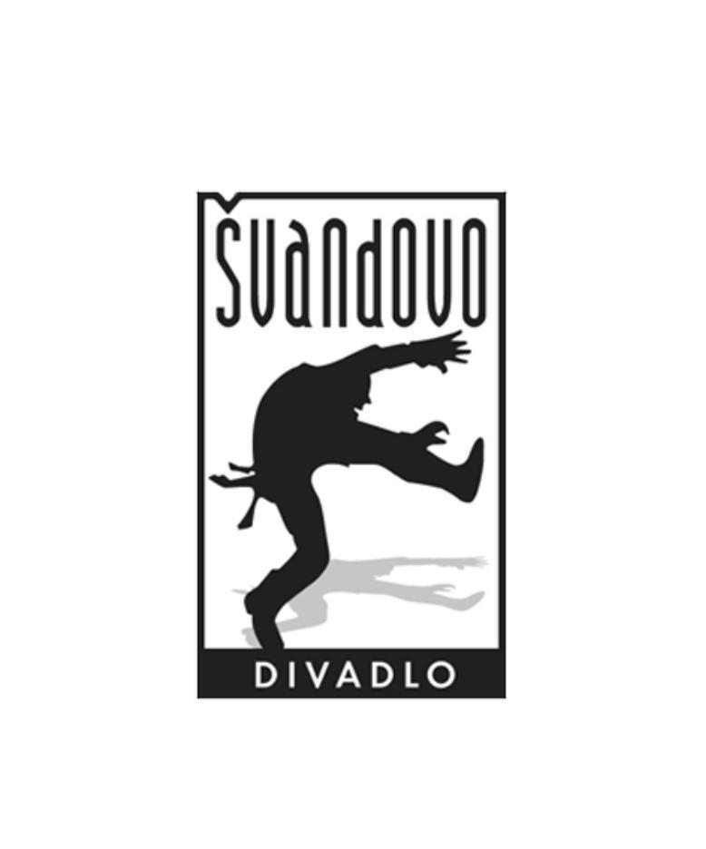
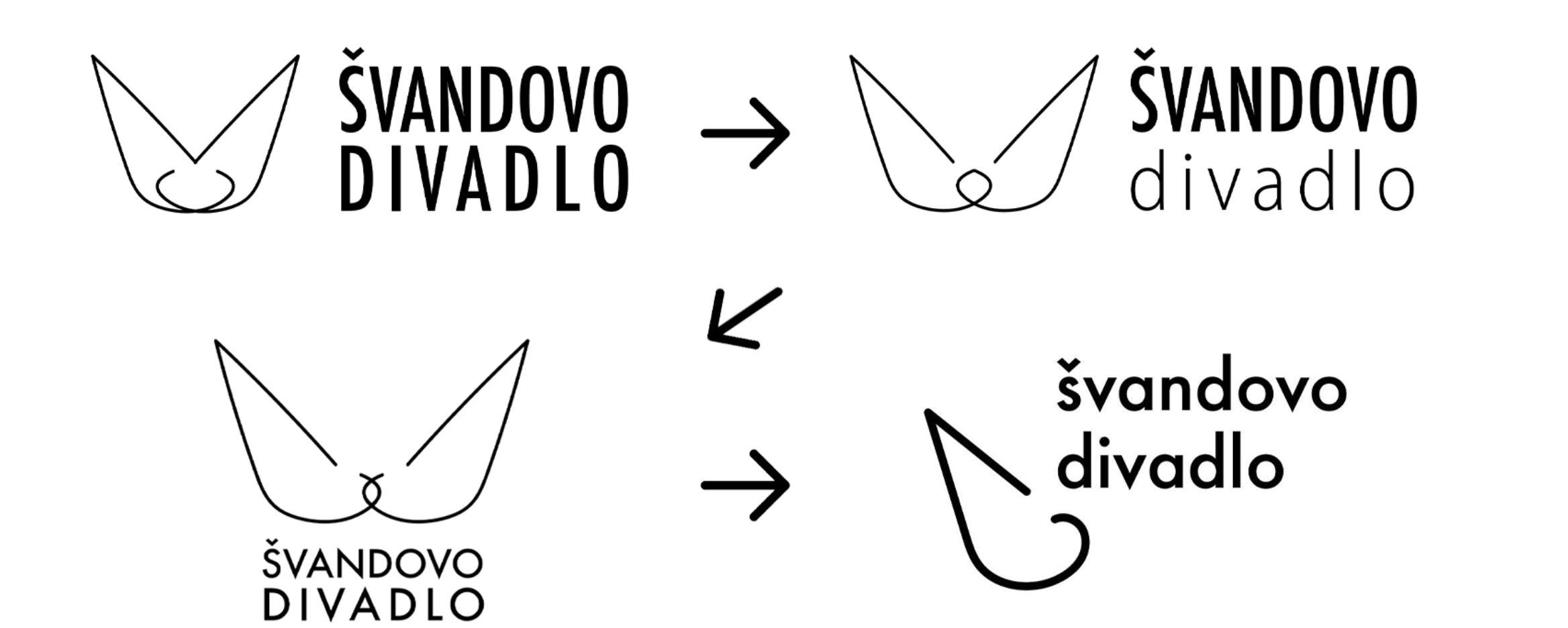
The problem with the old logo: outdated, doesn’t represent the main idea of the theater to portray ordinary situations from an unordinary perspective, busy, cannot be applied on small media.
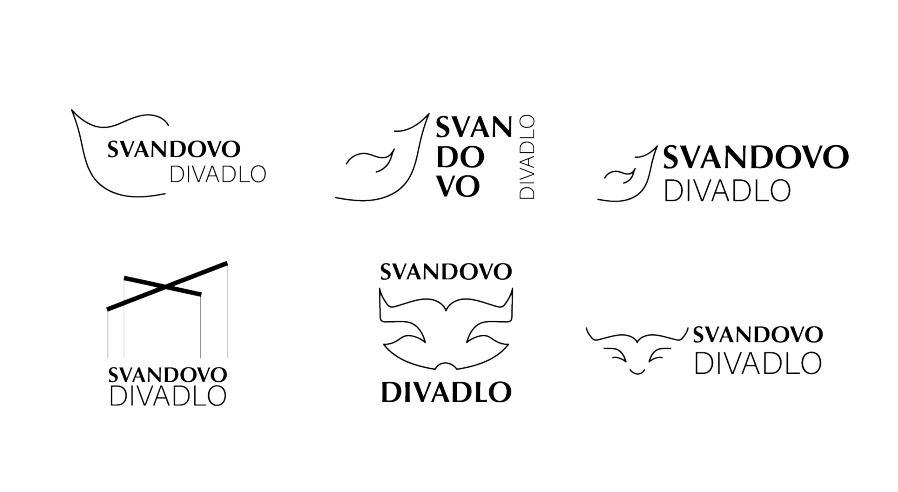
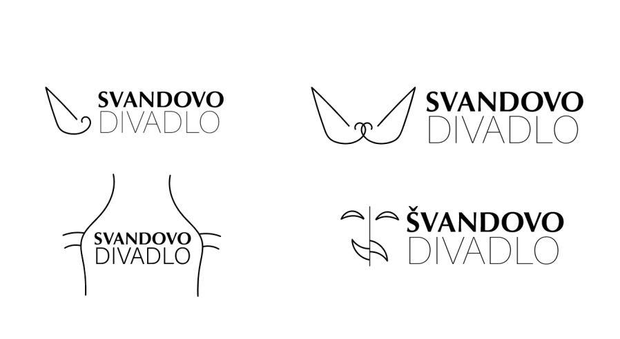
The evolution: the idea of the spotlight wasn’t always there, I began with thinking about typical items and metaphors in theaters, like masks, puppeteers, curtains. The spotlight is what struck me the most, as it is often overlooked as an item and metaphor, because it’s always there, it’s taken for granted but without it theater won’t be the same.
24
OLD NEW
NEW LOGO EVOLUTION
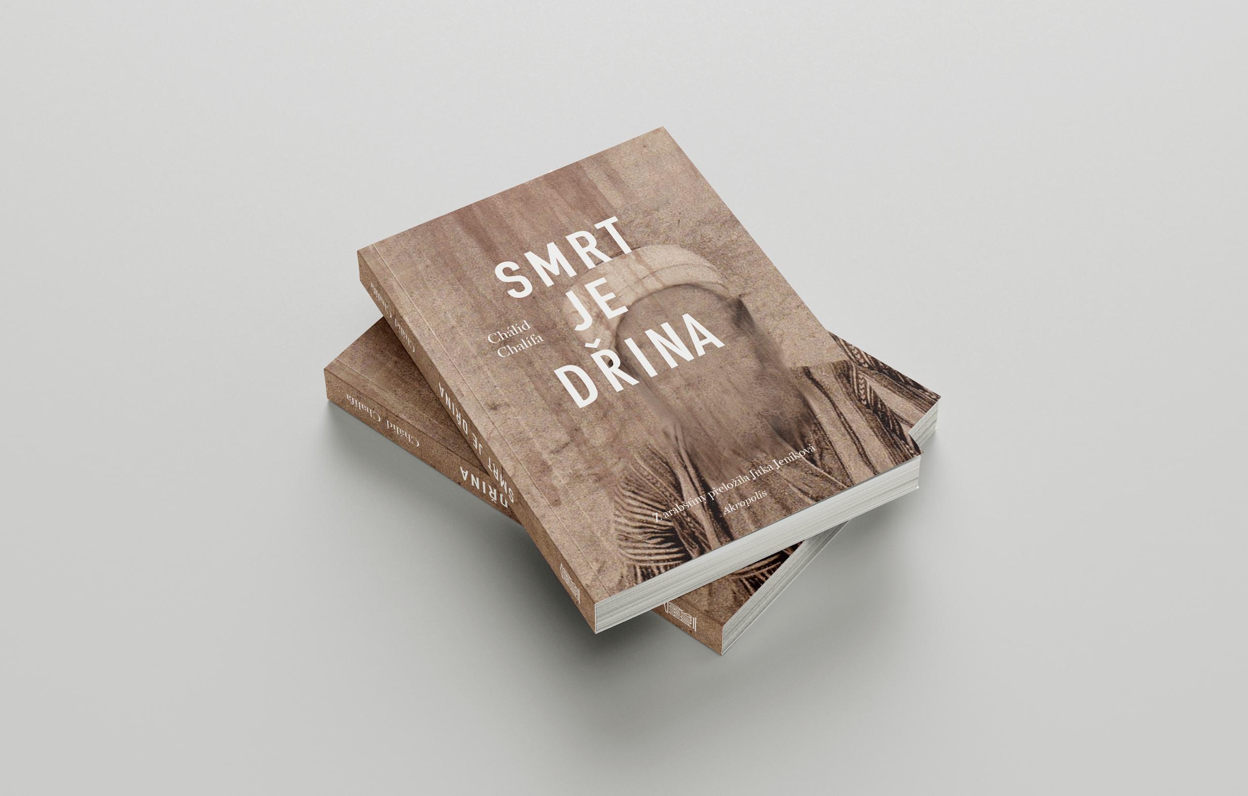
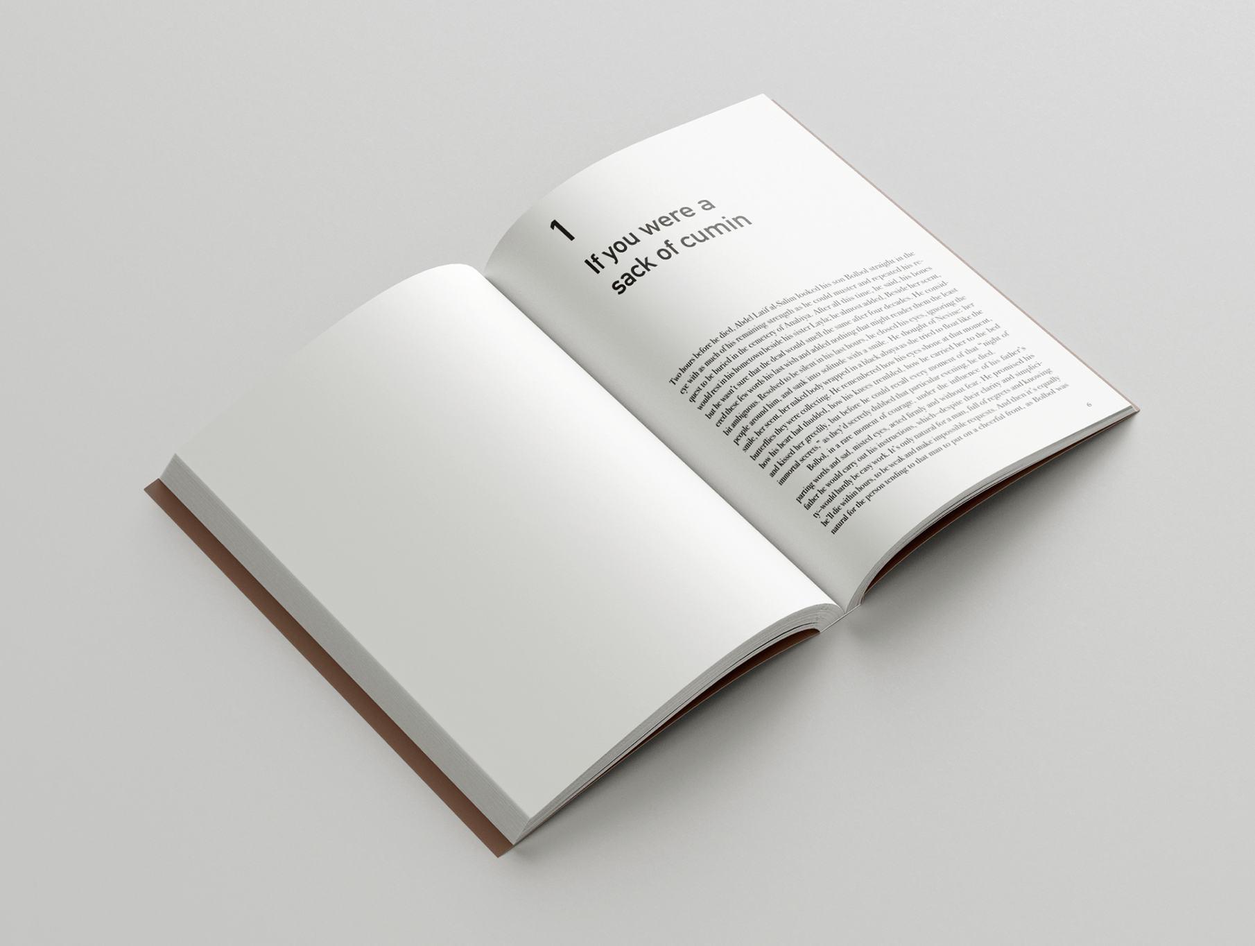
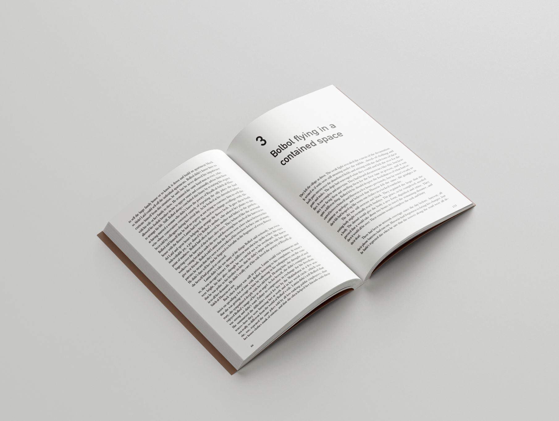
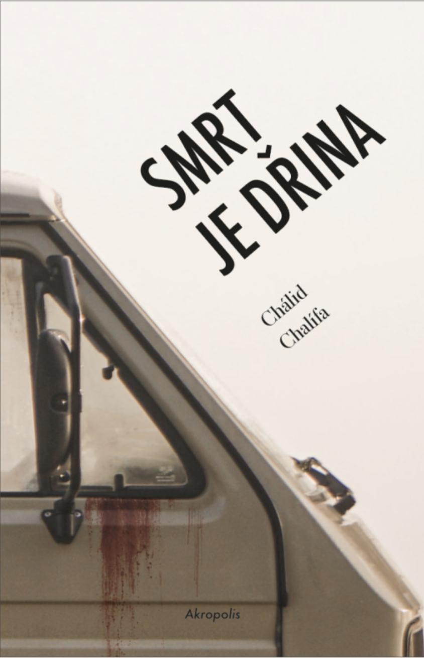
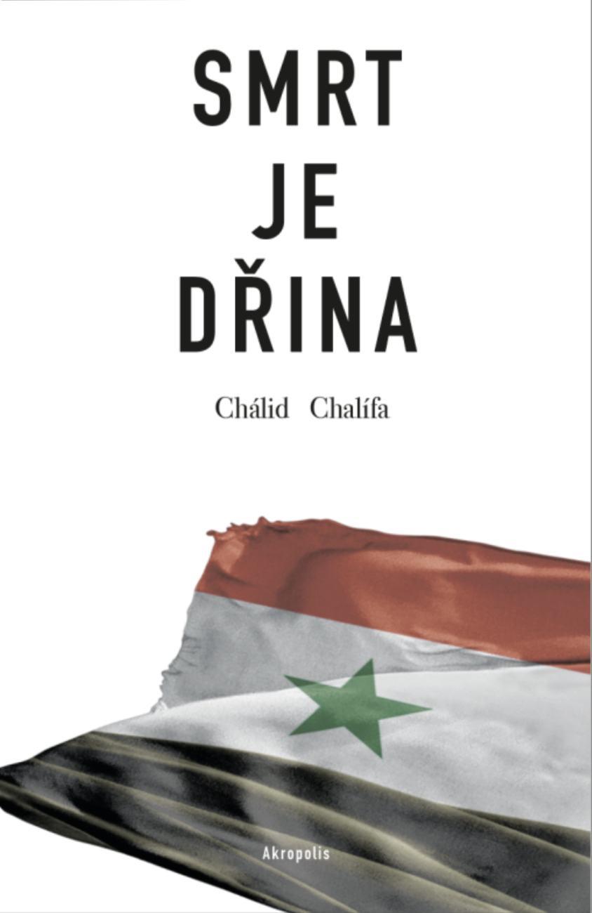
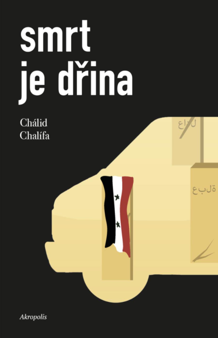
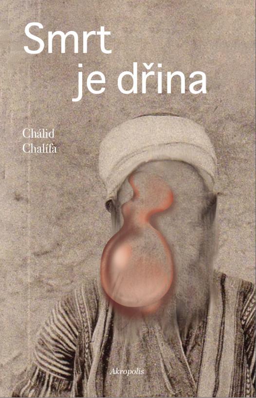
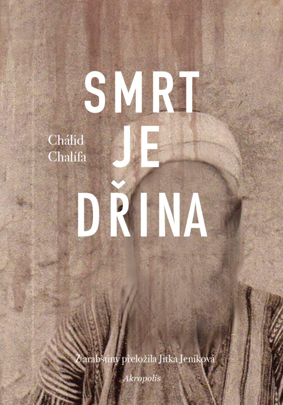
Cover and layout design for the Czech issue of “Death is Hard Work” by Khalid Khalifa. The story takes place in a civil war driven Syria where three kids are destined to fulfill their deceased father's last wish.
Originally a brief by the publisher, the Czech issue had no previous official cover and they spread the brief to various designers, trying to find the cover that would work best for them, no design limitations.
The design embodies a metaphor where the father's empty face represents his passing. The cover combines an antique look with modern typography, highlighting the story's contrast between the past and present.
editorial 25
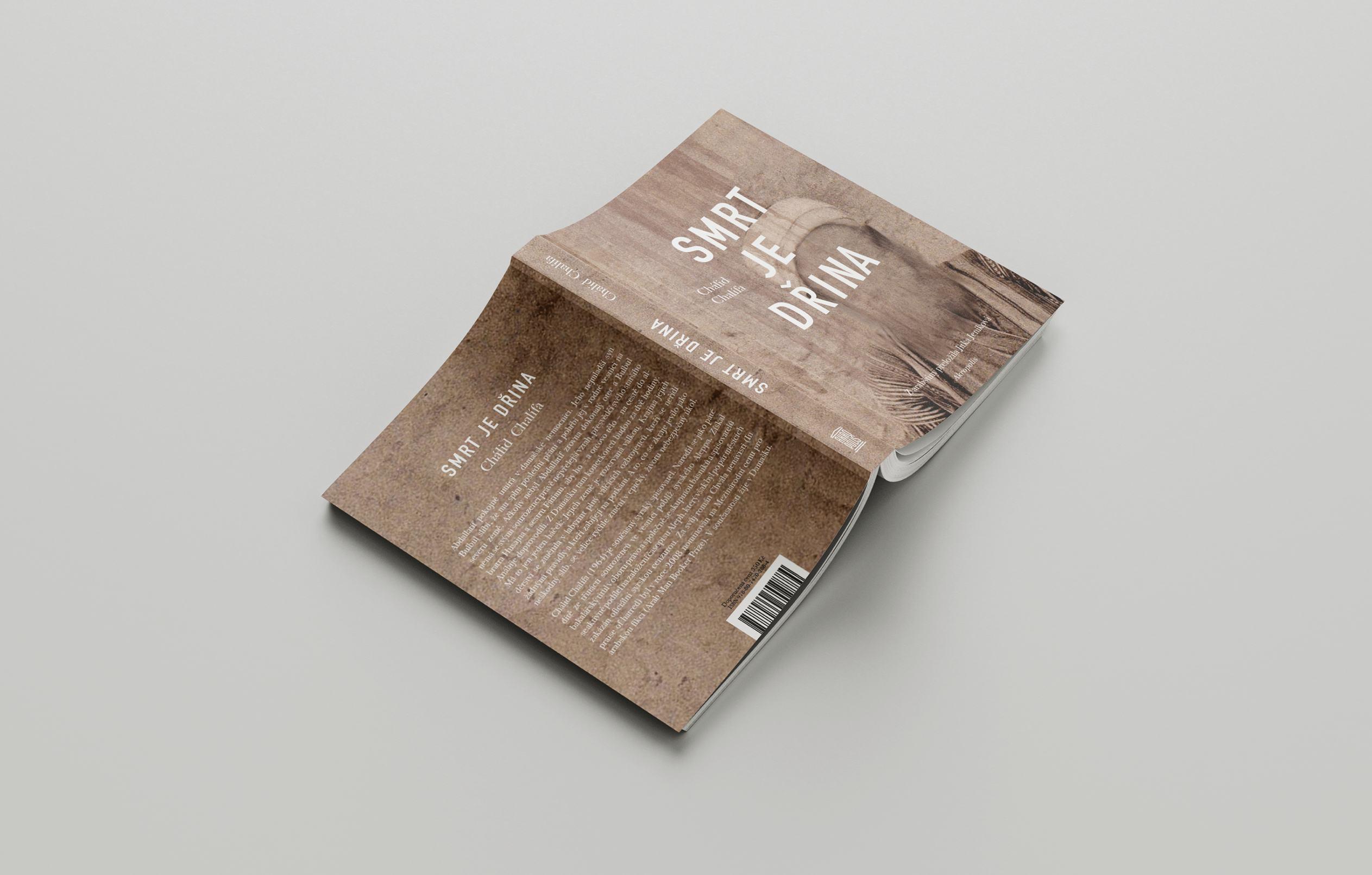

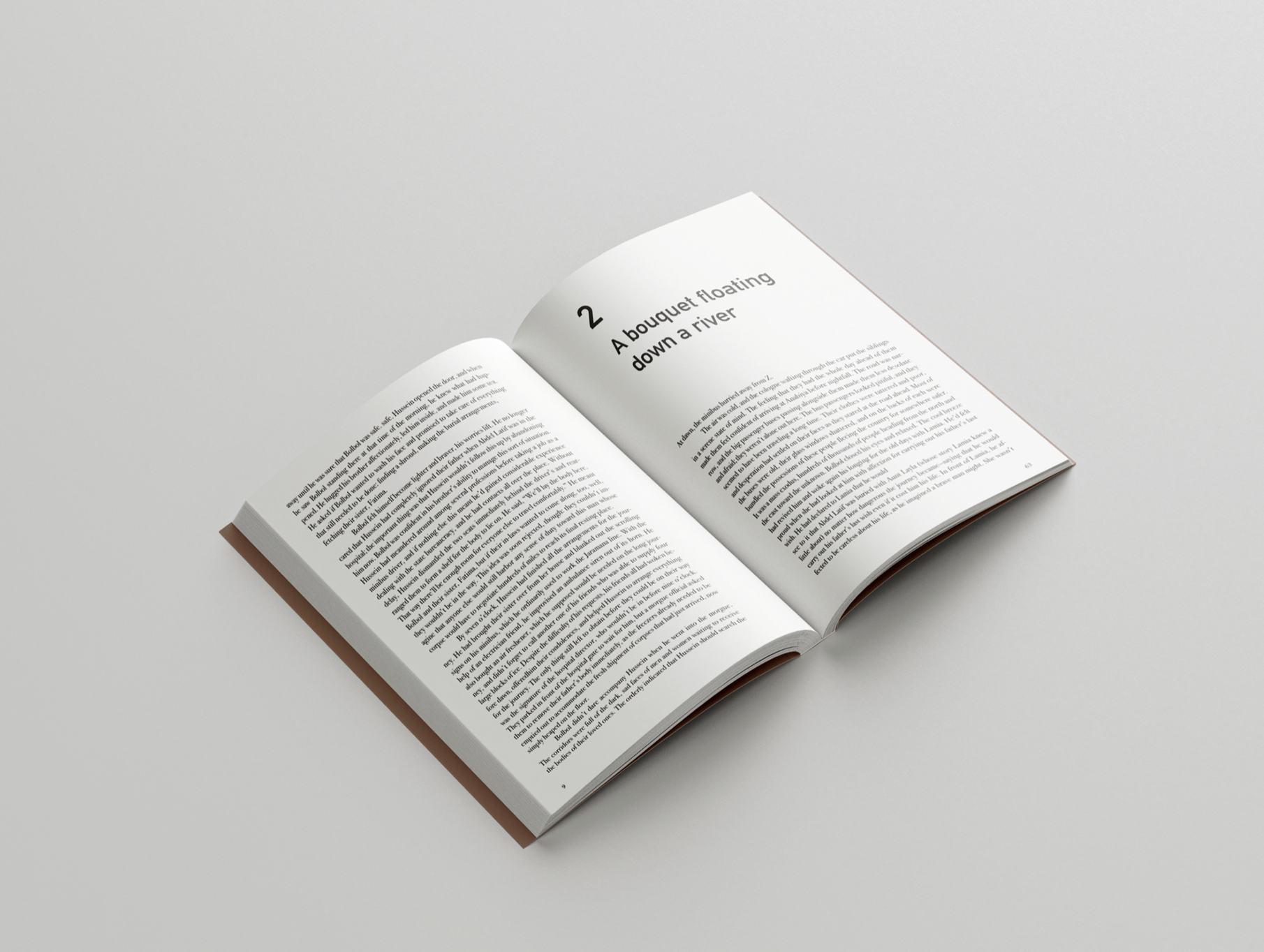
The story is set in the Middle East and it is full of despair, death but also hope. The main visuals are portraying the setting and cultural aspects of the book, the faceless man of the cover represents the deceased father, dressed in traditional clothes, the dusty and rusty look is contrasted by the typeface’s nature and color. The layout is standard, made to be easily readable.
The project includes a promotional video made specifically for Instagram, square formatted to fit the 2019 standards. It’s available on Behance.
26
THREE INITIAL CONCEPTS
ALTERNATIVE IDEA
DURING PROCESS
I had various ideas at first all portraying something different. The bloody bus represents the vehicle the main characters used for transportation but it didn’t represent the nature of the book that well. The flag on the second cover is to show where the story takes place and it’s already a metaphor for the difficulties of the story, but it was scrapped due to possible political issues. The third cover was also scrapped due to the same problem.
The alternate idea during the development of the final cover was to show even further the idea about bloodshed, but it was too brutal and obvious, so it was scapped. Instead dried blood marks were added to the final cover.
27
FINAL
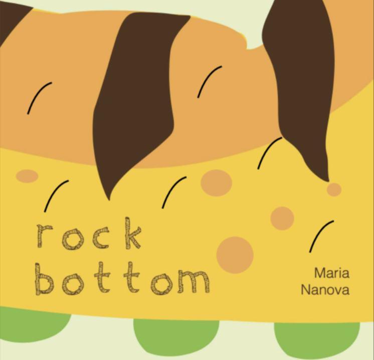
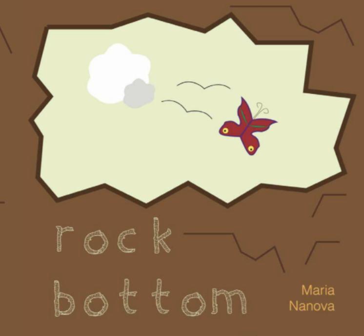
rock bottom
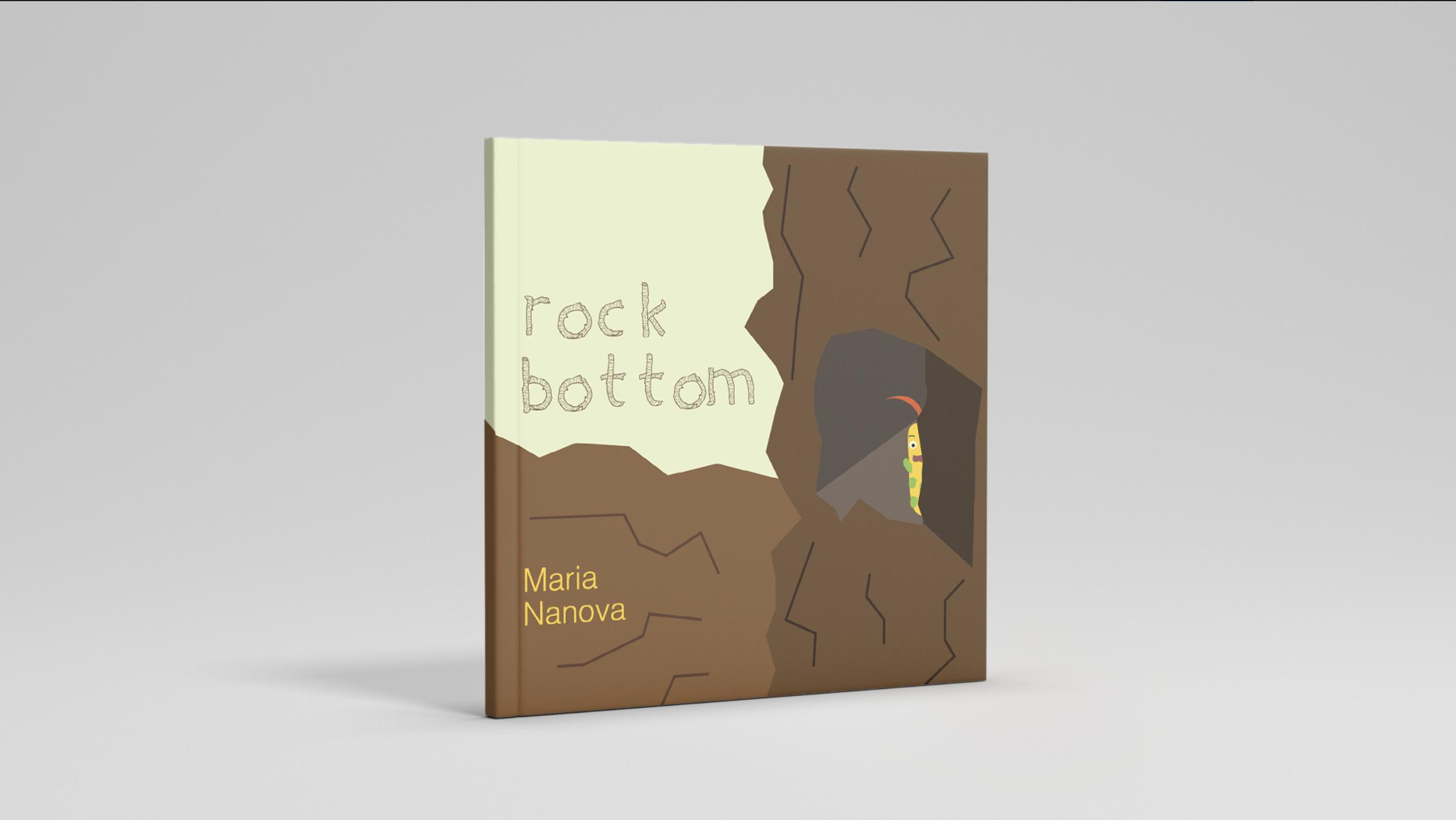
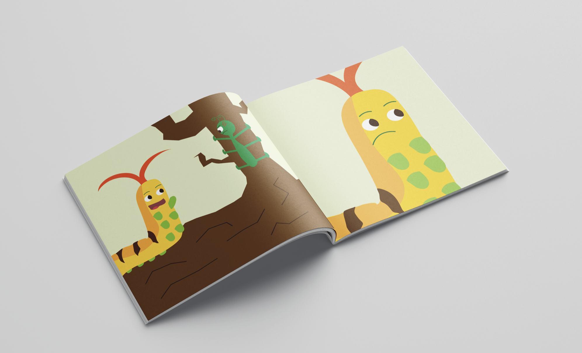
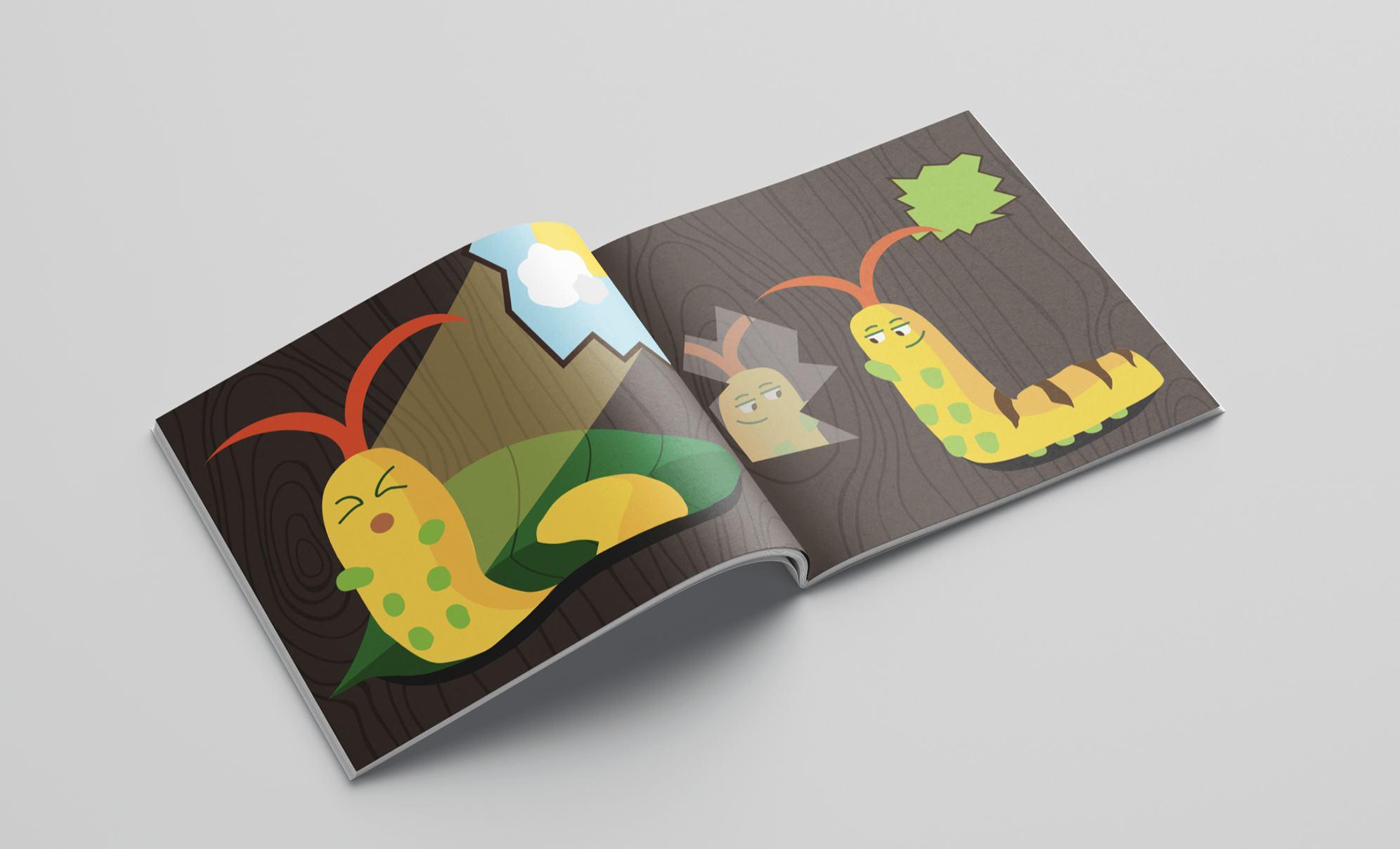
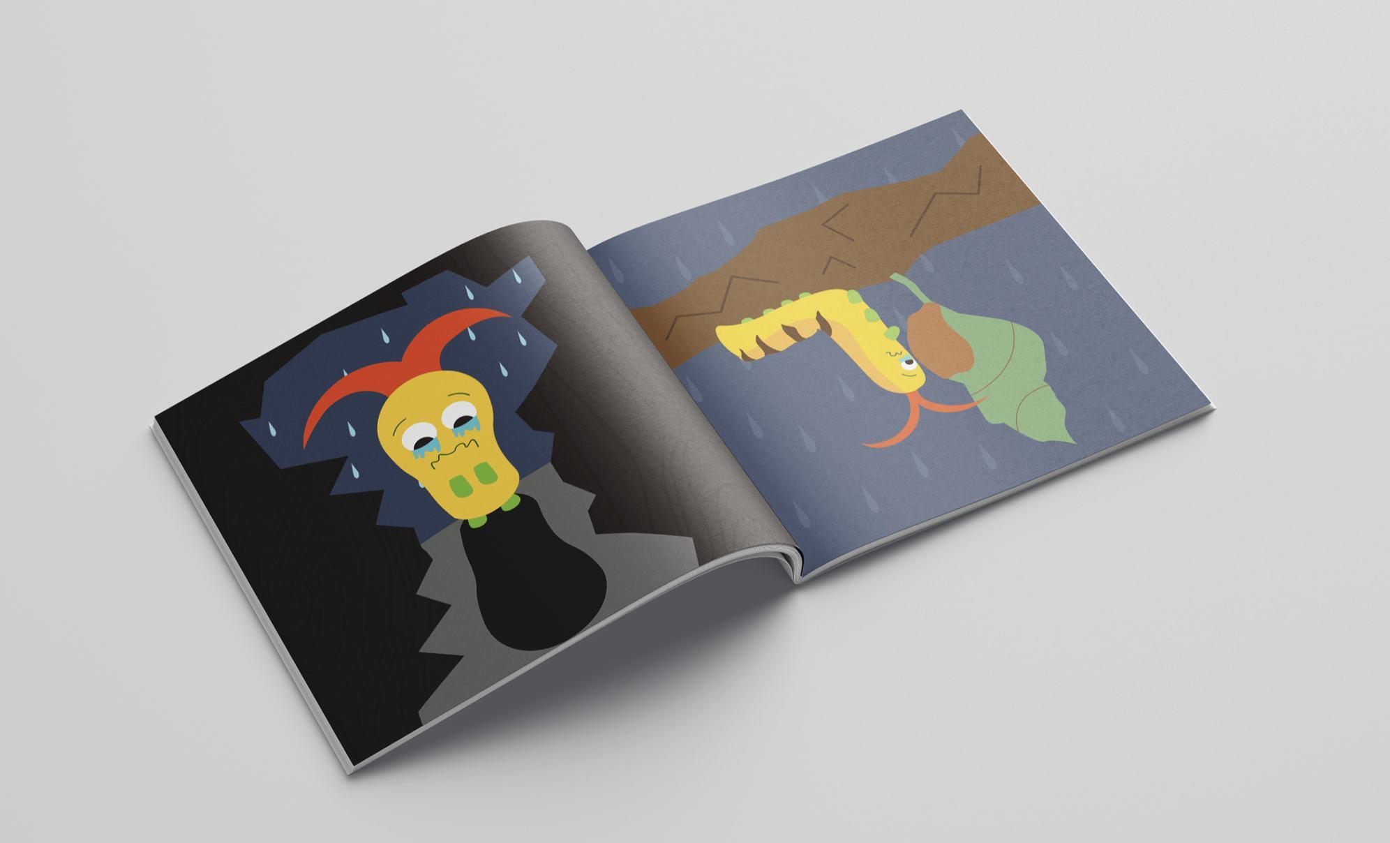
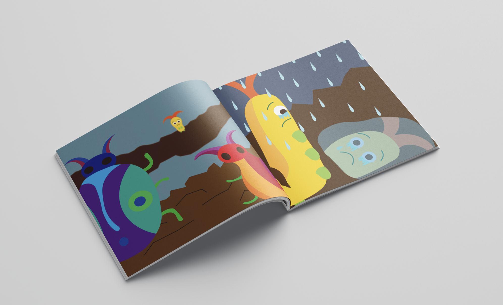
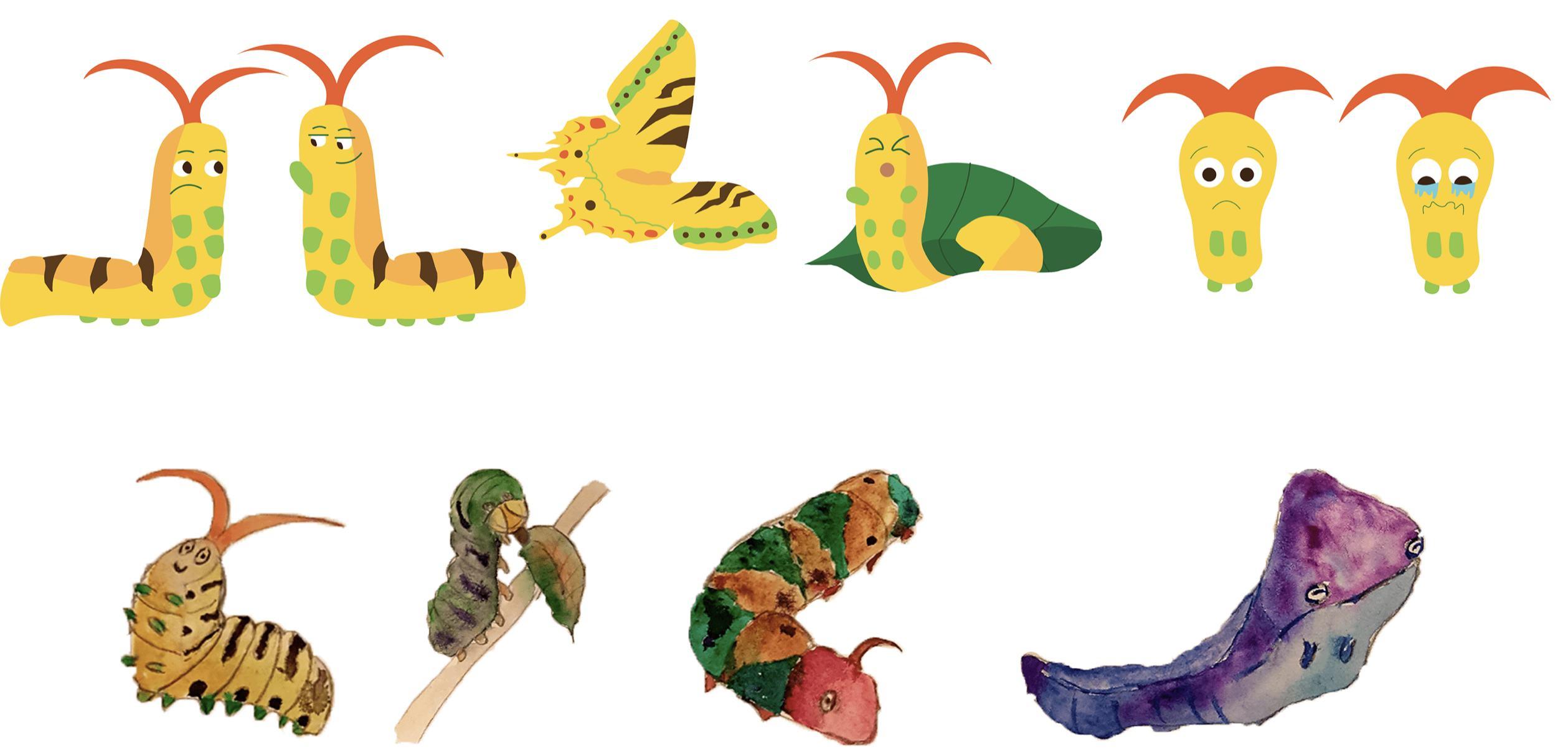
A silent story book authored by me, on the motive of "the ugly duckling". It tells the story of a caterpillar, which is ignored and despised by everyone, because of its ugly and boring appearance. However, once you hit rock bottom, the only way from there is up.
Problem Solution
Originally a brief for an illustration course during my Bachelor’s, the idea was to simply create a very short silent story book, conveying a message through illustrations alone.
A silent story book, 12 pages long, illustrated in a simple vector style mimicking children’s books, while telling a sad story with a happy ending with the “ugly duckling” motive.
editorial 28
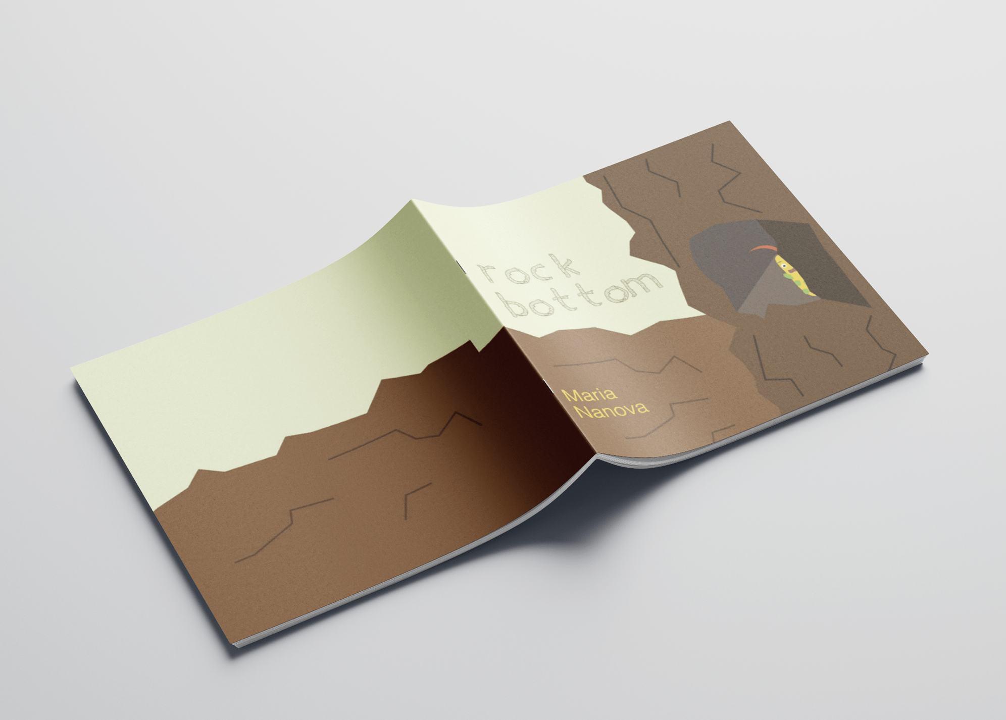
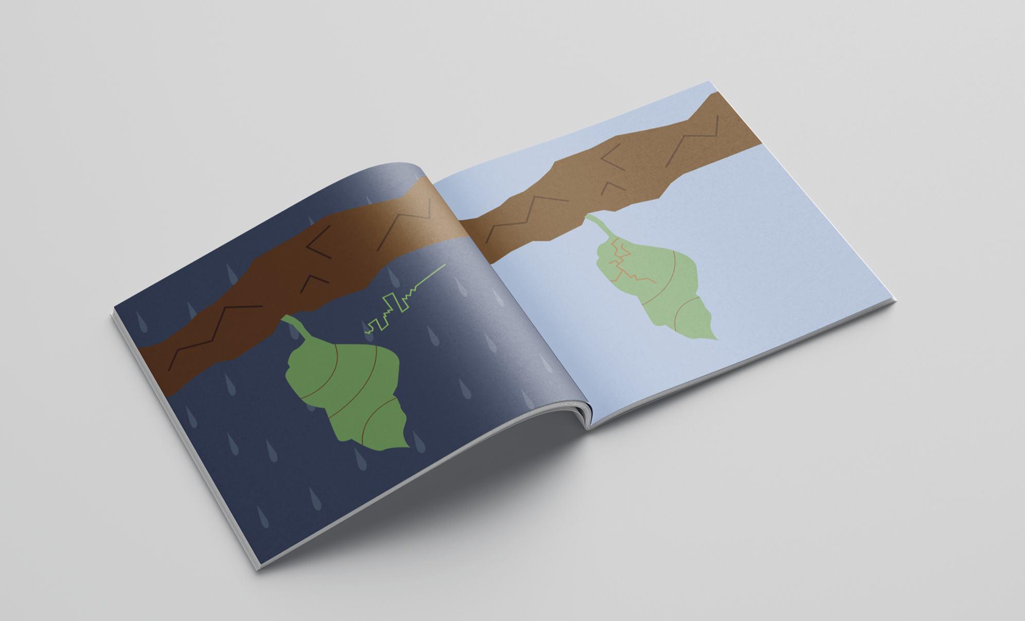
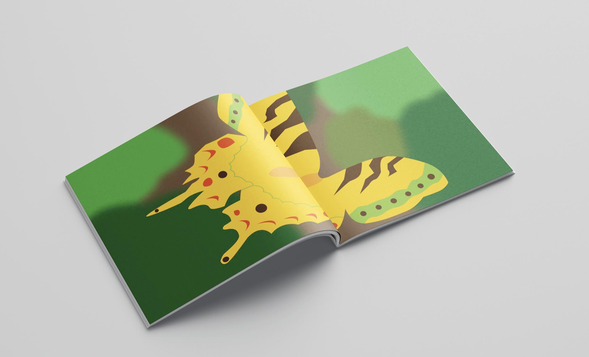
The simple vector graphic style has a good functionality - it could be understood by every age group, from kids to elders and is a nice contrast to the complicated nature of the motive behind the plot.
To be read from upper left, ends at bottom right. The caterpillar is considered bland and different from the other bugs in the tree and is ignored and made fun of. It decides to go to sleep forever in its cocoon, only to realize that once it wakes up, it’s the most beautiful insect.
29
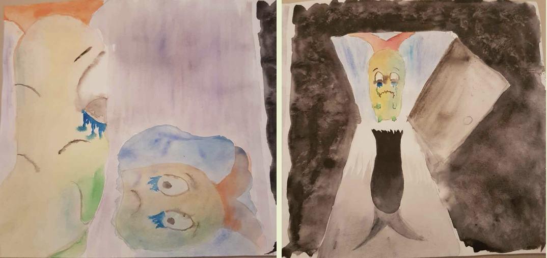
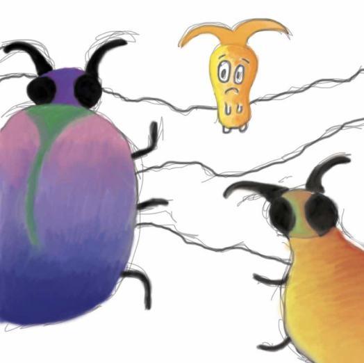

The vector style wasn’t my first choice. I experimented with watercolor and digital painting, however it didn’t seem like the right medium to me at the time, it took away from the simple representation of a complex problem. The vector graphics option portrayed my desired feel better than the previous two.
The character was inspired by a real caterpillar species and before that I had experimented with different looks of it.
30
Throughout the re-readings of various books I have noticed a few of them might benefit from a new cover that properly conveys the message and feel of the plot. Here are the chosen two that also happen to be my favorites.
Assumed that many designers don’t fully indulge in a book before designing its cover. This leads to miscommunication between potential reader and the plot of the book itself.
Two book covers inspired by my favorite reads. The new covers utilize a metaphorical approach to complex stories and settings without giving away too much of the plot.
editorial 31
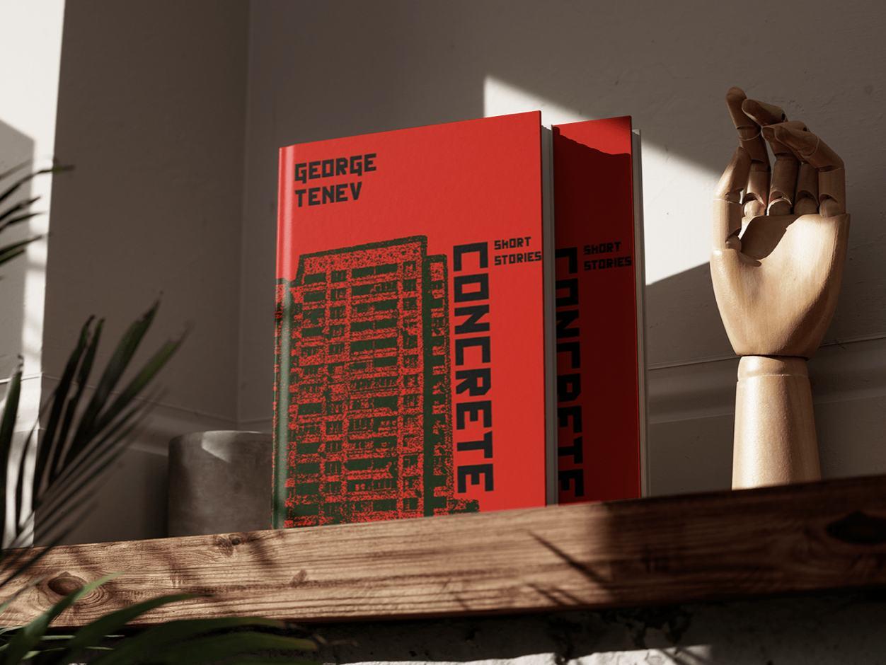
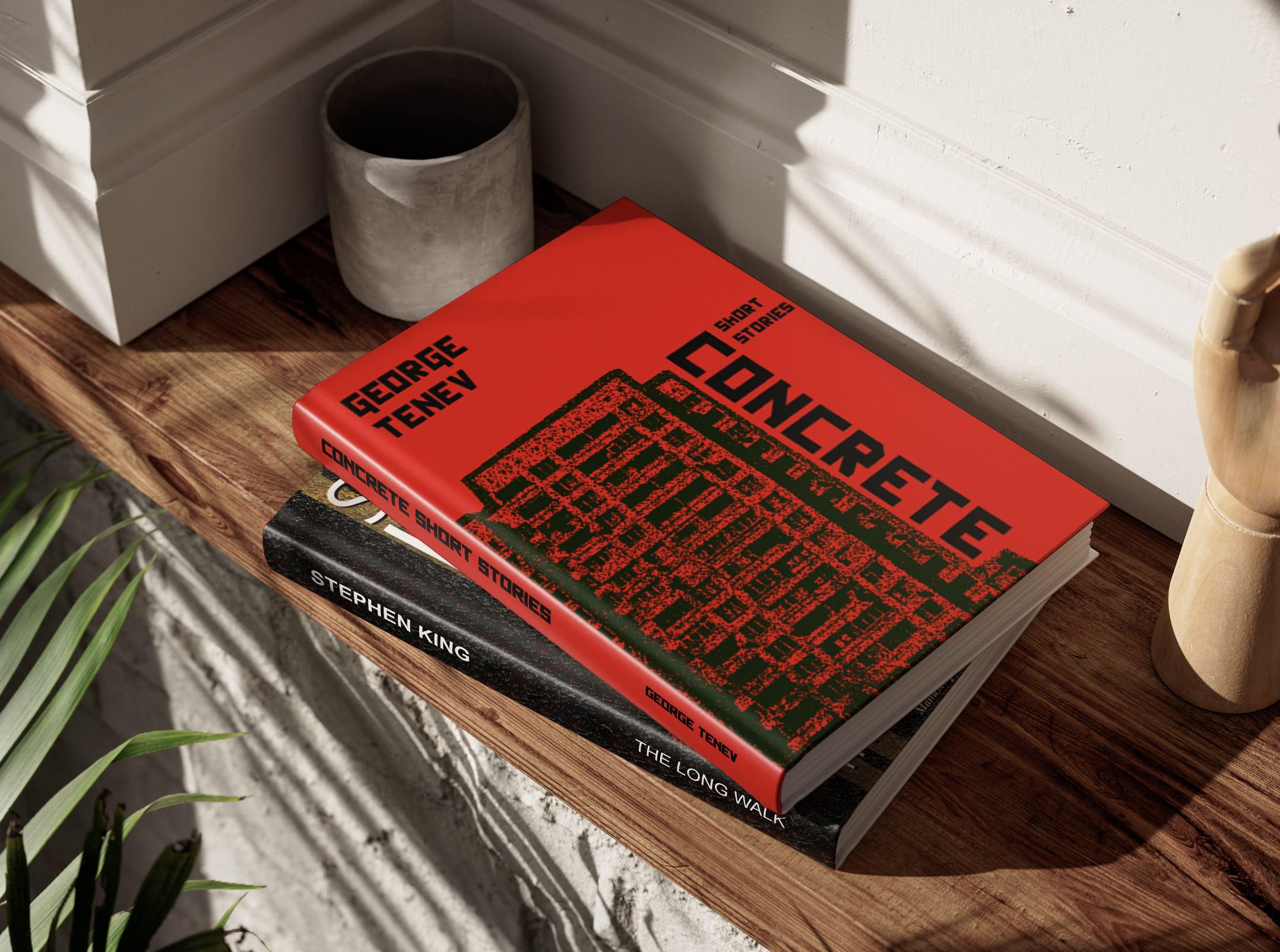
Concrete Short Stories
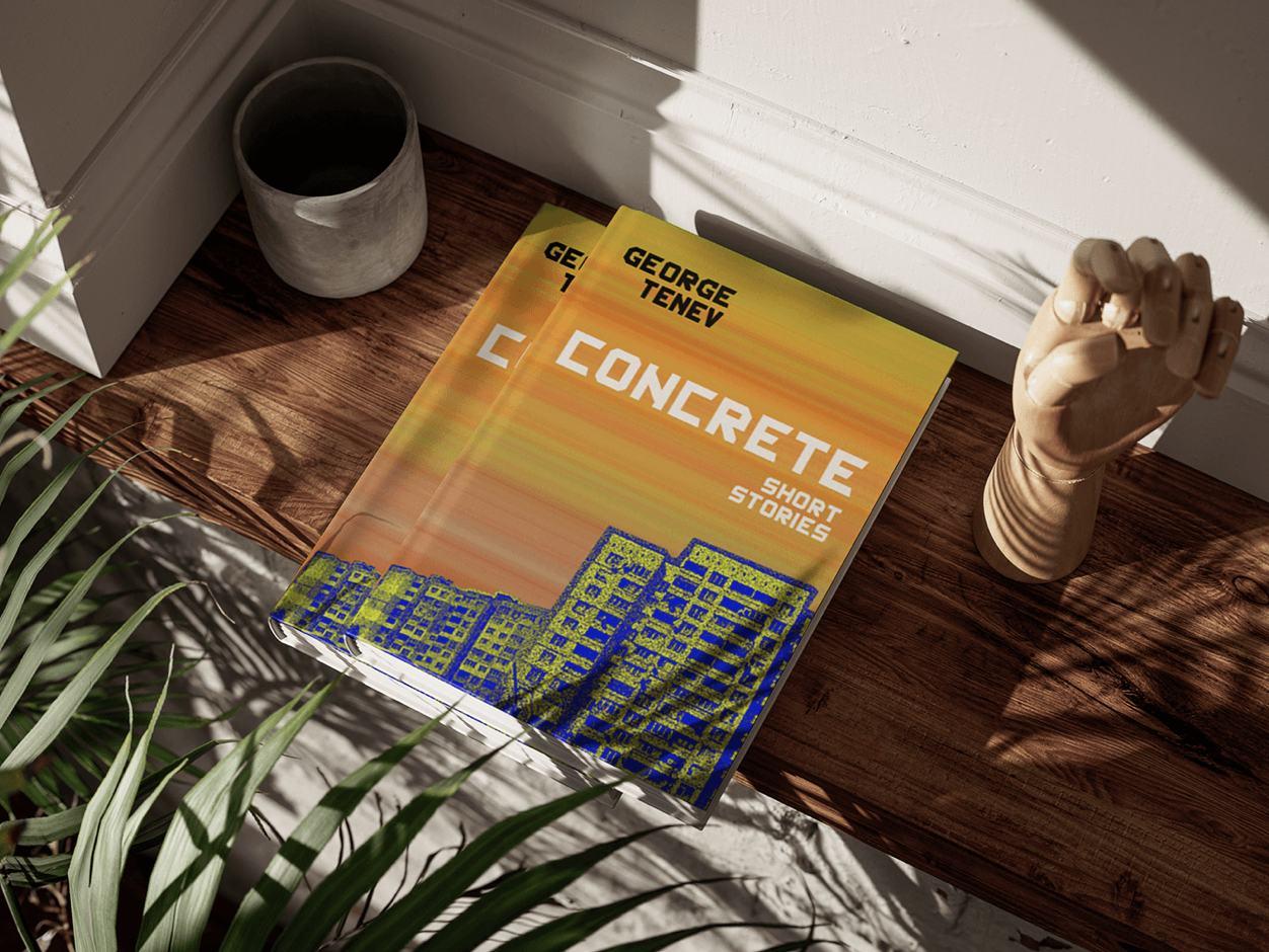
In 'Concrete Short Stories', the Bulgarian author delves deep into the stark reality of life within Bulgaria's iconic concrete buildings, a reflection of the communistic era. The cover pays homage to this unique narrative, featuring the panel blocks, a defined part of the country's history. The strategic use of a typeface reminiscent of Soviet propaganda posters adds historical depth, while the rough visual effects on the block e ude authenticity. Below is a second version of the cover, more nostalgic approach in terms of color palette.
32
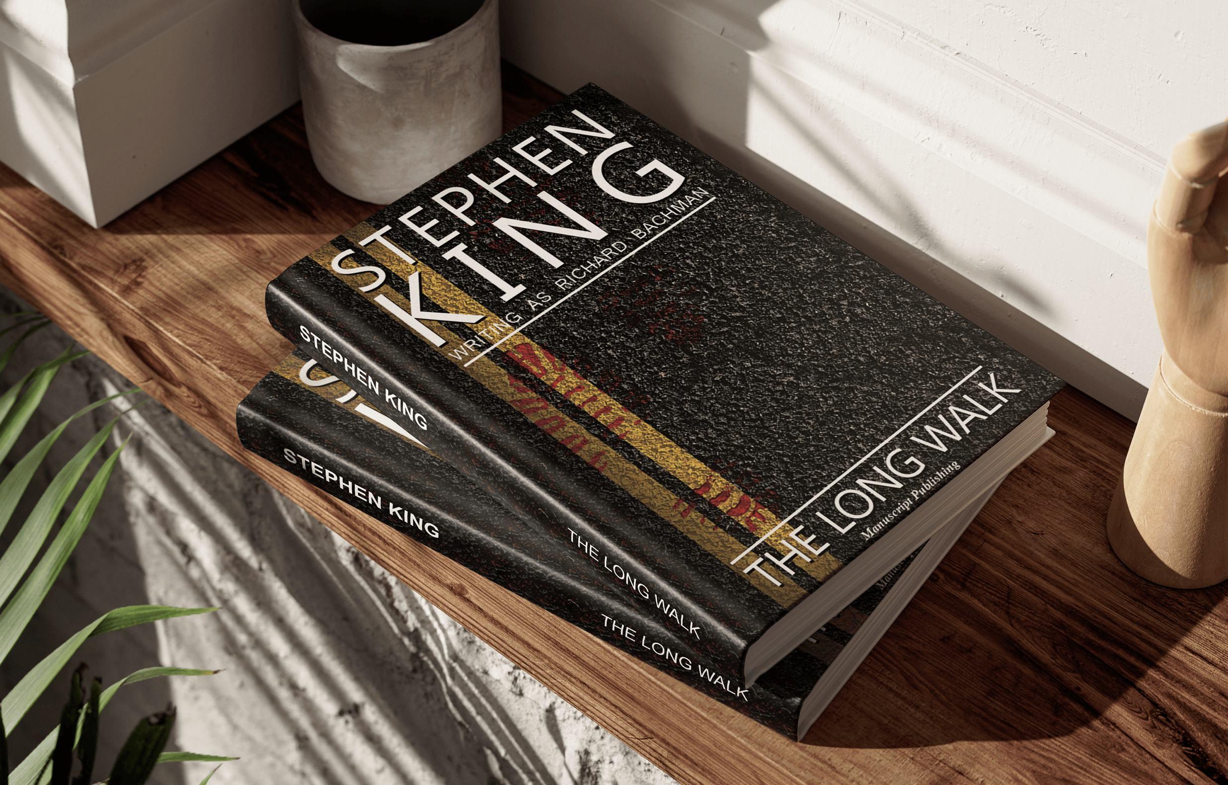

The Long Walk
n 'The Long Walk' the cover is a symbol of a recurring motif which embodies the harrowing journey where stopping means certain death. The design blends visuals and typeface and adds to the mystery. The story itself is about walking until you can’t anymore which leads to being shot by military. The fate of the 100 boys on this journey to certain death, where only one would survive lies behind the bloody footprint on the road.
33
thank you! designer maria nanova +46 793547797 miminanova@gmail.com
linkedin.com/in/mariananova