PORTFOLIO
Margarida Pinheiro Communication Design 2024

Polo Research
Full branding
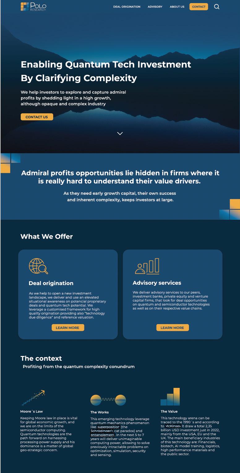
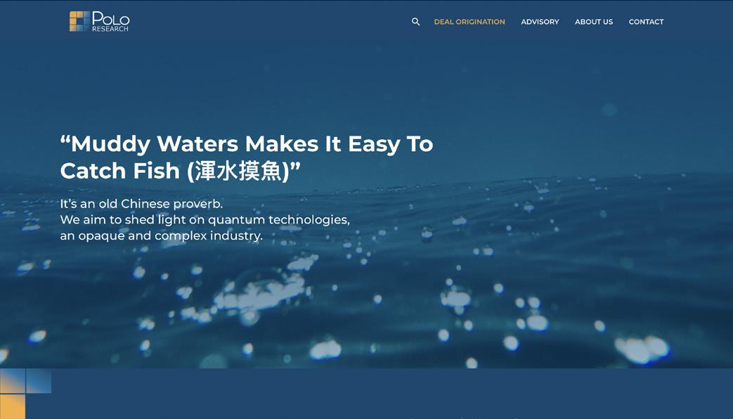
Polo Research is a research and advisory company focused on the quantum technologies area, that delivers deal origination and advisory services to private equity investors.Their mission is to build awareness and support sustained funding of quantum technology.
Based on this, I created their brand identity, aligned with the values that the client wanted to communicate: simplicity, forward thinking, endurance and confidence.
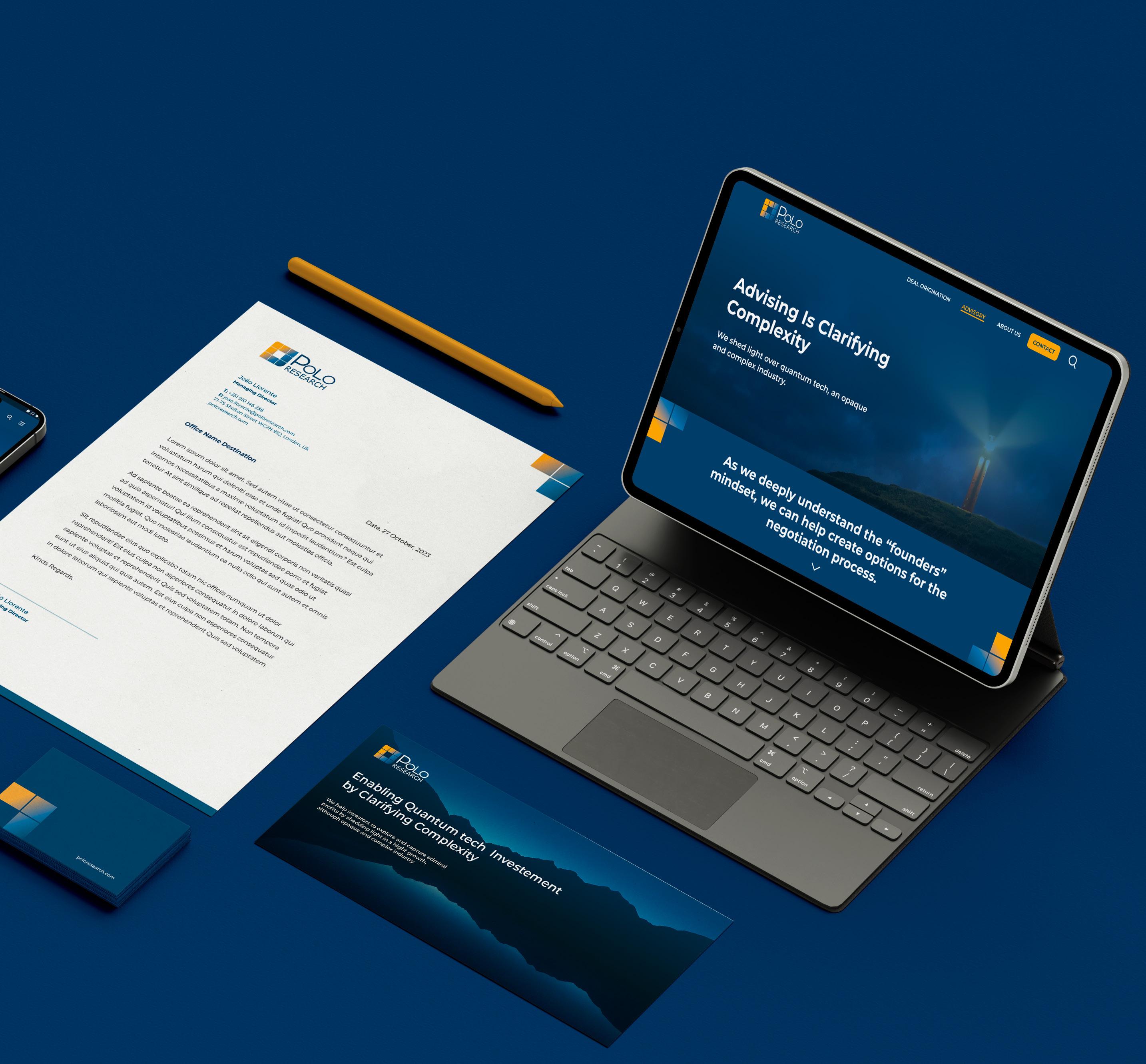
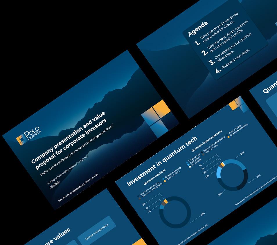
I designed the company’s logo, ensuring its versatile application across various platforms, including email signatures, business cards, letterhead, memorandum documents, and keynote presentations.The culmination of this creative process was the design of Polo Research’s official website. Tools Illustrator, Photoshop, Figma, Keynote, Pages


Logo
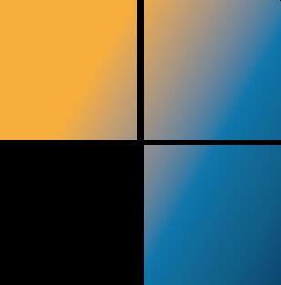
The logo encapsulates the core values of the company, which is dedicated to simplifying intricate concepts, particularly in the realm of quantum computing. The design prioritizes simplicity, reflecting the company’s commitment to clear communication.
The arrangement of the squares forms a microchip, with a gradient in an ascending motion.This is meant to symbolize trust and forward-thinking.The colors play a crucial role in reinforcing the brand message, with various shades of blue representing innovation, while the addition of yellow as an accent color introduces a positive and vibrant element that makes the brand stand out.


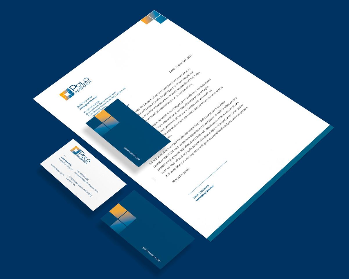
Letterhead and bussiness cards
 Moore’s law Quantum entanglement Value
Icons system Presentation decks
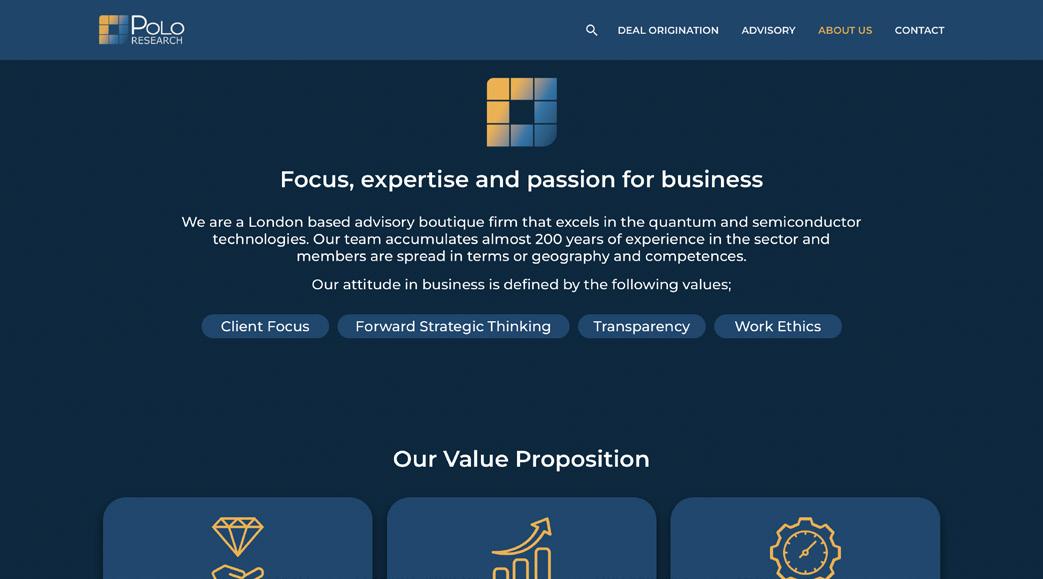
About
http://poloresearch.com Website Homepage Available at: Advisory page
us
page
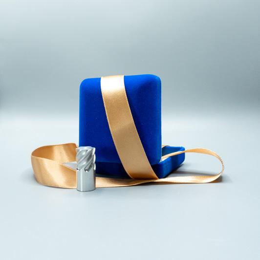
GIOIELLI MECCANICI
by

Microingranaggi Group project
Digital marketing / Social media
For this project, my group worked with the company Microingranaggi, an SME in Milan which speciallizes in the production of small gears and other mechanical components.The goal was to develop a marketing and digital communication strategy that would lead new potential clients to contact the company.To achieve this, we created a user journey that started with posts on Linkedin, where most people found the company.The posts have a call to action link to a landing page, with a video showcasing their work process and information on their services, leading to a contact form.
My role
Research and brainstorming, Design posts and storyboard for video

Tools
Figma, Procreate
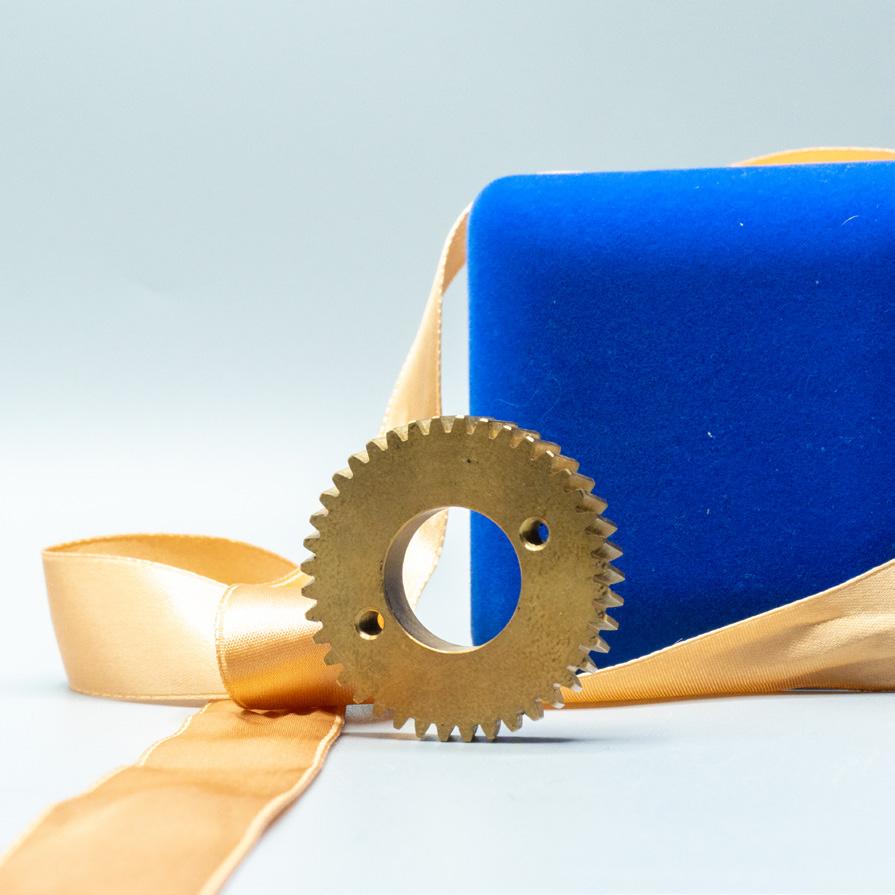
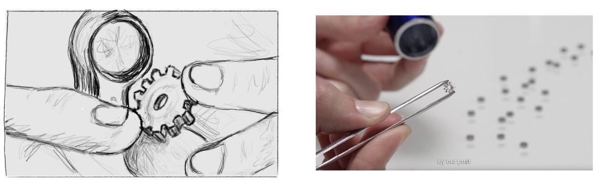
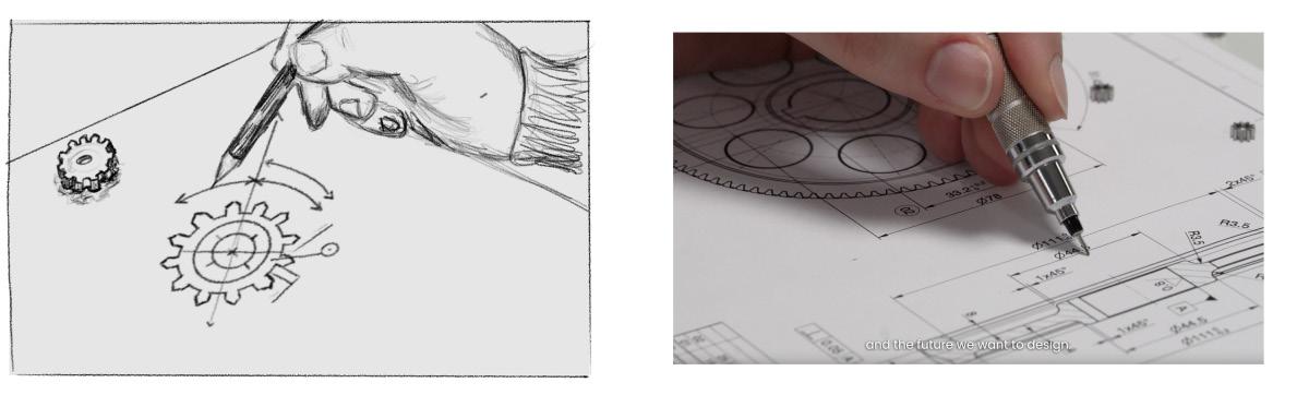
The concept: gears as jewels
When visiting the company we got some insights that allowed us to decide the direction that was most fitting. The process of creating these small mechanical components was so precise and meticolus, it resembled the process of jewelry making. With this metaphor we wanted to emphasize the craftmanship, attention to detail and quality of the products, making the value behind the work of Microingranaggi very clear to potencial clients.
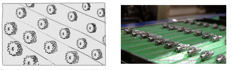
These posts of the products shot as jewels were the first category of our editorial line.
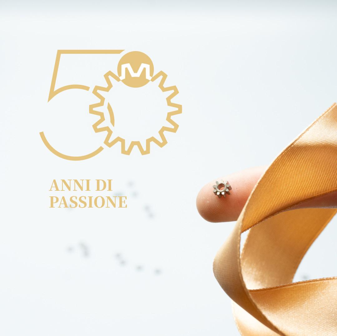
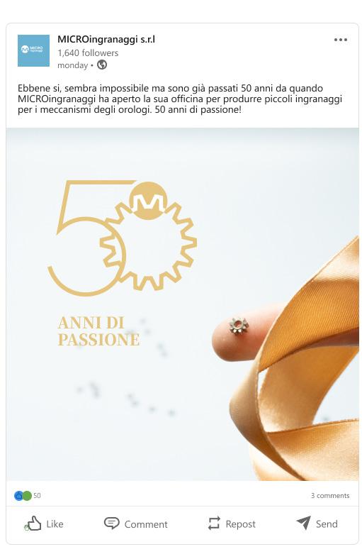
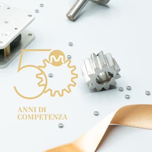
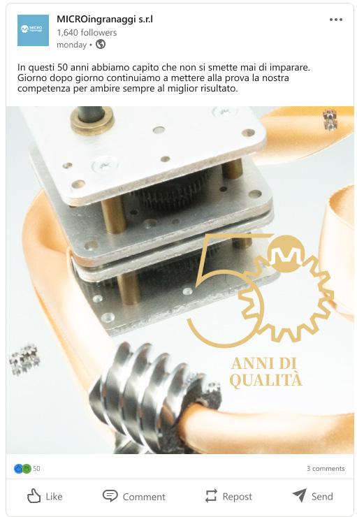
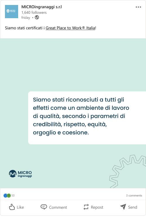
50 years
The second category of our editorial line was to celebrate the 50 years anniversary of Microingranaggi. Each post focuses on a specific value that is important and representative of the company.

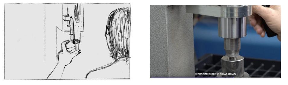
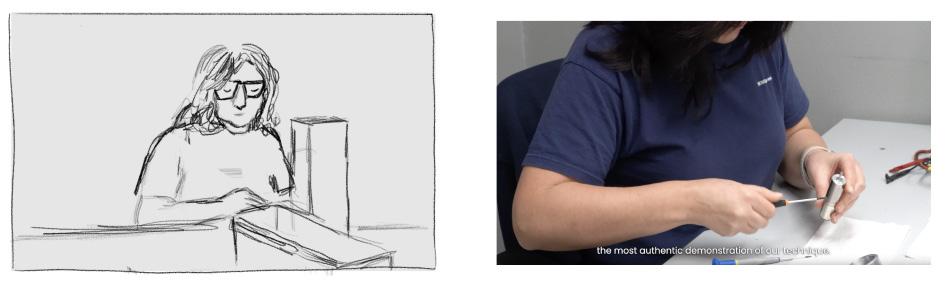
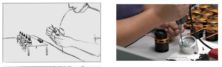
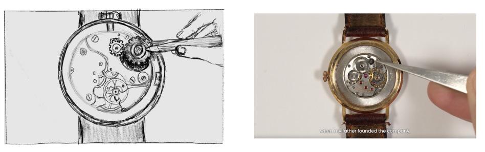
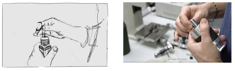
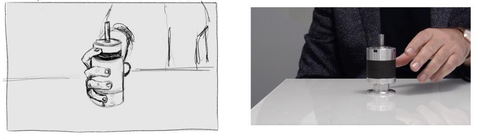
Storyboard excerpts/video planning
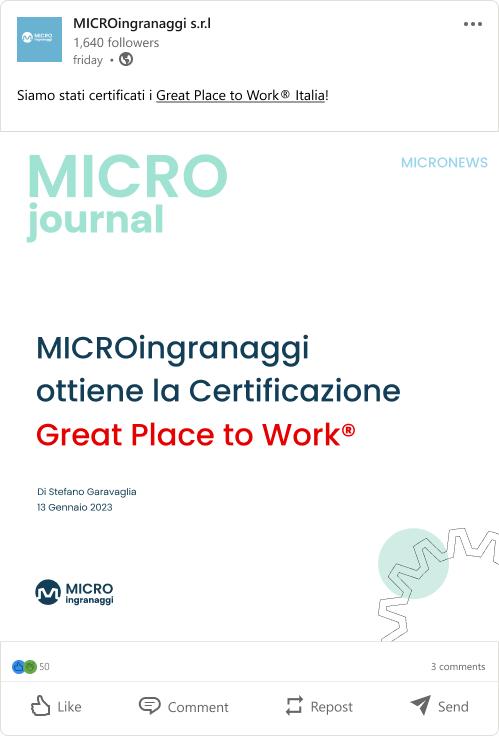
Microjournal Microstories
The Microjounal editorial line is for cultural and informative posts with market related news, announcements, opinion pieces and various articles.
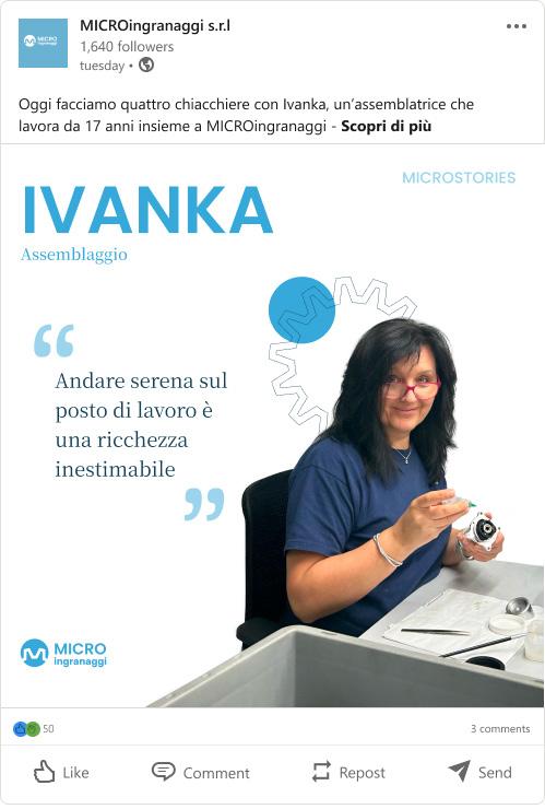
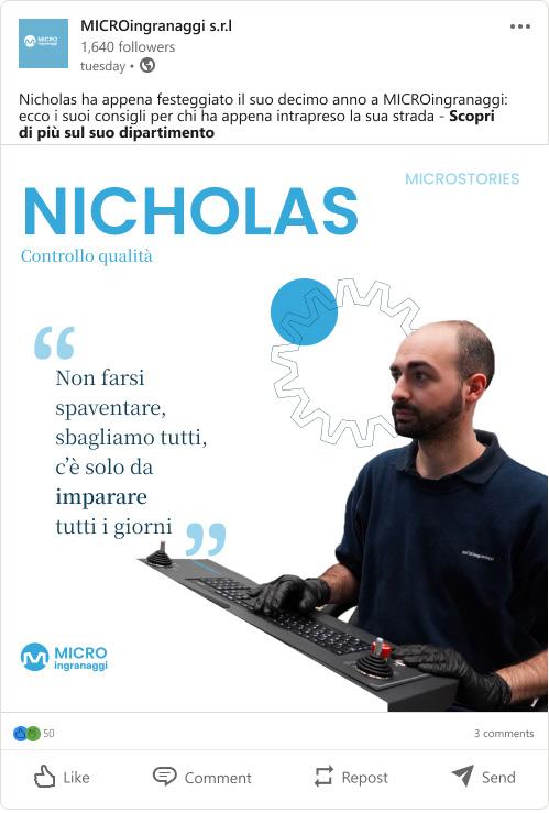
We created the Microstories guideline as we wanted to give a voice to the people behind the company. Every week a different employee is issued in a short interview format.
Launches


Recruiting EUROC 2021

Events Hybrid Engine History Build & Test
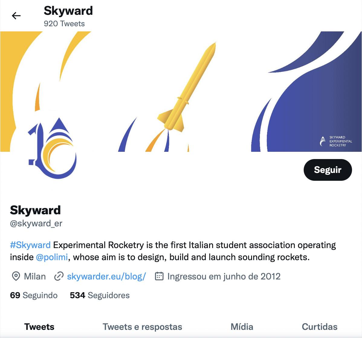
Skyward Graphic Design/Social media
Skyward is a student association of Politecnico di Milano that specializes in building and launching rockets competitively.
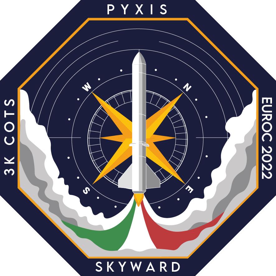
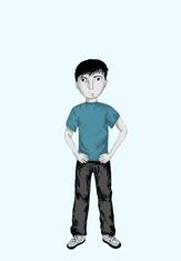
I undertook a significant role in shaping the visual representation of the project. Specifically, I took on the responsibility of desiging the mission patch for their rocket named “Pyxis.” The patch represents the contellation of the same name with the depiction of the nautical compass at the center. Additionally, I designed icons and banners tailored to enhance Skyward’s social media presence.
Tools
Illustrator
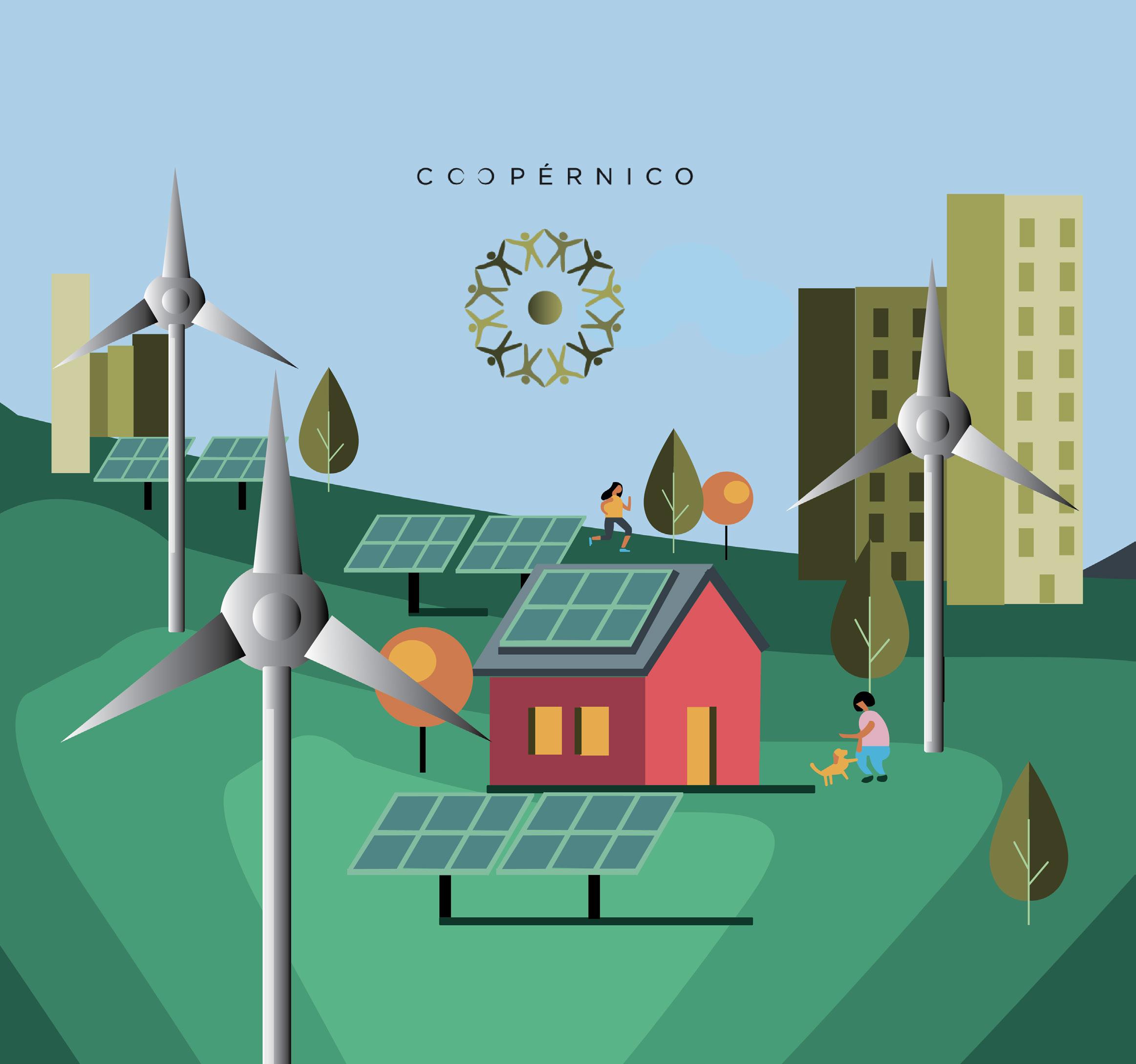
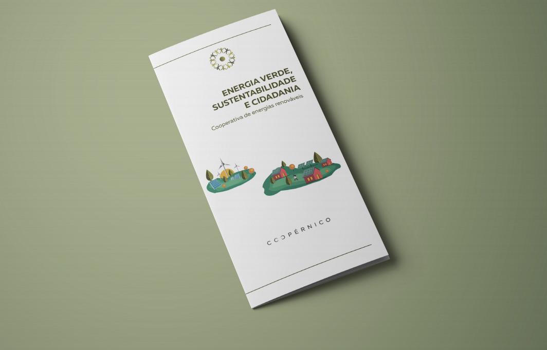
Coopérnico
Identity design/Illustration
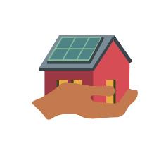
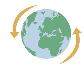
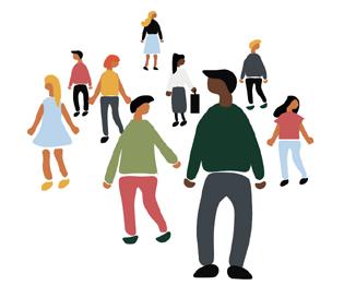
Coopérnico is a cooperative that promotes the involvement of citizens in the creation of a new social, economic and environmental paradigm.They promote collective investment in renewable energy projects and share the benefits among investors, society and the planet.
The challenge was to create a rebranding proposition which would reflect the company´s values and goals in a more modern, fun and youthful way, in order to attract investors.
Tools
Illustrator, Photoshop, Indesign
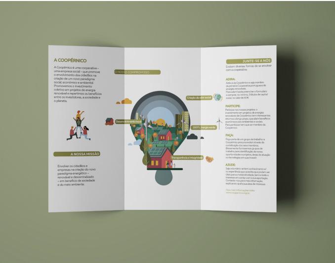
Illustrations and brochure


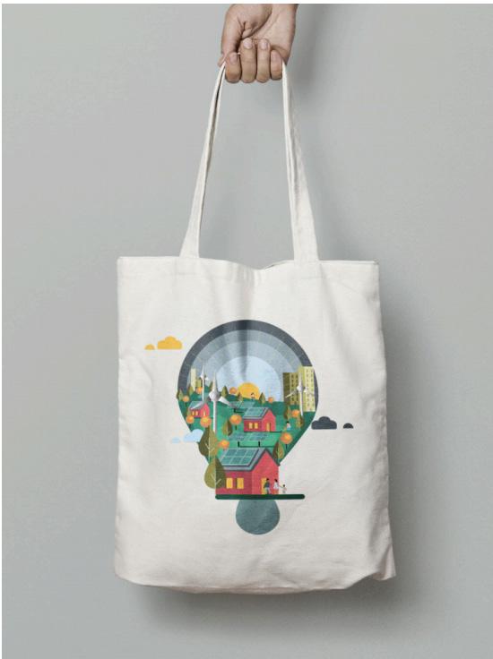
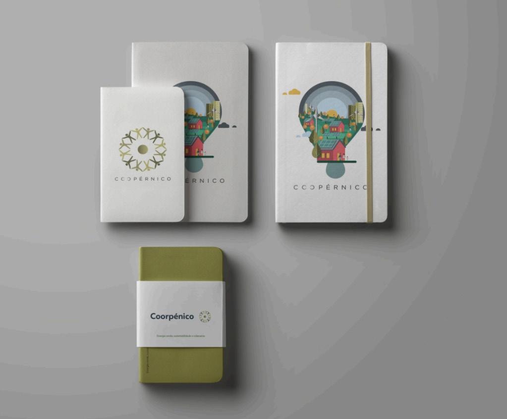
Main illustration Poster Notebooks
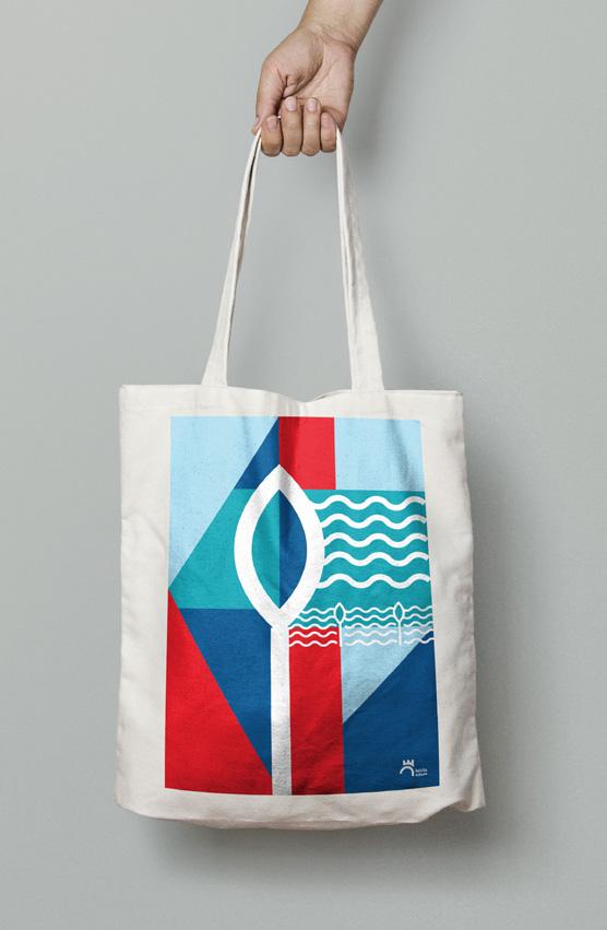
Tote bag
Leiria Cidade Group project
City Rebranding
Leiria is a small Portuguese city with a lot to offer, not only to those who visit it but also to those who call it home.
This project is a rebranding proposal for the city, made with a background of extensive research, which included a questionnaire conducted to 350 people. We wanted to make sure we understood the images, emotions and ideas that people associate with the city. We used different methods of research, taking into account the city’s main qualities and values. We defined their direct competitors and their positioning in the market
Our goal was to build a new identity to highlight Leiria´s most developed sectors and the quality of life of it’s inhabitants.
My role
Apart from the research process, I was also responsible for co-designing the icons and patterns used and for designing and writing the full city´s manual of production. Defining the different rules, guidelines and stipulations to ensure a coherent use of the brand.
Tools
Illustrator, Photoshop, Indesign

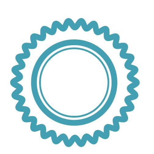
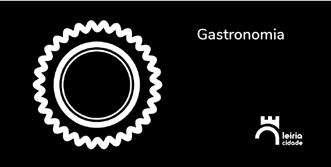
Each icon is based on emblematic elements of the city of Leiria.
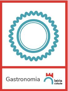
We made different variations of each icon.
The colours used represent the city´s most recognizable elements: the castle (red), and the river “Lis” (different shades of blue).
Historical Patrimony Natural Patrimony Cultural Patrimony Gastronomy Community Education Sports Assembly
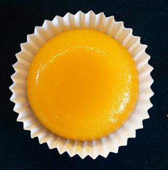
Brisa do Lis (tradicional dessert)
Colours C-0 M-95 Y-85 K-0 C-77 M-12 Y-29 K-1 C-46 M-1 Y-16 K-0 C-88 M-58 Y-25 K-9
Icons Patterns
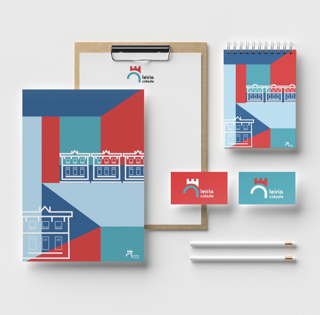
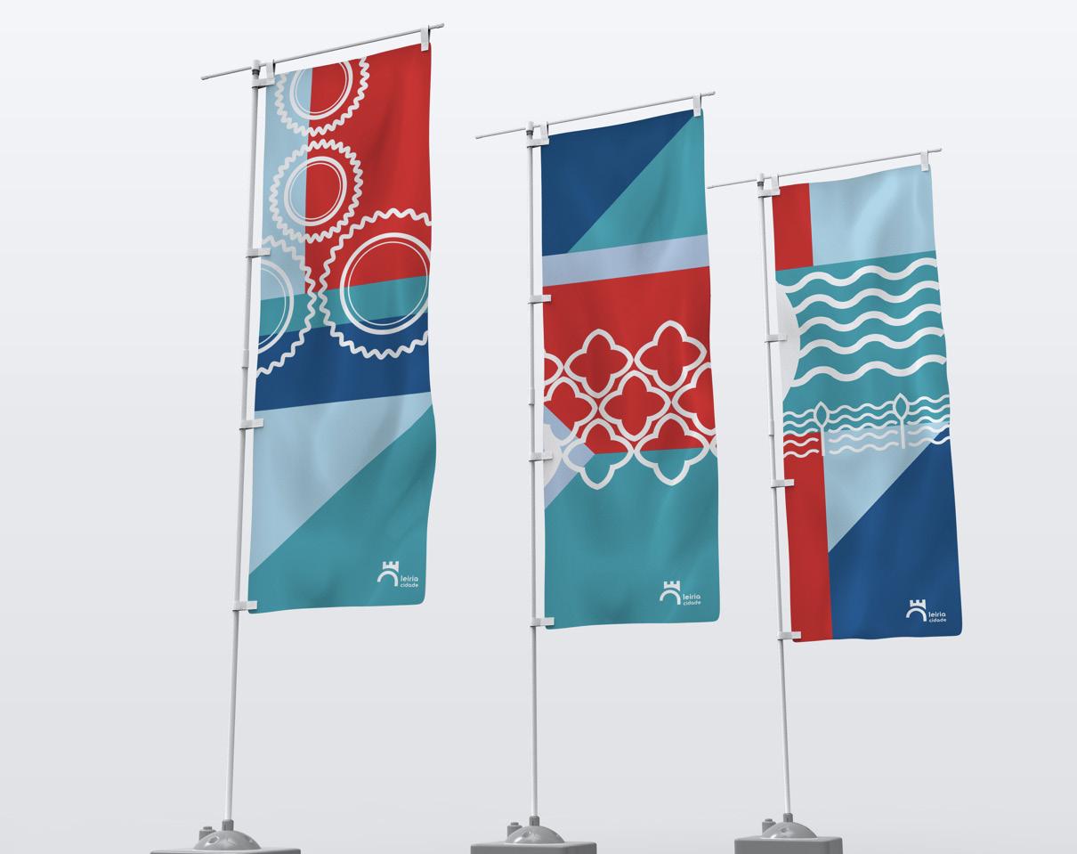
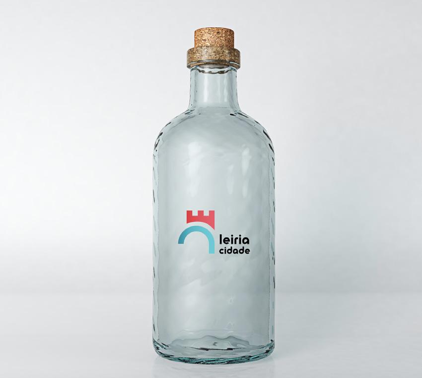
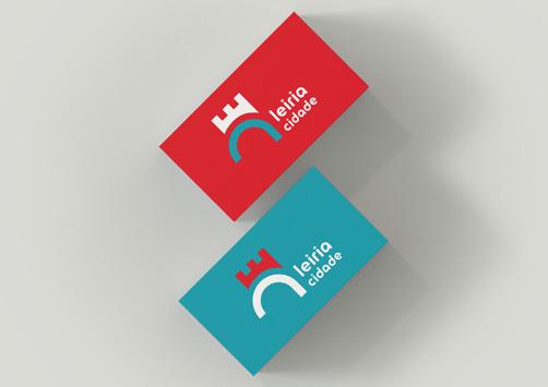
Stationary Flags Bottle Business cards Tote bag
Education Rights
Poster and gif
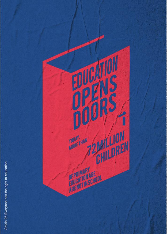
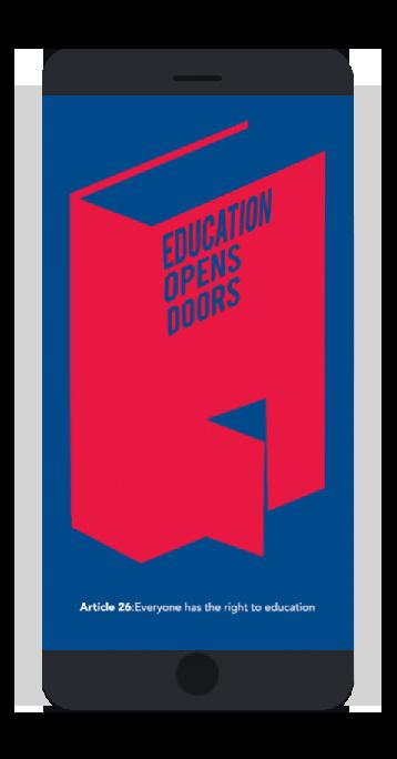
This poster and gif were made to promote the right to education stated in The Universal Declaration of Human Rights, Article 26: “Everyone has the right to education.” This is a right that is still violated, with more than 72 million children still not having access to school today.
Because of the objective and serious nature of this message, I opted for a clean illustrated and direct approach, both in print and in motion.
Tools Illustrator, Photoshop
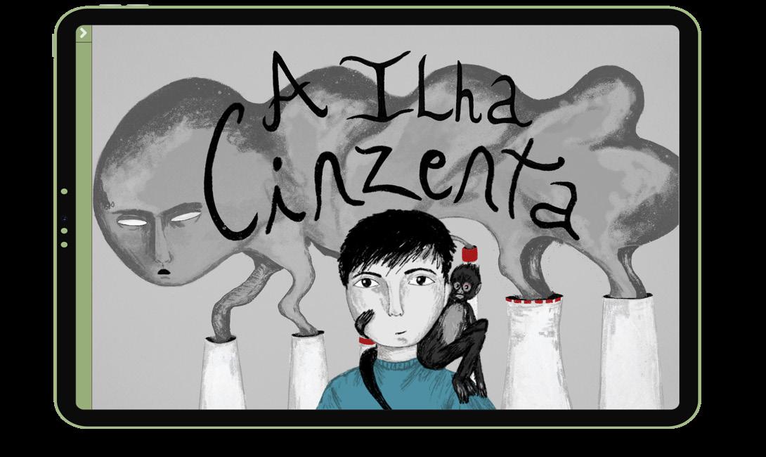
A Ilha Cinzenta
Thesis/ Interactive Digital Narrative/ Illustration
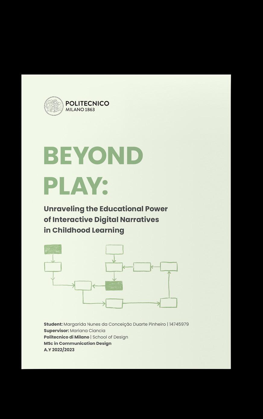
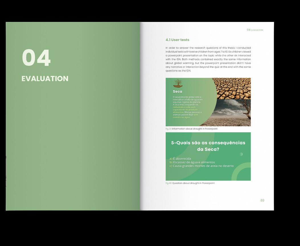
“A Ilha Cinzenta” is an interactive digital narrative I created as the project of my Master thesis. Interactive Digital Narratives (IDNs) are a form of storytelling in the digital medium where the user has an influence on the development and outcome of the narrative. This project was designed to adress a research gap concerning the lack of IDNs aiming to fulfill learning objectives for children. This IDN was made to engage children from the ages 7 to 11, addressing the causes and consequences of Global Warming with the goal of informing, motivating and bringing awareness to the topic, seeking a transformation of behavior. The effectiveness was evaluated through user testing with children, comparing its impact with that of a traditional PowerPoint presentation on the same topic. The results highly favored the IDN, showing its efficiency in conveying complex issues and in fostering empathy and engagement.
Twine, Procreate, InDesign
Tools

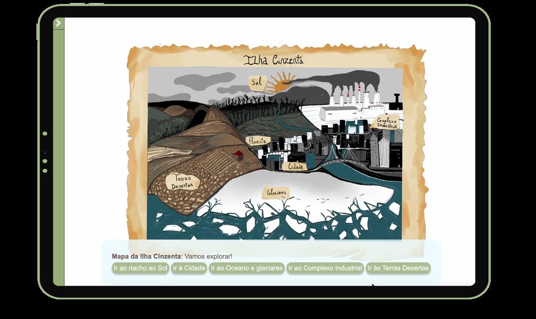
Simplified branching narrative
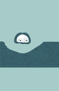
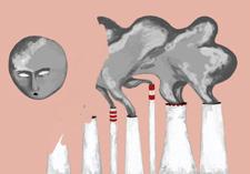
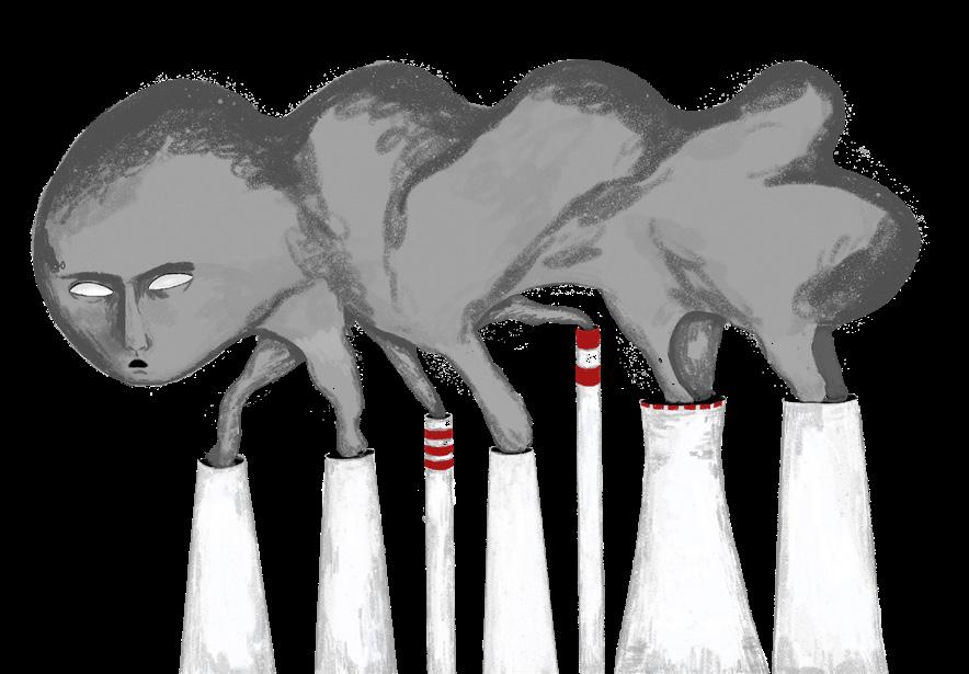
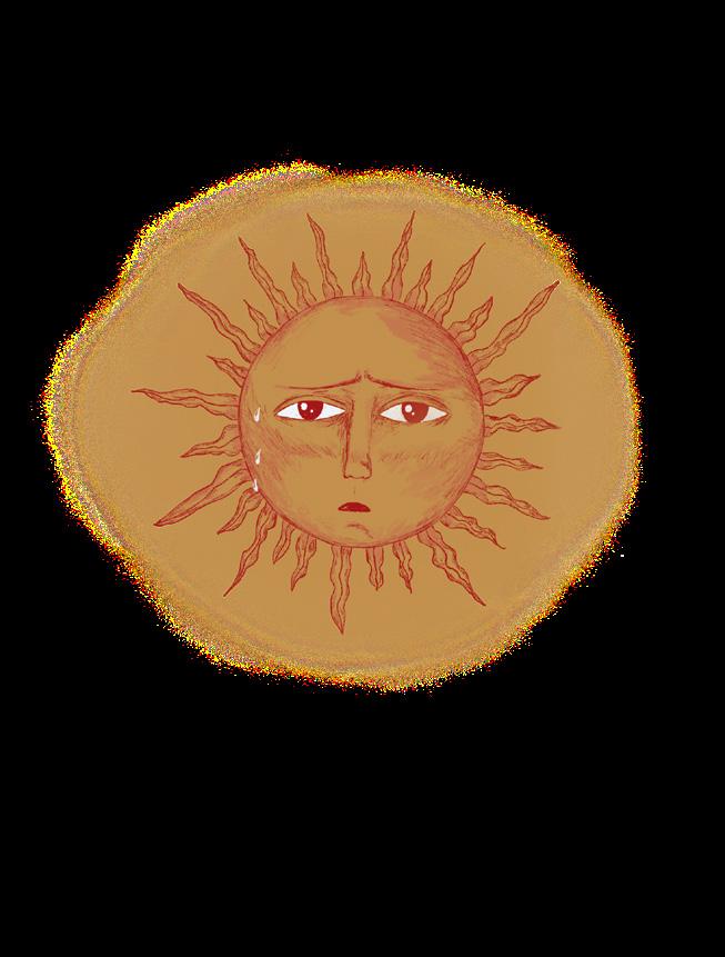
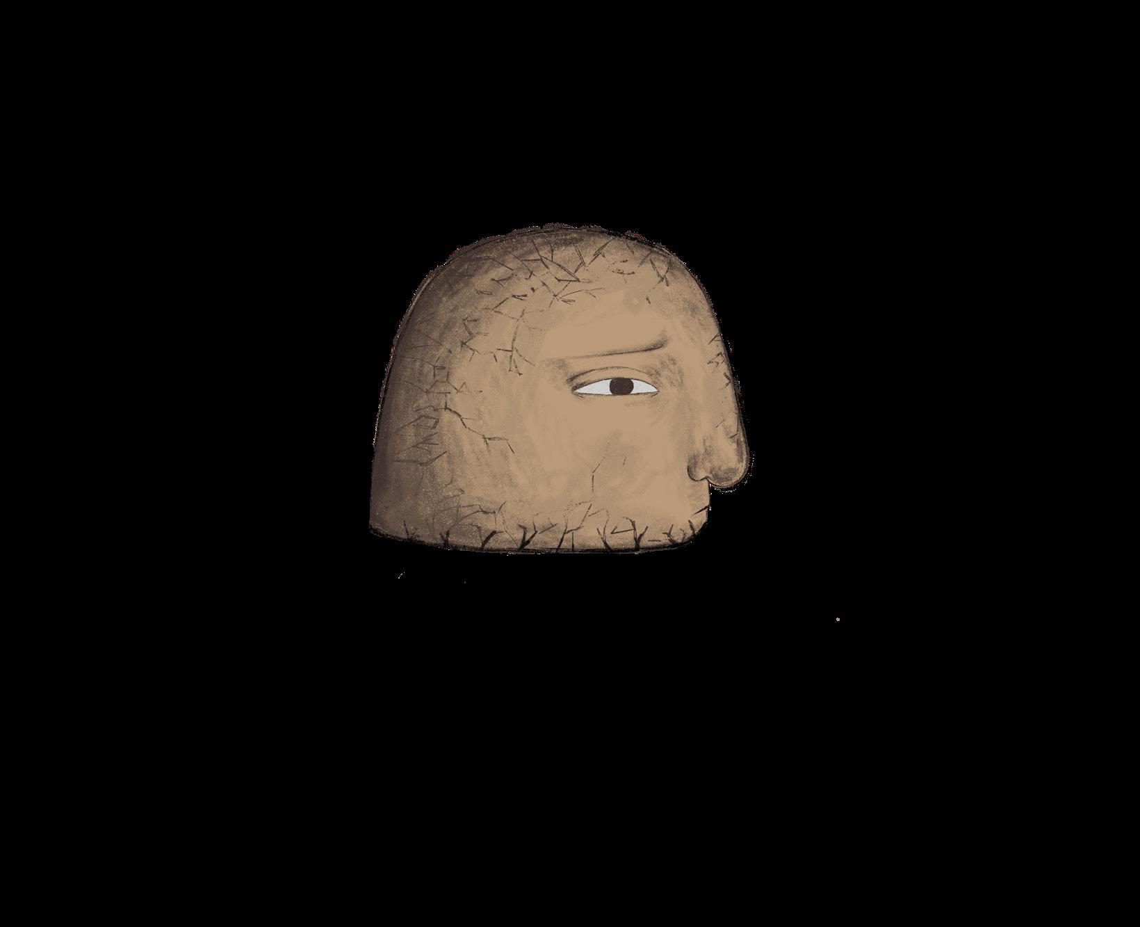
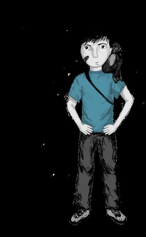
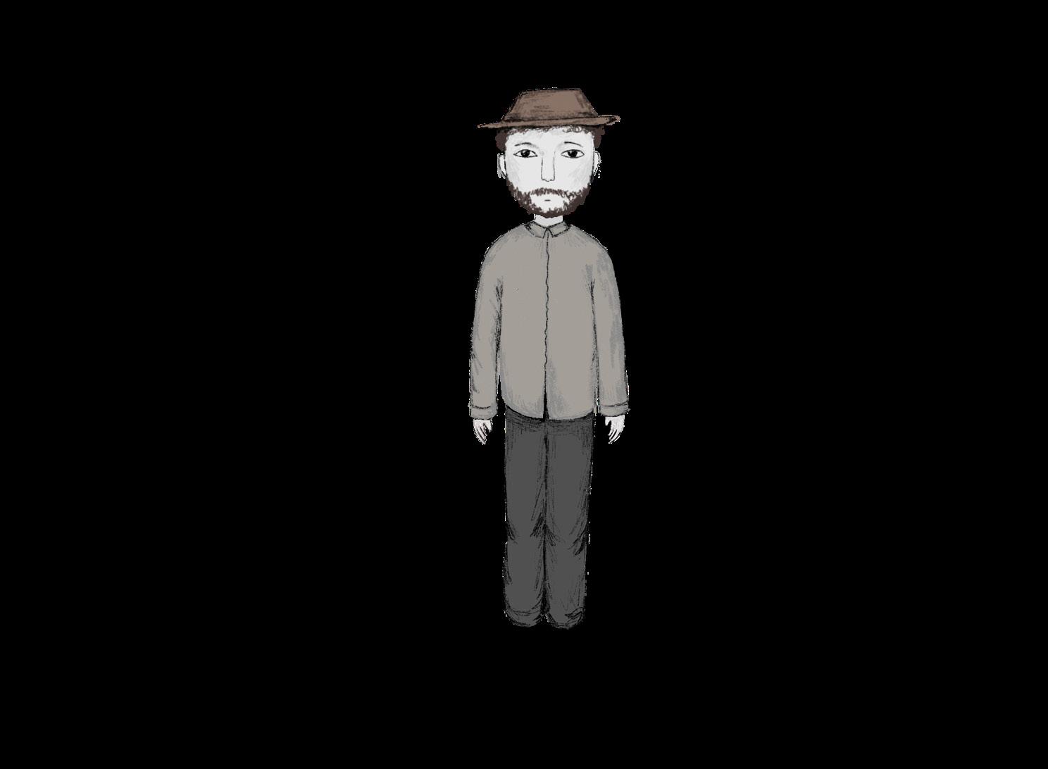
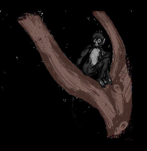
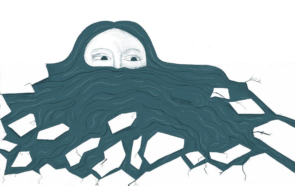
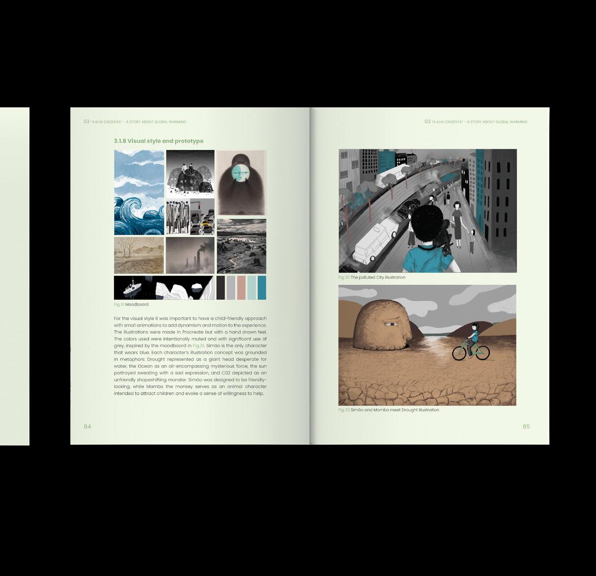
After the research on educational IDNs and on the target group was conducted, the project was developed with the creation of the storyworld and it’s characters, according to classical archetypes of storytelling. The characters are exaggerated metaphors of the different problematics of Global Warming: the overheating Sun, the rising Ocean and it’s melting ice-sheets, the lonely Farmer concerned with food scarcity, dehydrated and desperate Drought, and the smoke shapeshifting monster of C02. The adventure starts with the main character, Simão, meeting a monkey called Mambo who provides the call to action to save the planet. The narrative is structured around the map of the storyworld where the child can chose where to venture and meet the different characters. After each environment is visited there are questions that test if the learning objectives are met.
Illustrations of characters
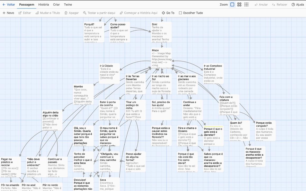
Screenshot from Twine
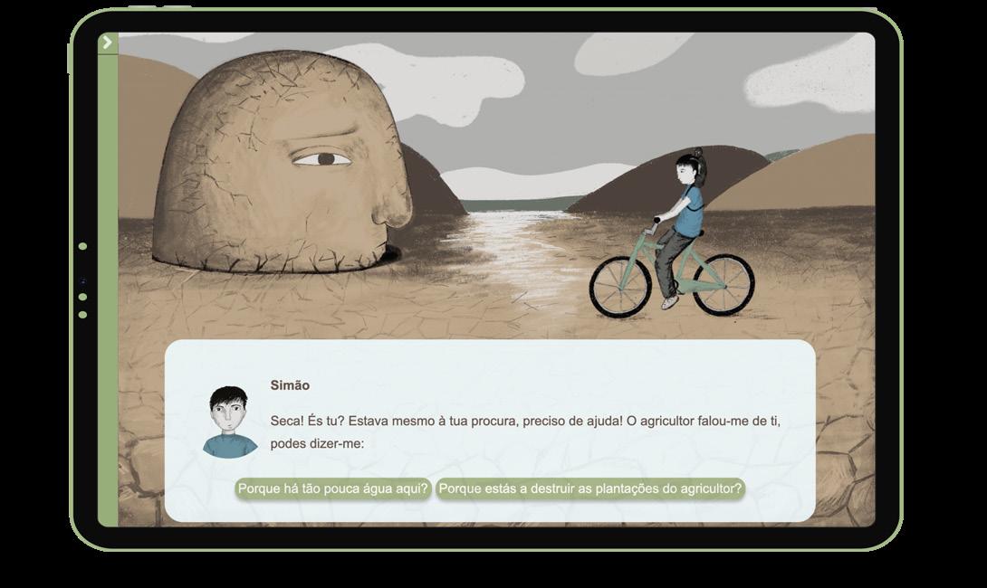
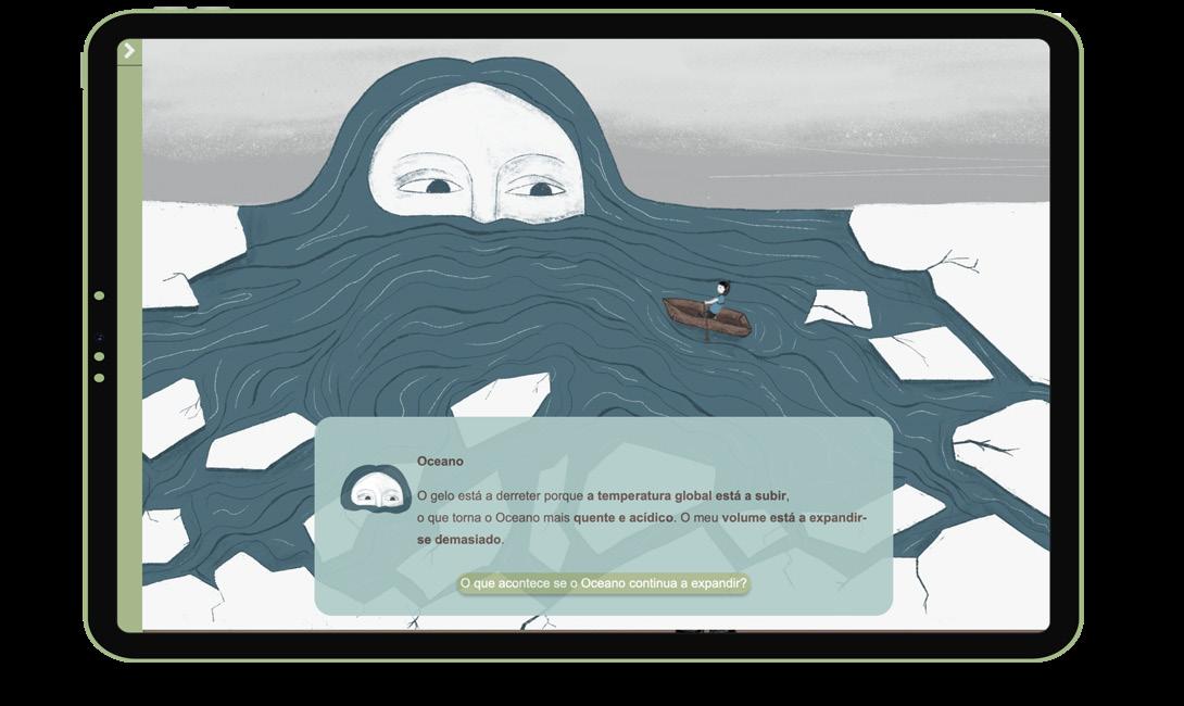
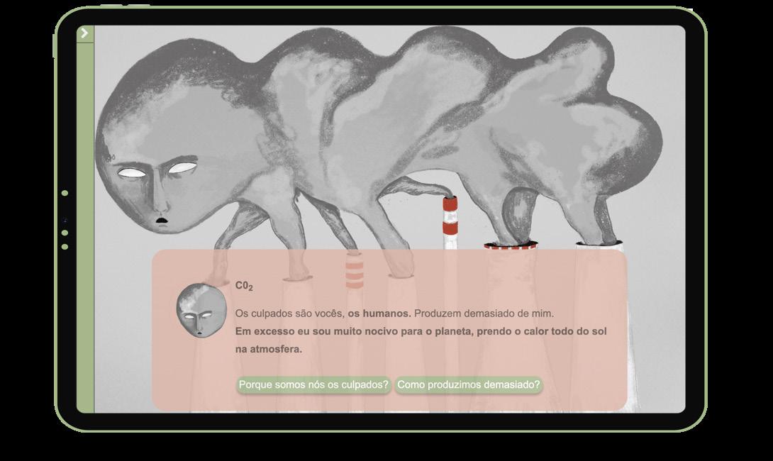
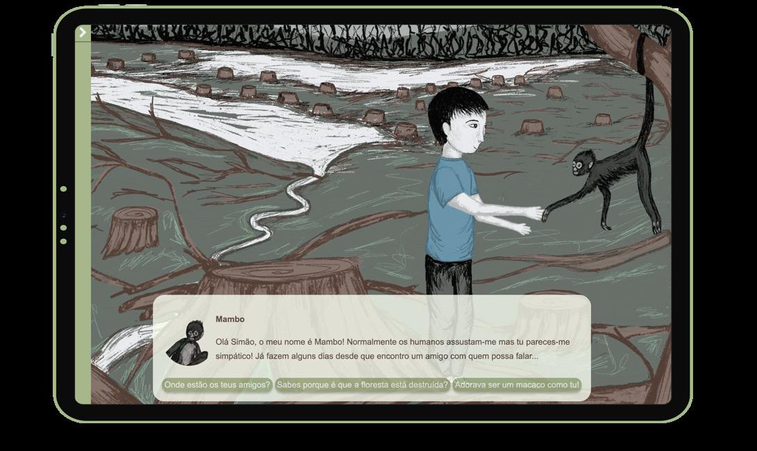
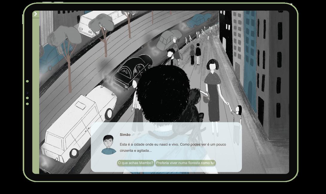
User interface
The UI consists of full screen animation s on the background, with a dialog box on topm where the decision points are also displayed. The green UI bar on the side allows for saving and rewinding the story.
Project available at: https://grey-island.itch.io/idn
Thesis layout
Thank you! Looking forward to connect: +39 351 335 9016 margarida99pinheiro@gmail.com
