Boston International. Where the world’s artists call home
Boston International. Where the world’s artists call home
Boston International. Where the world’s artists call home
Boston International. Where the world’s artists call home.
Boston International. Where the world’s artists call home
Boston International. Where the world’s artists call home
Boston International. Where the world’s artists call home
Boston International. Where the world’s artists call home
Boston International. Where the world’s artists call home.
Boston International. Where the world’s artists call home.
Boston International. Where the world’s artists call home
Branding Presentation | October 10, 2023

brand positioning
| We are a company that is home to artists from around the world. A lifestyle brand that seeks out the most diverse art and makes it accessible to the average consumer by offering it to them on paper goods and home goods.
It is that simple.
The heart and soul of a company is usually very obvious but we sometimes get caught up in “corporate speak”.
What better way to create a cache for your brand than to be perceived as a curator of artists?
Boston International. Where the world’s artists call home.
MARK & LOGO TYPOGRAPHY
- to be used as a graphic mark, but not on it’s own
- BOSTON INTERNATIONAL name should be used as type treatment on all products including co-branded. Use supplied art in outline form, not type.
- primary use is black when used in color. For color blocking & banding the background color or white with a 5 pt. rule
TYPOGRAPHY- preliminary
- News Gothic for all product names, subheads and titling- kerning is set at 2o.
- Titling at 15 pt. and product names at 12 point. Always in lower case.
- Bell MT for all body copy and product descriptions 10 pt. on 11 leading.
Pam Metz President
Boston International Inc.
8084 W. County Road 25 S. French Lick, Indiana
O 812-906-9566 | C 812-549-5260 pmetz@bostoninternational.com bostoninternational.com
BUSINESS CARDS
different color for each person or someone can pick their favorite color
below is an earthy but bright color palette
Lori Kelly Vice President of Sales
Boston International Inc.
8084 W. County Road 25 S. French Lick, Indiana
O 800-637-5061 | C 781-760-7525 lkelly@bostoninternational.com bostoninternational.com
Denise Harley Vice President New Business Development & Resources
Boston International Inc. 8084 W. County Road 25 S. French Lick, Indiana
O 812-906-9566 | C 812-549-5260 dharley@bostoninternational.com bostoninternational.com
Michele Mangiacotti Vice President Product Development
Boston International Inc.
8084 W. County Road 25 S. French Lick, Indiana
O 812-906-9566 | C 812-549-5260
mmangiacotti@bostoninternational.com bostoninternational.com
Boston International Inc.
8084 W. County Road 25 S.
French Lick, Indiana 47432
O 800 637 5061 | F 812 906 9601
orders@bostoninternational.com
bostoninternational.com
 Pam Metz President
Boston International Inc.
8084 W. County Road 25 S. French Lick, Indiana
O 812-906-9566 | C 812-549-5260
pmetz@bostoninternational.com
bostoninternational.com

- mass produce generic round wooden tag with grommet

- back label with UPC code


- use string or with tagging gun for textiles
- tag measures approximately 1.75”


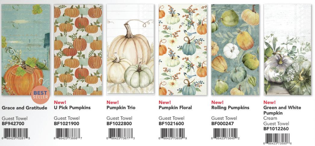
20 24 EVERY DAY


sample cover| shows graphic banding on bottom and type treatment on type on upper right corner. This will create a consistent format for all seasons.

20 24 FALL


BOSTON INTERNATIONAL where the world’s artisits call home.
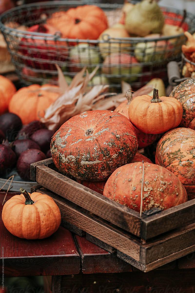
photograpy style| Creating desire to explore more. Selective focus lifestyle images set in the home. Clean graphic images that show the quality & craftsmanship.

20 24 FALL

existing product with new product ideas| pulling color from the product photography to co-ordinate graphic banding element.


20 24 FALL


existing product with new product ideas| pulling color from the product photography to co-ordinate graphic banding element.

welcome fall! It’s sweater weather
and time for us to embrace the crisp air of Fall. Celebrate the season in your home with beautiful paper napkins, party goods, textiles and home treasures. We have carefully curated the world’s best art and hand crafted items so you can enjoy them during this festive season.


BOSTON INTERNATIONAL
where the world’s artisits call home.


introduction spread| pulling color from the front cover to co-ordinate. A short intro to the season and images that evoke emotion for that time of the year.
you’re so gifted:
gifting finishing touches | introducing the new tags and ribbon that give the brand cache. The “mark” will begin to give the brand equity as begins to become more and more recognizable.


cross merchandising | including co-ordinating home decor to show how our products work well together to tell a story. A varying template will make the catalog have a good flow and increase sales by highlighting items outside the category.

complete the harvest look create a well merchandised display story with napkins and harvest home accents.


social media | using beautiful graphic images for each post. Paying attention to the appearance of the home page so it is graphically pleasing to the eye. Change seasonally to feature seasonal recipies, decorating, gifting


tradeshow 18 x 24 cabinet posters | clean graphic photography for cabinet and feature tables. They will show both seasonal imagery and product that creates an upscale look for the space to draw customers in.