

ootc@KKNK_2016: The Crossing Place 24 – 30 March
curator’s comment for ootc@KKNK_2016:TheCrossingPlace
the starting point
For the first time, the contemporary visual arts exhibitors were situated in one building, the Prince Vintcent-Gebou in the centre of town, simulating a micro art fair.
Paul invited artists, curators and galleries to send him exhibition proposals for the 2016 KKNK. His thematic brief was BlankSpaces:thepoetryoftheunfinishedorthe beginningofthenew. Paul wrote: Weembracetheconceptthatthereismorespacethancanbeseen, thattherearevoidspaces,or,asitwere,thatthereisavasterhorizon... Blank Spacesallowsforthenew,afreshstartfromthepast,newbeginnings,an opportunitytowipetheslateclean,ashiftindirectionorareinventionoftheold.

A second criterion, standard for the KKNK, was that the artworks must be no more than two years old.
by
mandy conidaris co-founder and curator of outoftheCUBE
The Klein Karoo Nasionale Kunstefees (National Arts Festival), a.k.a. the KKNK, is an annual Afrikaans language arts festival that takes place in the South African town of Oudtshoorn. Every three years a new festival curator is appointed, and last year Dr Paul Bayliss was retained in this position, to begin with the 2016 KKNK.
the exhibition concept
In my role as curator, my interpretation of the theme was that, once an individual is confronted with a blank space, another familiar space must lay behind; in other words, he/she is in transition, a state which provokes many conflicting emotions.
In contemporary life there are many different aspects of transition, ranging from the present-day migration crisis through to the evolutionary state of the creative process. Within the curatorial process I gave consideration to the artist’s intention and his/her thinking and making processes, as well as my own associations with and responses to the resulting artwork.
Early in the decision-making process, and after conversation with artist Sheila Flynn around ideas for the exhibition, she shared with me this part of the poem Trasna by
Raphael Considine: Thepilgrimspausedontheancientstones
Inthemountaingap. Behindthemstretchedtheroadwaytheyhadtravelled. Ahead,misthidthetrack. Unspokenthequestionhovered: Whygoon?…
Thisis…thecrossingplace.Come!
As the time approached to select artists from the outoftheCUBE website, I realised that several of them had already been exploring aspects of displacement, transition, migration, or the shifting of boundaries in his/her artwork. I began to look for artists who dealt specifically with these issues, whether philosophically, psychologically, and/or technically.
Finally, I offered ten artists the KKNK exhibition space to showcase their creative responses to the notion of processes of transition.
These lines reaffirmed my exhibition concept. I began to look on each selected artist as a creative pilgrim in the ancient sense, both meditative and questioning. This term has lost its impact in the secular Western world today, due in part to its religious connotations. But here it refers to a respectful acknowledgement of the artists’ often solitary journeys, undertaken with a commitment to an ongoing examining of and contemplation around the shortcomings of contemporary life. And any such journey - or breaching of a crossing place - causes irrevocable shifts in the pilgrim’ s persective. This idea seemed to link naturally across to Paul’s idea of a fresh start from the past.
The poem’s Gaelic title Trasna translates symbolically as TheCrossingPlace, which provided the exhibition title.
TheCrossingPlace artwork
The presented artworks comprised a variety of mediums, including editioned traditional or digital prints, monotypes, paintings, artist’s books, and mixed media works. Some were recent, and others created especially for this exhibition. But all related to each artist’s current creative concerns.
the exhibition installation
One aspect of the outoftheCUBE ethos is to keep exhibiting costs to artists to a minimum. Apart from two series of works already framed, the rest were presented unframed and hanging by means of bulldog clips.
Each artist’s vision was articulated via thought-provoking metaphor and a sophisticated use of techniques and materials. The artists’ concepts ranged from the universal, such as the current migration crisis, through to the ways that the individual must negotiate the intimate and invisible frontiers between their outer and inner lives.
exhibiting artists
Colleen Alborough, Simphiwe Cebekhulu, Karin Daymond, Sheila Flynn, Cloudia Hartwig, Banele Khoza, Laetitia Lups, Andrew Munnik, Yolanda Warnich and Emma Willemse. The artists’ rationales are given beside each body of work. The artists are presented in alphabetical order.
The KKNK is a cultural festival that pops up annually in Oudtshoorn in the Karoo. This meant that the visual art curators had to travel there and set up short-term ‘head-quarters’ in their allocated exhibiting spaces for the duration of the festival.
Prompted by these practical limitations, I intentionally extended the concept of transition in the installation of The Crossing Place exhibition. My reference here lay in the temporary nature of migration: packing up, travelling, unpacking, setting up, dismantling, packing up and travelling on.
The works were hung on boards covered with brown packaging paper, suggesting parcels in transit. ByHand and Fragile postage stickers were stuck randomly on the brown paper, referring to the vulnerabilities provoked in each artist during the complex thinking/emotional processes of artmaking.
Installation view

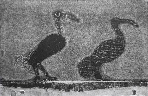
Her work deals with the multiplicity of anxieties activated by living in Johannesburg, and her symbolism relates to this often suppressed state. The exhibited works explore, in part, the recurrence of a ‘gold-rush’ mentality among Joburg inhabitants from all walks of life.
Her imagery here, the Hadeda, is a bird regularly associated with life in Joburg, and the inhabitants of the city and suburbs are familiar with its nerve-shattering cry. Colleen discovered that although a certain group of Hadedas live at the picturesque suburban Emmarentia Dam, they fly each day to the city’s rubbish dumps to scavenge. Commuting? This prompted her to create monoprints out of her usual waste materials, adding domestic scrap such as plastic mesh to her range.
Colleen is an experimental printmaker, wall installation and video installation artist. She has developed the ability to integrate all three mediums by using physical elements of each in all her works. She inks up cotton waste and acetate templates for monoprint subjects; builds stage sets using these same inked-up fragments to create animated videos; and then integrates these materials into her wall installations.
The Hadeda is an Ibis, in Egyptian mythology symbolising the God of Judgement. In her images, Colleen enmeshes the birds in plastic webbing, or situates them at a subterranean level below images of the Joburg mines. This raises interesting questions, such as whether these birds may be mimicking or judging the ethos of this city?
Colleen Alborough (Johannesburg) from the exhibition WeighingoftheHearts , Cologne, Germany

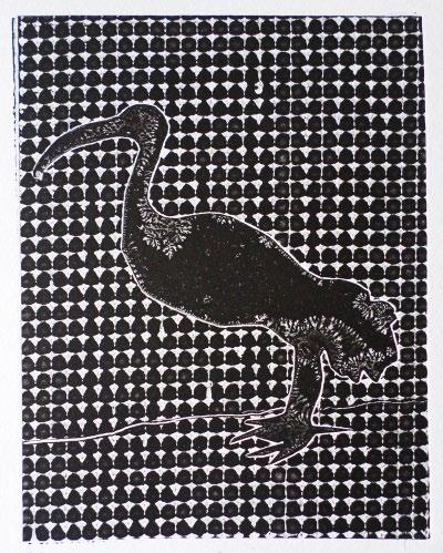


Colleen Alborough IbisI 2015 monoprint E.V. edition 10 paper size 22 x 17 cm (h x w) Colleen Alborough IbisII 2015 monoprint E.V. edition 10 paper size 22 x 17 cm (h x w) Colleen Alborough IbisIII 2015 monoprint E.V. edition 10 paper size 22 x 17 cm (h x w) Colleen Alborough IbisIV 2015 monoprint E.V. edition 10 paper size 22 x 17 cm (h x w)


2015 monoprint E.V. edition 10 paper size 24 x
w)
CityBirdsII 2015 monoprint E.V. edition 10 paper size 24 x
cm (h x w)
2015 monoprint E.V. edition 10 paper size 24 x
cm
w)
Colleen Alborough CityBirdsI
34 cm (h x
Colleen Alborough
34
Colleen Alborough CityBirdsIII
34
(h x


Colleen Alborough Back and Forth I & II (diptych) 2015 monoprint E.V. edition 10 paper size 24 x 34 each cm (h x w)
Colleen Alborough
The
Ibis Below

2015 wall installation image size 58 x 33 cm (h x w)
Colleen Alborough
FacingSkeletons
2015 wall installation image size 33 x 58 cm (h x w)

Installation view
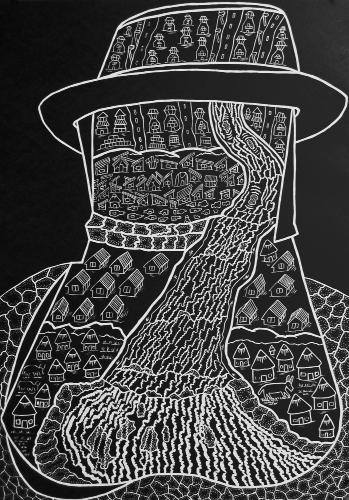
A strict boundary exists in traditional (rural) Zulu culture between male and female responsibilities in providing for the family, which is underscored in these partner works by the head and shoulder contours of the figures – the female head is soft and curved, and she wears a traditional Zulu headdress; while the male head is angular and sharp, and he wears the kind of hat associated with city life. Despite the rectangular nature of the two lino blocks, Simphiwe made the formal decision to position the imagery of each print within these linear shapes.

The female image depicts the laborious nature of the physical work the women undergo in caring for their families, along with the primitive nature of the implements they use to gather wood, light fires, and to grow and hoe their crops.
Preparation and Flow of Life
These two images represent the cross-over conflict experienced by many Zulu men on leaving their wives and communities in rural KZN while they go to the cities to work. This creates a disruption in the natural course of life, and has created many social problems.
In the male image, there is a clearly defined horizontal divide between the roundness of the rural kraal and the hard edges of the township houses and shacks, and the city beyond. The area around the kraal shows nature – cattle and vegetation – whereas the city is barren, the shacks surrounded by empty alcohol bottles scattered on the ground.
Soul versus practicalities. Simphiwe himself is a young man, torn between his desire to be an art-maker and his income-generating work as a mechanical engineer.
Simphiwe Cebekhulu (the KZN Midlands)
Simphiwe Cebekhulu
Preparation
2015 linocut edition 30 paper size 65 x 45 cm (h x w)
Simphiwe Cebekhulu The Flow of Life 2015 Linocut edition 30 paper size 65 x 45 cm (h x w)

Karin Daymond (Mbombela, Mpumalanga)
HereTodayI,HereTodayII, and HereTodayIII
For some time Karin has reflected on aspects of African migrancy, prompted by a holiday experience that she had in Sicily. Walking along a quiet stretch of beach, she and her husband came across tied-up bundles of clothes, and realised that people were hiding in the dunes – illegal migrants from Africa. This evidence of displaced people from the African continent – her own continent - affected Karin strongly. On returning to her home town of Mbombela (Nelspruit), she began to look at the land around her as a migrant might, as strange, potentially threatening and uncertain. Up until that time her artwork had featured the landscape as a metaphor for the familiar.
Installation view
Her personal collection and knowledge of traditional African cloths provided another symbol for her imagery, as she knew that the patterns of the fabrics were usually intimately tied up with a traditional woman’s life and background, and were a visual representation of her own identity. This need to retain a sense of self is considered of great significance to most migrants.
From these perspectives, the works represent the vulnerable physical and psychological state of the migrant in transit, facing an unknown future.


 Karin Daymond
Karoo Stone II 2014 monotype paper/image size 50 x 65 cm (h x w)
2015 lithograph edition 35 paper/image size 77 x 57 cm (h x w)
Karin Daymond HereTodayI
Daymond

 Karin Daymond
HereTodayII 2015 lithograph edition 35 paper/image size 77 x 57 cm (h x w)
Karin
HereTodayIII 2015 lithograph edition 35 paper/image size 77 x 57 cm (h x w)
Installation view

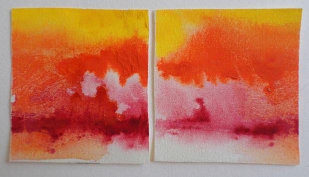
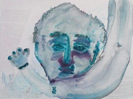
Sheila Flynn (Tselane Township, Gauteng) from the Trasna series
Sheila is a Dominican Sister who established Kopanang Community Trust, a woman’s embroidery collective in Tselane township (Gauteng), which today has around 60 members. For 14 years she has been facilitating the running of Kopanang, which includes organising training, stock control, marketing, arranging self-enrichment programs for the women and undertaking vigorous fund-raising for the project. In addition, almost daily, there is a need for her to offer solace to bereaved or traumatised women in the community.
Due to this highly visible and emotionally taxing professional life, Sheila needs quiet, contemplative time, and she finds this when creating miniature jewel-like watercolour abstracts. Her watercolour activity is secluded -almost cloistered - and the paintings are usually gifted to friends and colleagues.
This time spent painting, private and meditative, helps feed her spiritually, re-energising her to go back into her public realm.
Sheila Flynn
Trasna1_2(diptych)
2015 watercolour painting paper size 9 x 13,8 cm (h x w)
Sheila Flynn
Trasna3_4(diptych)
2015 watercolour painting paper size 11 x 12,4 cm (h x w)
Sheila Flynn
Trasna5_6(diptych)


2015 watercolour painting paper size 10,3 x 13,6 cm (h x w)

Sheila Flynn
Trasna7_8(diptych)
2015 watercolour painting paper size 12 x 16,7 cm (h x w)
Sheila Flynn
Trasna9_10(diptych)
2015 watercolour painting paper size 10 x 15 cm (h x w)

Sheila Flynn
Trasna13_14(diptych)


2015 watercolour painting paper size 10,7 x 20,3 cm (h x w)
Sheila Flynn
Trasna11_12(diptych)
2015 watercolour painting paper size 9,7 x 20 cm (h x w)
Sheila Flynn
Trasna15_16_17(triptych)
2015 watercolour painting paper size 10,4 x 15,5 cm (h x w)


Sheila Flynn
Trasna 18 2015 watercolour painting paper size 7 x 10,4 cm (h x w)
Cloudia Hartwig (Johannesburg)
an ongoing etching project of insect portraits

Cloudia is a committed lover of all things natural, and in recent years has turned to these as subjects for her own creative work.
This series of etchings forms part of an ongoing project in which she draws attention to the tiny, short-lived insects that scuttle around our domestic environments. Although generally considered by most people to be insignificant, repugnant and/or unhygienic, each forms an important link in the ecological chain.
Although the creatures here are carefully observed in terms of correct etymological detail, Cloudia’s intention has been to personify them, turning each into a unique individual, in this way respecting the existence and significance of each.
This leads to the way Cloudia’s images subvert the usual notion of portrait painting – the association of portrait painting being that a legacy is created by documenting and thereby honouring important figures in society.
Installation view
Cloudia Hartwig
Marvin the Mole-cricket
2015-16 etching edition 10 paper size 25 x 36 cm (h x w)
Cloudia Hartwig
Peter the Parktown Prawn
2015-16 etching edition 10 paper size 25 x 36 cm (h x w)


Mosesthemosquito 2015-16 etching edition 10 paper size 25 x 36 cm (h x w)


Cloudia Hartwig Robyntherainspider 2015-16 etching edition 10 paper size 25 x 36 cm (h x w)
Cloudia Hartwig Martin the mantis 2015-16 etching edition 10 paper size 25 x 36 cm (h x w)
 Cloudia Hartwig
Cloudia Hartwig
Garythegrasshopper
2015-16 etching edition 10 paper size 25 x 36 cm (h x w)
Cloudia Hartwig
Calvin the cockroach

2015-16 etching edition 10 paper size 25 x 36 cm (h x w)

Installation view
Banele Khoza (Pretoria)
A selection of prints from his recent works #FOMO (Fear of Missing Out)

Banele has an instinctive approach to the technique of monotype, recognising that only 60% of the result is under his control, while the rest is the medium’s counterreaction to his process. This taking of control contrasting with a lack of control extends through to his own interaction with people, actual and online.
For a long time he has not been dating. Seeing friends’ hashtag their adventures with their bae’s has filled him with a sense of missing out, and he has made a large number of monotypes – that also symbolise one-off encounters – titled #FOMO.
The six images here show imagined scenes of him adventuring with a fictional bae . Bae is slang for babe, sweetie or current spouse, especially on social media platforms. He decided to use the term for some of his artwork titles to place them in the present day, before bae lost its online currency – which, as the artist says himself “is the transition of the things that trend online, it’s all a wave”.
The fluidity and spontaneity of the medium, caused by the interaction between the oil and turps on the plate, also speaks of insubstantial relationships, and the frequency with which individuals change their ‘romantic status’ on Facebook.
Banele
Khoza
Please take a selfie of me
2016 monotype paper size 39 x 52,5 cm (h x w)

Banele Khoza
Fellagain
2016 monotype paper size 39 x 47,5 cm (h x w)
Banele
Khoza
“I seeWarhol”- Stuart
2016 monotype paper size 36 x 43 cm (h x w)
Banele Khoza
Baecation
2016 monotype paper size 36 x 43 cm (h x w)


Banele Khoza
Crossing 2016 monotype paper size 39 x 48 cm (h x w)
Banele Khoza Insta-bae 2016 monotype paper size 39 x 47,5 cm (h x w)


Installation view
Laetitia Lups Johannesburg)
works from the exhibition Lacere …

Laetitia’s artwork explores our own intuitions and realities, perceptions and connections, as triggered by experiences, memories and associations from our pasts. Some issues may be considered taboo, or may make us uncomfortable. However, her belief is that all things are connected as in a quantum world.
Laetitia says “My own realities exist simultaneously, since the past, present and future may co-exist within any given moment. These times and spaces interact and could be thought of as an alternative quantum world.”
A symbol she often repeats in her work is lace, which stands for the weaving of meaning and stories together and for ultimately reaching an awareness of the ‘holes’ in personal/cultural stories and their explanations. Lacere is a Latin word, meaning to entice or to ensnare.
As a digital artist using many layers of Photoshop, Laetitia often merges her photographic self-portraits with those of her three young daughters, which suggests an intergenerational cross-over, linking back to her belief in a quantum reality.


Laetitia Lups Freedom 2014 digitally manipulated photographic print edition of 3 400 x 270 mm (h x w) Laetitia Lups Truth 2014 digitally manipulated photographic print edition of 3 400 x 270 mm (h x w) Laetitia Lups Destiny 2014 digitally manipulated photographic print edition of 3 400 x 270 mm (h x w)
Laetitia Lups


Melan-coli 2014 digitally manipulated photographic print edition of 3 400 x 270 mm (h x w)
Laetitia Lups Daughter 2015 digitally manipulated photographic print edition of 3 580 x 410 mm (h x w)
According to the artist, these works were created as a response to an article in the New York Times soon after 9/11. The writer commented that after the tragedy, there was a noticeable increase in visits to art galleries, a new sense that people needed to revisit art to “renew their faith” in the human condition.

Each etching portrays a tragic event - manmade or natural - where smoke formed an integral physical element. In the foreground of each depicted event, the pianist Stacey is playing the song ‘Smoke gets in your eyes’. The prints are titled Stacey playing‘Smokegetsinyoureyes’at…then the name of the disaster – Hiroshima, Magersfontein, Twin Towers, Krakatoa, Fukushima, Treblinka, Cape Canaveral and London 1952.
In these works, the pianist’s presence is intended to represent the creative arts, acting as a foil for the destructive occurrence. The overwhelming nature of each disaster is challenged by the delicacy of Andrew’s mark-making, as well as his depiction of the pianist’s private smile as she absorbs herself in her own music.
Installation view
a suite of 8 etchings: Staceyplaying‘Smokegetsinyoureyesat…’
(Musical composition: Smokegetsinyoureyes , Jerome Kern, 1933)
But the notion of the same romantic song being played with such individual pleasure throughout the decades, while one devastating tragedy follows another, speaks of a certain human callousness revealed by our tendency to brush aside events that don’t directly affect us; as well as the way we continually inflict suffering on each other, or ignore the rumblings of the planet. We are not a species to learn from experience.
Andrew Munnik (Johannesburg)
Andrew Munnik
Andrew Munnik


etching edition 20 paper 34 x 25 cm
image 21 x
Staceyplaying‘Smokegetsinyour eyes’atCapeCanaveral 2015
(h x w)
14,5 cm (h x w)
etching edition 20 paper 34 x 25 cm
x w) image 21 x 14,5 cm
Staceyplaying‘Smokegetsinyour eyes’atHiroshima 2015
(h
(h x w)
Andrew Munnik
Staceyplaying‘Smokegetsinyour
Andrew Munnik

Staceyplaying‘Smokegetsinyour

eyes’atKrakatoa 2015 etching edition 20 paper 34 x 25 cm (h x w) image 21 x 14,5 cm (h x w)
eyes’London1952 2015 etching edition 20 paper 34 x 25 cm (h x w) image 21 x 14,5 cm (h x w)
Munnik
Munnik


2015 etching edition 20 paper 34 x 25 cm (h x w) image 21 x 14,5 cm (h x w)
Andrew
Staceyplaying‘Smokegetsinyour eyes’atMagersfontein
2015 etching edition 20 paper 34 x 25 cm (h x w) image 21 x 14,5 cm (h x w)
Andrew
Staceyplaying‘Smokegetsinyour eyes’atFukushima
Munnik

Andrew Munnik

2015 etching edition 20 paper 34 x 25 cm (h x w) image 21 x 14,5 cm (h x w)
Andrew
Staceyplaying‘Smokegetsinyour eyes’atTreblinka
2015 etching edition 20 paper 34 x 25 cm (h x w) image 21 x 14,5 cm (h x w)
Staceyplaying‘Smokegetsinyour eyes’atTwinTowers
Installation view
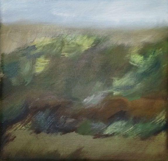
In this series, she has taken photographs of the landscape from her slowly moving car and manipulated them digitally. Two of these were exhibited at TheCrossing Place as vinyl prints on backing board as A/Ps (Artist’s Proofs), while the edition of 10 is available digitally as jpegs for the purchasers to do with as they please – print the image in any scale on any surface, or display it on a digital screen.
Implicit in this is the trust that Yolanda must place in the purchaser, namely not to abuse the principles of editioning by printing out many copies. This opening her image up to the potential for exploitation simultaneously presents the purchaser with a temptation alongside the challenge to respect her artwork. After all, who would know … This links to the current concerns many artists experience around the possibility of misuse of their creative work once it is online.
The second stage in the process has been to paint these digitally engineered images - including all their blurring and defects - in an attempt to build up a formal landscape. Here a selection of these small paintings has been presented as one long horizontal line, mimicking a horizon. They do not necessarily ‘lead into’ each other, and have the sense of reshuffled individual pixels.

Through various technical manipulations using a conventional subject matter, Yolanda’s resulting artworks represent an exploration of the creative possibilities inherent when shifting back and forth between traditional and new media.
Yolanda is a professional photographer and visual artist. In her own artwork she digitally photographs the land, then manipulates the images via Photoshop, which are extended as visual source for her paintings.
Yolanda Warnich (Cape Town) the IMG_#…fromTheCuriousRevisitofPigmentandPixels series (works in process)
PAINTEDIMG_015
2016 oil on canvas canvas size 20 x 20 (from the series The Curious Revisit ofPigmentsandPixels)
PAINTEDIMG_012
2016 medium oil on canvas canvas size 20 x 20 (from the series The Curious Revisit ofPigmentsandPixels)
PAINTEDIMG_005


2016 medium oil on canvas canvas size 20 x 20 (from the series The Curious Revisit ofPigmentsandPixels)
 Yolanda Warnich
Yolanda Warnich
Yolanda Warnich
Yolanda Warnich
Yolanda Warnich
PAINTEDIMG_003
2016 medium oil on canvas canvas size 20 x 20 (from the series The Curious Revisit ofPigmentsandPixels)
Yolanda Warnich
PAINTEDIMG_001
2016 medium oil on canvas canvas size 20 x 20 (from the series The Curious Revisit ofPigmentsandPixels)
Yolanda Warnich

PAINTEDIMG_002
2016 medium oil on canvas canvas size 20 x 20 (from the series The Curious Revisit ofPigmentsandPixels)
PAINTEDIMG_004

2016 medium oil on canvas canvas size 20 x 20 (from the series The Curious Revisit ofPigmentsandPixels)

 Yolanda Warnich
Yolanda Warnich
Yolanda Warnich
Yolanda Warnich
PAINTEDIMG_007
2016 medium oil on canvas canvas size 20 x 20 (from the series The Curious Revisit of PigmentsandPixels)
Yolanda Warnich
PAINTEDIMG_008
2016 medium oil on canvas canvas size 20 x 20 (from the series The Curious Revisit of PigmentsandPixels)


Yolanda Warnich IMG_0383#instalost 2013 medium digital print as JPEG on 8MG storage device edition 10 Yolanda Warnich IMG_0381#instapromises 2013 digital print on vinyl edition A/P I/III
Installation view
Emma Willemse (Riebeek Kasteel, Cape)
Four artist’s books from the ongoing project 101waystolongforahome
Emma believes that we all leave subtle traces of ourselves on each of our homes, especially the floor, which maps our intimate journeys. Just before a house she once lived in was scheduled to be demolished, she dug up and rescued the parquet flooring. For several years now she has made artwork that has elements of parquet flooring as the medium and/or the subject matter – suspended sculptures, wall installations, paintings and prints.
These four books are part of her more recent creative explorations. This long-term project has been conceived as a visual fantasy manual around ways to record the loss of a home, and re-imagine emotional coping mechanisms.

The books have been made in different formats and the ‘pages’ are created using a range of digital and hand drawn images. However, the common factor is that each cover is constructed from inverted reclaimed parquet floor blocks – and the way we as viewers may handle and leave traces of ourselves on the parquet book covers links back to the notion of the traces we leave on a home.
Conceptually, Emma’s work deals with displacement, signifying not only the universal experience of losing one’s intimate space, but also referring to the current involuntary uprootment of people due to wars, political strife and xenophobia.


TheRememberingBook 2015 Concertina-style artist’s book, digital print and discarded parquet floor blocks edition 5 E.V. size open 17 X 65 cm; closed 17 X 10 cm
Emma Willemse


TheSalvagingBook 2015 Concertina-style artist’s book, digital print and discarded parquet floor blocks edition 5 E.V. size open 16 X 66 cm; closed 16 X 9 cm
Emma Willemse
Emma Willemse


