Mallory Prost
FLORIDA STATE UNIVERSITY INTERIOR DESIGN GRADUATE
“ The essence of interior design will always be about people and how they live.”
- ALBERT HADLEY
Table of Contents An Adapting World: A University Library Designed with COVID-19 Guidelines 14 20 ATLANTA, GA 480-444-9461 prostmallory@gmail.com Rising to the Challenge: Faygo Beverages Office Design 33 26 Rising to the Challenge: Lighting Model 38 34 A Greener Tomorrow: MIweelz Retail Design Breaking Free: Fairview Behavioral Clinic Beyond the Box: North Point Youth Center Journey to Westminster: SOHO WEST Hotel 4
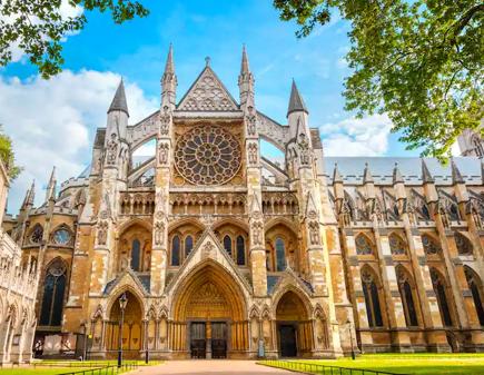
JOURNEY TO WESTMINSTER: SOHO WEST Hotel
PROJECT DESCRIPTION:
Traveling whether on business or pleasure can be an exciting time to explore and discover a new world. This eight story hotel in Soho, London gives guests the experience of visiting Westminster even if they are in business meetings all day. The goal of this design is to blend together the historical elements and contemporary design seen throughout Westminster. The first two floors feature several amenities for guests including a tea and coffee lounge, casual cafe, library, double sided bar, and formal restaurant. The top six floors are guest room floors with two king suites on the front corners. Overall, this design takes guests on a journey through time. It encapsulates what it is like to visit Westminster, so no matter how much of the city a guest gets to see they feel like they have experienced Westminster.
JOURNEY THROUGH TIME
1 Buckingham Palace
2 Big Ben and Palace of Westminster
3 Westminster Abbey
4 The National Gallery
5 Trafalgar Square
6 Westminster Bridge
7 Royal Academy of Arts
8 Casino
Hotel Site
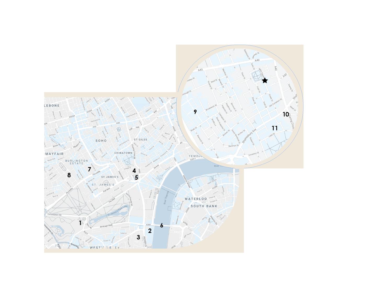
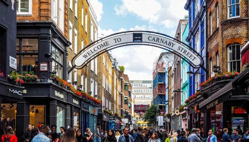
9 Carnaby Street
10 Palace Theatre
11 Chinatown
Traveling to a new city on vacation, or for business, means getting to explore and be a part of a new world. While in Westminster guests will discover historical buildings and new restaurants and shops. This clash of new and old will be featured through a mix of traditional and modern contemporary design elements. Outdoor views and elements of Soho will be highlighted throughout the design, and will encourage guests to go out and explore. A variety of waiting and lounge spaces for socialization and getting work done, will allow guests to uncover new spaces during their stay. Guests will delve into new culinary experiences with multiple food and drink areas, including a restaurant, bar, cafe, and grab and go space. Guestrooms will provide a refuge after a day full of discovery. Neutral and muted colors, along with cozy furniture will allow guests to relax and get comfortable after a long day. Efficient, functional and comfortable back of house areas will help the hotel run smoothly. The thrill of discovering something new pushes people to be curious and immerse themselves in a new community.
Westminster Abbey
4
Carnaby Street shopping and restaurants
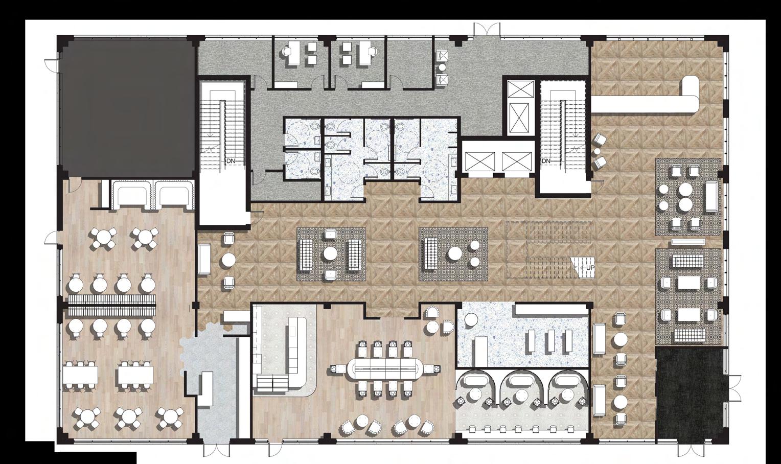

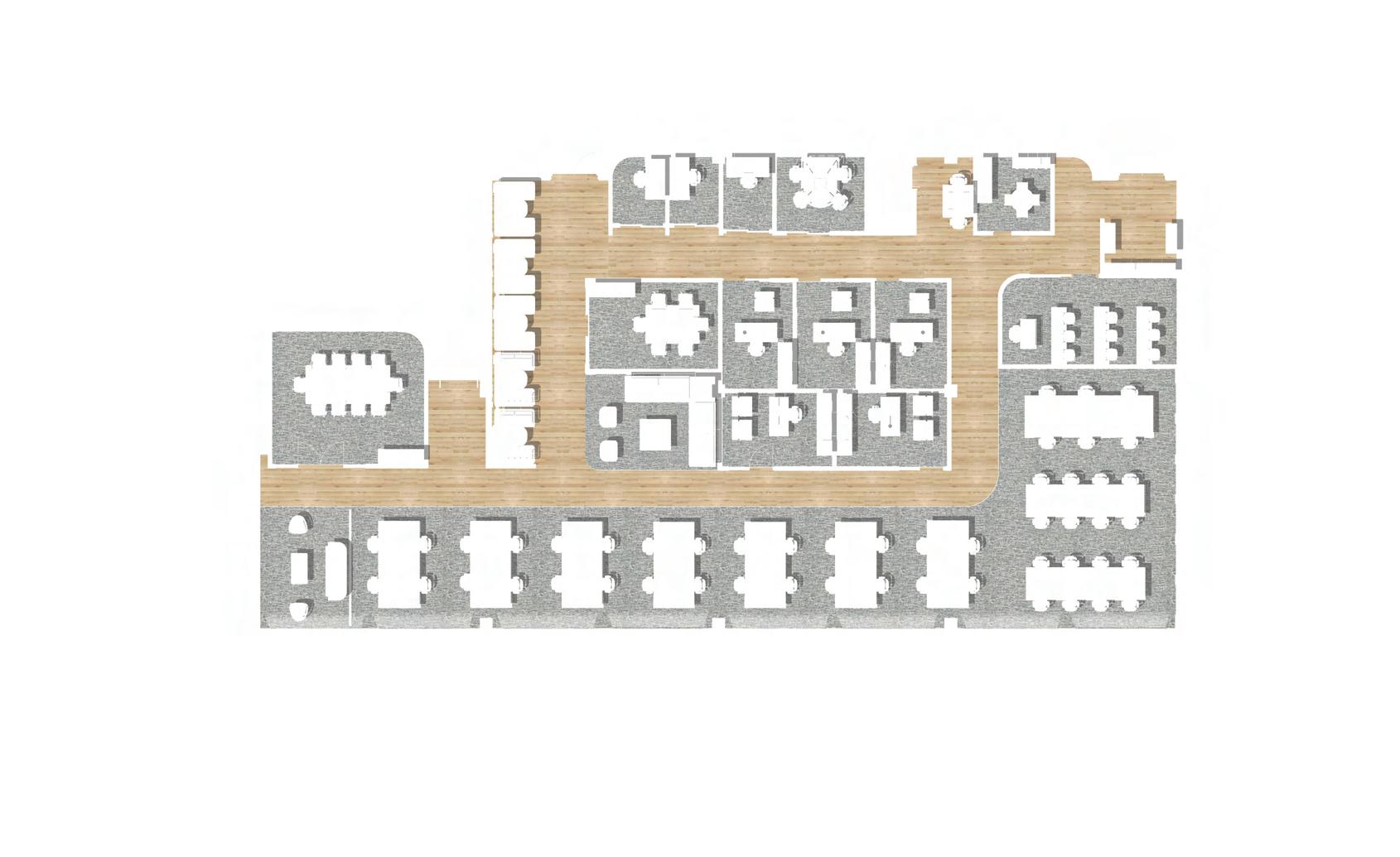
LEVEL 1 FLOOR PLAN DN 3/32" = 1'0 1 Level 1 N CAFE RESTAURANT GRAB & GO LOBBY BOH KITCHEN N
When a guest enters they have a clear site line to the reception desk where they can check in and get their room key.
5
“We are happy you are here”
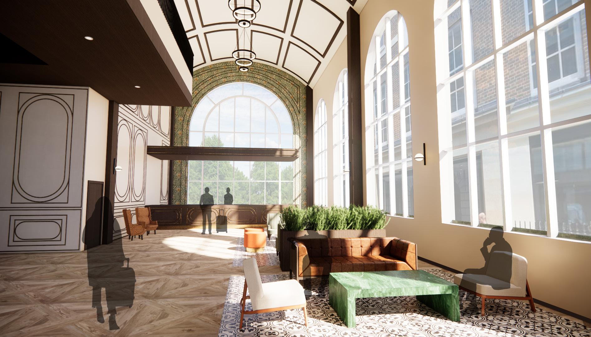
LOBBY & LOUNGE
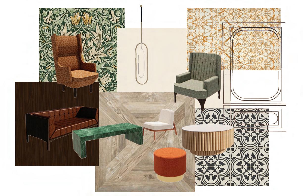
The lobby is grand but not overwhelming while welcoming guests inside. The bright and open space has a tall arched ceiling and multiple seating areas for guests to wait or lounge in. The lobby and lounge feature a mix of traditional elements with molding and William Morris wallpaper, and contemporary elements like oval pendants and ribbed circular tables.
3/32 1'0 N
6
“Welcome to Soho West”
LOBBY & LOUNGE
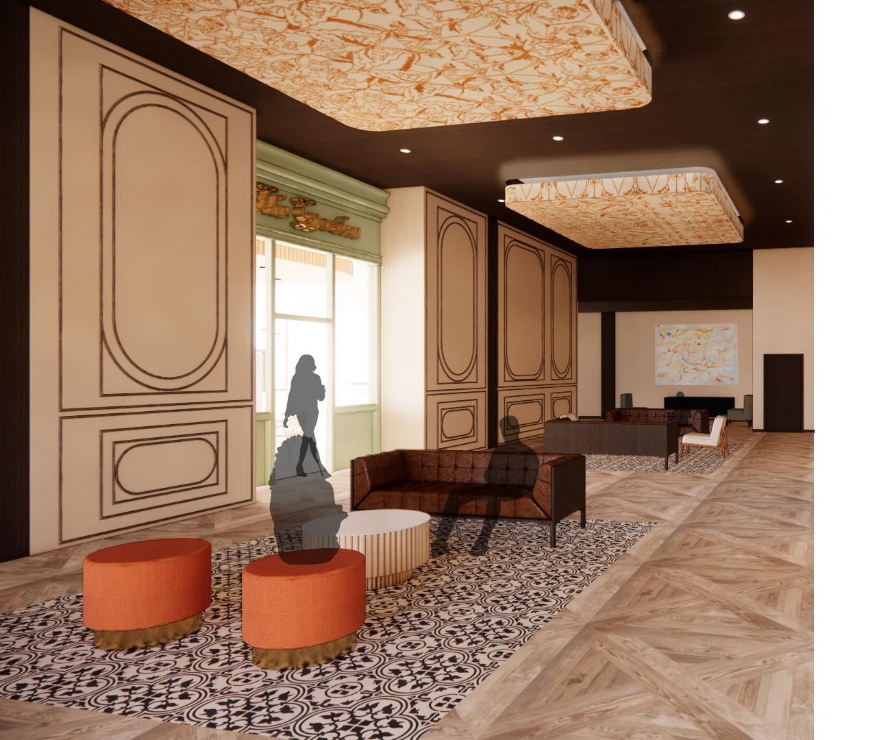
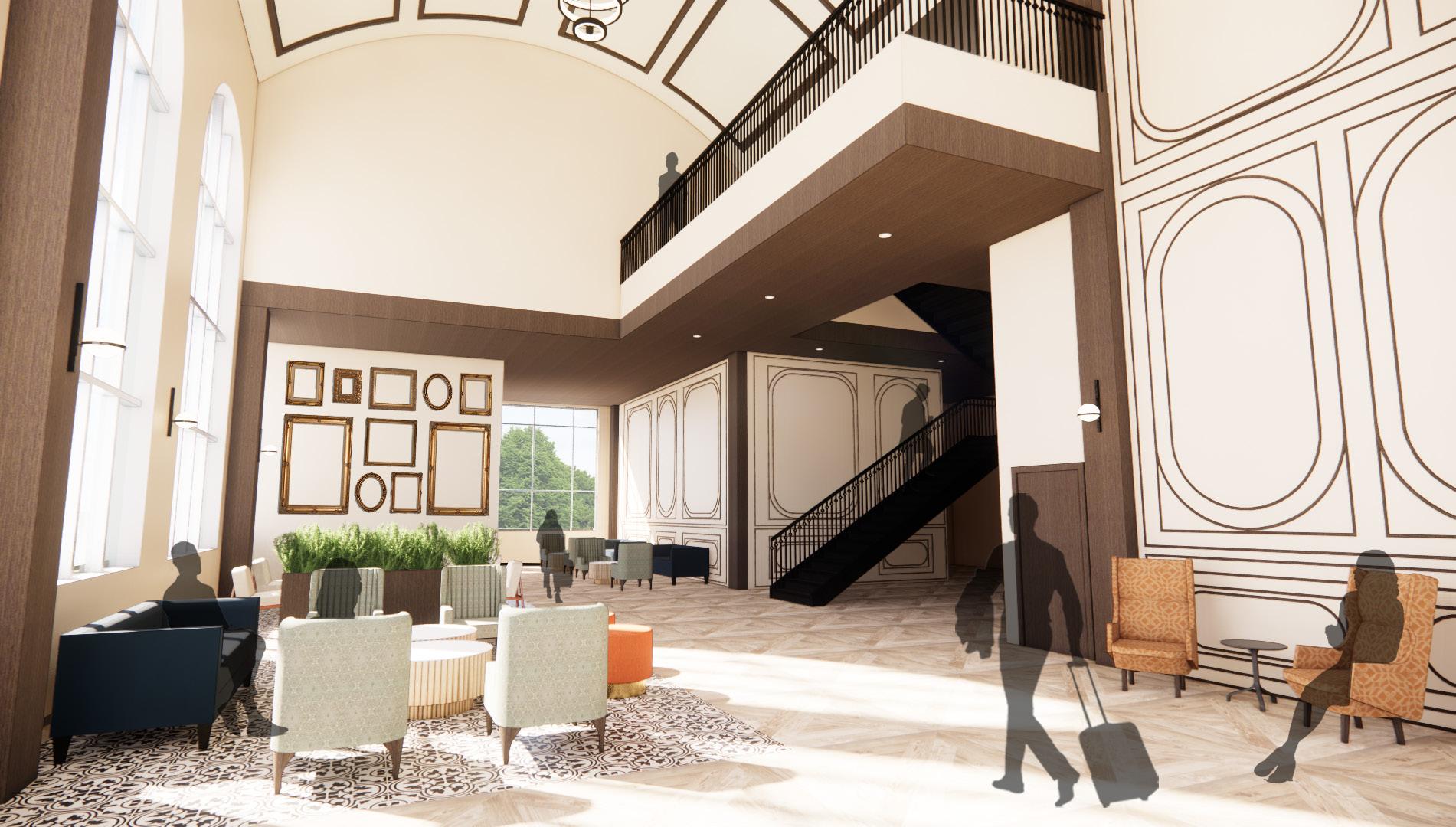
“Enjoy your stay”
Past the stairs there is another lounge area that is located conveniently near the elevators, stairs, bathrooms, and two food spaces. So, if guests are waiting to be seated in the restaurant or waiting for another guest they can use these seating areas. From the hallway, guests can also see the entrance to the Garden.
N
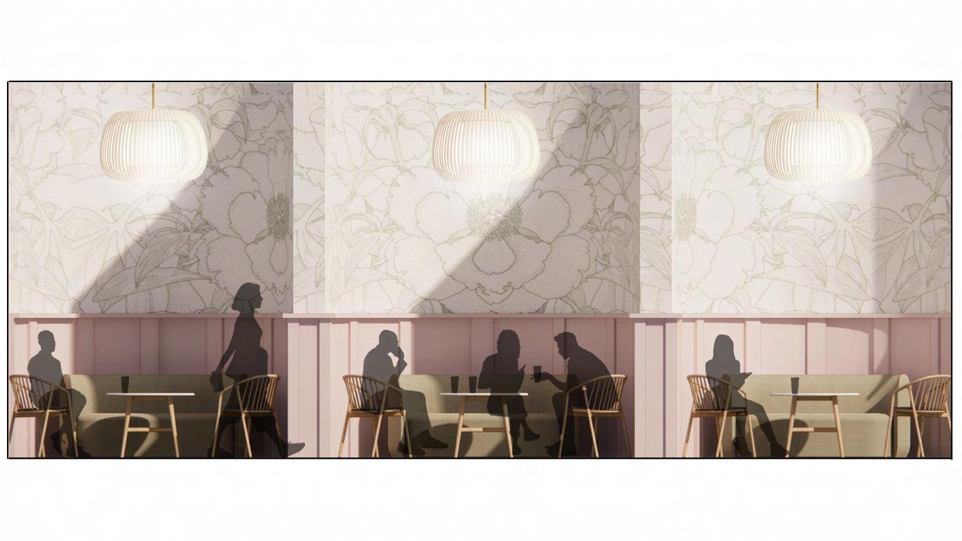
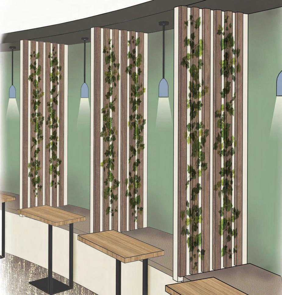
THE GARDEN: TEA & COFFEE LOUNGE
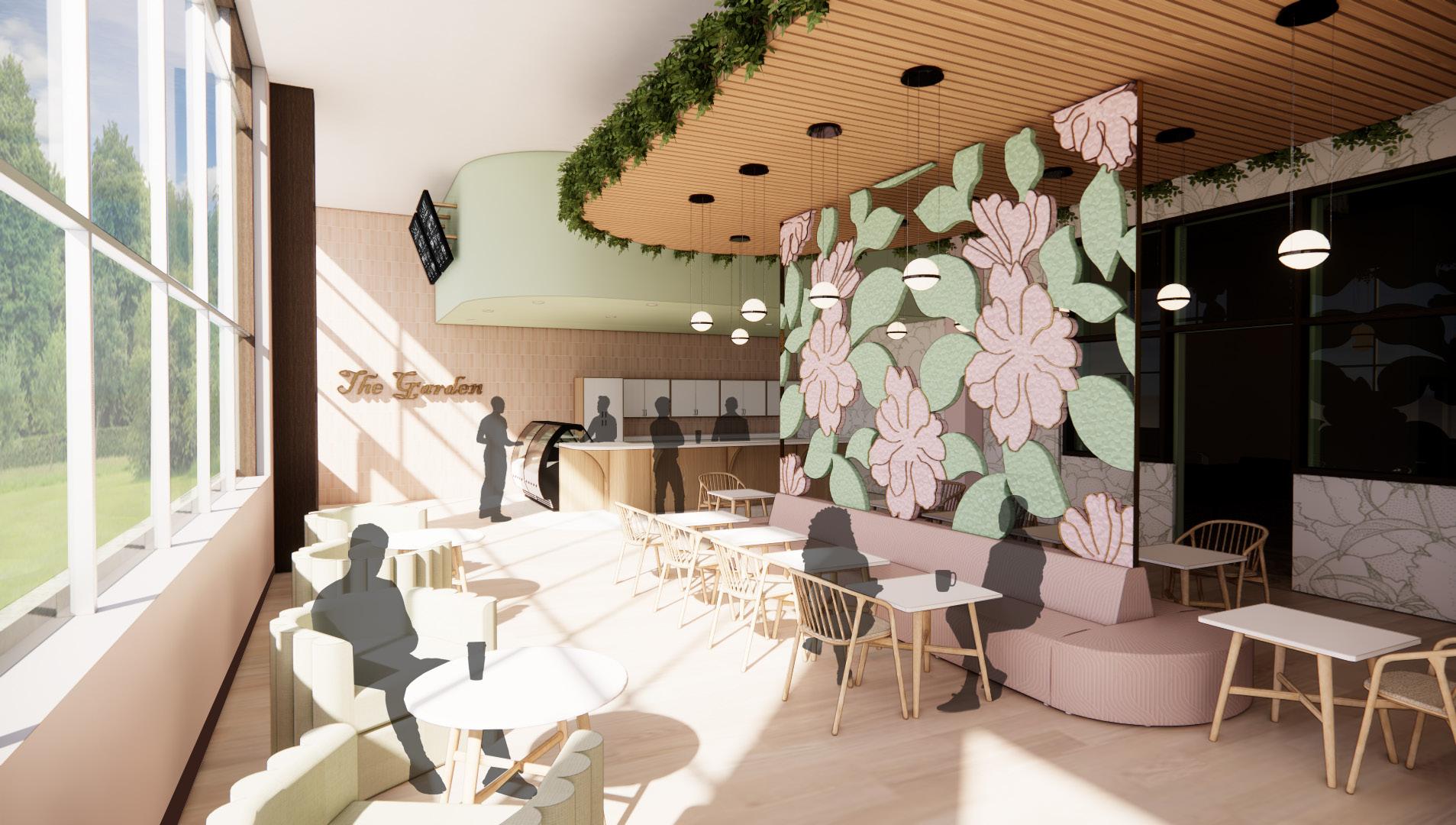
With pinks, greens, natural wood colors, and floral patterns this space will allow guests to feel like they are relaxing outside on a sunny day, or getting work done in the park even if it is a rainy day in London. This area features a stained glass floral wall and seating arrangement to socialize or get some work done. There is comfortable alcove booth seating for visitors to socialize in while feeling like they have a little bit of privacy from the rest of the open coffee and tea shop.
DN N
DN
SOHO SQUARE CAFE
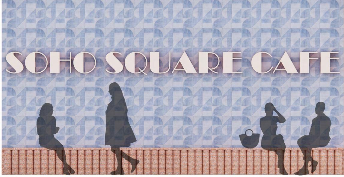
Next to the garden in the Soho square cafe. A fun and bold restaurant that goes with the contemporary first floor spaces. This cafe is a light breakfast and lunch space with a fun modern-retro style featuring geometric wallpaper and a modern-retro orange fabric on the chairs. This will be a space for guests to grab a quick casual meal before exploring Soho or heading off to a business meeting.
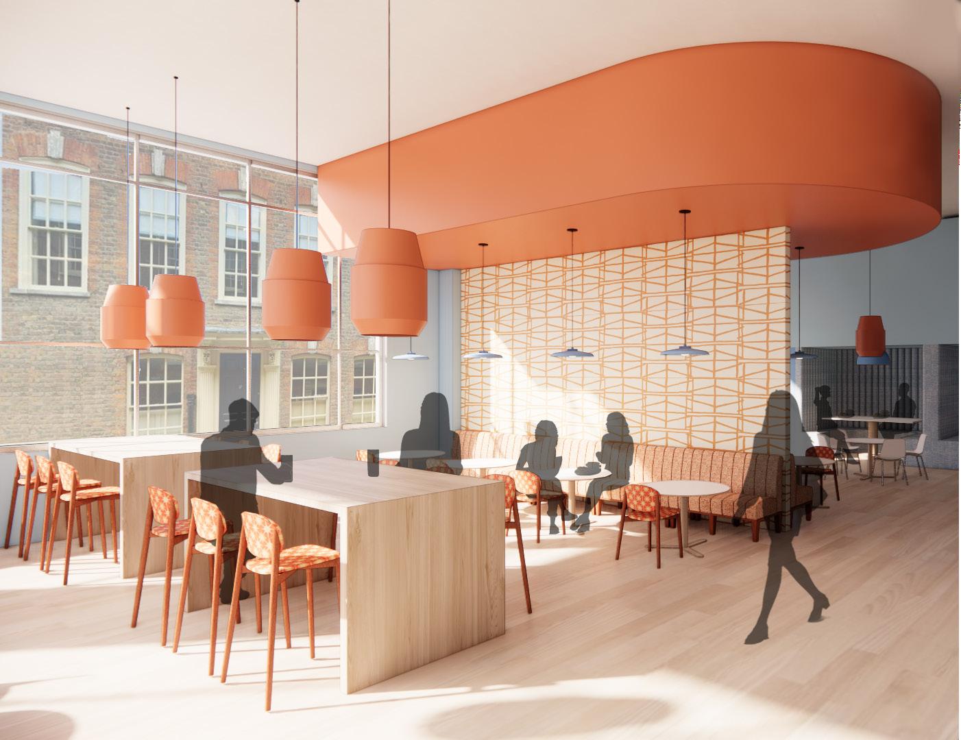
3/32 1'0 N 9
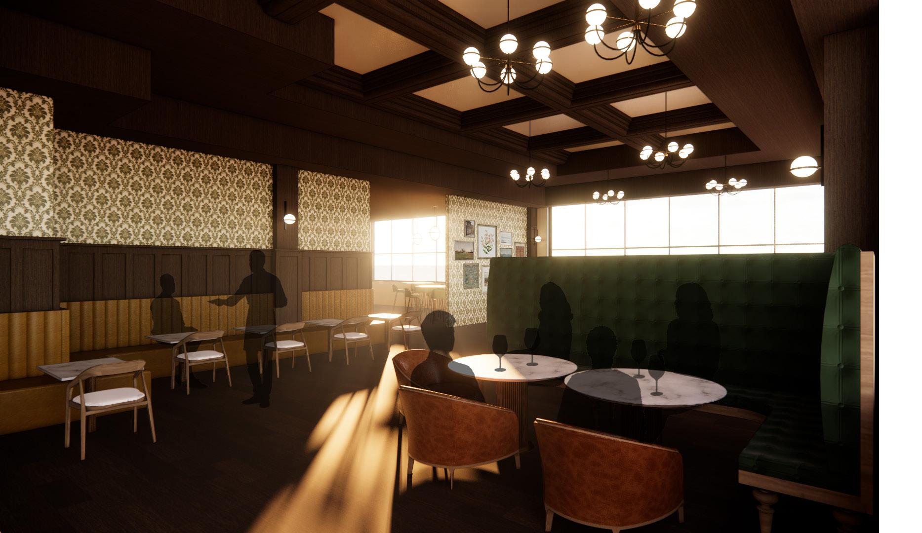
WEST PARK EATERY
The eatery is a formal restaurant only open for diner. This restaurant has an intimate feeling to it with velvet seating, dim lighting, and a feature tiered coffered wood ceiling. This is a great space for guests to relax with a glass of wine after a long day.
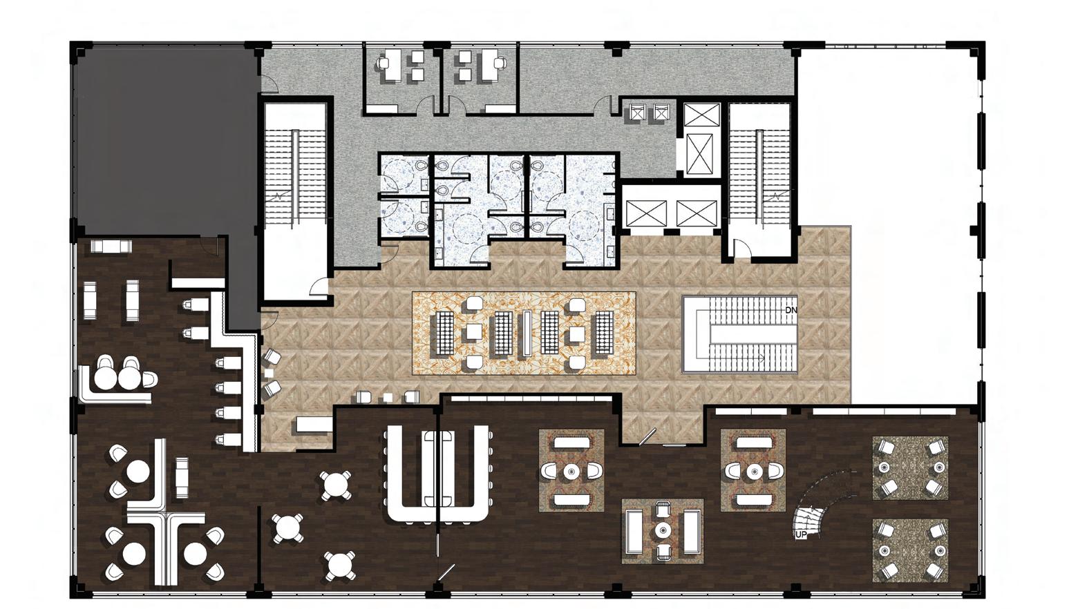
LEVEL 2 FLOOR PLAN DN 3/32" = 1'0 1 Level 1 N
UP 3/32" = 1'-0" Mallory Prost 3/24/22 Studio V N LIBRARY RESTAURANT BOH KITCHEN OPEN TO BELOW
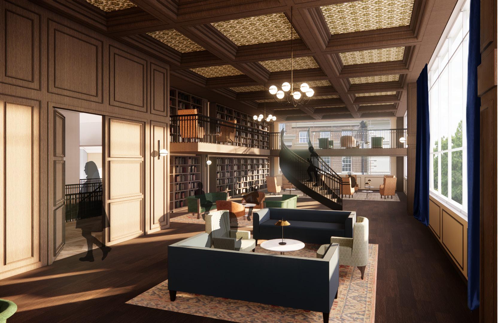
THE LIBRARY OF SOHO
As guests make their way up to the second floor they can feel time shift a little. Unlike the contemporary designs of The Garden and the Soho Square Cafe. The second floor features designs with more traditional elements, with coffered wood ceilings, dark wood molding, and velvet and leather furniture. The Library of Soho functions as a library and work space during the day and a bar lounge at night. This library features comfortable seating areas in a dark moody space.
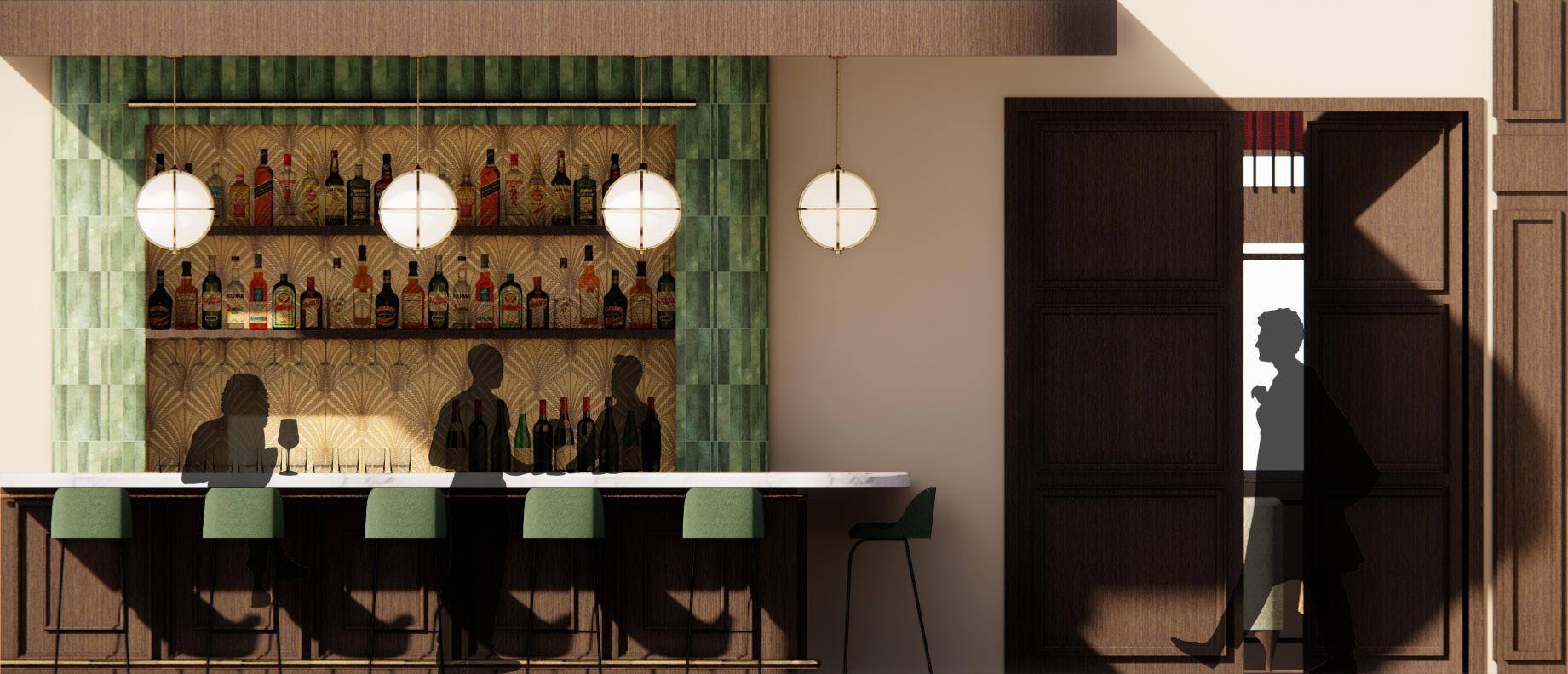
SOHO BAR & LOUNGE
During the day the bar in the library will serve tea and coffee, but at night it will transform into a full bar. The doors between the library and the restaurant will open creating one large space.
Mallory Prost 3/24/22 Studio V N
Mallory Prost 3/24/22 Studio V N
DN
11
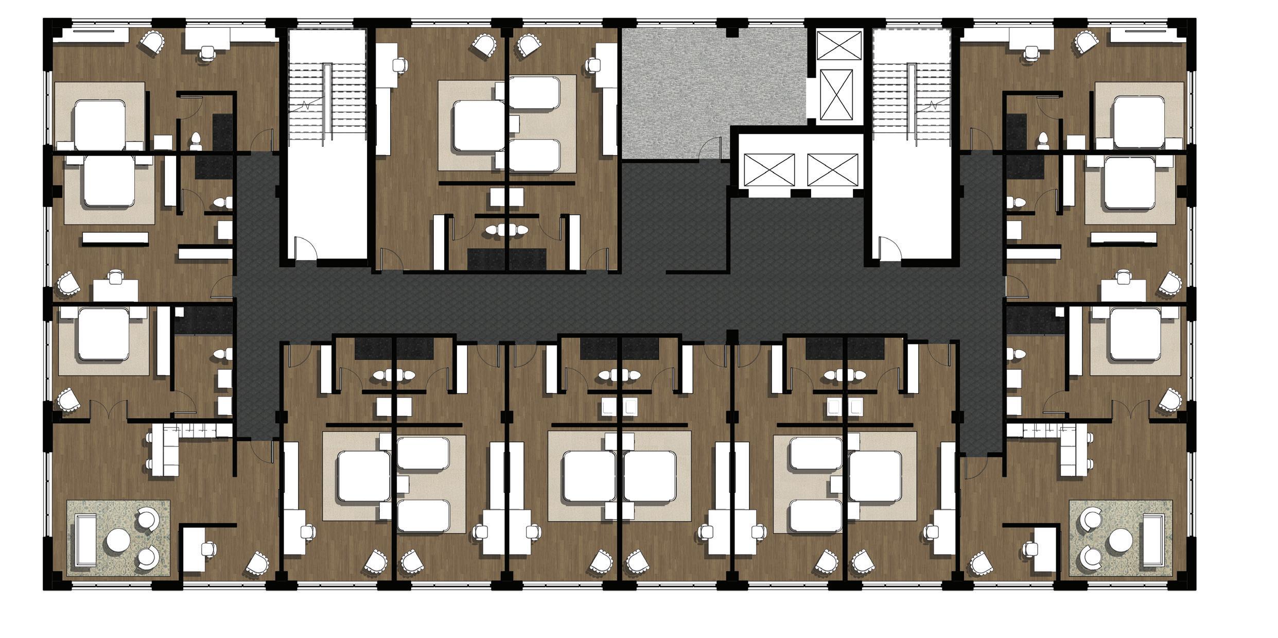
GUEST ROOM FLOORS
“Welcome Home”
After a long day guests can unwind in a comfortable and relaxing space featuring calming blues and natural wood tones. The king suite has a large living space with a kitchen as well as a tucked away semi private office space. The king suite continues with the idea of blending traditional and contemporary design with a muted color palette.
LEVELS 3-8 FLOOR PLAN DN DN 3/32" = 1'0 1 Level 1 N
BOH
KING SUITE KING SUITE ICE/ VENDING
12
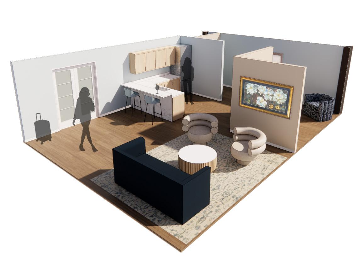
KING SUITE
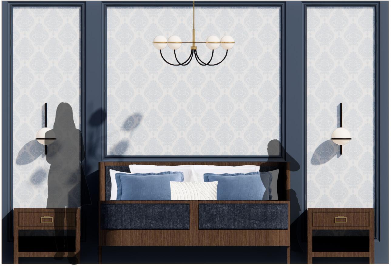
Bedroom
There is the bedroom will dark blue walls and dark wood furniture to give guest a cozy place to sleep on a cold London day.
Bathroom
The bathroom has a walk-in rain shower as well as two vanity areas.
13
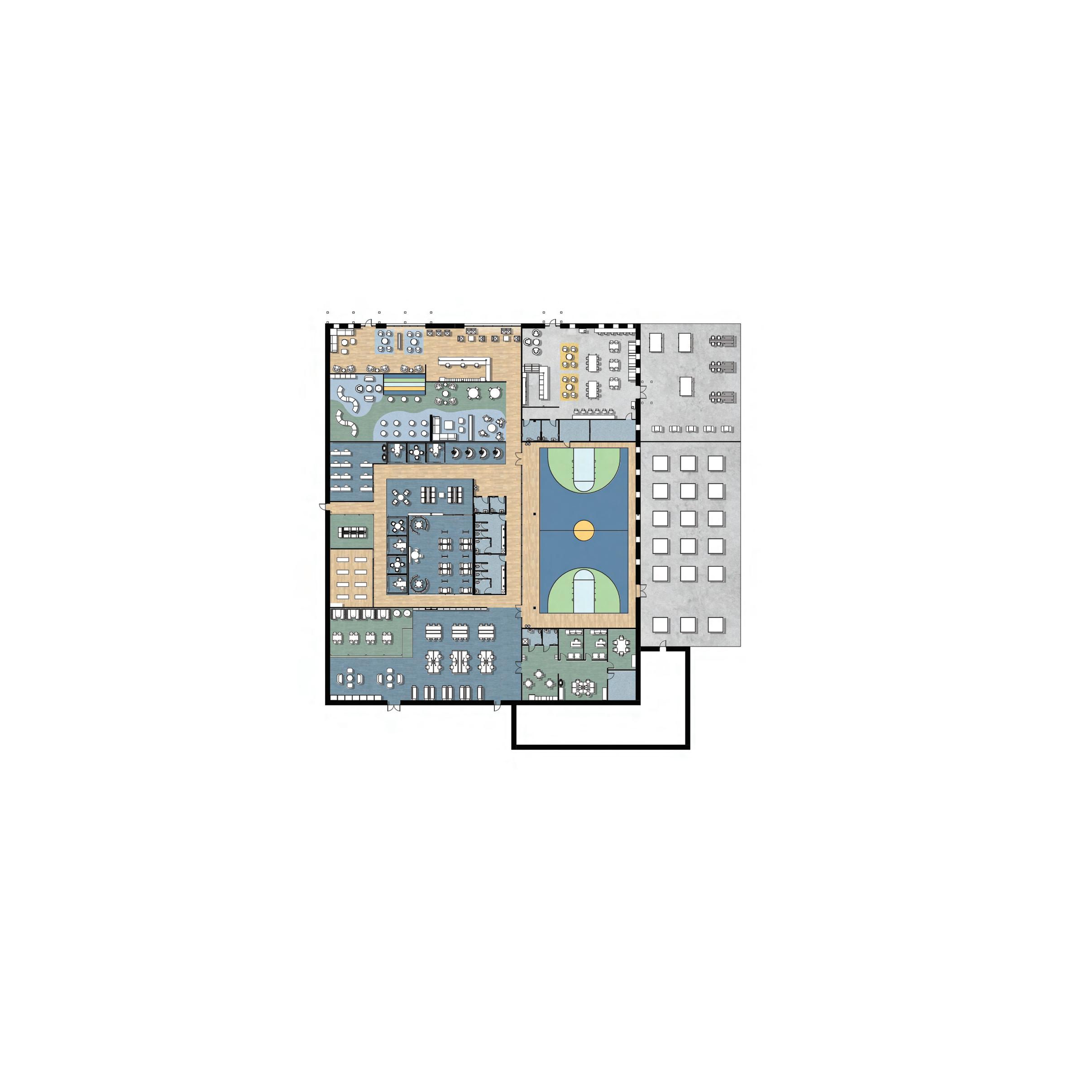
Breaking Free: Fairview Behavioral Clinic
PROJECT DESCRIPTION:
The Fairview Hospital is getting a new add on and they want to put a behavioral clinic on the first floor. This clinic will focus on 2-18 year old patients with mood disorders and substance abuse issues. Included in this 11,500 sq ft project are separate therapy rooms, staff rooms, and healing gardens for the two specialties. This design is influenced by Supportive Design Theory and focuses on a sense of control, positive distractions, and social support for both patients and staff. The goal of this design is to create a functional space for both patients and staff to feel relaxed in.
BREAKING FREE
Mental illness is isolating, and can make people feel like they are trapped within their own thoughts. When mental disorders are triggered in public, the first reaction is wanting to escape. Mental health treatments provide a relief and way to break free from the hold mental health has over patients. Connection, support, and motivation play significant roles on the path to progress with mental illness. Encouraging positive interactions with group seating arrangements help patients not feel so alone when starting their journey with treatment. Creating a space that has an open and bright atmosphere will reduce the confined feeling patients have when dealing with mood disorders. Organic forms and color will connect patients with nature. The use of bioplhilia and biomimicry will create an inspiring atmosphere, and a sense of escape. Being a part of the medical field is a stressful and overwhelming experience. Providing refuge to staff, with opportunities for connection and privacy, will allow staff to destress and take a breath. Finding the motivation to start improving mental health can be hard, but through connection, uplifting experiences, and inspiration, patients can break free.
14
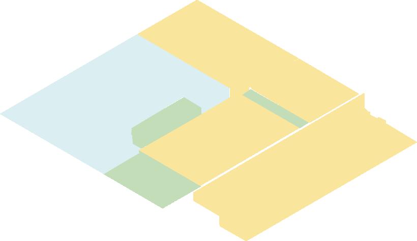
CIRCULATION & ZONING
Goals:
• Have a circulation path that is intuitive and include subliminal wayfinding elements to guide users through the space.
• Group patient areas together and place staff rooms close by to provide easy access to treatment rooms.
• Have staff areas integrated throughout the space, while still providing privacy. Locate staff zones by the patient areas they would frequently travel to.
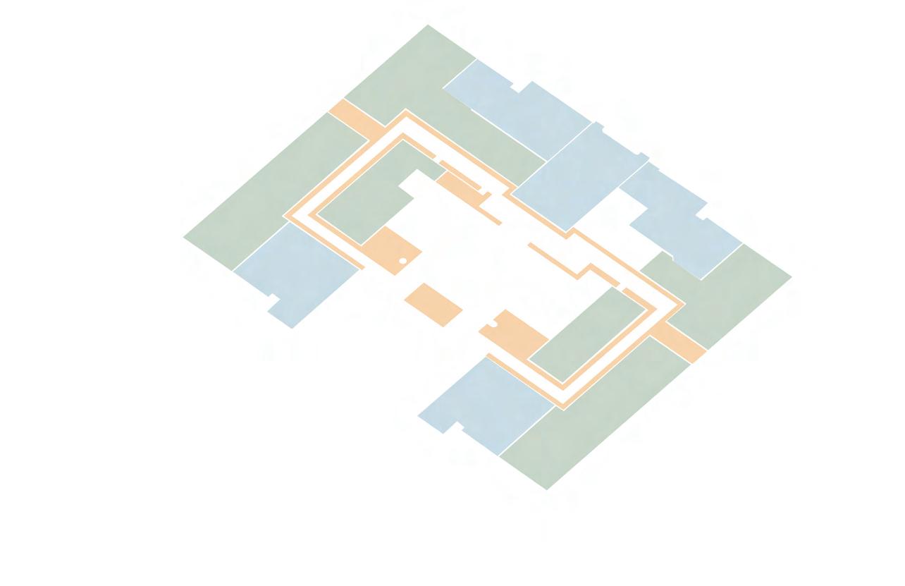
• A lowered ceiling with integrated lighting at 9’-0” AFF frames the major circulation path to guide patients and staff. This lowered ceiling is a wayfinding tool to help users navigate and follow the circular circulation.
• The check-in desk provides a landmark for wayfinding. When users are navigating the clinic, seeing the check-in desk will orientate them.
Patient Spaces
Caregiver Spaces
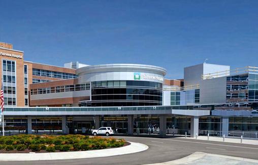
CLEVELAND, OHIO NORTH 1 2 3 4 5 6 1 4 3 5 2 6 Clinic MetroPark Rocky River Bus Stop Parking Garage Neighborhood Lorain Avenue Old Lorain Road Fairview Hospital Cleveland, Ohio
15
Fairview Hospital, clinic is located to the
right
FLOOR PLAN & RCP

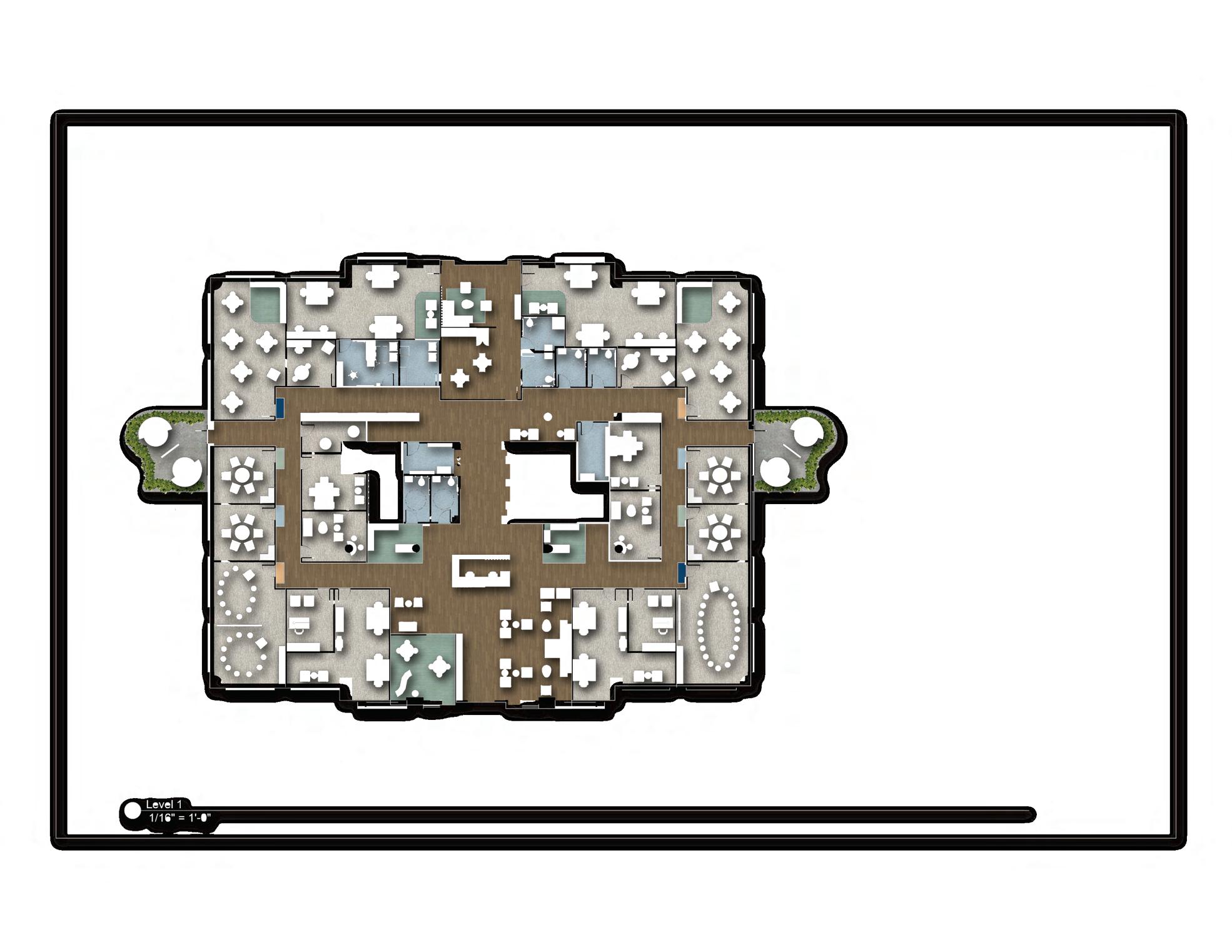
Floor Plan Justifications
• There is access to nature with the two healing gardens, one for each specialty.
• There will be an interactive space for kids in the waiting room.
• There is a cool down area for any patients who need a moment to settle down because of overwhelming emotions.
• A circular circulation path makes the space easy to navigate for patients and staff.
• Outlets are a part of several of the furniture pieces in lounge areas so that users can get work done and distract themselves.
• Furniture is heavy, so that it can not be thrown, but movable to give users control over their space
• There are lounge areas with the staff workrooms to provide a small break area outside of the larger breakroom
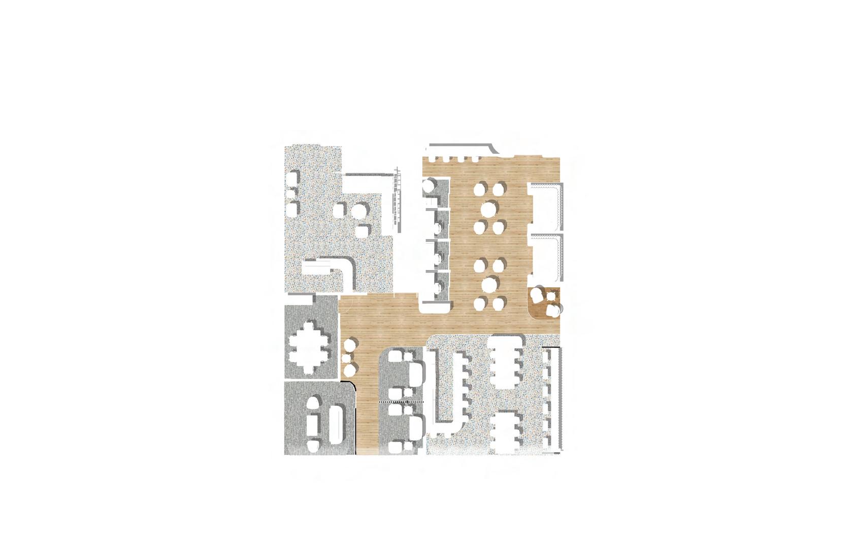
UP UP Check-in & Waiting Area Administrative Workroom Clinicians Workroom Managers Office Copy Room Staff Restrooms Staff Break Room & Lockers Soiled & Clean Utility Patient Restrooms Patient Lockers A B C D E F G H I J Research Consult Outpatient Clinical Consult Office Consult Large Group Therapy Small Group Therapy Vitals Exam Room K L M N O P Q R S
Cool Down Area Healing Garden NORTH A B C C D D E E F F G H I I J J K K L L M M N N N N O O O O P Q H I I R S S I B ACOUSTIBuilt Seamless Acoustical Ceiling System 8’0” FELTWORKS Acoustical Panels 9’0” ACOUSTIBuilt Seamless Acoustical Ceiling System 8’6” TECTUM Shapes for Acoustical Clouds 9’0” Barz 9’0” ACOUSTIBuilt Seamless Acoustical Ceiling System 9’0” ACOUSTIBuilt Seamless Acoustical Ceiling System 9’6” NIS
16
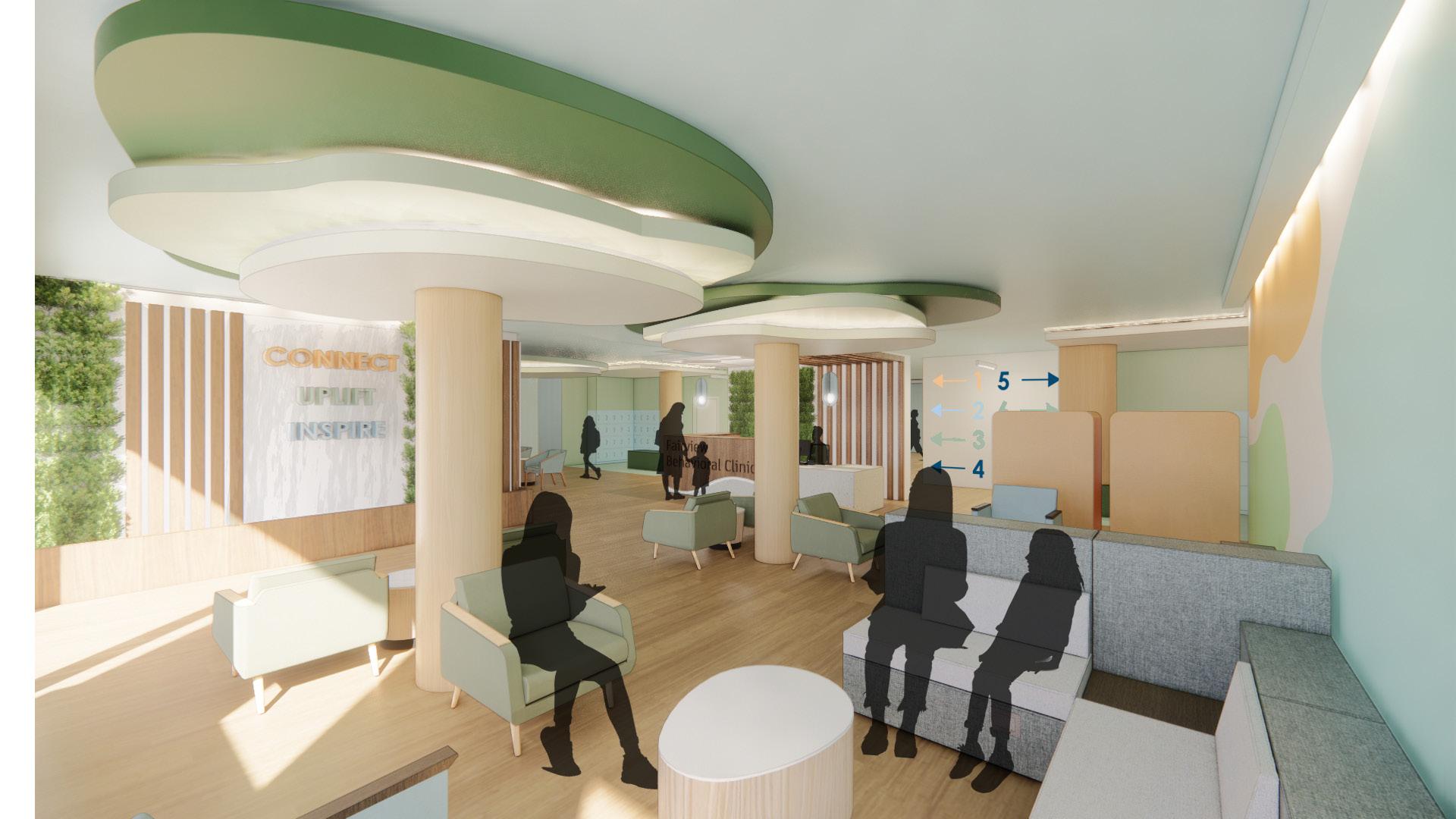
WAITING & CHECK-IN
The openness and clear sightlines, welcome patients into the waiting and check-in area. The waiting area embraces the freedom of nature with tree motifs, organic shapes, and natural colors and materials. A live water wall and a kids play area provide positive distractions for users.
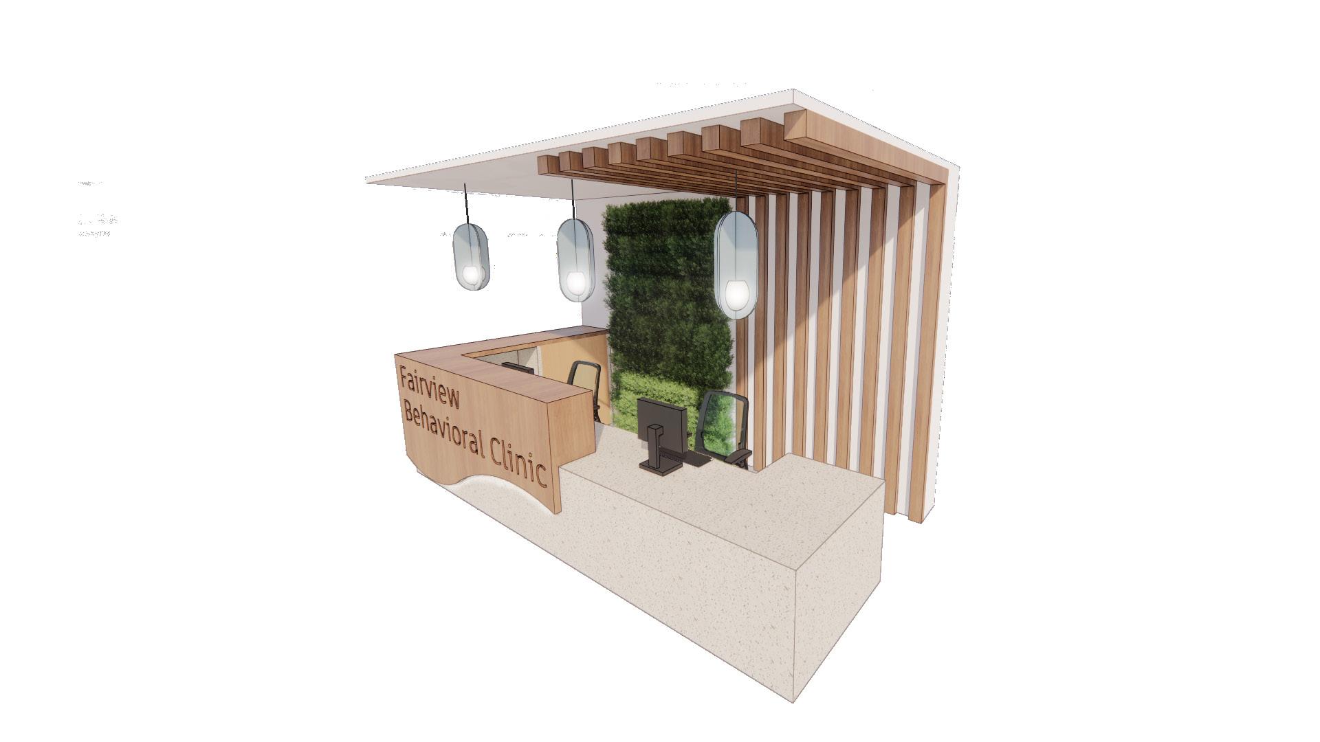
CHECK-IN AXON
Clear sightlines to the check-in desk from the front entrance and the engraved clinic name help users know they’re in the right place, and where to check-in. There is desk room for two people to work and built-in storage for files and office supplies. A magnetic whiteboard material is hidden behind the transaction counter for staff to personalize their work area. Two different counter heights, the lower counter is at 34”, to provide accessible access.
17
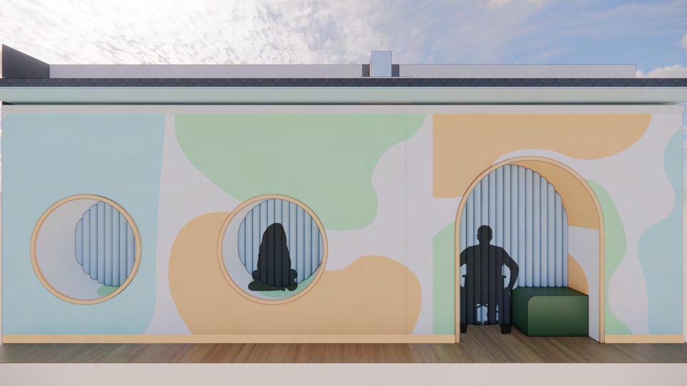
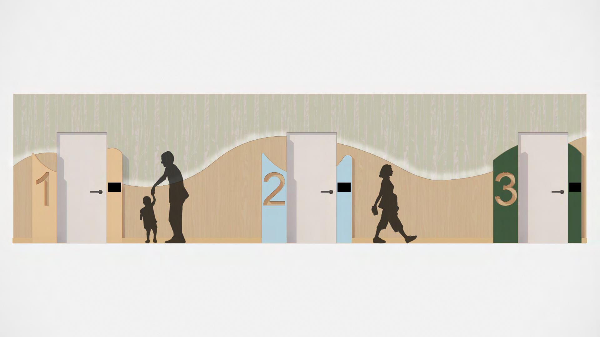
HALLWAYS
This treatment hallway provides multiple wayfinding tools to account for human error. There are large numbers and plaques with the room numbers, room name, and braille. The colors on the door panels match the flooring color in front of the door, and provide color coding wayfinding.
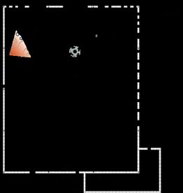
COOL DOWN PODS
These pods provide an area for patients to take a break if a session becomes overwhelming. The cool down pods are a more casual and open option compared to the cool down room. An accessible and standing pod is provided.
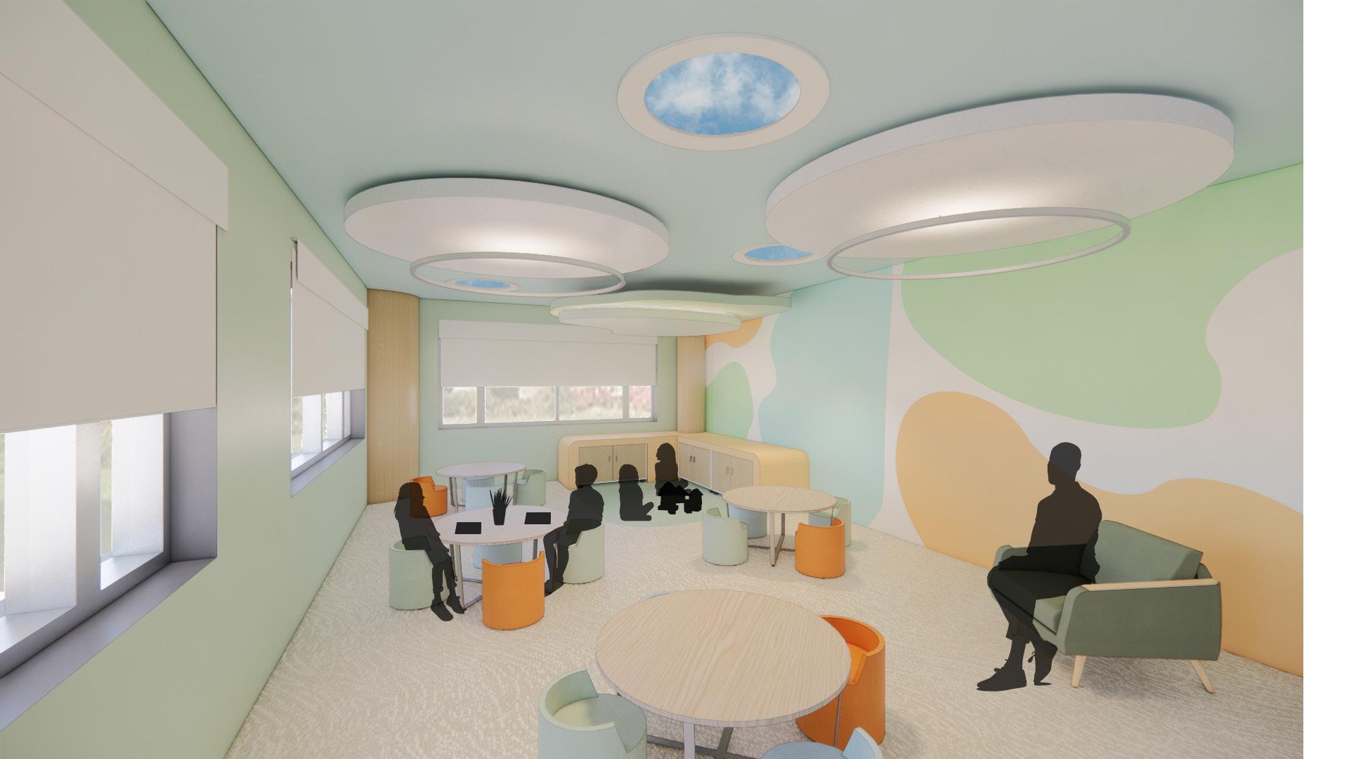
LARGE GROUP THERAPY
This open large group therapy room is flexible with seating that is easy to slide but too heavy to be a safety risk. When seating is separated into groups, a three part tree divider can be used to create zones. There is storage for clinicians to keep the room organized during treatments and when switching treatment rooms.
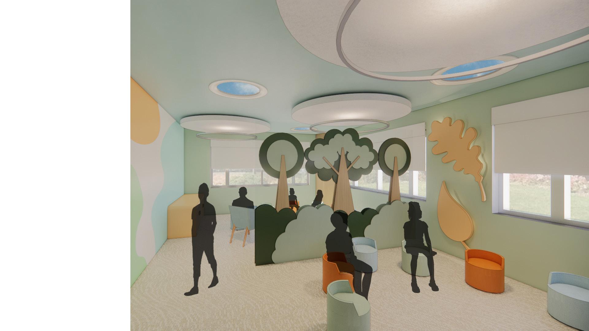
01 02 03
STAFF WORKROOM
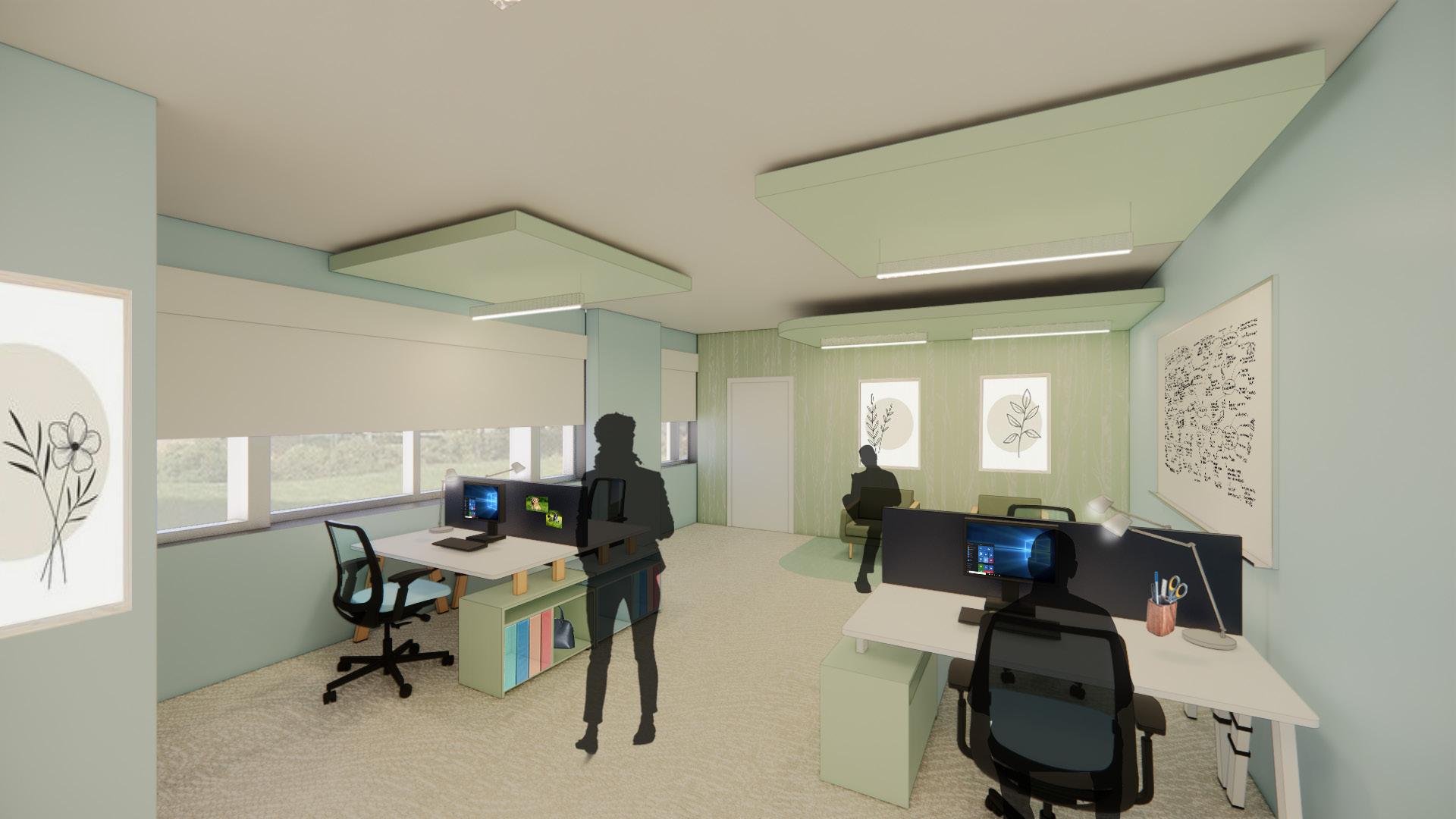
This large group therapy room provides areas for various types of therapy like art therapy and play therapy. The small tables allow for smaller, focused therapy strategies during large sessions. Positive distractions are provided through moving faux LED skylight, a noise machine, and toys.
UP
UP UP
The staff workrooms offer a private space for staff to be productive, social, and relax. Every staff member gets their own space with storage and a panel to display pictures. There is a small lounge area for guests and staff to have a comfortable seating area outside of the large breakroom. 19
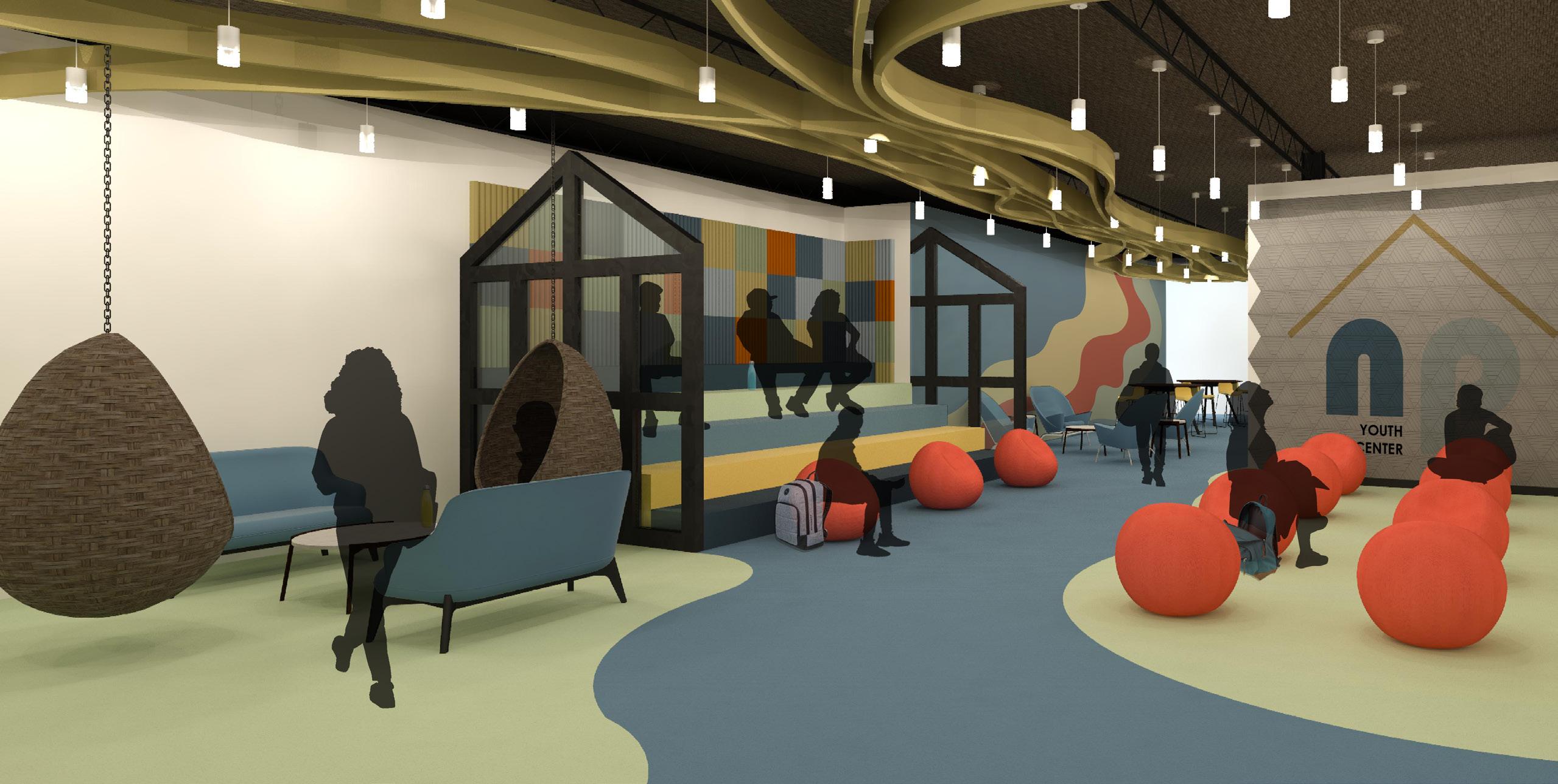
Beyond the Box: North Point Youth Center

SAFE HAVEN
PROJECT DESCRIPTION:
The Beyond the Box project was a quick three week partner project in the middle of the semester. The Tallahassee Citizens Task Force wants to use empty existing buildings on N. Monroe to enhance the social, mental, and physical well-being of an underserved population in the community. Helping the youth community reduces the number of later problems from developing, thus, the focused underserved population is youth between 11-18 years old. Additionally, the Knight Foundation and the W.K. Kellogg Foundation both fund projects that benefit the community and the youth. To complete this project I worked with my partner Sarah Kobes and gained valuable teamwork skills, and learned how to completed a project in a short amount of time.
A Safe Haven is a place of refuge and security. While this youth center is for anyone ages 11-18, it is meant for the disadvantaged youth who experience family/financial difficulties. These individuals have a hard time trusting others; thus, the top priority of this center is perceived safety. Open areas with clear sightlines and effortless navigation will give users the perception of safety. To create a comfortable, safe, and stimulating environment, architectural forms will feature curvilinear lines. Furniture pieces will be heavy to create a sense of security. Through these design considerations, the users will experience a sense of safety, comfort, and belonging.
THIRD PLACE THEORY
Ray Oldenburg’s Theory of Third Places focuses on public spaces that are impartial. A sense of community is one of the many positives that comes from having third places, as well as, a sense of social equality to the people around you. Third places create a sense of belonging within society and encourage connection between neighbors.
np YOUTH CENTER
np YOUTH CENTER np
np YOUTH CENTER
YOUTH CENTER
20
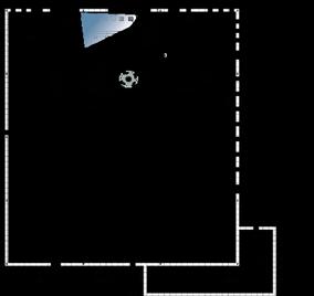
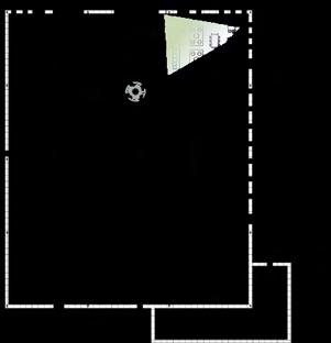
Loading Dock Monroe Main Entry Storage Gym Staff Offices Restroom Confernece Room Break Room Lockers Cleaning Room Lockers Check-in Waiting Area Garden Playground Public Private Semi-private Closed Space Enclaves Restroom Technology Area Work Rooms Tutoring All Purpose Area: Cafe Area Auditorium All Purpose Area: Cafe Area Auditorium Key: 50% 28% 12% 6% 2% 1% 1% Teenagers Public Parents Staff Outreach Visitors Managers Janitors HOME PRE-DESIGN DIAGRAMS BUBBLE DIAGRAM Loading Dock Storage Gym Restroom Confernece Room Break Room Lockers Cleaning Room Public Private Semi-private Closed Space Key: STAKEHOLDER ANALYSIS 2415 N MONROE ST
Gas Station Parking Mall Walgreen’s Hotel Bus Stop Site 21
1 2 3 4 5
DIAGRAMS
Public/ Loud
FACADE ELEVATION
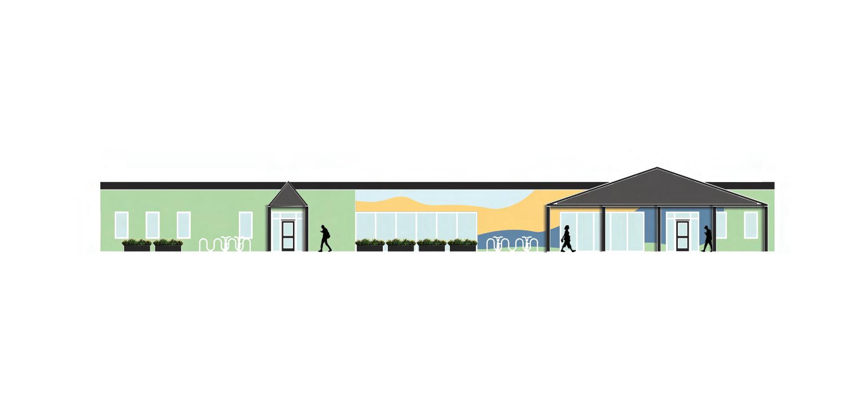
• Planters make the facade feel bright and welcoming.
Private/ Quiet
Semi-Private/ Semi-quiet
• Coffee Shop is labeled and has a different facade to differentiate the two entrances.
• The youth center entrance is labeled.
• The large logo and colorful waves help users identify the building.
• Bike racks are provided to encourage sustainable transportation.
ZONING
np
22
Floor Plan Notes:
• Room for turn circles are present in the bathroom and on circulation paths, there is also roll under space provided with all bathroom sinks.
• The coffee shop is completely cut off from the youth center to increase safety.
• The older members of the youth center, 16-18, can work in the coffee shop to earn money.
• Furniture is movable to accommodate wheelchair users, and there is roll up seating in the outdoor seating area.
• There are a variety of seating arrangements to accommodate all users.
ACTIVE ALL-PURPOSE AREA
TECHNOLOGY CENTER
WORKROOMS + INDIVIDUAL WORK ENCLAVES
TUTORING
MENTAL REST AREA
AREA
& LOCKERS
SHOP
+
WAITING
CHECK-IN
COFFEE
STORAGE
EQUIPMENT OUTDOOR SEATING RESTROOMS
YOGA & MEDIATION ROOM
&
STAFF WORK AREA
ROOM
CLOSET A B C D E F G H I J K L M N O P Q R S FACADE
A B C D D D E F F F G H I J K L M N O P F Q R S 23
GYM GARDEN QUIET WORK AREA BREAKROOM
LOCKERS
CONFERENCE
JANITOR
ELEVATION
ACTIVITY AREA
MATERIAL SELECTIONS


These finishes were chosen due to their durability, sustainability, and acoustic qualities. For instance, most of the wall panels are made with Polyester felt 60% preconsumer recycled from Armstrong. Most of the furniture comes from OFS since they have durable and easily cleanable furniture. Also, the color palette was chosen to create a safe and calming, yet exciting environment. For example, blue and green reflect safety and refuge while yellow and orange bring fun and warmth to the space.


The Activity Area is a zone committed to providing social interaction that users of the space might have lost due to the COVID-19 pandemic. This area also features a movie area with a projector, bleacher-style seating, and bean bag chairs.
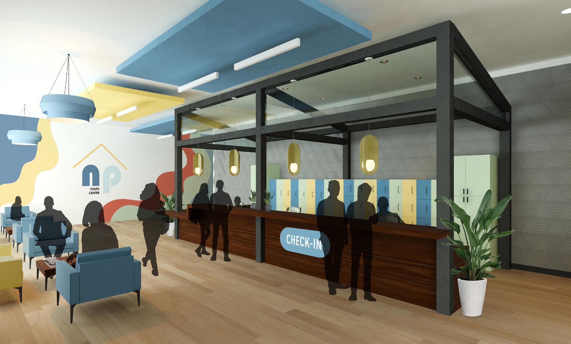
COFFEE SHOP & RECEPTION DESK
To provide a comfortable noise level in the Coffee Shop, design features were included for their acoustic qualities. For instance, both the wall on the left and the walls on the right feature acoustic paneling. Rugs, acoustic ceiling panels, and felt lighting fixtures also help with acoustics.

To provide safety for the users of the space, individuals must be checked in to the youth center. The Reception Area features a large check-in desk with an ADA-accessible lowered portion on the left.
25
Rising to the Challenge: Faygo
Beverages Office Design
PROJECT DESCRIPTION:

Faygo wanted to redesign their offices in Detroit, Michigan to create a space that would make employees want to come to work. This redesign was meant to be a new start, not incorporating any of the existing design. In close to 11,000 sqft, this design needed to include a work cafe and comfortable work areas, workstations for in-person and remote employees, meeting rooms, enclaves, and environmental graphics throughout the design. The goal of this design was to create a creative, comfortable, and diverse space that allows employees to find the perfect place for them to work, build employee relationships, and be inspired.
FAYGO
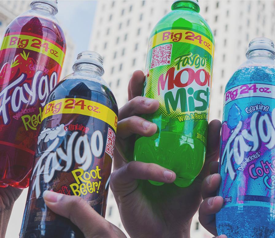
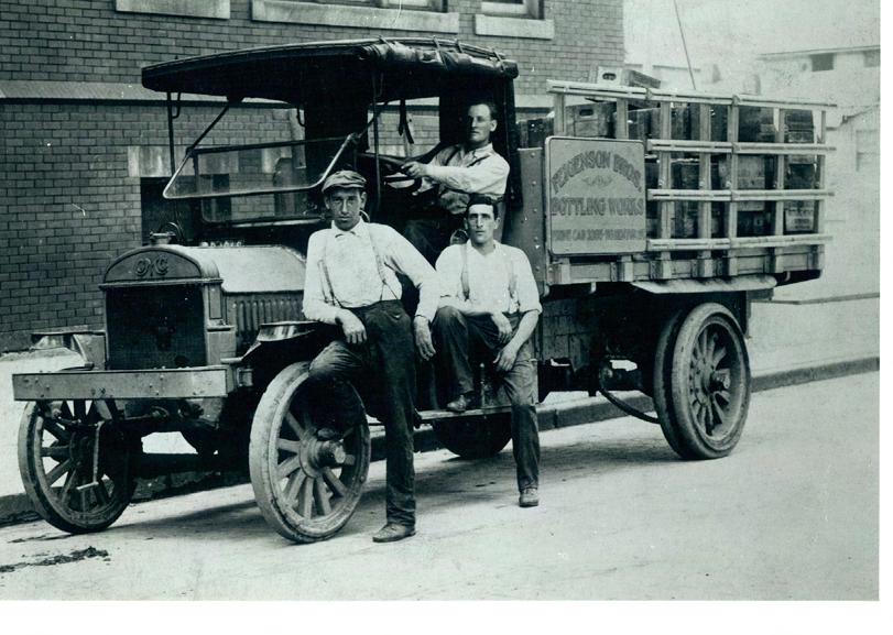
Faygo was started by brothers Ben and Perry Feigenson. They were Russian immigrants who started out as bakers in Detroit, Michigan. While bottling their soda water, they decided to create sodas based off of their frosting flavors, and that is how Faygo began. That was back in 1907, and today in 2020 Faygo is still going strong and is a staple to the Detroit area. Faygo started as a family company and family values are still at the core of their beliefs. When applying for a job at Faygo, Faygo tells future employees that they “offer quality benefits to promote the well-being of team members and families” and that “every person truly makes a difference here”(Faygo Inc).
26
PRE-DESIGN DIAGRAMS

BUBBLE DIAGRAMS
USER NEEDS DIAGRAMS


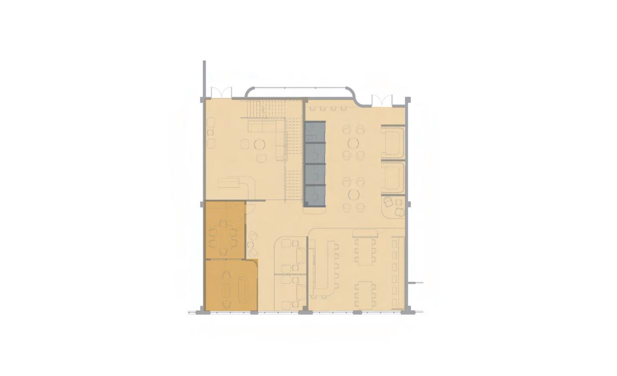

DIAGRAM KEY GROUP CLOSED

INDIVIDUAL CLOSED GROUP OPEN INDIVIDUAL OPEN
MAJOR PATH
MINOR PATH
FOCAL POINT ENTRANCE
27
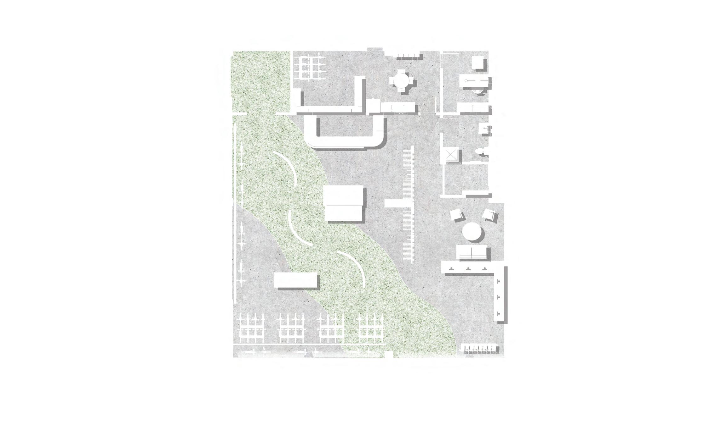
FLOOR PLANS
SHORT-TERM
LONG-TERM
EMPLOYEE ENTRY
FLOOR 2
RECEPTION
6 PERSON MEETING ROOM
2-4 PERSON MEETING ROOM
ENCLAVE
LOUNGE WORKCAFE
FLOOR 1
ENCLAVE
6 PERSON MEETING ROOM LOUNGE
2-4 PERSON MEETING ROOM
RESOURCE ROOM IT
TRAINING ROOM DEPARTMENT AND AGILE WORKSTATIONS
2-4 PERSON MEETING ROOM SERVER ROOM
N N
CONFERENCE ROOM
28
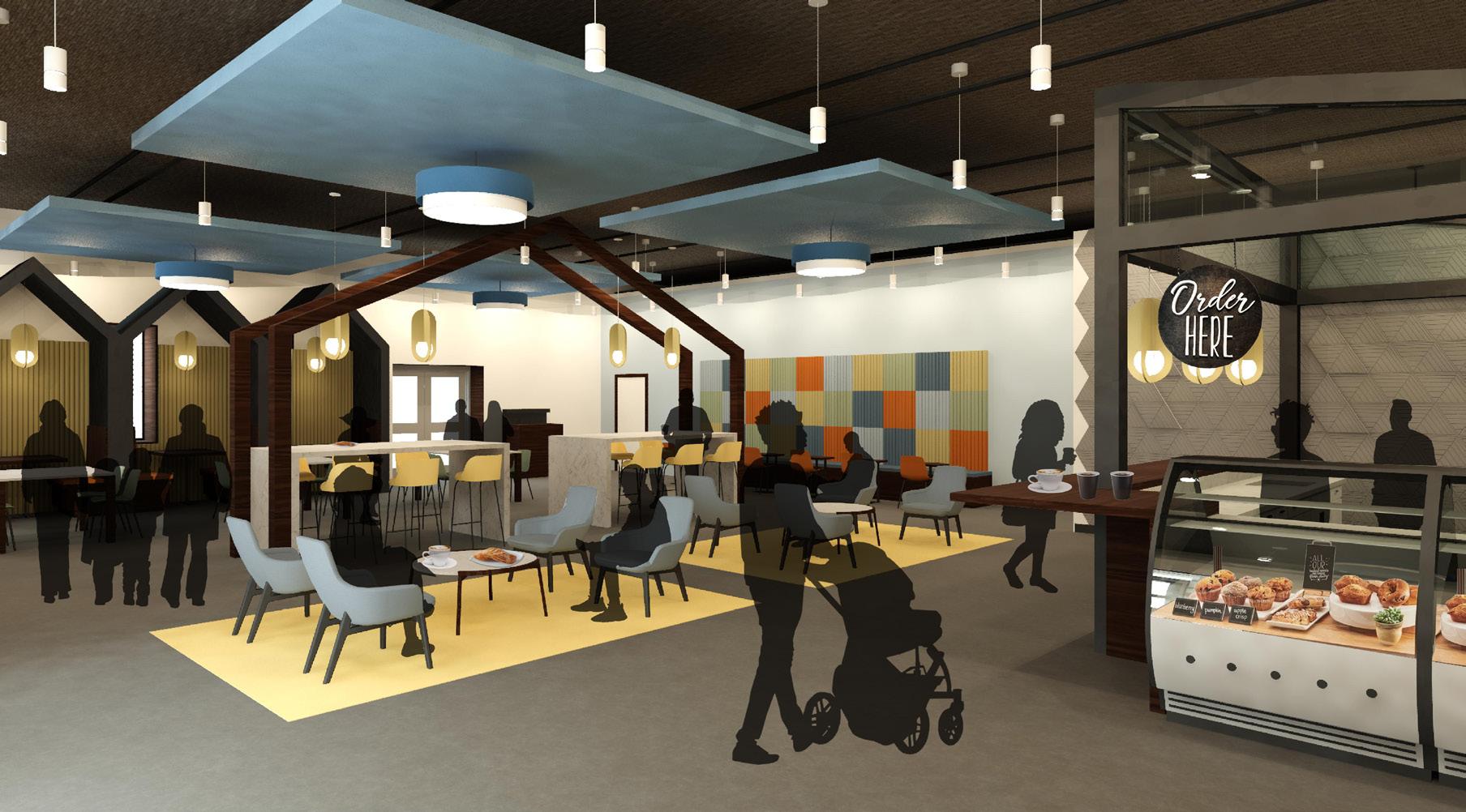
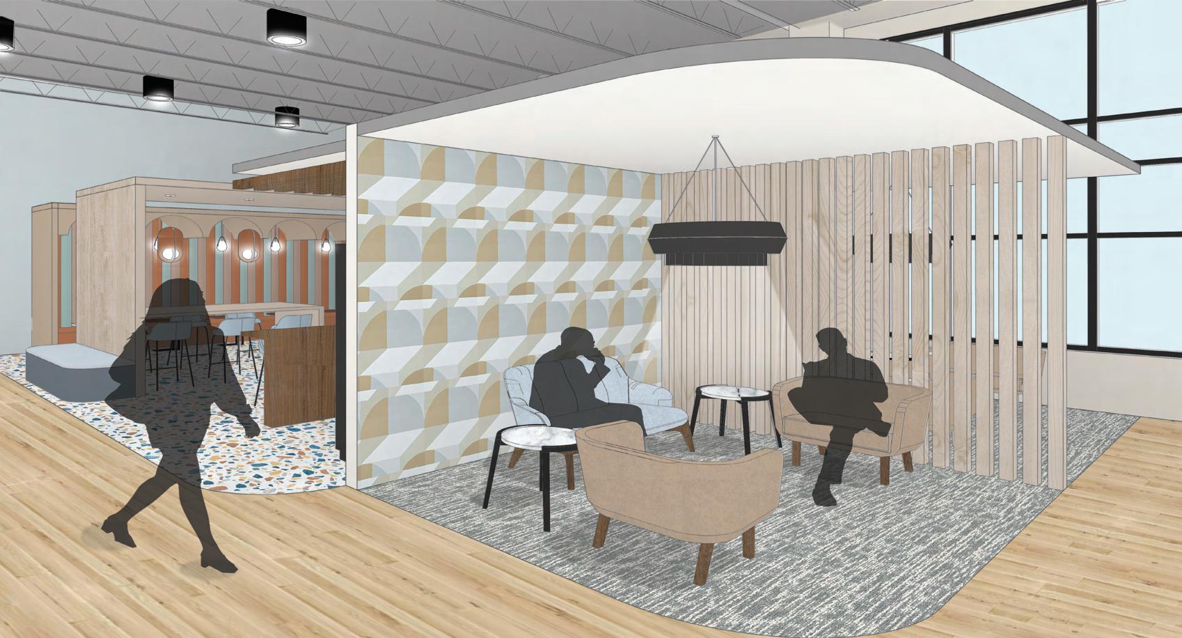
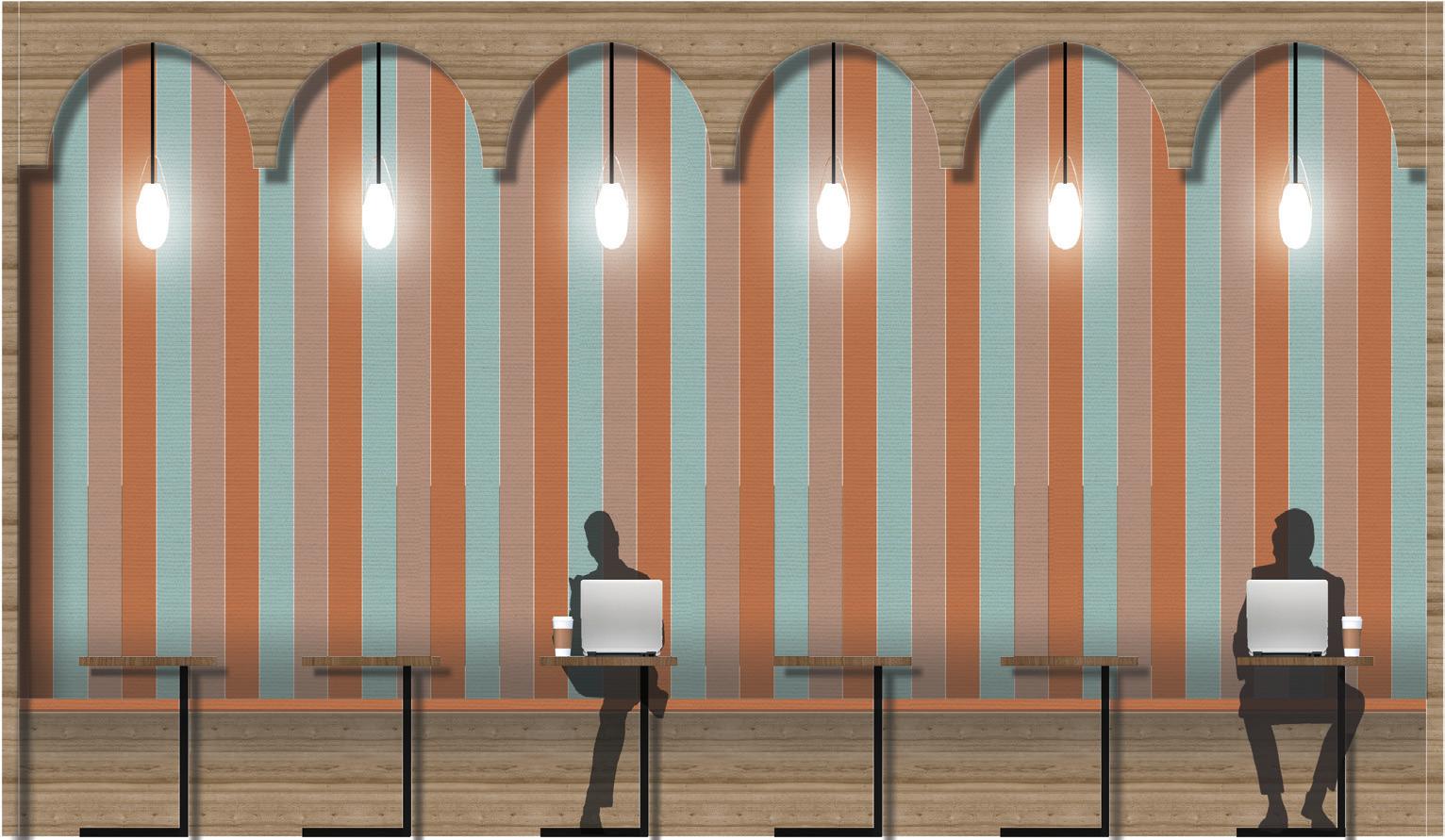
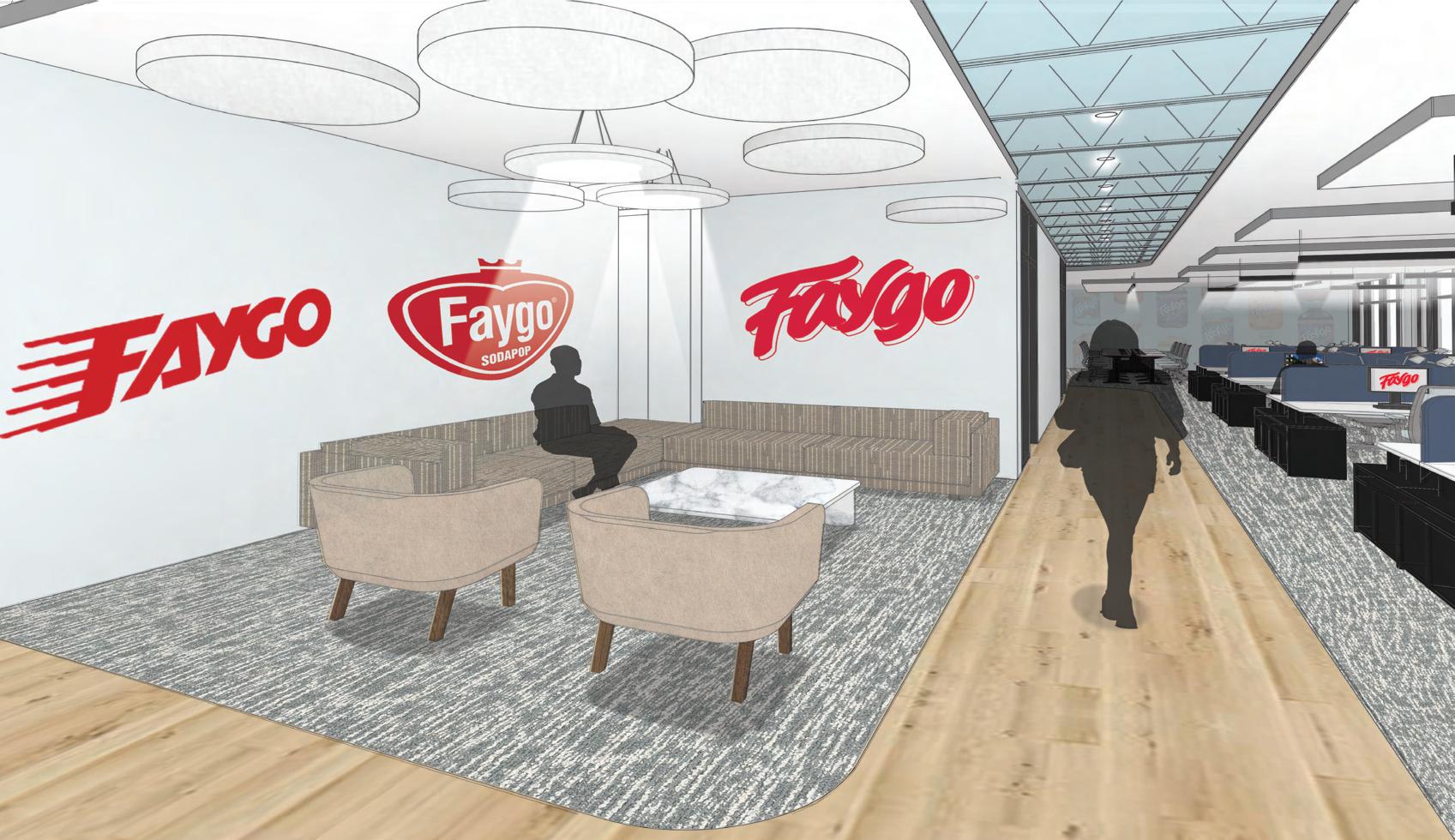
FIRST FLOOR LOUNGE
ENTRANCE WALL
This wall is made up of LED screens that show promotional Faygo videos. The main image for the wall is the Faygo logo with moving bubbles, and look like the screen is slowly filling up with a Faygo Beverage.

LOUNGE
This first floor lounge area gives employees a place for small meetings, and more privacy than the open lounge and work cafe area next to it. The seating is close to the 2-4 person meeting room and 6 person meeting room, so the seats offer an adjacent waiting area for employees and visitors before meetings.
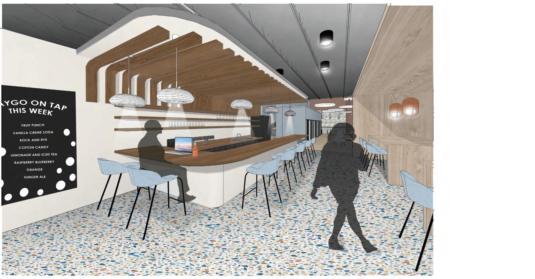
WORK CAFE
This work cafe gives employees a space to be social, get a drink, and eat. On the counter are eight drink taps that will have eight different Faygo beverages. These Faygo beverages will change from week to week, so that employees and visitors can try different Faygo products. There is also a coffee maker and sometimes cold brew on one of the drink taps. Inside the tall cabinet at the open end of the bar is a refrigerator.
WORK CAFE BOOTH
This linear booth area in the work cafe creates a work space for employees that offers different lighting and sense of privacy with an open office space. The comfortable seating is open. But a great space for individual work.
30
LOUNGE AND BOOTHS
BENCH TABLE ALCOVE
This bench table work area gives employees an area to get individual work done within the open lounge area on the first floor. The alcove element of this work area gives employees a sense of territory and privacy.
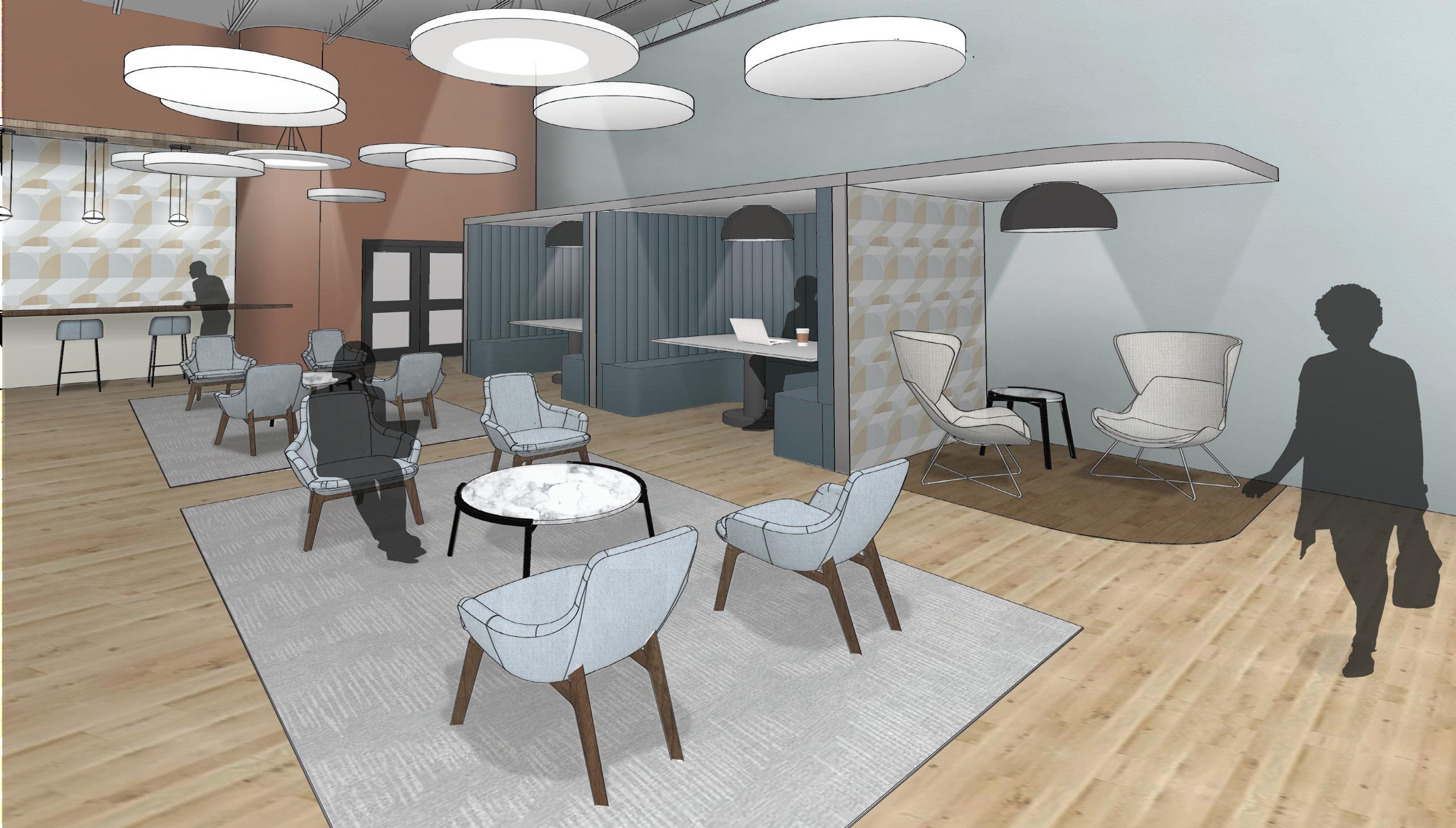
LOUNGE AND BOOTHS
This lounge seating area with group seating, booths, and an individual bench table work area offers many different seating options. This area is tucked away from the bright and open reception area, and active area of the meeting spaces on the first floor. The chairs are movable to allow for different seating arrangements. The short-term enclaves are next to the group seating, so the noise level in this space will not be as loud as the work cafe nearby.
SECOND FLOOR LOUNGE
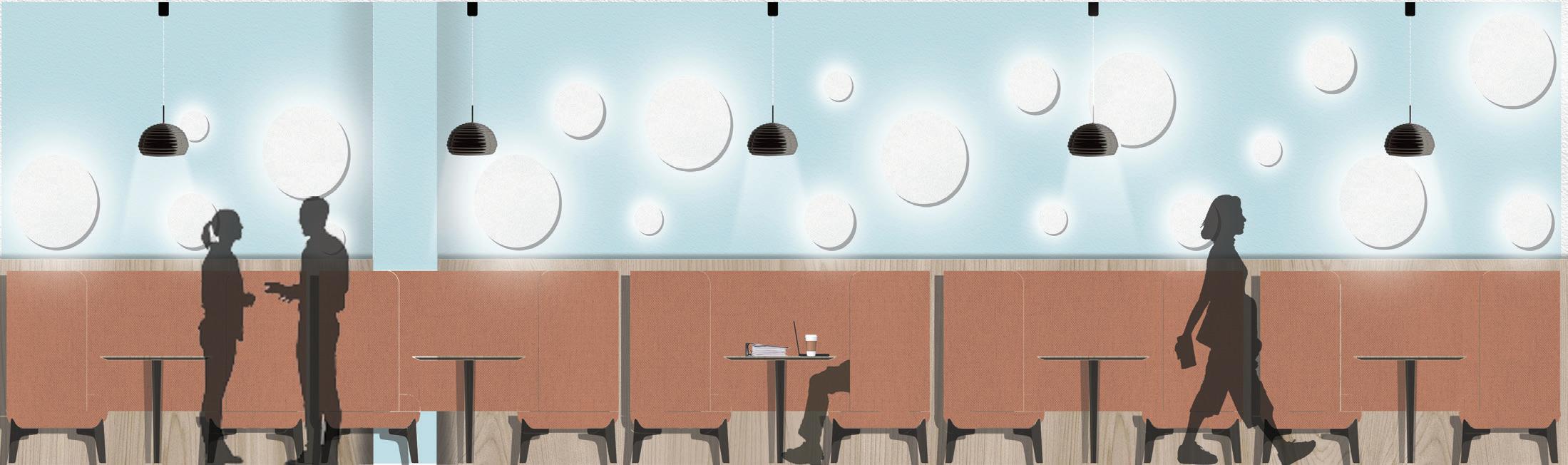
BOOTHS
These booths add to the lounge and comfortable seating on the second floor. These booths will allow employees a different place to work if they need a change, and an area for small group meetings if all meeting areas are being used.
LOUNGE
This second floor area allows for a comfortable seating area that is not part of the open lounge areas downstairs. The three different Faygo logos from throughout the years are displayed on the wall. There are also department and agile workstations, and the custom Faygo wallpaper on the back wall.
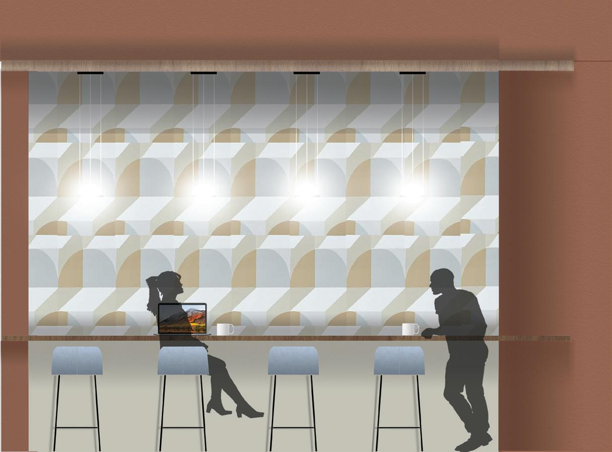
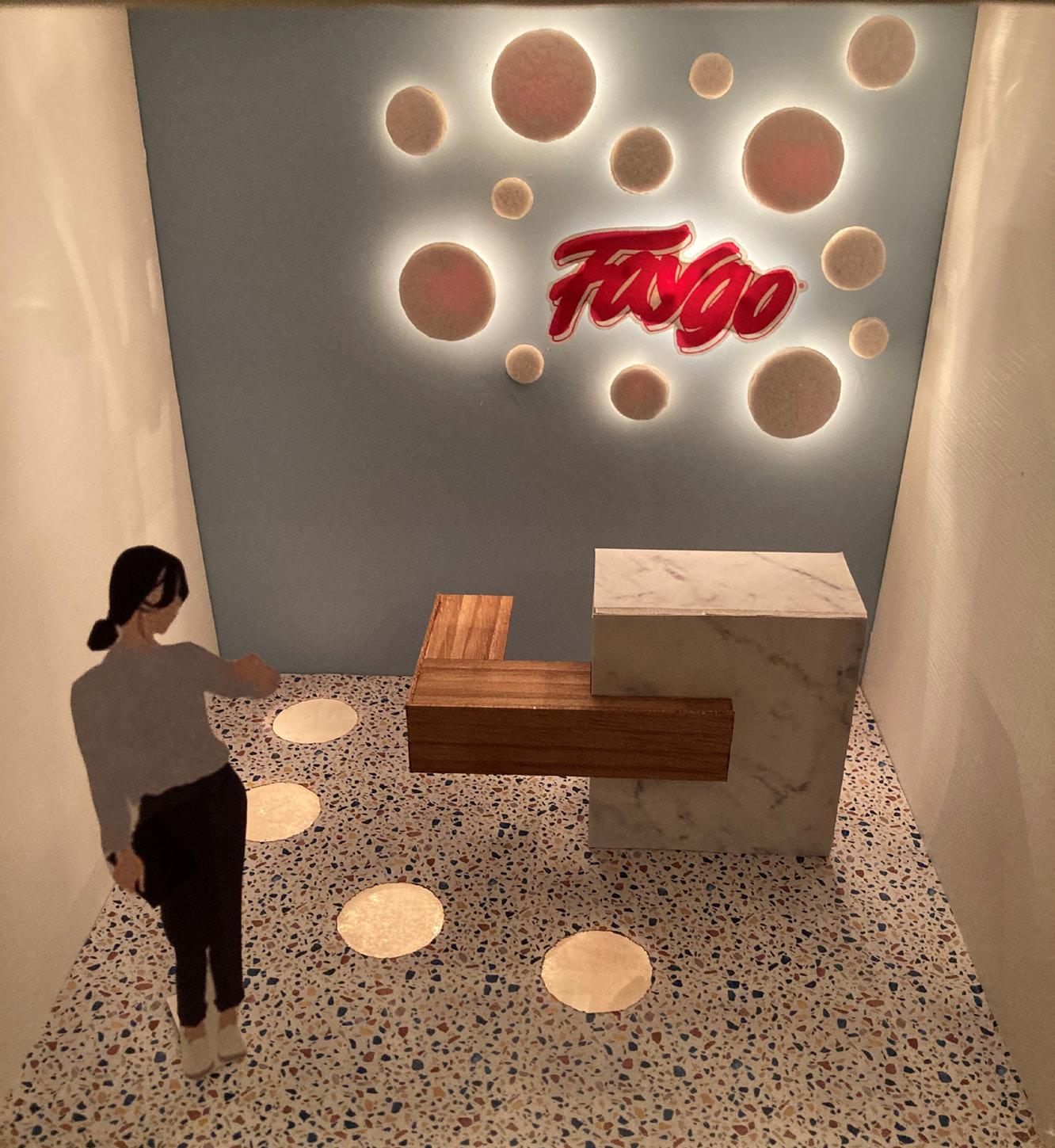
Lighting Maquette: Main Entrance with Reception Desk
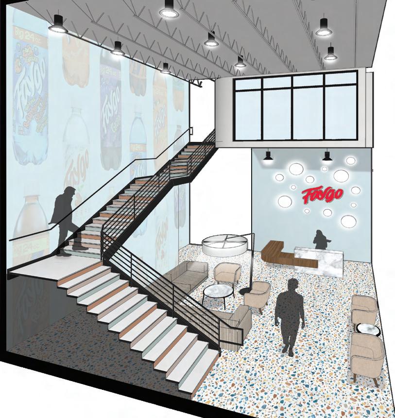
Based off of the Faygo workplace project, this lighting maquette represents a custom lighting feature on the reception desk wall. Faygo Beverages is a soft drink company that started in Detroit, Michigan over a hundred years ago. The concept for this lighting feature was rising to the challenge, which represents the innovation and creativity of Faygo Beverages, as well as, the rising of carbonation. Back lit acoustical felt circles surround a back lit Faygo logo, making the logo the focal point of this space.
 Section perspective of the main entrance and reception area at the Faygo office.
33
Lighting model of reception desk area at the Faygo office. The model was created in one week and is 10”x10”x10”.
A Greener Tomorrow: MIweelz Retail Design
MIweelz believes that everyone has a responsibility to care about the world we live in and the impact of climate change. Their goals to reduce pollution created by transportation inspires a design based on their goals of A Greener Tomorrow. This three week retail project focuses on mission driven branding, in-person and remote shopping, and customer engagement. A mix of organic and structured forms reflect the natural shapes found in nature meeting with the industrial forms found in a city like Detroit. Sustainable materials and a natural color scheme reinforces the green ideas that drive MIweelz to create a cleaner tomorrow. To get the MIweelz brand into the local community and further the company’s environmental goals, MIweelz has partnered up with many climate change organizations in Detroit. This design incorporates the MIweelz mission statement, while still providing an innovative shopping experience to customers.
BUBBLE DIAGRAM
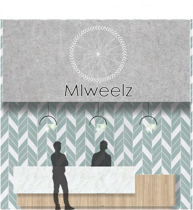
The custom designed MIweelz logo reflects the products and environmental goals of the company. The circle represents a bicycle wheel and the cycle materials go through when they are sustainability recycled and reused. The arrows creating the circle take inspiration from the arrows of the recycling symbol and bike treads.

Employee Private Employee Public Public Private Entrance Major Path Minor Path
34
FLOOR PLAN
ENTRANCE WAITING AREAS
Waiting area with chairs and a sofa with also serve as a consultation area.
PRODUCT SHOWCASE DISPLAYS
APPAREL DISPLAYS
Apparel displays include shirts and helmets.
3 4
6 7
4 4
2 5
BICYCLES DISPLAYS
Bicycle displays includes bicycles and three custom bicycles interactive screens.
POINT OF SALE
This area includes two cash wrap stations and a gift wrapping station.
DEMO AREA
Demo areas include a fitting room and demo area in the parking lot.
8
7 8 1 2
MANAGER’S OFFICE
10 11 12
BREAK AREA
This includes ten employee lockers.
BACK STOCK
This includes an eight foot shipping counter.
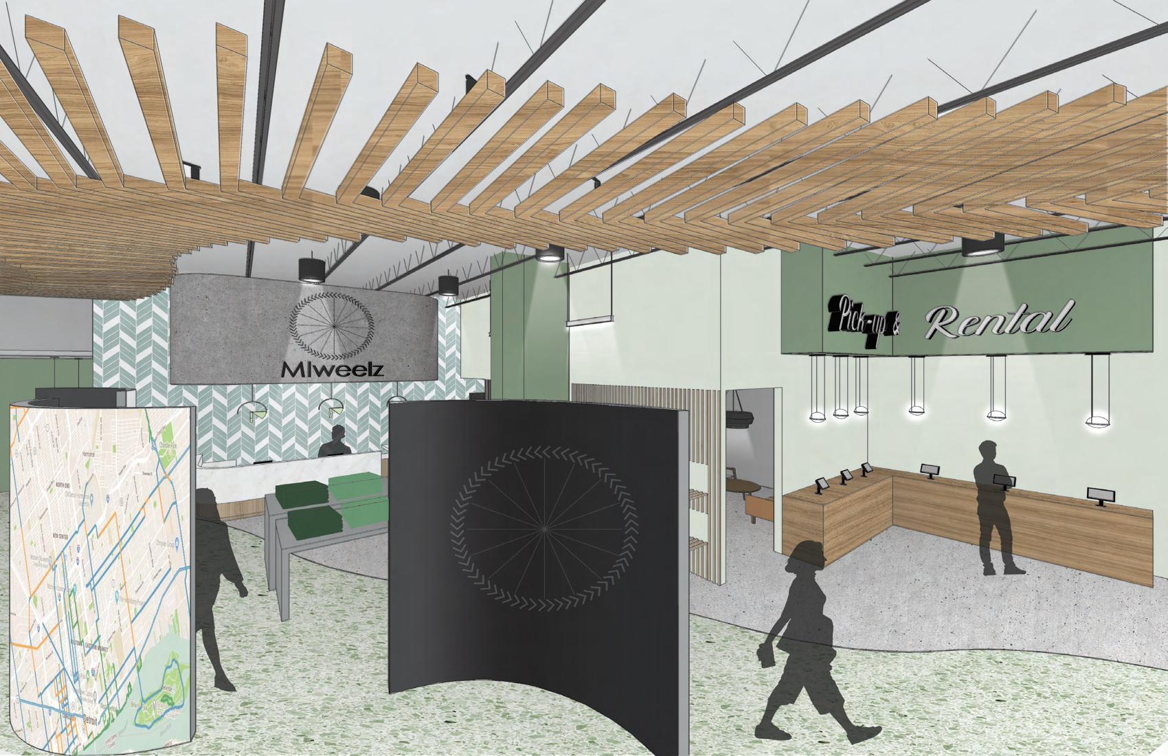
PICK-UP AND RENTAL
This includes six tablets where customers can check-in to pick-up or rent products.
9 10 11 12 35
5
9
1 2 3 4
6
RESTROOM 3 1
SALES FLOOR
The point of sale has clear site lines to the main sales floor. This sales floor includes apparel, like shirts and helmets, and bicycles. In the middle of the store there are three custom bicycle stations. These stations feature a custom bicycle interactive touch screen on the inside of the curved wall and infographics on the outside. The info-graphics include information comparing the carbon footprint of different transportation methods and a map of the bike lanes, roads, and trails in downtown Detroit. The back wall displays a map of Detroit and the Detroit River, which is also reflected in the flowing green terrazzo throughout the sales floor. The feel of the space is bright, welcoming, and natural; this reflects MIweelz’s mission of creating a greener tomorrow.
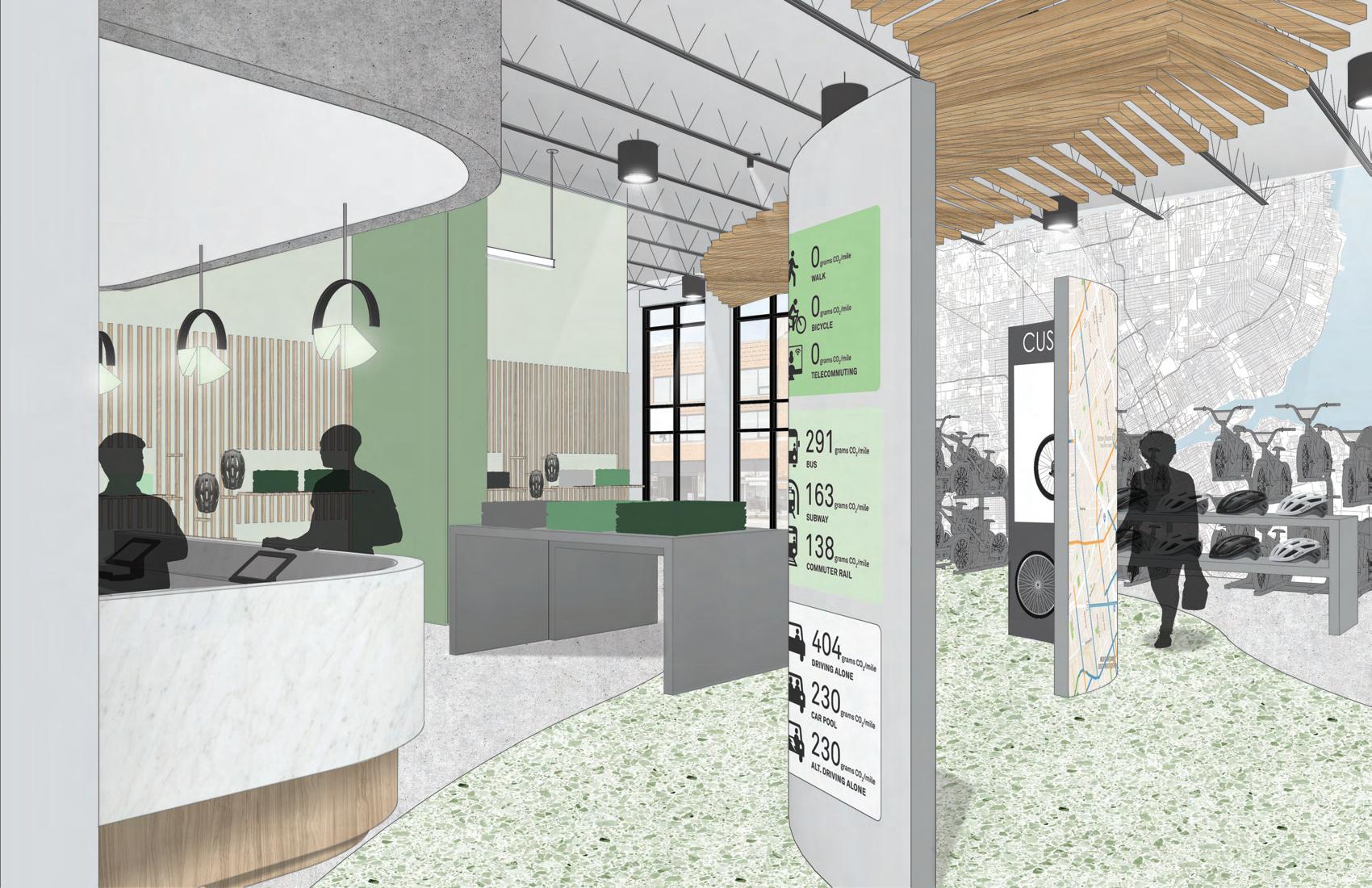
POINT OF SALE
This is a view of the main sales floor and pick-up and rental counter from a high eye elevation view. The pick-up and rental stations give customers the option to order online and pick up or rent merchandise from the MIweelz store. Also seen in this view is the interactive custom bicycles station with infographics on the back, and a little bit of the waiting and consultation area. The terrazzo and ceiling arrow paths help guide customers throughout the space. This uplifting retail space is inspiring, engaging, and has a mission driven purpose behind it.
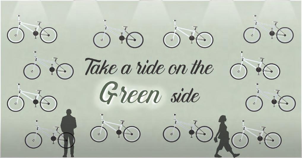
BRANDING WALL
This branding wall shows the product and purpose of MIweelz. The branding wall features one of MIweelz slogans “take a ride on the green side” and displays the bicycles. The word green is lit up because of the MIweelz mission statement to make “ a greener tomorrow” and put the focus on MIweelz’s environmental goals.
37
An Adapting World:
A University Library Designed with COVID-19 Guidelines
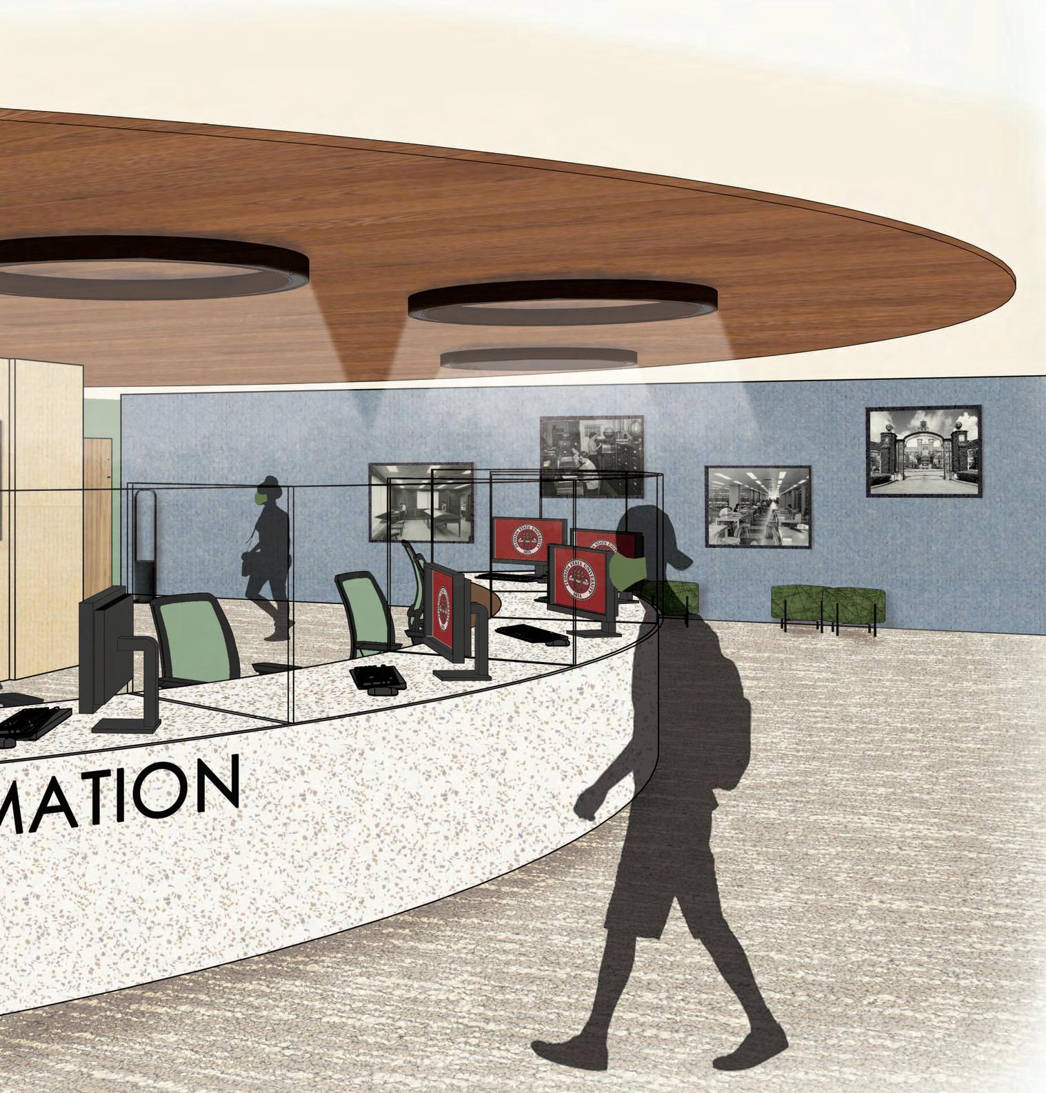
CIRCULATION DESK PROJECT DESCRIPTION:
Based on the COVID-19 pandemic, this six week group project focused on redesigning FSU’s Strozier Library with COVID-19 guidelines in mind. Designers Julia Edwards and Maggie Schmidt also contributed to the work created for this design. The redesigned first floor of the Library is around 21,000 sqft and needs to include a circulation desk, technology center, tutoring center, and group and individual study spaces. CDC COVID-19 guidelines are followed throughout the design with glass partitions, seating six feet away, and several hand sanitation centers. An important goal of this design was to provide diverse seating arrangements, so that every student could find a productive space.
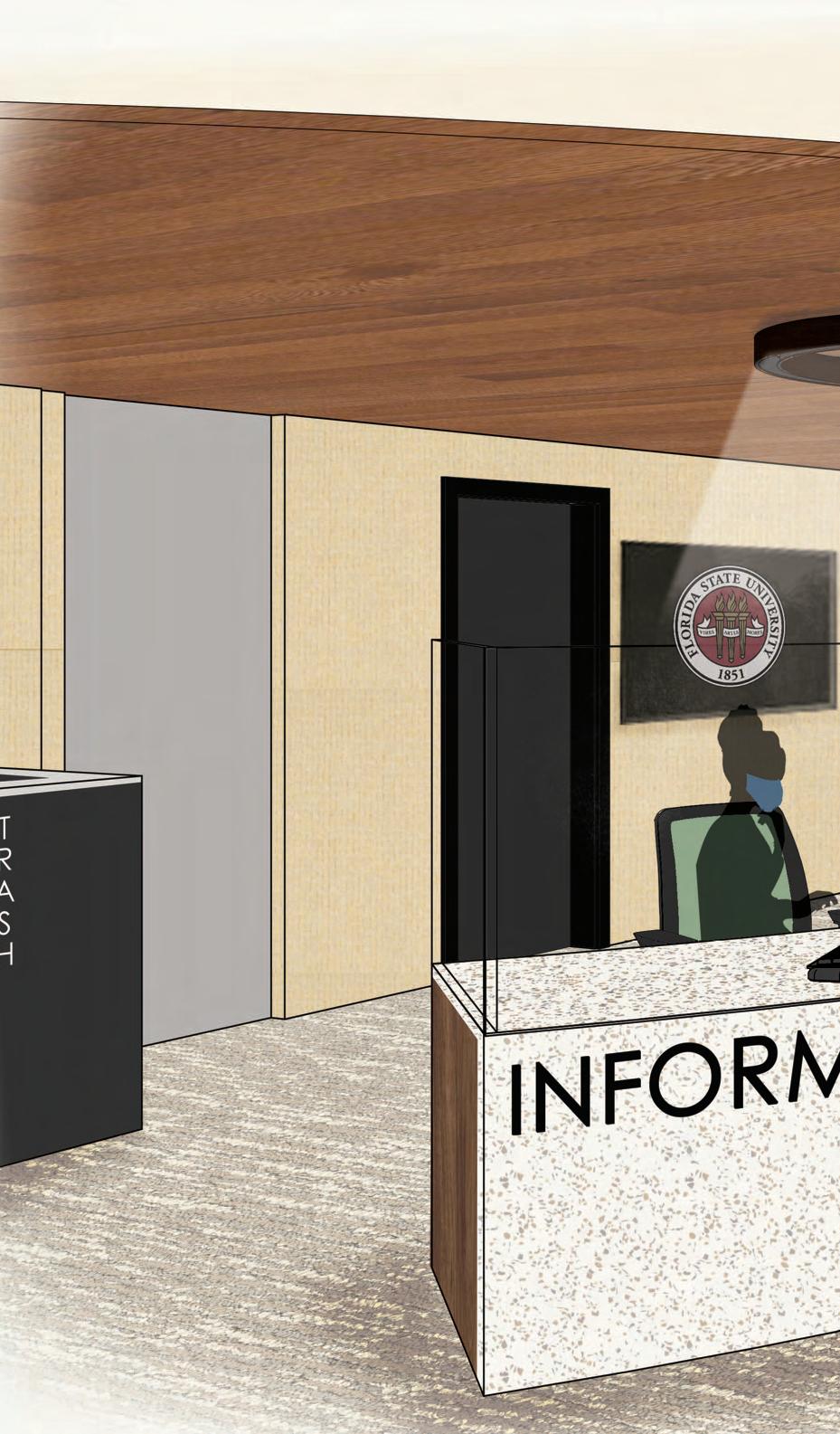
38
FLOOR PLAN
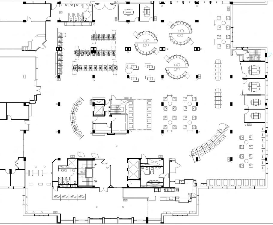
Floor Plan and Space Planning: Mallory Prost 39
Revit Model: Maggie Schmidt
Rendering:
Mallory Prost
RESEARCH:
• Comfortable seating and a cozy atmosphere are other improvements interviewees wanted in Strozier. One interviewee preferred studying at coffee shops because of their intimate atmosphere and warm lighting.
• 53% of people work in groups while at Strozier and 47% usually work alone.
• Providing various levels of illumination where windows are limited or absent may boost productivity levels, accommodate varying study habits, and enhance the overall space.
• Diverse seating opportunities will accommodate the needs of all study habits and styles, aligning heavily with the FSU student survey as their preferred study space within the library differed.
• Plants in indoor office spaces may reduce indoor pollution, increase ideas of well-being, lead to workers being more productive and creative, and reduce absences due to sickness.
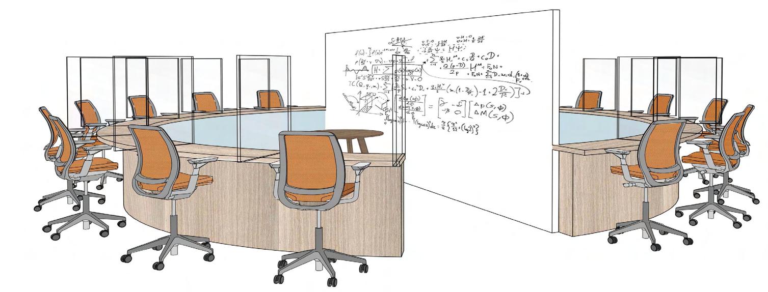
GROUP TUTORING
62% 20% 11% 7% 76% 4% 7% 13% Visits Before COVID-19 Visits After COVID-19 Once a week 2-4 times a week once a month 2-4 times a month never BOOTH SEATING
Circle Distanced Tutoring Setup Idea: Mallory Prost Rendering: Maggie
Schmidt
40
Revit Model: Julia Edwards Rendering: Mallory Prost
CONCEPT: ADAPTATION
Adaptability is defined as “an ability or willingness to change in order to suit different conditions.” This relates heavily to the obstacles that have transformed our way of living throughout the year 2020. COVID-19 has altered our current way of life greatly, thereby affecting the built-environment and spatial layouts we consider to be safe. Sanitization stations, touch-less technology, plexiglass, and low-maintenance finishes will prevent the spread of germs. A 6-foot space between furniture pieces and one-way circulation paths will ensure social distance guidelines are met. Appropriate signage will be placed to remind and inform visitors on the new library rules in regards to COVID-19. Diverse seating opportunities, and movable furniture, will accommodate both individual study and safe collaboration to adapt to the needs of all users. Nature as a whole is an extremely adaptable force, which has inspired the use of a neutral color palette, live wall, and additional foliage throughout the space. The design will provide increased safety efforts for both physical and mental health through its connection to nature and attributions related to COVID-19. Overall, the library will promote safety, diversity, and serenity through its adaptable design and spatial layout.

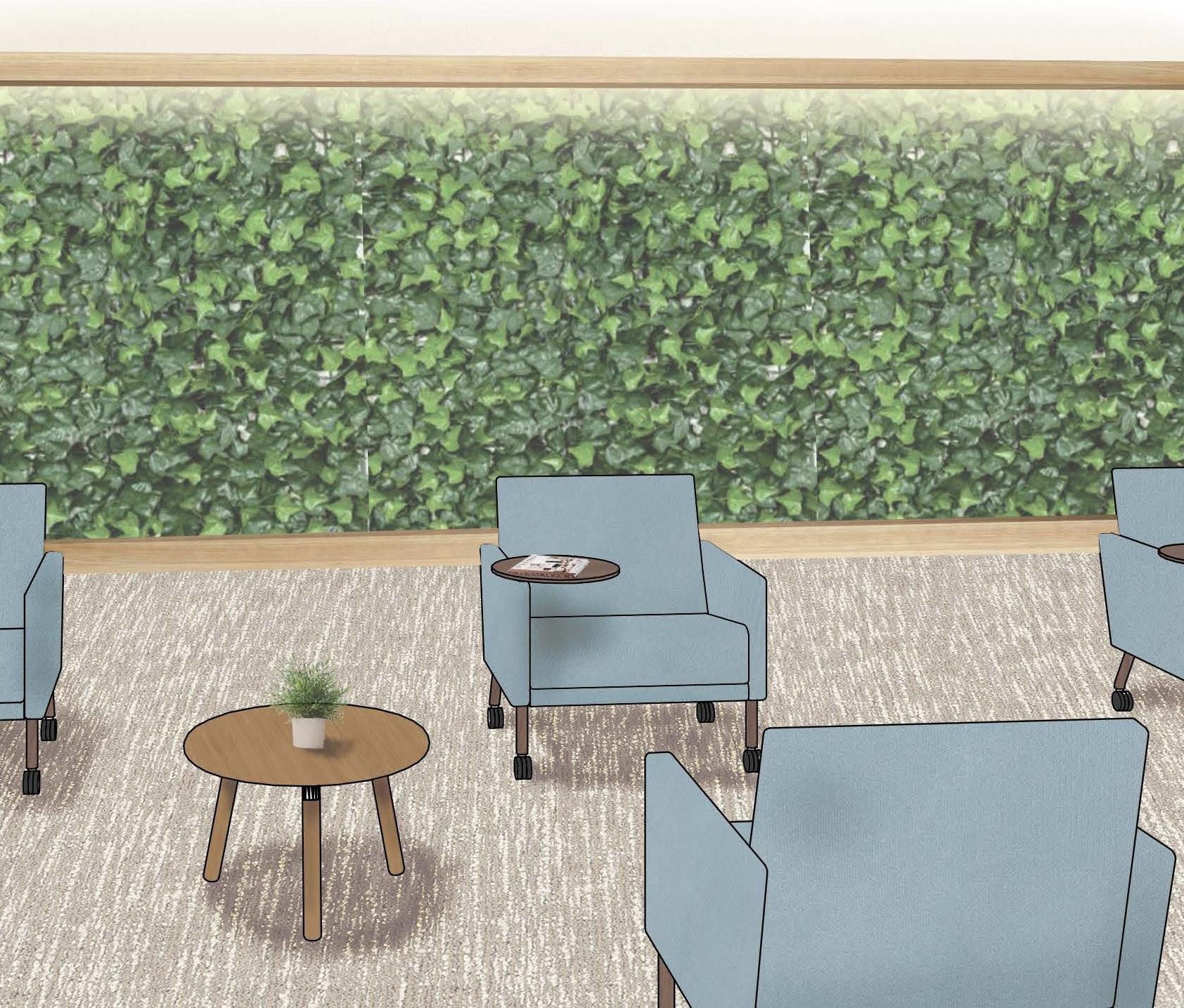
LIVE WALL
41
Model and Rendering: Julia Edwards
Let’s Stay in Touch Email: prostmallory@gmail.com Phone Number: 480-444-9461