VISUAL COMMUNICATIONS REPORT
STUDENT ID 220019576
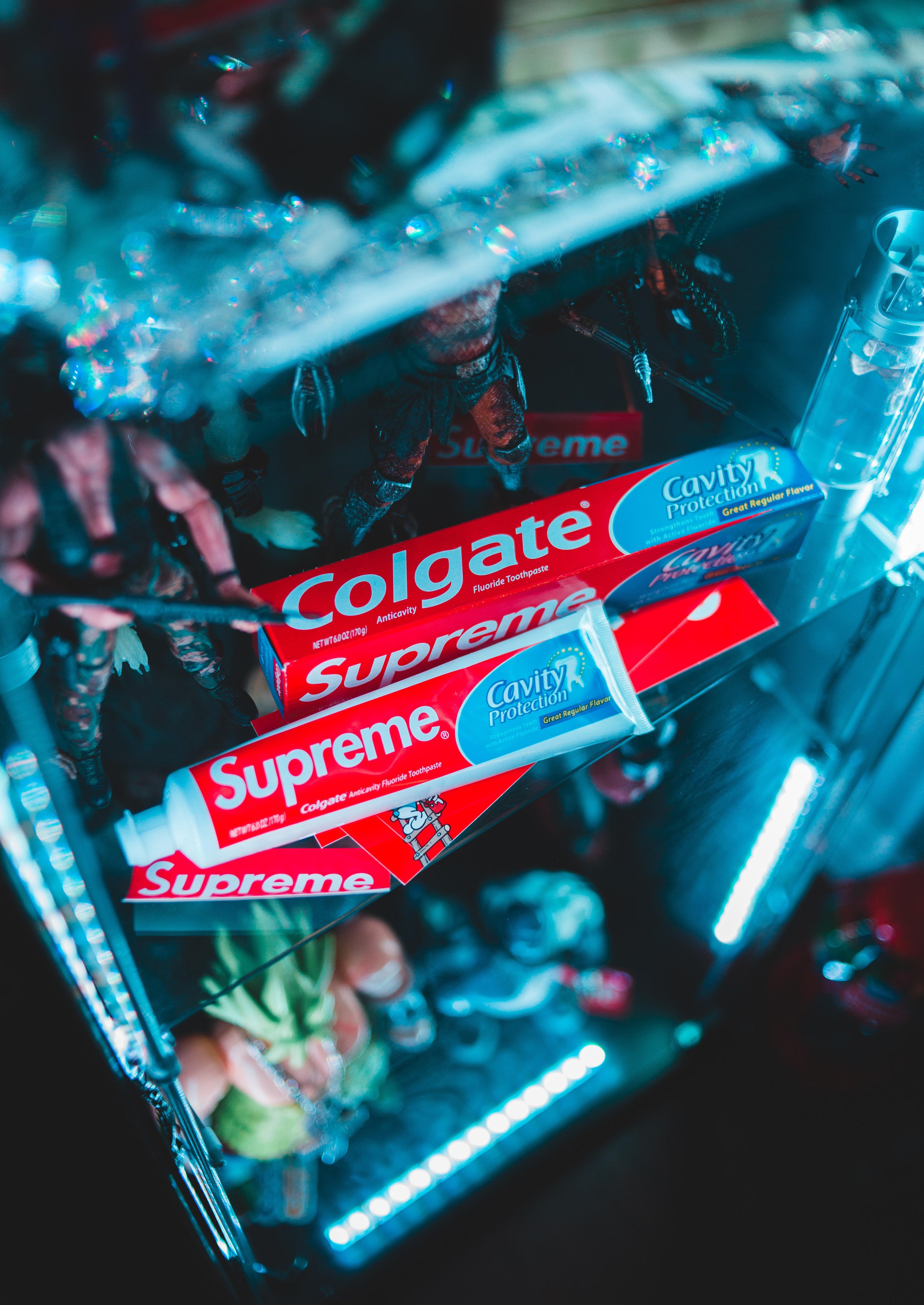
The logo for American streetwear brand Supreme appeals to their audience by using a straightforward, bold colour palette. The red box surrounding the text creates a ‘white space’, allowing the customer to focus on the brand itself and the image they’re trying to create (Tselentis, 2012). This red box logo has become synonymous with the brand and uses colour psychology to define the personality of the brand, as well as the customer (labelled above). Further to this, a strong colour palette creates a ‘pop’ (Saltz, 2009), making the text stand out against the contrast. This is specifically important as colour influences consumers buying behaviour (Best, 2017), so the bold contrast between the red and white grabs the attention of the ‘rebellious skater’ of whom are the main part of Supreme’s demographic.
Even now, brands are still using typographic size to attract both attention and assertiveness within the highly saturated fashion market (Tselentis, 2012). Using the ‘Heavy Oblique’ variation allows Supreme to do this, especially as characters with wider stems and strokes command a stronger presence (Saltz, 2009), paired with the contrasting colours, consumers are able to make their own judgement of the brand. In addition to this, Supreme makes use of ‘The Golden Section’, defining the composition which is most pleasing to the eye.
Supreme’s typography along with their bold colour choices allows them to speak directly to the interests of their demographic, whilst still having a simple, sleek design.
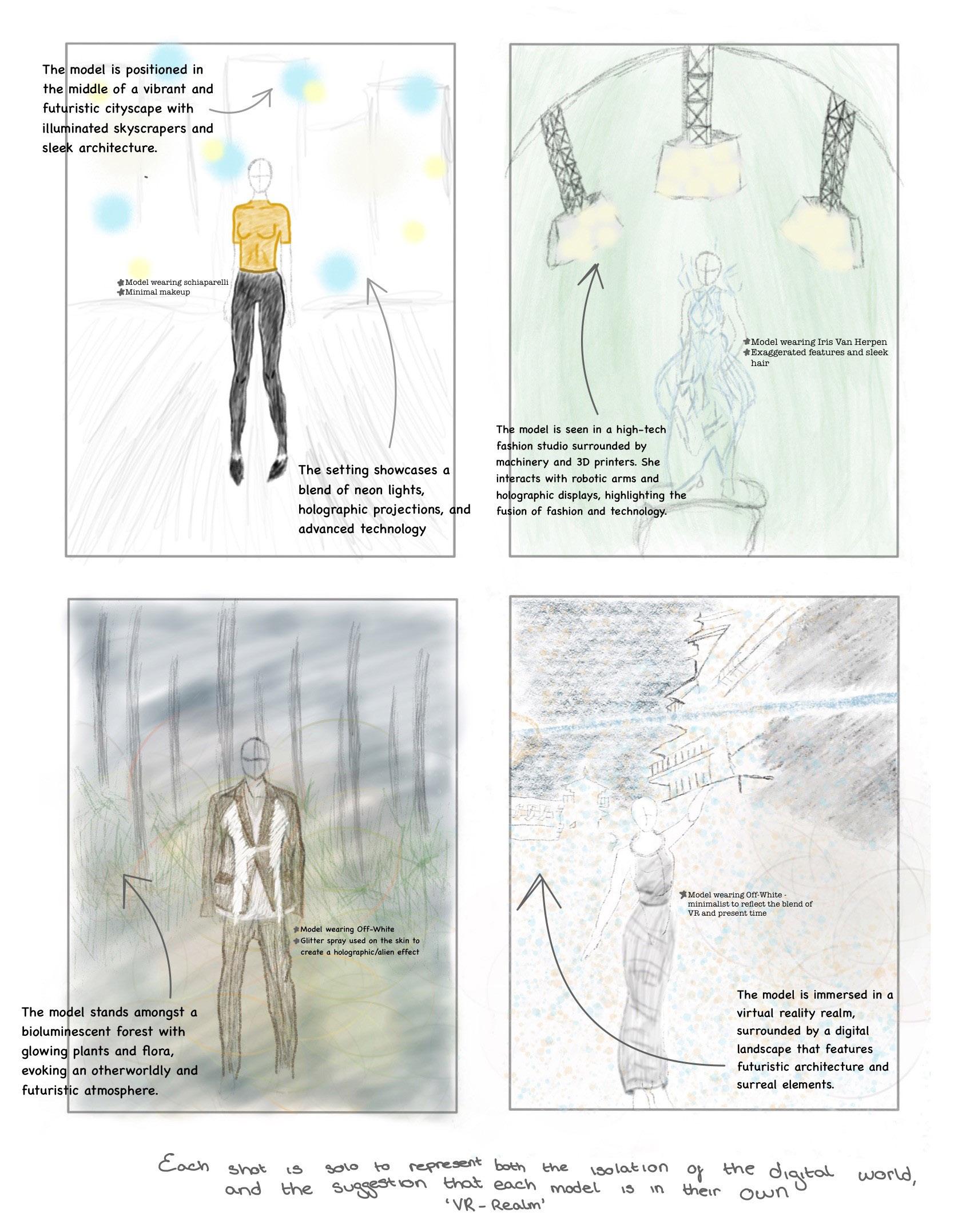
 ‘Heavy Oblique’ variant of the Futura font
Red: CMYK (0, 99, 97, 0) White: CMYK (0, 0, 0, 0)
Red represents power, passion, strength, and defiance
White represents simplicity, sophistication and freshness.
‘Heavy Oblique’ variant of the Futura font
Red: CMYK (0, 99, 97, 0) White: CMYK (0, 0, 0, 0)
Red represents power, passion, strength, and defiance
White represents simplicity, sophistication and freshness.

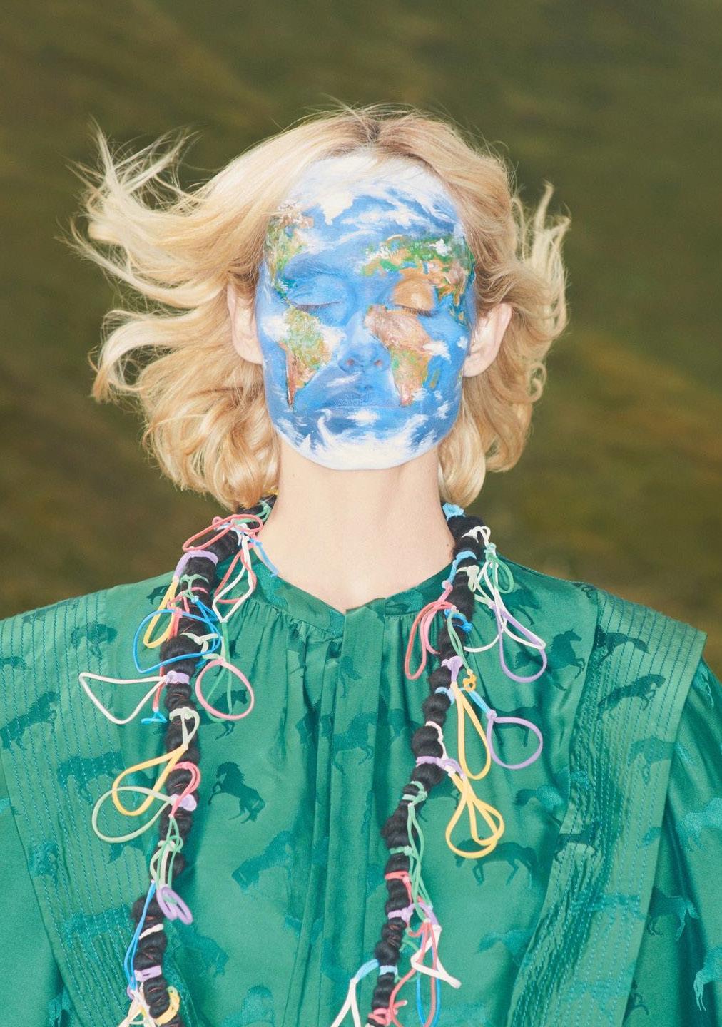
Stella McCartney is on a mission to ‘create luxury fashion that doesn’t compromise on desirability or sustainability’ (Stella McCartney, 2023), using omnichannel marketing to create engaging content for the consumer. Through McCartney’s Scotland campaign in 2017, they were able to demonstrate the brand values visually, addressing how they are advocates of circular fashion, using renewable materials and reducing waste. The promotional video for this aimed to highlight the toxic consumer culture within fashion by shooting at a Scottish Landfill, with models wearing products made from forest-friendly, recycled fabrics. The benefit of using visual communications is that they create a bigger emotional response from consumers from all demographics, not just those who are part of McCartney’s target market. Botha and Reyneke (2013) found that viewers who have emotional reactions to audiovisual content are more likely to share it, meaning that campaigns such as this can result in a bigger consumer response.
The omnichannel approach that the brand use doesn’t stay within the social media accounts, website or advertisements, with the London flagship store offering a multisensory experience that further embodies brand values. This includes cruelty free pink fur from previous collections is used to line the elevators and papier-mâché recycled from their office paper waste is used to create wall panels. This creates an ‘intersemiosis’ (Machin, 2014), as brand values are circulated throughout all functional aspects of the brand, embodying their sustainable mission.
Key components
The identity of a brand refers to the visible elements of a brand, including logo design, taglines and brand families, as well as being the main part that customers will connect to. This section of the report will discuss this in relation to Zara, the ‘flagship’ store of Inditex.
According to Rook (1985), consumers can think about brands as if they were celebrities and compare with how they relate to themselves, which in Zara’s case is with the creation of user imagery, serving as a symbolic or as a self-expressive function (Keller, 1993). Using Aaker’s (1997) brand personality model, Zara is seen to be a sophisticated brand, tapping into a dimension that customers desire but might not already have, giving aspirational associations such as glamour and style.
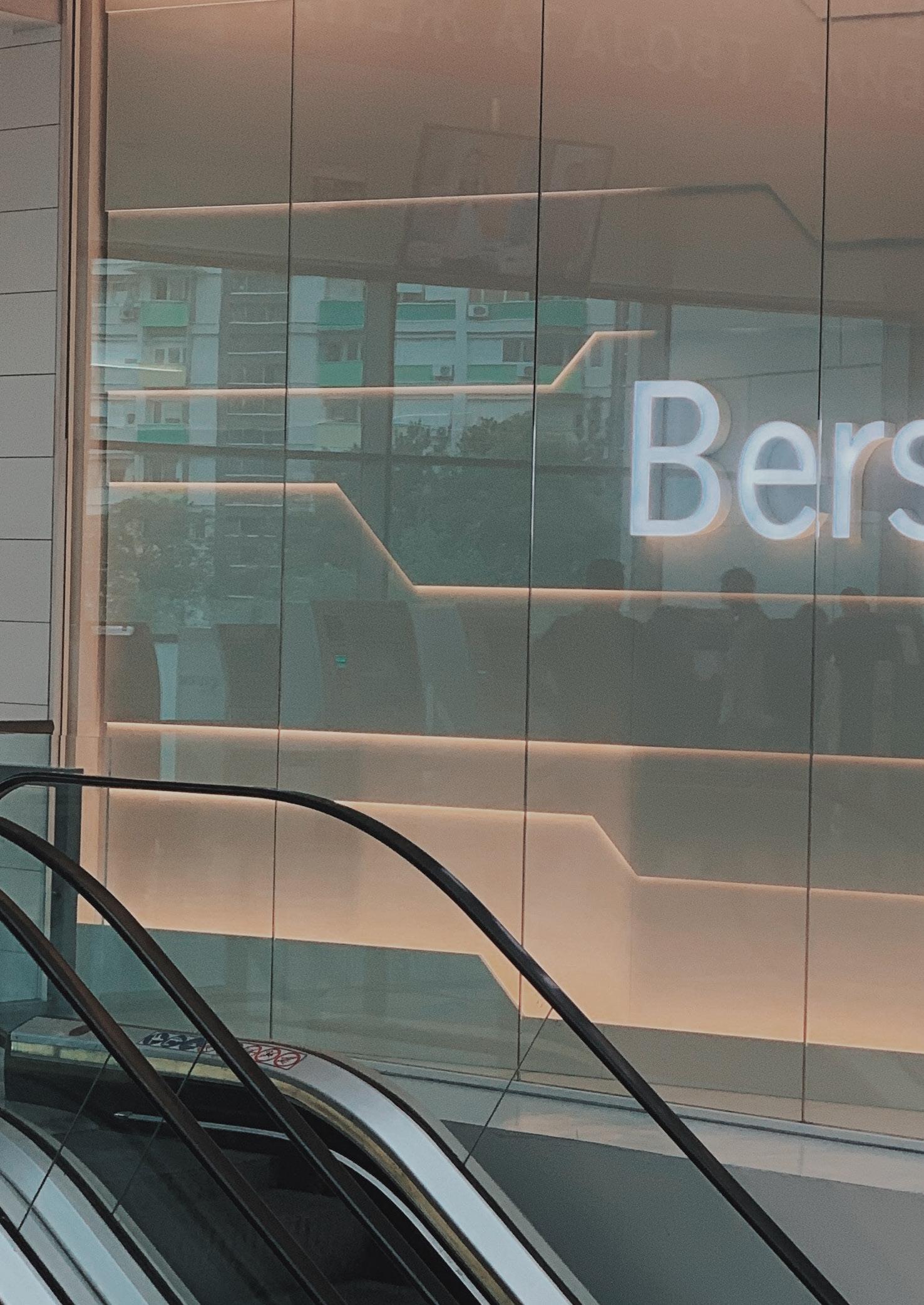
To adhere to this idea of sophistication, Zara’s logo is flexible and elegant, whilst still being able to adapt to the range of promotional items that it is used on. This appears to be a technique favoured by the ‘parent’ brand of Zara, Inditex, who own fashion brands such as Bershka, Pull & Bear and Stradivarius, who all feature a logo using wordmarks
(Slade-Brooking, 2016). This is a highly effective technique used by Inditex, as their wordmarks hold a lot of power, meaning stores such as Zara have minimal advertisements, and instead depend on their unique, elegant identity.
This also highlights a successful brand extension from Inditex, who were clearly able to understand how they are perceived by consumers. Creating brands such as Bershka and Pull & Bear allowed them to obtain a wider audience, whilst still retaining the aspirations of their flagship brand. This shows how Inditex have a strong communication strategy and are able to effectively express their brand identity.

With online content, information is produced differently, processed differently and accessed and navigated differently by the consumers. When reading on screens, people seem less inclined to engage and approach computers with a mind less conducive to learning (Jabr, 2013). This is highlighted in the 2006 Nielsen Norman Group study, which shows that consumers interact with content in an F-shaped pattern, scanning the information in order of perceived importance. Brands should therefore take this into consideration when designing their website to avoid important information being missed. This is particularly important as the landing page of a brand is often regarded as the first point of contact with customers, so should feature ease of navigation and a captivating web page design that portrays their brand identity (Siddiqui et al, 2003).
To appreciate the F-shaped pattern, brands should position important content on the left-hand side of a page to increase user engagement (Nielsen, 2006), this can include subheadings and links, as well as a dropdown menu. However, it is important to note that different things are required for different markets, with Arabic customers reading in a flipped F-shape pattern, and changes to webpage layouts based on responsive design.
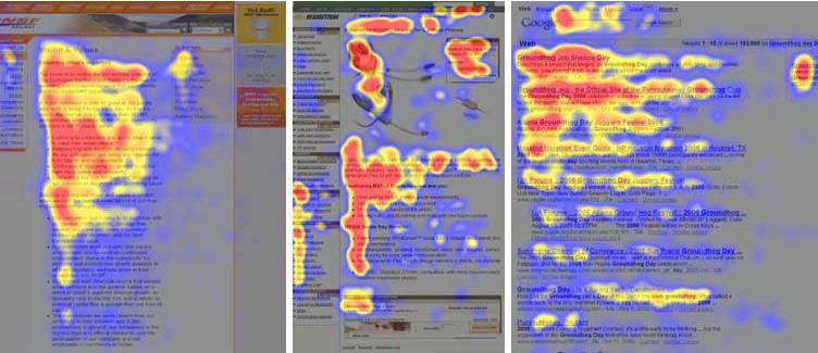 ‘F Shaped Pattern’, Nielsen Norman Group 2006
Not only should the F-shaped pattern be considered when optimising the landing page, as consumers are also looking for engaging content (Siddiqui et al, 2003). According to Vilardi 2020, a website’s aesthetic can influence many users’ purchasing decisions.

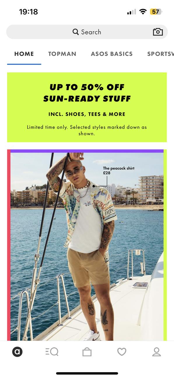
- Web Page utilising the F-shaped layout highlighting frop down menu on the top row, with engaging product and model shots and website information.
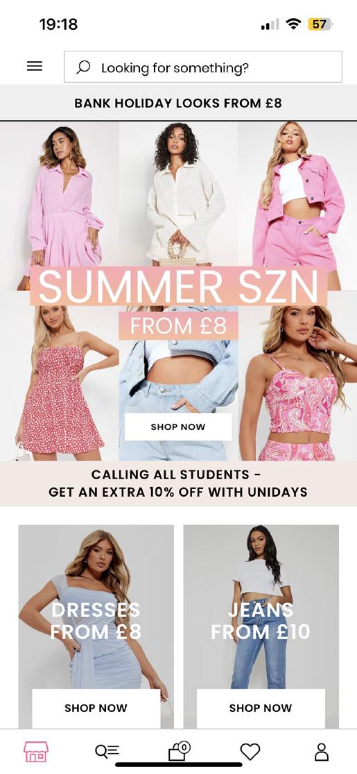
- This is also an example of how the F-shaped layout can change depending on the channel, as the optimisation of Asos’ app has the dropdown menu on the bottom.
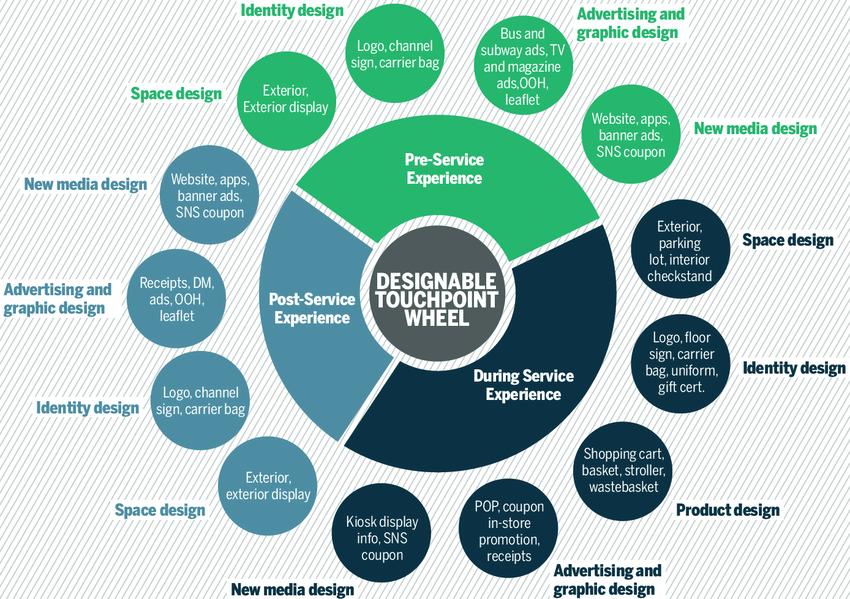
A way to communicate brand identity is through visual brand identity touchpoints, which are the points of contact between a brand and its consumers. For a fashion brand these touchpoints can include the architecture of the store, product design, identity design and media design, whilst communicating the brands personality and values. In order to have a cohesive experience, all the touchpoints should be integrated. A model that illustrates which touchpoints that customers should expect is the brand touchpoint wheel (Lee, Chung and Nam, 2013).
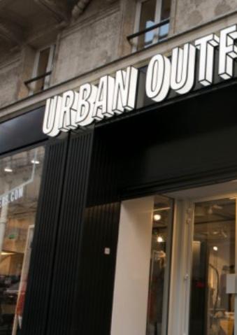
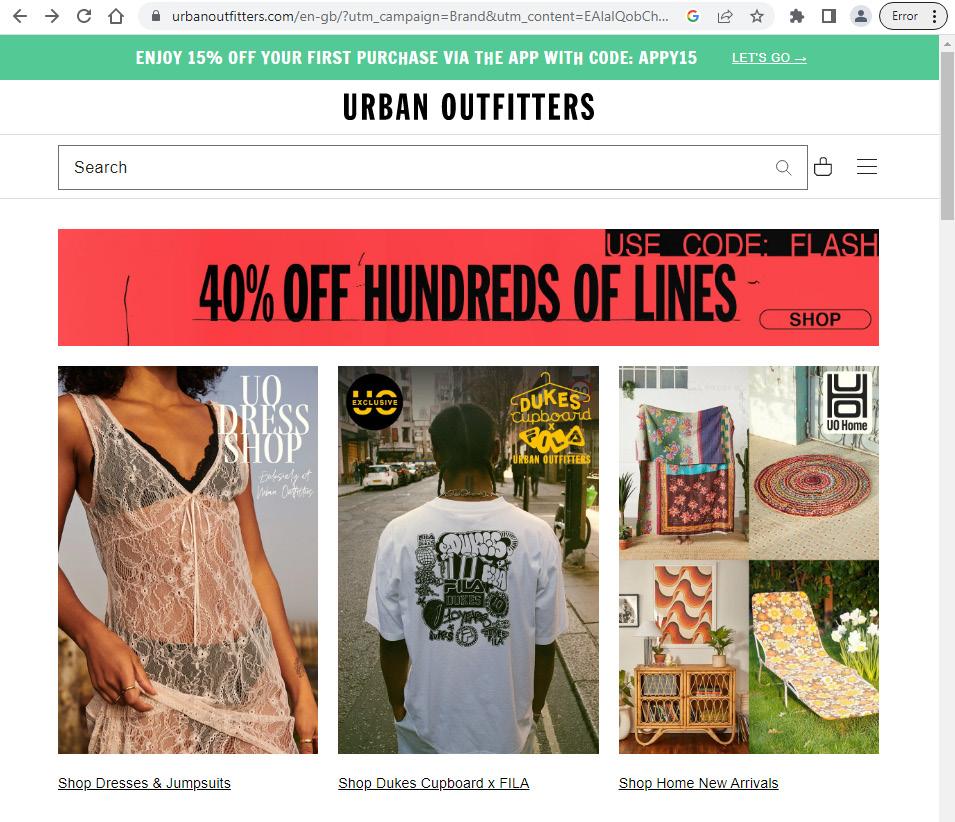
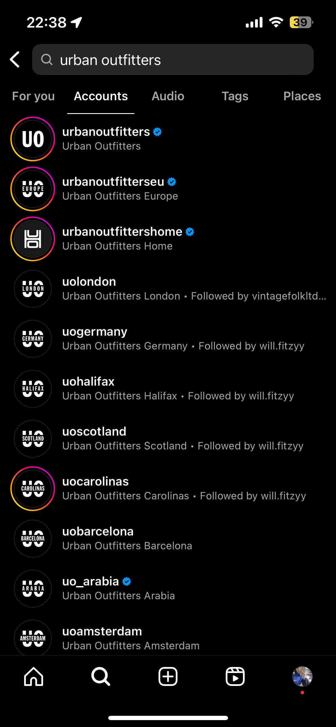
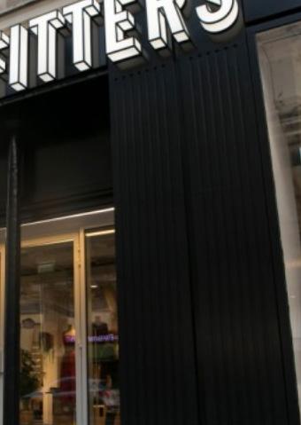
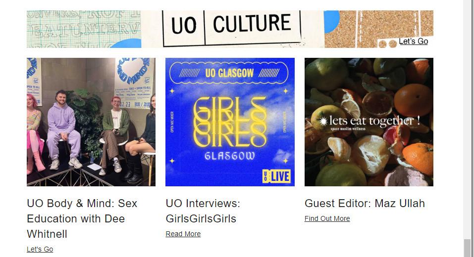
According to Siddiqui et al (2003), a webpage is regarded as the primary interaction for customers, and therefore should be representative of the identity that the brand is trying to portray. An example brand who successfully streamline their touchpoints with their values is Urban Outfitters. On their website the values state that they offer a curated mix of clothing and accessories, offer a place for likeminded individuals, represent community and offer inclusion through social media and events.
Slade-Brooking (2016) speaks about how customers now question the authenticity of brands who demand to know if they fulfil their promises, so by making tabs on their landing page synchronise with their values, Urban Outfitters can keep their level of trust with customers and exploit the online market (Siddiqui et al, 2003). With the addition of their experiential marketing, Urban Outfitters’ touchpoints work together in creating a well-rounded brand, communicating to the customer directly through their logo, social media channels and in-store experiences.
Landing page = clear women’s, men’s, accessories and home sections
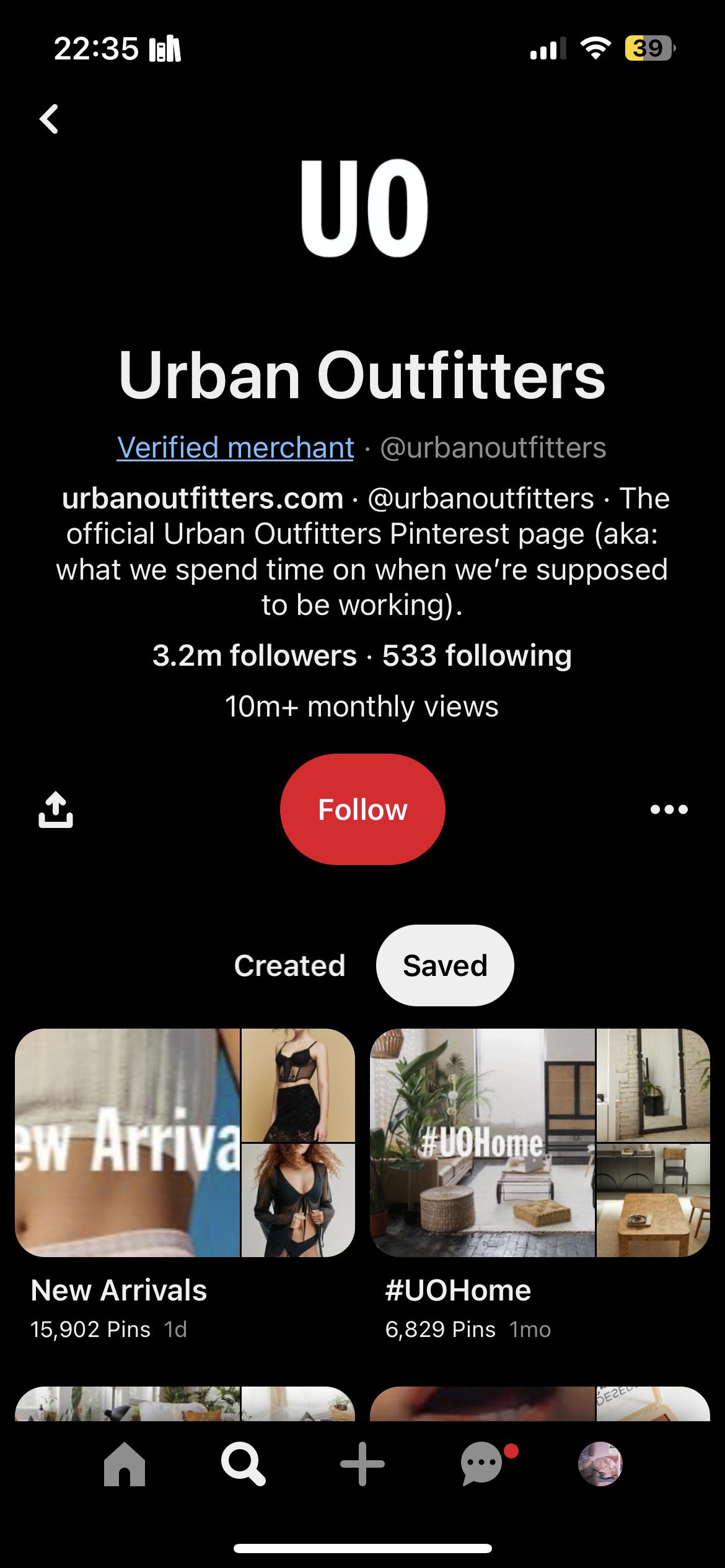
Experiential = omnichannel retail experiences: easy to navigate website and similar app; trendy, current and edgy stores which reflect their demographic ie. Playing popular music of their target audience; several Instagram accounts (UO general, UO Europe, UO London, UO home); pinterest account giving fashion ideas and tips; personalised email campaigns and many discounts for students
Place for likeminded creative individuals and community offering inclusion = website features guest editors, interviews with different members of the community highlighting new talent, features a physical and mental health community section
- Dense and feautures too much detail
- Broad advertising objectives
- Description of mandatory elements are too briefshould be displayed as a mood board or with examples given
The most common reason for a project’s failure is the lack of a coherent creative brief. This is due to the simple miscommunication that arises due to words having a different meaning to different people, yet this miscommunication with the client can be an extremely expensive mistake. The 3 main mistakes that can be found in a creative brief are: putting too much information onto the document, not asking the right questions to the customer and not including enough insights (Kit Altin, 2015, 0:46). These kinds of mistakes can not only be expensive, but can impact the identity of the brand. According to Aaker (1997), the personality of the brand are characteristics that a customer associates with the brand, so when producing a creative brief, the client needs to be mindful of how to best portray their personality and identity.
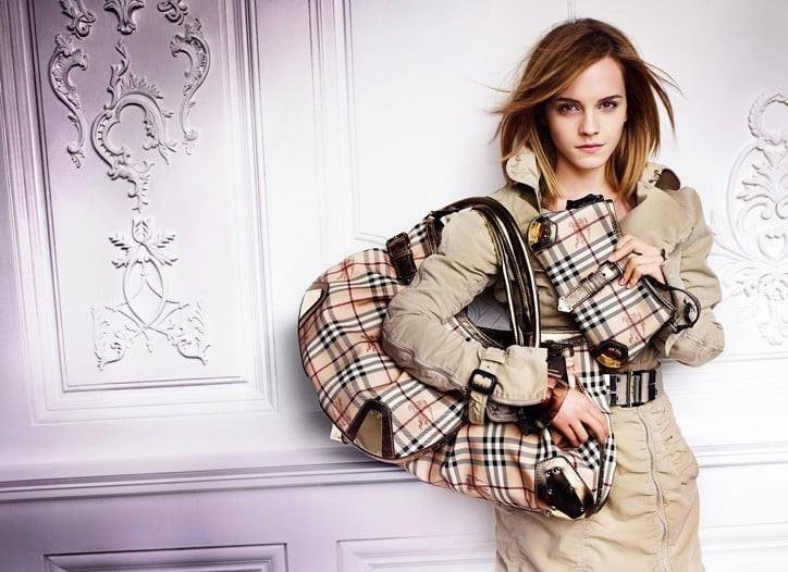
An example brand campaign is Burberry’s 2010 ‘Brit Girl’ campaign. The early 2000s, Burberry was synonymous with ‘chav’ culture in the UK (Day, 2004), yet their 2010 campaign can be seen as a way of trying to restore their brand identity, featuring actress Emma Watson. As Burberry’s authentic British heritage and image of quality and style had been damaged by working with supermodel Kate Moss (Day, 2004), the connotations of style, class and elegance of Emma Watson were highlighted in their Brit Girl campaign in an effort to remind customers of their brand identity.
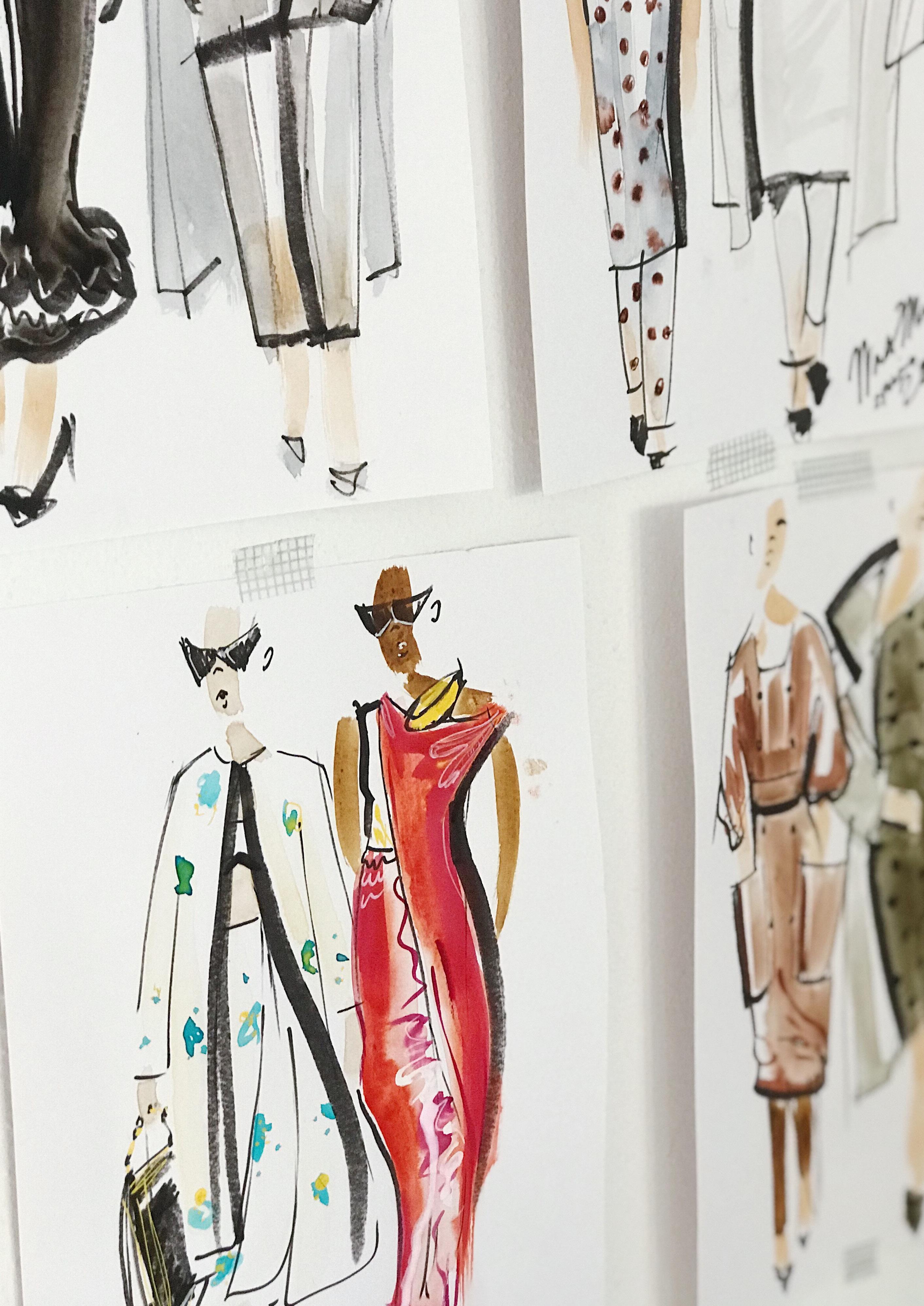
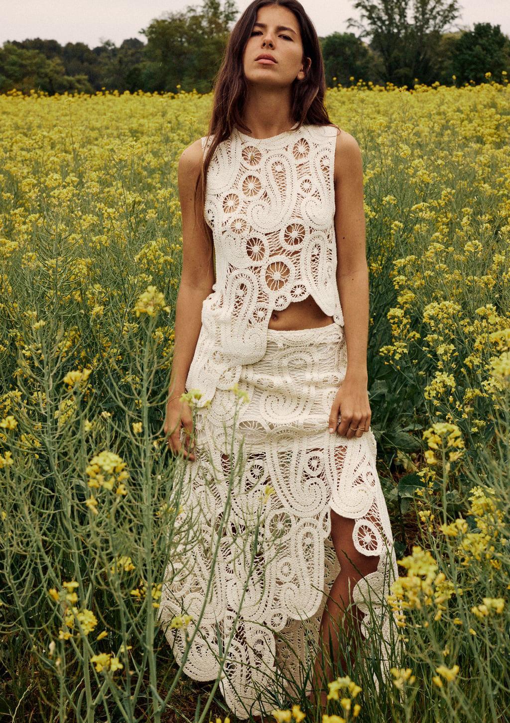
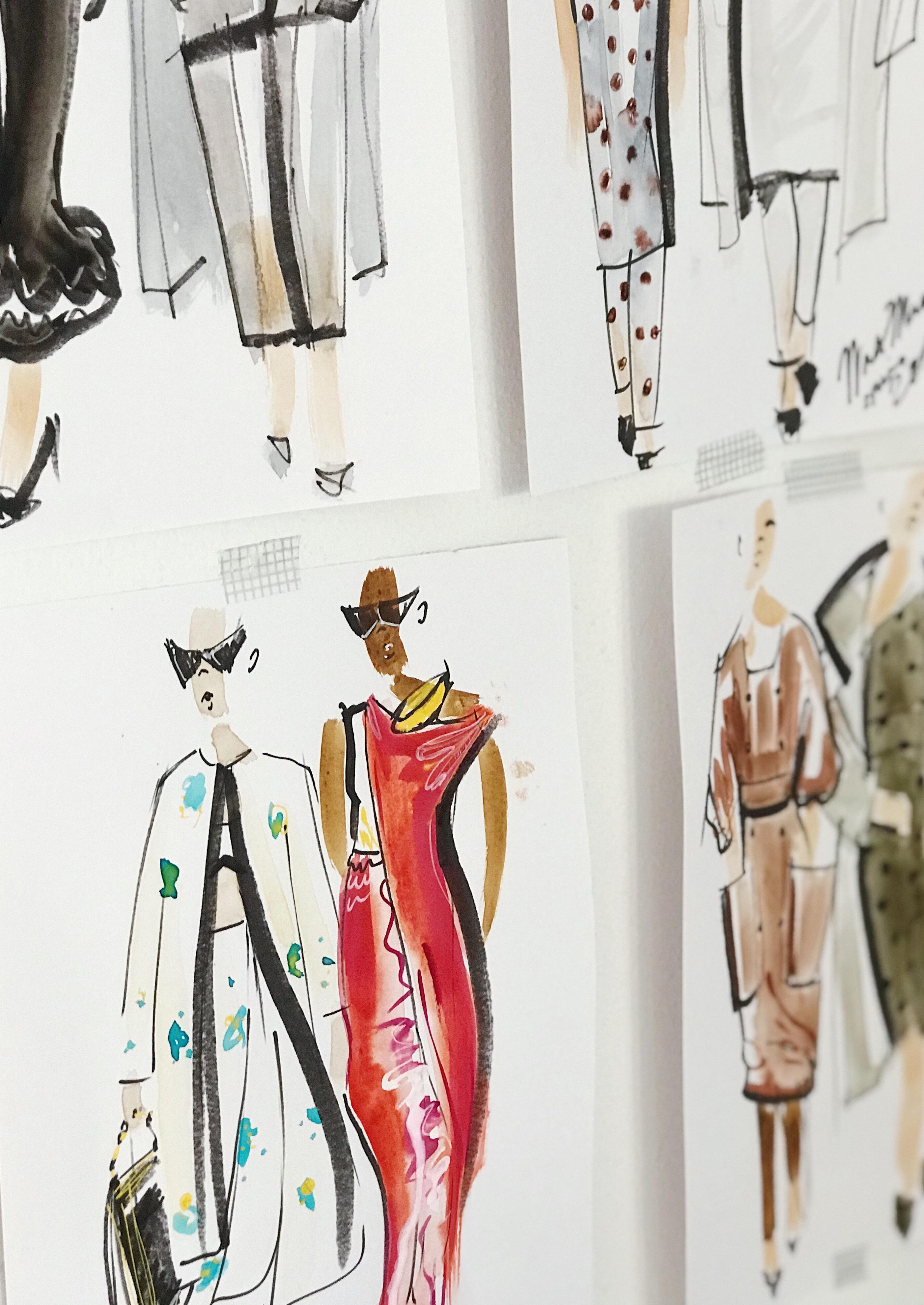
“Clothing is a part of our identity, and fashion provides an obvious means for presenting the self in the most favourable way” (Mair, 2018), stylists can achieve this through using the 3 main elements of styling. The first element, product, involves highlighting the aesthetics of the product being sold, in order to make them appear attractive to the customer (Pollanen et al, 2019). Products being styled in this way rely on visual marketing, using techniques such as flat lay to offer a top-down view of the product, as well as having minimal backgrounds and using shadows to make the product stand out. This can often be seen when selling accessories and items such as shoes.
The second element is stylistic, this also being editorial styling due to the highly constructed nature of the shoots. This type of styling is more often used for big campaigns, magazines or for high fashion/ haute couture collections. Whereas product styling is much more simplistic, stylistic aims to tell a story, this can be about the references and the inspiration. This is also a method of strengthening the brand identity, by using coherent visual concepts to increase the reach and visibility of products (Audaces.com).
 Product styling featured on Asos.com
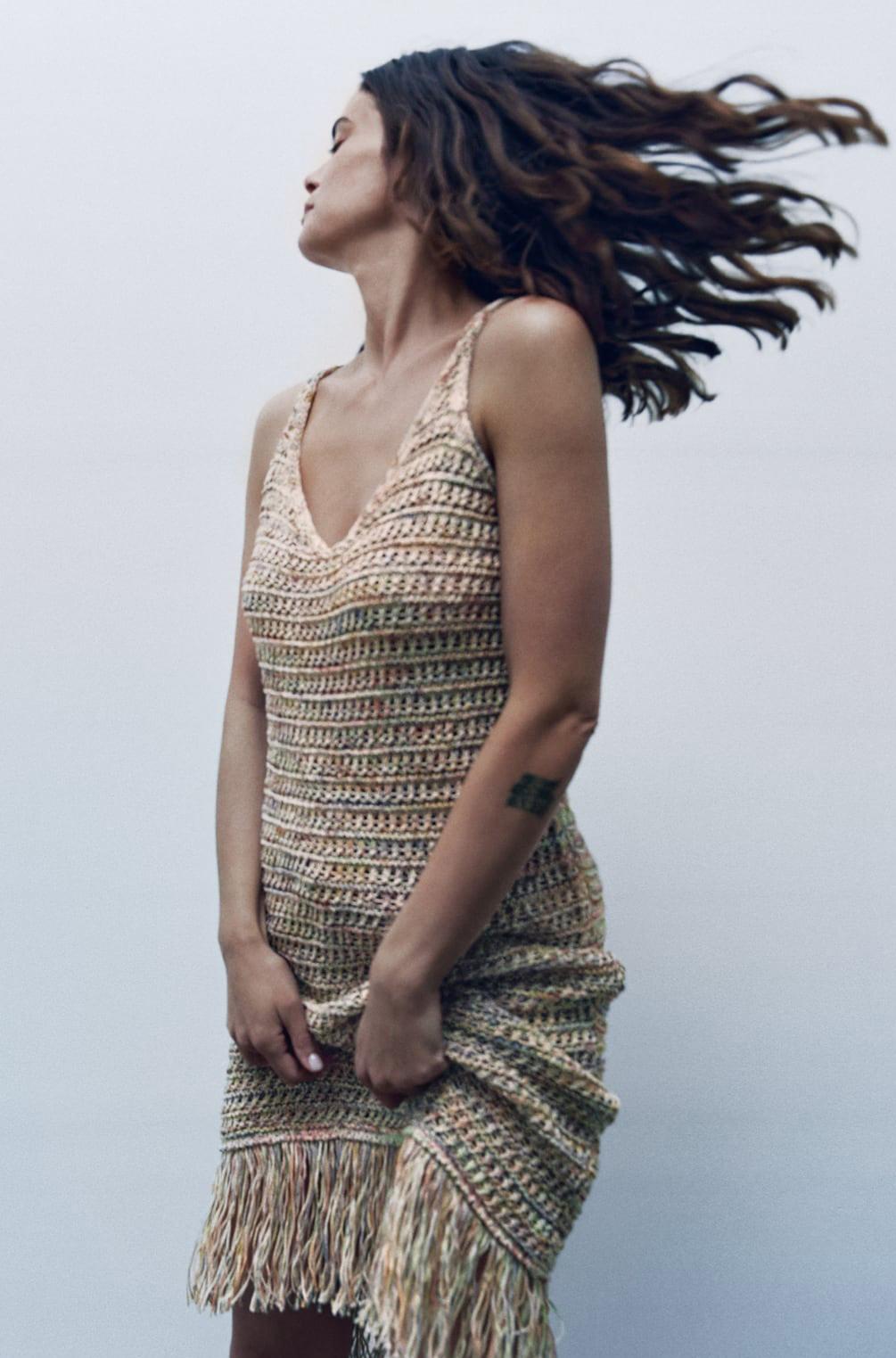
The final element is lifestyle, or aspirational styling. This element is particularly important as fashion provides a visual and easily accessible way to reflect self-expression and choosing how you want to be perceived, whether that’s individualism or belonging to a particular subculture (Mair, 2018). In this sense, aspirational styling features everyday looks with natural hair and makeup (Burns-Tran, Davis, 2018), making the looks easily imitable by customers who desire to embody/emulate a certain lifestyle.
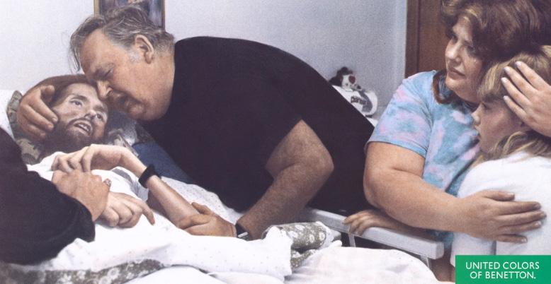
Oliviero Toscani is an Italian photographer and the brains behind photoshoots for brands such as Chanel, Fiorucci and Benetton who he worked with for 18 years. In his work for Benetton, Toscani has created many controversial campaigns on AIDS, the death penalty and women, with his images telling a story relating to the moment of history that he is in (Cochrane, 2017).
Pictured above is one of Oliviero’s pieces for Benneton which features gay activist and AIDs victim, David Kirby. Although the aim of this shoot was to bring awareness and stand in solidarity with AIDs victims, a topic at the time which was looked down on due to a lack of education and homophobic attitudes, groups of the public including gay rights activists called for a boycott of Benneton, with many claiming it spread fear and showed suffering as a commodity (Duffy, 2017). Although controversial, it was an extremely powerful move from Toscani, as throughout the 90s, AIDs was the leading cause of death for men between 25 and 44 (Duffy, 2017) but was still seen as dirty, so by publicising one victims story, they’re showing the LGBTQ+ community that they are seen and respected.
The role of controversy in fashion today is almost expected, with most Americans being exposed to around 4,000 to 10,000 adverts each day (Simpson, 2017), meaning that brands are fighting to stand out and catch their consumer ’s eye.
- New logo uses sans serif to align with the parent brand’s identity
- ‘Quirky’ design represents the fun, youthful nature of their Gen-Z target market
- Keeping the white space and bold lettering to remain with a strong presencve, but adding light shadow to further emphasis the name

- Use of orange tones represents happiness and warmth, reflecting the brand’s value as well as the customers
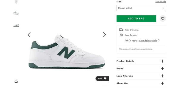
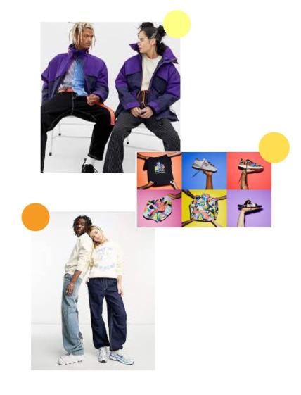
- Consider a gender neautral collection similar to the ones from Collusion and New balance (pictured)
- Keep the updated colour scheme in mind to create a collection of functional basics that show how fashion blurs gender restrictions
Branding essentially tells a story to the customer (Tungate, 2012), who the brand is, who they’re made for and why you should buy their clothes. Brands often have to ‘reinvent’ themselves, to reflect a new direction or respond to a new era in society. An example of this is Bottega Veneta’s transformation from a ‘heritage’ Italian brand into a luxury brand, ‘New Bottega’ (Sessoms, 2023).
differentiating the brand from the Inditex stable.
- Introduce a recycling scheme in store, similar to those seen at Lush and competitor H&M - Offer incentives such as £5 voucher for every bag donated or clothing sap events to pique the interest of the growing number of conscious consumers in the Gen-Z demographic
Bershka are part of the parent company Inditex, the company behind Zara, Bershka and Stradivarius to name a few. Although different in their target groups, their overall looks are reminiscent of each other, minimalist logos using a sans serif font and thick strokes, which, according to Saltz (2009), letters with a higher weight have a stronger presence, paired with the sophistication of white space on the logo (Tselentis, 2012), allows their name to stand out.
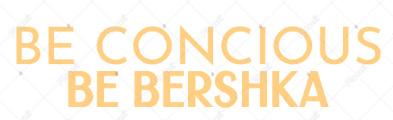
Despite this, the decision of many fast fashion rivals such as Primark, H&M and Monki to feature unembellished typefaces, the phrase ‘blanding’ (Pearl, 2023) comes to mind, blurring the lines of individuality from brand to brand. The aim of this section is to rebrand and transform Bershka’s image and differentiate them from its sister brands.
Aaker, J. (1997) Journal of Marketing Research. Dimensions of Brand Personality , 34 (3), pp. 347–356.
Anon (2011) The five principles of a good brief [Internet]. Available from https://www.independent. co.uk/news/business/sme/the-five-principles-of-a-good-brief-2347443.html. [Accessed 31st May 2023].
Anon (n.d.) 8 Major Fashion Rebrands to Know [Internet]. Available from https://www. lofficielusa.com/fashion/fashion-rebrands-designer-changes-burberry-gucci-saint-laurentceline. [Accessed 31st May 2023].
Anon (n.d.) About Us [Internet]. Available from https://www.urbn.com/our-brands/urbanoutfitters/about-us. [Accessed 31st May 2023].
Anon (n.d.) Our Commitments | Stella McCartney UK [Internet]. Available from https://www. stellamccartney.com/gb/en/sustainability/our-commitments.html. [Accessed 31st May 2023].
Audaces (2022) How to produce a fashion editorial – Audaces complete guide. Available from https://audaces.com/en/blog/fashion-editorial. [Accessed 31st May 2023].
Best, J. ed. (2017) Colour design: theories and applications. Second Edition ed. The Textile Institute book series. Cambridge, MA, Elsevier.
Bluedrop (2020) Brand Personality vs Brand Identity. Available from https://medium.com/@ wearebluedrop/brand-personality-vs-brand-identity-fd3b5008462f.
BURNS-TRAN, S. (2018) STYLE WISE + STUDIO ACCESS CARD. Place of publication not identified, FAIRCHILD Books.
Chakraborty, S., Hoque, M.S., Rahman Jeem, N., Biswas, M.C., Bardhan, D. and Lobaton, E. (2021) Fashion Recommendation Systems, Models and Methods: A Review. Informatics [Post-print], 8 (3), p. 49. Available from https://www.mdpi.com/2227-9709/8/3/49. [Accessed 31st May 2023].
Cochrane, L. (2017) Benetton’s controversial art director Oliviero Toscani returns. The Guardian [Internet], 30th November. Available from https://www.theguardian.com/fashion/2017/nov/30/ benettons-controversial-art-director-oliviero-toscani-returns. [Accessed 31st May 2023].
Day, J. (2004) Burberry doffs its cap to ‘chavs’. The Guardian [Internet], November. Available from https://www.theguardian.com/media/2004/nov/01/marketingandpr. [Accessed 31st May 2023].
Experience, W.L. in R.-B.U. (n.d.) F-Shaped Pattern of Reading on the Web: Misunderstood, But Still Relevant (Even on Mobile) [Internet]. Available from https:// www.nngroup.com/articles/f-shaped-pattern-reading-web-content/. [Accessed 31st May 2023].
Haley, A. ed. (2012) Typography, referenced: a comprehensive visual guide to the language, history, and practice of typography. Beverly, MA, Rockport Publishers.
Jabr, F. (n.d.) The Reading Brain in the Digital Age: The Science of Paper versus Screens [Internet]. Available from https://www.scientificamerican.com/article/reading-paper-
1st November. Available from https://www.theguardian.com/media/2004/nov/01/marketingandpr. [Accessed 31st May 2023].
Experience, W.L. in R.-B.U. (n.d.) F-Shaped Pattern of Reading on the Web: Misunderstood, But Still Relevant (Even on Mobile) [Internet]. Available from https://www. nngroup.com/articles/f-shaped-pattern-reading-web-content/. [Accessed 31st May 2023].
Haley, A. ed. (2012) Typography, referenced: a comprehensive visual guide to the language, history, and practice of typography. Beverly, MA, Rockport Publishers.
Jabr, F. (n.d.) The Reading Brain in the Digital Age: The Science of Paper versus Screens [Internet]. Available from https://www.scientificamerican.com/article/reading-paper-screens/. [Accessed 31st May 2023].
Kang, J., Hong, S. and Hubbard, G.T. (2020) The role of storytelling in advertising: Consumer emotion, narrative engagement level, and word‐of‐mouth intention. Journal of Consumer Behaviour [Post-print], 19 (1), pp. 47–56. Available from https:// onlinelibrary.wiley.com/doi/10.1002/cb.1793. [Accessed 31st May 2023].
Lee, K., Chung, K. and Nam, K.-Y. (2013) Orchestrating Designable Touchpoints for Service Businesses. Design Management Review [Post-print], 24 (3), pp. 14–21. Available from https://onlinelibrary.wiley.com/doi/10.1111/drev.10246. [Accessed 31st May 2023].
Machin, D. ed. (2014) Visual communication. Berlin, De Gruyter Mouton.
Mair, C. (2018) The Psychology of Fashion. London, Routledge.
Nast, C. (2010) Brit Girl [Internet]. Available from https://www.vogue.co.uk/article/ burberrys-new-campaign-with-emma-watson. [Accessed 31st May 2023].
Nast, C. (2017) Benetton’s Most Controversial Campaigns [Internet]. Available from https://www.vogue.co.uk/gallery/benettons-best-advertising-campaigns. [Accessed 31st May 2023].
Paulins, V.A. and Hillery, J.L. (2009) Ethics in the fashion industry. New York, NY, Fairchild Publications.
Pöllänen, S., Parkko, M. and Kaipainen, M. (2019) Conceptualizing fashion styling. Fashion, Style & Popular Culture [Post-print], 6 (3), pp. 369–387. Available from https://intellectdiscover.com/content/journals/10.1386/fspc.6.3.369_1. [Accessed 31st May 2023].
Saltz, I. (2009) Typography essentials: 100 design principles for working with type. Beverly, Mass, Rockport Publishers.
Siddiqui, N., O’Malley, A., McColl, J.C. and Birtwistle, G. (2003) Retailer and consumer perceptions of online fashion retailers: Web site design issues. Journal of Fashion Marketing and Management: An International Journal [Post-print], 7 (4), pp. 345–355. Available from https://www.emerald.com/insight/content/ doi/10.1108/13612020310496949/full/html. [Accessed 31st May 2023].
Simpson, J. (n.d.) Council Post: Finding Brand Success In The Digital World [Internet]. Available from https://www.forbes.com/sites/forbesagencycouncil/2017/08/25/ finding-brand-success-in-the-digital-world/. [Accessed 31st May 2023]. Slade-Brooking, C. (2016) Creating a brand identity: a guide for designers. London, Laurence King Publishing.
Tungate, M. (2008) Fashion brands: branding style from Armani to Zara. 2nd ed ed. London ; Philadelphia, Kogan Page.