Statement of Intent
Hi GD+I Faculty,
I have always loved drawing and creating art –both digitally and on paper. As a Studio Art and Neuroscience double major, I’m fascinated by how we see and process visuals, and how design can connect with people on both a cognitive and emotional level.
Taking ARTS 102 this semester has shown me how much more I enjoy design than I initially anticipated. I’ve learned so much already – from
using design tools to thinking more intentionally about layout, color, and storytelling – and I’d love to keep building those skills.
I’m not exactly sure what path I’ll take yet, but I know I want graphic design to be part of it. This program would help me grow as a designer, connect my creative and academic interests, and open up more ways to explore what I love.
Introduction
Hi!
I’m Maja Jerzmanowska, a freshman from Clemson, SC double majoring in Neuroscience and Studio Art. I love creating, observing, and learning about art in all its forms. This semester, I’ve really enjoyed ARTS 102 – it’s deepened my appreciation for design and made me even more excited about the possibility of continuing in the GD+I program.
I hope you enjoy looking through my process journal as much as I enjoyed creating each piece!
Project1
Overview
Project 1 was a pleasant surprise. We are used to being told not to use AI, but it was fun to test its capabilities. However, I did discover that generating AI prompts can be quite the talent—one that I am not yet very skilled at. I wouldn’t say I struggled greatly, but AI definitely never gave me my desired image, no matter how I phrased it. The six-word memoirs were enjoyable, even if they were somewhat cheesy. They helped me think in the simplest terms because you don’t want your designs to be overloaded with words, making them unappealing or overwhelming for others to read or look at.
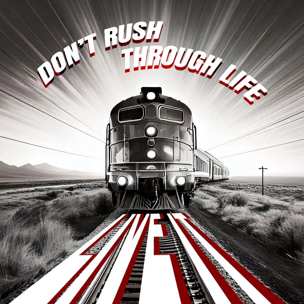
For #1___ it took me a lot longer to get my desired image and end result. I tried many prompts that would angle the rain from the side. I wanted it to be sketched, black and white, with lines that I could place my words along, as if they were moving fast with the train. Unfortunately, AI Copilot had different plans. I settled for
the train visible here, which emphasizes some lines showing its “speed,” so I could add words with some dynamics to them. I used the red drop shadow to make the words pop from the already greyscale picture. I hoped the message is like “stopping the train,” which symbolizes a rushed life – something we should try and avoid.
For #2___ the picture came easily, yet it was not at all what I was looking for. I had originally hoped when I typed “___” it would give me an open and vast field, yet I ended up with this— and it felt that much more perfect. A ship truly lost in the middle of nowhere. The message is to continue past the feeling of being lost. I don’t mean it in the physical sense of not knowing your location, but in your life – if you feel you do not know what you are doing, keep going, explore more, get more lost so you can find what it is you want.

Caption Example— It was the best of times, it was the
Caption Example— It was the best of times, it was the
Project
2
Overview
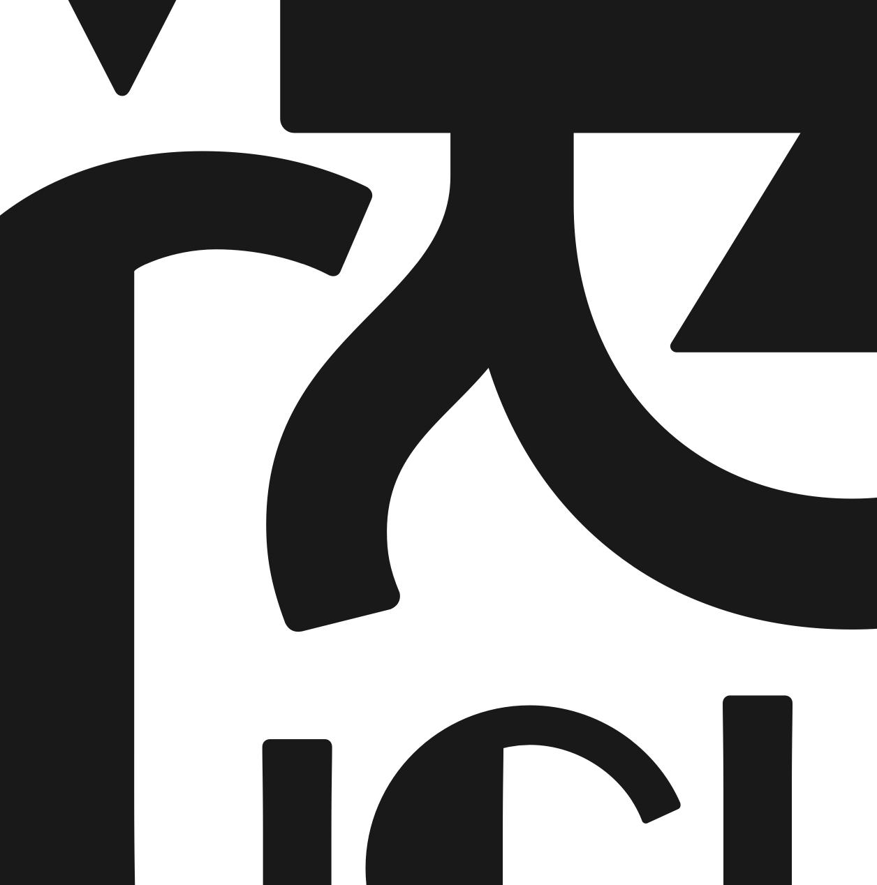
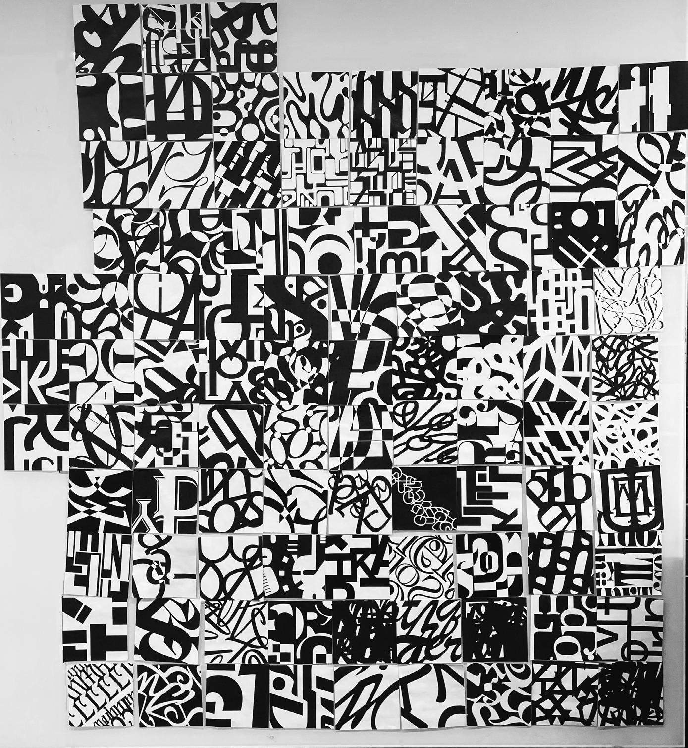
Project 2 was interesting because I had never done something like this before. While it was creative and required personal direction, it was also somewhat limiting due to the constraints of the letter shapes. Navigating these limitations
was an interesting challenge that I did not expect. Having to focus on the shapes and curves that the letters make is something I really had to focus on so that I would not make the letters visible.


Project 2 Process Details
Details
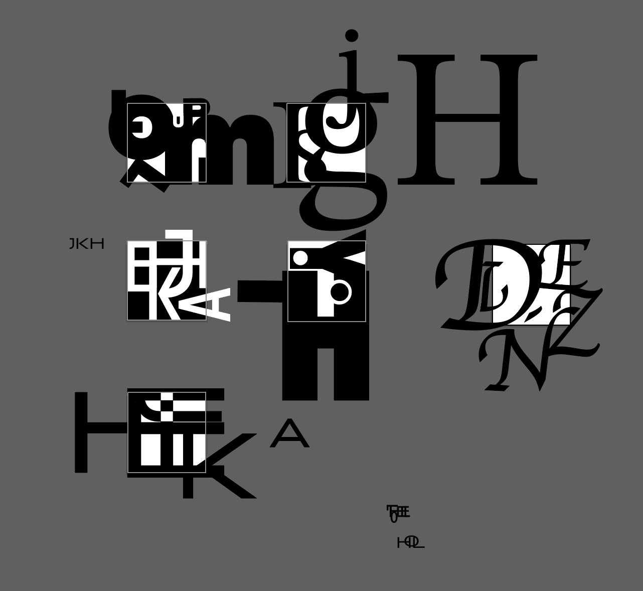
With Project 2, my initial thought was that the solution was just to find a fun font – because if the letters were shaped in interesting ways, they’d do all the work. I was surprised to find that simply placing the letters didn’t have much of an effect. It took a lot of trial and error to realize that I needed to focus on creating shapes from and between the letters – something totally new.
This process helped me understand that what I’m really trying to show is the uniqueness of the type itself. I need to design the artboards in a way that highlights the specific qualities of the font – creating shapes that only that font could make. Because of that, I leaned toward using letters with more distinct forms, like “K” and “J,” and stayed away from simpler ones like “I” and “L.”
Project
Project 3
Overview
In the beginning, everything was smooth sailing – it didn’t take me too long to come up with ideas, and even refining the drafts of my designs wasn’t too difficult. However, my biggest challenge was learning how to navigate InDesign. Another issue, which I didn’t really foresee, was
arranging the words in the quote. Simply placing it on the side didn’t look great, and even when I rearranged the letters and changed their sizes, it still wasn’t working. I ended up adjusting the size and color while experimenting with InDesign’s tools.
—
Carl Jung


Project 3 Process Details
Details
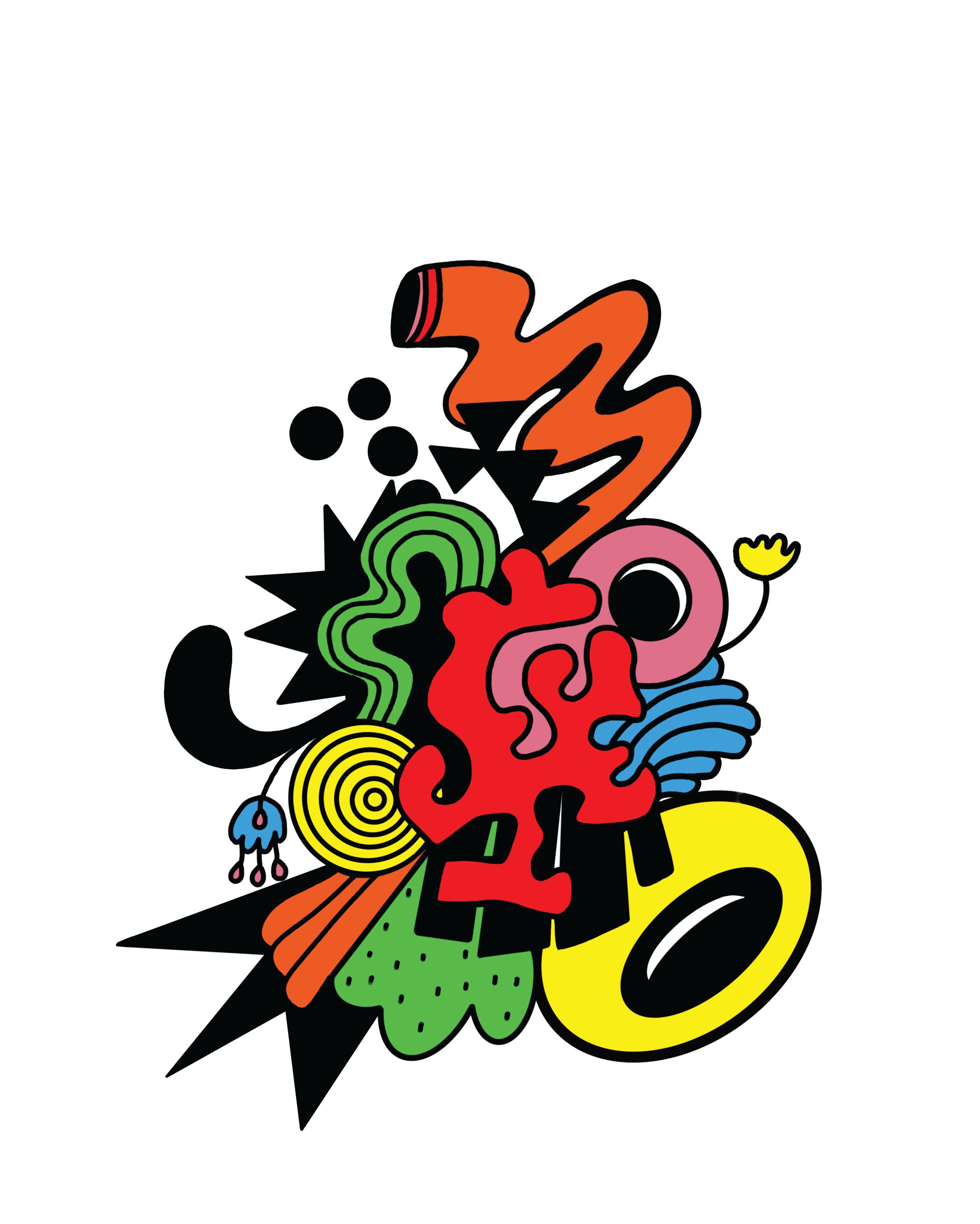
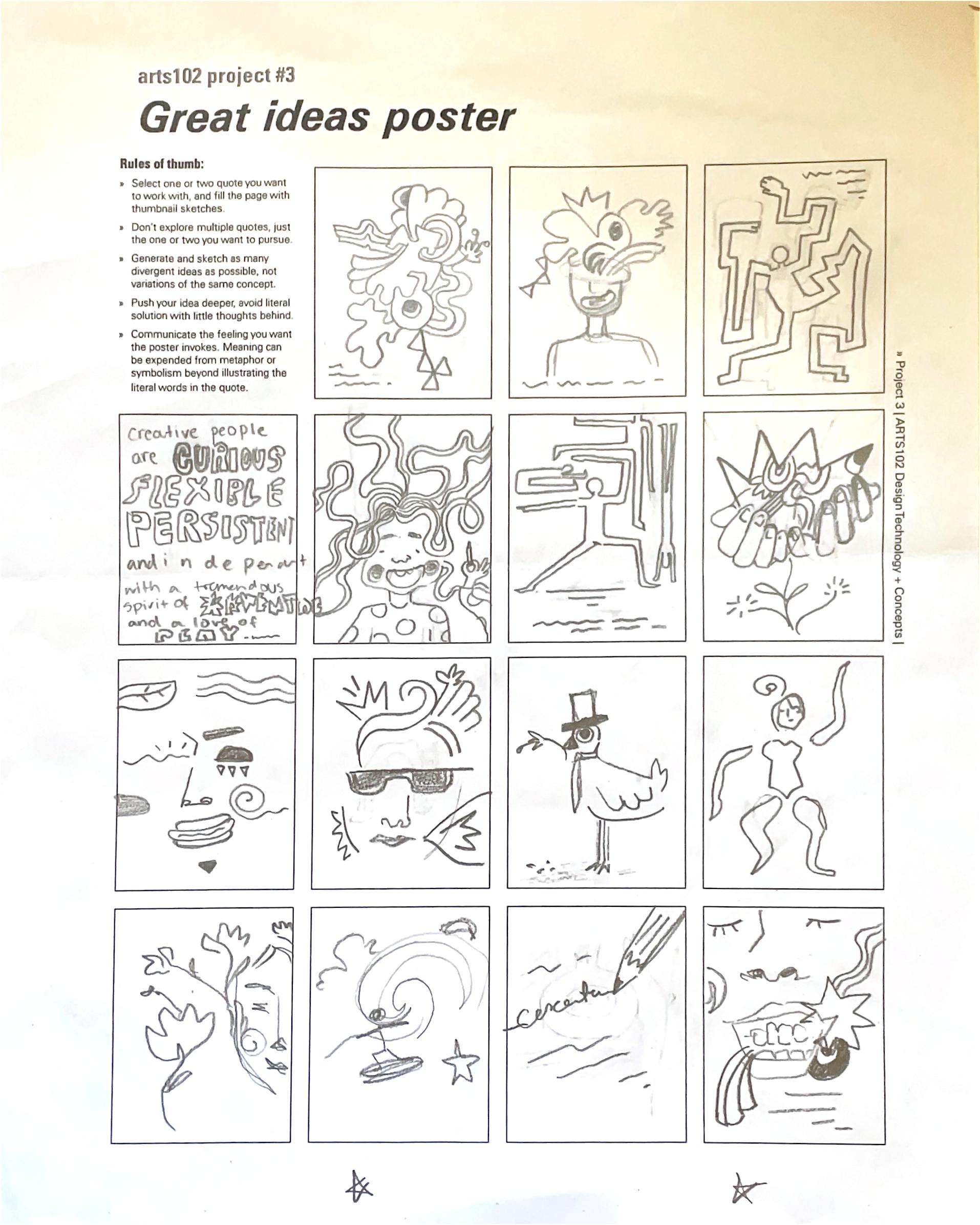
Project 3 was my favorite – I had a lot of fun experimenting and working through different trial-and-error moments. I started by choosing a quote I could approach more abstractly. Once I had one that felt flexible, I began sketching ideas in the thumbnails ___.
At the time, I was really into doodling random splats, lines, and weird shapes that all connected together. That style felt like a perfect match for the quote – playful, bold, creative, and kind of chaotic, which is exactly what the illustration became.
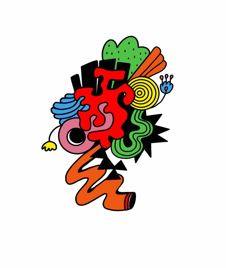
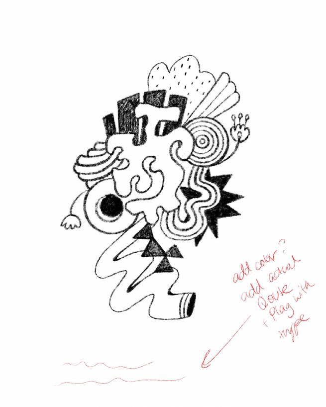
I first pulled from doodles in the margins of my planner, then moved into Procreate to make it digital ___. Like most of my pieces, I started in black and white, but it felt flat — so I added color. That’s when it really started to come to life. I shifted to a more bold, graphic look using thick lines and high-opacity colors ___.
Then came the text. I started with black, of course, but it didn’t work. I needed a bold font to match the graphic, but it still felt dull. So I experimented with color and curves to make the typography more engaging. Still, it wasn’t quite there. After feedback from Prof. Chi, I tried zooming into the graphic and placing it in the corner instead of the center. To balance it out, I added more doodles and flipped the design, which helped the type feel more integrated. Adding a drop shadow to the text also helped tie everything together visually.
___ was the version I submitted to class, but after getting more feedback, I made final tweaks. The text was too crowded, so I spaced it out for better legibility – and that’s how I landed on the final version.
Project
Project
Overview
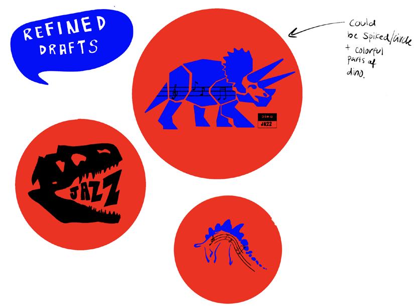
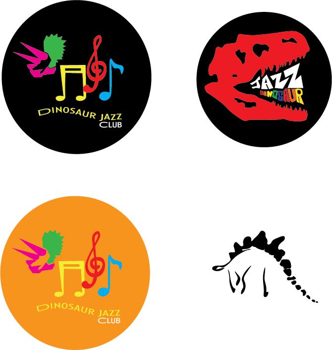
In this project, we worked on creating logos while being constrained by the name of the brand. Mine was “Jazz Dinosaur.” It is obviously quite an unconventional brand name; however, I appreciated its playfulness, so I tried to make it into a fun jazz bar logo. I wanted to use many more colors, but again, we were working with constraints, just as it would be with clients, and
I had to restrict my color palette to three colors. The main difficulty I initially had was making the designs simple. I love little details, so this made me work outside of my comfort zone to simplify the designs. I found it to be a great exercise to learn about design, but also about working with clients. I still feel I could improve a lot with it.
Project 4 Process Details
Details
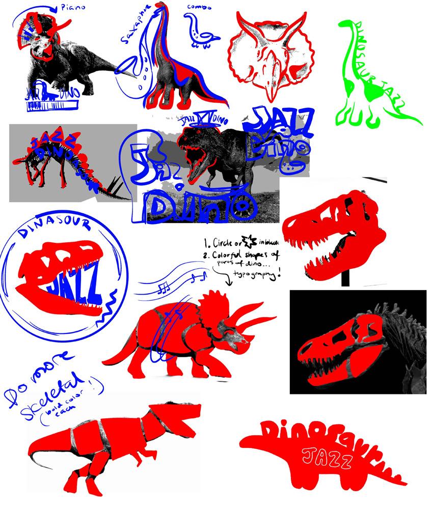
When I was first assigned “Jazz Dinosaur,” I was a little unsure – what kind of brand would even have that name? But since “jazz” was in the title, I knew it had to be something musical. Still, combining that with a dinosaur (which instantly made me think of kids) meant I needed a playful twist, even though the setting – a jazz club –would be for adults. I wanted to use bold, bright colors but still keep things sophisticated.
At first, I played with dinosaur shapes and tried integrating instruments into their forms, but nothing really clicked. I liked the idea of a side-profile skull – its shape felt right for a logo and offered a fun way to play with typography.
For my second option, I started with a more blocky version based on shapes from the ___, but it was too detailed. It also lacked strong musical elements (ADD PICS?). I tried adding mu-
sical notes inside the dinosaur, but zoomed out, the details disappeared. Then I had the idea to use the notes as part of the body – they became perfect as legs.
To keep a “classic” feel, I used primary colors. I submitted ___ as my final, but after reviewing it and getting feedback, I noticed some things were off. The colors felt too bright, the black background made it look like a sticker, and the head didn’t match the body – it was still in the more detailed, structured style of the original draft.
So I revised it: toned down the colors, removed the black background, and reworked the head to be more curvy and playful instead of rigid. I also updated the typography so that “Jazz Dinosaur” stood out more than “Club.”
Project
Project 5
Overview
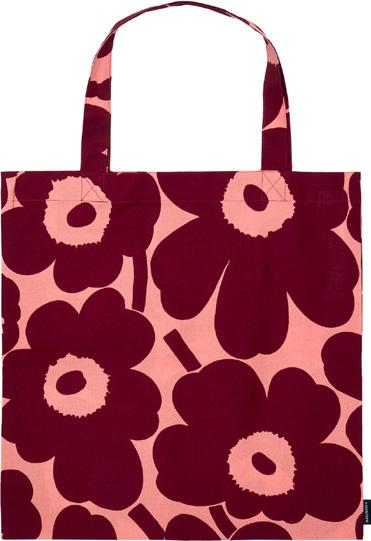
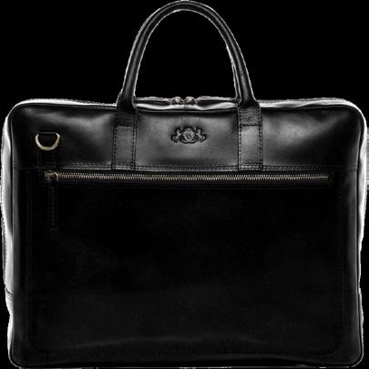
Project 5, was a pretty simple project, yet I learned a lot about the mechanics of InDesign that I hadn’t known before. The hardest part of this project was probably choosing which objects to use. I was torn between many different options, ranging from cars to lamps to guitars,
but ultimately, I chose bags because I loved the endless possibilities of their designs. Even though we were restricted to finding different types of bags, I really love tote bags with fun and bold prints. Despite its simplicity, this project taught me a lot.


SEMANTICS: DENOTATION (specified) Bag > Reusable Bag > Whole Foods Grocery Bag
SEMANTICS: EXPRESSION (feelings) Flimsy, Patterned, Practical
SEMANTICS: CONNOTATION (associations) People in the grocery store
PRESENCE (contextual)
SEMANTICS: DENOTATION (specified) Bag > Clutch > Fancy Party clutch
SEMANTICS: EXPRESSION (feelings) Expensive, Fancy, Elegant
SEMANTICS: CONNOTATION (associations) A formal event where people are very fancy
PRESENCE (contextual) Lots: At the park Little: At a restaurant or dance
SEMANTICS: DENOTATION (specified) Bag > Reusable Bag > Marimekko Tote
SEMANTICS: EXPRESSION (feelings) Flexible, Bold, Cute
SEMANTICS: CONNOTATION (associations) Creative and Fashionable people
PRESENCE (contextual) Lots: In a professional office Little: In a coffee shop
SEMANTICS: DENOTATION (specified) Bag > Reusable Bag > Brief Case
SEMANTICS: EXPRESSION (feelings) Sturdy, Simple, Classic
SEMANTICS: CONNOTATION (associations) Professors, Office Works, Business Owners
PRESENCE (contextual)
Lots: In a
Project
Project 6
Overview
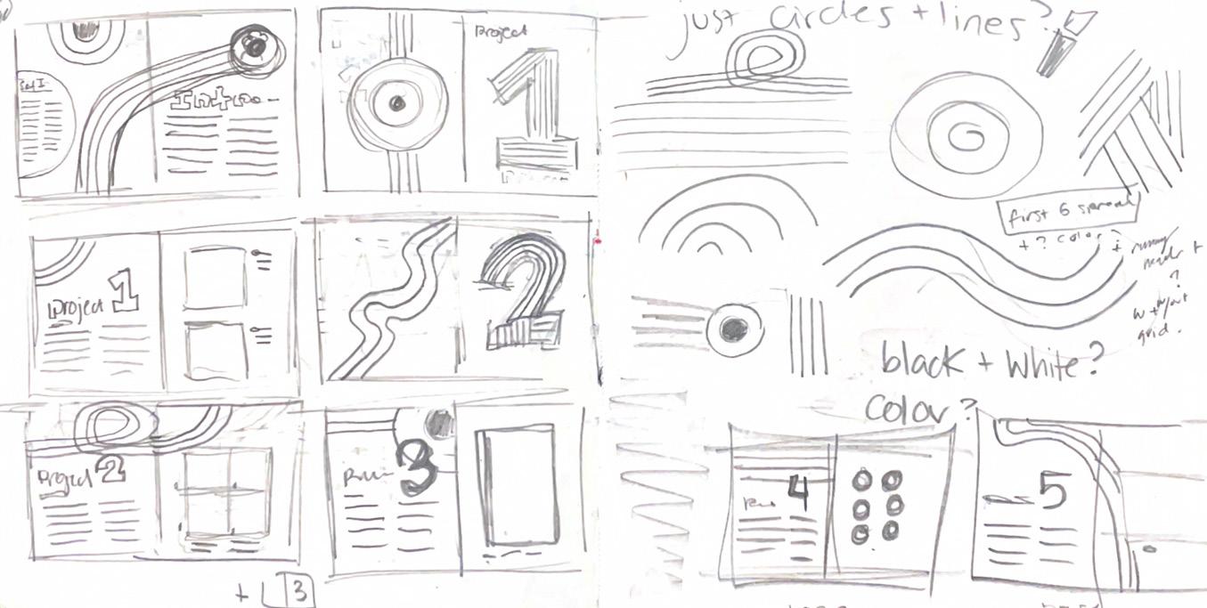
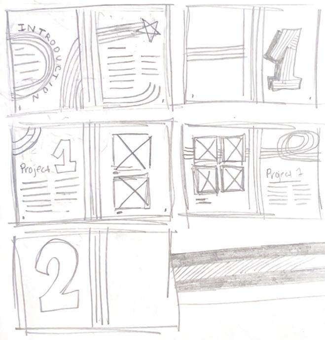
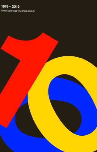
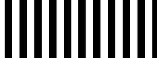
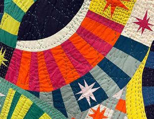
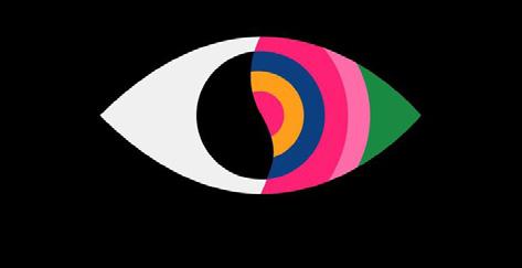
Project 6 was definitely the most daunting of all the projects – but also the one I learned the most from. I struggled most with making sure the journal didn’t overpower the actual art pieces. As I’ve mentioned before, I love bold colors, patterns, and lots of detail – which shows in some of my past projects and my moodboard. But once I finished the moodboard, I realized that using it as-is would overwhelm the work instead of supporting it.
So I decided to pull elements from it rather than taking it as full inspiration. Even then, I still had a hard time scaling back – balancing design and
color so that the journal supported the artwork instead of competing with it. I also realized I wasn’t as confident in InDesign as I needed to be to achieve the look I was going for. There’s still so much I want to learn about the program.
For a large part of the process, I wasn’t proud of what I was making – and honestly, it’s still not one of my favorites. But I’m grateful for how much I learned from it. It showed me exactly where I need to grow, and gave me experience that will help me make stronger design choices moving forward.




Course reflection:
I greatly enjoyed this class. I gained many valuable skills, especially using Adobe Illustrator, Photoshop, and InDesign. Beyond the technical side, I also developed a much stronger understanding of the design process: thinking conceptually, planning and structuring a piece, and creating a visual flow that guides the viewer’s eye.
Learning about hierarchy, the Gestalt principles, and the importance of balance and composition helped me approach visual works differently.
I enjoyed every project, and I feel like they all pushed me to learn something new. The critique process, in particular, helped me become more open to feedback and more intentional with revisions and improvements.
This class strengthened my design skills and made me more confident in my creative decision-making overall.
Colophon
Maja Jerzmanowska ARTS 102
Prof. Chi
University of South Carolina
Columbia, SC 2025
Title - Montserrat (TT) Black, 60pt
Project Intro - Montserrat (TT) ExtraLight, 36pt
Project Number - Montserrat (TT) Black, 280pt
Header - Montserrat (TT) SemiBold, 11pt
Body Text - Montserrat (TT) Regular, 10pt
Captions - Montserrat (TT) Light, 8pt
