1
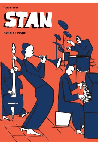
Stan is a visual journey of the collection of work I have made in response to the influence music has had on the development of my skills in image making and visual communication. The idea behind the name ‘Stan’, based on the slang term for an obesession or dedication, is a symbol of my endevour to illustate how certain types of music make me feel, my admiration for the musicians and how music has become a key source of inspiration to my work.
Over the last few years, I have begun to find a connection between the joy and comfort I get from music and the exercise of making artwork. The sounds of world instruments, and admiring the work behind the masters who make such sounds, has created a new kind of play in my work.
By using similar techniques as found in music, I have been able to embrace the process of learning - whether it was working by improvisation or using structures to create rhythmical patterns. As a result of this, my work has developed a freedom where there is a flow of movement in gestural marks and graphic image making.
More than anything, this publication is a visual celebration of this process.
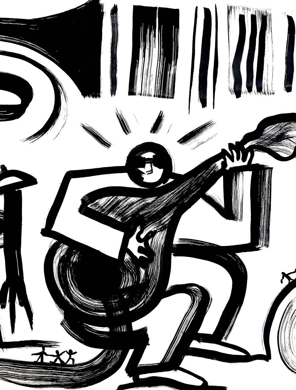
This series of large scale work was a breakthorugh for this self directed project. I had uncovered a new interest in playing with the figure of jazz musicians. With reference to photographers who have captured these musicians in the moment, I was able to experiment with the idea of visualising these figures as connecting shapes. Using a mixture of large paint brushes and inked sponges, I could embrace the physical act of mark making
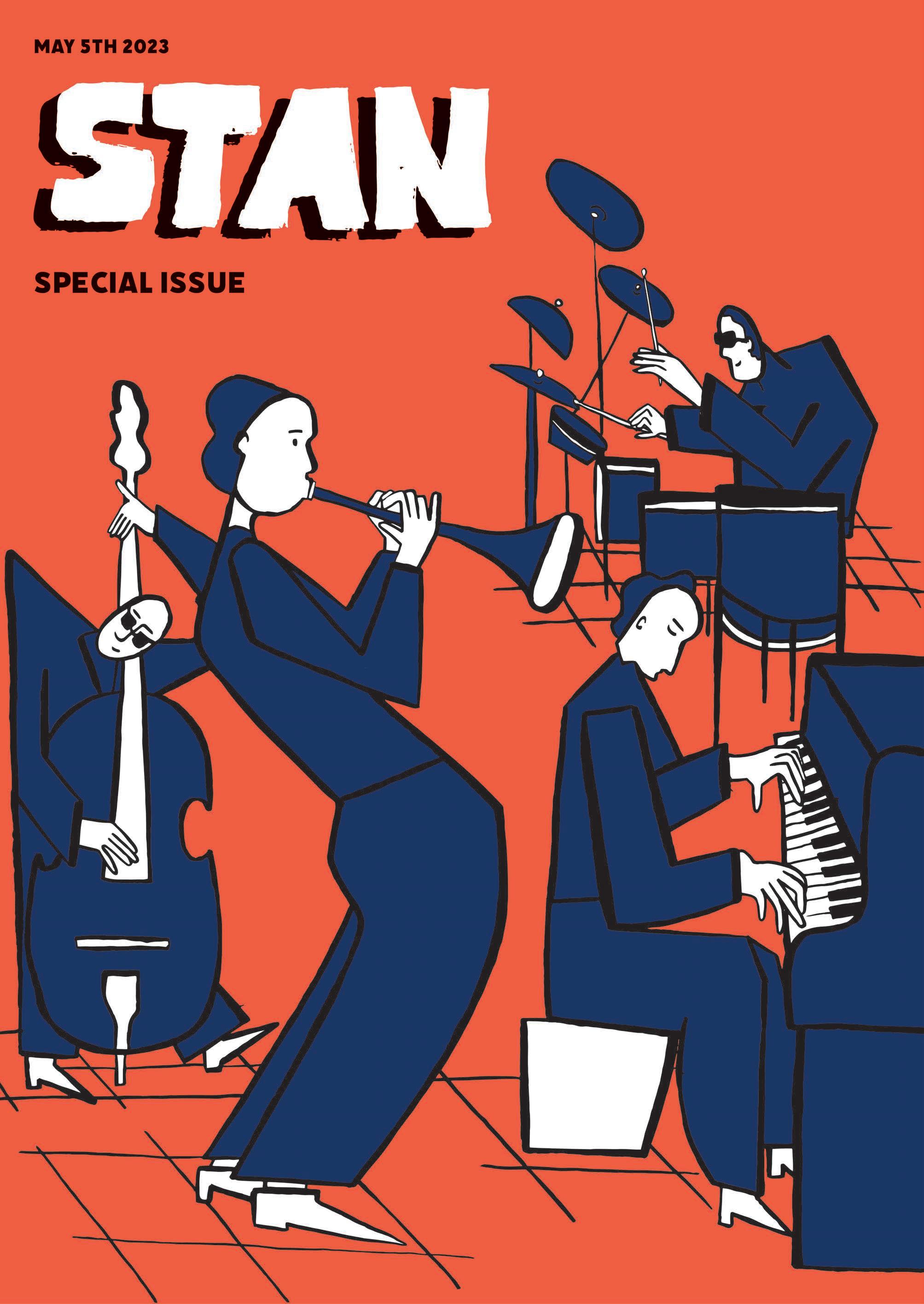
The shift towards large scale and figure experiments provided me with more space to play with this graphic and bold style of working and begin to incorporate colour into them digitally.
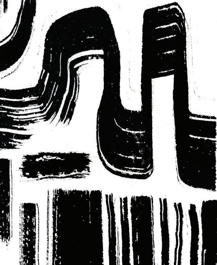
Jazz Hands is one of the most prominent stages of this collection of work. As my interest in the figure developed, I found myself returning to the posture of hands, which I had investigated in my previous project.
The Hands were able to convey a kind of emphasis of the musicians emotions that I had not yet visualised. Using a thick, opaque bold line with the brush seemed to work best for this.
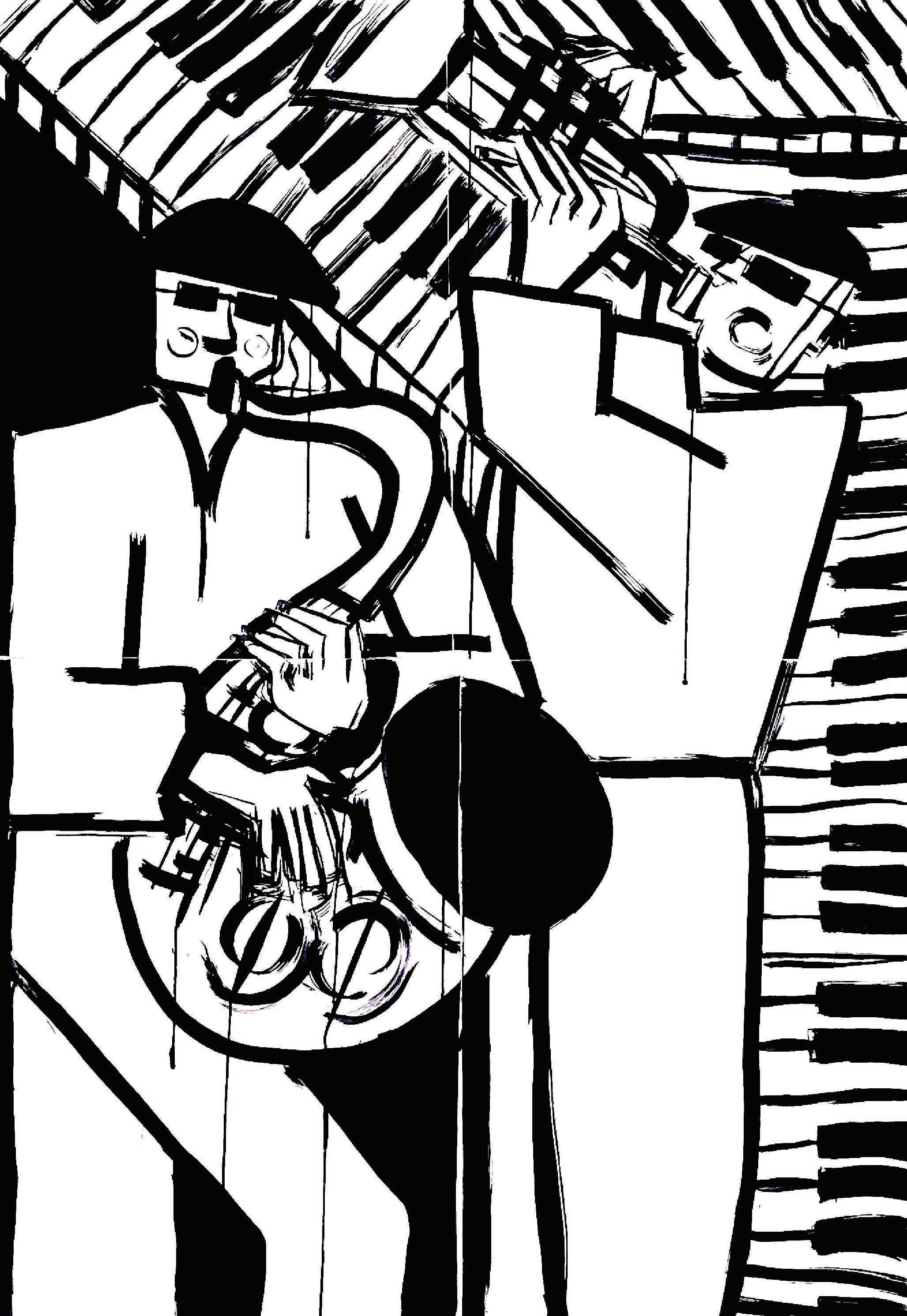
These two pieces were a contrast to the technique I had been so far using, I was intrigued to see what could be communicated using small ink brushes to begin with and then layering with a larger ink brush. These felt a little more technical, but signifcantly less freeing, even though they were still A2 pieces.
Whereas the image that can be seen on the left page was one of my most successful images, and later became the basis for a poster. This was made using a wide sponge and a large paint brush.
Finding references from personal photographs as well as inspiration from artists who work with the figure in exaggerated poses, I was able to build up a rhythm of making these large scale pieces continuously in various ways.
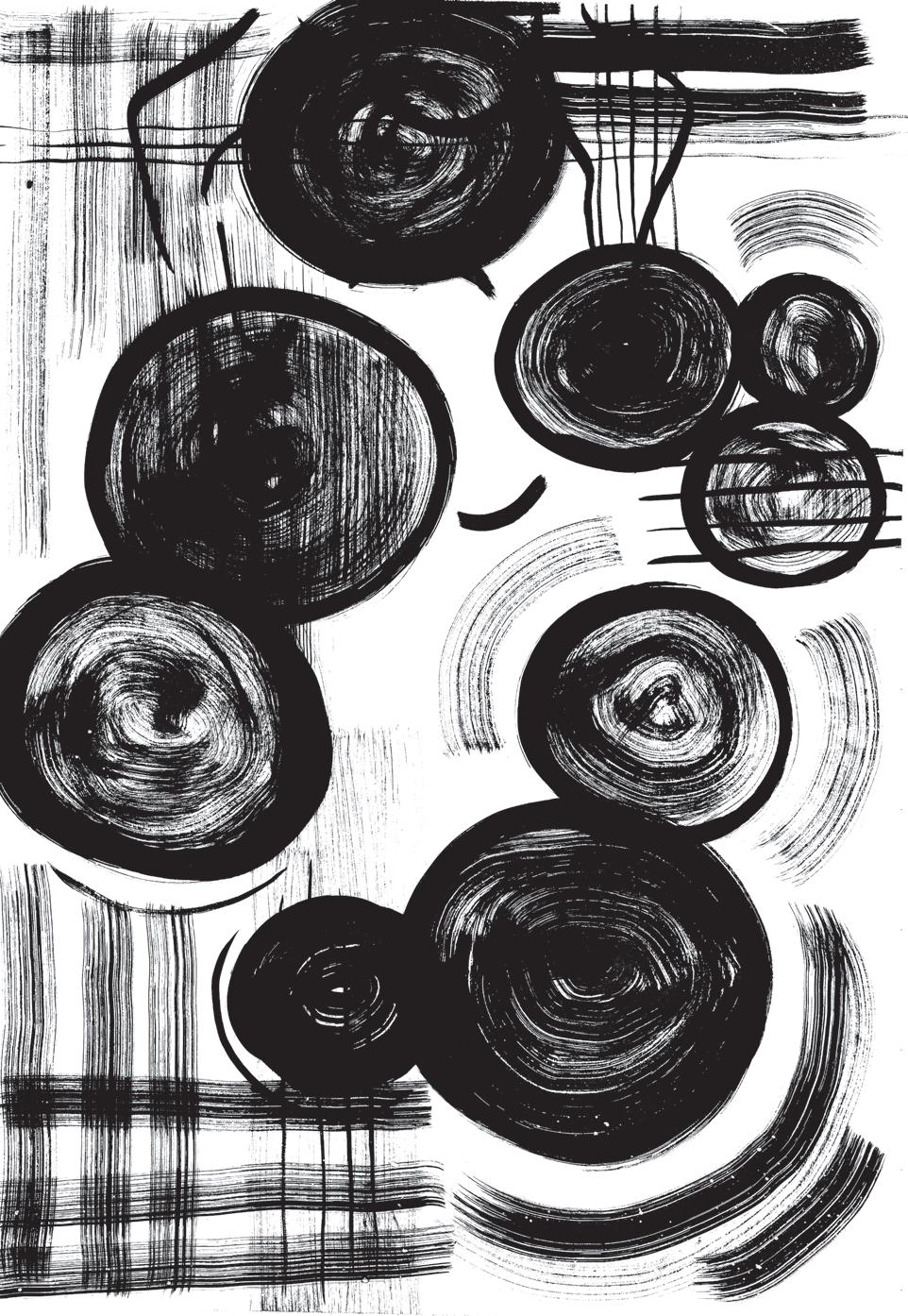
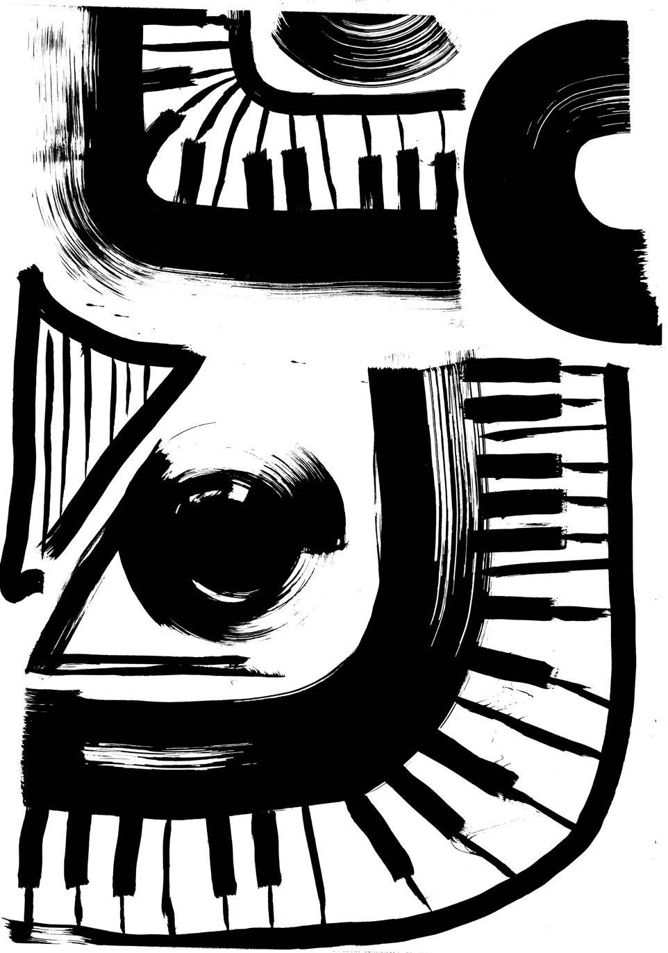
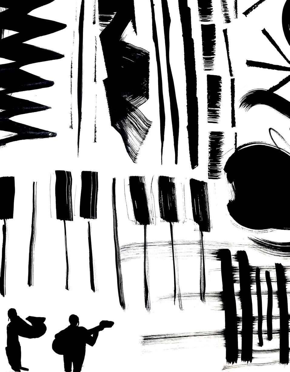
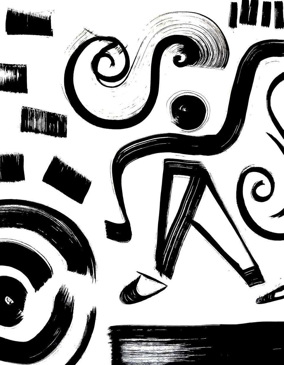
Whilst creating these figurative images, I started to consider what could be in the background. Using loose brush marks, I could create patterns and structures within the larger shapes.
Using repetititve brush marks and lines, these patterns began to emerge more and more.
Making shapes into ‘things’ can be found consistently throughout my work and has guided me a lot in developing my drawing practice. Jazz music as well as working to larger scale , has aided me in my progress of being able to successfully communicate an image using abstract shapes.
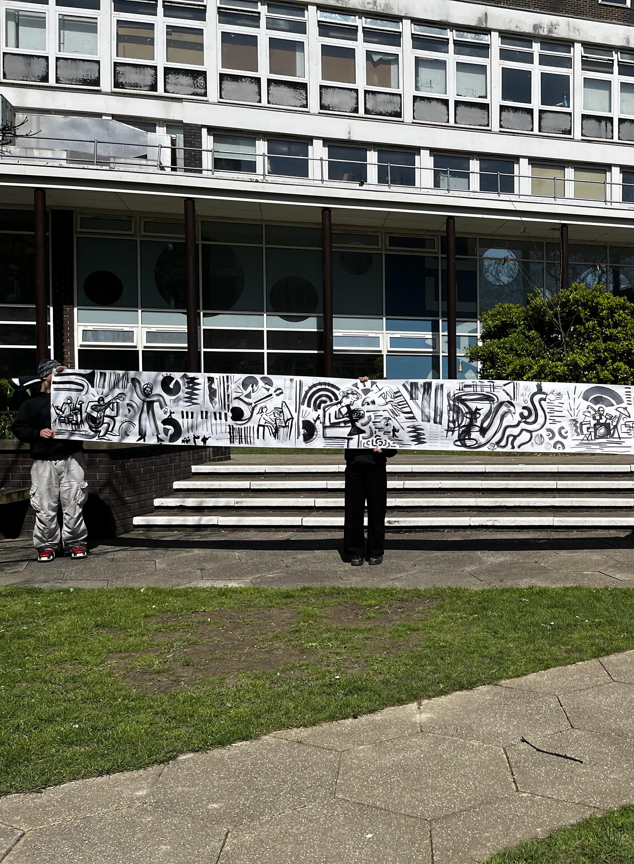
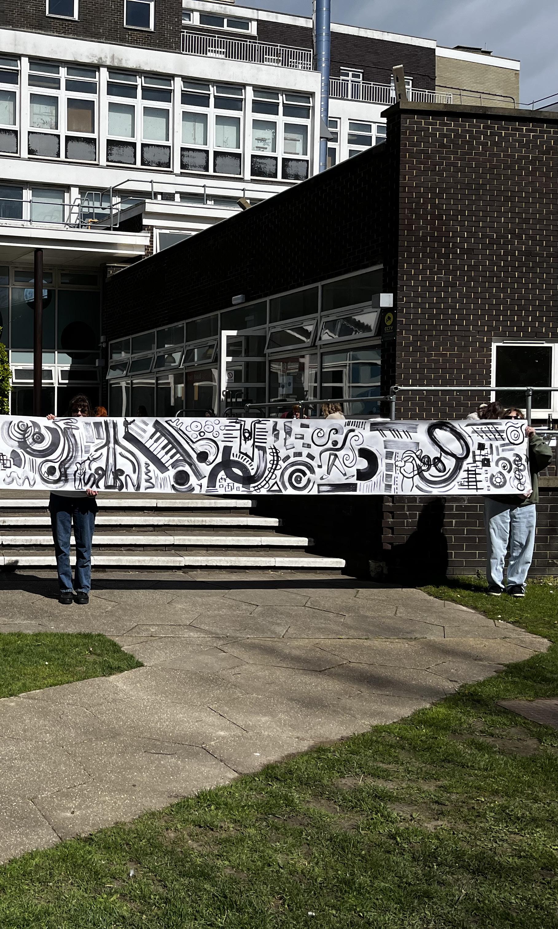
This roll, measuring out at 10 metres, was an exciting step in the production of this project. After the revalation I had upscaling my work, I had a new drive to push this even further. So I had the idea of using a roll of cartridge paper to create further work on. And by doing this, I could create an outcome which could be displayed that initiated interactions with others. The process of making it involved listening to music while using a selection of brushes to work with as I unrolled it.
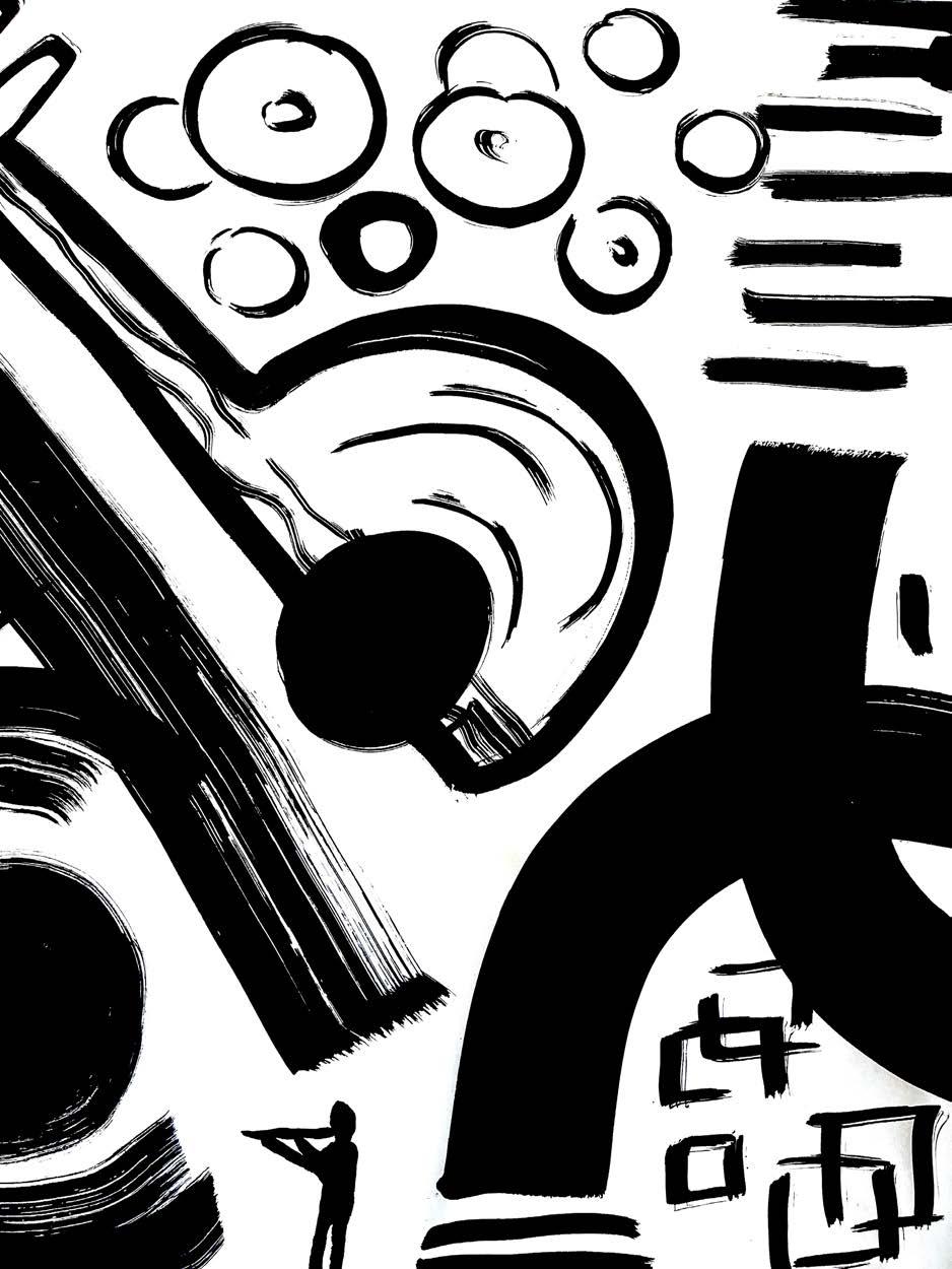
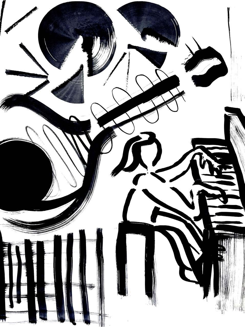
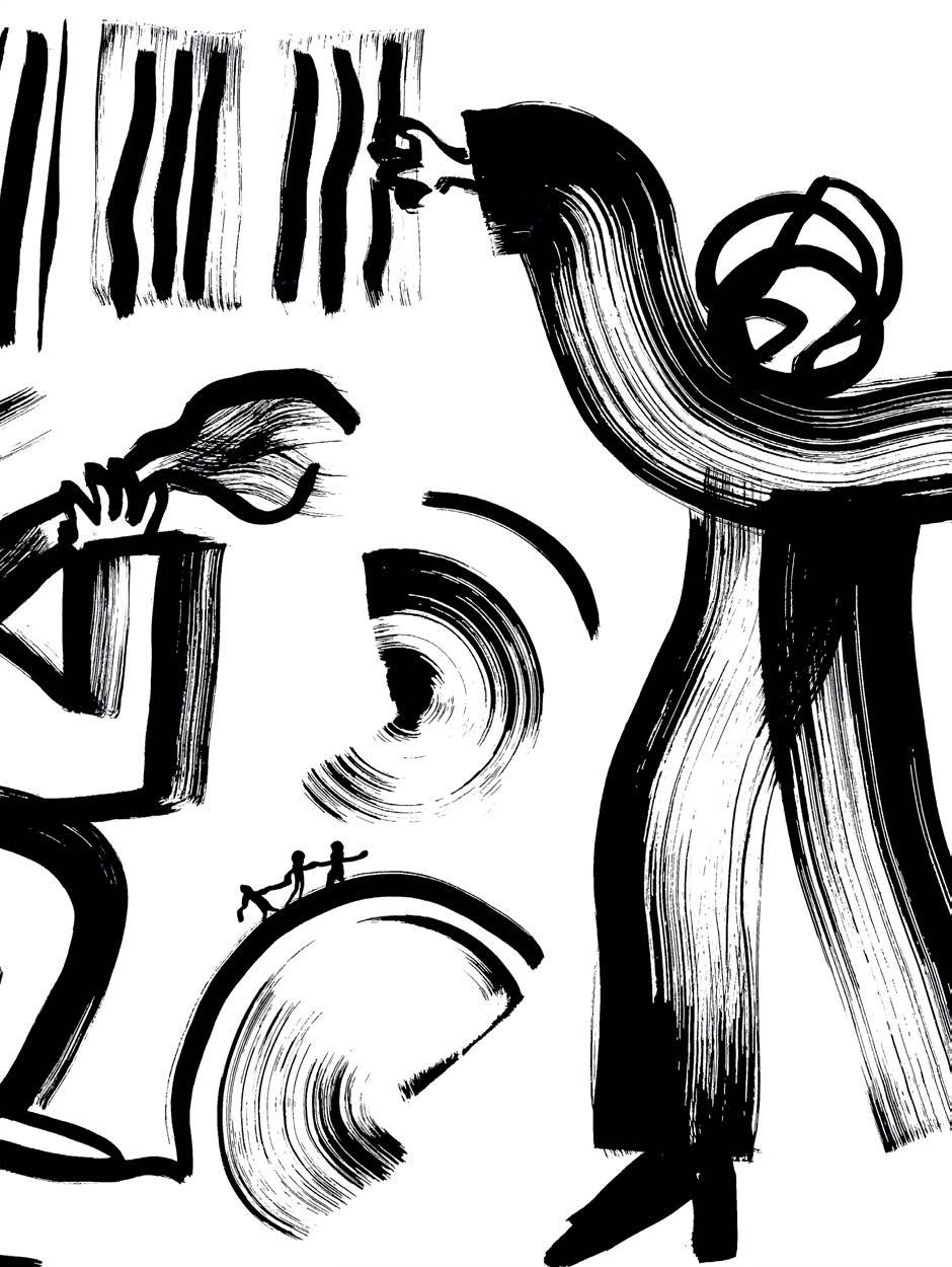
These close ups provide an insight into the smaller aspects within the image, such as the silhouetted drawings of musicians.

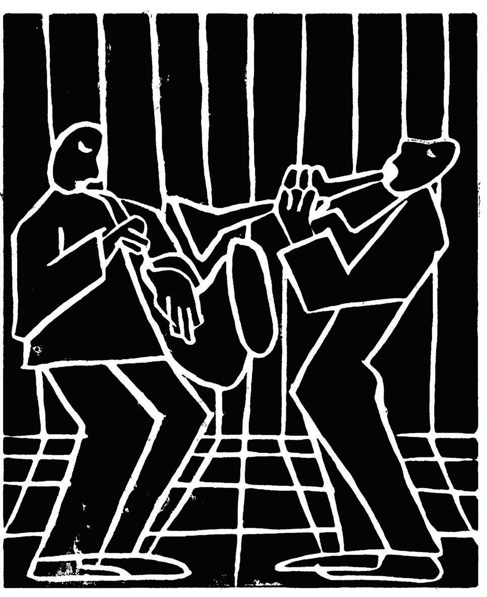
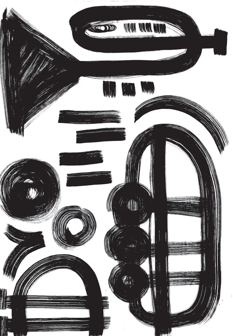
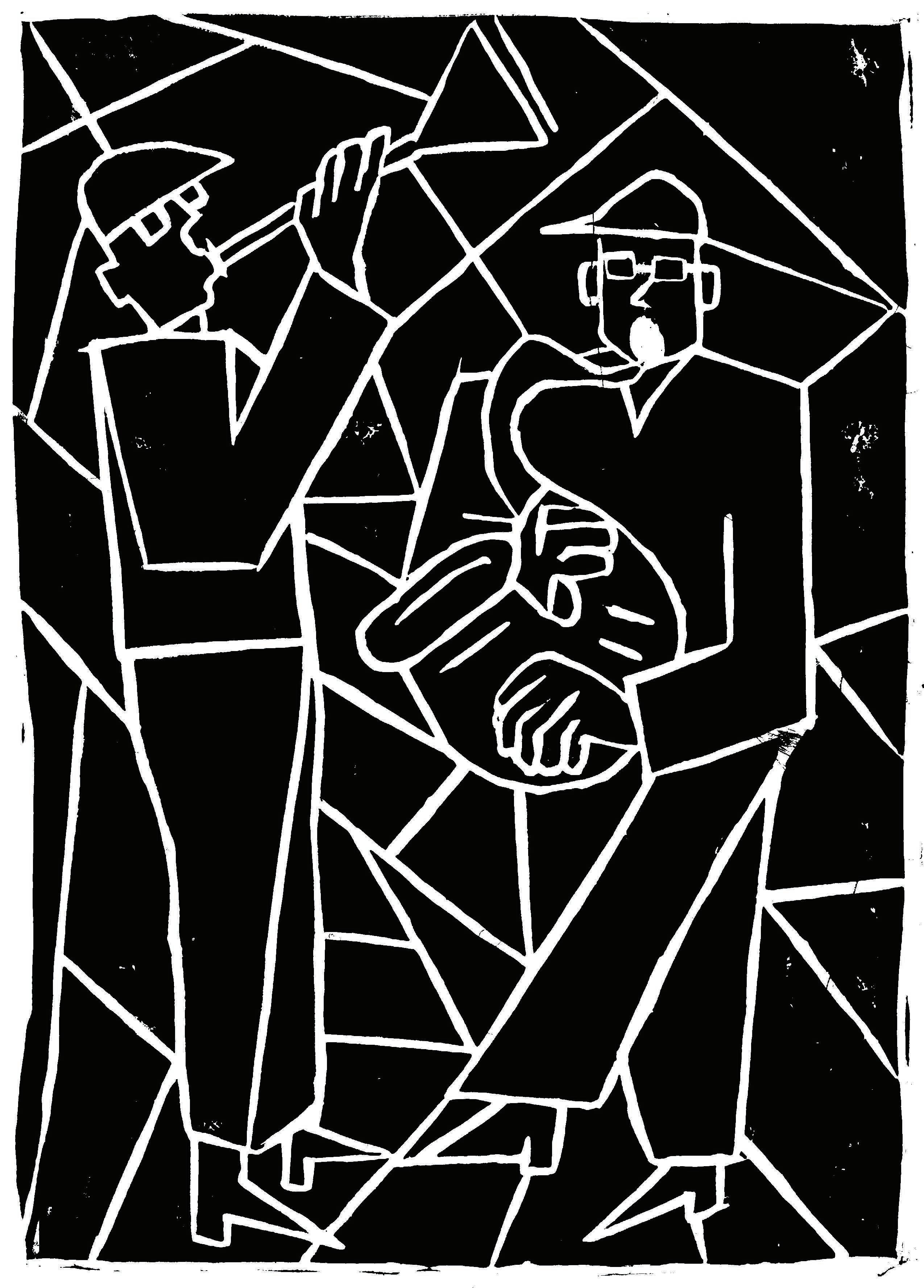
I have always enjoyed lino cut printing, but it seemed to become more exciting for me when I found myself using it to explore music. The shapes I was interested in making to create figures of the musicians as well as the shapes of the instruments, became stronger and bolder.
By using blank ink, I could now also see how my images looked inverted, with white lines on black rather than vice versa. This exploration taught me to take care and consider the quality of ink as well as paper I was using to make my images. I had learnt that a type of Japanese paper called ‘Imitation Japanese Vellum’ had a good texture and thickness for high quality printing.
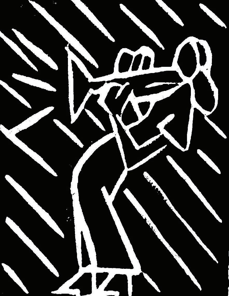

I tried woodcut printing for the first time as part of my academic essay in my final semester and wanted to use it to expriment for my enquiry into shapes and form within music.
I thought that the process of this kind of printmaking could be interesting to explore improvisation, a technique often found in jazz music.
The objective of printing my linocut images onto tshirts, were to develop further understanding of how prints could be contextualised and made into more than just a print. The key benefit of printmaking is that it can reproduced, so I wanted to use my experiments to my advantage and play with outcomes even more.
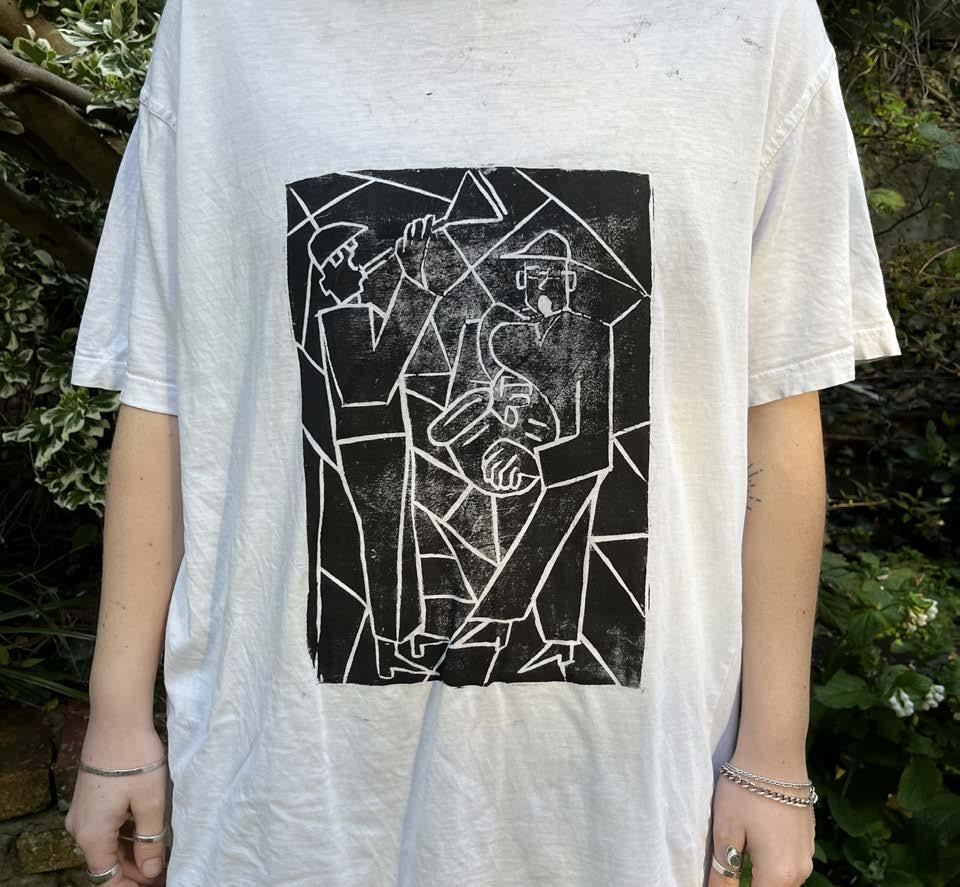
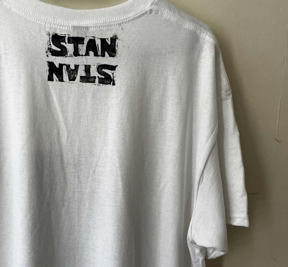
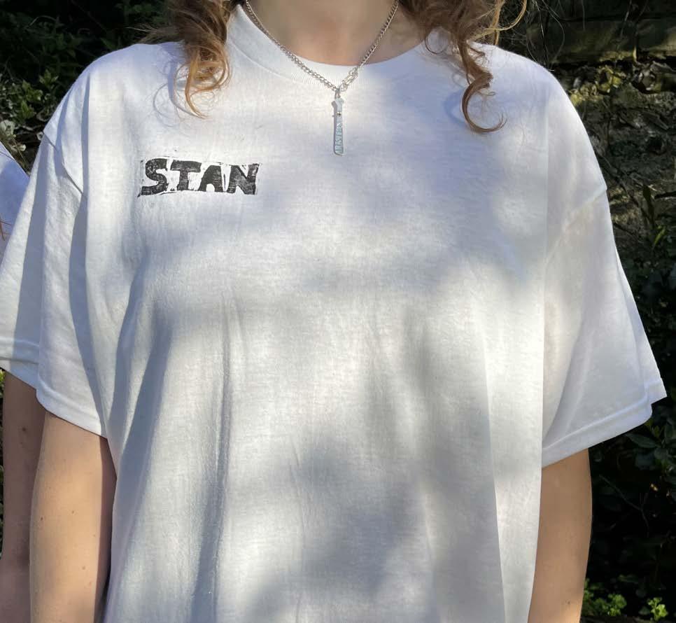
The linocut of the word ‘Stan’ later became typeface for this publication. I chose this particular image to reproduce onto a t-shirt as I felt it worked better compositionally.
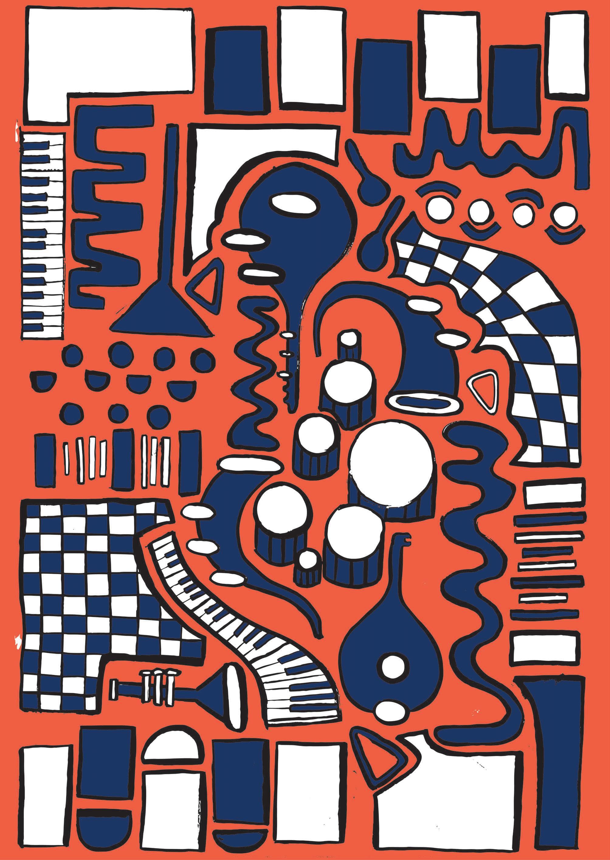
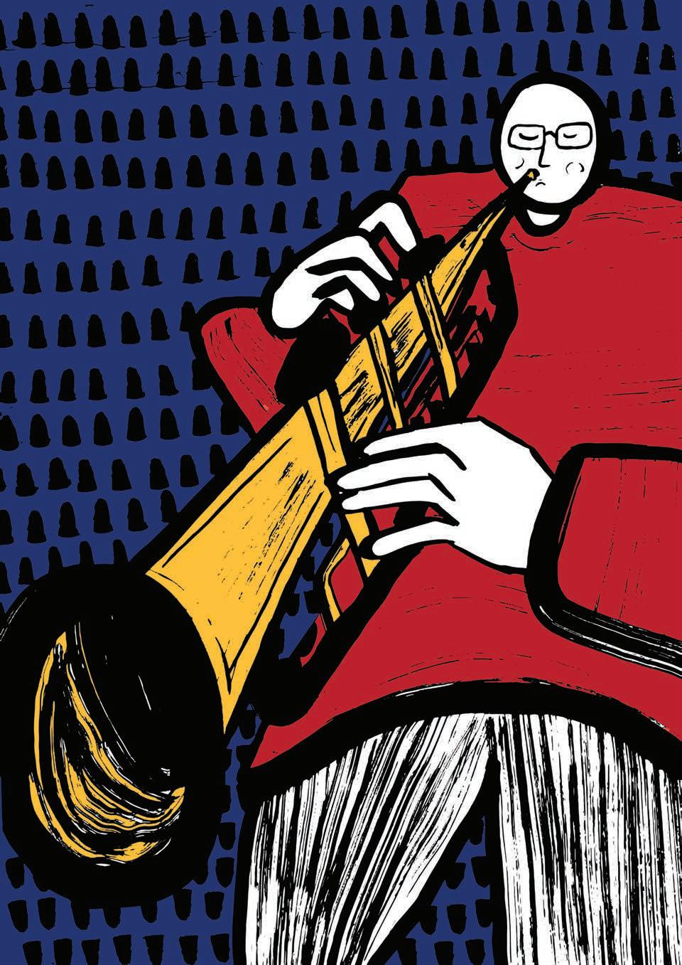
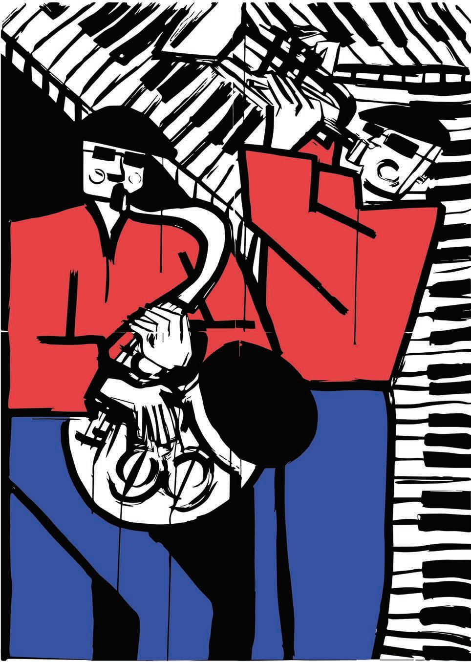
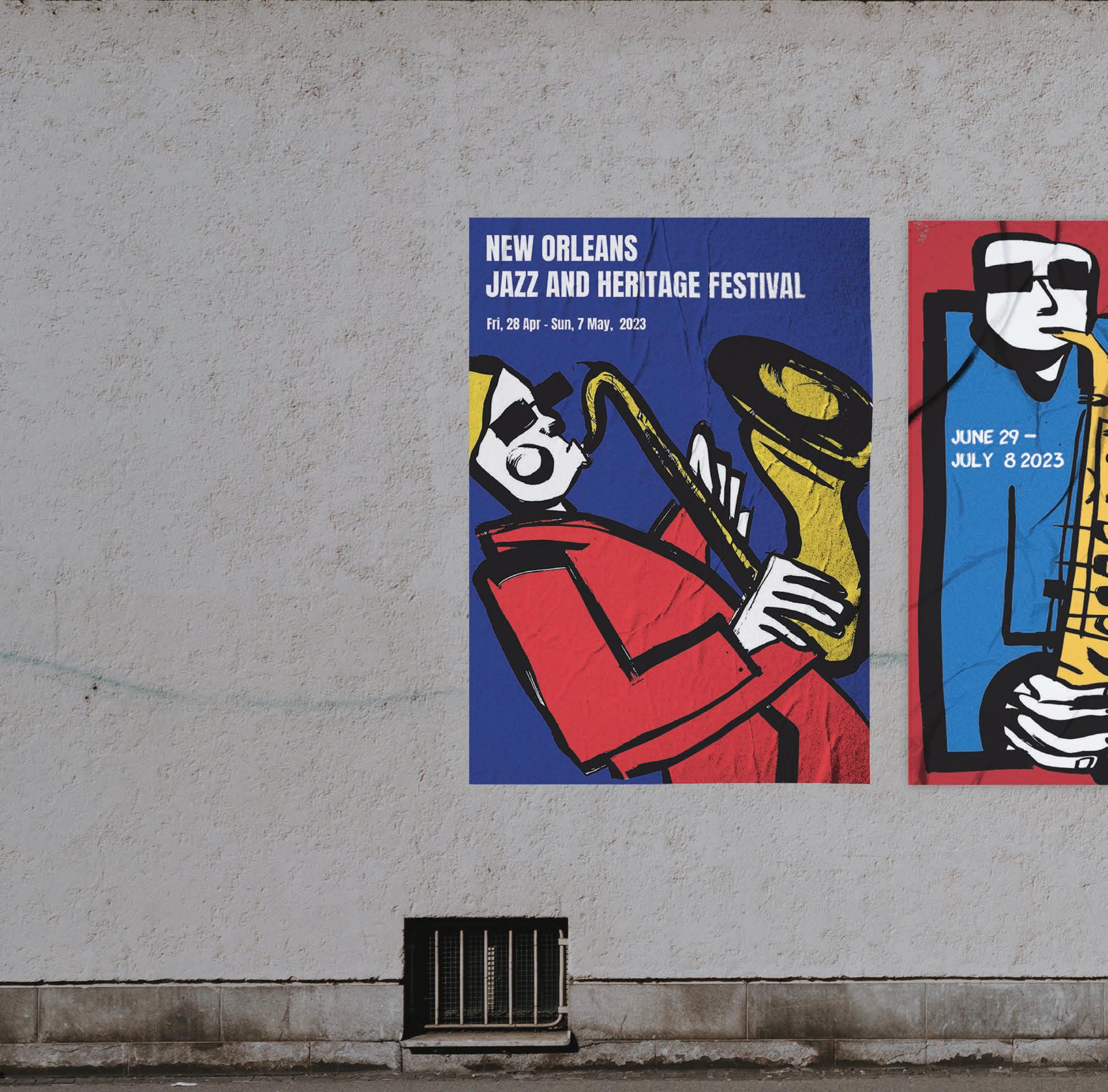
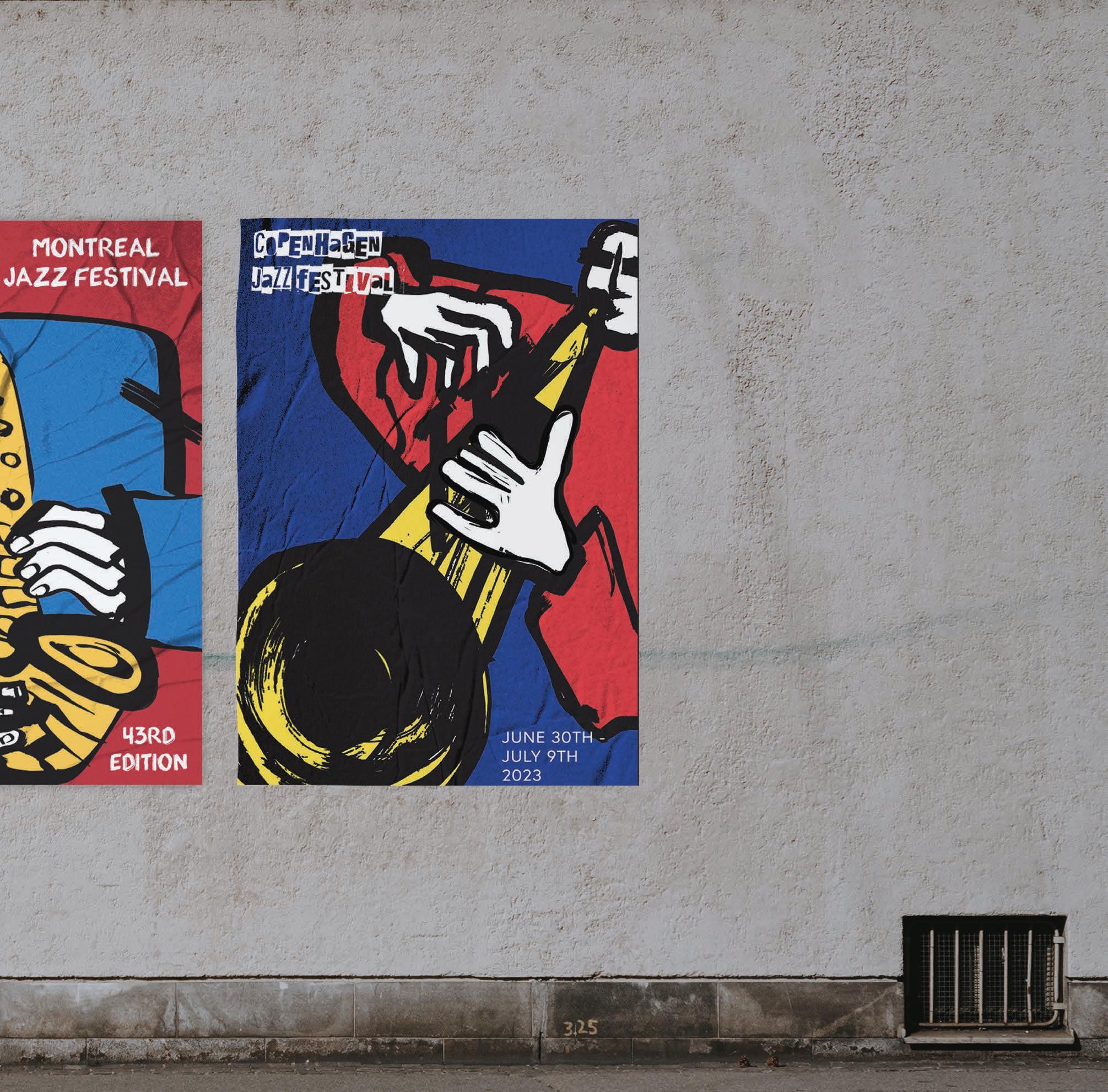
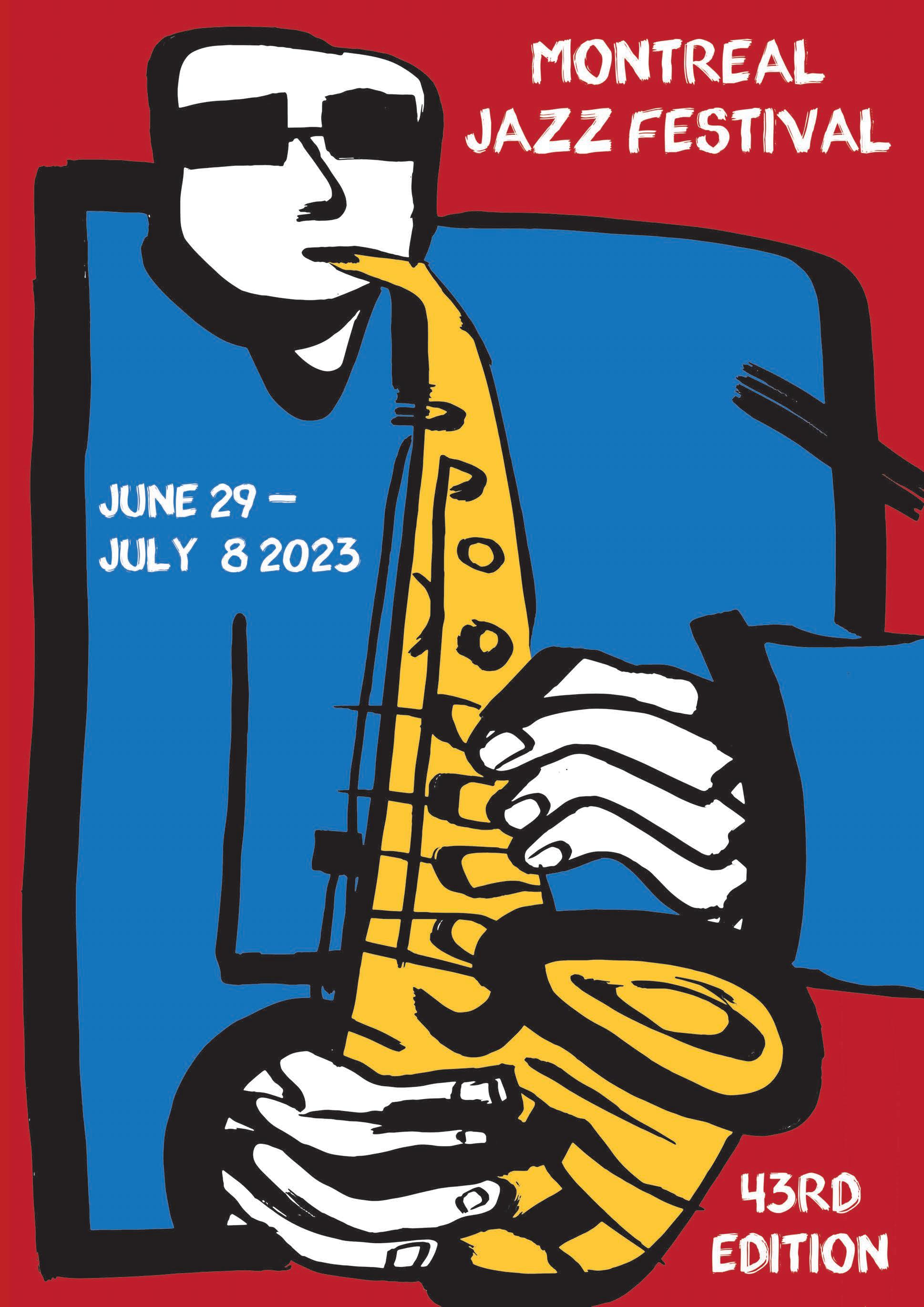
Translating some of my black and white ink work into colour was important for me. Colour has always been a core ingredient to my work, but I felt it was important in order to explore how these works could be contextualised in a commercial way.
I chose to digitally colour these pieces rather than in an analogue way, as I wanted to maintain the graphic boldness that the rich black ink provided. This also meant maintaining the brush strokes and gestural marks once I formatted them digitally, was key.
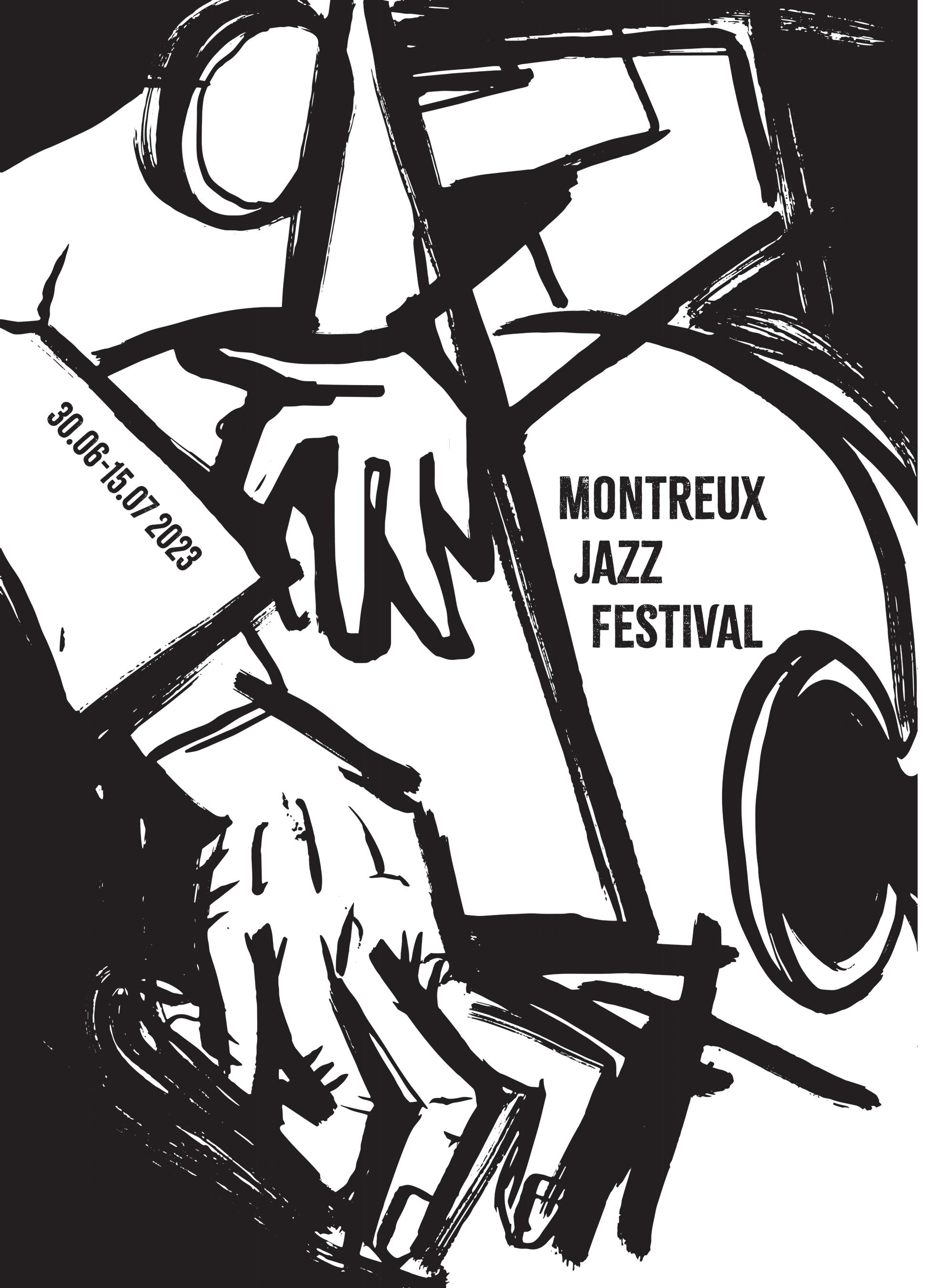
With jazz music, the primary colours have consistently felt the most naturally engaging for me when playing around with colour. The research of jazz festival posters became a huge influence on my process.
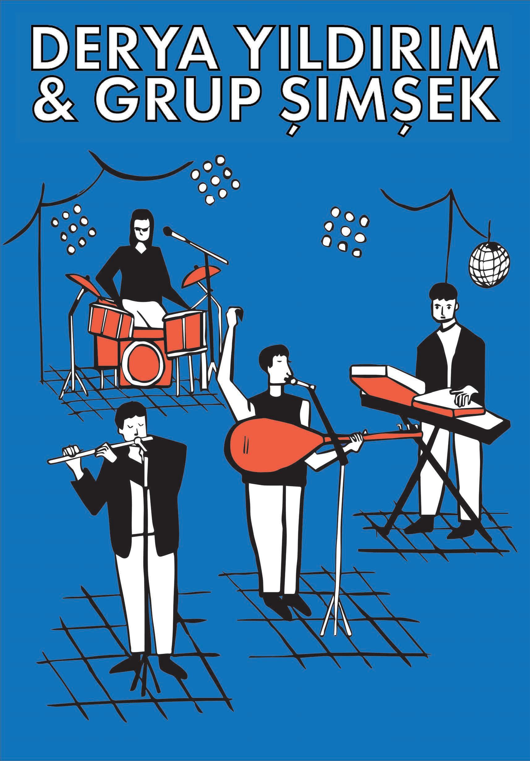
This was an Anatolian band I saw in concert, which inspired me greatly in exploring the musical instruments as a subject matter.
I have created over a vast body of images during this project of a combination of A1, A2 as well as lino and woodcut prints. The art of making and the process of embracing the mistakes, has given me a new freedom and enjoyment in my illustration practice.
This visual journey felt most appropriate being collated into a publication of this type, where hopefully an audience can feel a kind of playful pleasure from it.
To see more of my work, please go to:
https://maiaroman.myportfolio.com
@maiasmusings @stan.publication

Web Preview of this publication can be found at:
https://stanprint.cargo.site

All featured work by Maia Roman
Publication Designed by Maia Roman.