
Designing an album pre-order app for a trendy musician
Mahya Varasteh


The product: MerchBar is an online album pre-order app that allows you to order or pre-order your favorite artist's album or merch anywhere and at any time.
Project duration: It took three months from the program surveys process to digital wireframes to be written, designed and prepared by me.
The problem: Finding a good and creative way to design a product to reduce the problems raised.
The goal: Trying to design a product which helps the customer to meet her needs according to the provided persona.
role: UX researcher, UX designer, and UX writer
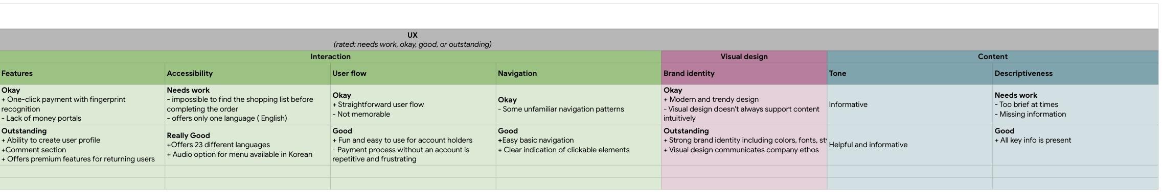
User research reports, User personas, Problem statements, User journey maps, Goal statements, Competitive audit, Storyboards, User flow, Paper wireframes, Digital wireframes, Low-fidelity prototype, and
Usability studies
I conducted interviews and created empathy maps to understand the users I'm designing for and their needs. A primary user group identified through research was teenagers who are interested in collecting idols and famous musicians merch. This user group confirmed initial assumptions about Merchbar customers, but research also revealed that traffic was one of their problems in the first hours of album releasing. Other user problems included obligations, interests, or challenges that make it difficult to get their favorite products in music shops in-person.
Users are busy for spending their time in music shops in-person
Users are struggling to get the item they want to check out
After getting lost in an online article, Users rudely interrupted by a paywall
IA
Text-heavy menus in apps are often difficult to read and order from

Problem statement: Sara is a busy student-artist who needs easy access to music shops ordering options because she wants to augment her album collection.


Mapping Sara’s user journey revealed how helpful it would be for users to have access to a dedicated Merchbar app.

Writing Sara’s goal statement revealed how obvious it would describe our product and its benefits for the user.

Charting competitive audit revealed identified key competitors, reviewed the products that our competitors offer, how our competitors position themselves in the market, and examined what our competition does well and what they could do better.

A competitive audit report indicates an overview of our competitors’ strengths and weaknesses which can help us to know how competitors do well and what they can improve.


A series of panels have been drawn to visually describe an explorer of a user's experience with a product.


Outlining the path taken by a typical user on an app or a website can help us to become familiar with the tasks that they complete from start to finish before designing the project.


Taking the time to draft iterations of each screen of the app on paper ensured that the elements that made it to digital wireframes would be well-suited to address user pain points. For the home screen, I prioritized a quick and easy ordering process to help users save time.

As the initial design phase continued, I made sure to base screen designs on feedback and findings from the user research.
This button at the top of the home screen makes it fast and easy for users to return to the previous page.
This button at the bottom of the home screen makes it fast and easy for users to order.
Easy access to navigation
Easy navigation was a key user needito address in the designs in addition to equipping the app to work win assistive technologies.
wireframe example that

Here is the link of MerchBar’s Low-fidelity prototype

All these processes taught me to remind myself that “Learning is a never-ending cycle”.
This project learned me to focus on solving problems for users in the product design process and also made me to work with Figma for making a prototype.
I will continue to learn in the field of UX to gain more experience and information.
I will do more finishing steps for my prototype so that I can launch an app.