
MAHROUSH MAHMUD
CONTENTS 01 07 08 14 ARTWORKS AND SKETCHES PHOTOGRAPHY
18
PROJECT 01 PROJECT 02
PROJECT 03
ARTWORKS
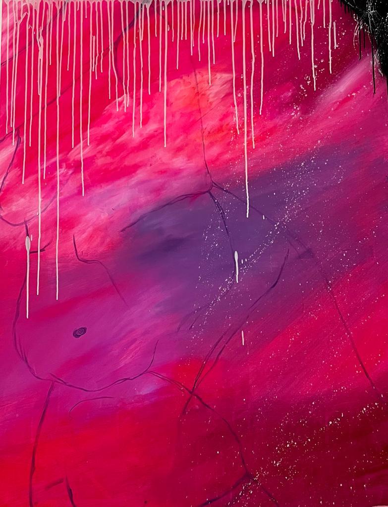
Vulnerable: A Lesson on Vulnerability and Sensitivity
Medium: Acrylic on Canvas
Size: 152.4 x 121.92 cm
Year: 2022
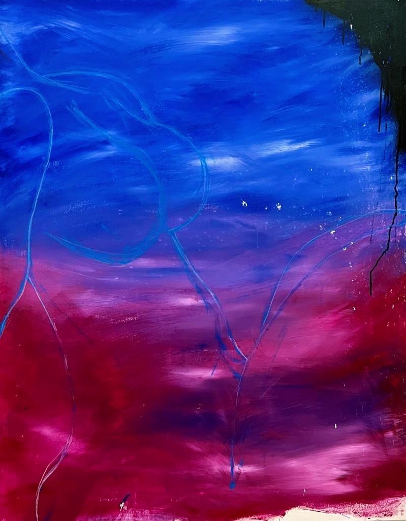
Resilient: A Lesson on Strength and Flexibility
Medium: Acrylic on Canvas
Size: 152.4 x 121.92 cm
Year: 2022
Optimus: A Lesson on Heartbreak and Betrayal
Medium: Acrylic on Canvas
Size: 152.4 x 121.92 cm
Year: 2022
Imperfect: A Lesson on Flaws and Imperfections
Medium: Acrylic on Canvas
Size: 152.4 x 121.92 cm
Year: 2022
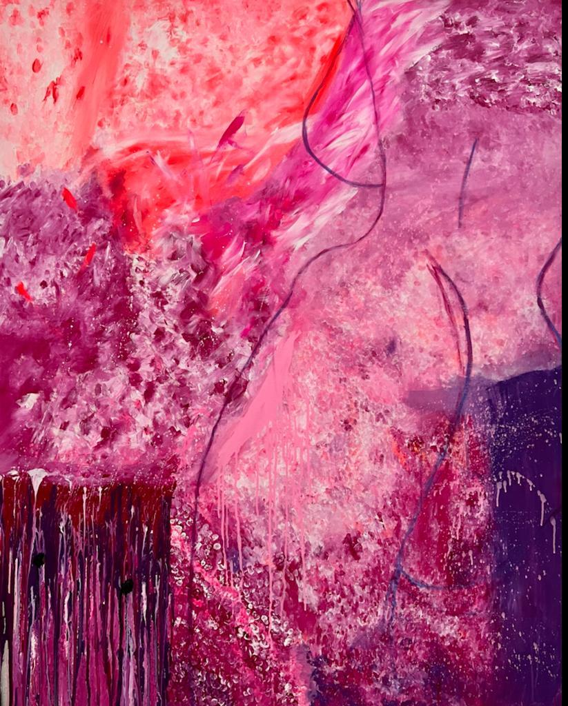
Misunderstood: A Lesson on Misconceptions
Medium: Acrylic on Canvas
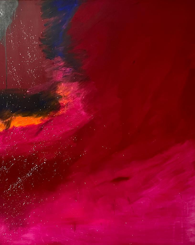
Size: 152.4 x 121.92 cm
Year: 2022
“Misunderstood” an artwork in the Lessons on Vulnerability series, is painted using acrylic on canvas. This artwork is a lesson on misconceptions. The background for this artwork was painted using dark colors such as dark blue, and dark, blood red with hints of pink. Inspired by the pressures of society; many ideas and thoughts are lost between layers and layers of misconceptions and restrictions. This painting encourages one to look past those layers. The female body is not missing, but rather, it is present within the layers. urge the viewers to let go of their misconceptions and truly “read between the lines".
01
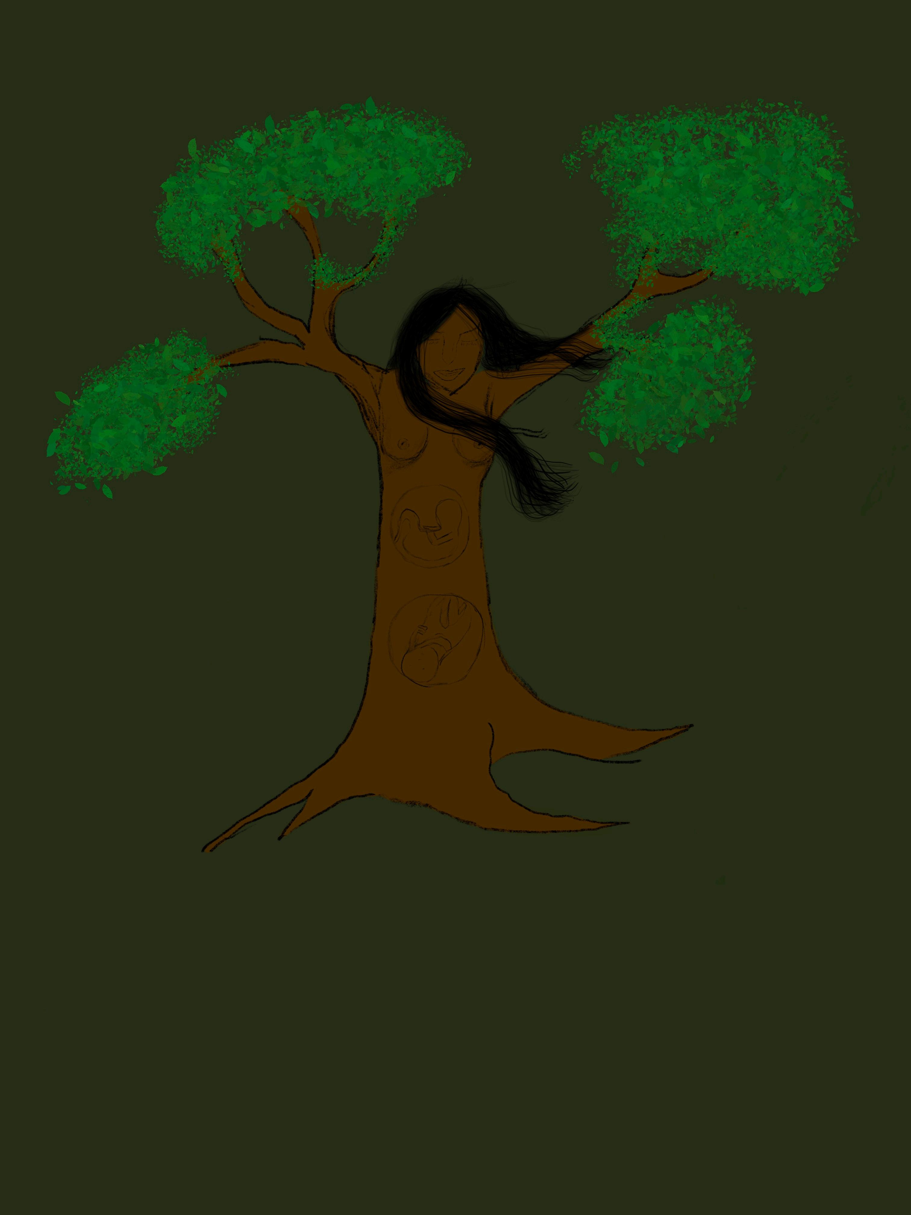
The theme of this artwork revolved around the process of rebirth, the personification of a woman as a tree of life, giving birth to life forms/humans. I also featured facial expressions, and tried to draw accurate representations of foetuses inside the tree of life, or “the mother’s womb”.
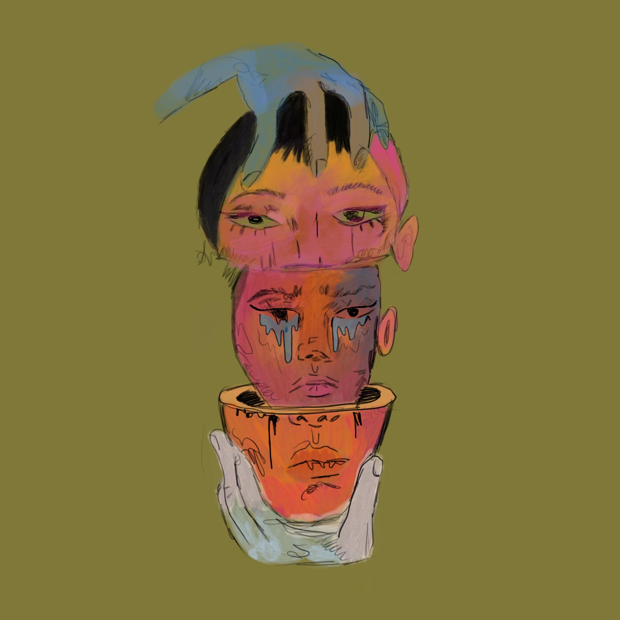
The theme of this artwork revolves around the mental and psychological pressures women have to face due to societal expectations, lack of freedom and gender stereotypes. The artwork, titled “Mind Over Matter”, shows woman’s face pulled apart in half, revealing a crying face; a reflection of her real emotions. I experimented with different colours, synonymous with the multitude of feelings that overcome her.
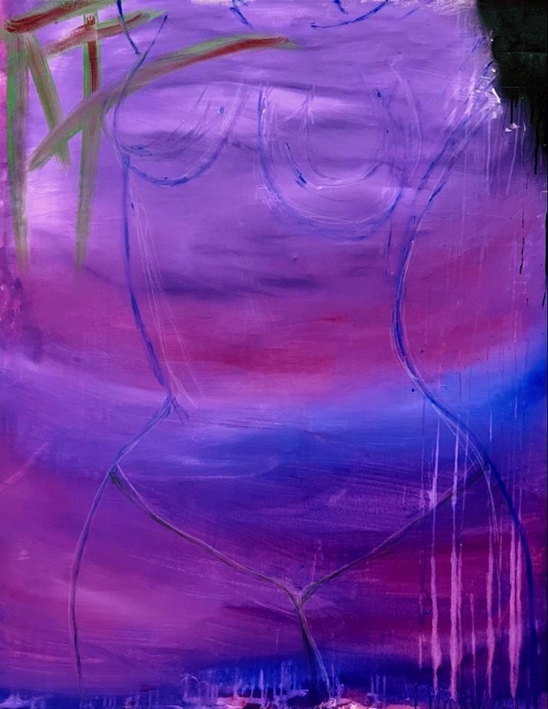
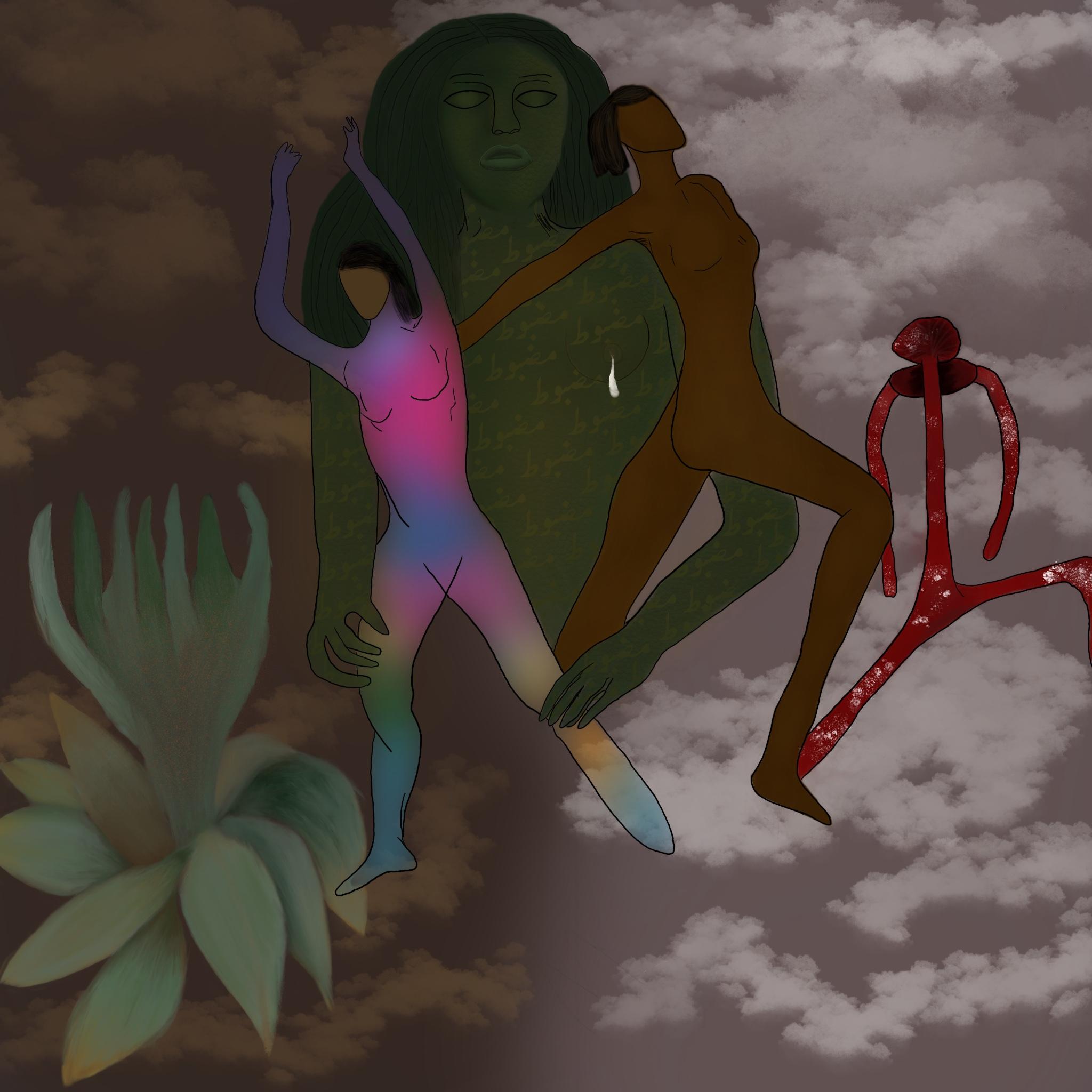
Divine Femininity is my personal artwork inspired by the three artists I studied; Frida Kahlo, Nancy Spero and Barbara Kruger. Gai’a, the green figure, expresses freedom in terms of the female body. Upon a closer look, Gai'a's body is embedded with text in my mother tongue, Urdu, which reads out the word "طوبضم “.When translated to English, the word means strong or resilient.
DIGITAL ARTWORKS 02
SKETCHES
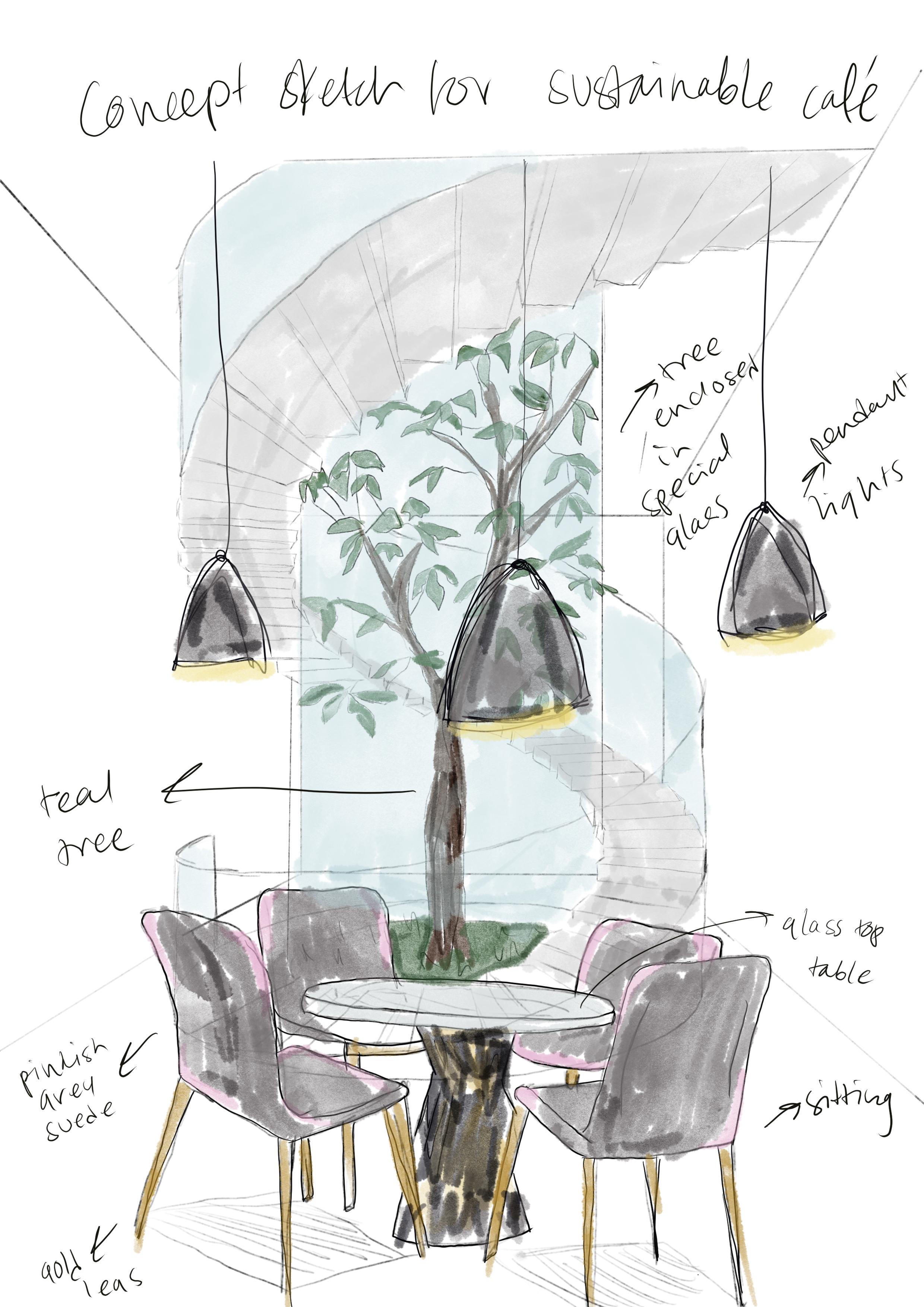
The concept sketch for the sustainable café was inspired by treehouses; how stairs or ladders lead one up to the treehouse. I wanted to recreate that idea for a restaurant, but in a unique and modern style that would feature an endangered species of a tree, enclosed in a special glass.
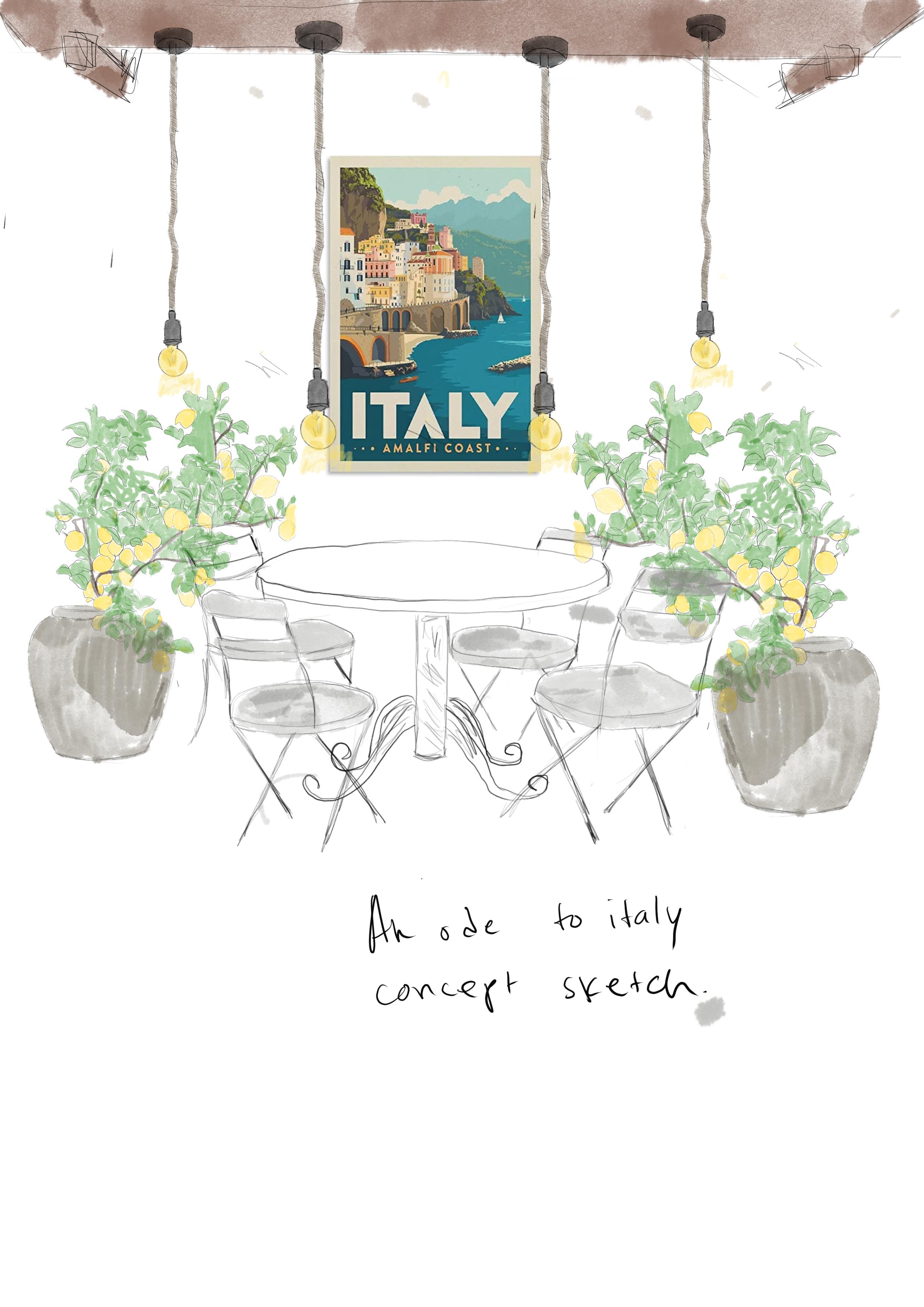
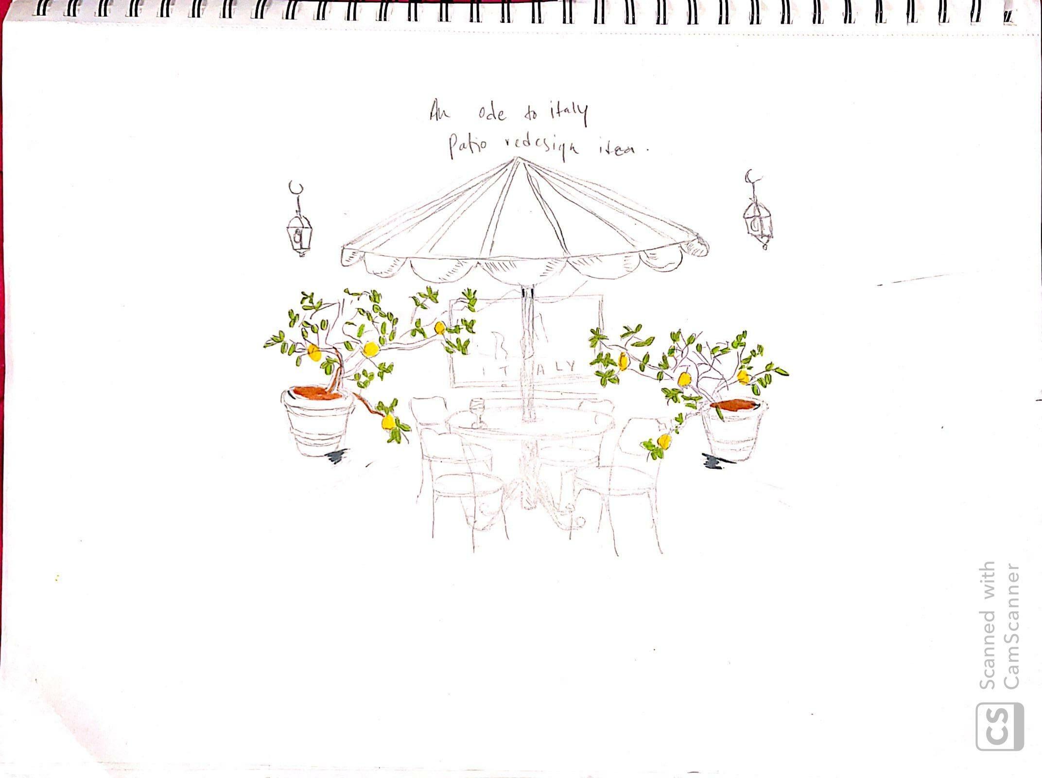
The concept sketch for An Ode To Italy was largely inspired by my fascination and love for Italy, more specifically inspired by Restaurant da Paolino in Capri, Italy. The sketch is a patio redesign, featuring lemon trees growing out of minimalist grey stone pots, and a very casual seating arrangement complemented with hanging rope lights.
03
SKETCHES
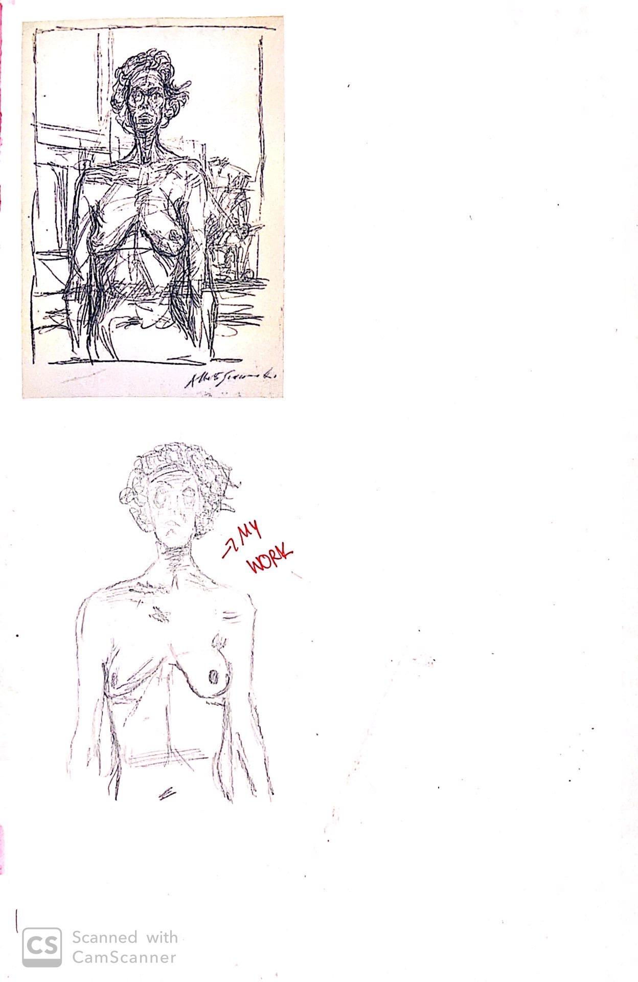
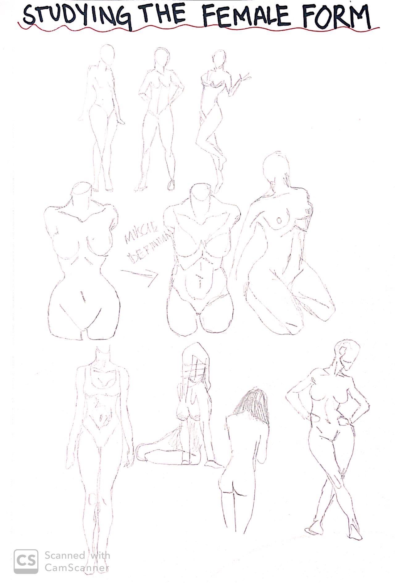
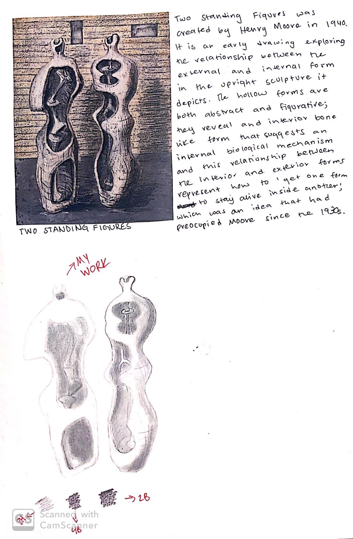
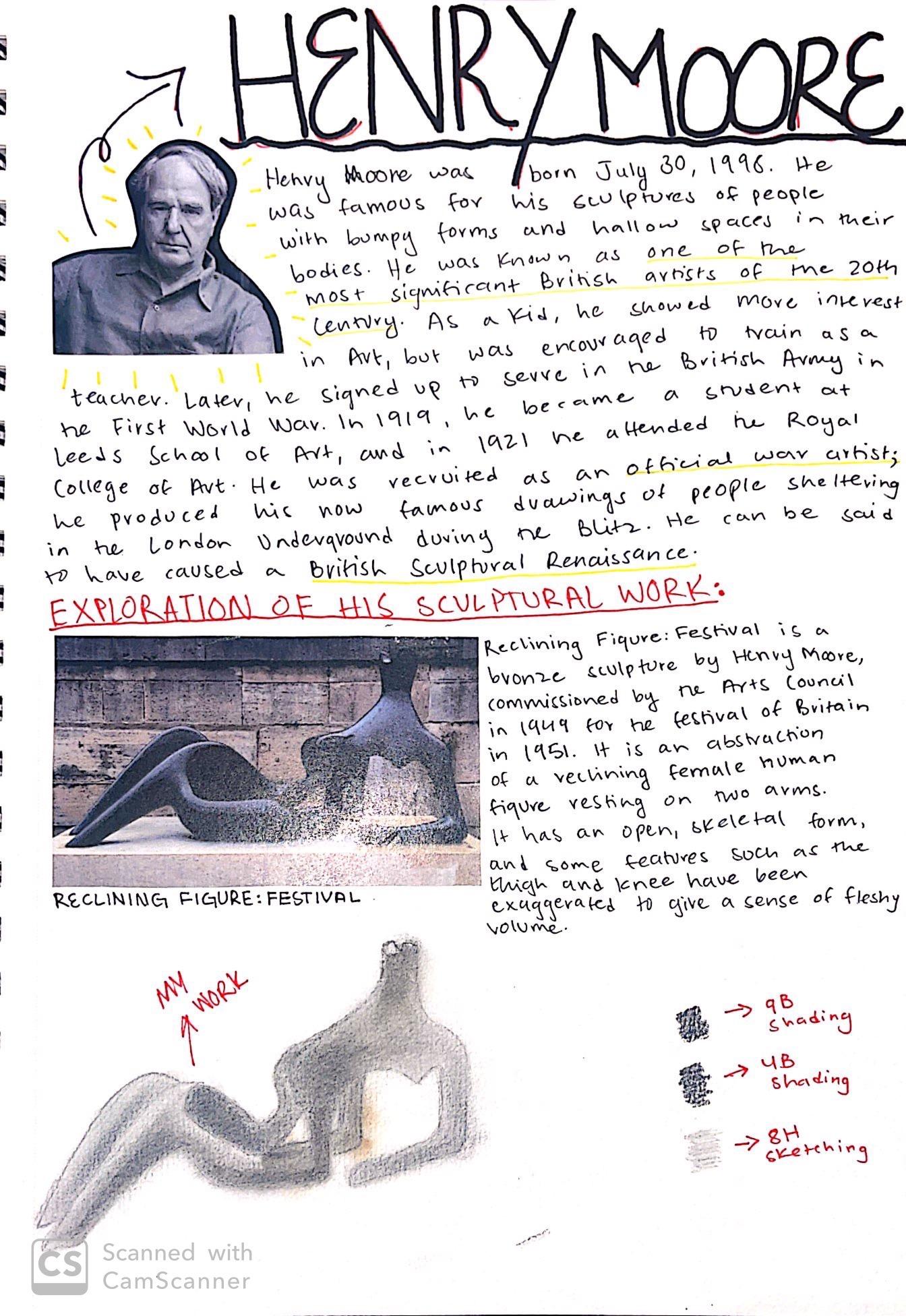
These are pages from my sketchbook during my time studying the IB Visual Arts course. I was able to study many artists such as Henry Moore and Alberto Giacometti. I also studied the female form to achieve my final artworks.
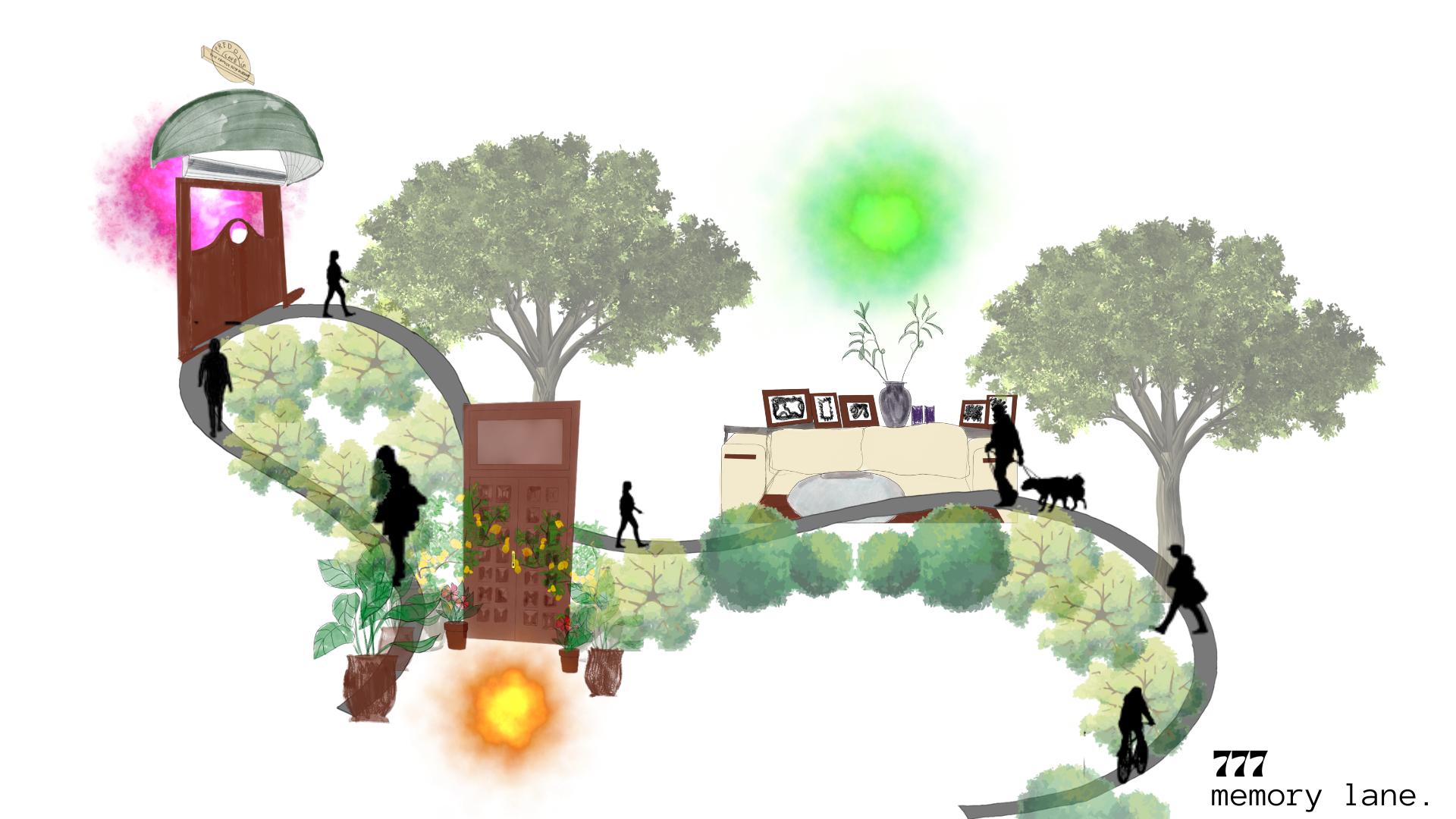
777 Memory Lane is a personal artwork that stemmed from a simple sketch of my grandfather’s front door. After that one simple sketch, I found myself completely overcome with emotions and realised how much I really missed my childhood. Suddenly, I found myself sketching the entrance of Freddy’s Café (a café that I would visit regularly with my family as a child) and the yellow sofa from my old house in Askari 9 (a small neighbourhood in which my parents shifted after their marriage and where we stayed as a family for 7 years before moving to our current house). I assigned it with the number 777 because the angel number 777 means “luck” and “good things are coming”. I also assigned auras to these landmark locations; orange for lasting relationships, pink for comfort, and green for personal growth and healing. The artwork is a representation of the little neighbourhood I’ve created in my mind; me walking down memory lane and reminiscing my childhood.
04
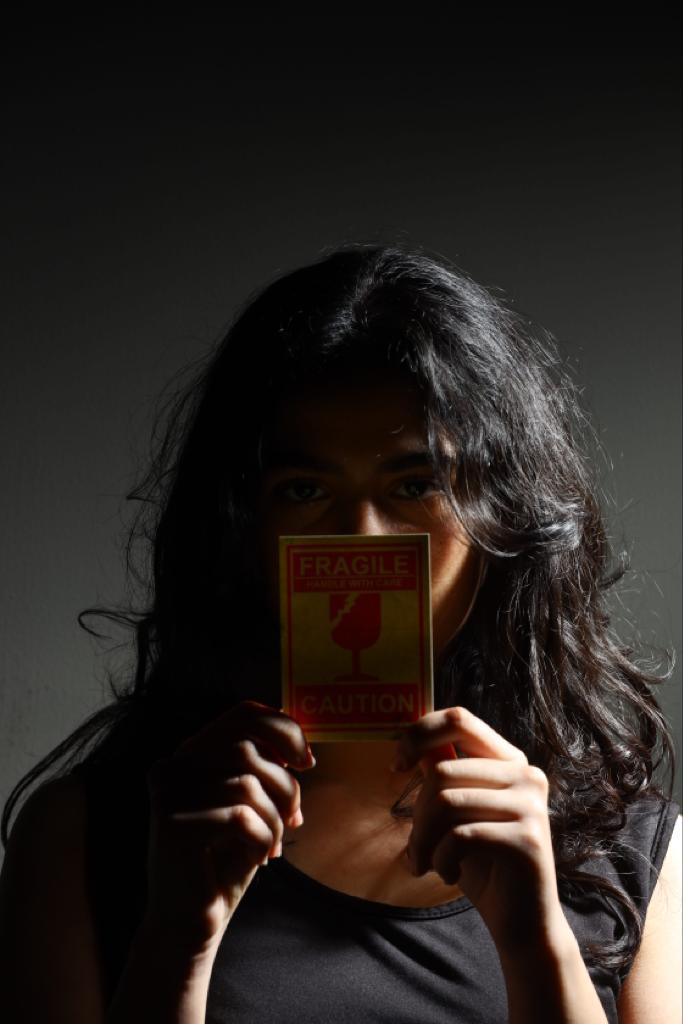
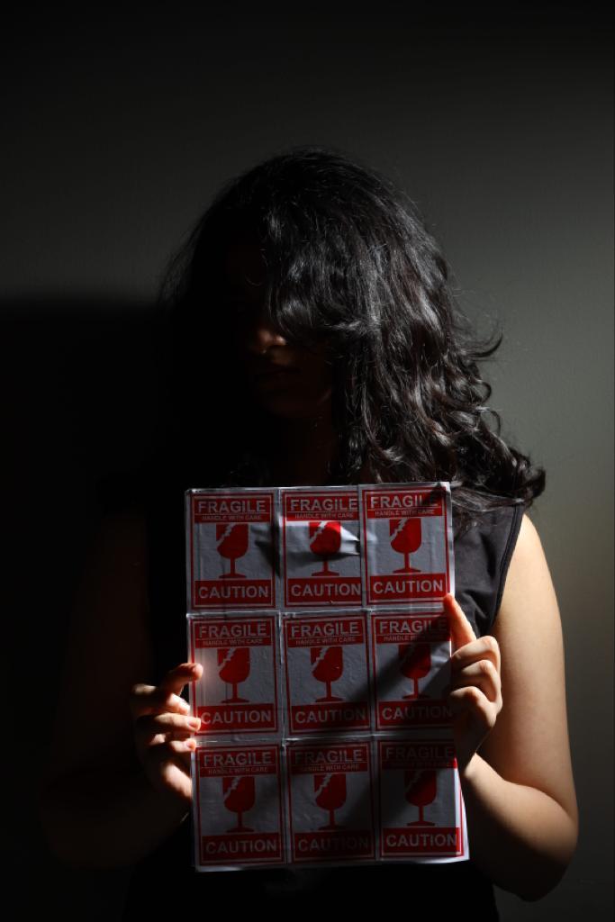
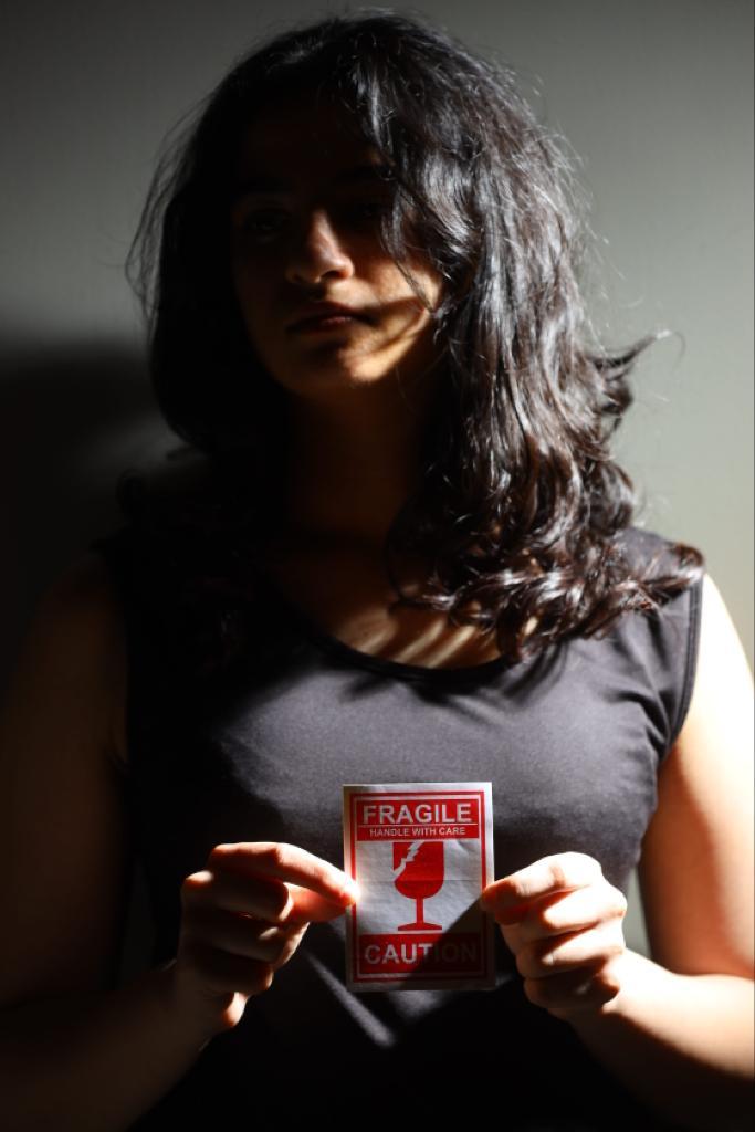
PHOTOGRAPHY
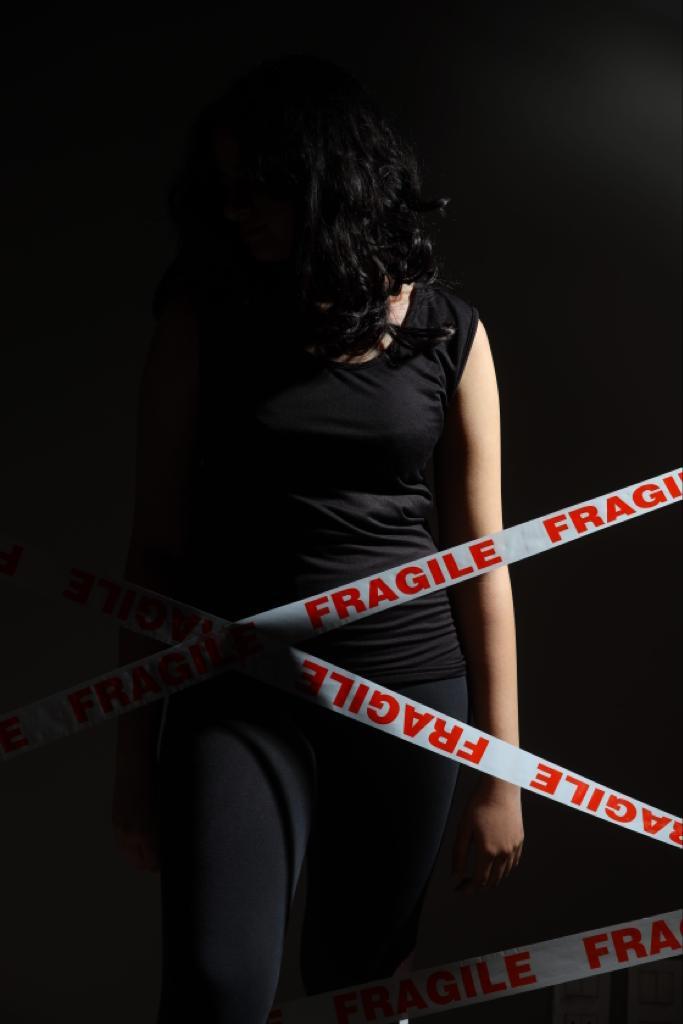
As part of the IB Diploma Programme Visual Arts HL course, I experimented with many different techniques in photography and was able to take good quality portraits with a Canon EOS R professional camera. These photographs all share a common element; fragile packing tape. The stickers reflect the fragility of the female body as a result of constant objectification and oppression.
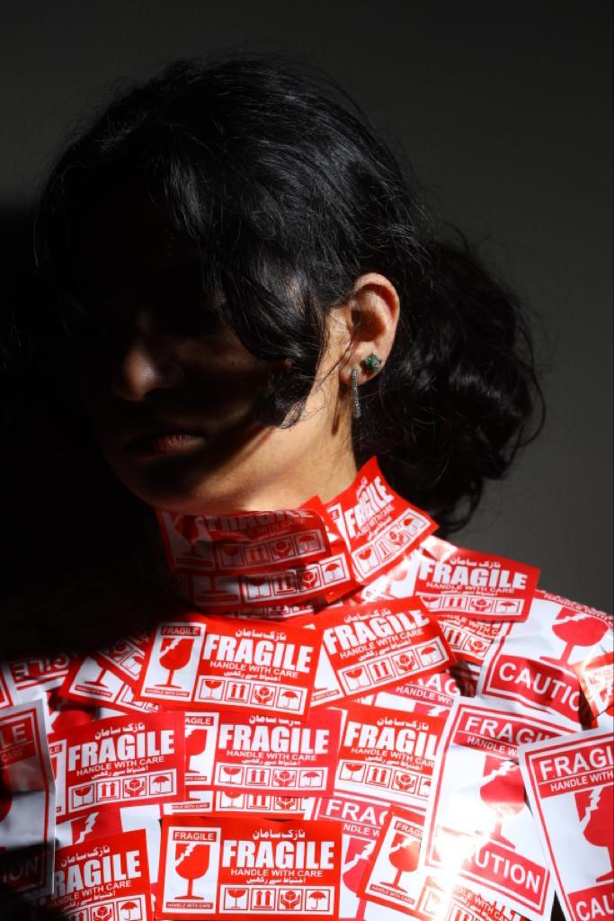
The tape acts as a barrier and a reminder of the pain and oppression women often feel.
05
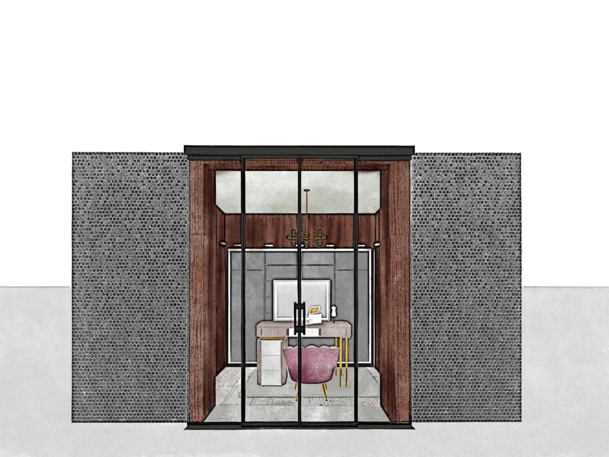
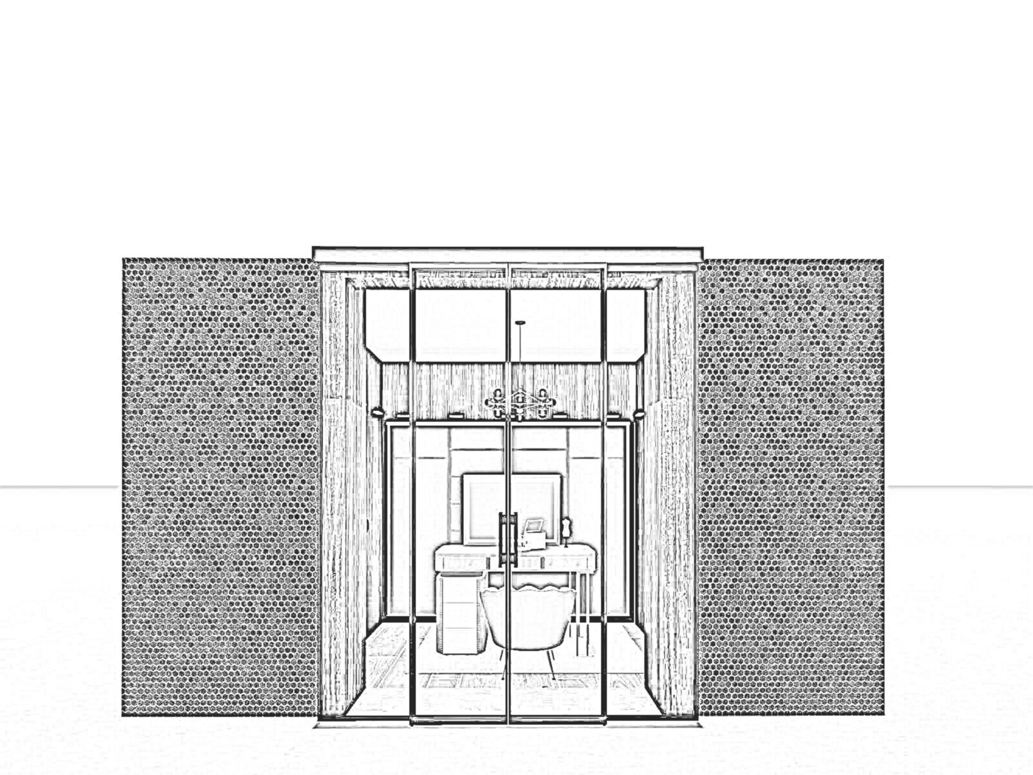
PROJECT 01
WASHROOM REDESIGN
Design Brief:
Redesign Dressing Area in my Washroom to increase efficiency and achieve better functionality.
06
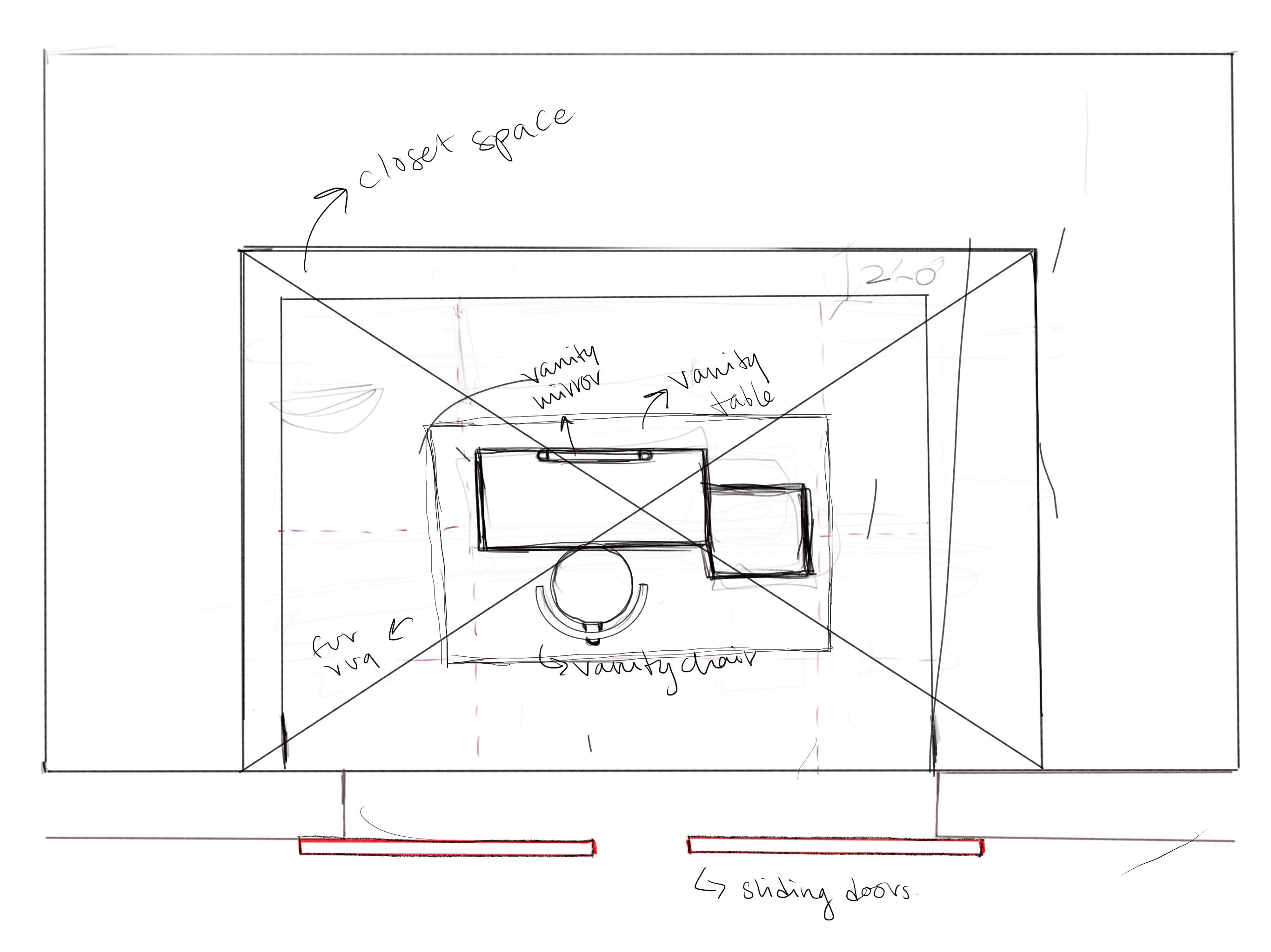
FLOOR PLAN DEVELOPMENT STAGES
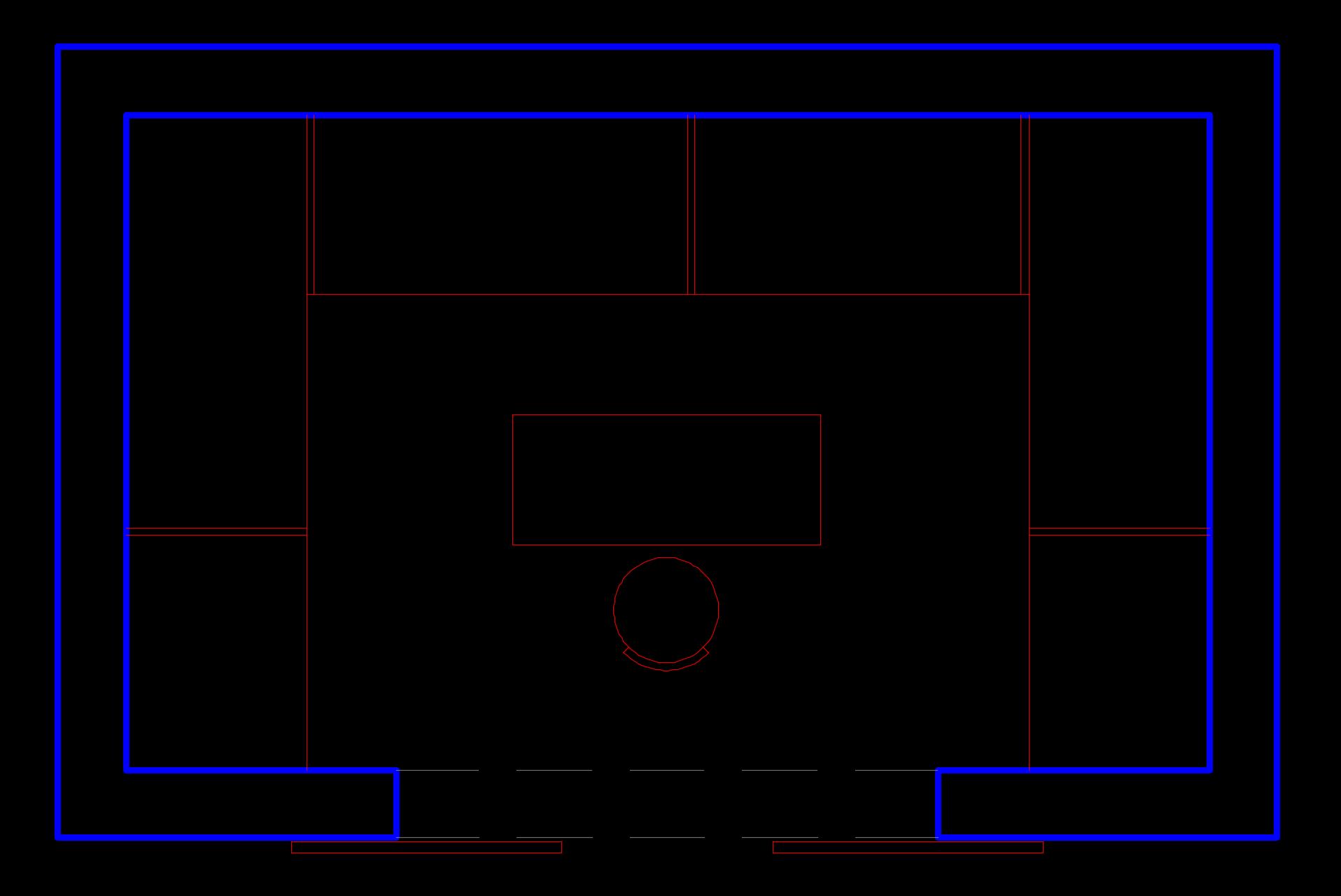
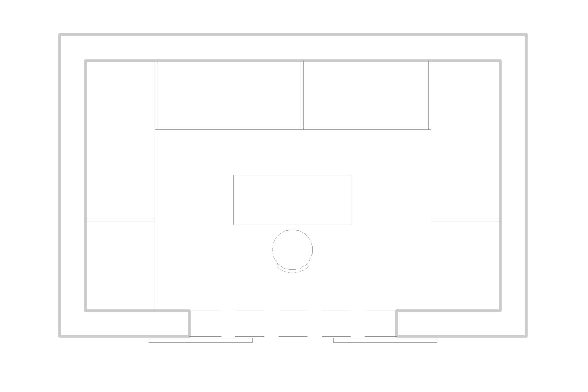
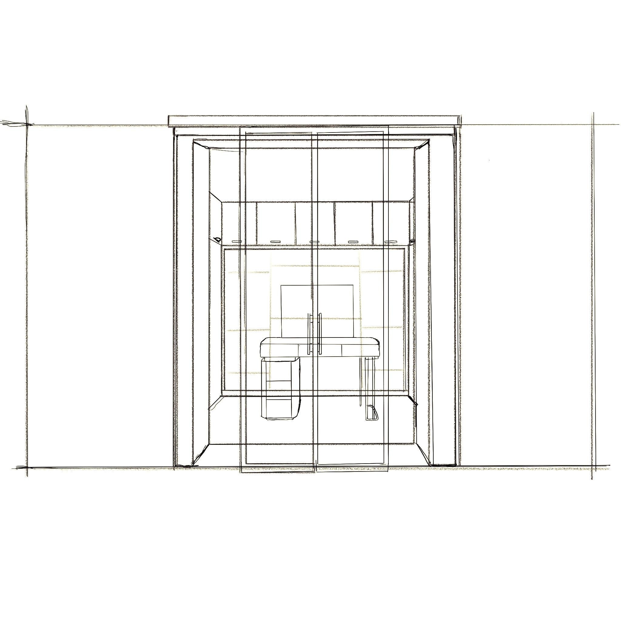
The floor plan for the dressing area had to go through various stages of development before I could present the final rendered floor plan. I started from a rough sketch in Procreate, which gave me a clearer idea of what furniture to place where, and to highlight the key changes. After doing so, I drafted the floor plan in AutoCAD to achieve accurate proportions. Then, I was able to take the drafted AutoCAD plan into Photoshop, where I first inverted the plan to convert it into black and white, and then continued to render the floor plan according to materials (wood, wood tile, marble top) etc.
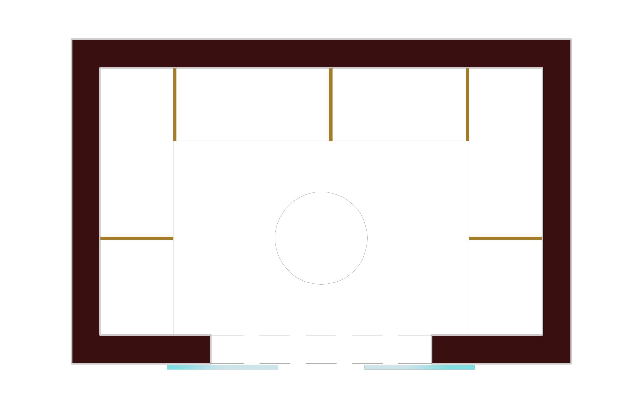
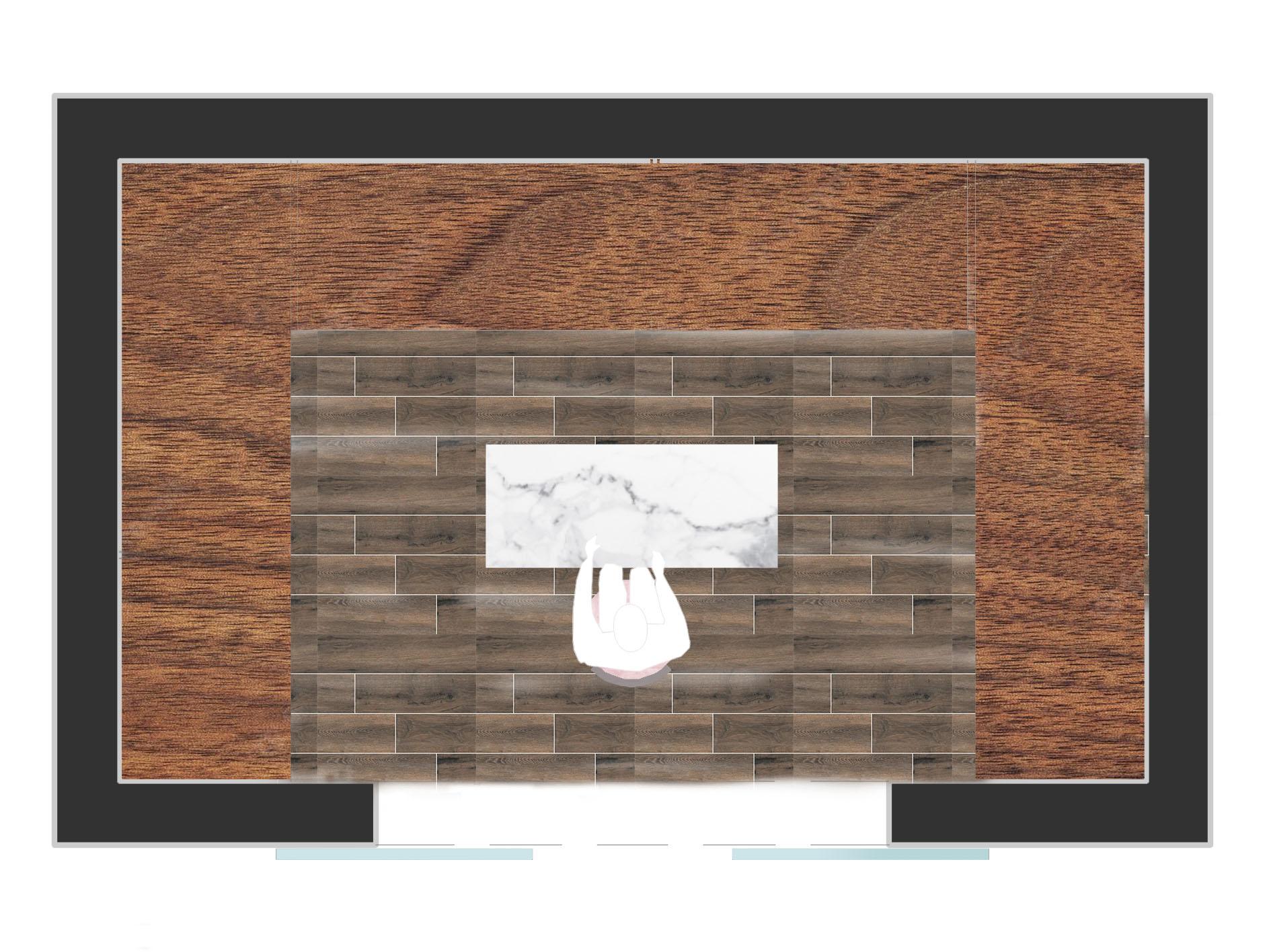
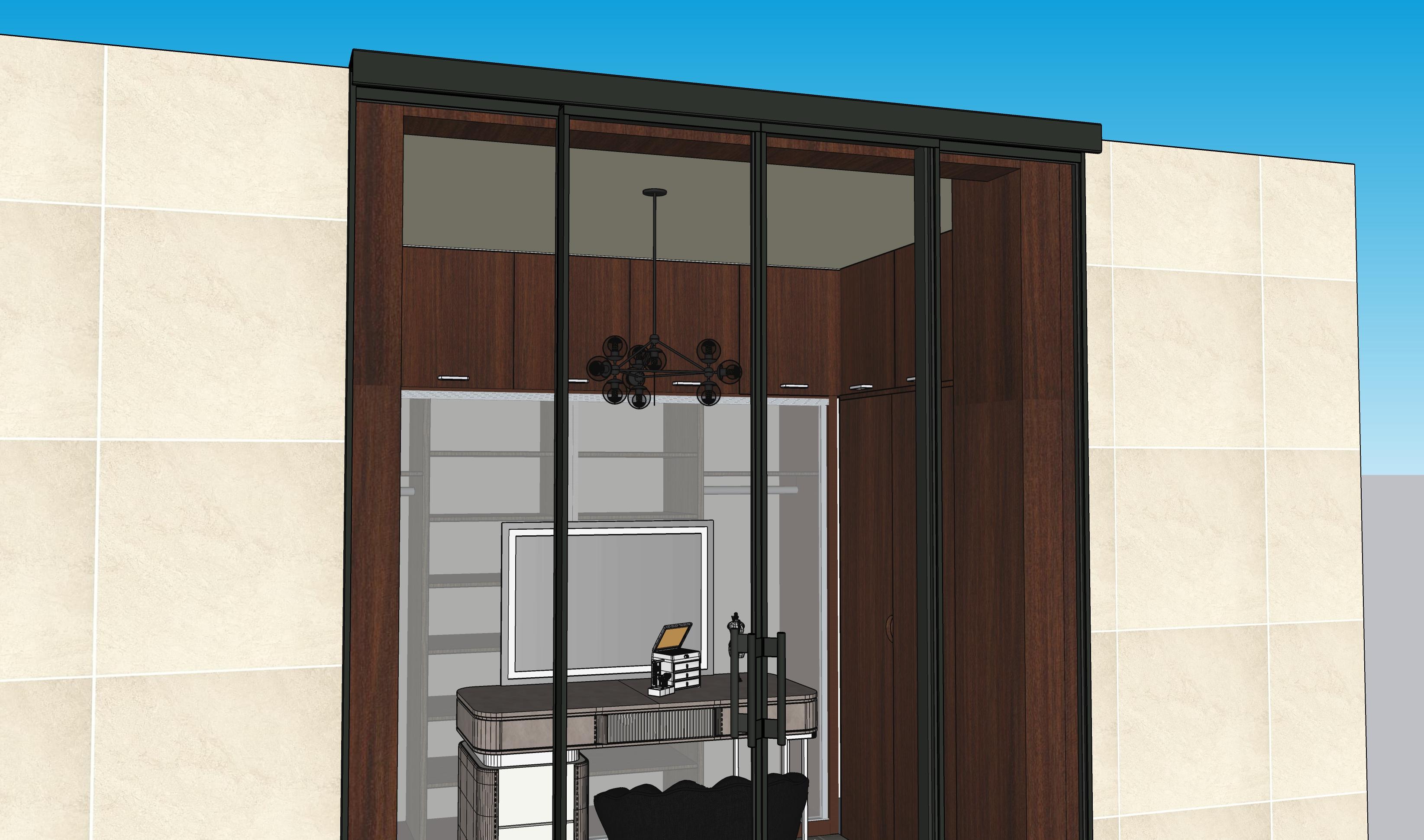
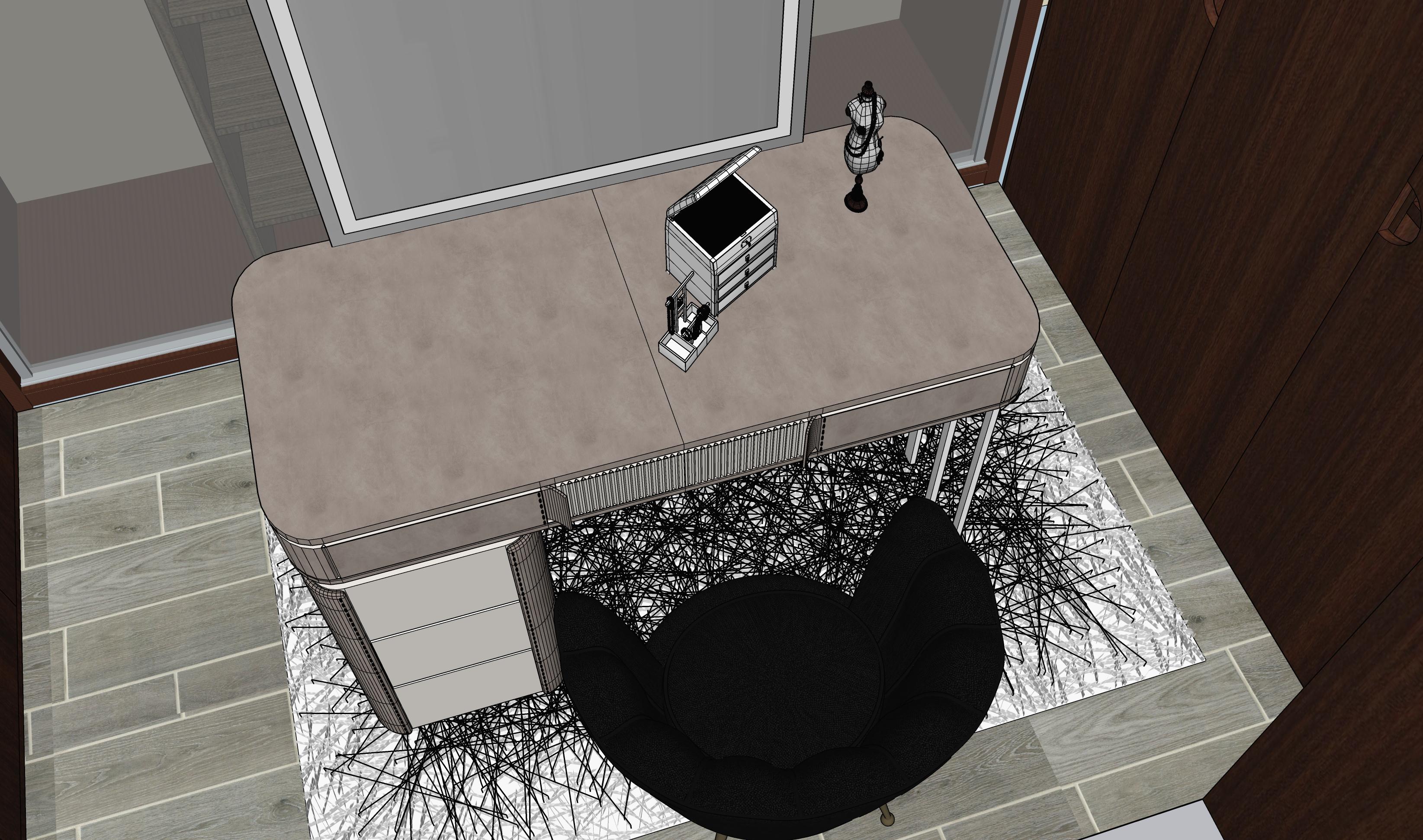
My washroom had plenty of space for a vanity room and was not being used. I wanted to design a vanity room that would take up the existing available space and also improve efficiency. Though the space was available, it was a bit tight due to the thickness of the closet space. Therefore, spatial awareness was crucial to this design.
07
Procreate AutoCAD
Photoshop - Inverted
Photoshop Photoshop - Rendered
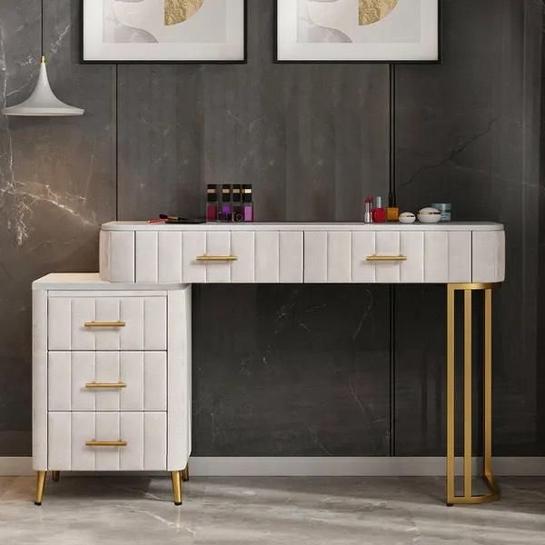
DESIGN TOOLKIT

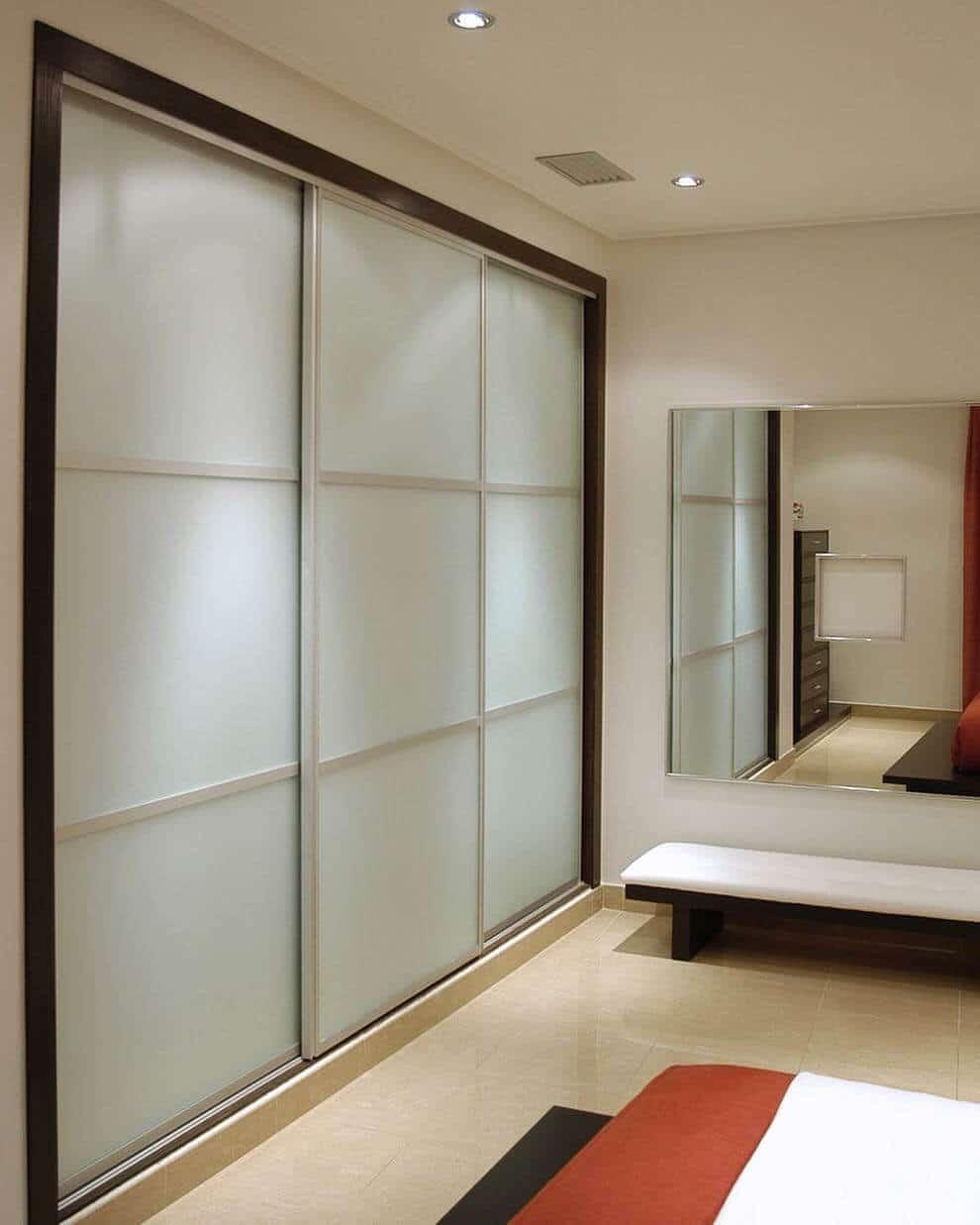
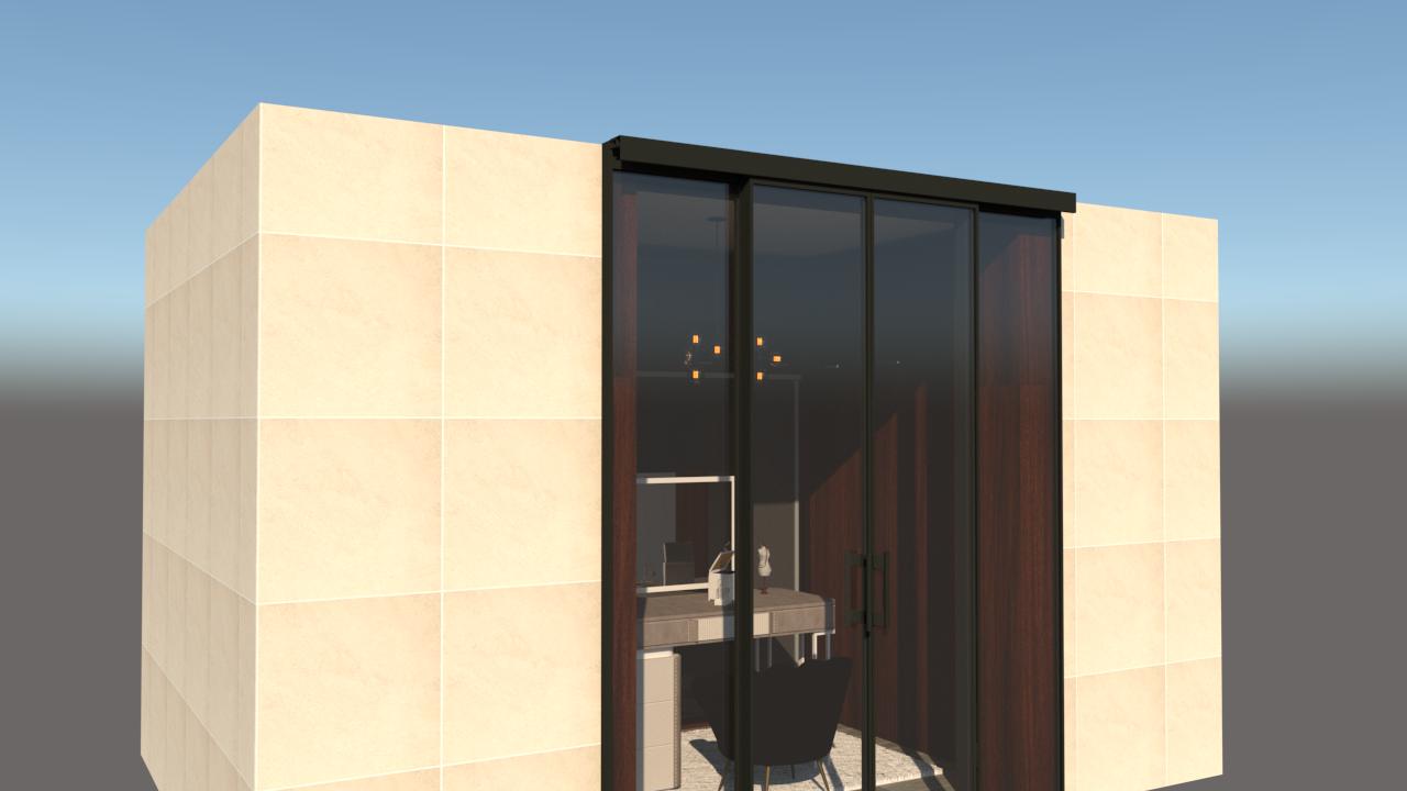
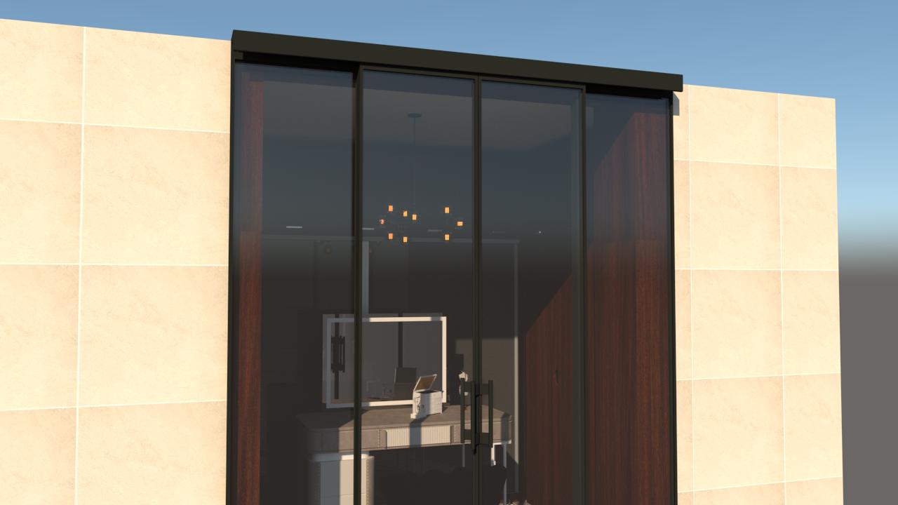
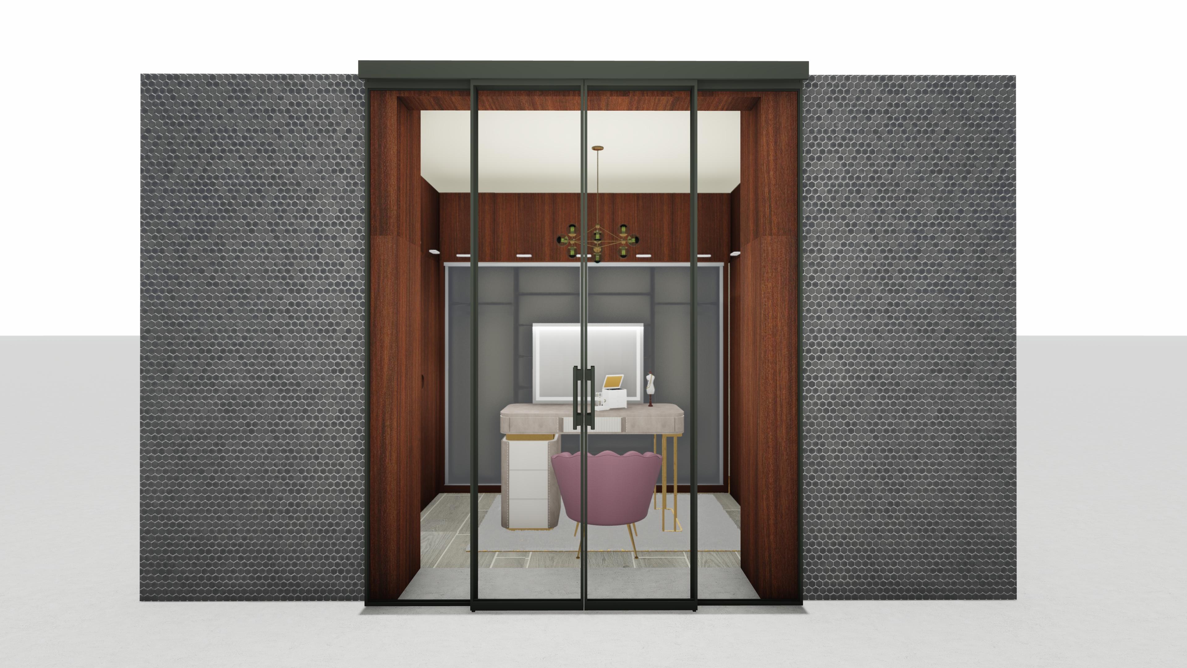
 Sliding Glass Door Closets
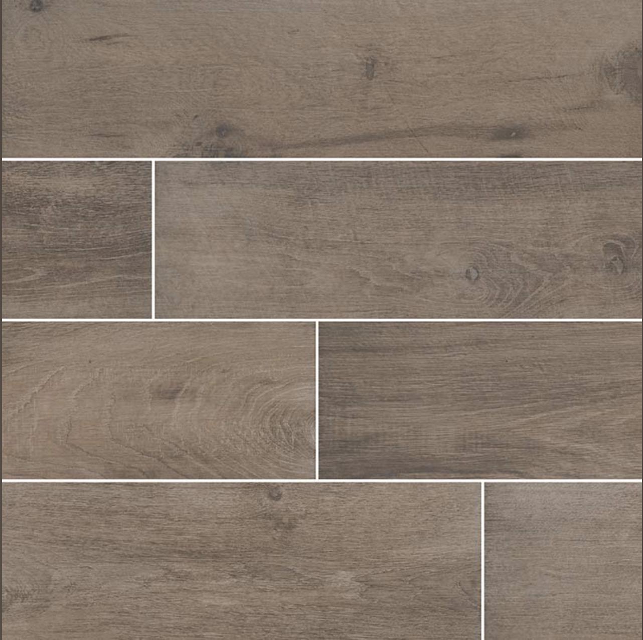
Wood Finish Ceramic Tile
Sliding Glass Door Closets
Wood Finish Ceramic Tile
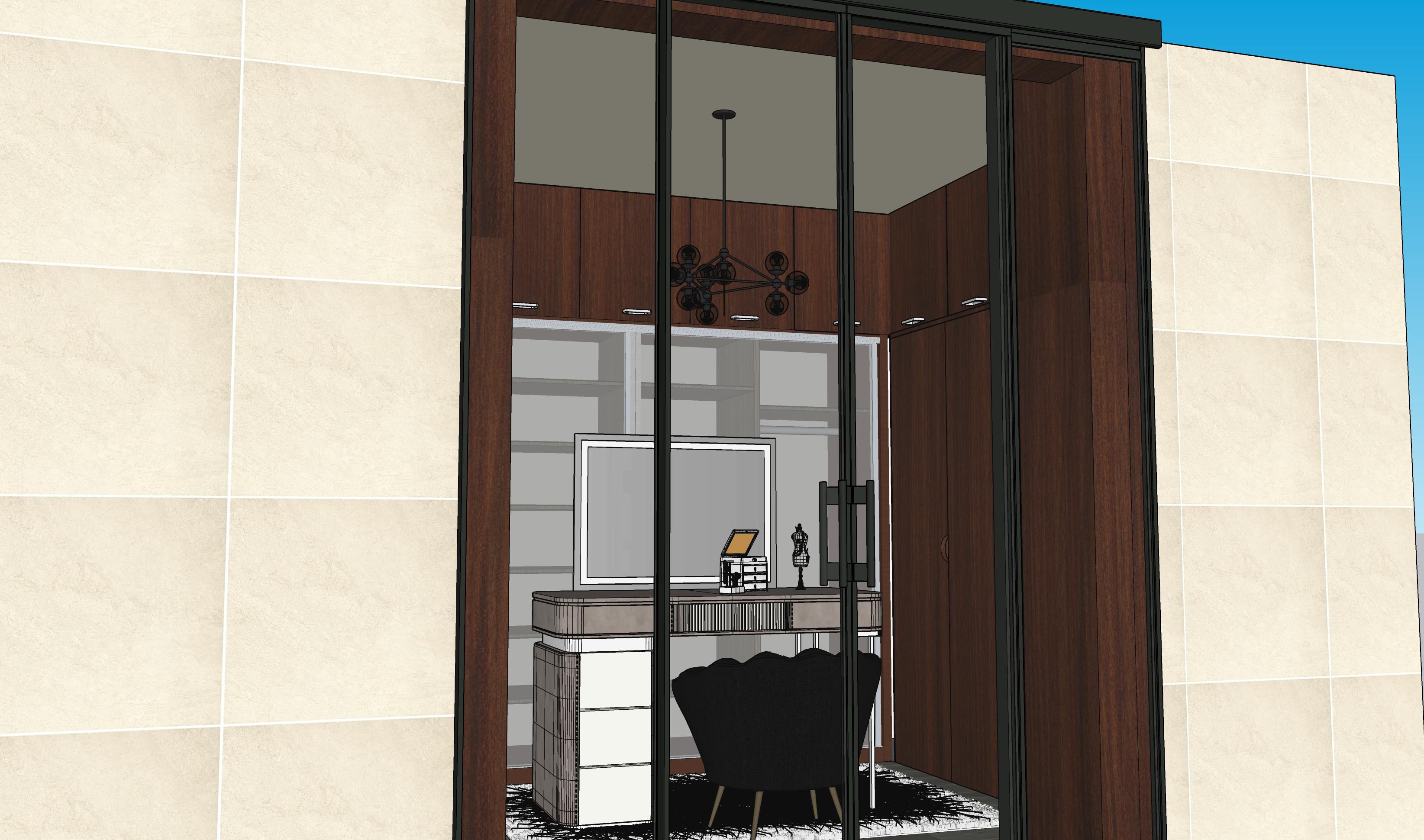
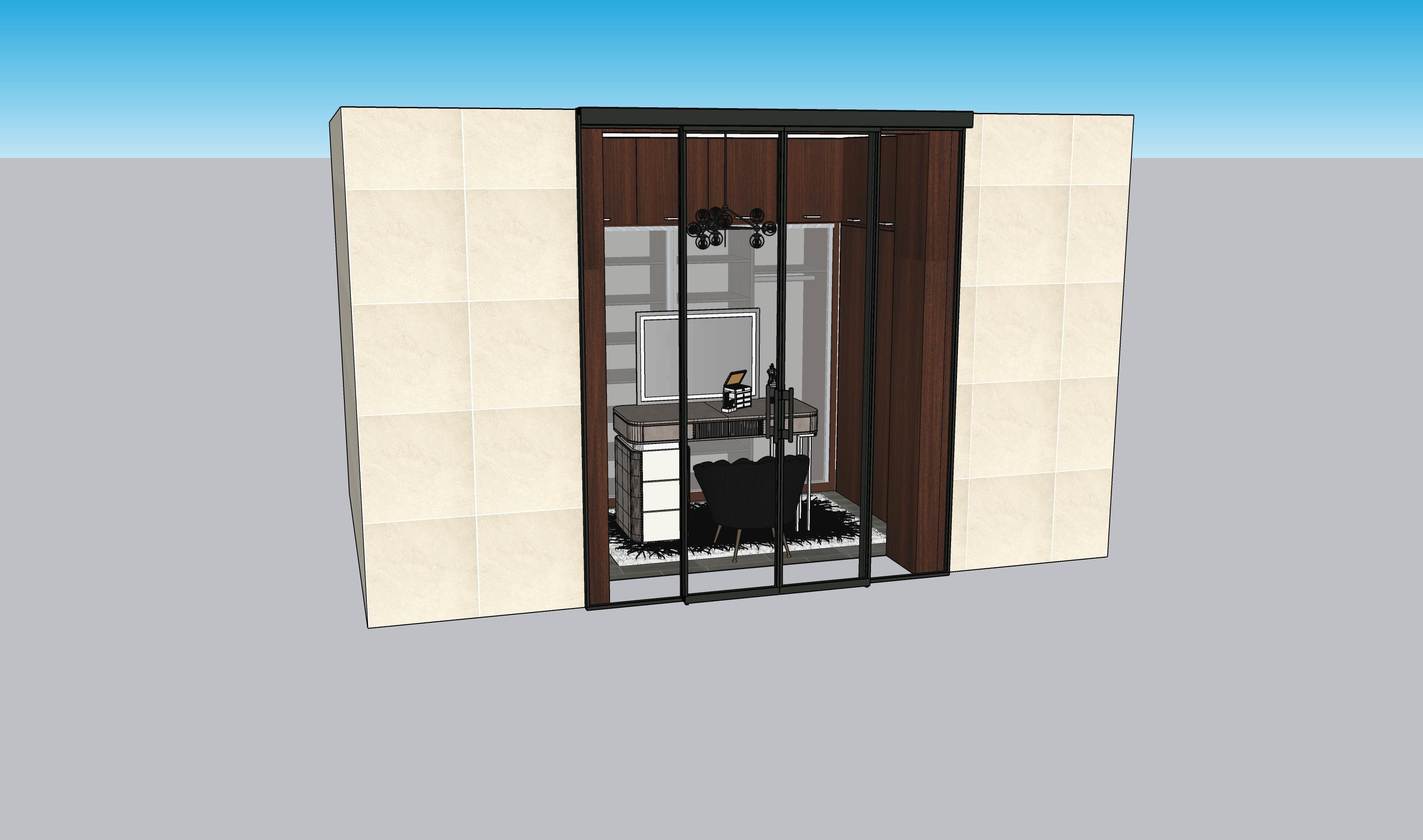
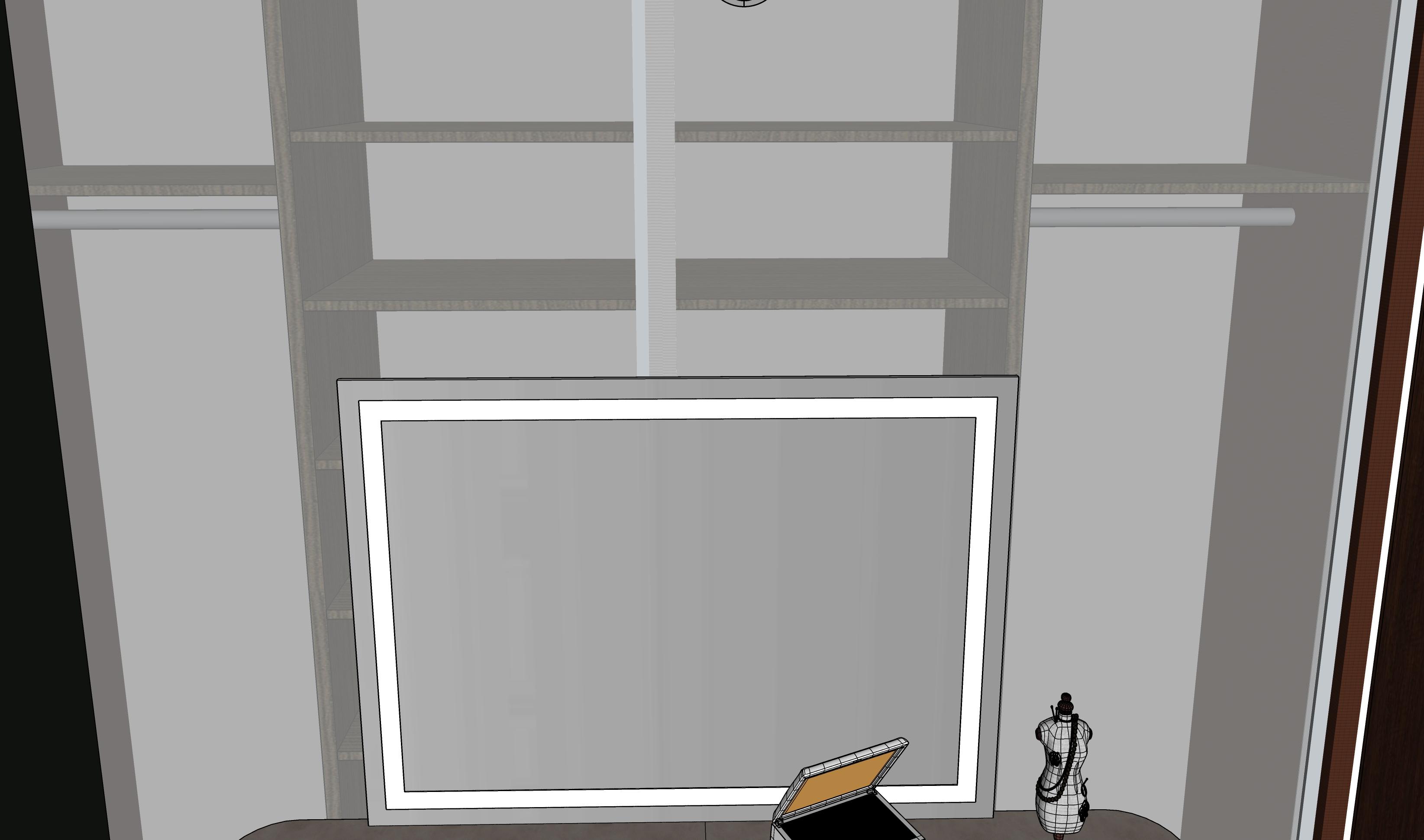
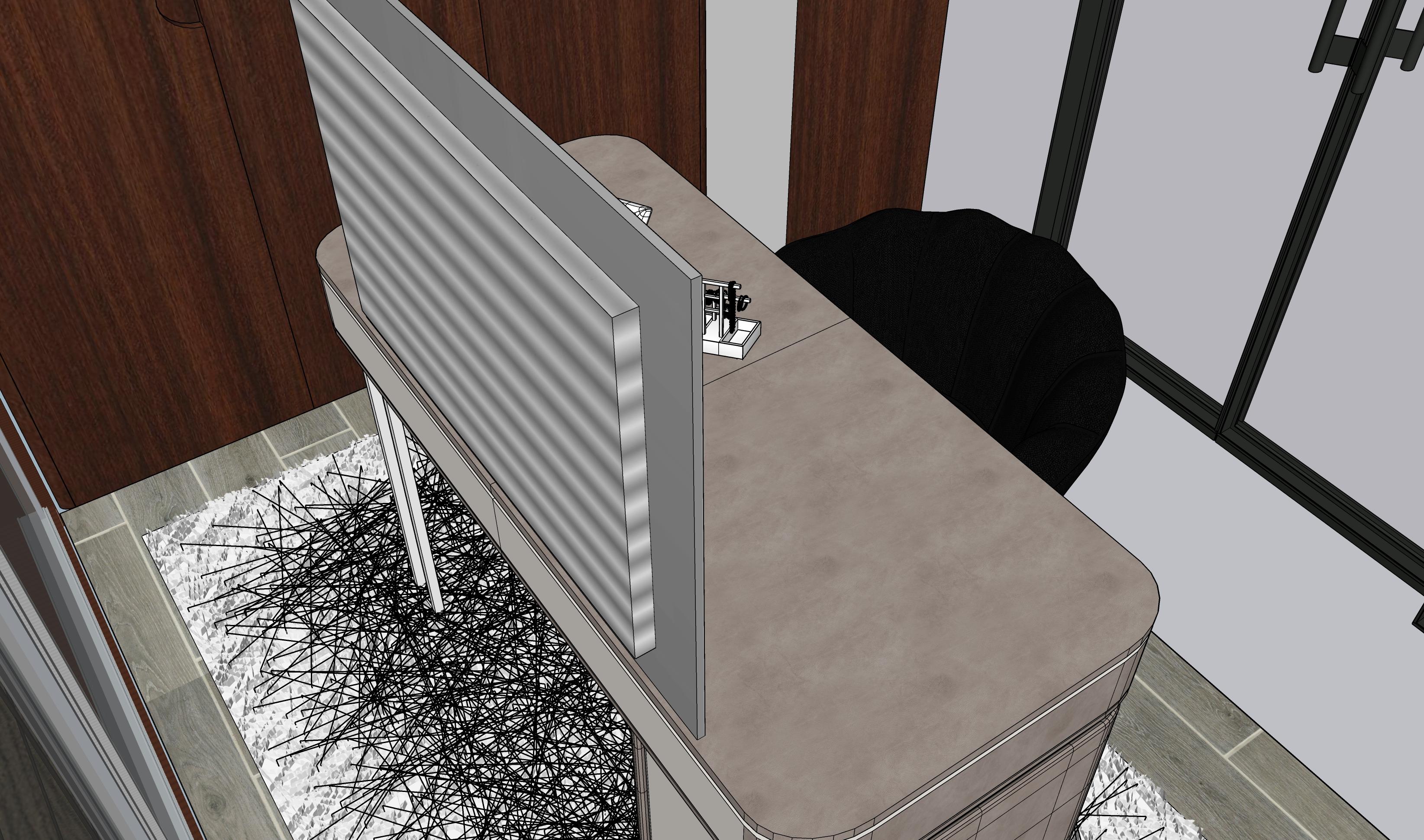
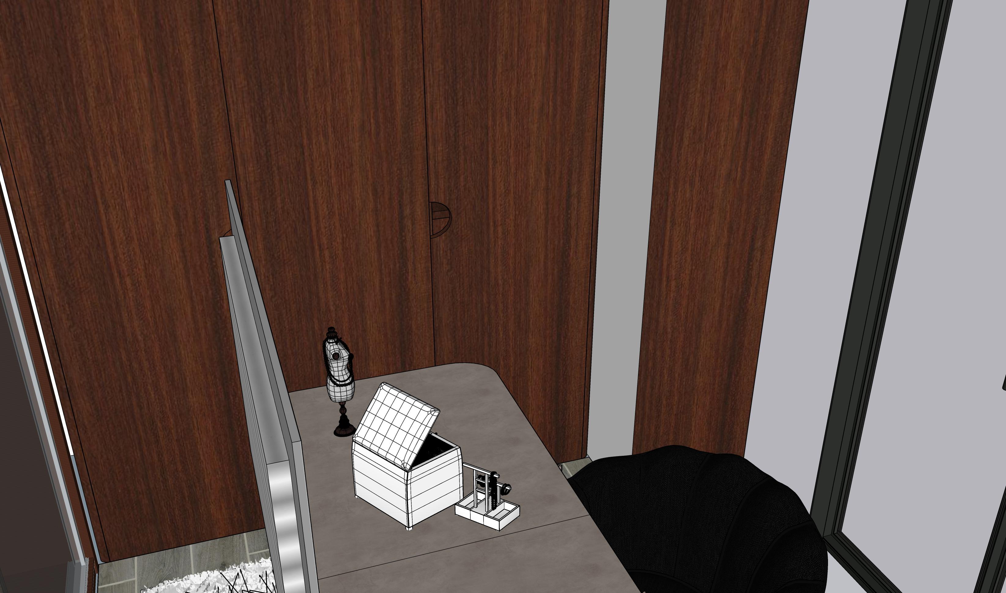
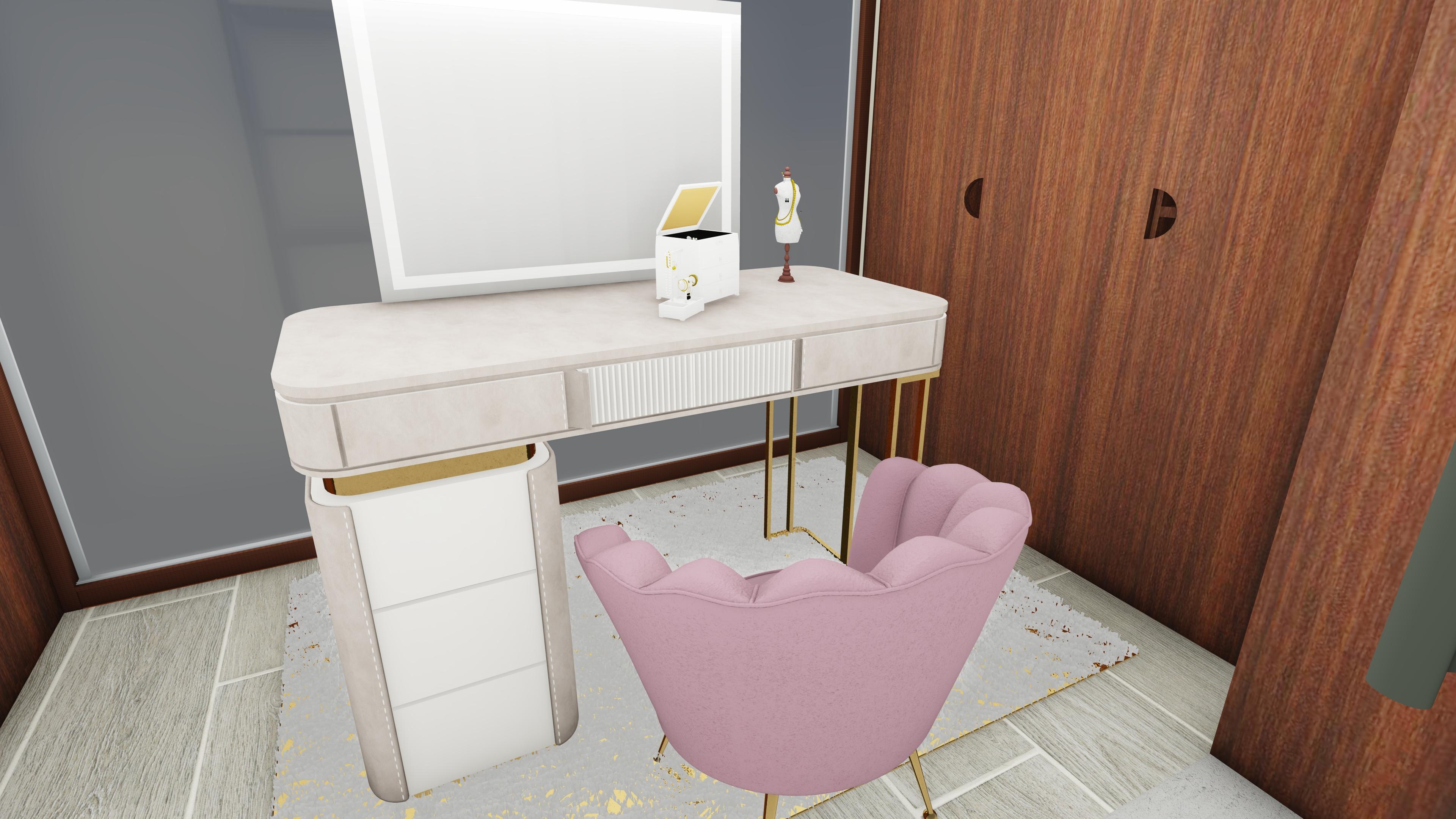
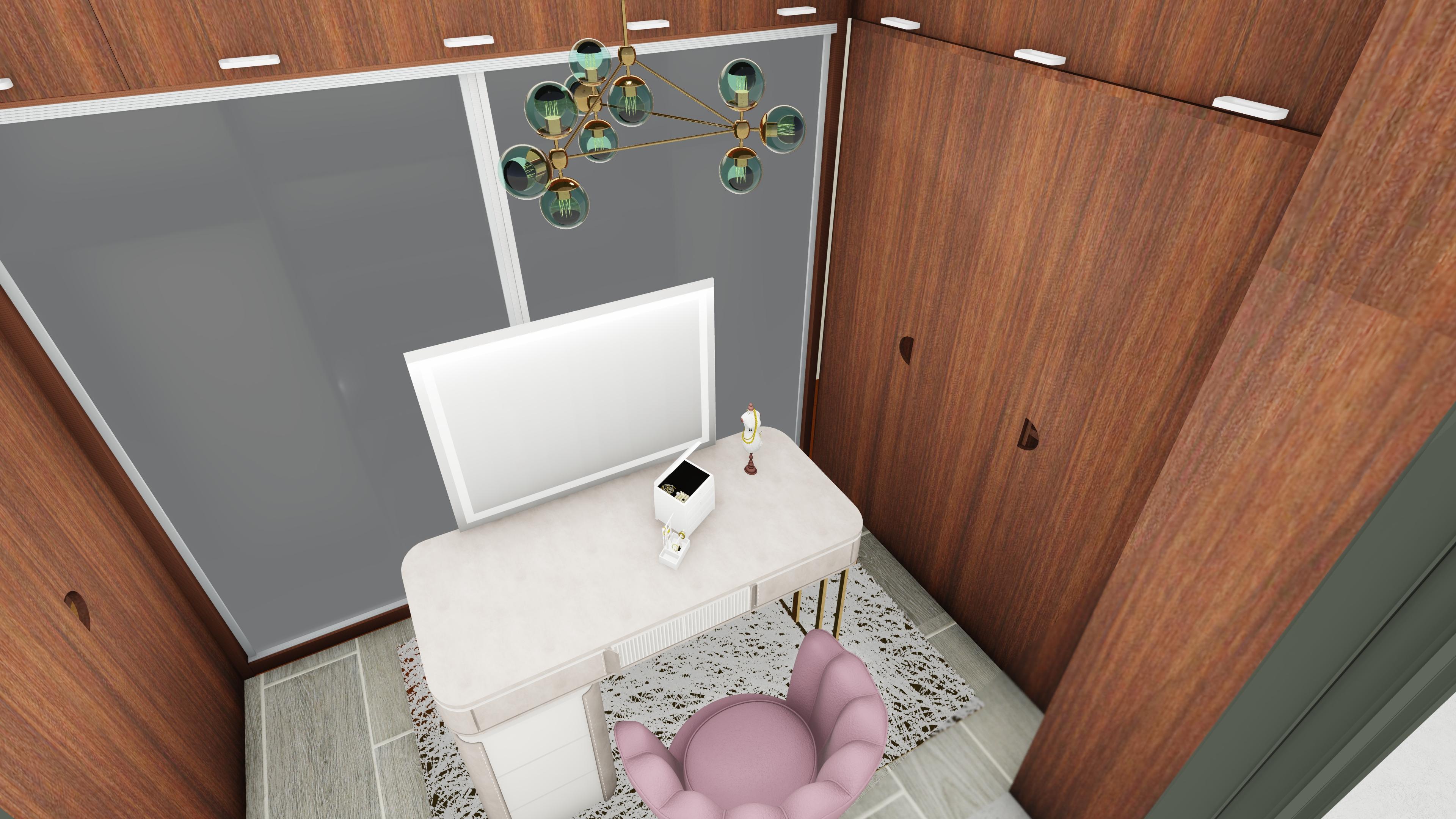
Vanity Table 08
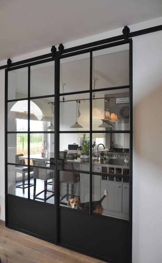
Iron Frame Transparent Sliding Glass Door
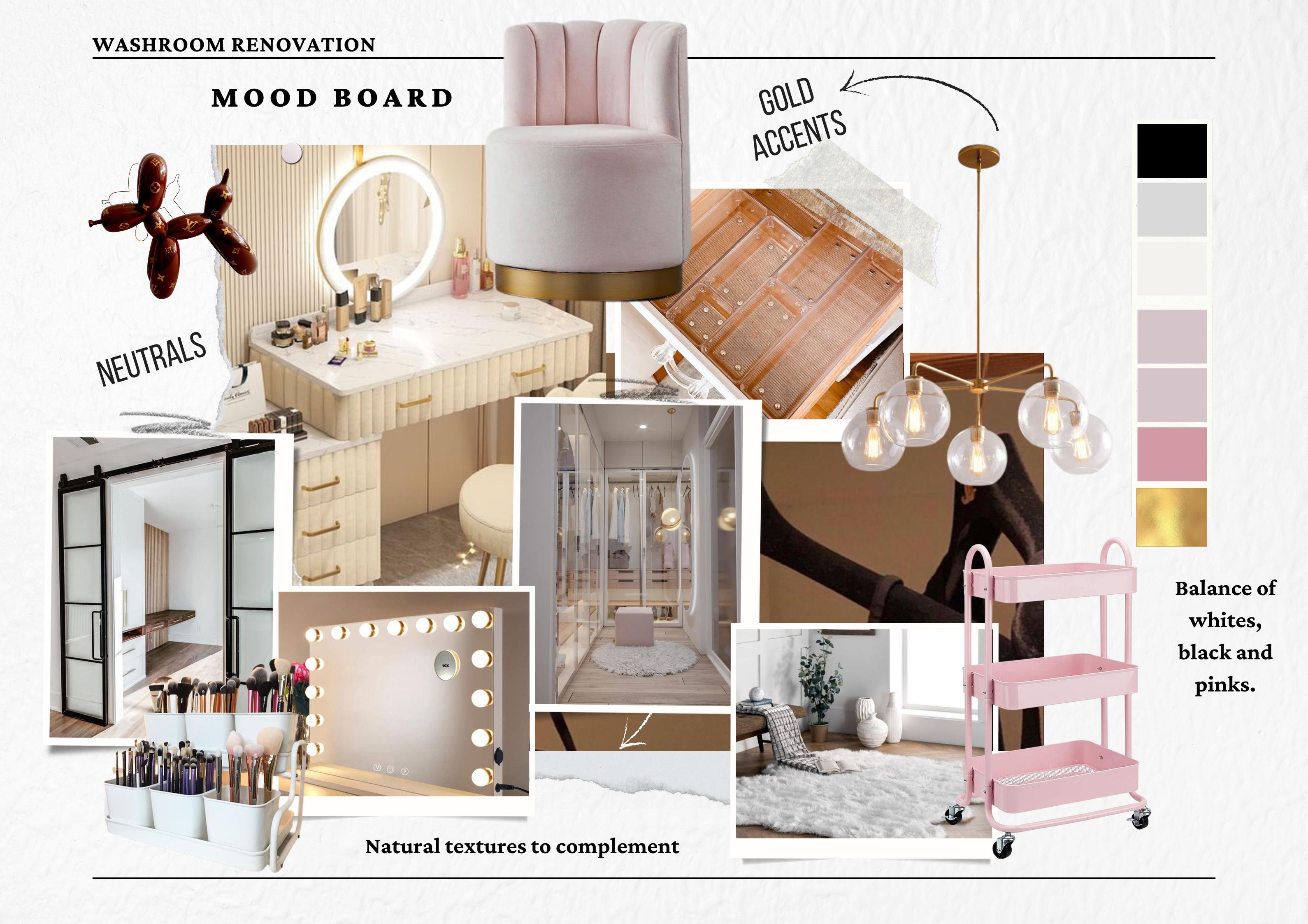
MOOD BOARDS
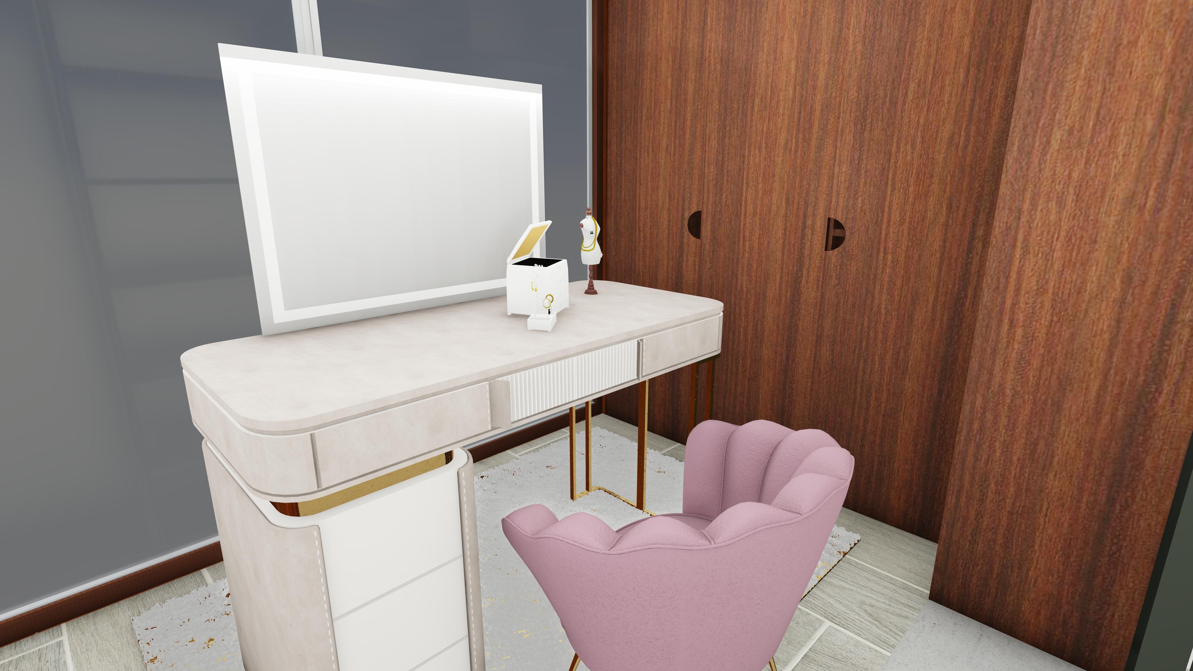
The mood board I created for this project was based on a minimalist and modern design style where the neutral colours and tones are in harmony with the existing natural textures (wood tiles, translucent sliding closet doors, chestnut wood) and the balance is established with the addition of pinks in the form of sliding trolleys and the blush pink vanity chair clad in suede. The gold accents would also add a sense of flair and look visually appealing.
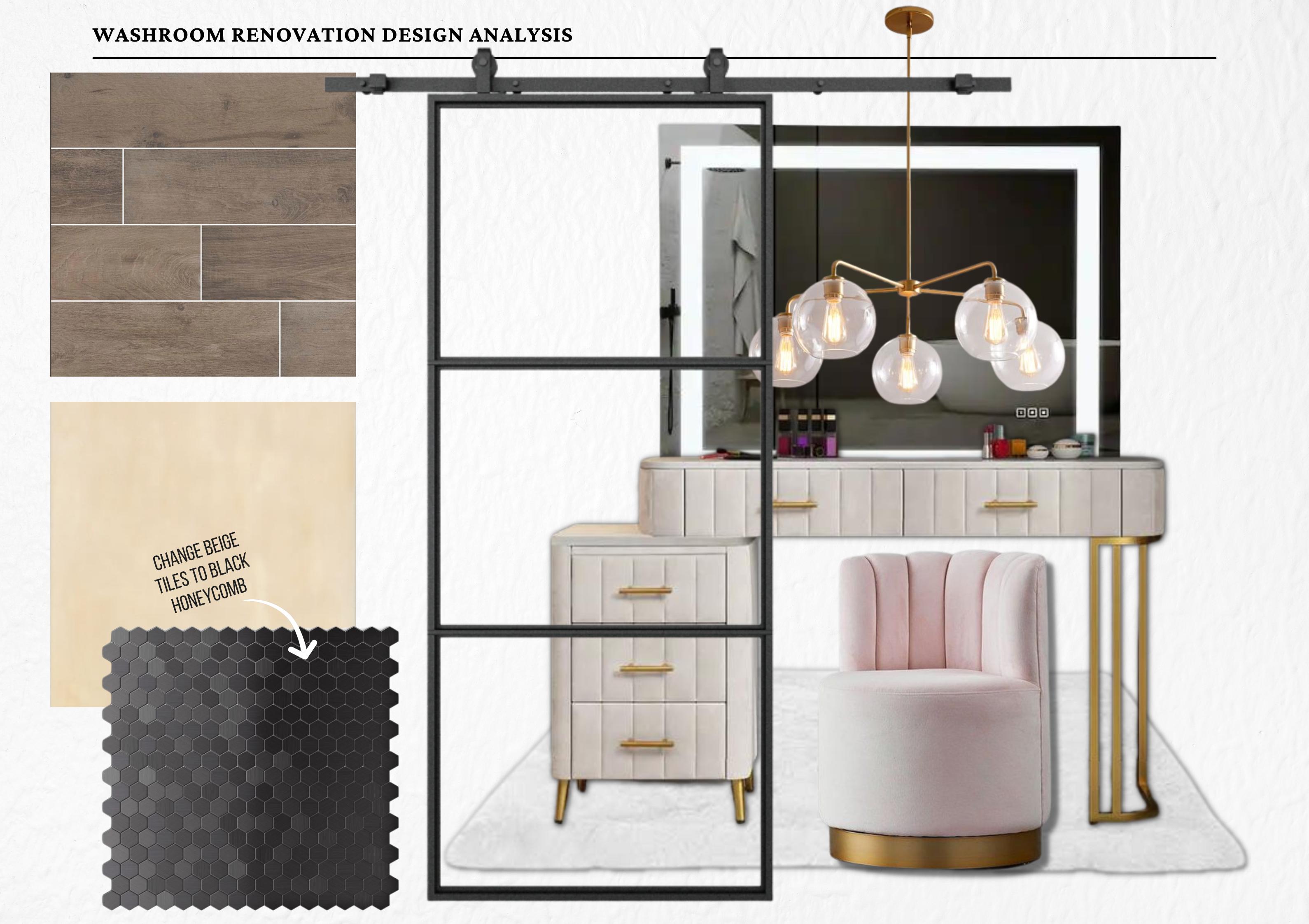
I designed this vanity room for myself; for someone who loves neutral colours such as white and black, and also prefers highlights of pink. I also grew tired and bored of the beige tiles that surround the exterior of the dressing room, and decided that I wanted to change it to black honeycomb patterned tiles. The honeycomb tiles would also be practical in the long run as they would be easy to take off if I ever change my mind and want to switch back to beige.
09
3D RENDERS DEVELOPMENT
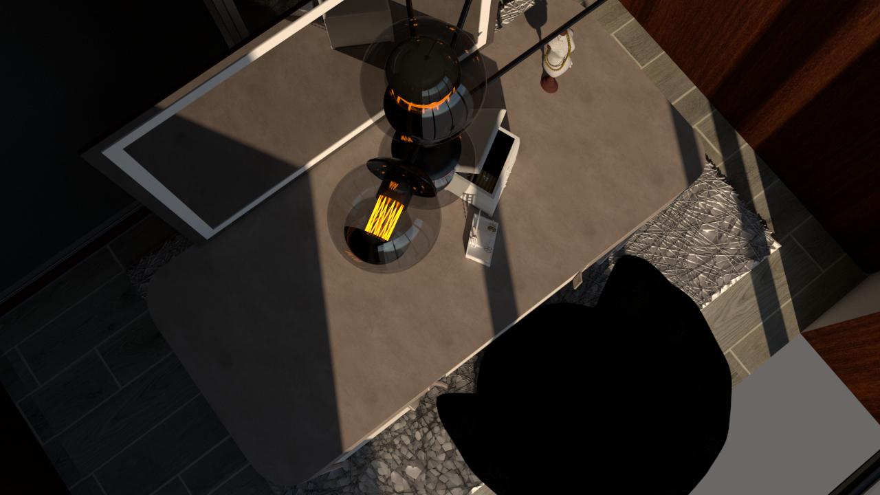
Before shifting to Lumion for final touches, I built the 3D model on SketchUp, using the floor plan I had made on AutoCAD, This allowed me to achieve more realistic looking renders, and gave me a better idea of the implementation of my chosen materials and textures in a real life setting.
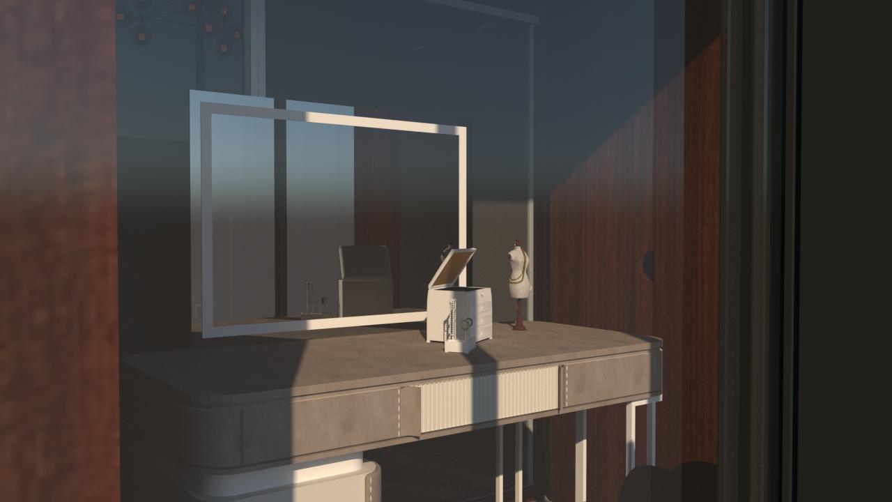
Other than Lumion, I also experimented with VRay and was able to create a number of photorealistic renders of the dressing area. Though the learning curve was steep, after much trial and error, I was able to achieve good quality renders. However, I still struggled with lighting and if I would do it over, I would definitely spend more time learning and trying to perfect the lighting and atmosphere.
11
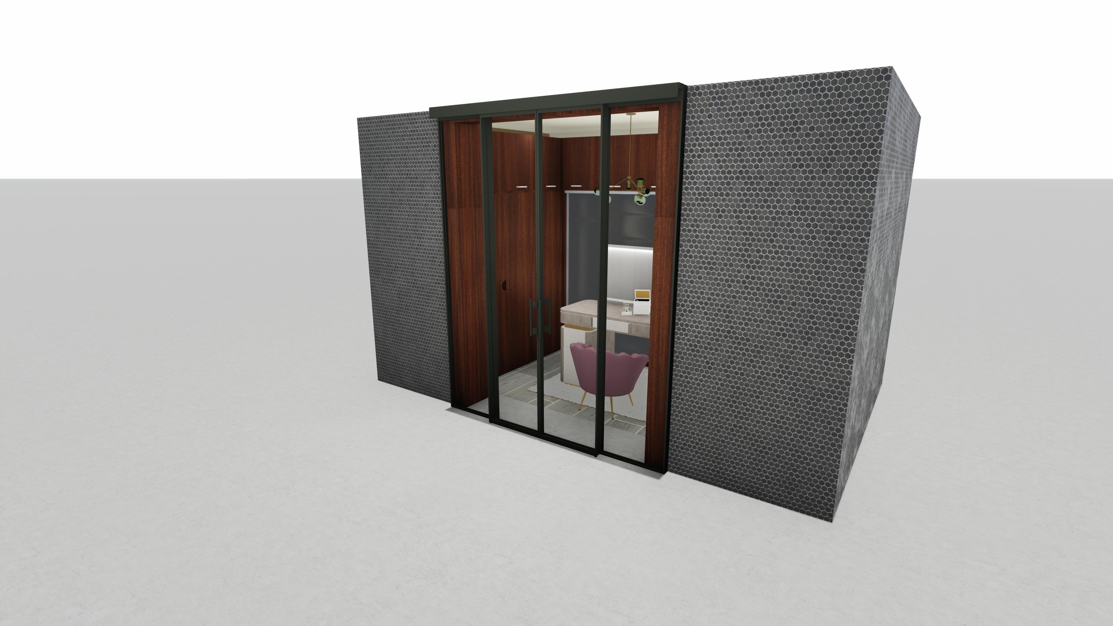
Using the orthographic view in Lumion, I was able to capture and render the 3D model in its entirety.
3D RENDERS
FINAL RENDERING STUDIES IN LUMION
10
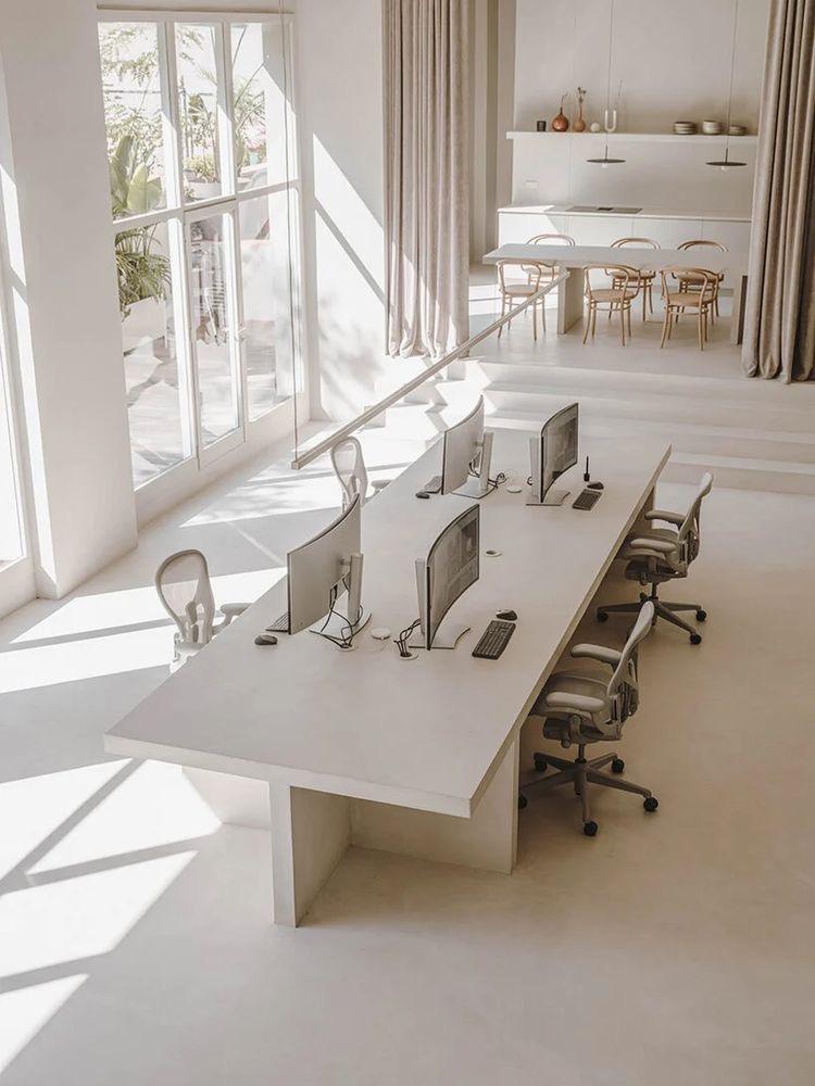
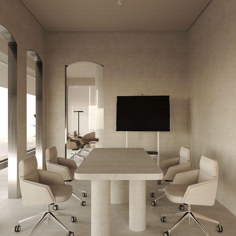
PROJECT 02
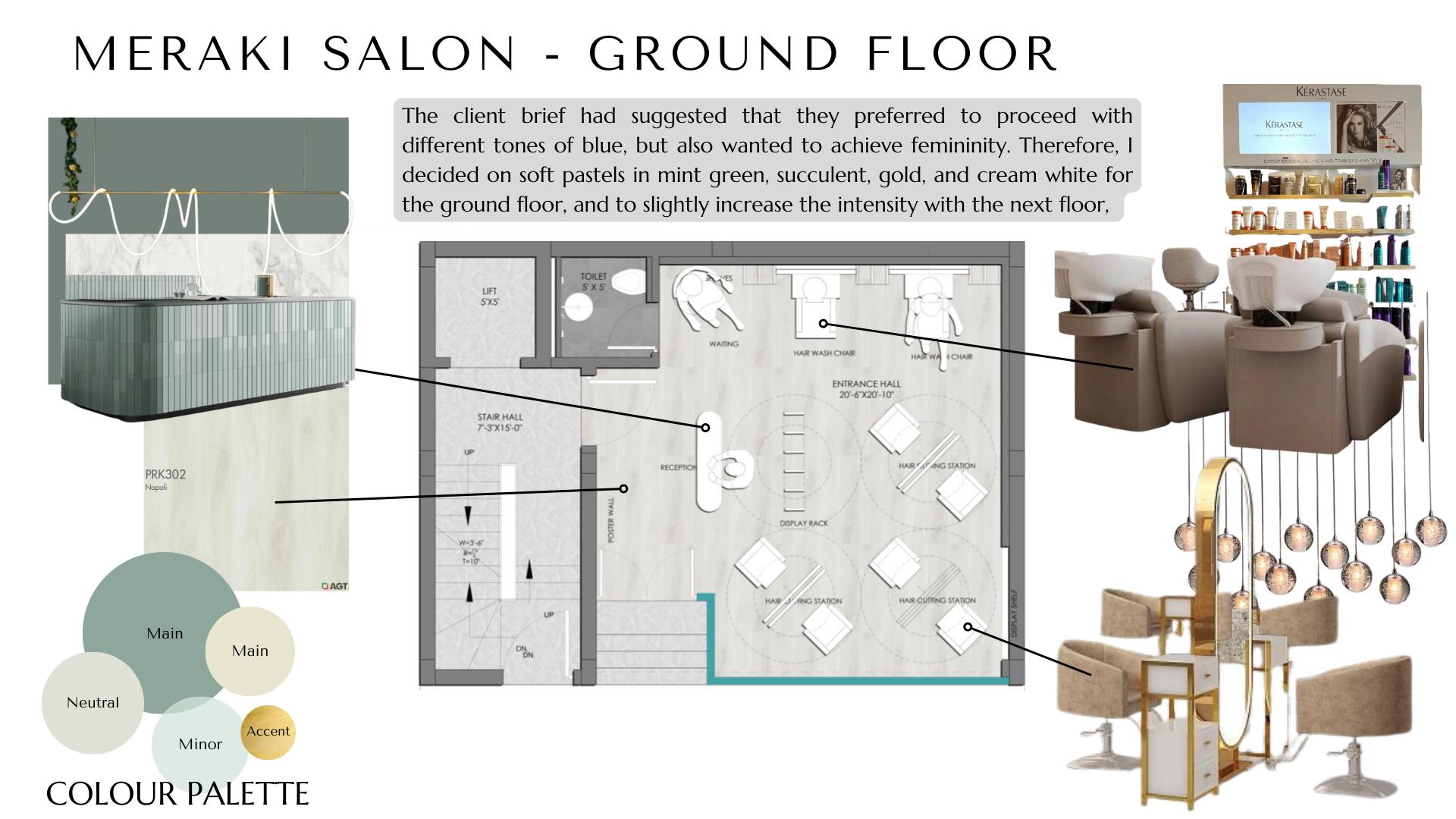
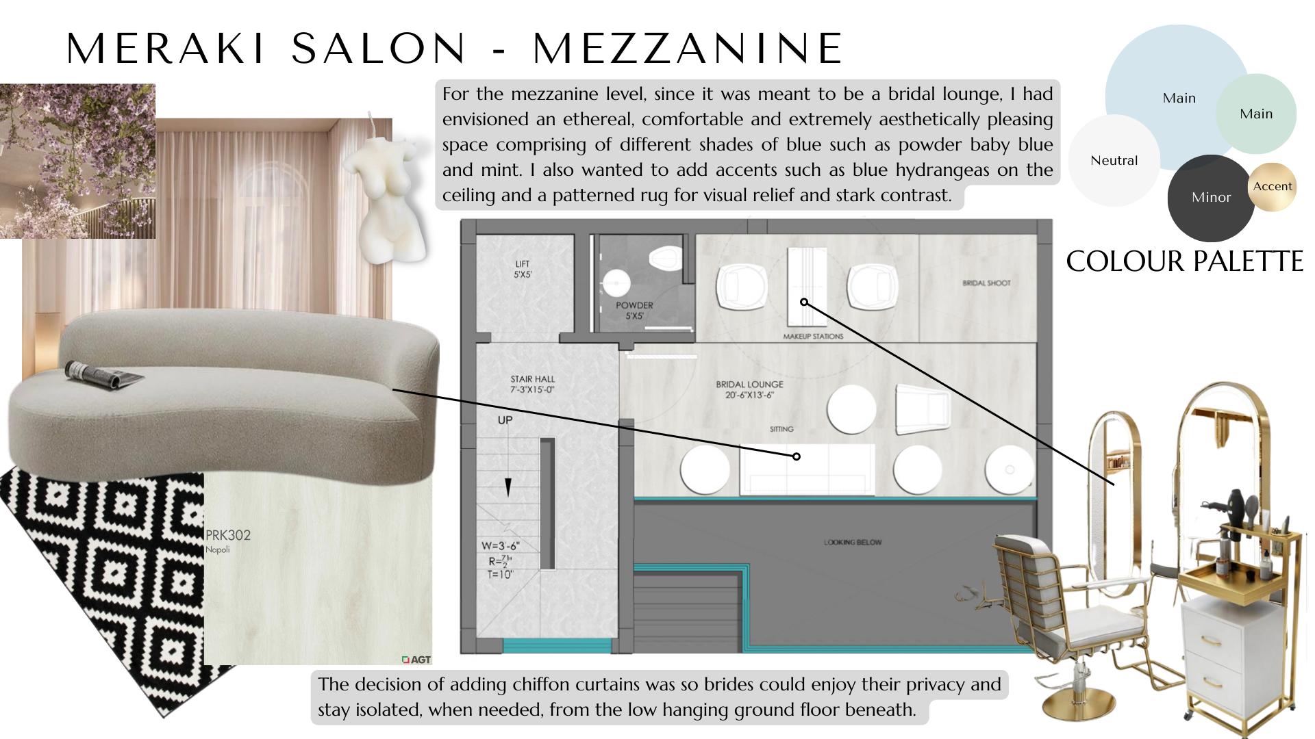
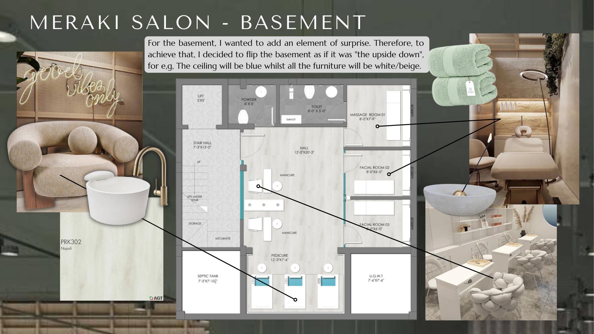
MERAKI SALON
Design Brief: Create a concept design for Meraki that establishes a unique brand identity of beauty, flair and truthfulness to femininity.

12
13
14
15
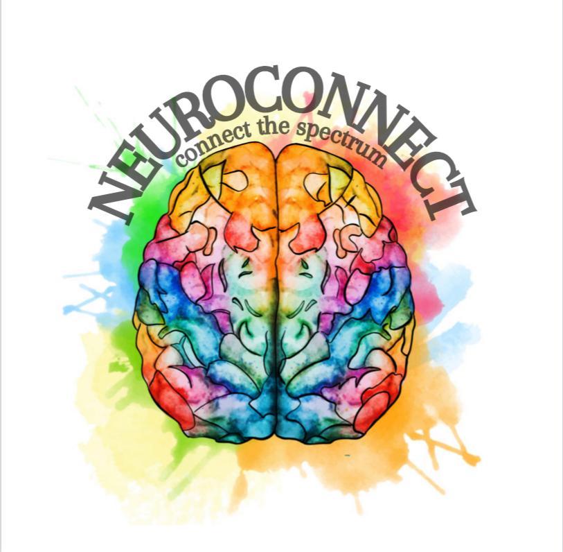
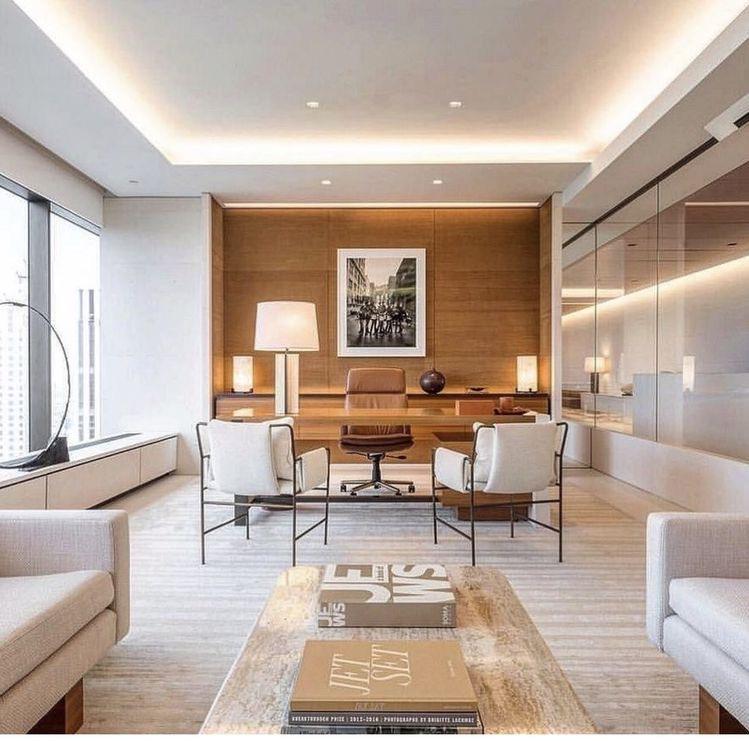
PROJECT 03 NEUROCONNECT
Design Brief:
To design a learning center specifically for neurodivergent children, paying attention to space, colors and functionality.
NeuroConnect is an initiative I started, that aims to spread awareness about neurodiversity and the stigma that surrounds it. The project is based upon a family property that I would like to donate to the cause in the future.
16
MY VISION
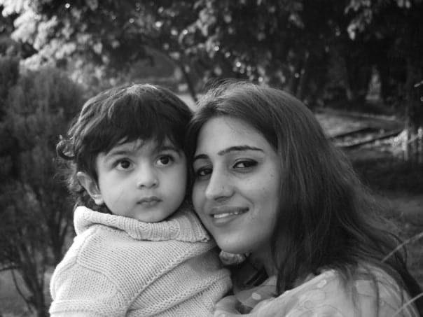
My younger brother was assessed as autistic at the age of 3 and has since then oscillated within the spectrum from Low Functioning Autism to High Functioning Aspergers Syndrome.
Two years ago, I developed an initiative called NeuroConnect to spread awareness about children on the neurodivergent spectrum. I’ve always seen design as a means to solve problems; to make life easier and more accessible.
The school environment in Pakistan does not seem to address issues associated with neurodivergence. I would often find my brother complaining about loud noises and bright colours that would trigger his stimming responses, and cause him to lose focus in school.
Using NeuroConnect as my platform, I carried out extensive research into what makes the perfect learning center for neurodivergent children. Using this information, I designed a learning center incorporating a low arousal, calming decorative scheme, paying attention to space, colors and functionality. Through this process, my interest in interior design evolved. I came to the realization that interior design can make a difference, an impact.
17
PROCESS SKETCHES
Design interventions on existing plans through sketches
Before making changes to the blueprint plan of the site on AutoCAD, I made rough changes to the plan digitally. This allowed me more flexibility in terms of any changes that had to be made or anything that I felt needed to be removed from the plan entirely. For example, I had worked out an idea of adding an elevator to the plan, but later decided against it due to lack of space.
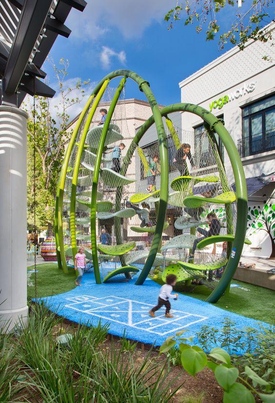
A challenge I faced was adding the "Luckey Climbers" interactive play area to the floor plan. During my research, luckey climbers' vision of offering "adventures to kids of all ages while challenging them to problem-solve, think spatially, and most of all, be kids with other kids" really appealed to me and seemed suitable for the space I was designing (an outdoor sensory playground). However, I struggled with adding its top view into AutoCAD. I solved this problem by studying the Luckey Climber and sketching its elevation, 3d orientation, and top view.
18
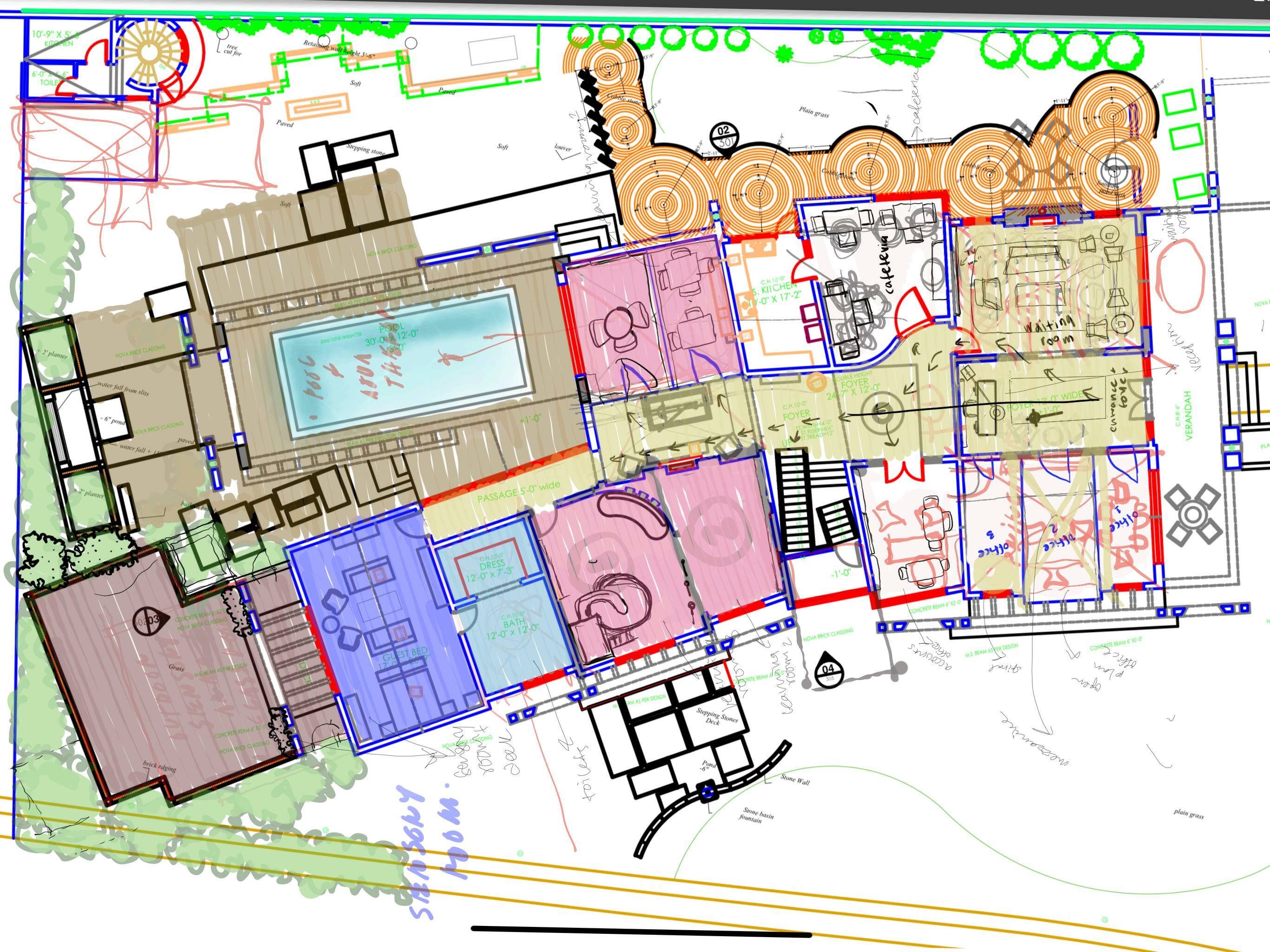
FLOOR PLAN GROUND FLOOR


After an adaptive reuse of the existing plans of the property, the final plan was achieved. I studied the digital drawings and made the changes on AutoCAD.


Throughout this process, I suggested property renovations and took advice from the architects and engineers of walls that I wanted removed and/or added to create spaces that fit my design intent.
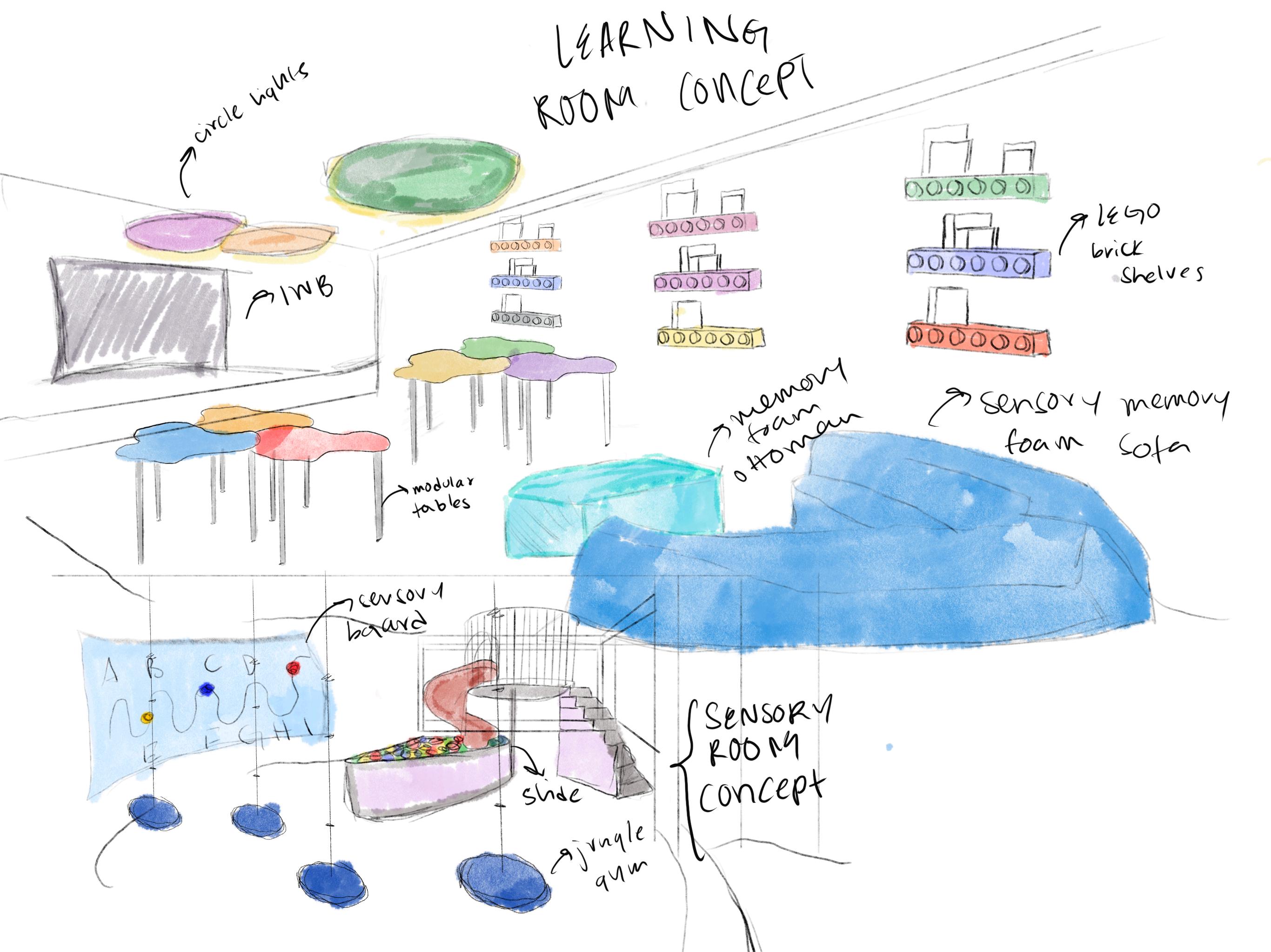
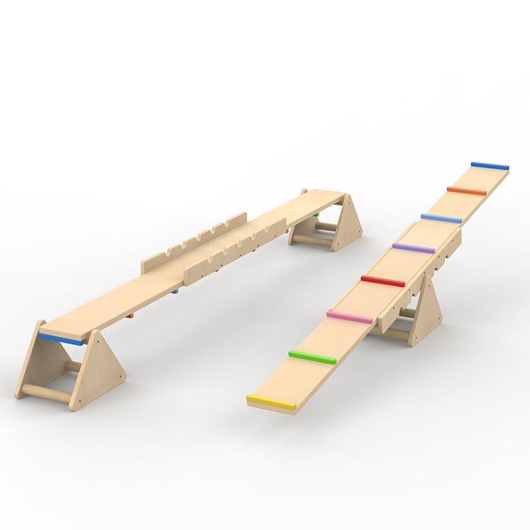
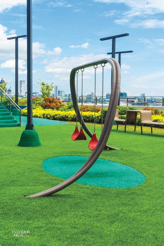
For the outdoor sensory playground, I wanted to incorporate balance board see saws, an ergonomic curled swing and a Luckey Climber. All of these products in an outdoor setting would increase sensory play, encourage communication and result in positive reactions to stimuli.
For the learning rooms/ therapy rooms, I wanted to incorporate soft colours (pastels) that are low arousal and don't overstimulate the neurodivergent mind. I also wanted the tables to promote interactiveness, so I added stackable tables and art tables.
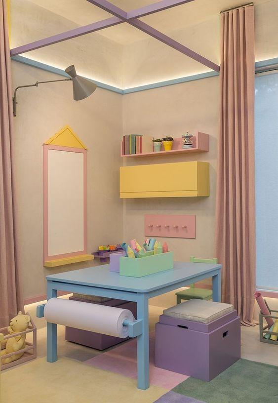
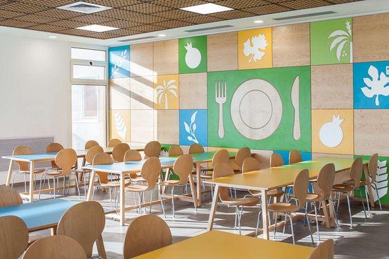
For the cafeteria, wanted to once again, incorporate soft colours (pastels) and stackable tables to promote interactiveness. I want this space to encourage healthy eating habits and allow the kids to form a good relationship with food.
For the waiting area, I wanted to incorporate a minimalist design style and use shades of white that are easy on the eyes; especially since that is the first space the children will see once they enter. I also want the colours to produce a sense of calmness and reassurance for frantic parents who may choose to wait for their children.
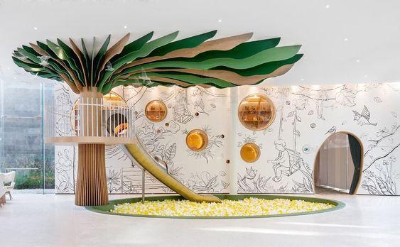
For the indoor sensory room, I wanted to create an interactive space with a multipurpose treehouse like slide set including stairs to climb up to the second story, and a sitting/sleeping area in the lower story. Along with that, I included an indoor jungle gym challenge.
19
FLOOR PLAN FIRST


FLOOR


I sketched an interpretation of the sensory tree, to better understand how to include this in the floor plan.
For the executive office, I wanted to switch to a more mature colour palette and design style. Therefore, I decided on a color palette of whites, accentuated with natural accents of wood.
Following the same steps as I did for the ground floor plan, I achieved the final floor plan through an adaptive reuse of the existing plans. I made changes to the existing plan in AutoCAD based on my design intent and finished by rendering the floor plan in Photoshop.
There is no mezzanine over the waiting room because I wanted to keep the grandness and beauty of the double height.
For the second sensory room on the first floor, I wanted to add a sensory play area in the form of a tree attached to a slide leading into a ball pit. I chose this room for the sensory tree because there is a beautiful view of suburban agricultural land; perfect location for a sensory room.
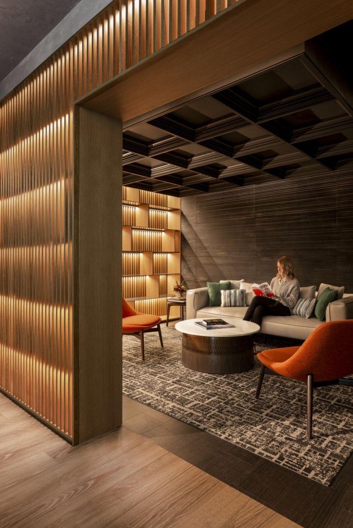
For the therapists lounge, keeping in mind that this is a space where the staff would come to enjoy their lunch break, or relax and unwind for a little while, decided on a brown colour scheme with accents of black and white
The room underneath has pitched roofs which made it perfect for a mezzanine addition. Therefore, I decided on a prefabricated steel structure to support the therapist lounge like a mezzanine loft.
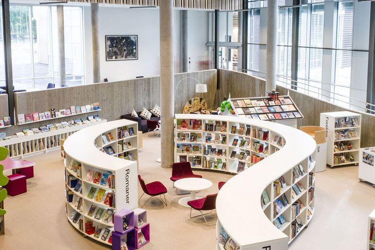
I chose this room for the library library because it has best sunlight in the house and therefore, the intuitive choice for the library Moreover, I want the library to exude good design, which will, in return, promote the pursuit of knowledge,
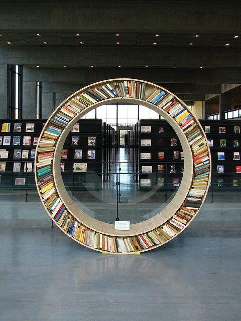
In the library, I wanted to include a curved bookcase with cushioned openings for the kids to sit. With ergonomic design, these openings would adapt to the human spine and allow back support.
20