
Mahek Jain

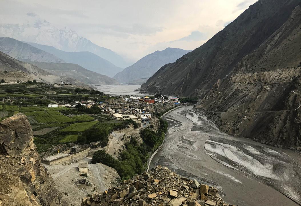
My passion for interior design began to emerge after I witnessed the detrimental repercussions of the earthquake that struck Nepal in 2015, leaving the homes of countless individuals in utter ruin. Following the earthquake, there was a dramatic rise in people’s fear regarding their sense of safety and security in any given space. As a result, people were compelled to remain confined in their homes which had a colossal impact on their mental well-being. This sparked my interest in creating spaces that not only serve as a safe haven for individuals but also provide a strong sense of serenity, warmth and comfort.
With a profound belief in the transformative power of design and a commitment to fostering positive change, I am dedicated to enhancing people's lives. My education and experiences have provided me with deep insights into how the human mind and emotions engage with a space. This understanding, combined with my passion for Interior Design, drives me to develop environments that are both visually stunning and emotionally engaging. I aim to leave a lasting impression by creating spaces that convey compassion, are rooted in authenticity, and embrace innovation. Through my work, I strive to contribute to a better world.
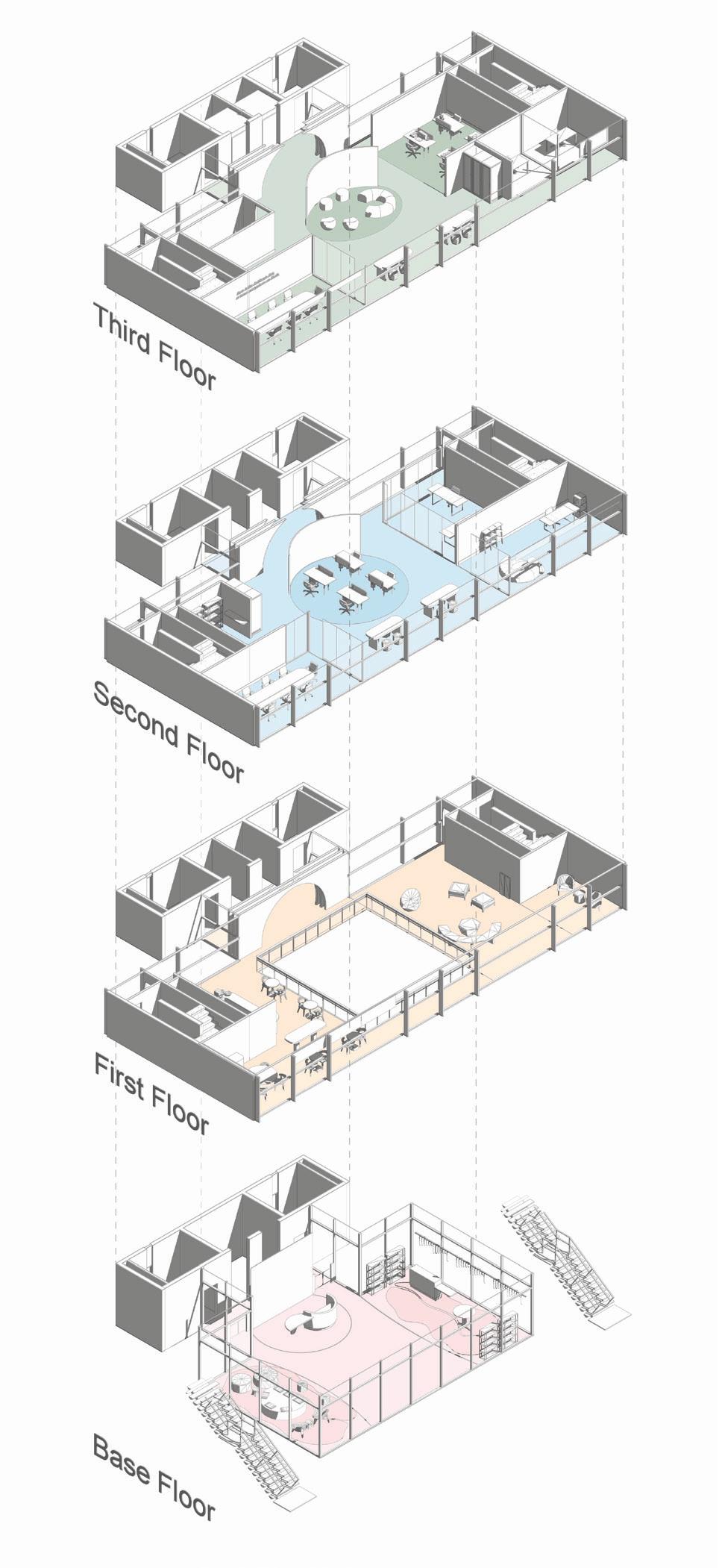
Preservation and promotion center for Nepalese arts & crafts
Capstone - Studio V & VI | Fall & Winter 2023-2024
Project Description
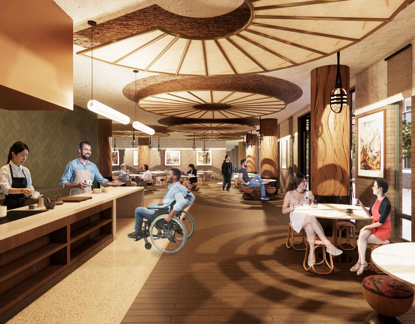
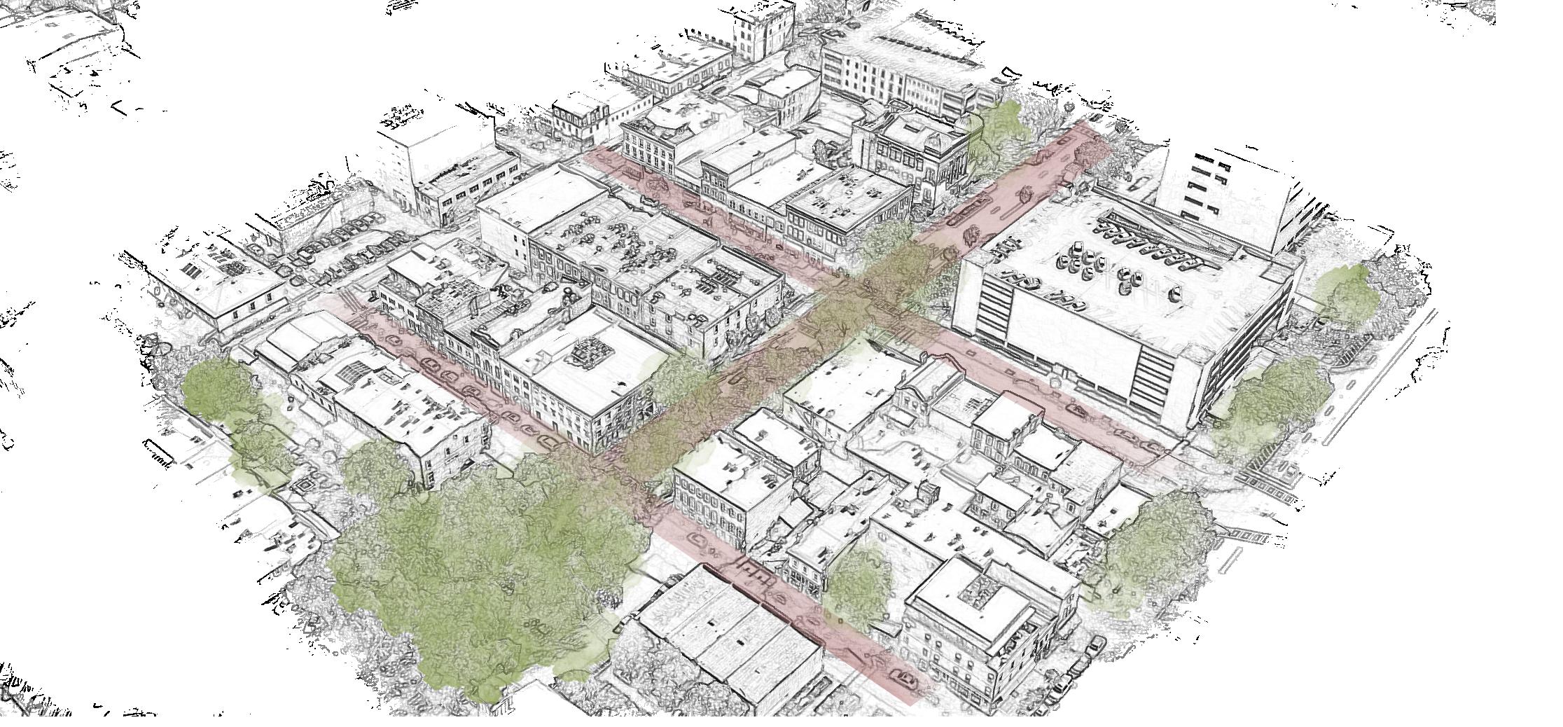
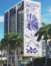
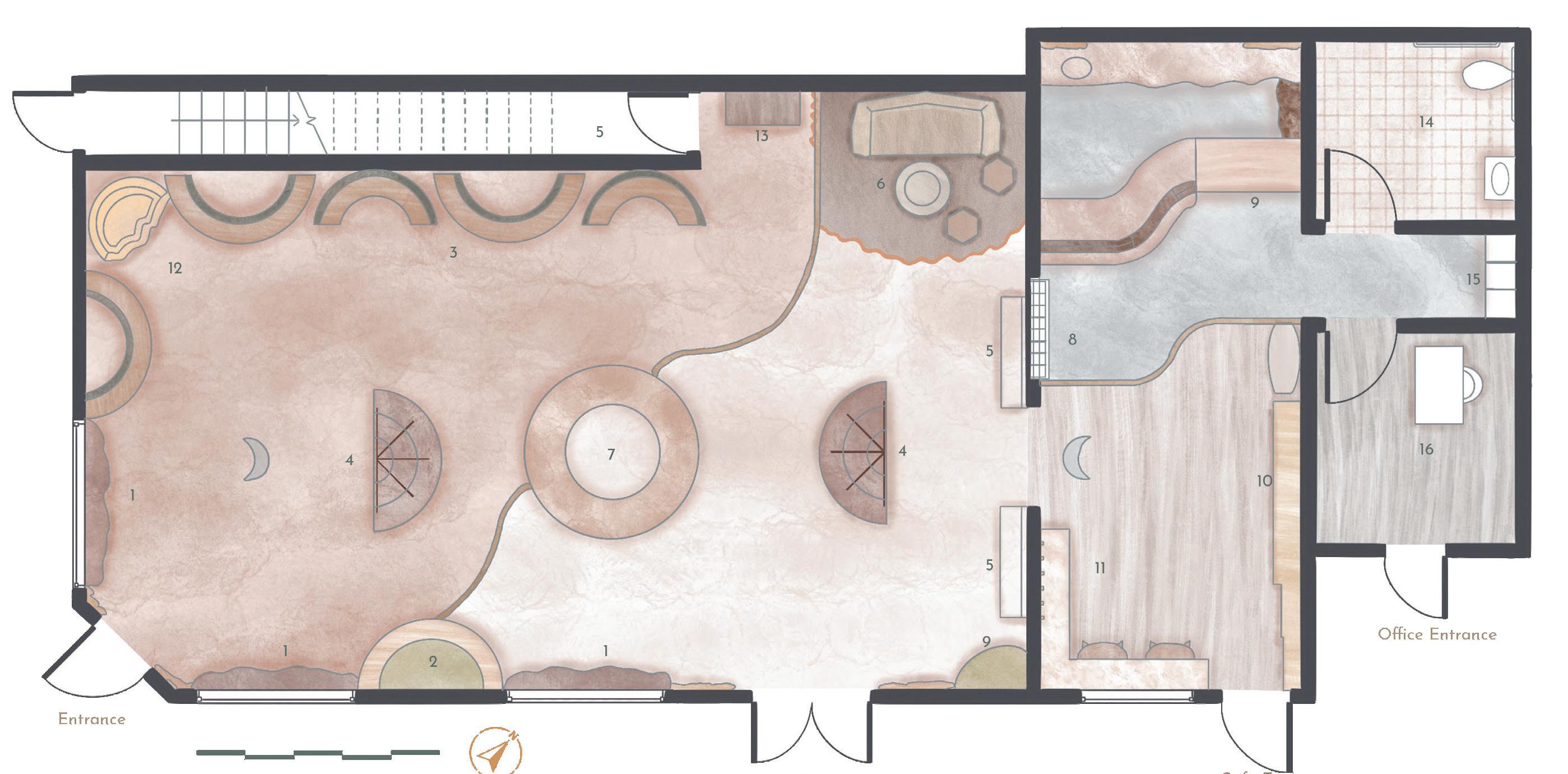
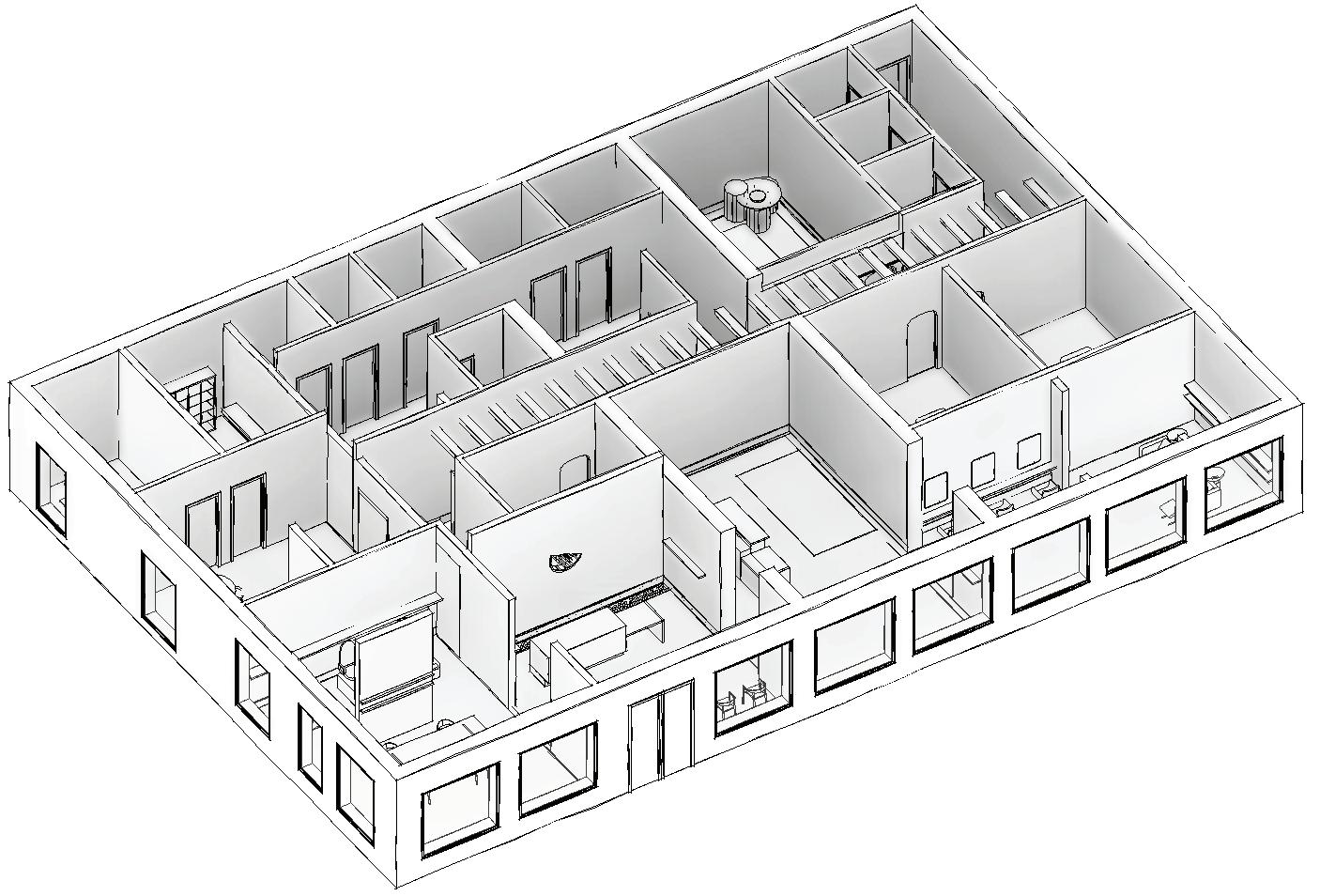
Chhaya is a celebration of Nepal’s identity, offering a platform for artisans to collaborate for the re-interpretation and innovation of local arts and crafts by bridging the old and the new. This facility aims to preserve and promote handmade Nepalese arts and crafts through the fusion of business, design, and increased awareness. The objective is to provide a place where artisans can envision, assimilate, and implement innovative ideas; visitors can gain awareness, learn, and interact with artisans; and business strategists can nurture the growth of the artisan’s products and spread their influence.
Chhaya, meaning “shadow” in Nepali, symbolizes the essence of the past informing the present. It serves as an emblem of the country’s rich heritage, inviting all to partake in its vibrant tapestry of tradition and innovation. It acts as a gateway to the perpetuation of this wealth, and offers individuals to wander, explore, and immerse themselves in it.
Softwares used
Revit, Enscape, Photoshop, Illustrator, InDesign
Process Book:
https://issuu.com/mahekjainportfolio/docs/capstone_ii

Client Information

The Federation of Handicraft Associations of Nepal (FHAN) is a non-profit organization established in ���� with the goal of enhancing and promoting the handicraft trade. It facilitates connections between national and international traders and local handicraft enterprises. FHAN provides a democratic platform for stakeholders, members, artists, and associations to exchange ideas and support artisans across Nepal's handicraft sectors.

Key challenges related to Nepalese arts and crafts
• Limited provision of training
• Underestimation of value
• Skills known by limited number of people
• Westernization and introduction of computerized machinery
• Innovation in design
• Design evolution
• Compromise in quality
• Collaboration with other artisans
• Market infrastructure
• Market research
• Product promotion and distribution

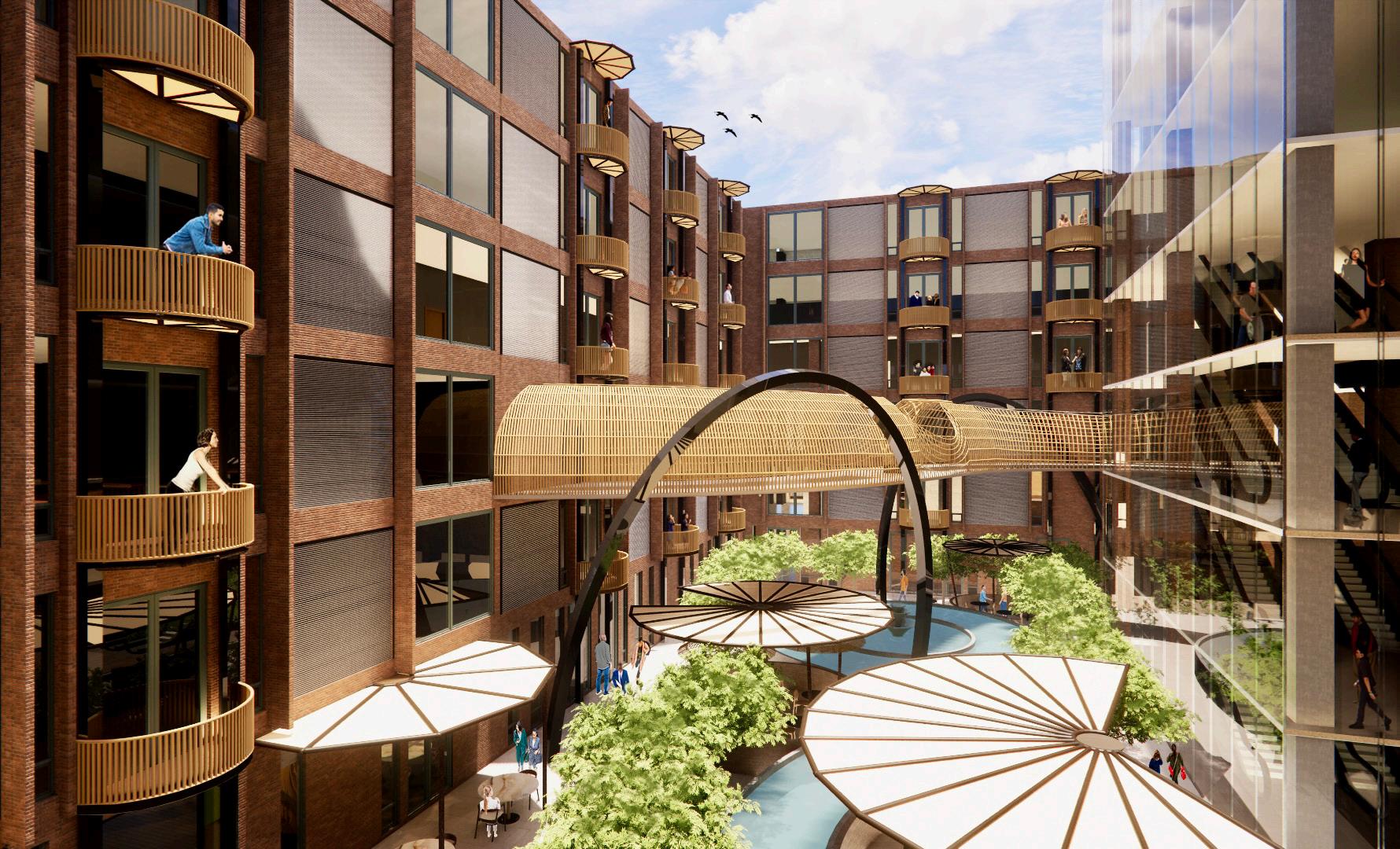
In Nepal's ancient streets that wind and weave, where narrow alleys whisper stories, a new surprise awaits in each twist and turn where tradition and modernity converge and blend. The interplay between light and shadow in these narrow alleys underscores the contrasts and complexities of life. The paths where dreams and reality converge, binding the pages together, allow for a closer look at the past fused with the present.
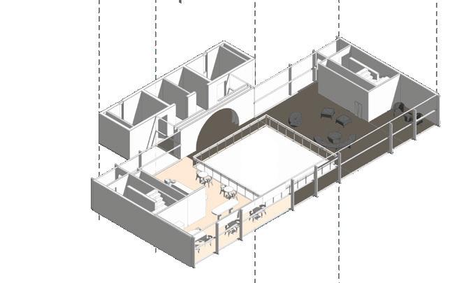
The space is a celebration of Nepal’s identity, offering a platform to artisans to collaborate for the re-interpretation and innovation of local arts and crafts by bridging the old and the new. It acts as a gateway to the perpetuation of this wealth, offering individuals to wander, explore, and immerse themselves in the history, culture, and spirit of Nepal.

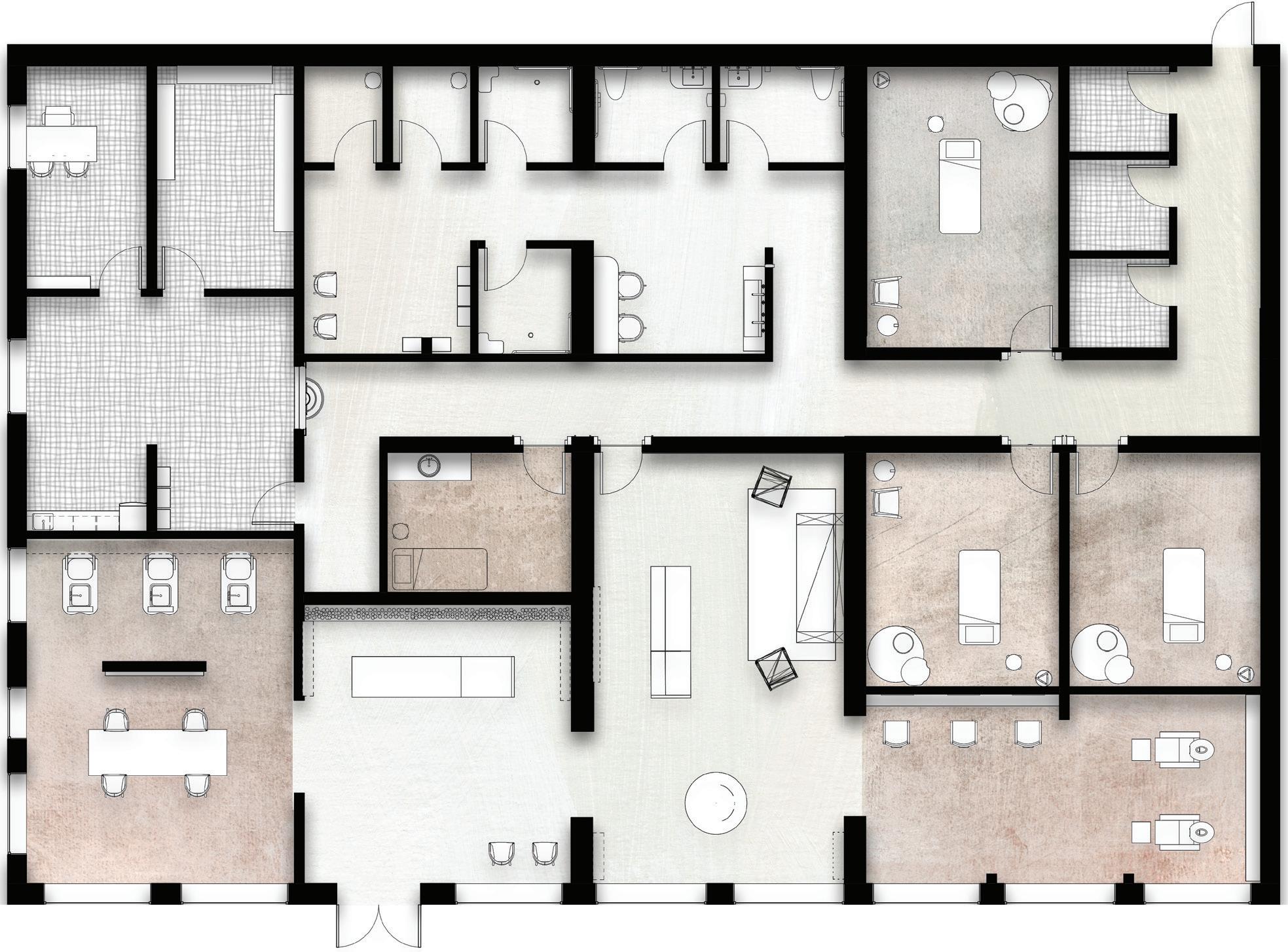
• Business rooms:
Rese arch
Strategy
Marketing
•
•
Individual studios
Balconies
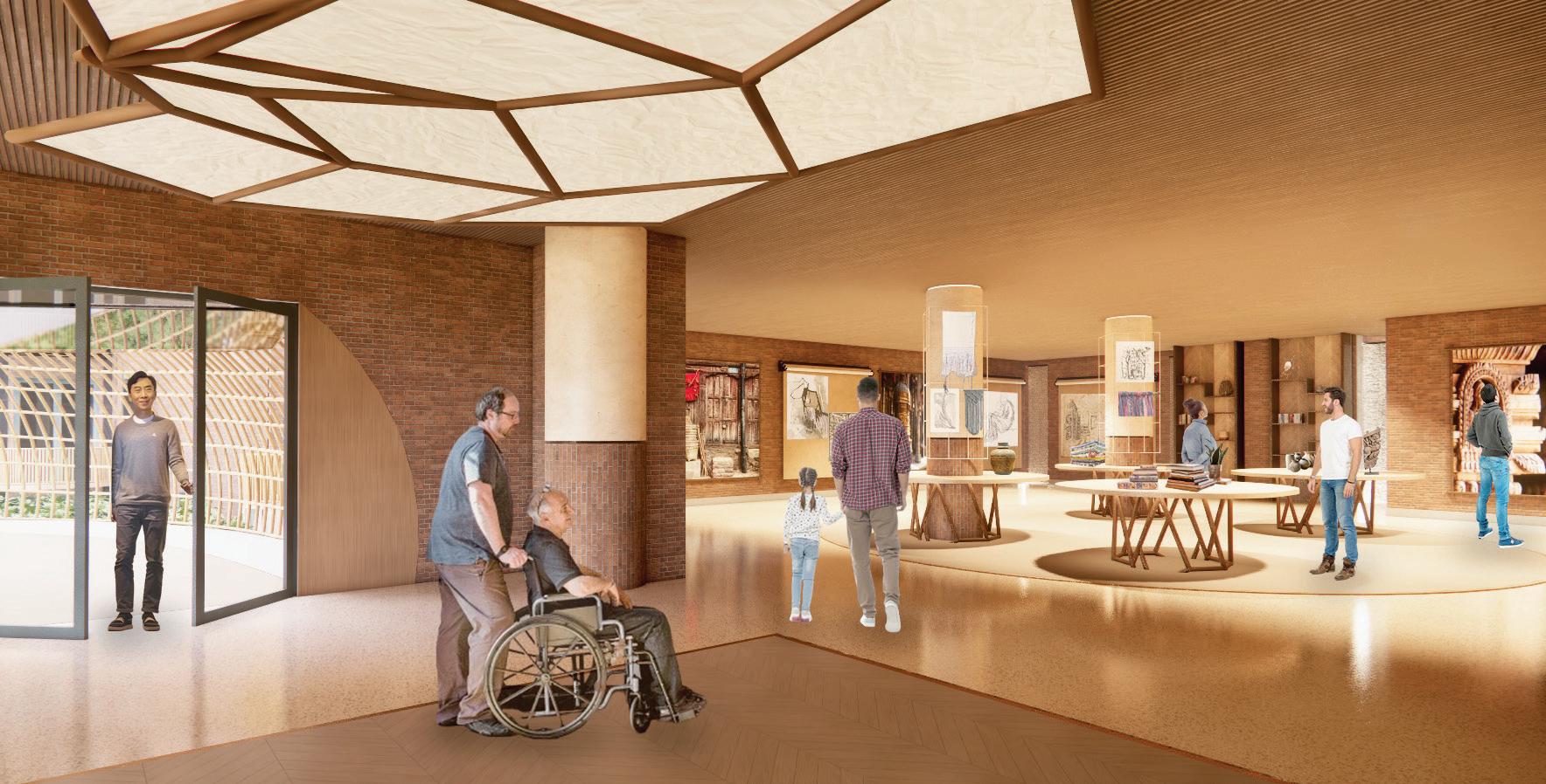
• Lokta zone:
Display space
Workshop

Crafts materials focused in the project


•
Process display space
• Artisans collaboration rooms
• Balconies
• Workshops
Classrooms
• Textile themed hallway
• Balconies
• Lobby Courtyard
oodcarving zone:
Display space
Classroom
• hallway
• Woodcarving themed
• Event space
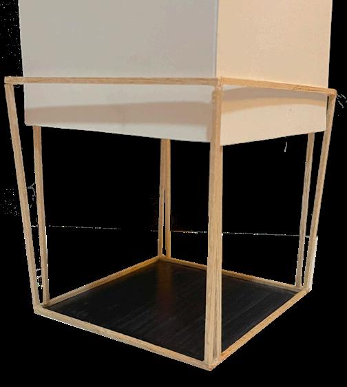
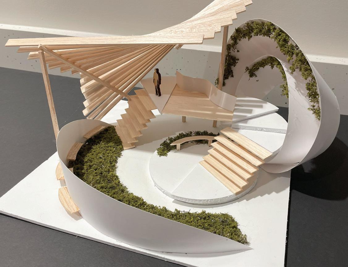
Study model application:
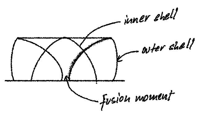
• Form within a form
• Connection of parts
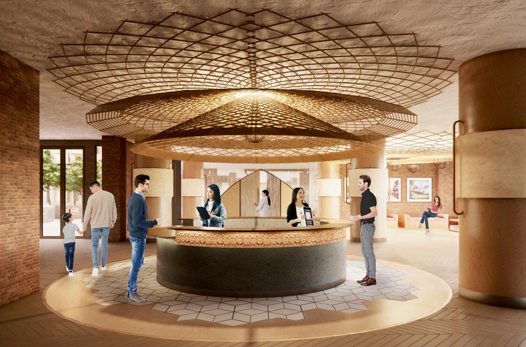
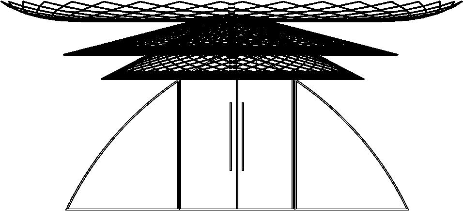
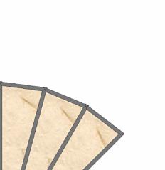
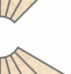
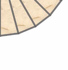
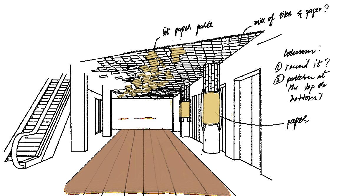
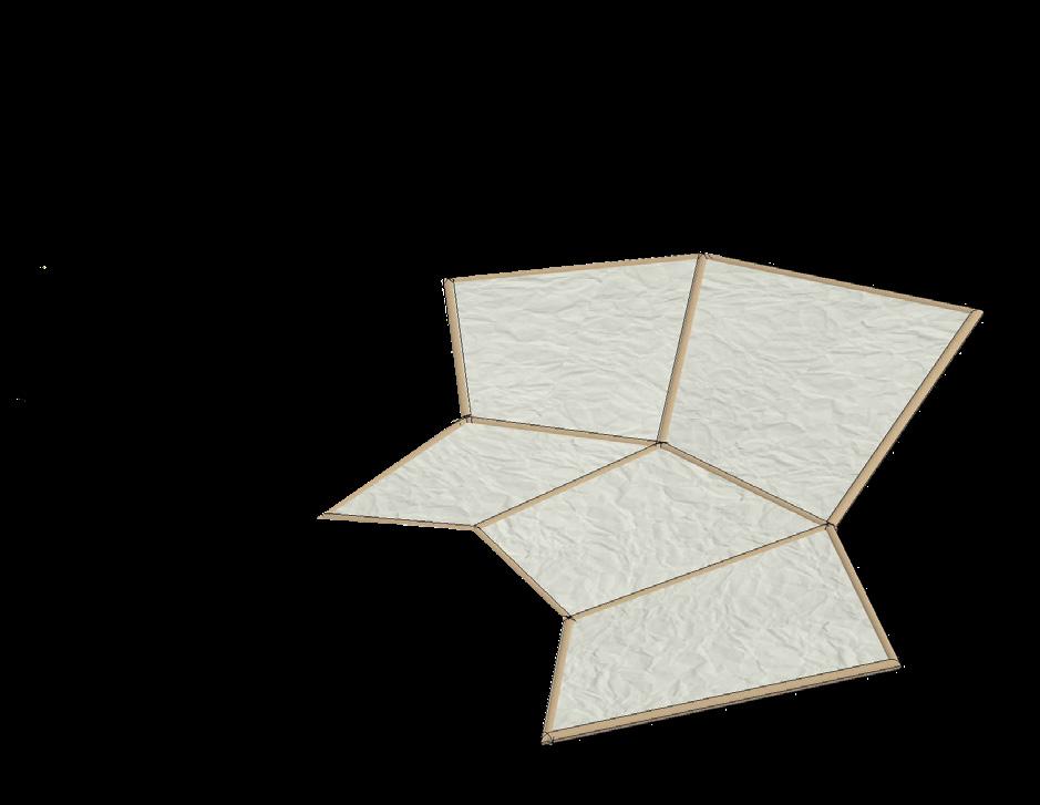
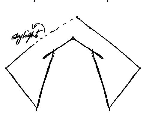
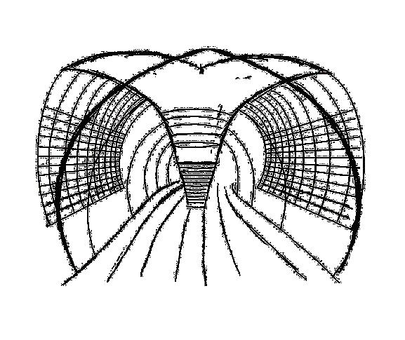
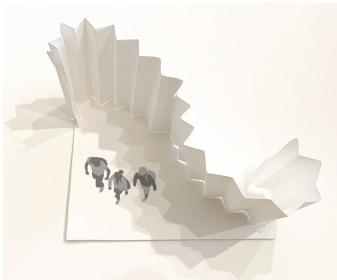
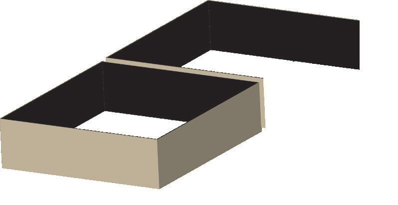
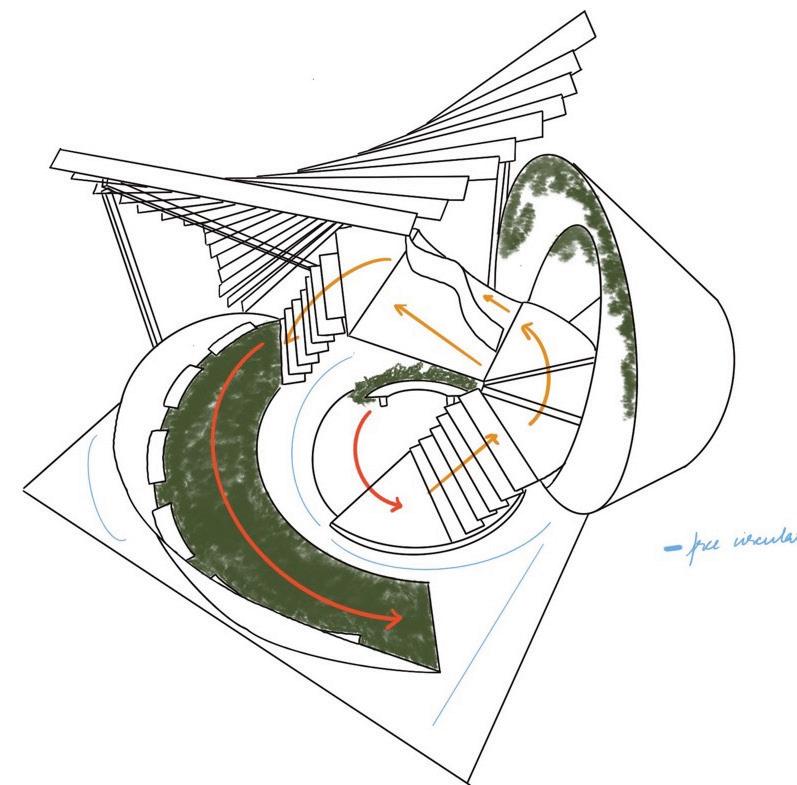
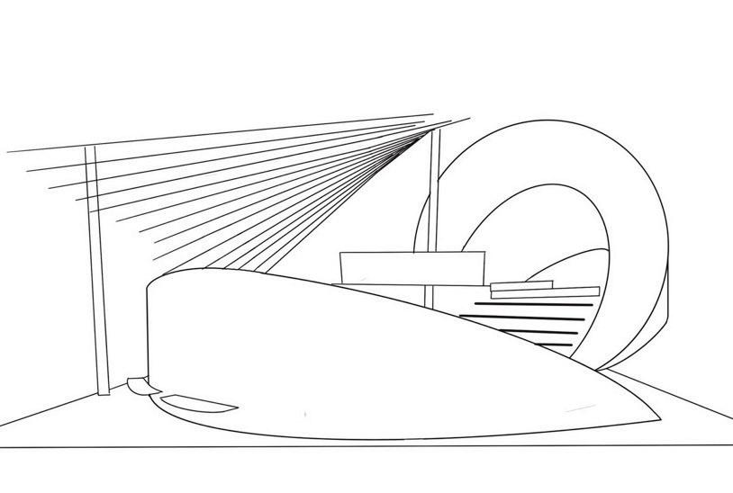
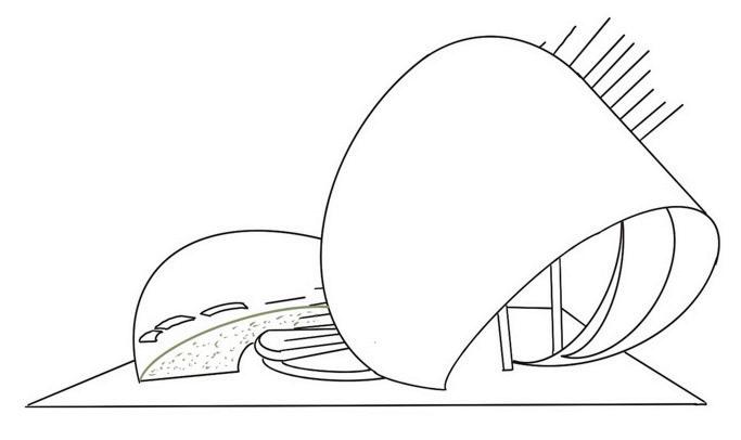
Re-interpretation of the pagoda roof structure.

The cross shows fusion and represents the namaste gesture at the entrance of the space.
• Fusion is shown through the convergence of ceiling elements and flooring.
• Integrating all five traditional crafts—lokta paper, dhaka fabric, allo fiber, woodcarving, and pashmina—to weave a rich tapestry of textures and cultural heritage.
The concept of parts coming together and connecting emphasized.
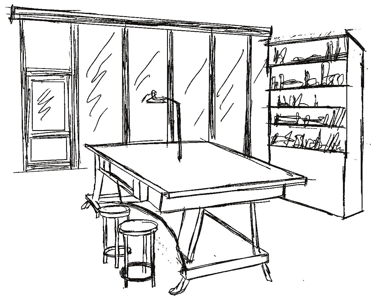
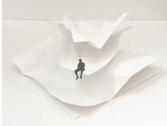
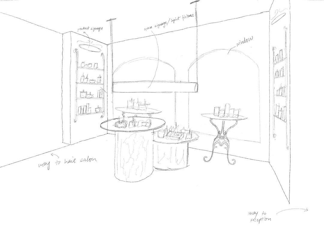
Preliminary sketches to explore seating options and conceptual ceiling design


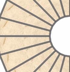
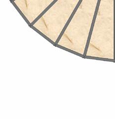
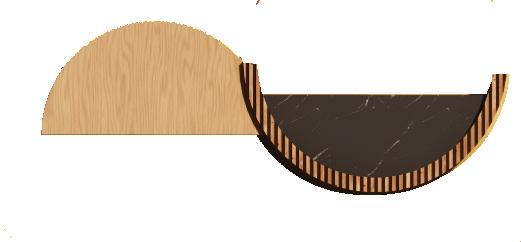
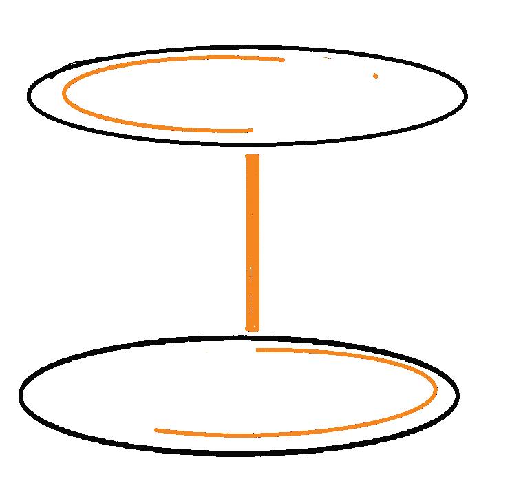
Combination of half and full circles to show one thing informing the other - the past translating into the present.
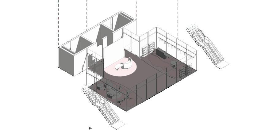
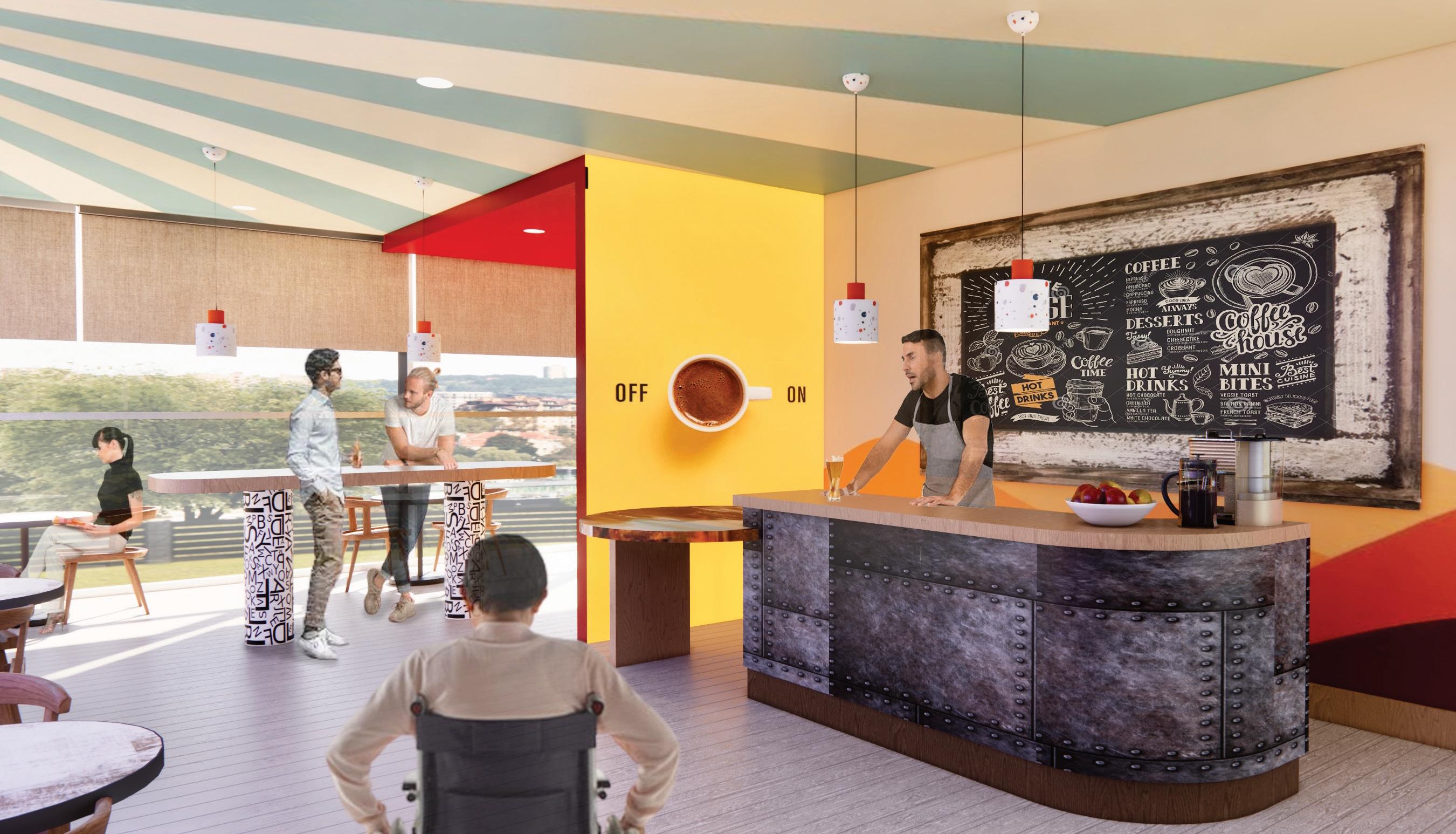
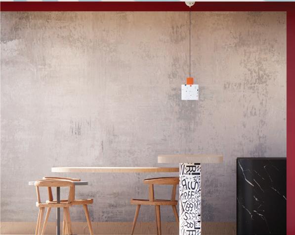
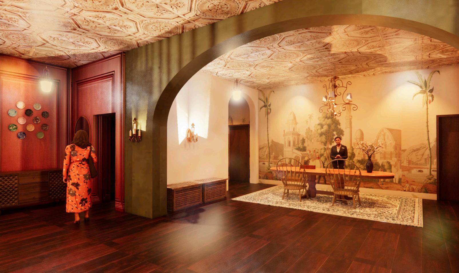
• The café serves a variety of hot Nepali snacks alongside tea, echoing Nepal’s cultural tradition of communal interaction.
• It aims to encourage conversation, fostering connections and a strong sense of community.

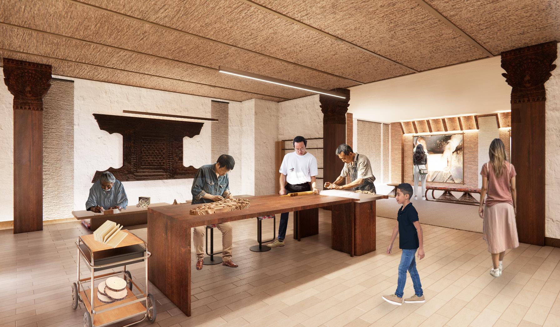

• The woodcarving zone comprises workshop areas and spaces dedicated to displaying the process and history of this craft, and a classroom.
• It allows visitors to engage with artisans, learn about the craft, and gain awareness of its historical significance.
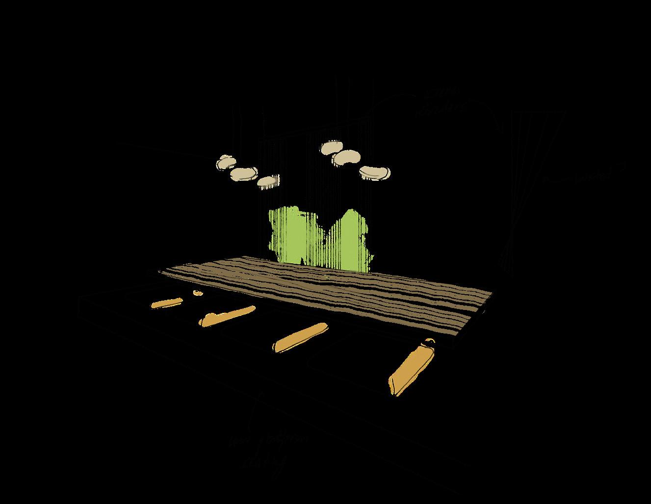
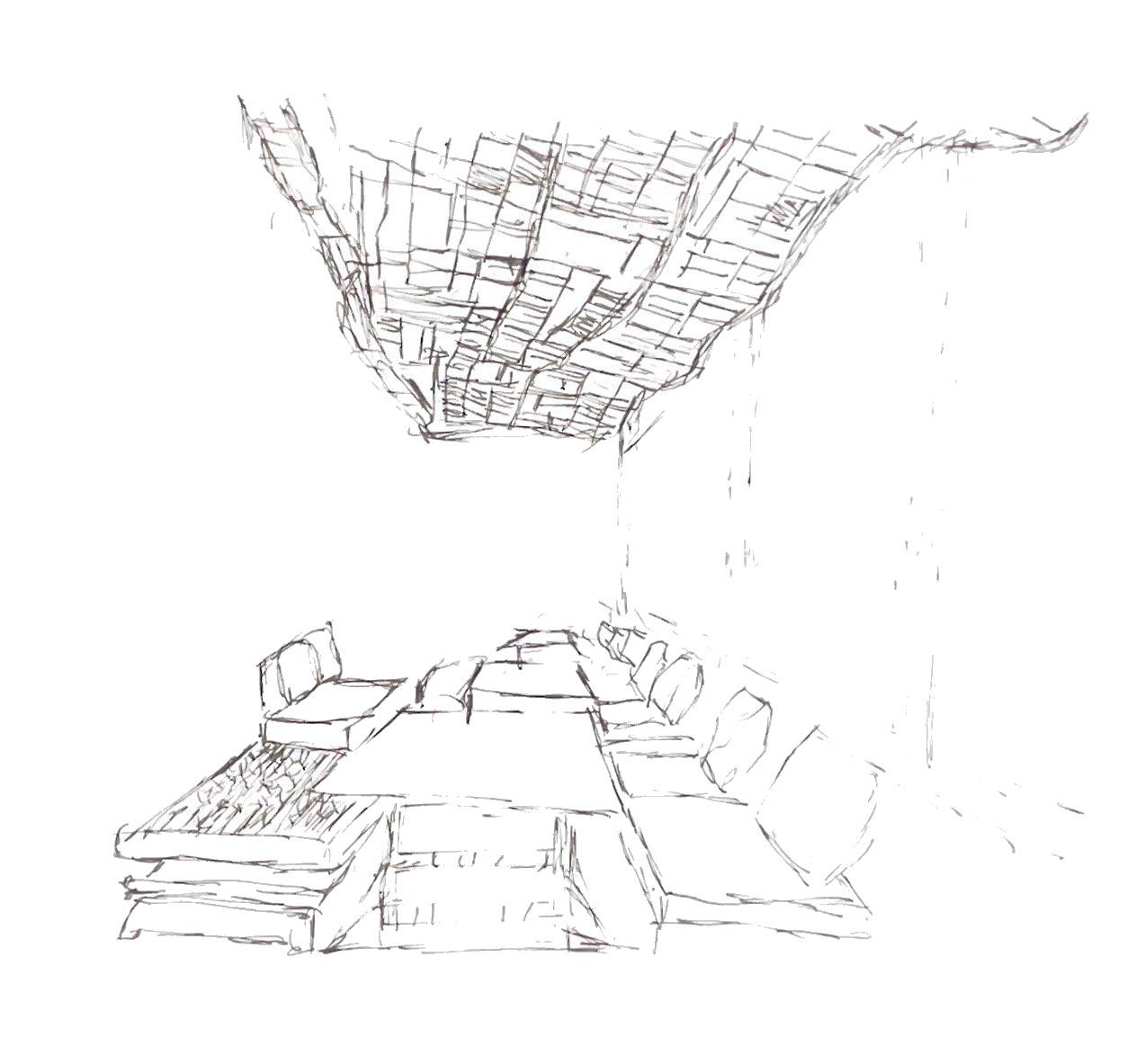
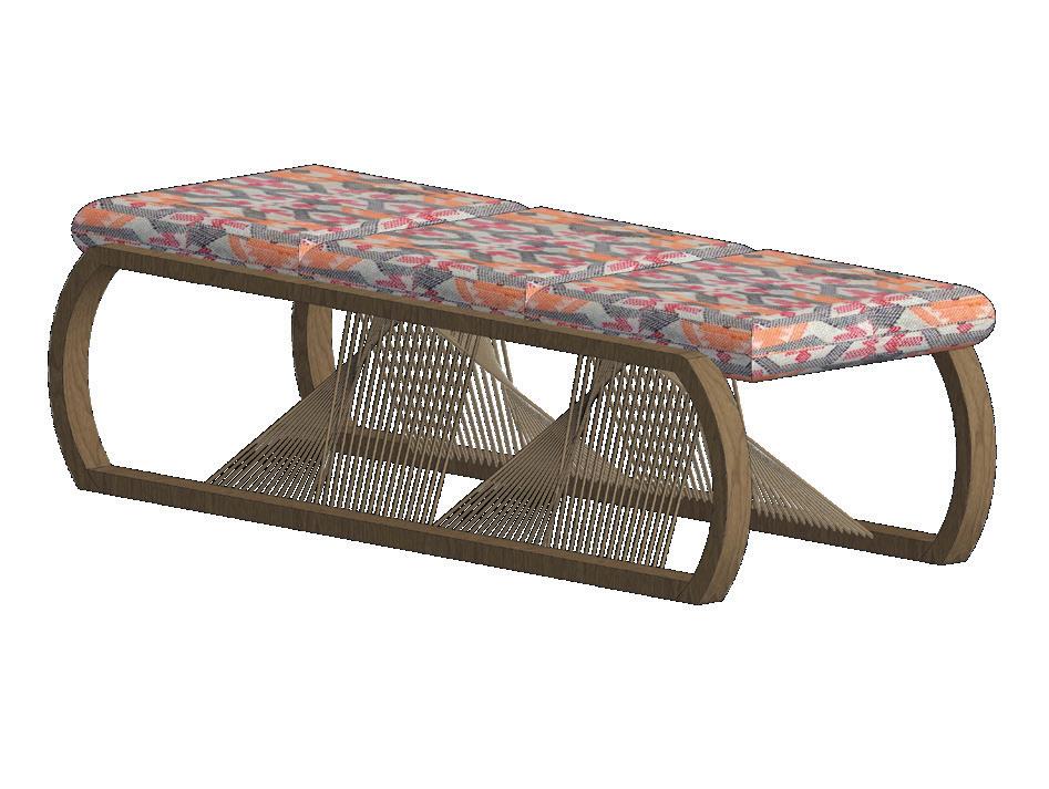
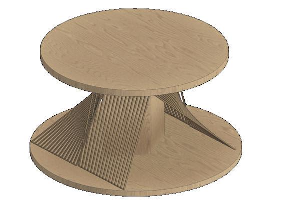
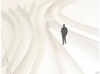
Custom seating options inspired from the concept of winding and weaving. The winding ropes connect the top and the bottom.
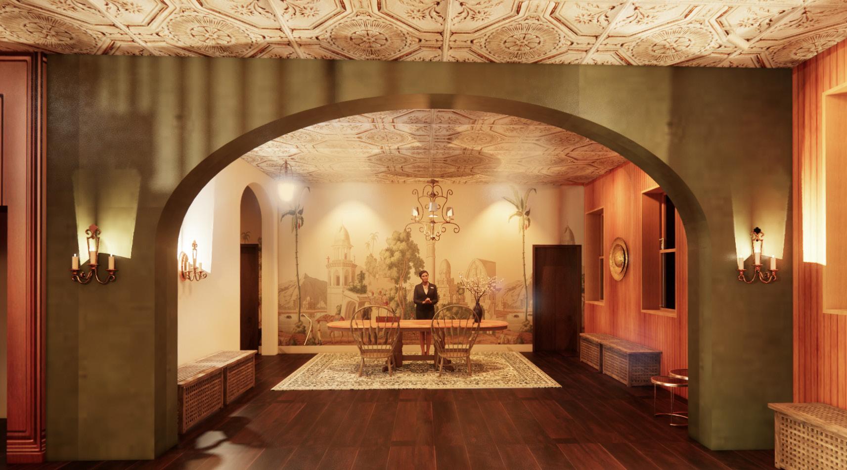
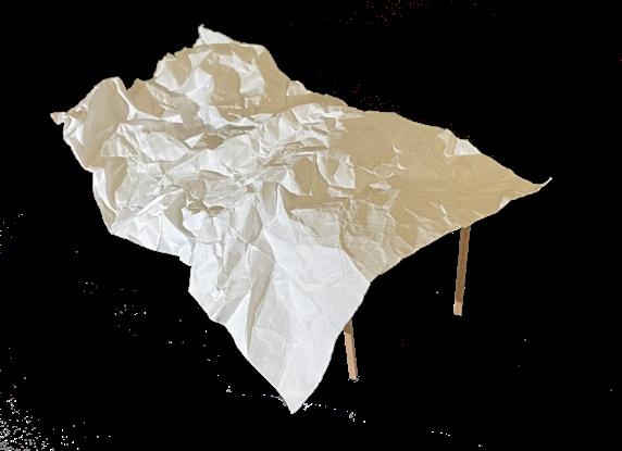
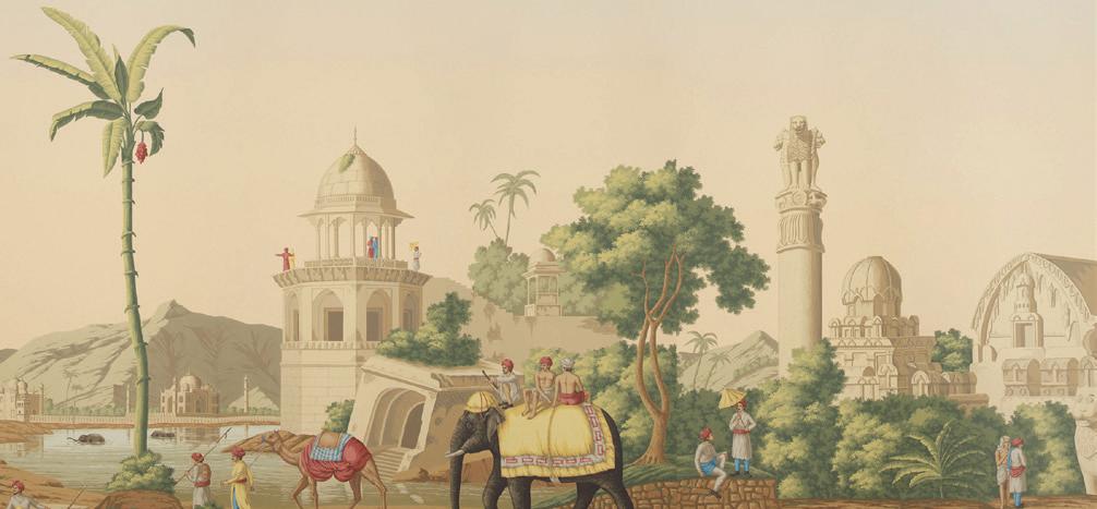
Ceiling finish inspired from the straw ceiling of old resting stops spread throughout the city which were used by artisans in the past.
Preliminary sketch


Study model application:
• Soft and unsoft textures merged to show blend
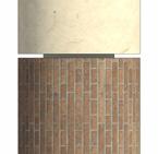
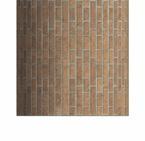
Crushed and lit lokta paper panels used in the lokta paper themed hallway. The concept of clustered organization of buildings in the area applied. Brick and lokta paper wrapped around the column to show re-interpratation of usage of lokta.
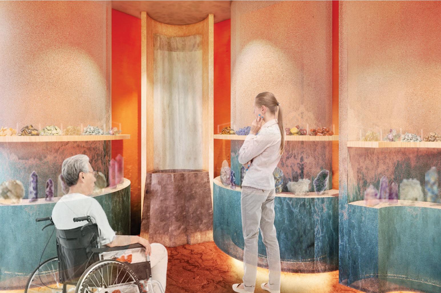
• This space showcases artifacts representing various crafts.
• It utilizes screens to present items that cannot be physically displayed within the space.
Preliminary sketches

Study model application:
• Dynamic growth along the path
The woven design language starts loose at the start and gradually becomes tighter representing the past consolidating into today.
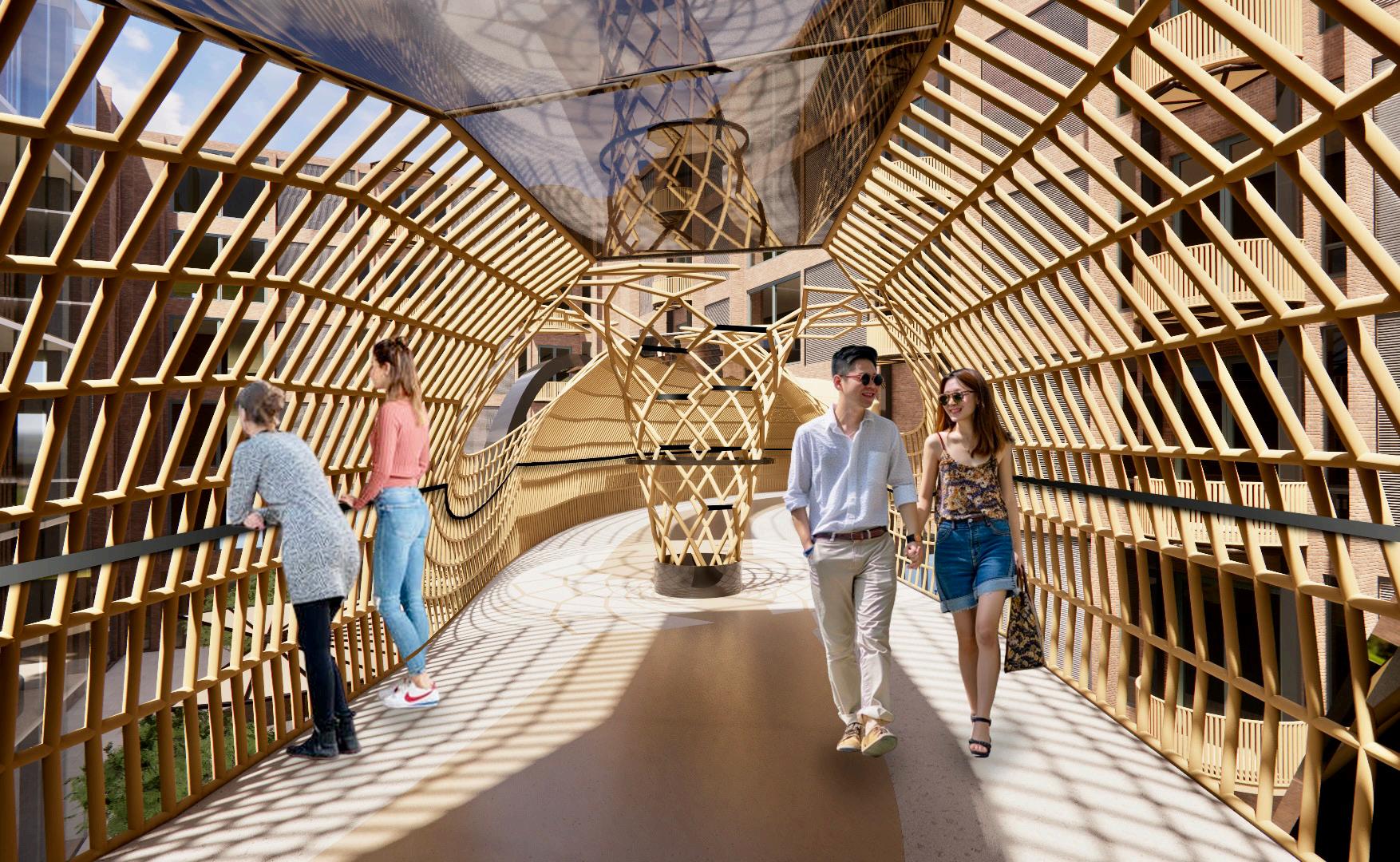
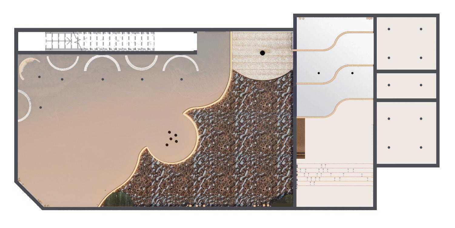
360 view of the space:

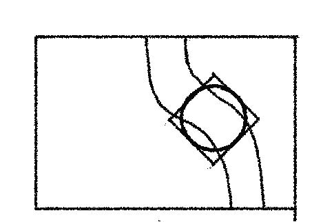
• The bridge links the artifact display space with the process display area.
• At its center, the broken floral element exaggerates the harmonious convergence of modernity and tradition.
• The combination of local materials-wood, glass and metal-also reinstates this blend.
Preliminary sketches
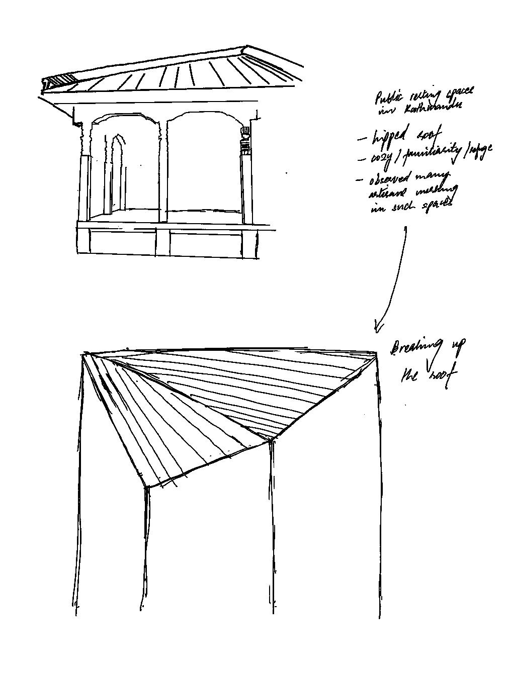
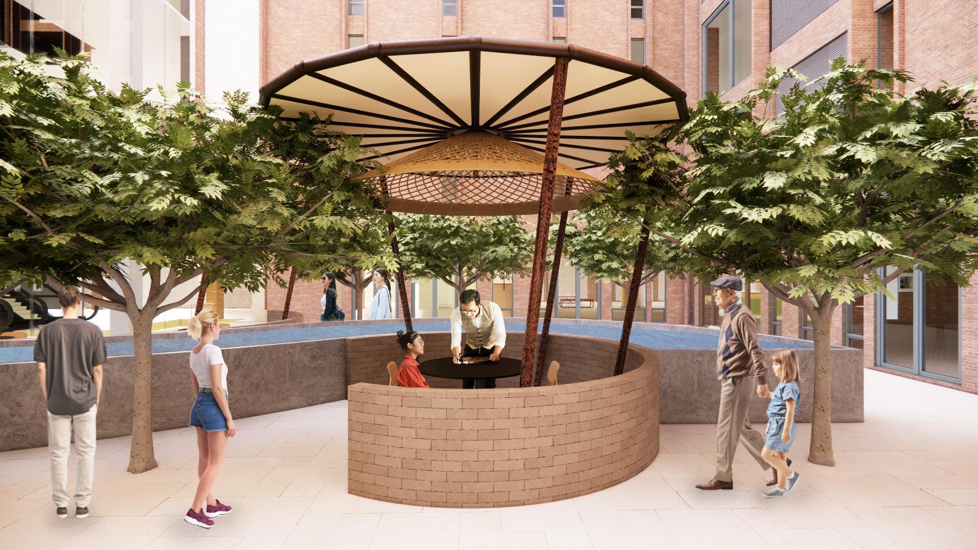
Re-interpretation of resting stops where artisans used to work in Kathmandu.
• The gazebo structures in the courtyard are nestled around a reflective pool which foster interaction among visitors and artisans.
• They create moments of pause and tranquility.
Documentation and Communication- Studio III | Winter 2023
Project Description
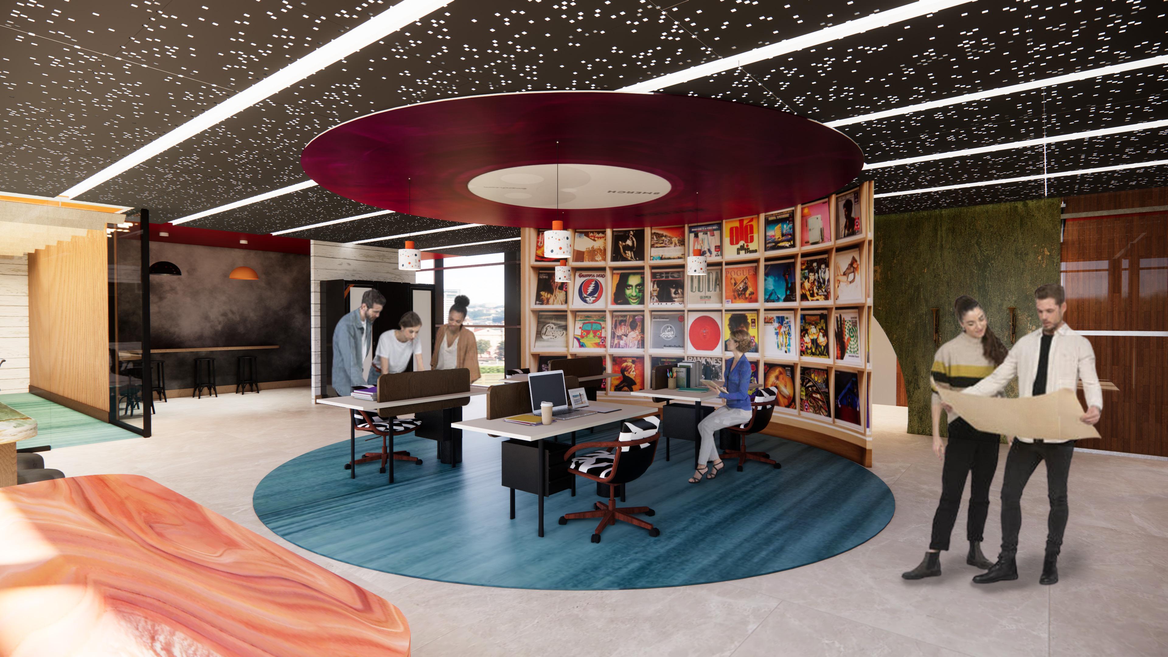
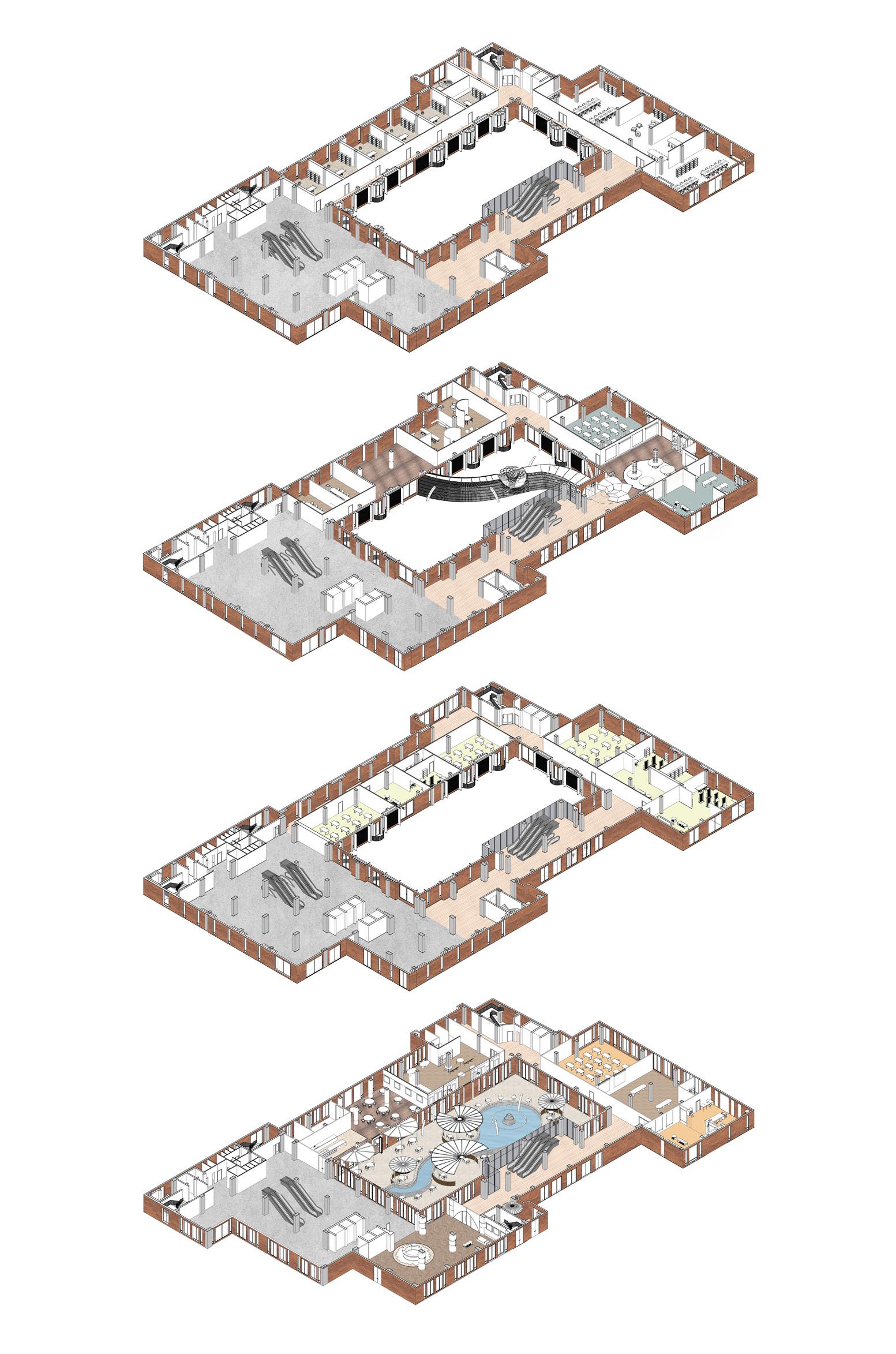
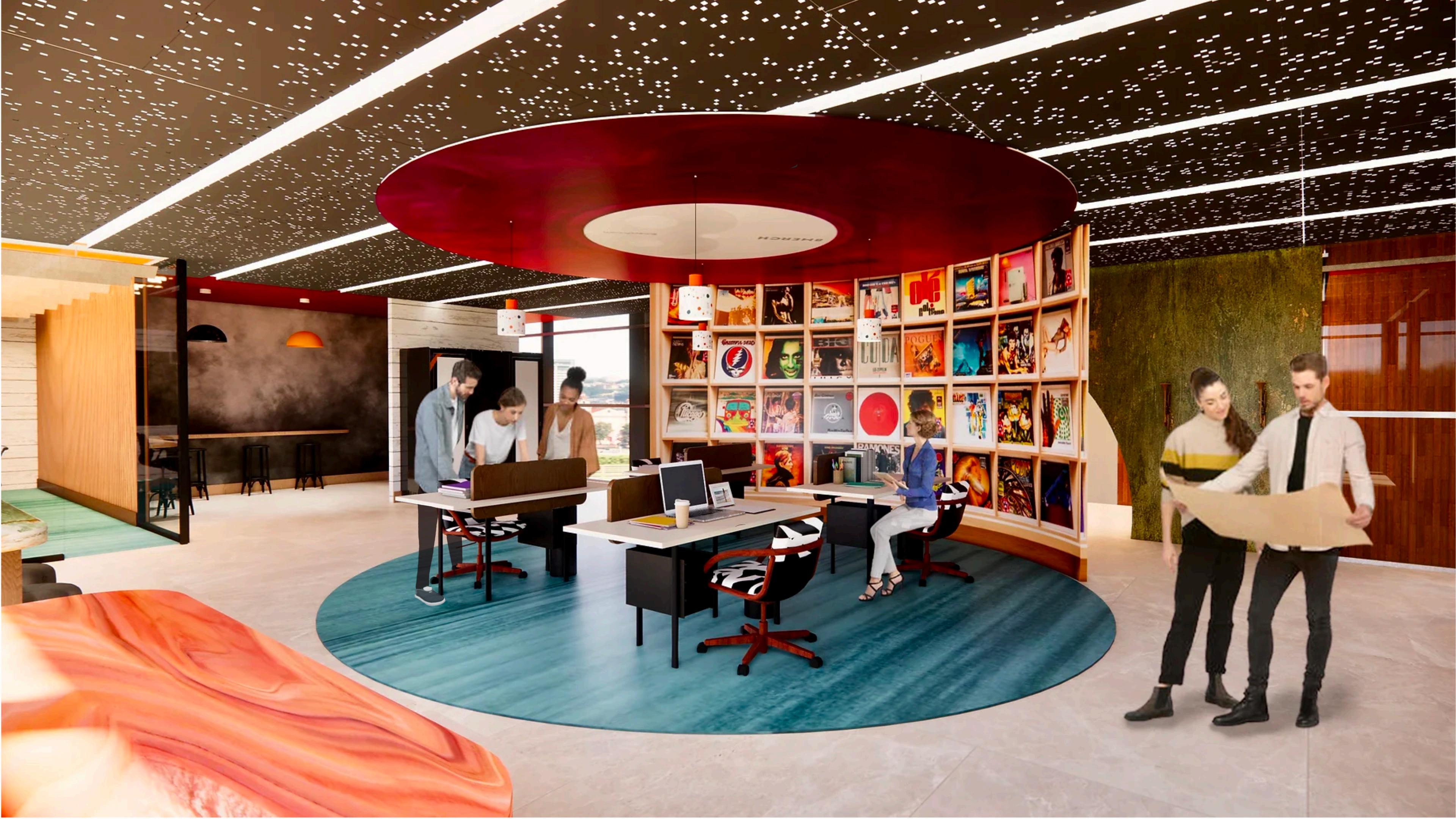
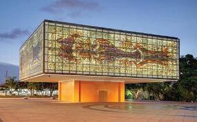
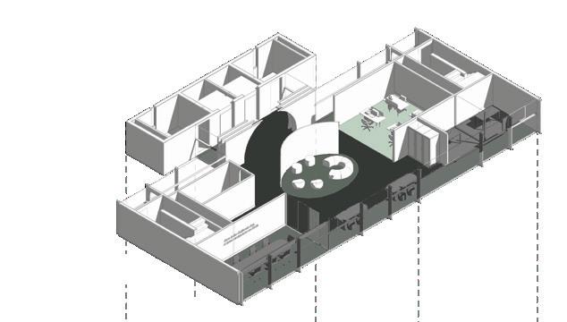
This workspace design uses vibrancy in multiple ways to evoke joy and ecstasy in the users. It celebrates fearlessness and diversity Warner Records supports and shows in the artists it collaborates with to produce a variety of music. This project has � floor designs; � in the Tower building and � in the Annex.
Revit, Enscape, Photoshop, Illustrator Softwares used


Warner Records Inc. (formerly Warner Bros. Records Inc.) is an American record label. A subsidiary of the Warner Music Group, it is headquartered in Los Angeles, California. It was founded on March ��, ����, as the recorded music division of the American fi lm studio Warner Bros. It is a record label of iconic, culture-shaping music and entertainment, built on irreverent ideas, creative risks, and life-changing hits. Created as a home for artists – established and emerging, mainstream and maverick, legends and legends-to-be, it is run by a fearless team of music obsessives.

2100 Biscayne Boulevard, Miami, FL, 33137

Warner Records is known for recognizing diverse talents and making them feel at home in their creative process. The intention is to use this idea as a frame for a variety of content, acting as a sponge for color, supporting artists worldwide- old, and up and coming. As the sun rises, its bold and subtle sparkles on the water create a sense of amusement and joy. Contrast and movement in the space exude this idea of delight. Every bit evokes ecstasy and inspiration to transcend all barriers of creativity with the use of asymmetry, repetition, vivid colors, and patterns.


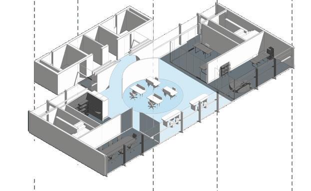
Workstations
Seating Area
Private Workstations
Conference Room
Breakout Space
Working Nook
Restrooms
1. Workstations 2. Working Nook 3. Conference Room 4. Breakout Space 5. Executive’s O ce 6. Manager’s Room
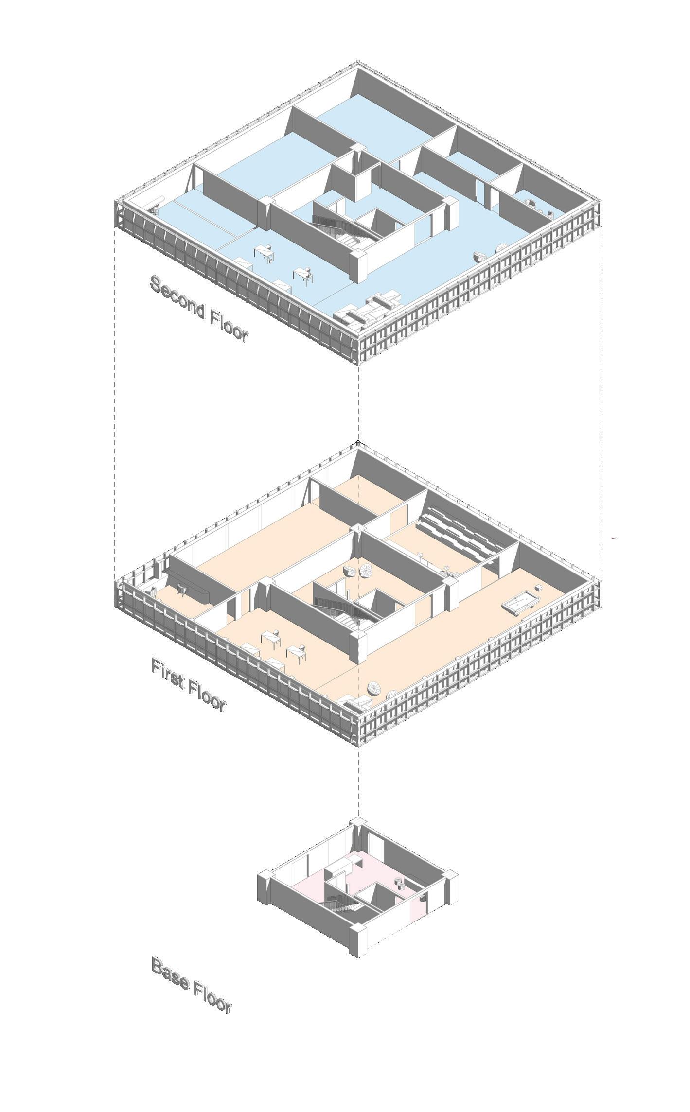
Recording Studios
Private Room
Seating Workstations
Working Nook
Storage Restrooms
Performance/Sound Room
Break Area
Seating Workstations
Make-up Room
Green Screen Filming Room
Storage Restrooms
Reception
Seating
Restroom
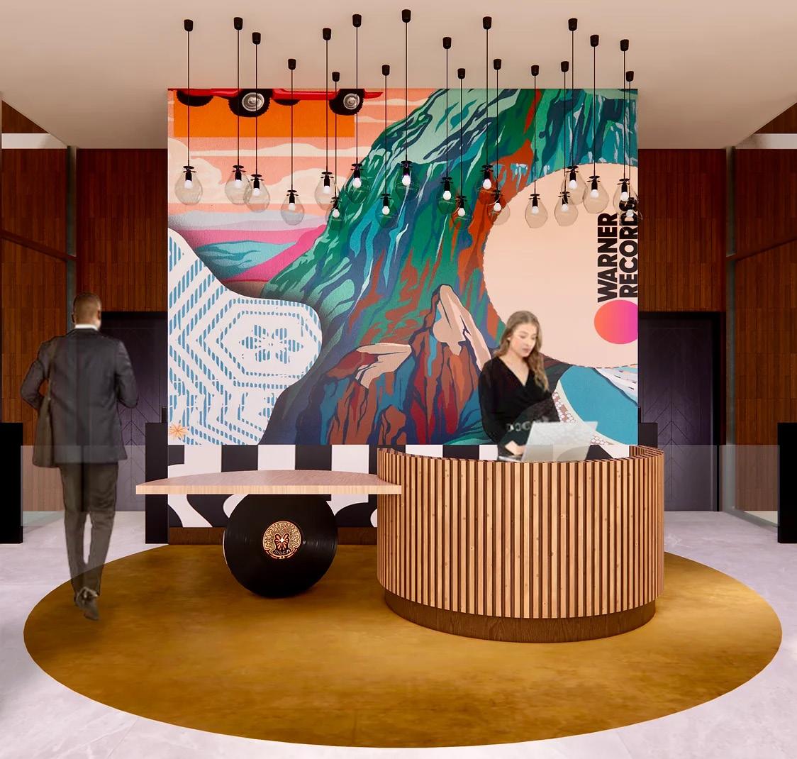
Movement interpretation in reception technology on the ceiling
• Strong brand presence is evident with the floor and the desk depicting the
• The street stylish wall shows the diverse brand endorses
• The lights depict raindrops and the references to the sun which denotes approach the brand has for music

with the design of the logo diverse talents the the floor has denotes the global production
Tower Level 1
Reception
& Pantry desk and

Level 2
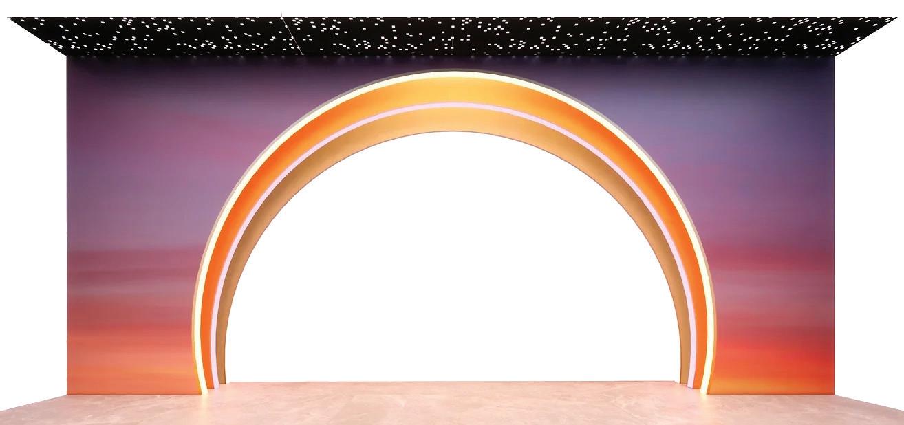
• Each arch closes in on the person walking through it to reinforce the feeling of walking through the setting sun under the stars.
• The acoustical ceiling mimics a starry night which inspires creative minds to think out of bounds.


Tower Level 3 Workstations
• The ceiling sense of and innovation second workspace.
ceiling continues the of inspiring creativity innovation present in the floor’s open workspace.
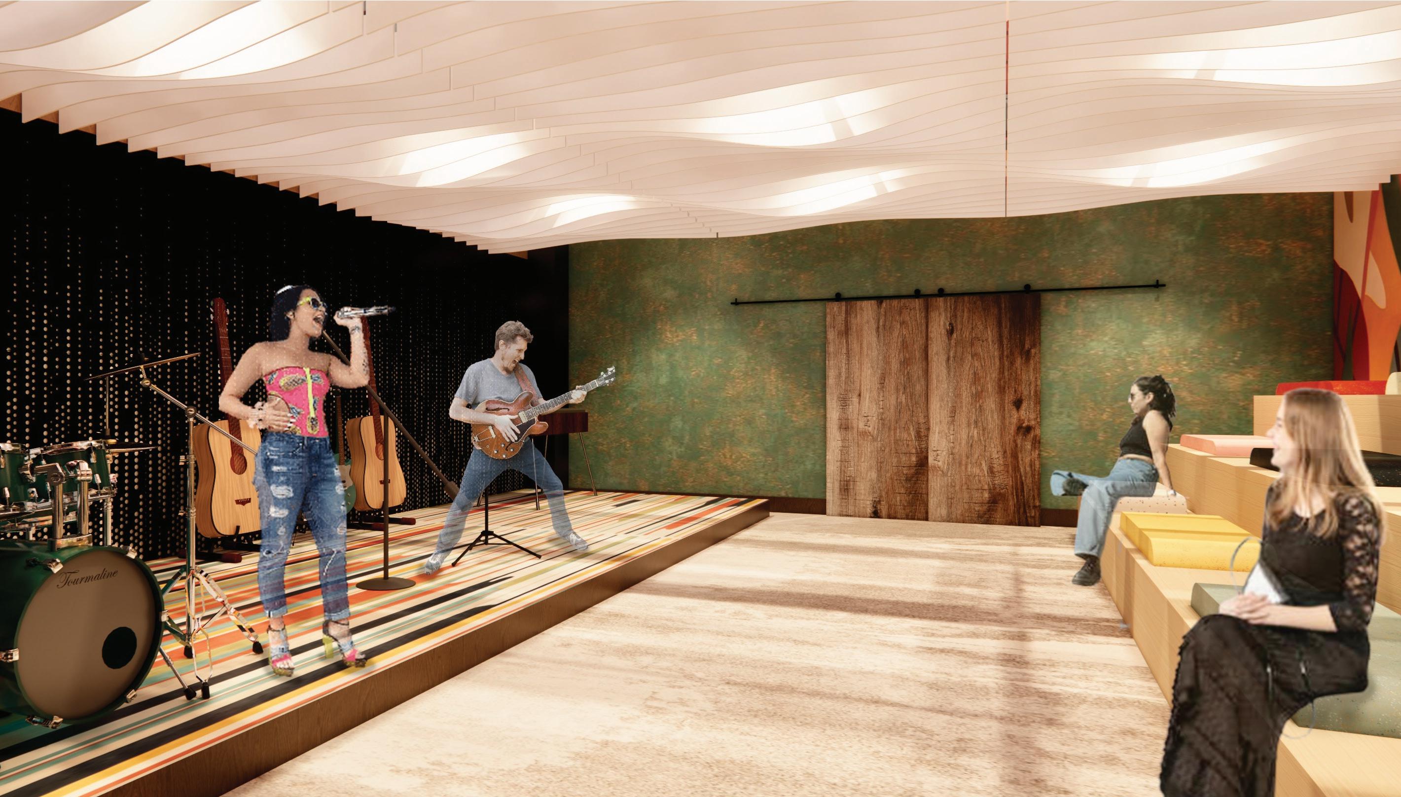

• The space encapsulates a consistent flow of energy and good spirit.
Annex Level 2
Performance Area
Collaborative Practice in Design- Studio IV | Spring 2023
Project Description
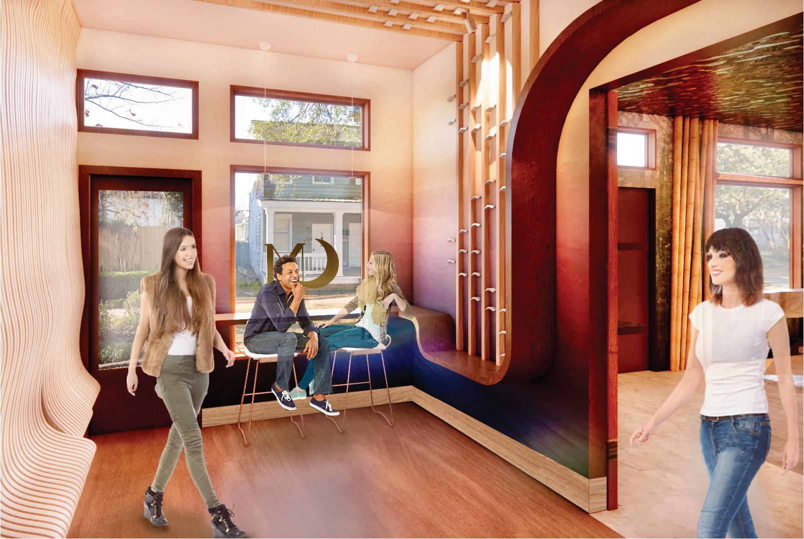
Playfulness of contradicting elements piques curiosity in a way that makes people want to explore more. Openness and mystery, fire and ice are a few inspirations sourced from the depths of nature that have been dramatically expressed in the forms of asymmetry, movement and containment in this forest immersive retail and cafe space. This project is a design proposal for a metaphysical retail brand, Ordinary Magic, that plans on opening up a store in a different location in Savannah.
Softwares used
Revit, Enscape, Photoshop, Illustrator, InDesign
Crystal Ju, Jagrati Bahety, Mahek Jain, Montse De Santiago, Nyah Reese, Zollie Barefoot Design Team
Parts worked on by me
Revit modeling, FFE & finish selections, and Rendering

Ordinary Magic, opened on June ��, ����, was created as a sister shoppe to Savannah Yoga Center. A natural addition to yoga, this conscious lifestyle shoppe serves soul seekers and fuses the synergies of urban style with modern mysticism. They carry crystals and minerals, small batch non-toxic skin, hair and body care, adaptogens, books, tarot & Oracle cards, jewelry and more. They also offer workshops and events to entice and enhance the life of people.
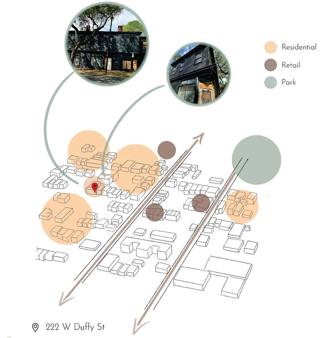
222 W Du y St, Savannah, Georgia, 31401
The word “krystallos” is a Greek word meaning coldness drawn together, ice that seems to exist between liquid and frozen states. Many believe that the gravitational pull of the moon during different phases affects Earth's energy fields, including those within the soil and rocks where crystals form. It enhances crystal formation by influencing the movement of fluids and minerals.
Moon phases are often interpreted as symbols of balance and tension due to the cyclical nature of the lunar cycle and the visual representation of light and darkness.


• Light containment in moon and crystal
• Circulation of moon during different phases

Full, half and crescent moon phases
Removing the actual phases and incorporating the rest of the shapes
Study of the circulation path in different phases
Circulation path mirrored on the foor to link spaces
Idea of containment: maximization of warmth and light in a contained space.
• Balance and tension coming together through colors
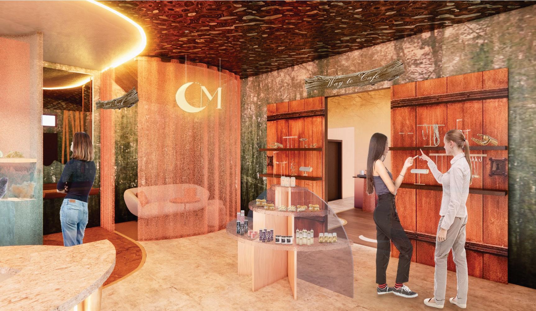
• Bringing in the tide caused by the moon’s gravitational pull on the display
• Half moon phase shown through display tables
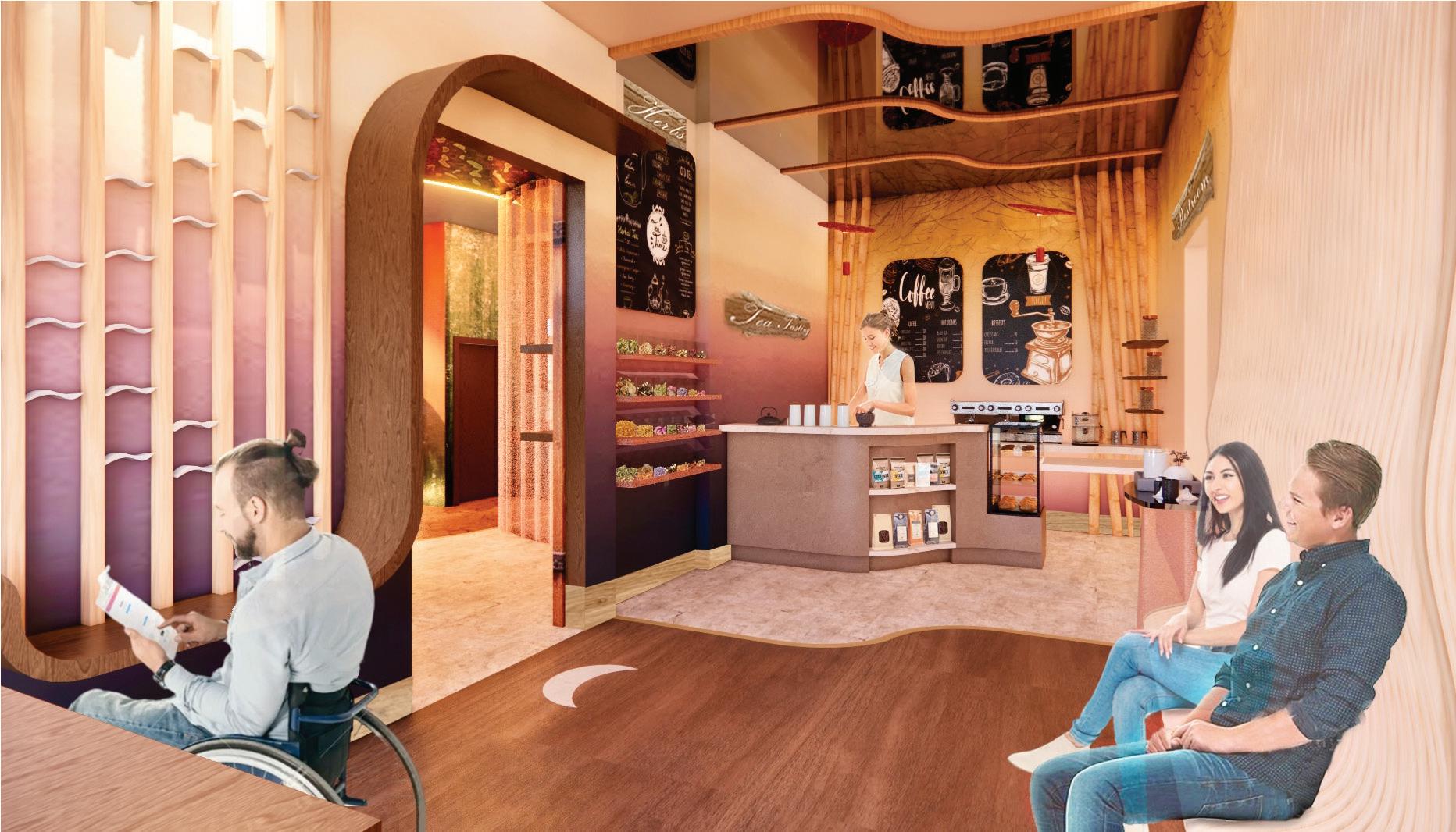
• The herb space is interactive where people can mix their herbs from the wall and take them to the tea-tasting bar to have their tea prepared.
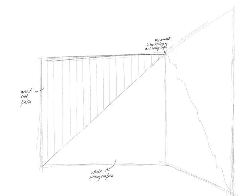
• The arrangement of the pieces placed between the slats represents a collection of parts coming together in alignment.
• The parallel slats connect both seatings and create containment.
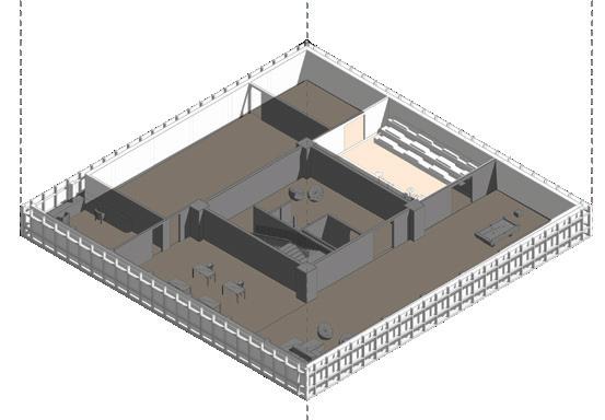
Specialized Interior Environments - Studio II | Fall 2023
Project Description
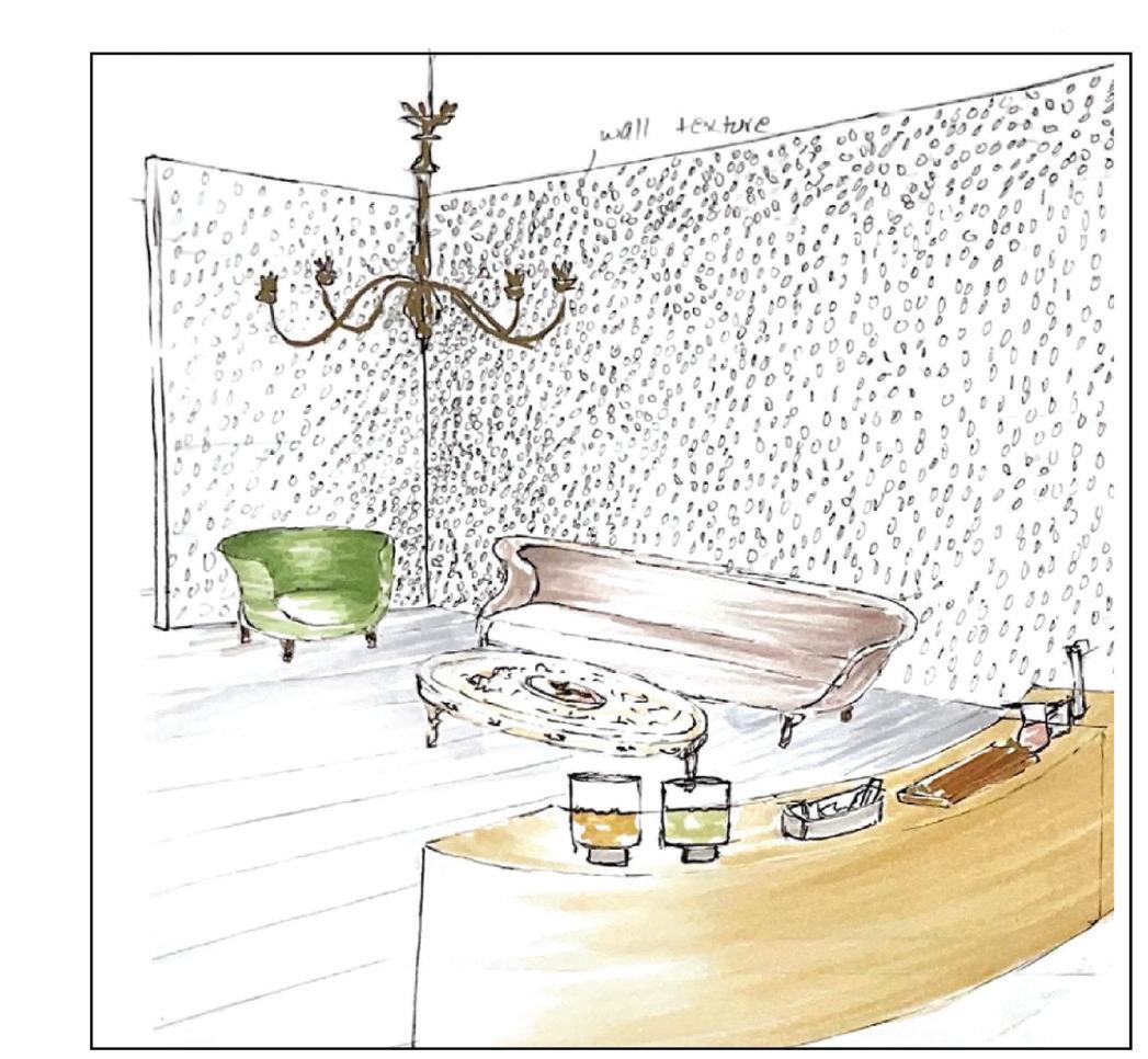
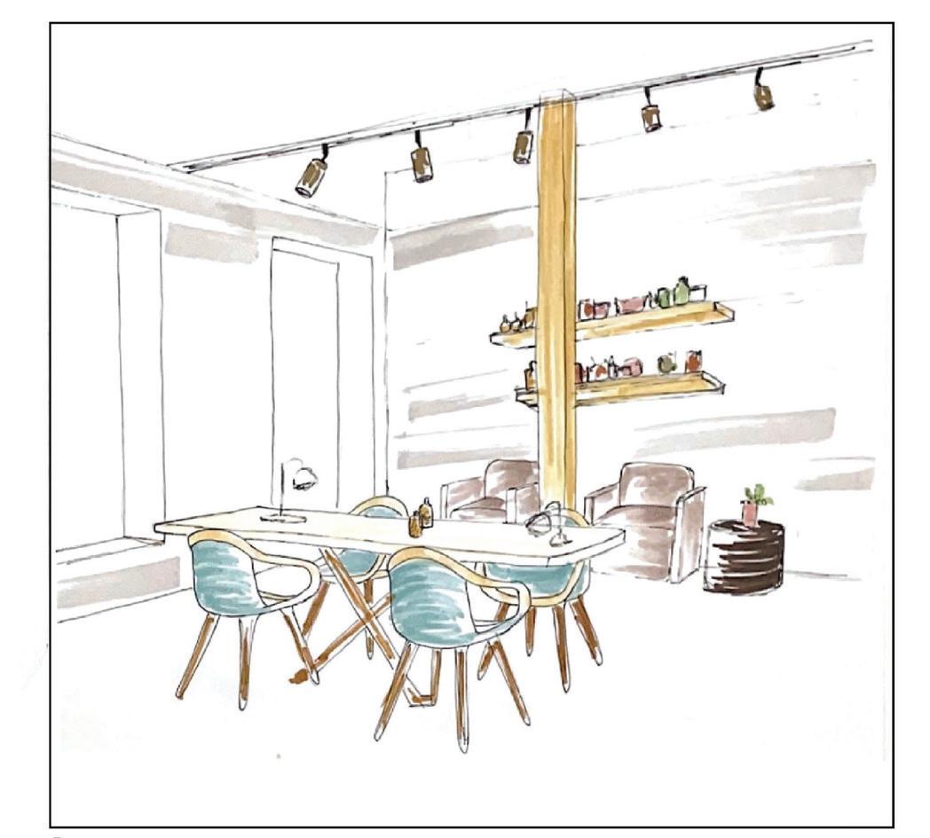
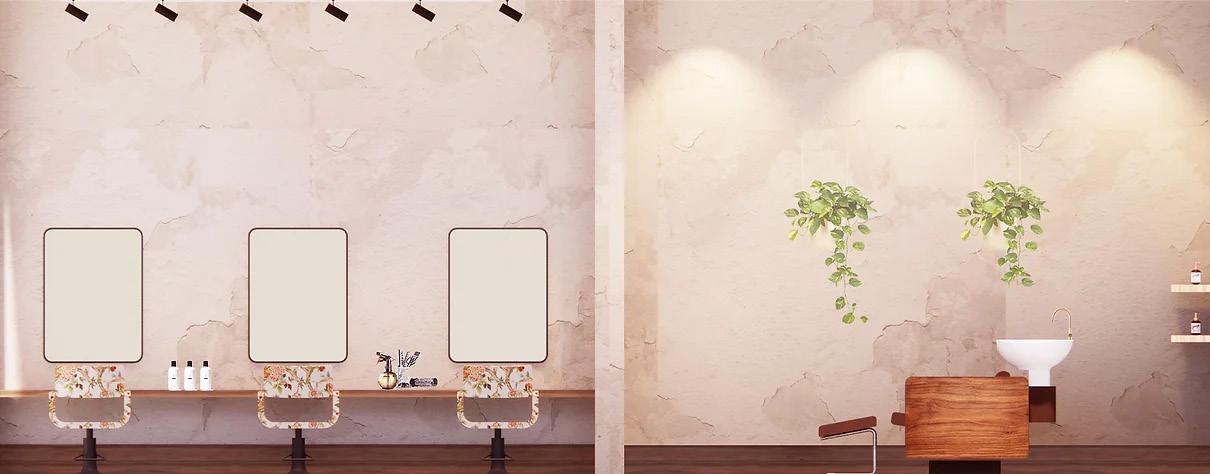
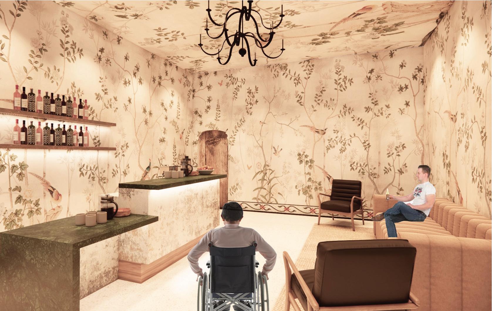
This spa takes the users through nature-inspired immersive experiences while they relax and recenter. The space is designed to stimulate feelings of self-awareness and wholesomeness by creating an illusion of being in nature with the use of visually calming and invigorating textures, materials, colors, and lighting.
Revit, Enscape, Sketchup, AutoCAD, Photoshop, Illustrator Softwares used
Client Information
On September ��, ����, Spavia opened its doors with a mission and vision of making a positive difference in the world one guest at a time and delivering an exceptional experience its guests couldn’t live without. It is an affordable luxury day spa destination for massage therapy, skincare, and body and beauty treatments. The founders created the brand with the intention to create a name that reflected the products and services it offered and deliver results to help their guests relax, recenter, and renew.

Inspired by the concept of escape, the design aims to create a space where individuals can fully embrace tranquility, shift away from the chaos of everyday life, and find a harmonious balance between relaxation and rejuvenation. The space is an immersive experience that encourages introspection, renewal, and a profound sense of escape. It is a space where individuals can recalibrate their senses, shift their focus inward, and rediscover the profound beauty of stillness in a world in constant motion.

Combining all the partis

Incorporating in the circulation

• Being in an escape
• Experiencing

• Nature embracing
• Maximum self-awareness


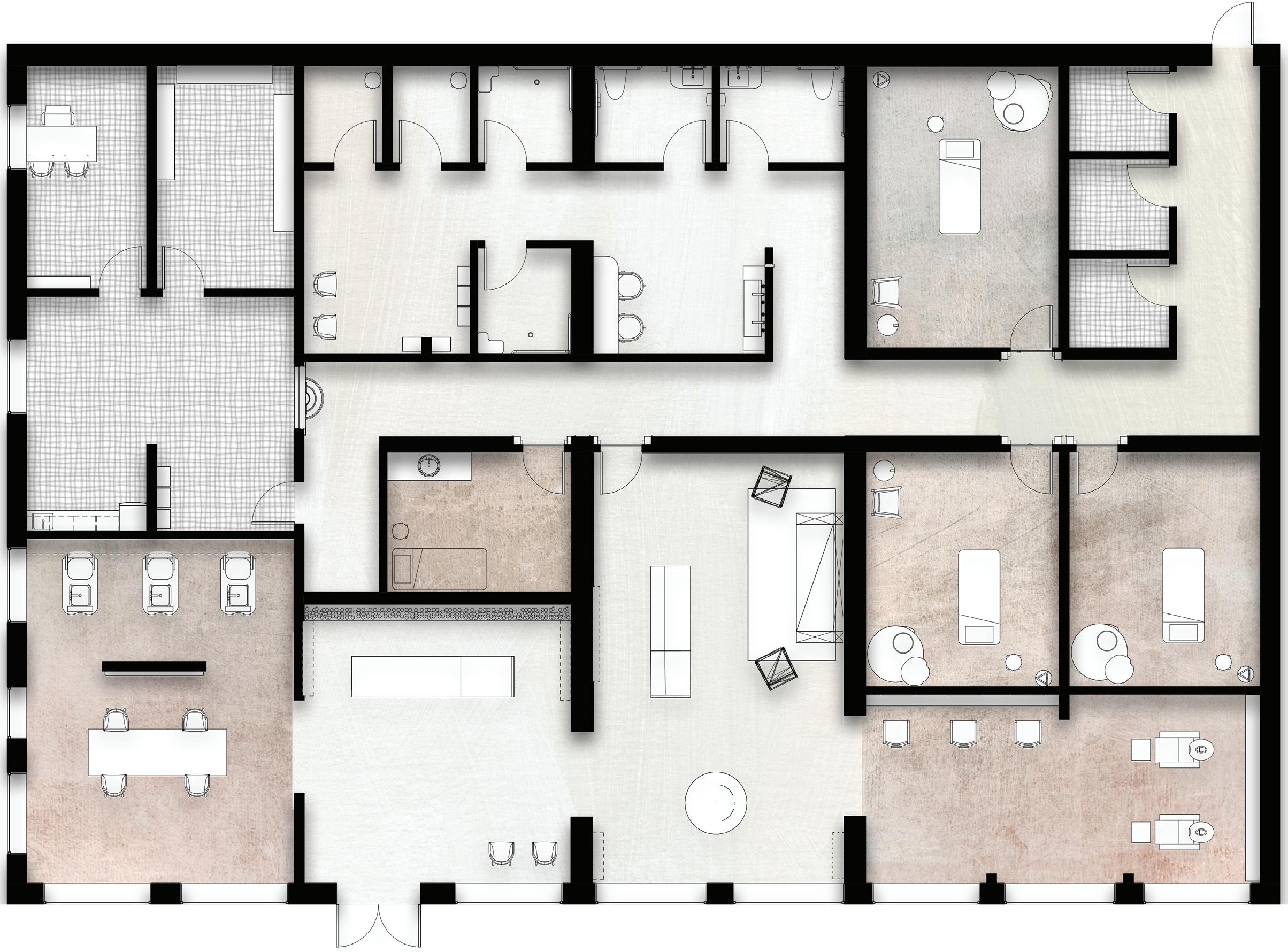
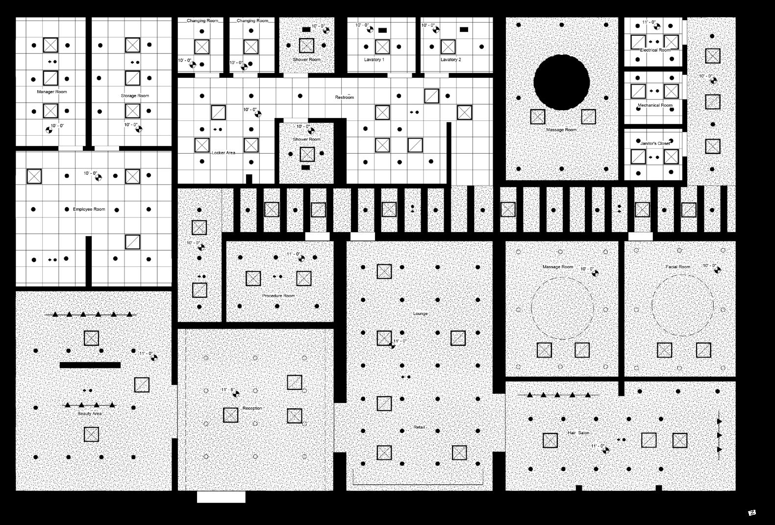
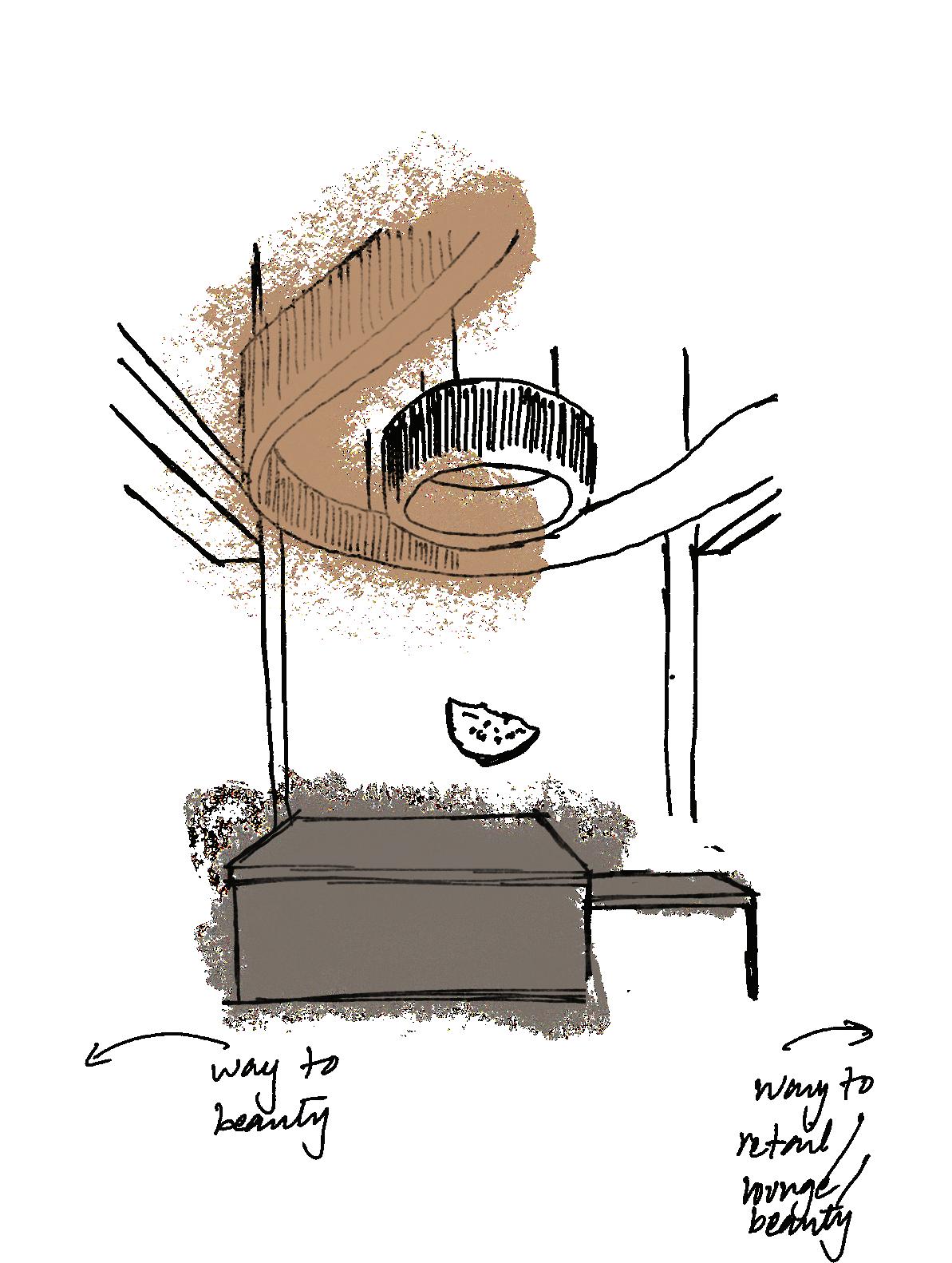
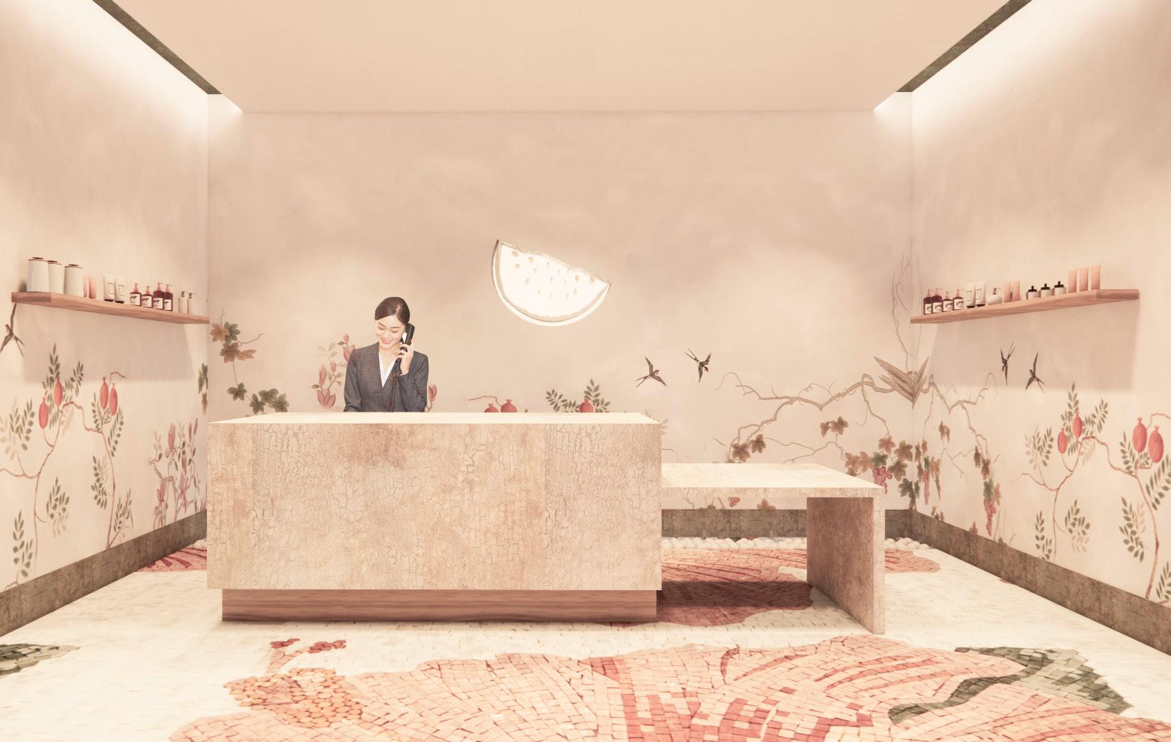
Reception
• Embrace of nature from all sides
• Strong shift in headspace at the entrance
• Start of the escape narrative
Retail
• Visible from main areas of pause and transition to enhance the customer journey
Preliminary sketches
• Maximum self-awareness as all five senses triggered in this space.
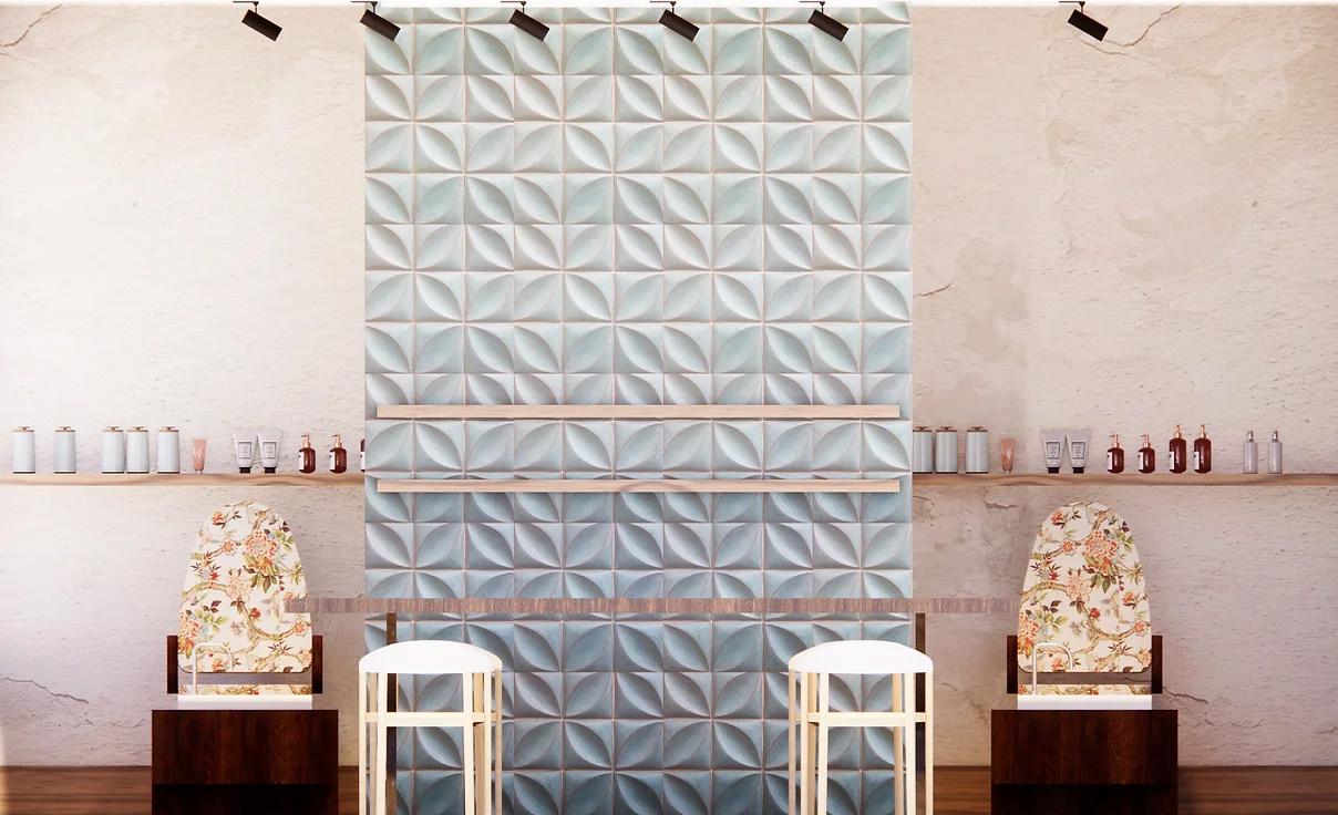
• Materials and textures inspired from nature.
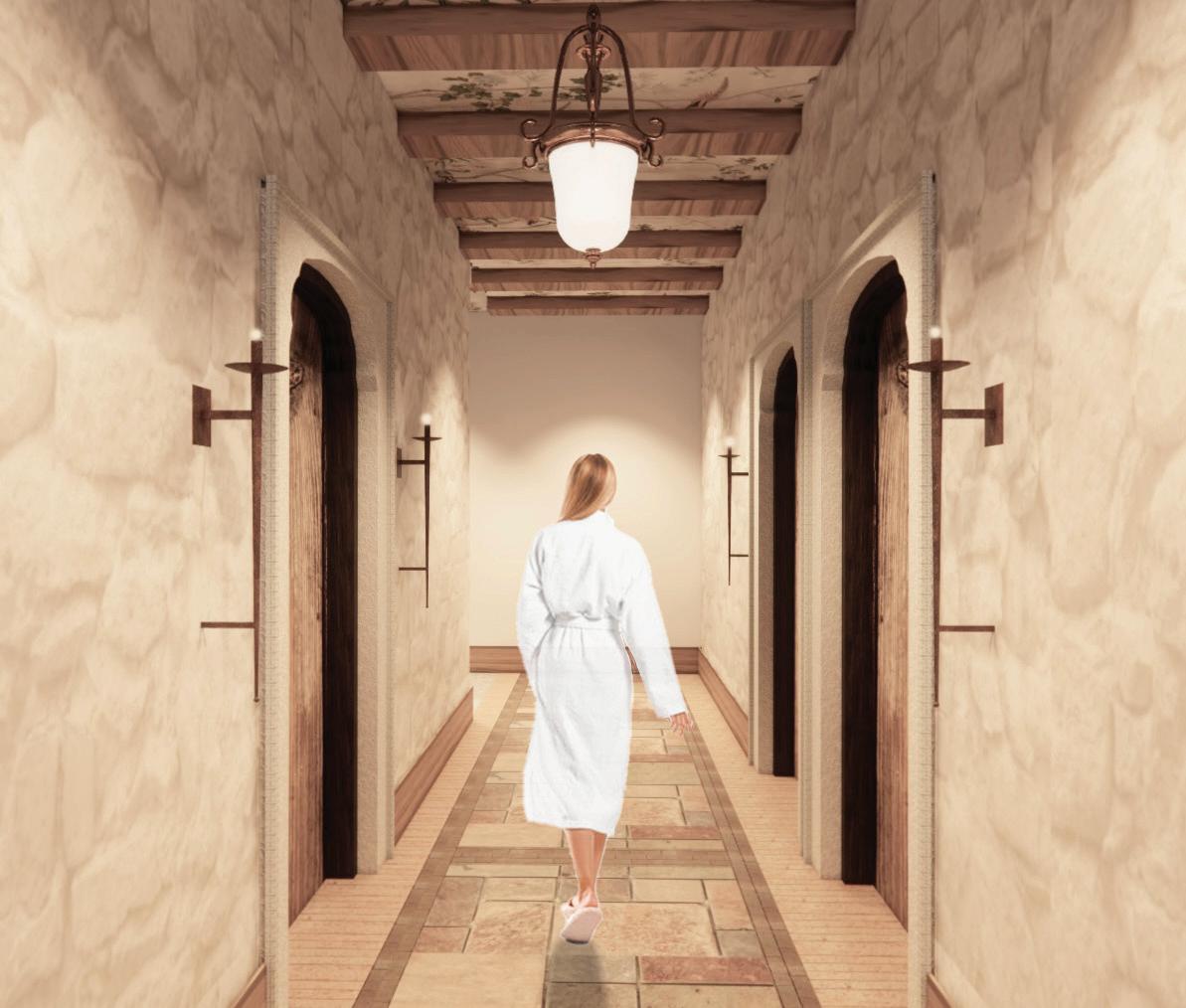
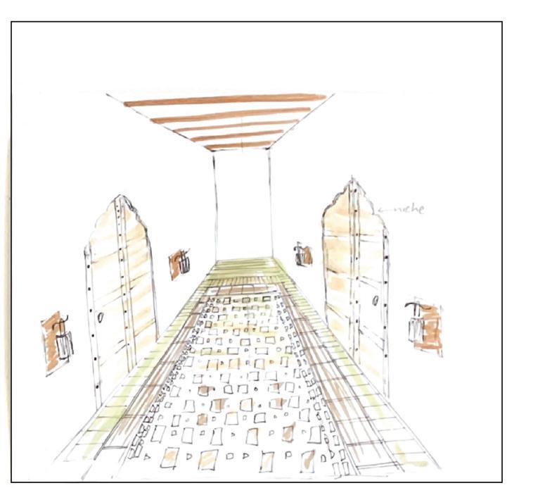
• The sound of water water feature, which other side of the corridor, reminds the user that still experiencing within the space.
water from the which is on the corridor, that they're nature
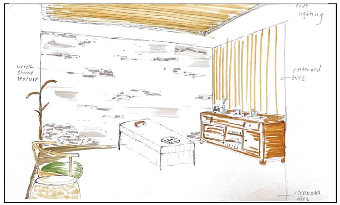
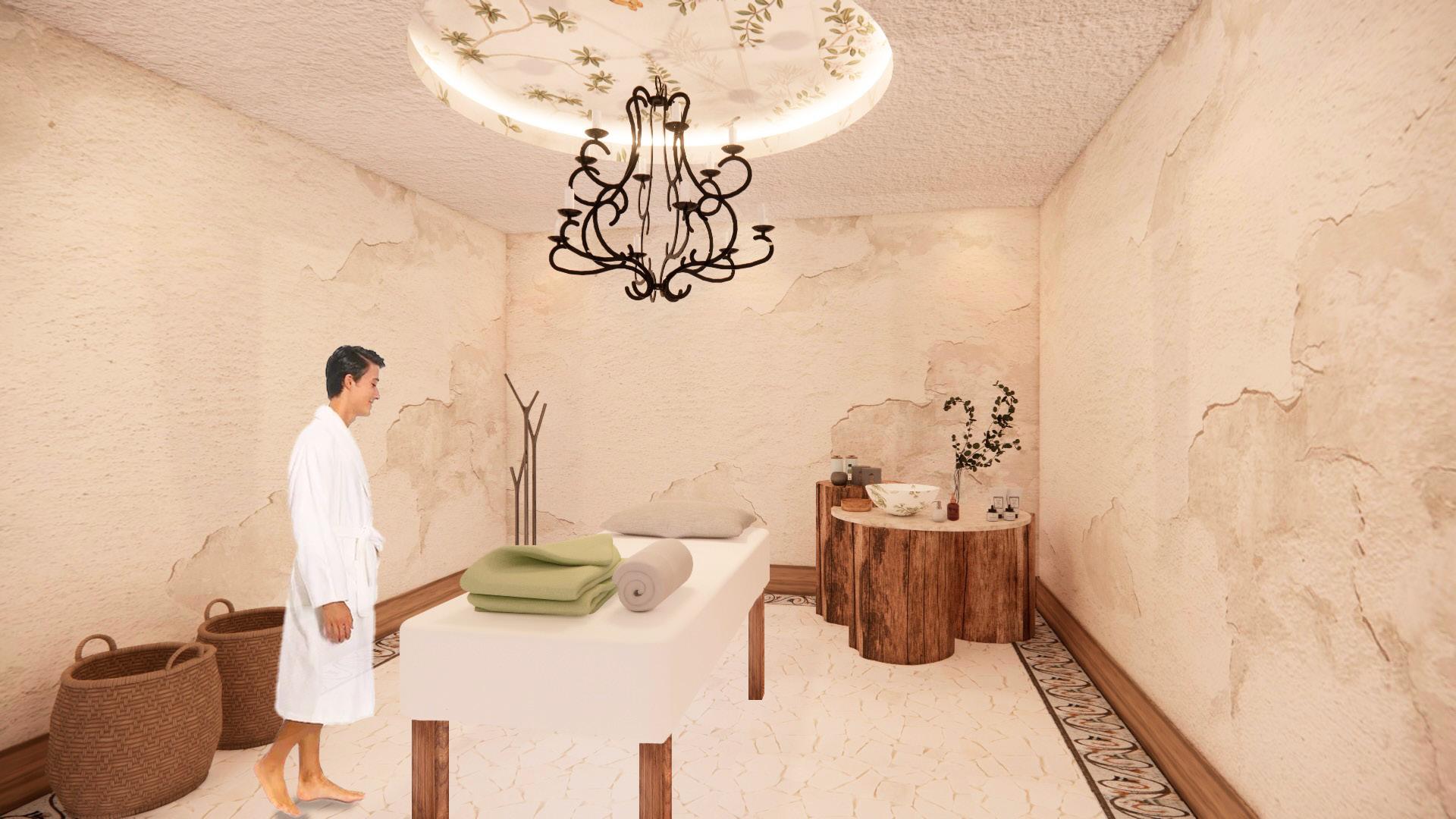
Massage Room
• Continuity of the idea of being in an old story.
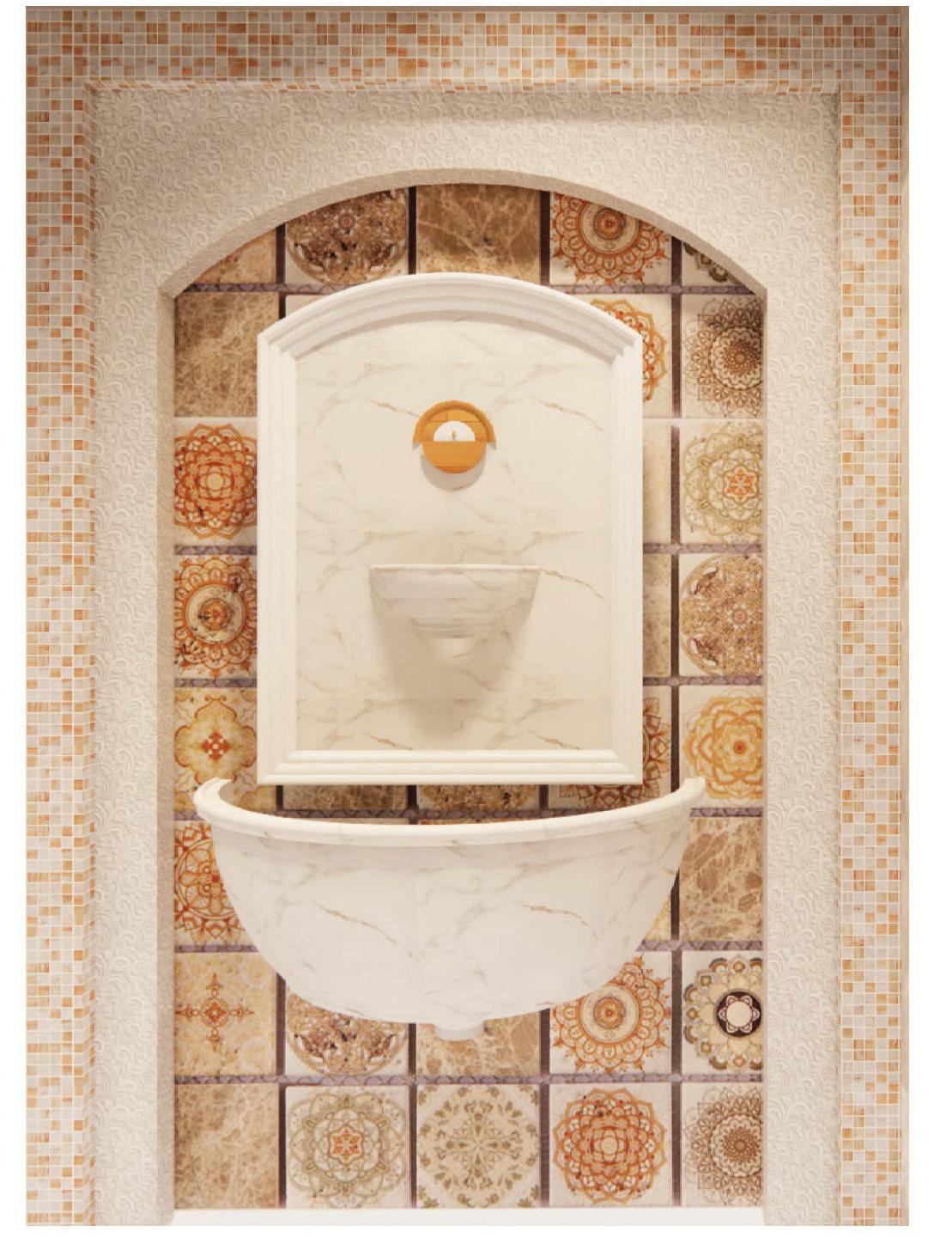
Lighting for the Interior | Summer 2022
Project Description
For this project, the class was given the opportunity to design a retail store of their choice in a space in Savannah. The shell of the space was given. Many aspects of lighting like glare, light distribution, intensity, color, rendition, and energy effectiveness were considered. The retail store chosen for this project is an Indian heritage jewelry brand named Sabyasachi.
Softwares used
Revit, Enscape, Photoshop, Illustrator

Sabyasachi Mukherjee is a renowned Indian fashion designer known for his intricate and opulent designs, particularly in the realm of traditional attire and jewelry. The designer takes inspiration from all over the world and likes to surround himself with things collected from his travel while designing pieces. His designs often showcase a rich tapestry of Indian cultural heritage characterized by a blend of traditional craftsmanship and contemporary aesthetics. The brand's design philosophy embraces a sense of luxury and elegance.
An age-old craft, jadau was introduced to India by the Mughals, and perfected by the artisans of Rajasthan. A painstaking artisanal endeavour, setting a single stone can begin at sunrise and end at sunset. Most Sabyasachi pieces pay homage to the rich heritage of jadau craftsmanship by incorporating intricately detailed jadau settings.
With the highest attention to detail, each jadau piece depicts a beautiful affair amongst all the materials used in it and tells tales of Indian culture and heritage Concept
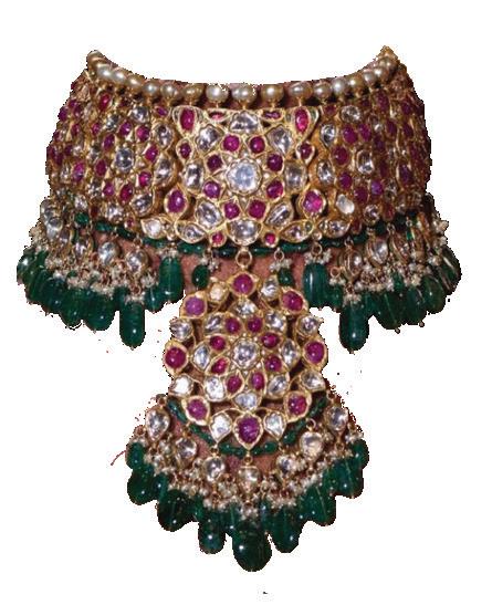
Elements incorporated in the space inspired from the jadau piece:
Soft curves

Pattern and arrangement: symmetry balance repetition Statement unifying piece

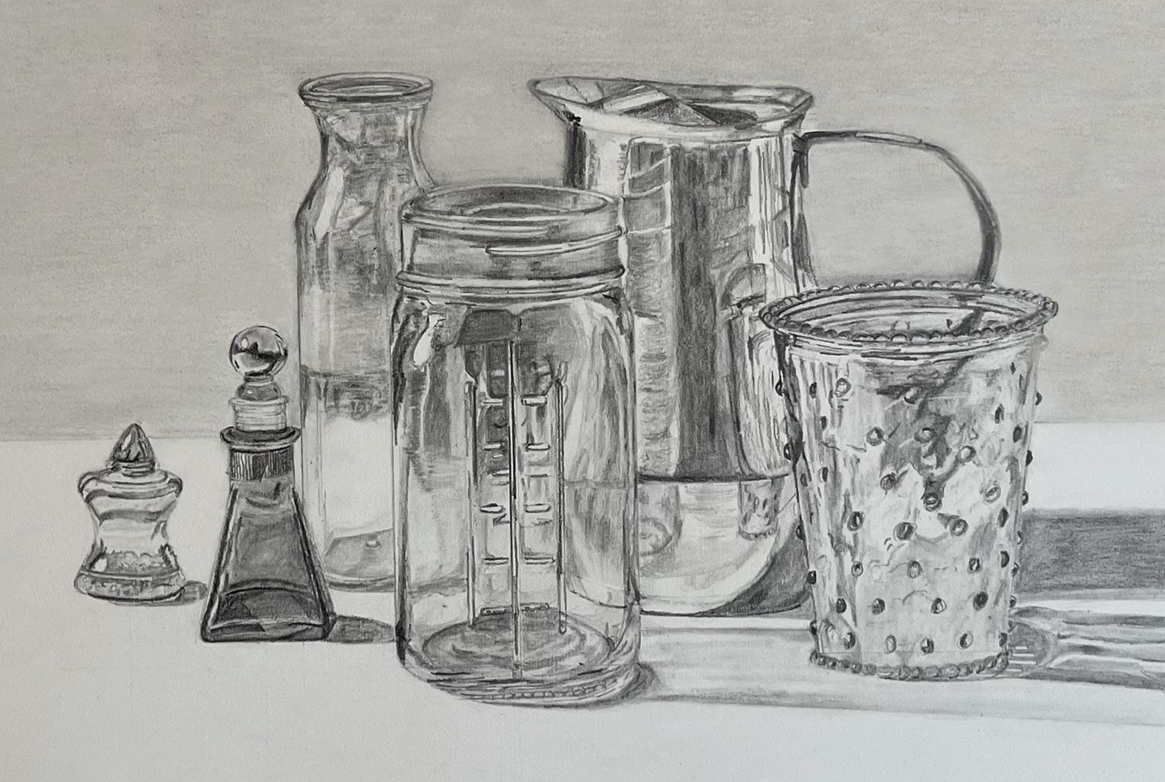
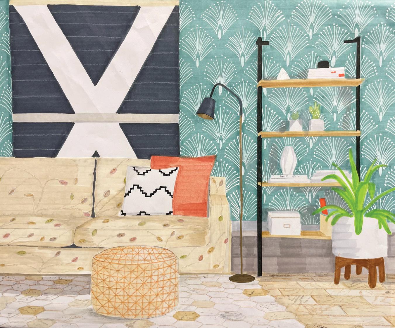
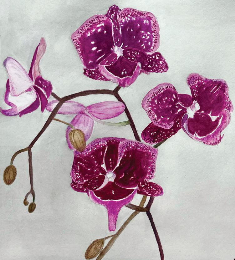
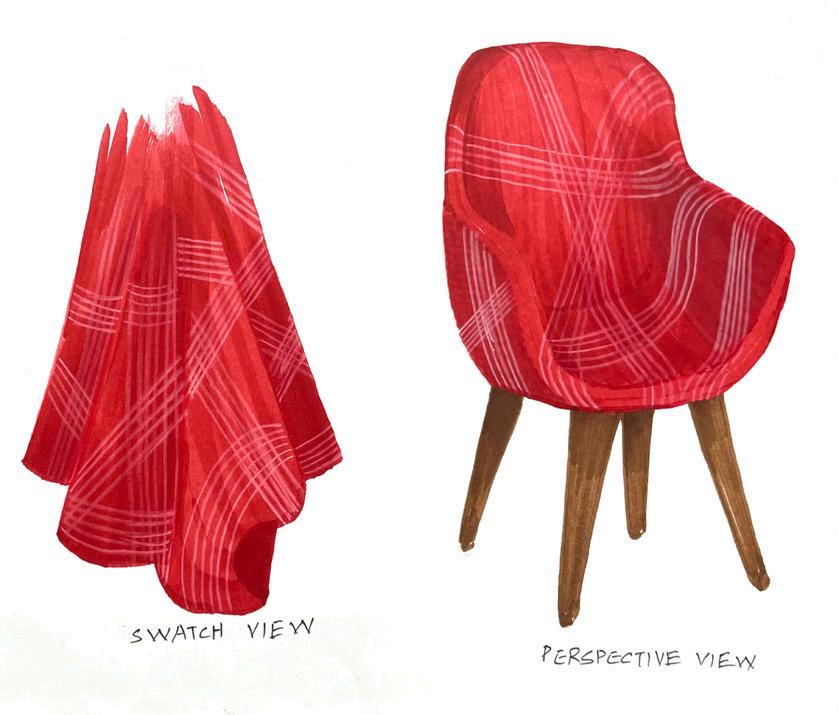

Hand Renderings Photography
Other works :

https://mahekjainn30.wixsite.com/portfoliosite

mahekkjain30@gmail.com
