TABLE OF CONTENTS
About Us
Our DNA
Sustainability Mission Statement
Target Customer
Brand Identity
Copy Tone & Voice
Brand Voice
Product Copy
Social Copy
Copy Style
Primary Logos
Secondary Logo
Brand Typeface
Examples of Typography Treatments
Brand Primary Colors
Photography
PDP Images
PDP Image Cropping
Video
Organic Content: Instagram & Facebook
Organic Image Cropping
Digital Advertising: Instagram & Facebook
Digital Advertising: Google
ABOUT US
Who are we as a brand?
What matters to us? What do we represent?
What differentiates us from our competitors?
How are we authentic?
3
OUR DNA
Founded in 2007, Alp N Rock presents as a new-wave ready-to-wear brand by SwissCanadian designer Susanne Reich.
Born from the desire to create pieces that transcend trends, with an emphasis on quality and fit, each season is a collection of timeless staples that bear Alp N Rock’s signature detailing and aim to offer a thoughtful perspective on multi-hyphenate dressing. Every piece is crafted with supreme attention to detail and the highest caliber materials and construction available.
We believe that modernity is underpinned by ethical and sustainable practices. Alp
N Rock is proud to be a 100% cruelty free brand. Our Eco-friendly, animal-friendly alternatives are top of the line, surpassing standards and proving that choosing to make a positive impact is not only possible, but preferred.
Our highest ethos is that true luxury is the ability to give back. Up to 10% of profits go to Room to Read, funding education for girls in developing countries.
4
SUSTAINABILITY MISSION STATEMENT
At Alp N Rock, mindfulness has always been in our DNA. We believe that in many ways, sustainability and mindfulness are synonymous. Of course, we aim to be economically sustainable, but beyond that, we strive to fulfill the social and environmental responsibility that is a fundamental part of being an ethical company. We keep this ethos close along each step of the way - from how we choose our materials, to our factory selection, all the way to the closets of our valued customers.
5
When thinking about the brand voice, imagining the customer as one, specific person, gives us the ability to focus on what she would want to hear, and in turn, what she wouldn’t want to hear.
TARGET CUSTOMER
She is successful and well educated. She leads an active and balanced lifestyle reguardless of where she lives. She has a penchant for adventure and travel, whether that’s discovering a new restaurant, taking a weekend ski trip, or exploring a foreign country. She has an effortless and natural sense of personal beauty, but an elevated eye for craftsmanship and that which is unique. she cares about others and gives back to the world around her, and as such, takes an interest in brands that align with that same value.
6
We move with intention and responsibility always putting our future first.
Sustainability shouldn’t compromise style.
BRAND IDENTITY
Effortless essentials
Transcend trends
Sustainable luxury
Cruelty-free
Consciously Cool
Give back initiative
Eco-friendly
Bold
Look good, do good
7
COPY TONE & VOICE
• Our copy should be informative, friendly, but not overly familiar. Each word used should be carefully considered to convey the most useful information to the customer. Offer practical advice and guidance, but keep it short and to the point
• When writing, use an active voice instead of passive because it is more direct and requires less words to get your point across.
• Refer to the brand as a singular entity so use words like has, gives, uses, its, etc.
Ex: There’s nothing basic about the Elke Henley. Designed from an organic cotton blend, contrast embroidery and signature vegan leather patch detailing gives this essential an instant upgrade.
8
BRAND VOICE
Alp N Rock’s brand voice should be authoritative, authentic, bold, familiar, but not overly friendly. Our brand voice and messaging needs to be consistent across all channels and should sound the same no matter what platform it’s being viewed in.
Example product copy: Effortless layering starts and ends with the cardigan. Our Sam style is soft yet superior thanks to its impeccable knit construction and faux horn button detail. Drape yours over coordinating looks when chilly temperatures arise.
9
PRODUCT COPY
• Our product copy should answer any unanswered question(s) the customer may have about the item that the picture doesn’t tell them. Ex: Is it part of a key trend? How could it fit into your lifestyle? Why is this item special? How does it fit/feel?
• PDP copy should focus on product description /selling points
• Avoid using ‘closed’ scenarios. Try not to define the item as being suitable for just one scenario as this may discourage someone from purchasing it. We really want to show the versatility of our products.
10
SOCIAL COPY
• Our social copy should stand out, encourage interaction and communicate the personality of the brand.
• When writing social copy, we should pay special attention to diction (word choice), length (short and brief or long sentences) and tone
• Use hashtags sparingly and when it makes sense
• Use capital letters to differentiate between words in a hashtag. Ex: #FallFashion
11
COPY STYLE
• Numbers 0-9 should be written out and anything 10 and above should be written numerically
• When possible, include style tips like ‘Pair it with…’, ‘Wear them with…’ You should only use ‘pair’ when referring to one other item and ‘wear’ when alluding to more than one item.. Ex: Pair it with your favorite cropped jeans
• When utilizing keywords, we should think about what customers are likely to search for and the various product we carry that falls within those search terms (refer to marketing for SEO keywords)
12
This is our primary logo. It should be used for all branded elements.
PRIMARY LOGOS

13
Legibility is our top priority. The minimum size of our logo on screen is 21px and .25in in print. This is measured by the height of the “A”. Always leave clear space around the logo.
PRIMARY LOGO SPACING
14
PRIMARY LOGO INCORRECT USES
DO NOT STRETCH THE LOGO.
The primary logo should be in black, or can alternatively be white on dark backgrounds.

DO NOT APPLY COLOR TO PART OF THE LOGO.
DO NOT PLACE LOGO OVER VISUALLY BUSY IMAGES OR PATTERNS.
DO NOT RESET THE TYPOGRAPHY OF THE LOGO.
15
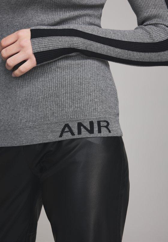
This is Alp N Rock’s secondary logo. It can be used to show more of the brand’s personality when needed.
SECONDARY LOGO
16
Legibility is our top priority. The minimum size of our logo on screen is 36px and .5in in print. This is measured by the height of the logo border. Always leave clear space around the logo.
SECONDARY LOGO SPACING
17
The secondary logo should always be in black, or white when the background is dark.
SECONDARY LOGO INCORRECT USES
DO NOT STRETCH THE LOGO OR RESIZE INTO A SQUARE.
DO NOT PLACE LOGO OVER VISUALLY BUSY IMAGES OR PATTERNS.
DO NOT APPLY COLOR TO PART OF THE LOGO.
DO NOT REDESIGN ANY IMAGERY IN THE LOGO.
18
Helvetica Neue is to be used for all applications: print and digital platforms. When Helvetica Neue is not an option, use Helvetica as the typeface.
BRAND TYPEFACE
Aa Bb Cc Dd
Ee Ff Gg Hh
Ii Jj Kk Ll Mm
Nn Oo Pp Qq
Rr Ss Tt Uu Vv
Ww Xx Yy Zz
Helvetica Neue Regular
Aa Bb Cc Dd
Ee Ff Gg Hh
Ii Jj Kk Ll Mm
Nn Oo Pp Qq
Rr Ss Tt Uu Vv
Ww Xx Yy Zz
Helvetica Neue Bold
19
EXAMPLES OF TYPOGRAPHY TREATMENTS The Summer Essential
MEET THE COLLECTION
THE
SUMMER ESSENTIAL
MEET THE COLLECTION
Body copy
20
Black and white are the primary colors and should be used with minimal pops of color that reflects the season palette.
BRAND PRIMARY COLORS
21
Black White
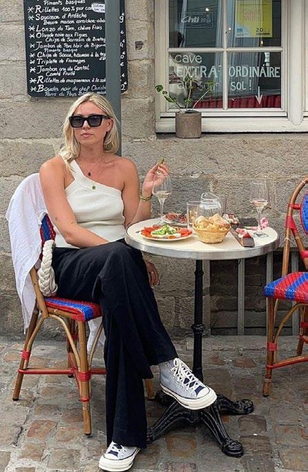
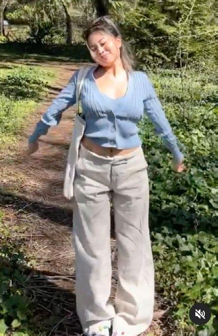
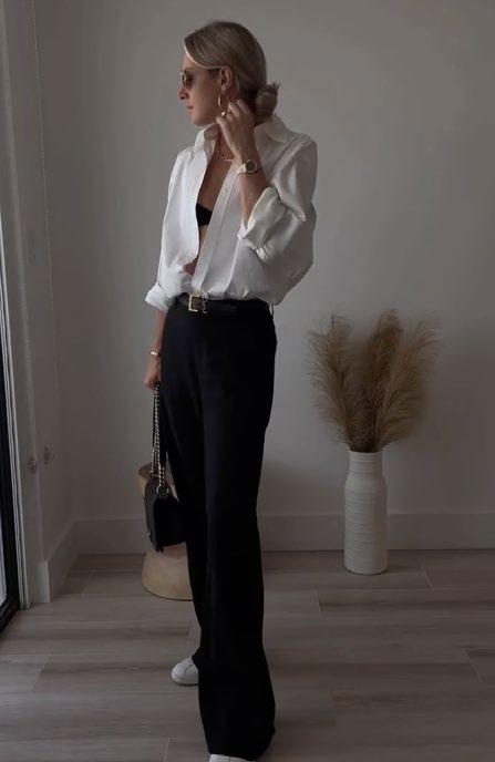
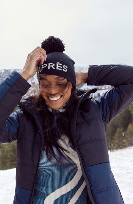
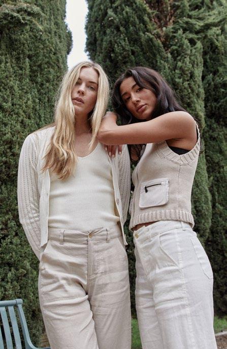
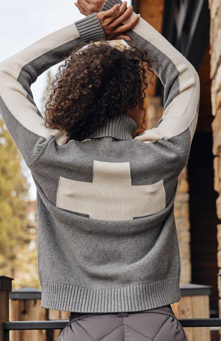
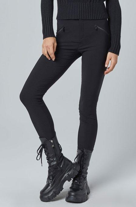
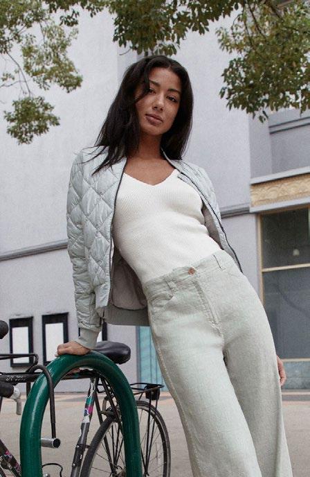
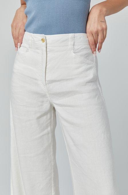
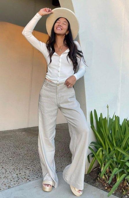
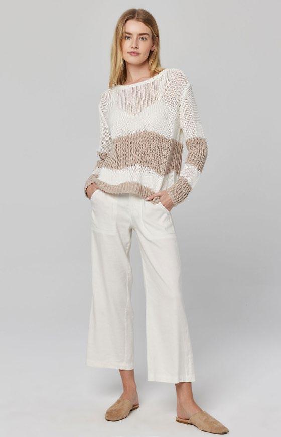
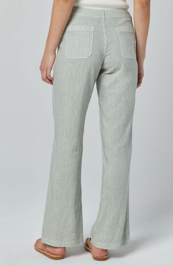
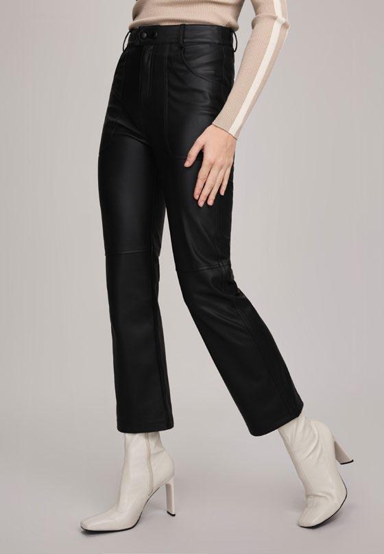
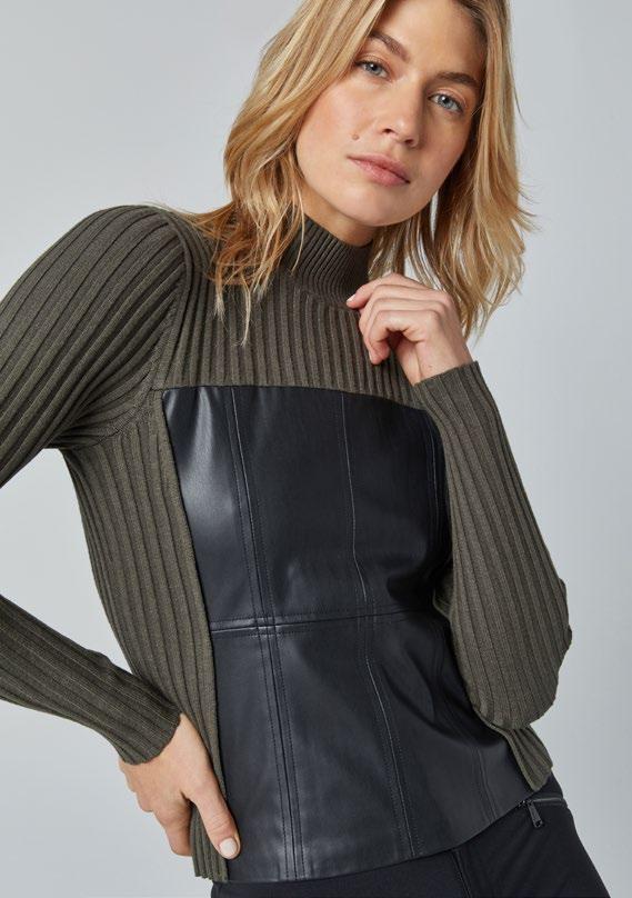
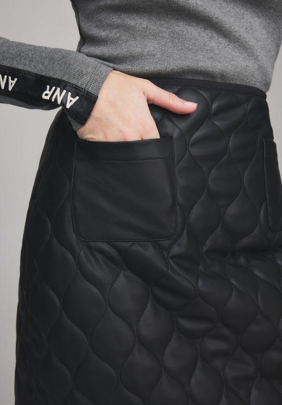
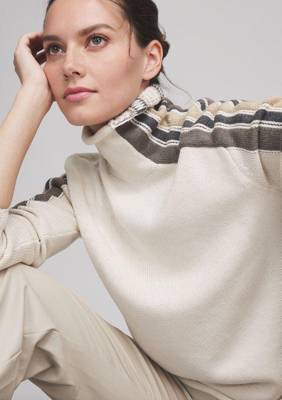
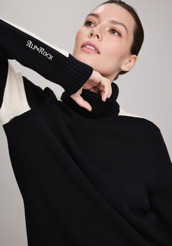
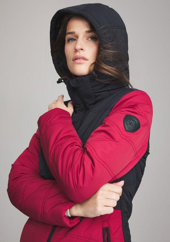
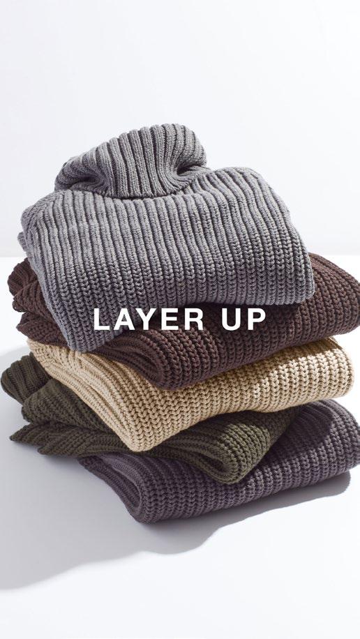
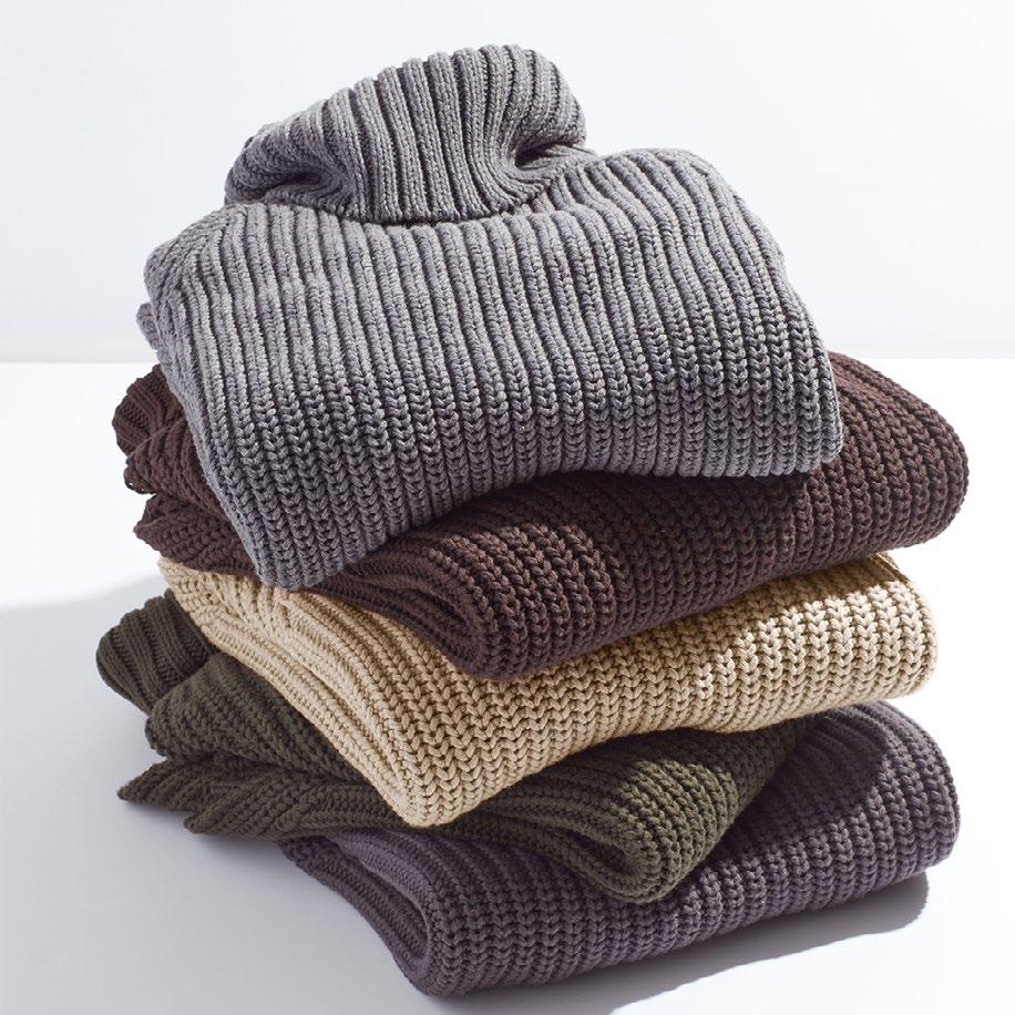
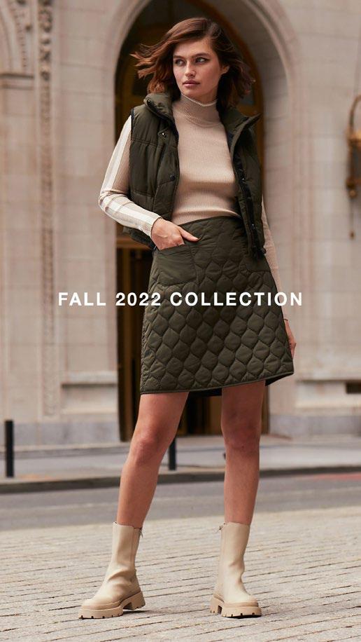
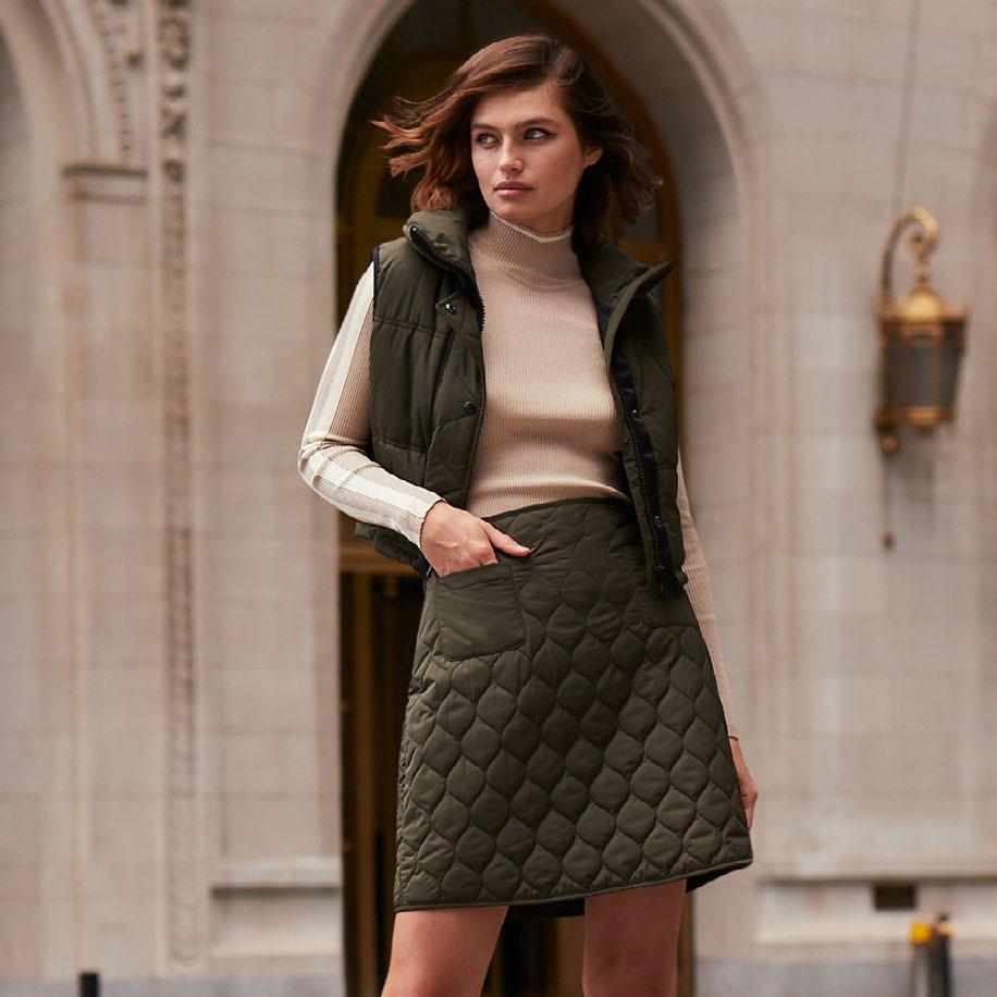
Product photography images should be styled with a variety of different shoes to show versatility and that product can be worn different ways, in different locations and for different activities.
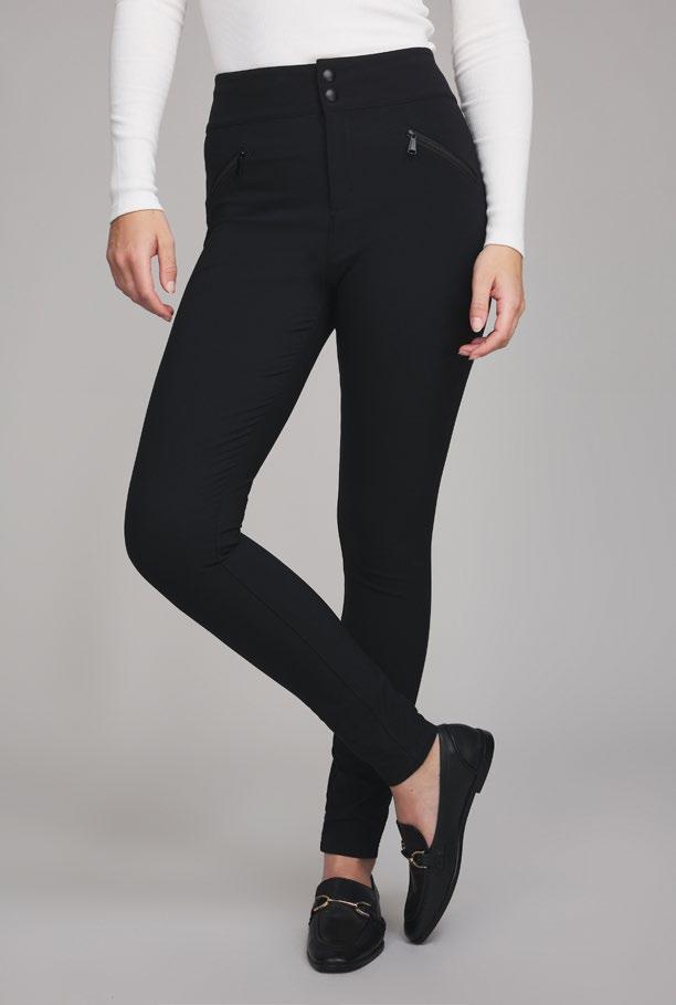
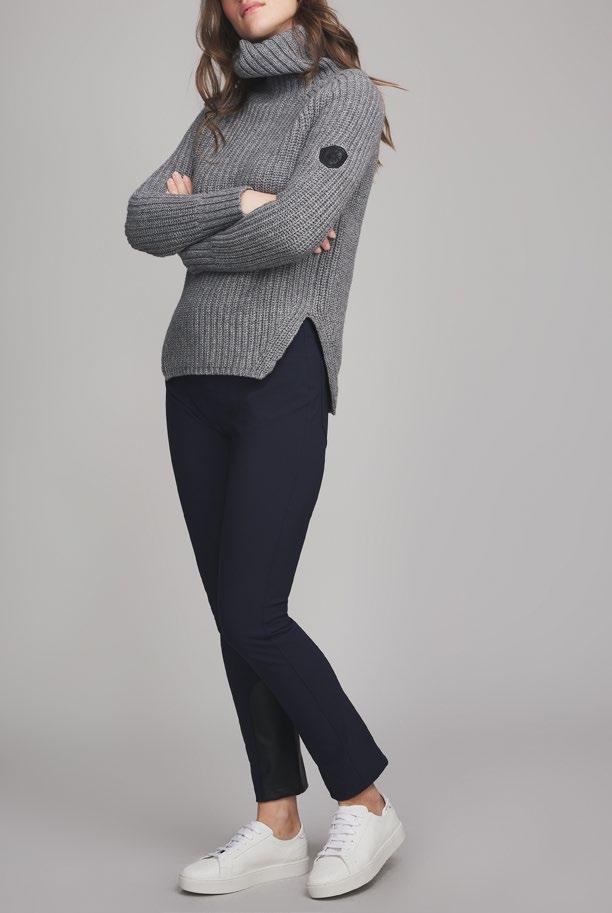
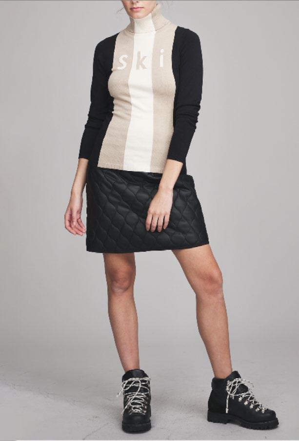
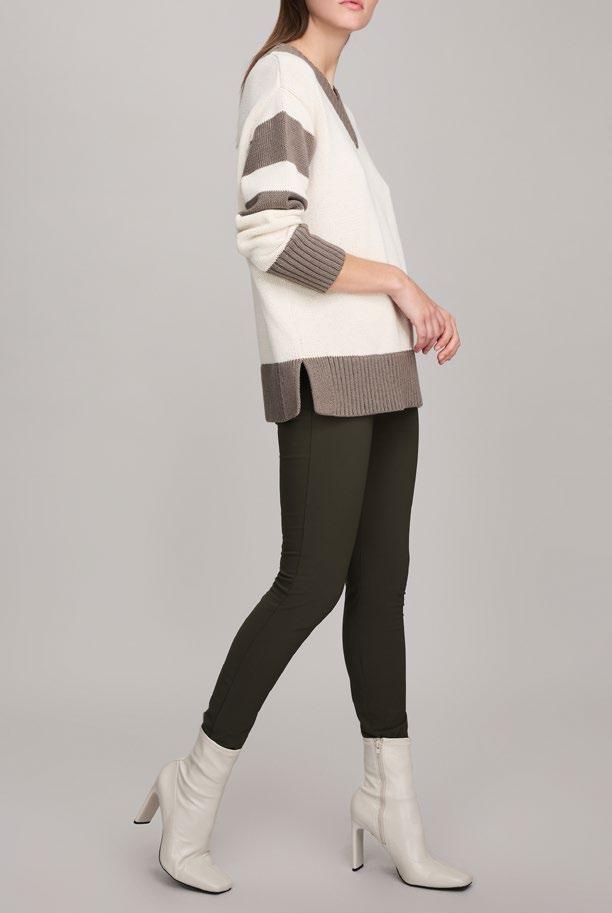
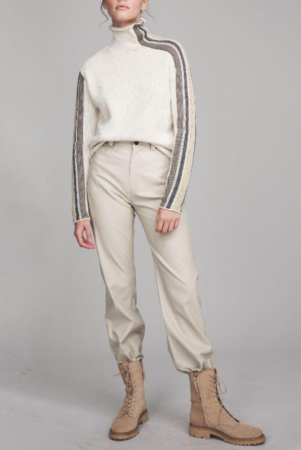
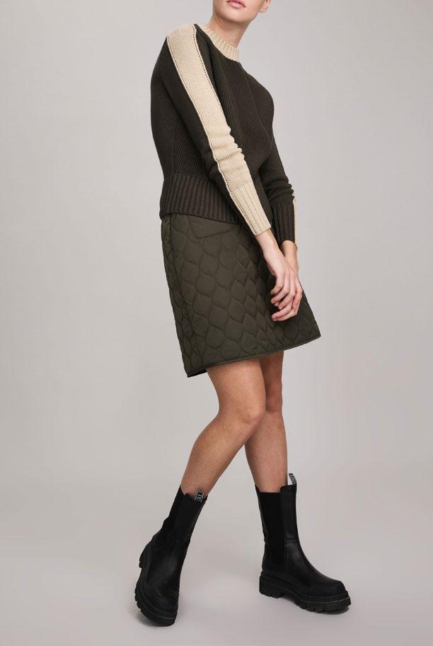
PHOTOGRAPHY
22
PHOTOGRAPHY
• No images should be posted online without being retouched.
• All garments should be properly steamed, pressed, etc prior to any photoshoot and this includes but isn’t limited to pdp photography, editorial, influencer shoots, etc.
• If a garment is ill-fitting the image should not be used or posted regardless if it was taken by a professional photographer, features a professional model, etc.
23
24 Do Don’t
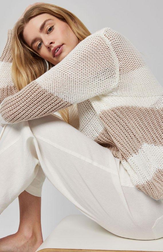
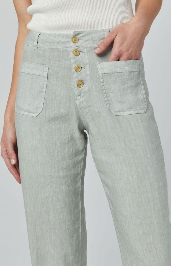
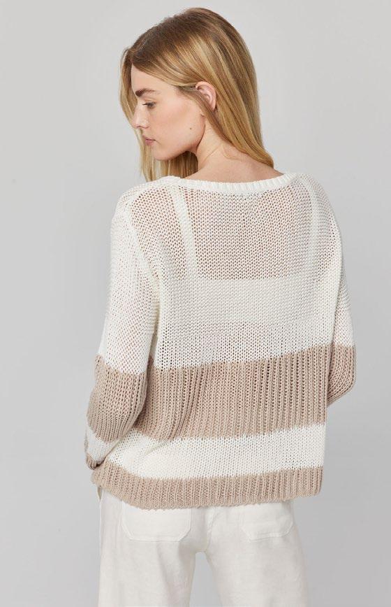
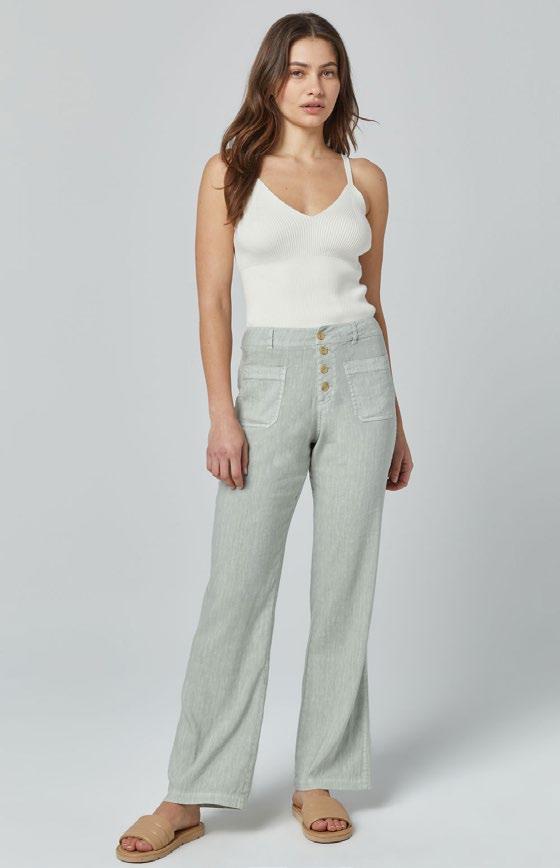
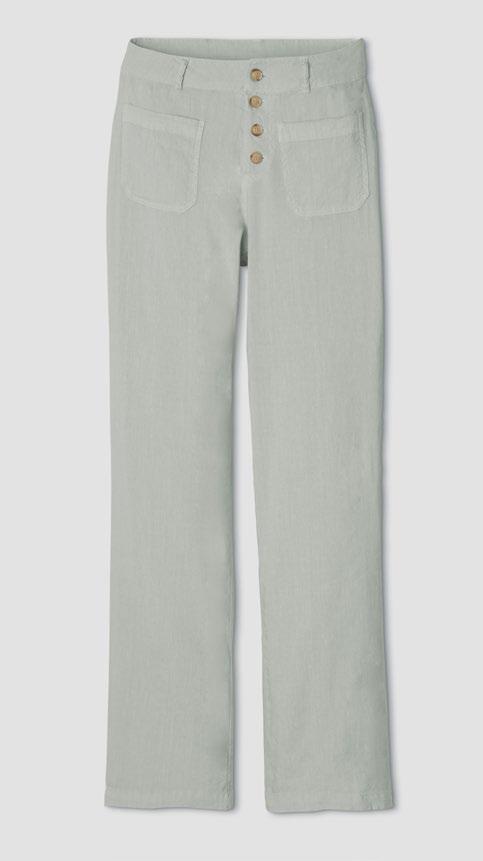
Include a front, back, detail, and full body image as well as a flat lay when available. Include editorial image if available.
PDP IMAGES
25
PDP IMAGE CROPPING
26
1000 x 1550 px
VIDEO
• All video should be intentional and purposeful.
• There should be cohesion in video with a beginning, middle and end.
• We should be mindful of posting quality videos with proper clarity, color, movement, etc.
27
The Instagram feed should be sleek and always be a visual representation of the brand. The colors will gradually change each season for the new fall and spring collections.
The feed content includes video, product shots, stock images, black and white images, and images with copy. Copy may be directly on images, but used sparingly. Stock images are used to create a mood board.
ORGANIC CONTENT: INSTAGRAM & FACEBOOK FEEDS
28
Social, email, & other channels
ORGANIC IMAGE CROPPING
29
Static & Video
Feed: 1080 x 1080 px
Story: 1080 x 1920 px
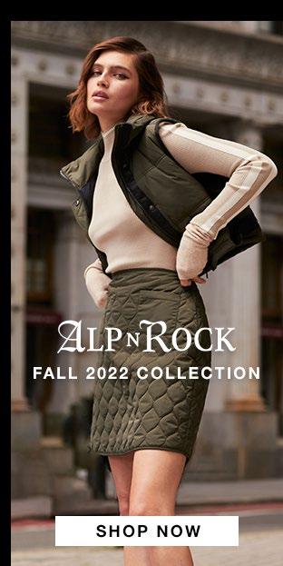
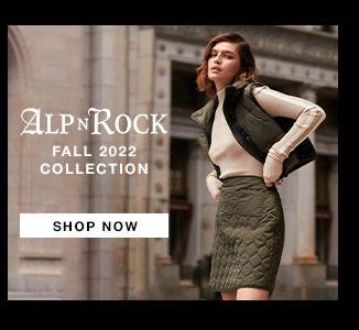
DIGITAL ADVERTISING: INSTAGRAM & FACEBOOK
30
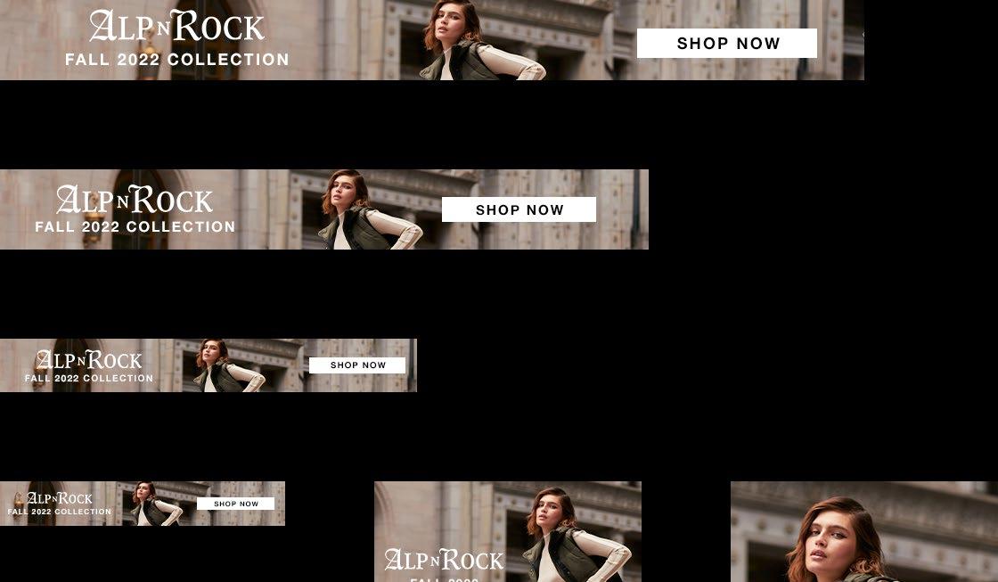
Google ads should always have a clear CTA and logo. Image should represent the brand.
Google ad sizes include:
970 x 90 px
728 x 90 px
468 x 60 px
320 x 50 px
300 x 250 px
300 x 600 px
DIGITAL ADVERTISING: GOOGLE
31
