P OCESS RP CESS ORP ESS CORP SS ECORP S
Madalin Bartholomew PROCESS ROCESS

Week 1 - Type
Week 2 - Tool
Chosen Object
Photoshoot
Experimentation
Final Font
Week 1 taught me many things, we focused on the fundamentals of type and the different ways of designing a font.
We saw different examples of people creating fonts using a range of items, from something you would find in your house, like a banana, to something that had to be built, like a crane. We also
looked at different fonts and their fundamentals, things like the baseline, kerning, ascender, and tail.
This week also helped me practice using the software needed for creating a typeface, as well as the thought process behind creating a typeface (planning, sketching, etc.)
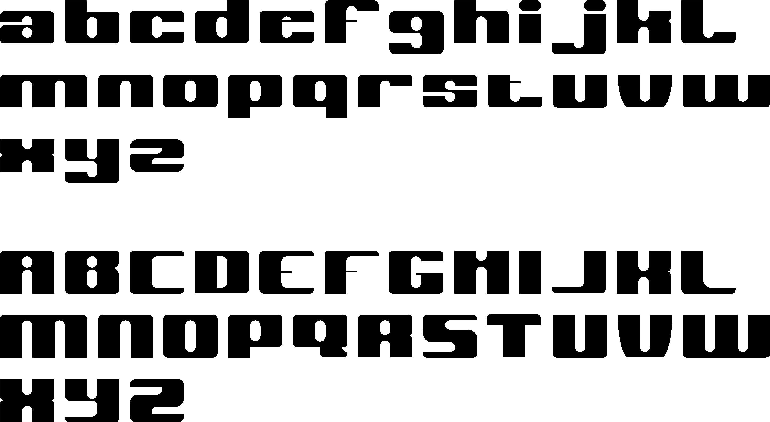
When creating this font I knew that I wanted to create something different from the usual serifs and sans serifs. I was inspired by the typical analog clock, I like the fact that the font was broken down into geometric shapes, squares, and rectangles, there are no curves or rounded edges.
I also looked at bitmap fonts and got inspiration from the letters themselves, looking at how they made the ‘v’ look different from the ‘u’, which I struggled with at first when I was creating this font.
I am happy with the final font, I think it is unique but still simple and clear, and the ascenders and descenders are equal on all of
the characters which is important when designing a typeface. However, I think if redesigned this font I would definitely change the ‘m’ and the ‘w’ because, as I learned from feedback, those letters are typically wider than the rest of the characters, so they look a little squished.
Overall, creating this font helped with learning and to understand the fundamentals of type and got me used to the idea of taking inspiration from an object, although I didn’t use the physical analog clock to design this, it did get me thinking about the different objects I could have used which will be good for the rest of the project.
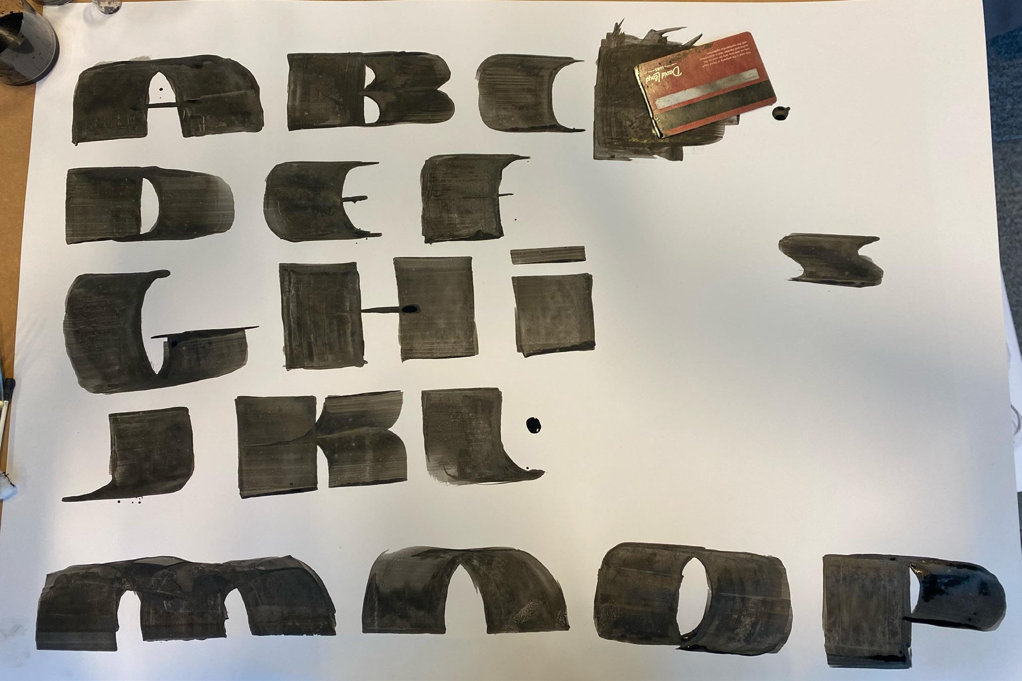
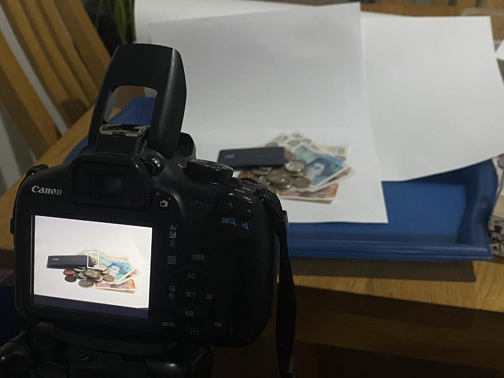
Week 2 also taught me a lot, we had to bring in some objects to begin experimenting and developing our typeface. The object should be somewhat good looking as we would have to take pictures of our object for the photography-based editorial.
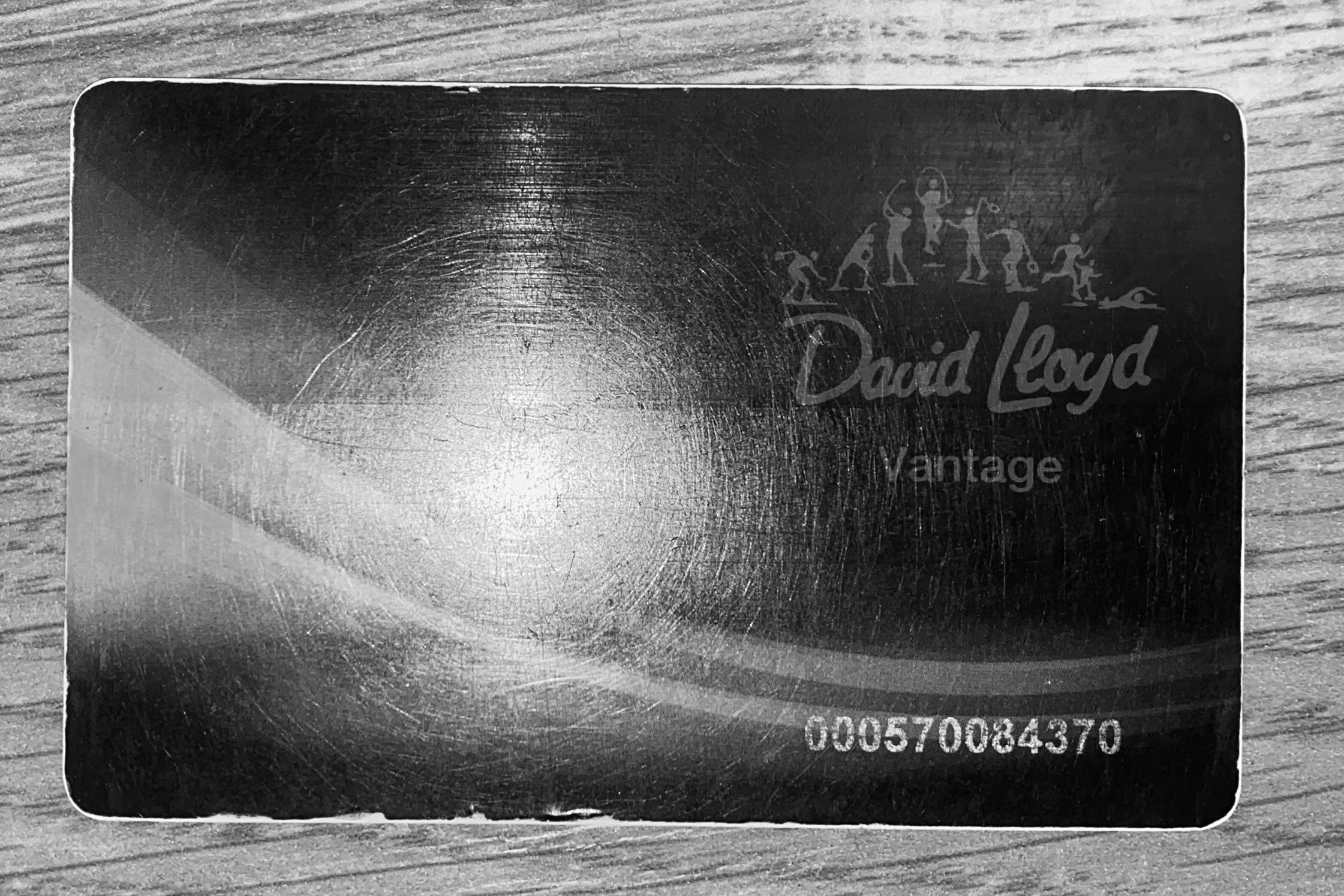
For the in-class experimentation, I used my old gym membership card, I wanted to use something that I had on me at the time. After experimenting with the card, I decided that I loved the look of the bold, black font. I like the way
that the vertical stroke was thick and the horizontal stroke was really thin.
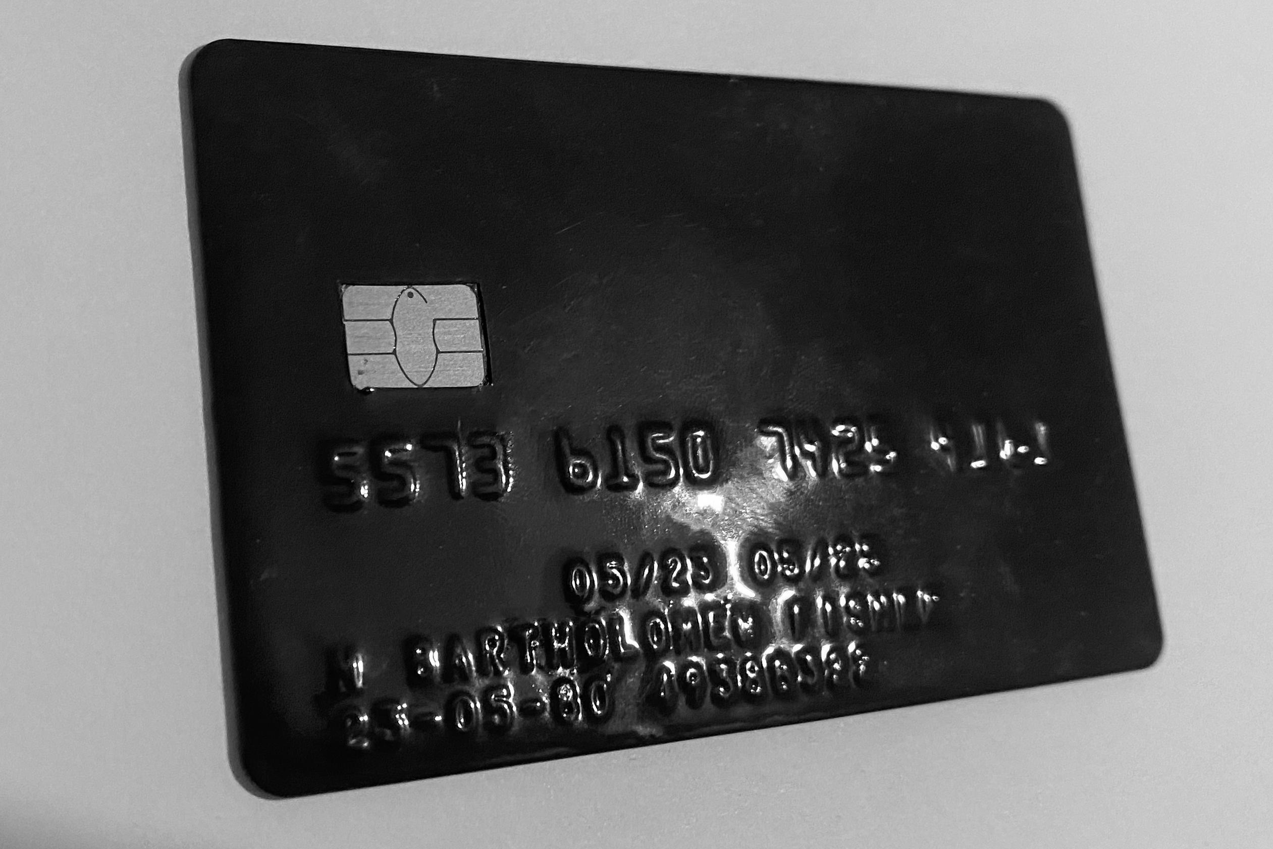
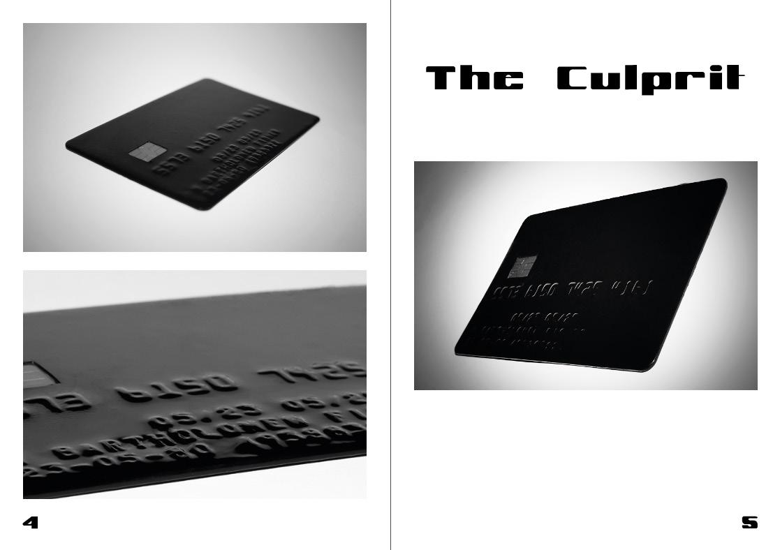
However, I understood that the object itself was not the bestlooking thing, and after talking to one of the lecturer’s I decided to use a bank card instead of the gym card. I thought this was a good idea because then I could incorporate other money (coins and notes) into the pictures for the photography editorial, a bank card had more depth than a gym card.
I chose an old bank card as my object because I liked the idea of using the theme of money in my photography-based editorial and I loved the font I had started to create using a card.
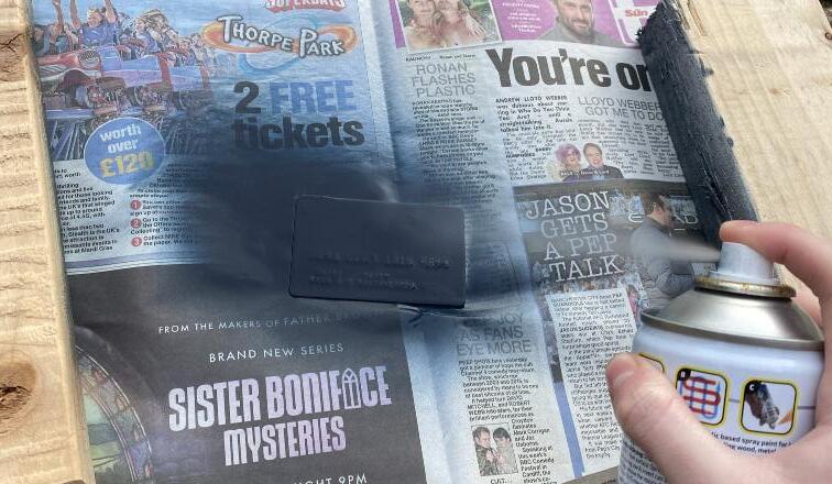
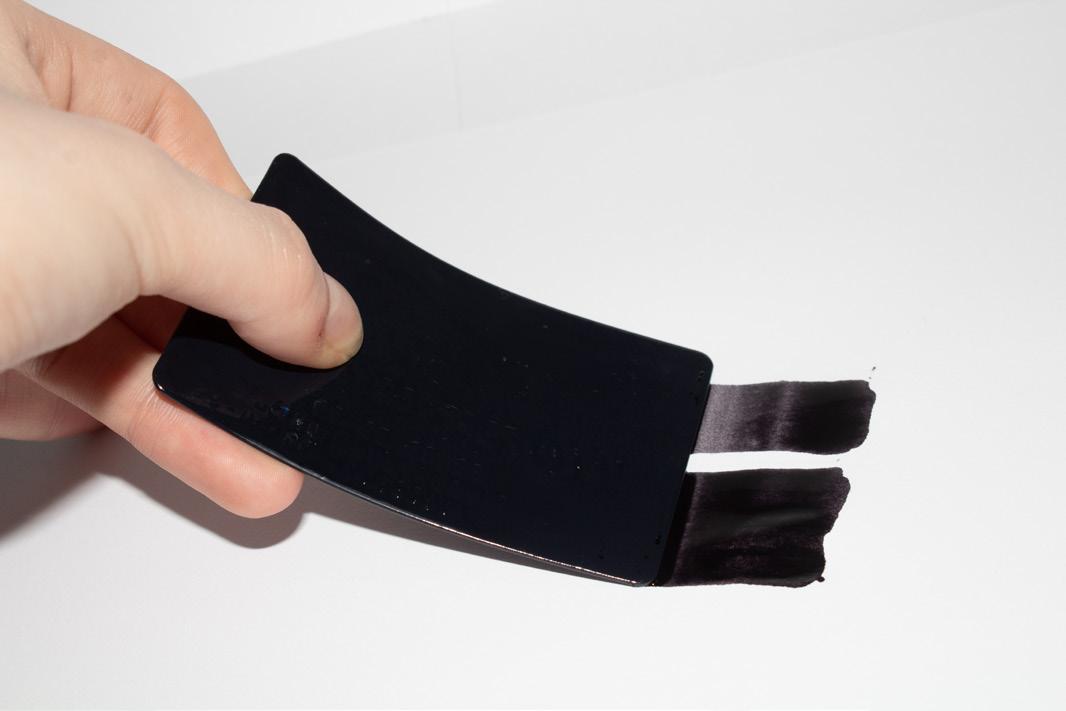
However, the card I was using was a metro bank card, which is red and blue. I knew I didn’t like the card as it was, so I came up with the idea of painting the card black.
After brainstorming a little, I thought the best way to evenly cover the surface of the card but
leave a smooth finish, was to use spray paint.
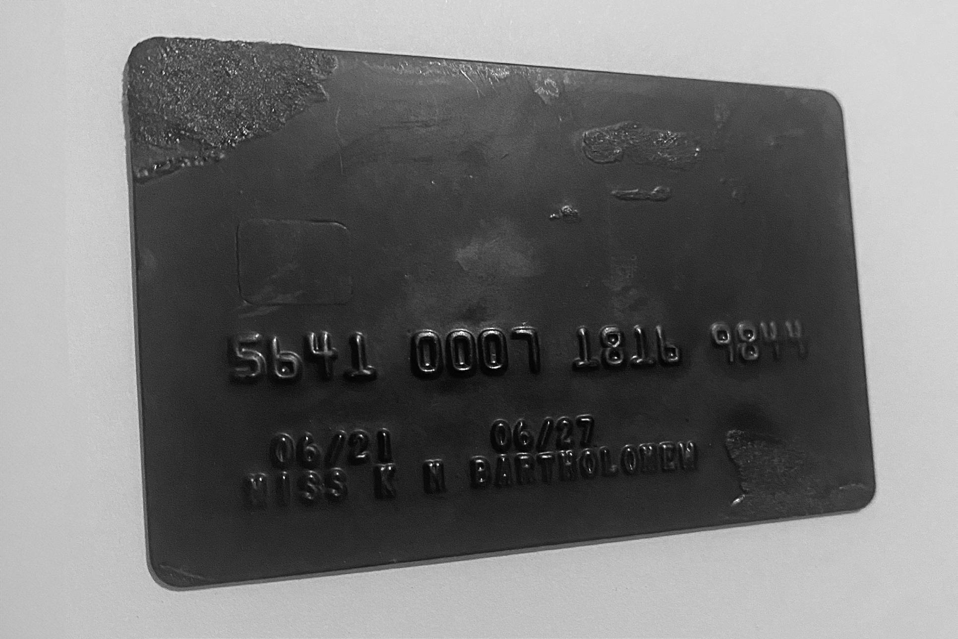
After my first attempt, I wasn’t happy with the finish, it was bubbly and had a lot of impurities, which was not what I wanted, so I tried again making sure to do many thin coats. Using this technique, the finish on the card was near perfect, the embossed letters were visible and so was the metal chip, which I wanted to keep unsprayed because I thought it would keep the card recognisable as a bank card.
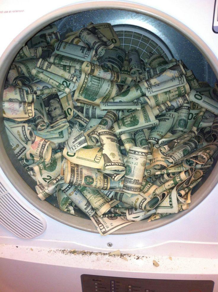
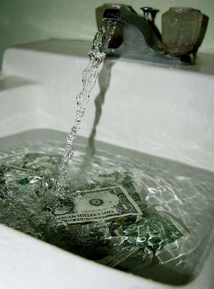
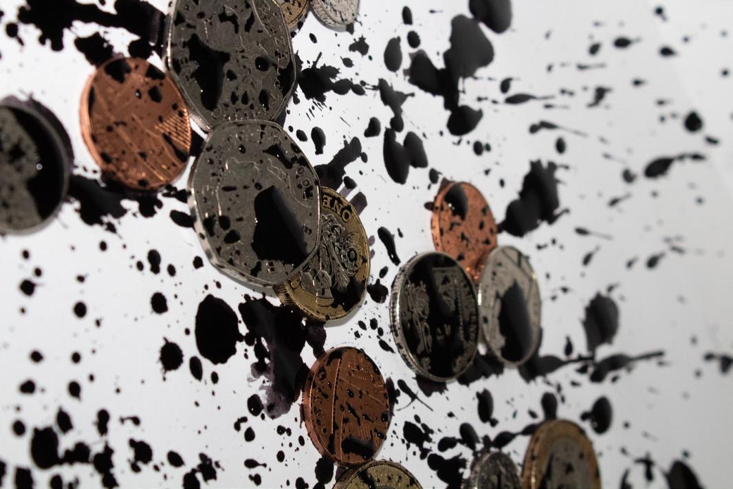
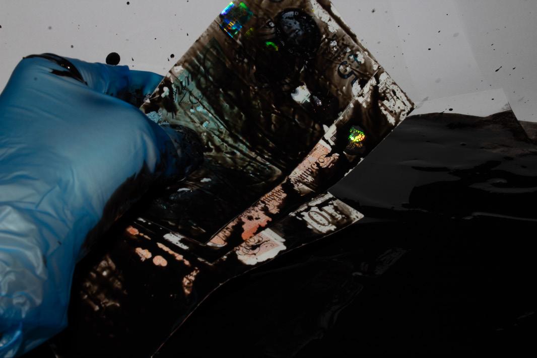
After knowing I was going to use the money for my photographybased editorial I began throwing ideas around, the one I liked the sound of the most was the idea of having dirty money. Dirty money is money acquired illegally (money laundering, stealing, selling drugs, etc.) I thought this idea had a lot of potential for creativity.
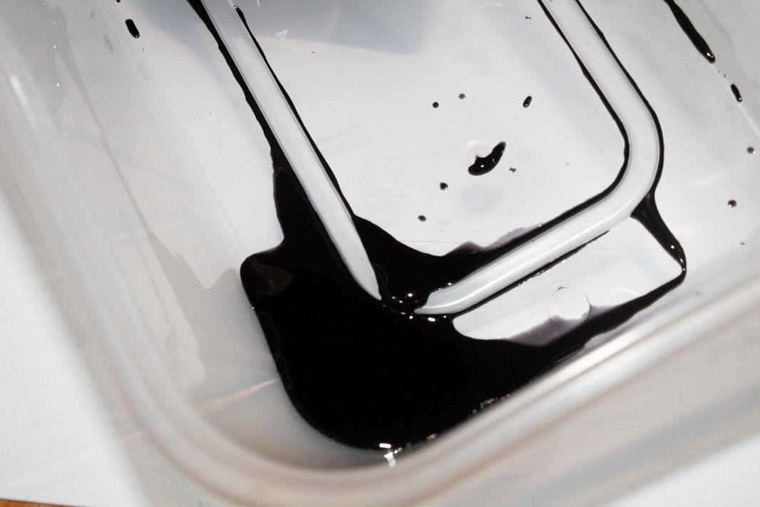
I decided to combine the dirty money idea with using ink, I wanted to use ink with this object because together, it is how I created the font for the typebased editorial. I think that using ink gave the whole idea and project a roundness to it, like a
full-circle situation.
When I was editing the pictures
I thought if I made the pictures black and white, the ink could be seen more as blood, adding to the dirty money idea and giving it a dark edge.
Lastly, for part of the photoshoot, I was inspired by the images below to incorporate the cleaning of the ‘dirty money’ which is a part of the process of cleaning money, which is done when money is printed illegally, putting the money in a tumble dryer makes the money look used, making the notes seem legitimate
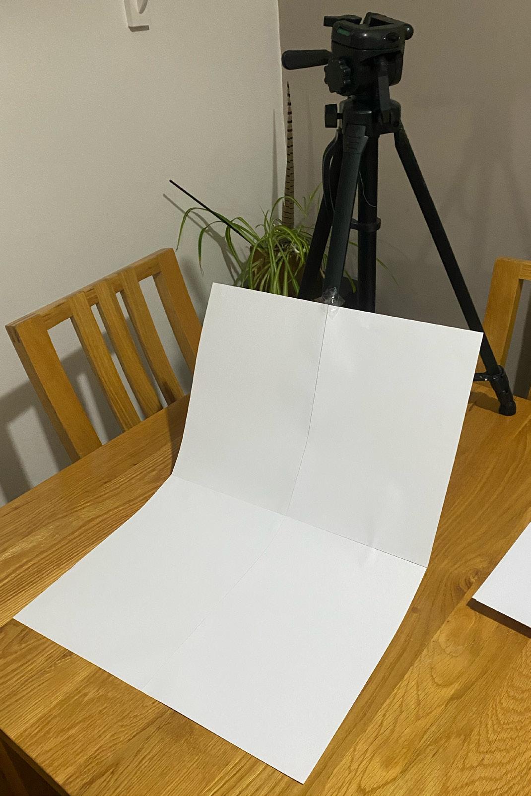
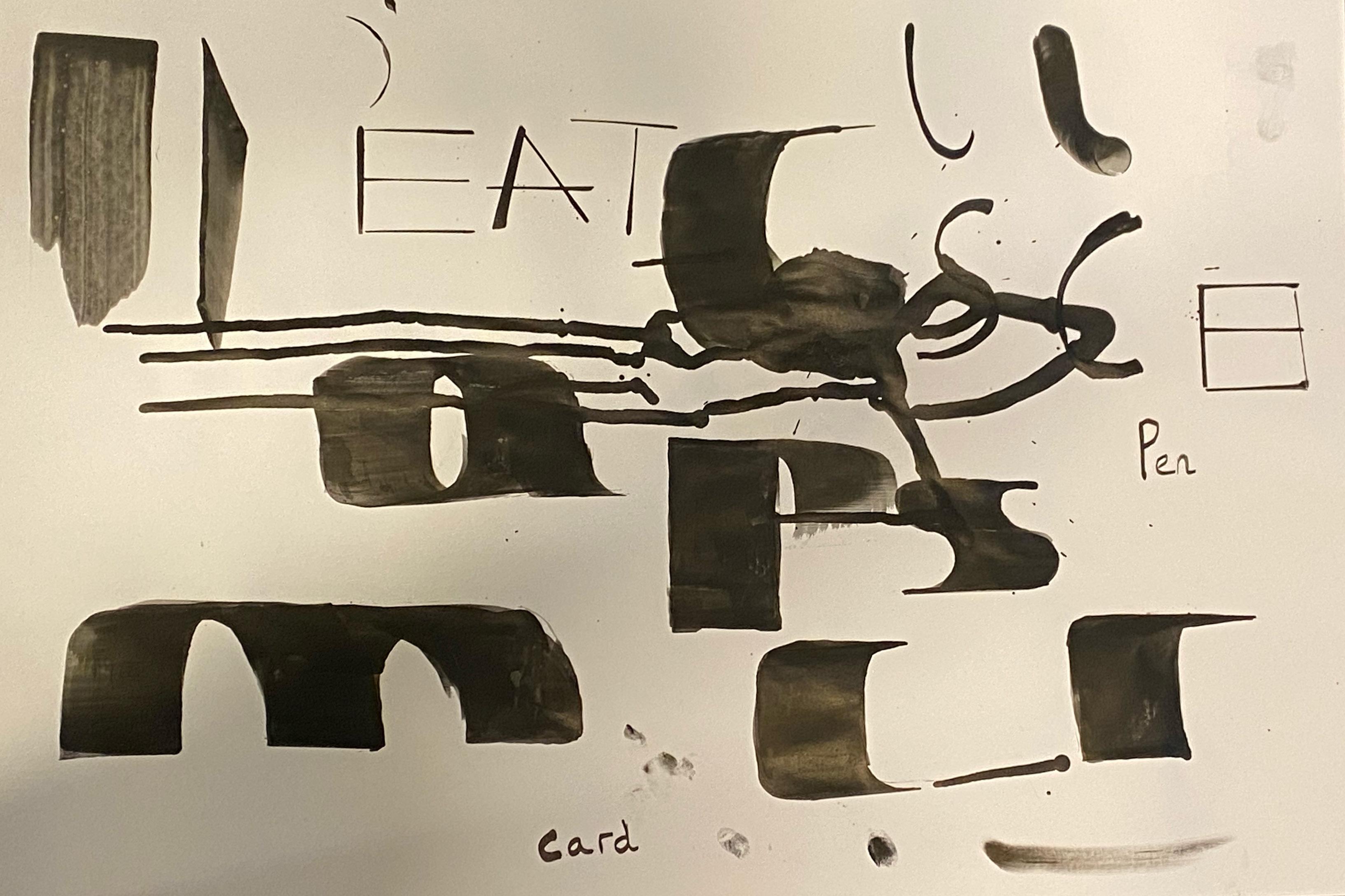
I did a lot of experimentation in this project. the first thing I did for experimentation was the the photo shoot. I experimented with different angles and lighting and I played around with the actual pictures I was taking, using different amounts of ink, etc.
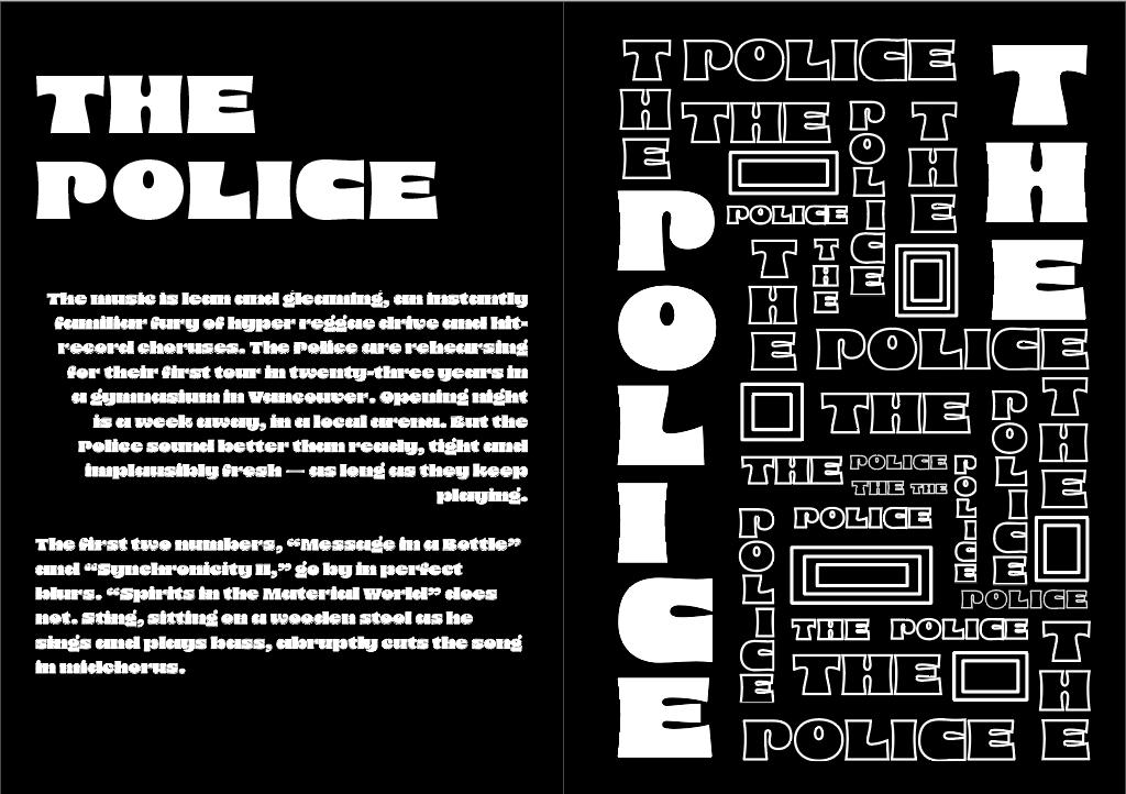
The second thing I experimented with was the typography book layout. for example, the image on the right was my initial layout for the police pages of the book, however, I decided that because
my books are going to be A6 the design wouldn’t work well when scaled down.
Lastly, I experimented with the layout of my photography book, i was initially going to use headings for each page as I designed the book and took photographs to create a story around the theme of “dirty money” Throughout the book, it tells a story of a crime surrounding money, but I was worried about going over the 10% word limit.
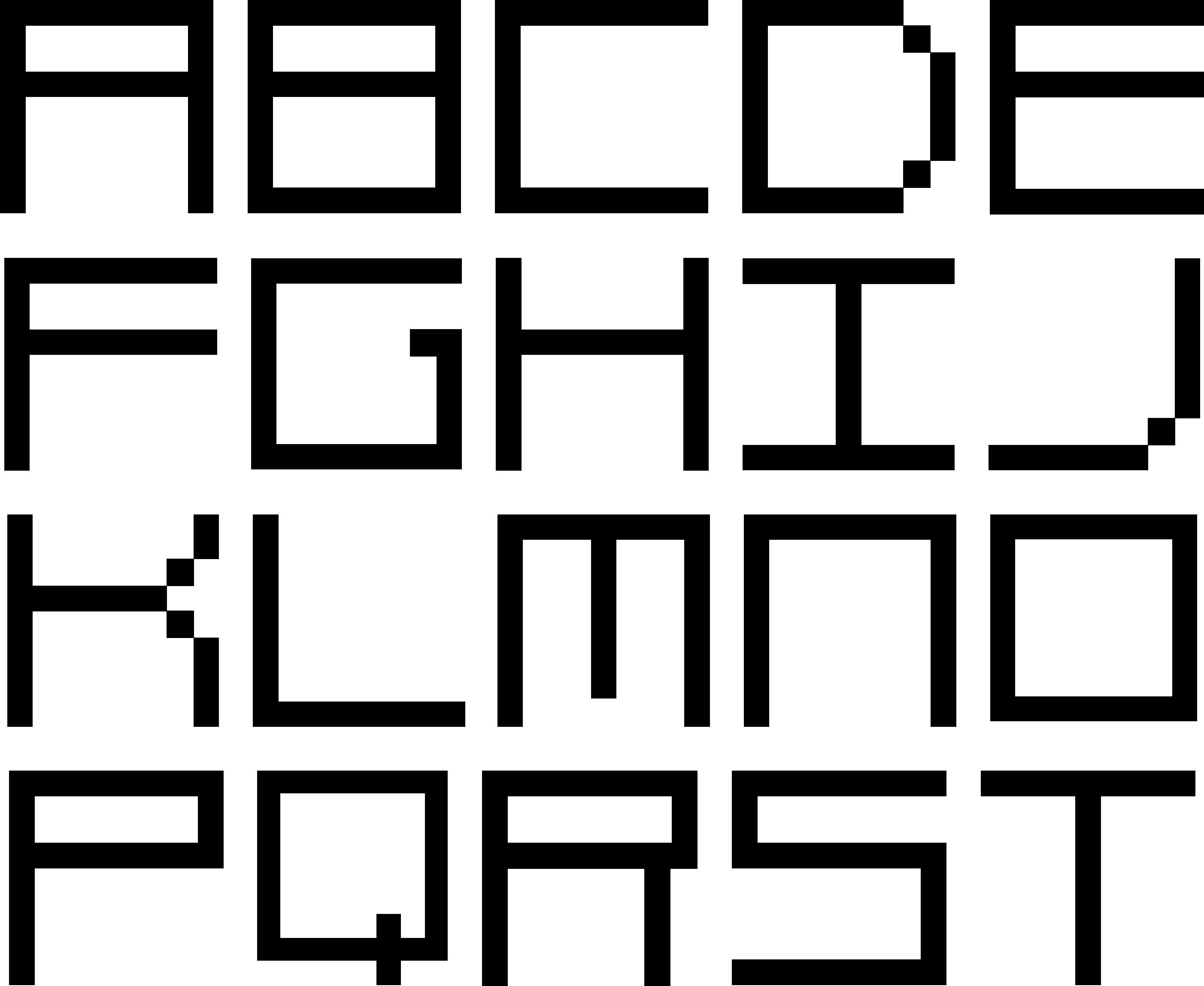
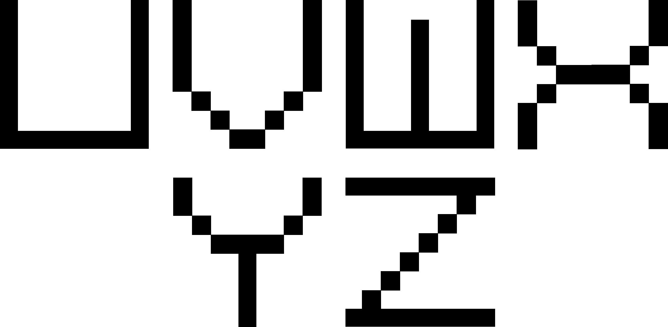
I am 50/50 on how I feel about my final font because I feel that it has a good structure, but I think there are a lot of things that need to be worked on.
The first fault, I feel, is the crossbar, because the crossbar is so thin when the text is scaled down it becomes harder to see, making the ‘e’ look like a ‘c’ and the ‘t’ look like an ‘l’. If I had more time on this project that is definitely something I could do differently. I also think that there are some characters that need
to be looked at and changed, for example, the letter ‘v’, the letter ‘x’, and the letter ‘z’.
On the other hand, I think that this font has the structure to be a really unique font. All of the ascenders and descenders, baselines, and x-height are the same and I really like the wide bold lettering.
Overall I do like my font, I think it is a good start to a font, however, it does need some finesse for this font to be better.