ARCHITECTURE PORTFOLIO
Hello, I am Luiza Serradilha. I am a 3rd year Architecture major at the Georgia Institute of Technology working towards a Spanish minor. My interest in architecture is to explore the depths of connection of the place to the people as well as finding new ways to make architecture acessible.
I throughly enjoy getting my hands dirty whether that means site visits, material samplings, or study models. The process of making and creating is something that brings me closer to my architectural passion.
470-265-5196
serradilhaluiza@gmail.com
Georgia Institute of Technology
Architecture Major
Spanish Minor Graduation Date May 2024
Wheeler High School
High Museum of Art
Graduated 2020
English - Native
Portuguese - Native Spanish - C1 Level
Research at museum: how curvilinear and rectilinear forms can influence a visitors mood and feeling
Green Vertical Architecture and how it can be more readily implemented
Worked on getting volunteers to help new schools get set up for the school year; volunteered for a week: 30+ hours
Adobe InDesign
Facilities Management October-December 2019
Sector Internship kevin.streiter@woodruffartscenter.org
Churras Brazilian Steakhouse March 2023-Present
Host/Server/Manager valerian14@hotmail.com
Frankie’s Italian Restaurant November 2019-August 2021
Server/Bagger/Hostess
Yogli Mogli
Cashier
770-578-6608
February-October 2019
678-653-8554
Adobe Illustrator
Adobe Photoshop
Rhino 3D
V-Ray/Rhino
Revit
Microsoft 365
Outlook
 George Johnston
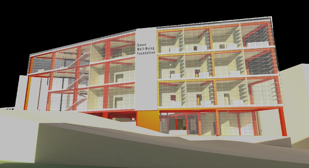
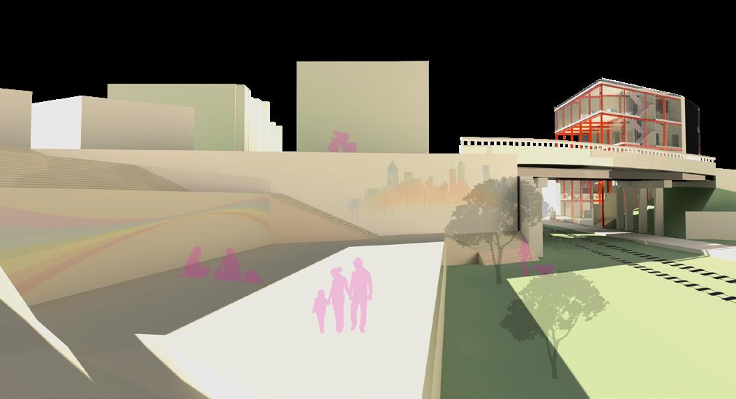
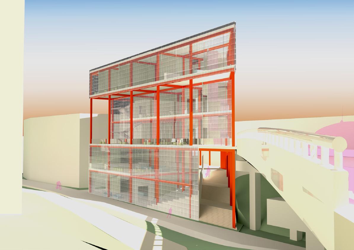
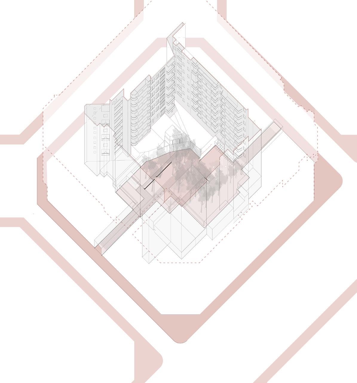
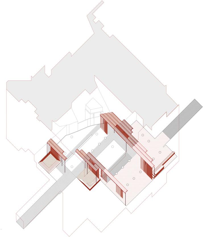
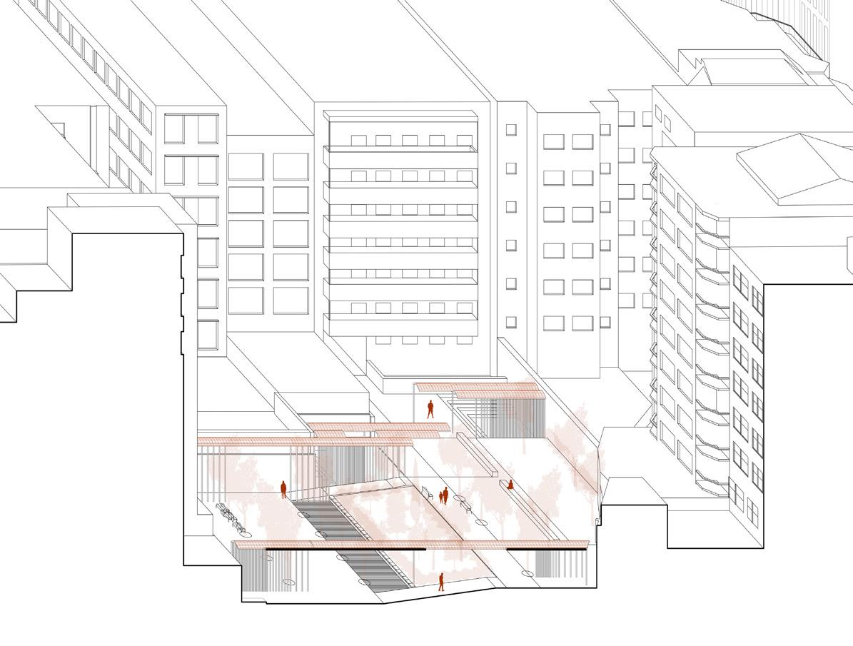
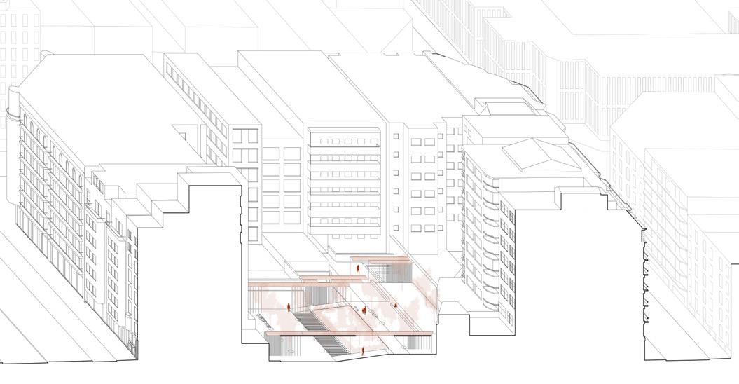
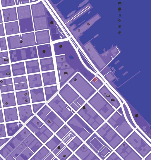
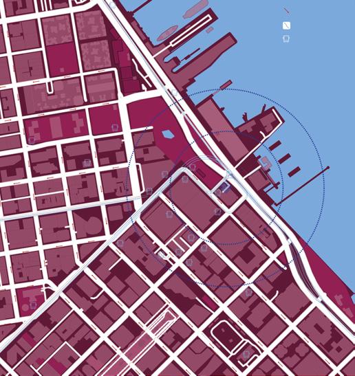
The Queer Well-Being Foundation strives to support the well-being of the LGBTQ+ community in health, legislation, and community. The community has always sought out to be united and equal, since the Stone Wall Riots; they gathered in cities where they could exchange thoughts, ideas, and their feelings, creating a collective. Atlanta is one of those cities and its location is prime to create a safe space for the community to thrive in. The project encompassed a public space on the left side of the beltline and the other the foundation. Together, they foster a space for people to come together, from the inside to the outside.
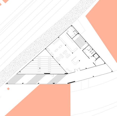
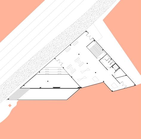
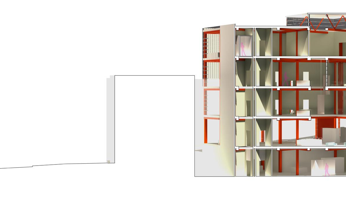
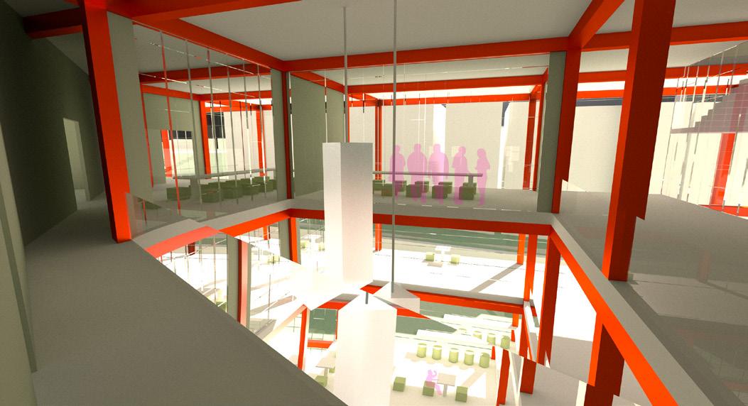
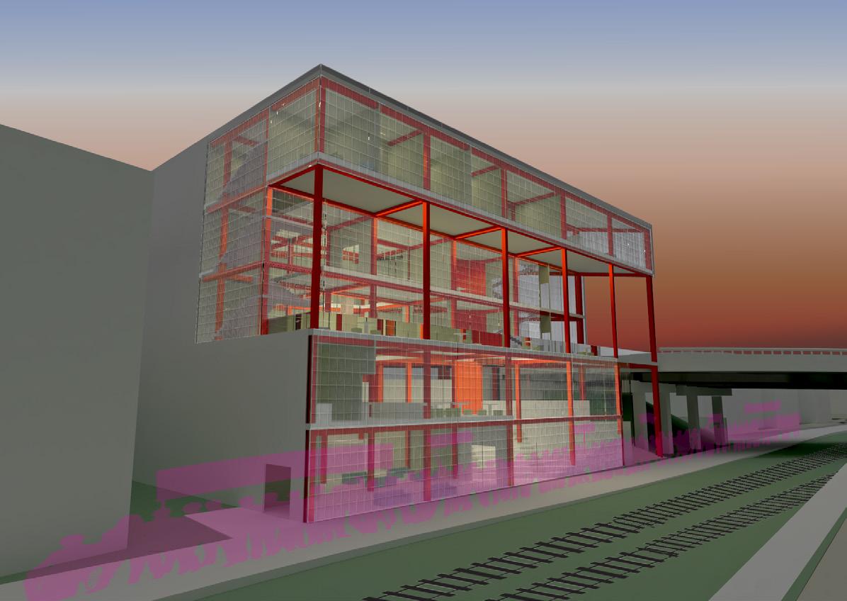
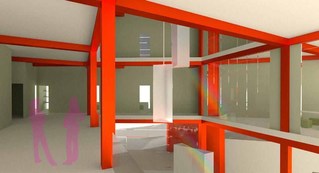
The top floor is centered around physical and mental well-being, with single and group therapy rooms, as well as, a testing center. The middle two floors, one with an opening to the bridge, serve to educate and push to better serve the community on a larger scale. There are offices and conference rooms where people can gather to discuss and advocate for rights. The bottom two floors are where people can find a community to rely on: a small cafe, a flexible seating area overlooking the beltline, and an adaptable section to any event or exposition that could be happening in town, such as, a holiday market, or a Pride Parade.
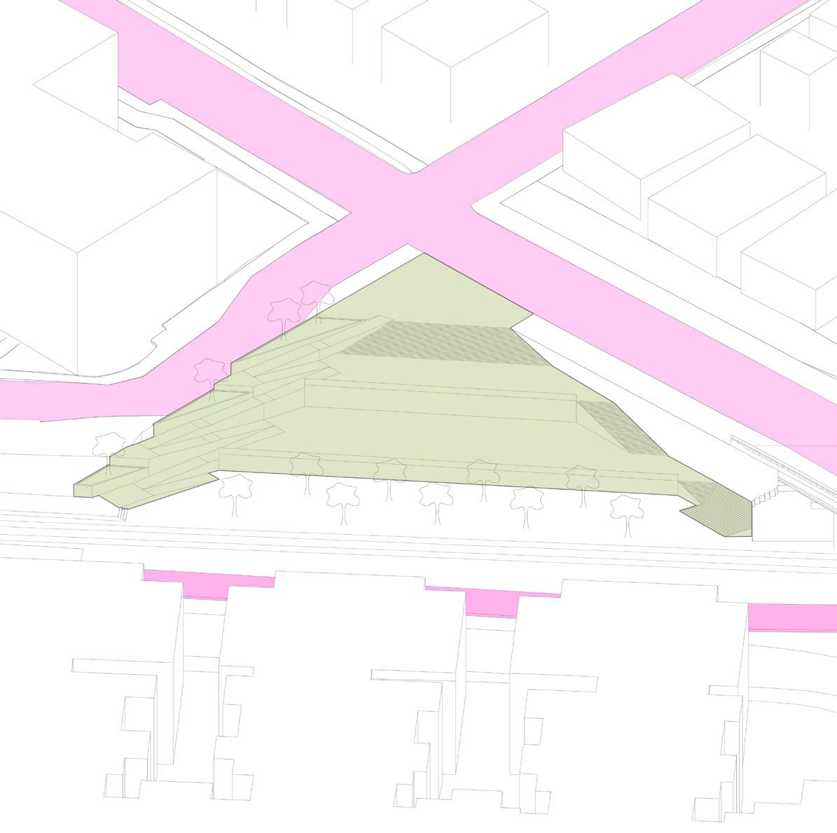
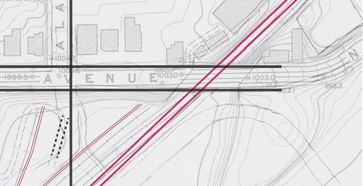
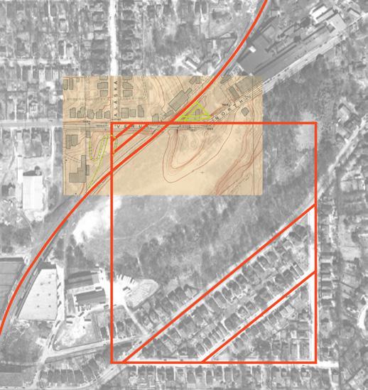
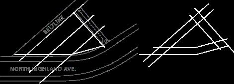
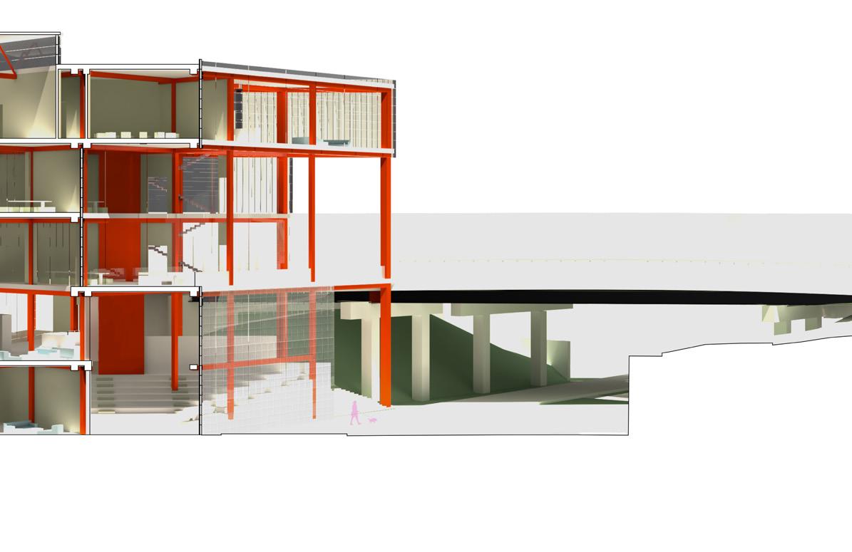
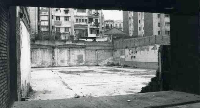
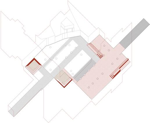
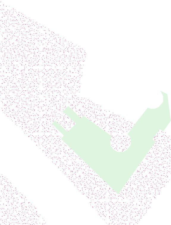
The challenge with these sites were their shapes and changes in elevation. These sites were split by a road bridge and the Beltline which formed the two triangular shaped sites. To study this, numerous models were made to understand the relationship between those issues and each other. Each site had a different proposal, the left/west was to be a public space and the right/east site was to be a foundation that supports the LGBTQ+ community, both would converse with the road, Beltline and eachother. The public space has three tiers with the two egresses on the short legs of the triangle: the ramp is more closely located to the future light rail running alongside the Beltline that was informed by an old rail that was there previously and the stairs are opposite to the ramp allowing for the two middle tiers to be central and safe from the light rail movement. On the other site, a similar circulatory system was formed for the queer foundation by the difference of road elevations and the Beltline.
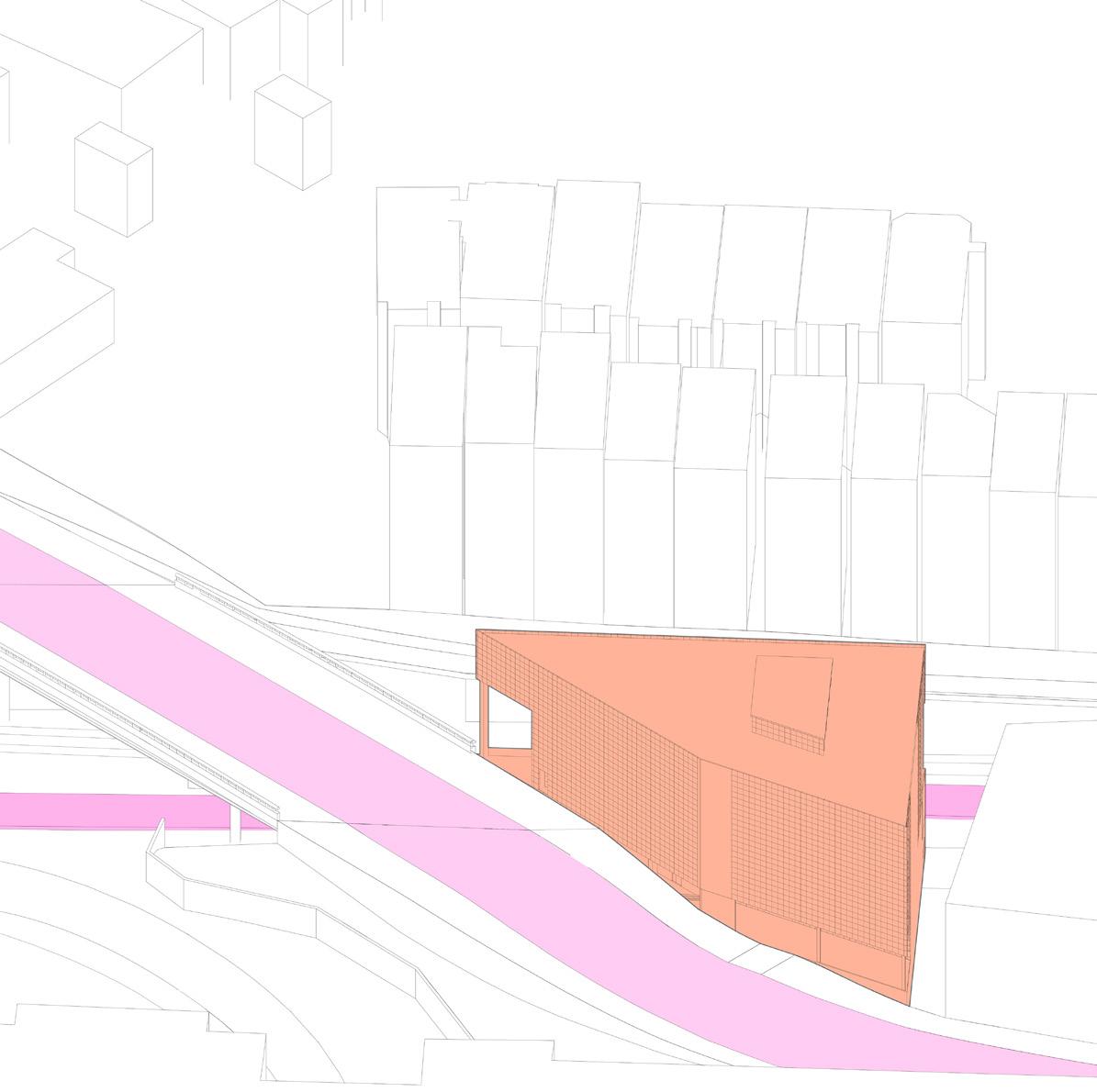
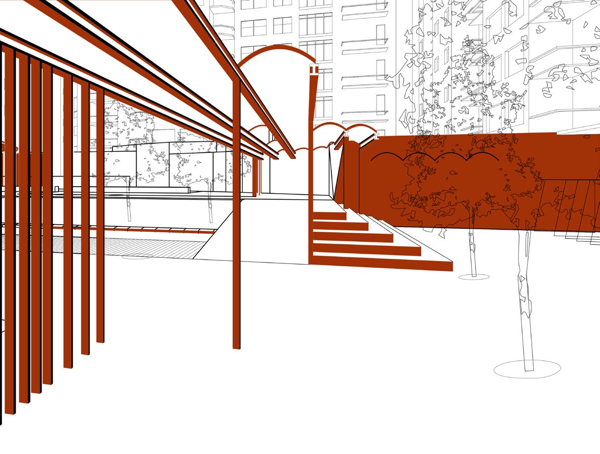
The form was informed by the outlines of the road and Beltline, that shaped the circulation of each floor and allowed for the program to shape itself. The design was informed by Maison Hermes idea of the glass blocks; it portrayed a different light into the foundation as a symbol of freedom of expression and identity for this community. The glass blocks allow for great insulation and energy savings, while still allowing for views to the Beltline and the cityscape.
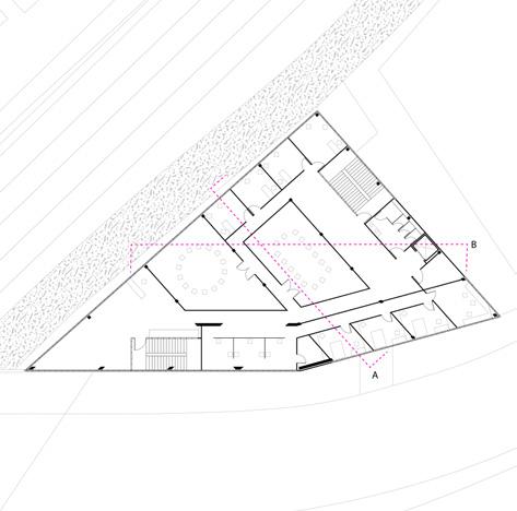
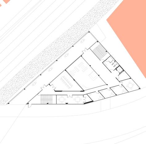
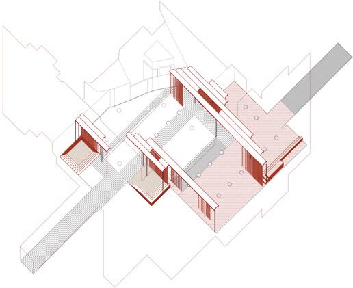
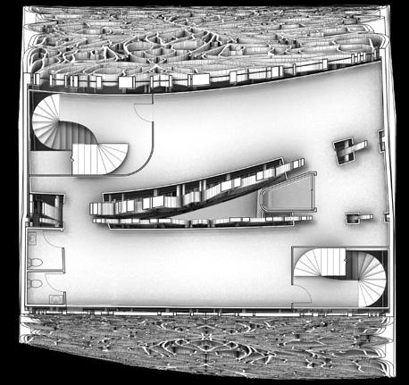
 3rd Floor Plan (Bridge Level)
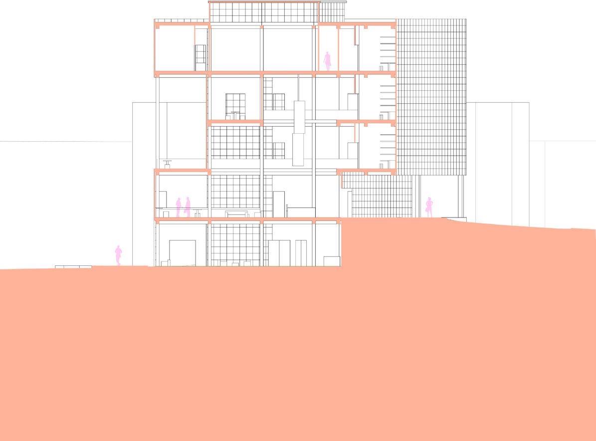
Section A and Parti Diagram (Right)
3rd Floor Plan (Bridge Level)
Section A and Parti Diagram (Right)
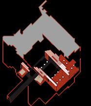
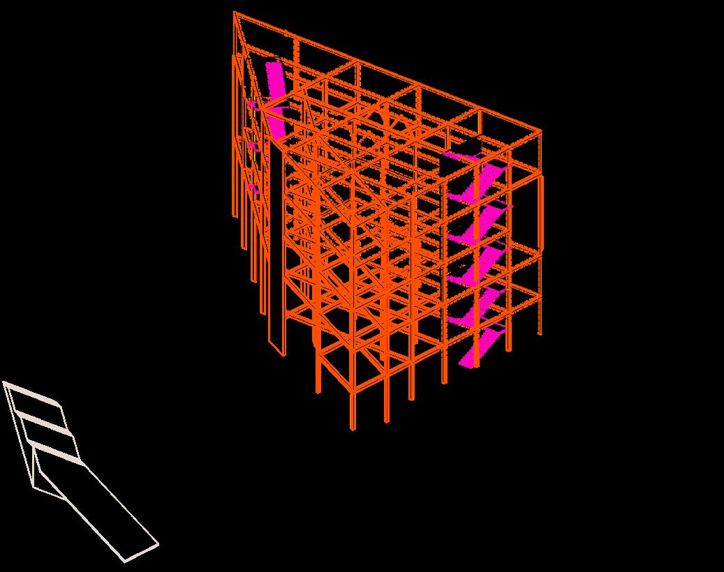
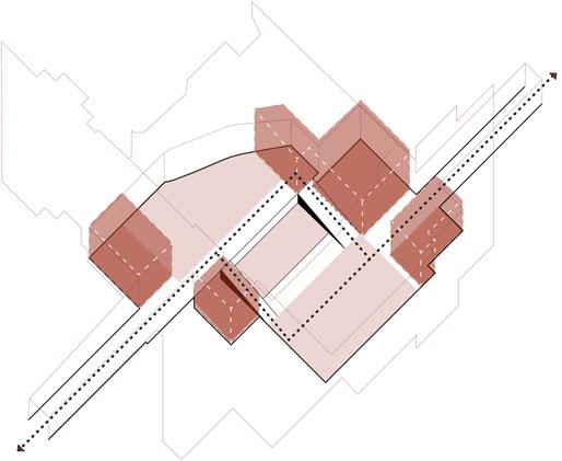
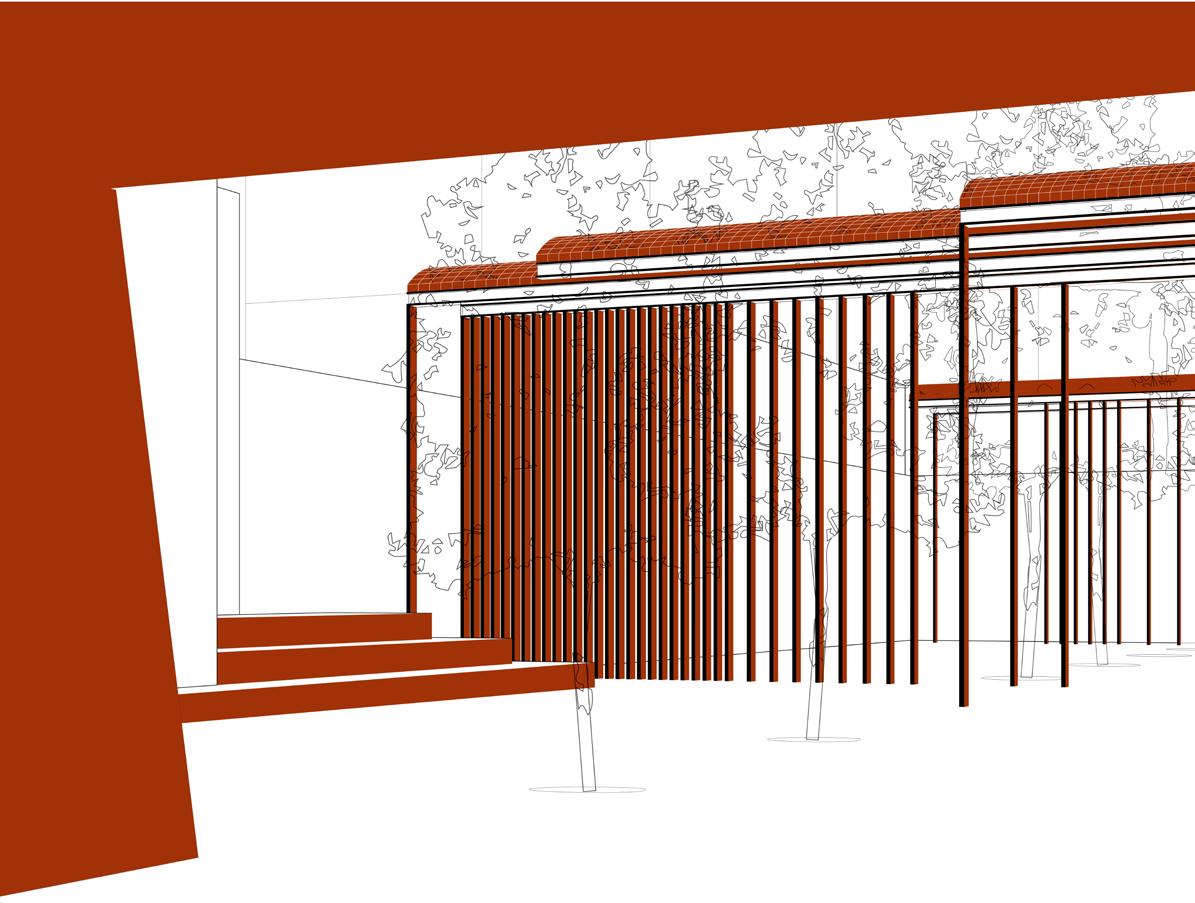
The glass blocks wrap the orange steel columns and beams that support these triangular overlapping floors that create different indoor and outdoor spaces that shape the visitors perspective on the landscape, city, as well as the relationship of the LGBTQ+ community.
The structure conformed to the triangular form creating quirky structural shapes, and was supported by its three structural vertical elements of the fire stairs and elevator.
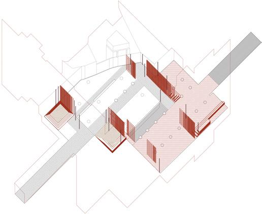
 2nd Floor Plan (Street Level)
1st Floor Plan (Beltline Level)
2nd Floor Plan (Street Level)
1st Floor Plan (Beltline Level)
Partners: Cayleigh Nicholson and Julia Wennerholm
Studio - Summer 2022
Mark Cottle
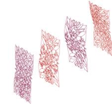
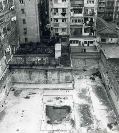
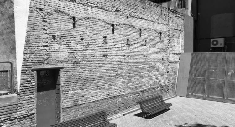
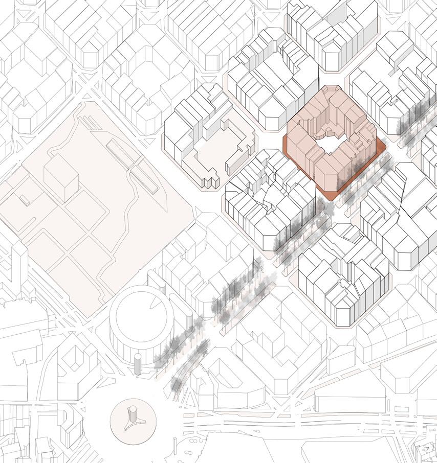
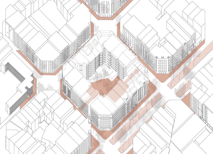
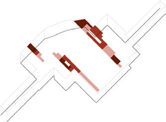
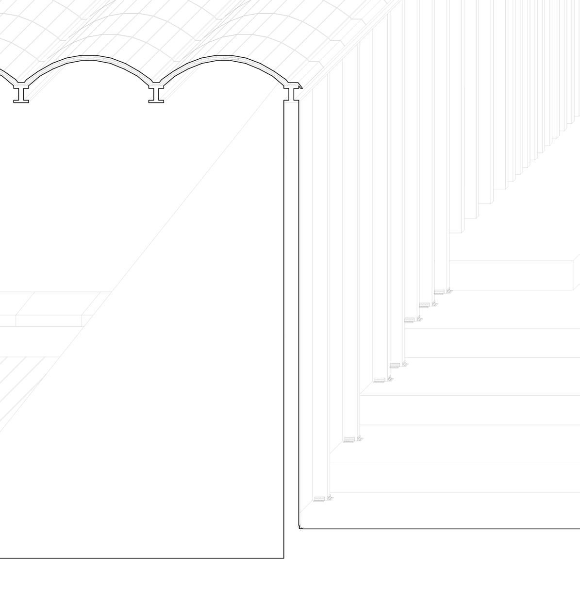
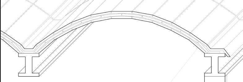
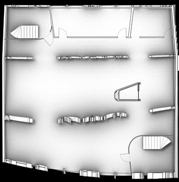
In this Barcelona studio, we dove deep into the Cerda Plan of the ‘new city” of Barcelona where all blocks were organized with beveled corners and courtyards within each one that allowed for more green spaces such as parks and community gathering areas. Throughout history, these courtyards have been taken away by Barcelona’s high density and few remain. We researched blocks that still contained these courtyards and sought to reform them to better serve the neighborhood they were in. We chose to work on a courtyard near a main street and with multiple schools around. we found what was successful in this courtyards was its program defined by the changes in elevation that allowed every age group to enjoy a section. We found that in a underdeveloped area, there were remains of catalan arches from a previous structure, and decided to incorporate it into the courtyard. Since it was already succesful in a few areas, we targeted the underdeveloped ones with catalan arched walkways that sheilded the sun and allowed for cohesion throughout all three different areas in the courtyard.
Addressed successful (light pink) and unsuccessful (muted red) areas by usage, sun path, and direction of circulation throughout the jardin. It was divided into three tiers that served varied age groups.
Unsuccessful areas were to be raised or sunken with steps according to their respective tiers. Flooring patterns were changed to play on the axial mirror shape of entrances.
 Original Eixample Jardin Axonometric
Columns were set along regularly used pathways to shield the sun and provide direction. They were placed at varied widths apart to allow for views, especially for parents and their children.
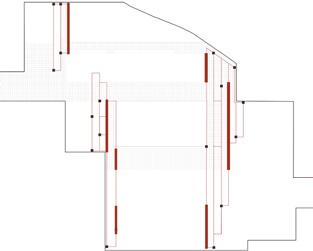
 Final Eixample Jardin Axonometric with Roof Color Pattern
Catalan arches were placed over the columns with few openings allowing for maximum shade on rest areas and illuminated walkways. Their direction works in contrast to the entrances allowing dialogue.
Final Eixample Jardin Axonometric with Roof Color Pattern
Catalan arches were placed over the columns with few openings allowing for maximum shade on rest areas and illuminated walkways. Their direction works in contrast to the entrances allowing dialogue.
Studio - Fall 2021
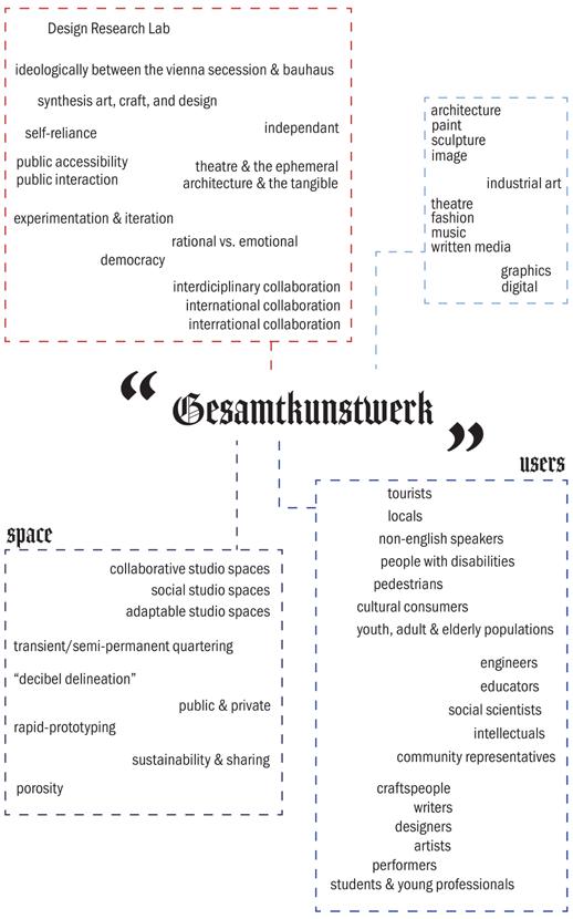
Lars Spuybroek
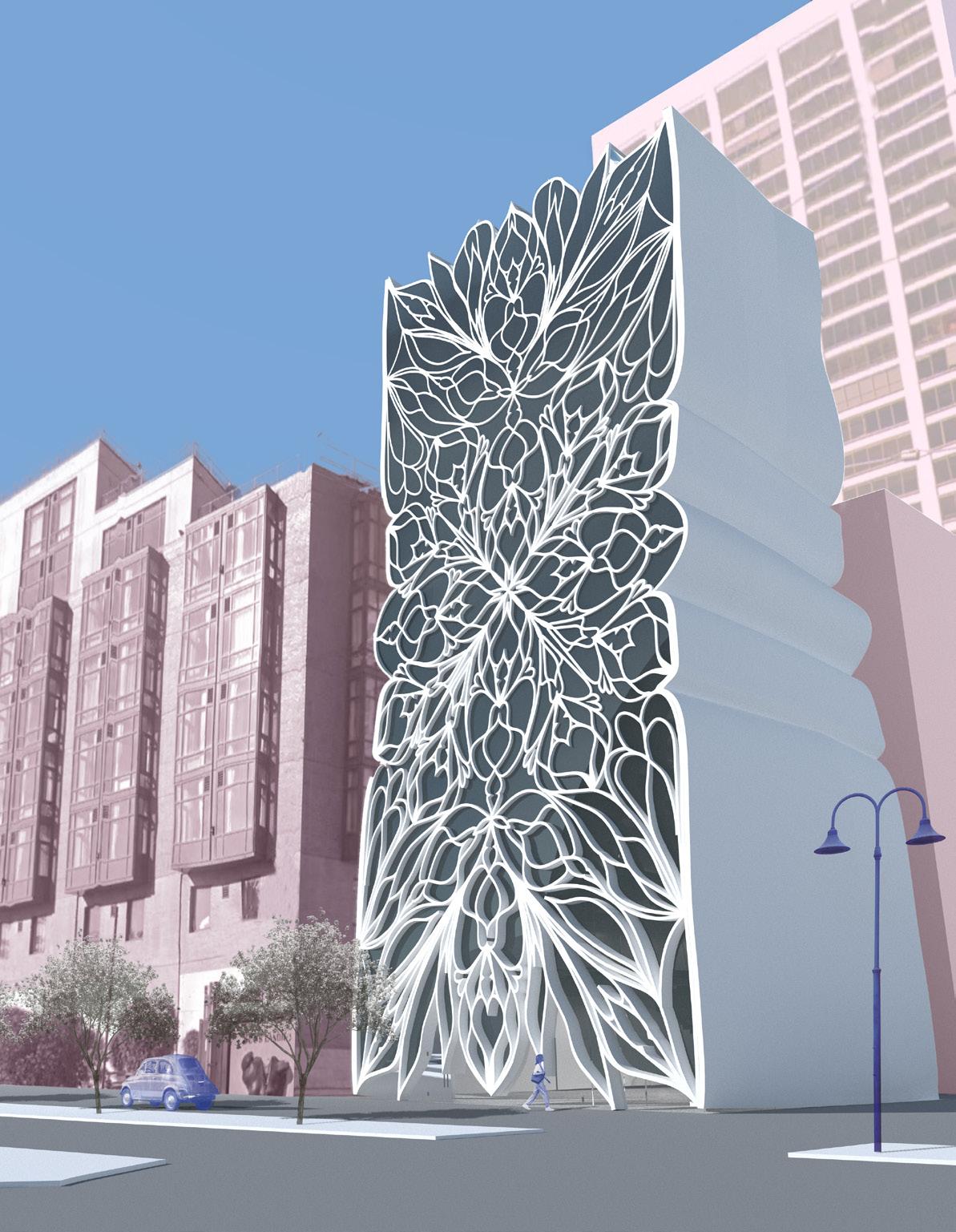
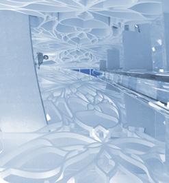
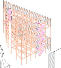
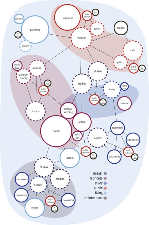
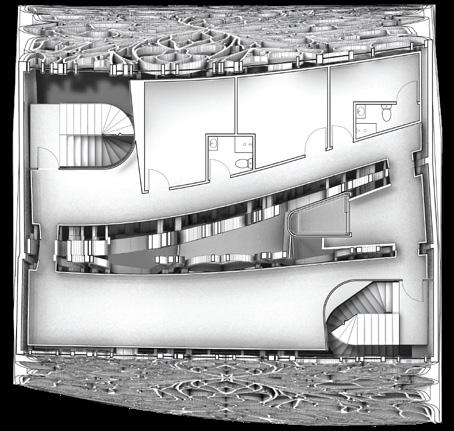
Inspired by Wagner’s idea of total sythesis of the arts, the Design Research Laboratory in Downtown San Fransisco is an interdiciplinary collaborative studio space for students and young designers to design and fabricate works of architecture, cotoure, and mass-product using digital fabrication methods and parametric design tools. Fostering community and face-to-face social spontaneity are central to the idea of studio. Open studio, lab, and classroom spaces creates opportunities for daily serendipity. Offering dormitory-style dwelling spaces accomodates international collaborators. This ethos extends beyond the daily inhabitants of the architecture to San Fransisco’s broader community, with public access to gallery space and the rooftop cafe.
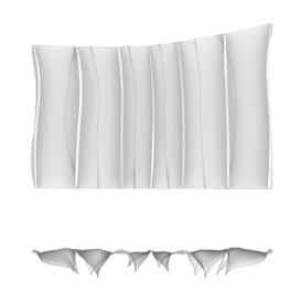
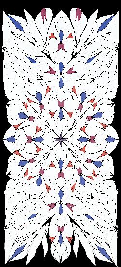
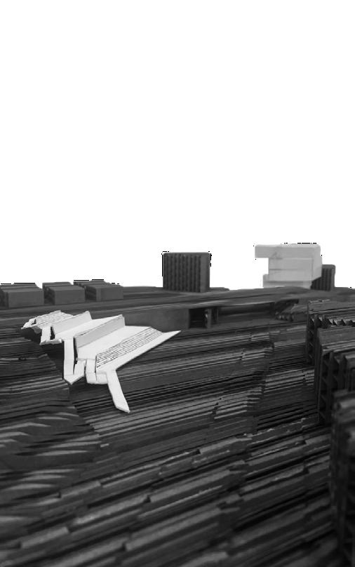
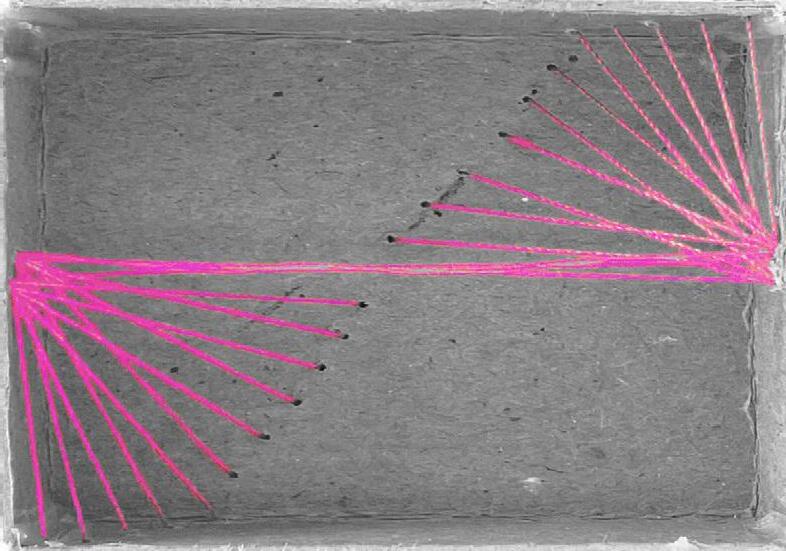
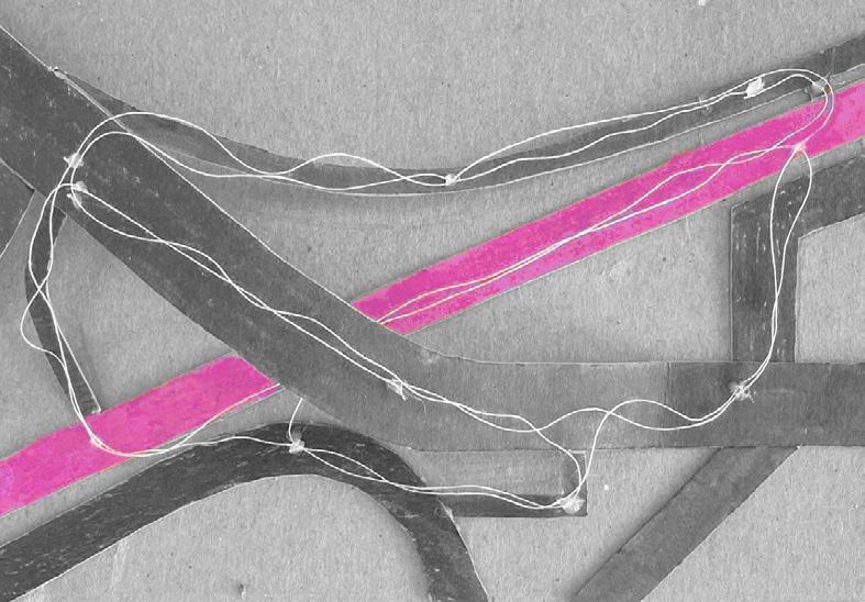
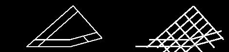
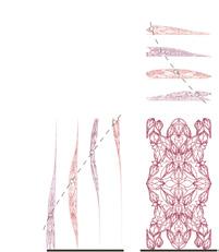
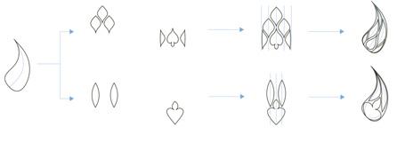
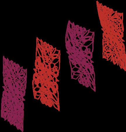
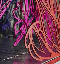
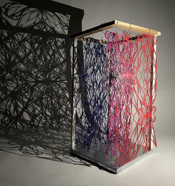
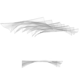
The exploration began with the Gothic style, primarily churches. Shapes and forms were collaged out of this style and a matrix was created to understand its limitations using spines to manipulate them. These modules were configured in multiple ways and assembled to form sheets that would come to create the Design Research Laboratory, using the parametric design tools that it celebrates.
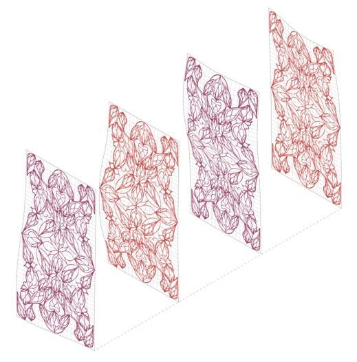
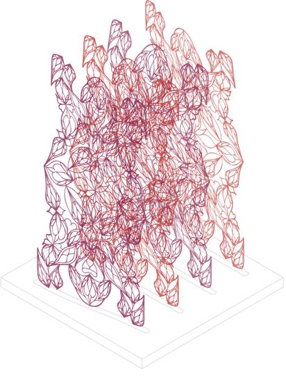
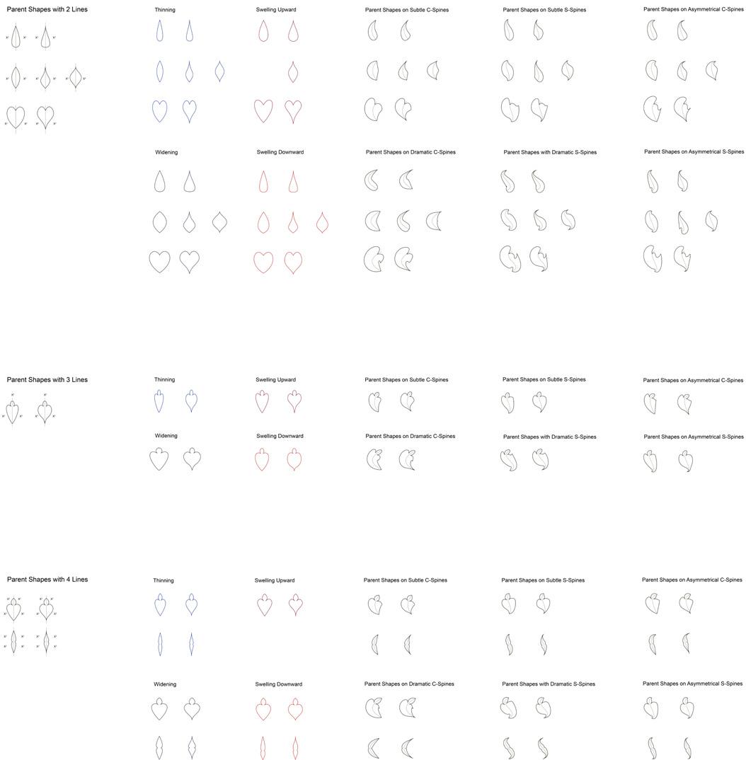
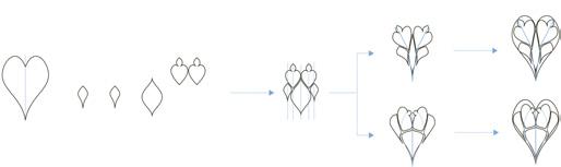
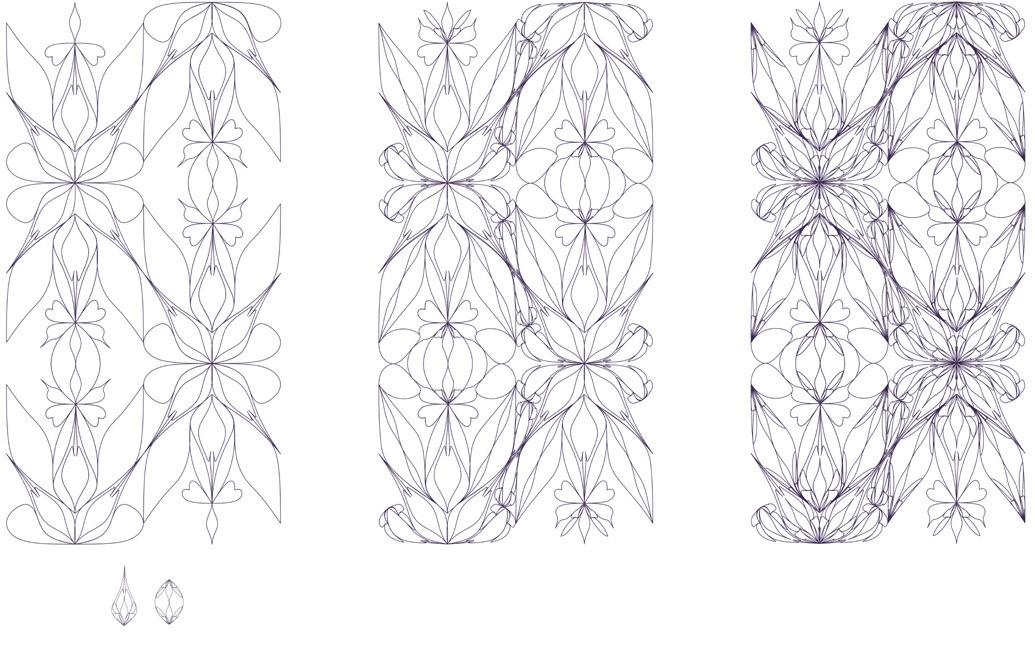
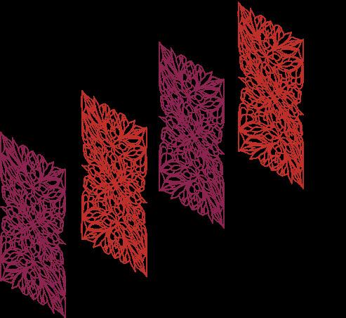
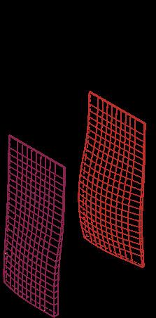
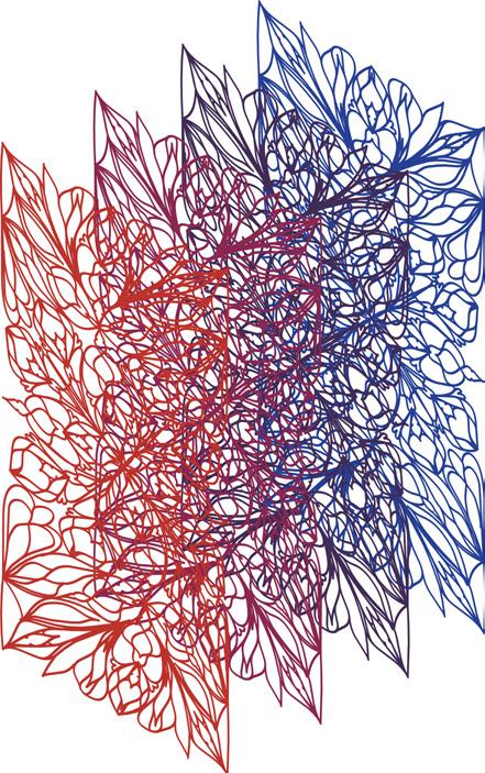
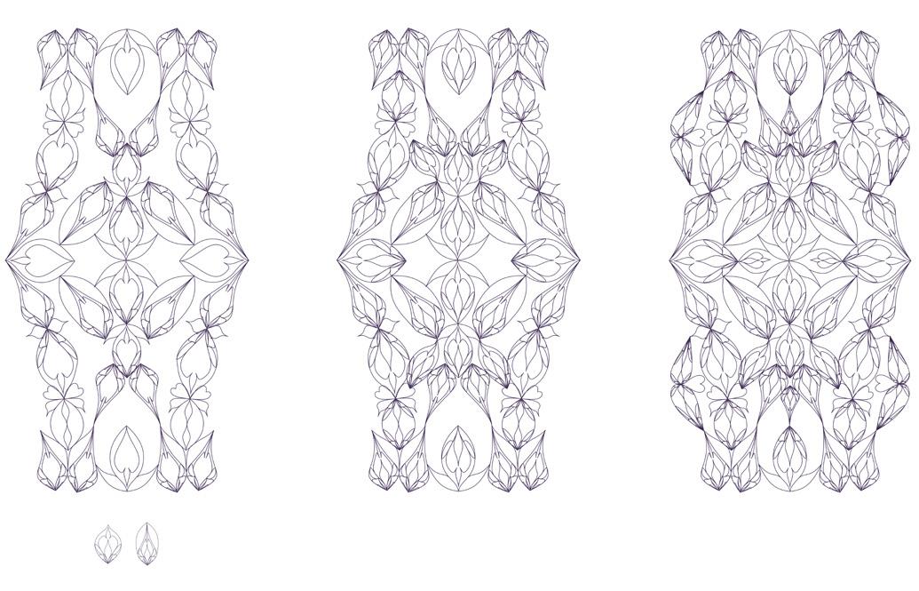
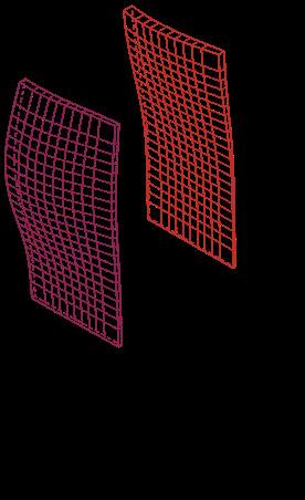
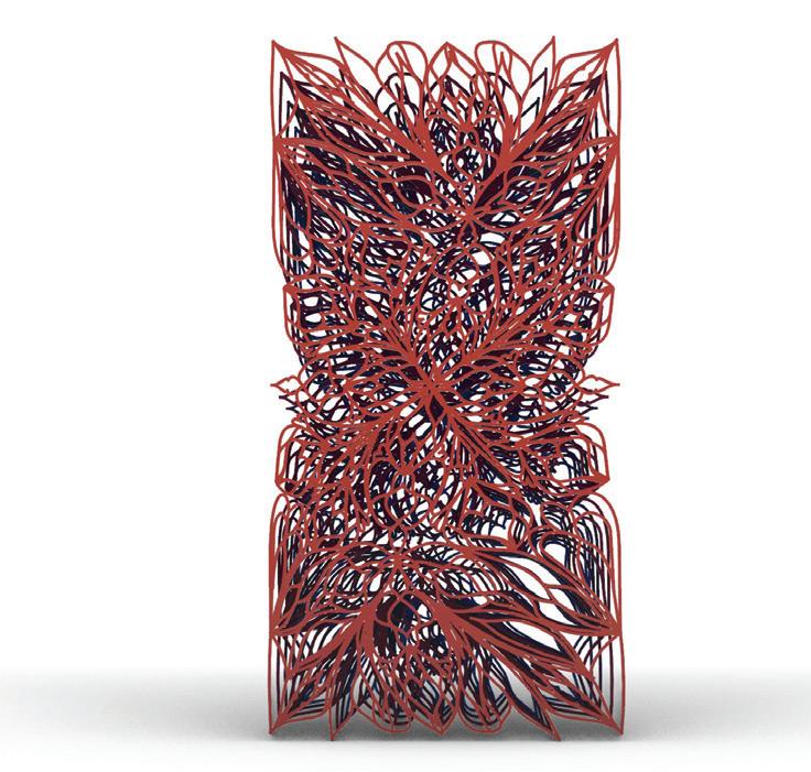
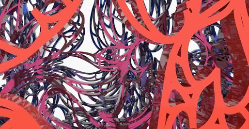
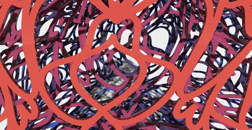
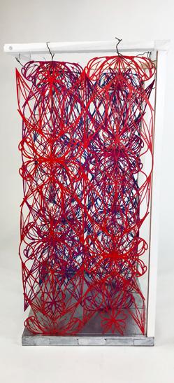
After the sheet explorations, 3D and physical models were created in order to resolve the method of color, material and its deformations. These models of different sheets allowed for light and shadow manipulation, structure experiments, as well as, pattern testing in the form of a building.
The history of San Francisco as a fast paced and highly technological city informed the type of program this building should accomodate: a Design Research Lab. This proud mix of art, culture, and technology brought the needed qualities for the creation of the Laboratory. This place would be an easily acessible hub of design for all designers, creators, and makers throughout the Bay area. Its work and production would range from theatre to sculpture and would encompass the wide demographic that is San Francisco.
Intercultural and interdisciplinary studies would be at the forefront of design and become itself with experimentation and iteration through the minds of innovative thinkers alike.
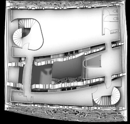
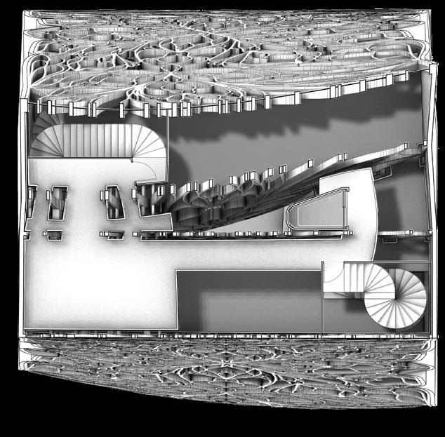
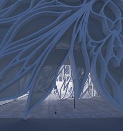
The glass roof is connected and bends into each petal of the sheets. It illuminates the cafe, as well as, the atrium that runs all the way into the auditorium on the entrance floor. The floors create overlooks and overlaps that allows for the light become more diffused as one moves along to the lower floors.
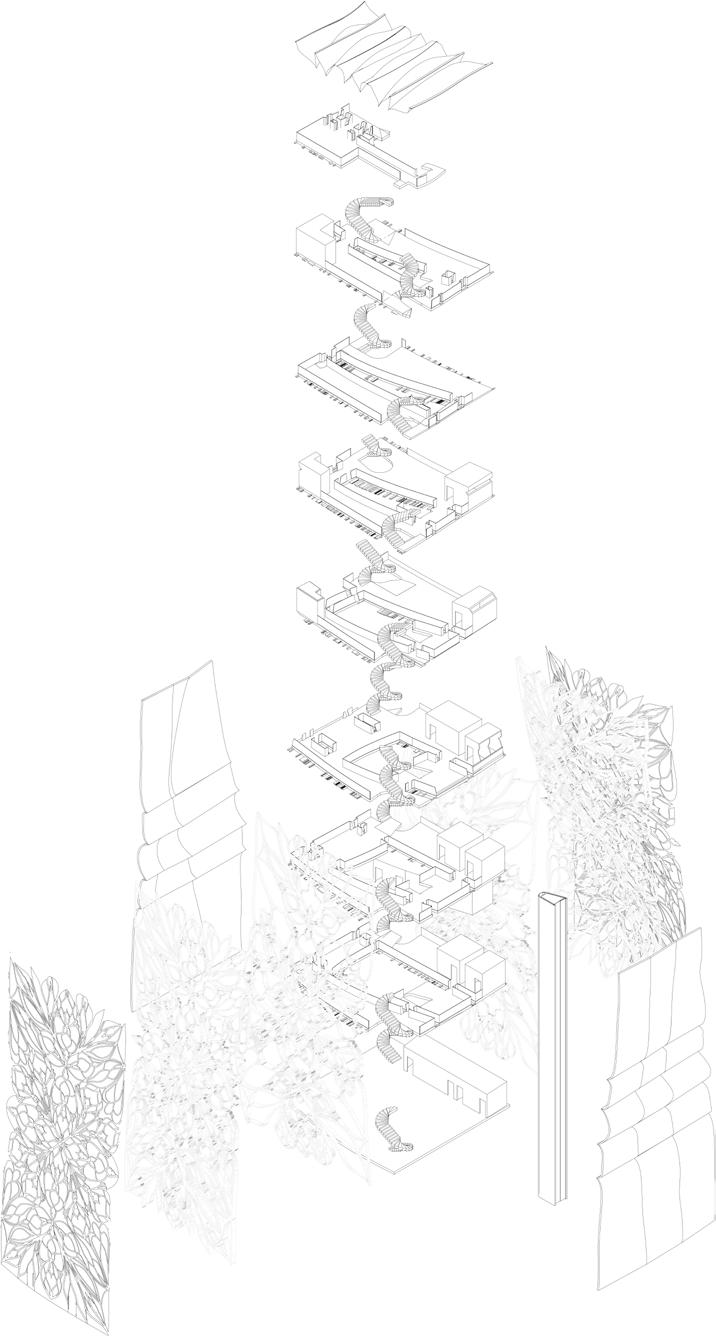
The outer sheets contain tinted grey windows with accent windows tinted various colors throughout the floors. These shapes and colors were a nod back to the gothic stained glass windows that research and experimentation was done on in the beginning.