Our Vision: To deliver excellent service and knowledge to our clients. To offer Complete Property Solutions across all sectors of our business.
Our Values :
Customer Satisfaction
Excellence
Innovation
Integrity
Teamwork
Complete Confidence
The Logo
The logo is the cornerstone of our identity and must be used on all communication material.
Where possible the full colour version of the logo should be used. White and black versions of the logo are available. These can be used if the colour version is not appropriate or special print finishes are required.
N.B. Ensure the logo is legible on the background.
Full colour on yellow
Full colour on white
Grayscale
White on dark background
Logo Variations
The JNP logo is normally boxed.
Exceptions include:
• The Full colour on white logo is used (for example letterhead and business cards)
• The logo appears on a yellow background
• The white/yellow logo is used on a dark photo or solid background.
Yellow block on photo
Yellow block on solid colour background
White on dark photo
White on solid colour background
Social Media
Keeping the logo consistent
It is important that all our collateral has a clean and crisp look. It is always a good practice to leave an area of ‘breathing space’ around the logo to ensure that the brand is clearly visible in the surrounding design or text areas.
Isolation Area
The Isolation Area is the space around the lettering element of the logo in which no other text, graphic or photographic elements may encroach. The size of the isolation area is the distance of the horizontal stroke of the letter J.
When using the boxed version of the logo, the box acts as the Isolation Area.
Do NOT distort
Do NOT use the old logo
Do NOT change the colours
Do NOT add effects
Do NOT rotate
Do NOT put full stops in JNP
The JNP URL
Typography
The brand typeface is Isidora Sans, this has been chosen because it is clean, legible and classic.
Typography and a consistent use of typeface is a key element in creating a cohesive look across all the JNP identity.
It is importatnt that only Isidora Sans font is used. DO NOT use any of the other Isidora family fonts, including: Isidora Sans
Alt, Isidora Soft, Isidora Soft Alt.
Arial should be used for transactional items such as standard forms and letters created in-branch, where staff generating the items do not have access to Isidora Sans.
Arial should also used for email signatures to avoid issues with typeface rendering on the recipient’s computer.
Isidora Sans Thin
ABCDEFGHIJKLMNOPQRSTUVWXYZ
abcdefghijklmnopqrstuvwxyz
1234567890 // !@#$%^&*()
Isidora Sans Light
ABCDEFGHIJKLMNOPQRSTUVWXYZ
abcdefghijklmnopqrstuvwxyz
1234567890 // !@#$%^&*()
Isidora Sans Regular
ABCDEFGHIJKLMNOPQRSTUVWXYZ
abcdefghijklmnopqrstuvwxyz
1234567890 // !@#$%^&*()
Isidora Sans Medium
ABCDEFGHIJKLMNOPQRSTUVWXYZ
abcdefghijklmnopqrstuvwxyz
1234567890 // !@#$%^&*()
Isidora Sans Semi Bold
ABCDEFGHIJKLMNOPQRSTUVWXYZ
abcdefghijklmnopqrstuvwxyz
1234567890 // !@#$%^&*()
Isidora Sans Bold
ABCDEFGHIJKLMNOPQRSTUVWXYZ
abcdefghijklmnopqrstuvwxyz
1234567890 // !@#$%^&*()
Isidora Sans Black
ABCDEFGHIJKLMNOPQRSTUVWXYZ
abcdefghijklmnopqrstuvwxyz
1234567890 // !@#$%^&*()
Isidora Sans
Colour Palette
Colour is an essential part of our brand and marketing collateral.
There are primary colours, plus secondary colours to provide designers with a broader working palette. Try to refrain from using too many colours on the same piece of work. CMYK: 0% 30% 6% 0%
In its core evergreen materials and content JNP uses photography of People, Property and
Interiors.
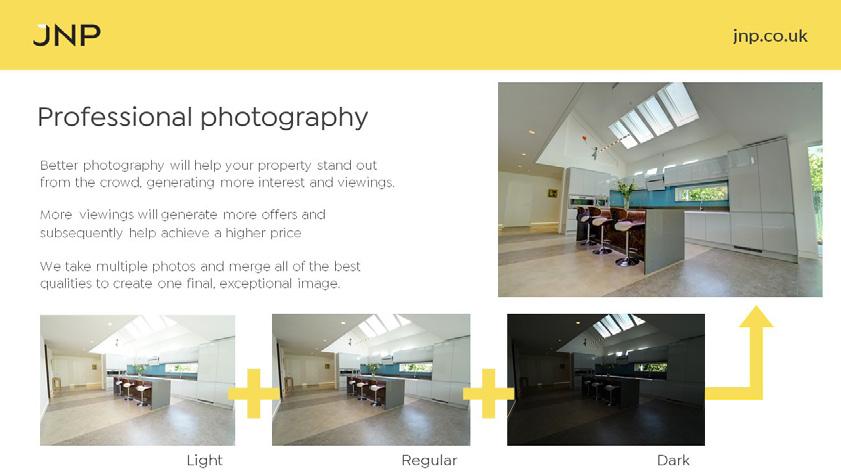
The chosen photography should be engaging and aspirational. Avoid the obvious and clichéd. Cropping a photograph well can have a dramatic effect on its impact drawing the viewers eye and excluding visual clutter.
People: JNP takes pride in portraying diversity and inclusivity. JNP is a sociable brand and uses images of people together and in social situations, rather than depicted on their own.
Imagery
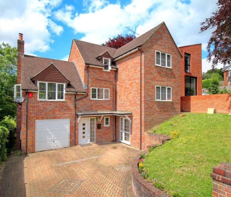
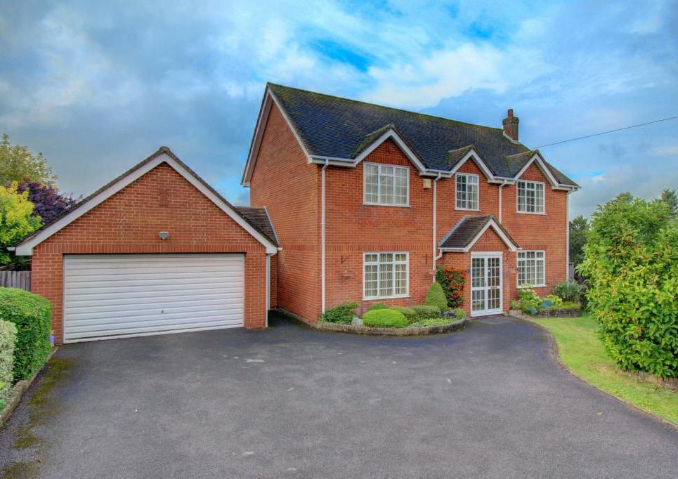
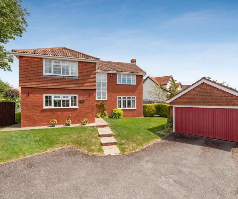
Property: JNP chooses to portray property that is “typical” of its Buckinghamshire location and its customer base. This property is 3-4 bed detached/semi-detached family homes
£400,000 - 800,000 range, appealing to couples and families.
Imagery
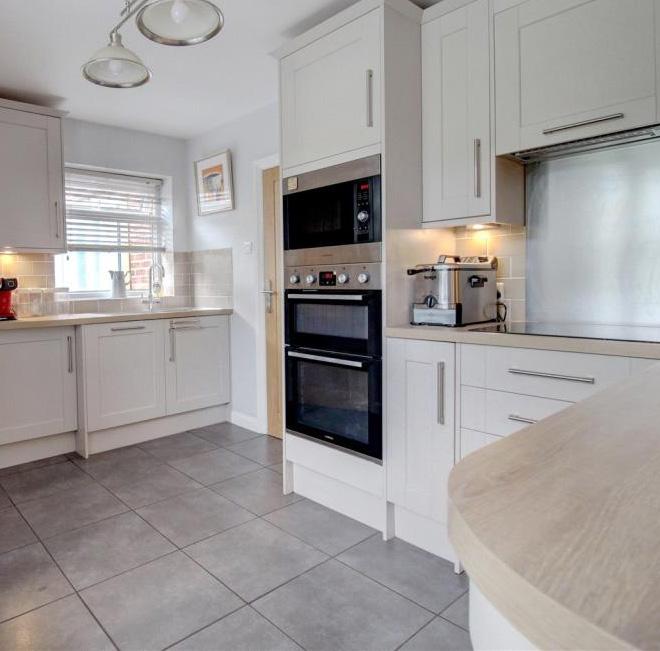
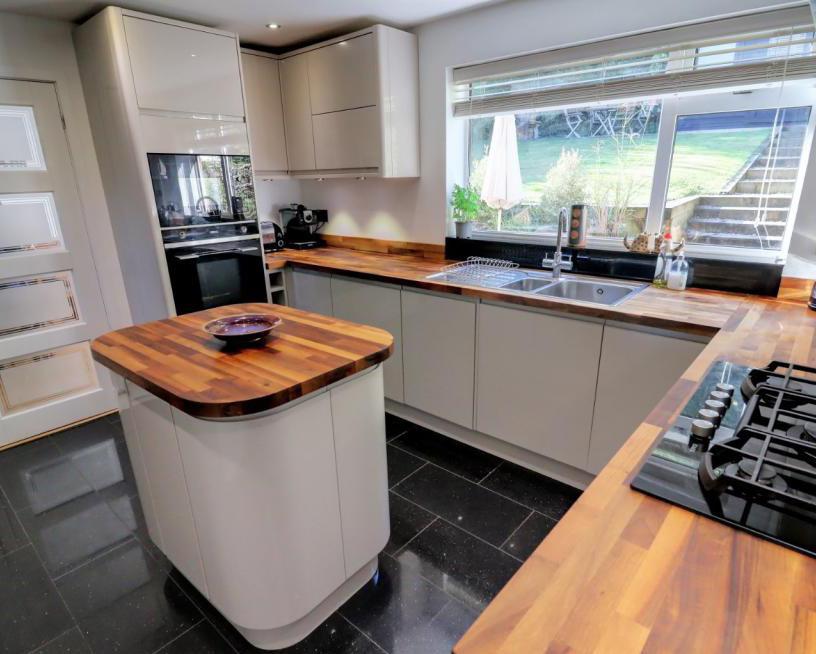
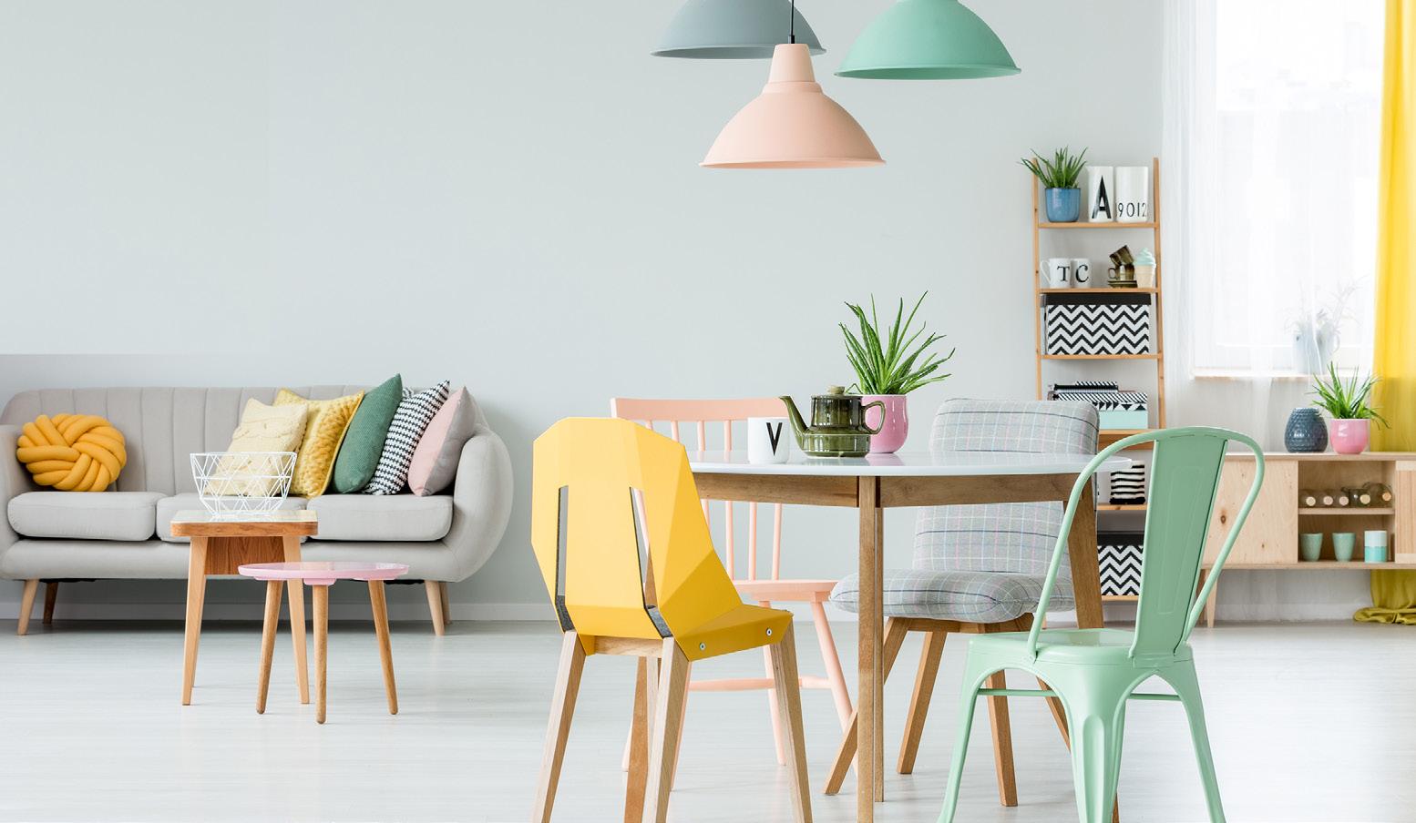
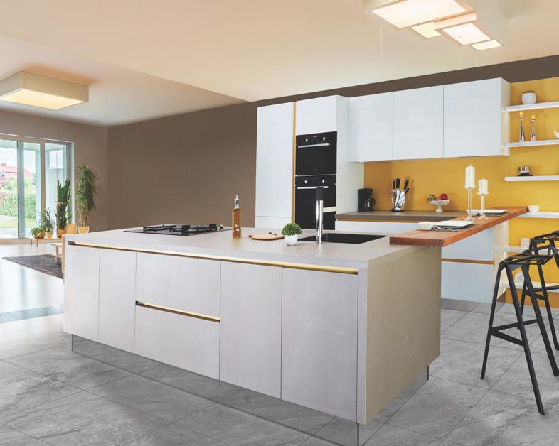
Interiors: interiors portrayed on JNP evergreen materials should be modern and simple. Where possible, feature elements such as furniture, curtains, cushions and objects should reflect the colour palette, but should not dominate the image.
Imagery
Evergreen Materials: When evergreen materials are functional (for example a tenant handbook), functional photography can be used to illustrate products and services.
Staff photography: Imagery of staff should be in full colour against a relatively plain background, preferably smiling and taken with the individual in 3/4 portrait, with their face turned to the camera.
Imagery
Campaign materials and social media:
In its campaign materials and in social media content JNP is modern, cheeky, clever and slightly humorous, using unexpected imagery to pique interest.
The Brand In Action
The Brand In Action
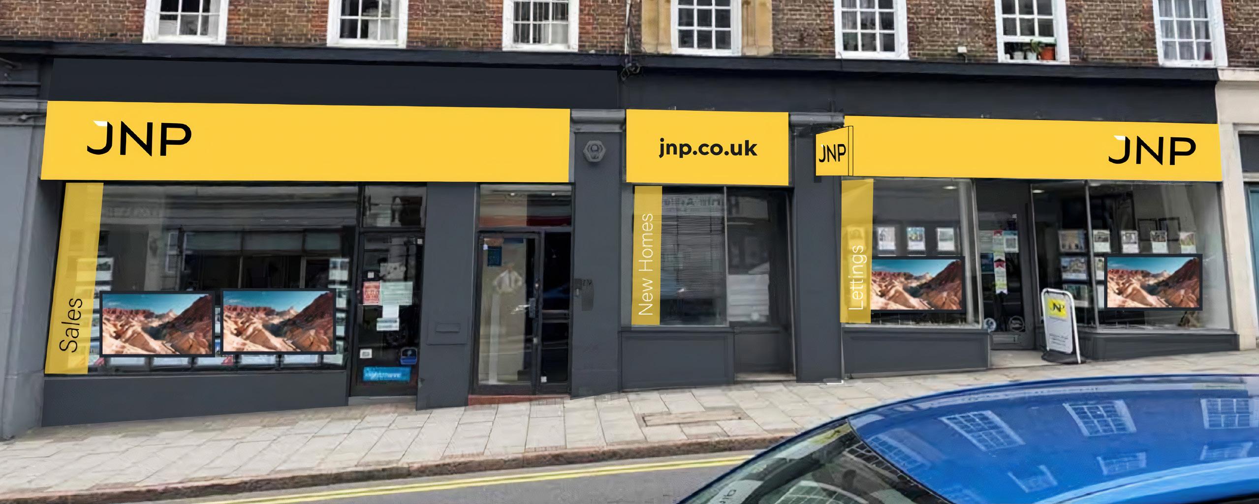
Shop Fascia
The Brand In Action
Kane Hennessey managing
The Brand In Action
Canvassing Cards
Canvassing Cards
OMOA Cards
Personalised Canvassing Card
The Brand In Action
Brochures
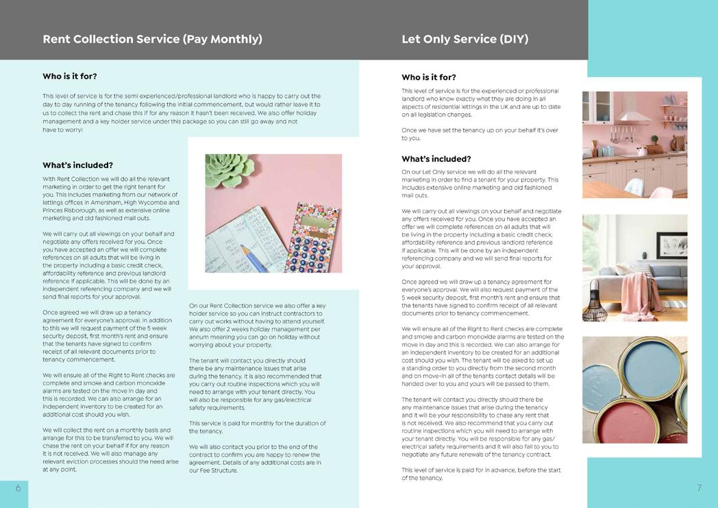
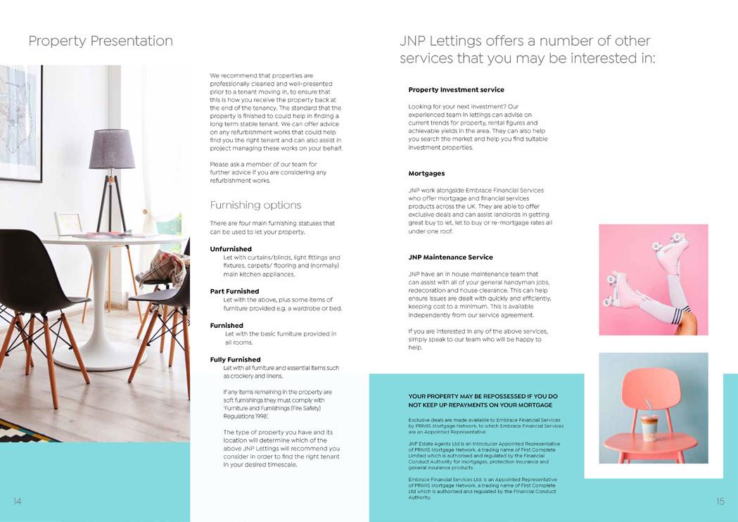
Lettings Brochure
The Brand In Action
Sales Presenter
Compliance Wording
Compliance wording should be added when appropriate. It should be located at the foot of the relevant page, close to the body copy to which it relates. It should be set in a font size large enough to be legible at the intended print size.
Canvassing materials, including On Market, Other Agent:
JNP respects any Sole Agent or Sole Selling Rights Agreement currently in place. We will not market your property until this has expired or has been terminated. The terms and conditions of any previous Agency Agreement must be considered to avoid the possible liability to pay two commission fees. or
Please note that if you have already instructed another agent you should check any agreement you may have to ensure that you are not liable for more than one commission by instructing us as your agent.
Materials which promote mortgages through EFS:
JNP Estate Agents Ltd. trading as JNP is an Introducer Appointed Representative of PRIMIS Mortgage Network, a trading name of First Complete Limited which is authorised and regulated by the Financial Conduct Authority for mortgages, protection insurance and general insurance products. JNP is a trading name of JNP Estate Agents Ltd. Registered Office: Howard House, 3 St Marys Court, Blossom Street, York, YO24 1AH. Company Registration Number 03764697.
Mortgage and protection advice is provided by Embrace Financial Services Ltd., an Appointed Representative of PRIMIS Mortgage Network (PRIMIS) a trading name of First Complete Limited which is authorised and regulated by the Financial Conduct Authority for mortgages, protection insurance and general insurance products only. Exclusive deals are made available to Embrace Financial Services by PRIMIS Mortgage Network, to which Embrace Financial Services are an Appointed Representative.
Embrace Financial Services usually charges a fee for mortgage advice. The amount of the fee will depend upon your circumstances and will be discussed and agreed with you at the earliest opportunity. YOUR PROPERTY MAY BE REPOSSESSED IF YOU DO NOT KEEP UP REPAYMENTS ON YOUR MORTGAGE
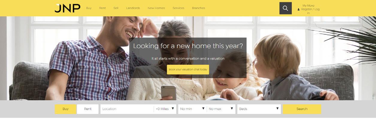
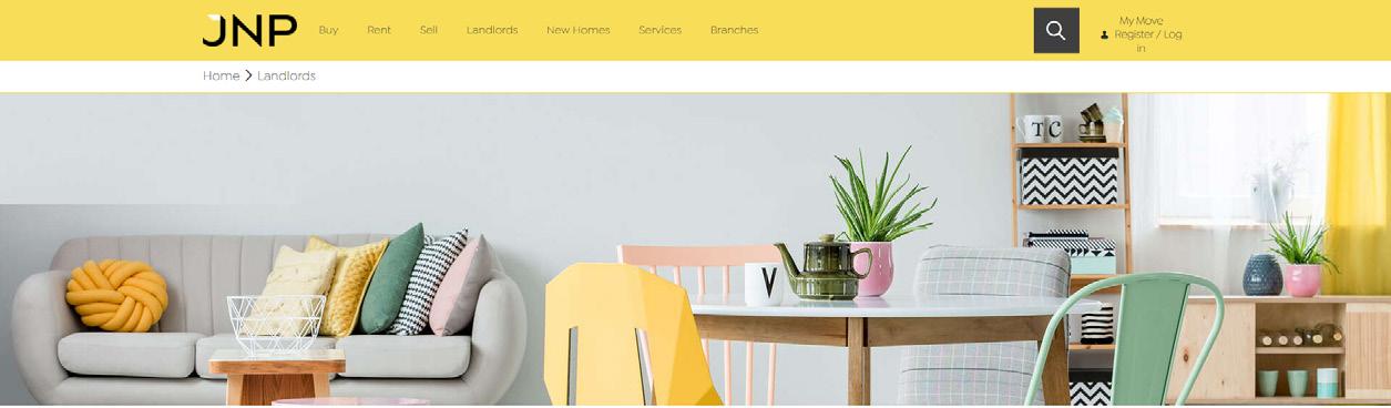
Online Website
Header images of people or interiors should be used on all level 1 and level 2 content pages. These should be selected in line with the imagery requirements detailed on pages 9, 10 and 11.
1
2
Staff photos are cropped within a circle and presented with name and job title – on a scrolling carousel if there are more than 4 members of staff within a branch.
Example
Example
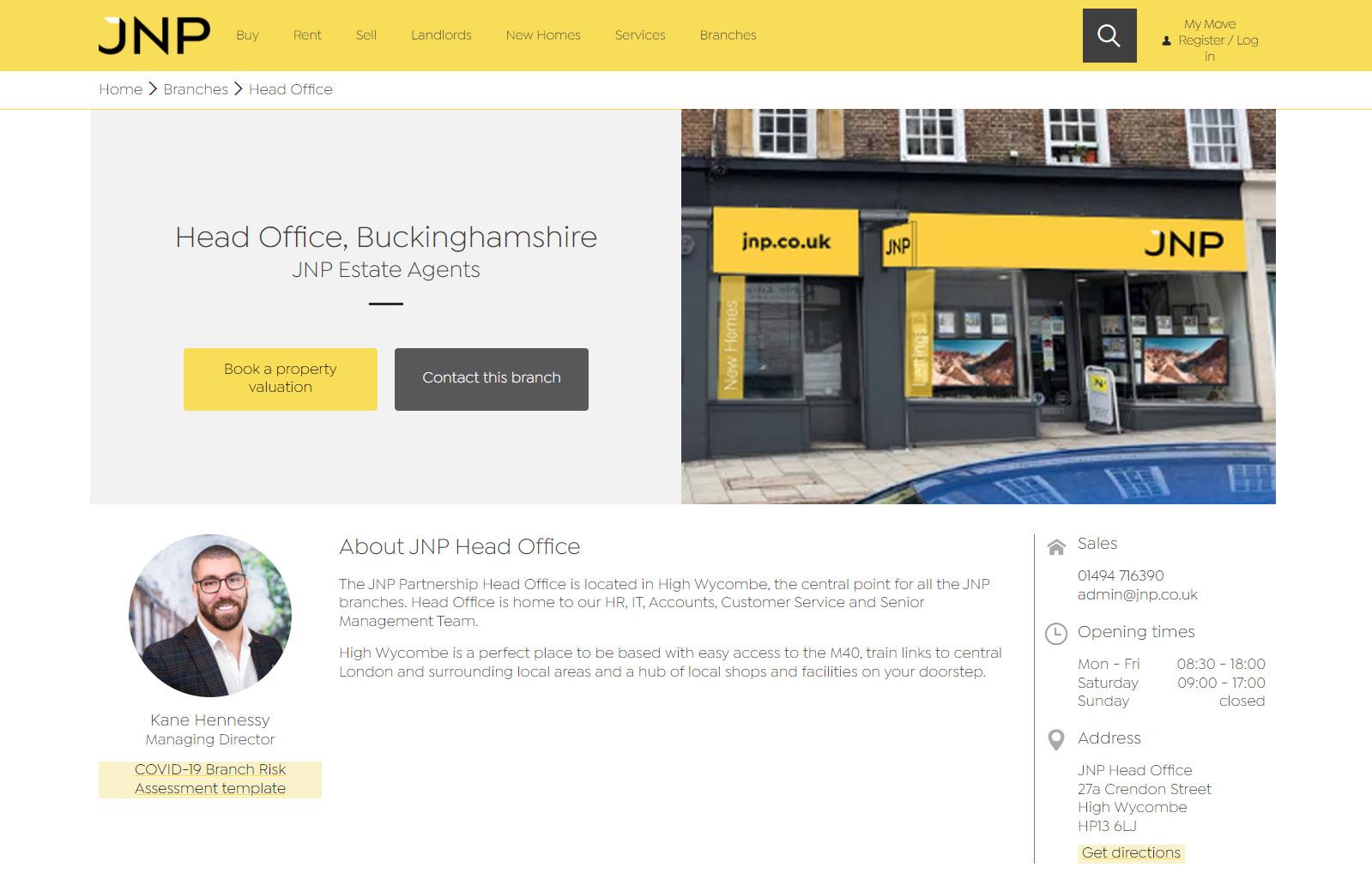
Online
Branch details are displayed online with full-colour photography showcasing on-brand, clean fascia and signage, in dry or sunny weather. The senior member of staff’s photo is also displayed along with relevant contact details, opening times and location.
Banners using dark overlays and solid block colours are used to separate out important content and create contrast and visual interest.
CTA boxes at the foot of each page feature people, interiors and product images utilising the secondary colour palette.
Online
Website
The website uses Isidora Sans typeface with colour reference Hex #3f3f3f throughout.
Grey icons (RBG: R:147 G:147 B:146) provide links to guide users to key steps of their online journey.
Online
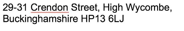
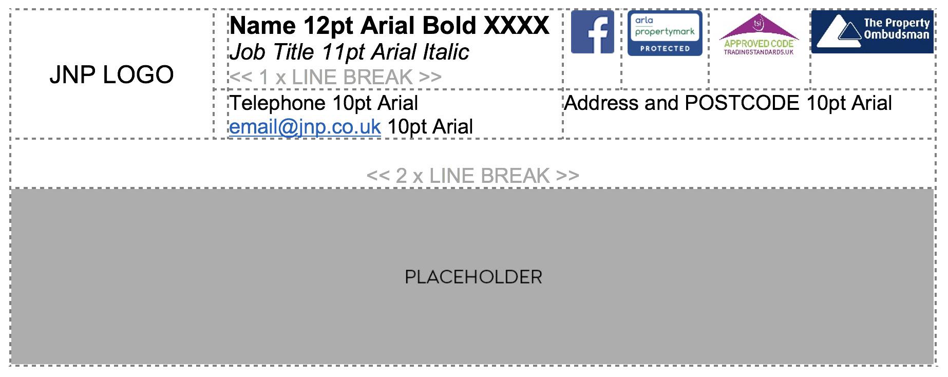
Email Footer
• JNP logo – must have a hyperlink to www.jnp.co.uk
• Facebook logo – must have a hyperlink to www.facebook.com/JNPestateagents
• Propertymark logo should reflect the qualification/ accreditation of the named individual.
• Campaign footer asset should have clearly defined, coloured edges as white gets lost against email background.
• All email campaign footer assets must have a hyperlink to the appropriate landing page and campaign tracking, which can be set up using https://ga-dev-tools.web.app/campaign-url-builder
Example
Incorrect campaign footer asset
CAMPAIGN FOOTER ASSET PLACEHOLDER
Online
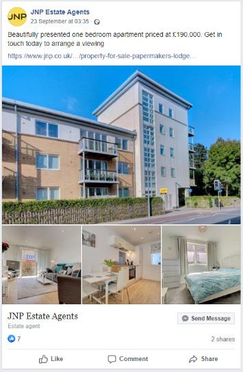
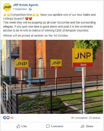
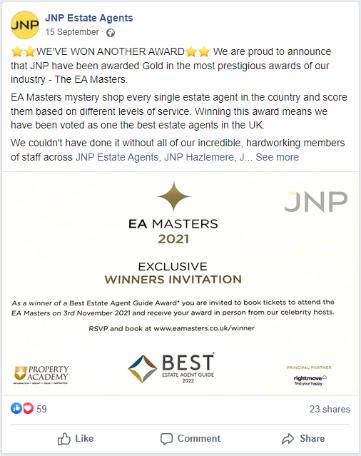
Social Media
JNP’s social media posts are a mixture of property details using multiple images or video, competitions, and good news stories from colleagues at the various JNP branches – awards, good reviews and customer feedback.
Property detail posts should ensure that the main image is the best interior/exterior photo available. Photos of team members should be in full colour and show a smiling, positive social interaction reflecting JNP’s reputation for excellent service and friendly staff.
For more information, or any usage queries please contact: