Core Values
Team
We provide better service to consumers by working together, sharing information and having the consumers’ objective above individual or company objectives, our teams include our customers.
Trusted
Consumers can trust us because we are trained to a professional standard, we will give them what we believe to be the best advice, we will alert them to any potential conflicts of interest and we will be truthful.
Recommended
Our best measure of success is the amount of repeat and recommended customers we have, this includes length of staff service and staff recommendation to new recruits.
Local
We want all front line staff to be able to deal with consumers locally. We want them to know enough about their locality to help consumers make good property decisions, be involved in the local community and whenever possible live close to where they work.
Evolving
We like adopting new ideas and ways of working because they improve the service we give to consumers and make us more efficient.
The Logo
The logo is the cornerstone of our identity and must be used on all communication material.
Where possible the full colour version of the logo should be used. White and black versions of the logo are available. These can be used if the colour version is not appropriate or special print finishes are required.
N.B. Ensure the logo is legible on the background.
A stacked version of the logo, with the shield above the brand name, can be used in certain applications, such as the Davis Tate Sale/Let boards.
Colour on white background
Colour on purple background
Black on white background
White on dark background
Grayscale
The Davis Tate Coat of Arms
The shield motif is an established and useful device which reinforces the brand and its heritage.
The shield motif may also be used as a graphic element in its own right - either in its full colour form, or using the outline version as a feint/ghost image.
In all instances, it should appear in addition to the main logo, not instead of it.
Logo Variations
Where possible the full colour version of the logo should be used. If the logo is not legible on the background, the purple boxed, colour version should be used, with the box bleeding off the edge of the page.


Logo on photo
Purple block on solid colour
Logo on Purple background Colour on light background
Logo on busy background
Social Media DAVIS
Keeping the logo consistent
It is important that all our collateral has a clean and crisp look. It is always a good practice to leave an area of ‘breathing space’ around the logo to ensure that the brand is clearly visible in the surrounding design or text areas.
Isolation Area
The Isolation Area is the space around the logo in which no other text, graphic or photographic elements may encroach. The size of the isolation area is the height of the letter “d” in the logo.
When using the un-boxed versions of the logo, the isolation area is still the height of the letter “d” in the logo, but measured from the edge of the shield motif and text, rather than the edge of where the box would have been.

Do NOT distort
Do NOT change the shield to word ratio
Do NOT change the colours
Do NOT add effects
Do NOT rotate
Do NOT use just the shield icon
Typography
The brand typeface is Dexa Pro, this has been chosen because it is clean, legible and classic.
Typography and a consistent use of typeface is a key element in creating a cohesive look across all the Davis Tate identity.
Arial should be used for transactional items such as standard forms and letters created in-branch, where staff generating the items do not have access to Dexa Pro.
Arial should also used for email signatures to avoid issues with typeface rendering on the recipient’s computer.
Dexa Pro Thin
ABCDEFGHIJKLMNOPQRSTUVWXYZ
abcdefghijklmnopqrstuvwxyz
1234567890 // !@#$%^&*()
Dexa Pro Extra Light
ABCDEFGHIJKLMNOPQRSTUVWXYZ
abcdefghijklmnopqrstuvwxyz
1234567890 // !@#$%^&*()
Dexa Pro Light
ABCDEFGHIJKLMNOPQRSTUVWXYZ
abcdefghijklmnopqrstuvwxyz
1234567890 // !@#$%^&*()
Dexa Pro Regular
ABCDEFGHIJKLMNOPQRSTUVWXYZ
abcdefghijklmnopqrstuvwxyz
1234567890 // !@#$%^&*()
Dexa Pro
Dexa Pro Medium
ABCDEFGHIJKLMNOPQRSTUVWXYZ
abcdefghijklmnopqrstuvwxyz
1234567890 // !@#$%^&*()
Dexa Pro Bold
ABCDEFGHIJKLMNOPQRSTUVWXYZ
abcdefghijklmnopqrstuvwxyz
1234567890 // !@#$%^&*()
Dexa Pro Extra Bold
ABCDEFGHIJKLMNOPQRSTUVWXYZ
abcdefghijklmnopqrstuvwxyz
1234567890 // !@#$%^&*()
Dexa Pro Black
ABCDEFGHIJKLMNOPQRSTUVWXYZ
abcdefghijklmnopqrstuvwxyz
1234567890 // !@#$%^&*()
Typography
The brand typeface is Argent, this has been chosen as a heading font.
Argent Thin
ABCDEFGHIJKLMNOPQRSTUVWXYZ
abcdefghijklmnopqrstuvwxyz
1234567890 // !@#$%^&*()
Argent Light
ABCDEFGHIJKLMNOPQRSTUVWXYZ
abcdefghijklmnopqrstuvwxyz
1234567890 // !@#$%^&*()
Argent Regular
ABCDEFGHIJKLMNOPQRSTUVWXYZ
abcdefghijklmnopqrstuvwxyz
1234567890 // !@#$%^&*()
Argent Bold
ABCDEFGHIJKLMNOPQRSTUVWXYZ
abcdefghijklmnopqrstuvwxyz
1234567890 // !@#$%^&*()
Argent
Argent Demi Bold
ABCDEFGHIJKLMNOPQRSTUVWXYZ
abcdefghijklmnopqrstuvwxyz
1234567890 // !@#$%^&*()
Argent Extra Bold
ABCDEFGHIJKLMNOPQRSTUVWXYZ
abcdefghijklmnopqrstuvwxyz
1234567890 // !@#$%^&*()
Argent Super
ABCDEFGHIJKLMNOPQRSTUVWXYZ
abcdefghijklmnopqrstuvwxyz
1234567890 // !@#$%^&*()
Colour Palette
PRIMARY COLOURS
Colour is an essential part of our brand and marketing collateral.
There are primary colours, plus secondary colours to provide designers with a broader working palette. Try to refrain from using too many colours on the same piece of work.
C:49 M:87 Y:0 K:0 R:132 G:62 B:139 #843E8B
C:42 M:74 Y:0 K:0 R:146 G:90 B:156 #925A9C
M:13 Y:14 K:0 R:215 G:215 B:215 #D7D7D7
M:27 Y:27 K:0
G:178 B:178 #B4B2B2
SECONDARY COLOURS HIGHLIGHTED COLOURS
C:70 M:87 Y:0 K:47
R:66 G:40 B:91 #42285B
C:0 M:75 Y:24 K:43
R:138 G:68 B:90 #8A445A
C:45 M:90 Y:0 K:0
R:137 G:57 B:136 #893988 C:64 M:16 Y:0 K:45
R:81 G:115 B:145 #517391
C:66 M:90 Y:0 K:22
R:89 G:49 B:115 #593173
C:90 M:58 Y:37 K:37
R:49 G:73 B:95 #31495F
C:71 M:94 Y:35 K:39
R:70 G:40 B:75 #46284B
C:60 M:50 Y:48 K:42
R:88 G:87 B:87 #585757
C:0 M:80 Y:21 K:0 R:188 G:78 B:119 #BC4E77
#DB8E4F
#78A6BB
#6CA79F
Imagery
In its core evergreen materials and content Davis Tate uses photography of People, Locations, Property and Interiors which reflect the brand’s personality:
- Friendly, local, people-focussed.
- Grounded in our heritage, with a modern approach.
- Trustworthy and recommended.
Aspirational images of idyllic moments are used to connect people, location and emotion.
Cropping a photograph well can have a dramatic effect on its impact, drawing the viewer’s eye and excluding visual clutter.


Imagery
People
Davis Tate portrays people enjoying home style, country living, simple pleasures, outdoor leisure activities and quality time with others.


Images should be lifestyle shots of diverse ‘real’ people in natural settings, rather than posed portraits of models.


DAVIS
Imagery
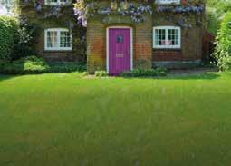
Property
Davis Tate portrays properties which reflect their customer base. In the countryside and villages around Sonning Common, Twyford, Shinfield and Burghfield this tends to be charming period cottages and established family homes through to larger individual houses set in their own grounds.
In the larger villages and market towns of Pangbourne, Goring, Henley-onThames, Abingdon and Wantage they sell a blend of styles and sizes - from central period townhouses, smaller modern developments through to premium riverside homes.
In the towns of Reading and Didcot, typical properties listed range from newly built apartments with doorstep amenities, to Victorian and Edwardian terraced houses, as well as large modern developments with schooling and leisure facilities.


DAVIS TATE BRAND
Imagery
Interiors
Interiors portrayed on Davis Tate evergreen materials should be engaging, uncluttered and light. Where possible, images should feature elements such as furniture, curtains, cushions and objects should reflect the colour palette, but should not dominate the image.


Imagery
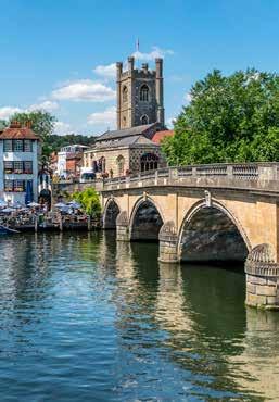
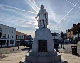
Locations:
Davis Tate uses both stock and bespoke commissioned photography depicting local landscapes, easily recognisable landmarks and architectural features to reinforce the local focus and expertise of the brand.
Emotion:
The brand also uses imagery which sits across the categories of people/ properties/interiors/locations and which evoke aspirational emotions attached to the experiences depicted, for example:
Standing in a field of barley, wheat or sunflowers, running hands over corn or grass on a riverside walk, a glass of wine and a book in a garden at sunset.


Imagery
Staff photography
Portrait photography of Davis Tate staff should be in colour without excessive filters or processing, portraying the friendly, approachable and professional service that we provide for our customers. Where possible, backgrounds should be plain and not distract from the individual portrayed in the foreground. Where appropriate, images of staff at work are acceptable, but should preferably not look staged or unnatural. Images of colleagues on the phone often look staged, so should be avoided.


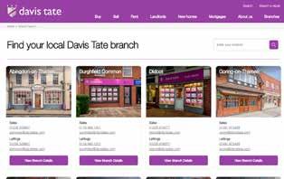
The Brand In Action


The Brand In Action
Brochures


The Brand In Action
Email Signatures
Do


The Brand In Action


07817