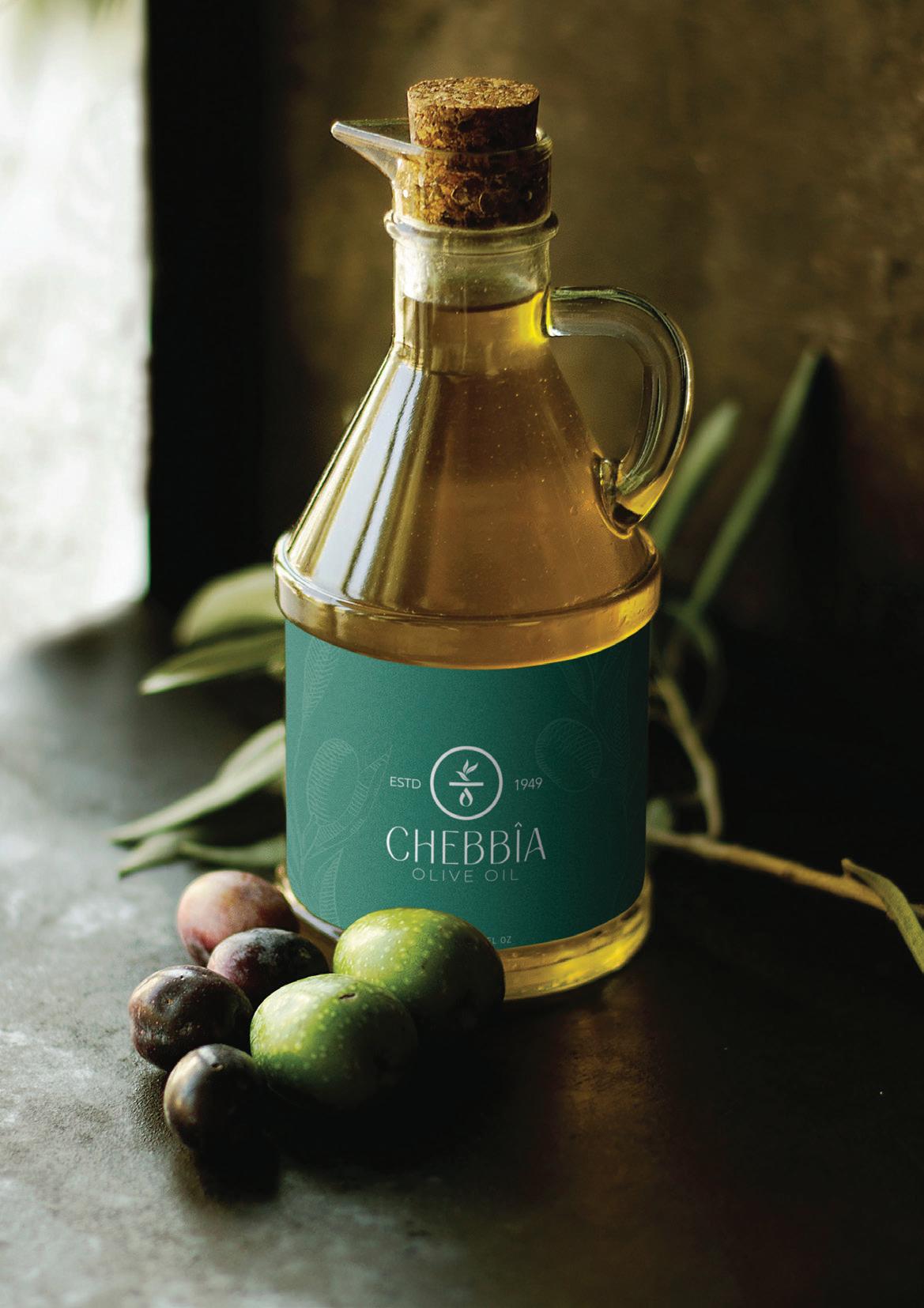
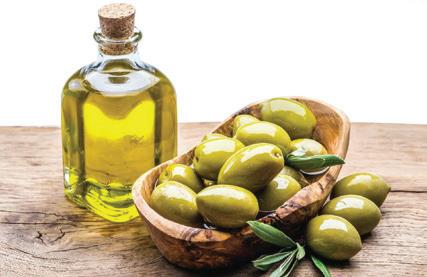
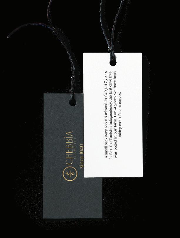
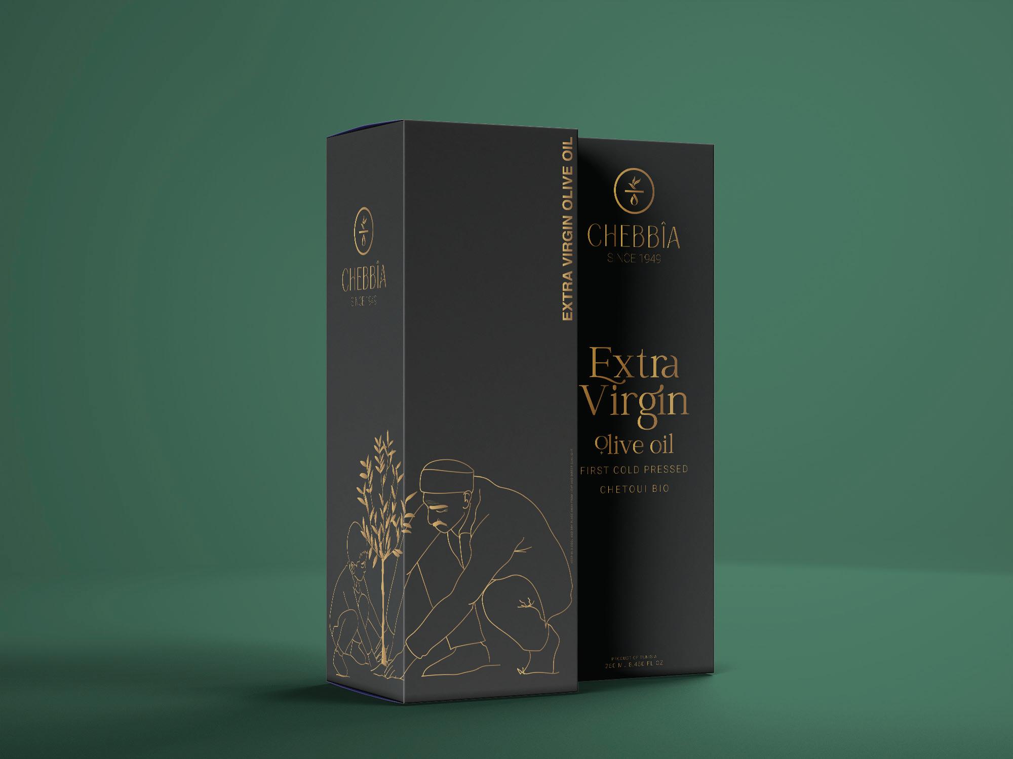
Ch bia is the First Cold Pressed Ext Vir n Olive Oil. His hist y be ns in Ain Yo es wh e the rst olive Tree was potted in 1949. Fr day e, o olive trees was th oughly n t ed by o olive oil f m s fr groves to t le. This olive oil was a ed by T isi olive oil exp ts.
Fr the rst dr , you c taste the diff ce of o olive oil whi was c efully cold pressed in o auth tic olive press e ing the best tasting d the highest quality Ext Vir n Olive Oil. Rooted to auth ticity, o Olive Oil e a ed to help you e d live healthy ev y day.
CONCEPT
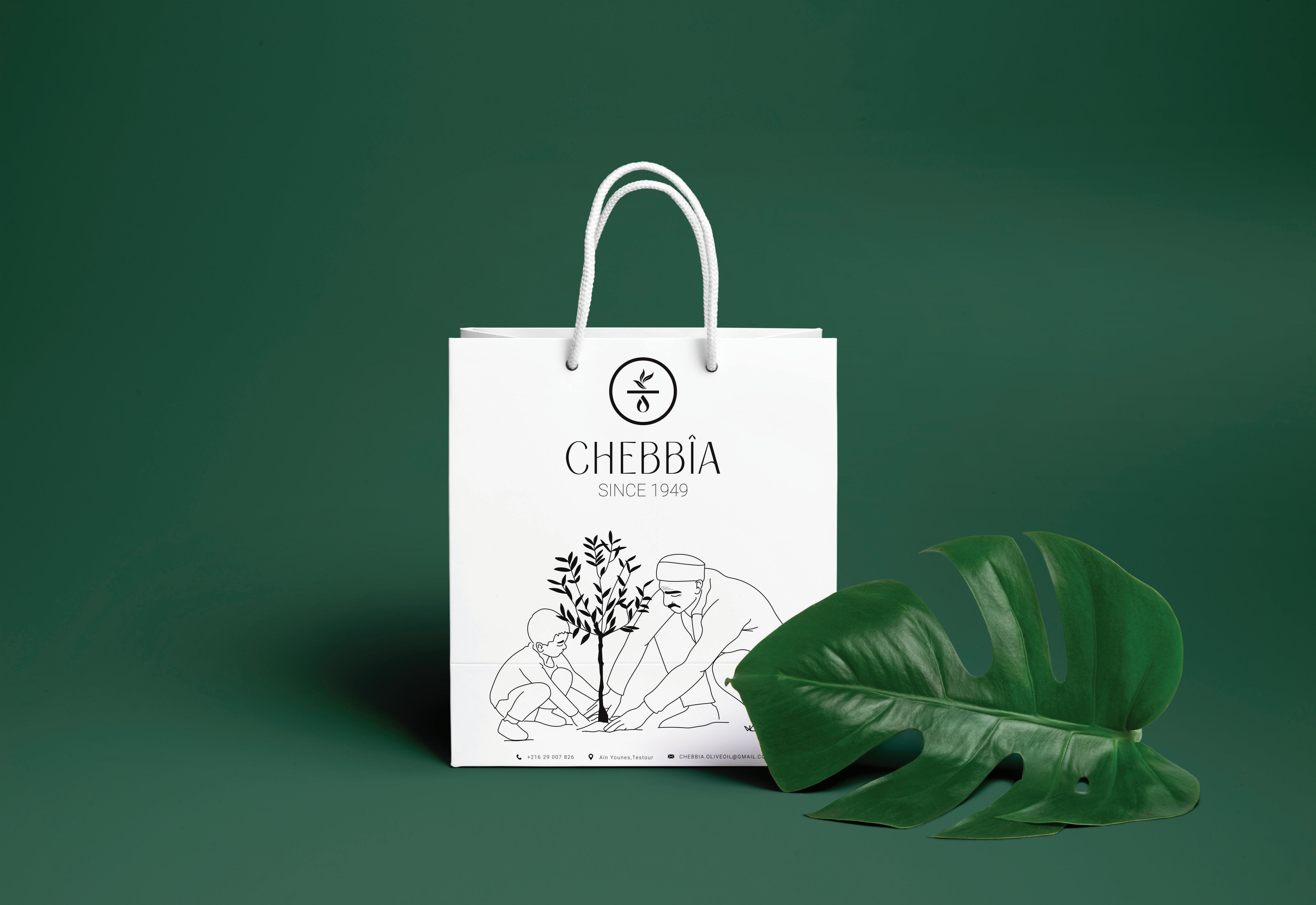
The logo is quite simple and straight to the point. We want to show the consumers what our product is really all about.
The letter O on the logo is the first letter olive oil
The leaves on the logo explains the leaves on olive
An icon of the soil where the olives are planted in.
The droplet icon below the circle explains the droplet of an olive oil.
FINAL LOGO
Final logo is consist of wordmark and icon.
VARIATIONS
The logo can be in horizontal formation or vertical formation. Depending on where it is used
PLACEMENT
Logos must not be placed too close to other design elements such as type, photos, or other logos. The logos should always be surrounded by a minimum clear space. The logo is increased or decreased in size, the clear space should adjust proportionally.
ICON MARK
Icon marks are design elements unique to your brand. Using them consistently across all materials and online channels enhances vour brand value and inspires brand recognition
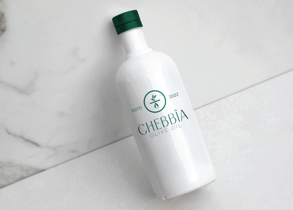
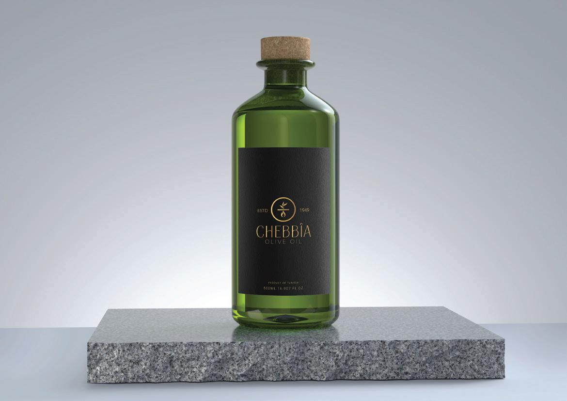
LOGO WITH BACKGROUND
logos must not be placed too close to other design elements such as type, photos, or other logos. The logos should always be surrounded by a minimum clear space. The logo is increased or decreased in size, the clear space should adjust proportionally.
INCORRECT USE OF THE LOGO
In order to preserve the branding please avoid misusing of the identity. Here's the things you should not do.
Do not Stretch the logo
Do not rotate the logo
Do not change the color
chebbia
Do not change the font
Do not apply drop shadow
TYPOGRAPHY
Typography is an important visual element of your branding. It should align with your style, the expectation of the target audience, and your brand personality. The following font guidelines should be adhered to across all we platrorms to maintain the standardization of the brand elements.
Typography is an important visual element of your branding. It should align with your style, the expectation of the target audience, and your brand personality. The following font guidelines should be adhered to across all we platrorms to maintain the standardization of the brand elements.
The brand color palette is a way ot creating a vibrant visual experience with the target audience while simultaneously showcasing the brand's unique personality. The following color guidelines should be adhered to across all web platforms and print materials to help establish a successful brand identity.
Hex: 1e5743
PATTERNS
The brand icon can be used as pattern in different design platforms. It can be a backdrop or maybe an overlay background depending on it's usage.
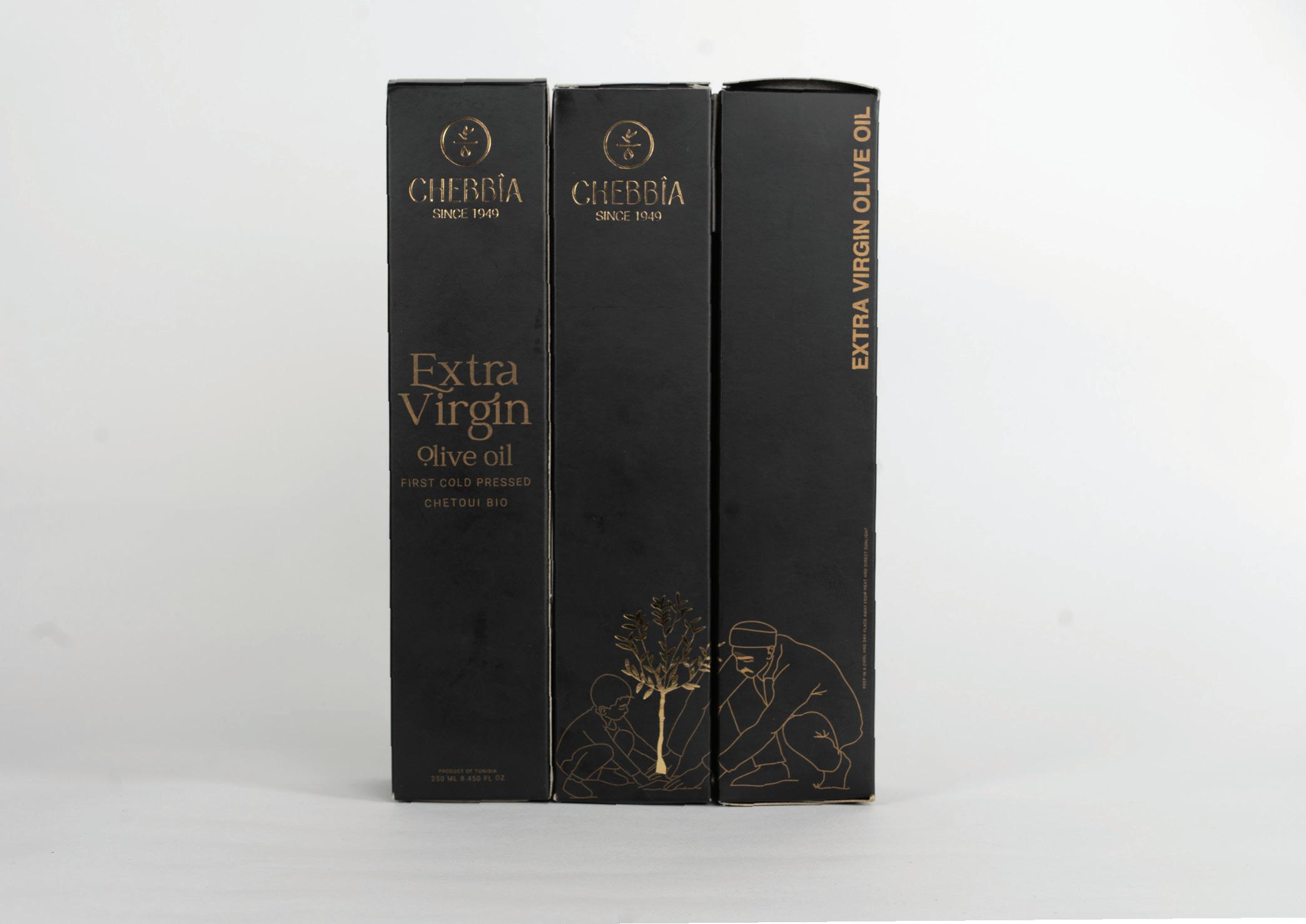
250 ml Bottle
The main typography for this bottle is called JOHN MAYER and the secend one is Roboto.
Width: 6 Cm
Length: 12 CM
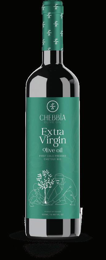
500 ml Bottle
The main typography for this bottle is called JOHN MAYER and the secend one is Roboto.
Width: 8 Cm
Length: 16 CM
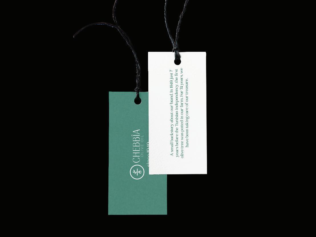
Bottle Tag
Width: 6 Cm
Length: 3,33 CM
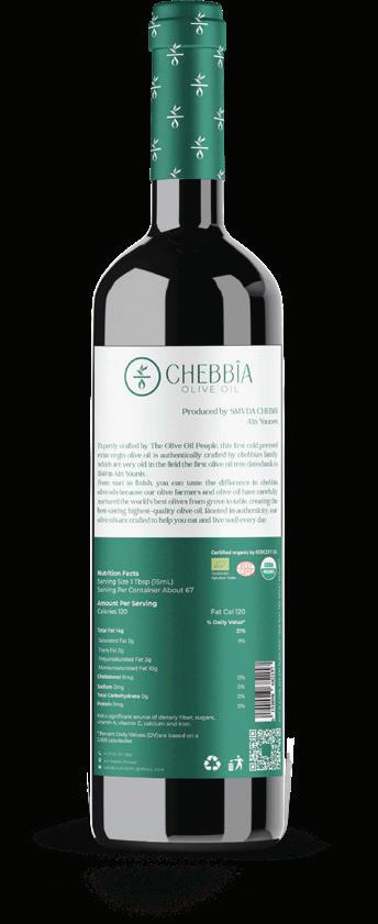
500 ml Bottle
The main typography for this bottle is called JOHN MAYER and the secend one is Roboto.