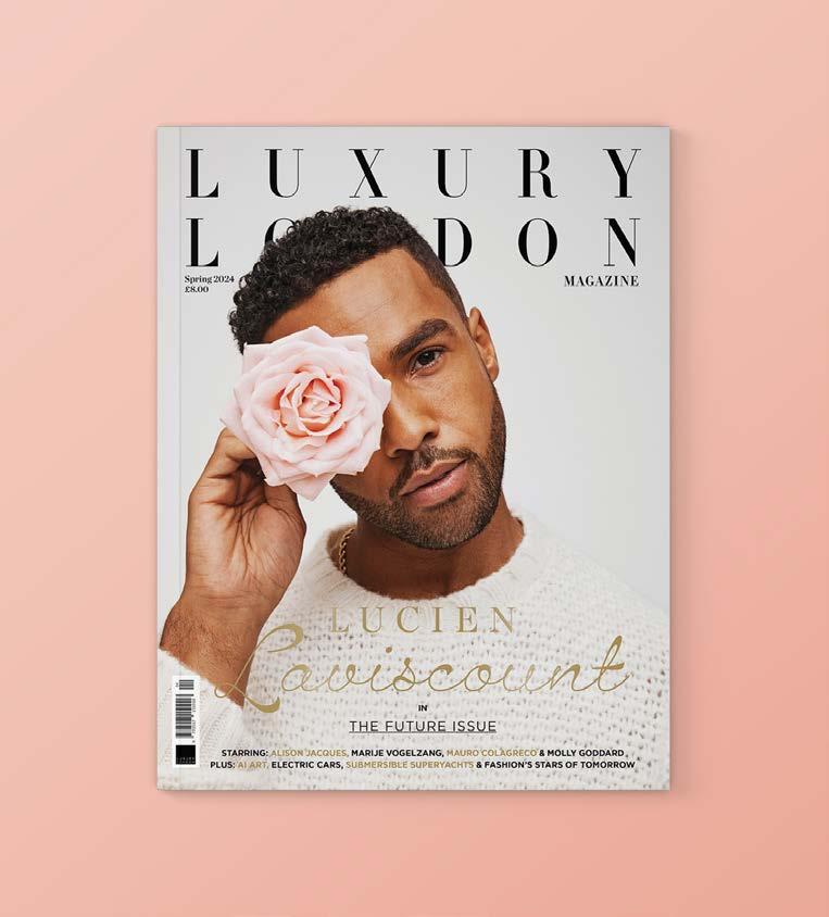
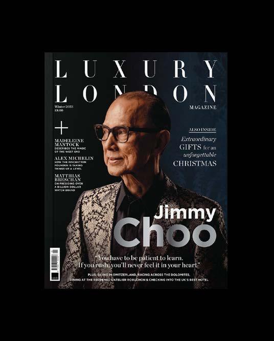
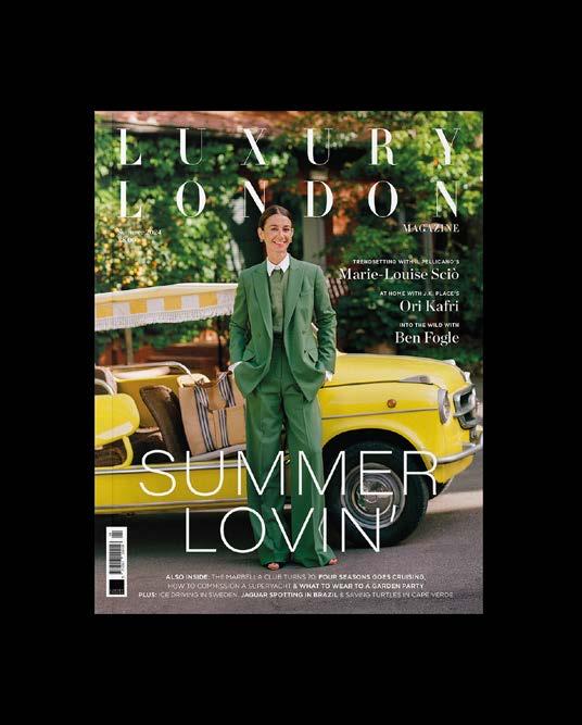
LUXURY LONDON MEDIA
LUXURY LONDON MAGAZINE
FRONT COVER
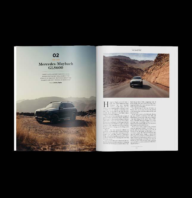
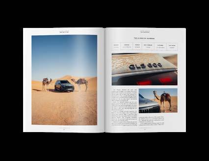
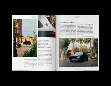
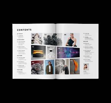
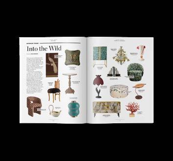
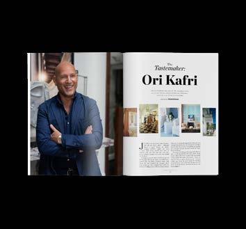
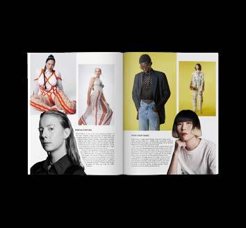
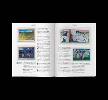
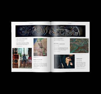
Luxury London Media is an independent media organisation that connects luxury brands with high-net-worth individuals. The premium print publication, Luxury London Magazine, is a quarterly magazine that features articles focused on the luxury sector, including travel, property, fashion and culture. As design lead, I was responsible for designing the entire magazine, including all editorial content and front covers. With article formats varying considerably, an adaptable approach was necessary in order to produce a wide range of unique layouts for product pages, listicles, fashion shoots, interviews and advertorials.
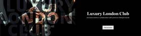
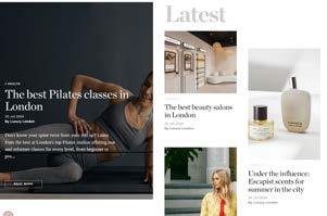

DIGITAL AND PRINT ADVERTISING CAMPAIGN WEB BANNERS & MAGAZINE ADVERT
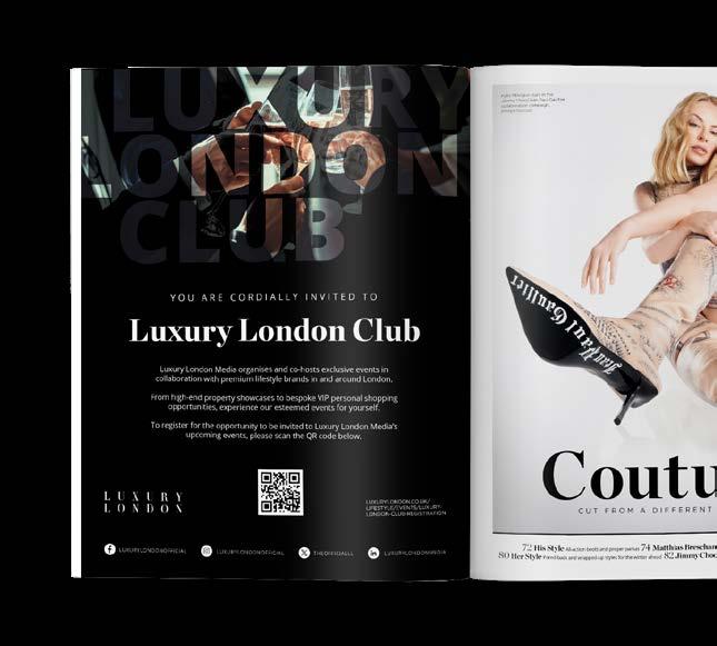
I created cohesive advertising campaigns that featured on Luxury London’s digital and print platforms. This luxury events subscription service included animated web banners/MPUs on the website and full page adverts in the magazine.

SOCIAL
CARDS INSTAGRAM STORY & LINKEDIN POST
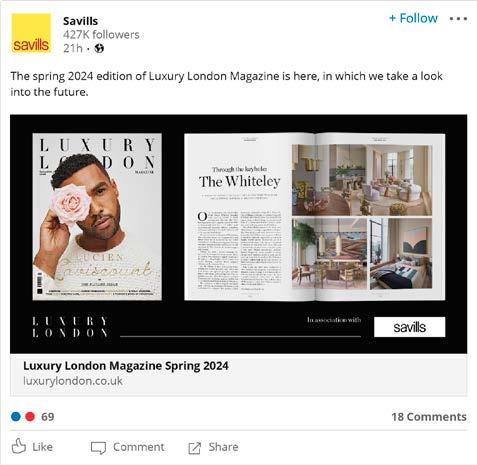
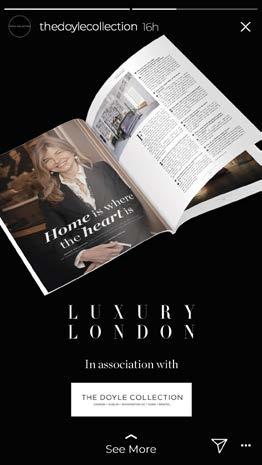
After publication of the magazine, clients were provided with bespoke social cards featuring images of their advertorial pieces. These were to be distributed on the clients own social channels as a means of further driving engagement with the magazine.

RACONTEUR
THE TIMES SPECIAL REPORTS DASHBOARDS
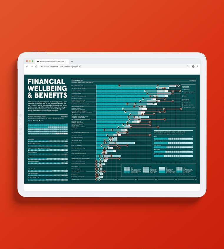
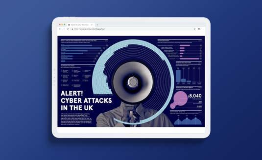
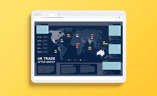
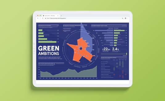
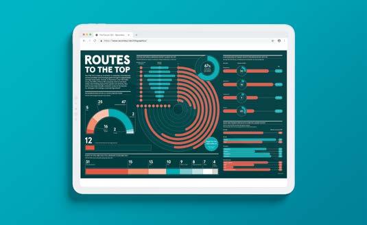
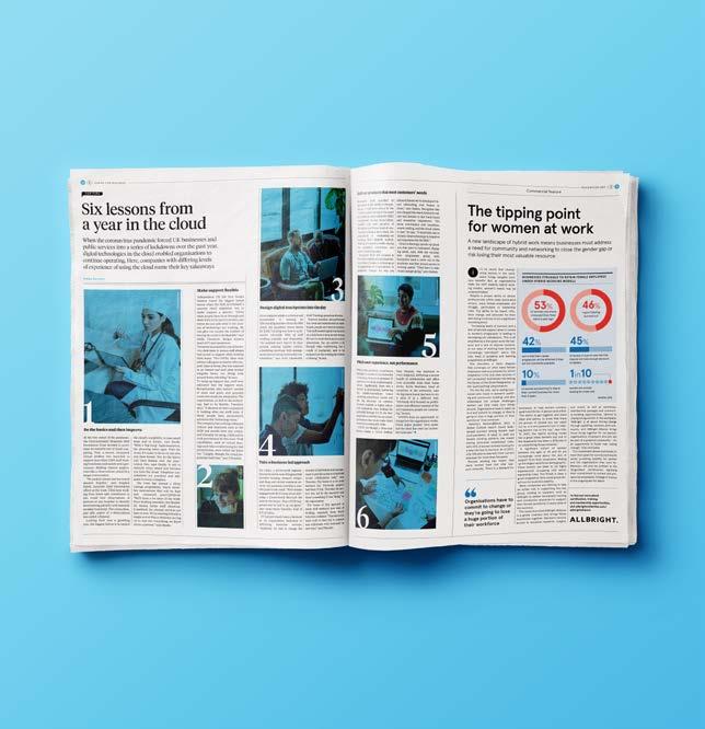
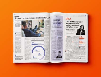
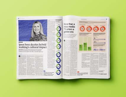
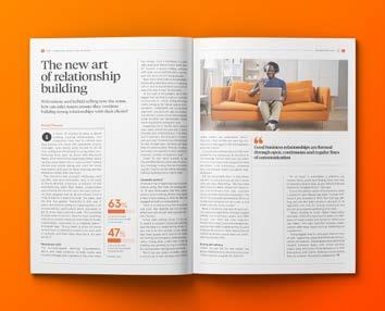
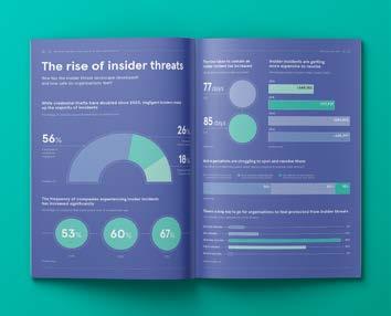
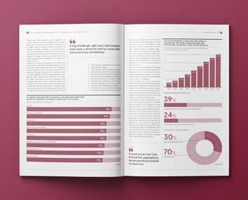
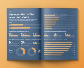
Raconteur are most known for the special report supplements which they publish in The Times and Sunday Times. Each report focuses on a particular business related topic and provides a platform for B2B communications.
I produced editorial layouts for a range of internally commissioned pieces and commercial sponsored articles. A key component of Raconteur’s brand is their iconic infographics, and the dashboards which feature in the print and digital versions of each report quickly became a speciality of mine. I used data to create a series of graphs and charts which tied together with coherent narratives and engaging visuals.
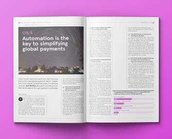
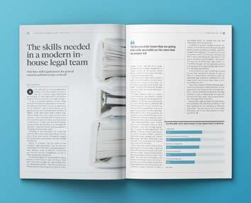
INSIGHT REPORTS
EDITORIAL DESIGN
These commercially sponsored reports contain a series of articles based around the client’s area of expertise. Initially created as online pieces, these are examples of the printable pdf conversions I created for the client to distribute.
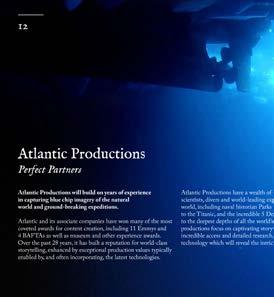
ATLANTIC PRODUCTIONS
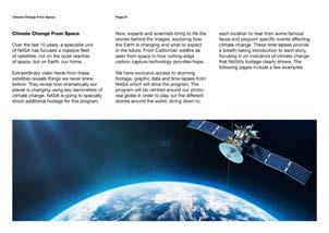
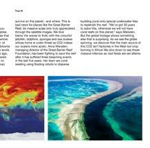
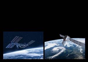
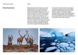
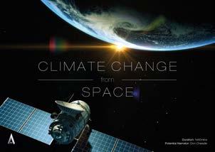
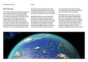
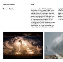
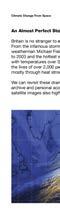
CLIMATE CHANGE FROM SPACE PITCH DECK DESIGN
As part of the television production company’s development team, I brought ideas for factual and documentary programmes to life in compelling pitch decks.
Pitching a range of niche programme ideas to commissioners with such diverse audiences required creative versatility, social awareness and in depth research to establish the appropriate visual tone. With top-level commissioners regularly receiving such an influx of pitch decks, my designs had to be both concise and engaging while working to extremely tight turnarounds.

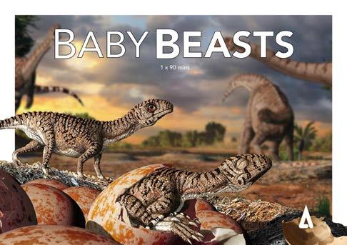
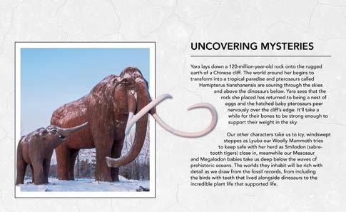

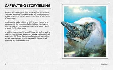
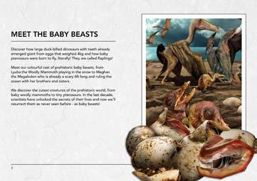
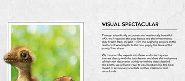
BABY BEASTS PITCH DECK
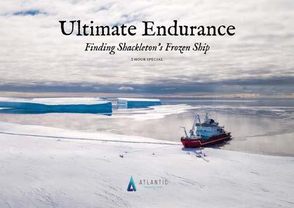
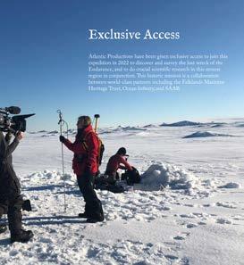
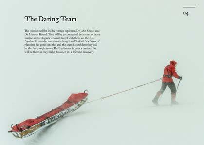
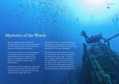

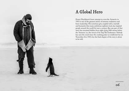
ULTIMATE ENDURANCE PITCH DECK
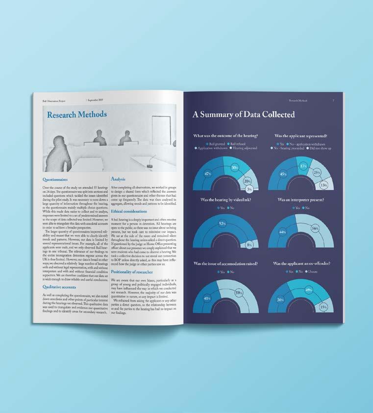
CITY UNIVERSITY OF LONDON
BAIL OBSERVATION REPORT
EDITORIAL DESIGN
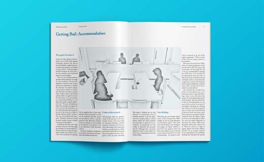
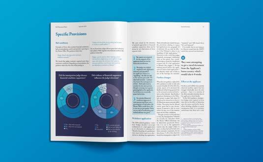
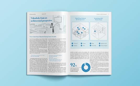
Students of the City University of London commissioned me to design a report that documented their research and observations from 55 immigration bail hearings at Taylor House Tribunal Hearing Centre in London.
I created an accessible and informative report, allowing the comprehensive research to be easily analysed and understood. It featured diagrams, infographics and traditional courtroom sketches, reflecting the feelings of isolation and anonymity put upon immigration detainees while receiving their bail hearings.
UNIVERSITY/SELF INITIATED PROJECT
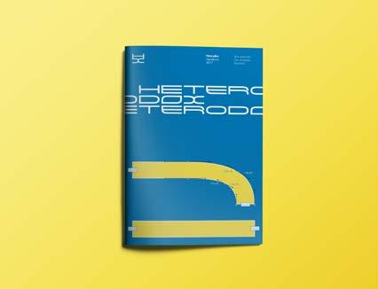
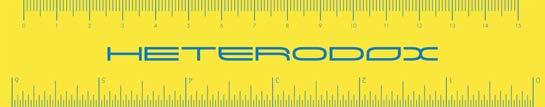
HETERODOX
WEBSITE AND BRANDING
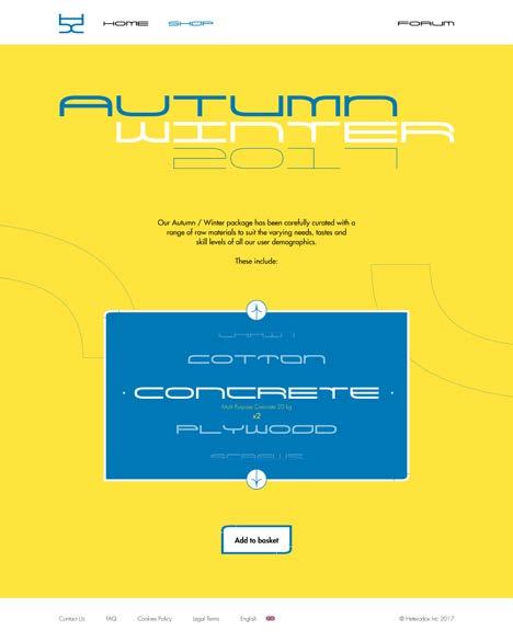
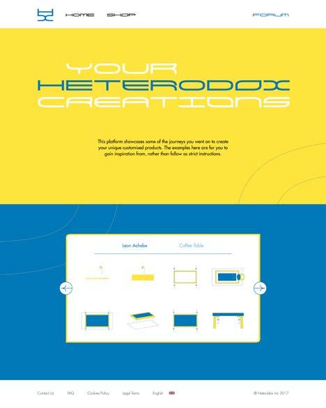
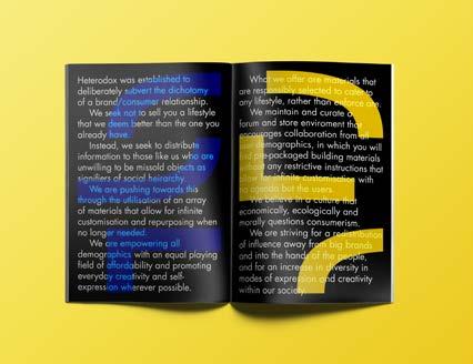
I developed this conceptual brand with the objective of subverting the common big brand ideology of prescribed trends, taste and faux individuality. I wanted to create a brand that had as little limitations as possible, giving the customer freedom to express their true individuality and creativity. Building on this ethos, I decided that the brand wouldn’t sell complete products, but a set of materials for customers to do with what they will. The website provided a platform where users could learn more about the brand’s philosophy, make purchases and gain inspiration from user examples in the forum.
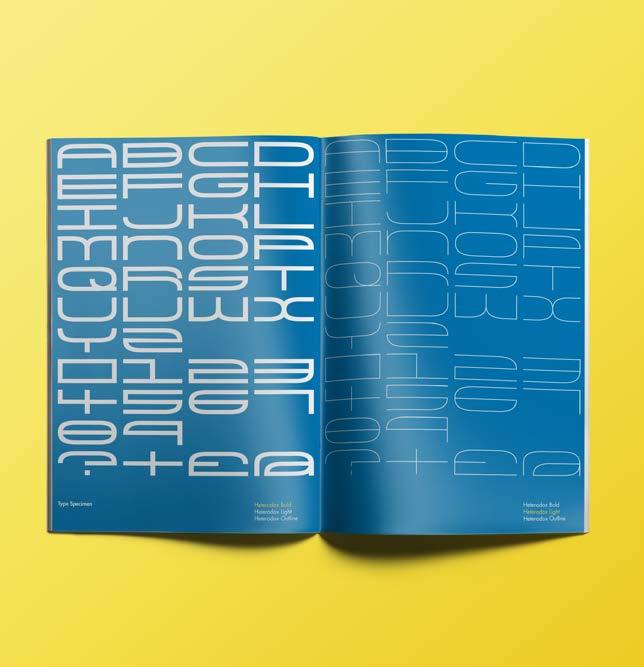
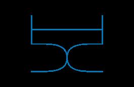
I created a custom display typeface to be used across the brand identity. Each of the three versions – bold, light and outline – are monospaced, highlighting the letterforms modular structure and reflecting the brand’s philosophy of repurposing materials into new forms and functions. There are also multiple variations of each character so that they can be used in different combinations and allow each word to look fresh and unique whilst maintaining a distinct identity.


HETERODOX WEBSITE
HETERODOX BRAND HANDBOOK
HETERODOX STATIONARY


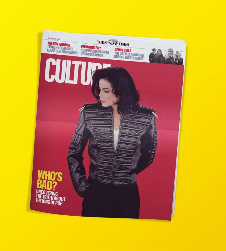
THE TIMES
CULTURE MAGAZINE COVER
EDITORIAL DESIGN
During my time interning at The Times, I worked to brand guidelines on both print and digital projects. While producing cover concepts for Culture Magazine’s feature on the ‘Leaving Neverland’ documentary, I learnt about the possibilities and limitations of designing covers for a reputable tabloid supplement. I also worked on online marketing pieces that had to be adapted and reconfigured so they were accessible on all digital devices.