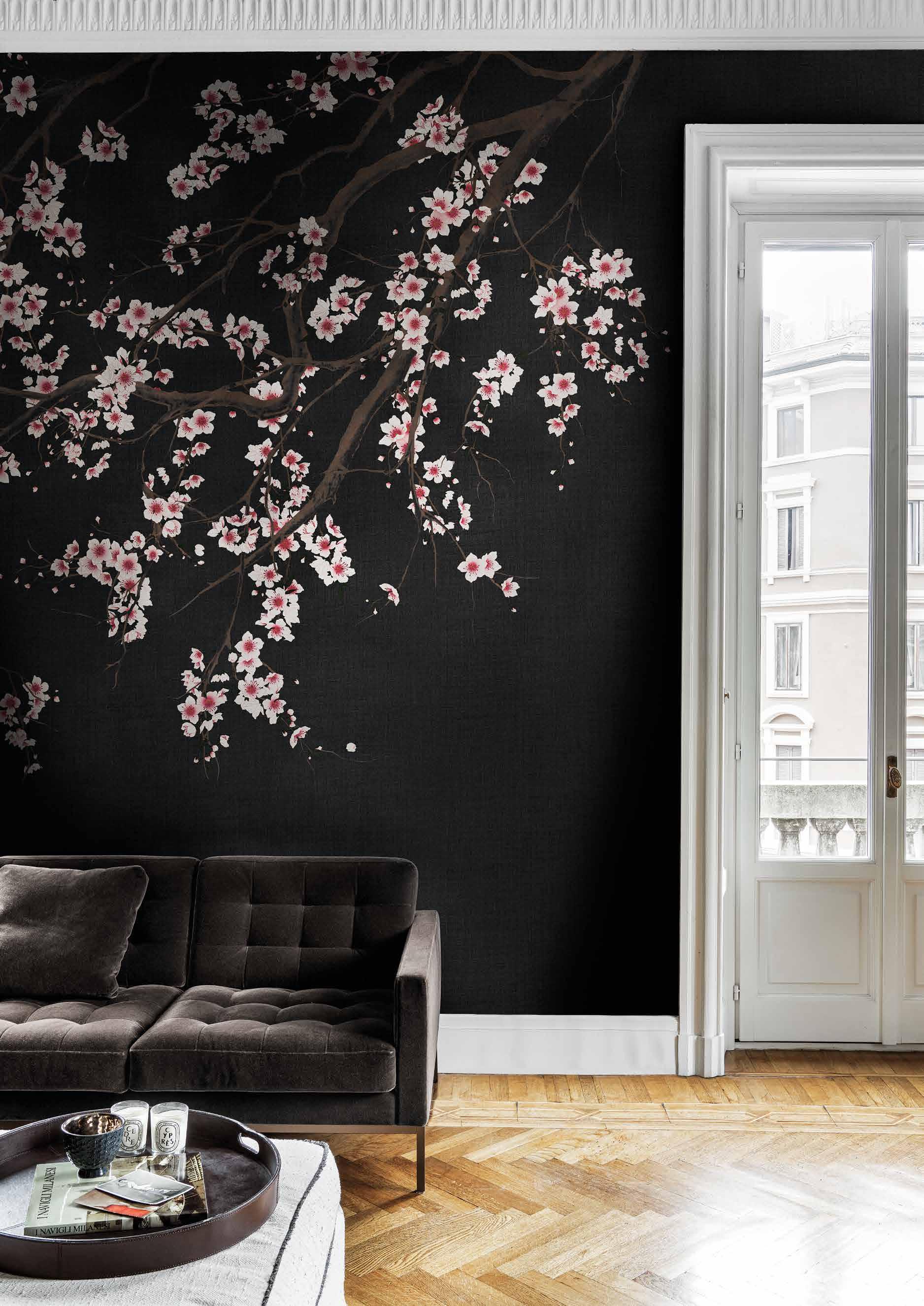
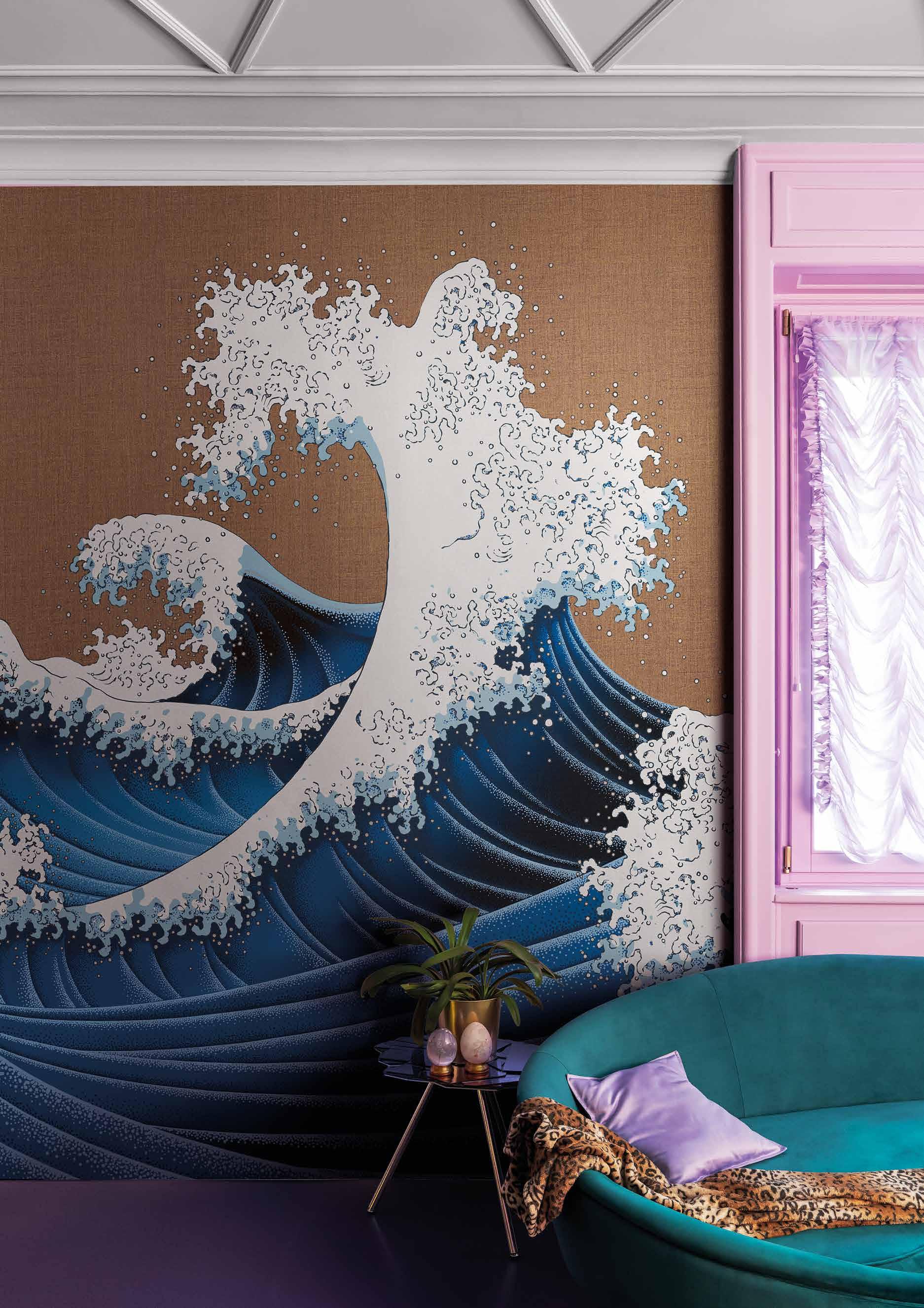
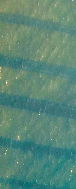
 Furi KMN14-B
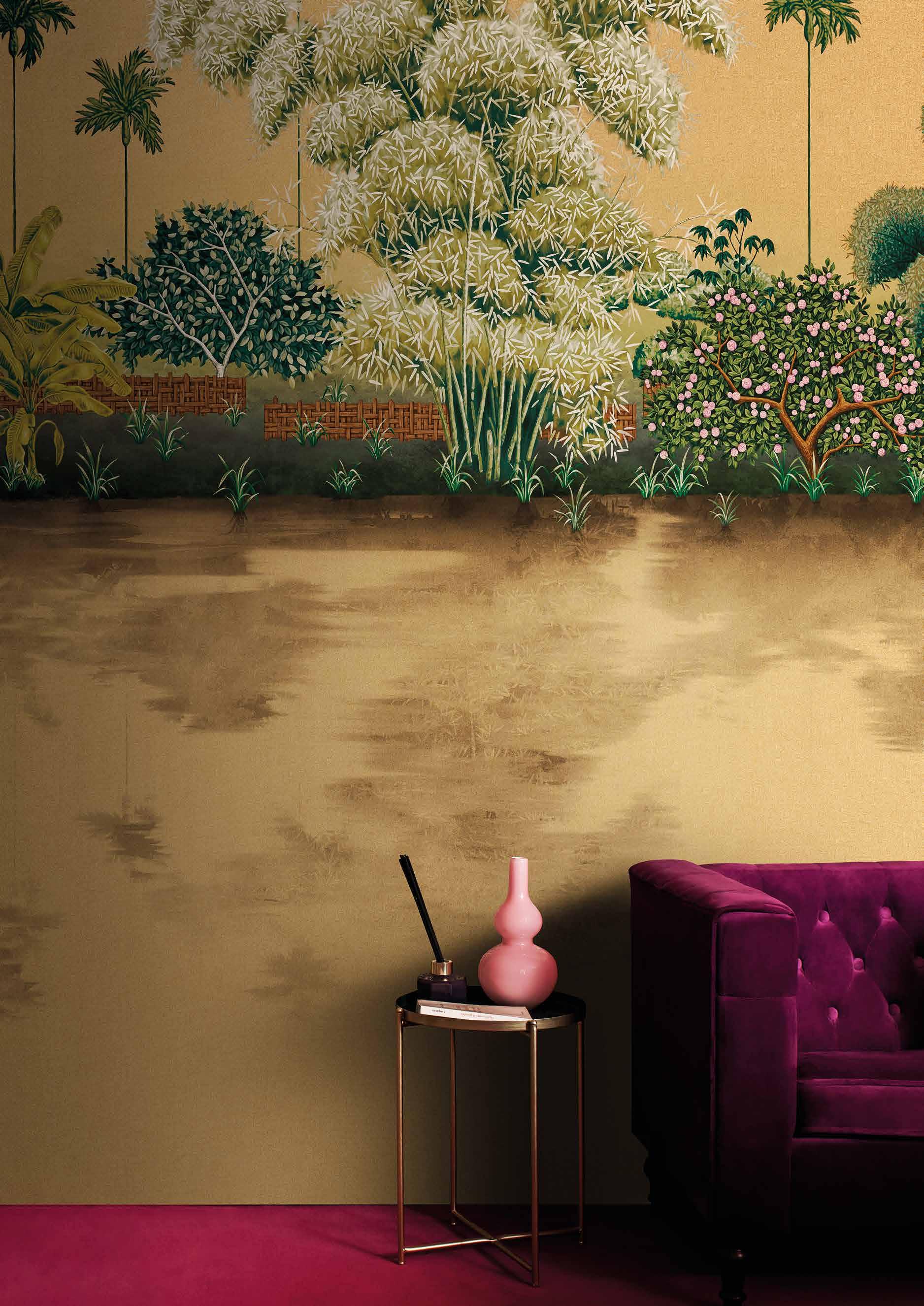
Paris est toujours une bonne idée ed è proprio a Parigi in occasione di MAISON&OBJET 2023 che Londonart ha deciso di presentare la nuova collezione Tale Books:
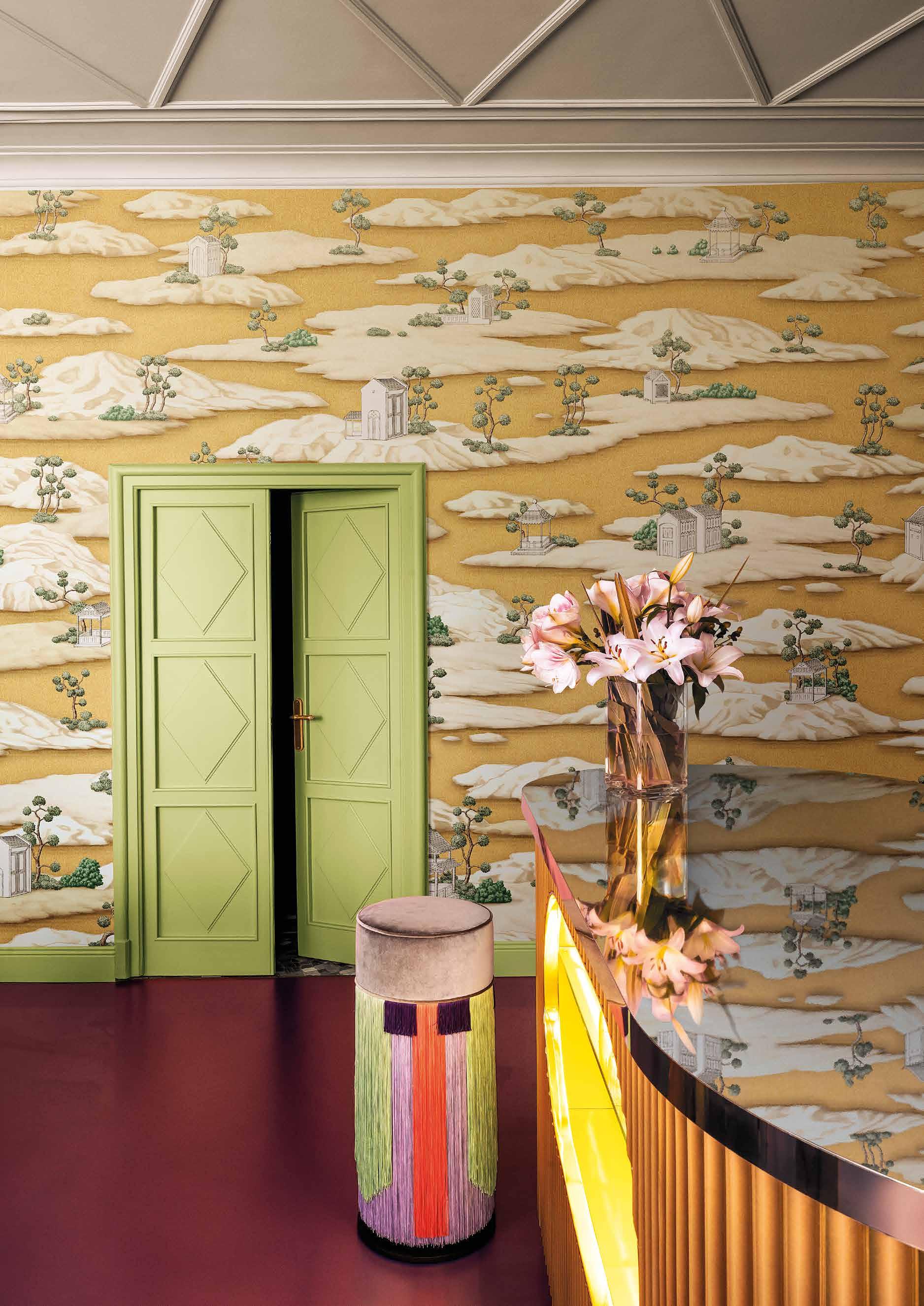
Kimono il progetto pensato e voluto da Nicola Bottegal, Art director e CEO dell’azienda. Soggetti preziosi che si ispirano all’oriente, fondi oro e colori squillanti per la collezione preziosa e innovativa.
Oltre ai wallpaper in questo nuovo numero del Mag, che si propone sempre di
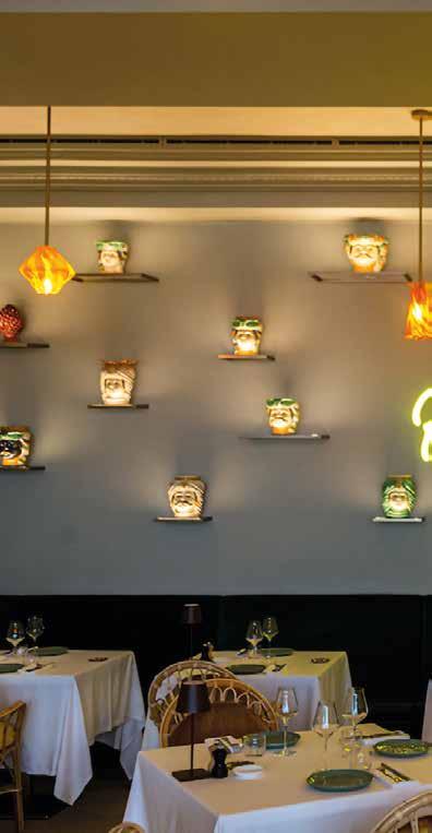
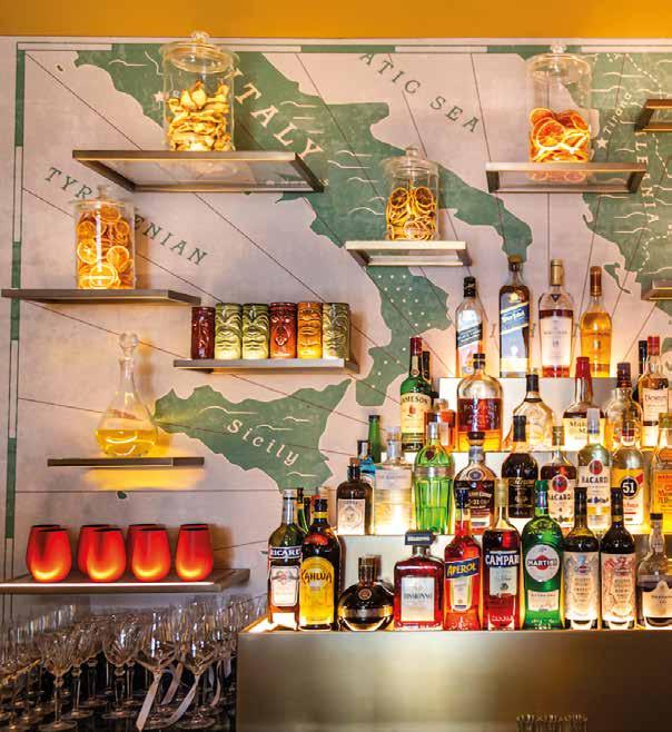
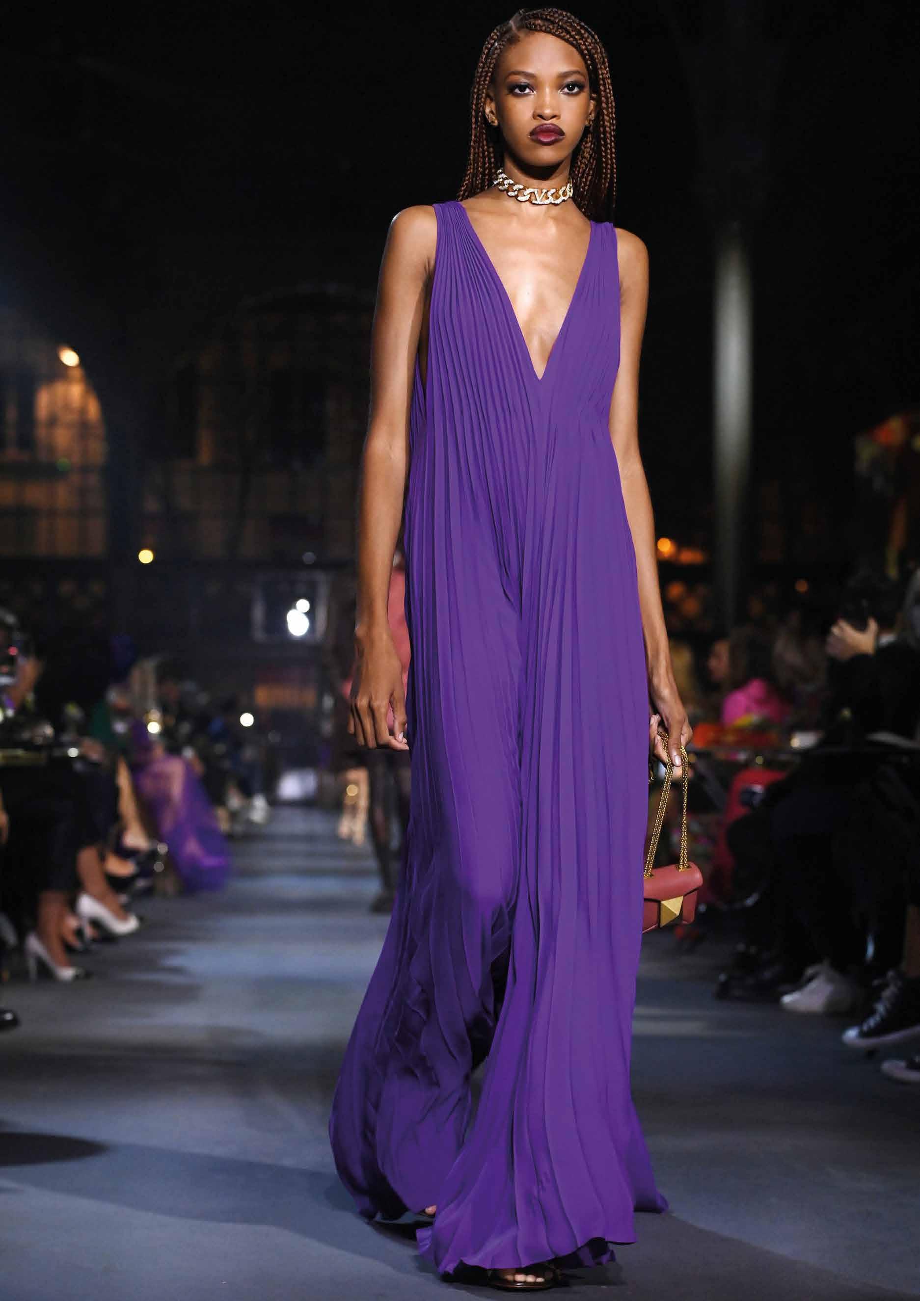
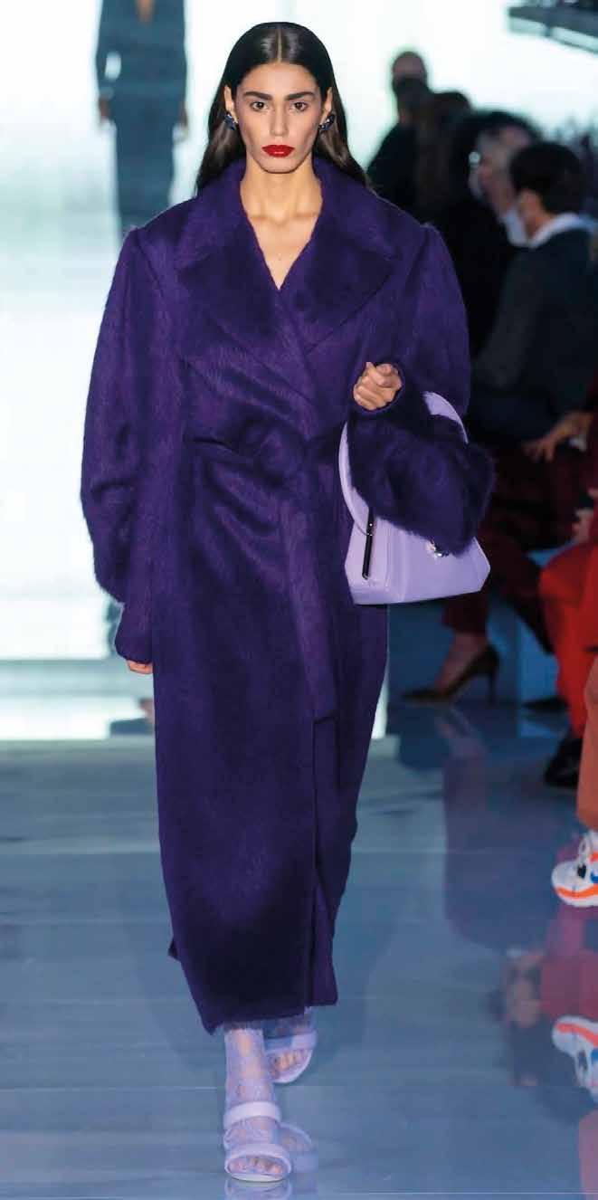
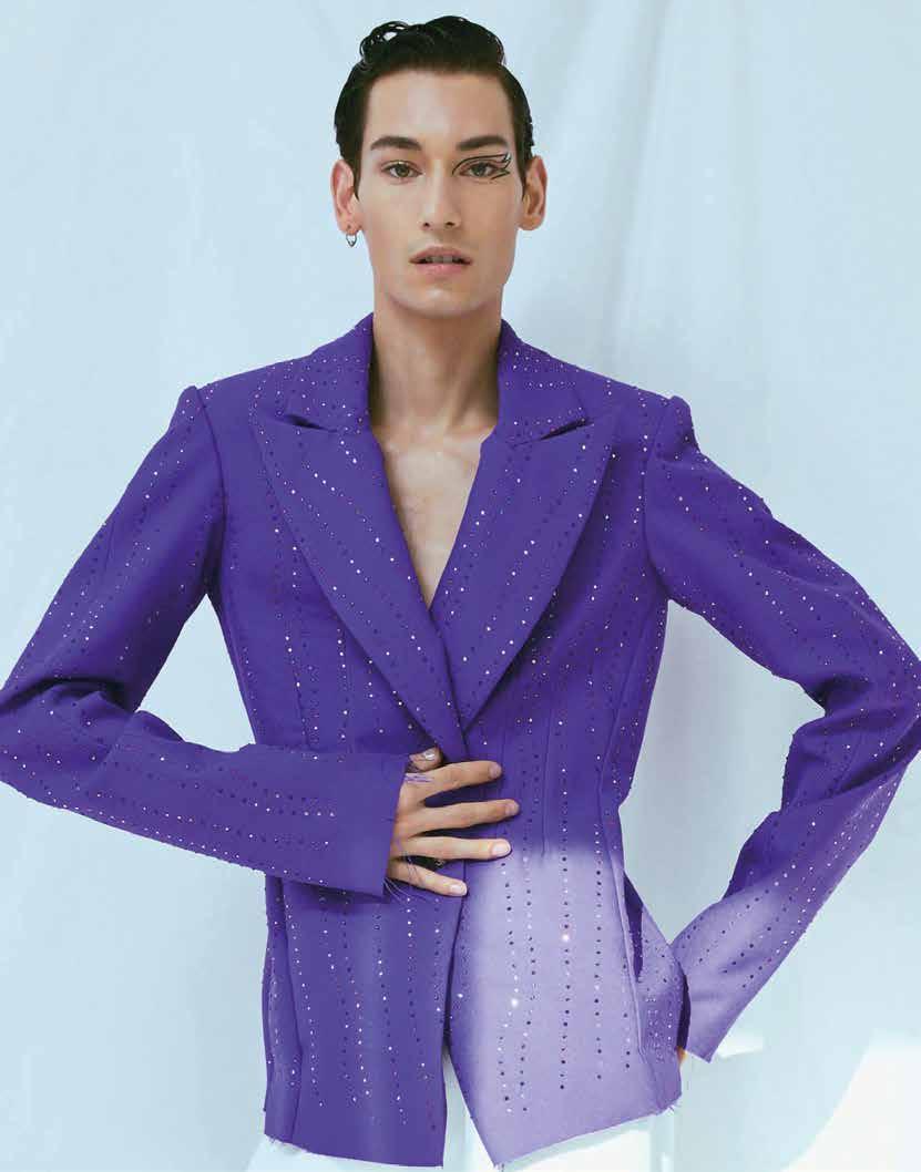
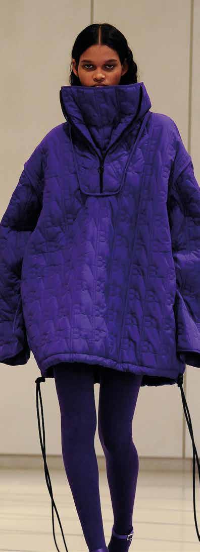
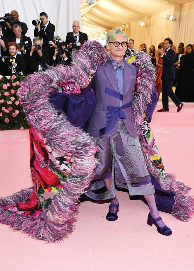
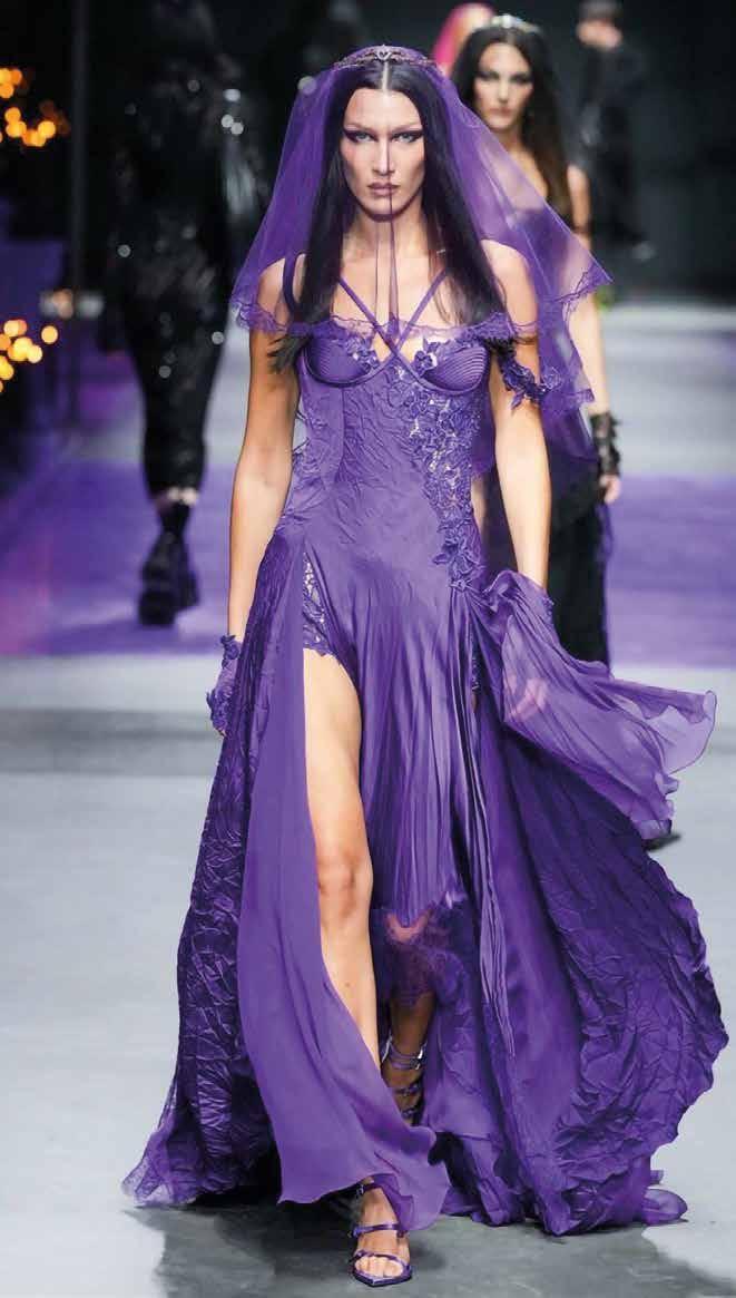
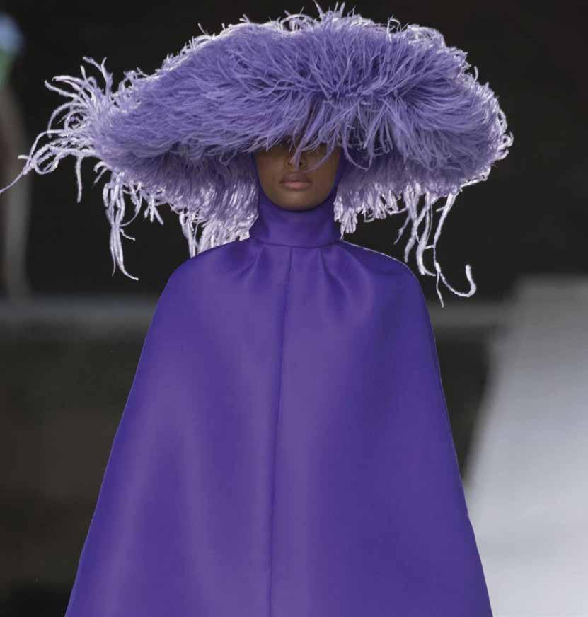
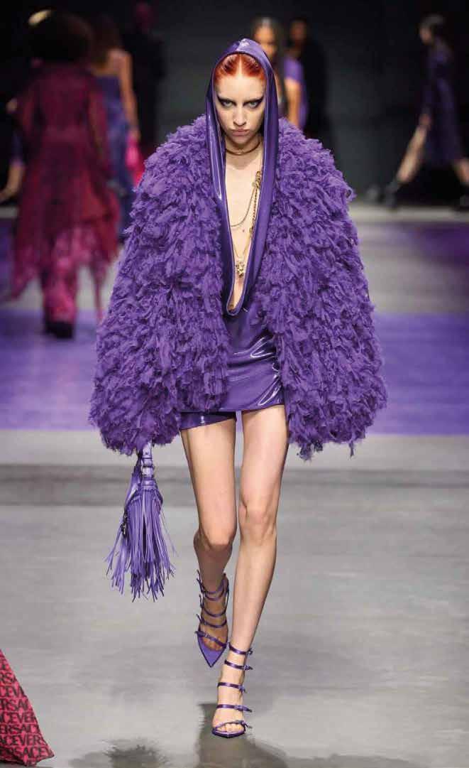
Paris est toujours une bonne idée and it is indeed in Paris, for MAISON&OBJET 2023, that Londonart has decided to present the new Tale Books: Kimono collection, the project conceived by Nicola Bottegal, Art director and CEO of the company. Precious subjects inspired by the East; golden backgrounds and vivid colours for the precious and innovative collection. This new issue of the MAG, which is increasingly a universal container covering all shades of beauty, features, in addition to the wallpapers, many new contents. Starting from interior design and architecture, you will find homes with blurred boundaries in total connection with the outdoors and vegetation, where you will dream of living. We will then take you around the world to the most amazing and exclusive restaurants capable of igniting our senses and giving a touch of charm. Still on the subject of food, an interesting point on the new vision of the food system based on three macro trends dictated by the growth of climate change. In this issue #15 of the MAG you will also be seduced by fashion, starting with the colour purple, a debated and controversial hue, and continuing with the trend of the balaclava, a technical and rebellious accessory, absolute protagonist of the latest catwalks.
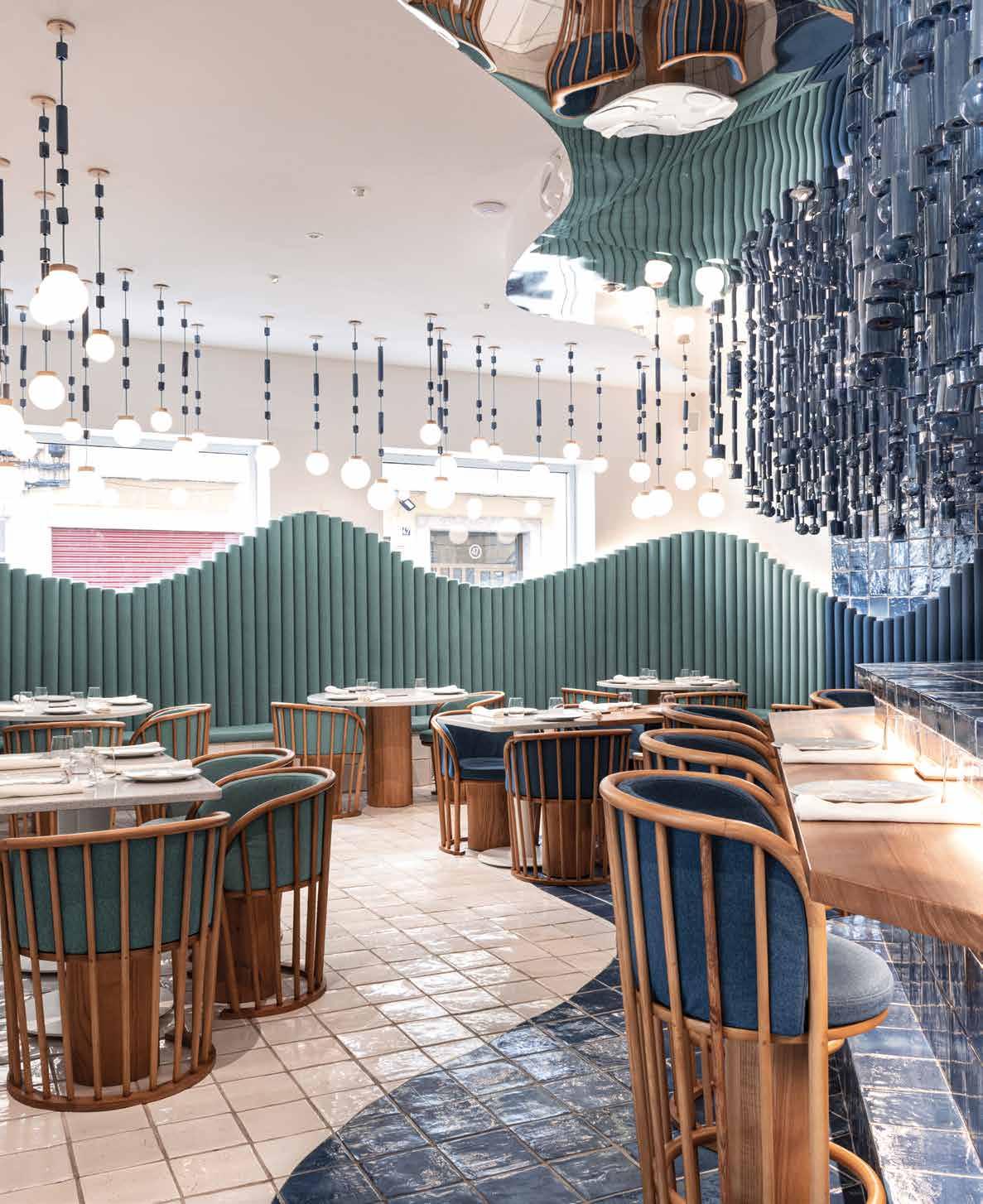
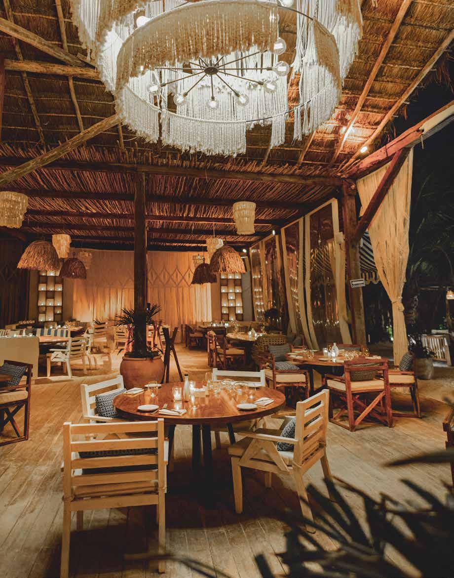
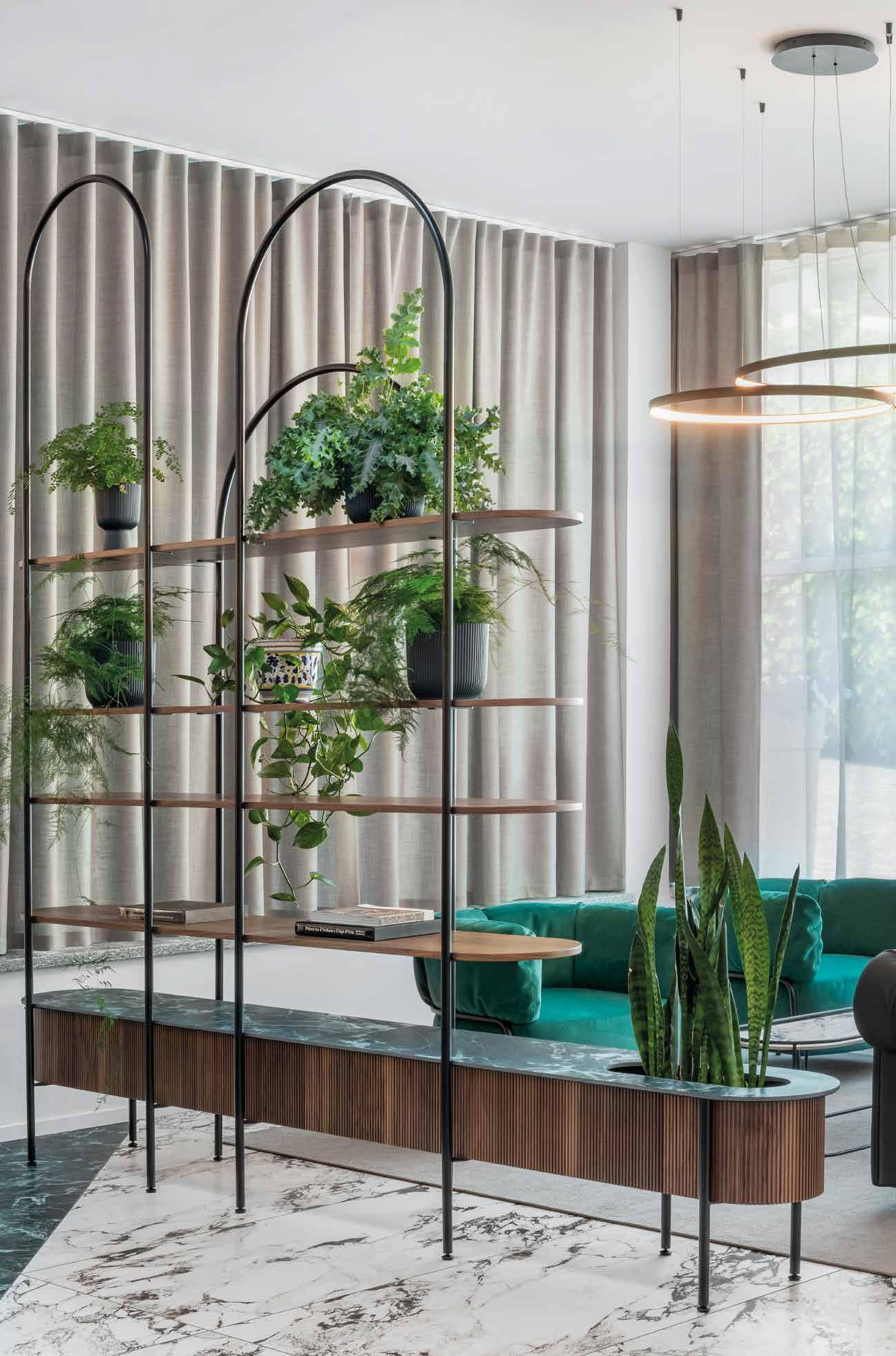
più come un contenitore trasversale capace di dialogare con le diverse sfumature della bellezza, non potevano mancare tanti contenuti inediti. Partendo dal design e dall’architettura troverete case dai confini sfumati in cui sognerete di abitare, in totale connessione con l’esterno e con la vegetazione. Vi porteremo poi, in giro per il mondo nei ristoranti più sorprendenti ed esclusivi capaci di accendere i nostri sensi e regalare un tocco di charme.
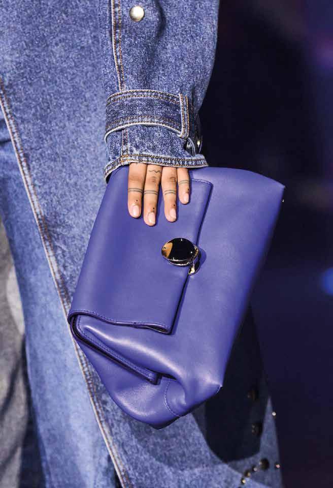
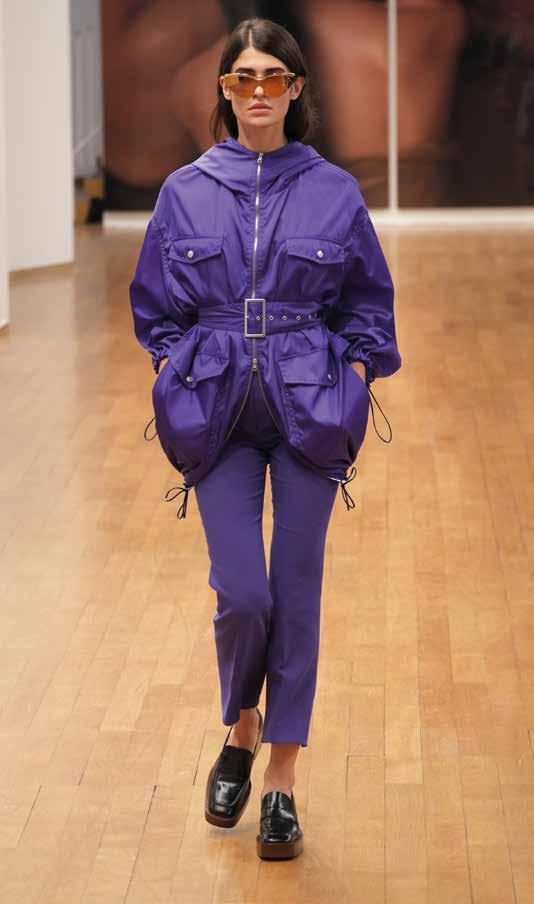
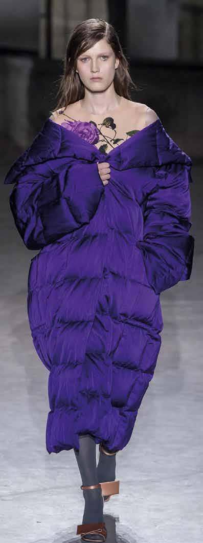
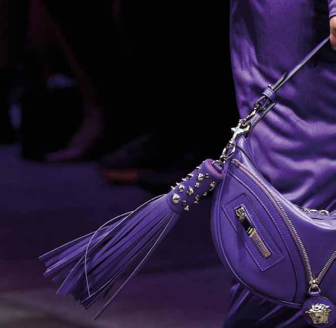
E sempre a proposito di cibo un punto interessante sulla nuova visione del sistema alimentare che si fonda su tre macro trend dettati dal crescere dei cambiamenti climatici. In questo numero #15 del MAG potrete farvi anche sedurre dalla moda partendo dal viola, colore discusso e controverso e proseguendo con il trend del passamontagna, accessorio tecnico e ribelle, super protagonista delle ultime passerelle.
ART DIRECTOR & DIRECTOR: NICOLA BOTTEGAL
EDITORIAL DIRECTOR: VALENTINA PEPE
CONTRIBUTORS:
VALENTINA PEPE MARINA JONNA, MARA BOTTINI

EDITORIAL DESIGN: RICCARDO ZULATO
HEADQUARTER IT Via Migliadizzi 18 Noventa Vicentina, Vicenza | Italy +39 0444 760565 info@londonart.it
SHOWROOM IT Piazza S. Marco 4 Milano | Italy +39 02 23175856 milano@londonart.it
SHOWROOM UK Design Centre, Chelsea Harbour Lots Road, Chelsea, London | UK +44 (0)2045473447
london@londonartwallpaper.co.uk
londonartwallpaper.com londonartwallpaper.co.uk londonart.it
Bonne lecture#whatsnew TALE BOOKS: KIMONO COLLECTION
17
#closeuptalk WALLPAPER MURALS, INTERPRETED BY CREATIVE DESIGNERS
22
#design NATURE INSIDE

62
11 36 46 70
#trend HANDS UP

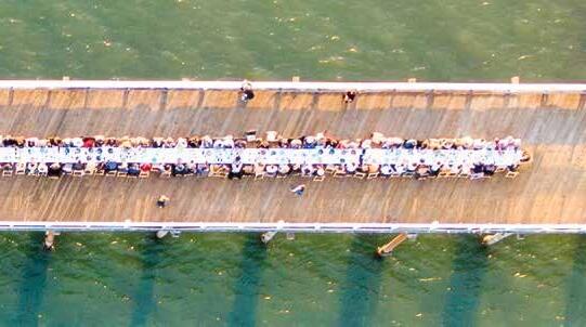
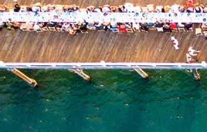
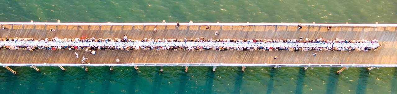
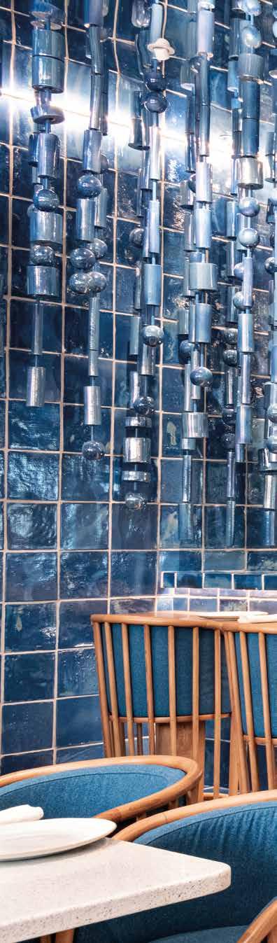
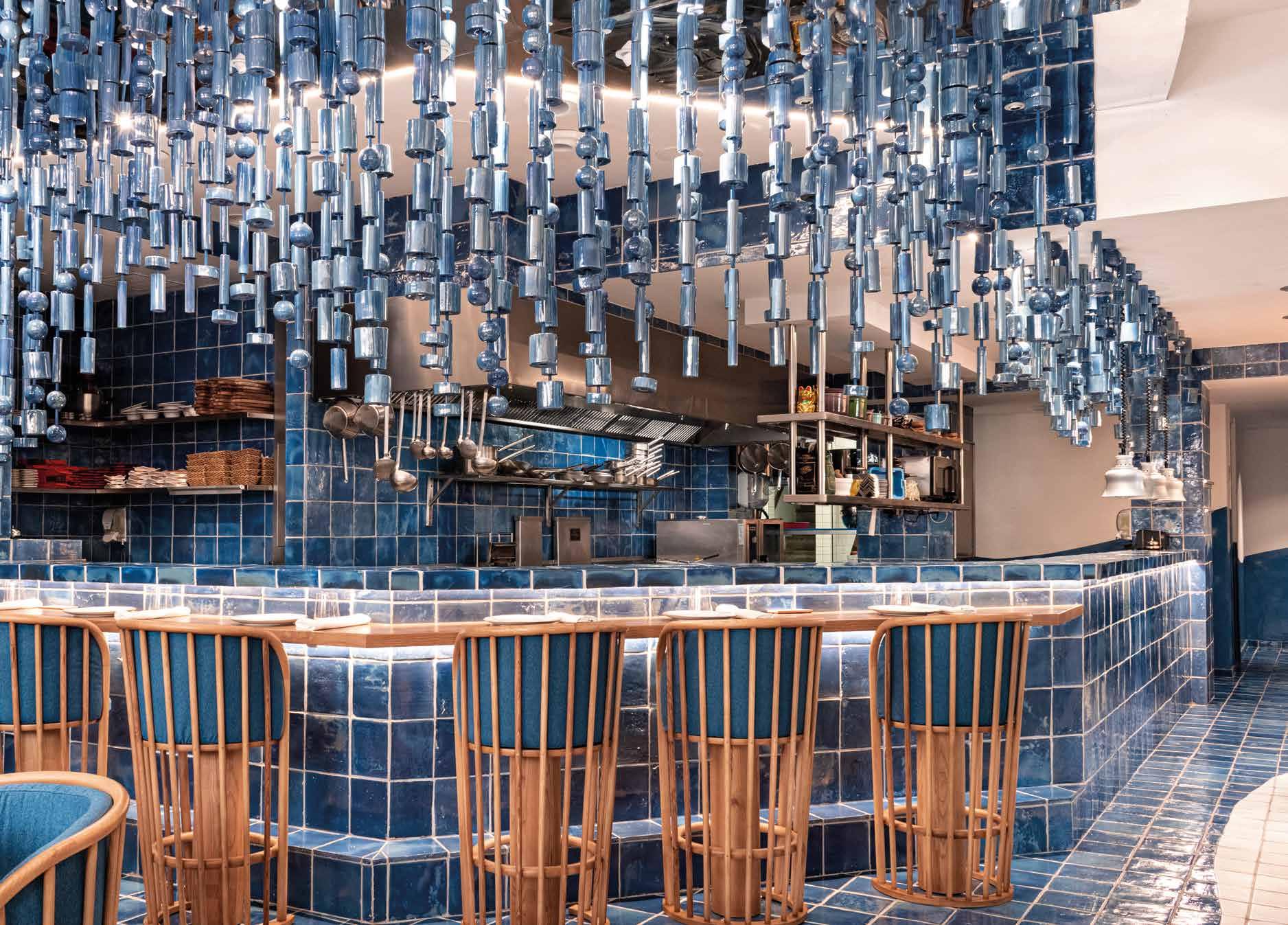
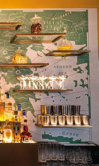
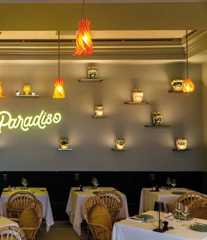
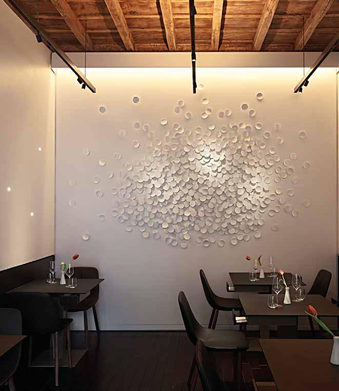
#travel DESIGN IS SERVED


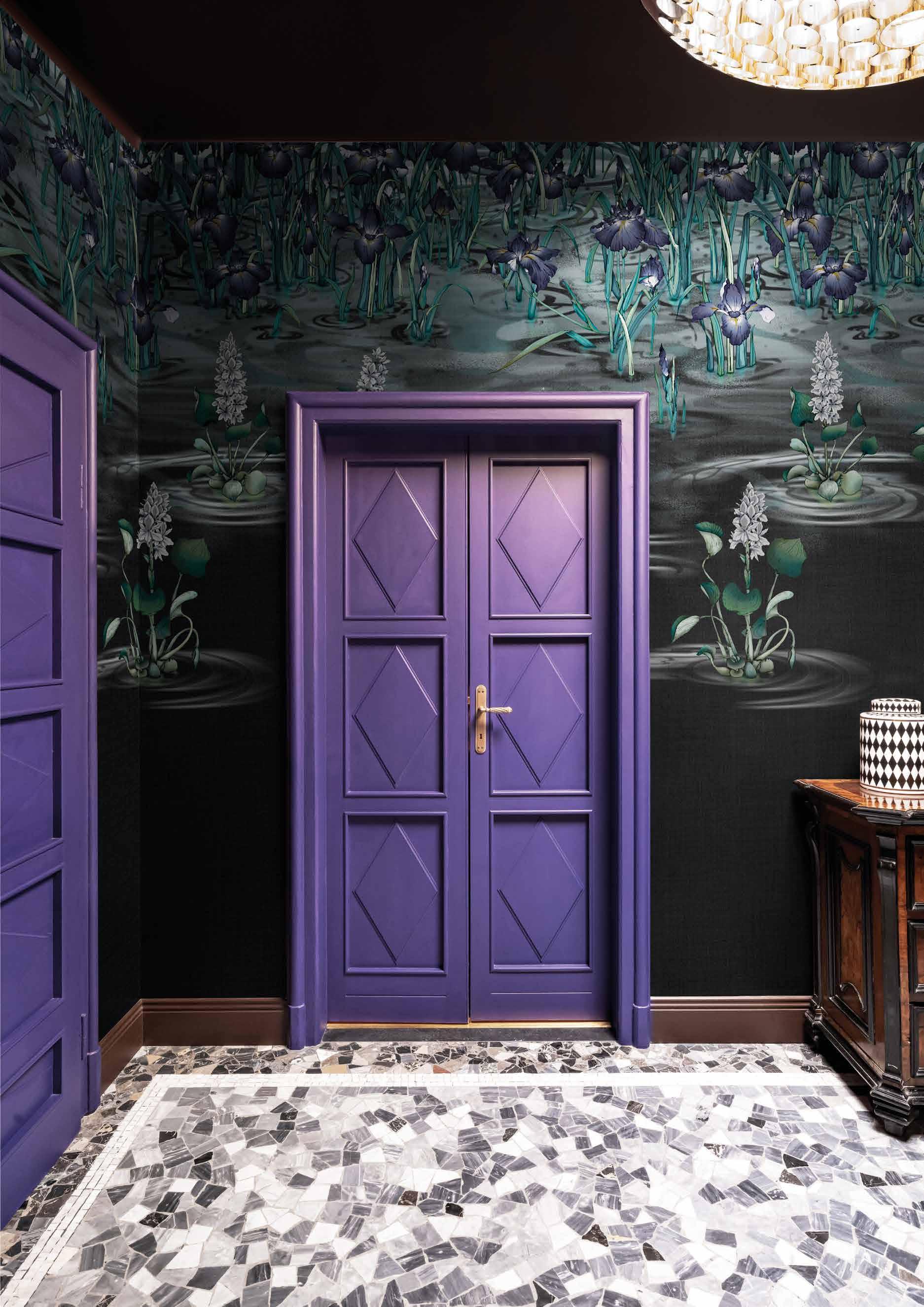
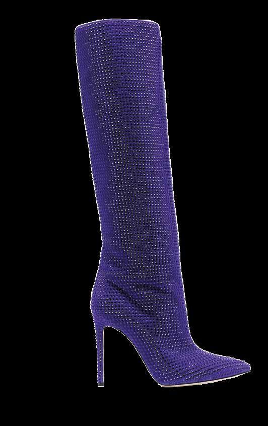
#fashion PURPLE REIGNS

#food


FUTURE ON THE PLATE

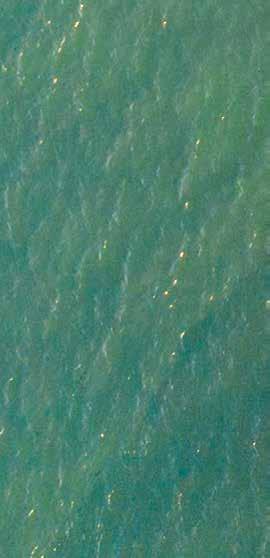
 Hakma KMN11-A
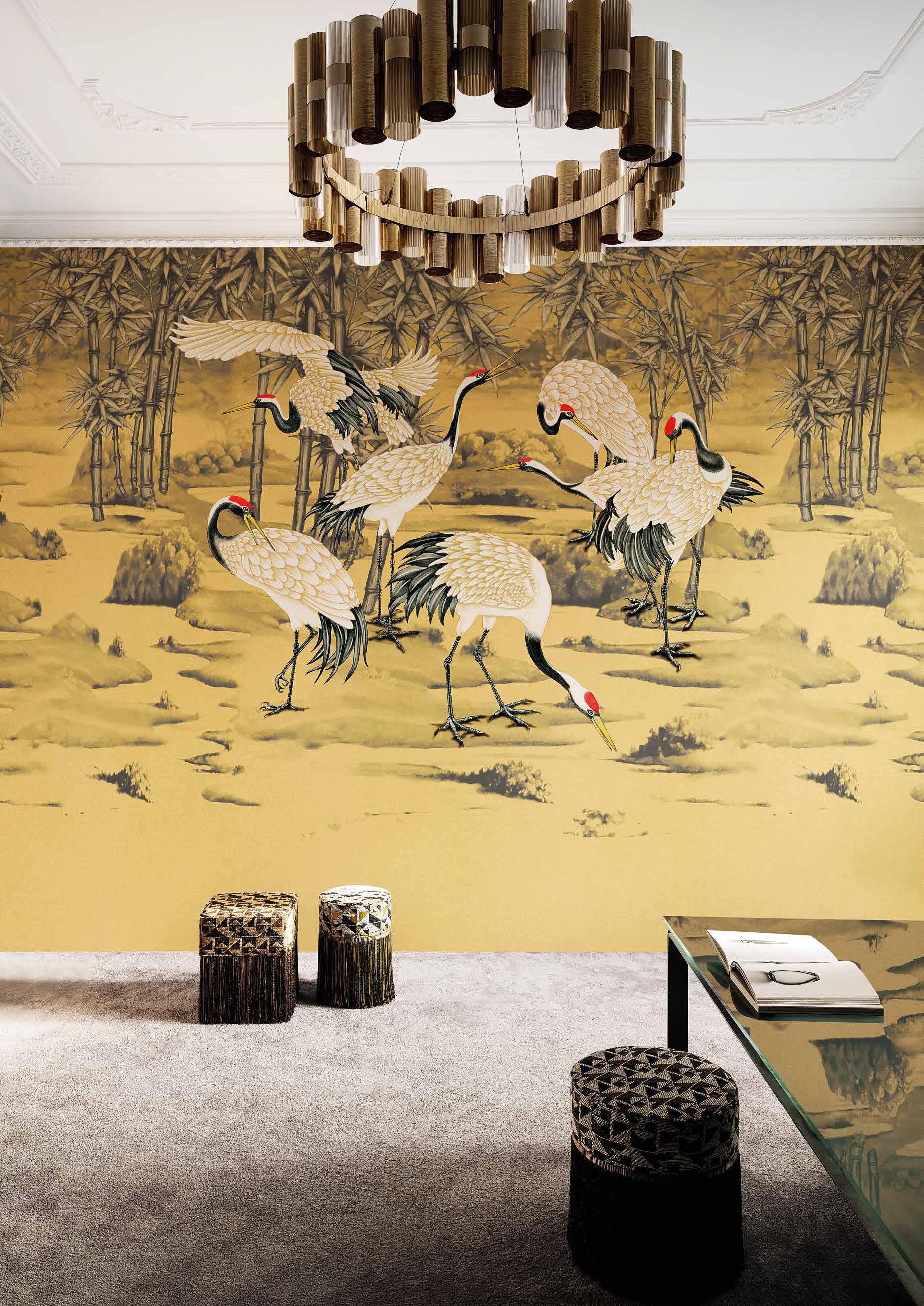
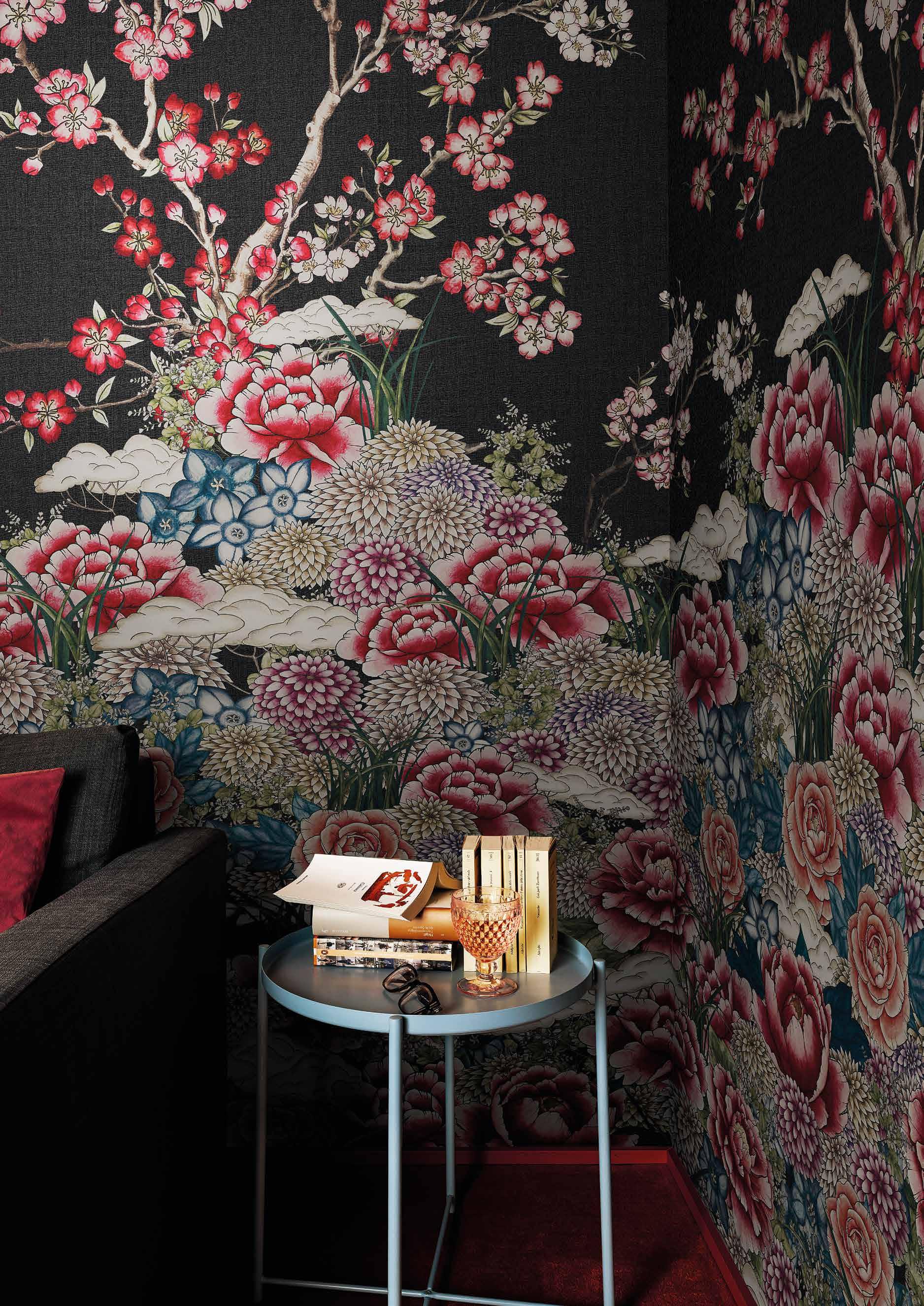
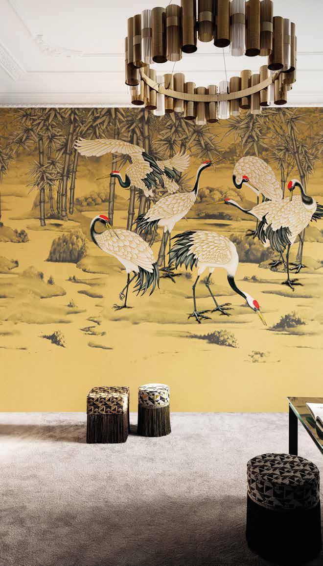
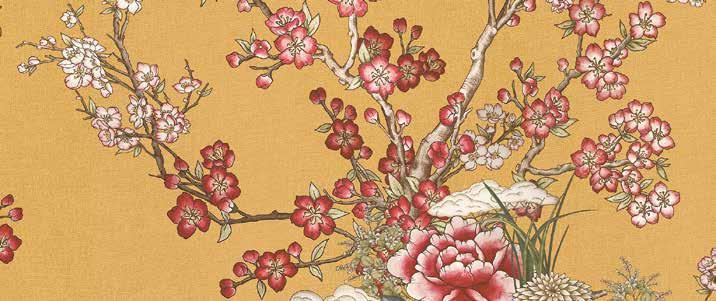
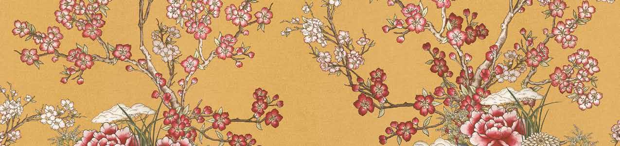
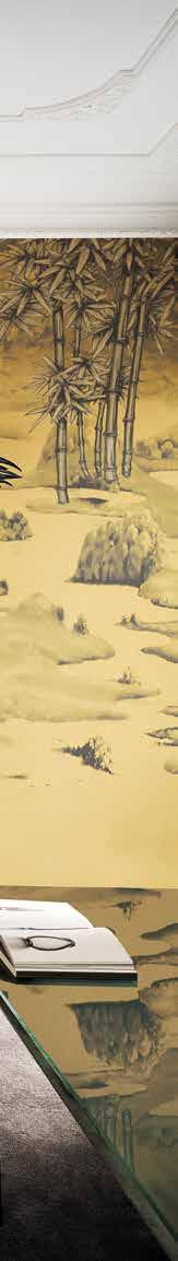
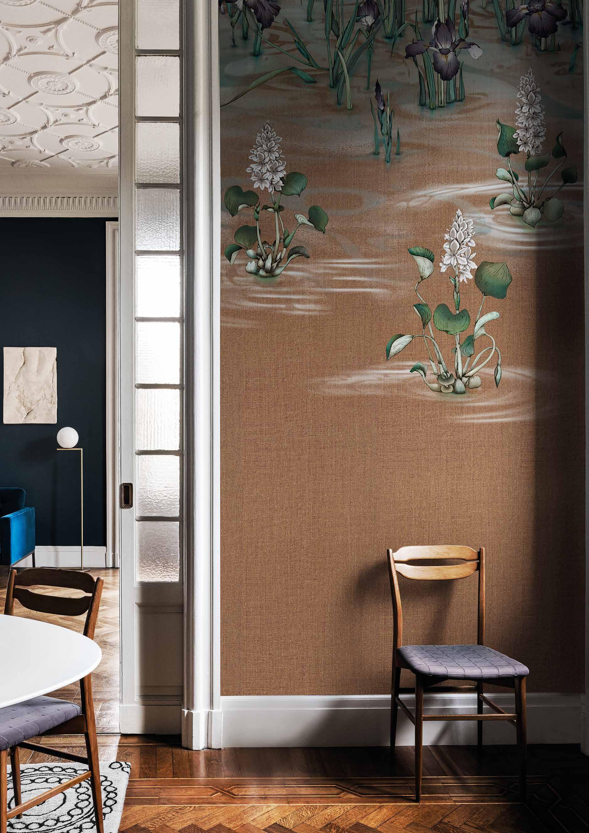
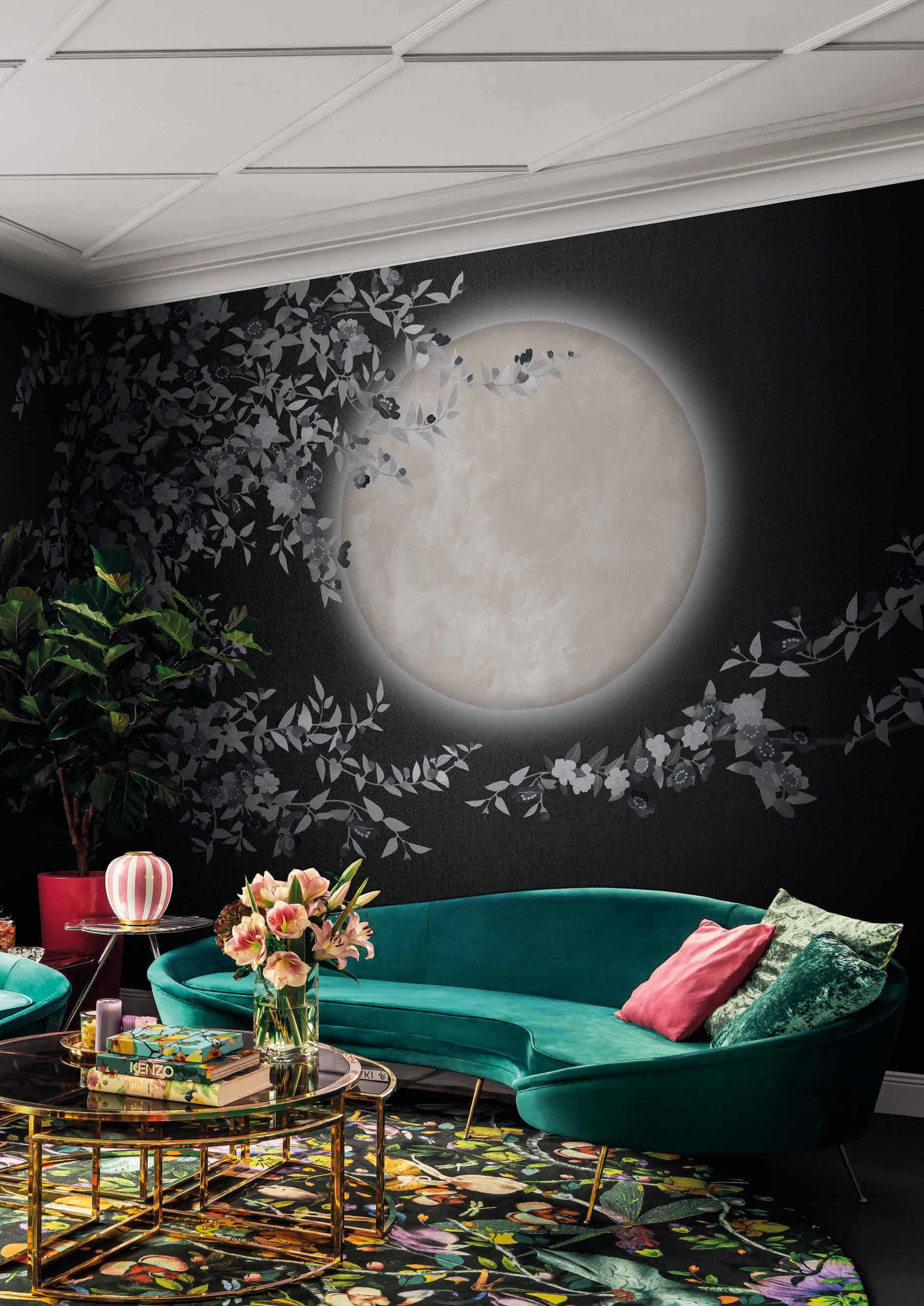
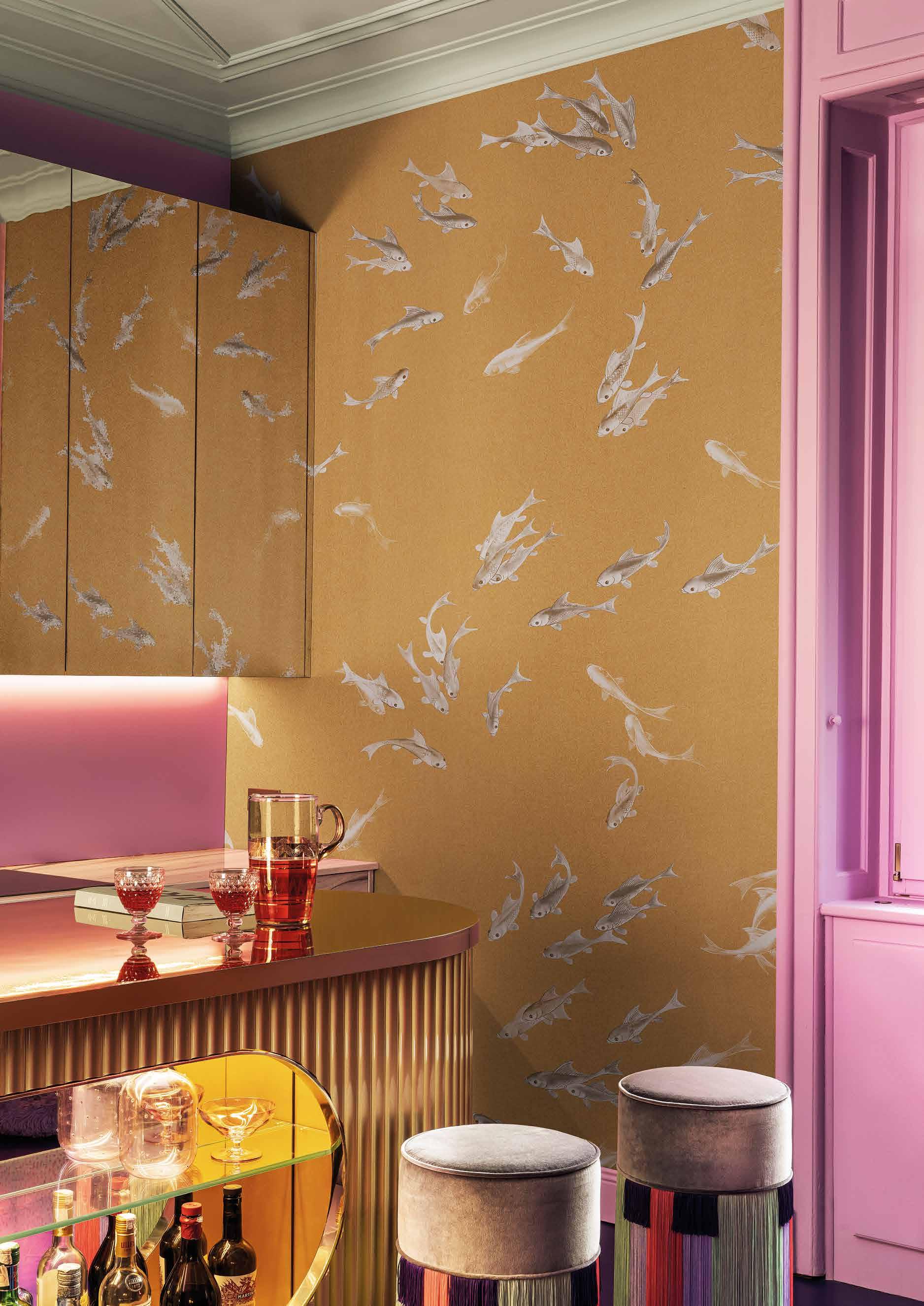
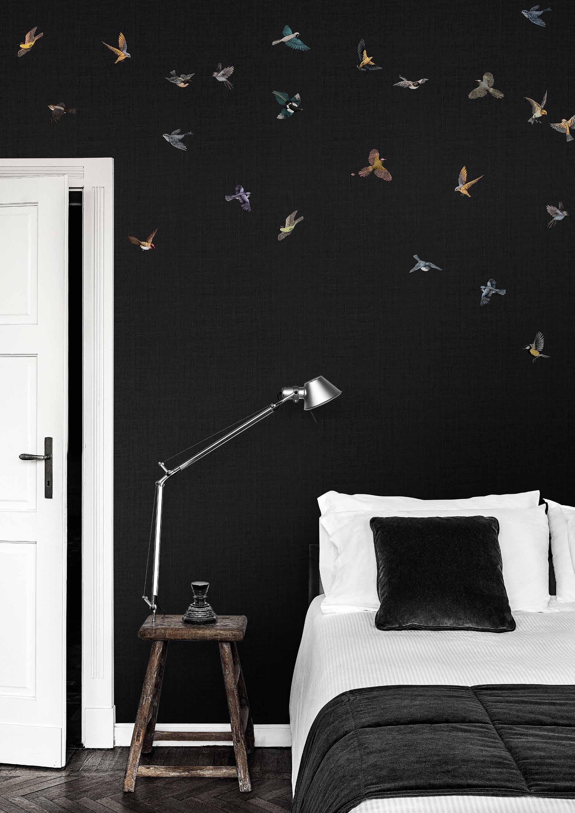
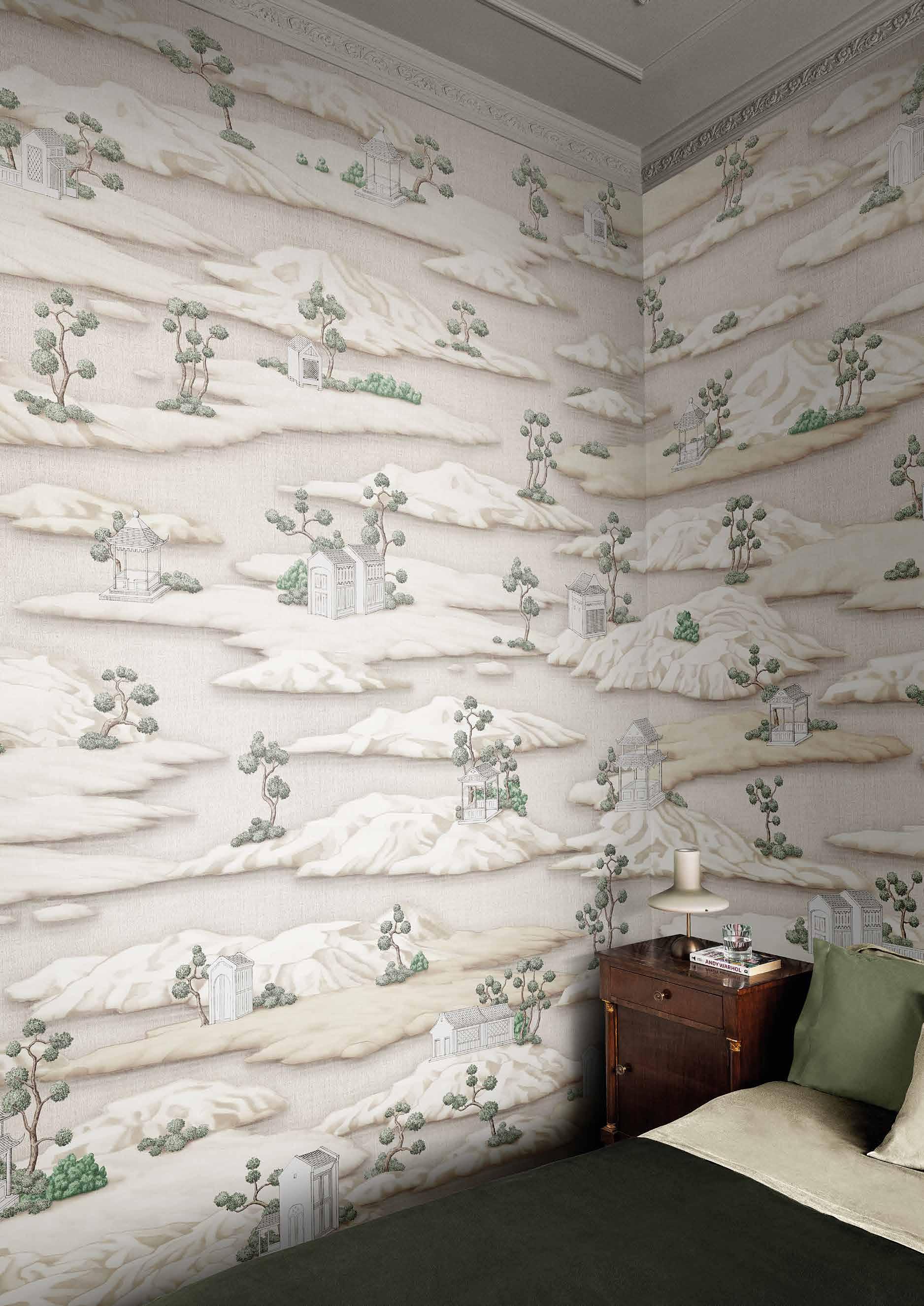
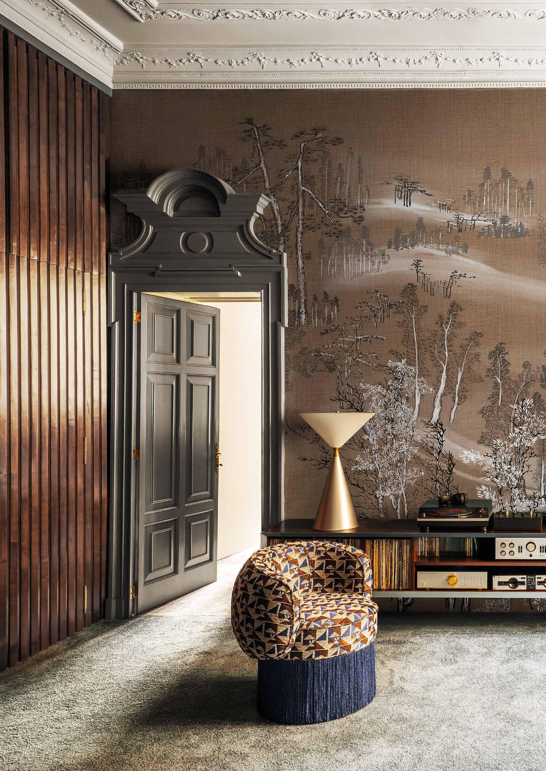
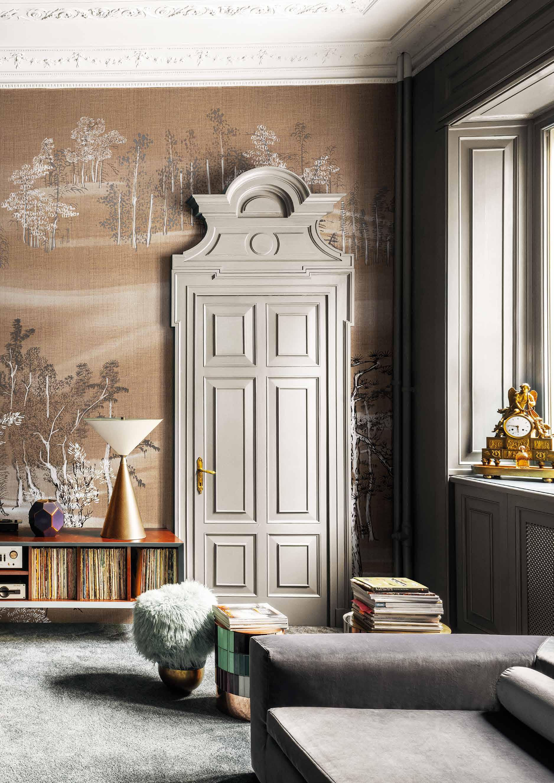
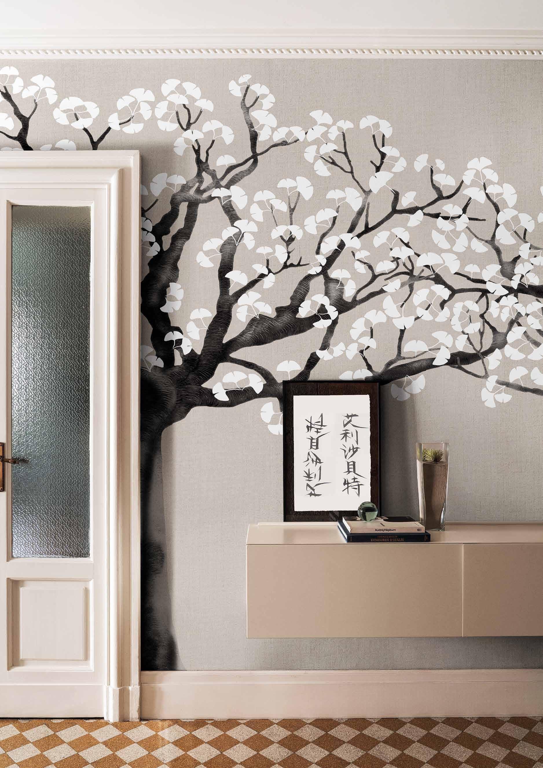
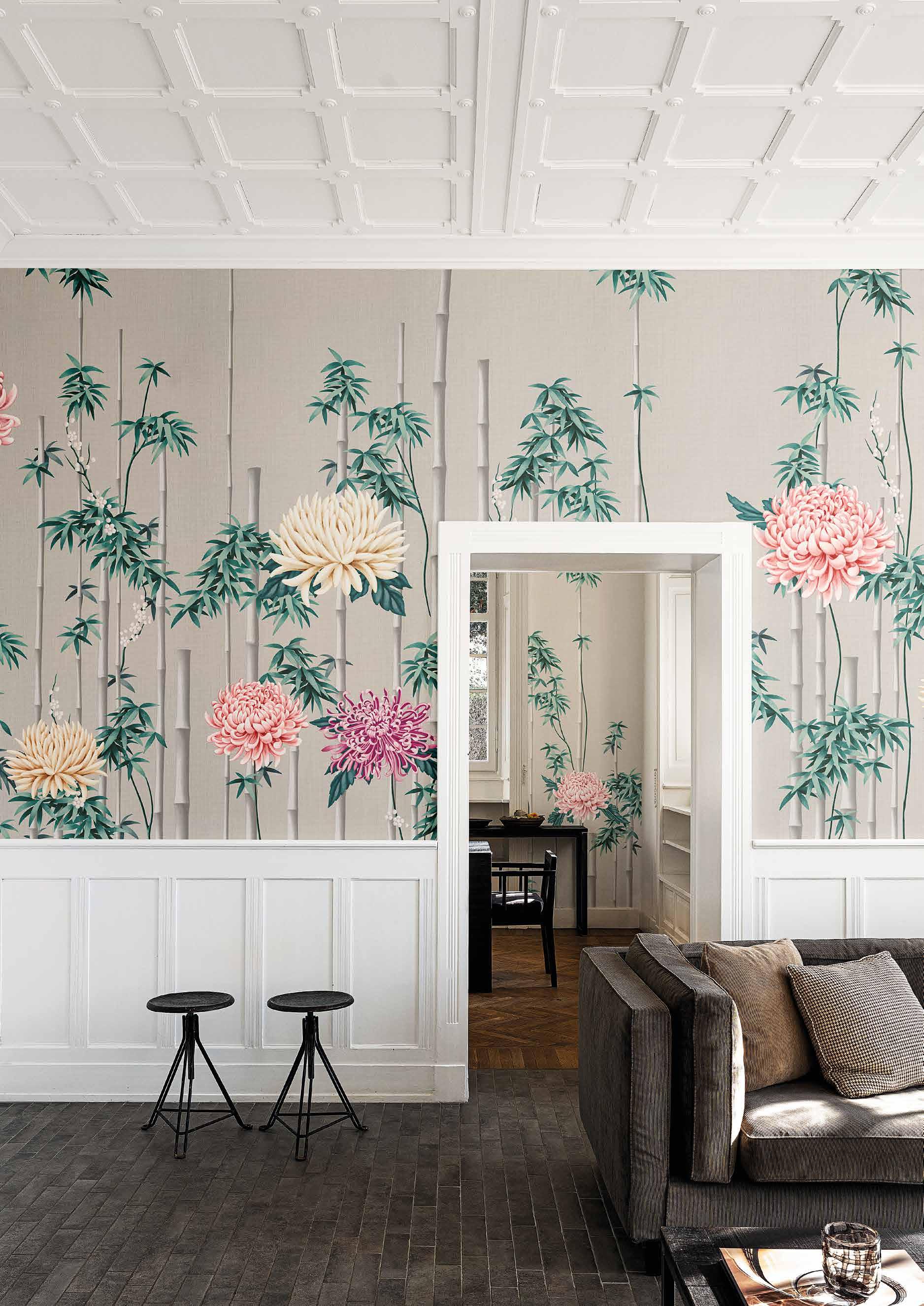
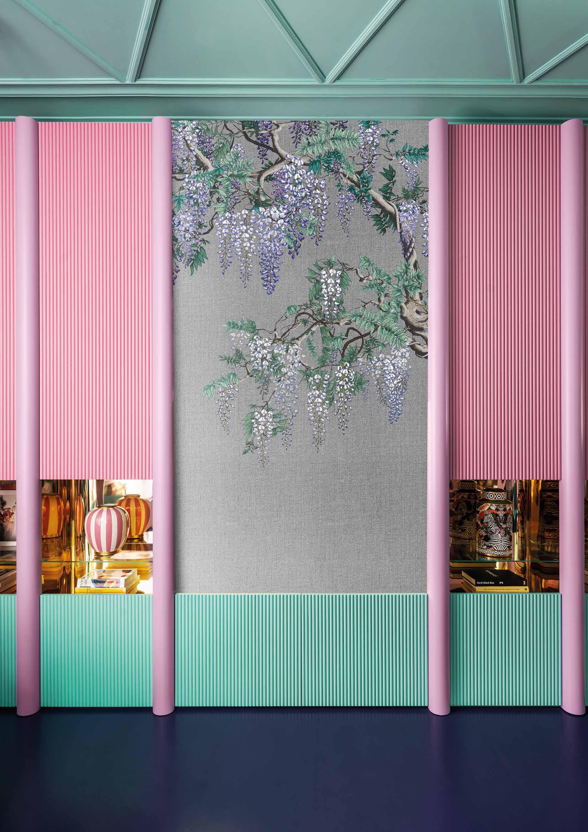
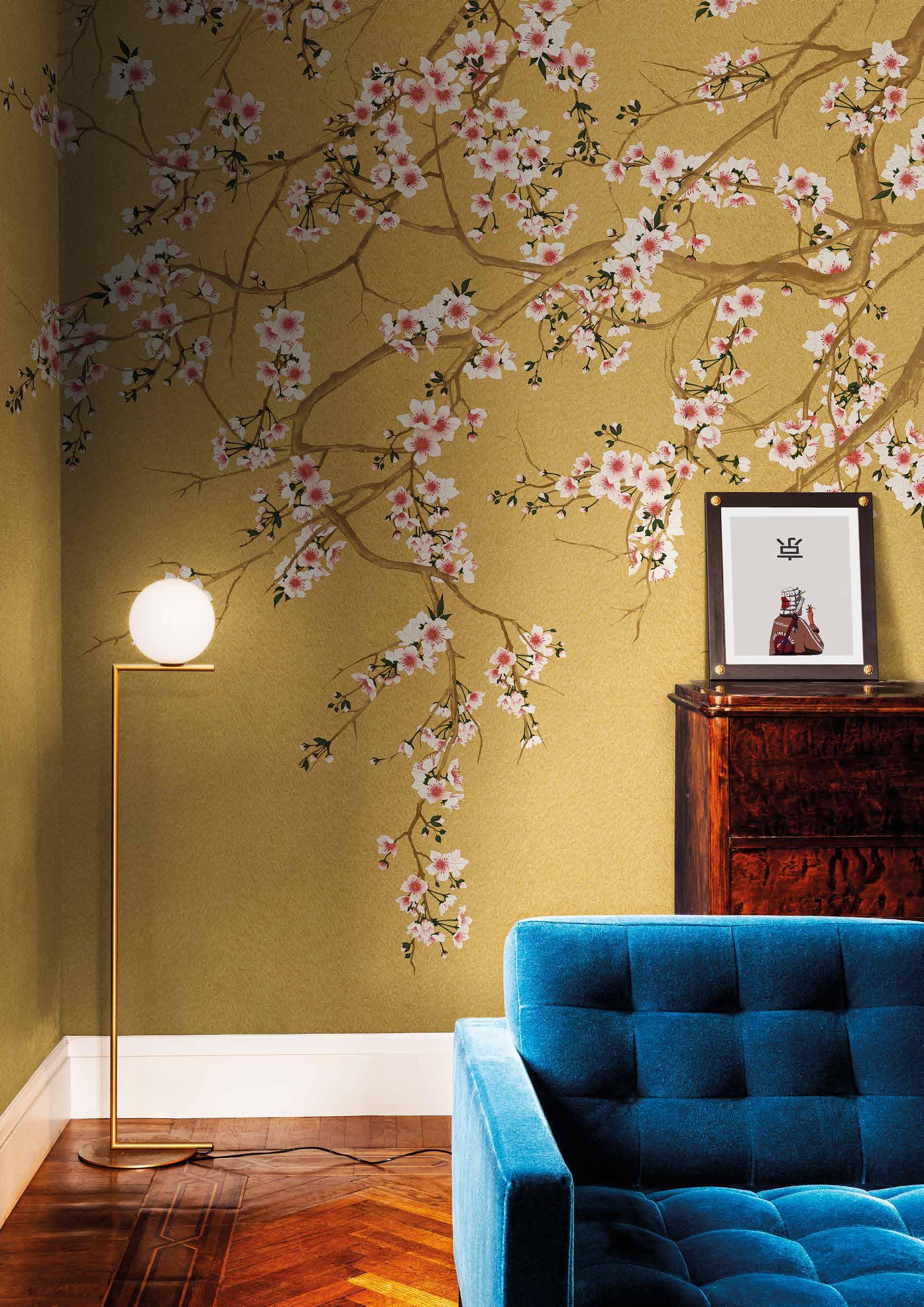
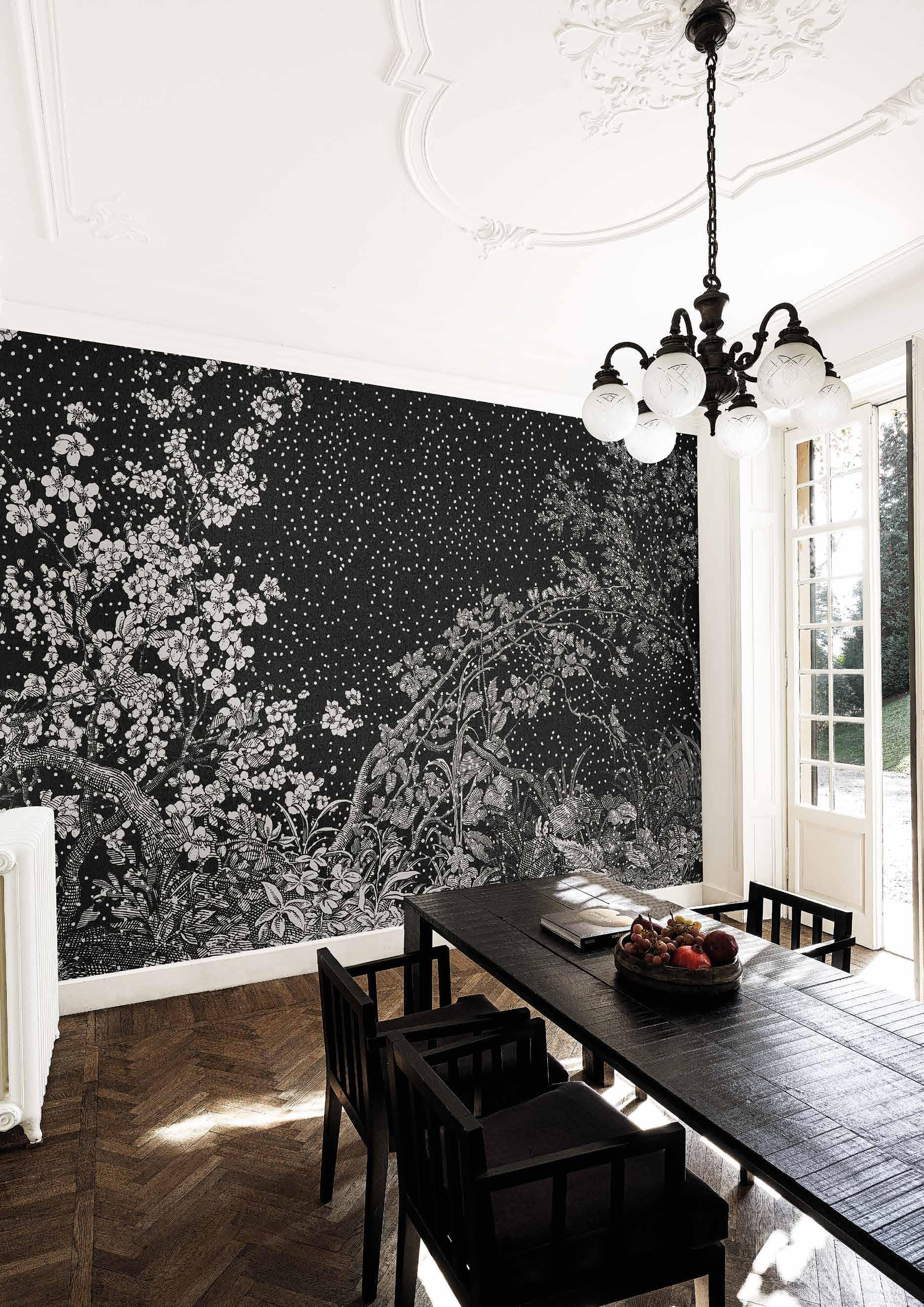
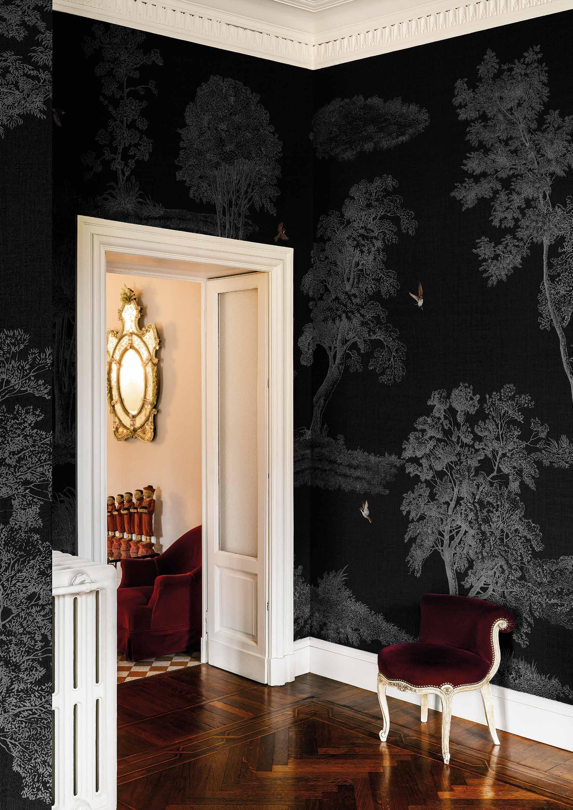
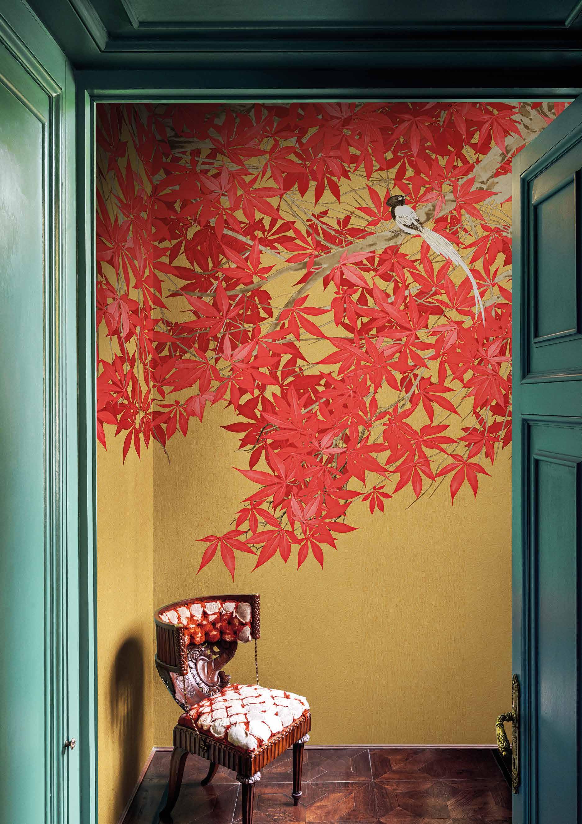
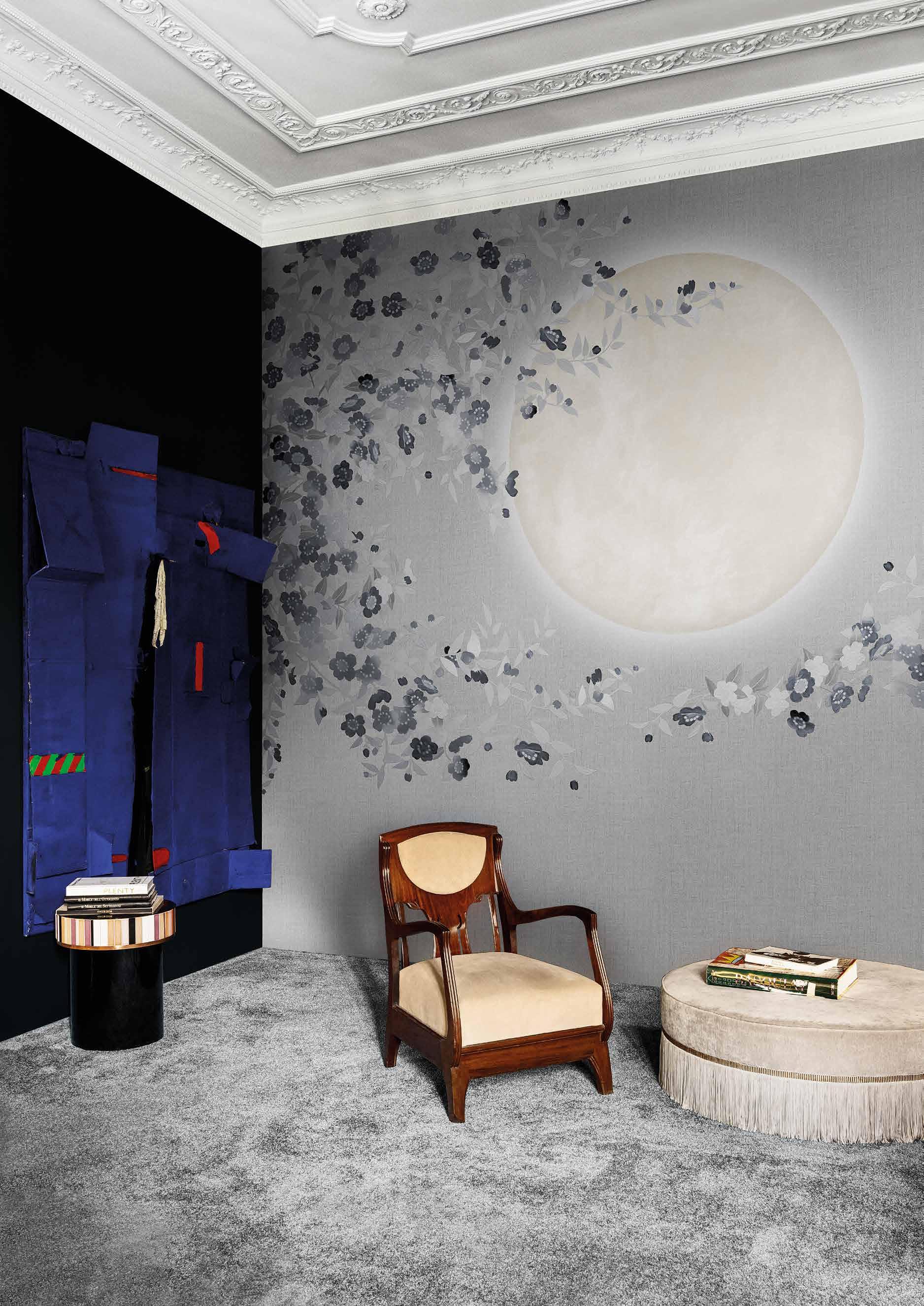
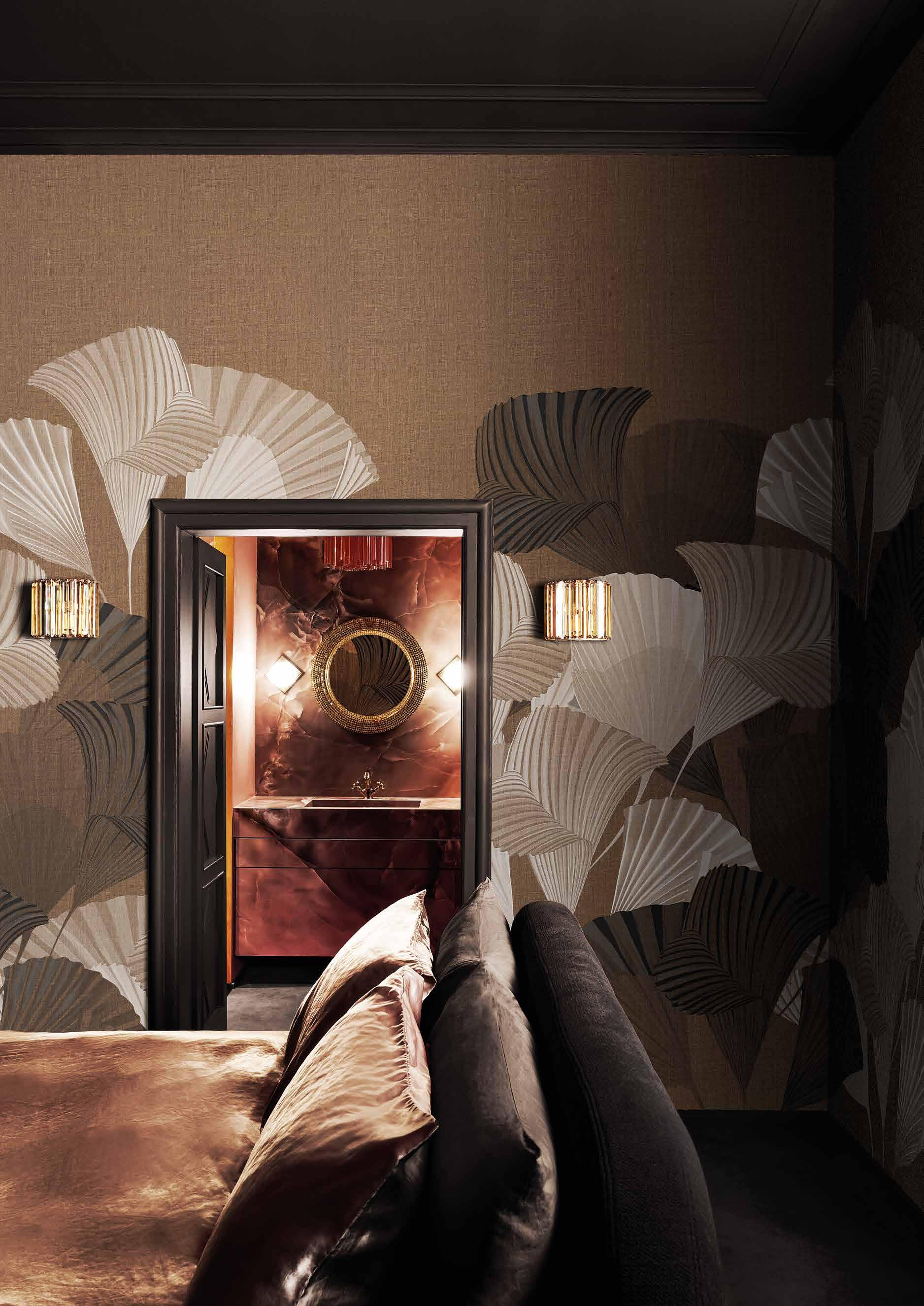
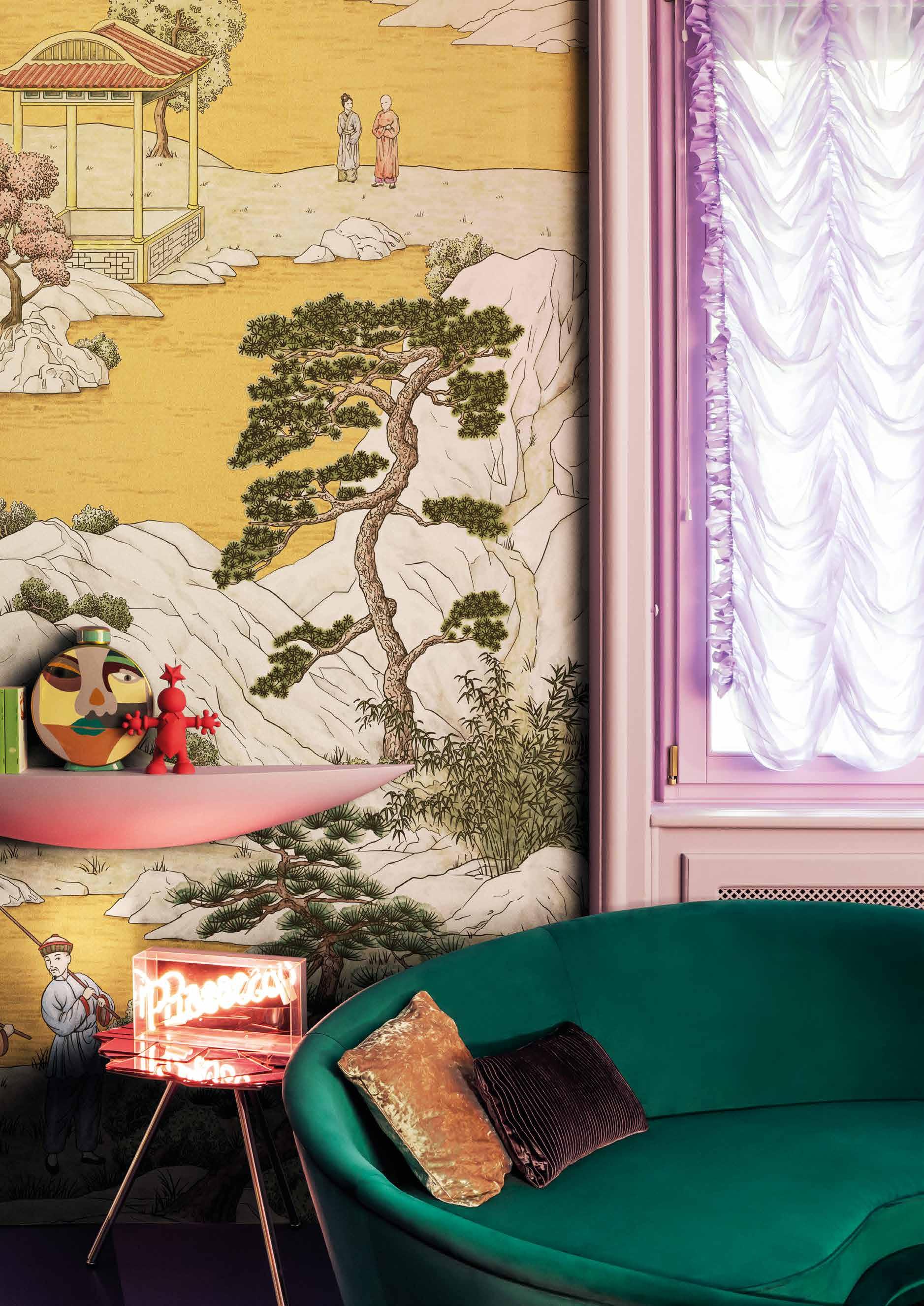
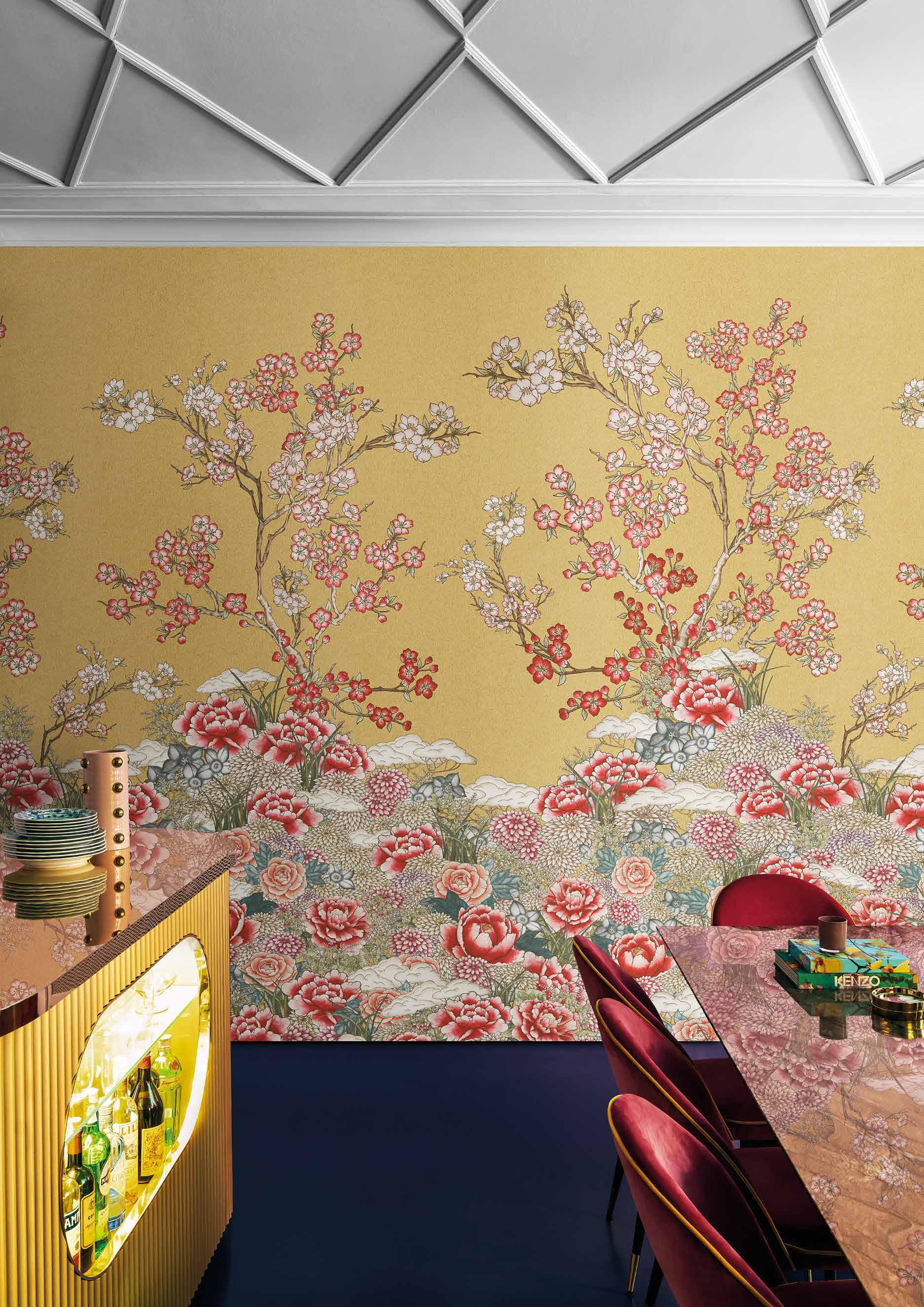
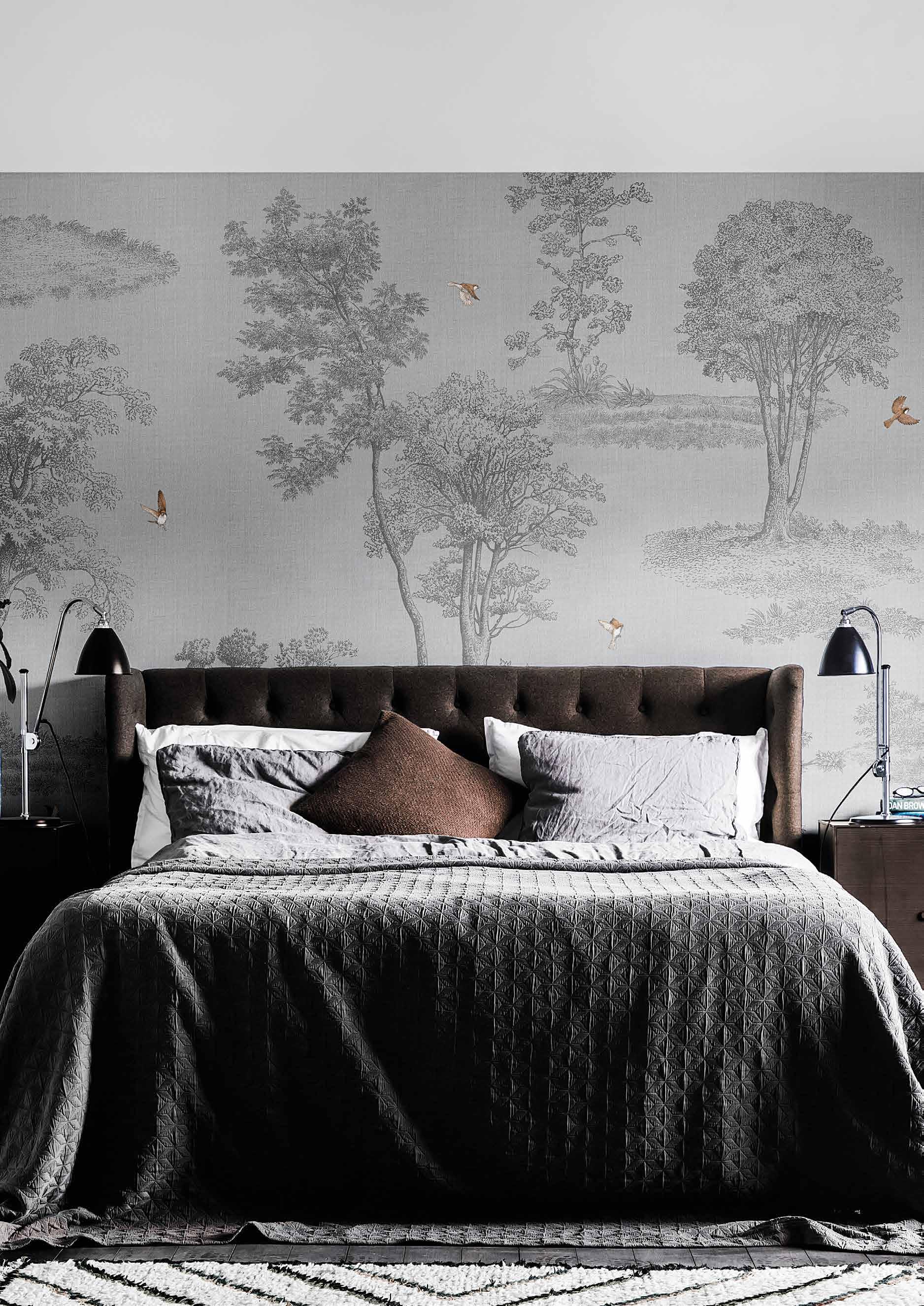
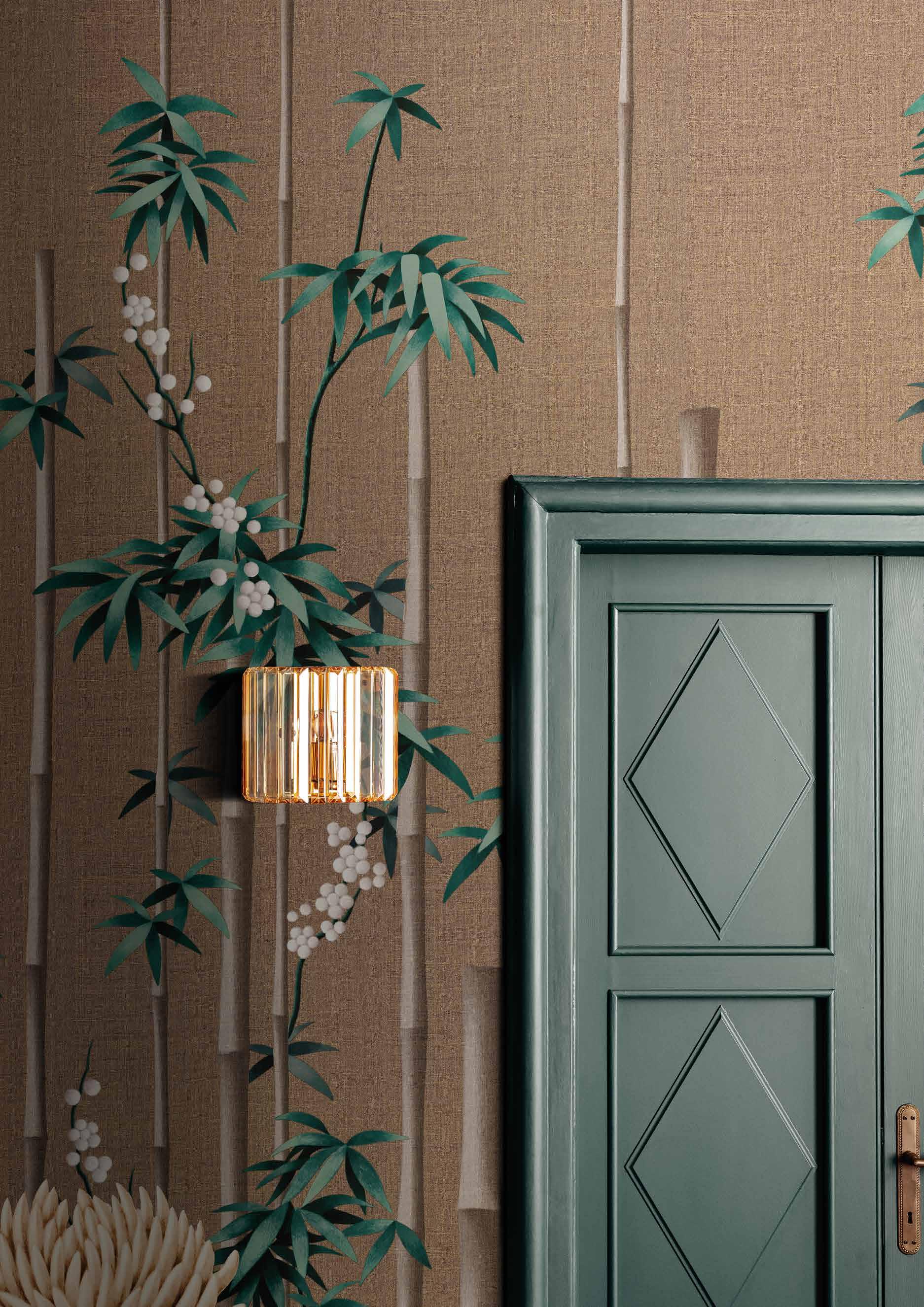
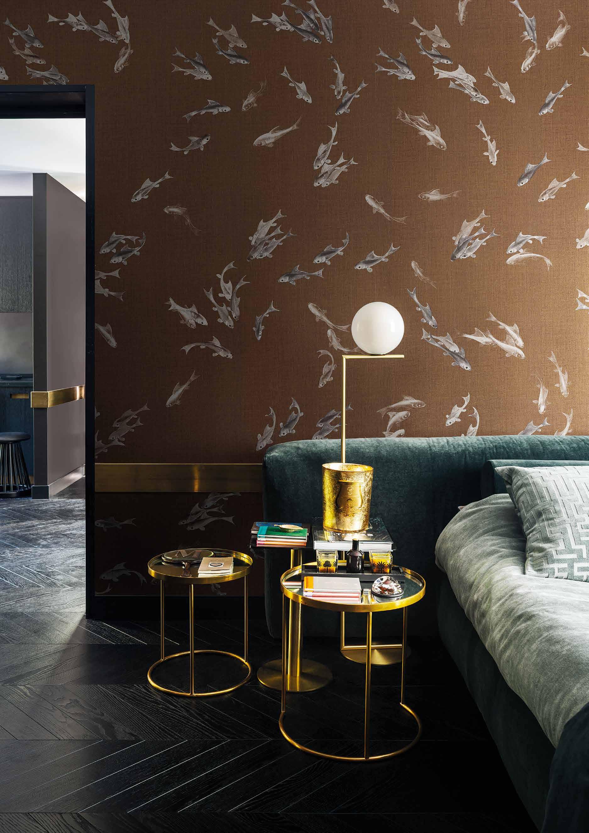
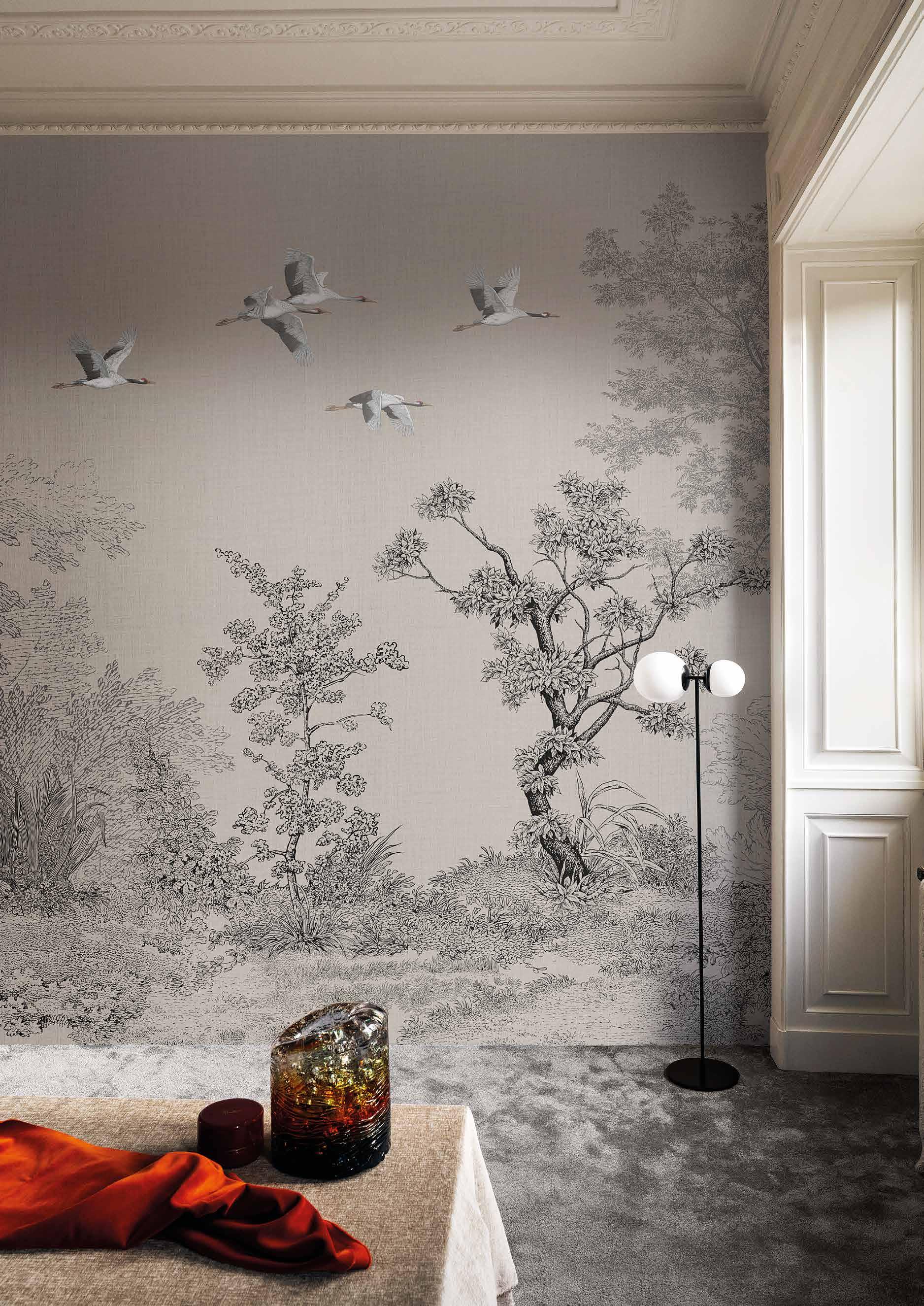
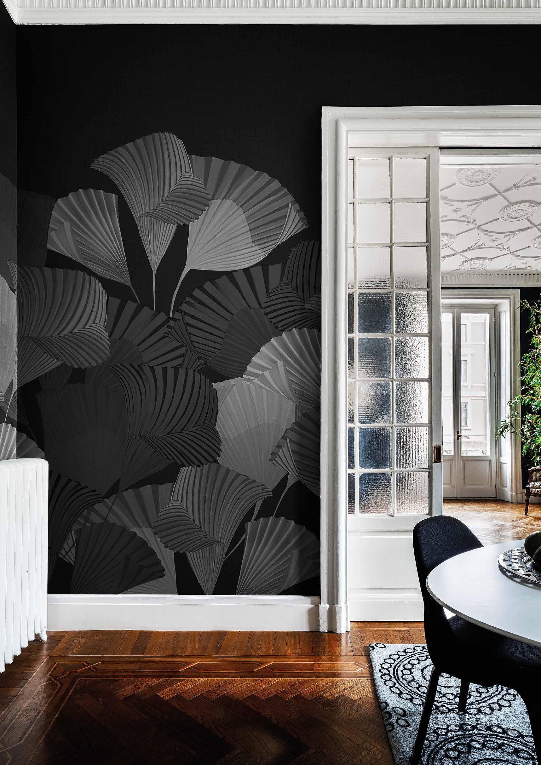
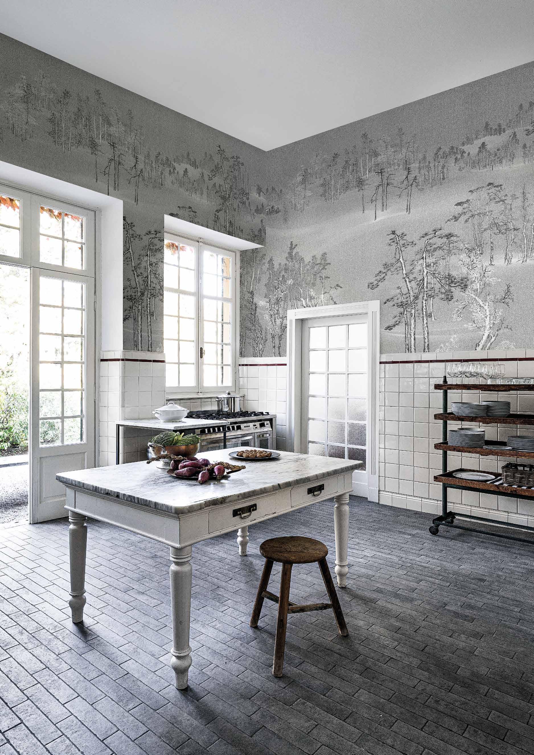
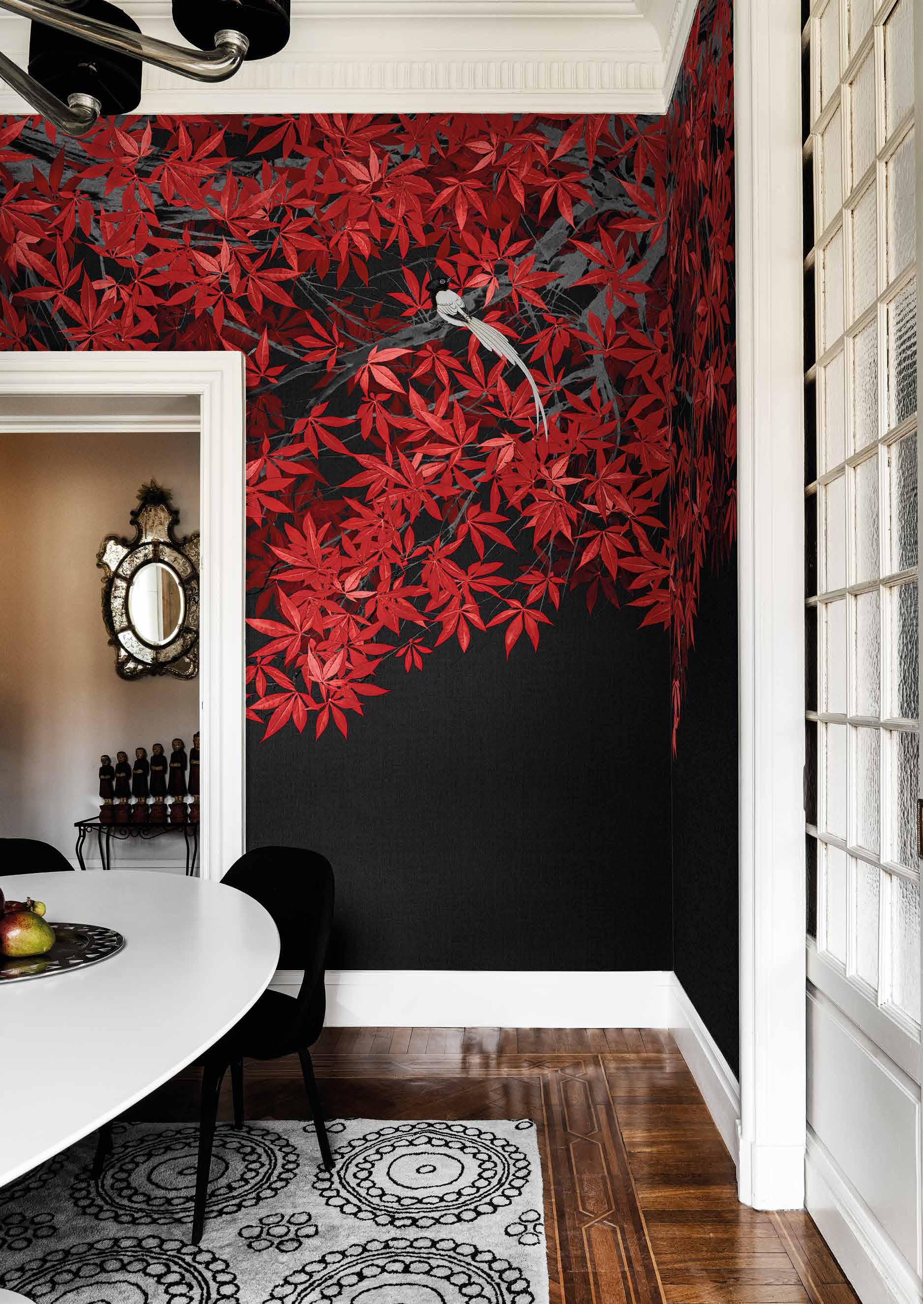
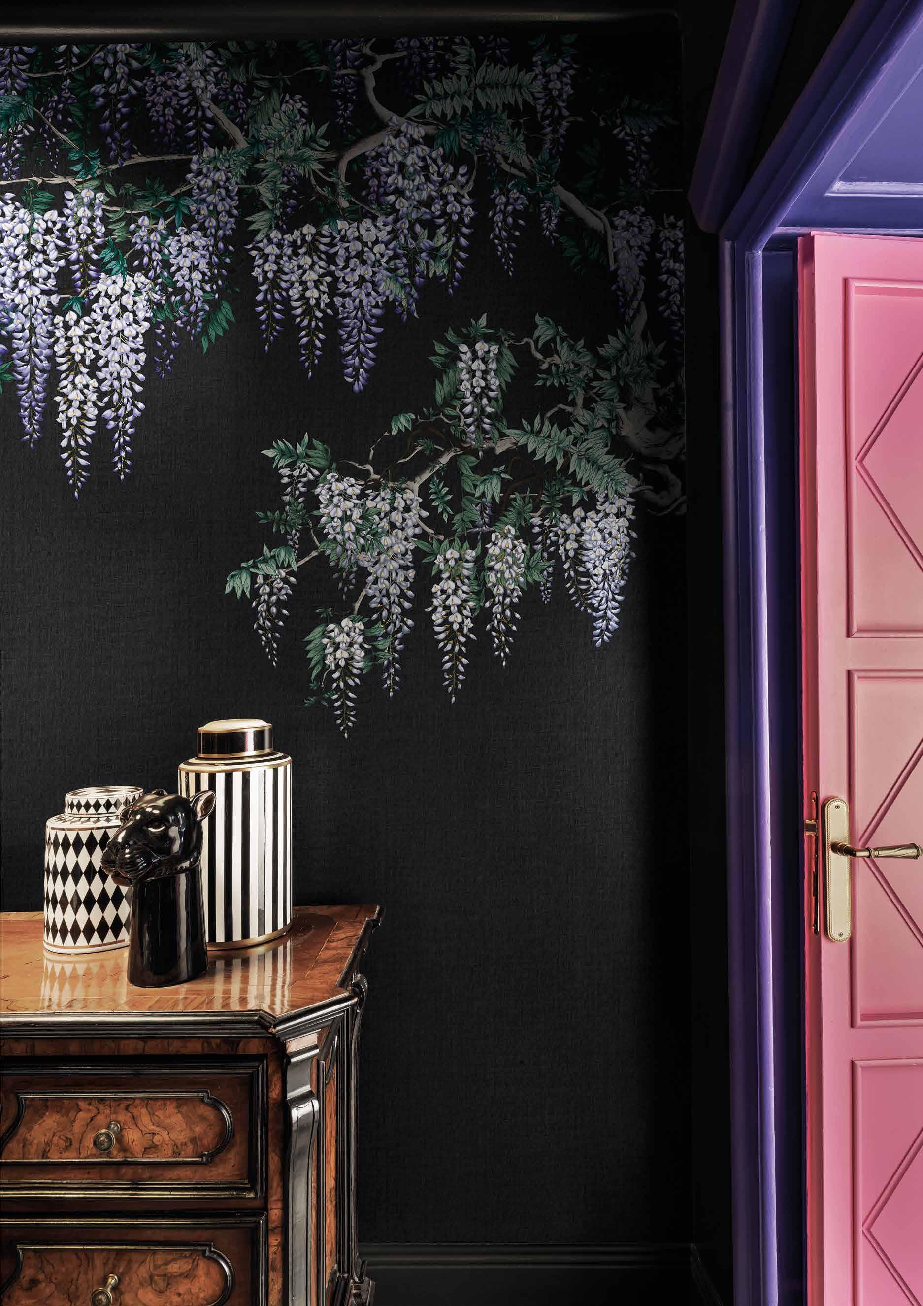
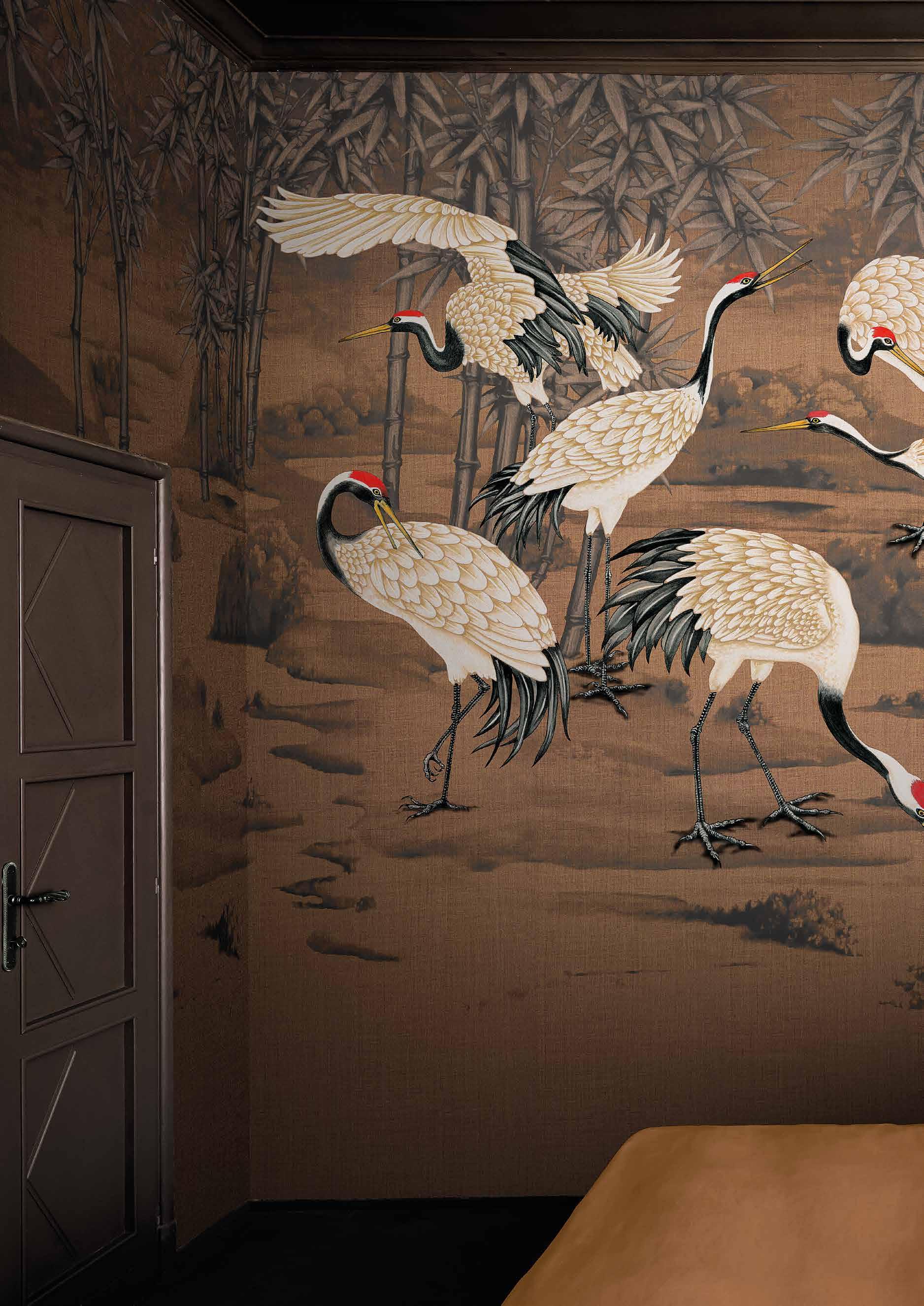
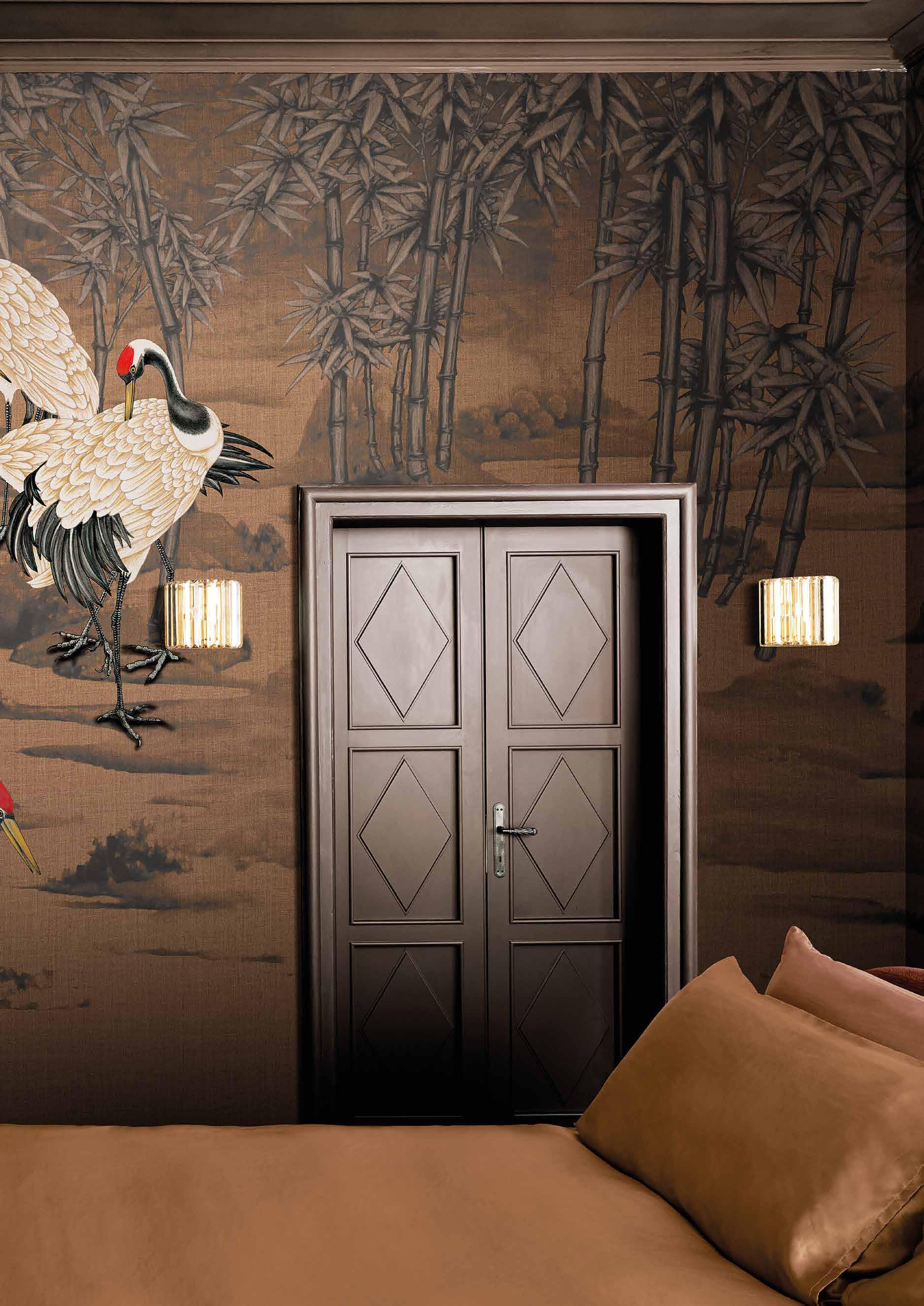
Londonart continues to explore and experiment through the new Tale Books Collections designed by Nicola Bottegal. The core of this collection is tales, travels and culture, exploring specific creative worlds. The first capsule “Kimono” is inspired by the art of fabrics, patterns, and ancient screens. These artworks can involve the senses in a new aesthetic experience, to light up the atmosphere with splendour and elegance. The result of the reinterpretation of centuries of decorative art, essential and yet full of details, Tale Books Collection recreates decorative surfaces that embellish the places they inhabit, offering, in the case of Kimono, glimpses of Japanese life, of the tradition and evocative and imaginative creativity that this world enshrines. The printing of this fine Tale Books collection is the result of two different printing technologies. Gold, silver, caramel, white and black hues, are the background to the precious and extremely detailed hand-made designs. Protagonists of this collection are the traditional elements of Japanese iconographies, such as Cherry Blossom branches, Bamboo, Wisteria, a stolen landscape, waves and Herons. An Oriental-style palette of possibilities ready to create atmosphere and chiaroscuro effects, in an alternation of strokes that accentuate its three-dimensionality. The “optimistic” bright and vivid colours chosen, like red, bright purple, blue, and green, enrich this collection, a triumph of precious details, inspired by Eastern wisdom.
Londonart continua ad esplorare e sperimentare attraverso le nuove Tale Books Collection ideate da Nicola Bottegal. Una raccolta di racconti, di viaggi e di culture è al centro di queste collezioni, che esplorano emisferi creativi ben precisi. La prima capsule “Kimono” è ispirata all’arte dei tessuti, ai pattern e ai paraventi antichi giapponesi. Opere in grado di coinvolgere i sensi in una nuova esperienza estetica, per accendere di bagliori ed eleganza le atmosfere. Frutto di una reinterpretazione di secoli di arte decorativa, essenziale e al contempo piena di dettagli, Tale Books Collection ricrea superfici decorative che impreziosiscono i luoghi che abitano, raccontando nel caso di Kimono, scorci della vita nipponica, della tradizione e della creatività suggestiva e immaginifica che
questo mondo racchiude. La stampa delle preziose carte Tale Books Collection è frutto di due diverse e innovative tecnologie di stampa. L’oro, l’argento, il caramello, il bianco, il nero, fanno da sfondo ai preziosi disegni fatti a mano che risultano estremamente dettagliati. Protagonisti della collezione sono gli elementi tradizionali dell’iconografia giapponese: il ramo di ciliegio, il bambù, il glicine, un paesaggio rubato, le onde e gli aironi. Un ventaglio orientale di possibilità pronte a suggerire atmosfere e i giochi di chiaroscuri, in un’alternanza di tratti che ne accentuano la tridimensionalità. Anche i colori che sono stati utilizzati risultano estremamente “ottimisti” il rosso, viola acceso, blu, il verde arricchiscono questa collezione, che diviene un tripudio di lavorazioni preziose, dal sapere orientale.
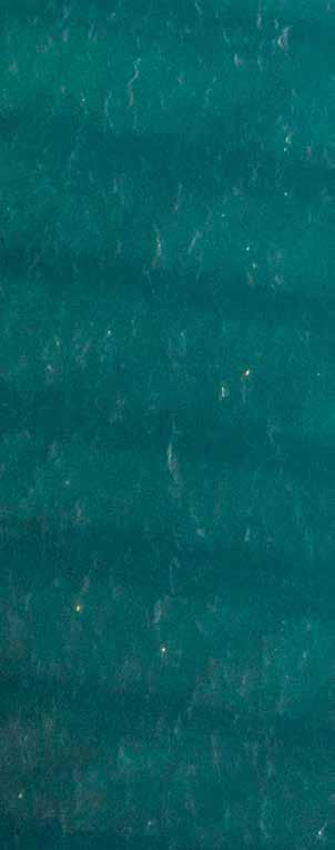
 Yuki KMN16-C
Wallpaper murals, interpreted by creative designers
NICOLA BOTTEGAL
The founder of Londonart focuses on the expressive power of designer collections. From the fashion sets of Dsquared2 to the pop blow-ups of Toiletpaper

PARATI COME MURALES, INTERPRETATI DAI CREATIVI
Il fondatore di Londonart punta sulla forza espressiva delle collezioni d’autore. Dalle scenografie fashion di Dsquared2 alle gigantografie pop di Toiletpaper
LIVING №12 ⚡ 2022
CORRIERE DELLA SERA
>txt: Mara Bottini
The contemporary wallpaper exploits the expressive potential of digital printing, with results ranging from hyperrealism to computer language. Londonart (the name recalls the international vocation of the brand and the great tradition of English wallpaper) creates emotional wallpapers designed as imaginative domestic murals. Pop, dreamlike, natural, decorative, architectural, fashion, depending on the authors.
The first collection was signed by Marcel Wanders. My brief ? “Do Wanders”. And he staged his neo-baroque vision The latest, Dsquared2 for Londonart by designers Dean and Dan Caten, creating a dialogue between fashion and design. The duo imagines rooms dressed in the emblems of the brand: monogram and animalier, camouflage denim and tartan (in full revival), The graffiti of street art and the forests of Canada, their country of origin.
La prima collezione l’ha firmata Marcel Wanders. Il mio brief ? ‘Fai Wanders’. E lui ha messo in scena la sua visione neobarocca L’ultima, Dsquared2 per Londonart degli stilisti Dean e Dan Caten, mette a dialogo moda e design. Il duo immagina stanze vestite con gli emblemi della griffe: il monogramma e l’animalier, il denim camouflage e il tartan (in pieno revival), i graffiti della street art e le foreste del Canada, loro paese d’origine.
The Toiletpaper Luxury Shit capsule translates the artistic photos of Maurizio Cattelan and Pierpaolo Ferrari into pop and irreverent blow-ups. While the language of architects Ferruccio Laviani, Gio Pagani and Carlo Colombo plays with graphics and geometries. This year, for the company’s 10 year anniversary, I have collected these and many other bestsellers in the Re-Edition collection, looking towards neutral tones, which are definitely back in the limelight.
La capsule Toiletpaper Luxury Shit, traduce le foto artistiche di Maurizio Cattelan e Pierpaolo Ferrari in gigantografie pop e dissacranti. Mentre il linguaggio degli architetti Ferruccio Laviani, Gio Pagani e Carlo Colombo gioca con grafismi e geometrie. Quest’anno, per i 10 anni dell’azienda, ho raccolto questi e molti altri bestseller nella Re-Edition collection, virata sui toni neutri, tornati decisamente alla ribalta.
1 ★ 2 ★ 3 ★ 4 ★
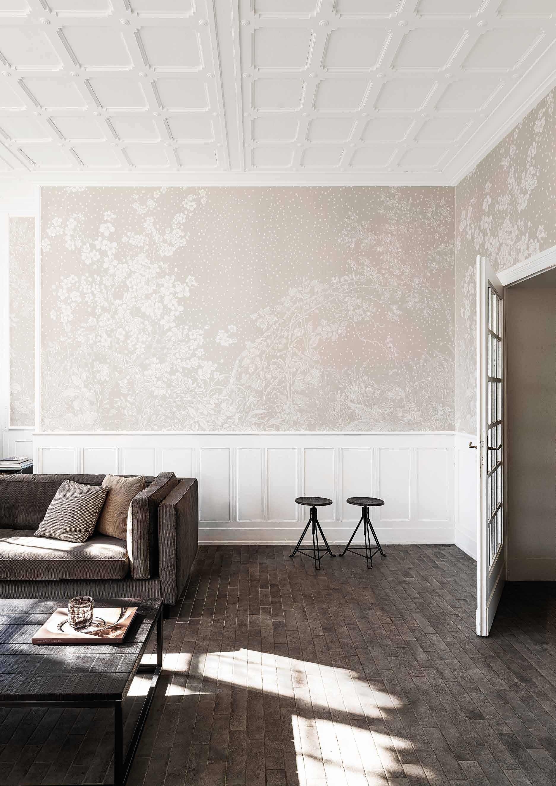
Two main trends: the ceiling wallpaper (perfect for dining room and corridor) and the return of the wallpaper on all walls (ideal in large rooms). For those who prefer to paper a single wall, I recommend the one behind the bed or sofa. Among the most innovative types are the sound-absorbing and waterproofing wallpapers, which have paved the way for wallpapers in the kitchen and bathroom, even in the shower. Before choosing, check the toxicity certifications.
Due le tendenze principali: il wallpaper a soffitto (perfetti sala e corridoio) e il ritorno del parato su tutti i muri (ideale in ambienti di grandi dimensioni). A chi preferisce tappezzare un’unica parete, consiglio quella dietro al letto o al divano. Tra i supporti più innovativi di sono i fonoassorbenti e gli impermeabili, che hanno sdoganato i parati anche in cucina e in bagno, perfino nella doccia. Prima di scegliere, attenzione alle certificazioni di tossicità.
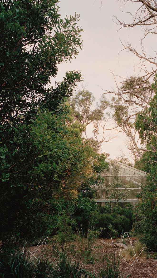
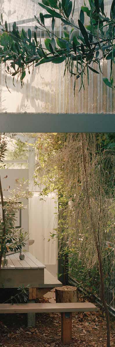
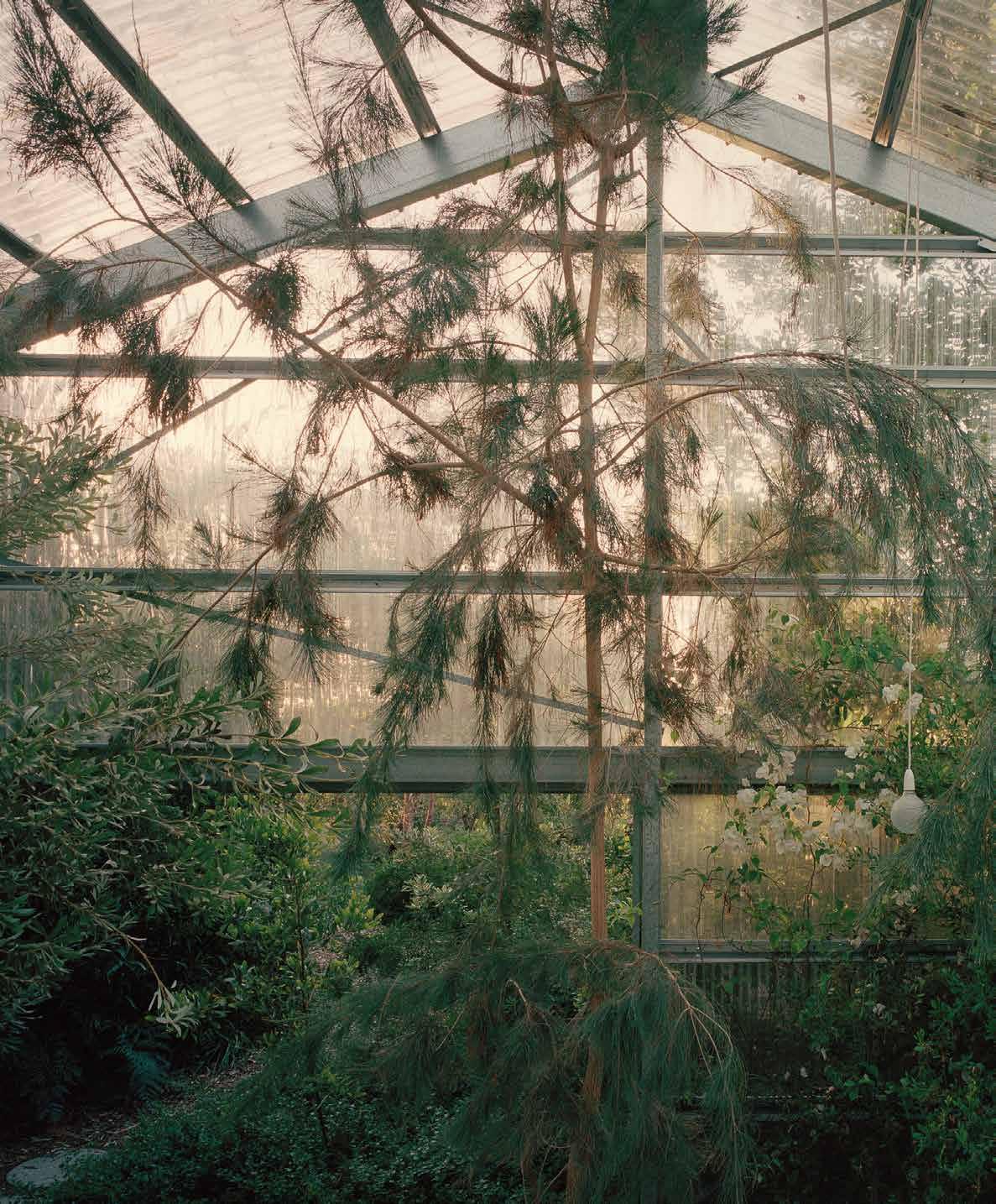
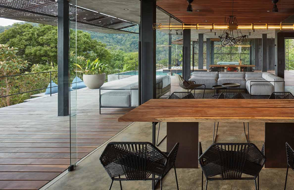
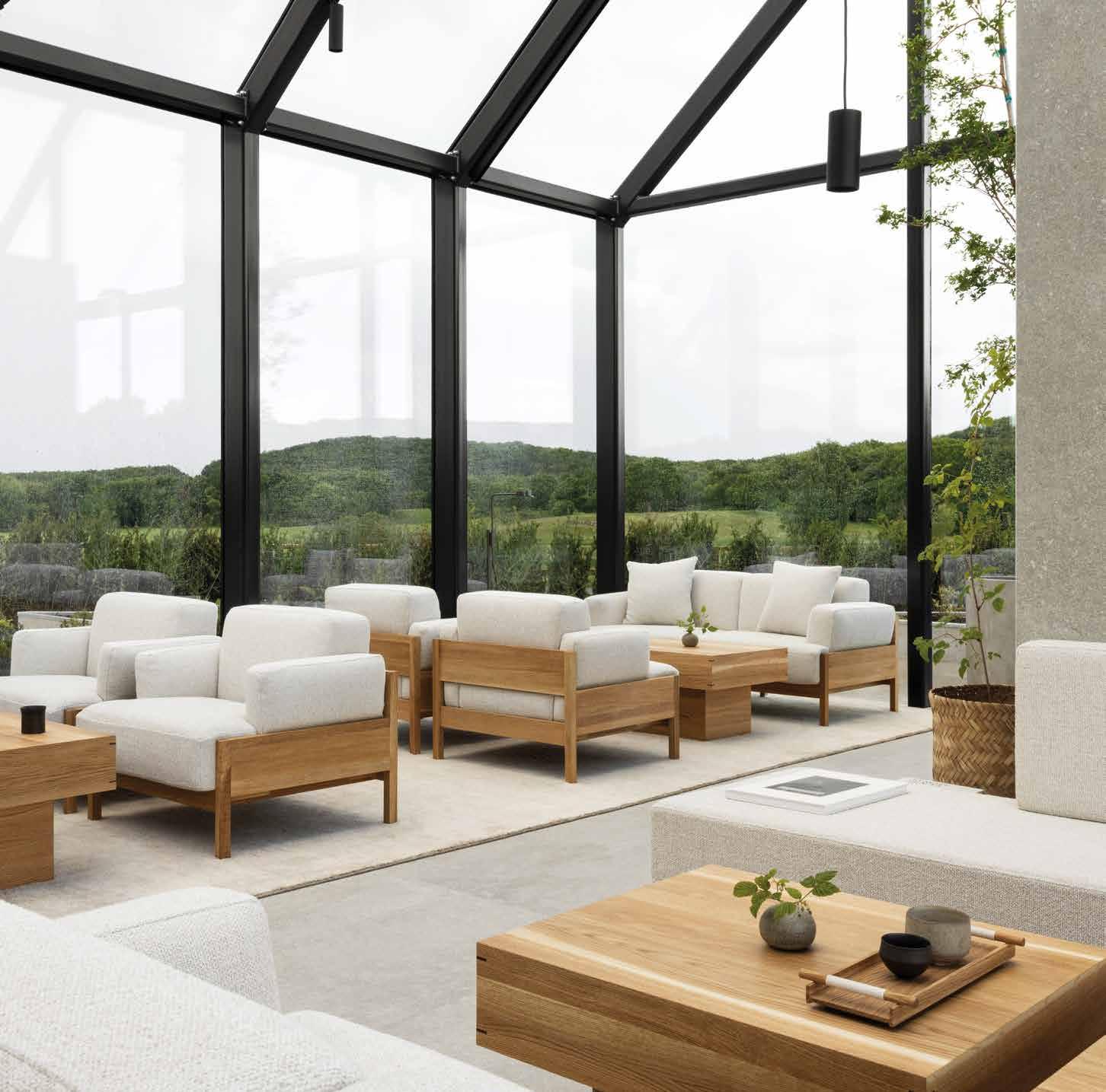
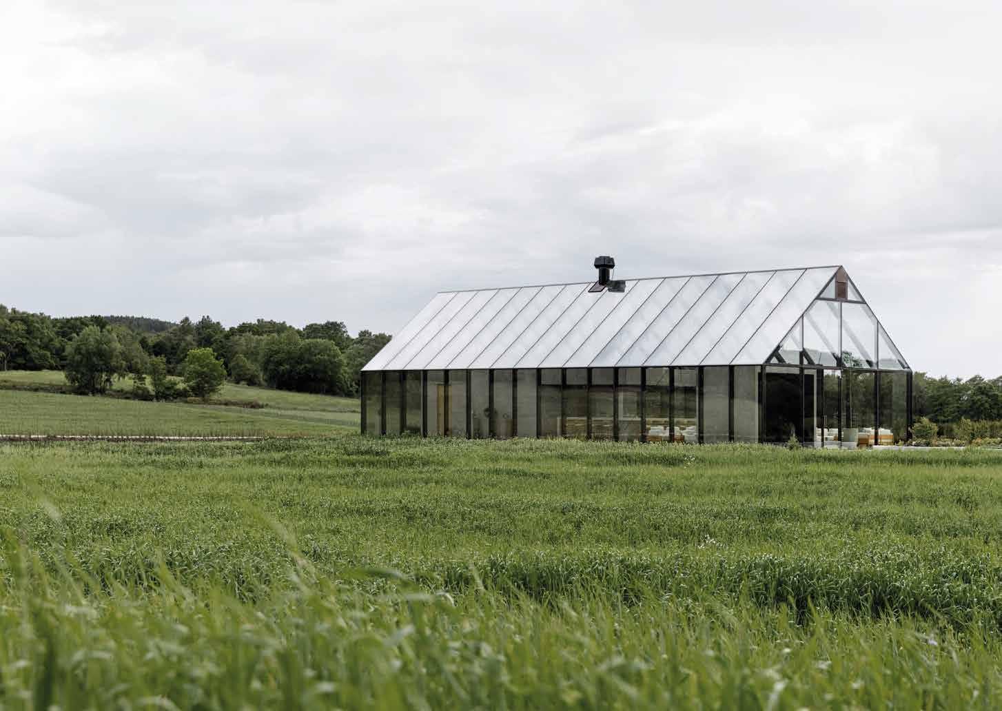
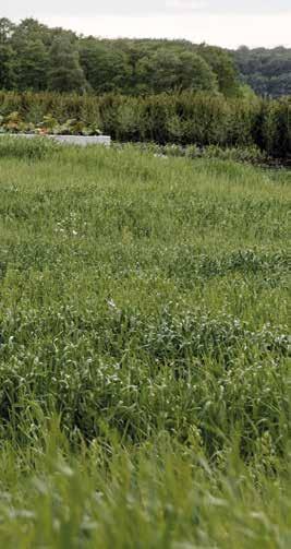
Boundaries blur and vanish, leaving room for air curtains in total connection with the outside, allowing vegetation to enter the house. Fascinating residences where time is dictated by nature, first design element of the house. Like in the case of the Garden House, the experimental project of a couple of architects, Mauro Baracco and Louise Wright, who have decided to live literally surrounded by the Australian landscape. Located in the territory of the Australian Aboriginal people Boon Wurrung, in a clearing near Western Port Bay not far from Melbourne (Australia), the project by Baracco+Wright Architects is an active part of the regeneration of the site’s ecosystem. The house appears to be a greenhouse, a building
Magical spaces where humans, plants, and animals coexist seamlessly. Welcome to the transparent Garden House in Australia and the enchanting Atelier Villa in Costa Rica>txt: Marina Jonna
Spazi magici dove uomini, piante e animali convivono senza soluzione di continuità.
Benvenuti nella trasparente
Garden House in Australia e nell’affascinante
Atelier Villa in Costa Rica
I confini sfumano e svaniscono, lasciando spazio a pareti d’aria in totale connessione con l’esterno, permettendo alla vegetazione di entrare all’interno delle mura domestiche. Residenze affascinanti dove il tempo è quello dettato dalla Natura, primo elemento di design della casa.
Come nel caso della Garden House, il progetto sperimentale di una coppia di architetti, Mauro Baracco e Louise Wright, che ha deciso di vivere letteralmente immersa nel paesaggio australiano.
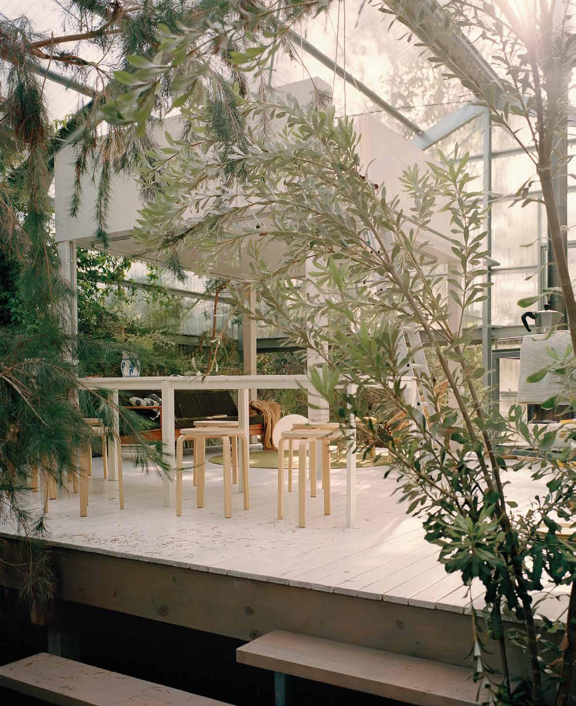
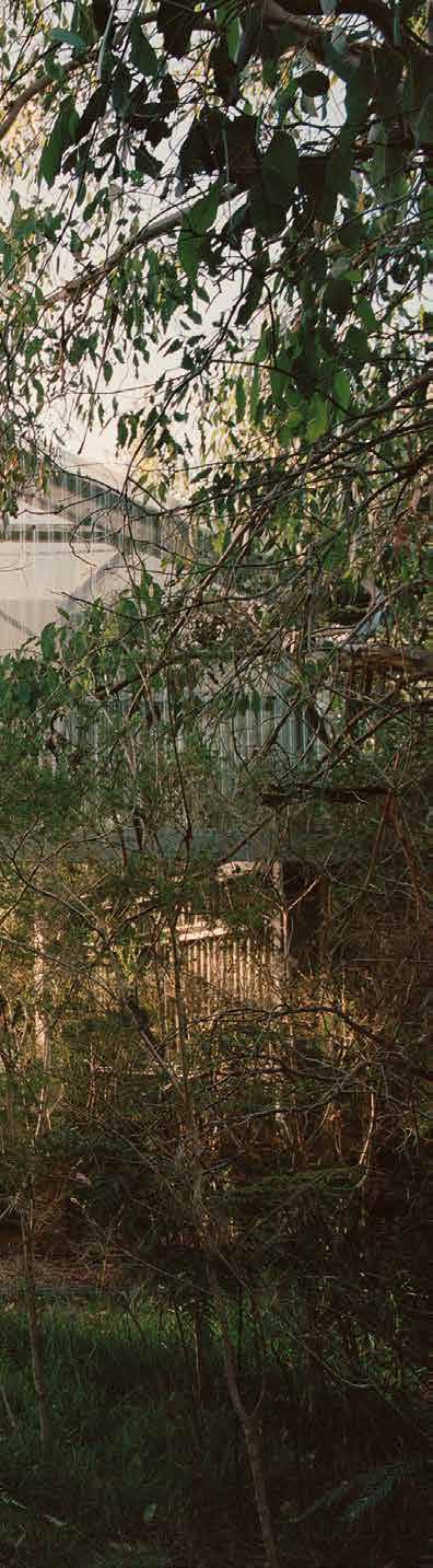
Situato nel territorio degli aborigeni australiani Boon Wurrung, in una radura nelle vicinanze della baia di Western Port non lontano da Melbourne (Australia), il progetto di Baracco+Wright Architects è parte attiva della rigenerazione dell’ecosistema del sito. La casa appare come fosse una serra, un edificio dove la luce naturale disegna lo spazio, fortemente connessa al verde e alla natura circostanti, progettata in modo da lasciare crescere le piante al suo interno. Raccontano gli architetti: “Ci siamo accampati lì per circa tre anni prima di costruire la casa. Volevamo capire il ciclo della luce e i ritmi naturali del luogo, oltre a scoprire specie vegetali endemiche.
La nostra sfida era quella di rigenerare l’ecosistema
where natural light draws the space, strongly connected to the surrounding greenery and nature, designed to let the plants grow inside. The architects said: ‘We camped there for about three years before building the house. We wanted to understand the cycle of light and the natural rhythms of the place, as well as discover endemic plant species. Our challenge was to regenerate the severely compromised local ecosystem. We wanted the house not only to be connected to the landscape, but completely surrounded
by it.’ To be able to bring it to life, they chose a light metal structure, to be assembled on site, enriched, on both sides, by several layers of vegetation. Instead of windows, large sliding doors and perimeter panels that allow plenty of natural light to enter. Inside the house there is a raised wooden platform, where the living area is located, which includes the conversation corner, the kitchen,
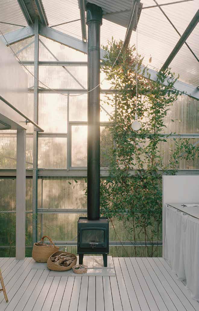
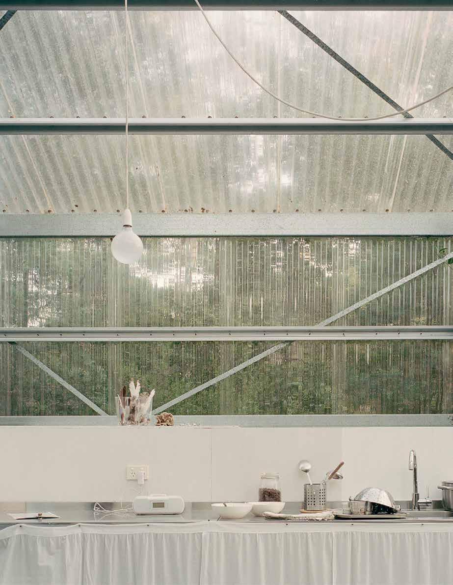
locale gravemente compromesso. Volevamo che la casa non fosse solo in relazione con il paesaggio, ma totalmente immersa in esso”. Per riuscire a realizzarla, hanno scelto una struttura metallica leggera, da assemblare sul posto, arricchita, su entrambi i lati, da più strati di vegetazione. Al posto delle finestre, grandi porte scorrevoli e pannelli perimetrali che permettono alla luce naturale di entrare in abbondanza. All’interno della casa, una piattaforma rialzata in legno, dove si trova l’area giorno che comprende
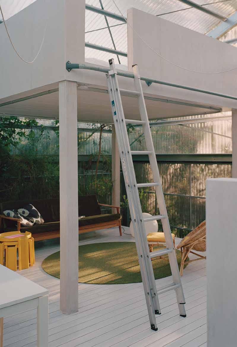
and the dining room: this allows an easy outflow of water in case of heavy rains, in addition to reducing the impact on the environment. Indeed, the plants grow around and under the house, redefining the perimeter of the house over time, so much so that the two architects have to change the entrance to the house from time to time. The night area is instead created via a mezzanine, while
l’angolo conversazione, la cucina e la sala da pranzo: questo permette un facile deflusso dell’acqua in caso di forti piogge, oltre a ridurre l’impatto sull’ambiente.
Le piante crescono infatti intorno e sotto la casa, ridefinendo il perimetro della casa con il passare del tempo, tanto che i due architetti sono obbligati a cambiare, ogni tanto, l’ingresso della casa. La zona notte è invece ricavata su un soppalco mentre l’area servizi è lunica appoggiata al suolo. La superficie è minima,
8x8 metri, ma l’architettura risulta funzionale e ariosa grazie all’assenza di muri, corridoi o stanze, lasciando il vero ruolo da protagonista al giardino spontaneo che cresce e l’avvolge. Non solo, qui entrano con i loro suoni, i piccoli animali del bosco. La sensazione è quella di dormire su di un prato dove l’uomo diventa solo un osservatore rispettoso di quello che è il miracolo della Natura.

Passiamo ora nella jungla rigogliosa della Costa Rica dove la vegetazione,
the restroom is the only one resting on the ground. The surface is minimal, 8x8 meters, but the architecture is functional and airy thanks to the absence of walls, corridors or rooms, leaving the real
leading role to the spontaneous garden that grows and envelops it. And not just that, the small animals of the wood enter as well with their sounds. The sensation is that of sleeping on a meadow where humankind becomes just a respectful observer of the miracle of Nature.
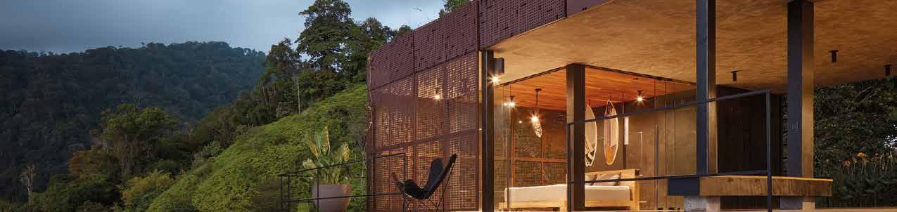
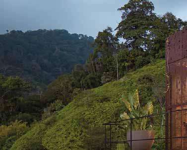
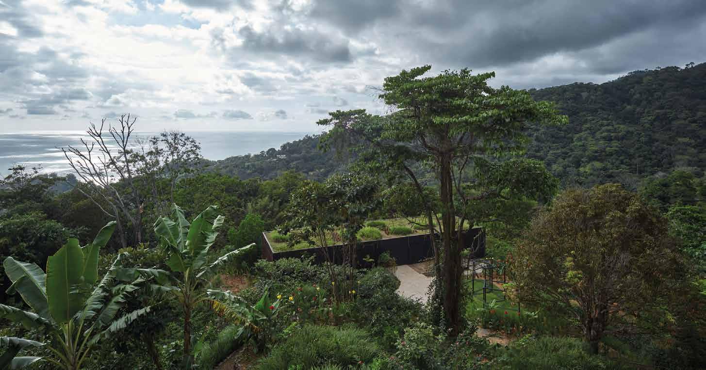
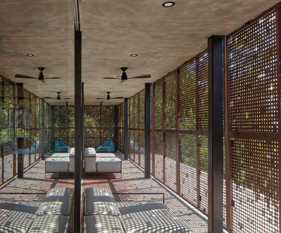
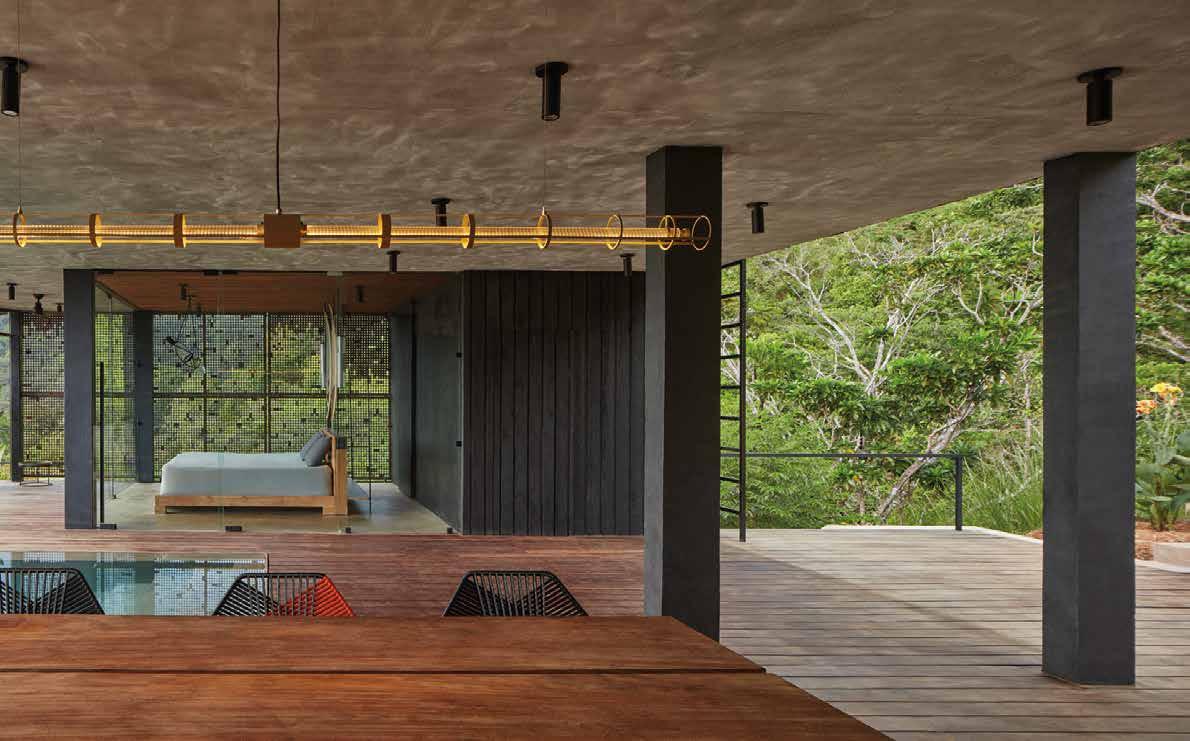
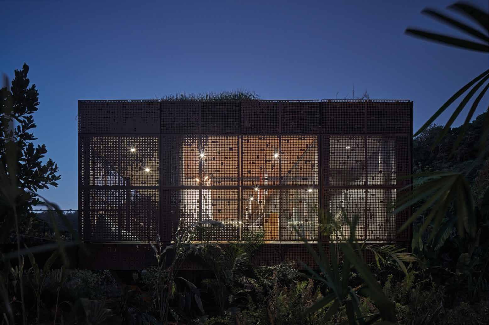
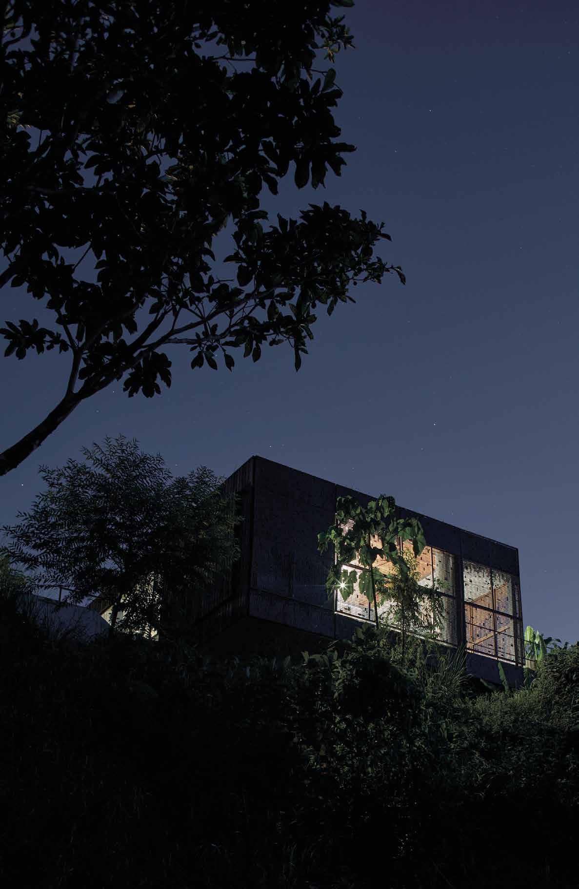
Let’s now move on to the luxuriant jungle of Costa Rica, where the vegetation,
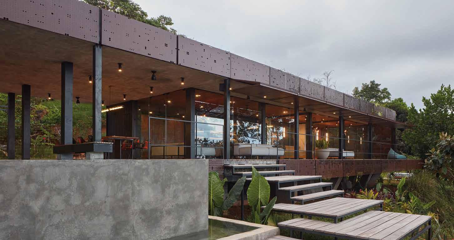
sicuramente più selvaggia e prorompente, accoglie il progetto Atelier Villa firmato da Formatal. Una residenza adagiata nella foresta, aggrappata su di un ripido pendio, dove i confini fluidi e gli spazi aperti delineano la costruzione. Definita da una forma pura, un parallelepipedo lungo 26 metri, ha una maglia strutturale di 4x4 m, che può chiudersi e compattarsi come un bozzolo o, al contrario, spalancarsi sul mondo esterno. La facciata rivolta verso l’oceano, è
certainly wilder and more rampant, welcomes the Atelier Villa project designed by Formatal. A residence nestled in the forest, clinging to a steep slope, where fluid boundaries and open spaces outline the building. Defined by a pure shape, a 26-metre-long parallelepiped, it has a 4x4 m structural mesh that can close and pack itself like
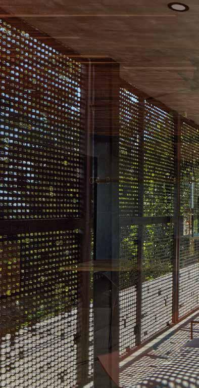
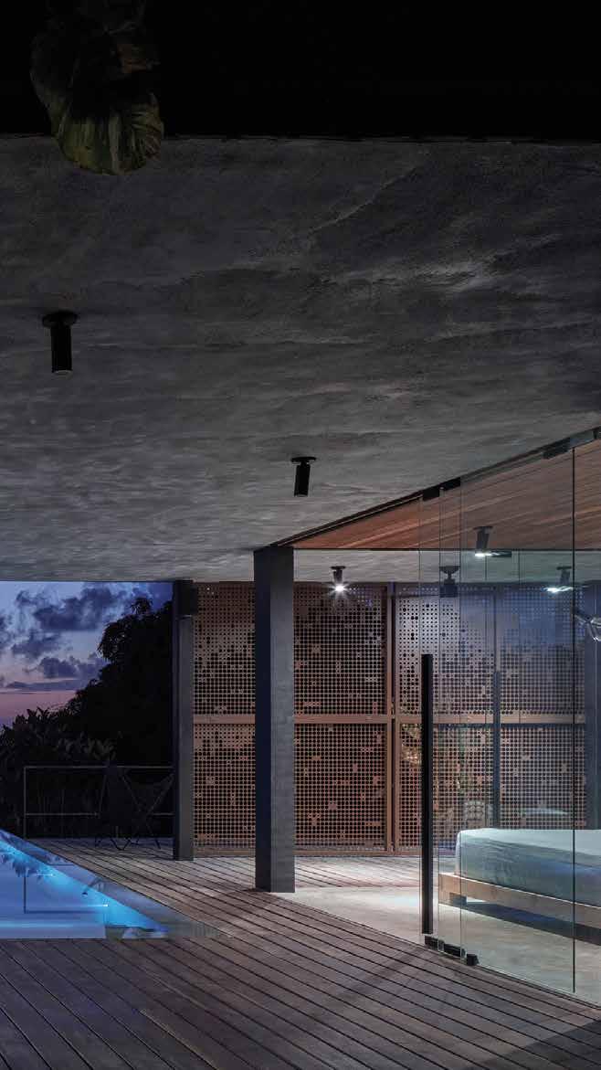
realizzata con pannelli mobili in acciaio Corten traforati, con motivi differenti a seconda delle sezioni, a creare un emozionante gioco di luci e ombre all’interno. Resistenti alla ruggine e refrattari al calore del sole, se alzati, fungono da tettoie riparando i proprietari con la loro ombra. L’intera struttura posteriore, rivolta invece verso la montagna, è rivestita in legno carbonizzato trattato con l’antica tecnica giapponese Shou Sugi Ban, in grado di proteggere il legno dalle intemperie e dall’invecchiamento.
Dal punto di vista della disposizione degli spazi interni, la villa possiede lo stesso spirito minimalista che la sua forma suggerisce.
I ripostigli, i bagni e la cucina sono disposti lungo la parete di fondo. La disposizione del resto della casa è molto aperta; i confini tra l’interno e l’esterno scompaiono e l’intero spazio sembra una terrazza coperta da un tetto verde. Leggere pareti divisorie scorrevoli, poste nell’area giorno, possono servire come strumento per creare zone private e movimentare lo spazio a seconda delle necessità.
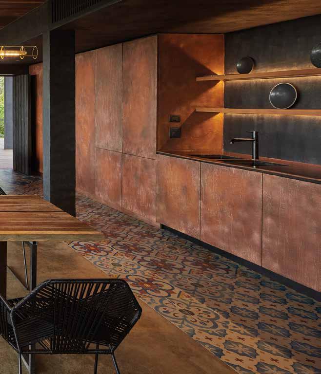
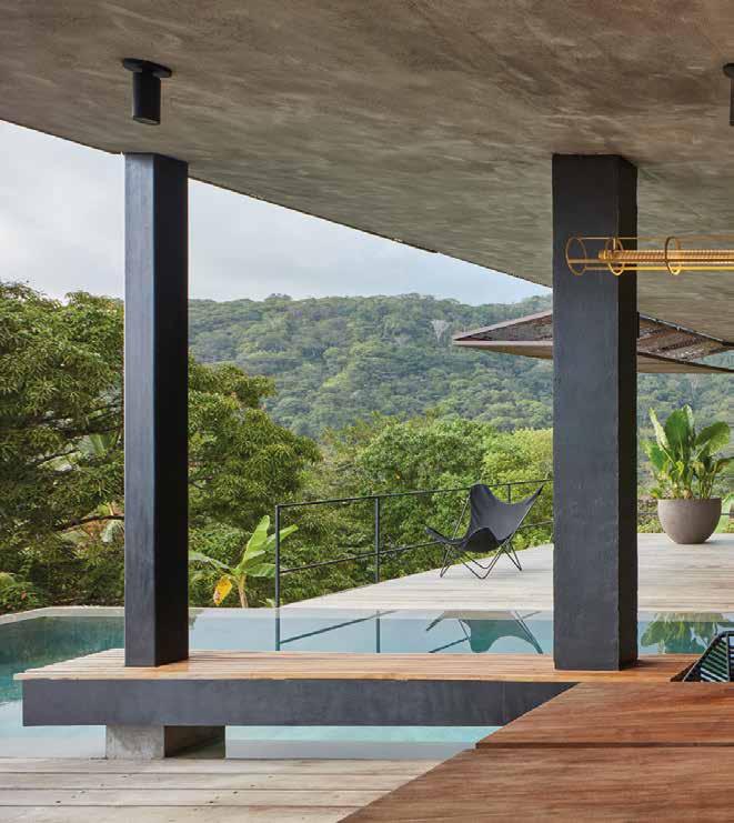
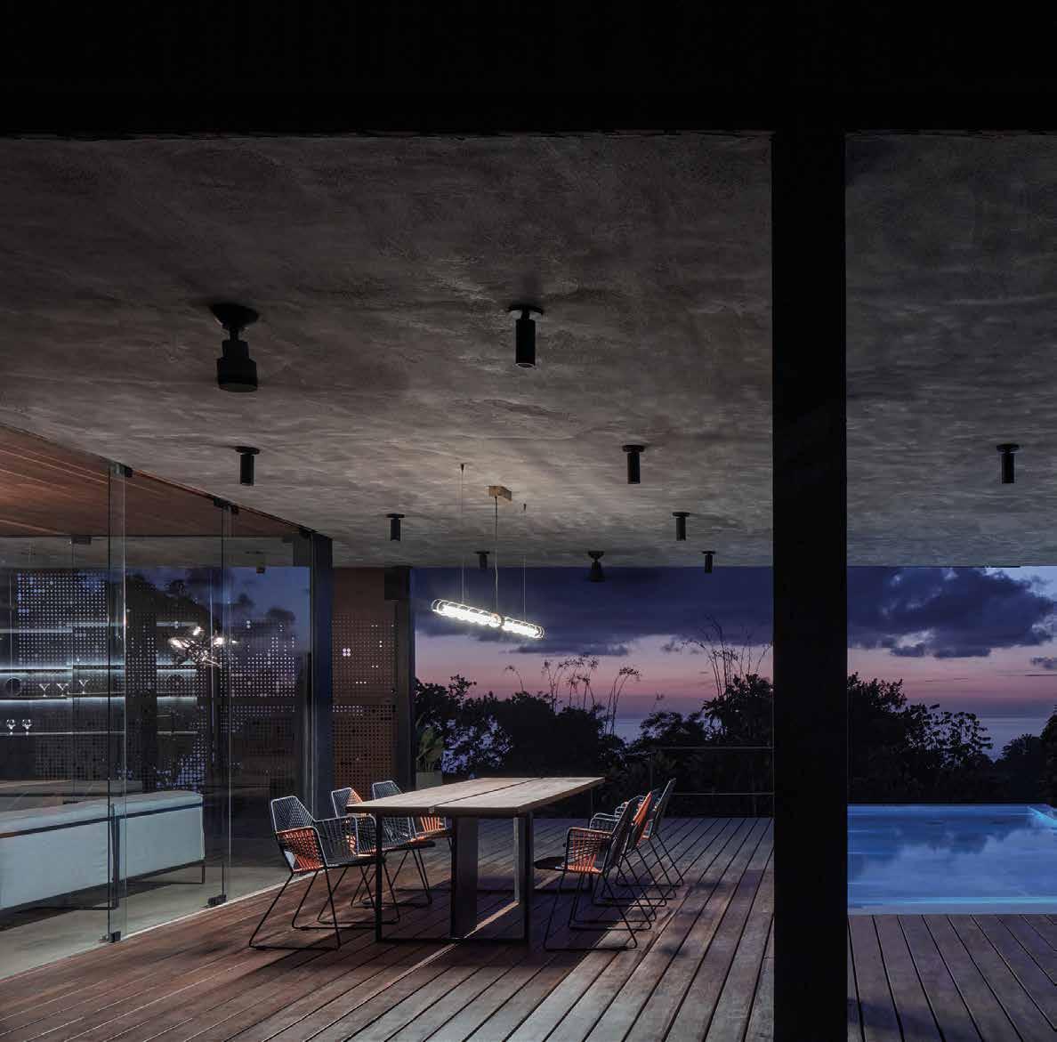
Infine il patio, che rivela una piscina a sfioro parzialmente coperta per proteggerla dal sole cocente. L’arredamento è caratterizzato dai toni caldi e terrosi dei materiali naturali. Tutti gli arredi, a parte le sedie del salotto e della zona pranzo, sono stati
a cocoon or open wide to the outside world. The facade facing the ocean is made with mobile panels in perforated Corten steel, with different motifs depending on the sections, creating an exciting play of lights and shadows inside. Resistant to rust and refractory to the heat of the sun, if raised, they act as canopies, sheltering the owners with their shade. The entire rear structure, facing the mountain, is clad in charred wood treated with the ancient Japanese technique Shou Sugi Ban, which protects the wood from bad weather and ageing. For the layout of the interior spaces, the villa has the same minimalist spirit that its shape suggests. The closets, bathrooms, and kitchen are arranged along the back wall. The layout of the rest of the house is very open; the boundaries between inside and outside disappear and the whole space looks like a terrace covered by a green roof. Light sliding partition walls, placed in the living area, can serve as a tool to create private areas and move the space according to need. Finally, there is the patio, which reveals a partially covered infinity pool to protect it from the scorching
sun. The furniture is characterized by the warm and earthy tones of natural materials. All the furnishings, apart from the chairs in the living room and dining area, were designed by the architects and custom made by local craftsmen. Only the lights (Shibari by Bomma), which blend perfectly with the tropical atmosphere, come from the homeland of the architects, the Czech Republic, renowned for its glassmaking skills. The raw aesthetics of the places of conviviality, open onto the jungle, reveal a simple elegance that focuses on materiality and authenticity, underlining the warm embrace of nature. Both of these projects, although very different from one another, pursue and achieve the harmony between
Ceca, rinomata per l’abilità vetraria. L’estetica raw dei luoghi della convivialità, aperti sulla jungla, rivelano un’eleganza spartana, che punta su matericità e autenticità., a sottolineare l’abbraccio caldo della
humankind and nature. An objective sought after by designers as early as the last century with organic architecture, whose greatest exponent was American architect Frank Lloyd Wright; Catalan modernism, represented, among others, by the works of Antonio Gaudí; and the garden city movement, founded by English urban planner Ebenezer Howard. As Wright wrote: ‘No house should ever be on a hill or on anything. It should be of the hill. Belonging to it. Hill and house should live together each the happier for the other.’
natura. Entrabi questi progetti, pur diversissimi fra di loro, inseguono e raggiungono un’armonia, quella tra uomo e natura. Un obbiettivo ricercato dai progettisti già a partire dal secolo scorso con l’architettura organica, di cui il massimo esponente fu l’architetto amercano Frank Lloyd Wright, il modernismo catalano, rappresentato, tra gli altri, dalle opere di Antonio Gaudí, e la città giardino, idea declinata per prima dall’urbanista inglese Ebenezer Howard.
Come scriveva Wright: “Una casa non deve essere su una collina, o su qualsiasi altra cosa. Deve essere della collina, appartenerle, in modo tale che collina e casa possano vivere insieme, ciascuna delle due più felice per merito dell’altra”.
 Haori KMN05-A
 Mofuku KMN04-C
 Tsukesage KMN20-A
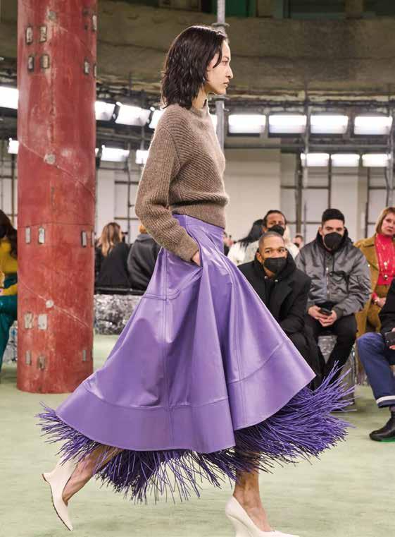
Ski mask or balaclava, whatever you want to call it, is undoubtedly the musthave accessory for the cold season. Probably also thanks to the complicity of this absurd period in which, given the circumstances, we have become accustomed to having our faces partially covered, what before might have seemed strange and at times even unsettling, no longer frightens us and has become part of our daily habits, making the use of this accessory more acceptable and normal. It has military origins: its first use dates back to the battle of Balaklava in 1854
Ski mask or balaclava, whatever you want to call it, is undoubtedly the musthave accessory for the cold season. Probably also thanks to the complicity of this absurd period in which, given the circumstances, we have become accustomed to having our faces partially covered, what before might have seemed strange and at times even unsettling, no longer frightens us and has become part of our daily habits, making the use of this accessory more acceptable and normal. It has military origins: its first use dates back to the battle of Balaklava in 1854


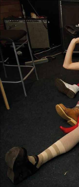

during the Crimean war, where balaclavas are said to have appeared on the faces of British soldiers to cover themselves and face the harsh climate.
From that moment on it is basically impossible to retrace all the uses of balaclavas clearly and linearly. Mrs Riot, an illustrator who has made the balaclava her logo, says she started using it in 2019,

per la stagione fredda. Probabilmente anche grazie la complicità di questo periodo assurdo in cui, per forza di cose, ci siamo abituati ad avere in parte il volto coperto, ciò che prima poteva sembrarci strano e a tratti persino inquietante, non ci fa più paura ed è entrato a fare parte dei nostri usi quotidiani, rendendo l’uso di questo accessorio più accettabile e normale. Nato
when she first saw it worn by Pussy Riot. From ski slopes to fashion catwalks, the balaclava has managed to establish itself and captivate everyone at the latest fashion shows; from the most particular and colourful models to handmade versions, from fabrics inspired by the future, to fine yarns. Its success is also due to its double allure: on the one
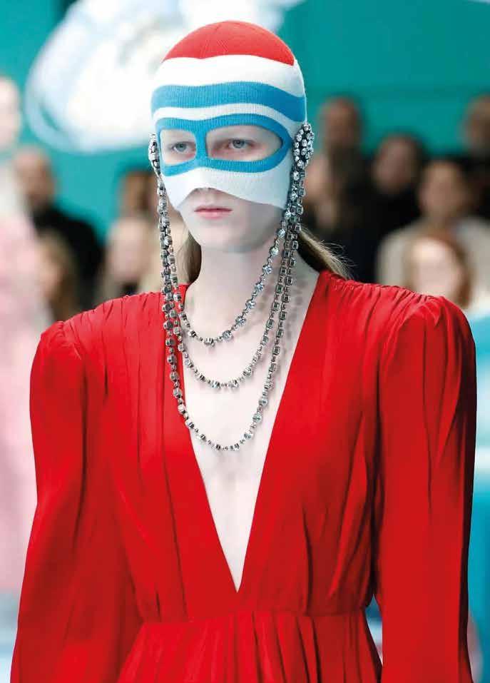
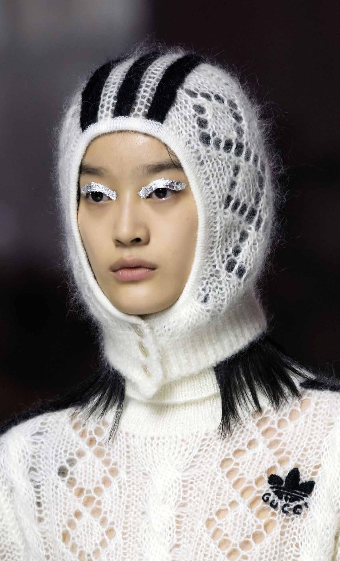 Passamontagna o balaclava, comunque lo si voglia chiamare è senza dubbio l’accessorio da avere nell’armadio
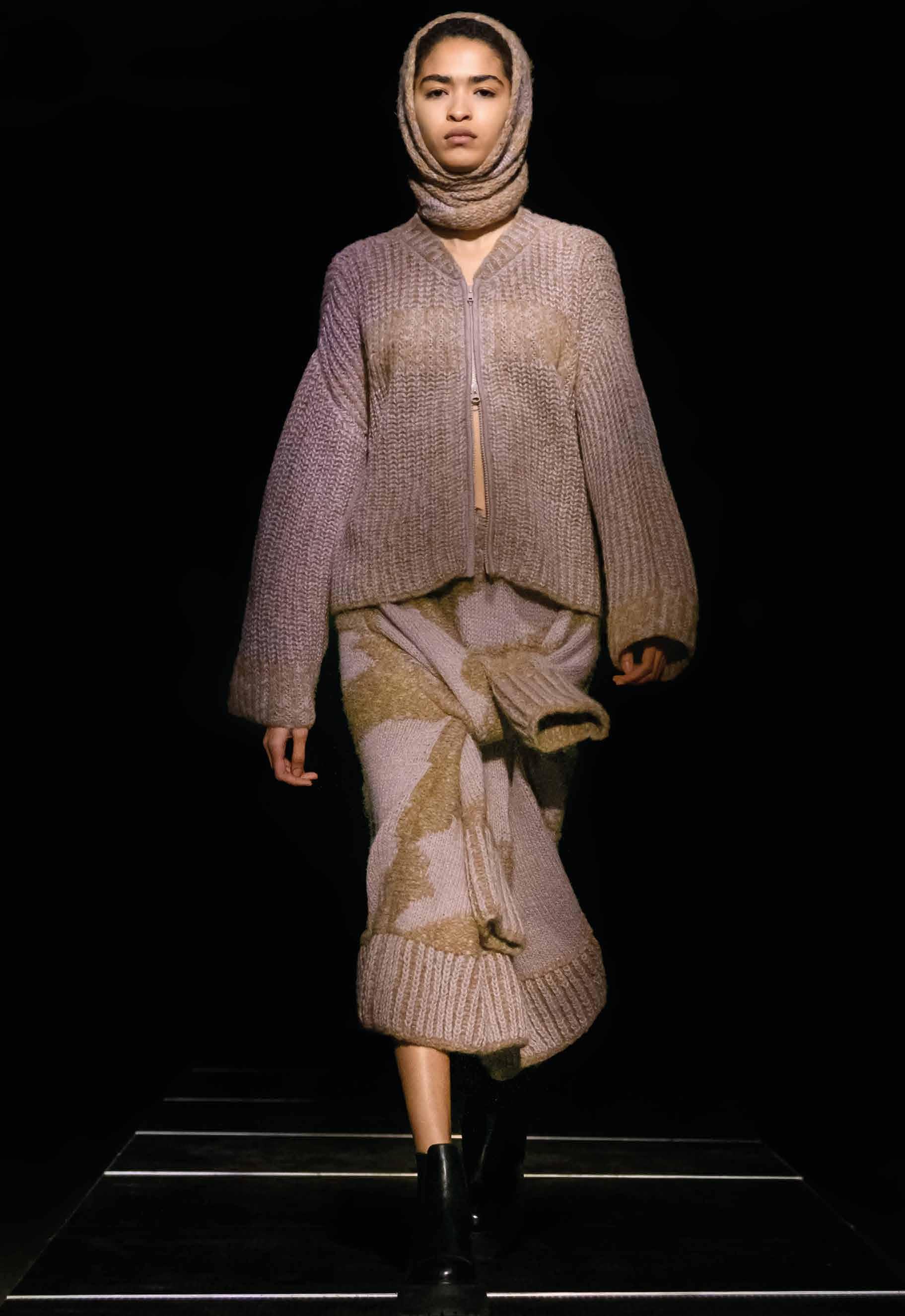


hand it is an accessory with a technical soul, ideal for snow sports and to protect yourself from the cold, on the other, it reveals its more glamorous side in the precious versions presented with frostproof and sophisticated casual looks.
con una funzione militare, la prima occasione in cui è stato utilizzato infatti, risale alla battaglia di Balaklava del 1854 durante la guerra Crimea, dove si narra che i passamontagna fossero apparsi sui volti dei soldati inglesi per coprirsi e affrontare il clima rigido. Da quel momento in poi è praticamente impossibile ripercorrere in modo chiaro e lineare tutti gli utilizzi
del balaklava. Mrs Riot, illustratrice che ha fatto del balaklava il proprio logo, racconta che ha iniziato a utilizzarlo nel 2019, quando l’ha visto per la prima volta indossato dalle Pussy Riot. Dalle piste da sci alle passerelle di moda, il passo è breve e il passamontagna

è riuscito ad imporsi e a conquistare tutti alle ultime sfilate; dai modelli più particolari e colorati
alla versione fatta a mano, dai tessuti ispirati al futuro, ai filati pregiati. Il suo successo è dovuto anche alla sua doppia allùre: da un lato è un accessorio dall’anima tecnica, ideale per gli sport sulla neve e per proteggersi dal freddo, dall’altro rivela il suo lato più glamour nelle versioni preziose presentate a corredo di look anti-gelo e casual sofisticati.

 Yuki KMN16-B
 Furi KMN14-E
 Fuki KMN10-B
 Hakma KMN11-B
 Hikizuri KMN19-C

 Tsukesage KMN20-C
 Tabi KMN03-B