Interiors & Lighting Selected Works Texas Christian University


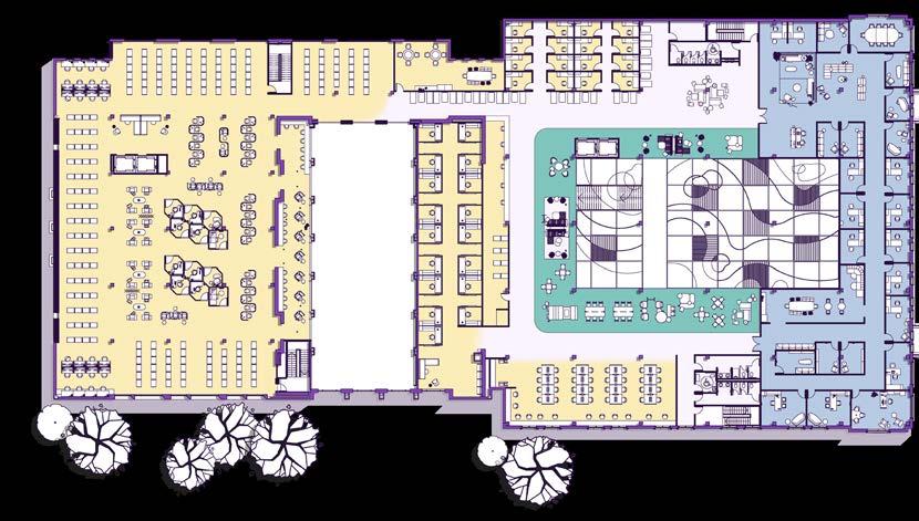
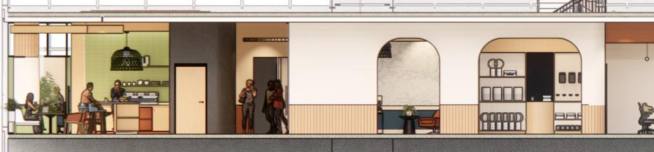
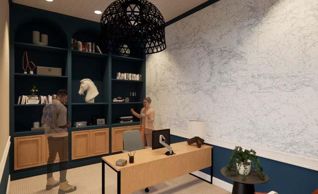
Historic Reading Room

Historic Reading Room
Reframing Mental Health on TCU’s Campus
Software
Revit, Enscape, Photoshop, AutoCAD
Spring 4th Year | Higher Education | Fort Worth, TX
As higher education shifts to a digital sphere, campus libraries are rapidly fading from a crucial educational space into a graveyard for physical books. Flourish reevaluates the goals of Texas Christian University’s library; this centralized building should be more than just a home for learning, but a hub for overall student wellness. Introducing a multi-use program, with spaces for intellectual, social, mental, physical, and environmental wellness emphasizes the importance of routinely investing time in all forms of wellbeing.


Flourish draws inspiration from the five basic elements of gardening — light, water, air, space to grow, and nutrients. Just as every plant in a garden requires its own individualized combination of each, college students all have a unique path to achieve wellness.
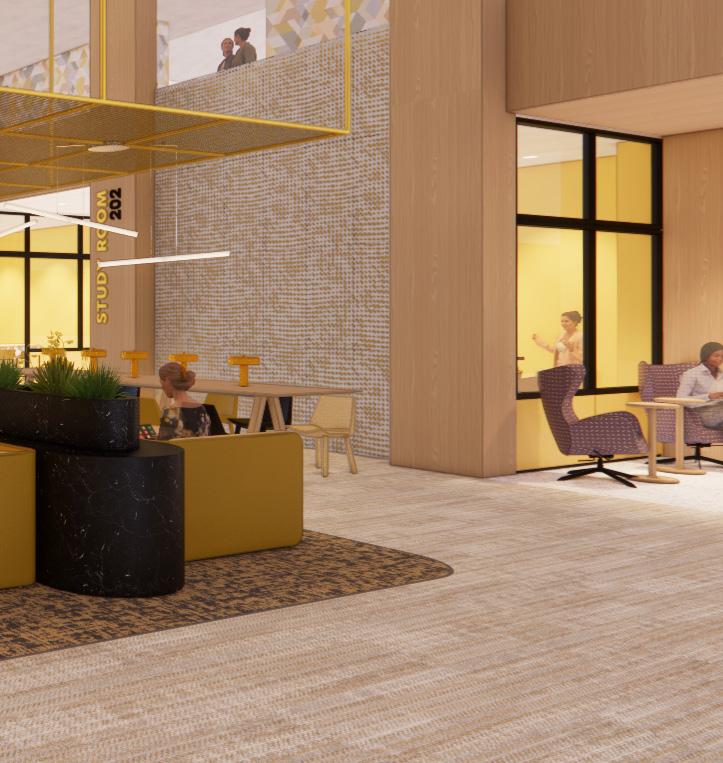
SHARED ENTRY TO REFRAME PERCEPTIONS
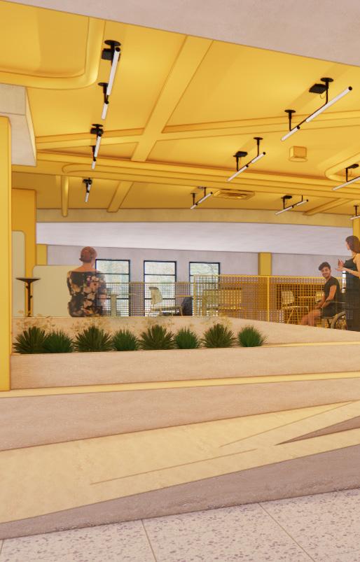
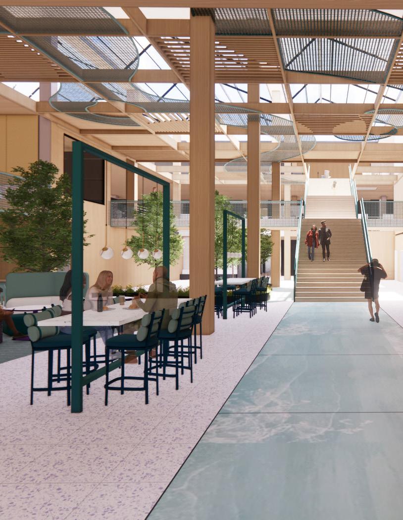
Flourish relocates TCU’s Mental Health Center from one of the oldest buildings on campus to the third floor of the TCU Wellness Center. Students are now welcomed by a three story atrium on their way to the Mental Health Center. By altering the context surrounding the mental health center and introducing a mixed use ground floor, architecture has the power to reduce the stigma of seeking out mental healthcare and entering the mental health center.
Book Stacks
Private Study Pods
Quiet Study Lounge
Staff Offices
Library & IT Help Desk
Quiet Digital Lab Mental Health Reception Mental Health Counseling Mental Health Admin Digital Consultation
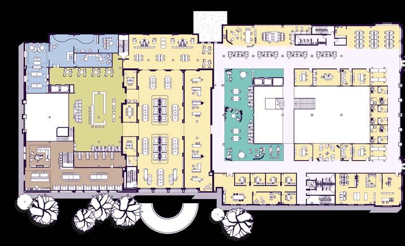
Commuter Lounge
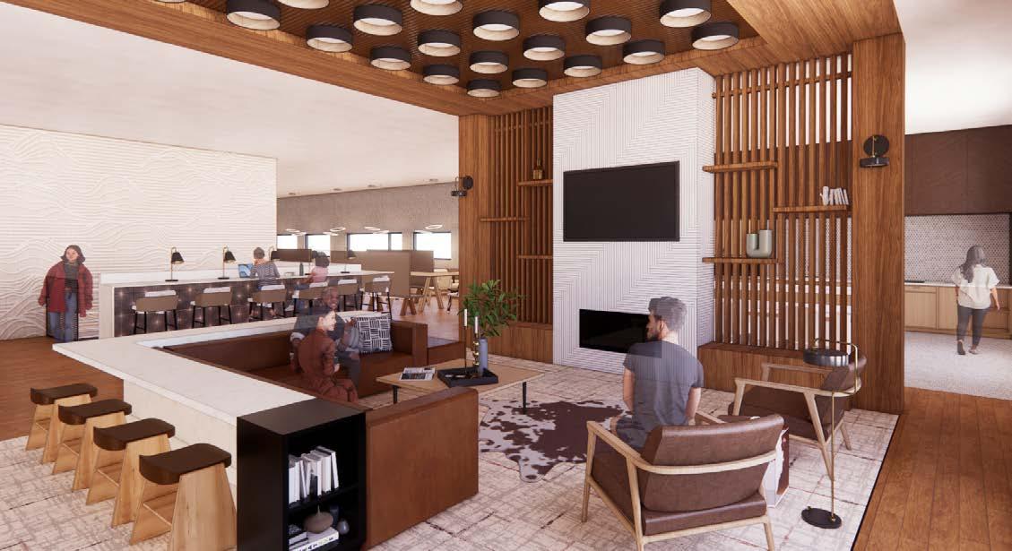
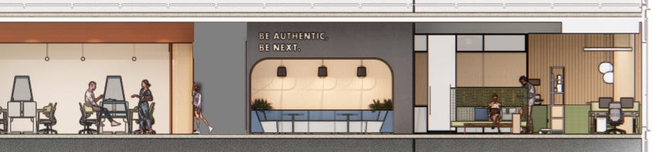
Tulip Coffee Bar Break Lounge Historic Reading Room Study Lounge
Collaborative Digital Lab Staff Offices
Innovation
Study Rooms
Study Rooms
FIRST FLOOR | NTS
Collaborative Study Island
Commuter Locker Room
University Market
Student Showcase
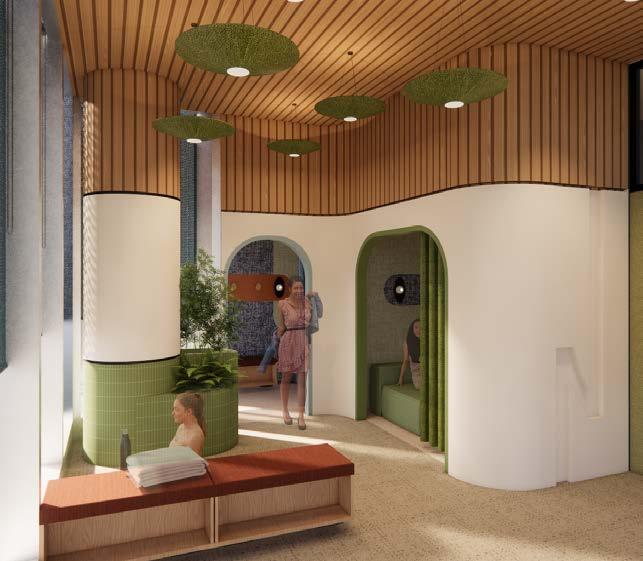
Wellness Rooms
Staff Offices
Group Study Room
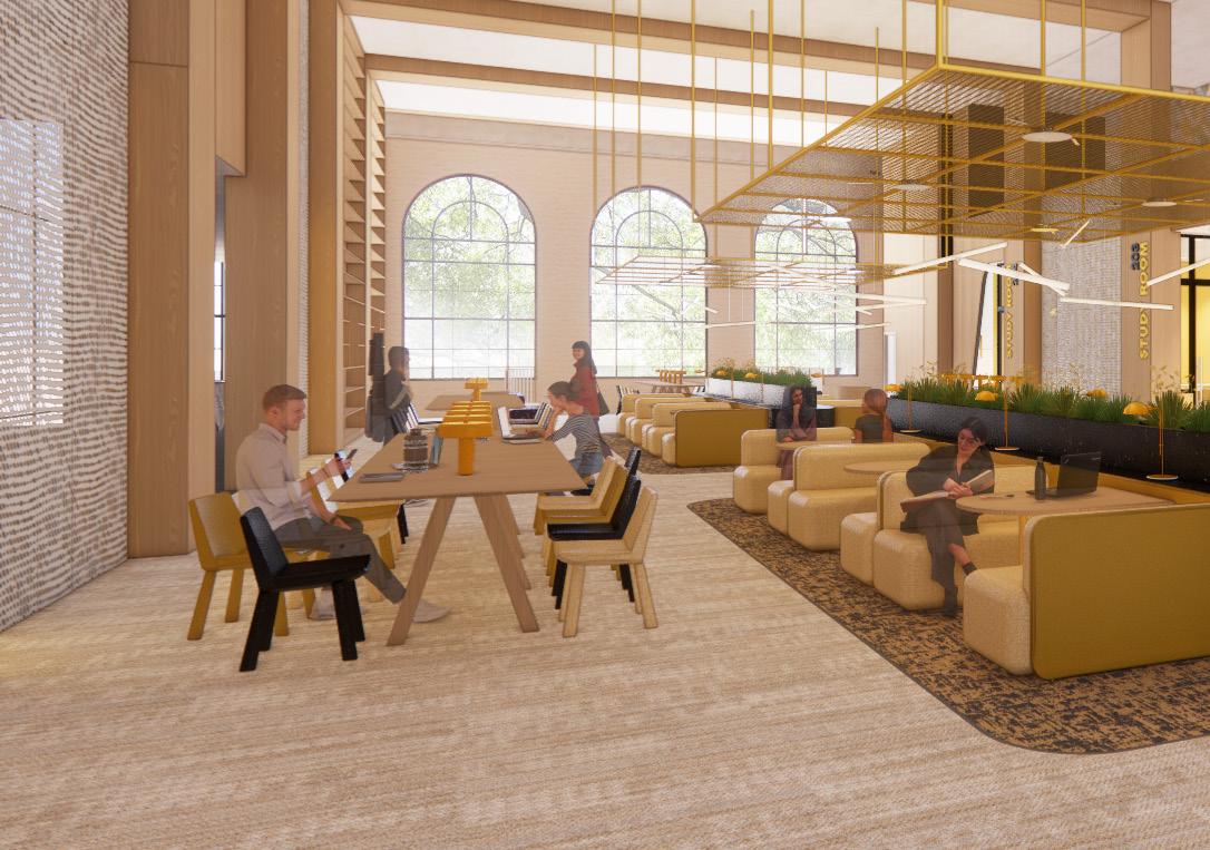
Work Cafe
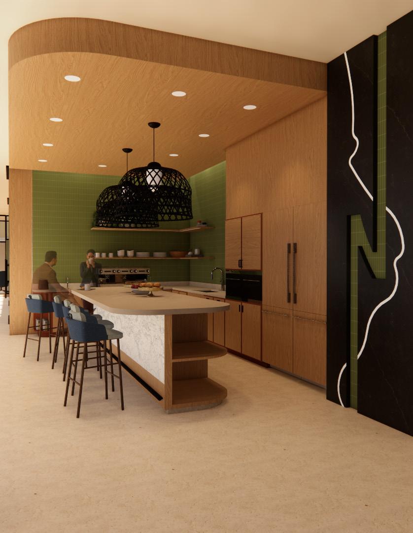
Nap Room Green Frog Cafe Information Desk
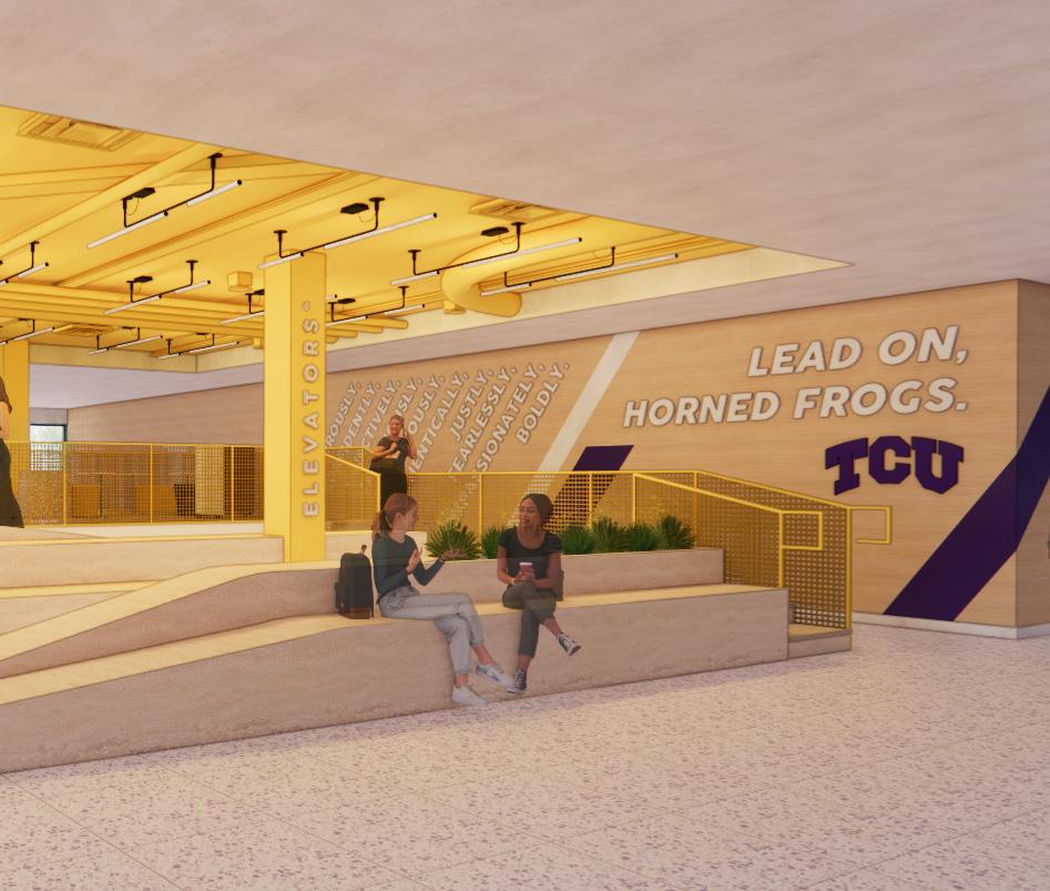
The study island takes the concept of an entry focal point such as a grand staircase and flips it into something more accessible. The island greets students as they enter the Wellness Center off of University Drive and provides a flexible study space that is ideal for collaborative work.
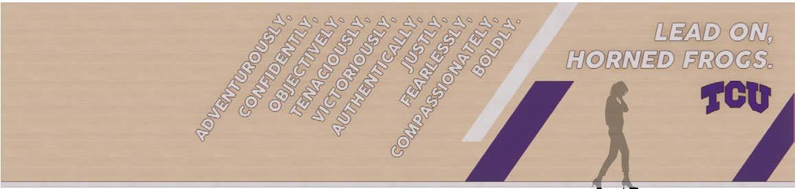
While the primary color palette for the TCU Student Wellness Center shifts away from the school’s traditional colors of purple and white, branding moments such as this mural reinforce school identity without subjecting students to the constant barrage of purple found across TCU’s campus.
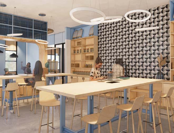
Honing in on an often forgotten demographic — commuter students — this lounge provides a home base for students who don’t live on campus. With amenities including a locker room, kitchen, and even a nap room, this lounge gives commuters a space on campus to decompress and socialize in between classes.
Featuring an art space, game room, and theater, the lounge provides a mental break from schoolwork.
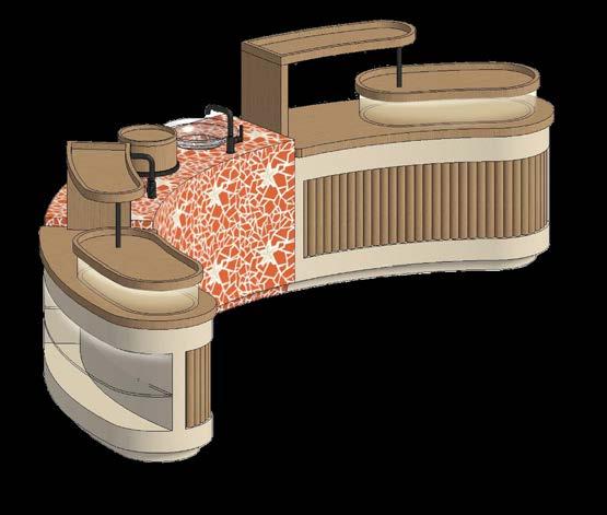
Shop Interior
Wellness Based Pop-Up Shop
Software
Revit, Enscape, Photoshop, AutoCAD
Fall 4th Year | Retail | Queen’s Beach, HI
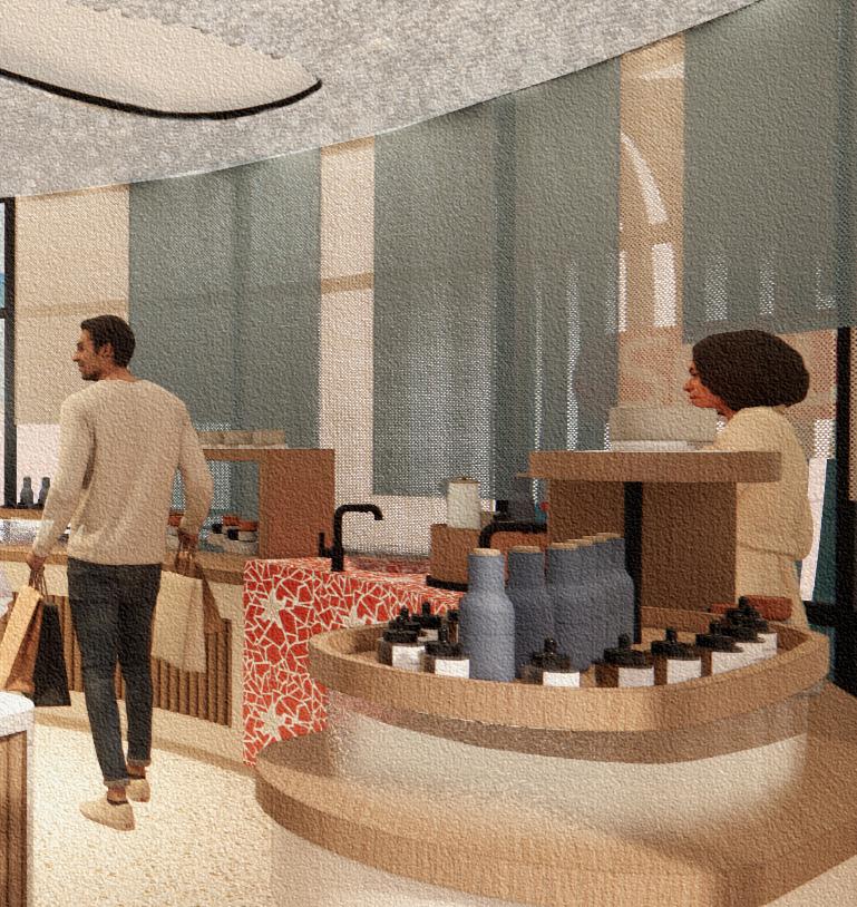
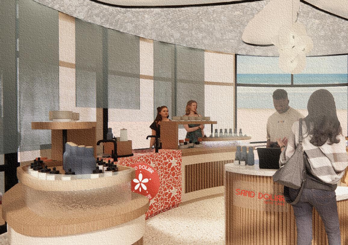
Sand Dollar Skin Care is on a mission to provide skin care to shelter your skin and the sea. All Sand Dollar products are ocean friendly: free of harmful chemicals that degrade marine landscapes and packaged in alternatives to single use plastic. This popup shop, located on the beach, increases accessibility to ocean friendly sunscreens, while also spreading awareness of harmful chemicals found in most sunscreens.


Concept Statement
A coral reef is a barrier that protects shorelines and marine life from coastal storms and erosion. Just as coral reefs are essential to protecting marine ecosystems, sunscreen and skincare products protect our skin from harmful UV rays. The Sand Dollar Pop-Up Shop draws inspiration from shelter providing coastal elements, from single shells to large networks of reefs.
EMPHASIZE SYMMETRY & BALANCE
REFLECT CORE BRAND VALUES
Recycled
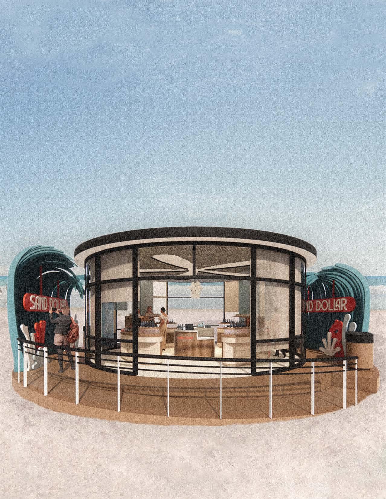
Queen’s Beach, which sits along the Waikiki shoreline, is a hub for tourists, with numerous beach front resorts nearby. Hawaii has already made a move towards banning non reef-safe sunscreen, making it the perfect location for a Sand Dollar Pop-Up Shop, which provides easy access to ocean friendly skincare on the beach.
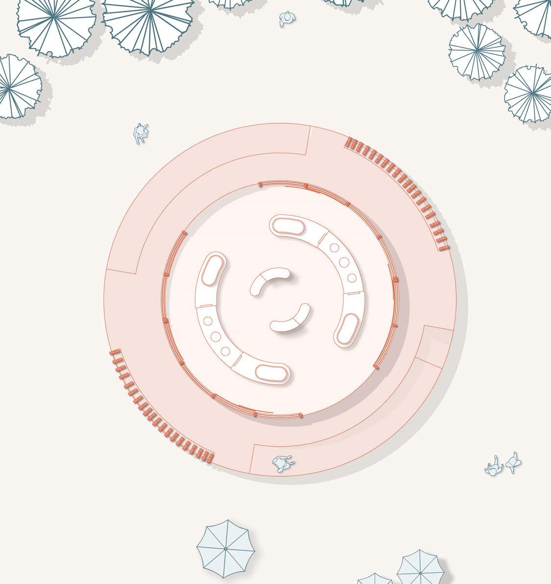
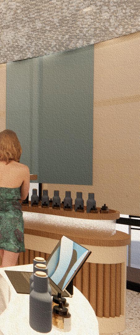
Display
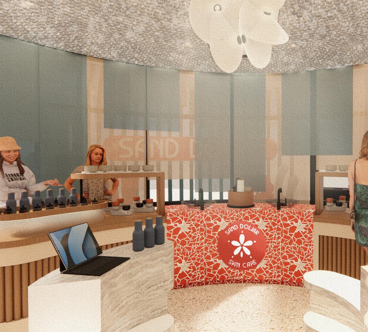
MILLWORK | MULTIFUNCTIONAL DISPLAY
Custom rounded displays are mulitifunctional to make up for the limited square footage, incorporating multilevel shelving, sampling areas with integrated sinks, and concealed storage beneath. The soft, rounded shape of the displays, combined with the diffused light of the back-lit frosted glass, echo the brand ethos of providing products that are gentle on skin and the environment.
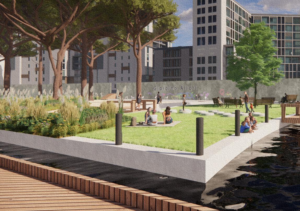
Revitalizing a Local Park
Software
AutoCAD, Sketchup, Enscape, Photoshop
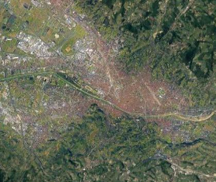
Spring 3rd Year | Urban Planning | Florence, Italy
Magnolia Patio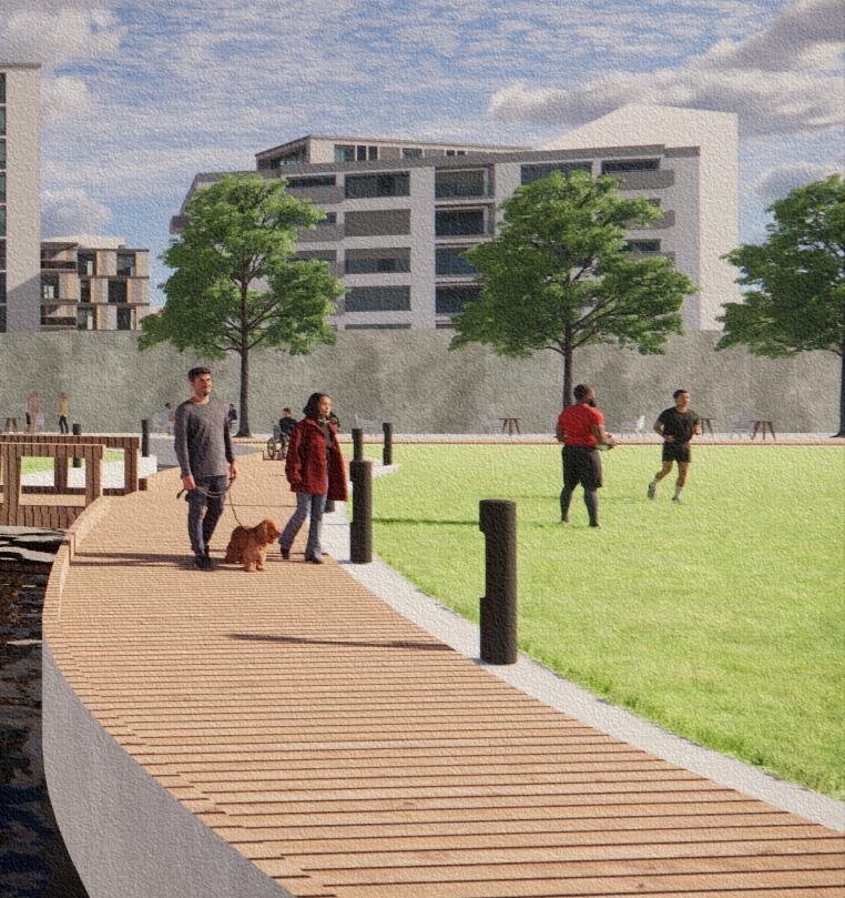
As one of the few green spaces remaining in the suburbs surrounding the city of Florence, Giardino Allori should be a hub for the community. However, the park lacks sufficient planning and exists in a state of near deterioration. Often overlooked in favor of the more recently developed Parco San Donato, Giardino Allori is sparsely utilized in a leisurely manner and functions more as a utilitarian space for locals to take their dogs on a quick walk.
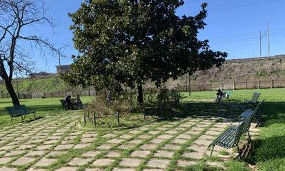
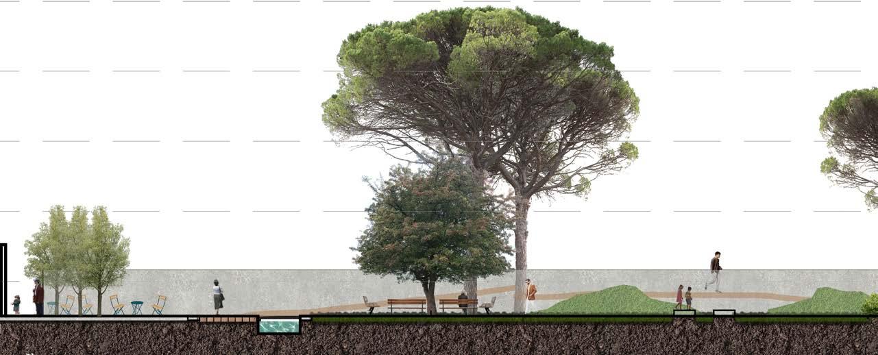
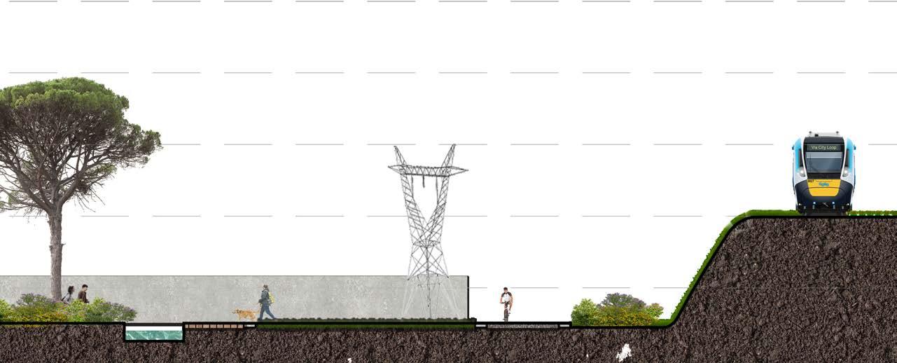
The revitalization of Giardino Allori optimizes the green space and utilizes existing features to inspire a new identity. Key elements, such as the railroad and the central magnolia tree, become the foundation for a park that is both tranquil and dynamic, one which invites users of all demographics to engage with the space.
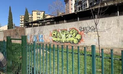
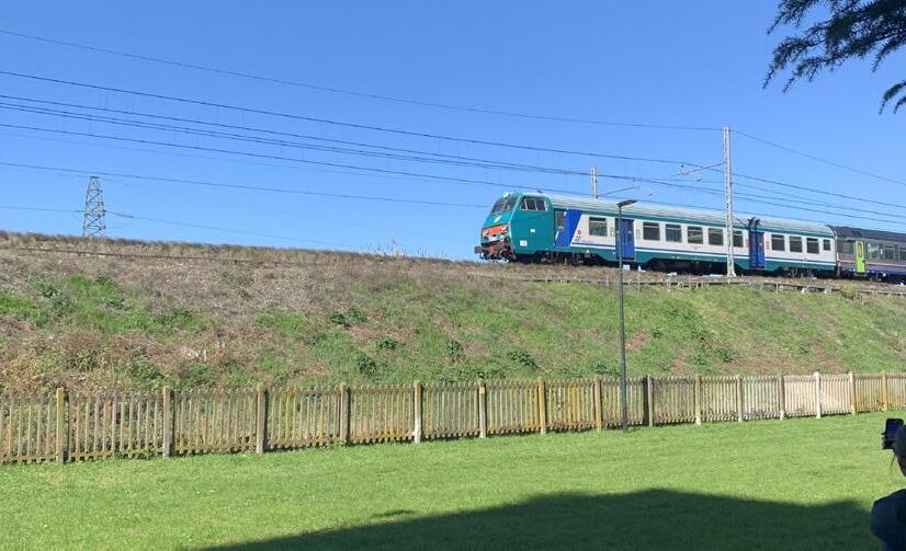
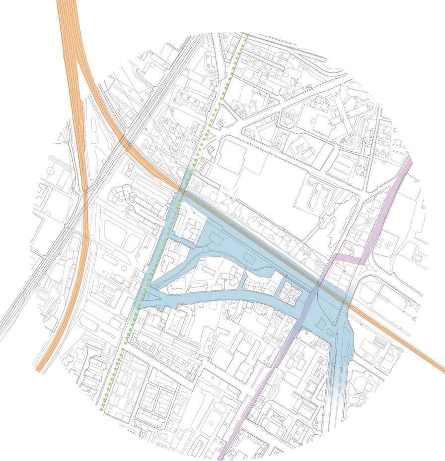
Giardino Allori is located in the Novoli district in the suburbs of Florence. The park itself is situated along the railway running to Pisa on the western coast; a food kitchen sits on the other side of the railway, drawing a population of unhoused to the area. Although the park is safe, there is an existing perception within the community that the park is dangerous because of its proximity to the food kitchen.
LEGEND
Existing Bike Lane
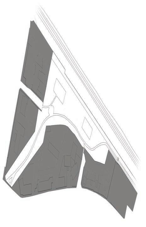
The existing park lacks variety of use typologies, resulting in severe over utilization of certain areas. Usage is concentrated in a few specific areas leading to dead grass, while other areas see hardly any use at all.
Most of the entries to the park are confined on either side by residential properties and lack distinction, making it difficult to locate the park and even intimidating to enter.
Proposed Secondary Park Entrance
Utilizing a wide array of surface materials creates a dynamic park that engages users of all abilities and invites people of all ages to play. Materiality shifts between spaces create buffer zones that introduce a secondary option for walking along the pathways through the park. These varied pathways also allow for imaginative input and can function as a game for children.

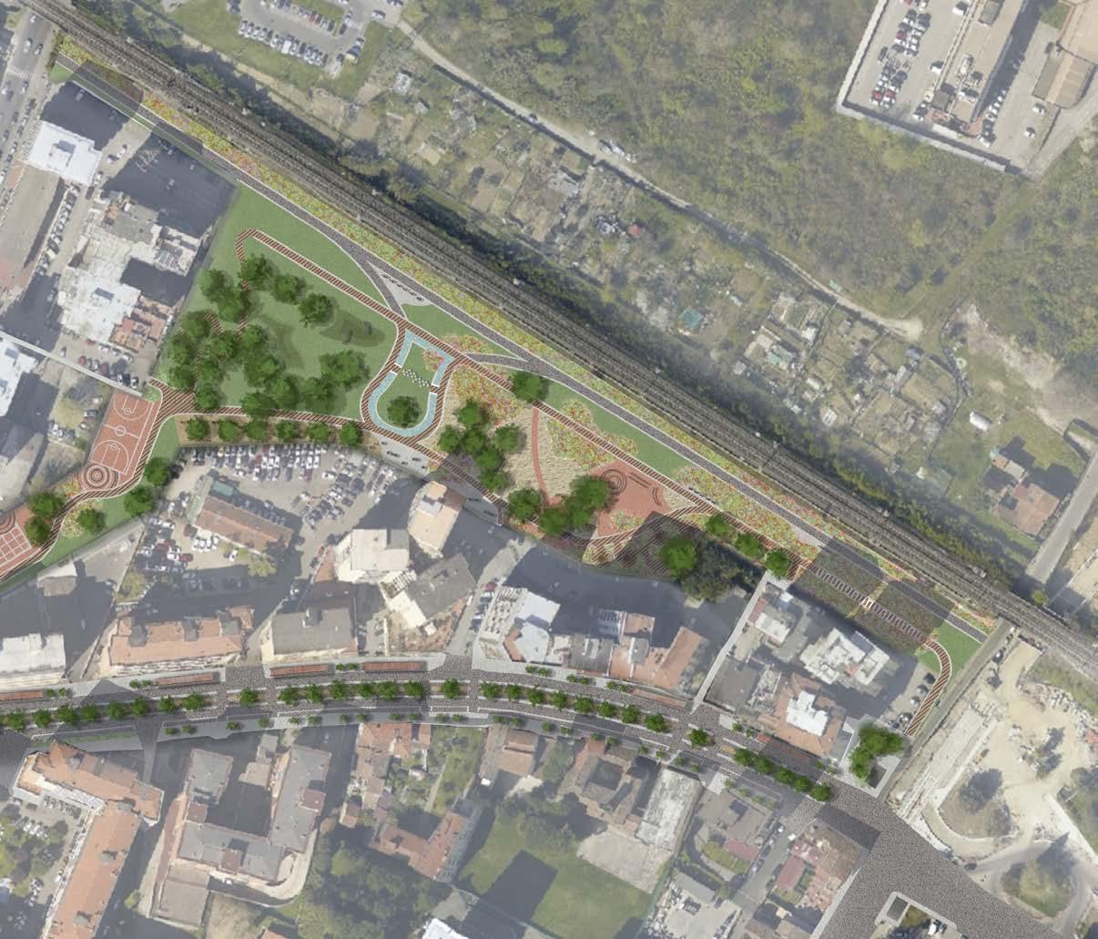
Rendered Master Plan
NEXT Robotics is a home robotics company based in Providence, Rhode Island. Their mission is to provide home technology that makes it easier to maintain your home and live as your most authentic self. NEXT believes that everyone is an artist with their own unique flair for life; whatever your style may be, NEXT is guaranteed to seamlessly integrate into your home.


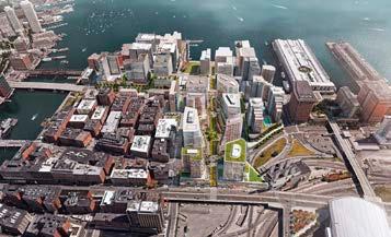
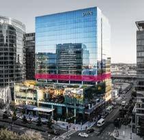
Seaport, Boston represents a dynamic intersection between the past, present, and future.
Just as in nautical navigation, it is vital to know where you have been in order to know where you’re going, which is why Next’s R&D hub pays homage to the rich shipbuilding history of the site as the company paves the way toward the future.
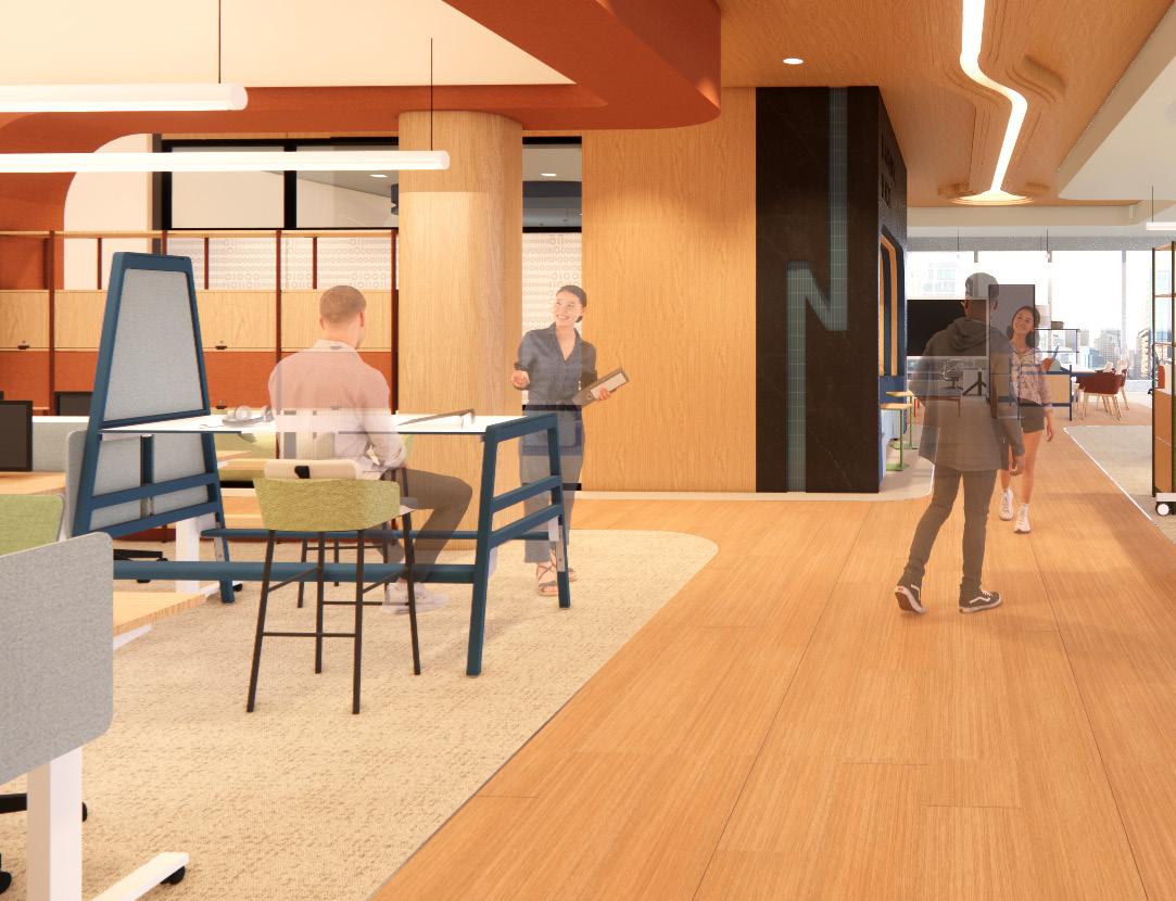
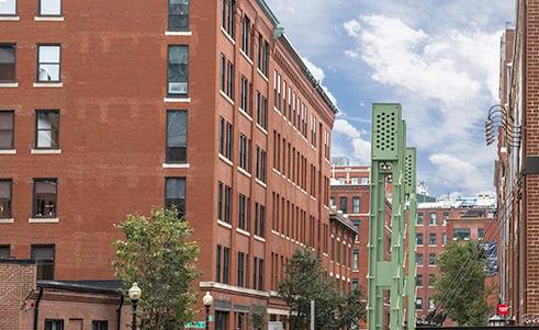
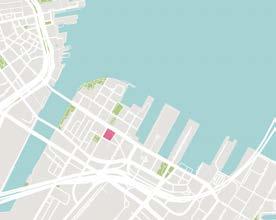
The Seaport District of Boston has a rich history as an industrial shipbuilding hub, but continues to evolve into a creative nucleus for the city of Boston. Today, Seaport remains a popular destination for sailing and is home to the Boston Harborwalk. Next’s R&D office is located in a modern high rise, just a few minutes from the harbor.
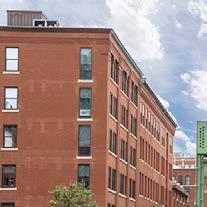
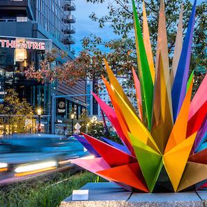
The palette for NEXT’s office is drawn from the colors of the past, present, and future of Seaport. Red alludes to the historic architecture of the brick warehouses, relics of the Industrial Revolution. Blue represents the city’s nautical culture of the present. Lastly, green reflects the district’s artistic flair and vibrant future.


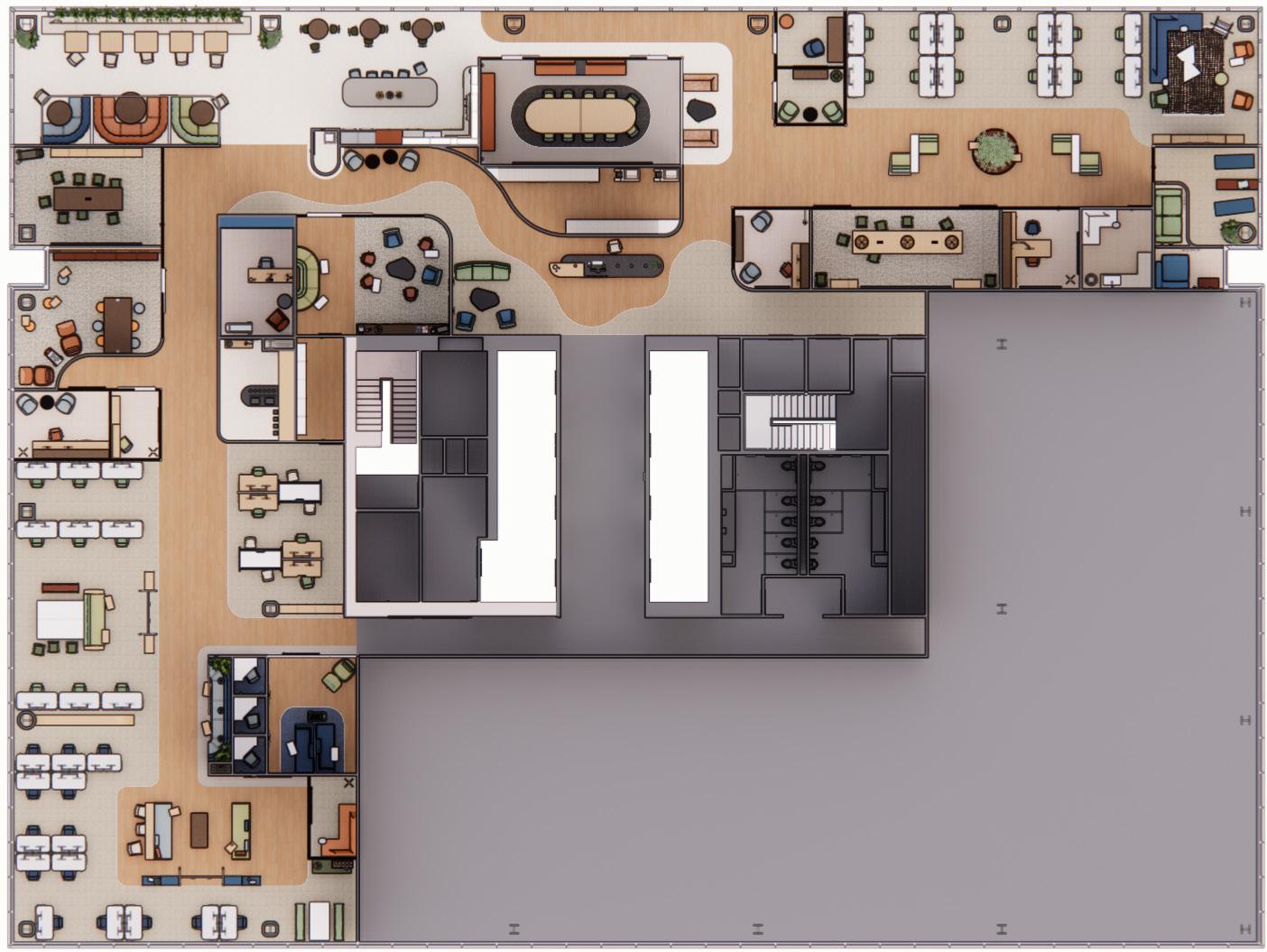
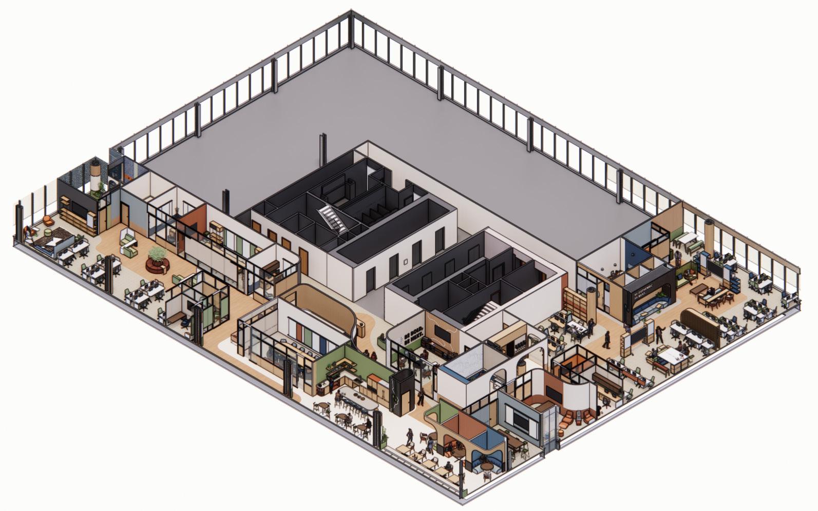
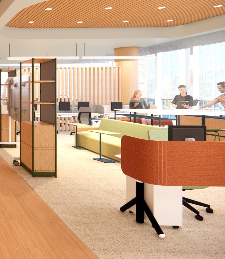
Large brand logos in a variety of colors establish landmarks throughout the workspace to help orient employees and visitors, each logo’s color corresponding with spatial typologies. Green represents collaborative work, red is active wellness, blue depicts focus work, and white portrays quiet wellness.
The work cafe takes cues from residential design to create a serene space to take a break from work and socialize with coworkers, something that cannot be achieved through remote working. Compelling secondary spaces such as the work cafe entice employees to come into the office to engage in elements of work culture that simply cannot be replicated in the virtual realm.
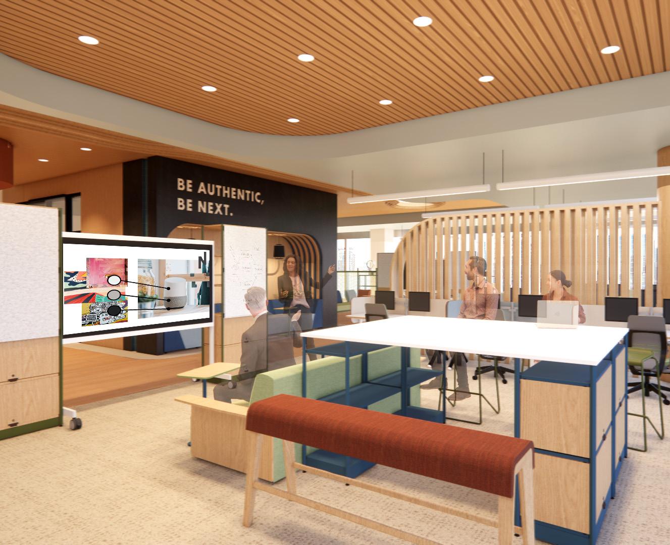
Huddle zones throughout the office support collaborative in-person work and are equipped with technology to support hybrid work. Workstations on either side of the huddle make it easy to transition between individual and collaborative work.
A dedicated quiet wellness room utilizes sound masking technology and acoustically absorbent materials to minimize auditory distraction and provide a refuge for employees who are easily overstimulated or in need of a mental break. An open central area functions as a meditation space.
The home office lab takes cues from the traditional New England style, with a white ship lap ceiling and intricate crown molding. Large built ins create a backdrop for photography of NEXT products in a home office environment, while carpeted flooring tests mobility of home assistance devices.
Project Narrative
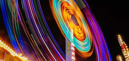
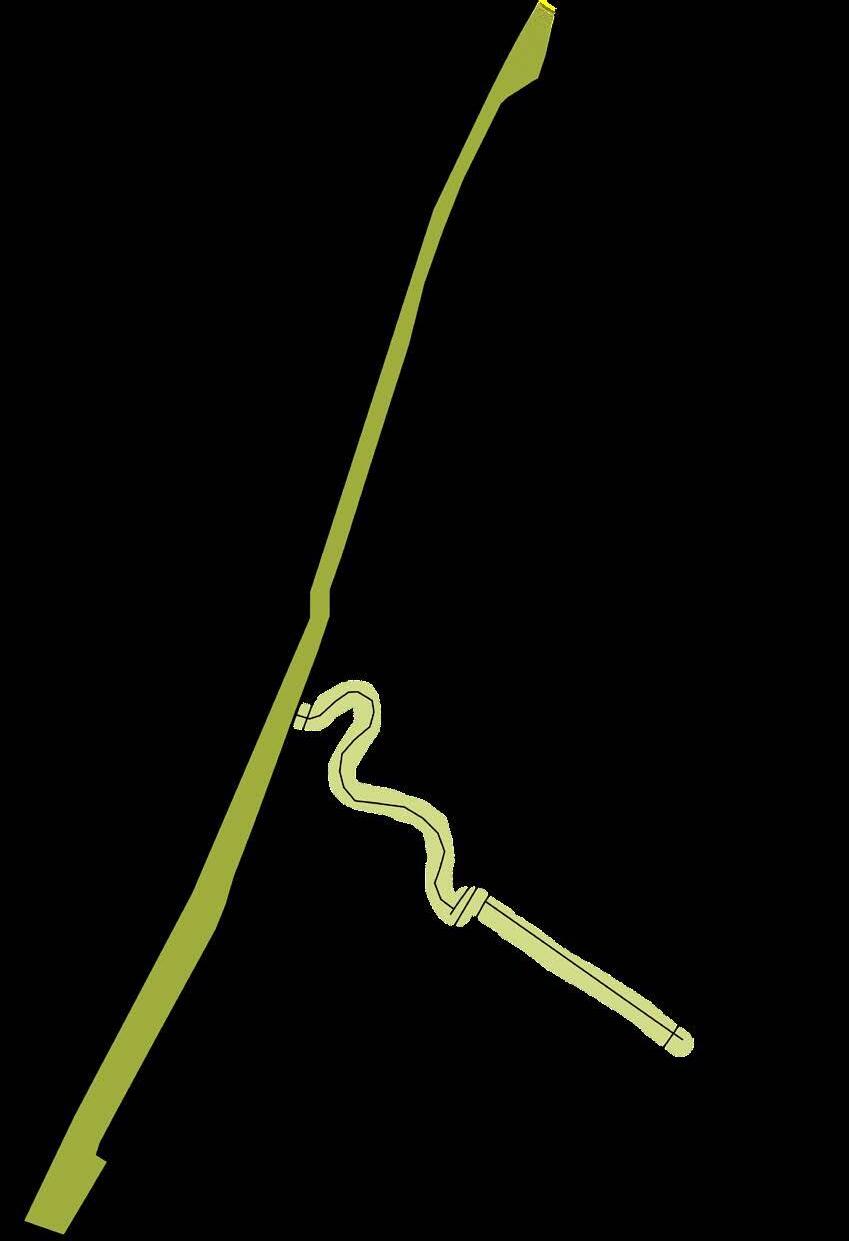
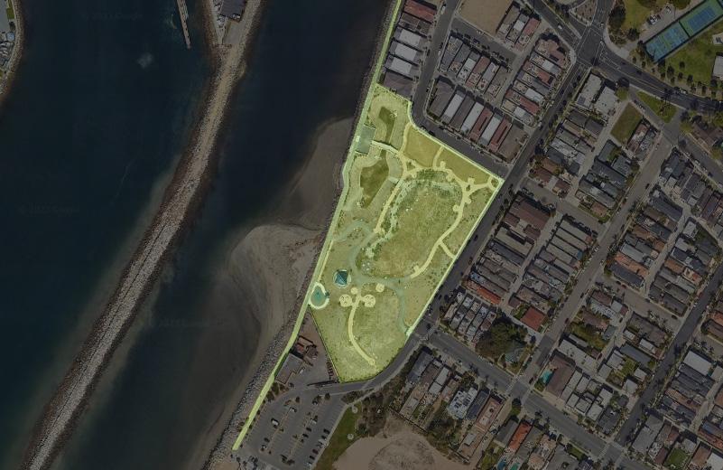
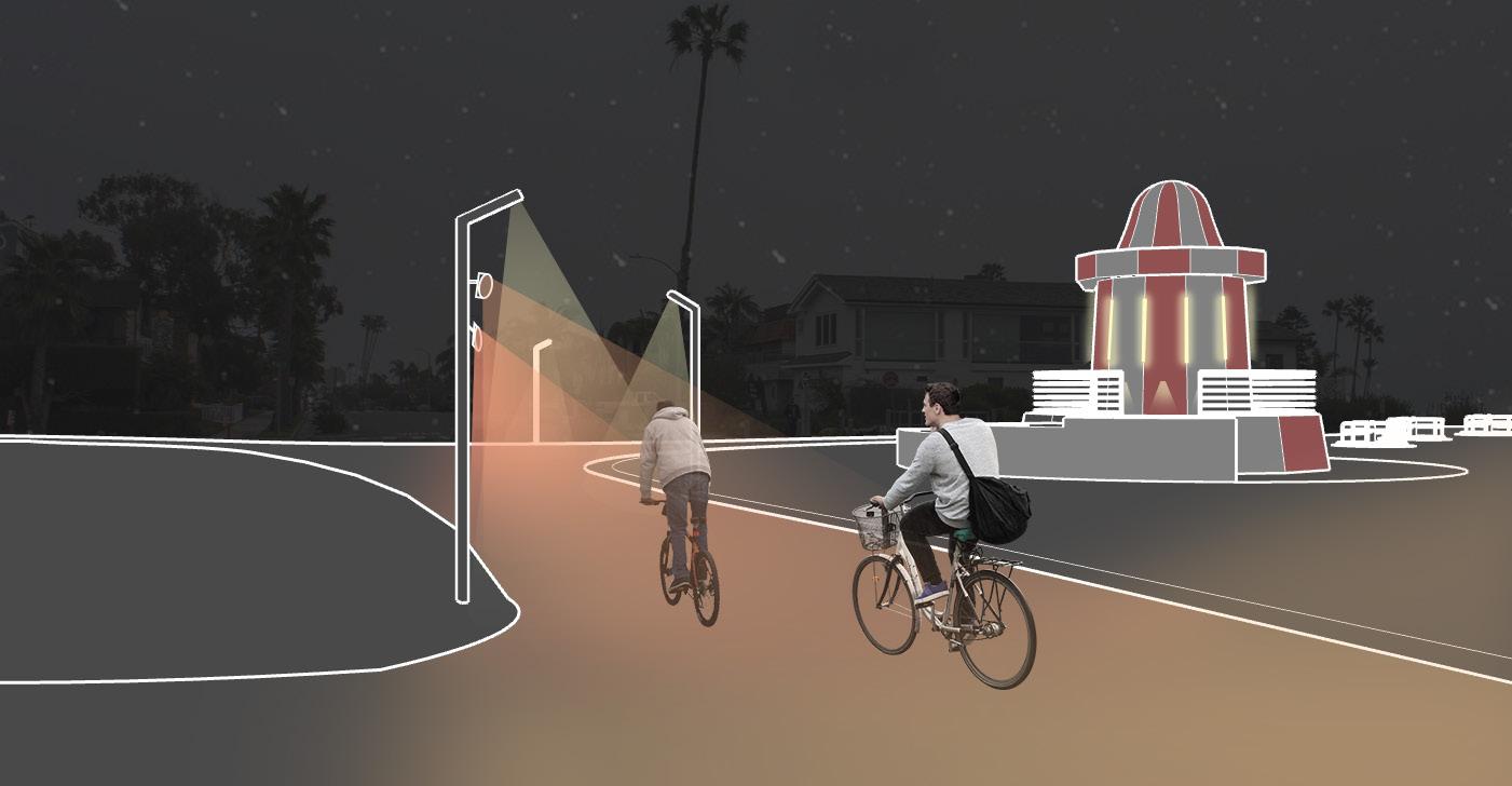
Urban lighting exists at a delicate crossroads of sustainability: minimizing light pollution yet providing sufficient illumination to invite community members to engage with an urban space. Urban lighting should also be more than utilitarian. River’s End Park merges light and motion to create a memorable night time environment that is unique from its daytime identity.
Awarded “Best Lighting Thesis” at 2023
TCU Senior Interior &
Concept Statement
River’s End Park is an homage to the city of Seal Beach’s long forgotten past as the home to a seaside amusement park. The lighting design is inspired by the kinetic motion and colorful nature of amusement parks at night.
Design Drivers
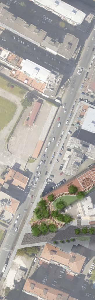
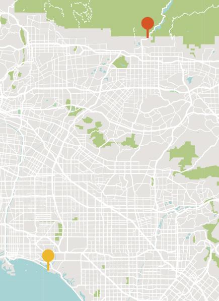
The city of Seal Beach is a quiet seaside town located 28 miles from Los Angeles. Today, it is known as a quaint family town with a charming historic main street. In the 1920s, however, the city was home to the Joy Zone amusement park, which set out to be the Coney Island of the West Coast before a fire destroyed it.
The San Gabriel Bike Path spans across the Los Angeles Metropolitan Area, from the San Gabriel Valley in Azusa to the coast of Seal Beach. The portion that runs through Seal Beach is extremely popular with local cyclists, many of whom cross through River’s End Park to historic downtown Seal Beach for breakfast on their morning bike rides. However, usage of the bike path drops off significantly during the evening hours due to a lack of path lighting.
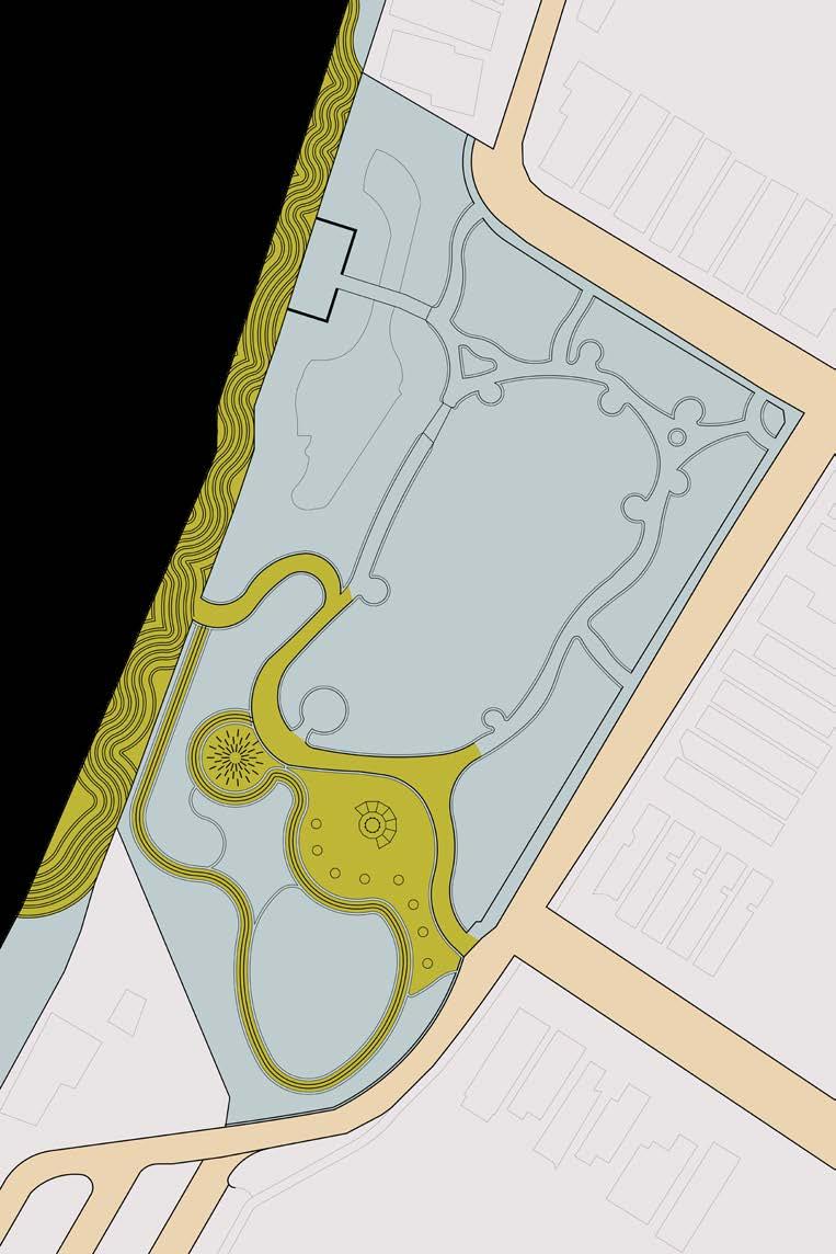
Blocking Plan
BLOCKING LEGEND
Safety Layer
Interactive Layer Street
LIGHTING CONCEPT | DUAL LAYER LIGHTING
The existing site at River’s End Park is perceived as barren and sparse, with basic lighting that reflects the lack of personality. Rather than acting as a hub for community gathering, the existing park functions mostly as a cross through between the marina and residential area surrounding the park.
The proposed lighting design designates two primary zones within the park — a safety layer, which provides basic illumination without prescribing a particular function, and the interactive layer, which utilizes a number of the different tactics to create a relationship between motion and light.

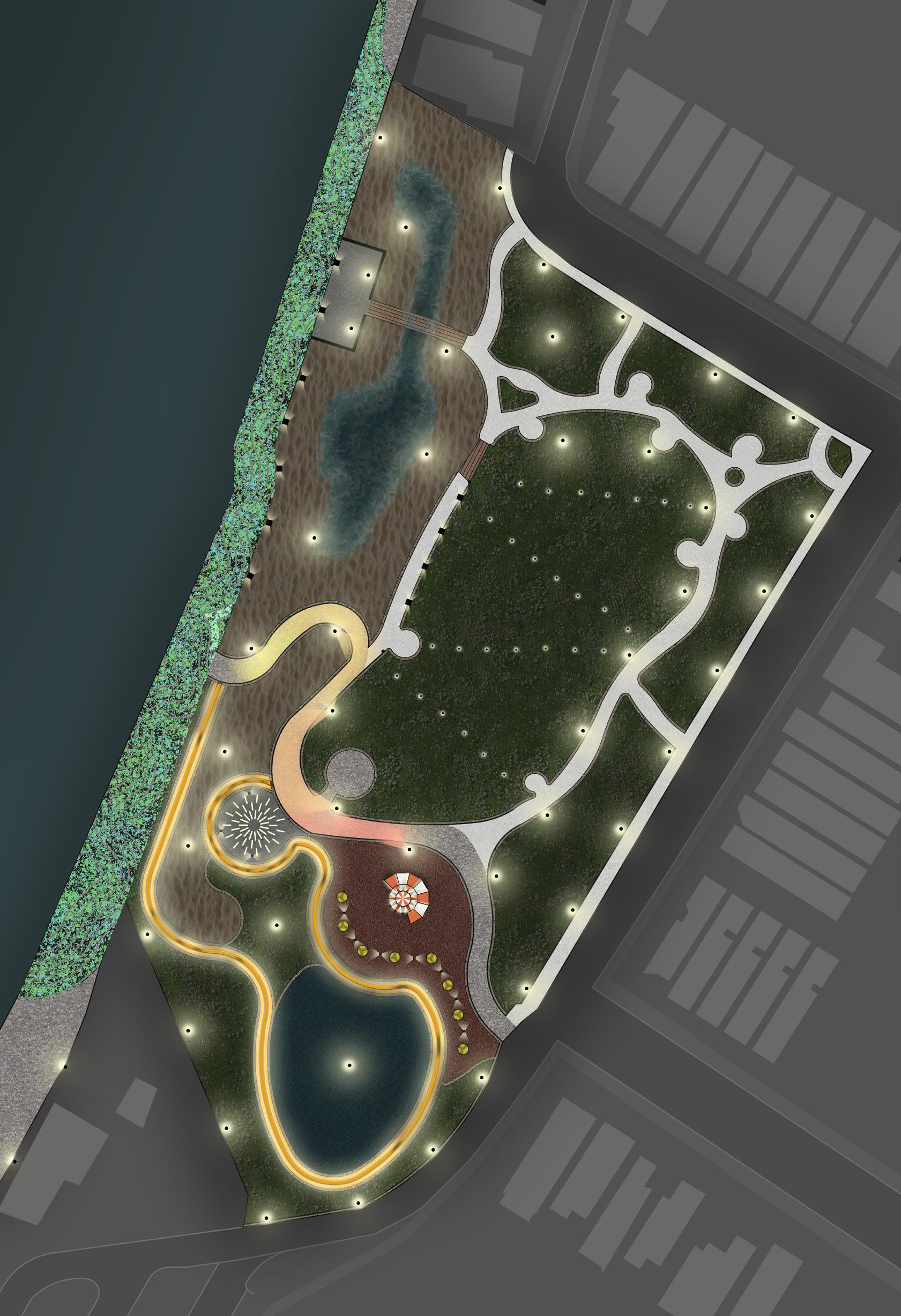


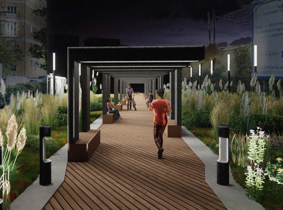
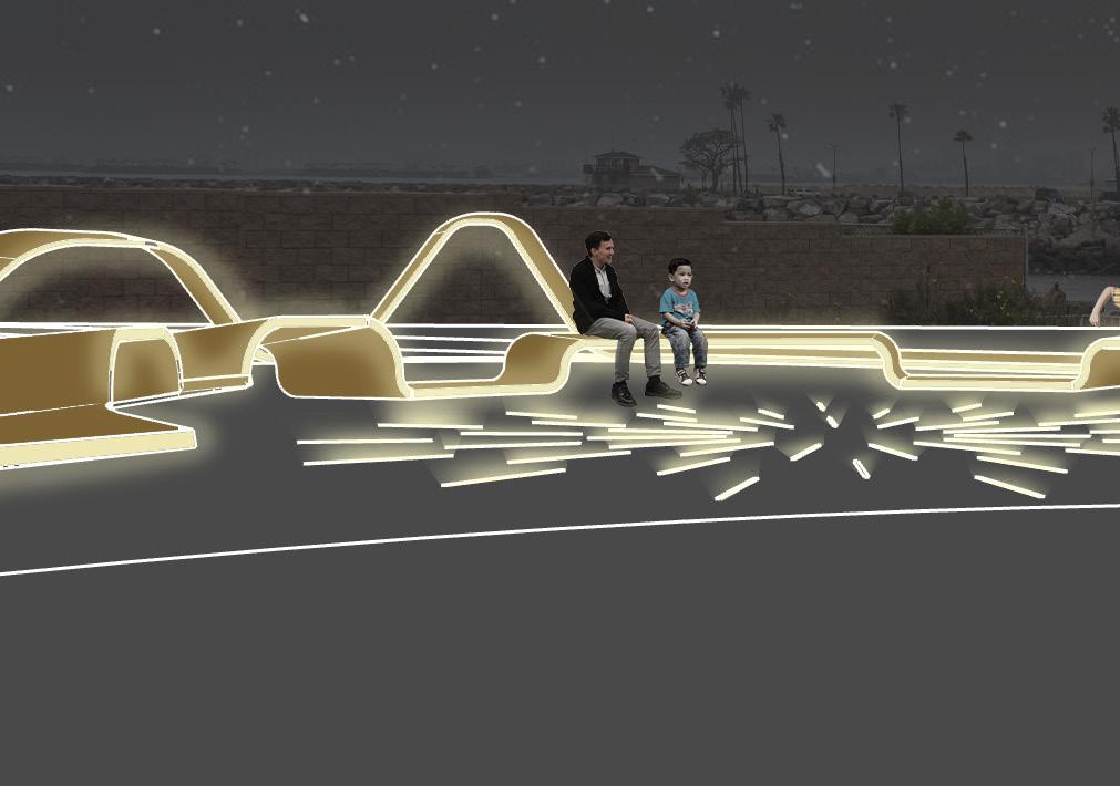
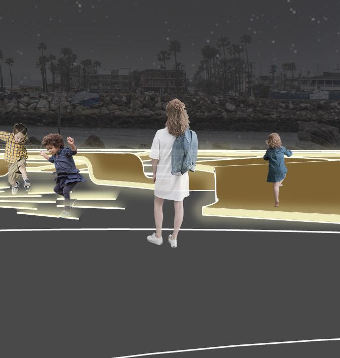
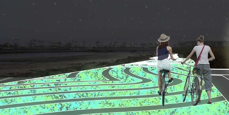
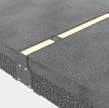
Mosaic glow aggregate forms a wavy pattern within the asphalt bike path. The aggregate is coated in a special paint that charges during the day and glows for up to 8 hours at night, providing low illumination.

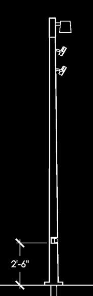
SCALE: 1” = 1’-0” RAIL PROFILE
LIGHT RAIL BENCH AREA ELEVATION
SCALE: 3/32” = 1’-0”
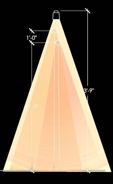
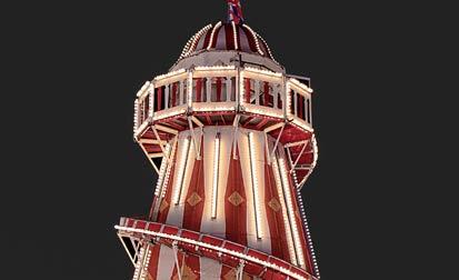
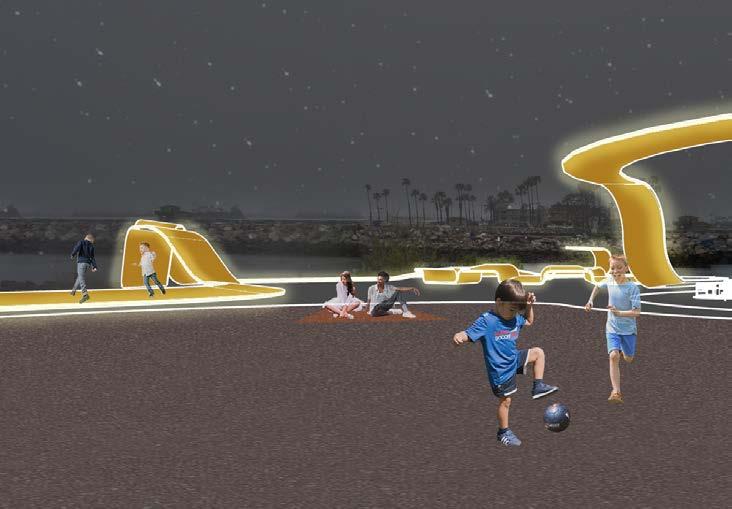
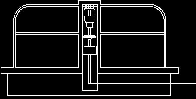
Inspired by the shape of a roller coaster track, the Light Rail is a yellow acrylic structure that runs through the park. A 6” profile with flexible LED fixtures integrated on either side extrudes up and down to create shapes like a roller coaster. These upwards and downwards extrusions function in a number of ways, from overhangs to benches and even slides.

RAIL PROFILE DETAIL
SCALE: 3” = 1’-0”
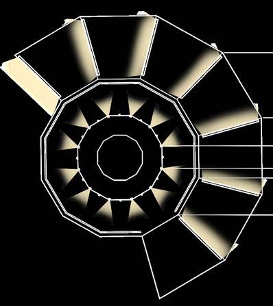
LINEAR FIXTURES POWERED BY KINETIC ENERGY FROM CAROUSELS
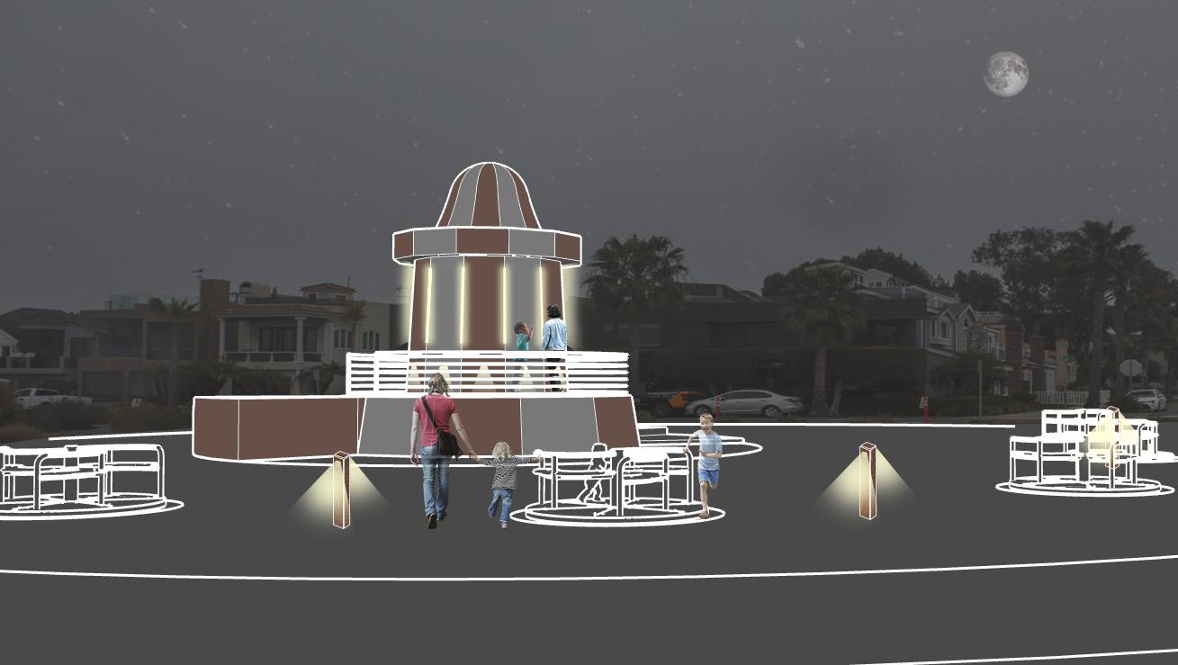
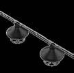
Light House Play Structure
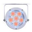
DTS Lighting Focus 6 RGBW
Outdoor Projector Fixture Tag B
Luminii Trident Recessed Outdoor
Recessed Linear Fixture Tag R
BOLLARDS PROVIDE LIGHT BETWEEN THE CAROUSELS & CREATE AN OPPORTUNITY FOR PLAY
RGBW PROJECTORS TRIGGERED BY LASER SENSORS DETECTING CYCLISTS’ MOTION
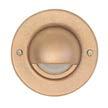
Beachside Lighting Brass Steplight
Surface Mount Fixture Tag M
POST LAMPS PROVIDE WHITE LIGHT SEPARATE FROM RGB LIGHT
Q-TRAN
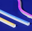
Anybend RGB
LED Strip Fixture Tag Q
Color Cycle Bike Path
LIGHTHOUSE ELEVATION
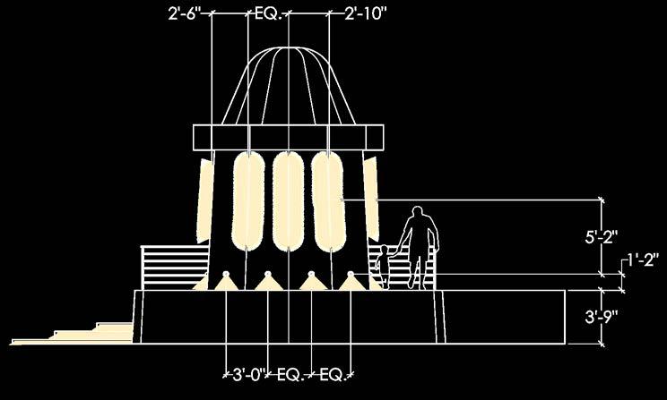
INTEGRATED GENERATOR CAPTURES ENERGY FROM CAROUSEL SPINNING
As cyclists pass the modified post lamps, 2D Lidar sensors trigger RGB projectors to illuminate the path in a tail of colored light. Upon initial trigger, the projectors illuminate red and eventually fade to yellow.
TRANSFERS ENERGY
TRANSFERS ENERGY TO LIGHTHOUSE