
Meditations in Hue EDWARD ZUTRAU


Cover illustration:
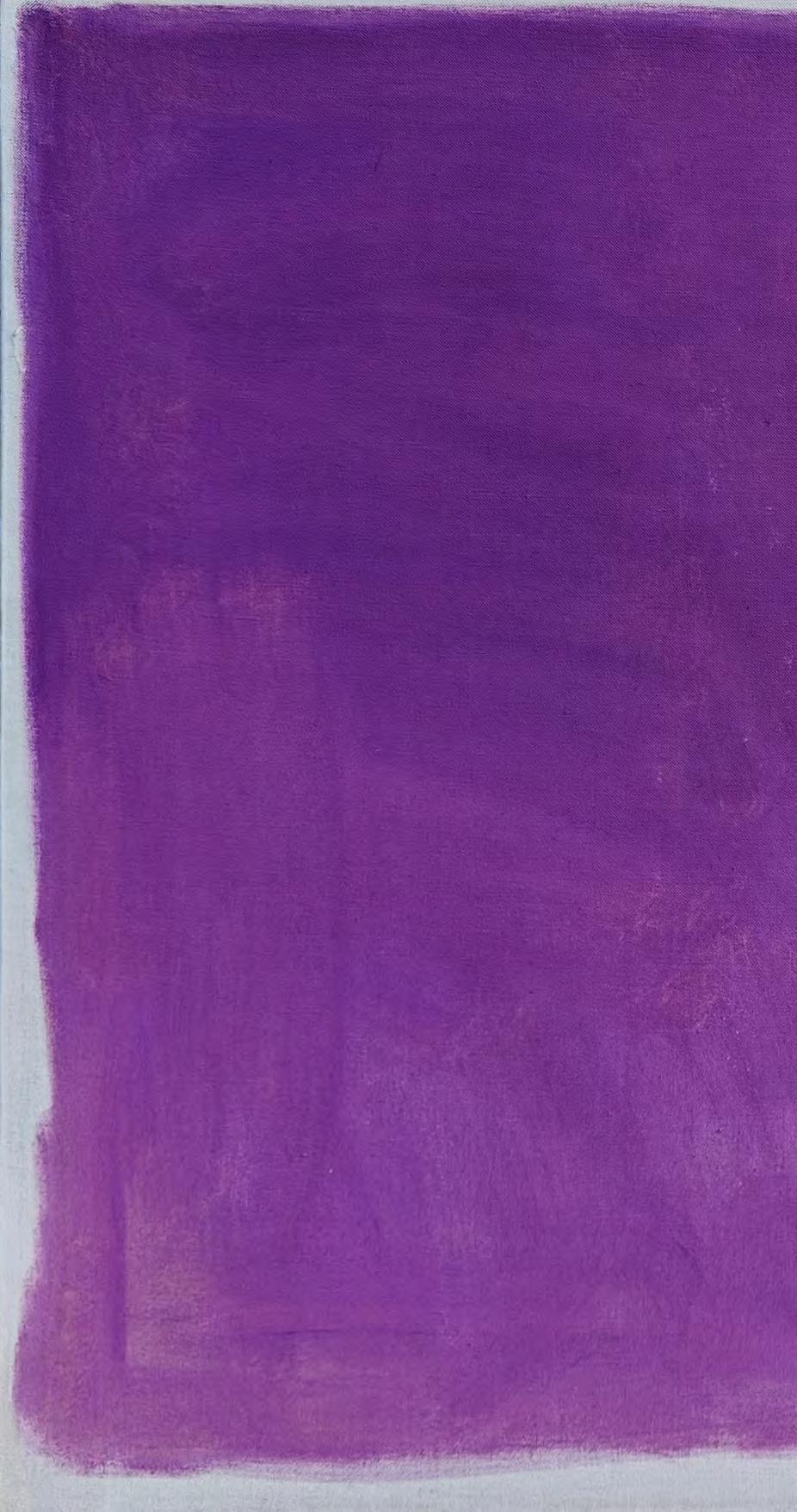
Untitled, 1960 Oil on linen
51 1/2 x 38 1/4 inches
All rights reserved, 2024/2025. This catalog may not be reproduced in whole or in any part, in any form or by any means both electronic or mechanical, without the written permission of Lincoln Glenn.
Catalog design by Clanci Jo Conover

Our journey with Edward Zutrau began nearly a decade ago when we first encountered his work. We were immediately struck by the depth and emotional resonance of his pieces, and from that moment, we knew we wanted to be part of his artistic legacy. As we continued to grow in the art world, our admiration and desire to engage with Zutrau’s work never waned. His art has been a constant for us, and we are honored to bring his paintings back into the spotlight.
This exhibition, which focuses on Zutrau’s abstract works from his time abroad in Japan (1958-67), captures the beauty and calmness of the world around us—moments of serenity that often go unnoticed in our busy lives. Zutrau, a lifelong expressionist and a fixture in the New York art scene, brought these qualities to life in his art, creating meditative compositions that invite viewers to pause and reflect.
We are thrilled to present this exhibition, the second in New York since Zutrau’s passing, as a celebration of his enduring legacy. We extend our deepest gratitude to the Zutrau family for their support and assistance in making this exhibition possible. Special thanks also go to Filippo Marino for his photography and cataloguing of these remarkable works, Clanci Jo Conover for her catalogue design, Jeffrey Wechsler for his scholarship and dedication to the unsung artists of the 20th century, and Jeffrey Gold for his passion and unwavering dedication to Edward Zutrau over the past eight years.
We hope this exhibition allows you to experience the tranquility that Zutrau fully captured 60 years ago.
Warmly,
Douglas Gold & Eli Sterngass
EDWARD ZUTRAU (1922-1993)
Edward Zutrau is among the many worthy yet infrequently remembered American artists who worked within the whirlwind of diverse abstraction that spun out in the decades immediately following the burgeoning of Abstract Expressionism. A teacher at various schools for many years during his career, including stints at the Fashion Institute of Technology and New York University, Zutrau received three one-person shows at the Betty Parsons Gallery. The overall arc of his full output reveals a thoughtful development of successive pictorial formats that were informed by the artist’s highly individual approach to the act of painting, which was often quite self-aware and even philosophical at times. Zutrau produced many written descriptions of his ideas about art, frequently rather philosophical, including published and unpublished brief essays and diaristic expressions of daily occurrences and thoughts concerning art and life. From these sources, one glimpses an artist who is deeply introspective, and profoundly passionate. Reading the artist’s written reflections, it may be observed that some of Zutrau’s visual influences were specific, and sometimes very personal, almost quirky. For example, in a printed statement of November 1960, he notes that “My impulses to paint are stimulated by red and black and white”, and he rhapsodized about the colors and shapes of fighting airplanes of World War I, focusing on “The red black and white German planes and the red and blue markings of the allied planes,” and further noting “What an exciting shape the tail of the Fokker D-7 had.” He once admitted that some paintings were inspired by an album cover design for a recording of composer Bela Bartok’s “The Miraculous Mandarin.” At other times he created deeply felt and perceptive ponderings about the process and appreciation of painting, as in a published comment of November 1960 that posits: “To write about painting is exactly that, [the word] ‘ABOUT’ meaning around or nearly, never directly hitting the point. Only the act of painting can do this and then convey it to others purely on the terms of painting, not to simply be looked at, or seen intellectually but to be seen and fully comprehended with our whole being.”

In the 1960s, Zutrau pursued a manner that occupied a middle ground between two contemporary approaches to abstract painting, each of which can only be described through somewhat imprecise and open-ended visual parameters. One featured hardedge shapes and flatly painted surfaces, in which the areas, generally small in number and in color or black and white, were positioned to create subtle compositional interactions: such works can be found within the art of Ellsworth Kelly, John McLaughlin, Lorser Feitelson, and Myron Stout. Zutrau’s art of the 1950s echoed this carefully composed geometric style. The other style was more directly derived from Abstract Expressionism, using a rather painterly technique, in which the color shapes had ragged or indistinct borders, and were dispersed in arrangements that were occasionally simple, such as in Fig.


Ray Parker’s work, but more often of greater complexity than the style mentioned above, frequently with many scattered and abutting forms: within this category can be placed Esteban Vicente and Giorgio Cavallon, and many others. In terms of Zutrau’s pictorial development, an untitled painting of 1957 (fig. 2) offers a convenient indication of the artist’s transition between the two modes. Significantly, both of the styles loosely defined here had a common element: subtlety in composition or color.
The majority of works in the current exhibition demonstrate how Zutrau’s work of the 1960s chronologically straddled and often visually intermingled the methodologies noted above. For example, in Kamakura 4/19/63 (fig. 3), the painting consists of just two large rectangular color areas, green and blue. However, the intensity of the hues are rather different, with the green being quite bright, approaching an acid tone, and the blue more subdued. Although this simple image may parallel to some degree certain compositions of Ellsworth Kelly, there are two essential differences. Zutrau’s paint surface is not flat, but is varied with visible brushstrokes. Very importantly, the two main color shapes do not have straight edges nor do they consistently reach to the border of the paintings. Instead, the areas allow empty space to meander around them, with irregular yet carefully controlled wavering perimeters. On the other hand, Zutrau’s Kamakura 5/19/63 (fig. 4) is a relatively more complex composition. Its shapes, varying in size and shape, have intense colors, including pink, orange and a bright yellow. While more
intricately constructed than the previous Zutrau work, its color areas are maintained firmly within their borders, and do not diffuse into the background or adjacent shapes, as happens within the paintings of Vicente and Cavallon.
The considerable interest in subtlety that informs Zutrau’s work includes not only the careful and intricate balancing of adjacent or interlocking forms, but the management of many high-keyed colors to resolve into a composition with a sense of internal stability, counteracting the otherwise visually complicating effects of bright patches of color. The selection of the contours of the shapes that inhabit Zutrau’s paintings further

illustrate the artist’s subtle touch. The shapes frequently display slightly curved boundaries, suggesting a curiously puffy quality. Even L-shaped forms, usually sharply angular, are given the impression of softness; instead of firmly hooking onto or aggressively piercing into adjacent areas, they seem to nestle among their neighbors with the gentlest of touches (fig. 5). This tendency toward implied softness asserts itself in a particularly intriguing way in Rock Shapes (fig. 6), where the almost flaccid appearance of some shapes contradicts the work’s title that nominally presents the image as depicting stones.


A further instance of subtlety may be perceived in the many canvases that emphasize Zutrau’s attention to slight details of paint application that add interest to otherwise apparently very simple compositions. In an untitled painting (fig. 7), all the viewer seems to be offered are two large blue rectangles, placed side by side. However, Zutrau has employed a few intriguing devices that reward close study. First, neither blue area is an uninflected surface of flatly applied blue. The rectangle on the left shows an application of a matte blue that allows the perception of a lighter blue beneath, enlivening the area. The edge at the bottom is not a plain border, but is slightly feathered to offer a soft effect. The rectangle on the right has a more irregular surface, with scumbled paint applied in strokes that are relatively wider than those on the left. The edges of the painted areas do not uniformly reach the borders of the canvas; they leave irregular blank spaces that carefully recede from or move toward the painting’s periphery. And finally, an embellishment of relatively heavy white impasto intercedes between the rectangles at the top center – a textural surprise, as it were. While the delicate visual variations of this painting are evidence enough of Zutrau’s interest in prying out
visual interest from extremely reduced pictorial incident, this tendency is enhanced by his decision to only use blue as the painting’s single chromatic component.
Paintings such as this indicate that, despite the many other works which make evident his ability to orchestrate compositions ranging over a wide spectrum of colors, Zutrau found considerable interest in wresting as much pictorial potential from a single color as possible. In a note from May 1980, he expressed his confidence in succeeding within such a restricted manner in reference to the color blue: “Blue is a subject for a painting. If I was put in prison and given only 5 foot square paintings to do (canvas 5x5) and only
tubes of blue pigment, cobalt blue and some white, nothing else, and if for the rest of my life, I was obligated to use the blue (mixed with white, or without) I think it would be possible to do endless numbers of paintings, each one different.” This comment reflects Zutrau’s attitude toward color in a period soon after that represented in this exhibition; by the late 1970s, reflecting his opinion on the viability of essentially monochromatic painting, his work began rather naturally to drift toward simpler chromatic experiments and formats, resulting in groups of square, serene canvases featuring expanses of single colors, lightly modulated.
With his sensitivity to the subtleties of color and shape, it also seems logical that Zutrau might be attracted to the refined artistic traditions and introspective philosophy of East Asia. Indeed, he took two extended sojourns to Japan between 1958 and 1967 with his family (his wife was Japanese), and created many works there, including some in this exhibition. He had several shows in Japan which garnered generally positive reviews as well as a reasonable number of sales. In an article in the Mainichi Daily News of May 17, 1963, the writer declared that Zutrau’s best works “are definitely Oriental in his grasp of a very concentrated, directly intuited, transcendent realization of … space-color of a quite original kind,” further stating that Zutrau’s understanding “of some of the most essential things from our tradition” creates “a perfect harmony of the East and the West in the fusion of some very profound essences of both traditions.”
Bolstering this intercultural perception, in one of his notebook jottings dated May 16, 1980, Zutrau mused: “The clear white surface of a canvas to a painter, or paper to a writer are the emptiness and centering (or focusing) we are told about when the people involved in meditation and Zen talk about clearing away all worldly distractions…. This white surface is our ego –it is us. It breathes and lives just as we breathe and live…. The surface we work on actually tells how we are breathing.” By paralleling the act

8: Edward Zutrau, Street in Shibuya, Tokyo, Japan, 1959 of painting with the control and continuous perception of one’s breathing found in various East Asian meditative methods, along with the philosophical notions of “emptiness” and “centering,” Zutrau exposes his quite personal and thoughtful approach to art. Within one oeuvre are found dichotomies: the visual complexity of arrays of bright colors in a matrix of jostling forms in contrast to the simplicity of two similar adjacent shapes of similar hue; the active geometric elements of his early work or the introspective, simple, hazy and misty fields of his later work. Observing the balancing of all these evocations in a sort of yin-yang interplay, we find a rather chimerical but deeply personal and thoughtful body of work by an artist whose career of conceptual continuity was paradoxically expressed through progressive change.
As one of Zutrau’s notes, dated May 15, 1980, tells us: “There is no style in painting or technique – style and technique merely means ‘the way we work’ and the way we work becomes recognized as us – it is what we are. We make our own space on a
surface that our work is seen and recognized – this is our so-called ‘style’ – but it is the content – the energy – the way we do things that must come through – just seeing the surface is not enough.”
Jeffrey Wechsler
Jeffrey Wechsler was Senior Curator of the Jane Voorhees Zimmerli Art Museum of Rutgers University until his retirement. He specializes in lesser-known but worthy artists and styles within 20th century American art, organizing exhibitions such as “Surrealism and American Art, 1931-1947” and “Asian Traditions / Modern Expressions: Asian American Artists and Abstraction, 1940-1970.”

51 1/2 x 63 1/2 inches

44 x 60 1/2 inches

Untitled , 1960
Oil on linen
51 1/2 x 38 1/4 inches

Untitled , 4/1963
Oil on linen
35 1/2 x 51 inches
Signed and dated on stretcher bar


Polynesian Image, 2/1960
Oil on linen
38 1/2 x 51 inches
Signed, dated and titled on verso
Kamakura, 5/1963
Oil on linen
38 1/2 x 51 1/2 inches
Signed, dated and titled on verso


Rock Shapes , 8/1960
Oil on linen
38 x 51 1/2 inches
Signed, dated and titled on stretcher bar

Kamakura , 5/19/1963
Oil on linen
38 1/2 x 51 inches
Signed, dated and titled on verso

Kamakura , 4/19/1963
Oil on linen
38 1/2 x 51 inches
Signed, dated and titled on verso

26 x 31 1/2 inches
Signed and dated on stretcher

Untitled , 2/17/1963
Oil on linen
25 1/2 x 21 inches
Signed and dated on verso

Untitled , 1960
Oil on canvas 13 x 9 3/4 inches
Signed and dated on stretcher verso “11/60”

Kamakura , 5/1963
Oil on linen
9 1/2 x 13 inches
Signed, titled and dated on stretcher bar

Untitled , 1963
Oil on canvas
10 3/4 x 8 3/4 inches
Signed and dated on stretcher verso “4/63”

Untitled , 1963
Oil on canvas
10 3/4 x 8 3/4 inches
Signed and dated on stretcher verso “5/63”

Untitled , 1960
Oil on canvas
8 3/4 x 10 3/4 inches
Signed and dated on stretcher verso “11/4/60”

Untitled , 1963
Oil on canvas
8 3/4 x 10 3/4 inches
Signed and dated on stretcher verso “5/63”

Untitled , 1963
Oil on canvas
8 3/4 x 10 3/4 inches
Signed and dated on stretcher verso “5/63”
Untitled, 1963
Oil on linen
51 1/2 x 63 1/2 inches
Untitled, 1957
Oil on linen
44 x 60 1/2 inches
Untitled, 1960
Oil on linen
51 1/2 x 38 1/4 inches
Untitled, 4/1963
Oil on linen | 35 1/2 x 51 inches
Signed and dated on stretcher bar
Polynesian Image, 2/1960
Oil on linen | 38 1/2 x 51 inches
Signed, dated and titled on verso
Kamakura, 5/1963
Oil on linen | 38 1/2 x 51 1/2 inches
Signed, dated and titled on verso
Rock Shapes, 8/1960
Oil on linen | 38 x 51 1/2 inches
Signed, dated and titled on stretcher bar
Untitled, c. 1960
Oil on linen | 26 x 31 1/2 inches
Signed and dated on stretcher bar
Untitled, 2/17/1963
Oil on linen | 25 1/2 x 21 inches
Signed and dated on verso
Kamakura, 5/19/1963
Oil on linen | 38 1/2 x 51 inches
Signed, dated and titled on stretcher bar
Untitled, 1960
Oil on canvas | 13 x 9 3/4 inches
Signed and dated on stretcher verso “11/60”
Kamakura, 5/1963
Oil on linen
9 1/2 x 13 inches
Untitled, 1963
Oil on canvas | 10 3/4 x 8 3/4 inches
Signed and dated on stretcher verso “4/63”
Untitled, 1963
Oil on canvas | 10 3/4 x 8 3/4 inches
Signed and dated on stretcher verso “5/63”
Untitled, 1960
Oil on canvas | 8 3/4 x 10 3/4 inches
Signed and dated on stretcher verso “11/4/60”
Untitled, 1963
Oil on canvas | 8 3/4 x 10 3/4 inches
Signed and dated on stretcher verso “5/63”
Kamakura, 4/19/1963
Oil on linen | 38 1/2 x 51 inches
Signed, tiled and dated on verso
Untitled, 1963
Oil on canvas | 8 3/4 x 10 3/4 inches
Signed and dated on stretcher verso “5/63”
