

“making space to allow each of us to be seen, heard, and authentically expressed”


A brand style guide is a go-to document that lays out the rules for representing a brand consistently across all media. It covers everything from logo use, color schemes, and typography to imagery and graphic elements, making sure the brand looks unified and recognizable. This guide helps everyone, from employees to designers and marketing partners, stay on the same page and keep the brand’s identity intact.
Logos must be designed in a vector application such as Adobe Illustrator, not Photoshop! The reason for this is that the logo needs to be scalable without losing its quality. It should be crisp regardless of whether it is printed on a tiny business card or a billboard.


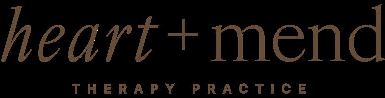
1.0.1 Primary Logo
1.0.2 Badge
1.0.3 Logomark
1.0.4 Logo Usage
1.0.5 Logo Usage
Logotype is the definitive modern collection of logotypes, monograms and other text-based corporate marks. Featuring more than 1,300 international typographic identities, by around 250 design studios, this is an indispensable handbook for every design studio, providing a valuable resource to draw on in branding and corporate identity.


It is important that the logo can be reproduced in a single colour such as black or white while still being recognisable. Imagine how the logo will look on a newspaper advert or reversed out.

Color is the element of art that is produced when light, striking an object, is reflected back to the eye. There are three properties to color. The first is hue, which simply means the name we give to a color (red, yellow, blue, green, etc.). The second property is intensity, which refers to the vividness.


2.0.1 Primary Colour
2.0.2 Colour Palette
While it is good to experiment with colours, it is best to keep a limited colour palette. A lighter or darker version of each of your main colours can be used for variation.
Romance
RGB R244 G238 B241
WEB #f7f2ed
Half Spanish White
RGB R227 G212 B194
WEB #e3d4c2
Jambalya
RGB R101 G076 B055
WEB #654c37
Mystic
RGB R218 G223 B219
WEB #dadfdb
Taupe
RGB R184 G145 B120
WEB #b89178
Heathered Grey
RGB R143 G144 B126
WEB #8f907e
Green Kelp
RGB R164 G119 B126
WEB #383b26
Typography is the art and technique of arranging type to make written language legible, readable, and appealing when displayed. The term typography is also applied to the style, arrangement, and appearance of the letters, numbers, and symbols created by the process.


3.0.1 Primary Typeface
3.0.2 Secondary Typeface
Inter is an sans-serif typeface designed by Swedish designer Rasmus Andersson. It was designed to work well on screens. The family is available in nine weights with matching italics, as well as a variable font version.
Ivyora is a modern typeface designed by Samuel Oakes. It is characterized by its elegant and sophisticated design, making it suitable for various applications such as branding, editorial design, and web design
I vyOra Display
Collateral design refers to a form of promotional design that supports marketing. The goal of collateral design is to create cohesive and visually appealing pieces that effectively convey the brand’s message and enhance its overall image.


4.0
4.0.1 Business Cards
4.0.2 Letterhead
4.0.3 Pinterest
4.0.4 Pinterest Alternate
A business card/letterhead typically includes the giver’s name, company or business affiliation (usually with a logo) and contact information such as street addresses, telephone number(s), fax number, e-mail addresses and website.
To Susan Lemaire Patient

Job No. 1203404
Sam utemquatiae odisim qui volorep erferro quidesciam hicilic aerferu mquate volende digenis provitam dolorescium est, torent faccae de cus, simi, sinvern atenda vellector sitaque arume se es doluptatur as rem ipsunt. Ovit untis sequam sit peria volo dolumquis vit vidis dit et laborunt aut eni ut landi si tem est as pro ma aut is velenda ipsania veri totatibusam, sinullo ribus, in paribus aut ant, quatur sae vellitatur ario. Iciis aut aut officab oratur aut aut ariandu ntiantibusa vendi nos volore seque nos delibus. Vere nonemquidi cum quid ut alitis nisinctotae pratum elessed quod modis niae num quo conemol oreriam comnisc idebisc itatiam cor res maximporem illorestiaes repudam quibus aut qui atum nos eic te nobis utatem laccullab ipsam hariori atemped que antiis dolori ni audam nonem ex et fuga. Nem et ullacca estiosae conet aut liquam, nosam con necum voluptur, cumquae. Ut faces a corent odisti berum ut modit faciume sanditiis aut ut a ditinum si quati alia am, accus unt. Untibus aut aborro maio. Tur aciamus, et que nat aci dellit aut eatur, que num

Pinterest says 600 x 900 pixels is optimal – or any 2:3 size. Any business with access to the Pinterest Ads Manager can buy this standard ad format to support marketing goals like awareness, engagement and traffic.

COUNSELLING WITH COMPASSION