Symbolic Meaning
For this assignment I created symbols representing womanhood: Strength (crown), Joy (dancing), and rest. I sketched in Photoshop, then traced in Illustrator using the Pen tool for clean, geometric lines. For my name, I used Rockwell font, highlighting “m”, “r”, “o”, and “i” in red. Combining both parts into a balanced composition.




Page Design #2
Hieroglyph Writing Exercise
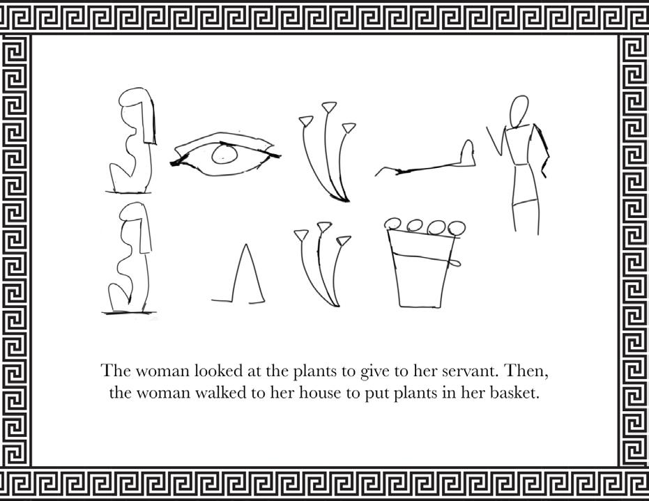
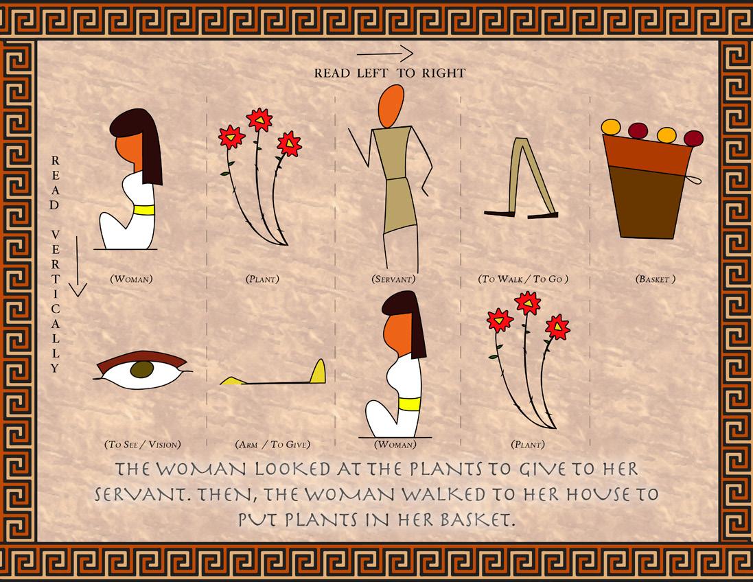
I combined traditional hieroglyphs with modern design techniques to narrate a story where a woman selects plants for her servant and later places them in a basket at home. I began by sketching each symbol in Photoshop, focusing on their historical accuracy while adding intricate details for a more modern look.
After arranging the symbols vertically, I designed an Egyptian-style border to frame the composition. I then imported the design into Illustrator, where I meticulously traced each element with the Pen tool, adding color to enhance the visual depth and bring the story to life.


Page Design #3 Lettering during the Roman Empire and Middle Ages
For this project, I chose the Brioso typeface. I emphasized its calligraphic roots with a sketch of the word “Illumination.” The lightbulb illustration, symbolizing the concept of illumination, was added to reinforce the theme.
I balanced text and imagery by placing a decorative illustration of an illuminated manuscript, connecting the historical context. The border uses a hand-drawn, flowing line to frame the entire composition, creating cohesion and guiding the viewer’s eye across the page.
Objectives/
Learning outcomes
Learn Typography History
Hand Draw and Trace Lettering
Research and Design Layouts
Further Develop Illustrator Skills
Reflect on the Process
Page Design #4 Renaissance Typography and Printing Objectives/ Learning outcomes
For this project, I began by sketching the word “scripture” in Photoshop. I then traced the sketch in Illustrator, using the Pen tool to refine the letterforms. For the artwork, I designed a scroll paper with a quill, incorporating letters and a simple border to evoke a Renaissance aesthetic. This process highlighted the elegance and readability of the Bembo font, linking it to its historical context in France.

• Study Renaissance typography and printing
• Hand draw and trace historical typefaces
• Create a structured infographic layout
• Design glyph-inspired illustrations
• Enhance Illustrator tracing
• and formatting skills

Page Design #5
Typography During Colonization and Industrialization
This design focuses on the Art Nouveau movement, combining organic, flowing forms with structured typography. The word “Harmony” was chosen to represent the movement’s connection to nature and balance. I hand-drew the word, emphasizing curvilinear shapes, then traced it in Adobe Illustrator using the Pen tool to create precise vector forms.
The Copperplate font was selected for its symmetry and elegance, complementing the flowing, decorative style of Art Nouveau. Nature-inspired borders and lines were added to reinforce the theme of harmony, enhancing the visual connection between the typography and design elements. The composition is in grayscale, focusing on the contrast of black and white to highlight shapes and structure. The layout maintains balance, with each element contributing to the overall theme of harmony, reflecting the Art Nouveau aesthetic.


Design for Progress

Objectives/ Learning outcomes
• Explore early 20th-century typography.
• Focus on layout, hierarchy, and balance.
• Era-specific fonts and trace them.
Page Design #6 Early Twentieth Century Typography
This design explores the Constructivism movement, focusing on its bold, geometric aesthetic and its connection to social progress. The theme centers on the word “Progress,” chosen to reflect the movement’s revolutionary ideals. The typeface Franklin Gothic was selected for its functionality and strength, key qualities of Constructivist design. The layout incorporates bold geometric shapes and sharp contrasts, emphasizing clarity and readability while maintaining a sense of dynamic movement.
I began by hand-sketching the word “Progress” to capture its essence, then used Adobe Illustrator to trace the letters with precision. The composition is dynamic, guiding the viewer’s eye through the elements while maintaining balance and strength, in true Constructivist style.
Page Design #7
The Swiss design Style/International
Typographic Style
This design is inspired by the vibrant energy of the disco era, capturing the movement and excitement that defined the 1970s. The word “Dance” was chosen to reflect the period’s lively atmosphere, and I selected ITC Souvenir Bold for its playful curves, mirroring the rhythmic and carefree spirit of disco music.
To amplify the theme, I incorporated bold neon colors and geometric shapes that evoke the lively dance floors and dynamic sound of the era. The design is structured to feel alive, with elements that seem to move and pulse, much like the music itself. Using Adobe Illustrator, I carefully traced the sketch with the Pen Tool, ensuring accuracy while maintaining the type’s playful character. This design showcases how design and typography can capture the essence of a cultural moment, creating a lasting impact through visual expression.


Objectives/
Learning outcomes
Explore the Swiss Design Style and •
International Typographic Style Design a well composed page layout • Focus on hierarchy, structure, and • clean compositions
Page Design #8
Contemporary Typography and Digital Technology
I focused on the relationship between laser printing technology and Tahoma font. I used Adobe Illustrator to create the design, employing the Pen tool for precise geometric shapes and clean typography.
I implemented the CMYK color scheme to represent the printing process visually, ensuring vibrant and meaningful colors. Each element was placed on separate layers to maintain organization and facilitate adjustments. I focused on creating a clear visual hierarchy, guiding the viewer’s eye through the design.
Finally, I fine tuned the composition for balance and clarity, emphasizing readability and modern aesthetics.
Objectives/ Learning outcomes
• Investigate contemporary typography and digital technology.
• Choose modern typeface from the


Objectives/ Learning outcomes
Page Design #9 Type face’s anatomical details, Width & Weight
For this project, I focused on the Didot typeface and its connection to Breton culture. The word “Tradition” was selected to convey the theme of continuity, bridging the gap between past and present, much like the cultural practices of Brittany.
I used Didot, a classic serif typeface known for its refined and elegant aesthetic, to bring the concept to life. Through Photoshop, I traced each letter, ensuring the details of the typeface were preserved, while Illustrator was used to finish the design with a vintage, and timeless look. I paid special attention to typographic anatomy, while keeping the overall composition clean and refined. The layout was designed with a sense of balance, using a combination of sandy and dark tones, allowing the design to convey a sense of timelessness while maintaining the modernity of Didot.
Page Design #10
Type
Identification
and Classification
For this assignment, I explored the Hobo typeface, known for its playful, retro style that embodies a sense of friendliness and informality. I selected the word “Hobo” to trace and build the design around this concept.
Using Adobe Illustrator, I first traced the letters of “Hobo,” paying close attention to key attributes such as x-height, ascenders, and terminals. Hobo’s rounded, flowing form was emphasized in the hand-drawn approach, which I later vectorized to maintain crisp, clean lines throughout the design. I added organic, freeform shapes, layered with vibrant, 70s-inspired colors, to complement the type’s playful personality. For the layout, I kept the composition fun and dynamic, with abstract elements to balance out the boldness of the font.
This fusion of type and illustration, set in a retro context, helped bring out the charm of the Hobo typeface while demonstrating its versatility for both retro and modern designs.


Objectives/ Learning outcomes
• Explore historical and visual features.
• Research a favorite typeface and analyze its characteristics.
• Design an engaging layout.
Page Design #11
Value, Color, and Contrast
For this assignment, I created a heart-shaped design filled with lyrics from various romantic and sentimental songs. The heart represents love, emotion, and connection, aligning with the lyrical content. Using Adobe Indesign, I created 10 text frames in various shapes, all within the heart outline. I filled each text box with different song lyrics that resonated with the themes of love. I chose a range of fonts for each song, while playing with tracking, and leading to enhance readability and visual harmony. For each song, I added a headline and sub-headline with the artist’s name. I experimented with font sizes, paragraph justification, and tracking to create contrast and emphasis. This process helped shape the flow of the text, guiding the viewer’s eye across the design.
Objectives/
Learning outcomes
Experiment with type size/tracking/leading • Use different fonts for each song • Apply a compositional principle •
1. La
al Mundo By Calle 13
2. Amor Eterno By Juan Gabriel
3. Nunca Es Suficiente By Los Angeles Azules
Songs Used
4. CONTIGO By Karol G and Tiesto
5. Un Millon de Primaveras By Vicente Fernandez
6. La Distancia By Manuel Medrano
8.
9.
10.


Objectives/ Learning outcomes
• Develop 3 logo variation.
• Design a typography based logo with a vector symbols.
• Experiment with font combinations.
Page Design #12
Selecting and Combining Fonts Creatively
For this project, I created a logo for Tropical Vibes Juice Co., a juice and smoothie bar inspired by the tropical atmosphere of South Florida. The logo concept centers around a pineapple/orange, symbolizing energy, freshness, and beachy vibe of the region. I started the design process by sketching six variations of the logo, focusing on different ways to incorporate the pineapple symbol with playful, curved typography. The three words in the logo, “Tropical,” “Vibes,” and “Juice Co.,” where each constructed using a different font to create a unique combination that still felt cohesive.
Once I selected my preferred concept, I moved into Adobe Illustrator, where I used the Pen tool to trace and refine the pineapple shape, ensuring it was clean and precise. Then, I experimented with color variations to enhance the tropical feel, using bright, vibrant hues of yellow, green, and orange.
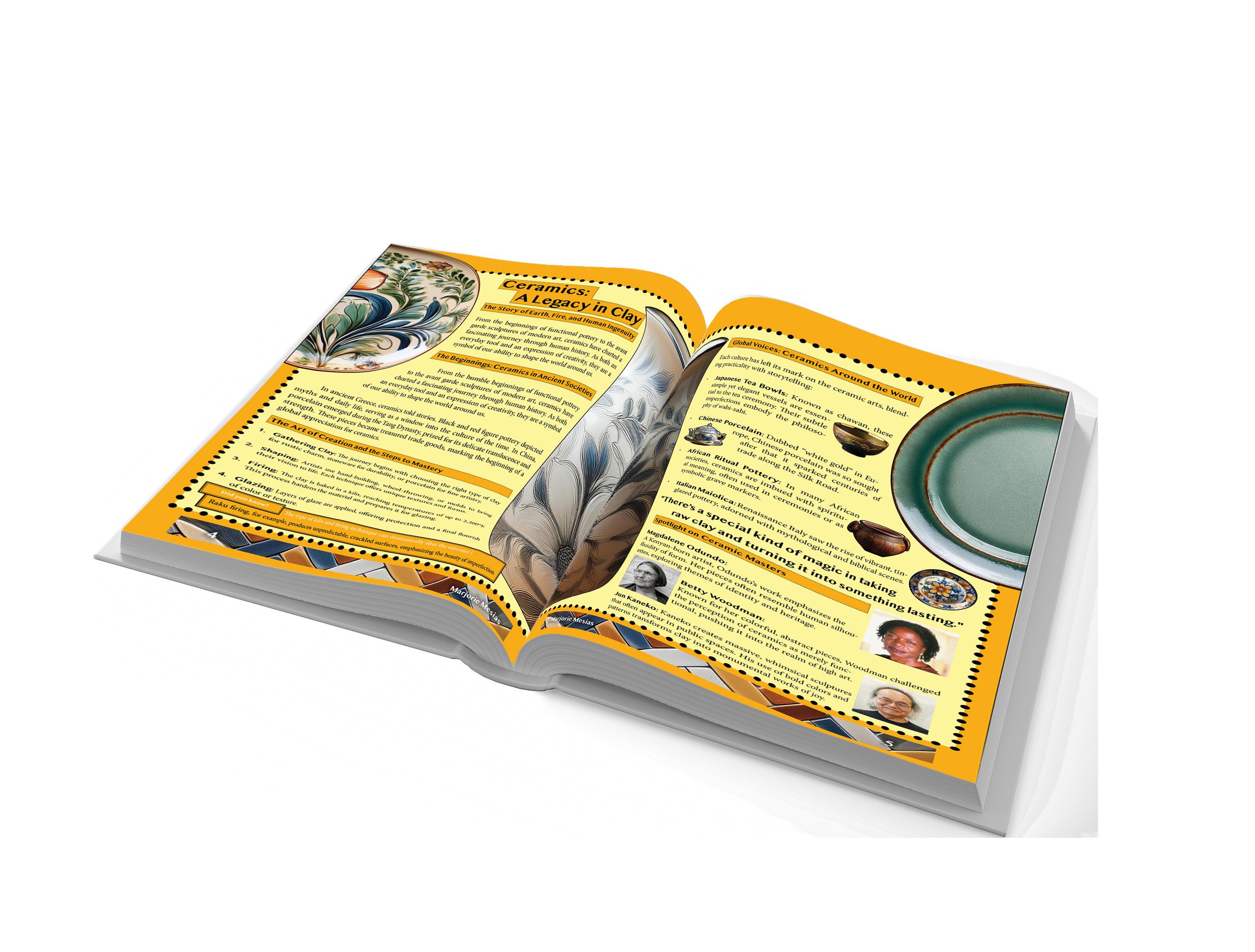
For this project, I designed a two-page spread centered on ceramics. I gathered content from Wikipedia on ceramics and broke it into sections. I used copyright-free content to ensure the article remained relevant. The layout I created using Adobe InDesign, was organized on two facing artboards, each formatted to US letter size. The header,
Page Design #13 Editorial pages
Part 1 Traditional (Conservative)
Learning outcomes
Design a two-page editorial layout • with text and images
Use copyright-free content for articles • Include headlines, subheadings, • bylines, pull quotes, captions
Apply typographic composition • and visual hierarchy for readability

Page Design #14
Editorial
pages Part 2
Contemporary /Modern (Liberal)
For this project, I designed two-page spread named “Ceramics: A Legacy in Clay” , it was
Objectives/ Learning outcomes
• Design two editorial pages with a modern, experimental approach.
• Use creative typography and varied fonts.
• Include headlines, subheads, body copy, pull quotes, captions.
• Add vector illustrations and apply modern design principles (contrast, balance, etc.).

an k y o u
thanks to professor Kolos schumy
