FONT &
FABRIC
29, 2024
BOWERS
APRIL
LILAH
Fonting the Fashion: Dive into the symbiotic relationship between font choices and fashion branding, unraveling how typography shapes the identity and perception of fashion brands.
Unveiling Font Prestige:
Uncover the psychology behind prestigious fonts, delving into the intricate factors that elevate certain typefaces to convey luxury, sophistication, and exclusivity.
Decoding Font Psychology:
Navigate the neural pathways of font psychology, unraveling how different typefaces evoke emotions, memories, and perceptions in the minds of consumers.
TYPE & FASHION LOGOS FONT PRESTIGE FONT PSYCHOLOGY 1. 7. 11.
CONTENTS
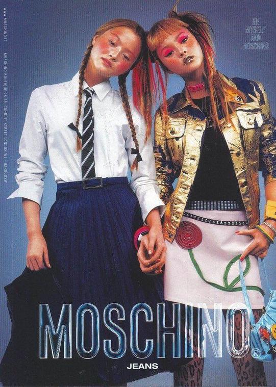
LOGOMANIA TRENDS IN TYPE & FASHION CASE STUDY: THE BURBERRY LOGO
From Coco to Kendall: The Rise of Logomania: Trace the evolution of logomania from Coco Chanel’s revolutionary branding to modern-day sensations, exploring its impact on fashion and cultural trends.
Typography Through Time:
Take a historical tour of typography trends in fashion branding, from ornate Art Nouveau to contemporary custom fonts, exploring how cultural shifts shape visual expressions.
Burberry: A Typographic
Odyssey: Explore the dynamic evolution of the Burberry logo, from classic serif elegance to modern sans-serif boldness, reflecting shifts in brand identity and market demands.
CONTENTS
15. 23. 35.
TYPE & FASHION LOGOS
CREATING A BRAND IDENTITY
1
2
1. 2. 3. 4. 7.
5. 8. 6. 9.
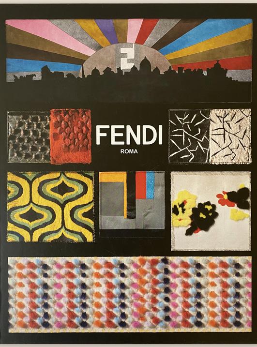
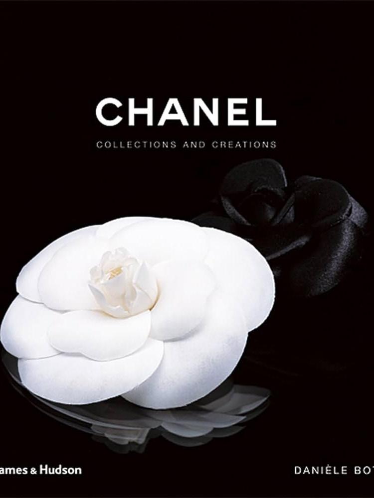
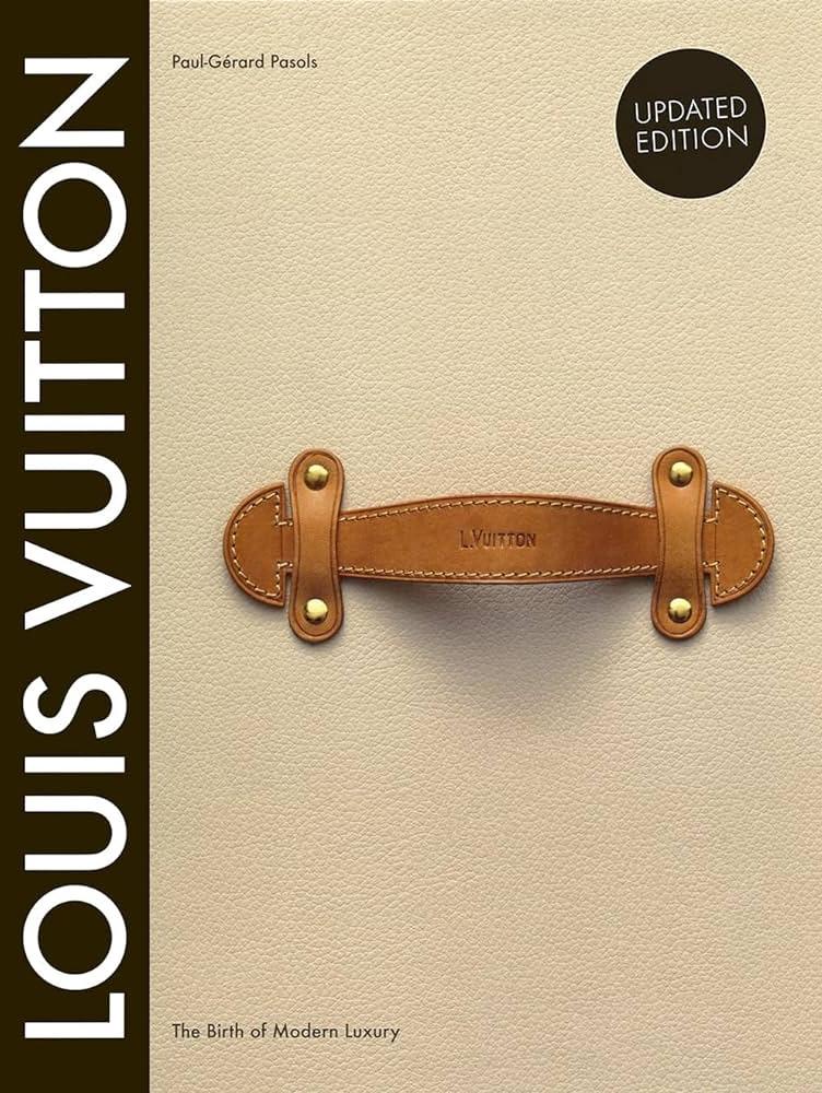
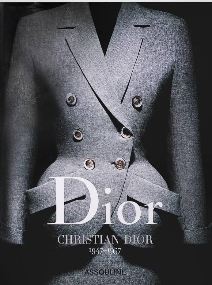
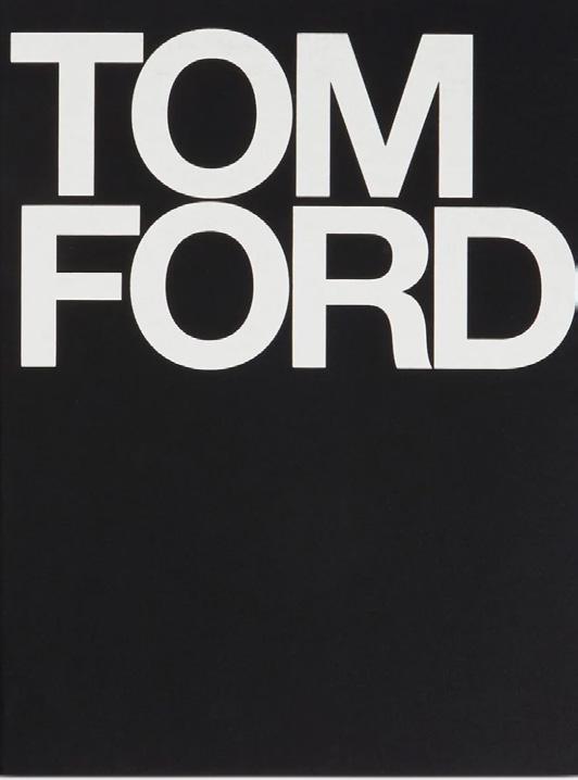
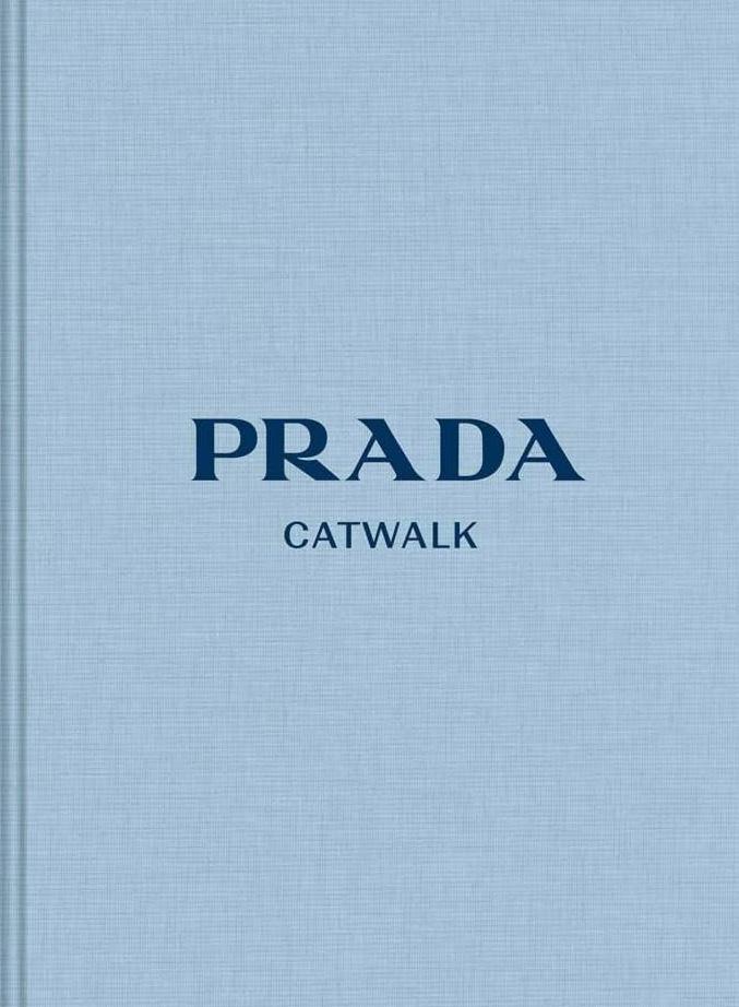
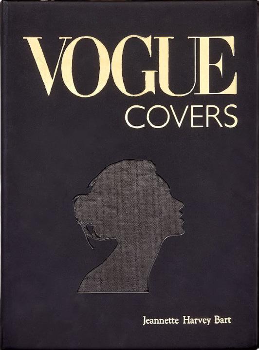
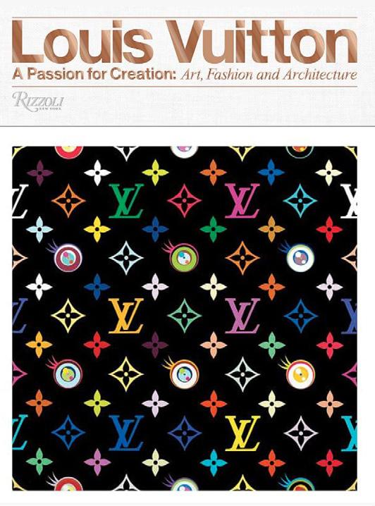
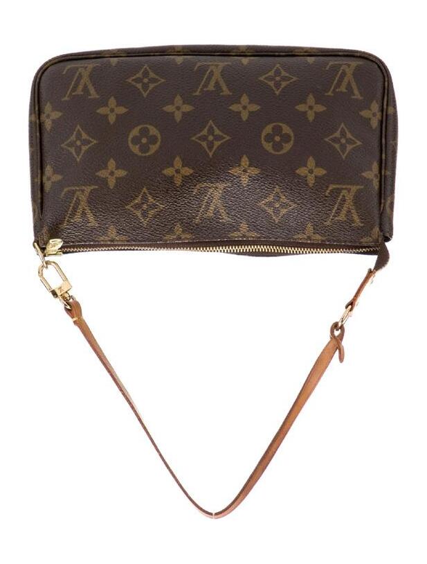
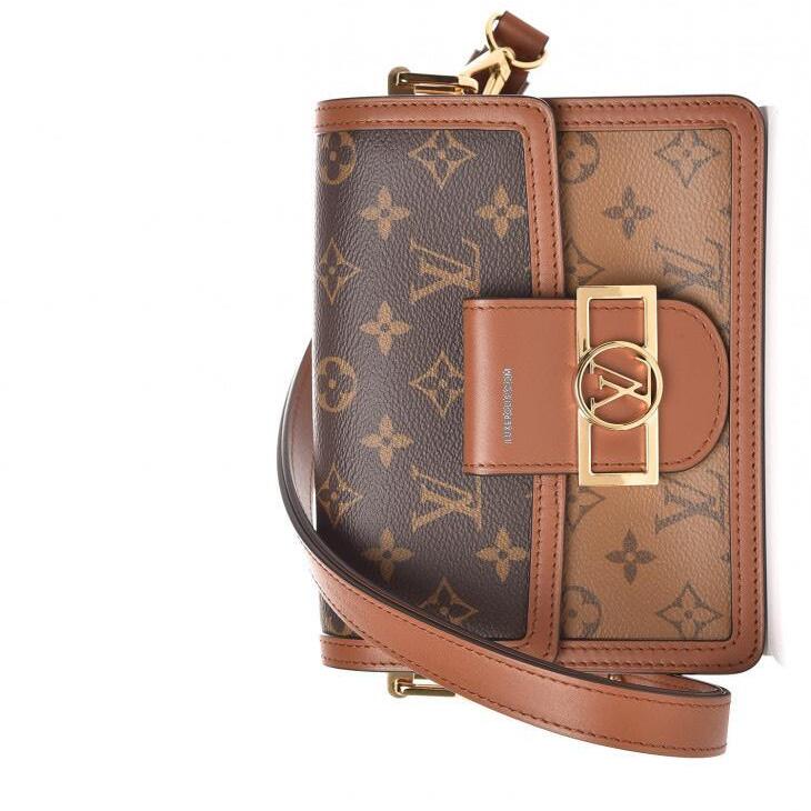
1. Book of Fendi Roma; 2. Book of Chanel; 3. Book of Louis Vuitton; 4. Book of Dior, Christian Dior; 5. Book of Tom Ford; 6. Book of Prada Catwalk; 7. Book of Vogue Covers; 8. Book of Louis Vuitton: A Passion for Creation; 9. Book of Chloé Catwalk
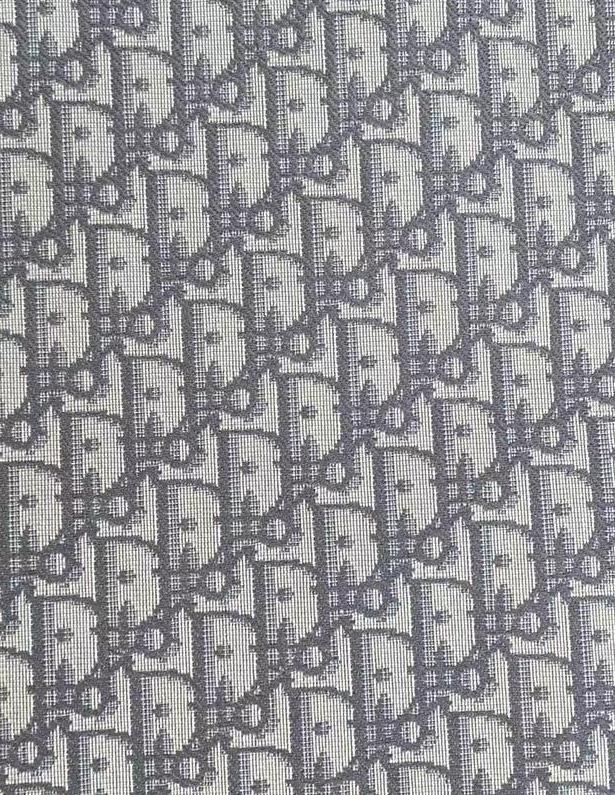
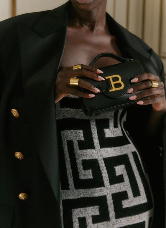
The relationship between font choices and fashion brand logos is a crucial aspect of branding and design, as it significantly influences the overall perception and identity of a fashion brand. Fonts play a key role in conveying the brand’s personality, style, and values, and they contribute to creating a distinct visual language that resonates with the target audience.
Fonts help communicate the personality of a fashion brand. Serif fonts are associated with tradition, luxury, and sophistication, Sans-serif fonts convey a more modern and minimalistic vibe. Different fonts appeal to different demographics. Fashion brands targeting a younger, trendier audience might opt for bold and modern fonts, while those aiming for a more classic clientele may choose elegant and timeless typefaces.
3
WORDMARKS:
Wordmarks, which consist of the brand’s name in a distinctive font, contribute to easy brand recognition.
Using the actual name helps consumers associate the logo directly with the brand, which is particularly important in the highly competitive and visually-driven world of fashion.
Language is a universal element, and using a wordmark allows brands to communicate their identity across different cultures and languages. Many luxury fashion brands opt for wordmarks to convey a sense of tradition and elegance.
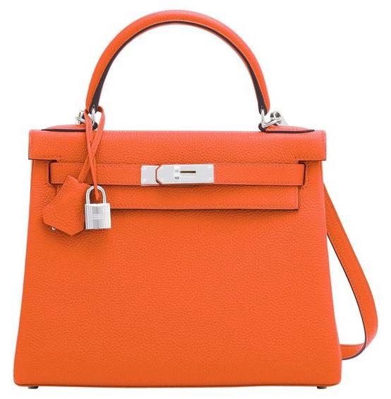
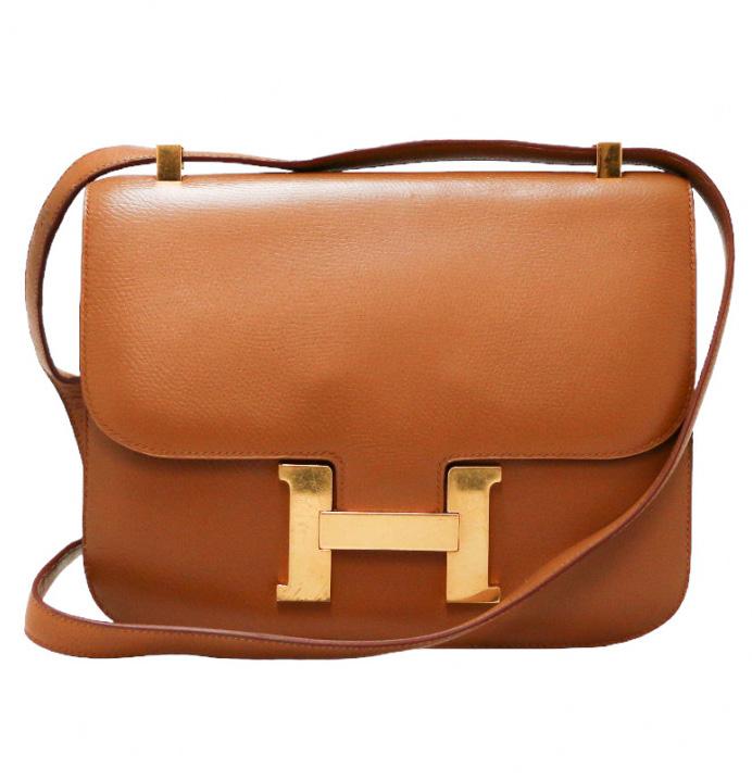
Serif fonts, are often associated with luxury and timeless sophistication, contributing to the overall brand image.
Fashion is about personal expression and identity. A brand’s name in the logo fosters a direct connection with consumers. When graphic design was still finding its foothold, the essence of luxury was entwined with opulence and extravagance.
Simple wordmarks and monograms were deemed inadequate to encapsulate the grandeur associated with affluence. Back then, excessiveness was the language of the elite, and restraint had no place in the narrative.
4
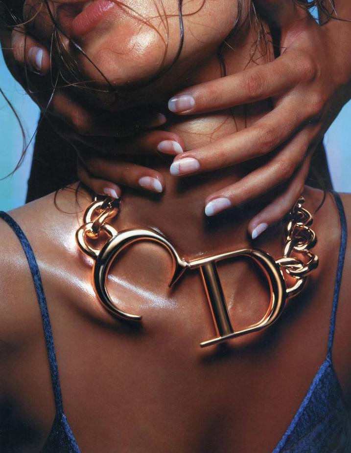
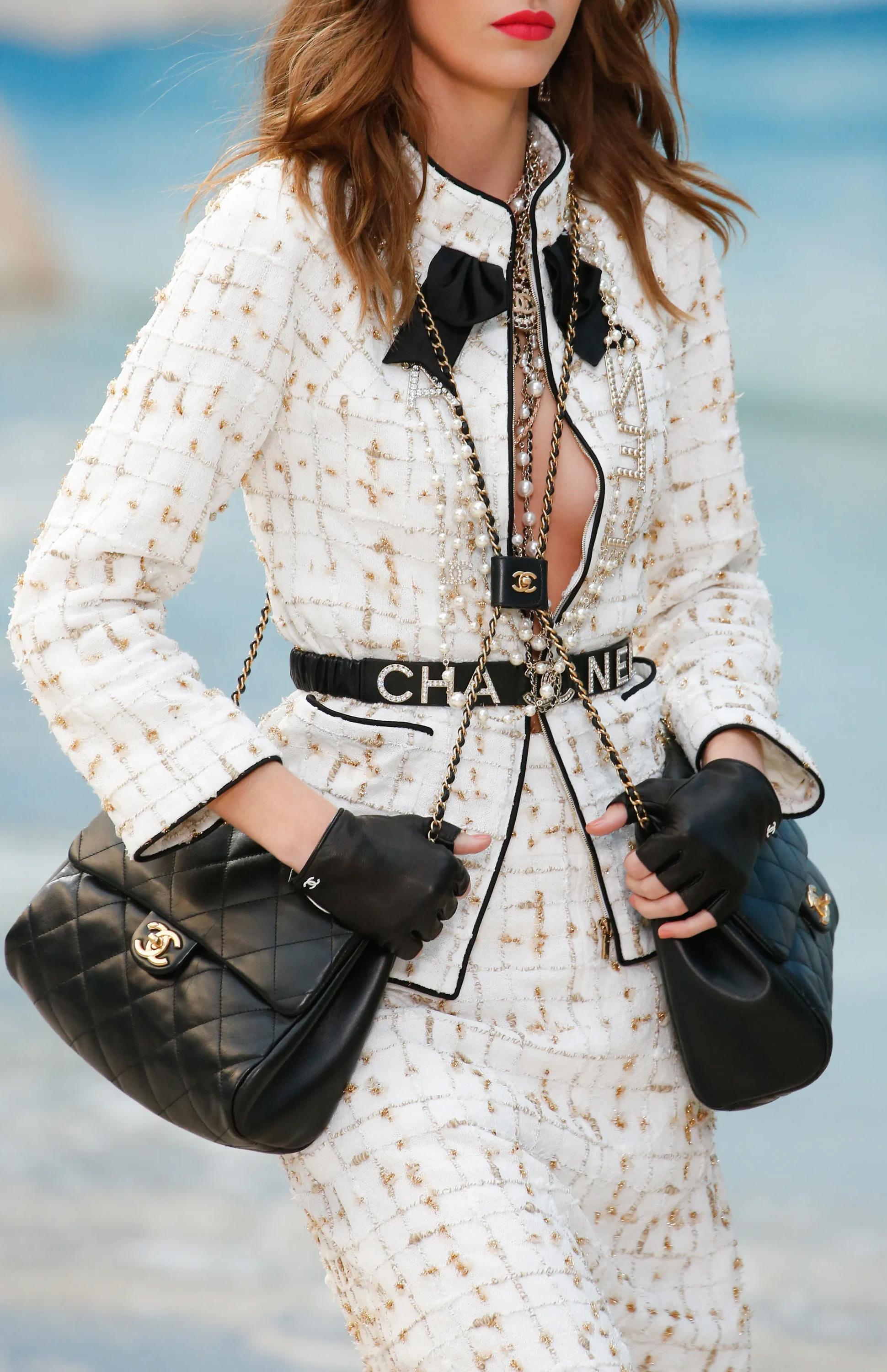
‘IN 2023, OVERT LOGOS ARE OUT AND VISUAL SIGNATURES — SUCH AS THE INCLUSION OF MOTIFS OR ADOPTION OF CERTAIN COLORS — ARE IN. A SEA CHANGE IN CONSUMER ATTITUDES HAS PROMPTED THE RETURN OF QUIET LUXURY, DIMINISHING THE APPEAL OF SHOUTY MARKETING.’ - VOGUE

5
The proclamation resonated through the corridors of fashion, signaling the end of an era dominated by overt logos. Against this backdrop, the concept of quiet luxury staged a triumphant comeback.
No longer enamored by excess, the elite class found solace in the understated elegance of visual signatures. A silent revolution begun, reshaping the landscape of luxury and redefining the very essence of what it meant to be wealthy.
The once-dismissed simplicity of wordmarks and monograms found itself vindicated in a new era where less was more, and the power of subtlety spoke louder than ever before.
This cultural shift has implications for the future of typography, prestige and luxury fashion marketing.
With the ever-changing nature of fashion and typographic trends, what do we consumers, predict to see as the next ‘big thing?’
6
FONT PRESTIGE
CONVEYING LUXURY, SOPHISTICATION, AND EXCLUSIVITY.
7
8
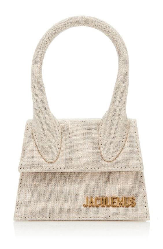
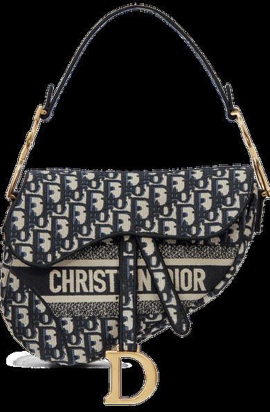
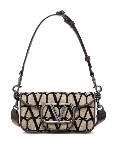
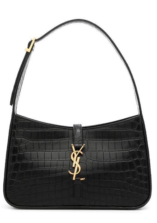
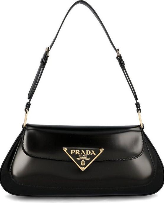
Jaquemus
Dior
Prada
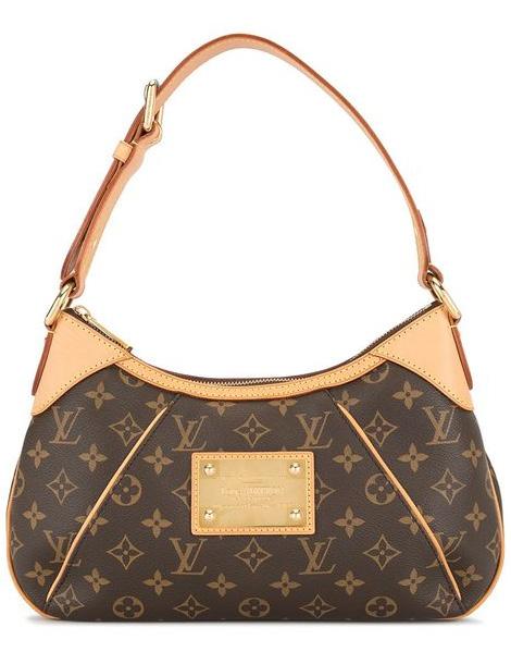
Louis Vuitton
Gucci
Yves Saint Laurent
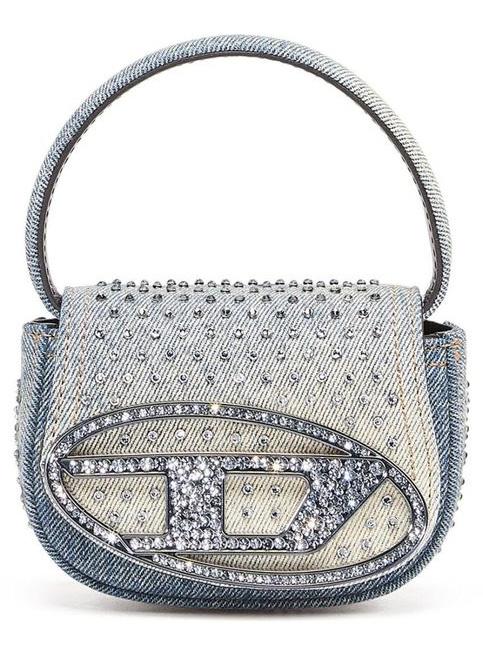
Diesel
Valentino
esearch in The British Psychological Society in 1989 found correlation between adjectives and various fonts perceived by the study subjects. Subjects were shown multiple typefaces and asked to rate the perceptual qualities they may possess, such as heavy, light, fast, and slow.
Another study, which broadened the study subjects’ adjective choice, found the highest correlation with Times New Roman and Helvetica fonts and the adjectives “formal” and “legible,” respectively.
A font is considered prestigious based on several factors that contribute to its perceived quality for conveying a sense of
luxury or sophistication. Fonts that have well-crafted letterforms, balanced proportions, and a refined aesthetic sets them apart from others.
Fonts with a historical pedigree or association with prestigious publications, institutions, or traditions can carry a sense of prestige.
For example, fonts inspired by ancient calligraphy or classical typefaces with a rich history may be considered prestigious. Perceptions of prestige can vary based on cultural, industry, and individual preferences Ultimately, the choice of a prestigious font depends on the specific context, brand positioning, and the intended audience.
Serif fonts, characterized by small decorative strokes at the ends of letterforms, are often associated with tradition, formality, and prestige.
While the simplicity of sans serif fonts makes logos readable and versatile, it has its drawbacks. Without additional details and features, sans serif fonts have far fewer options for differentiation. While you can vary things like the height, weight, and slant, sans serif fonts simply have fewer features to work with than their more intricate fellow fonts. This results in logos that look very similar.
Sans-serif fonts, with their clean lines and absence of decorative strokes, project a modern, sleek aesthetic, embodying simplicity, clarity, and contemporary style.
Gone are all the elaborate little details of the previous era. When you add brands’ tendency to go black-and-white, you end up with a sea of logo sameness which is the opposite of what logos should be. The purpose of a logo is to be instantly recognizable, different, memorable, and, if possible, to refer to the brand’s values. Blending into everyone else’s achieves none of these things.
9
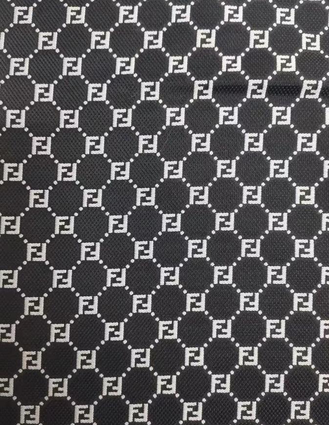
FENDI FENDI
FENDI FENDI
10
FONT PSYCHOLOGY
NAVIGATING NEURAL PERSPECTIVES
11
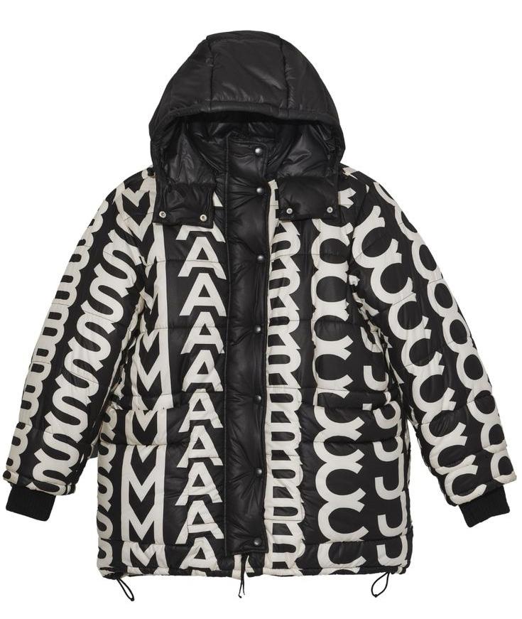
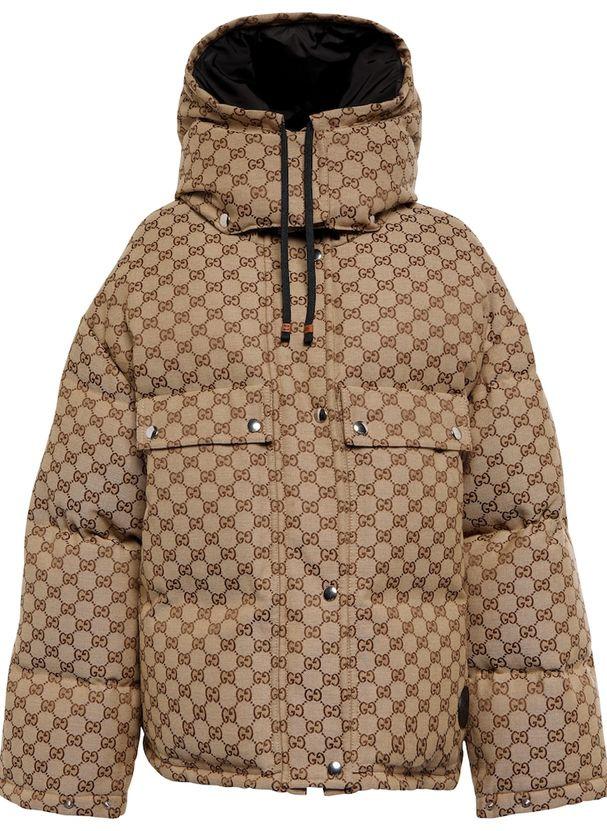
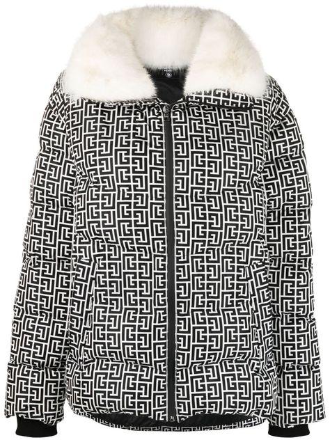
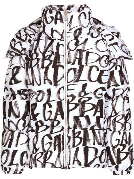
WHICH JACKET IS THE MOST EXPENSIVE? Take a Guess!
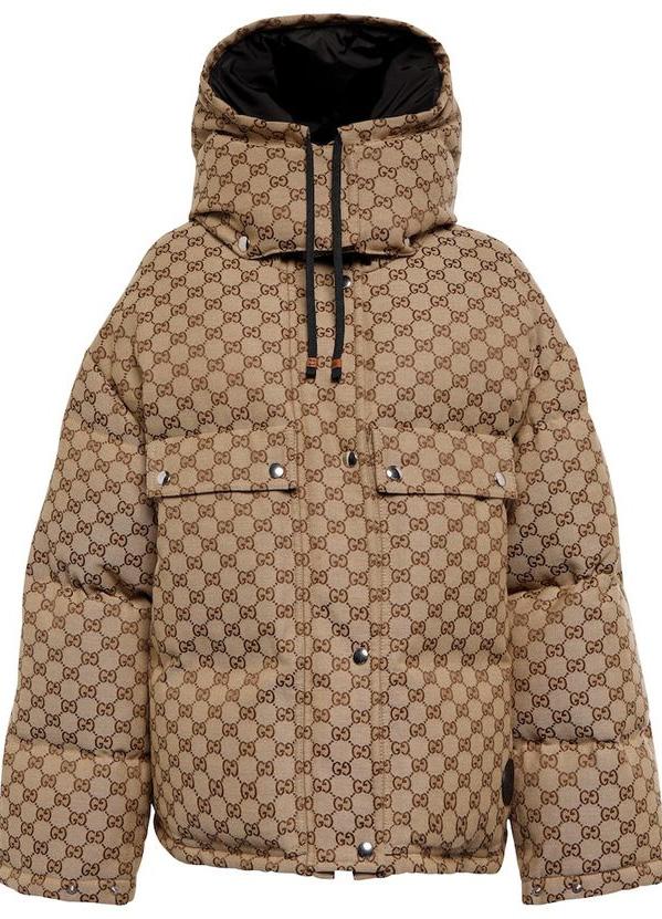
12
Marc Jacobs
Marc Jacobs– $995 Gucci
Gucci – $3,800
Balmain
Balmain – $3,595
Dolce & Gabbana
Dolce & Gabbana – $2,595
Font psychology revolves around how people react emotionally and psychologically to the type of text used. The brain looks at the font, attaches it to an emotion or feeling, and then associates it with the brand. People have very different (and, oftentimes, very specific) thoughts, feelings, and associations with different font types. For example, Comic Sans creates a very different emotional response for the audience compared to Arial, Roboto, or Montserrat. Understanding the different associations and emotional responses and how to use them to your advantage is what brands aim to do to harness font psychology. According to Albwert Mehrabian’s Rule of Personal Communication, 93% of personal connection is
non-verbal, meaning ideas and values need to get across in the simplest way possible. Depending on what we’re looking at, we’ll have our thoughts, feelings and actions impacted in different ways.
In the dynamic world of fashion logos, font psychology plays a pivotal role in conveying a brand’s identity. The choice of fonts goes beyond mere aesthetics, delving into the realm of consumer perception.
Elegant and flowing script fonts, such as the iconic cursive of the Oscar de la Renta logo, evoke a sense of sophistication and timeless allure. Meanwhile, bold and sans-serif fonts, as seen in the modern Adidas logo, communicate a contemporary and dynamic vibe. High-end fashion houses like Gucci often opt for custom-designed fonts, exuding exclusivity and luxury.
13
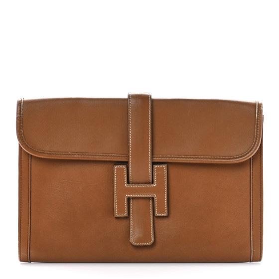
The use of fonts in fashion logos becomes a silent storyteller, shaping the narrative of a brand’s personality and leaving a mark in the consumer’s psyche. Whether it’s the classic serifs of Hermes or the sleek minimalism of Calvin Klein, each font choice becomes a signature stitch in the intricate fabric of fashion branding.
Font psychology intricately weaves through the neural pathways of consumer perception. The brain subconsciously decodes the personality of a brand based on the font used in its logo.
The brain processes fonts as a form of non-verbal communication, linking the visual representation to emotions and memories. As fashion logos strategically navigate this cognitive landscape, font choices become powerful tools to establish an emotional connection, imprinting the brand’s identity in the consumer’s mind and fostering a bond between fashion and psyche.
14
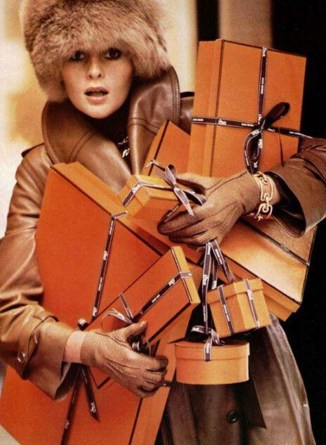
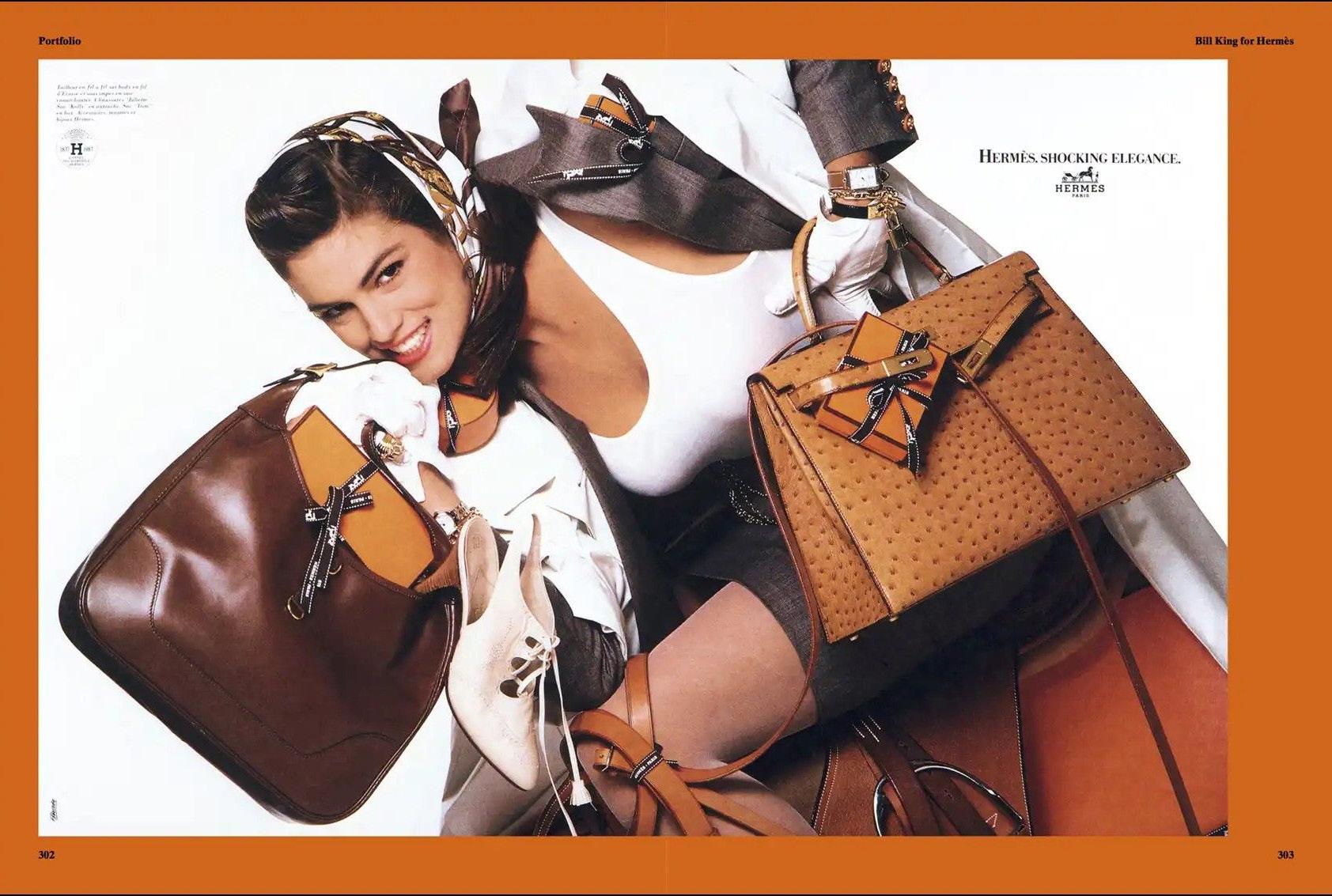
Cindy Crawford for Hermés, 1987
LOGOMANIA
TRACING THE EVOLUTION OF A TYPE-FUELLED FRENZY
15
16 Dior, Circa 2000
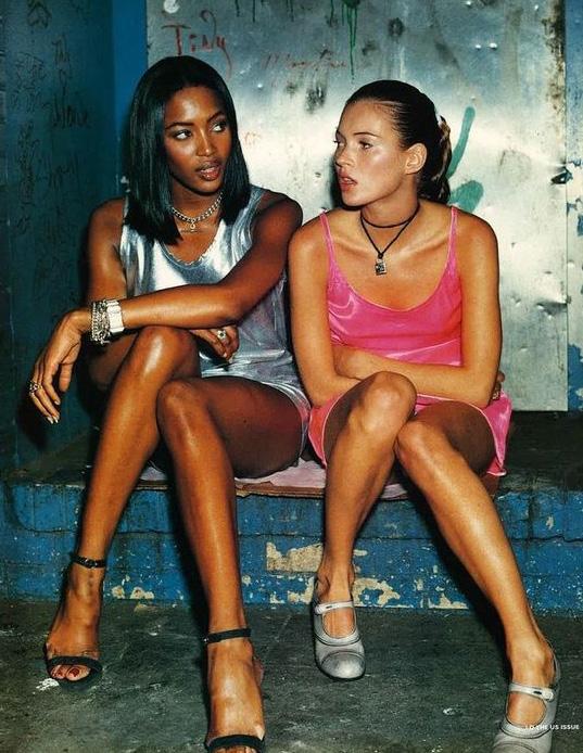
In 1925, Coco Chanel transformed her brand by doing something that was, at the time, revolutionary — she put her name directly onto her clothes.
Much like Claude Monet’s name scrawled on the corner of his famous Water Lilies, something about Chanel’s newfound logo imbued a particular kind of magic into her garments. Since then, the fashion logo has acted as a symbol of status for generations of consumers.
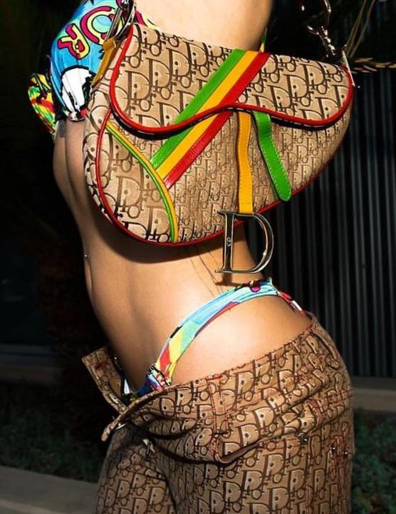
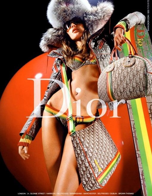
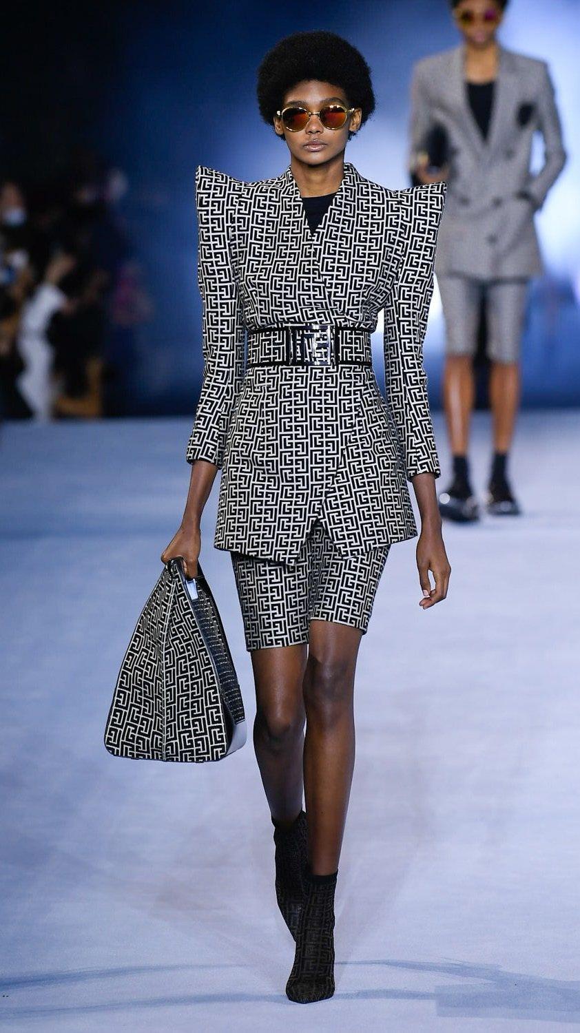
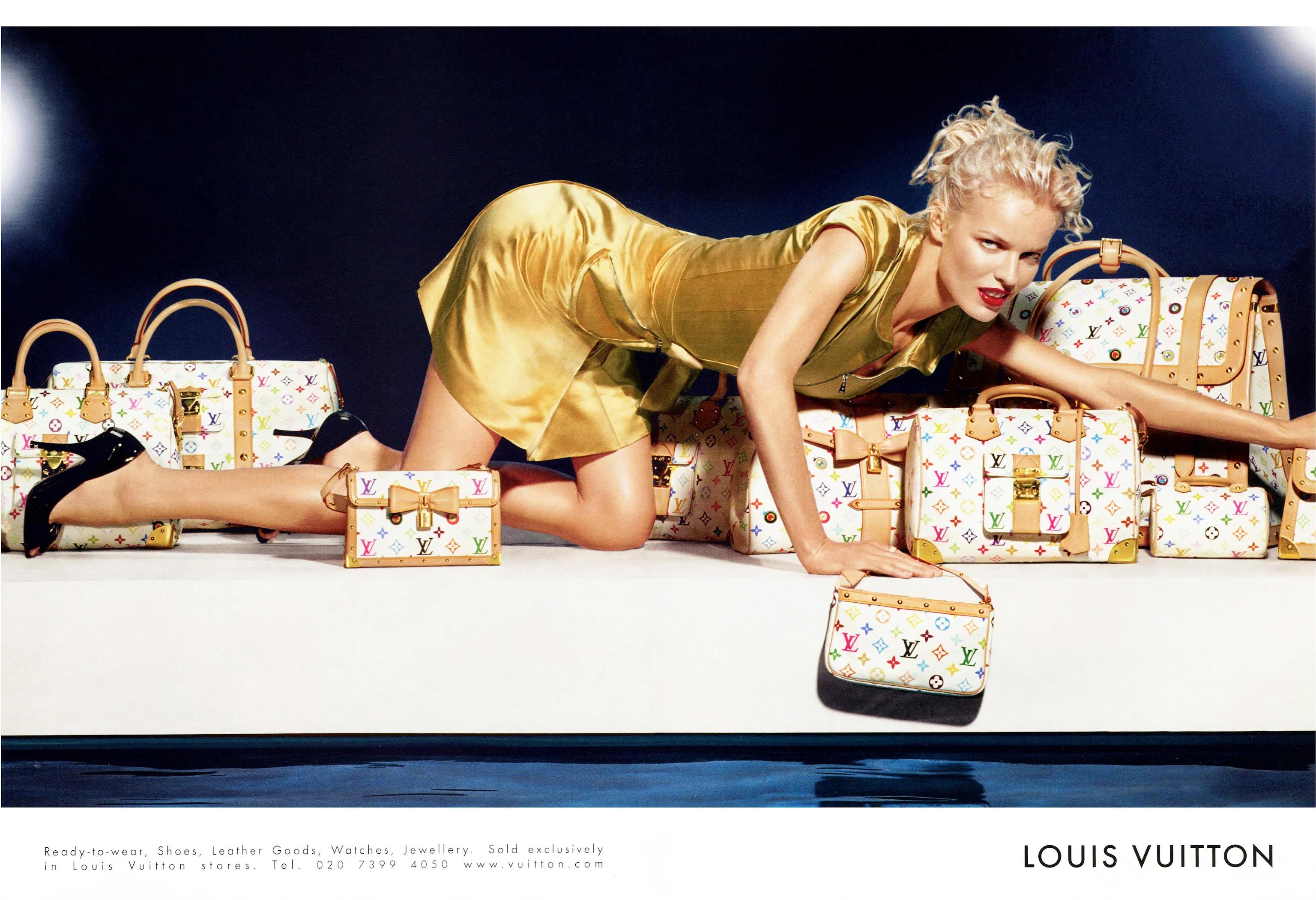
With the logo came logomania—a trend whereby obvious branding is strewn all over one’s clothes. Rather than a brand name hidden away in a shirt on a tag, a fashion house’s logo was now worn to be seen. Since its inception, logomania, like many other trends, has risen and fallen in tandem with the current economic climate.

17
Typography is intricately connected to logomania. The design and presentation of brand names and logos play a central role in creating a visual language that resonates with consumers, communicates identity, and contributes to the overall aesthetic appeal of fashion items.
Logomania logos typically feature bold and distinctive lettering. The typography used is often customized or stylized to create a unique visual identity for the brand.
This bold lettering contributes to the trend’s overall emphasis on making a statement and attracting attention.
18
Chanel Spring 2019 Ready-to-Wear Collection
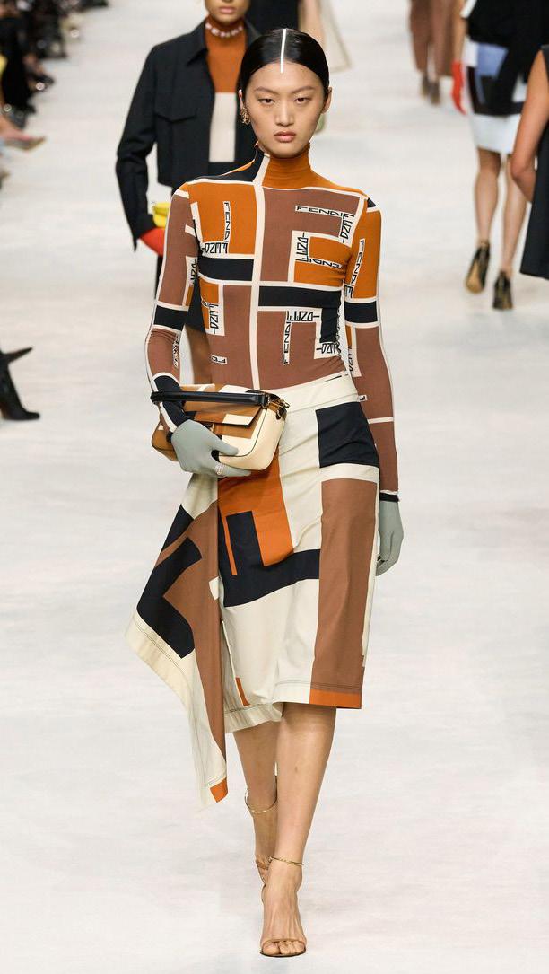
Following a 2018 Fendi runway in Milan, the brands participation in logomania blew up. After Kendall Jenner modeled a cropped fur jacket in the iconic Fendi print there was a surge in the logo being produced and worn by logomaniacs.
The first Fendi logo was introduced in 1925 and looked very different and unique compared to the logos of other fashion houses. The logo featured a squirrel sitting on a walnut tree branch.
This version of the logo persisted for 40 years until 1965 and only changed after Karl Lagerfeld joined Fendi. Lagerfeld drew the famous “FF” sign on a piece of paper in just a few seconds. And the black logo beneath it was written in all caps in solid and straight sans-serif, matching the height of its letters. The only change this logo saw in its long reign was In 2000, when the “FF” mark was removed from the official version of the logo.
19
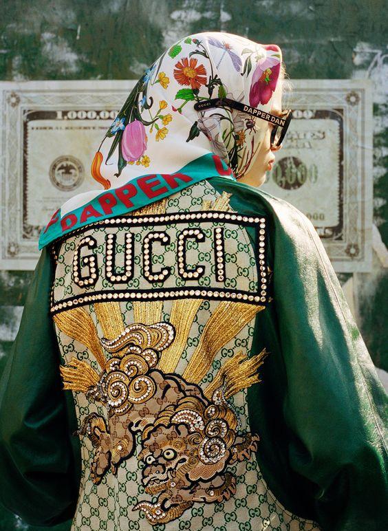
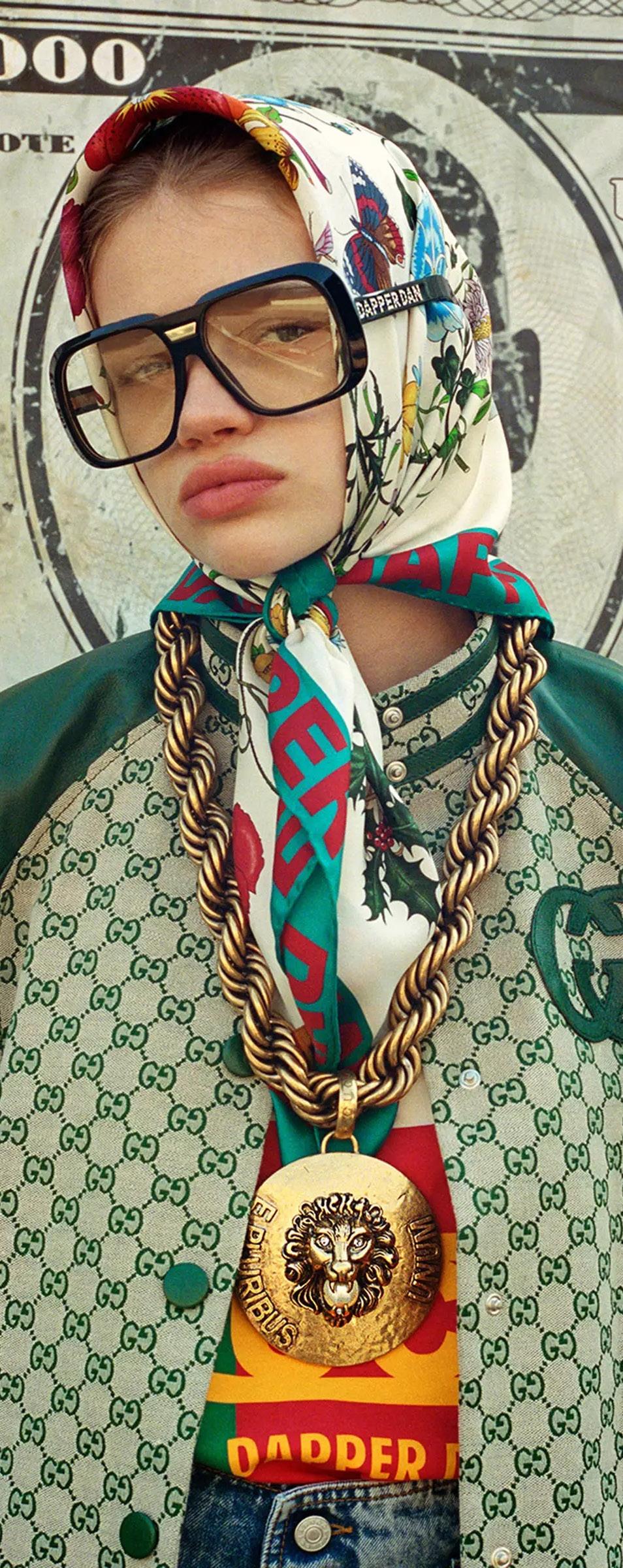
Gucci-Dapper Dan Collection 2018
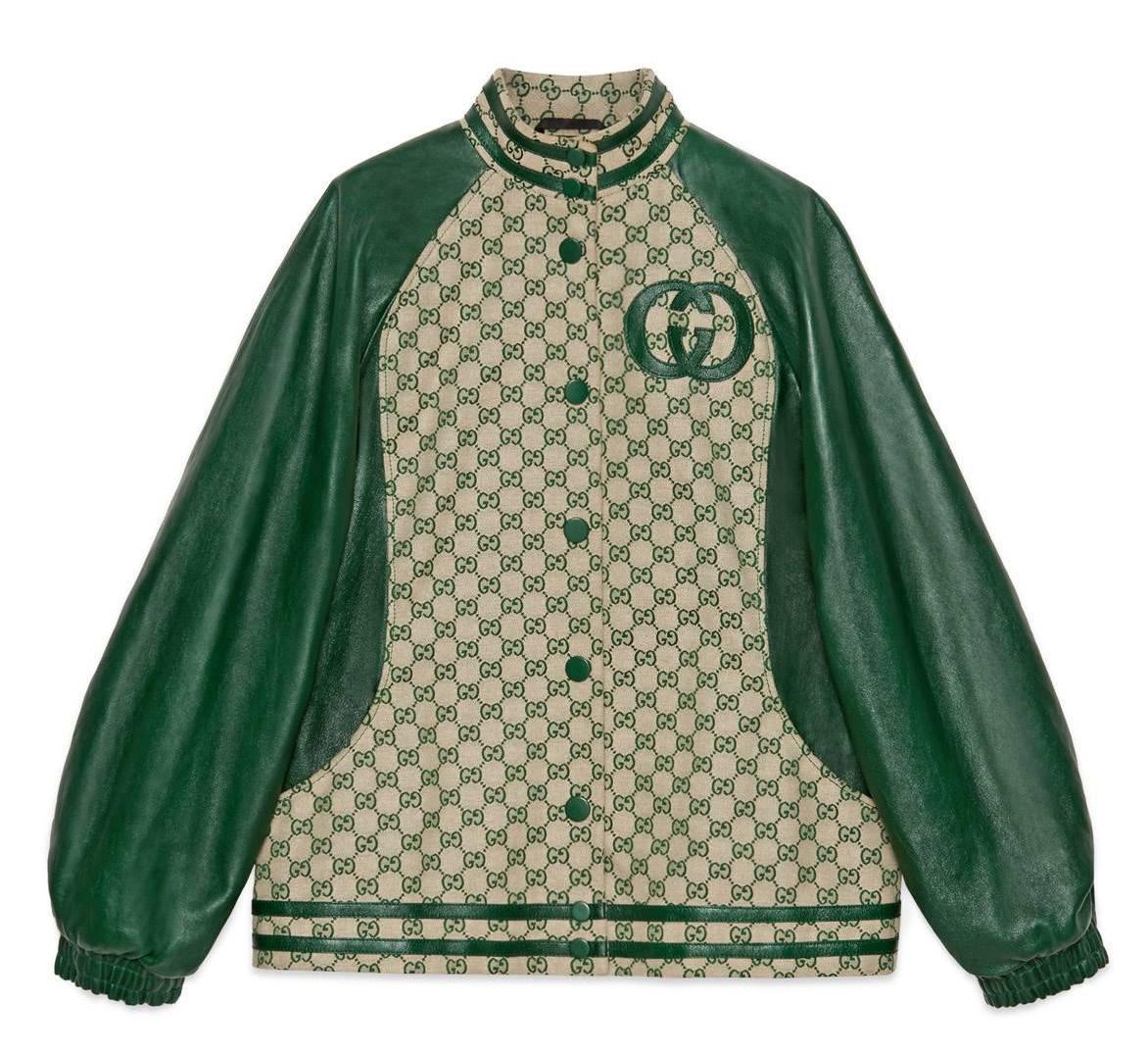
Gucci-Dapper Dan Jacket, Green
In 1992, Daniel Day was forced to close his legendary clothing boutique, Dapper Dan’s Boutique, after Fendi took legal action against what it argued was the streetwear designer’s trademark infringement for using the company’s logo in his creations.
The fashion house won the battle, but Dapper Dan won the war. Day’s creations, which incorporated the logos of fashion houses like Fendi, Gucci and Louis Vuitton and which were quickly adopted by rap stars, have since become synonymous with the golden age of hip-hop. (His use of those logos has drawn comparisons to the sampling going on in the music at the time.)
Decades later, Day frequently collaborates with the same high-fashion world that once legally prosecuted him: with Gucci, for example (pictured right), he collaborated on a mens-wear line and an atelier in Harlem.
20
LOGOMANIA IS PROBABLY MY BIGGEST ACHIEVEMENT IN TERMS OF FASHION. I’M THE FATHER OF LOGOMANIA. I LIKE THE WAY THAT SOUNDS - DAPPER DAN [DANIEL DAY]
21
Fendi Spring/Summer 2024 Ready-to-Wear.
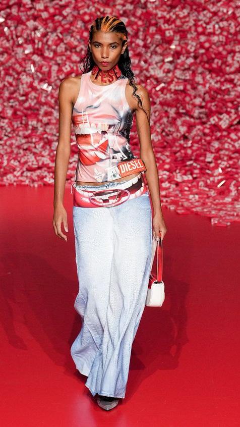
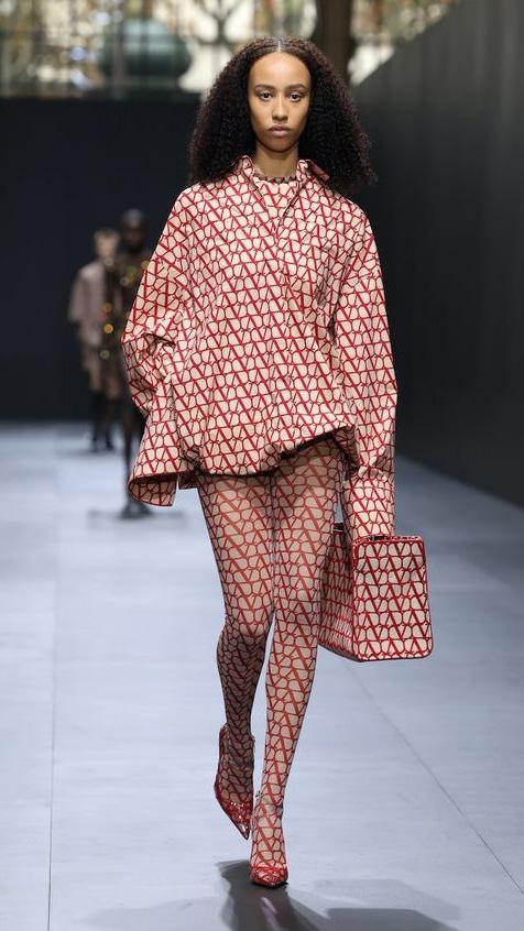
Diesel Fall 2023 Ready-to-Wear.
Valentino Spring 2023 Ready-to-Wear.
22
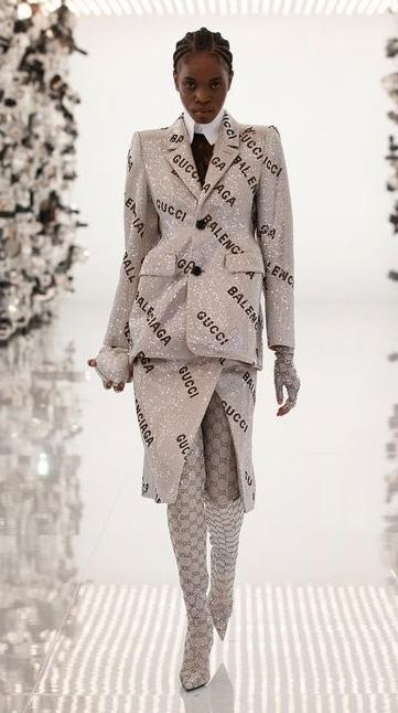
Gucci x Balenciaga Fall/Winter 2021-2022
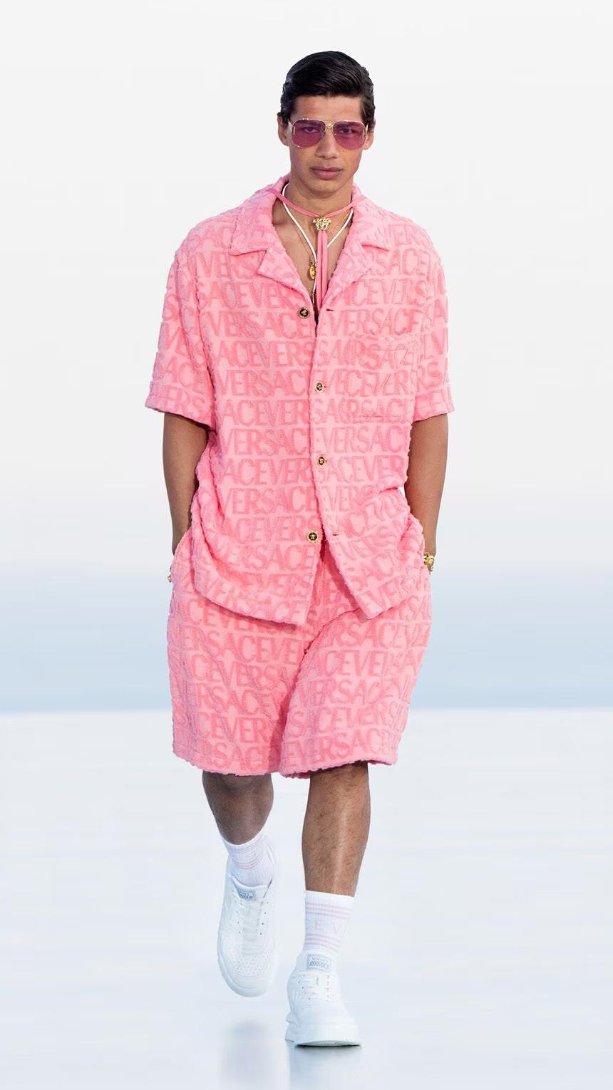
Versace “La Vacanza, see-now-buy-now fashion” 2023
Balmain Spring/Summer 2021
TRENDS IN TYPE & FASHION LOGOS
FOLLOWING TIME THROUGH THE LENS OF FASHION AND FONT
23


24
2003
Louis Vuitton, S/S
Typography trends and fashion trends often share a symbiotic relationship, as both are influenced by broader cultural shifts, aesthetic preferences, and design innovations.
The choice of typography in fashion branding reflects the evolving tastes, attitudes, and design.
Just as fashion designers adapt their collections to mirror societal shifts and individual expressions, typographers craft fonts that resonate with contemporary sensibilities.
Whether it’s the sleek minimalism of sans-serif fonts reflecting a preference for clean lines and modernity, or the ornate flourishes of script fonts evoking a sense of nostalgia and luxury, typography in fashion branding captures the zeitgeist of the moment.
Moreover, typography doesn’t just complement fashion; it can also challenge conventions, subverting expectations and pushing boundaries.
In this symbiotic relationship, typography and fashion trends constantly inspire and influence each other, visually shaping the landscape of our means of cultural expression.
25
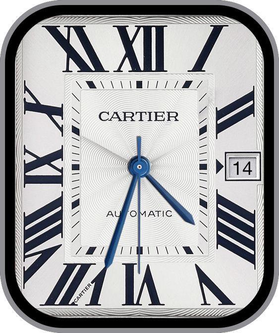
Ballon Bleu de Cartier watch
Art Nouveau and Early 20th Century
The Art Nouveau movement, characterized by ornate and decorative design elements, influenced typography and fashion during the late 19th and early 20th centuries. Fashion brands of this era often used elaborate and embellished lettering in their logos and promotional materials.
26
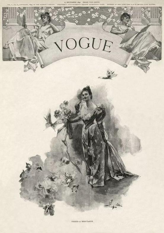
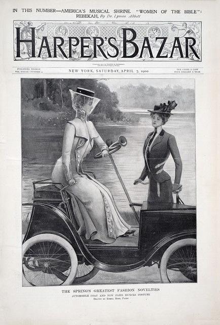
Harpers Bazaar, 1900
Vogue, 1905
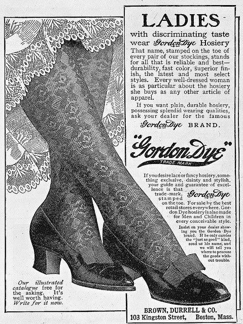
Gordon Dye Hosiery, 1905
Art Deco and the 1920s-1930s
The Art Deco movement brought about a shift towards geometric and streamlined design. Typography in fashion brands during this period embraced clean lines, symmetry, and modernity. Logos and promotional materials featured bold sans-serif fonts and sleek, stylized letterforms.
27
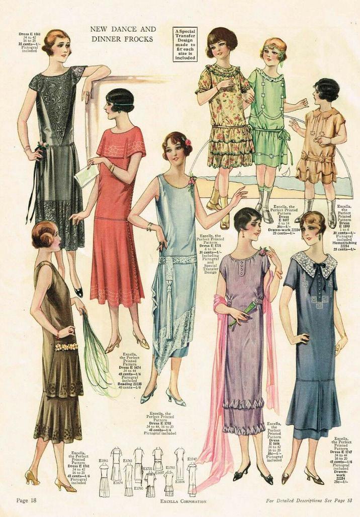
Excella Spring 1925 Quarterly Pattern Catalog
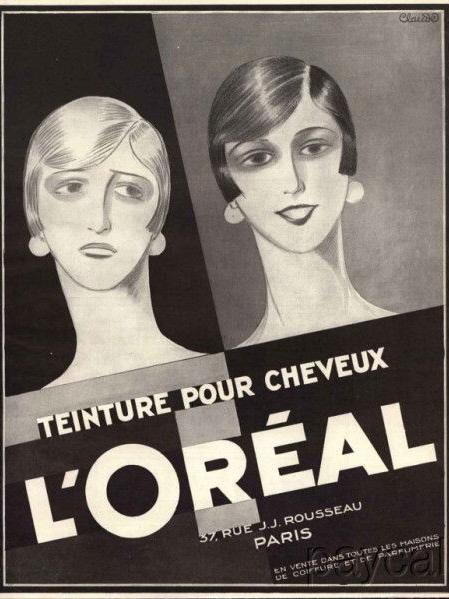
L’Oreal Paris Ad, 1927
Mid-20th Century Modernism
The mid-20th century saw the rise of modernism, with a focus on simplicity and functionality. Fashion brands embraced minimalist typography, often opting for clean and legible sans-serif fonts. This era’s design principles, including the use of Helvetica and other geometric typefaces, influenced fashion branding.
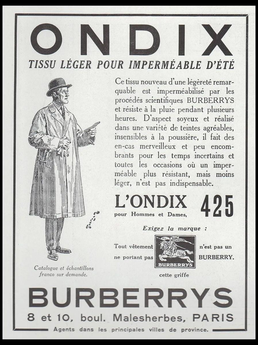
28
Burberrys 1942 Advert
Swinging 60s and Psychedelic Typography
The 1960s, known for its counterculture movements, saw a surge in experimental and psychedelic typography. Fashion brands of this era incorporated bold, colorful, and sometimes unconventional lettering in their logos and advertising materials to capture the spirit of the time.

29
Sears Catalog, 1968
1970s & Retro Script Fonts
The 1970s witnessed a revival of retro and vintage aesthetics. Fashion brands embraced script fonts and cursive lettering, often incorporating a sense of nostalgia in their logos. This era’s typography trends reflected a return to more ornate and expressive styles.
30
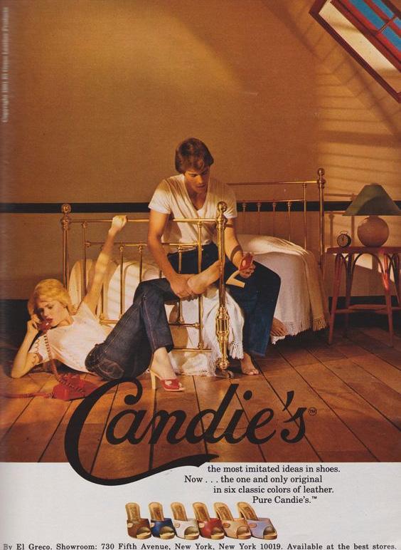
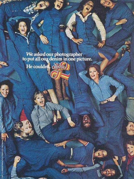
Levi’s Ad, 1970
Candie’s Ad, 1972
1980s and BOLD Logotypes
The 1980s were characterized by bold and expressive design, and fashion brands embraced impactful logotypes
31
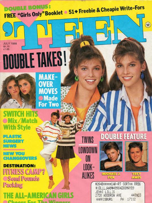
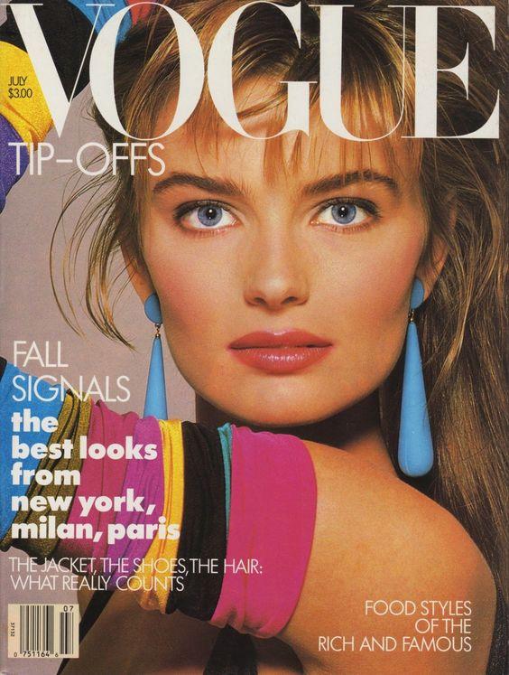
Vogue, Fall 1987
Teen, July 1988
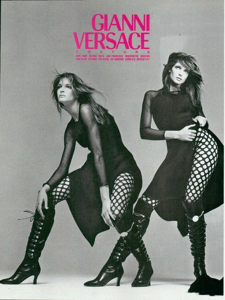
1990s Grunge and DIY Aesthetics
The grunge movement of the 1990s influenced both fashion and typography. Brands adopted a more DIY (do-it-yourself) aesthetic, using distressed and informal typography in their logos. Handwritten and grunge-style fonts became popular, mirroring the anti-establishment ethos of the time.
32
Vogue, 1994
Gianni Versace, 1990
Vogue, 1991
DIGITAL AGE & Minimalism (2000s
Onward)
With the rise of digital media, fashion brands shifted towards a more minimalistic and versatile approach to typography. Sans-serif fonts, clean lines, and simplicity became dominant in logos and branding, reflecting a desire for timeless and adaptable design.
33
Gucci S/S 2000
Moschino S/S 2001
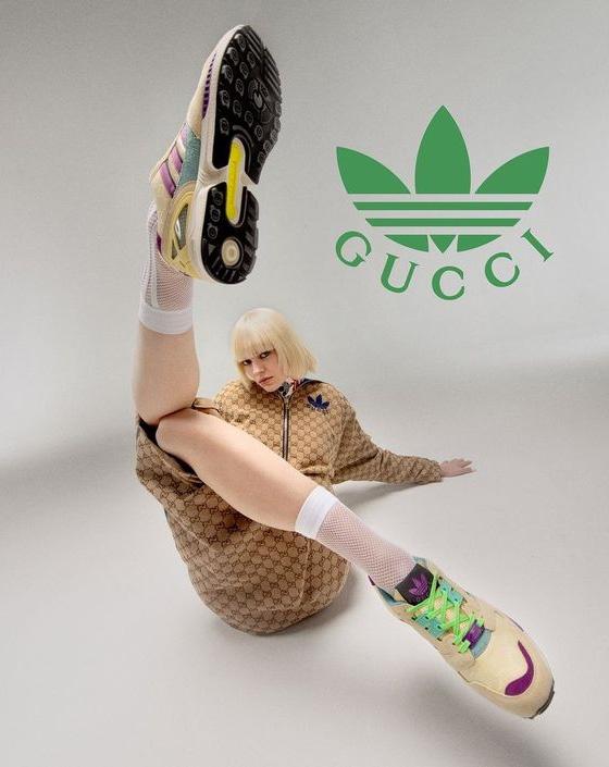
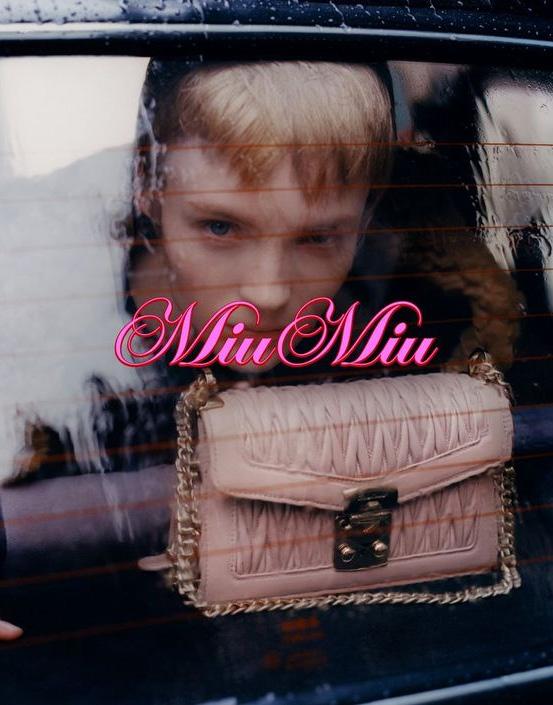
CUSTOM Typography & Branding (Contemporary)
In recent years, many fashion brands have invested in custom typography to create unique and ownable identities. Custom fonts help convey brand personality and establish a distinctive visual language, allowing brands to stand out in a crowded market.
34
Miu Miu 2019
Gucci X Adidas, 2023
CASE STUDY
THE HISTORY OF THE BURBERRY LOGO
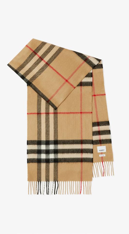
Check Cashmere Scarf
Archive Beige Price $590.00
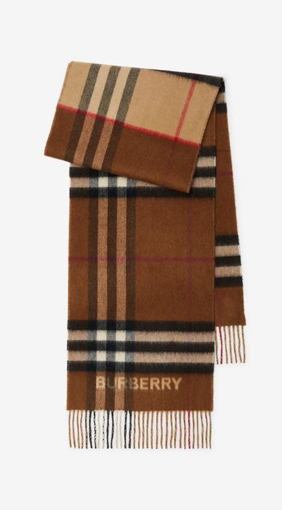
Contrast Check Cashmere Scarf
Archive Beige/Birch/Brown Price $660.00
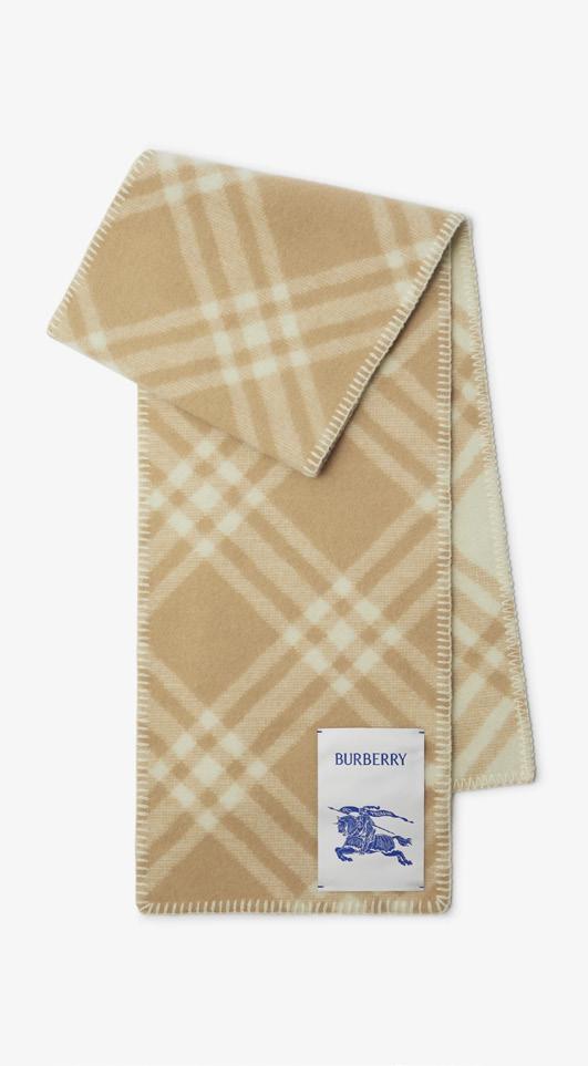
Check Wool Scarf
Archive Beige Price $550.00
35
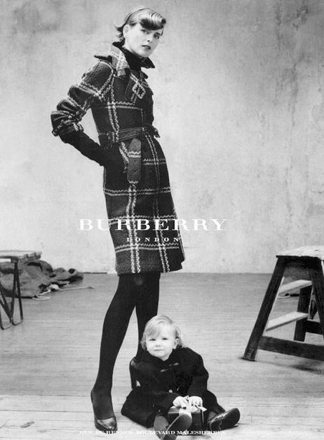
36
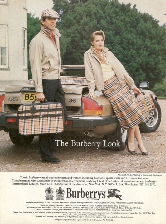
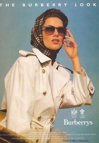
Burberrys of London, 1994
Burberry, 2017
Burberry London, 2003
Burberry, 2023
37
Burberry, 1991
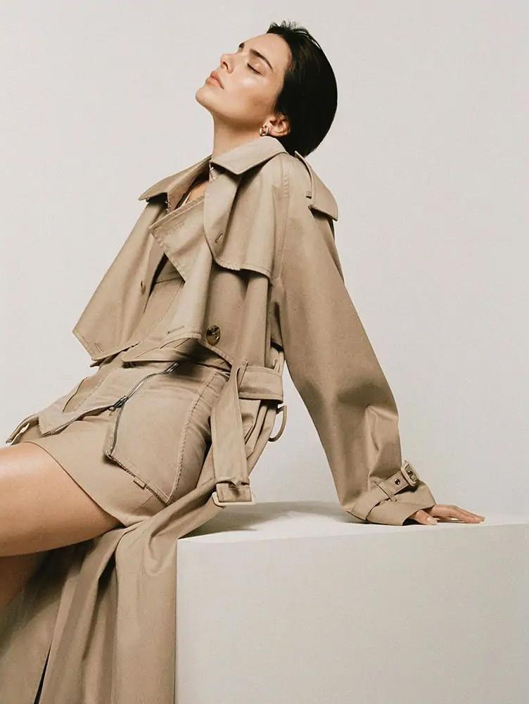
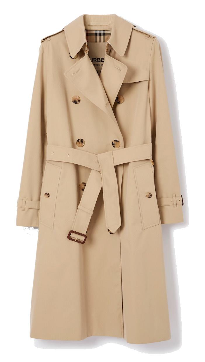
Long Kensington Heritage Trench Coat
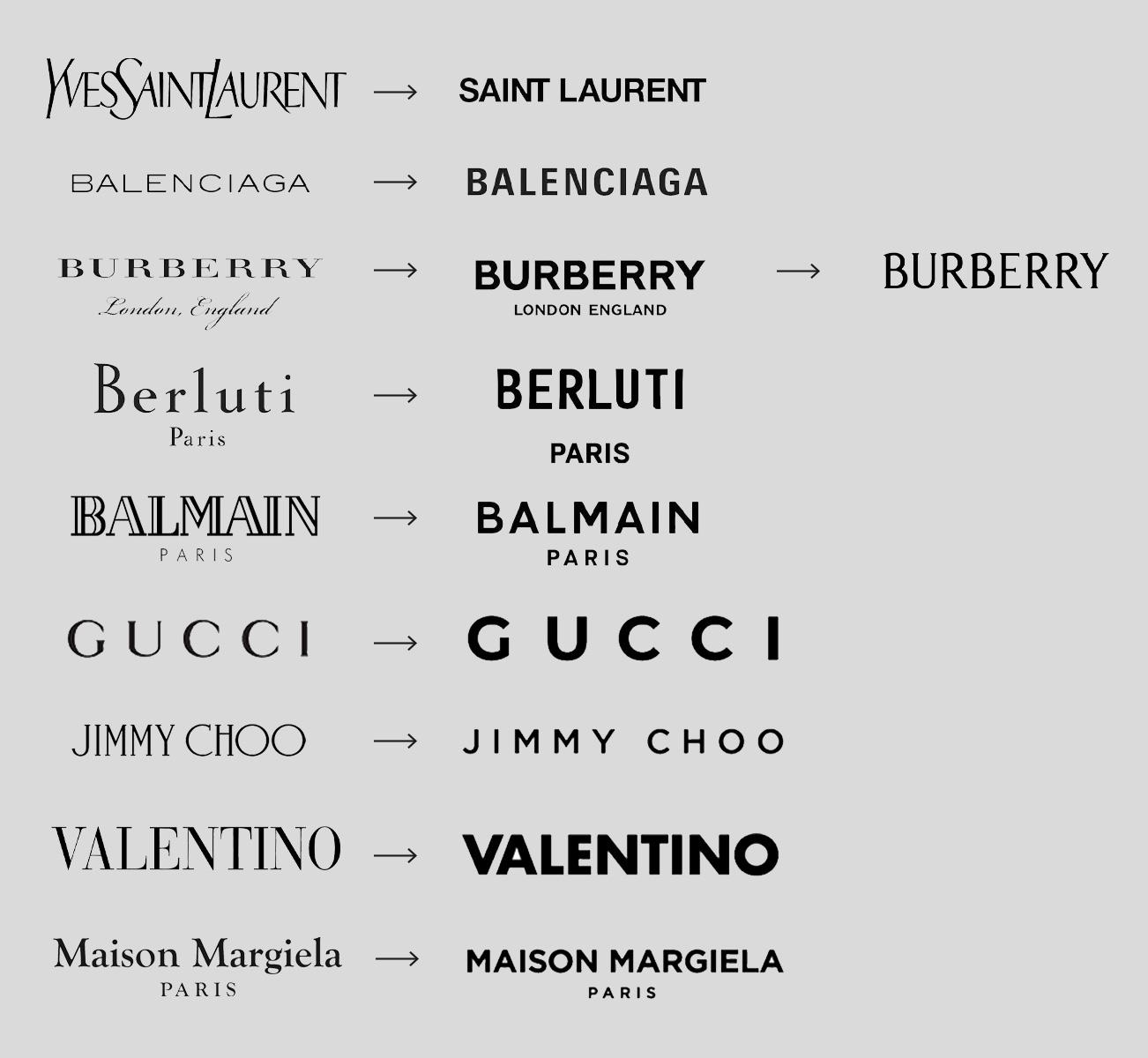
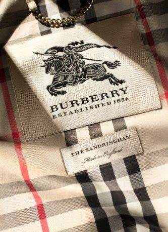
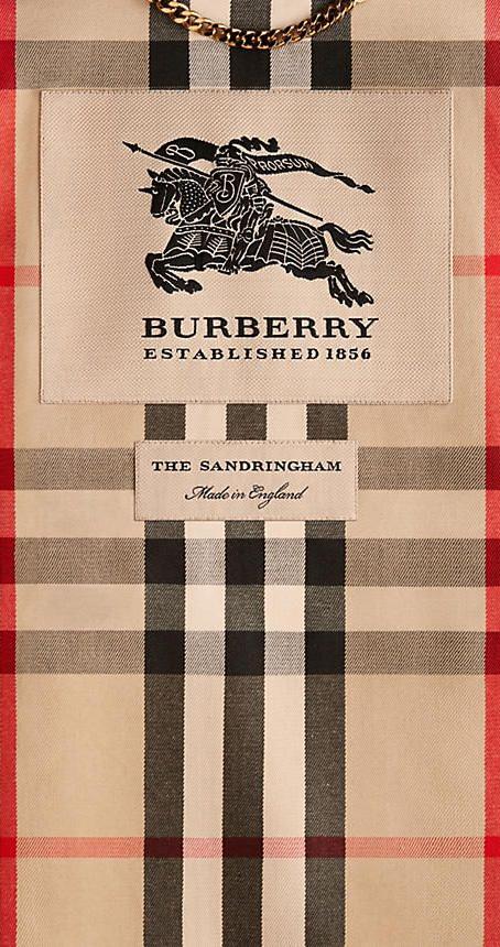
The Burberry logo font has undergone several changes throughout the brand’s history, reflecting shifts in design trends and brand identity. Originally introduced in the late 19th century, the Burberry logo featured a simple serif font with elegant curves, embodying the brand’s heritage and tradition. This classic typography remained relatively unchanged for many decades, symbolizing Burberry’s timeless appeal and craftsmanship.
The first Burberry font used in its logo, dating back to 1901, was a classic serif typeface. The specific serif font used by Burberry in its early branding likely embodied the timeless
sophistication and traditional craftsmanship associated with the brand.
In 2018, under the creative direction of Riccardo Tisci, Burberry unveiled a significant update to its logo and branding. The new logo featured a bold, modern sans-serif font with clean lines and a more streamlined appearance. This redesign marked a departure from the traditional serif font, signaling Burberry’s efforts to modernize its image and appeal to a younger, more fashion-forward audience. The new logo also coincided with a broader rebranding effort, including changes to the brand’s monogram and visual identity.
38
Burberry was soon followed by other houses such as Balmain, Celine, Saint Laurent, Balenciaga and more. Each house displayed then–and still do–the same minimalist identity, with a name like a monolith, a primal and timeless work, thus loudly asserting their existence, and requiring neither particularity nor ornamentation to be recognized as a monument in the world of luxury.
A return to the essential, which, by dint of being seen and adopted by more and more brands, eventually erased all of their individual, unique brand identities held previously.
The new 2023 letters bear traces of the “handmade” essence, inspired logo painted in 1901. The serifs and variable caster bring humanity to the letters, a detail which was completely neutralized in the 2018 edition. This new typographic identity, far from the minimalist geometric lineals, opens the door to the rebranding of other luxury brands as back in 2018.
We expect a return to the origins for the other luxury houses, with this need to distinguish themselves with a singularity, in a less streetwear and more classic identity as demand changes once again.
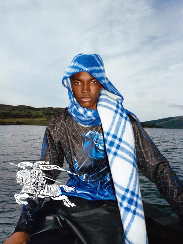
39
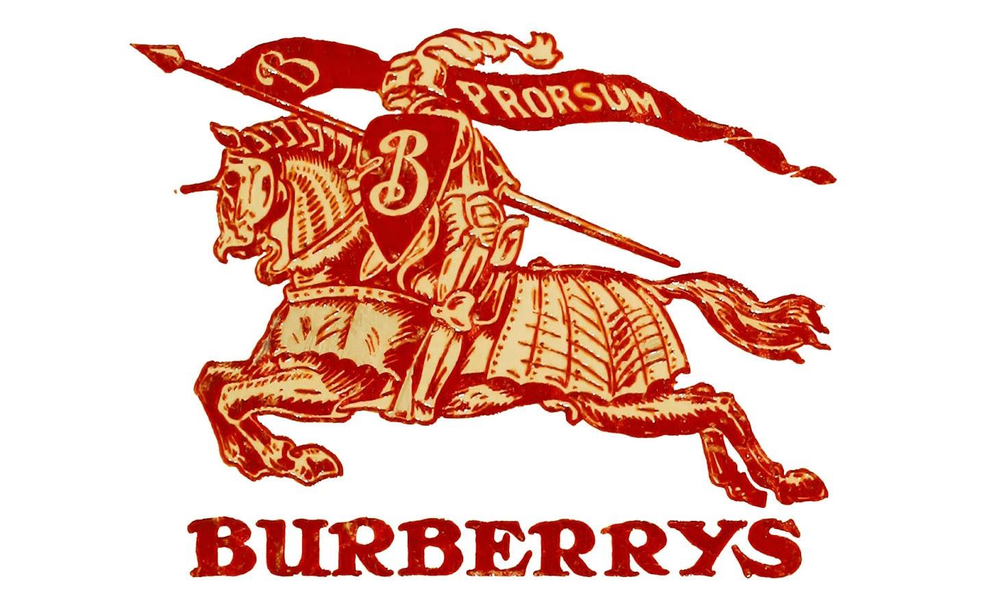
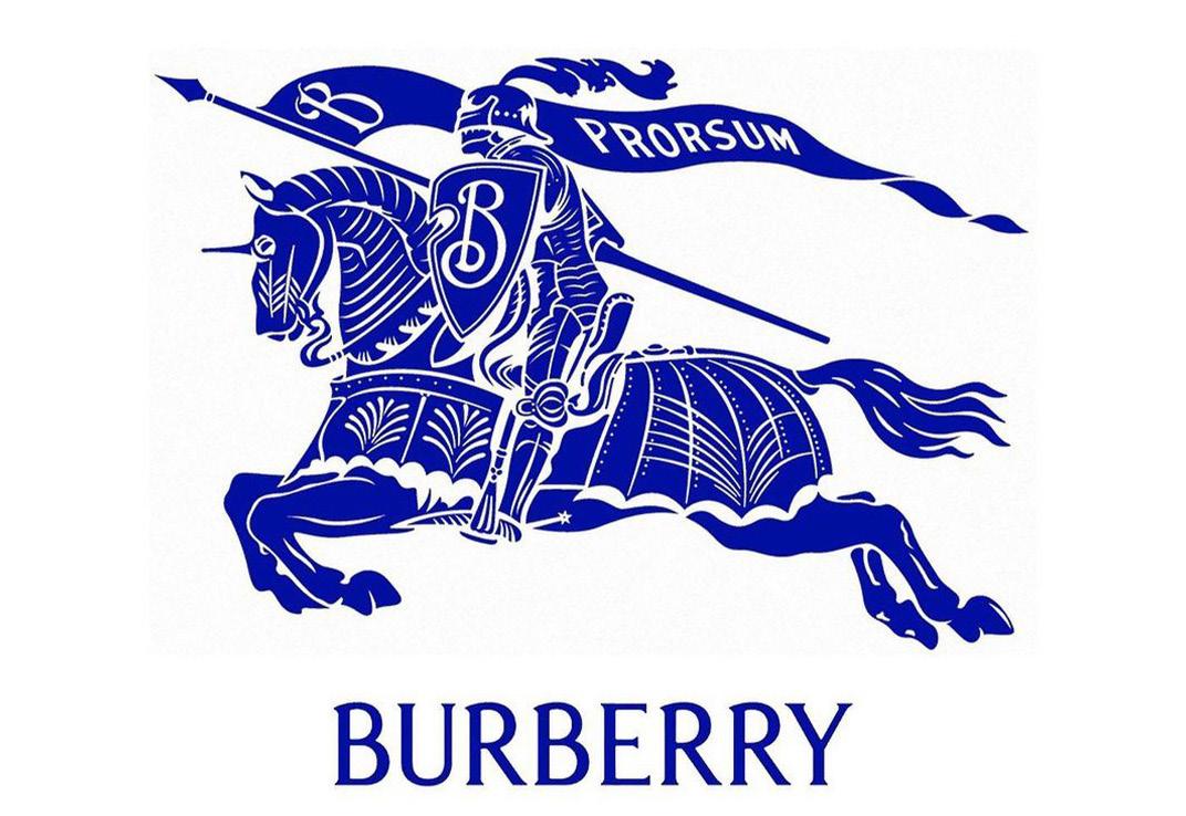
With this new logo, Burberry refers to heraldic coats of arms. Here, the knight is the logo. It should be noted that the B of the shield is not used as a logo as such, but it is the knight as a whole that is highlighted, with two colors: white or blue. The brand’s motto, “prorsum”, which means “forward”, is again inscribed on the flag. Burberry announces a clear return to its origins, in a spirit of chevalrous (re)conquest.
The complexity of this insignia from the past, often abandoned by modern brands that have chosen to simplify them over time, creates all the uniqueness of Burberry while
creating a strong sense of belonging under the same banner.
While the intention in changing to a simple sans-serif monogram was to make the wordmarks more clear and digitally compatible, for use on everything from websites to embroidery, the result was a sea of relatively indistinguishable wordmarks, often uncharacteristic of the brands’ heritage or creative direction.
Burberry’s rebrand injects history and personality back into the brand, reinforced by historically prestigious typography and iconography.
40