

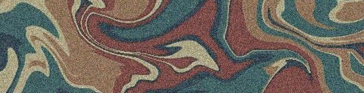
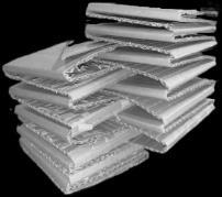
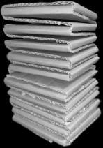
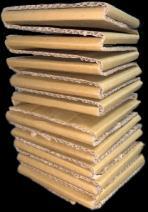
50件 白柚與文旦之間尺寸立體物件
Fondre Asphyxie Protéger La Combustion Effrondrement
+Colorful Ribbon
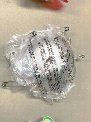
+Plastic bag +Wire
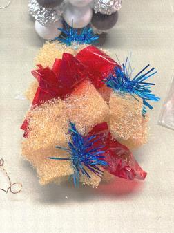
+Styrofoam +Sponge
+Clay +Gypsum +Paint
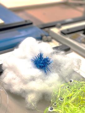
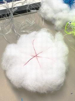
+Cotton +Cellophane
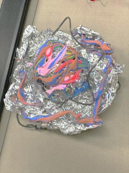
+Aluminum Foil
+Colorful Ribbon
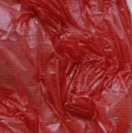
+Plastic bag +Wire
+Styrofoam +Sponge
+Clay +Gypsum +Paint
+Cotton +Cellophane
+Aluminum Foil +Wood
+Colorful Ribbon
+Plastic bag +Wire
+Styrofoam
+Cauliflower
+Clay +Gypsum paint
+Cotton +Cellophane
Colors Colors Colors & & &
+Aluminum Foil +Wood
+Colorful Ribbon
+Plastic bag +Wire
+Styrofoam +Sponge
+Clay +Gypsum +Paint
+Cotton +Cellophane
+Aluminum Foil +Wood
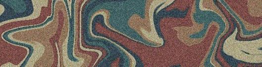
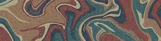
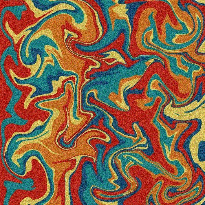
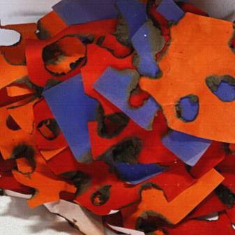
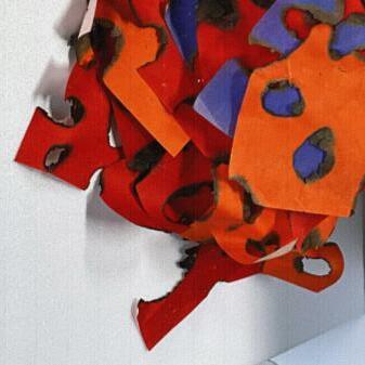
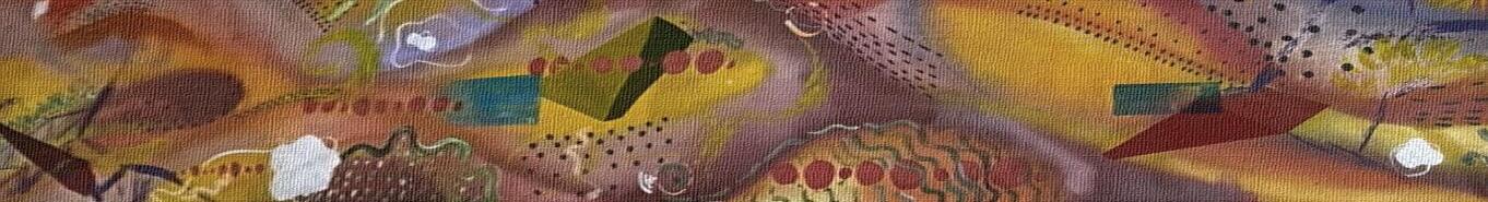
色彩與材料試驗
+Colorful Ribbon
+Plastic bag +Wire
+Styrofoam +Sponge
+Clay +Gypsum +Paint
+Cotton +Cellophane
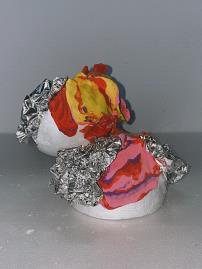
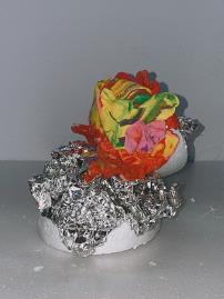
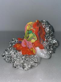
+彩色緞帶 +塑膠袋 +鐵絲 +保麗龍 +菜瓜布 +黏土 +壓克力顏料 +棉花 +玻璃紙 +鋁箔紙 +木材 色 彩 與 材 料 試 驗
+Aluminum Foil +Wood
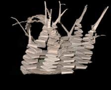
Materials Materials Materials
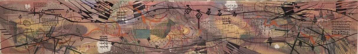
Emotions and Bodies
提取特定回憶片段的畫面色彩
To be continued
結合身體感知 發展
 Fondre Asphyxie Protéger
La Combustion Effrondrement
Fondre Asphyxie Protéger
La Combustion Effrondrement
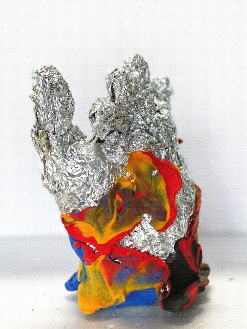
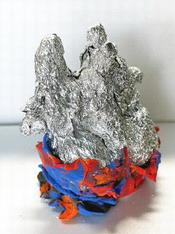
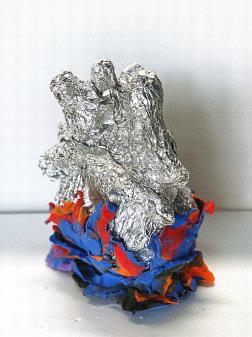
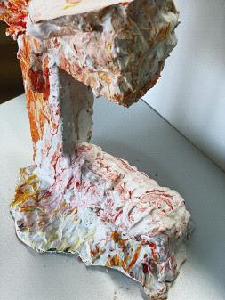
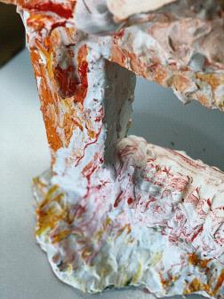
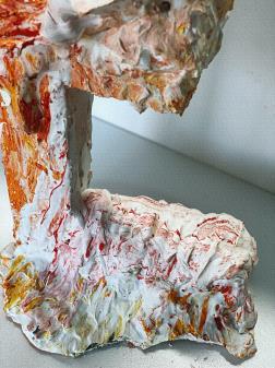
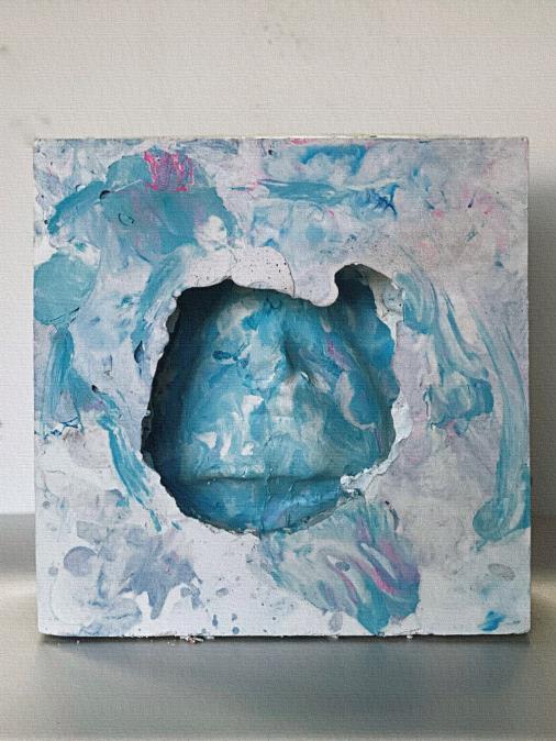
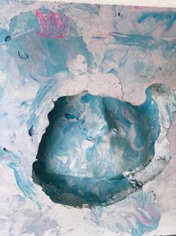
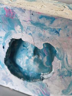
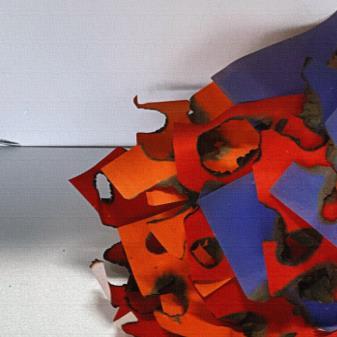
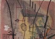
Fondre
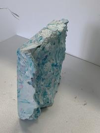
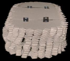
熔化
輕質土 鋁箔 霧面噴膠
-利用霧面亮面以及冷暖色調區分左心與右心
-底部混和少許黑色呈現燃燒時的灰燼
Lightweight Soil
Aluminum Foil
Matte Spray
-Using matte/gloss and cold/warm color tones to differentiate the left heart from the right heart.
-Mixing a touch of black at the bottom to present the ashes during combustion.
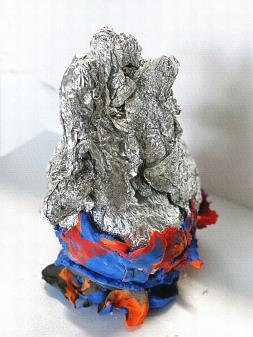
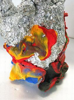
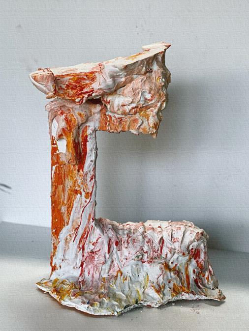
Protéger
守護

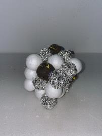
石膏 壓克力顏料
-抵擋炙熱
Gypsum
Acrylic Paint
-Resisting heat
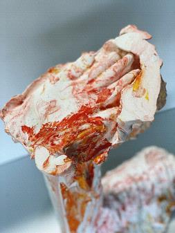


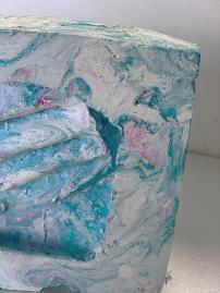
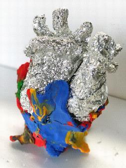
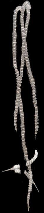
Asphyxie
窒息
石膏 壓克力顏料
-以臉為模型基礎
-光影加強壓抑感受
Gypsum
Acrylic Paint
-Using the face as the model base.
-Enhancing shadows and highlights to intensify the sense of suppression.
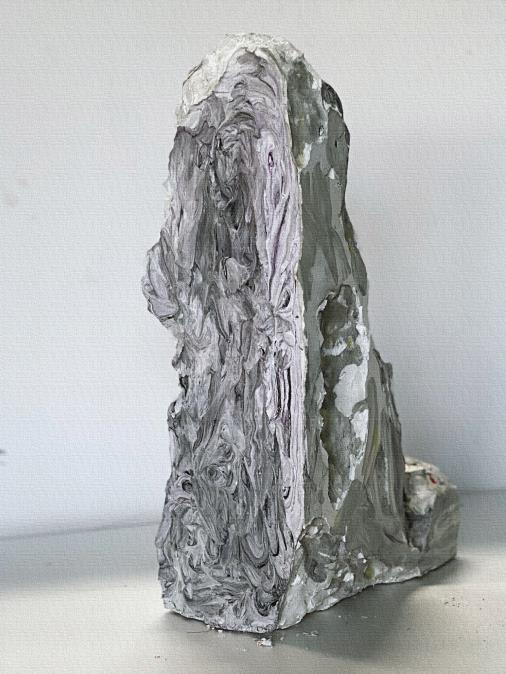

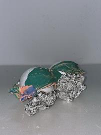
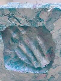
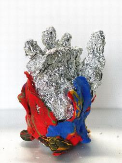
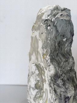
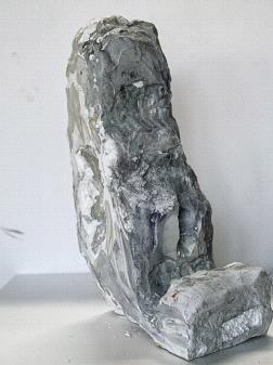
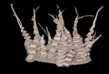
Effrondrement
崩潰
石膏 壓克力顏料
-山崩與碎裂
-山水畫線條效果
-不規則挖空
Gypsum
Acrylic Paint
-Mountain collapse and fragmentation.
-Landscape painting-style line effects.
-Irregular hollowing.
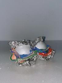
La Combustion
燃燒
色紙 火
-燃燒痕跡與高艷度對比
Colored Paper Fire

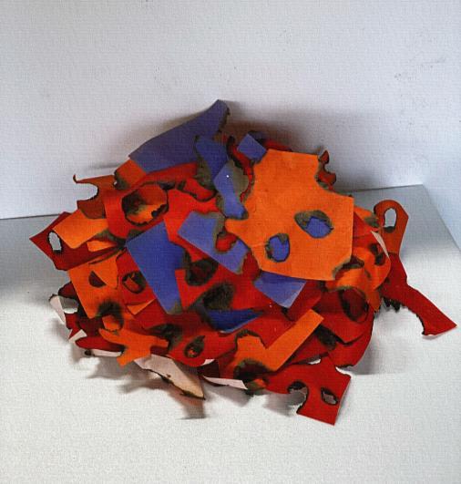
-Contrast between burning traces and high brilliance.

/Made by-李芳
/Instructor -呂武隆
各組別創作以身體為媒介的行為與動作,可以以 小組或個人為單位,聚焦於動作的本質與身體的 運用關係,產出形式可以為圖紙或是多媒體素材。
根據身體創作的內容進行設計的發想,分析動作 的必要性與機動性。無論是各個關節、部件和感 受或者物理性的材料連結皆可為創作起點
111102 身體 生活方式 空間 We Live in This Space行為的本質來自反應 設計以挑戰反應為目的之裝置 在不穩定的狀態下與身體對話
The essence of behavior stems from reactions.
Design aims to create installations with the purpose of challenging these reactions.
Allowing for the experience of bodily behavior in an unstable state.
???
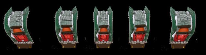
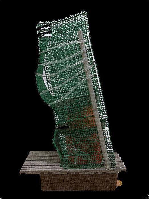
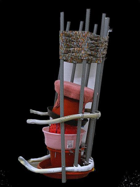
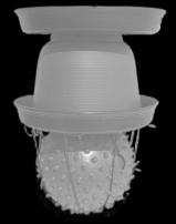
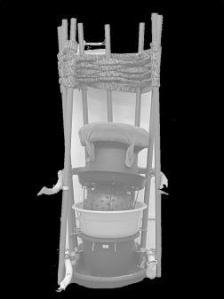
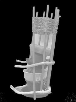
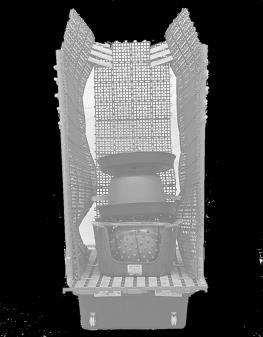
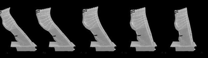
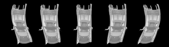
裝置核心
混和媒材 25x25x45
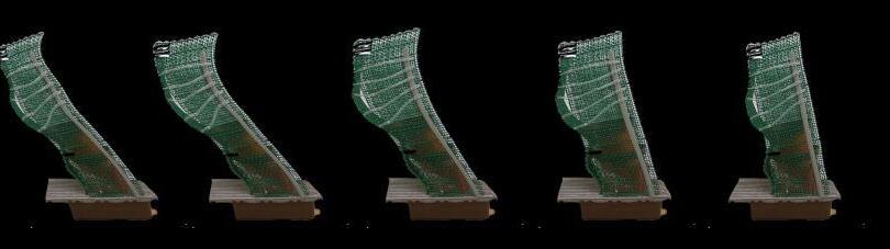
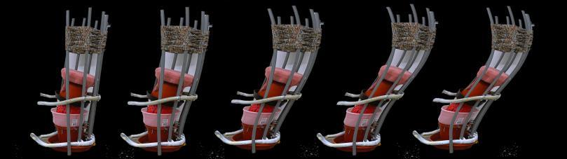
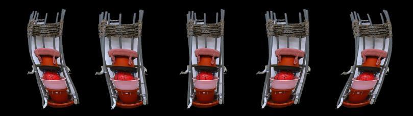
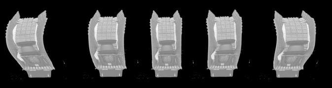
裝置 第一版本
混合媒材 40x50x90
裝置 第二版本
混合媒材 35x35x95
Core Device
Mixed Media 25x25x45 cm
Version 001
Mixed Media 40x50x90 cm
Version 002
Mixed Media 35x35x95 cm
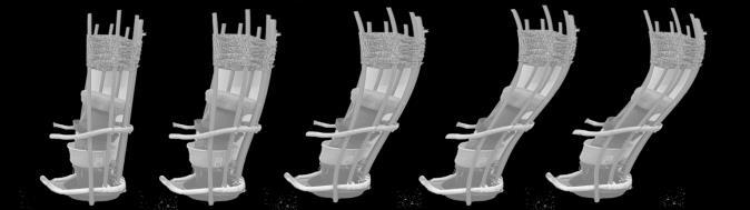
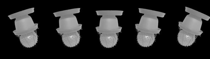
Pressure leading to deformation.
swaying from side to side
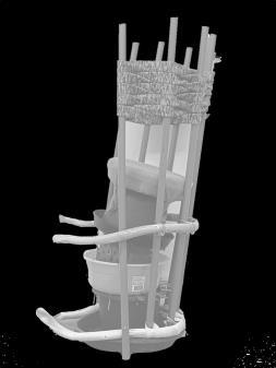
Ready-made object Experiment
Core device Purpose
Mobility and instability
Enhancing sensory nerves
現成物實驗
核心裝置
目標
可動與不穩定
強化感知神經
swaying from side to side
Experience Methodology
Source of Instability
Concept Seating
Seating
Pressure leading to deformation.
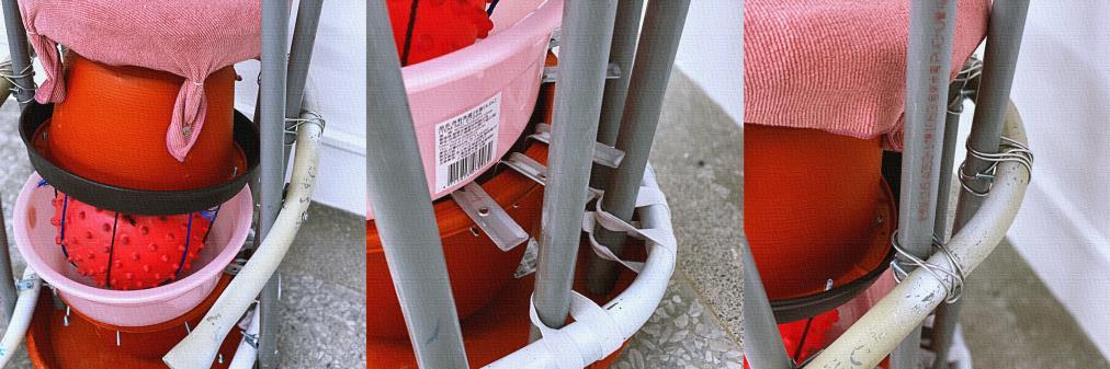
•Water collection tray
•Flower pot
•Water collection tray
•Ball
•Rope (for securing)
+花盆下面接水的
+花盆
+花盆下面接水的
+玩具球
+繩子 (固定)
swaying from side to side
swaying from side to side

• Elastic band
• Water hose
• Plastic tubing
• Hardware
• Soft drainage pad
• Core device
• Plastic chair
• Hard drainage pad
• Plastic basket
• Canned beer
• Wheels
+鬆緊帶
+水管
+塑膠軟管
+五金
+軟排水墊
+核心裝置
+塑膠椅凳
+硬排水墊
+塑膠置物籃
+罐裝啤酒(盛重)
+輪子

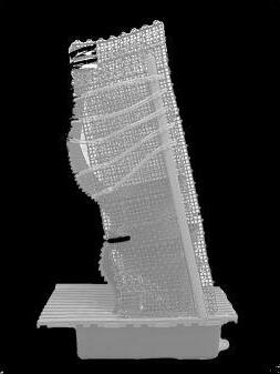
Installation Version 02
Adjustments
-Implementing Lever Principle Limitation System
-Reducing Degree of Freedom
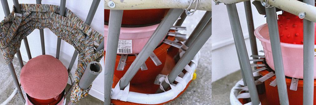
裝置 第二版本
調整 槓桿原理限制系統 縮減自由幅度
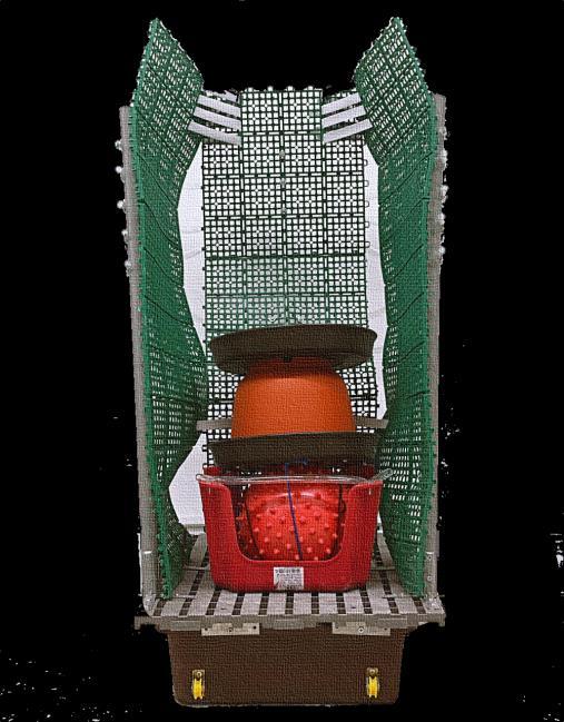
• Hardware handle
• Rigid water hose
• Cotton wide ribbon
• Core device
• Basin
• Flower pot
• Hardware
• Wire
• Elastic band
• Water collection tray
+五金提把
+硬水管
+棉質寬帶
+核心裝置
+面盆
+花盆
+五金
+鐵絲
+鬆緊帶
+接水盤


/Made by-李芳 李適安
/Instructor -呂武隆
/Collaborators
111103 再聚-邁向後疫日常的會面點生活於後疫日常的人們,對於生活的追求是回歸疫情前的「日常」, 期待能像以往一樣順其自然的在熟悉的場域從事熟悉的事。
觀察台灣街區的日常集會場域,會發現「榕樹下」是許多人的共同記憶, 在樹蔭下乘涼、談天、看書,對於台灣人來說是最親切的聚會模式。
同時,榕樹也是成大學生日常生活中最重要場域之一。
因此,我們希望將人們對於榕樹集會的共同記憶,以我們的作品重新詮釋, 使用「做空間」而非「做量體」為思考脈絡,期許營造出空間氛圍,進而引導再聚自然發生。
此次設計挑戰以仿生構築的手法,來回應這片相對於磚牆水泥較為軟性且有機的基地。
For people living in the post-pandemic daily life, the pursuit of life is to return to the "normalcy" before the pandemic, hoping to engage in familiar activities in familiar places just like before.
Observing the daily gathering places in Taiwan's neighborhoods, you'll find that "under the banyan tree" is a common memory for many. It's a place where people gather, relax, chat, and read under the shade. For Taiwanese people, this is the most familiar way of gathering. Additionally, the banyan tree is also one of the most important spaces in the daily life of university students.
Therefore, we aim to reinterpret people's shared memory of gathering under the banyan tree through our work. We focus on "creating a space" rather than "creating a structure," hoping to establish a spatial atmosphere that guides the natural occurrence of gathering. This design challenge takes on a biomimetic approach to respond to this relatively soft and organic site compared to the usual brick and concrete structures.
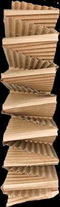
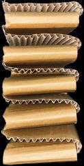
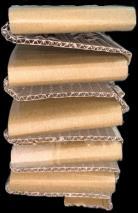
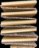
基地 2.5x5 m
材料 120x220 cm 厚8 mm 五層瓦楞紙版
Site 2.5x5 meters Material 120x220 cm, 8 mm thick, five-layer corrugated cardboard panels
Le Lichen
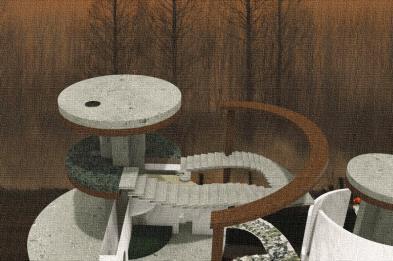
Le Banian
單元 Units
Low Material Consumption
High Deformation Capability
Multiple Connections
單元研究 Studies
Le Lichen
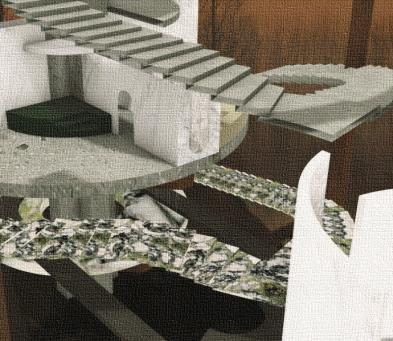
空間討論
001 垂藤-強調框景
延伸由四根柱子與天橋所組成的端景, 加強”框景”的感受,作為劃分兩塊基地的中介。
經由分析「框」的概念,得出以強化邊界來達成強調內部景物的效果。
構築上,
受到遺跡中常見的爬藤類植物啟發,以柔軟的條狀造型依附於基地的原有柱體, 回應基地老舊、悠閒的感受。
002 鋪面-弱化地磚
為了強化框景的感受與基地體驗,我們弱化天橋下廊道的印象。
操作上,
首先抽取地磚「方格」及「鋪塊」的語彙將其轉化成如分隔島一般的小量體, 透過這些小量體改變地磚的視覺輪廓,進而削弱其「廊道」的印象, 同時量體之間也形塑出軟性的動線。

003 桌檯-謙卑成全
在基地分析時,我們發現該片草皮因為沒有任何設備所以很少有人流。
我們觀察到生活中在草地上,人們最常聚集的地方是桌子。
我們希望提供一個場域給規設院的師生在此再聚, 以臺狀的量體提供放置圖紙、輕輕倚靠的機能, 期待讓原本人氣較低的基地活絡起來。
Extending from the four pillars and footbridge forming the scenic backdrop, emphasizing the sense of a "framed scene," serving as an intermediary dividing the two sections of the base.
By analyzing the concept of "frame," it is determined that enhancing the boundaries can effectively emphasize the interior scenery.
In terms of construction, inspired by the common sight of vines in ruins, soft linear forms are used to attach to the existing pillars of the base, responding to the aged and leisurely atmosphere of the site.
In order to intensify the sense of a framed scene and the experience of the base, we are diminishing the impression of the corridor beneath the footbridge. In terms of execution, we start by extracting the vocabulary of "squares" and "blocks" from the floor tiles and transforming them into small entities resembling separated islands. Through these small entities, we alter the visual outline of the floor tiles, thereby reducing the impression of a "corridor." Simultaneously, these entities shape flexible pathways between them.
During our analysis of the site, we discovered that the grassy area sees little foot traffic due to the lack of amenities.
We've observed that in daily life, people often gather on lawns around tables.
With this in mind, we intend to provide a space for the students and teachers to gather again on the premises. We propose using table-like structures, where they can place their drawings and lean lightly against. Our aim is to invigorate the relatively less popular area of the base and transform it into a lively space.

Sur Le Banian
空間討論
001 桌檯-引起聚集行為
以樹墩作為造型靈感,結合桌台機能,我們設計出以三個單元編排的樹墩圓桌。
三個單元型塑出具有彈性的空間, 讓人們可以依據不同的使用情境來改變跟此構築物的關係。
Taking inspiration from tree stumps and integrating table functionality, we've designed a round table composed of three individual units. These three units shape a space with flexibility, allowing people to alter their relationship with this structure based on different usage scenarios.
002
氣生根
-再現榕樹下意象
以不同浪性的單元組合,模擬榕樹的氣生根。
當在榕樹下聚會時,氣生根總會輕輕拂過人們的臉龐, 輕拉氣生根,我們將這樣的互動以浮根的方式再現,讓使用者體驗單元; 透過高低差的設定製造人與浮根的不同互動。
浮根也軟性界定了內外的空間感受,碎化基地的日照, 呼應了基地的草坪與周圍建物的差異性。
By combining units with different undulations, we simulate the aerial roots of a banyan tree. When gathering beneath a banyan tree, its aerial roots gently brush against people's faces. Mimicking this interaction, we've incorporated floating roots to allow users to experience the units. By varying the height differences, we create diverse interactions between people and the floating roots.
These floating roots also define the spatial perception of interior and exterior, breaking up sunlight across the site, echoing the contrast between the base's lawn and surrounding structures.

Aerial Roots
- Recreating the Imagery Under a Banyan Tree
Table Desks
- Fostering Gathering Behavior
/Conceptual Ideation
-李芳 李適安
/Members
-廖韋俐 王語芯 王品涵
/Made by-李芳
/Instructor -呂武隆
/Collaborating Performers
-李適安 廖韋俐 王語芯 王品涵 陳筠均
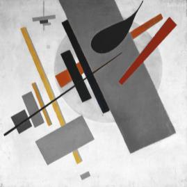
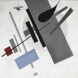
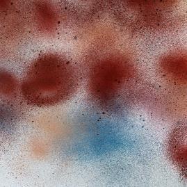
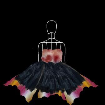
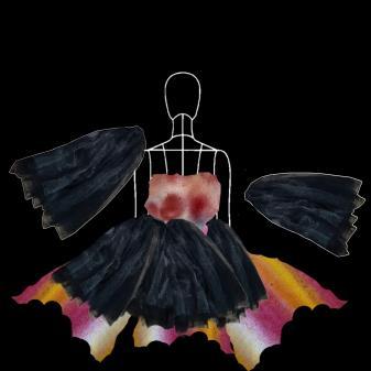
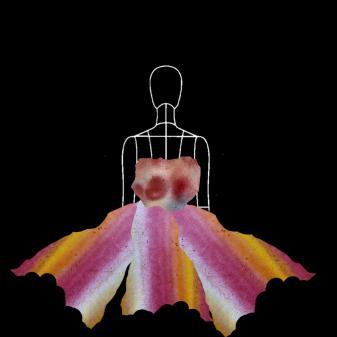
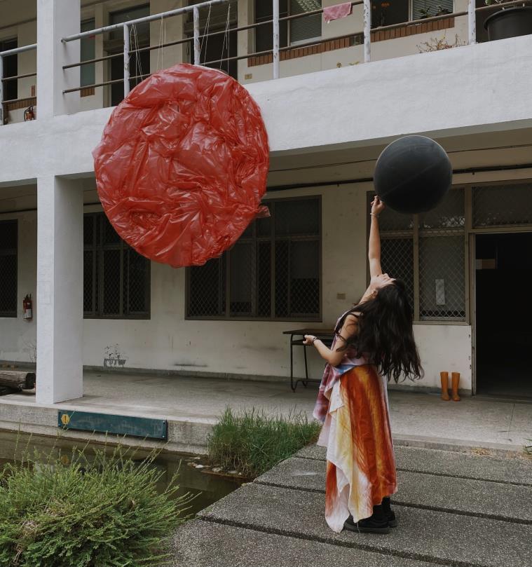
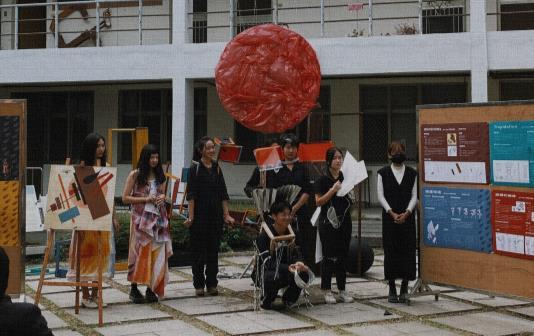
111104 身體的感知機器 Archimove
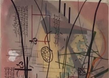
嘗試以至上主義之觀點理解畫作 以不同放像觀察與解讀
將其設定為聚也為之深度的立體存在 分類其中色彩並想像未知形狀 以不同手法再次組織與堆疊
最後以動態演出回放過程與感受
Attempting to understand the artwork from a perspective of supremacy, Observing and interpreting through various viewpoints,
Setting it as both a gathering and a profound three-dimensional existence, Categorizing its colors and imagining unknown shapes, Reorganizing and layering again using different techniques, Finally, presenting a dynamic performance to replay the process and sensations.
棉布 噴漆 塑膠袋 Cotton Fabric, Spray Paint, Plastic Bags
FleurirКазимир Северинович Малевич
畫作分析 Analysis
至上主義
Cупрематизм
Emphasizing basic geometric shapes while focusing on the artistic movement of using a limited palette of colors.
-無特定觀看角度,可自由欣賞
-無特定深淺遠近,製造想像空間
-色塊的重疊,深色多覆蓋於淺色上
感受
待展開的動態,
No specific viewing angle, can be appreciated freely.
No specific sense of depth or distance, creating an imaginative space.

從深色壓抑至繽紛綻放
Overlapping color blocks, with darker colors overlaying lighter ones.
Axonomatric Projection
A sense of anticipation for unfolding dynamics, transitioning from subdued dark tones to vibrant blossoming.
設計概念 Concept 色彩轉譯 Translate
由畫作中深色覆蓋於高彩度色塊,
以及長條色塊的方向性,感受到壓抑情緒,
加上色塊彼此因角度差造成的韻律感,
發展成可以展現繽紛色彩被揭開後綻放的穿戴裝置。
The feeling of suppression is conveyed through the dark colors overlaying high chromatic blocks in the artwork, along with the directional quality of the elongated color blocks.
The rhythmic sense resulting from the angular differences between the color blocks has evolved into a wearable device that can exhibit the unfolding of vibrant colors as if being unveiled.
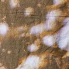
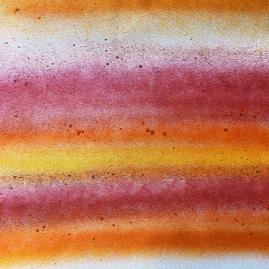
 噴漆 (打霧+側噴+顆粒)
噴漆 (粗線+細線+側噴)
漂白染
Bleaching
Spray Paint
Spray Paint
噴漆 (打霧+側噴+顆粒)
噴漆 (粗線+細線+側噴)
漂白染
Bleaching
Spray Paint
Spray Paint
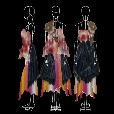
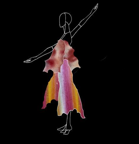
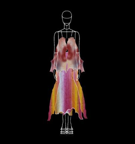
Black Plastic Bag - Generating Sound while Partially Concealing Bottom Colors
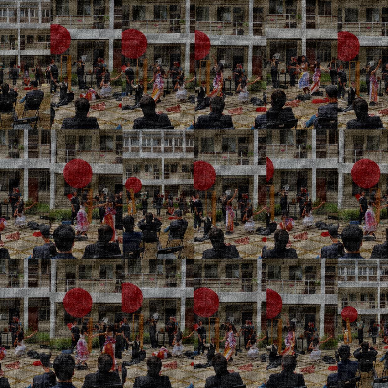

基地調查 個人基地圖
594x841 mm
共同基地圖
841x5940 mm
個人基地模
594x841x300 mm
量體設計
30x30x30 cm
期末展覽
Pavements
Asphalt
Red Brick
Gray Brick
Road Marking
Enclosure Walls
Left Side of Dorm 01
Red Brick Wall
Cement Wall
Facial Washed Terazzo
Graffiti
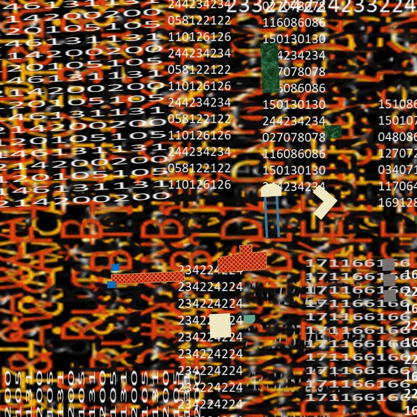
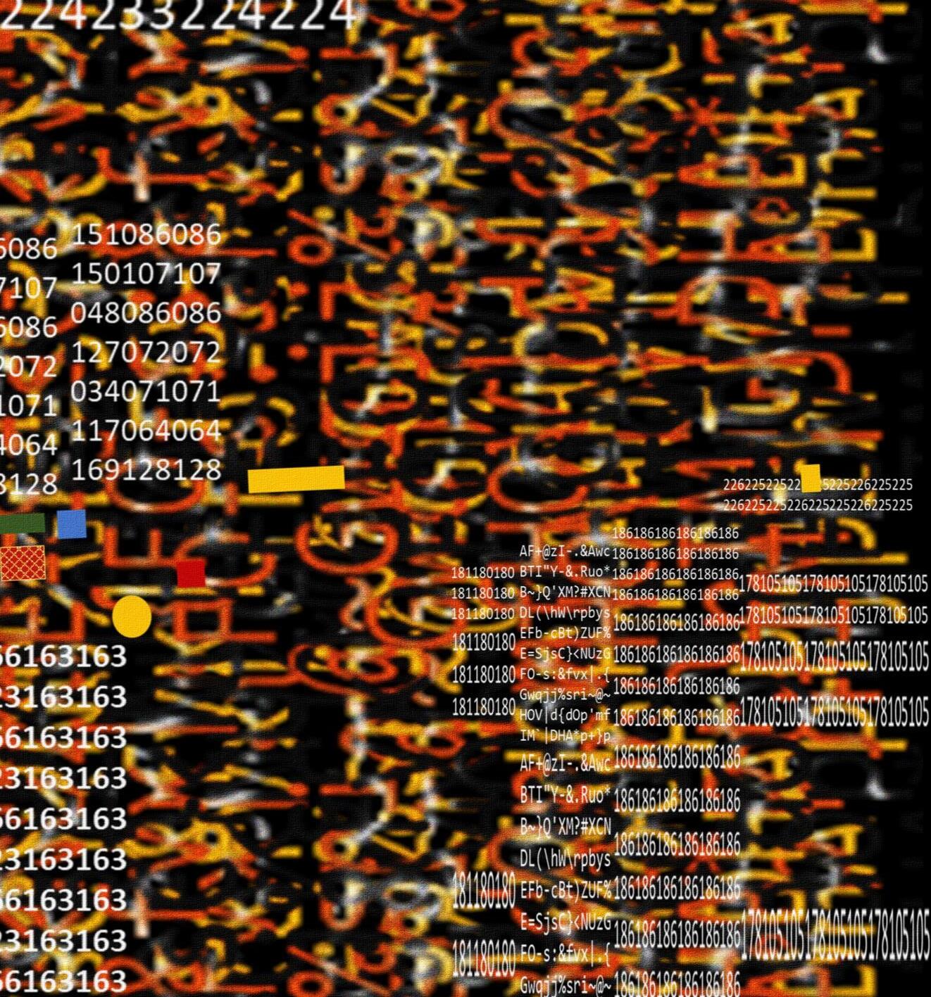
rgb(244,234,234)
rgb(27,78,78)
rgb(151,86,86)
rgb(255,192,192)
rgb(58,122,122)
rgb(116,86,86)
rgb(150,107,107)
rgb(96,105,105)
rgb(118,126,126)
rgb(150,130,130)
rgb(233,224,224)
rgb(186,181,181)
rgb(0,114,114)
rgb(244,234,234)
rgb(34,71,71)
rgb(48,86,86)
rgb(171,166,166)
rgb(232,224,224)
rgb(178,105,105)
rgb(120,105,105)
rgb(146,131,131)
rgb(214,200,200)
rgb(204,55,55)
rgb(166,163,163)
rgb(223,163,163)
rgb(117,64,64)
rgb(169,128,128)
rgb(127,72,72)
rgb(213,137,137)
rgb(181,180,180)
rgb(226,225,225)
rgb(186,186,186)
rgb(225,158,158)
rgb(110,105,105)
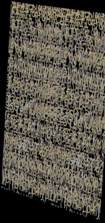
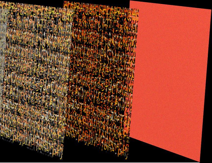
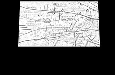
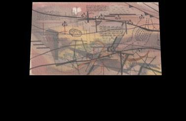
8:9@<UiX2!,x}t!(AUH&p6B|@A7y+;^SRN`5S7`K`j{D7v8WL}Xnu 8,XIZqNTgkOd"v0bvAKxB|T/4l7XH:|:~rX3vya~`#,ucU9,#>AU[S O2r,d<MIU=4>'CUu`FI~cwI8UVA#5y,wgx](R(JEYzG1qu(a48:9@ <UiX2!,x}t!(AUH&p6B|@A7y+;^SRN`5S7`K`j{D7v8WL}Xnu8,XI ZqNTgkOd"v0bvAKxB|T/4l7XH:|:~rX3vya~`#,ucU9,#>AU[SO2r, d<MIU=4>'CUu`FI~cwI8UVA#5y,wgx]-(R(JEYzG1qu(a4
Be motley in appearance
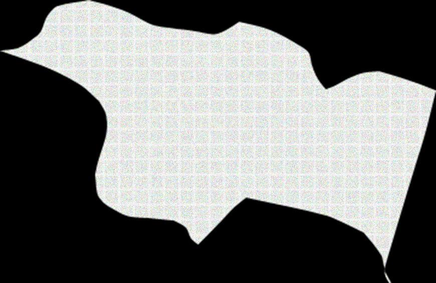
【Site Map Version 01 - Concrete Map】
Applying architectural colors to the building site shapes, and stack according to the number of floors.
Illustrate the architectural facade features of the buildings on Bo Ya Avenue.
Overlay the drawn site elements with the aforementioned survey.
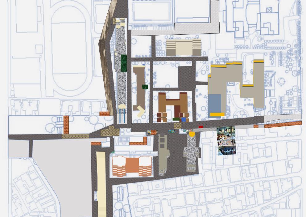
Based on CLUE Ⅰ

【Site Map Version 02 - Color Translation】
After analyzing, the colors are converted into RGB codes, and the code numbers are arranged in a pattern to form architectural blocks.
Add embellishing base elements with colors.
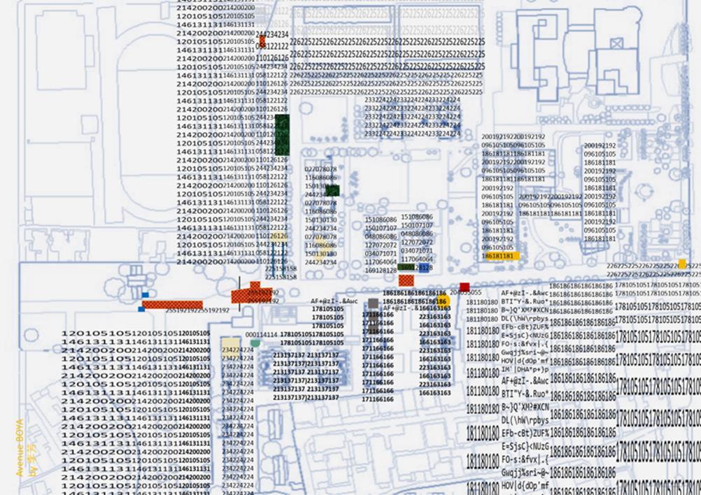
Based on CLUE Ⅱ
Final Version
Rendered primarily with a palette of colors representing Israel.
The jumbled codes at the bottom symbolize the diverse array of people and bicycles on the base.
Through scaling, color transformation, and layering, a sense of chaotic visuals is created.
Echoing the experience of the BOYA Avenue.
基地圖 最終版本-
基地圖 最終版本
以色票轉譯為主要構成 底部亂碼表示基地上形形色色的人與腳踏車 經過縮放、變色、疊合製造混亂的視覺感受 呼應對於博雅大道的體驗
斑駁 失序
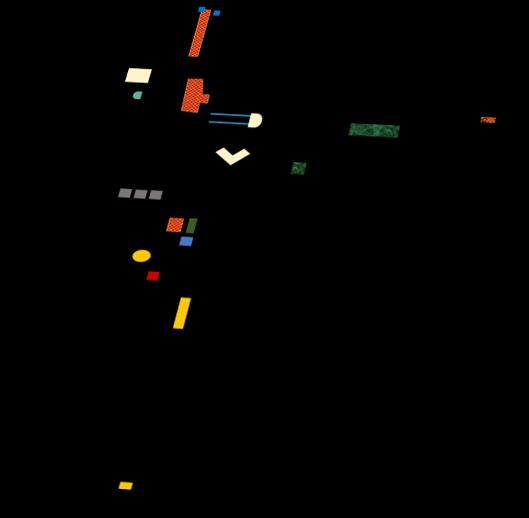
Upper Layer
Drafting paper & oil-based pens, Rational information through drawings.
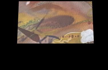
Lower Layer
Using spray paint & acrylic pigments, Emotional experience.
全組共同基地圖
Collective Site Map 上層
Overlay
841x5940 mm
Double-layered composition
描圖紙、油性筆
噴漆、壓克力顏料 感性體驗 疊合
841x5940 mm 雙層圖面
理性資訊 底層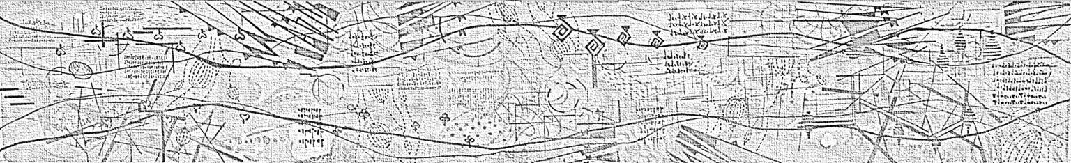
5940 mm
841 mm
1112.5 3D

觀察
符號種類眾多且繁雜


Observation
Complex and diverse types of symbols.
Reconfiguration
Employs grid vocabulary from the base map to recreate elements of the site.
重整
設計選用基地圖上格柵語彙,再現基地元素


A 視線引導、呼應底部曲面、串聯分層基地模
B 零碎符號 Guiding the Line of Sight, Echoing the Bottom Curvature, Linking the Layered Base Modules
Fragmented Symbols
C 描圖紙層線條
D 底層色彩
Drawing Paper Layer Lines
Bottom Layer Colors

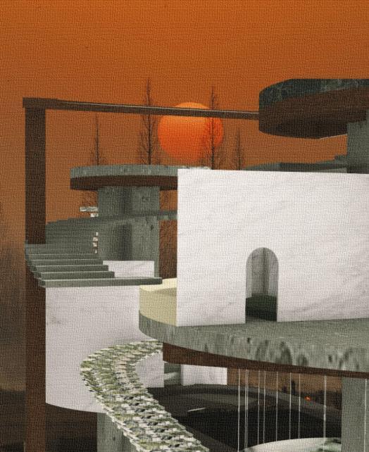
Des Immeubles sur La Place
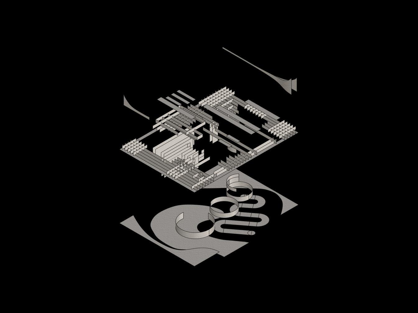
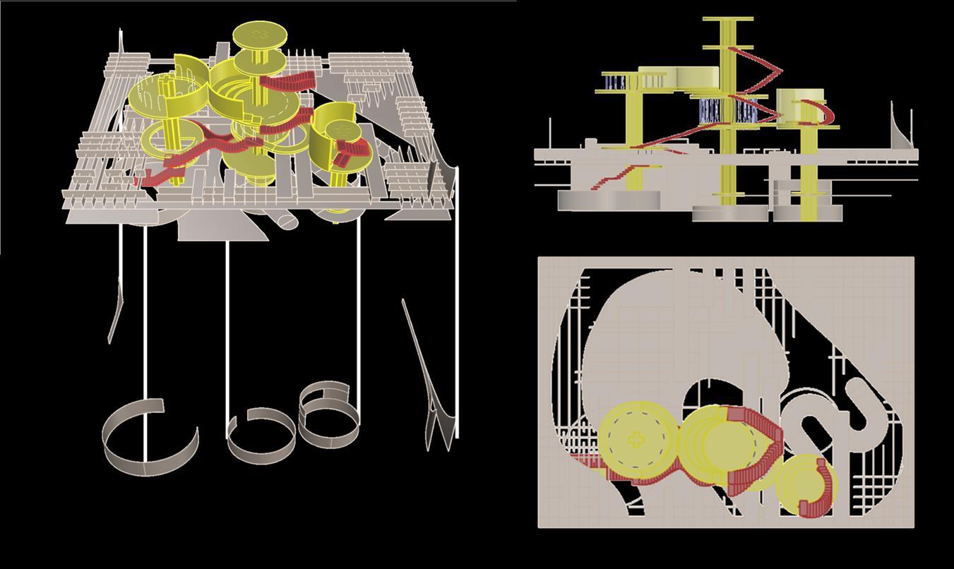
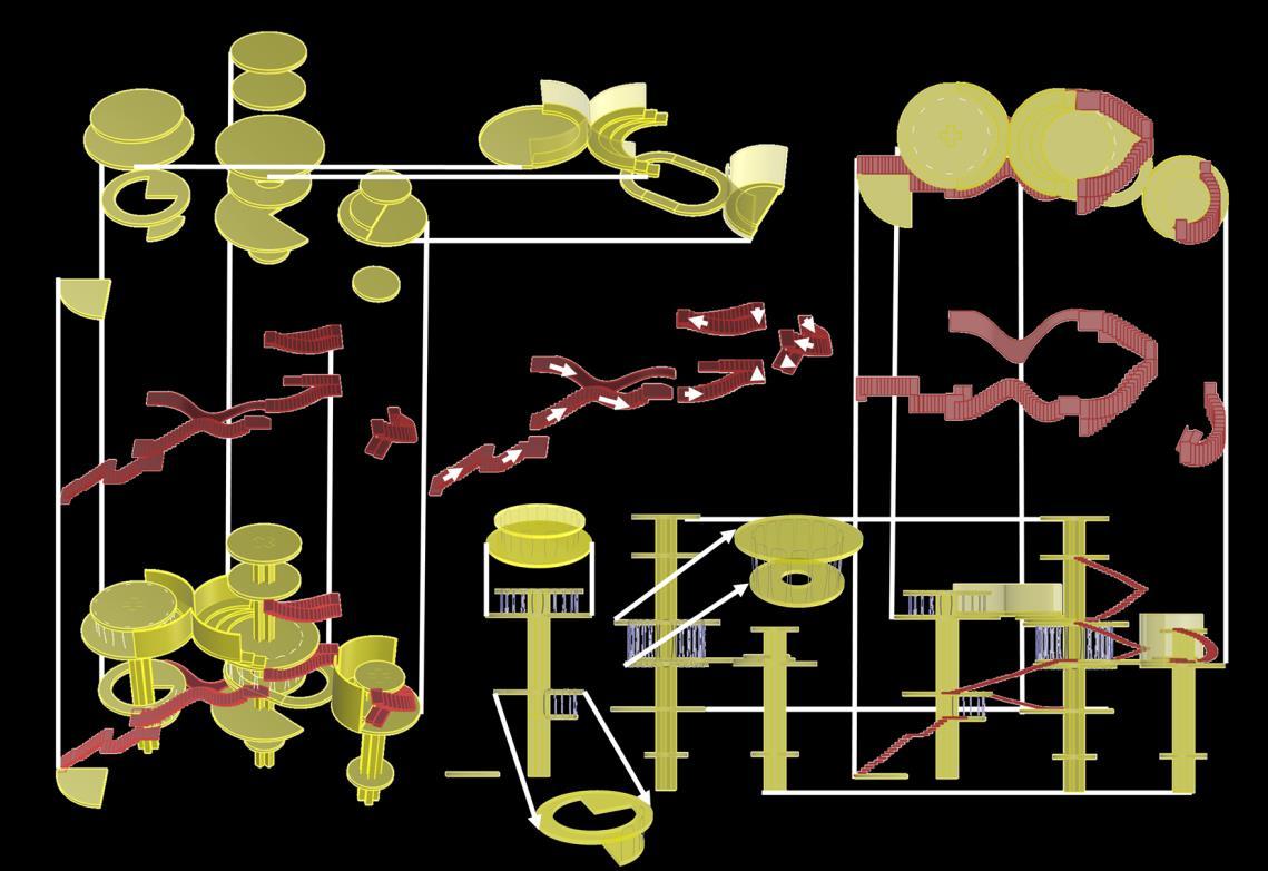
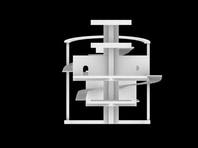
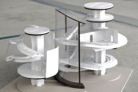
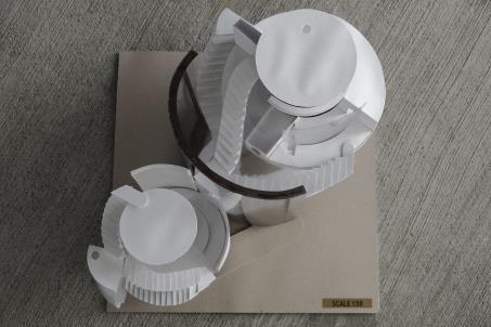
量體與基地

設計概念
跳脫對於基地格柵外形的直覺印象 將底層線索再次抬升
以柔和線條作為量體外型與理性的表層產生對比 量體內部沿用格柵交錯感受生成十字柱體
以垂直項突破基地線條方向性
Concept
Breaking away from the intuitive impression of the base grid outline, Elevating the underlying clues once again.
Creating a contrast between the gentle lines as the volume's external form and the rational surface.
The internal structure of the volume
maintains the sense of interlocking grids, generating cross-shaped pillars.
Vertical elements are introduced to break the linearity of the base.
量體與基地
量體與基地立面圖
基地線索
Indicators Top View Elevation
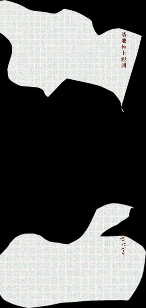
量體與基地上視圖
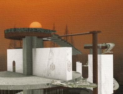
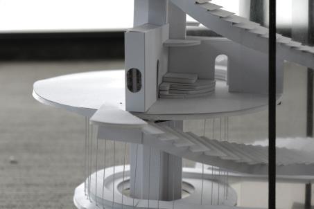
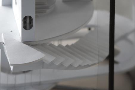
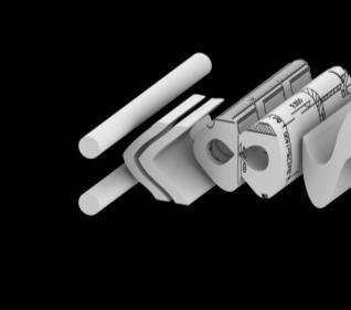
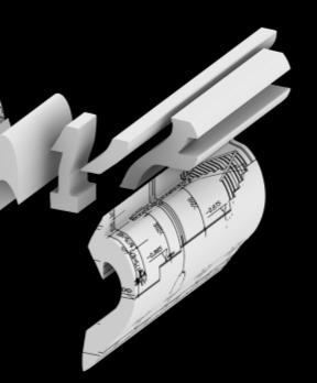
Des Immeubles sur La Place
量體設計
001 圓形樓板
將底部圓形線索再次抬升,與基地格柵形成對比
002 十字柱
十字形柱子邊緣作為空間分割暗示
003 懸吊空間
扣合基地多層次、挑空感受
004 過渡空間
利用窄鳳與高牆強調空間轉換過程
001 Circular Floor Plate
-Elevating the circular clue from the bottom, creating a contrast with the base grid.
002 Cross Pillars
-The edges of the cross-shaped pillars suggest spatial division.
003 Suspended Space
-Integrating the base's multi-level and open-air feel.
004 Transitional Space
-Using narrow passages and tall walls to emphasize the process of spatial transition.
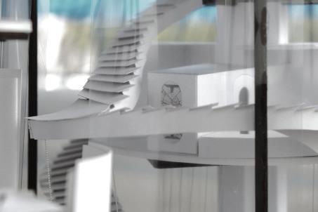
Floor Transition Space
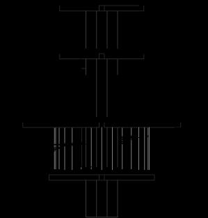
樓板
Top view
量體上視圖
樓梯上視圖
過渡空間 量體立面圖 動線 樓梯 / 坡道 量體 懸吊樓板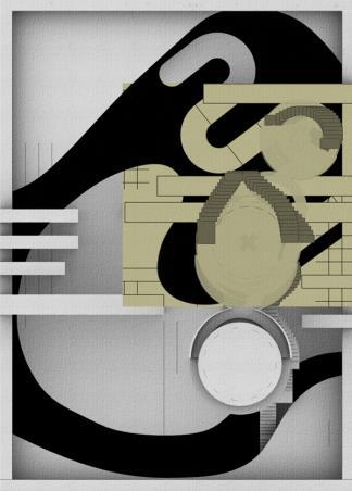
Partitioning of Specific Spaces
以十字柱邊緣作為空間切割依據
Using the edges of the crossshaped pillars as the basis for spatial segmentation.
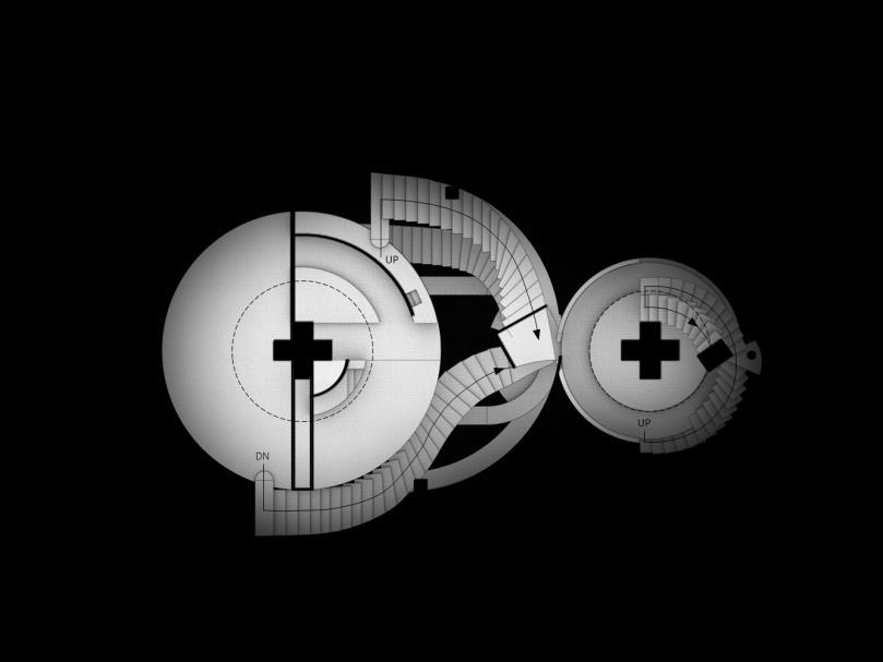
SCALE 1:400


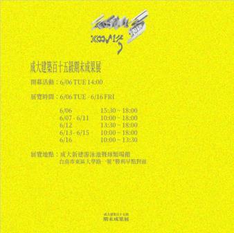
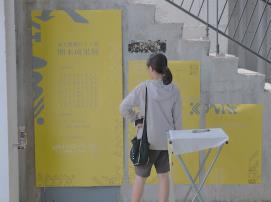
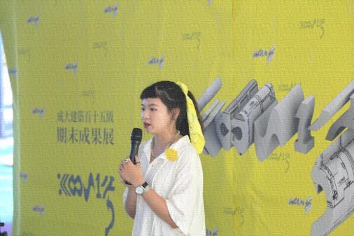
1112 Final Exhibition

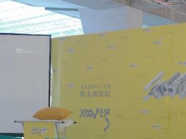
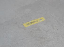
日期 20230606-0616
地點 成大新建游泳池暨球類場館
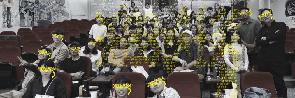
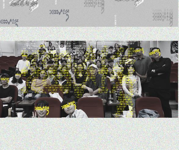
成大建築百十五級 全體學生
總召/ 李芳
展覽統籌/ 林子虹 詹凱博 張邑陽
活動企劃/ 張有芃 莊書豪 李適安 伍育廷
場務規劃/ 蔡承軒 張米淇 蘇于庭 蕭羽安 于皓
視覺總監/ 謝瑋庭 李芳
媒體公關/ 朱彥儒 王敏溱
財務管理/ 陳智偉 羅珮瑄
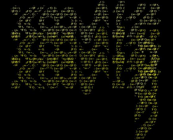
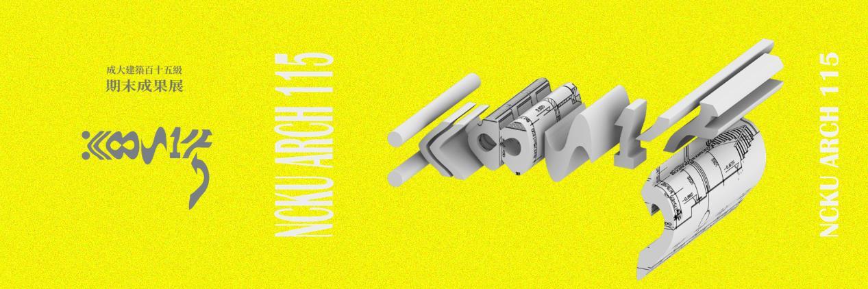
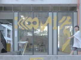
:《∞ ~ 1/F ⟲ 以八組各自代表符號組合而成
始自冒號,像是一句話的開始;終於RE,引人反覆回味。
符號的集合同時呼應展覽內容,由零碎元素構成大尺度創作。
:《∞ ~ 1/F ⟲ consists of eight sets, each representing a combination of symbols.
:《∞ ~ 1/F ⟲ consists of eight sets, each representing a combination of symbols.
It begins with a colon, like the start of a sentence; and ends with RE, inviting contemplation.
It begins with a colon, like the start of a sentence; and ends with RE, inviting contemplation.
The collection of symbols simultaneously resonates with the exhibition's content, creating a large-scale composition from fragmented elements.
The collection of symbols simultaneously resonates with the exhibition's content, creating a large-scale composition from fragmented elements.
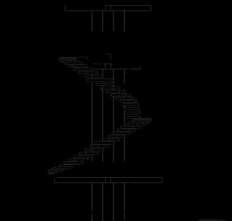
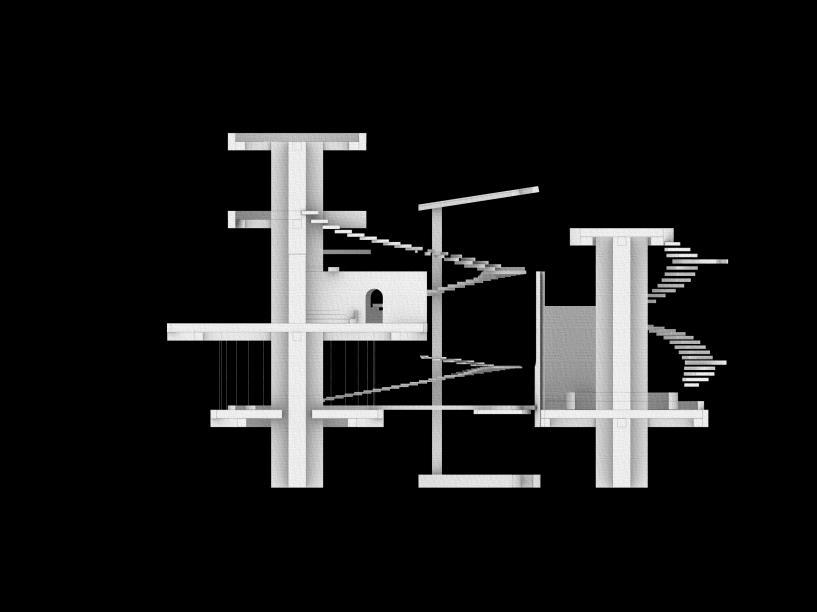
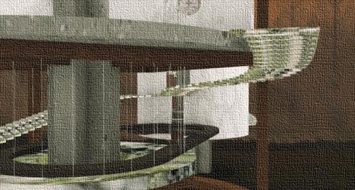
+建模
+錯層
+樓梯圖學渲染
Modeling
Misalignment of Layers
Rendering of Staircase Diagram
Modeling
Misalignment of Layers
Rendering of Staircase Diagram


視 覺 設 計

Service Desk
Signage System
Foyer
Windows
Windows
Interactive Exhibition Area Exhibition Space

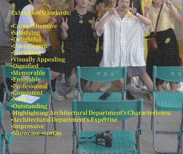
Exhibition Standards:
Exhibition Standards:
•Comprehensive
•Comprehensive
•Satisfying
•Satisfying
•Delightful
•Delightful
•User-Centric
•User-Centric
•Enriching
•Enriching
•Visually Appealing
•Visually Appealing
•Dignified
•Dignified
•Memorable
•Memorable
•Enjoyable
•Enjoyable
•Professional
•Professional
•Consistent
•Consistent
•Neat
•Neat
•Outstanding
-Highlighting Architectural Department's Characteristics:
•Outstanding Highlighting Architectural Department's Characteristics:
•Architectural Department's Expertise
•Architectural Department's Expertise
•Impressive
•Impressive
•Showcase-worthy
•Showcase-worthy