VISUAL DEVELOPMENT GUIDE
Student Rebranding Project

8 10 12 14 3 Development 1 Logo Development [Round2] Refined Sketches [Round2] Digital Comps [Round2] 5 Visual Inspiration Visual Inspiration Next Step 1 Our Story About Airwalk Timeline Mission Statement Keywords 20 22 31 40 2 Exploration Keywords Development [Round1] Keyword 1 Active—Square the Circle Keyword 2 Innovative—Advance your Life Keyword 3 Passionate—Enjoy Spontaneous Adventure 52 60 62 66 68 70 72 74 76 78 80 81 82 4 Development 2 Digital Comps [Round3]-1 Digital Comps [Round3]-2 Digital Comps [Round3]-3 Digital Comps [Round3]-4 More Sketches & Refinements Refined Digital Comps Color Palette Experiment Pairing with Logotype Final Logomark Similar Logos 88 94
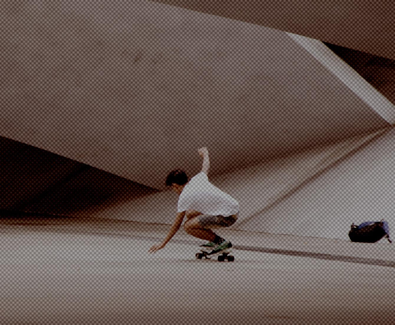
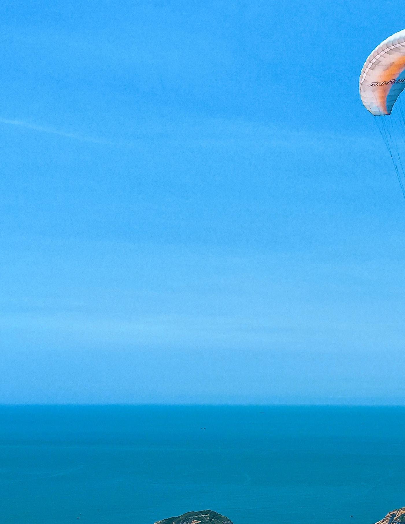
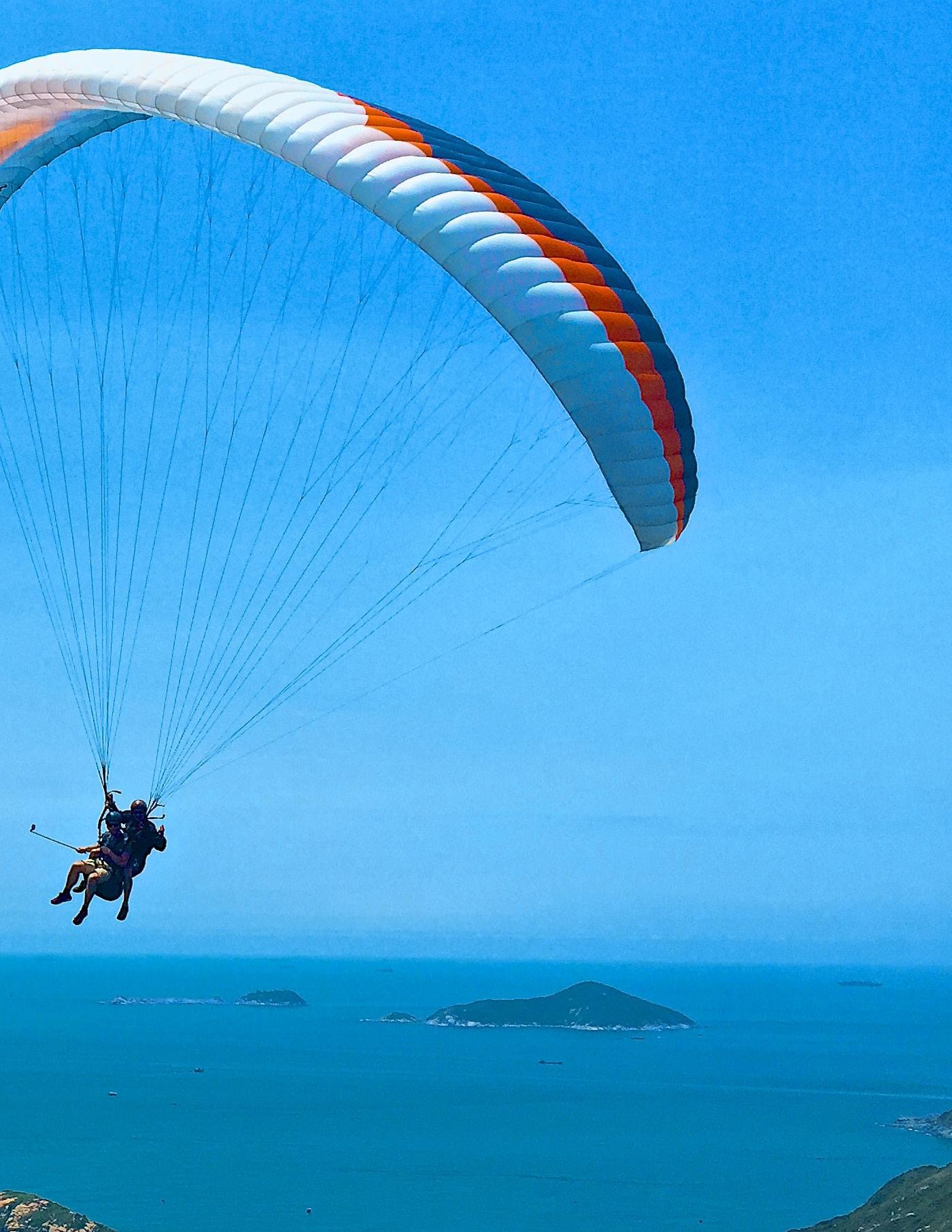
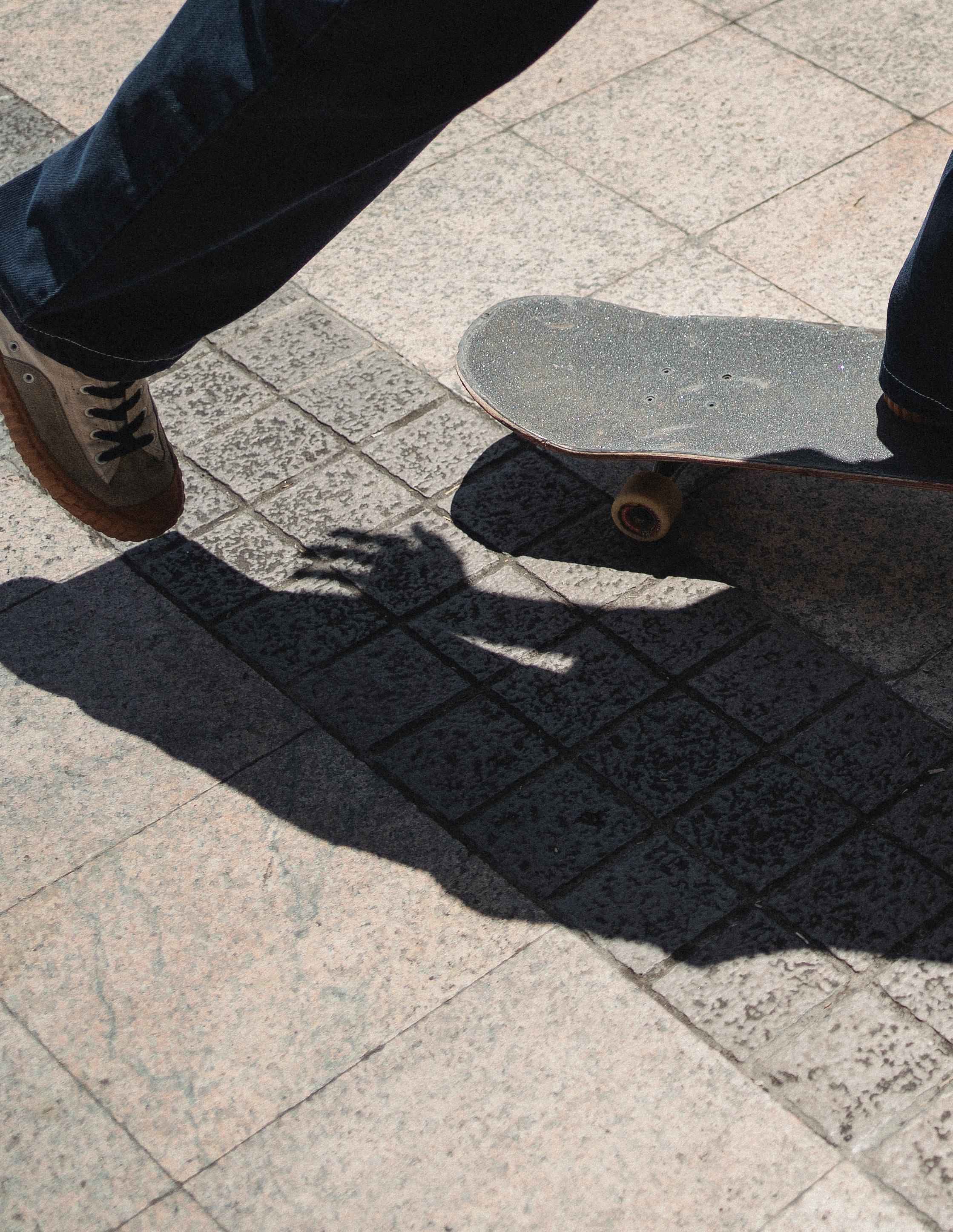
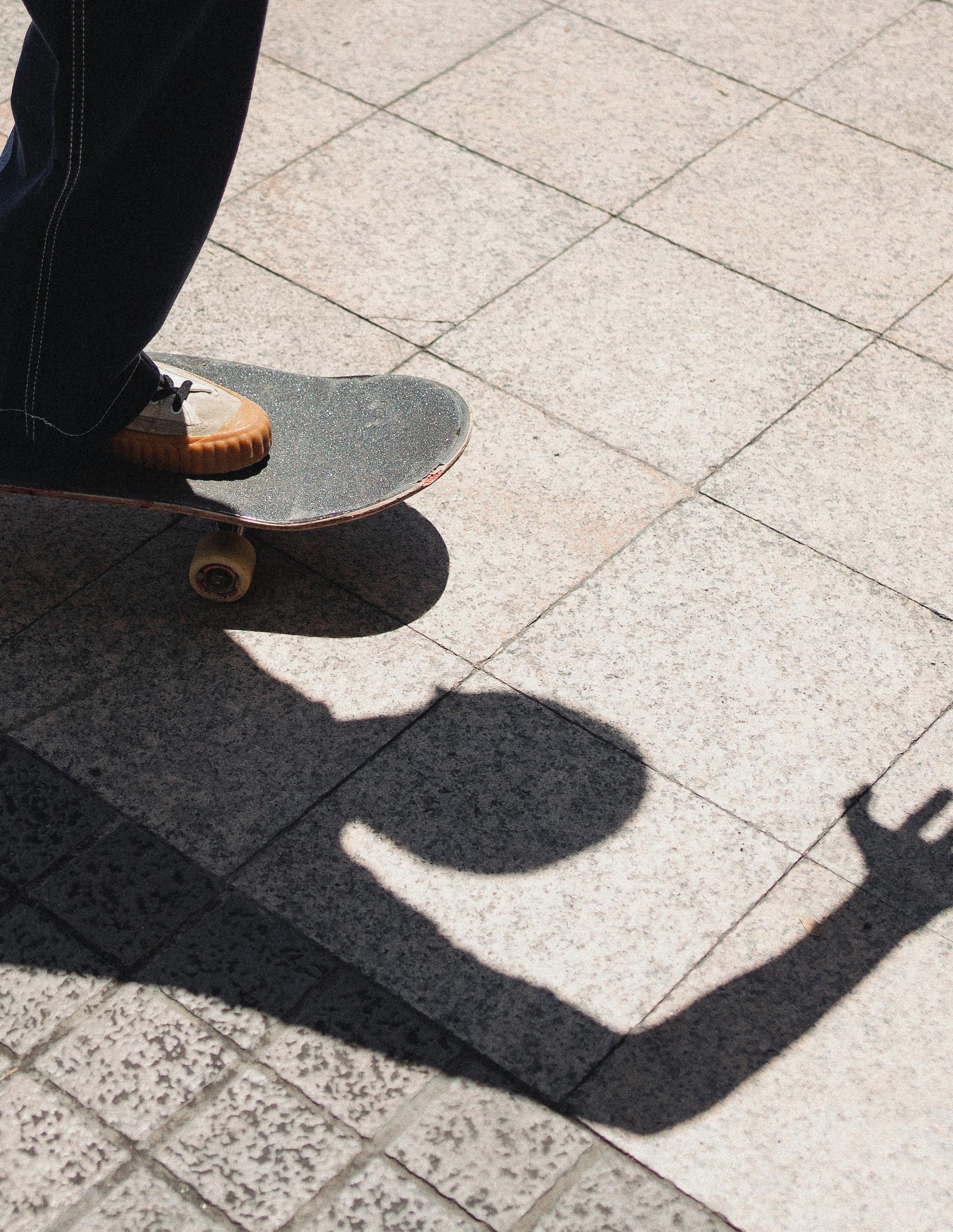
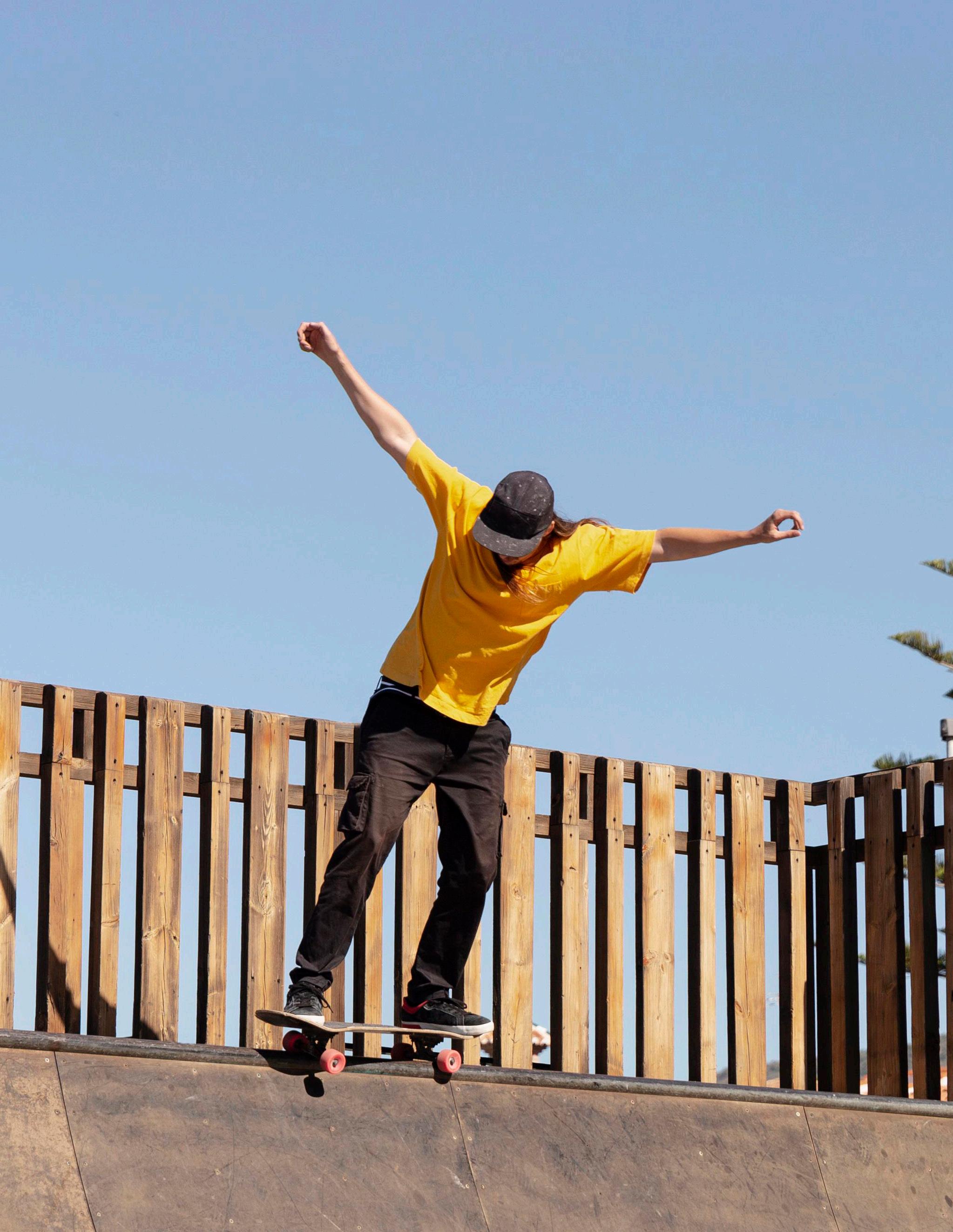
Recognize where your talent lies, work hard on it, and when you reach the top of your profession, don’t forget your roots.
American skateboarder 5
—Tony Hawk,
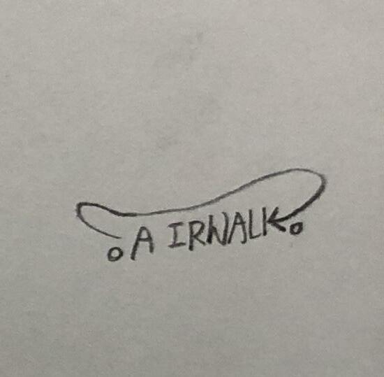
1 Our Story
About Airwalk Timeline Mission Statement Keywords
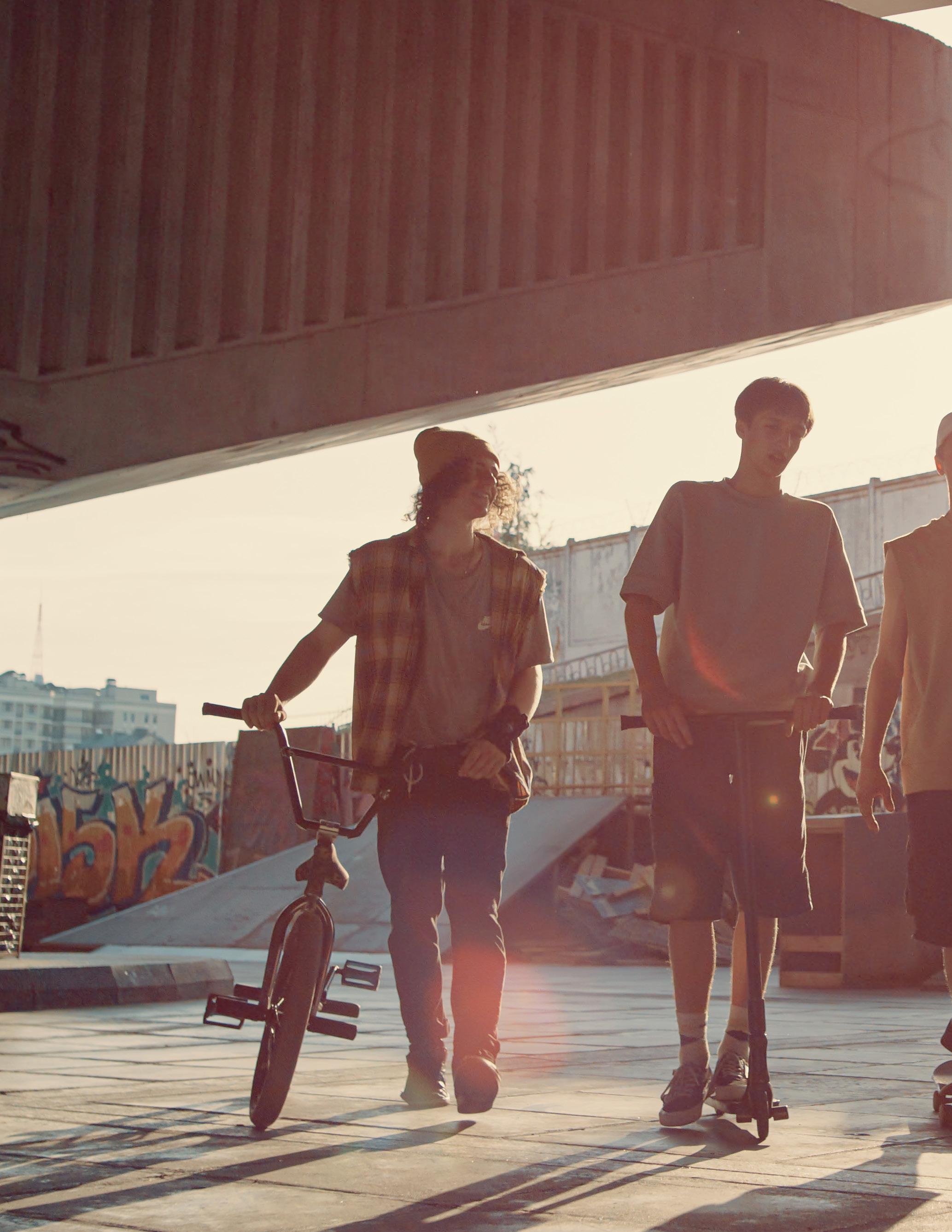
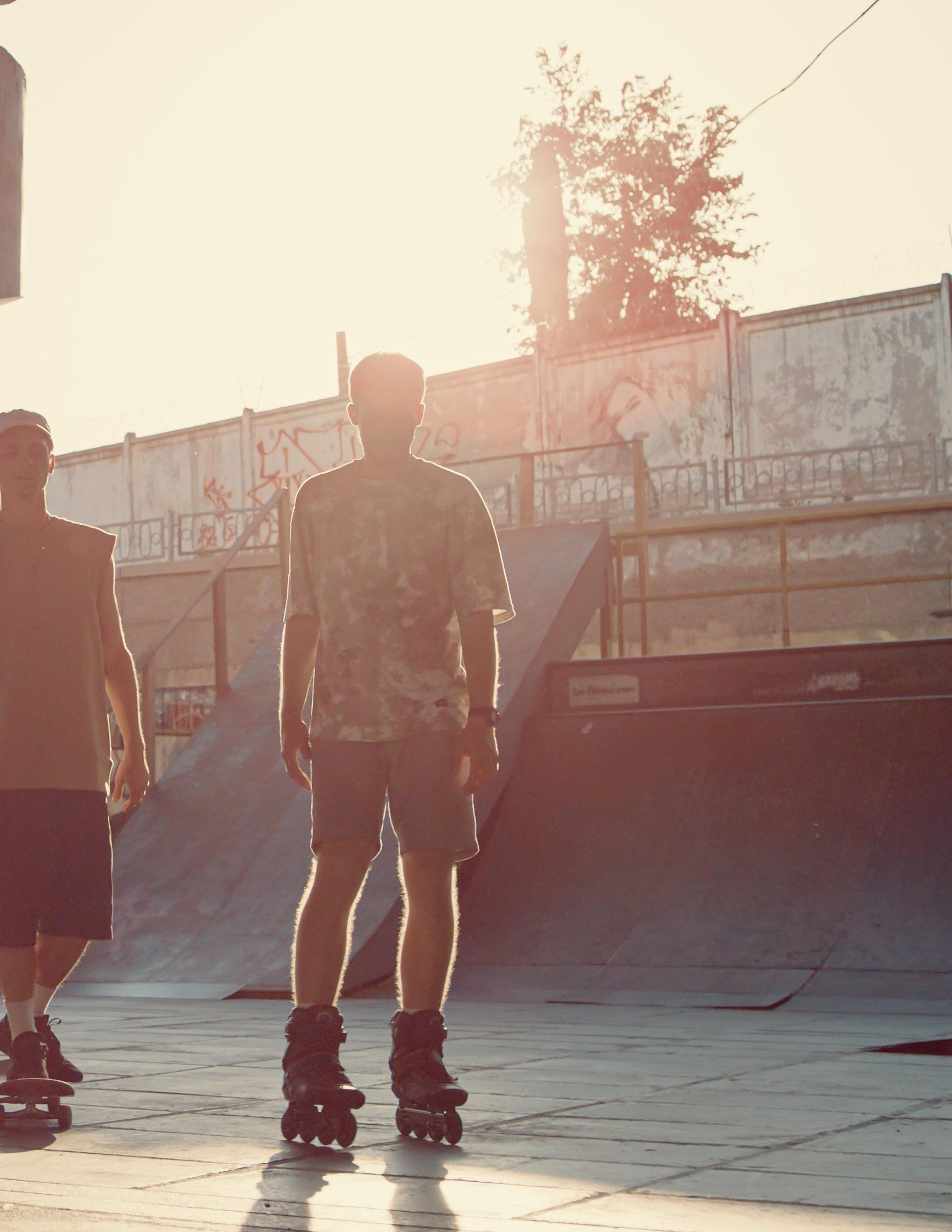
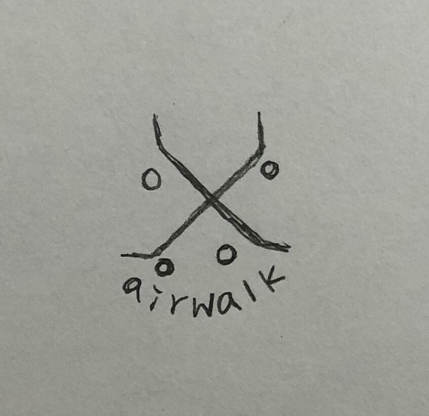
About Airwalk
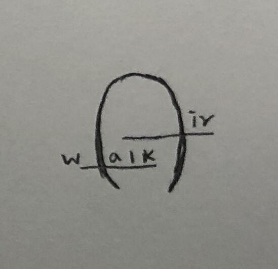
In 1986, George Yohn and Bill Mann decided to break into the industry with a simple goal: create shoes that are more functionally sound and durable for skateboarders. Hence, Airwalk was born. Airwalk is a real pioneering brand when it comes to the progression of that same sub-culture. It includes snowboarding, skiing, mountain biking and skateboarding. It is fueled by passion and progression, driven by people pushing innovation, supporting the scene, and taking risks.
9
Timeline
Airwalk originated as a start-up skate shoe company in 1985
By the end of 1987, Airwalks were available in over 100 styles, selling for relatively low prices, between $20 and $30.
1985 1987 1986 1990
Airwalk was founded by Bill Mann and George Yohn. While developing the technical aspects of the new type of shoe, Mann also went to work on its styling.
Airwalk started to sell in Europe market.
Airwalk weathered the collapse of its core skateboarding market. The sudden proliferation of skateboard parks across the country soon sparked a backlash against the sport. Many of the skateboard parks were closed, and Airwalk saw its sales slump to $8 million.
Airwalk stepped up its advertising budget, in part to counter attempts by Nike--then facing a drop in demand for basketball shoes as the athletic market as a whole began to slip —and others moved to enter the action sports arena. Spending $30 million in 1995, the company pledged another $40 million for 1996.
1991 1995
1994
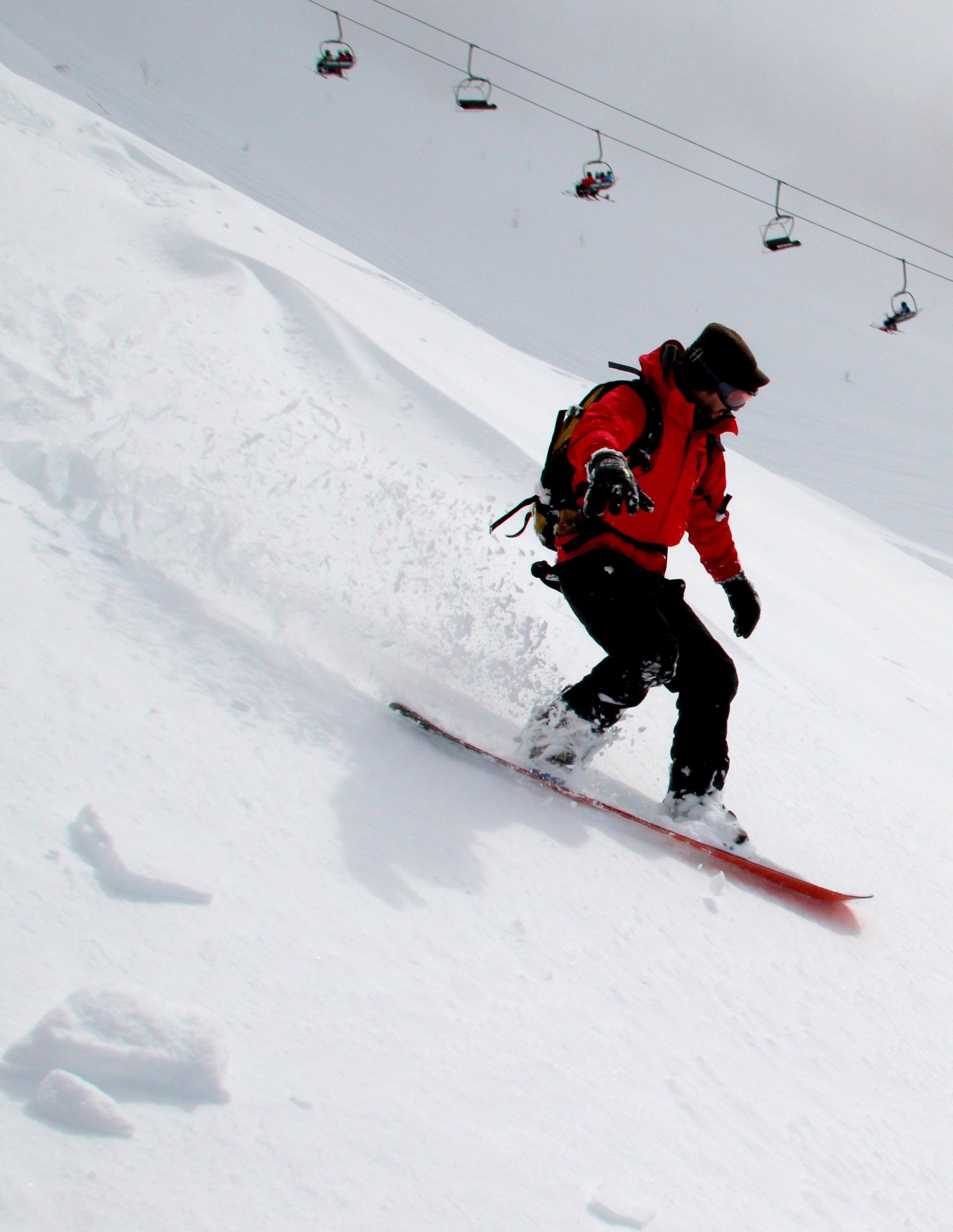
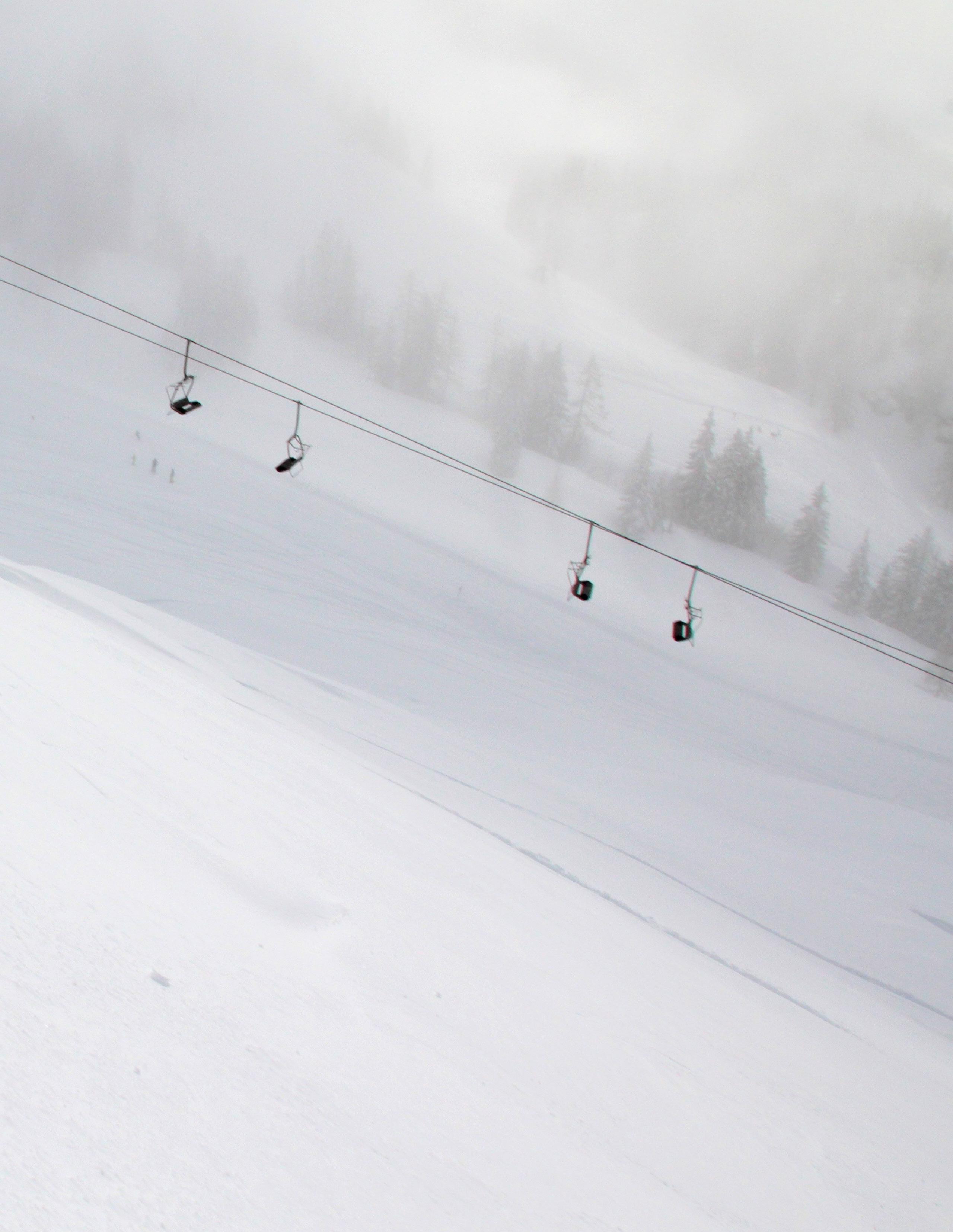
Airwalk had taken the lead in sales of snowboarding boots, just as snowboarding was becoming the country’s fastest growing sport.
Airwalk rebrands and devotes its efforts to build and shape an innovative community of people who want to challenge themselves and pursue a passionate and active life.
2022 1999
Airwalk moved its company to Denver Colorado, and it was purchased by Sunrise Partner.
11
Brand Mission
13
We devote our efforts to build and shape an innovative community of people who want to challenge themselves and pursue a passionate and active life.
Keywords
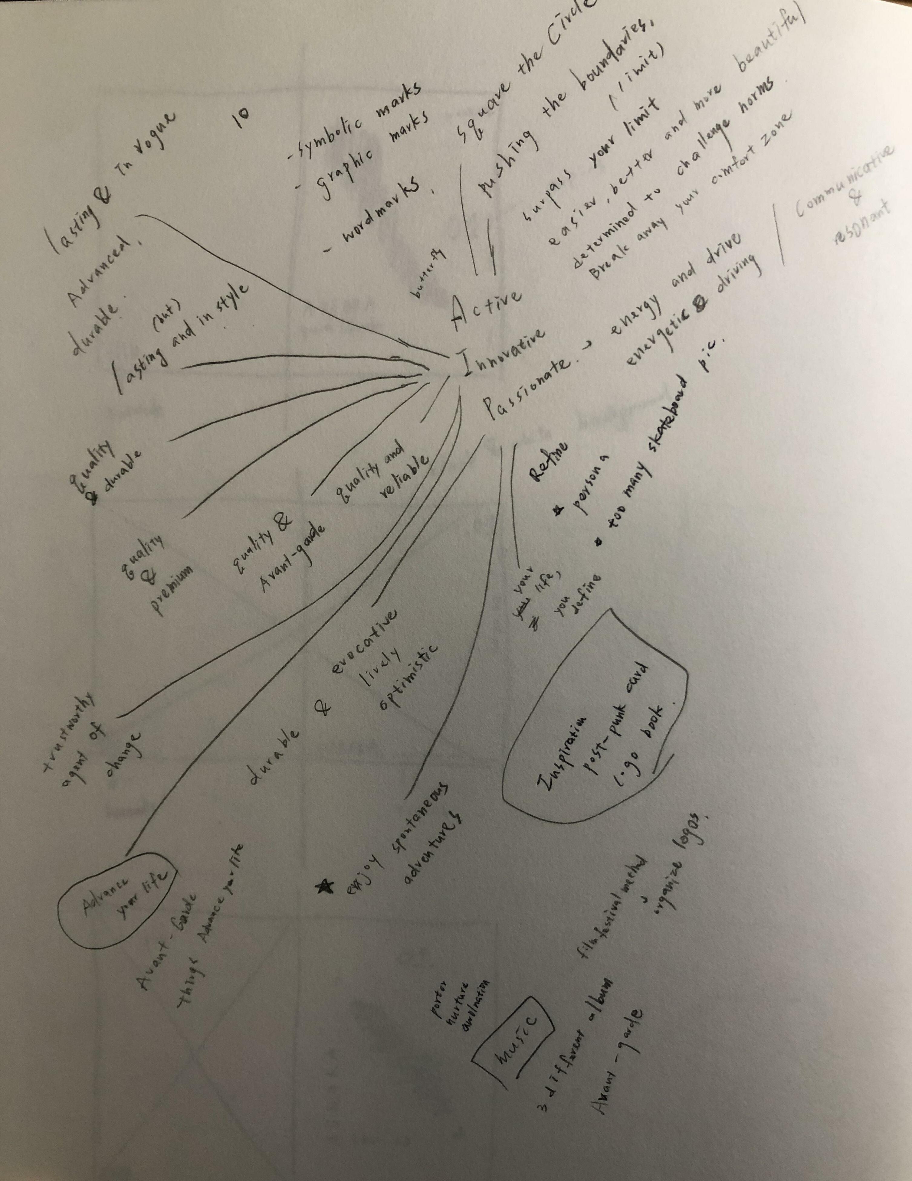
Active
We are dedicated to promoting an active lifestyle for people who lead a challenging and explorative life.
Innovative
We aim to create innovative products for people.
Passionate
We deliver our passion and growth with opportunities in this community.
15
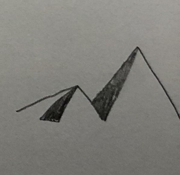
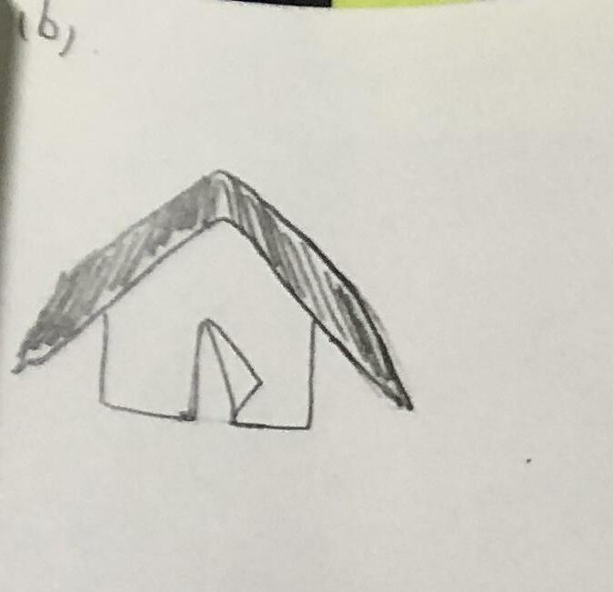
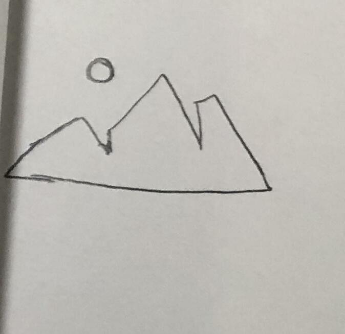
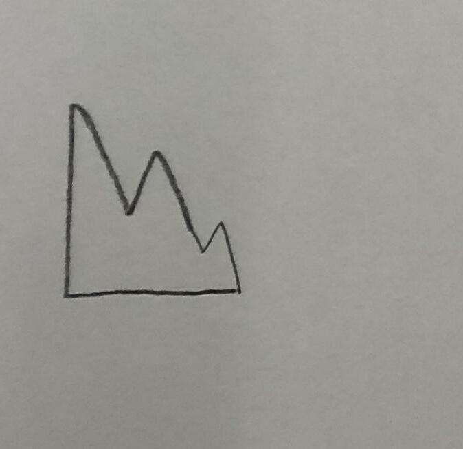
2 Exploration Keywords Development [Round1] Keyword 1 Active—Square the Circle Keyword 2 Innovative—Advance your Life Keyword 3 Passionate—Enjoy Spontaneous Adventure
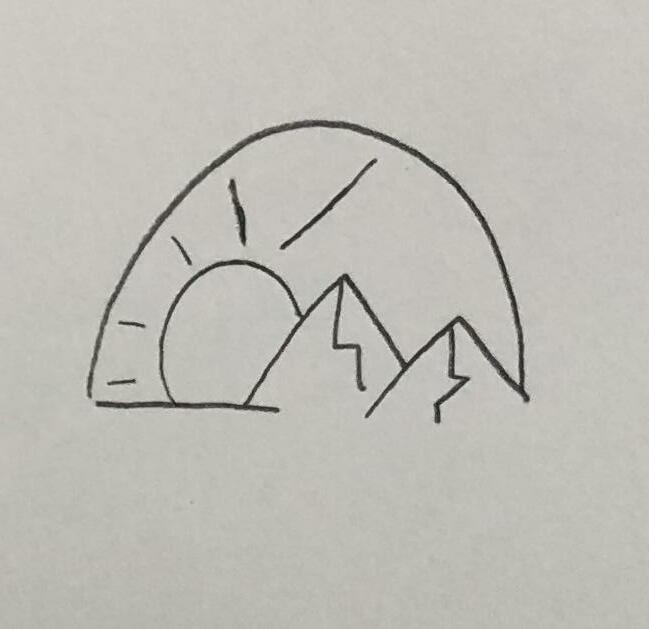
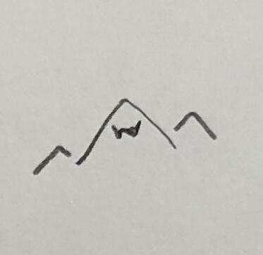
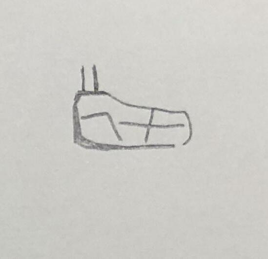
Exploration
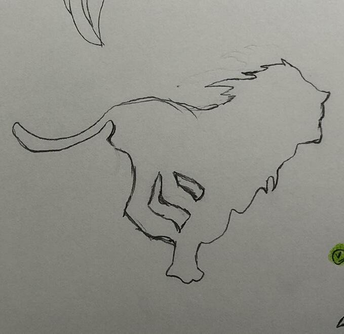
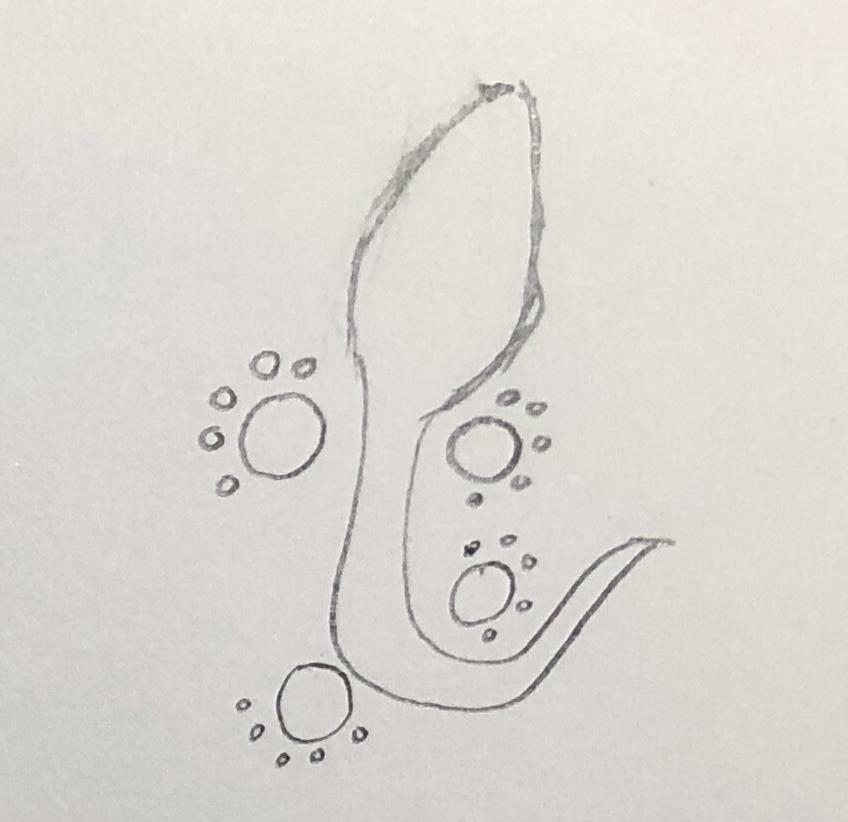
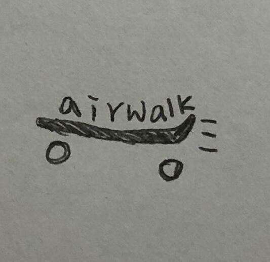
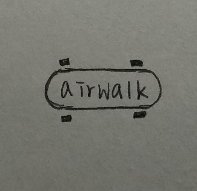
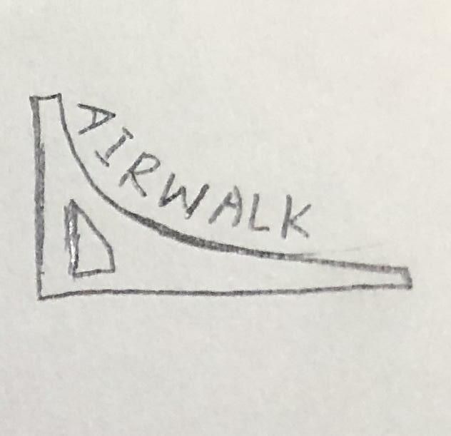
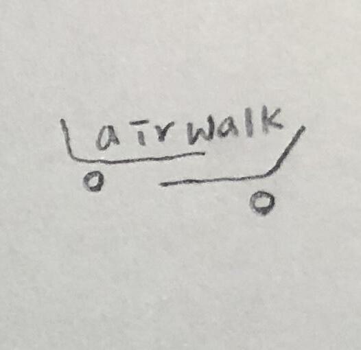
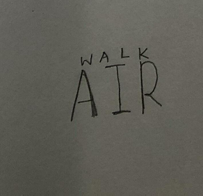
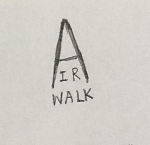
In this phase, we will explore our new Airwalk logo. After we did solid research for our brand, we would begin to sketch new possibilities of new logo. During this trial and error phase, we followed our 3 brand keywords ti generate more potential concepts in order to proceed this experiment.
19
Keywords Development [Round1]
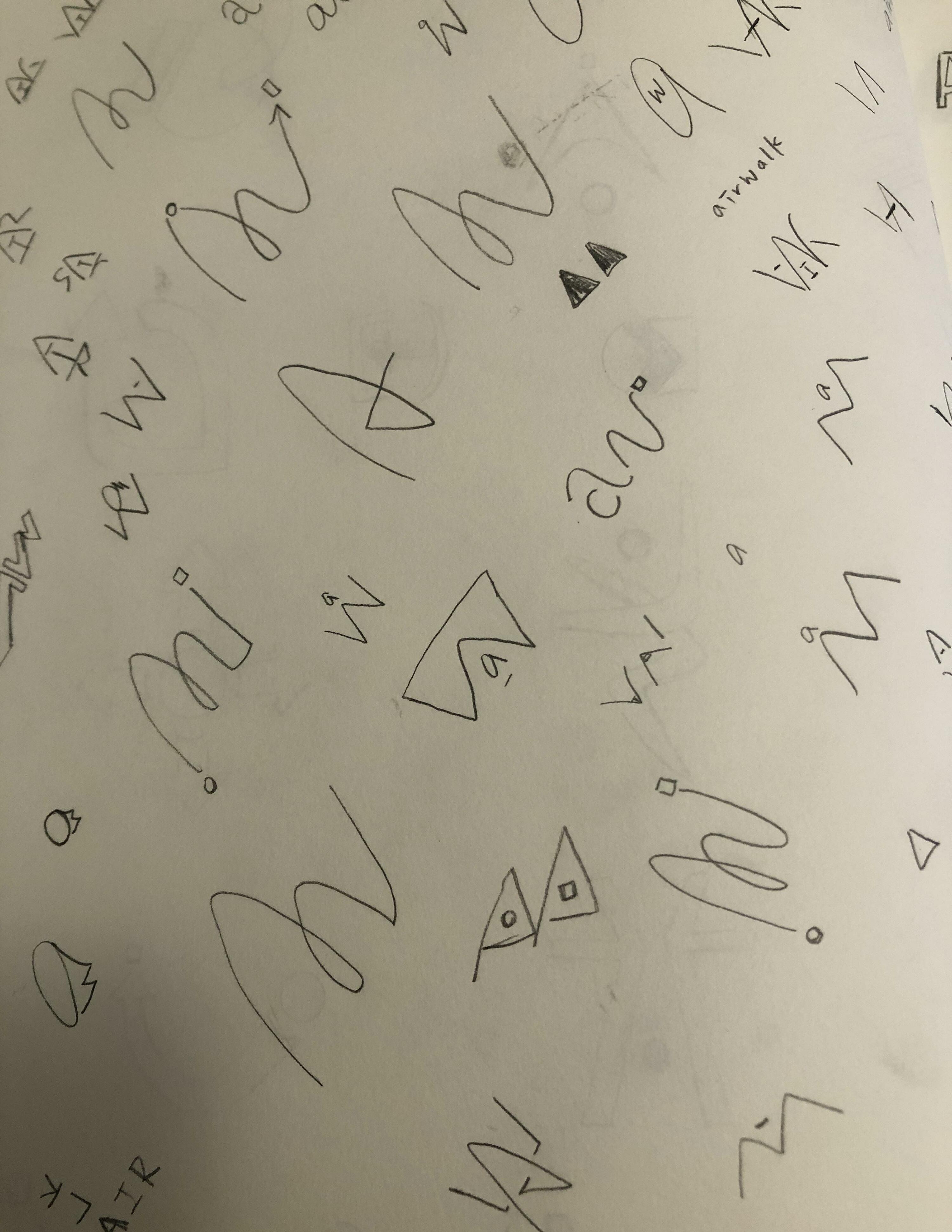
Concept generating—in order to give Airwalk a new impression, we integrate Airwalk’s previous ideas and combine them with new expended ideas for rebranding. By this action, we will see a new impression of Airwalk in the future.
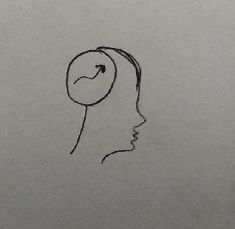
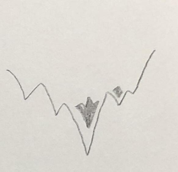
Active Square the Circle
Innovative Advance your Life
Passionate
Enjoy Spontaneous Adventure
21
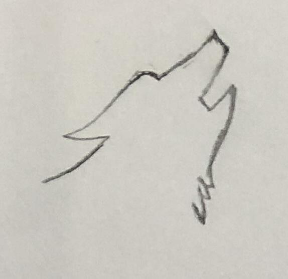
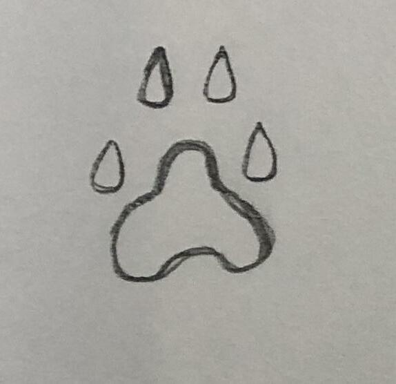
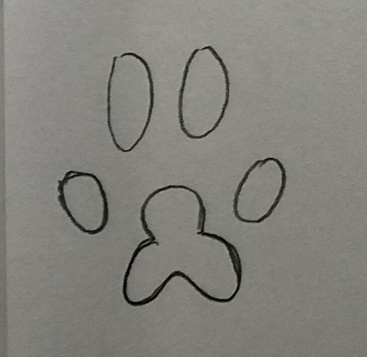

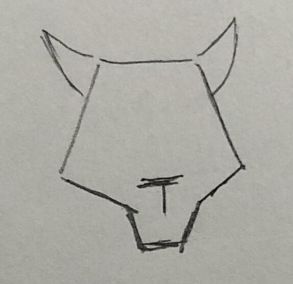
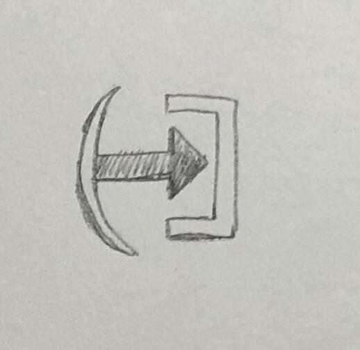
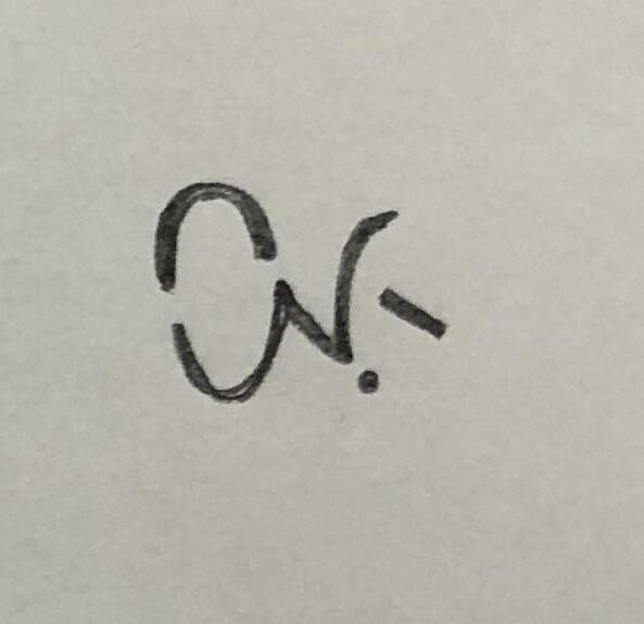
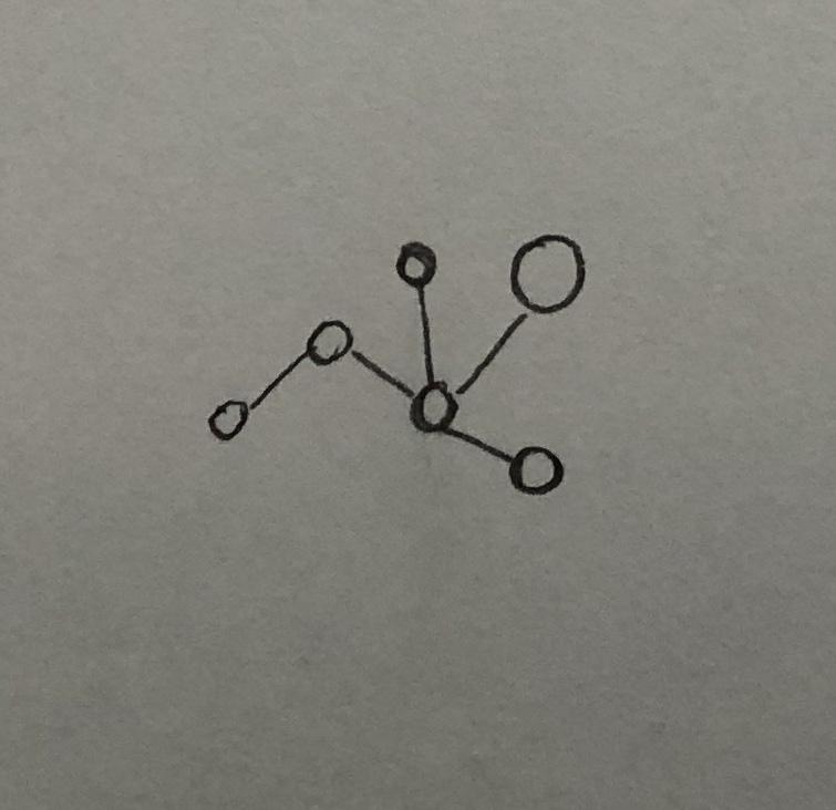
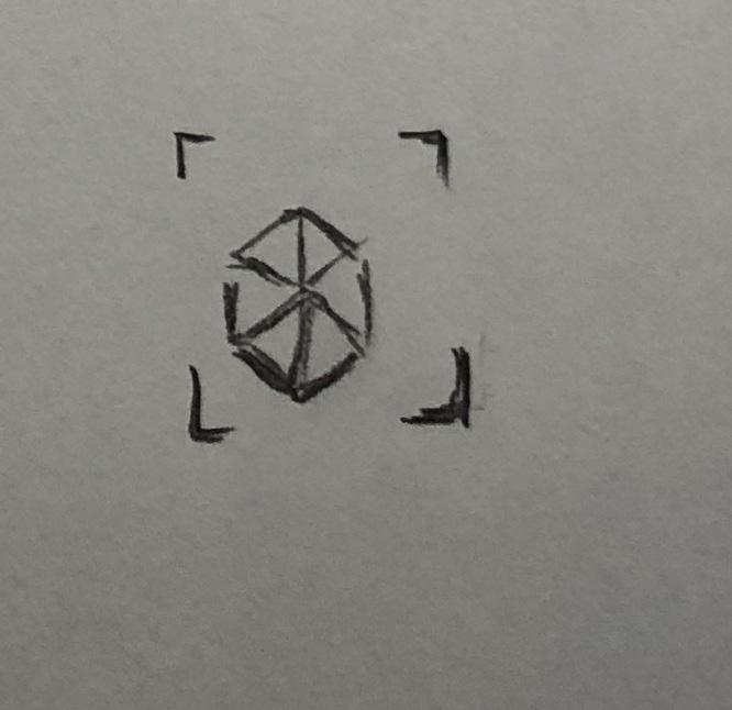
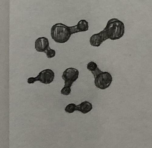
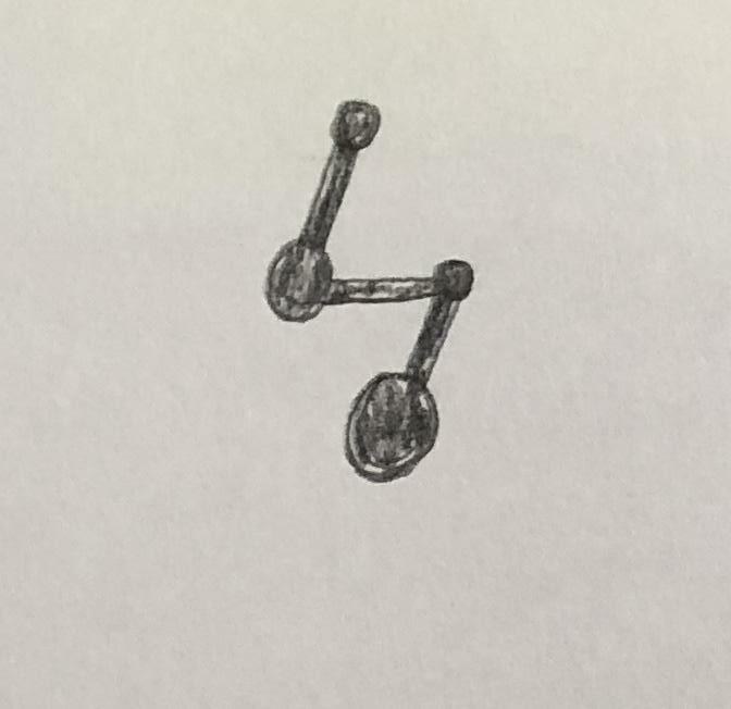
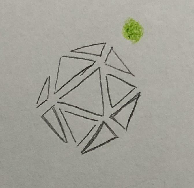
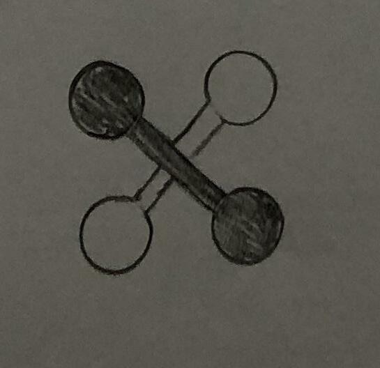
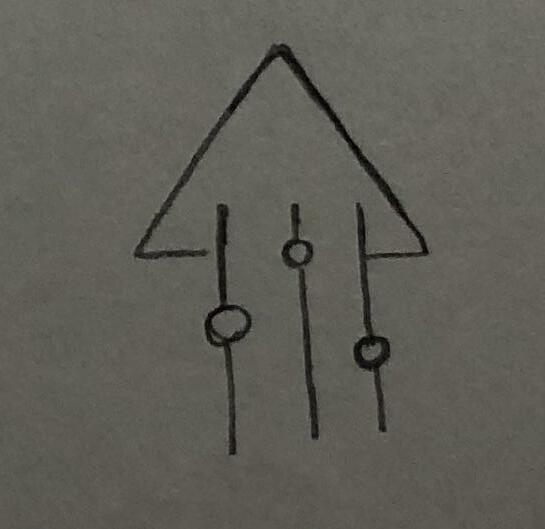
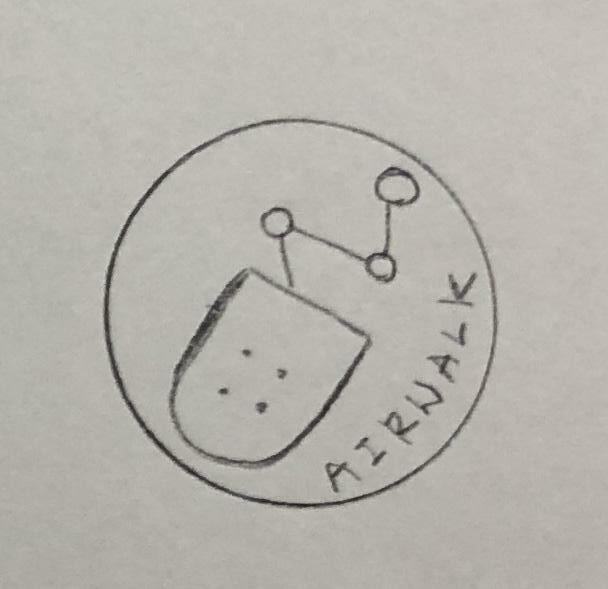
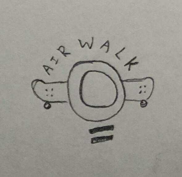
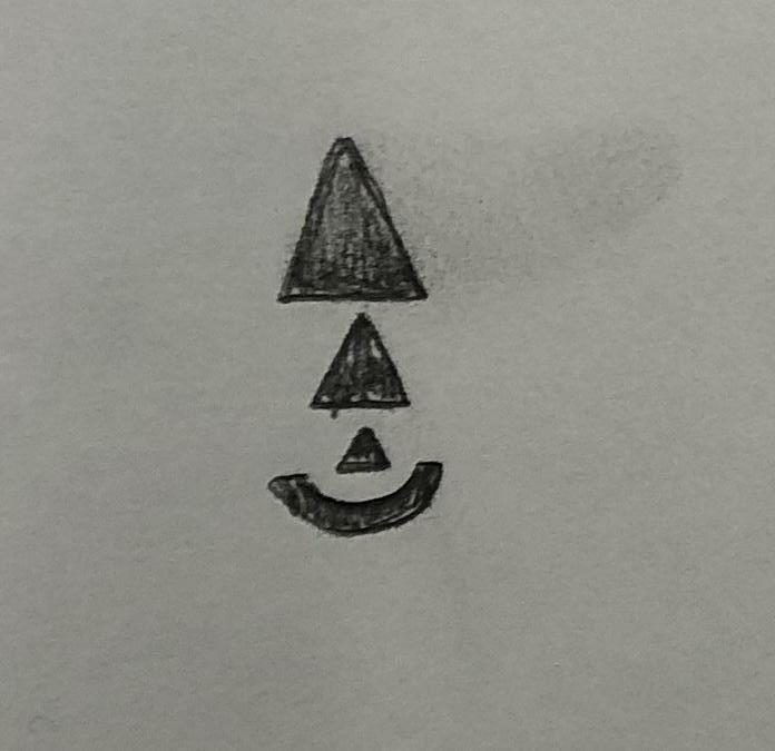
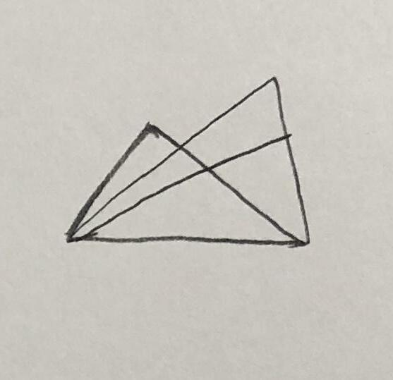
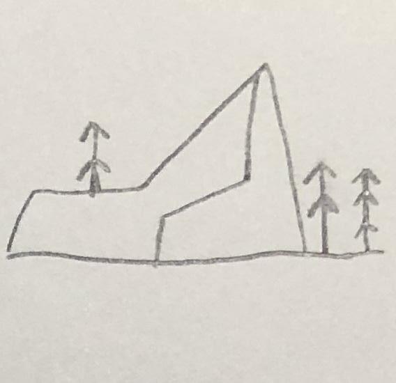
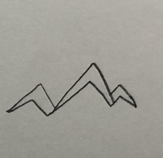
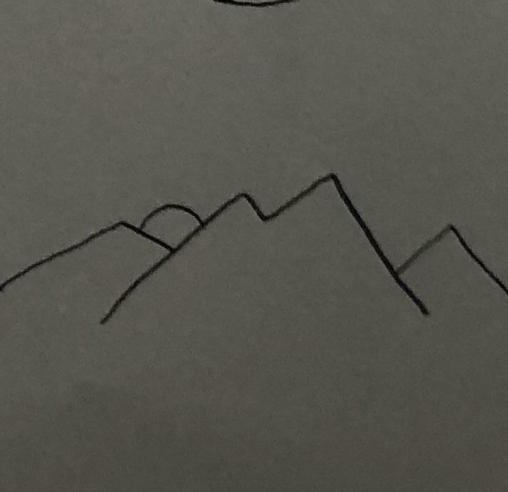
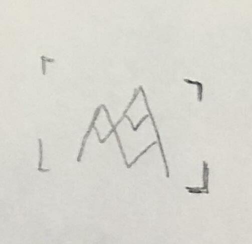
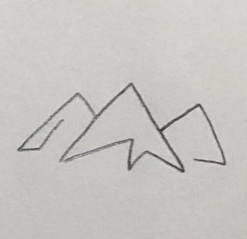
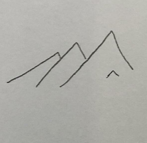
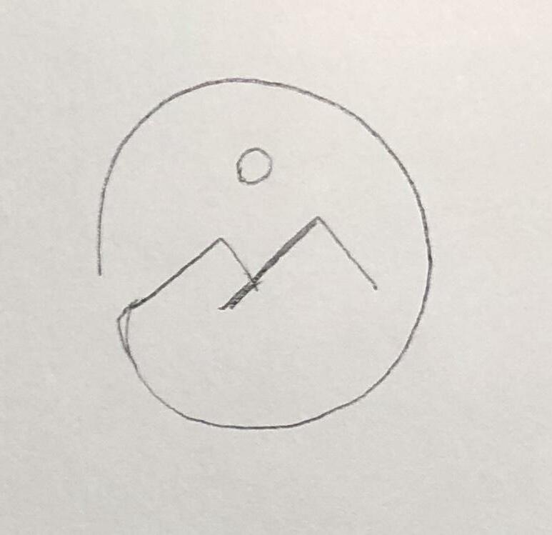
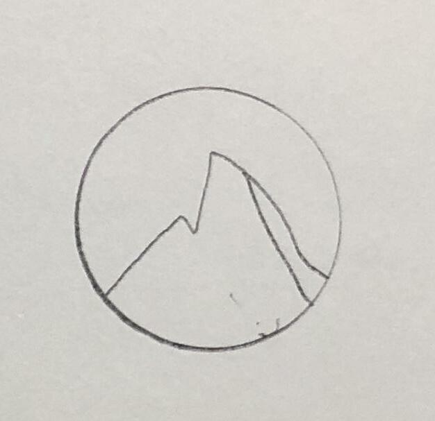
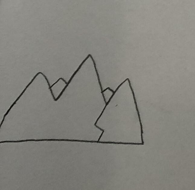
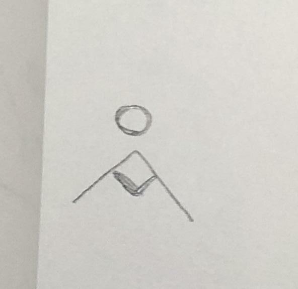
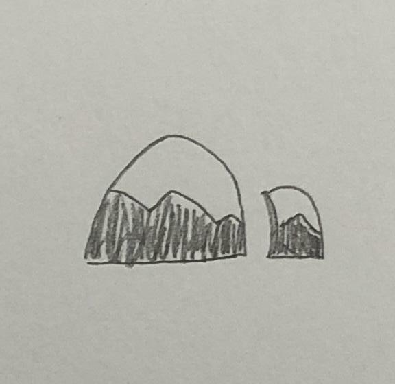
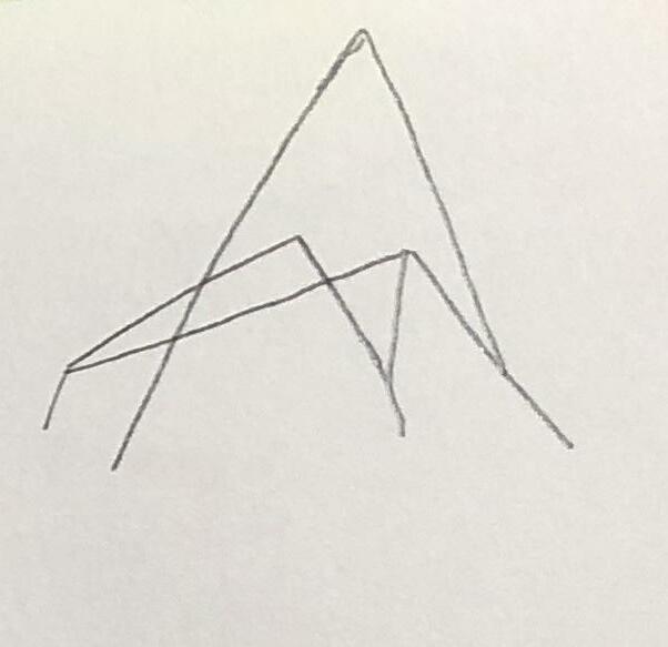
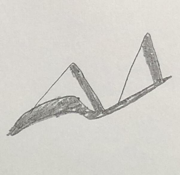
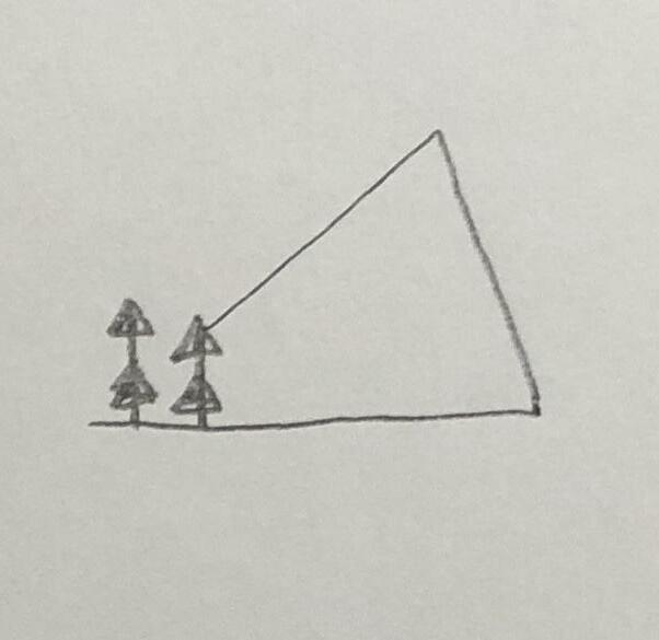
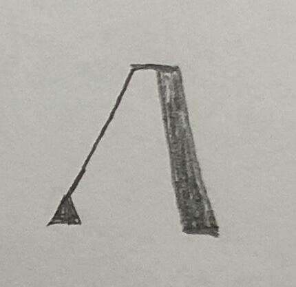
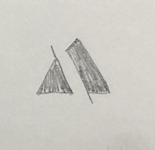
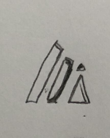
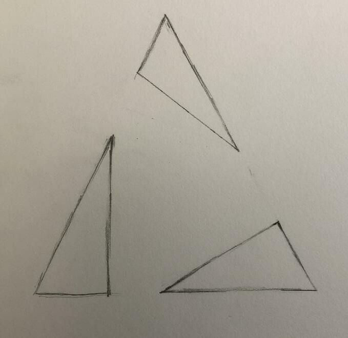
Active Square the Circle Keywords Development [R1]
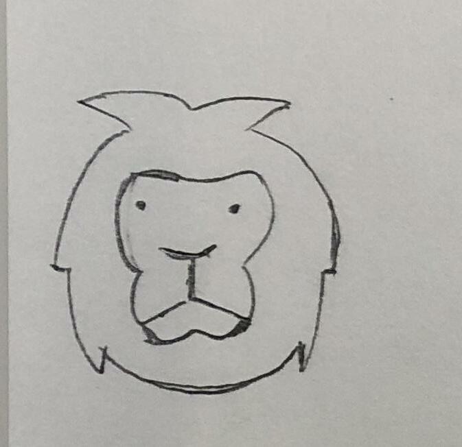
Active Square the Circle 2 Exploration 23

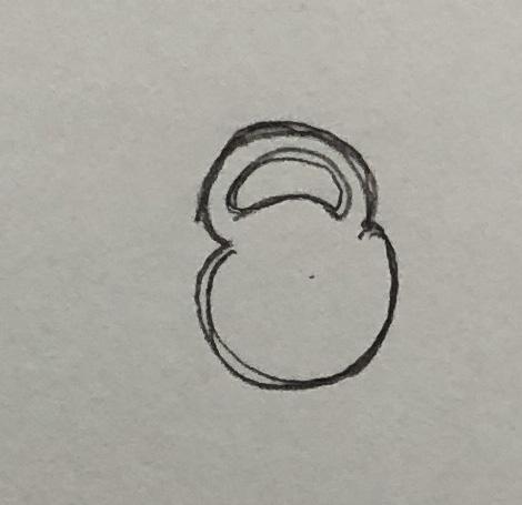
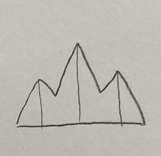
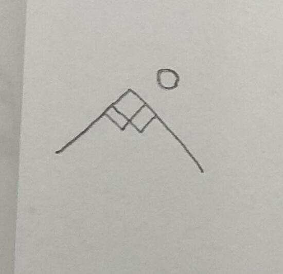
Keywords Development [R1] Active Square the Circle
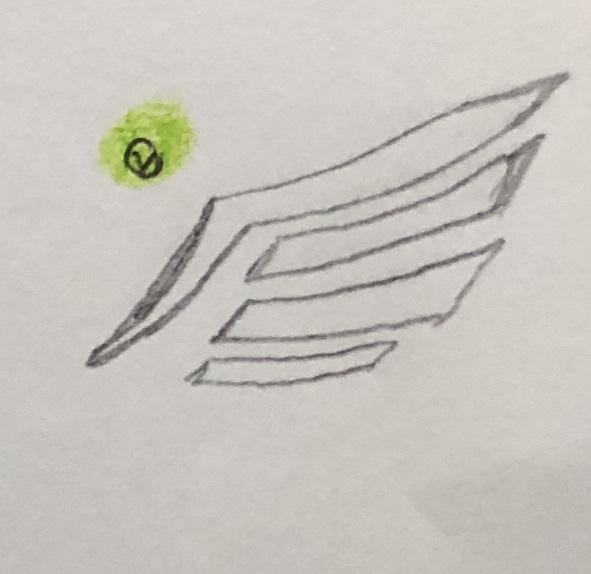
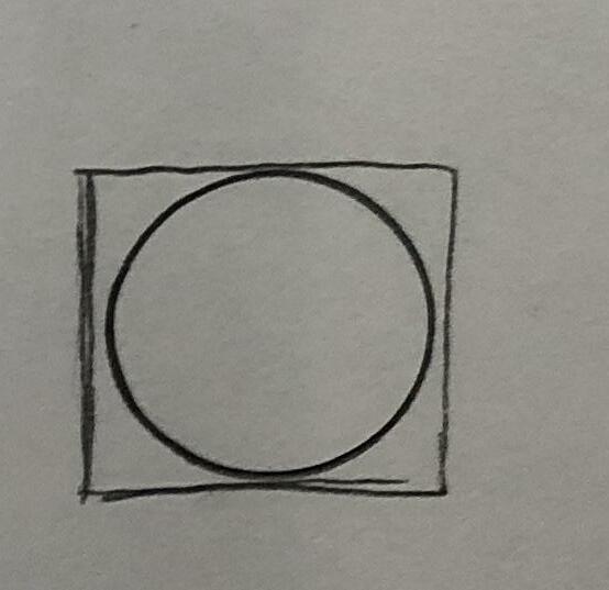
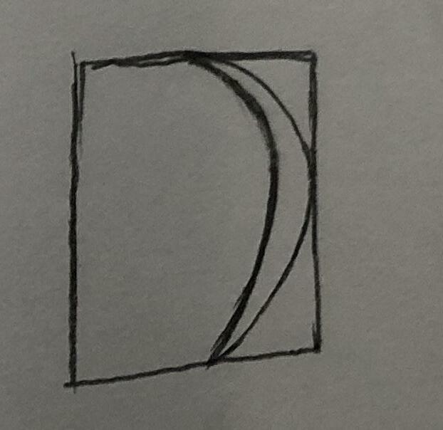
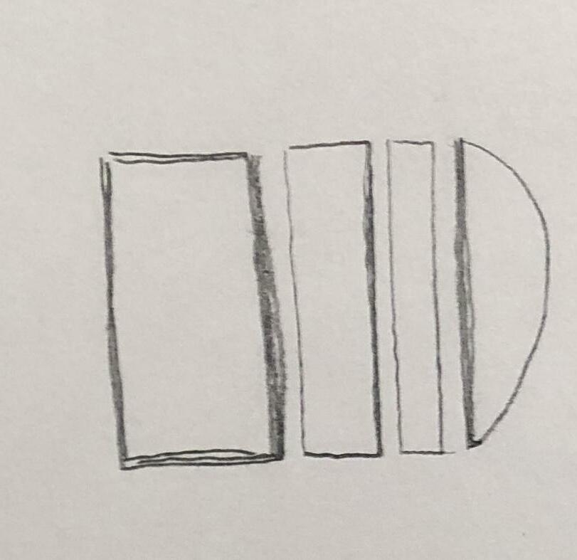
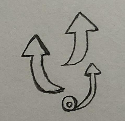
2 Exploration Active Square the Circle 25
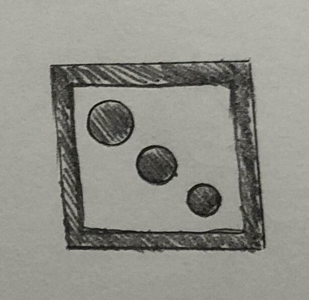
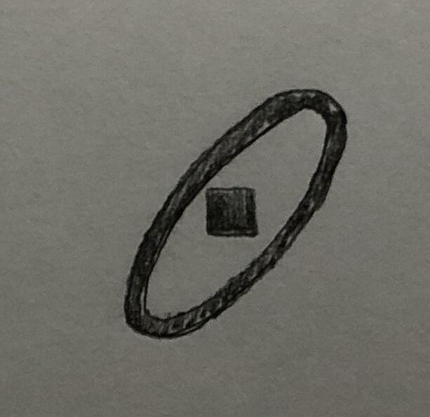
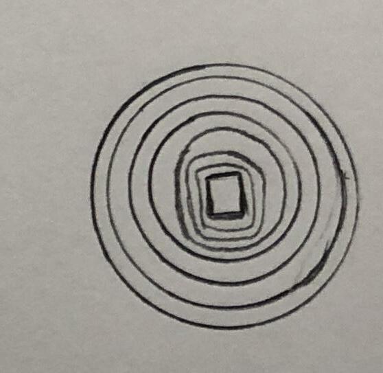
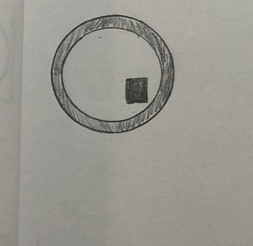
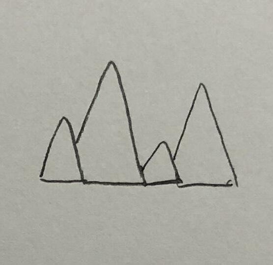
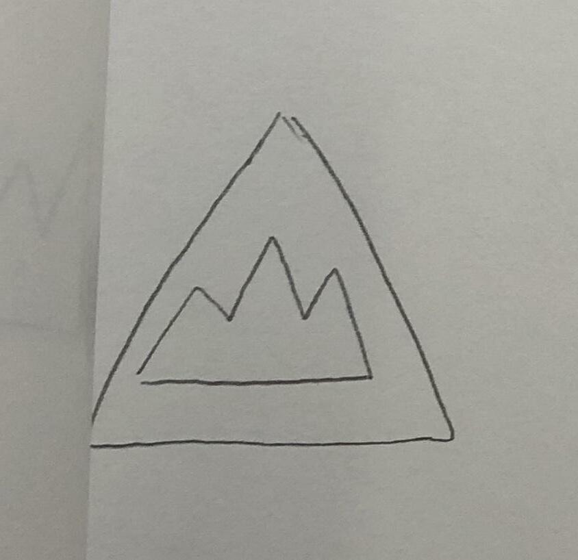
Keywords Development [R1] Active Square the Circle
2 Exploration Active Square the Circle 27
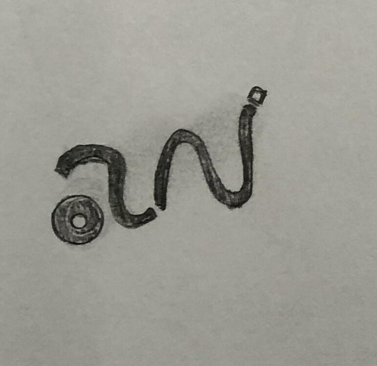
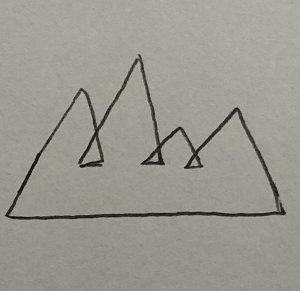
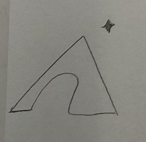
Keywords Development [R1] Active Square the Circle
2 Exploration Active Square the Circle 29
Keywords Development [R1] Active Square the Circle
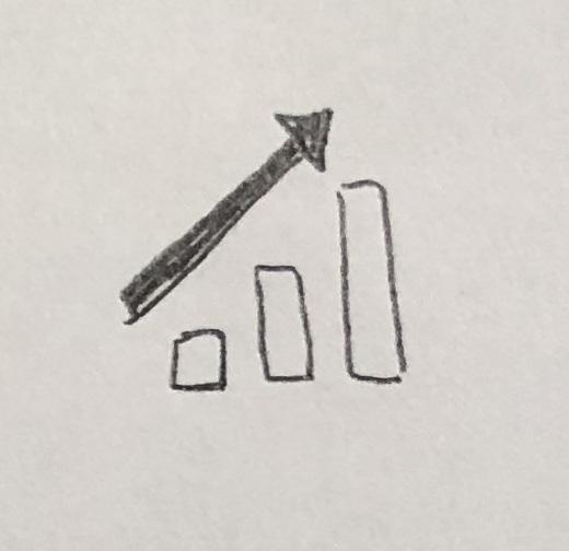
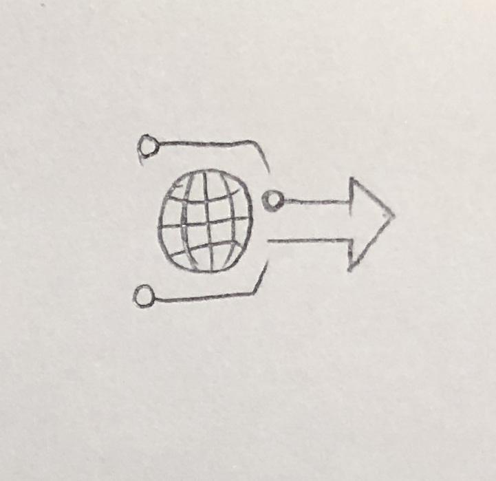
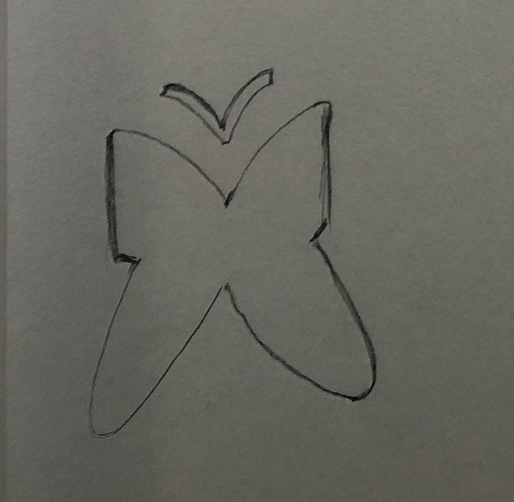
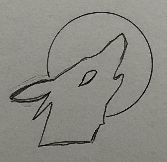
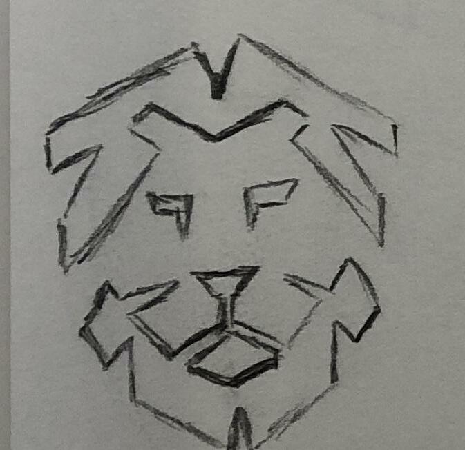
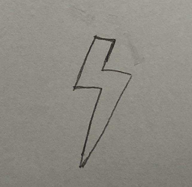
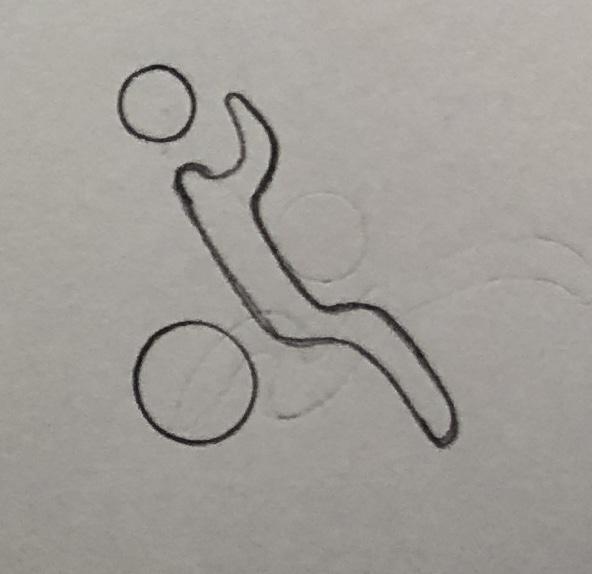
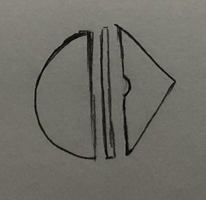
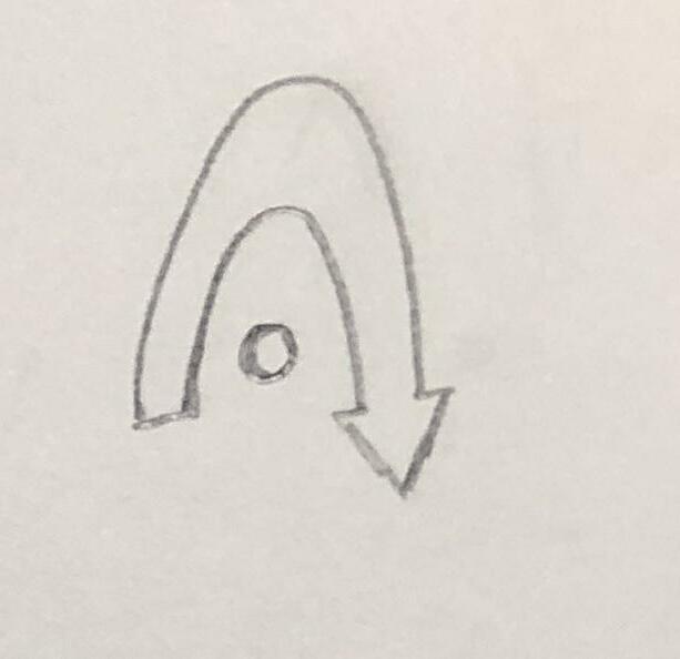
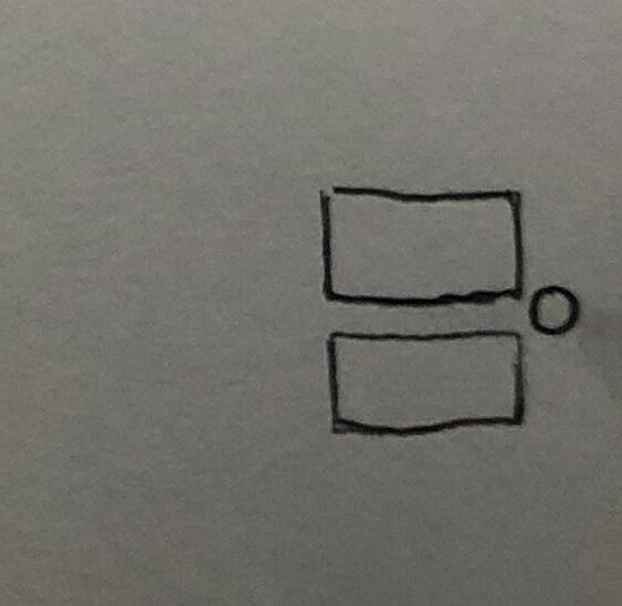
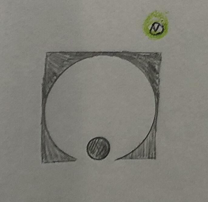
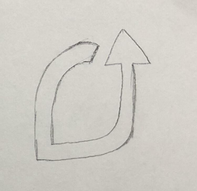
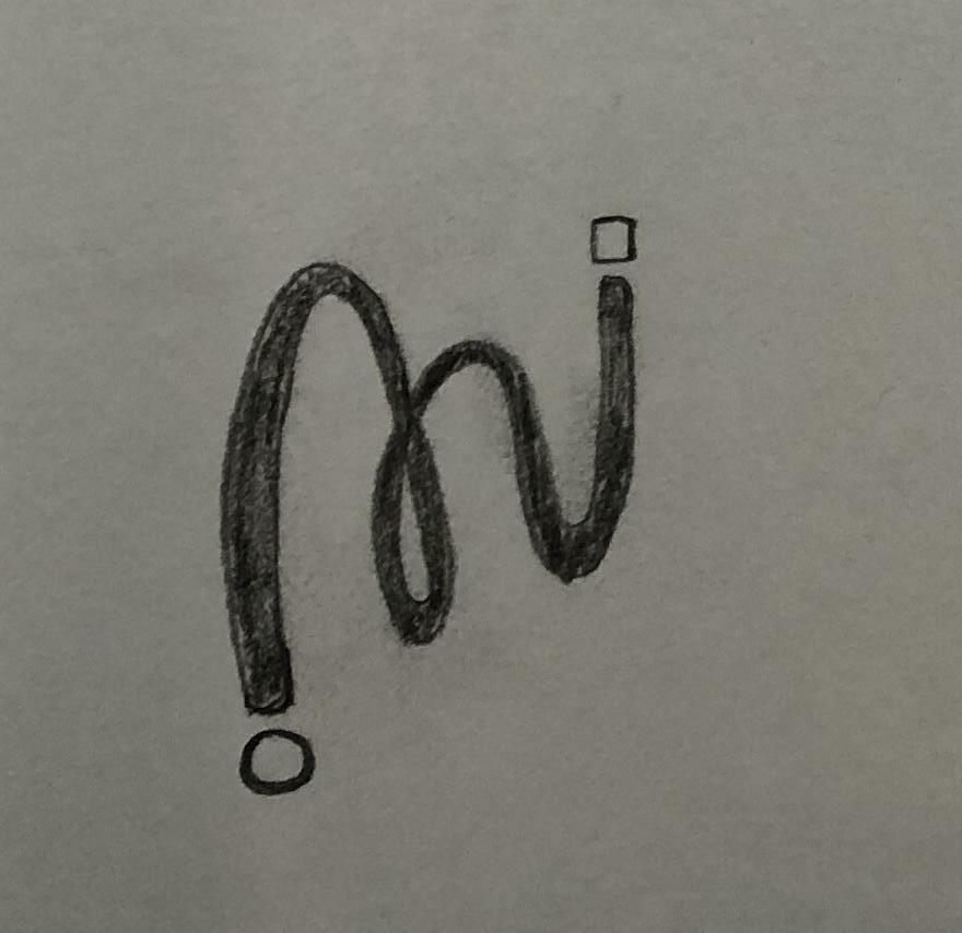
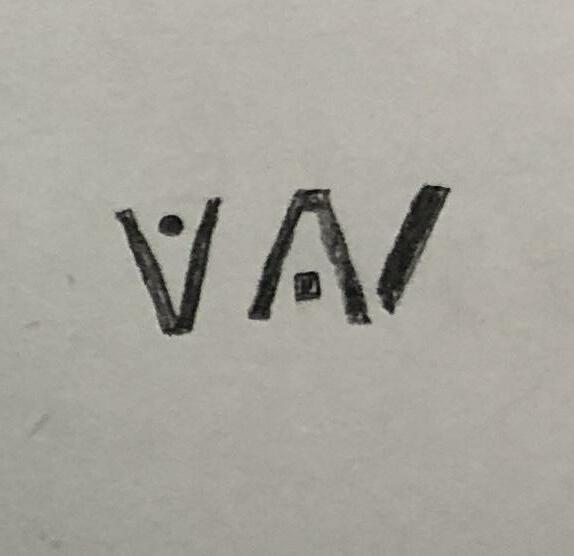
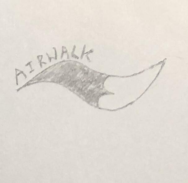
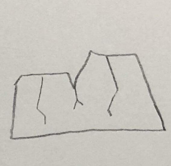
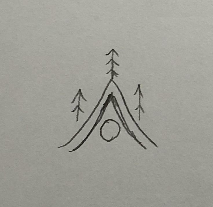
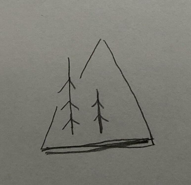
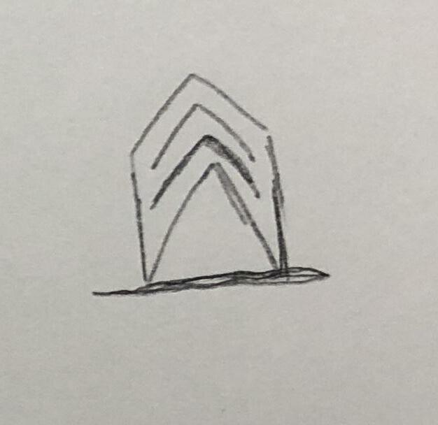
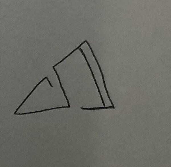
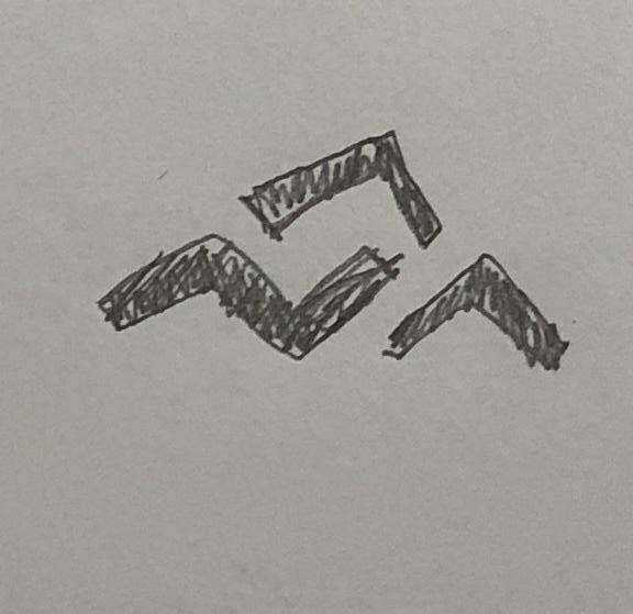
Innovative Advance your Life 2 Exploration 31
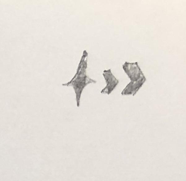
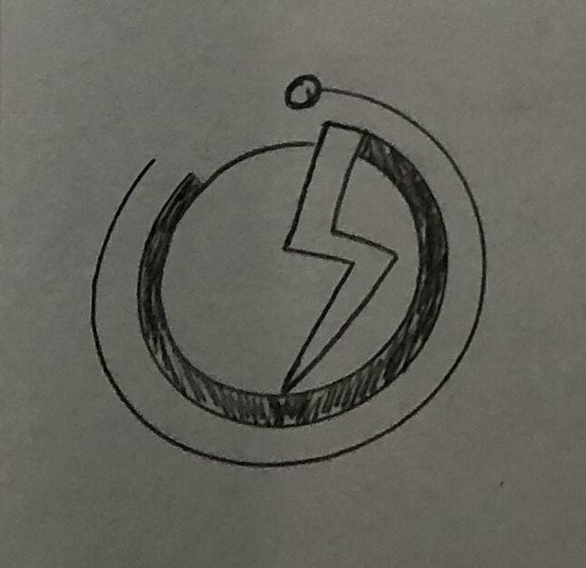
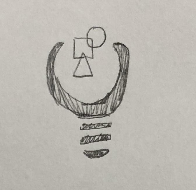
Keywords Development [R1] Innovative Advance your Life
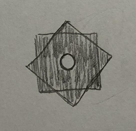
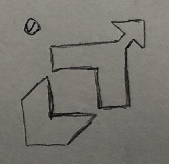
2 Exploration Innovative Advance your Life 33

Keywords Development [R1] Innovative Advance your Life
2 Exploration Innovative Advance your Life 35
Keywords Development [R1] Innovative Advance your Life

2 Exploration Innovative Advance your Life 37

Keywords Development [R1] Innovative Advance your Life
2 Exploration Innovative Advance your Life 39
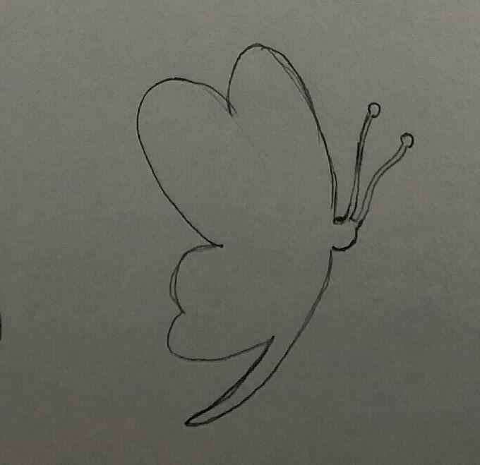
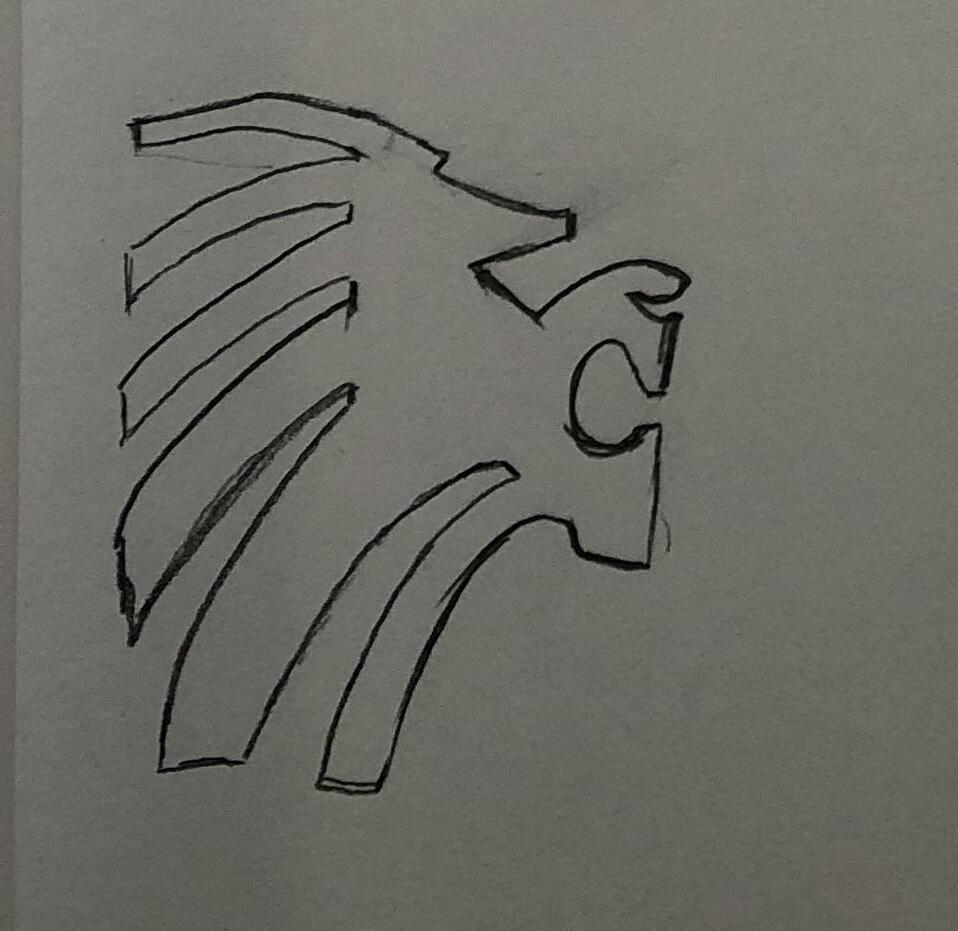
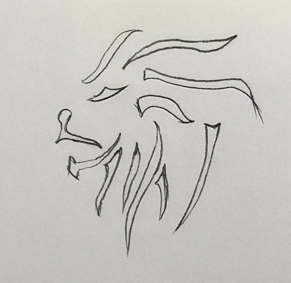
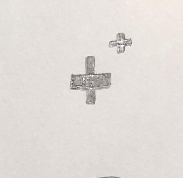
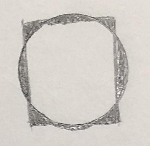
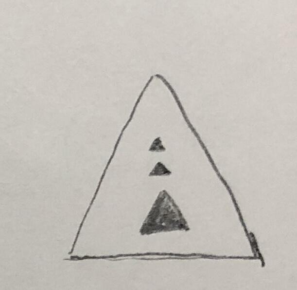
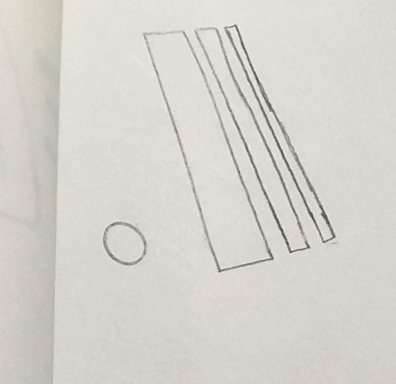
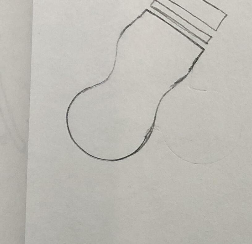
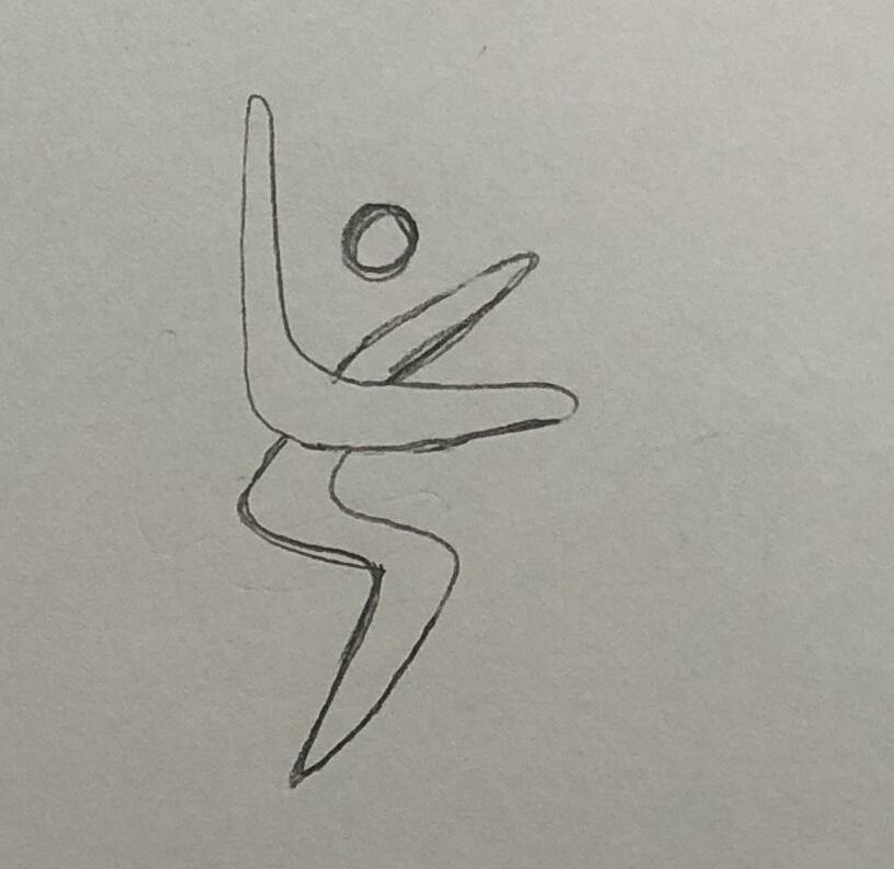
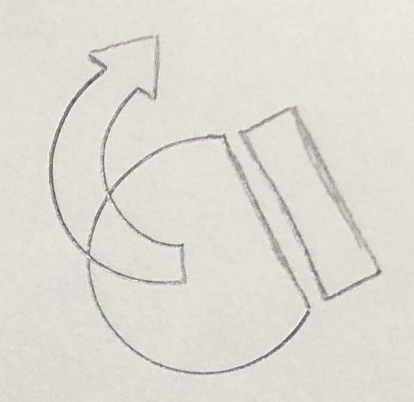
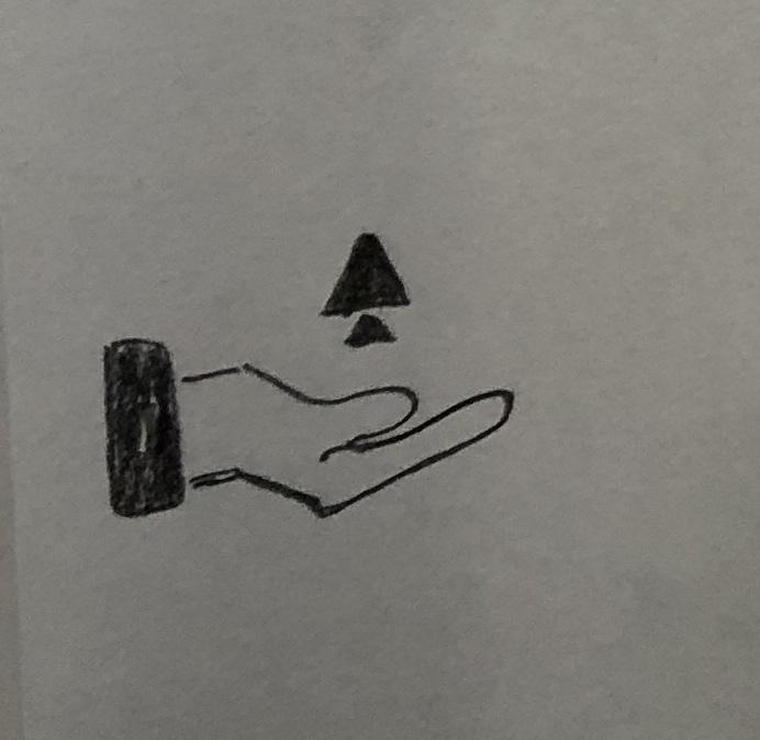
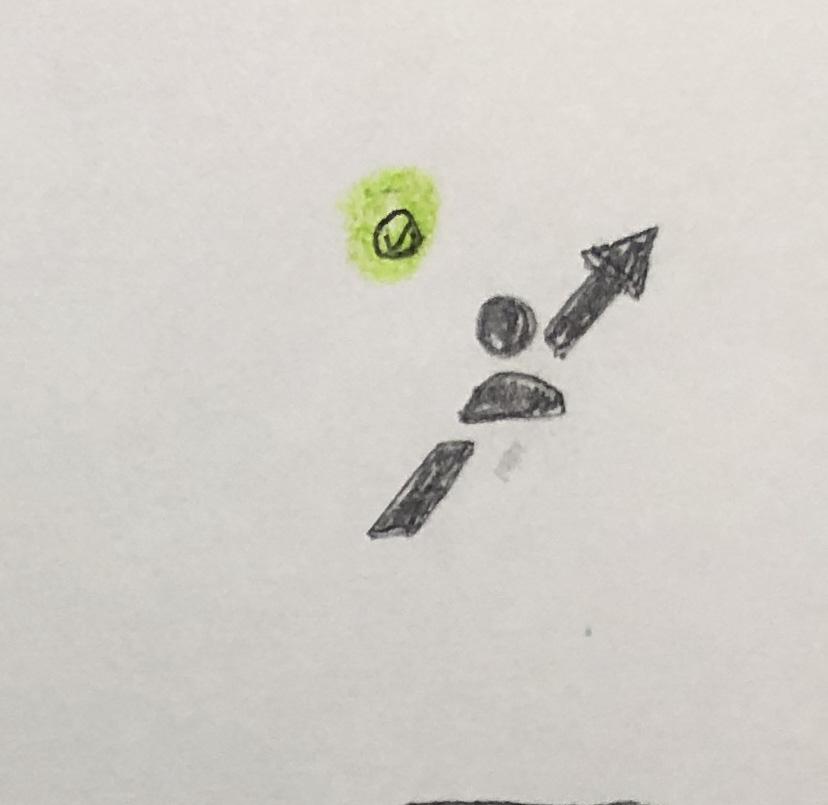
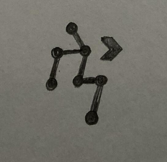
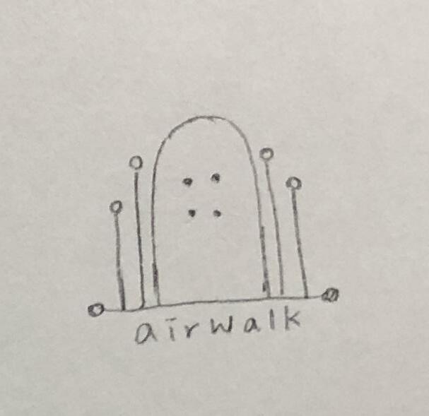
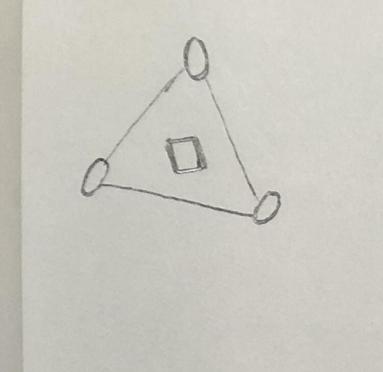
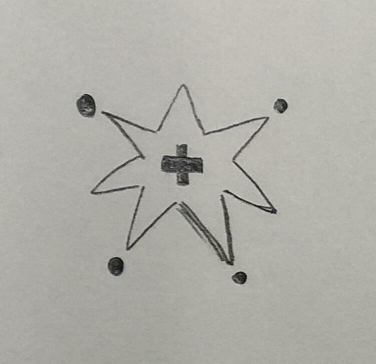
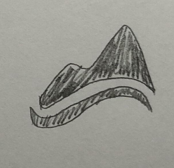
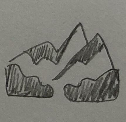
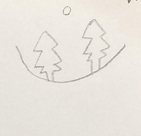
Passionate Enjoy Spontaneous Adventure Keywords Development [R1]
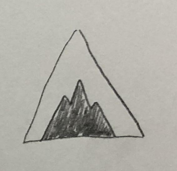

Passionate Enjoy Spontaneous Adventure 2 Exploration 41
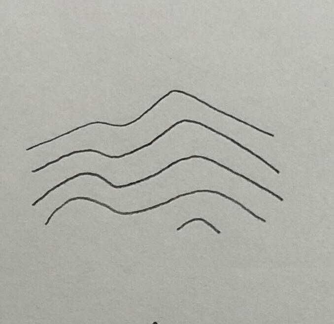
Keywords Development [R1] Passionate Enjoy Spontaneous Adventure

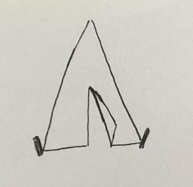
2 Exploration Passionate Enjoy Spontaneous Adventure 43
Keywords Development [R1] Passionate Enjoy Spontaneous Adventure
2 Exploration Passionate Enjoy Spontaneous Adventure 45
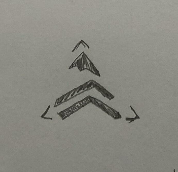
Keywords Development [R1] Passionate Enjoy Spontaneous Adventure
2 Exploration Passionate Enjoy Spontaneous Adventure 47
Keywords Development [R1] Passionate Enjoy Spontaneous Adventure
2 Exploration 49
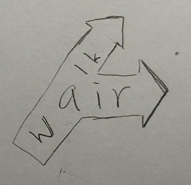
3 Development 1
Logo Development [Round2] Refined Sketches [Round2] Digital Comps [Round2]
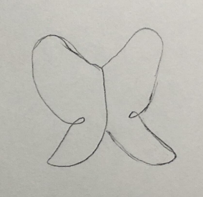
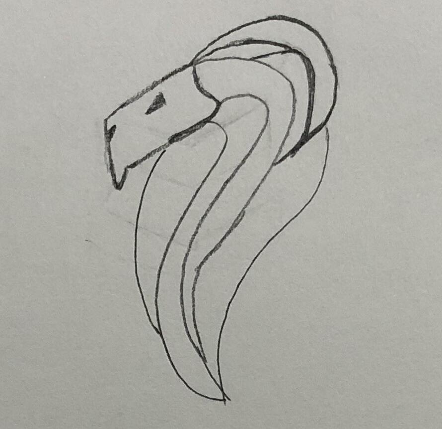
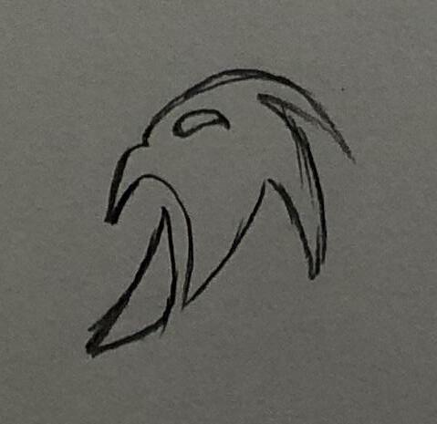
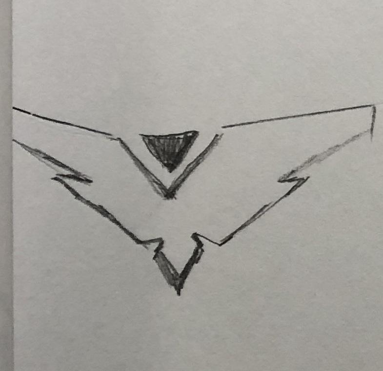
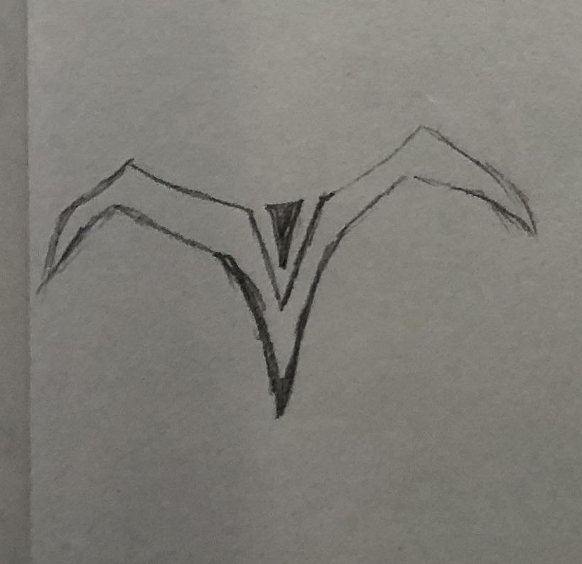
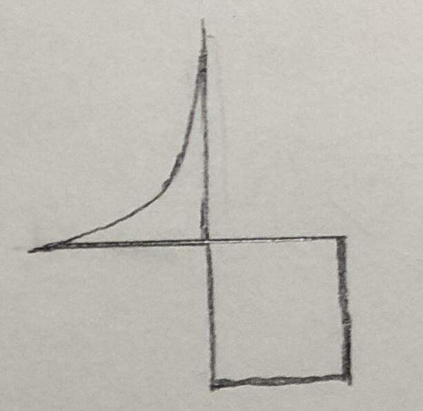
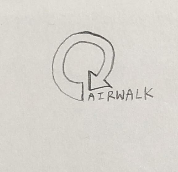
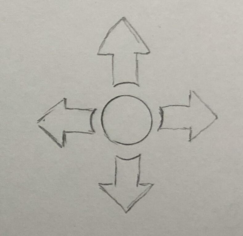
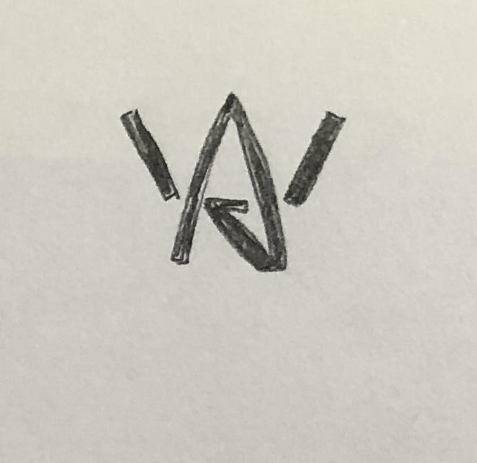
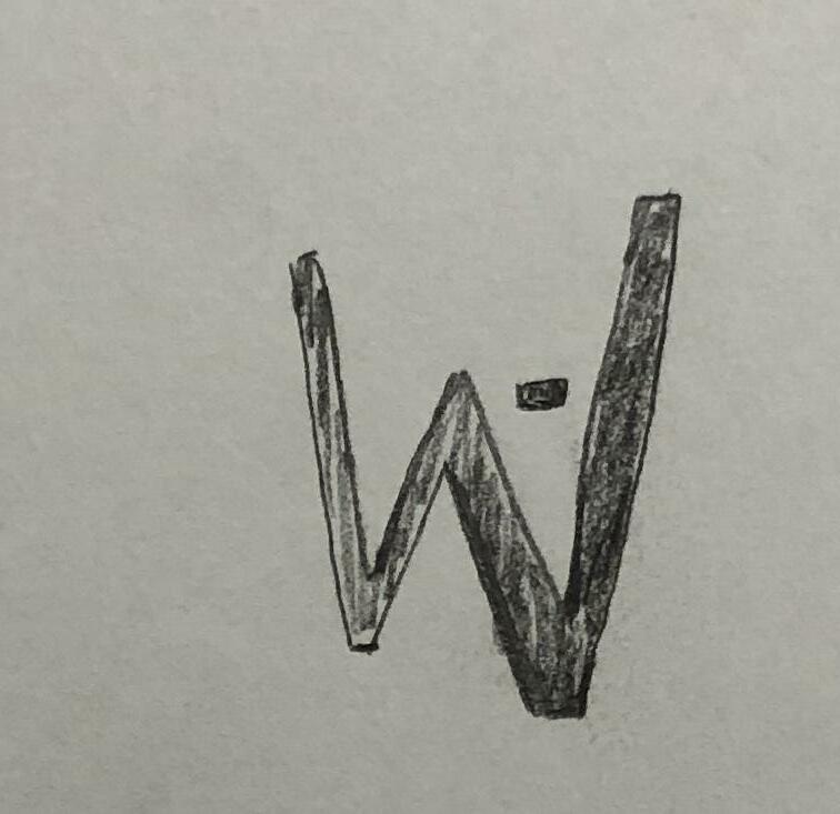
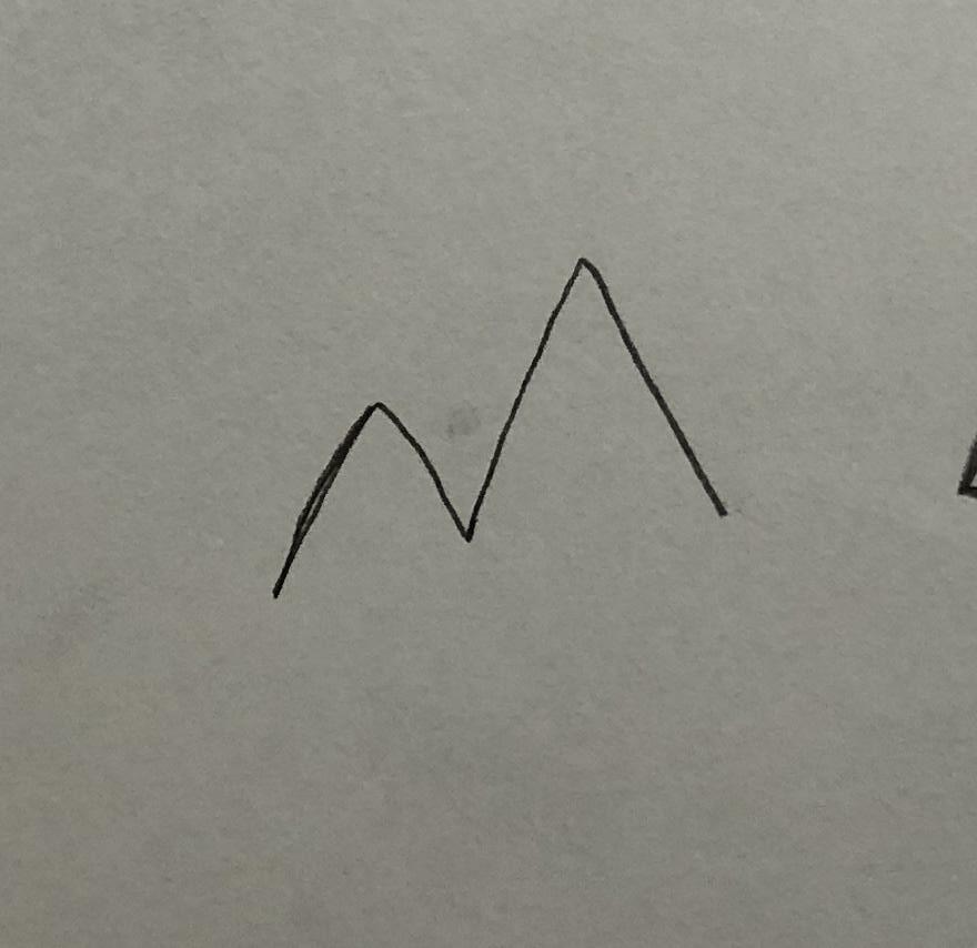
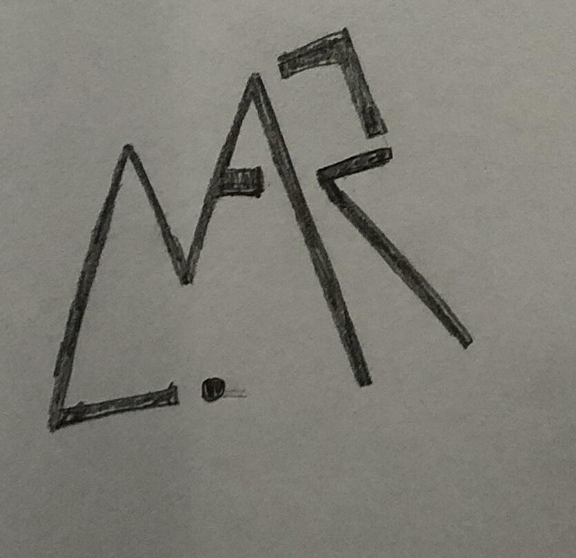
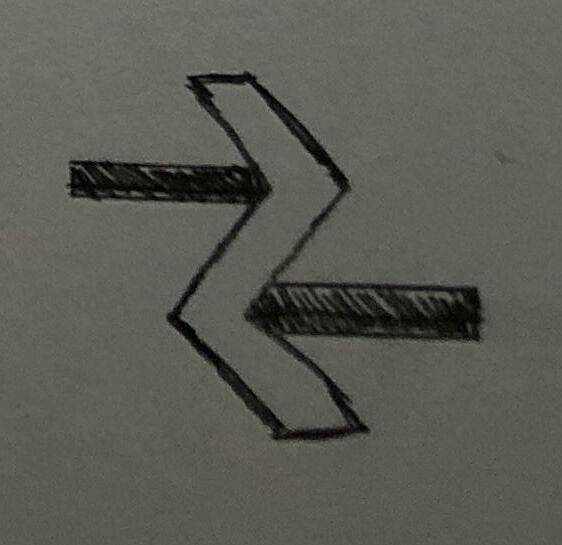
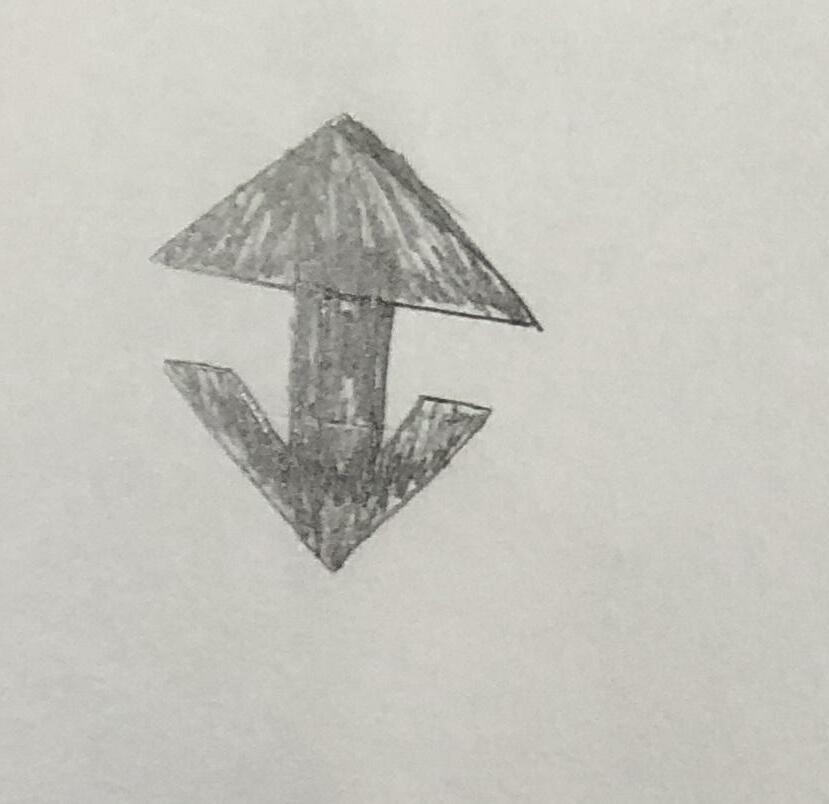
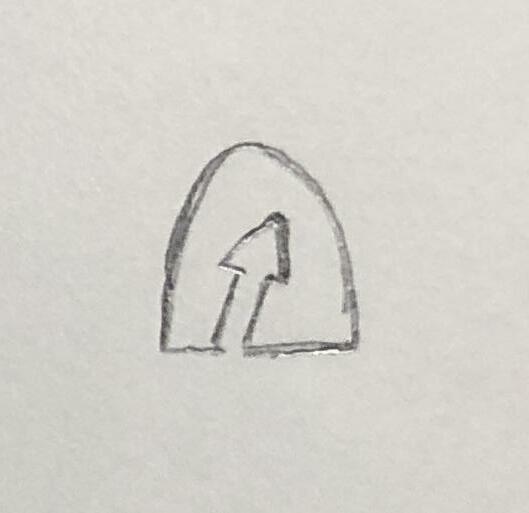
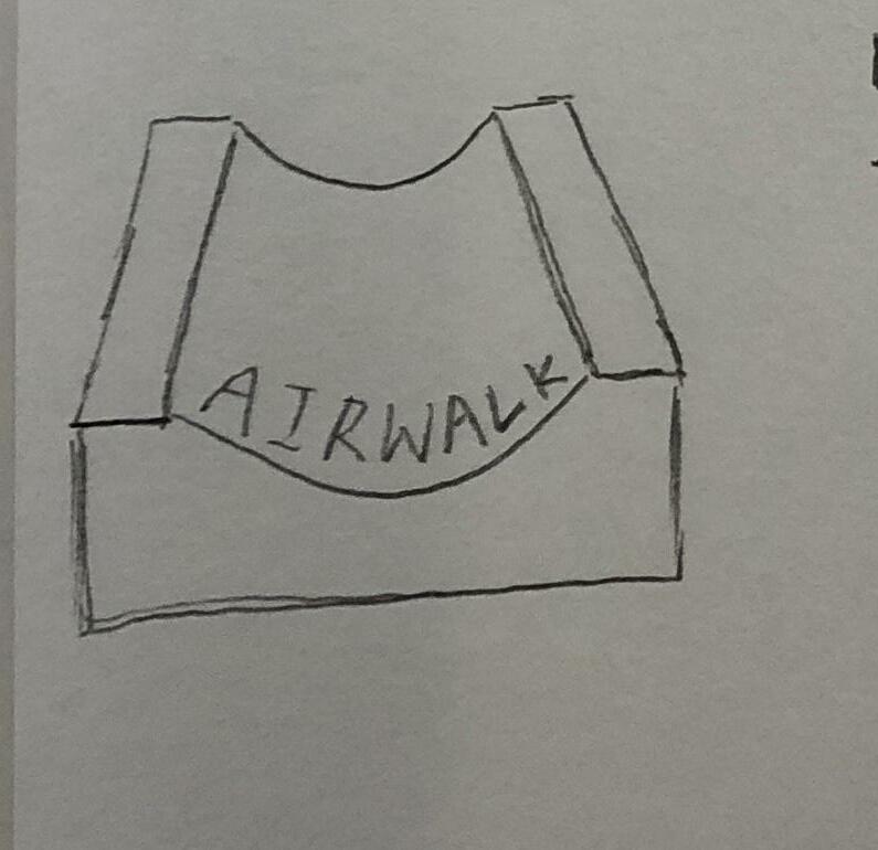
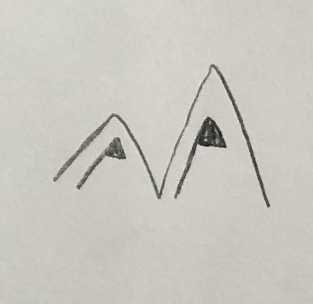
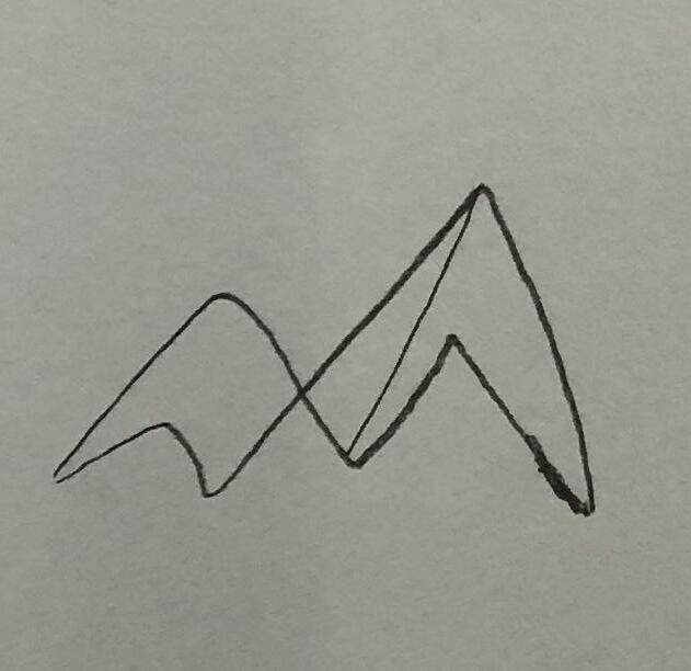
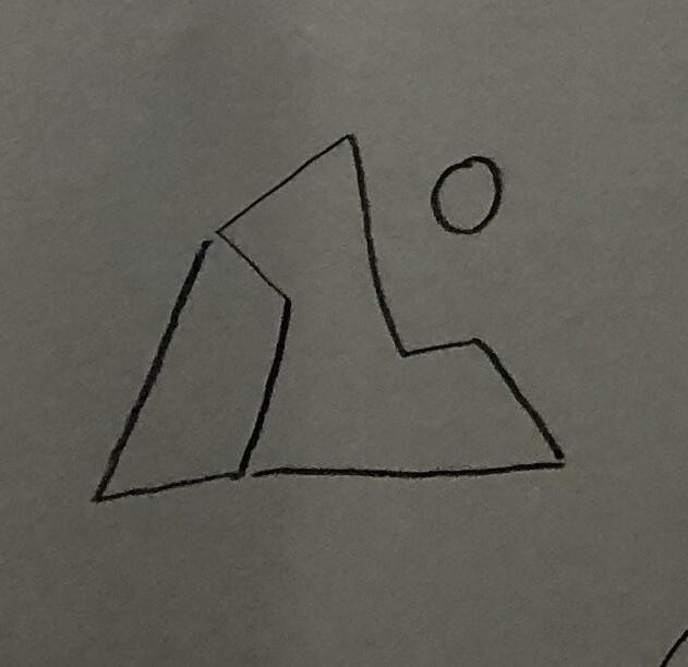
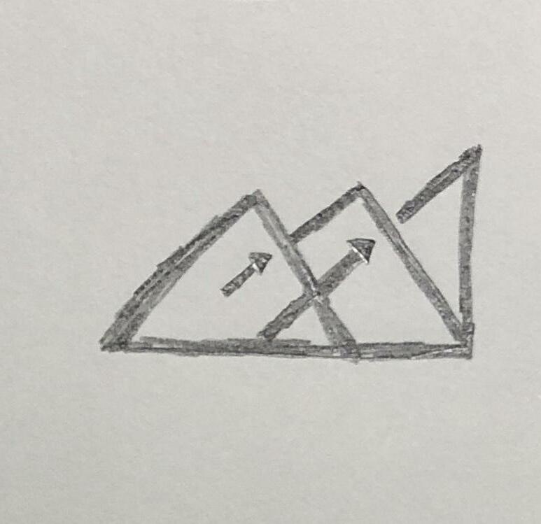
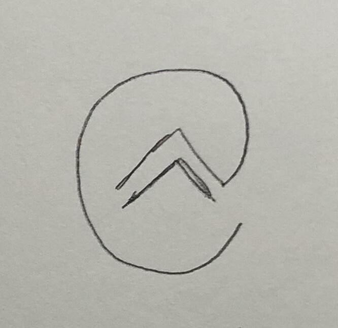
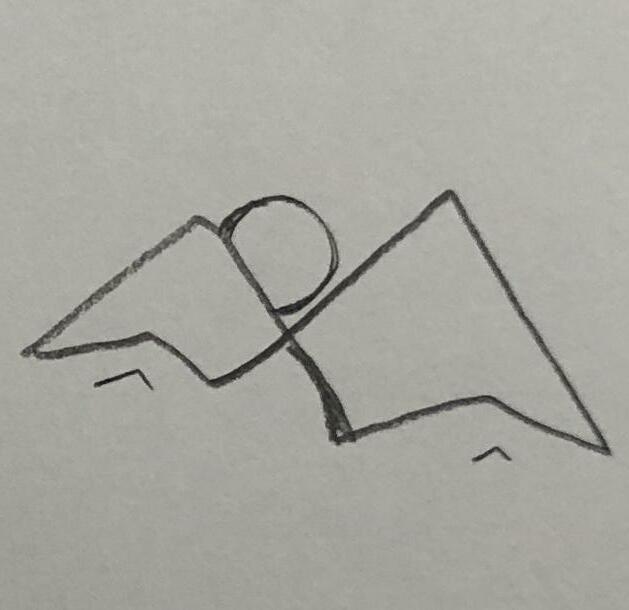
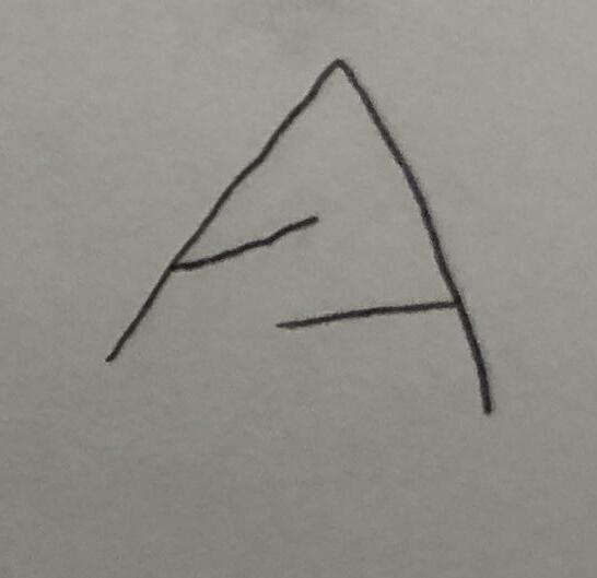
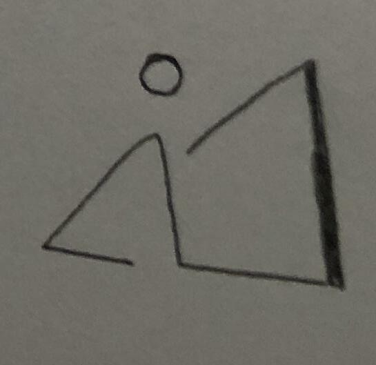
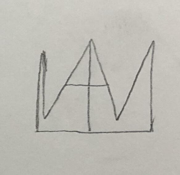
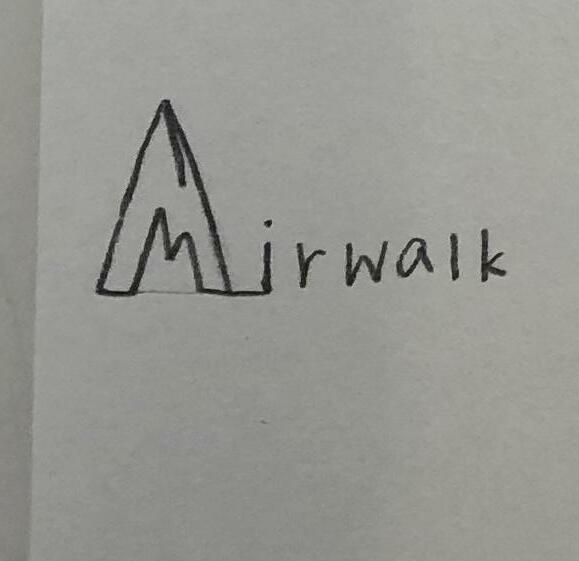
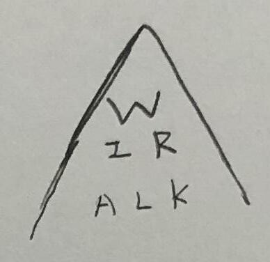
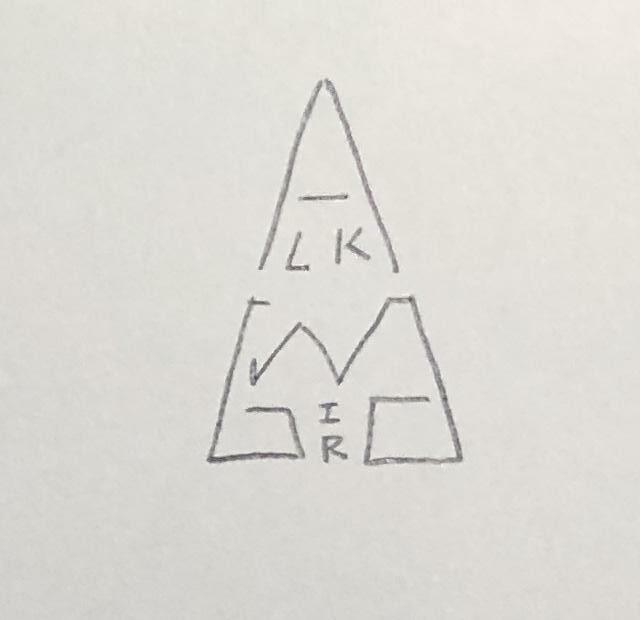
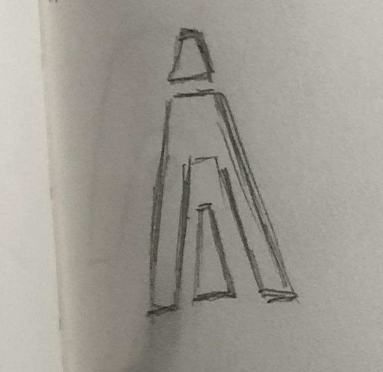
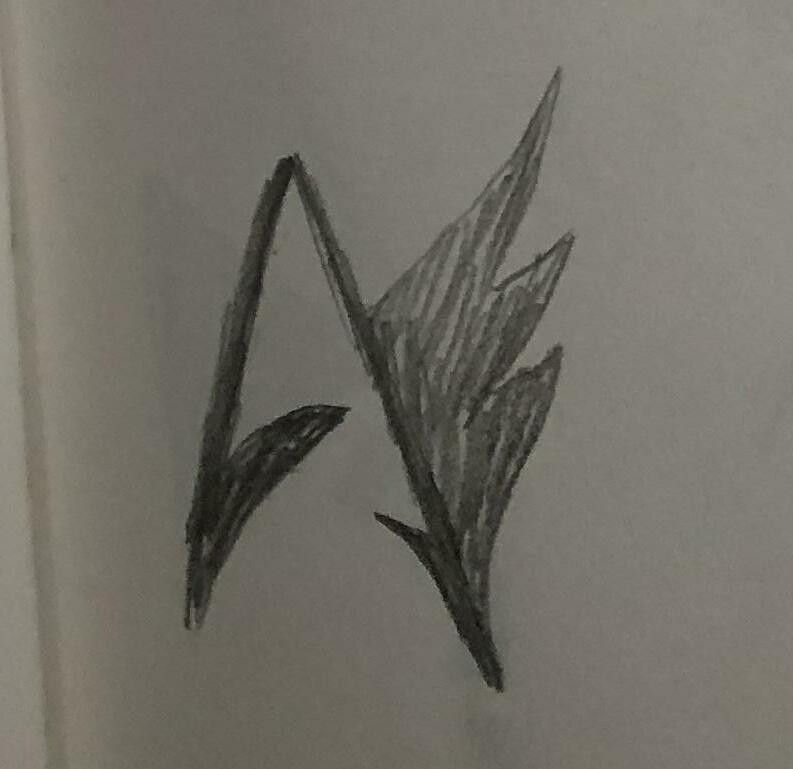
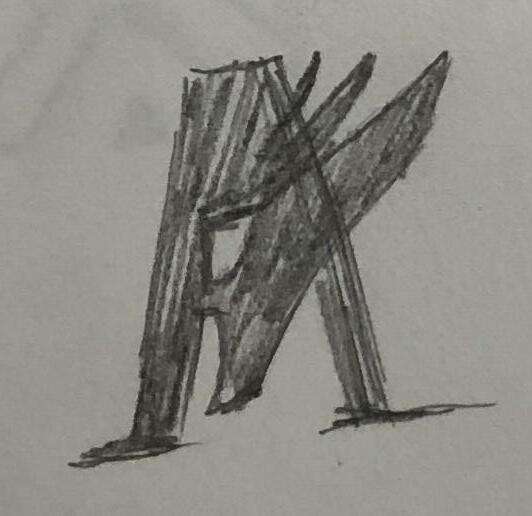
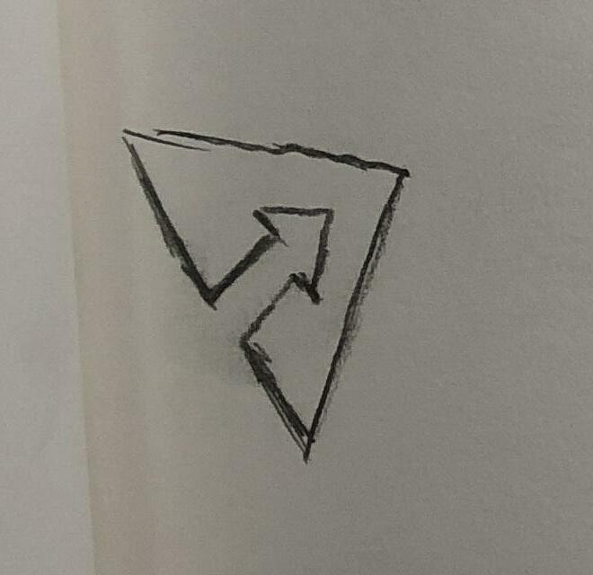
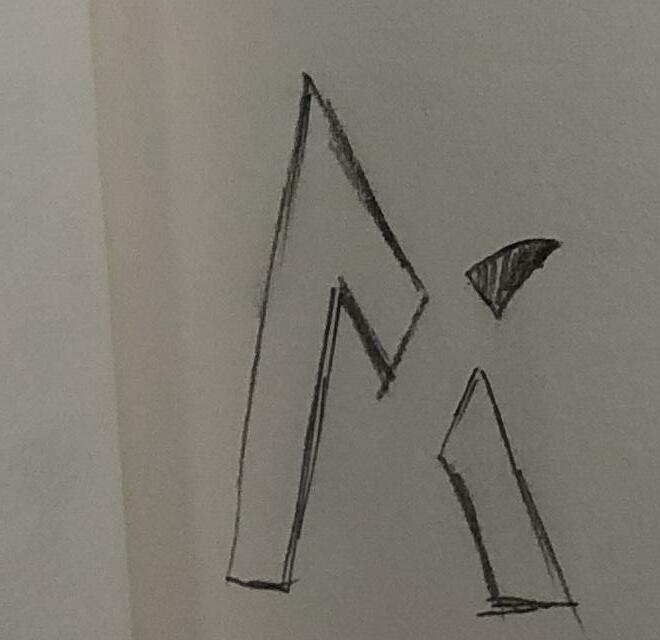
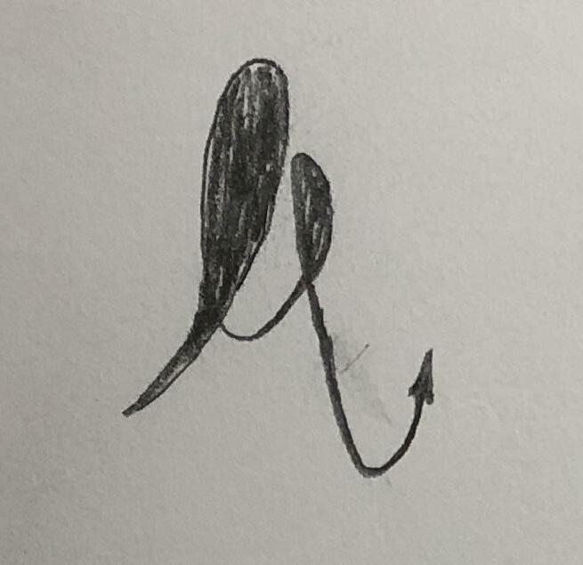
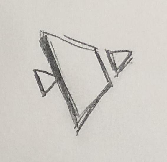
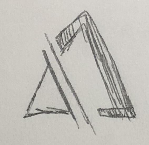
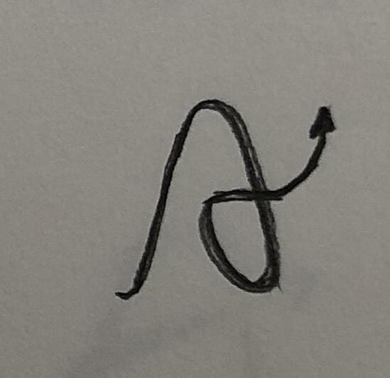
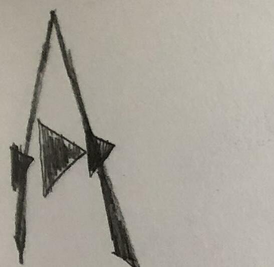
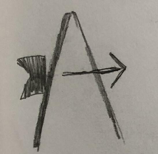
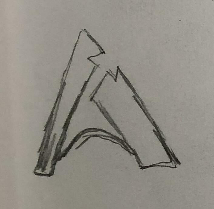
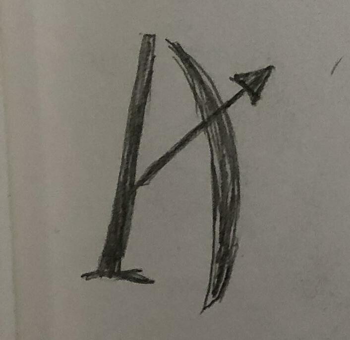
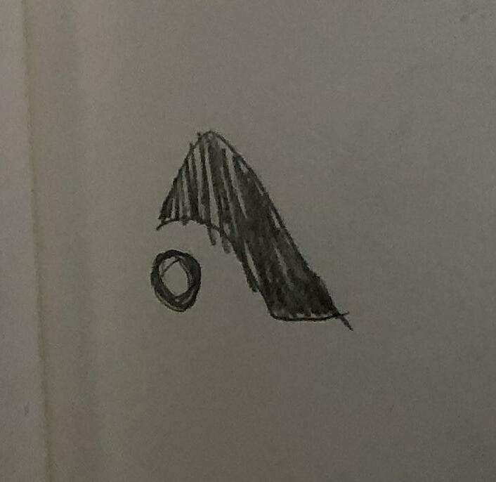
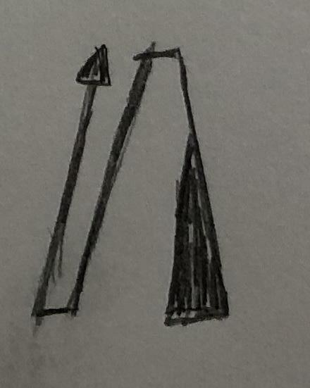
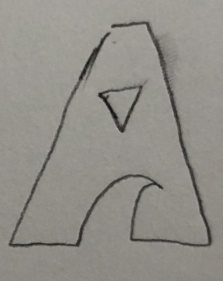
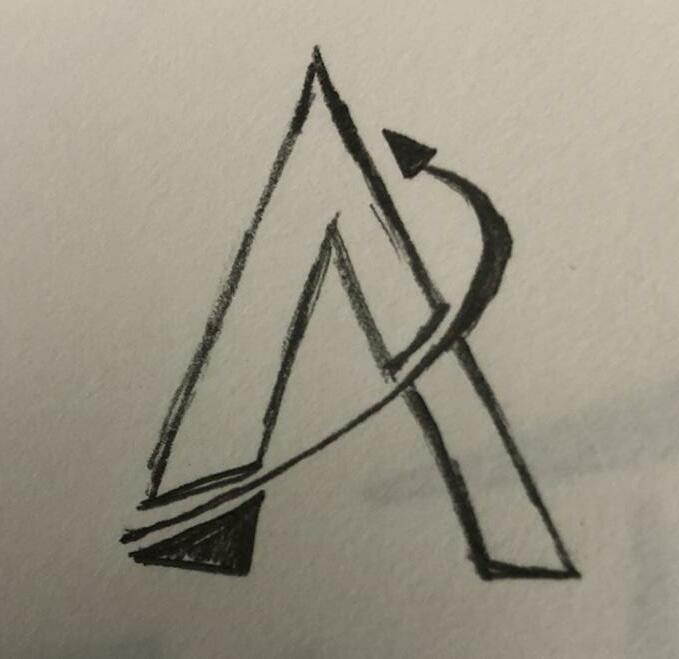
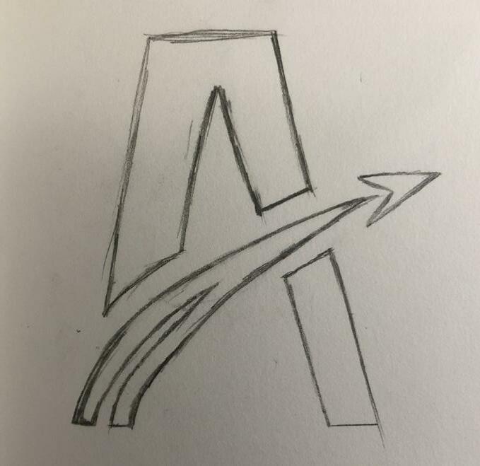
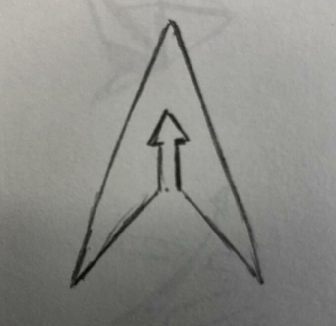
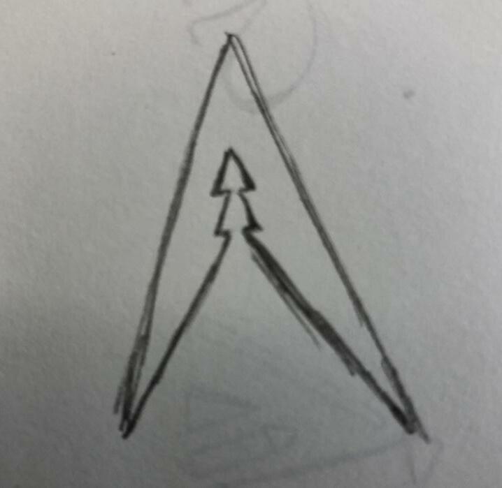
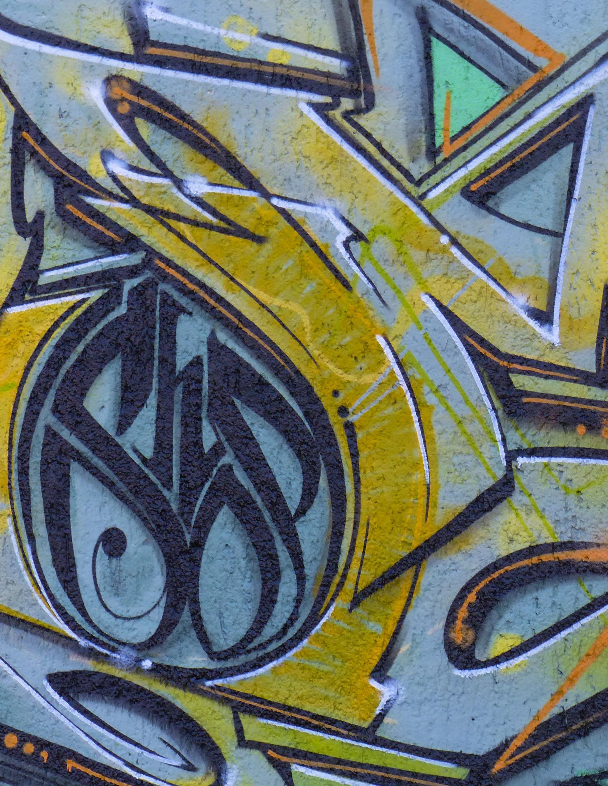
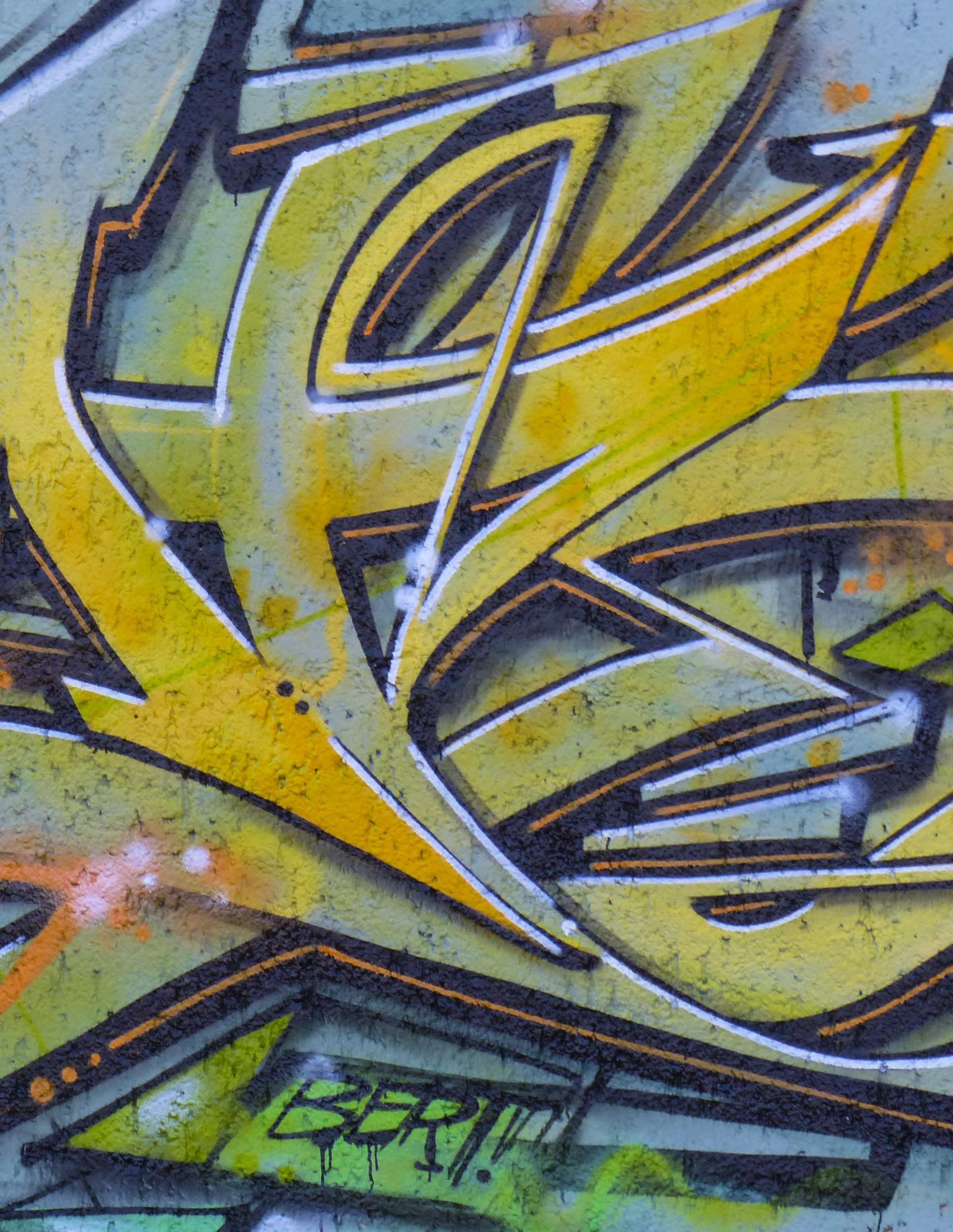
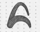
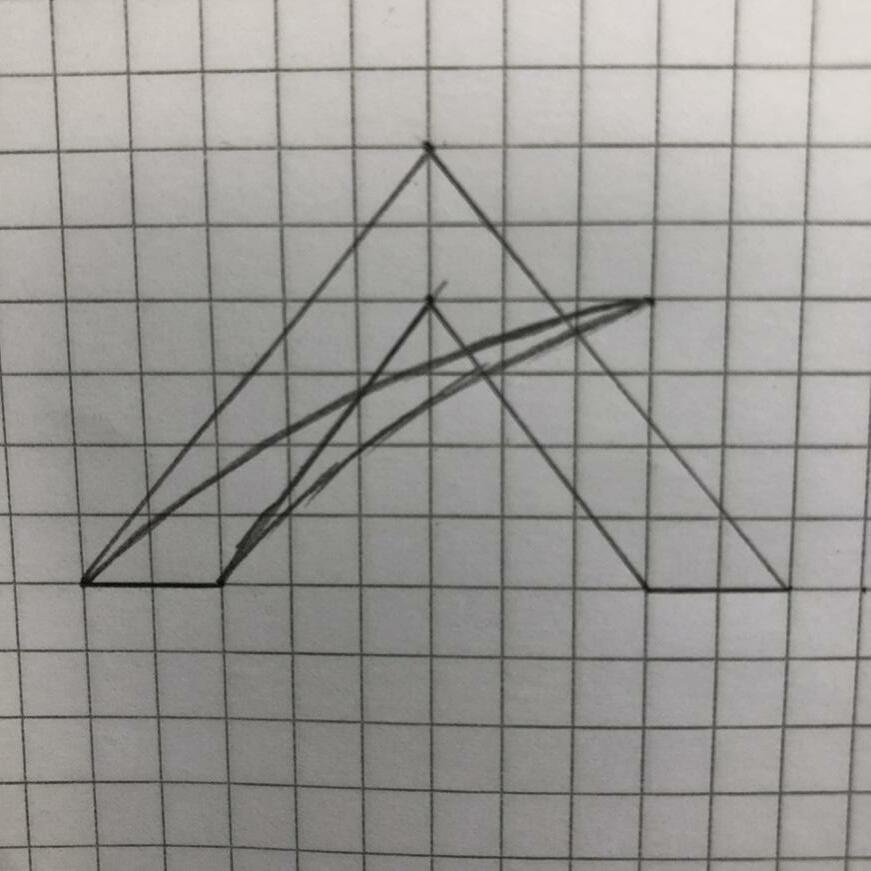
Logo Development [Round2]
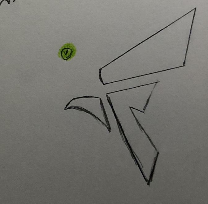
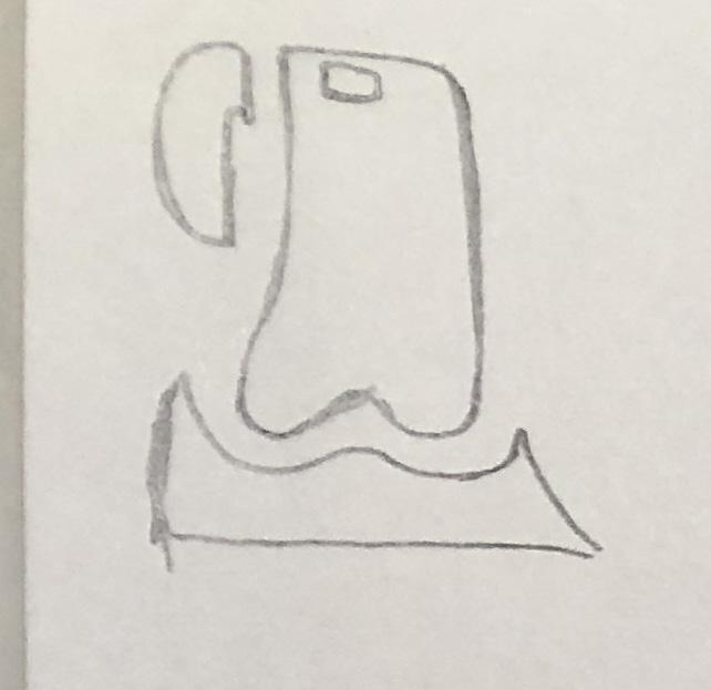
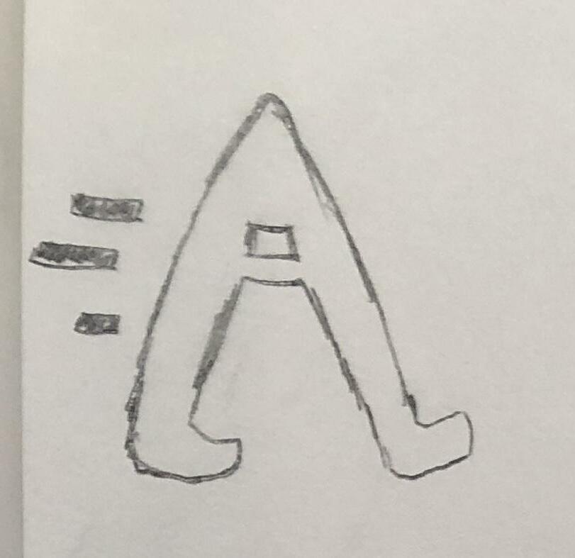
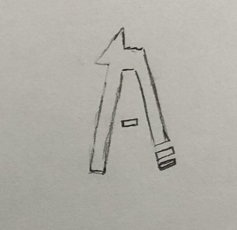
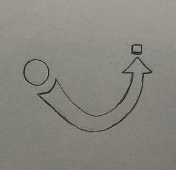
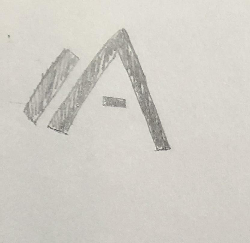
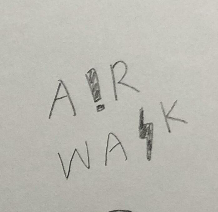
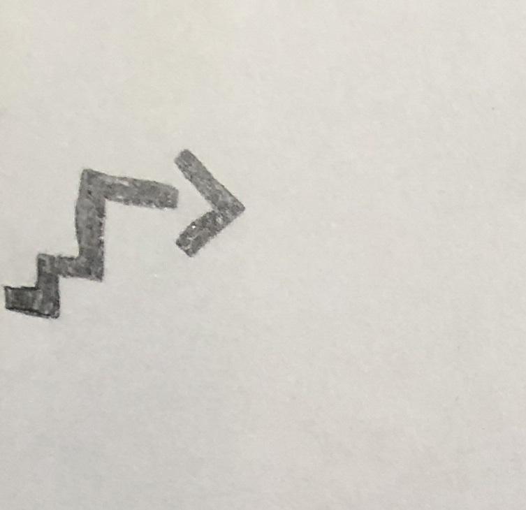
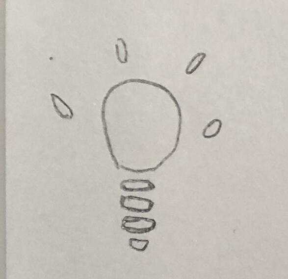
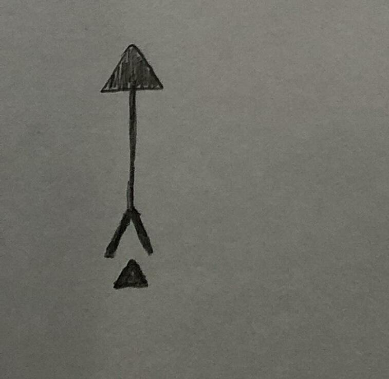
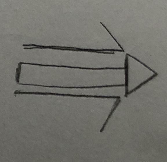
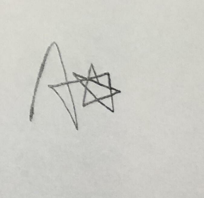
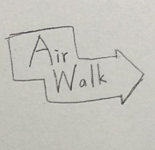
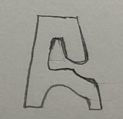
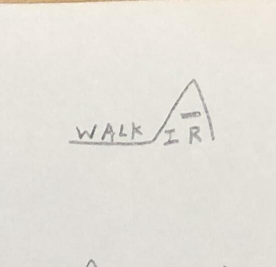
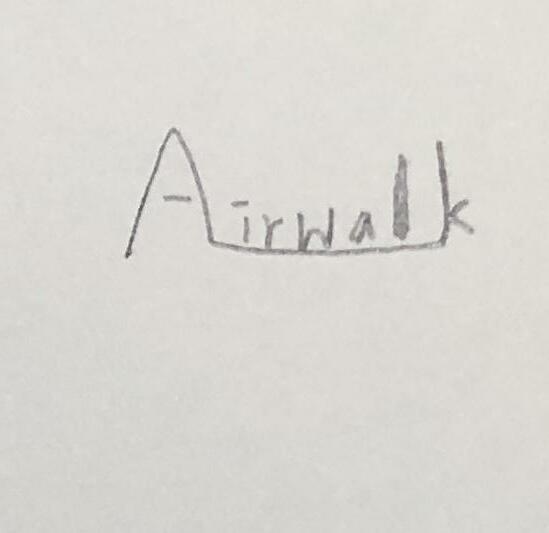
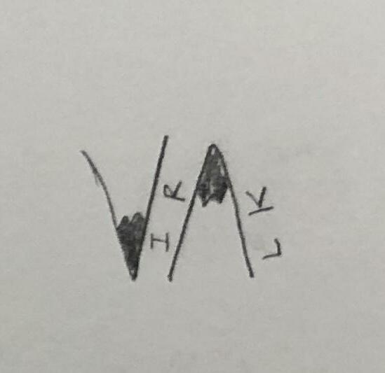
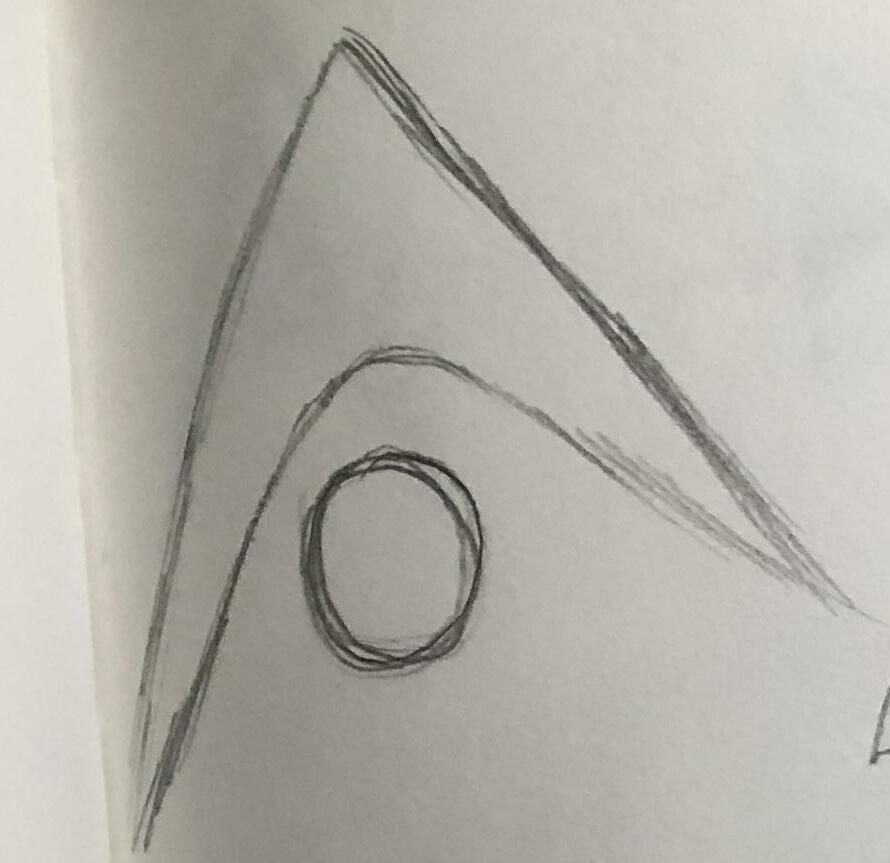
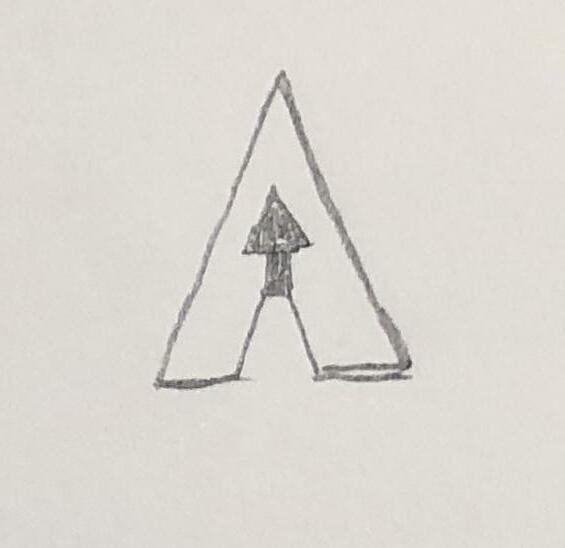
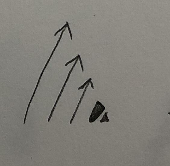
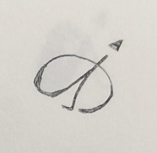
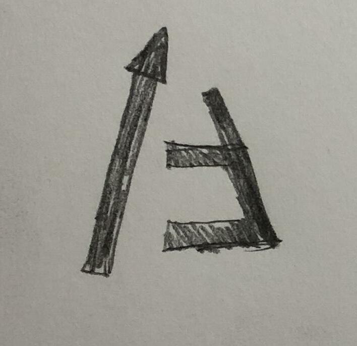
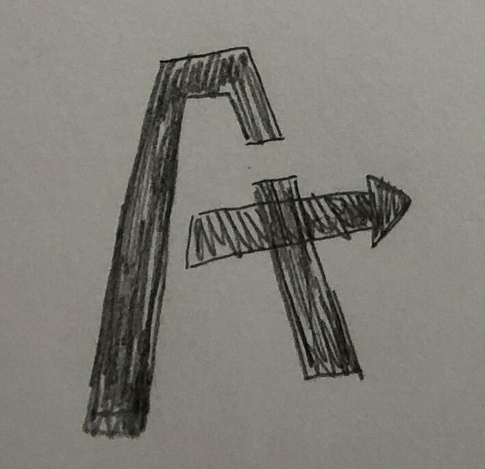
In this phase, we combined the concept of “Active” with “Innovative” to explore multiple likelihoods of the Airwalk logo. It contains geometric graphics, the capital letter “A” and arrows in this development.
Active Square the Circle
+
Innovative Advance your Life
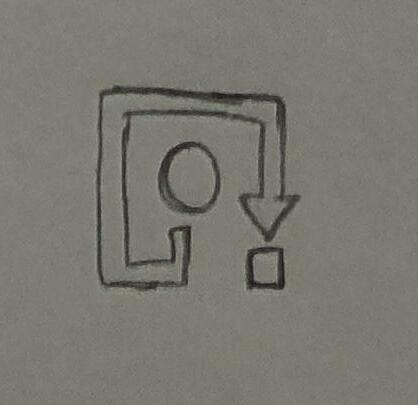
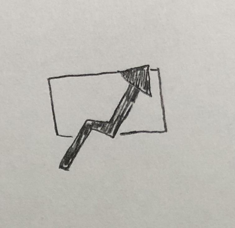
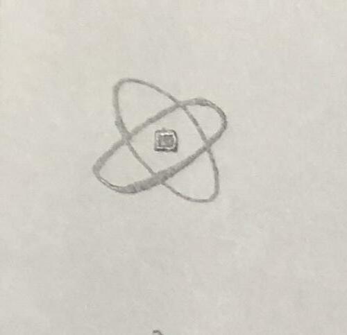
1. Geometric graphics
2. Letter “A”
3. Arrows
3 Development 1 53
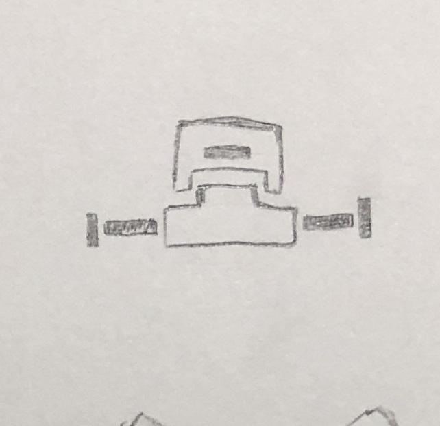
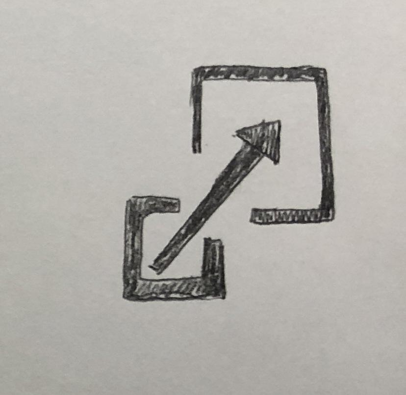
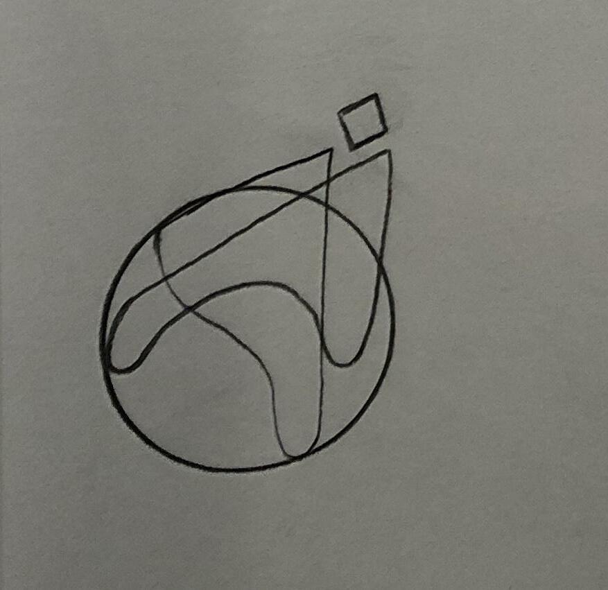
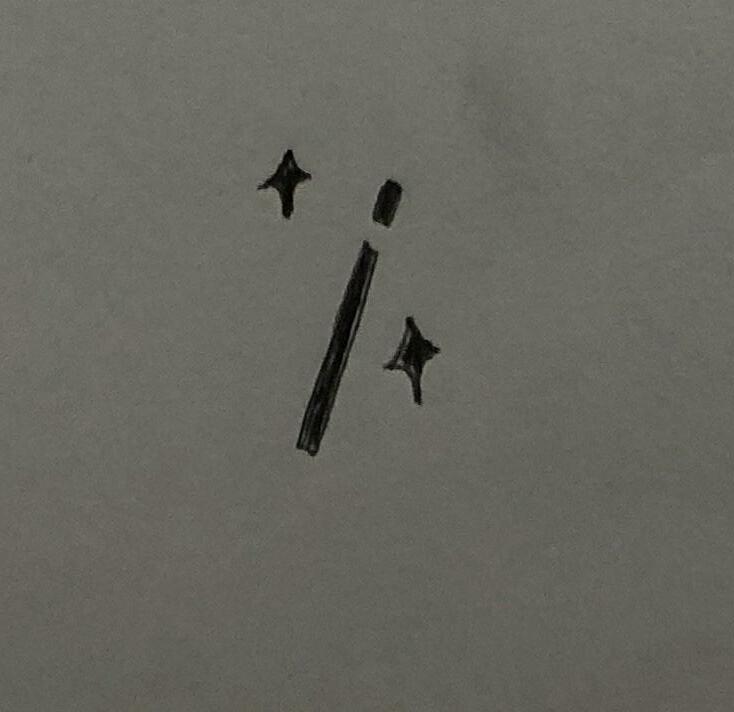
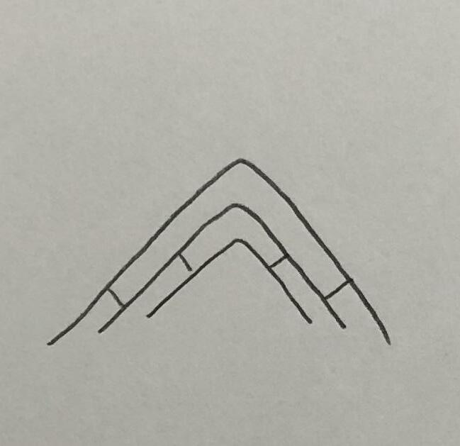
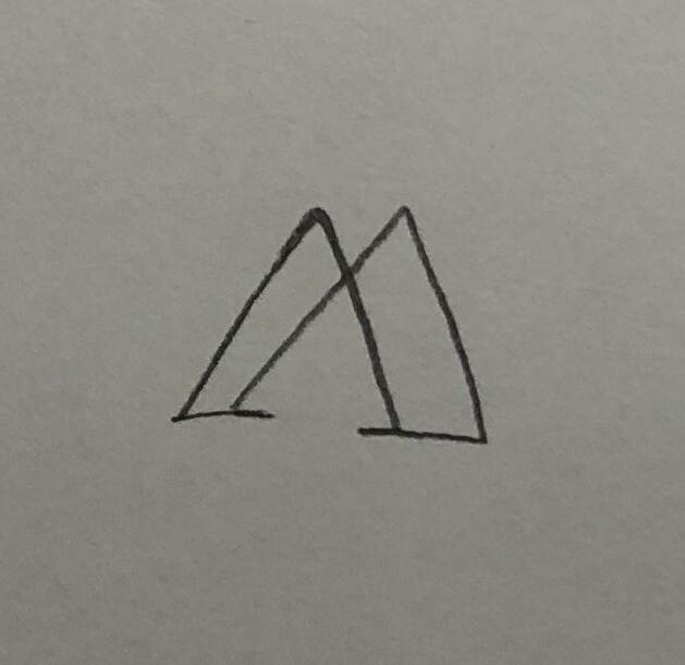
Logo Development [R2]
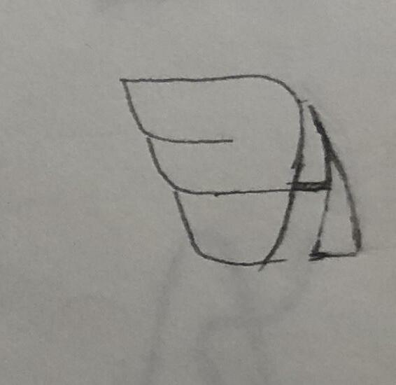
3 Development 1 55
Logo Development [R2]
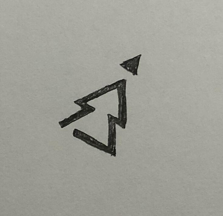
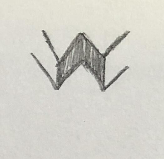
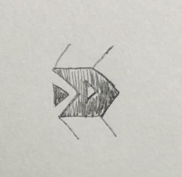
3 Development 1 > 57
Logo Development [R2]
3 Development 1 59
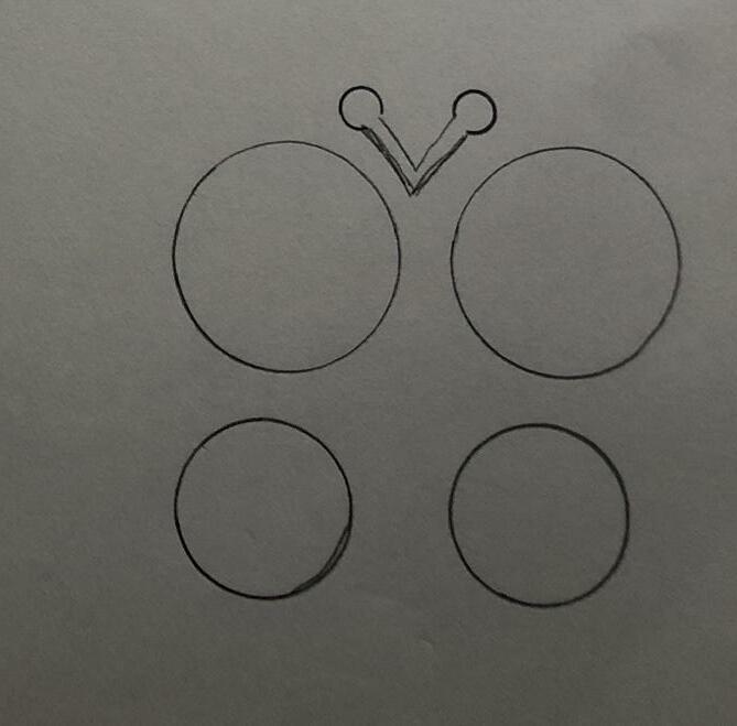
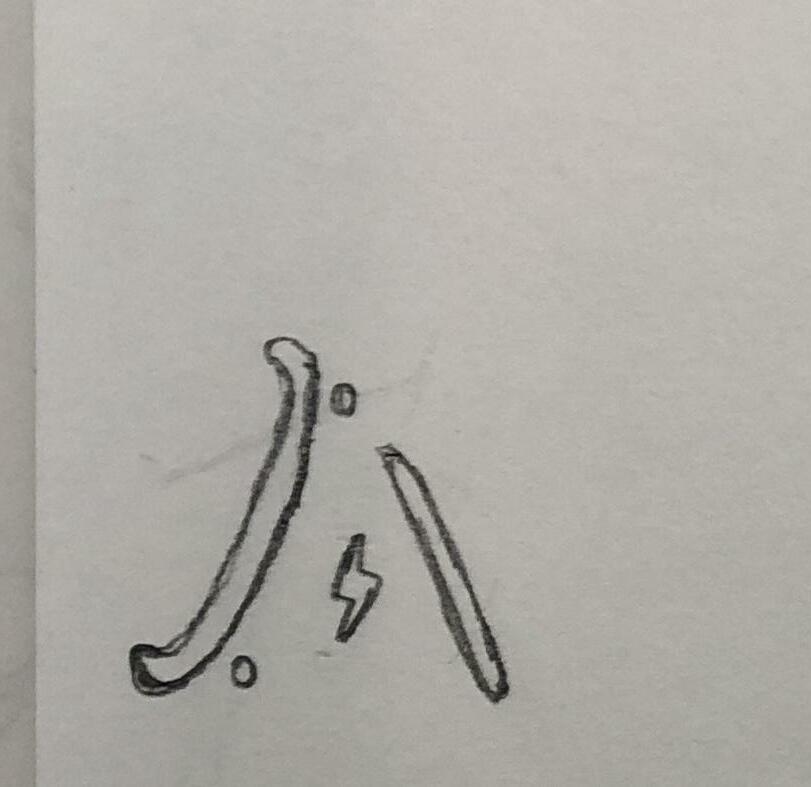
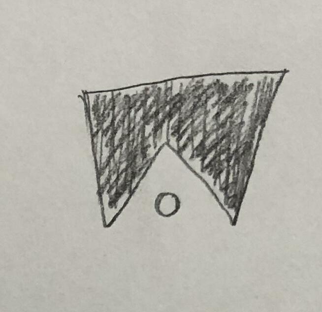
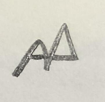
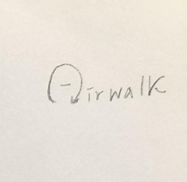
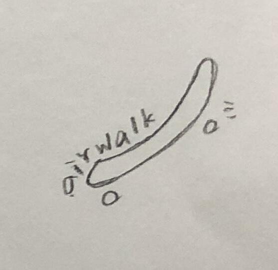
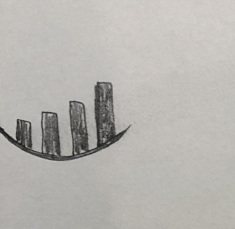
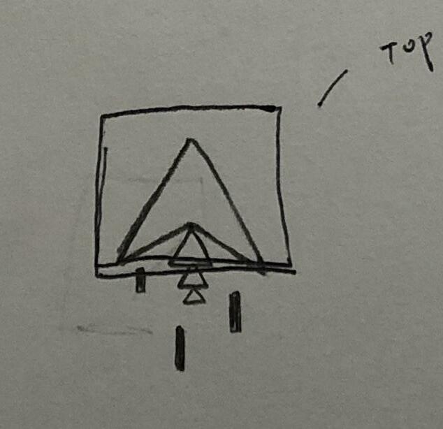
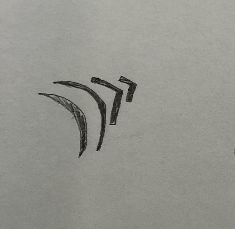
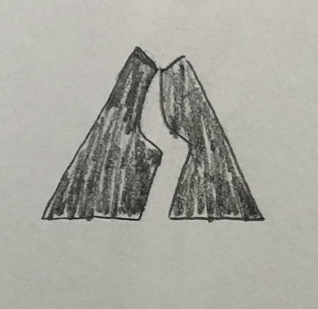
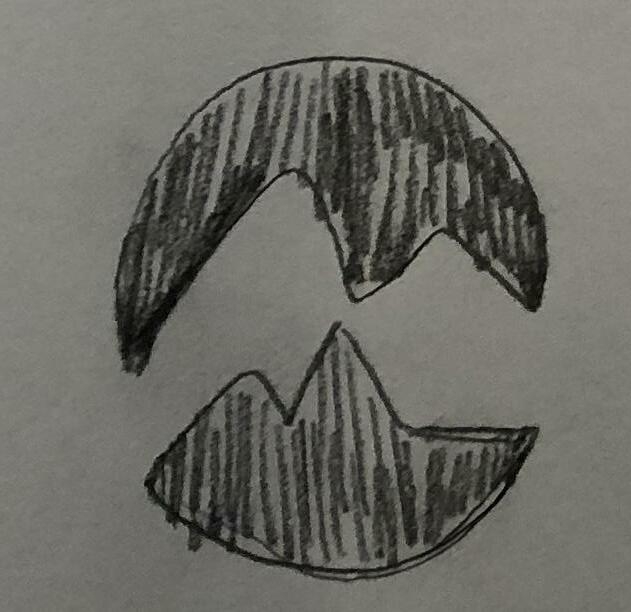
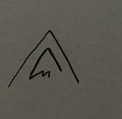
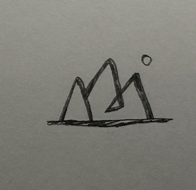
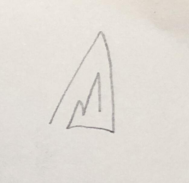
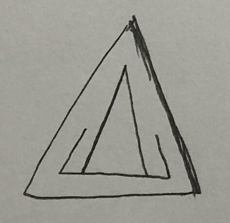
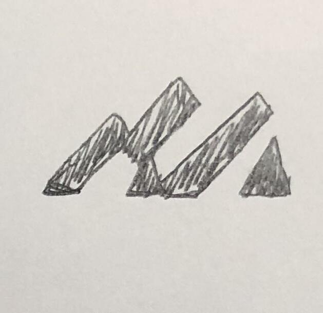
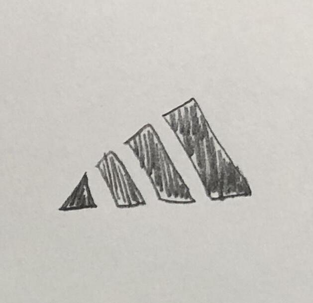
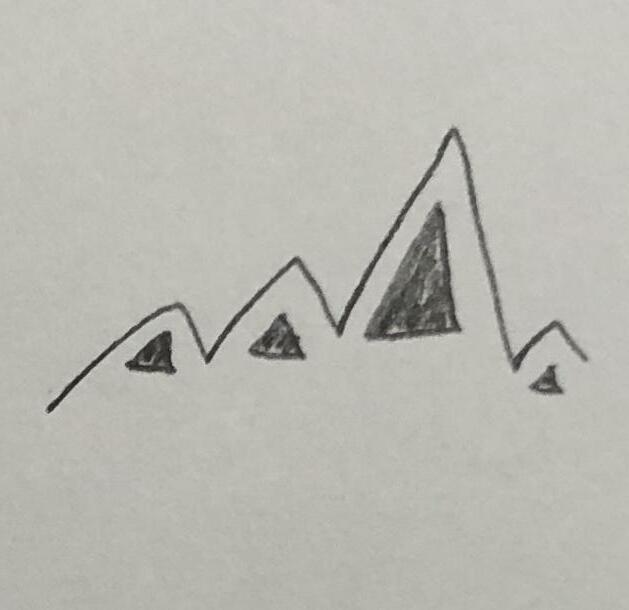
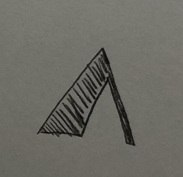
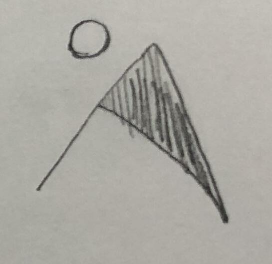
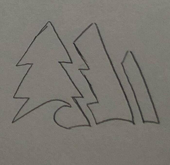
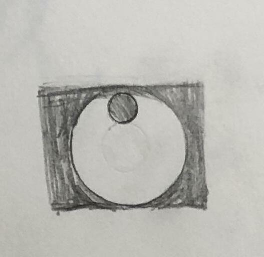
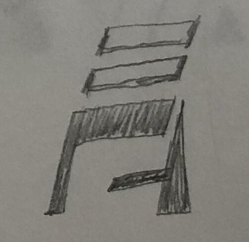
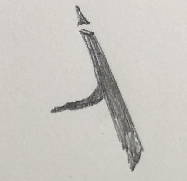
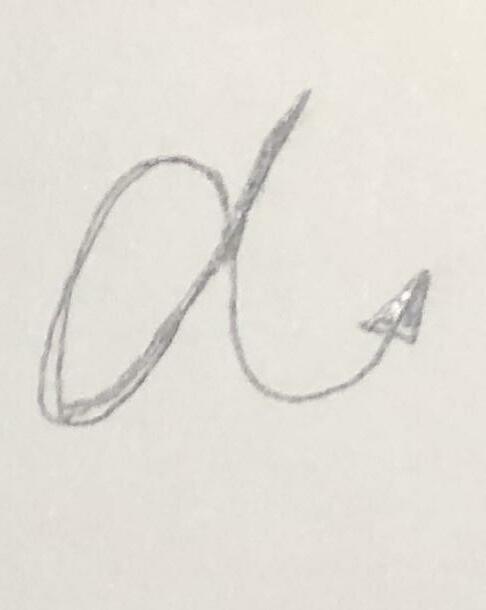
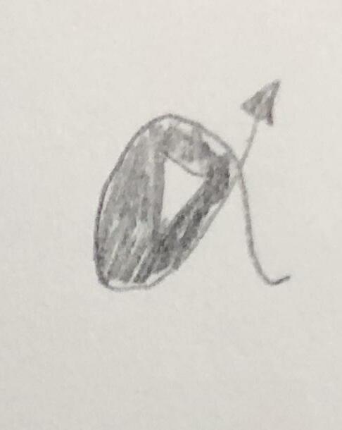
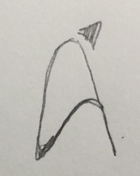
Refined Sketches
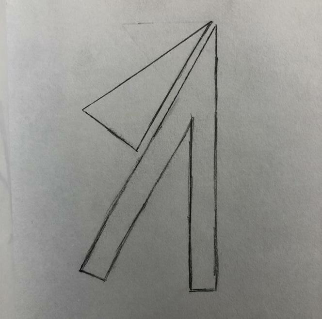
[Round2]
3 Development 1 61
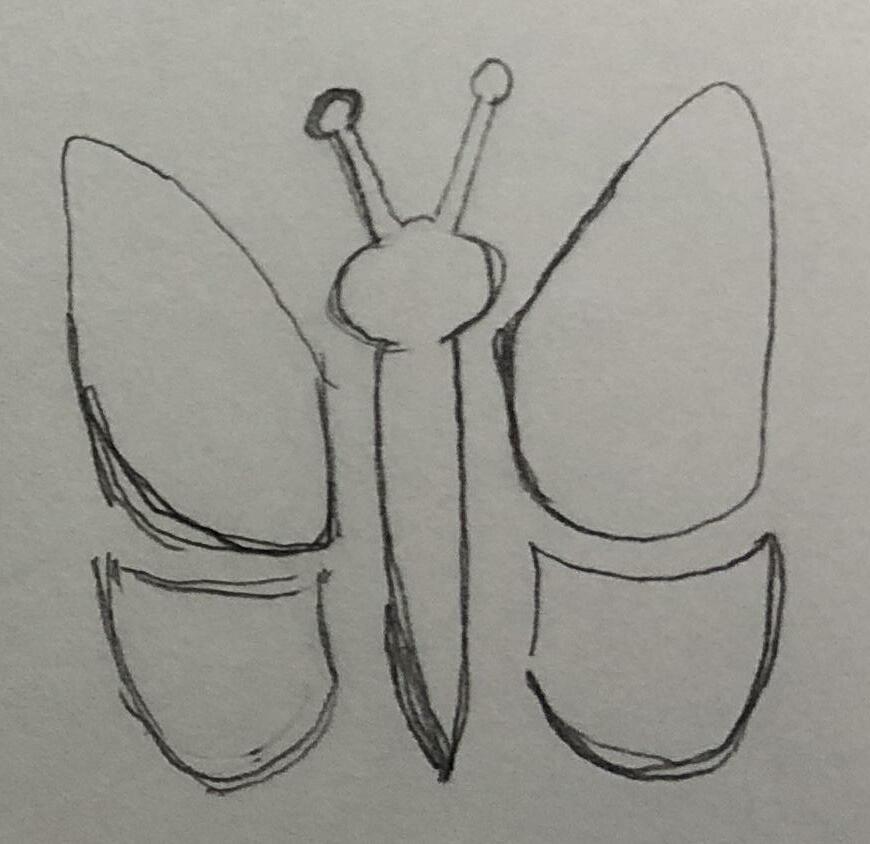
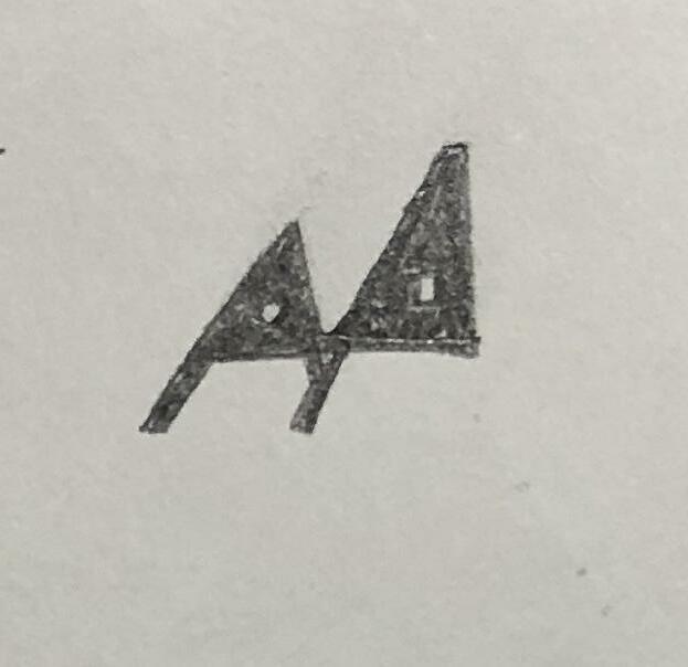
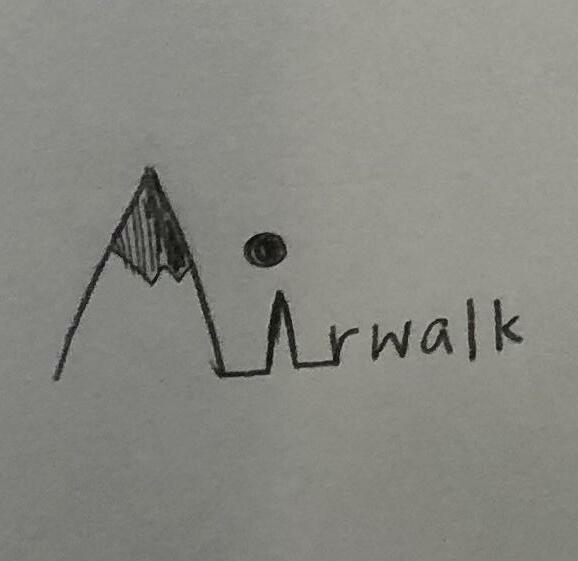
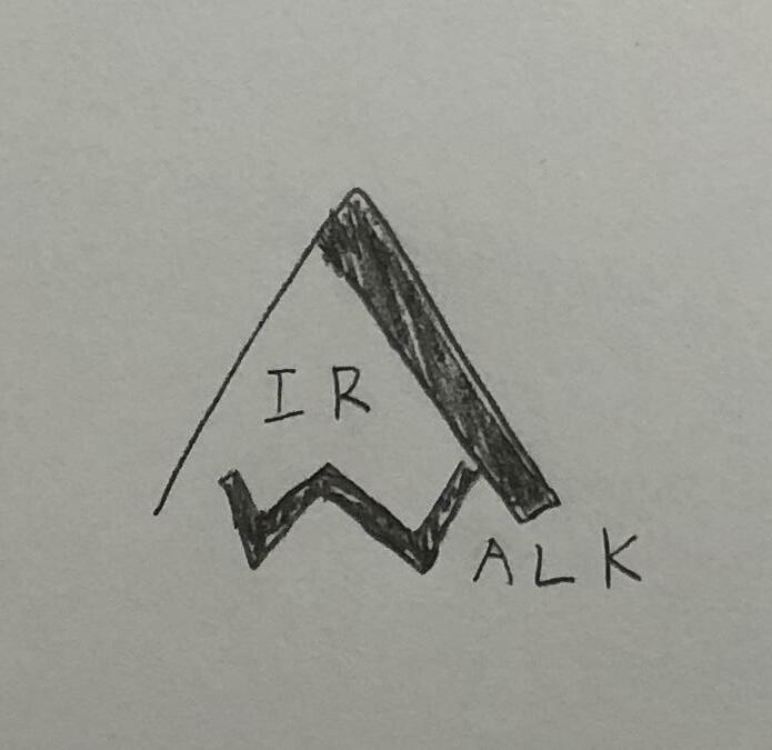
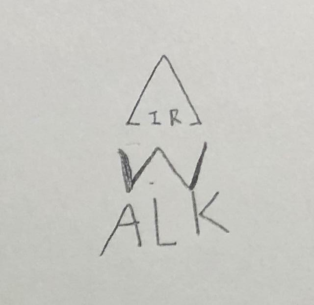
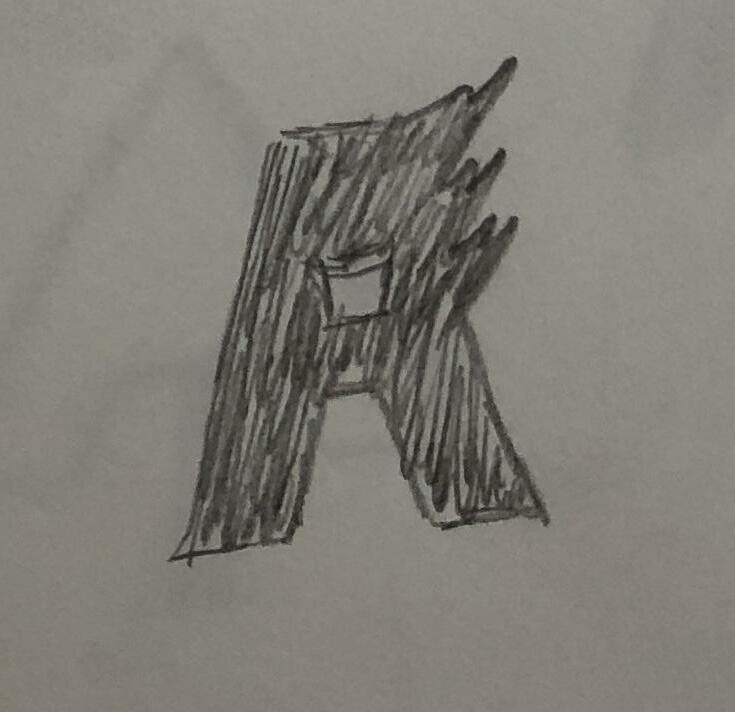
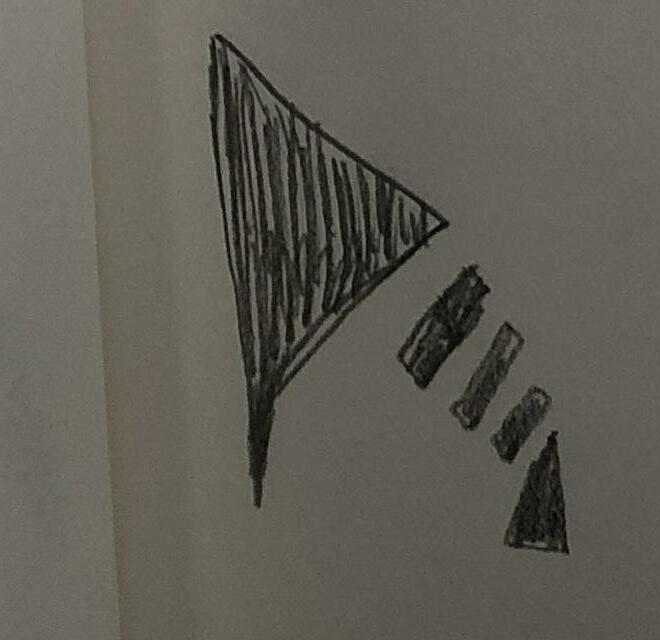
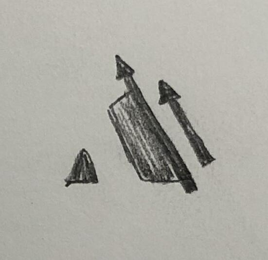
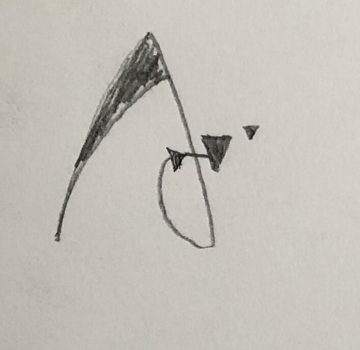
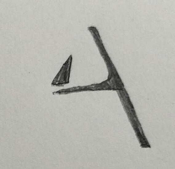
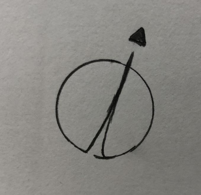
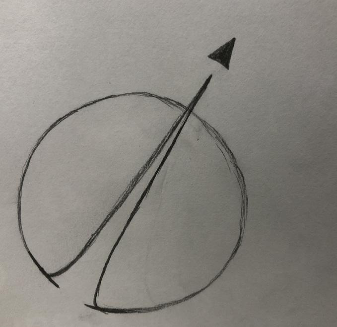
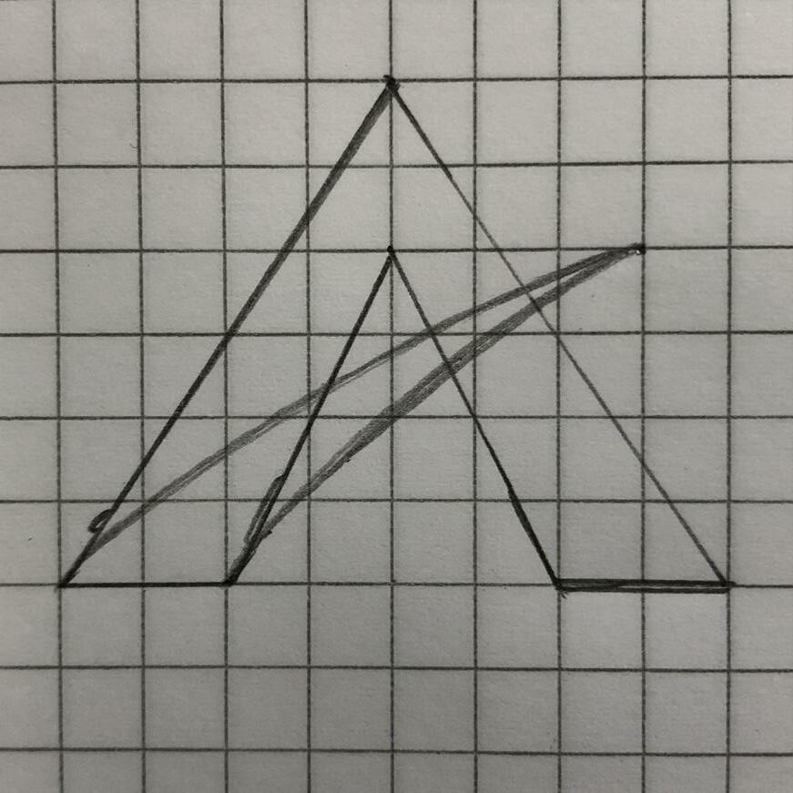
Digital Comps
[Round2]
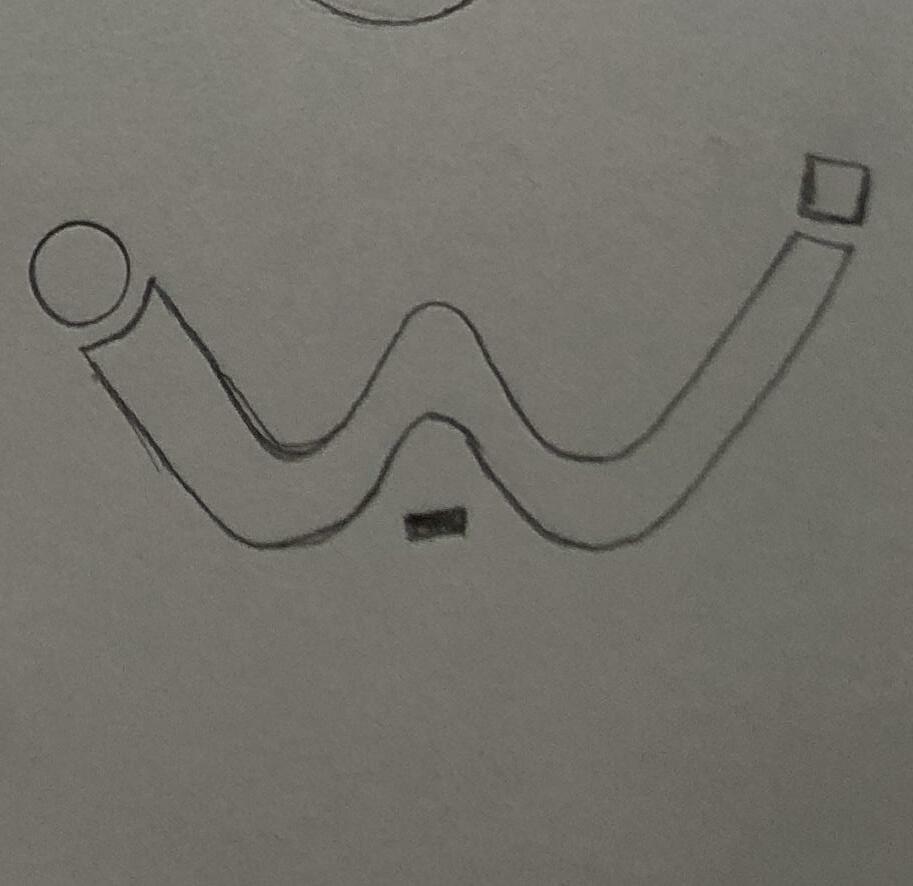
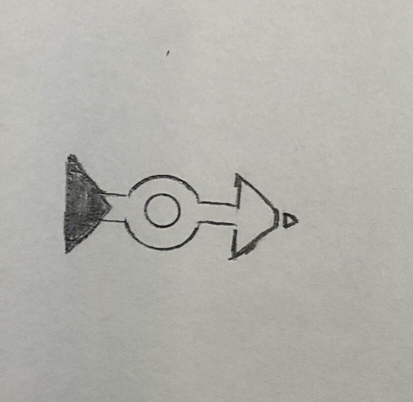
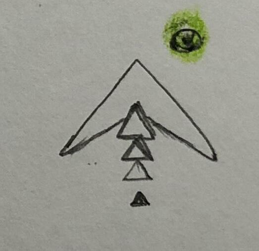
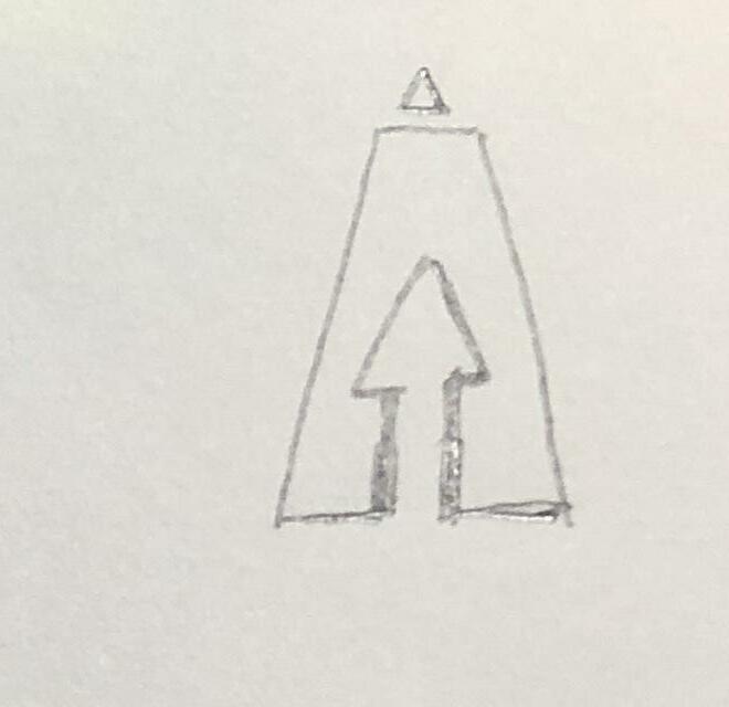
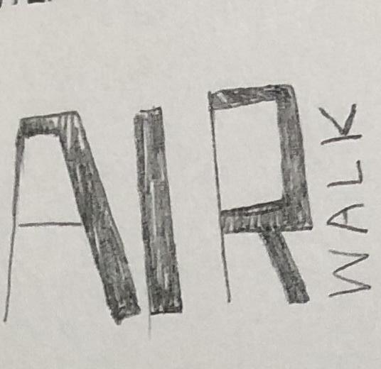
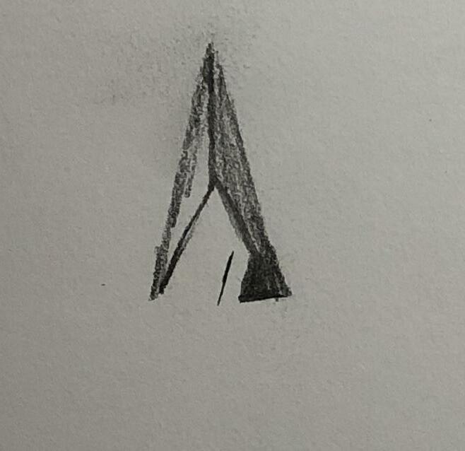
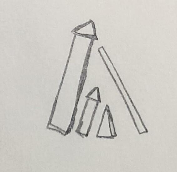
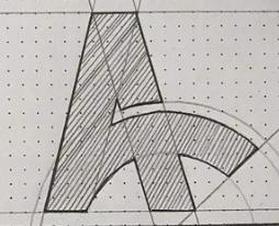
Before we went into logo exploration round 3, we tried to convert the refined sketches into a comp draft and explored different angles of the logo. The capital letter “A”, geometric symbols and arrows are still the proper visual direction that I was exploring in this digital comp journey.
3 Development 1 63
4 Development 2 Digital Comps [Round3]-1 Digital Comps [Round3]-2 Digital Comps [Round3]-3 Digital Comps [Round3]-4 More Sketches & Refinements Refined Digital Comps Color Palette Experiment Pairing with Logotype Final Logomark Similar Logos
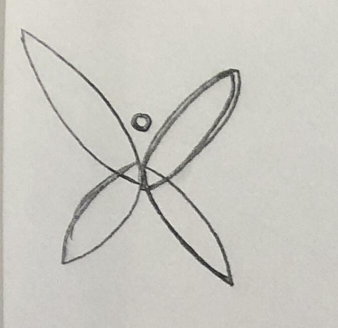
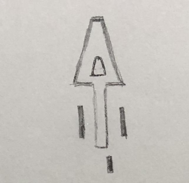
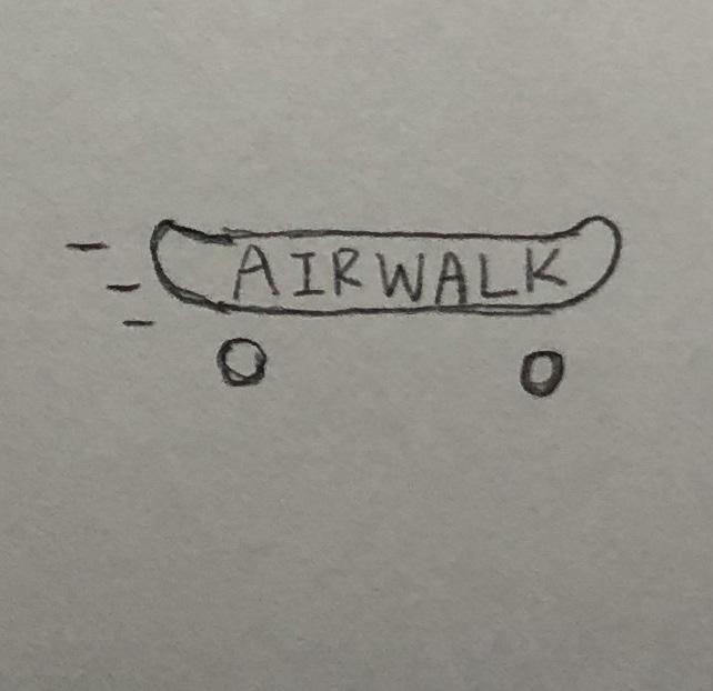
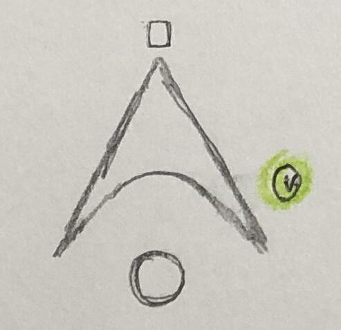
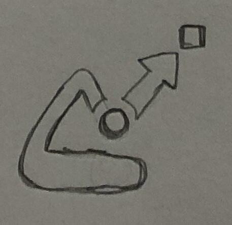
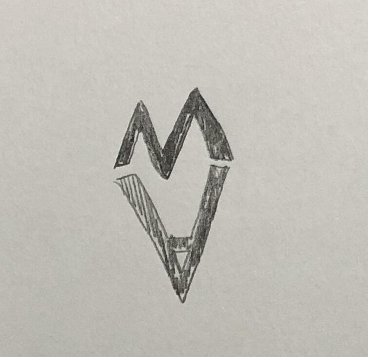
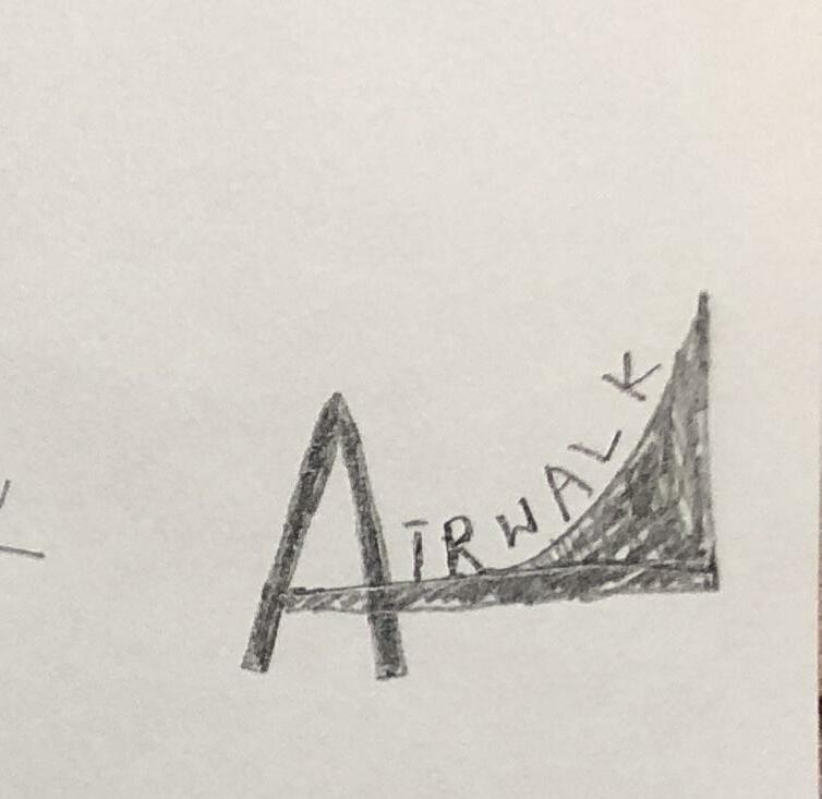
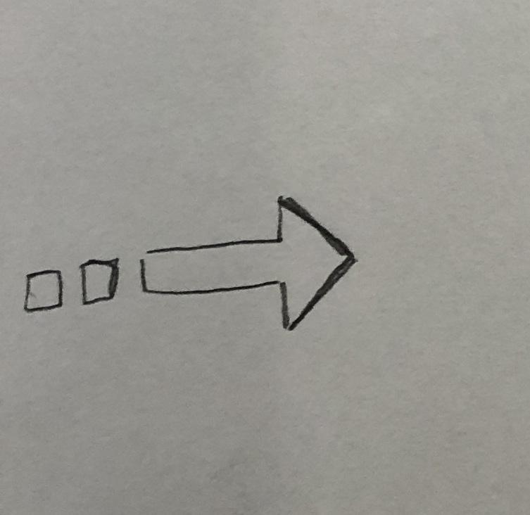
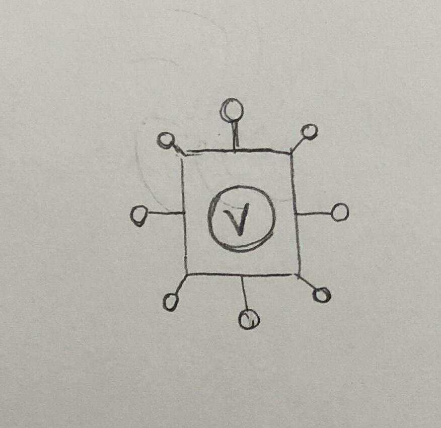
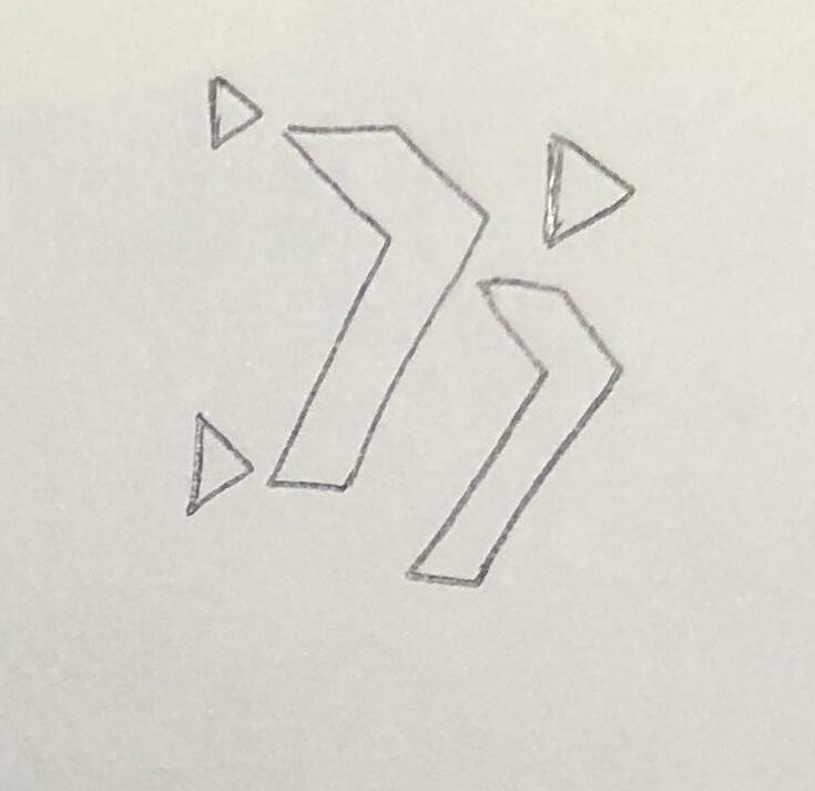
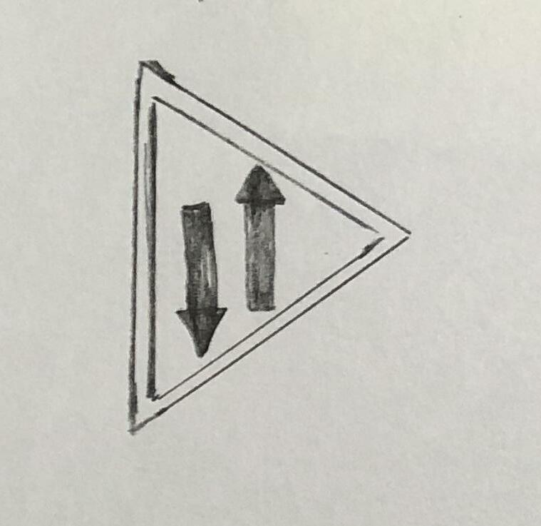
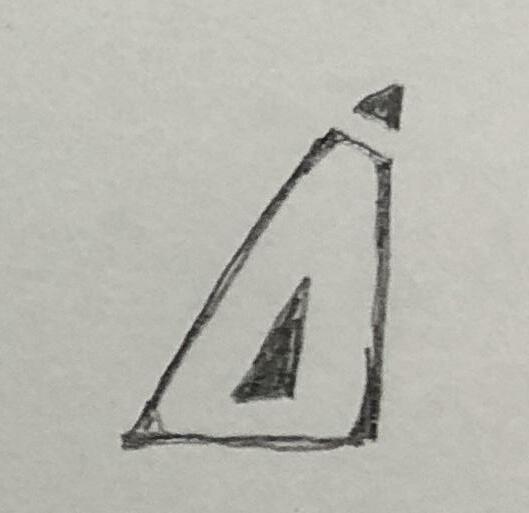
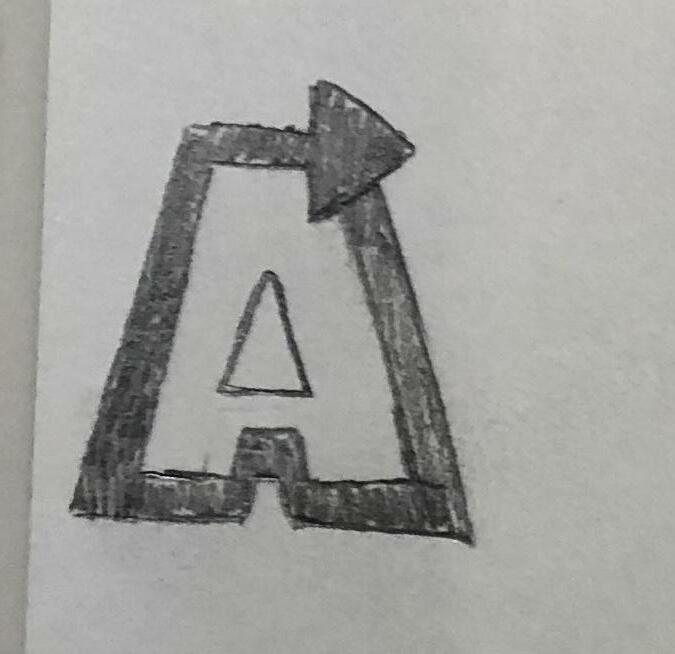
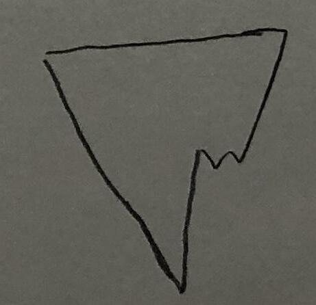
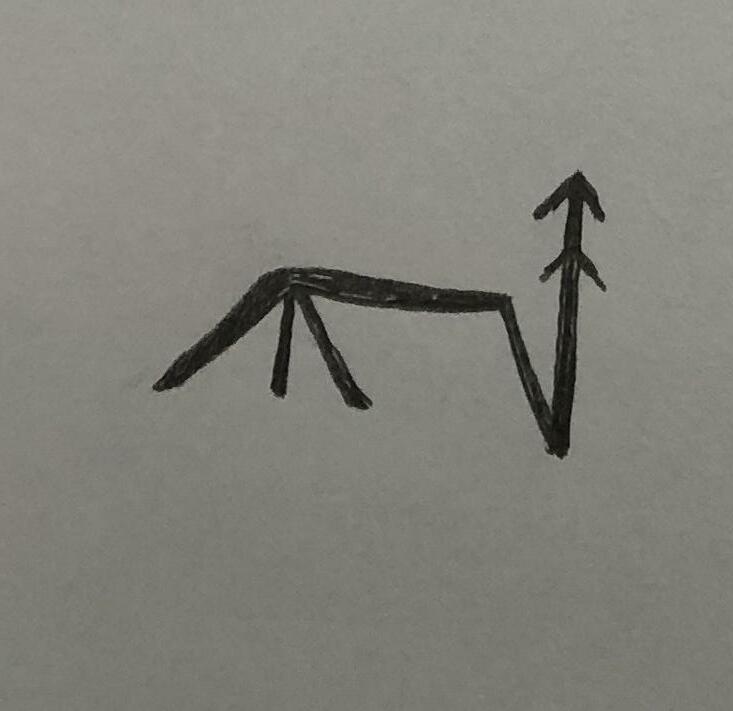
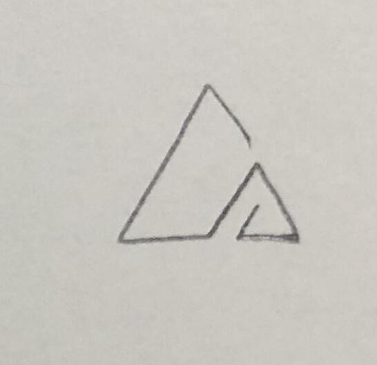
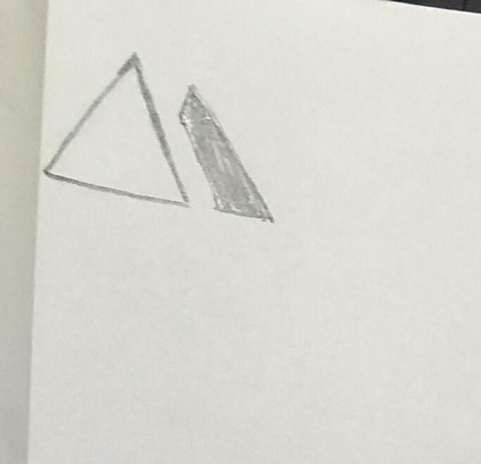
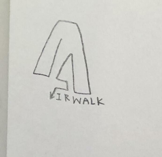
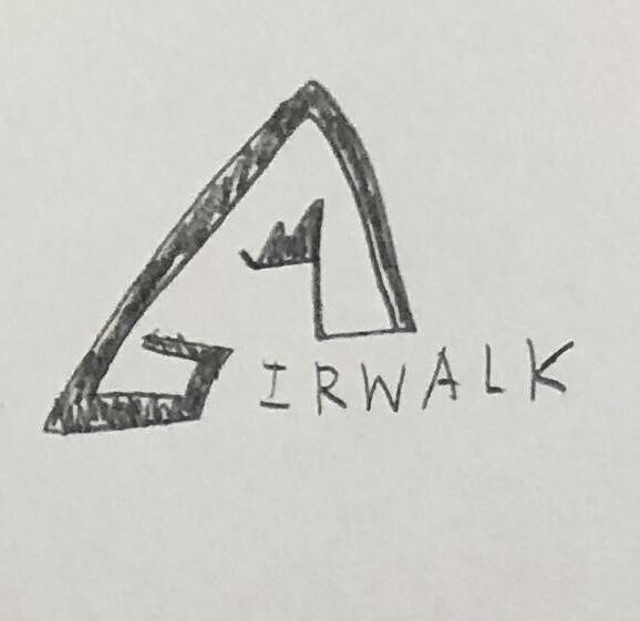
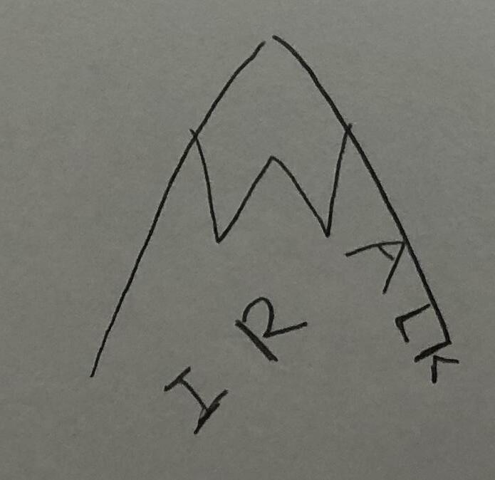
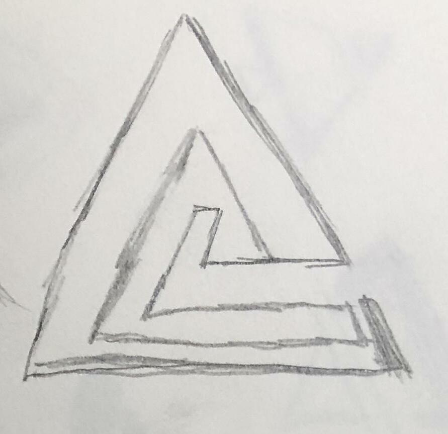
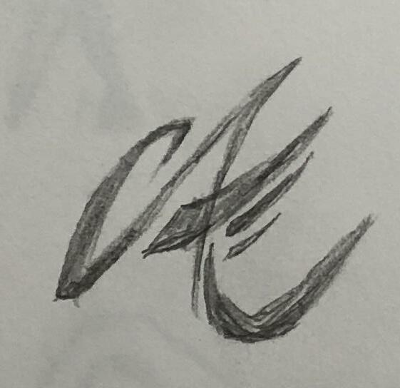
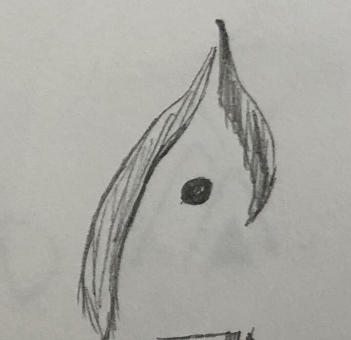
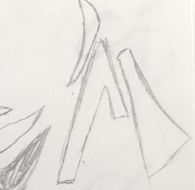
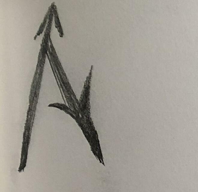
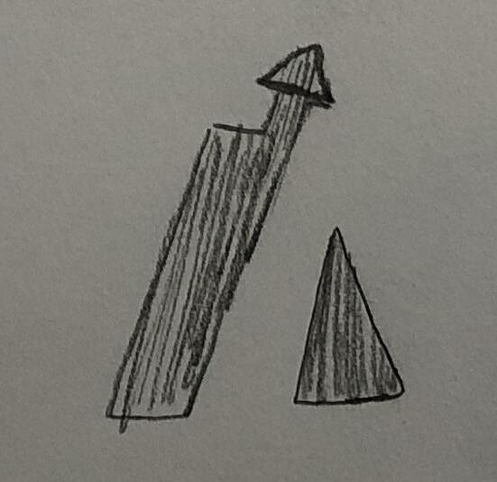
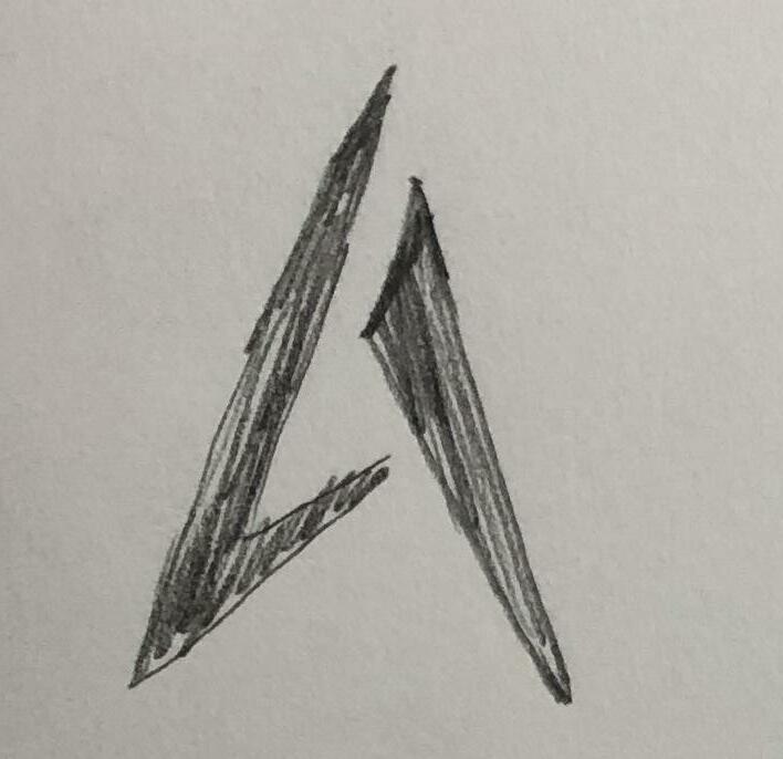
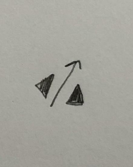
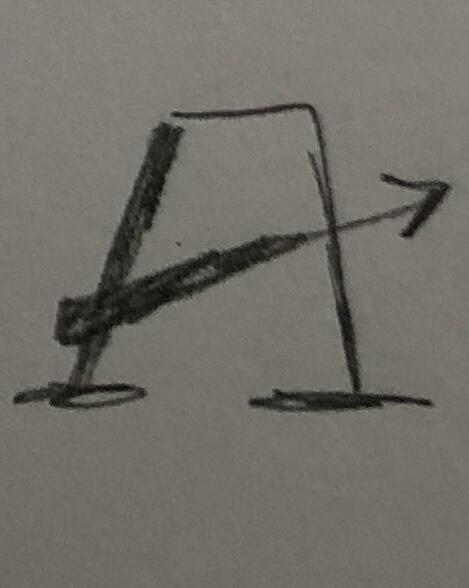
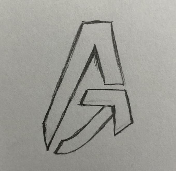
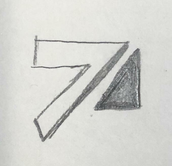
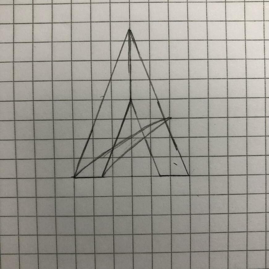
Digital Comps [Round3]-1
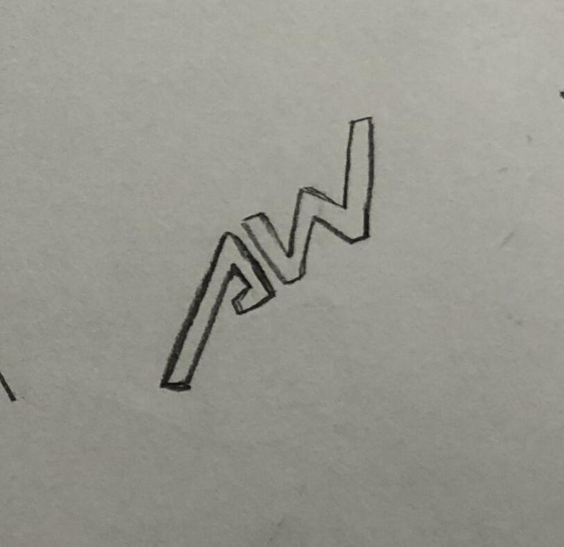
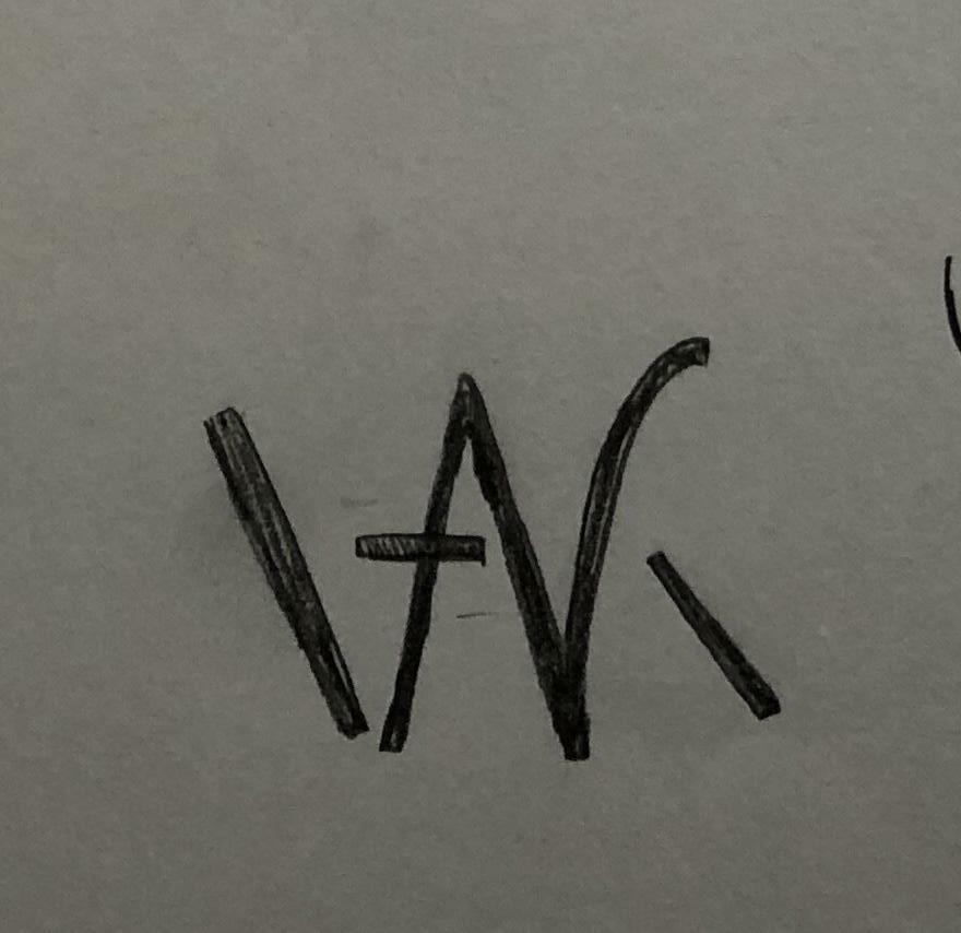
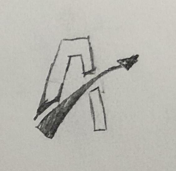
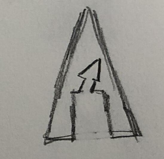
In this development, we were concentrating on the combination of the capital letter “A” and an arrow. The main factor that we played around with was spacing and the crossbar of the capital letter “A.”
PANTONE Orange 021 C
4 Development 2 67
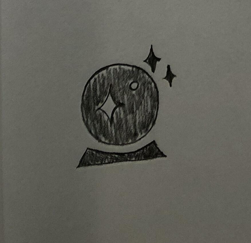
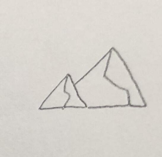
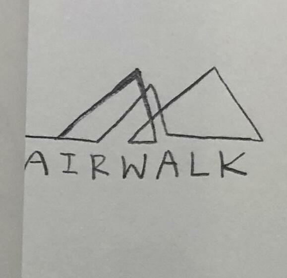
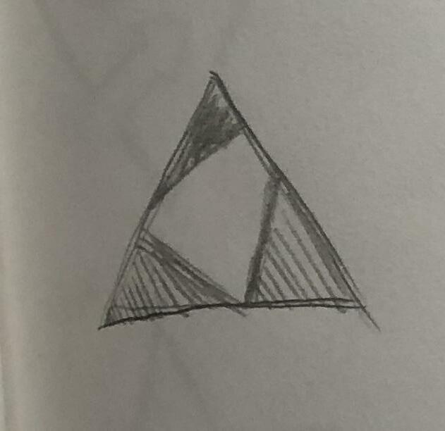
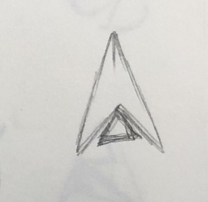
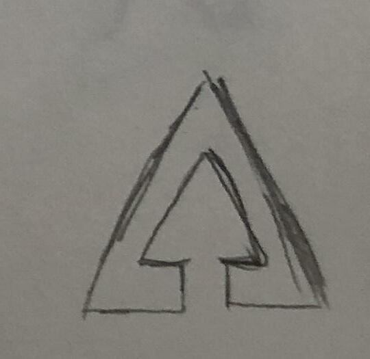
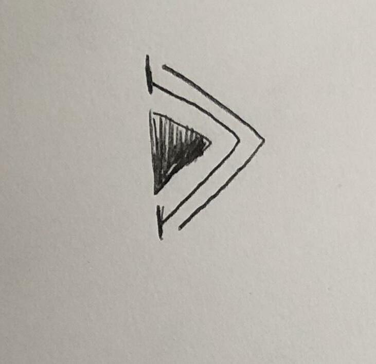
Digital Comps
[Round3]-2
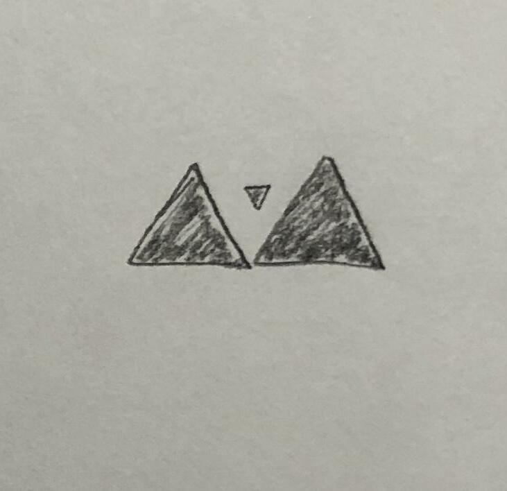
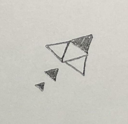
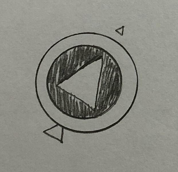
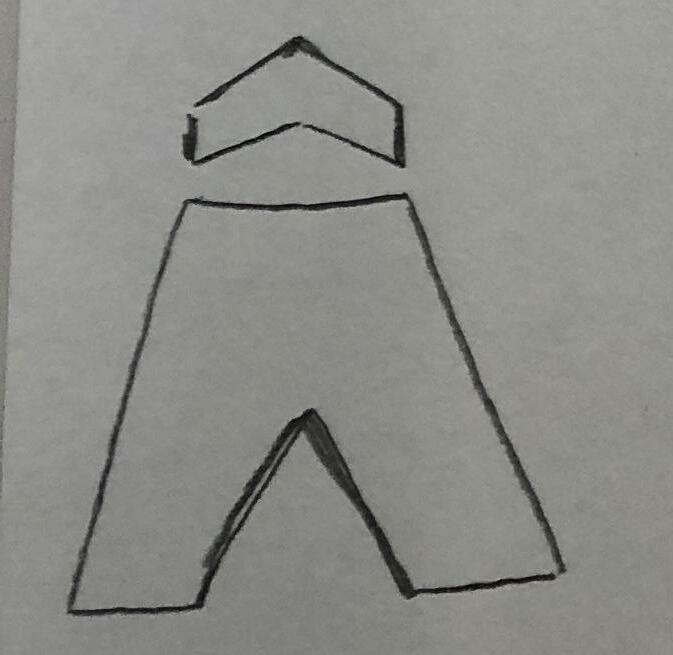
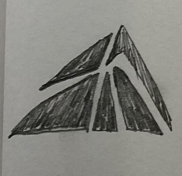
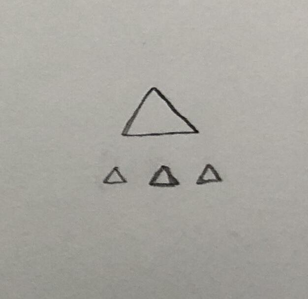
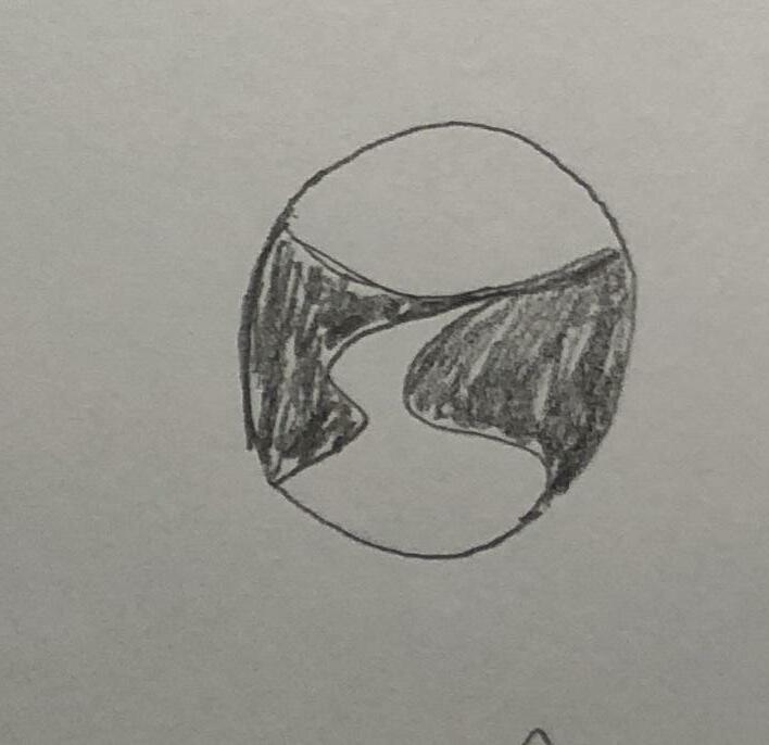
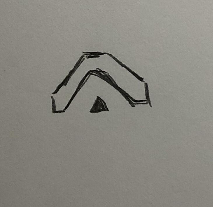
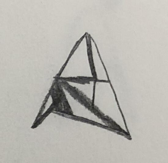
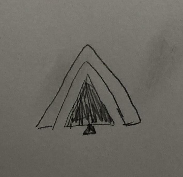
We explored the triangle symbol and the negative space. Unsymmetrical negative space and certain angels of triangles create an unpredictable feeling to people.
PANTONE 285 C
4 Development 2 69
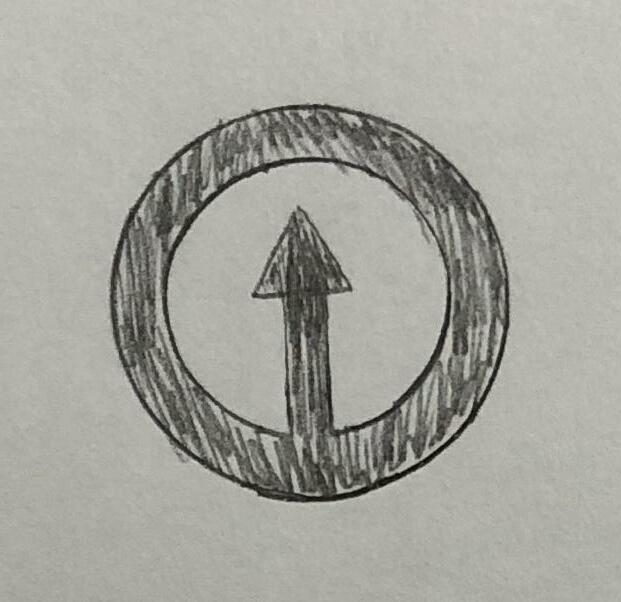
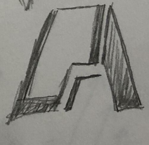
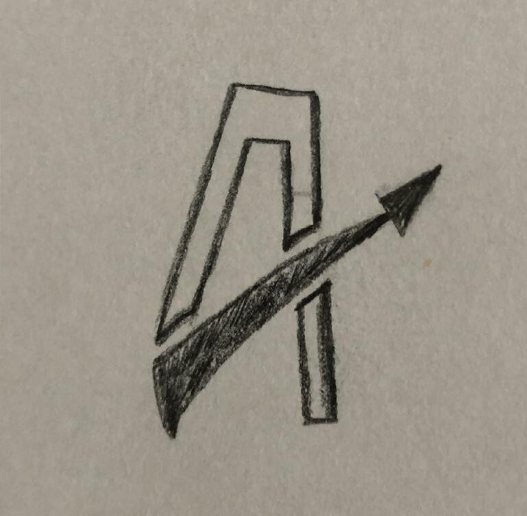
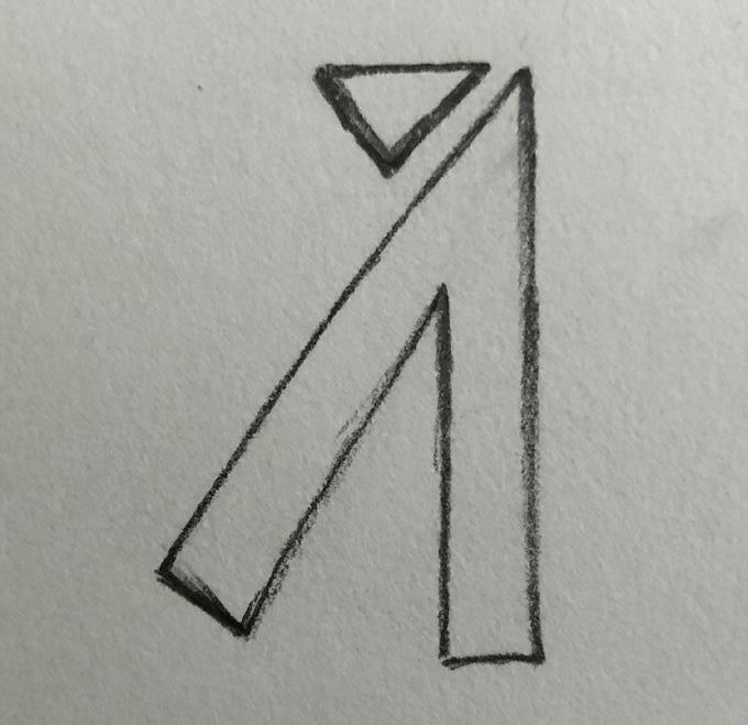
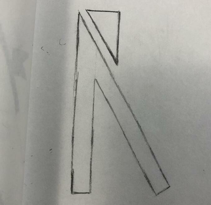
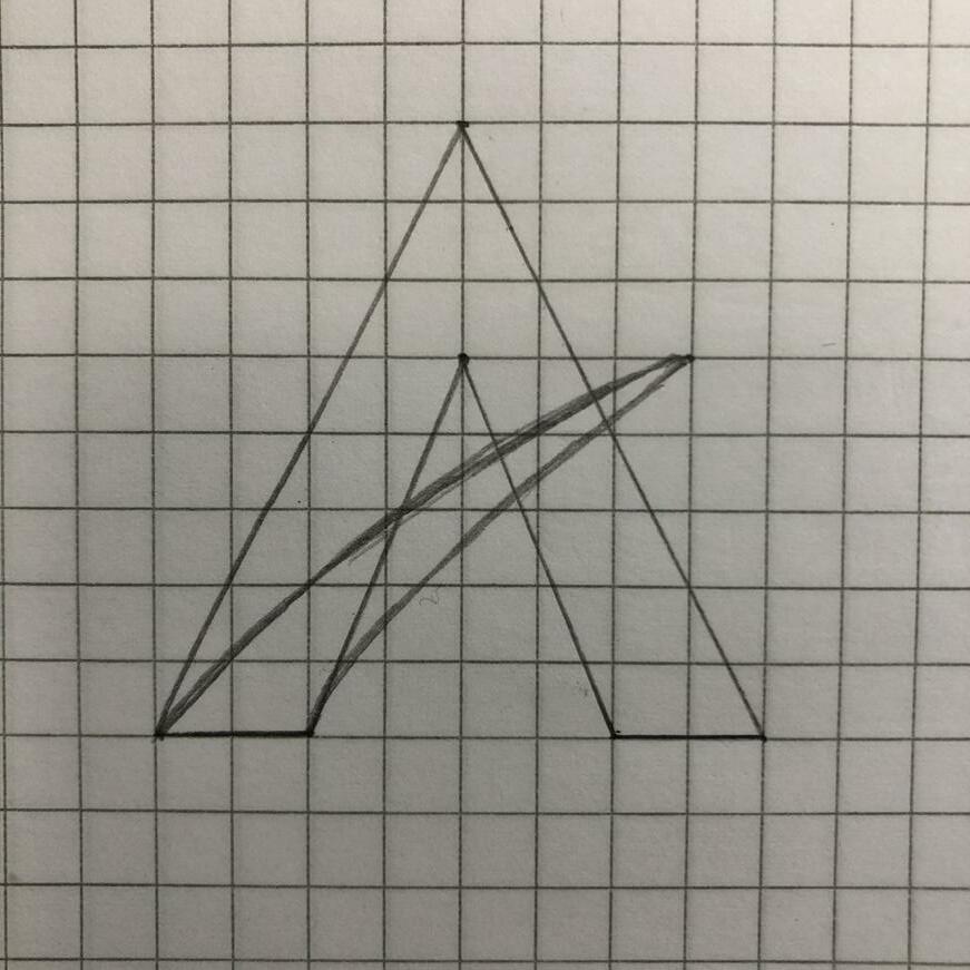
Digital Comps [Round3]-3
We were concentrating on the combination of the capital letter “A” and an arrow. The main factor that I played around with was spacing and the structure of the capital letter “A.”
PANTONE 192 C
PANTONE 285 C
4 Development 2 71
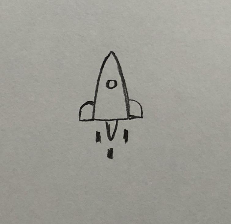
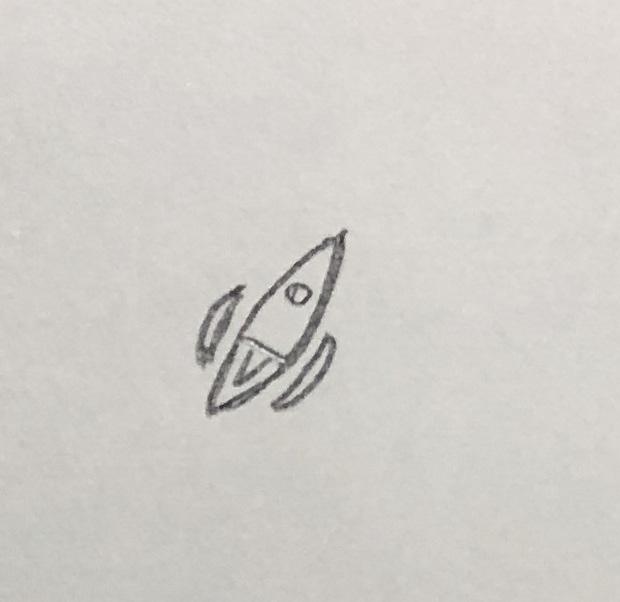
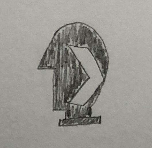
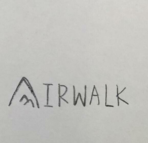
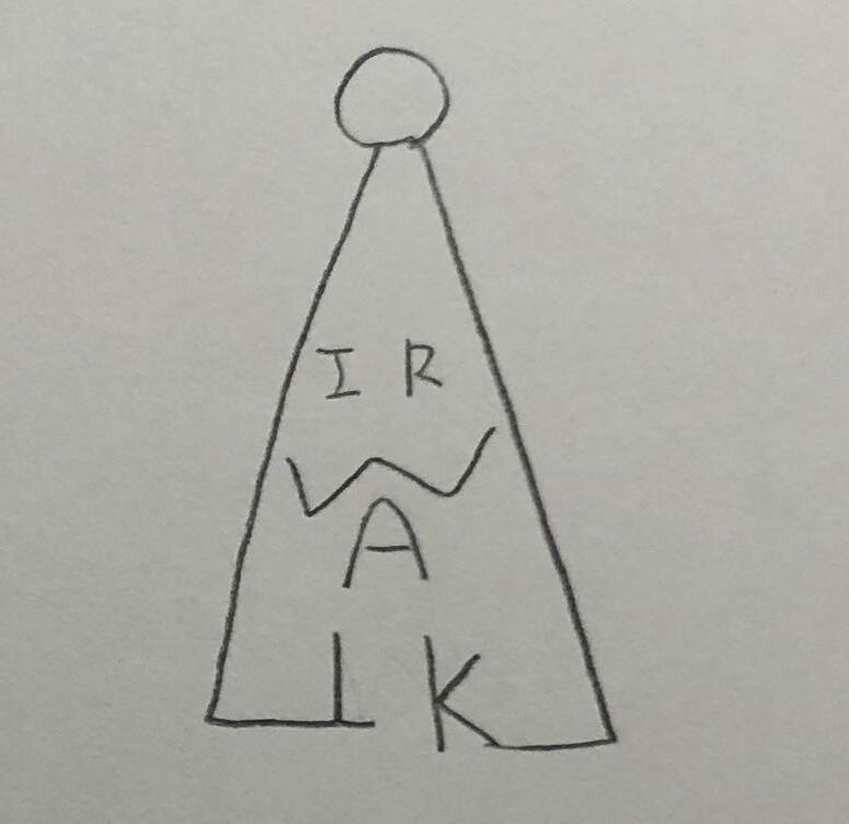
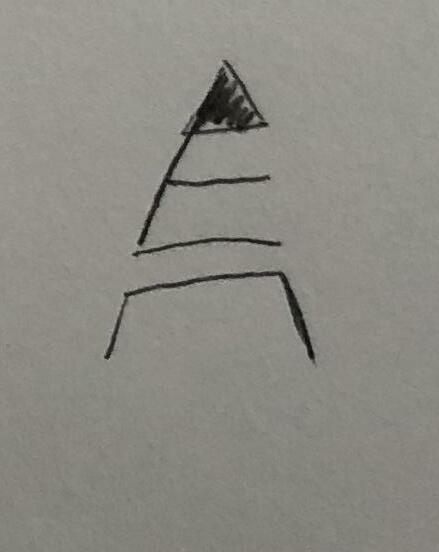
Digital Comps [Round3]-4
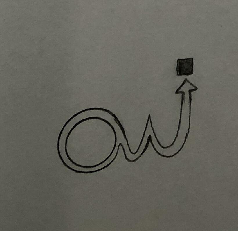
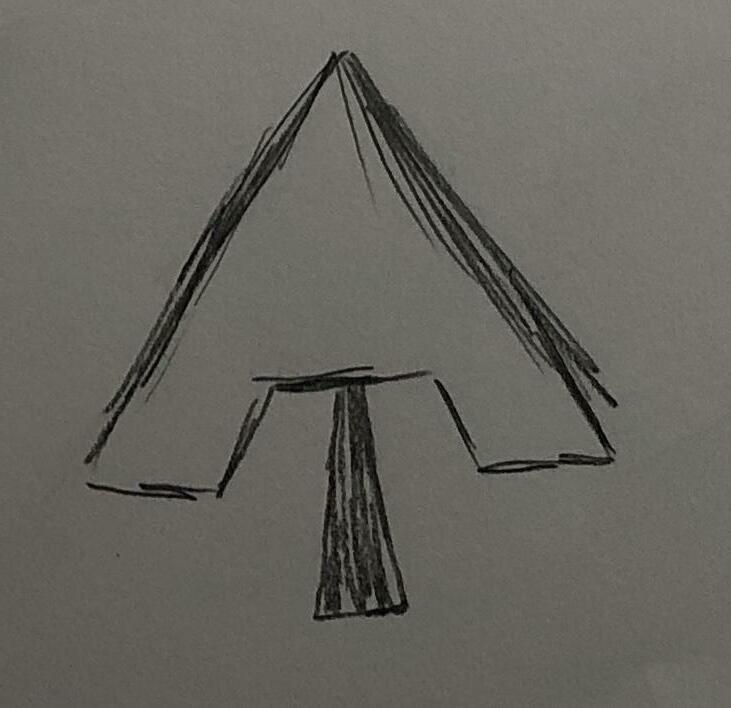
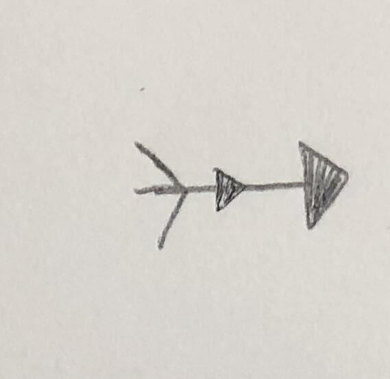
In this phase, we combined the concept of the structure of the letter “A” and the rocket to explore the logo. The little triangle (arrow) indicates an “active” feeling.
4 Development 2 73
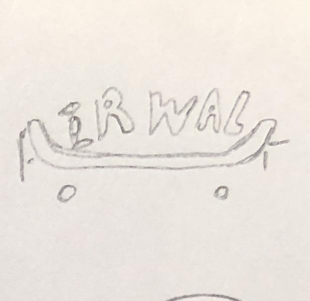
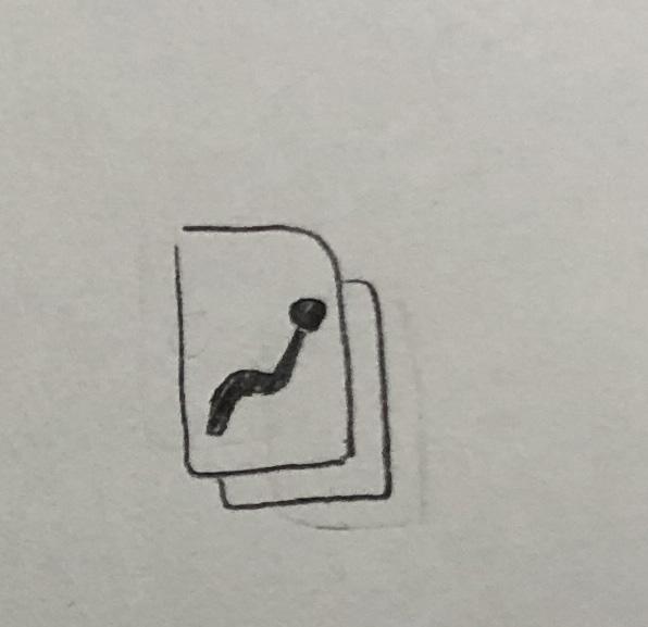
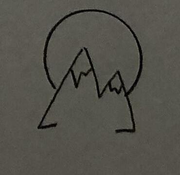
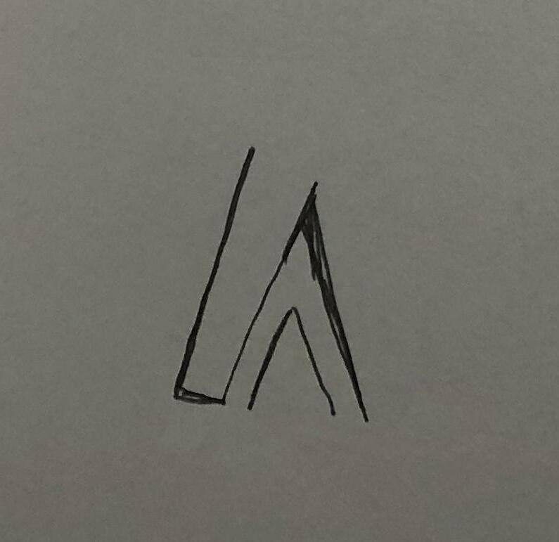
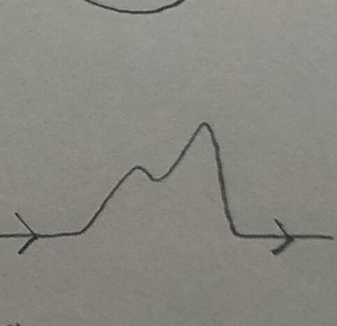
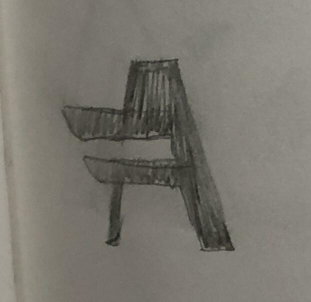
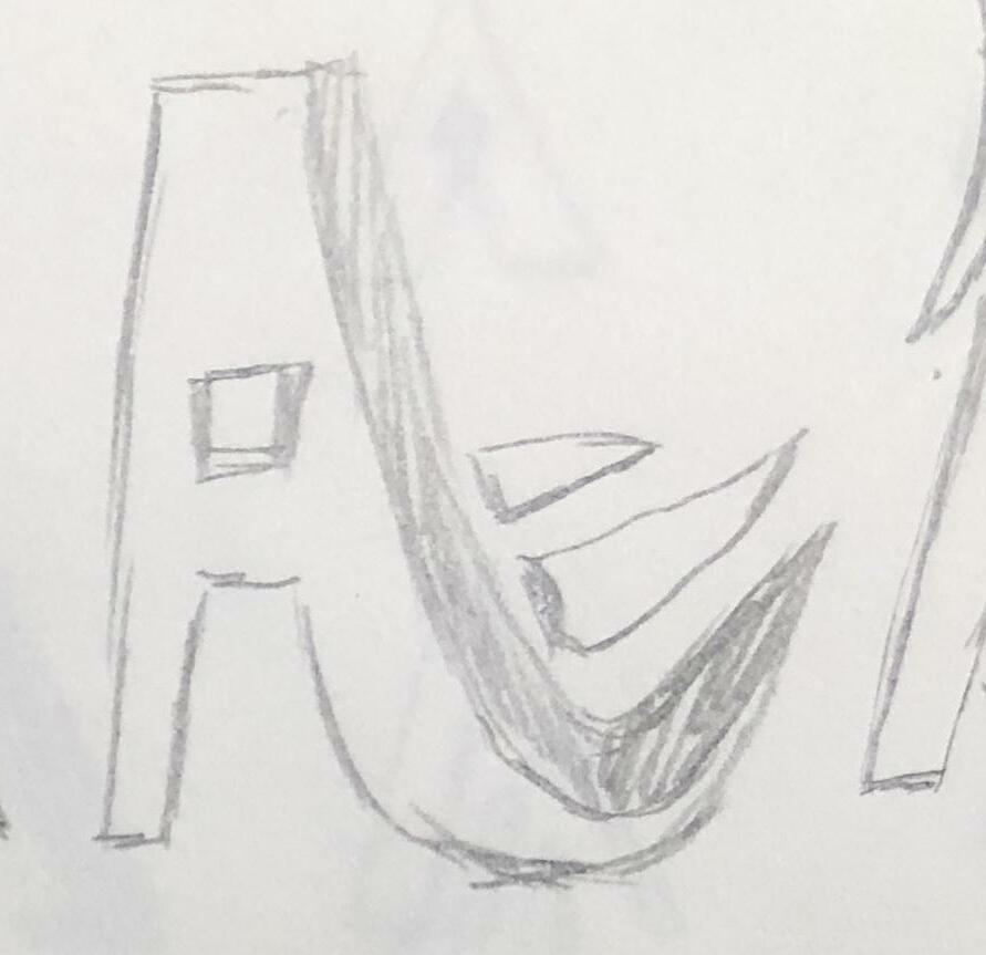
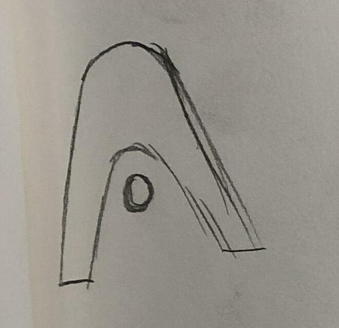
More Sketches & Refinements
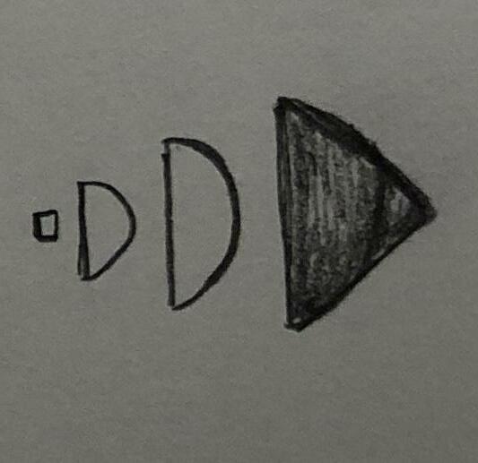
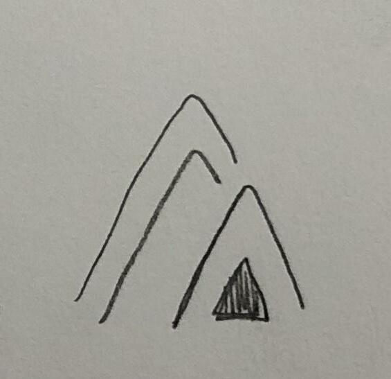
In order to make the letter “A” more simple but dynamic enough that people can easily recognize, we tried more refined hand sketches without the little arrow from the top right. Also, we remain sharp apex of letter A to avoid the similarity of Helvetica “A.”
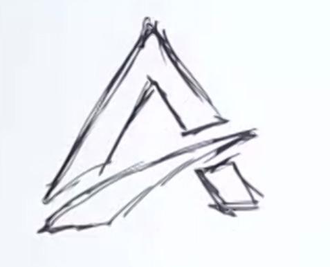
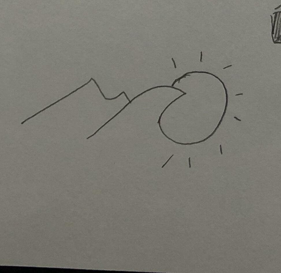
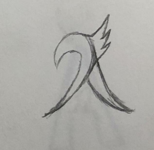
Inspiration
Keep the sharp apex
Delete the arrow
4 Development 2 75
Refined Digital Comps
4 Development 2 77
Color Palette Experiment
PANTONE Orange 021 C
PANTONE 300 C
PANTONE 298 C
PANTONE 192 C
PANTONE 127 C
PANTONE Violet C
4 Development 2 79
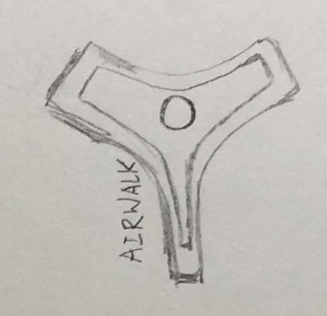
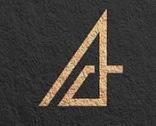
Pairing with Logotype
Final Logomark
4 Development 2 81
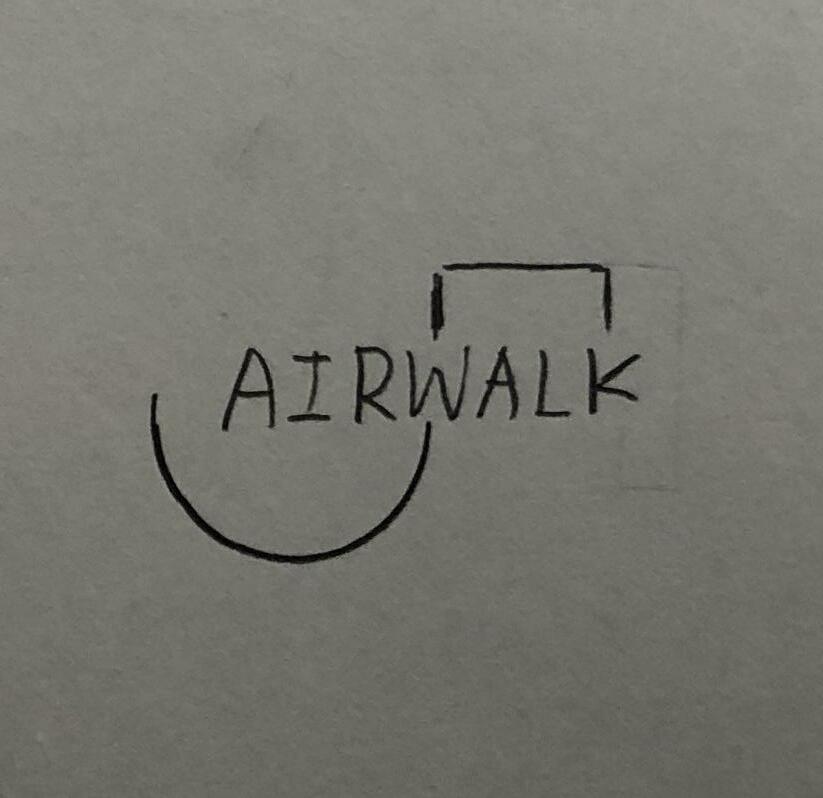
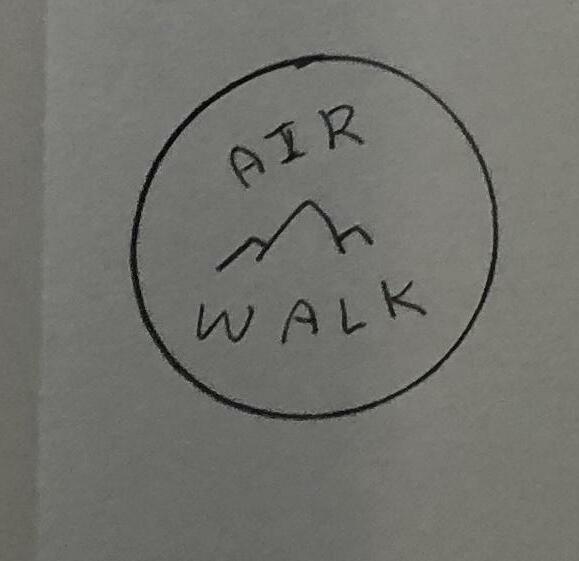
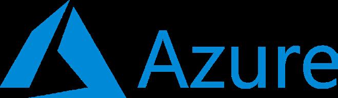
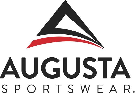
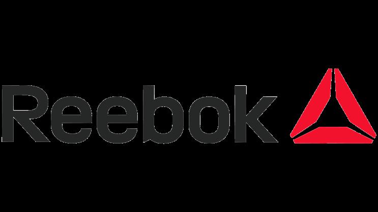
Similar Logos
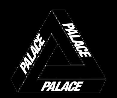
It is important that we look up similar logos before we design logos. This exercise helps us understand and consolidate our logo design to make sure that it is not already being used in the market. On the other hand, as a designer, we should avoid creating plagiarized work.
4 Development 2 83
Similar Logos
4 Development 2 85
5 Visual Inspiration Visual Inspiration Next Step
Visual Inspiration

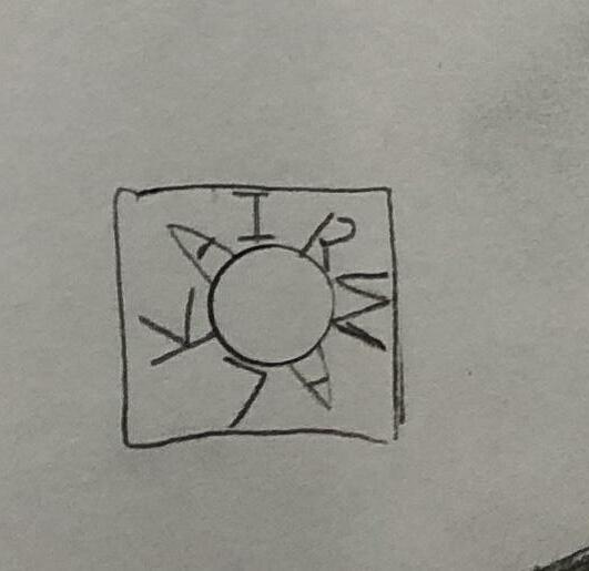
For the next coming page, we will do some exercises about visual inspiration of brand identity. In order to rebrand a solid image for Airwalk, the research of inspiration is a vital step that helps me to identify how good brands present their logo application.
1. New Identity
In Emploratorium’s visual identity, they capitalize the word “DNA” which makes me feel they are different. They want to create a depth of their brand and give energy and intrigue to their audience.
2. Logo Anatomy
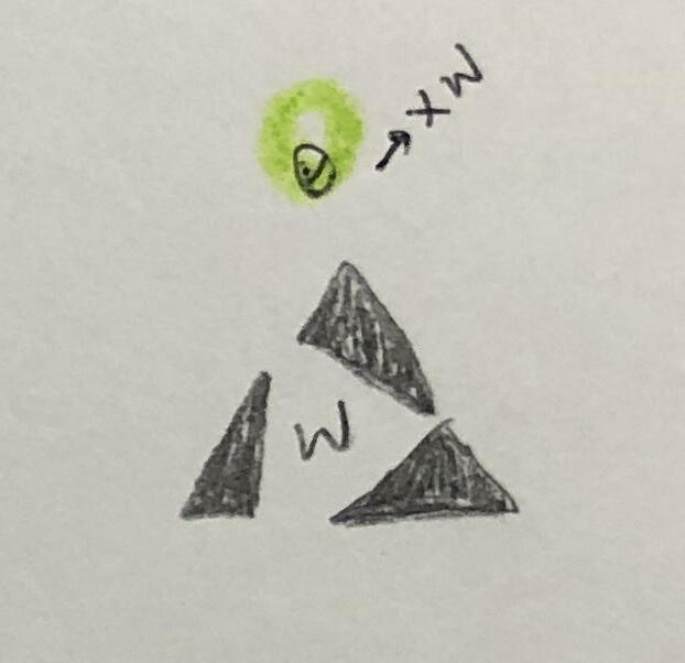
For this aspect, I will go over Gap’s logo. Gap’s logo clearly demonstrates the usage of spacing and proportion. The indicator “x” clearly shows the vicinity of Gap, Banana Republic and Old Navy. Not only that, the capital “G” also includes the corporate signature which makes the logo itself more unique.

89
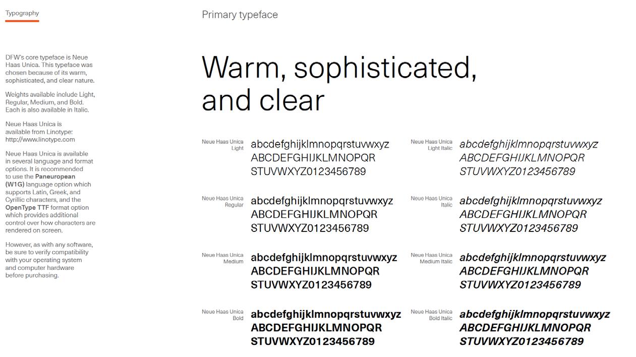
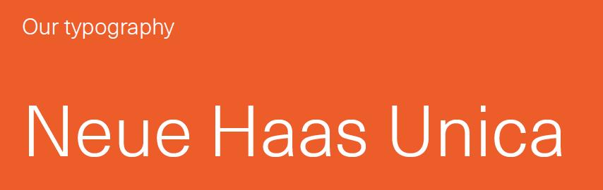
3. Type Specs
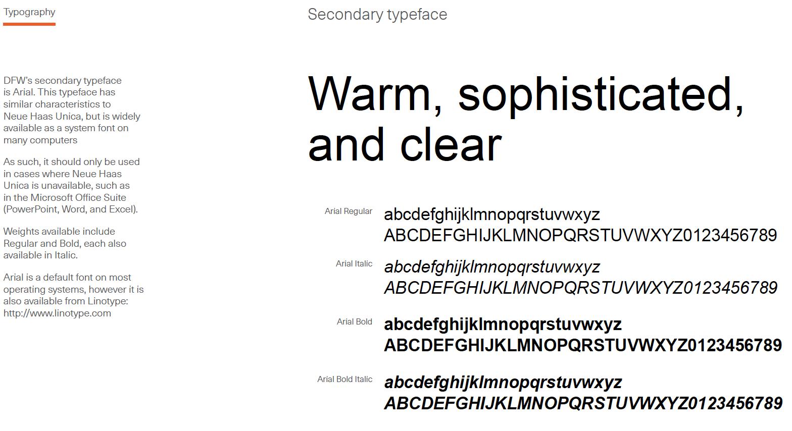
DFW did quite a good job in terms of typography. According to the typeface’s personality, DFW chose Neue Haas Unica and Arial typefaces to use. These two typefaces are warm, flexible and pairable. Also, DFW gives more detailed information on the different weights of fonts that they apply.
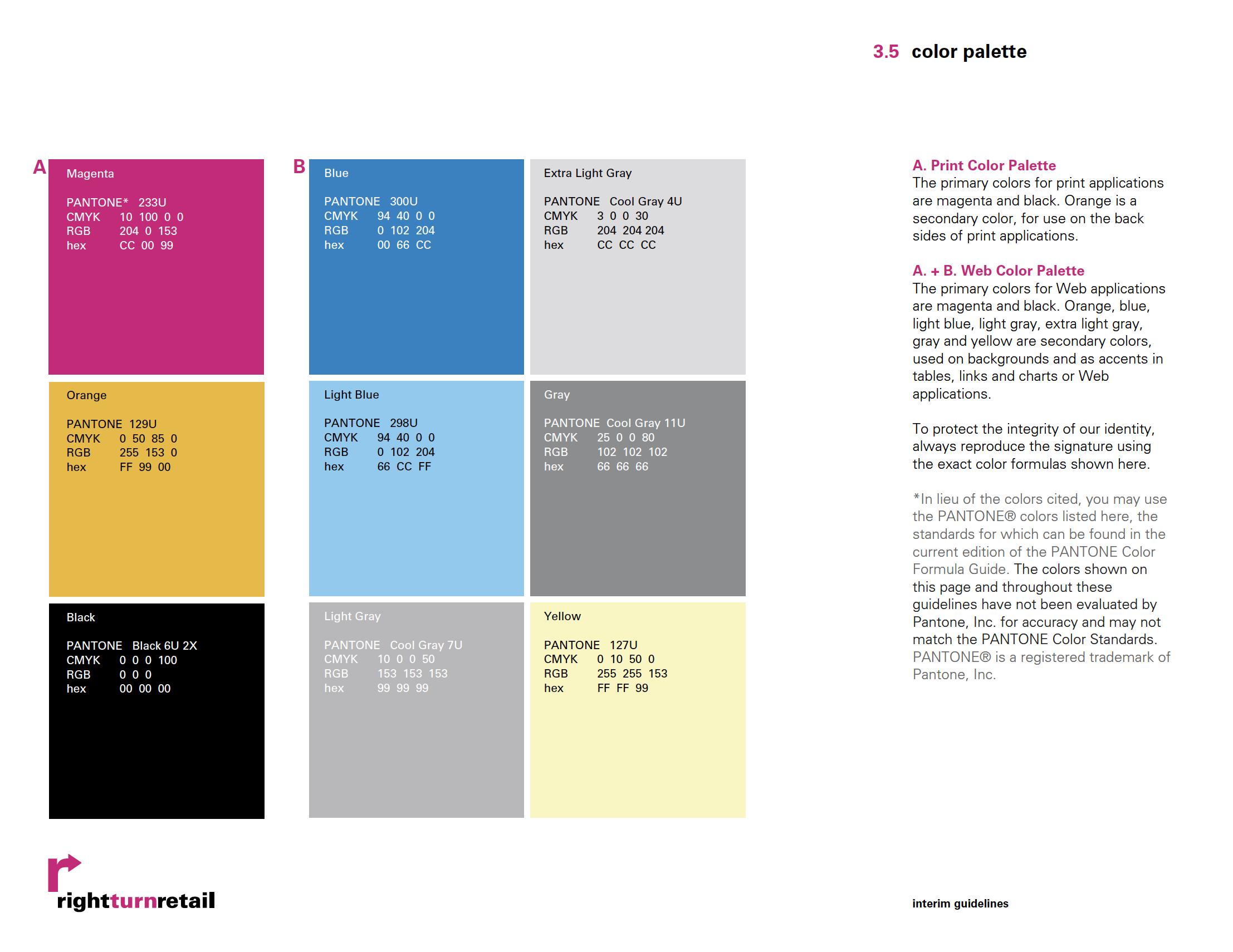
4. Logo Colors
Rightturnretail’s color palette works quite harmoniously. It elaborates on printing colors and web colors which gives more understanding for other designers to use. Also, it reminds designers of using Pantone Color Standards to examine colors.
91
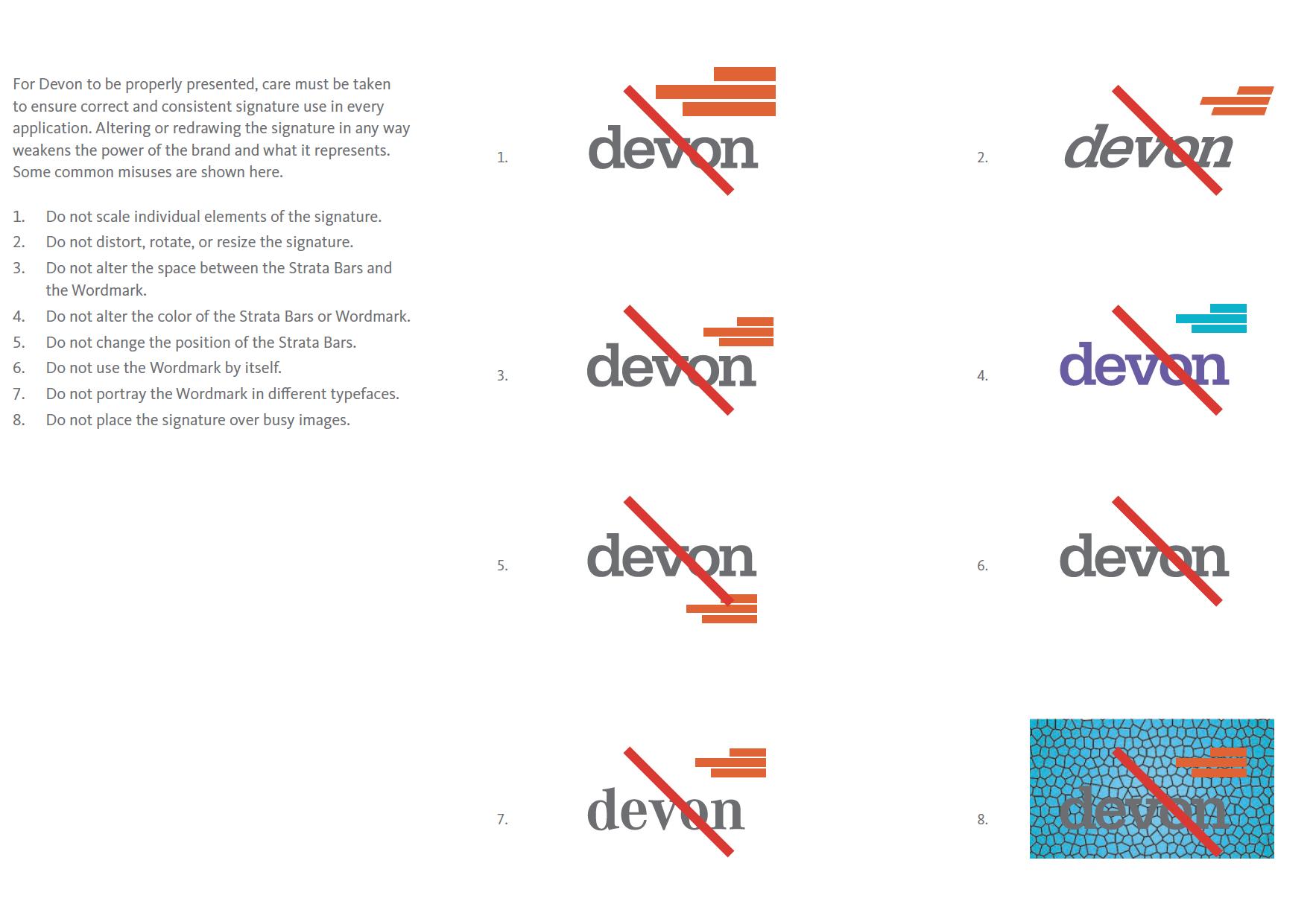
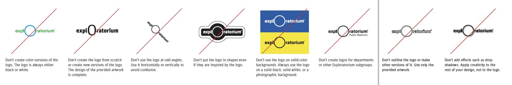
5. Logo Don’ts
Emploratorium clearly presents that their logo shouldn’t be used in some different ways. It includes color, proportion, odd angle, odd outline, wrong tagline position and drop shadow effects. On the other hand, Devon also showcases different types of unacceptable logo usage nicely for their brand. In order to protect a brand, we need to ensure the consistency on any design deliverables.
6. Alternate Versions of the Logo
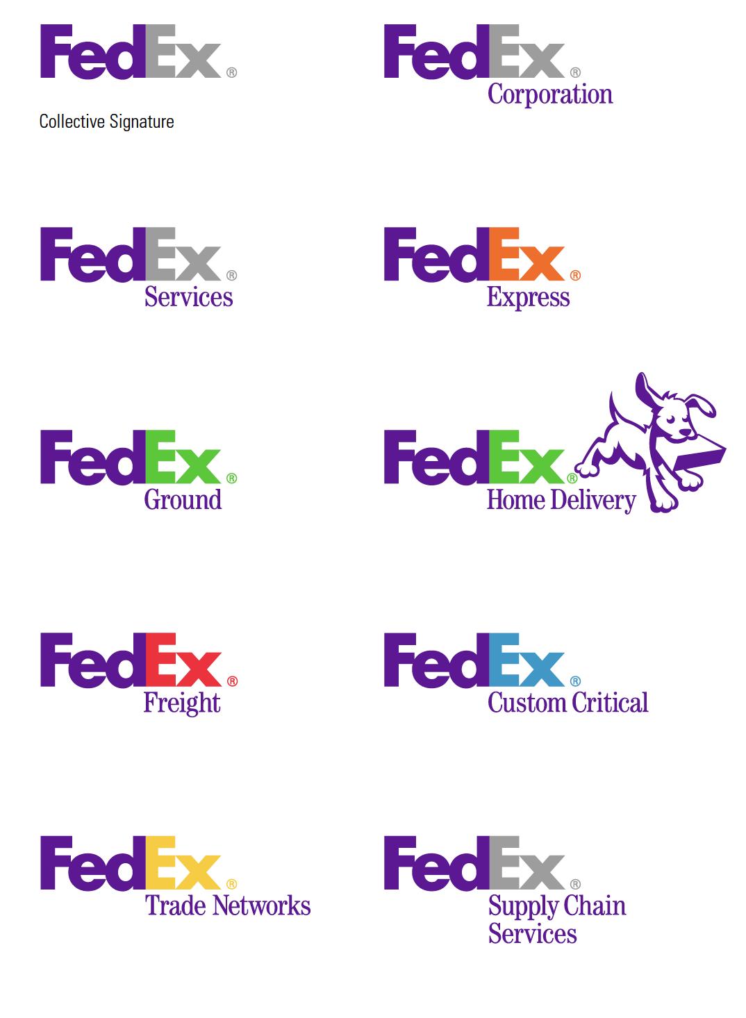
FedEx is a good example that shows different versions of alternative logos. It uses different colors, typefaces, positions and graphics to distinguish different departments. We can see that the tagline is always below the word EX which doesn’t influence the hierarchy of the entire logo.
93
Next Step
In this book, we probed and experimented different possible personality on our new logomark. Using our new brand mission and keywords, it guided us into right direction to sketch new marks. Now, we have the refined logo. Then, we will move to the third book—Visual Standards Guide in this series which is also the last book in this rebranding journey.
This is student rebranding project. Any content here are only for educational purposes and non-commercial use.
95
This project is only for educational purposes