

The following file documents works by Buro None, a Los Angeles–based interior design studio specializing in residential projects.
Bureaucratic Program
The program of Buro None entails the erasure of the perfectly curated designer’s recognizable style. The focus is shifted toward those who occupy the space. In procedural terms: the interiors are not about the bureau, but about the inhabitant.
Bureaucratic Statement of Purpose
The work of Buro None strives to situate the positioning and coordinates of interior life. In a way, it can be said that the interior doesn’t exist. Interior is a carved out, negative and excluded space in a volume of a house. We inhabit this exclusion and this exclusion is a focus of the work of Buro None. In making the inside out, the work of Buro None is delineating this emptiness.
Etymology
The name “Buro None” as a homophonic spelling of Bureau Number 1 or №1, is taken from the Soviet lineage of design bureaus, which were design institutions in the USSR. A bureau was officially identified by a number.
“Buro” is pronounced just as “bureau”, like a piece of furniture or the derivative from bureaucracy. №1 is pronounced as “None” and as such, nulls the number 1 by bringing it to 0, which perhaps may render this design “Bureau”, in particular, as non-existent.
Form 1A: Rebate Application
Document Type: Letter of Response
Filed in response to: “Mission Critical”
Author: David Lipton
Publication: The World of Interiors
Date: 28 May 2025
The World of Interiors’ call to make room for debate within the interiors industry feels timely— but just as urgently, it must make room for a rebate. Saying “we owe criticism to ourselves” risks implying that decoration still isn’t enough—that it must work harder to be taken seriously. Yet the industry has long paid more into the creation of a home than it has ever received back. A rebate shifts the frame: from what decoration owes to what is owed to it—a partial return on what it has already given.
Decoration is often ostracized from critical discourse. To claim a rebate is to ask why this field remains pushed to the periphery of intellectual questioning. The task now is to turn critique back on its critics—not to defend itself, but to reveal the fragile authority of the frameworks that marginalize it. Its strength lies in refusing that authority, not in apologizing to it.
What if decoration is not taken seriously not because it lacks rigor, but because it reveals the instabilities of the very disciplines that dismiss it? What if it doesn’t aspire to climb cultural hierarchies precisely because it quietly undercuts their illusions? What if it is more radical than the established fields it unsettles?
Hence, if this is to be a substantive debate, the question is whether we are engaging in genuine critique, or simply staging another symbolic -fetishistic exchange that submits decoration to borrowed narratives of legitimacy.
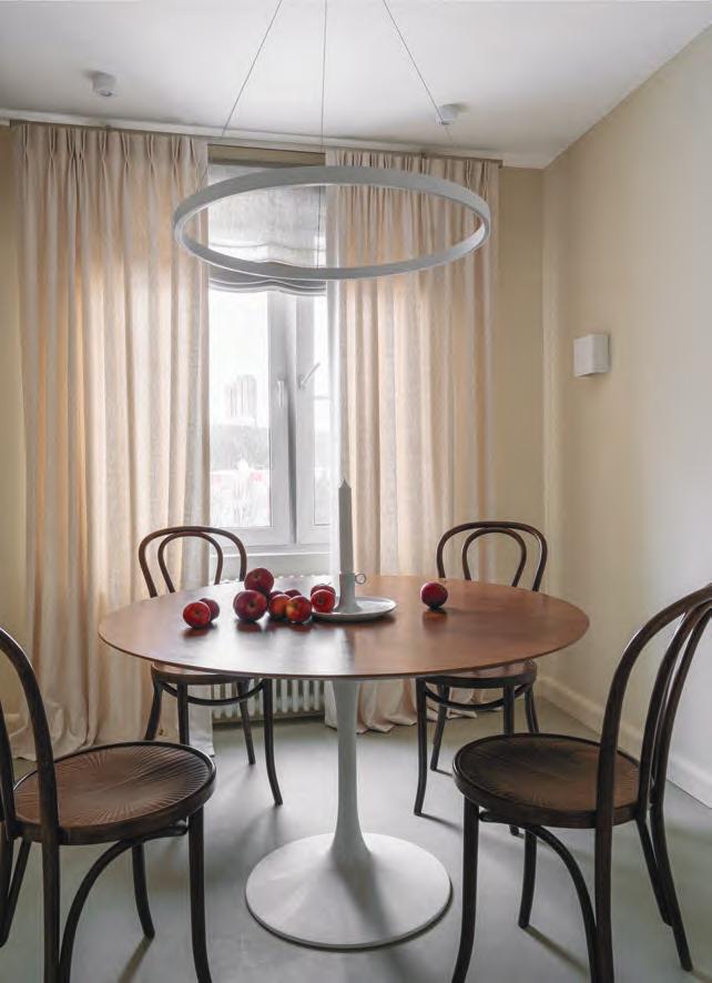
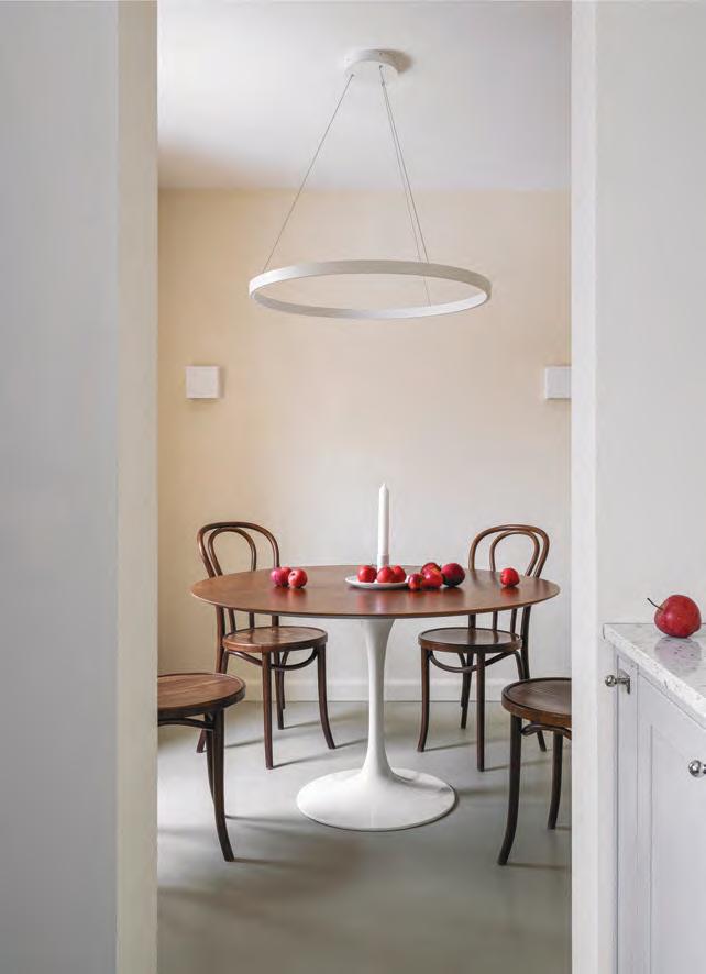
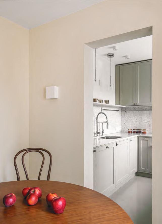
The 65-square-meter (approximately 699-square-foot) Moscow apartment is set in a residential building type II-49, the nine-story multi-sectional paneled house, the series of which was developed by MNIITEP. These houses were released between the years of 1965 - 1985 and are quite widespread (in the bedroom communities/sleeping areas) on the territory of central Russia. The apartment plan puts tight quarters to work: usually a small kitchen and a bathroom, two tiny bedrooms and a modest sitting room.
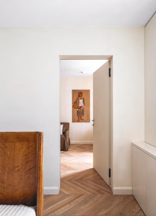
Unchallenging and unassuming, with little to none grand gestures, the quietly austere design of this home synthesizes the fashion on minimalist classics with a deep interest in the Biedermeier aesthetic period. Small, cozy and friendly, this honey-walled interior requires a bit of ingenuity to carefully accentuate the space. Instead of tearing down the walls and creating an open plan, preserving the
apartment’s original layout with a humble number of distinct zones and ample storage offers a sense of movement without feeling compromised on space.
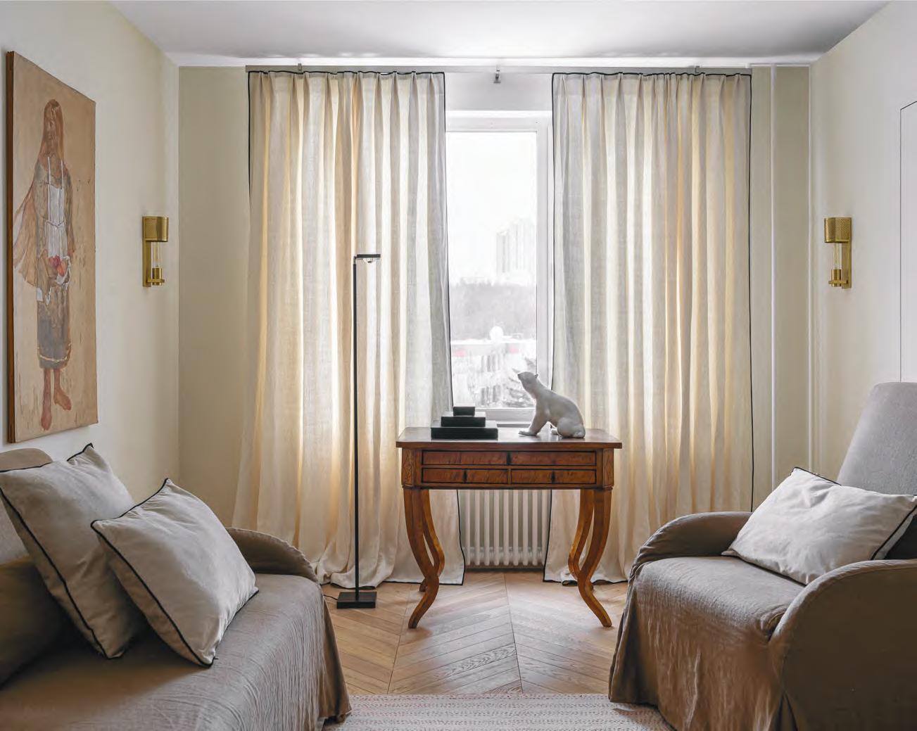
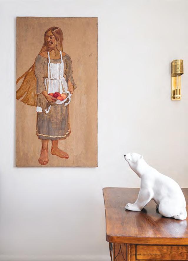
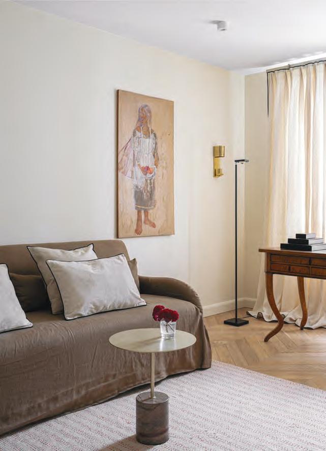
The sitting room which is looking out over a parkland is coined by an early 19th century inlaid Regency table – which holds a large white 1960’s Lomonosov Porcelain Factory bear – with a seating area along both sides. The table top was marbleized in black
which and, as jokingly suggested by the local antique shop, could perhaps be used for dissecting frogs. The marble top was removed under which an original wooden countertop was revealed and restored. The Regency table is backed by full-length curtains edged in black. The swirled hardboard background of the painting called “Blushing” by Olesya Glazieva brings the walls of the sitting room alive.
The palette throughout the apartment mixes reds, greens and soft neutrals with the woodwork taking on the surrounding colors of floors or walls to dissolve the boundaries of the two.The uninterrupted sightline from room to room helps the spaces of the sitting room, the bedroom and the office feel a bit more large. Both the bedroom and the office open up to the sitting room.
This carefully considered apartment interior proves that small dimensions and style aren't mutually exclusive especially when style is the main narrator which creates a split in the homogeneity of the typical Soviet apartment building by displaying the aesthetic standards of Biedermeier in the sleeping quarters of Moscow - the air of light and calm, affection and sensibility, moderation and modesty along with a state of cosiness and friendliness.
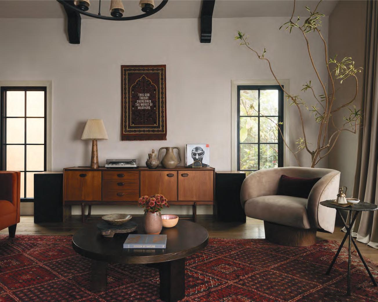
Tucked in the historic West Adams neighborhood of Los Angeles, this home began as a flipped fixer-upper—a blank, almost echoing space. The homeowners brought with them a rich South Asian heritage, a deep appreciation for music, and a love of meaningful detail that shaped the tone of the design from the very beginning.
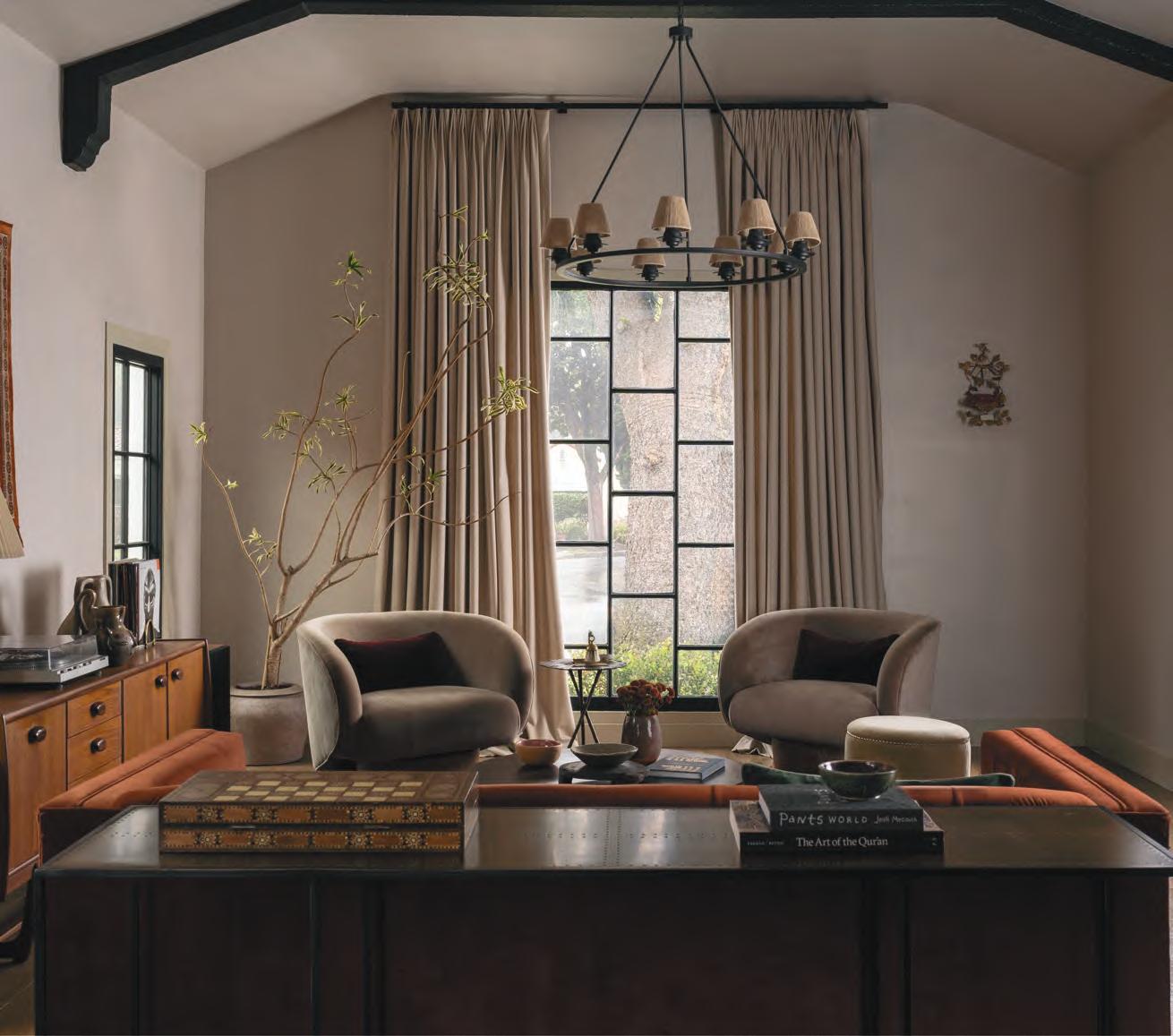
The project unfolded over three years, following an intentionally slow rhythm of decision-making and sourcing. This pace allowed the space to evolve into something layered, personal, and quietly alive. Handwoven textiles, tactile finishes, and deeply meaningful artwork were introduced gradually. Much of the art was already part of the homeowners’ lives—pieces with emotional weight and history—while others were found during the process and became quiet centerpieces in their own right. A palette of earth tones, blackened metals, and soft matte surfaces recurs throughout the home like the refrain of a piece composed in free time—unhurried, loosely structured, and rich with subtle transitions.

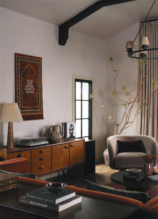
The interiors are softly layered, like an unfinished thought. They were never meant to speak loudly. Instead, they drift—like music without bar lines, where rhythm arises from intuition. A mid-century credenza holds a turntable and a quiet arrangement of ceramics. Above it hangs a prayer mat by Samira Idroos, a textile artist whose work explores identity, memory, and cultural inheritance. The
piece—rich in pattern and inscribed with a poetic phrase—serves as both visual anchor and quiet provocation, drawing the eye without dominating the room. Velvet seating in rust and deep plum doesn’t announce itself, but settles into the light. Every object, every material, every palette choice was selected for how it would live over time.
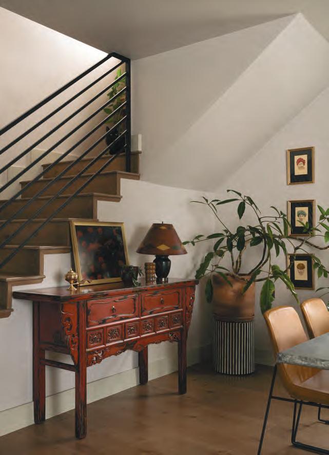
In the dining area, a red Chinese altar table brings sculptural depth and patina to the space. Atop it, a grouping of objects is anchored by a striking piece of artwork by Simrah Farrukh, an American–Pakistani visual artist whose work adds emotional resonance and cultural depth to the vignette. Just beyond it, three framed portraits purchased in a store in Bangalore add a personal, collected feel and complement the earthy palette of the space.
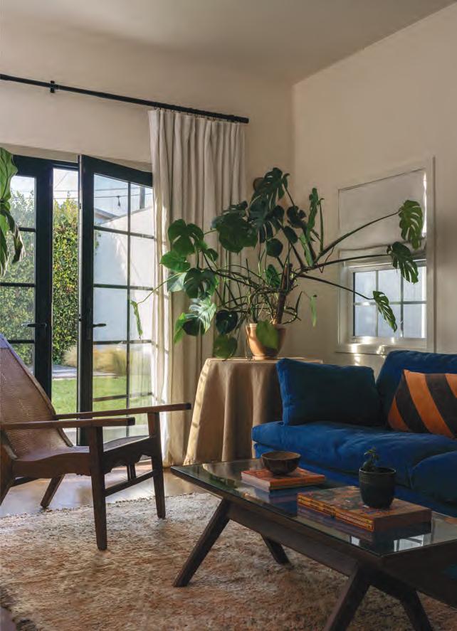
The family room adds the most volume. A deep denim sofa grounds the space, flanked by rust-striped pillows and a sculptural cane lounge chair. Lush greenery adds movement, while a piece of South Asian artwork on the wall introduces narrative energy. The piece above the denim sofa in the TV room is by James Jean. The room is meant for gathering, but remains consistent with the house’s overall restraint—expressive without becoming performative.
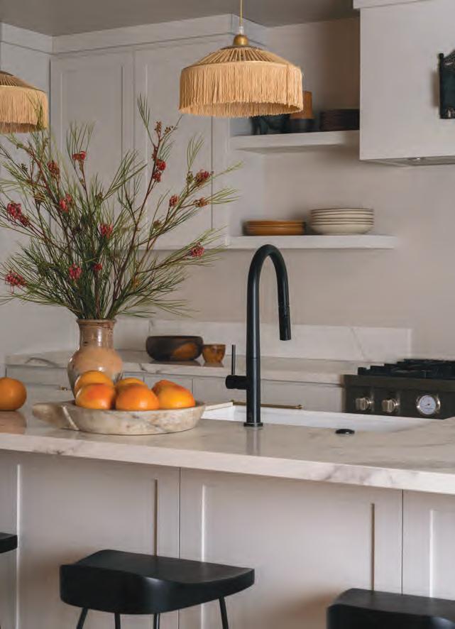
The kitchen continues the quiet sense of composition. Pale cabinetry sets a calm backdrop, open shelving holds clay vessels and everyday objects, arranged with a kind of gentle utility. Woven fringe pendants add texture overhead, casting a warm, softened glow.
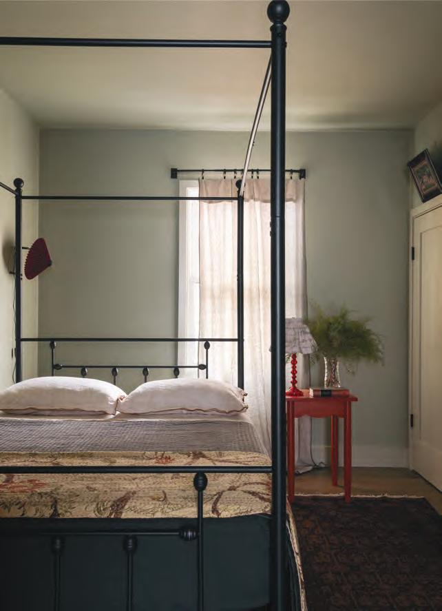
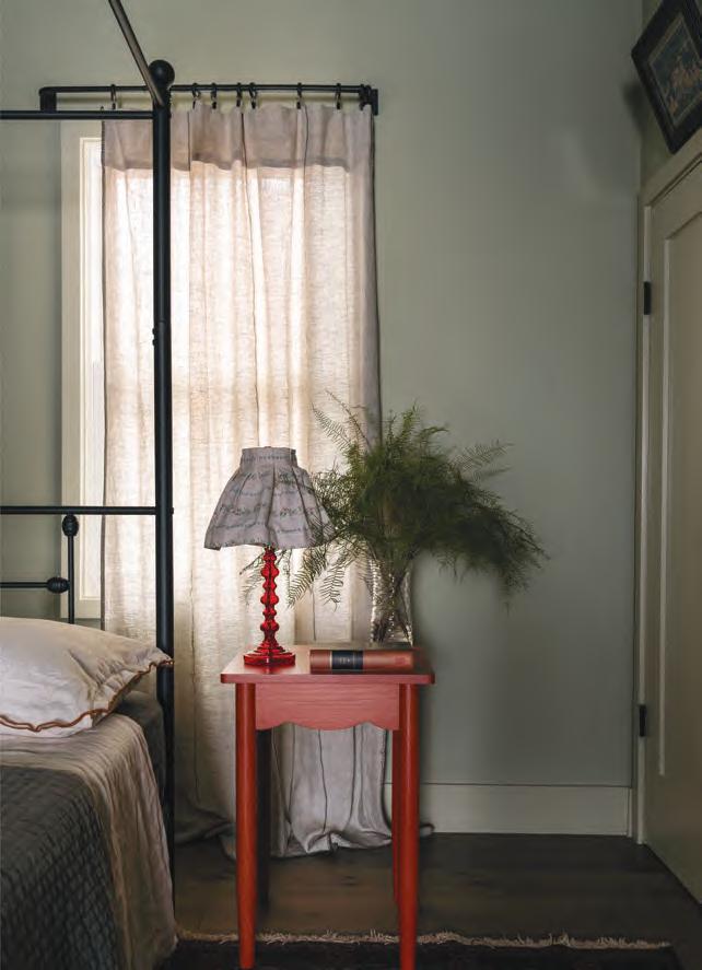
The small guest bedroom strikes a quietly graphic balance—spare but not minimal, with color used deliberately. A matte black canopy bed gives the room structure, its lines softened by pale linen curtains that filter the daylight. The palette remains muted and calm, until the red bedside table breaks through—a sharp, sculptural accent with a scalloped edge and vintage lamp to match. A wild
sprig of green in a glass vase brings a touch of softness and asymmetry. Underfoot, a Pakistani rug—passed down from the homeowner’s mother—grounds the space as a family heirloom, adding depth and a quiet sense of continuity. Though compact in size, the room feels generous in mood—carefully edited, quietly expressive, and deeply considered.
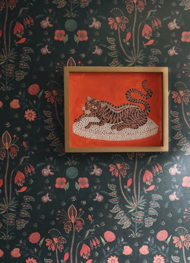
The powder room offers a contrasting interlude. Wrapped in dark floral wallpaper, it becomes a pocket of intimacy. It's a brief, concentrated pause within the overall tempo of the home—slower, enclosed, and slightly surreal. The orange tiger artwork in the powder room is a print by Willa Heart, adding a playful and unexpected burst of character to the space. The primary bedroom returns to softness and
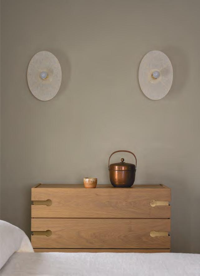
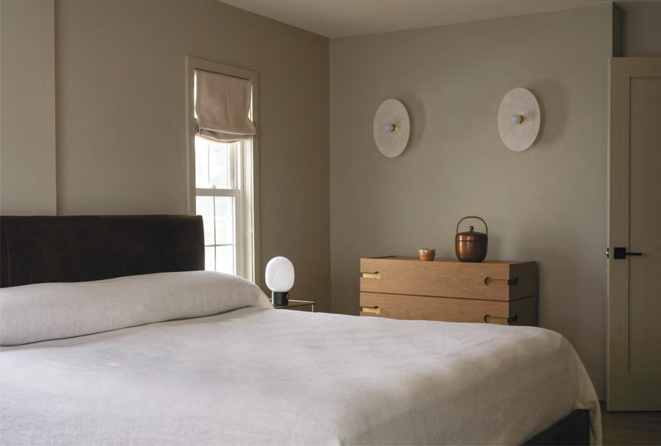
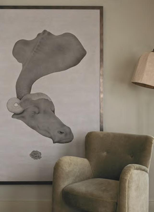
clarity. Linen bedding in muted tones creates a visual hush, while oak furniture and matte finishes add warmth without weight. Wall-mounted fabric sconces offer diffuse lighting, glowing gently at night. A painting of a water buffalo by Awais Naqvi—a contemporary Pakistani artist known for his emotive animal portraiture and realism—sets the tone for the room.
It wasn’t until the home had fully come into itself that its underlying mood became clear. The space began to call to mind Gnossienne, a series of piano compositions by French composer Erik Satie. While others of his time were composing sweeping symphonies, Satie proposed a quietly radical idea: that music in the future would become furnishing—not something to perform, but something to live among.
Background music for dining, for choosing clothes, for simply being. The idea was largely dismissed at the time, even considered absurd. And yet today, the Gnossiennes feel remarkably contemporary: emotionally spacious, structurally fluid, and gently subversive. These pieces were composed without time signatures or bar lines—meant not for performance in the traditional sense, but to be inhabited. They move slowly, guided by notations like lent (slow) and avec étonnement (with astonishment). Instead of commanding attention, they create space.
This home moves in much the same way. It doesn’t ask to be noticed, but it shapes how one feels in the space. It is design not as punctuation, but as tone. Not as show, but as support.
Design here becomes furnishing: a GNOSSIENNE.
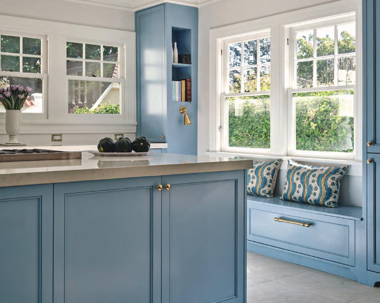
This 1920's Spanish Colonial Revival house is located on one of the most coveted streets of the small community of Spaulding Square in West Hollywood, California. The stewards of this home are avid entertainers and hosts, not to mention that one of them has a professional cooking background.
Needless to say, the kitchen had to be the center of attention with an island being the main stage on which cooking extravaganzas would be performed, flanked on one side with an extra seating nook for the interested and hungry spectators.
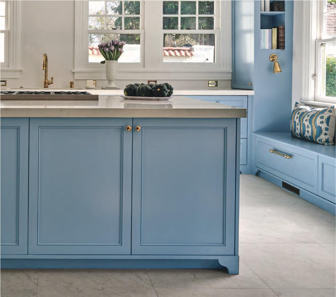
The couple loves blue, gray, and white tones, so this is the fundamental color range of the home that stretches from striking blue in the main kitchen area to the subdued tones of gray in the auxiliary spaces. In search of a statement color for the kitchen cabinets, Lulworth blue of Farrow & Ball caught everyone’s attention as being not only a fresh and bright tone but one which also turns into a deep peaceful hue in the low lit time of the day.
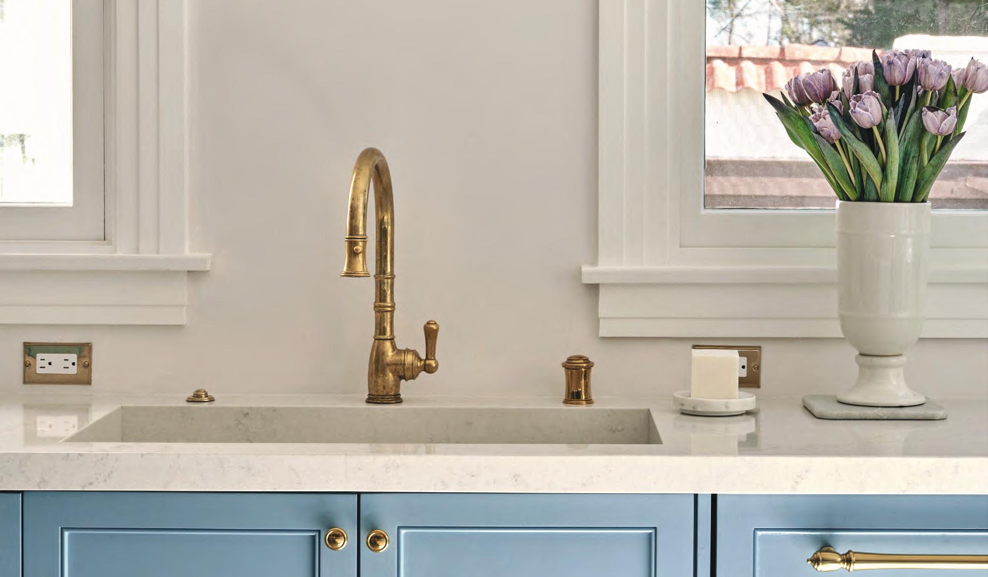
The project took about 9 months to complete. After taking down the kitchen walls and creating the bar in the back of the kitchen, the overall space acquired a seamless flow and a welcoming reprieve much needed for lively gatherings. And in this flow, the blue, centered and lavished in the foreground, is the warmest color.