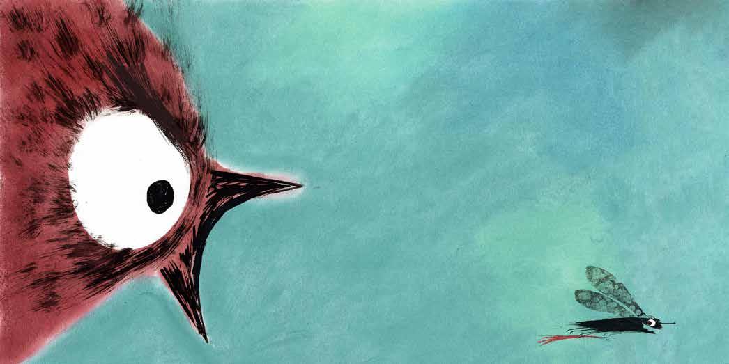
the worldwide picture book illustration competition
the worldwide picture book illustration competition
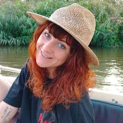
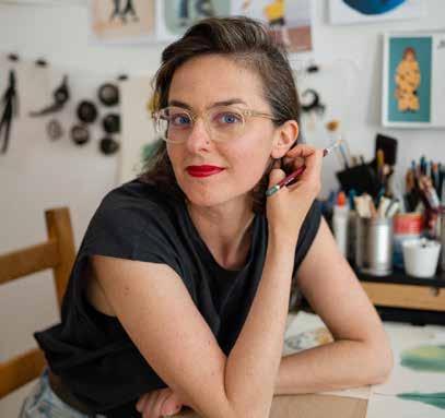
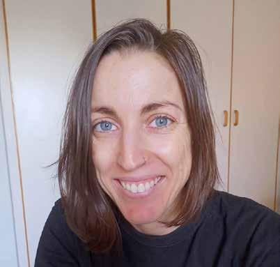
Caroline Rodriguez Velasco
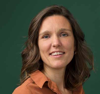
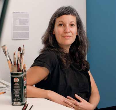
Suzanne Gunnink
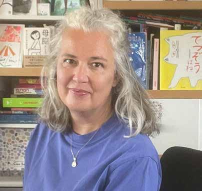
Monica Hajek
GERMANY
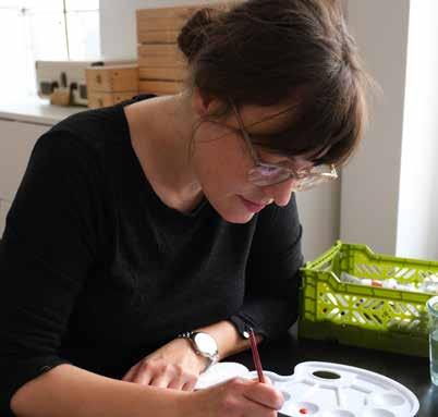
Charlotte Lorber
Clara Gilod
Enikö Gömöri
ITALY
Sara Cuperlo
Sara De Giorgi
Markéta Brecherová
THE UNITED KINGDOM
Lauren Sharples
Megan Knight
Qinzi
SOUTH AFRICA
Lula Pauw
Isabelle Smit
Neil Badenhorst
Copyright: © 2025 Lemniscaat b.v., Rotterdam
Cover illustration: © Clara Gilod
Photographs: © the winners
Picture this! Logo: © Tobias Hickey
Juries:
The Netherlands & Belgium: Jan Jutte, Miriam Bos, Sophie Pluim, Jesse Goossens
United Kingdom: Petr Horáček, Louisa Jackson
South Africa: Piet Grobler, Alida Bothma, Anzette Williams
Italy: Nicoletta Bertelle, Chiara Raineri, Beniamino Sidoti, Sara Saorin ,Francesca Segato
Germany, Switzerland and Austria: Ulf K., Dr. Pauline Liesen, Dr. Paula Peretti
More information on www.wwpbic.com
lemniscaat rotterdam


Caroline Rodriguez Velasco 12
Suzanne Gunnink 16
Monica Hajek 20 GERMANY
Charlotte Lorber 24 Clara Gilod 28
Enikö Gömöri
Sara Cuperlo
Sara De Giorgi 40
Markéta Brecherová 44 THE UNITED KINGDOM
Lauren Sharples 48
Megan Knight 52
Qinzi 56
SOUTH AFRICA
Lula Pauw 60
Isabelle Smit 64
Neil Badenhorst 68
In this catalogue we proudly present the winners of the 2025 international picture book illustration competition Picture this!, with entries from South Africa, the United Kingdom, the Netherlands, Germany and Italy.
From the many entries, juries in these countries chose the three most talented, new and unknown illustrators. The result is an impressive demonstration of the versatility and originality of the picture book all around the world.
Picture books have become a worldwide art form at which many try their hand, from newcomers to more established artists. And with good reason, as picture books are now a cherished part of many a child’s and parent’s world. And in children’s day-care centers, reading picture books is becoming a regular activity, which often inspires all sorts of further activities. In short: the picture book is here to stay!
Nevertheless, getting noticed and finding a publisher often remains a challenge for recently graduated illustrators. That is why publishers, academies and other cultural institutes banded together in 2014 to launch the Picture This! competition: as a platform for upcoming talented illustrators to demonstrate their ability.
To bring the winners’ work to attention, this catalogue is shared online with picture book publishers, art institutes and academies worldwide. Additionally, exhibitions of the work by the winning illustrators will take place in art institutes and libraries in the participating countries. With even an exhibition in the Bilderbuchmuseum Burg Wissem in Troisdorf (near Cologne), which fills our hearts with joy!
On behalf of the juries of Picture This, Lemniscaat Publishers / The Netherlands, Protea Publishers / South Africa, Camelozampa / Italy, Walker Books / United Kingdom & the Bilderbuchmuseum Burg Wissem in Troisdorf / Germany, we wish you much enjoyment and the artists every success!
Jean Christophe Boele van Hensbroek
Lemniscaat Publishers
The Netherlands
and the winners are ...
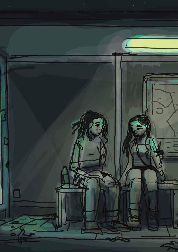
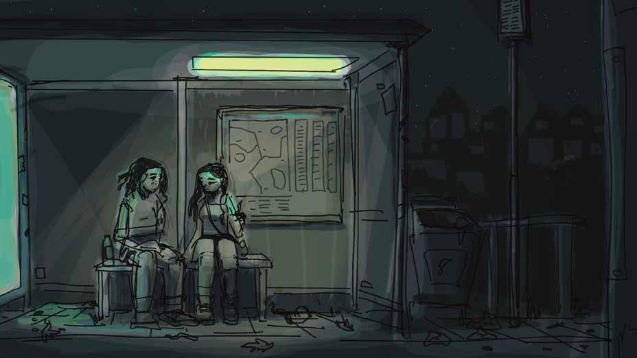
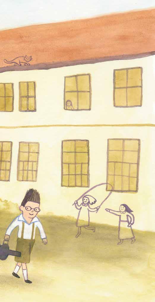
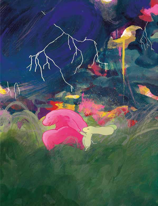
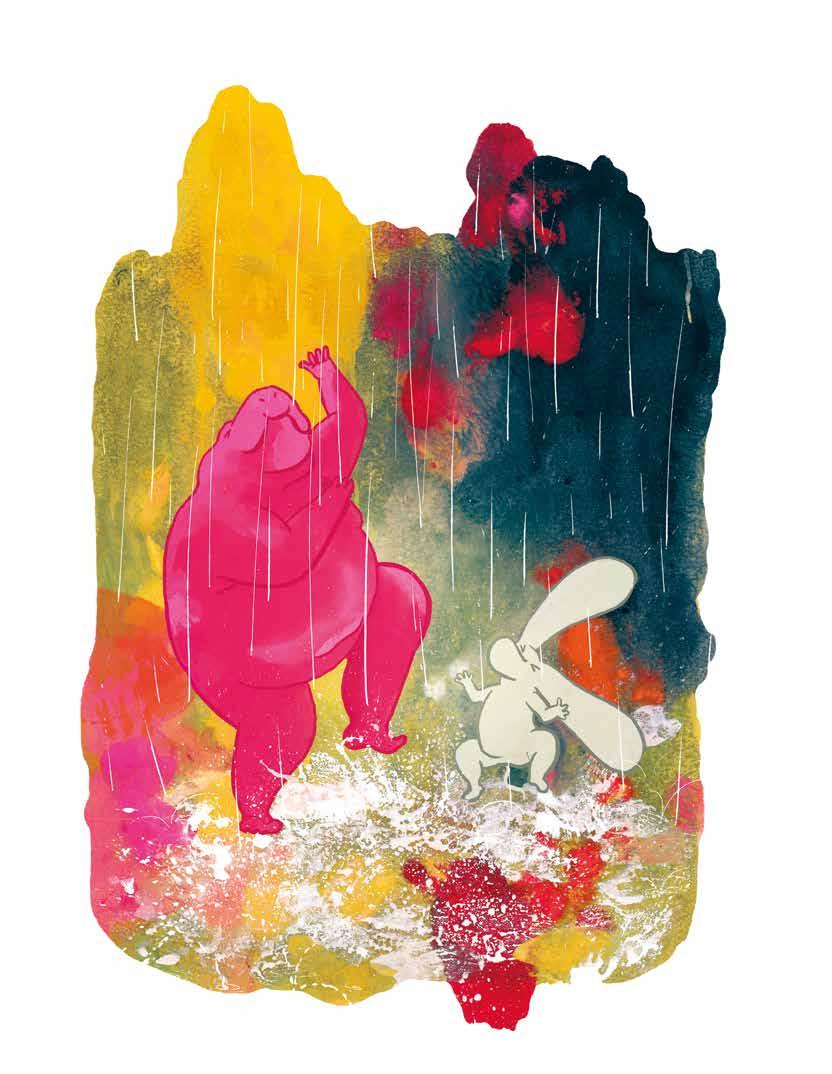
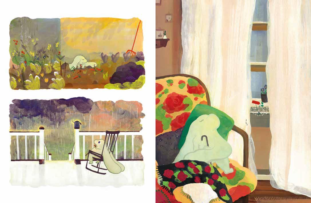
ON A DARK , empty schoolyard at midnight, the main character and her friend Larissa are attacked by bullies. While others have already run off, the two girls stay behind—afraid, but determined not to back down. Later, they sit together in a cold bus shelter. The main character doesn’t want to go home — partly because her father
might see the bruises and get angry, but mostly because home means sleep, and sleep means waking up to another school day where the same bullies roam free. Her biggest reason for staying is Larissa—a girl smaller than her, but huge in her heart. Someone who understands and cares for her, even in the cold night. In a later scene,
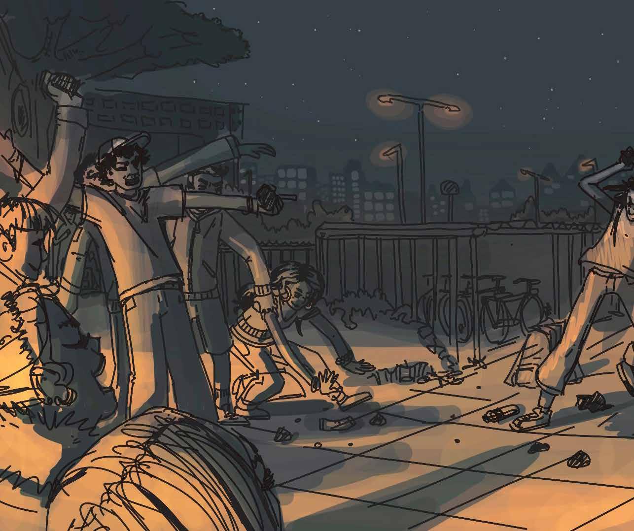
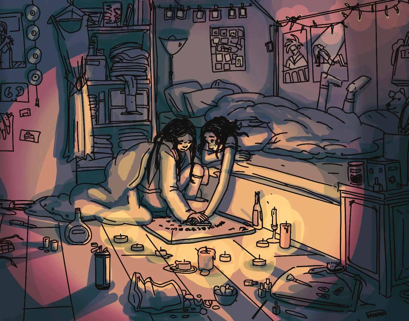
they try using a homemade Ouija board the main character crafted at school. Surrounded by candles, the mood is eerie but beautiful. Larissa fully believes in it; the main character is sceptical. Still, she says nothing when Larissa grabs her hand tightly—breaking the “rules” of spirit communication—because in that moment, the
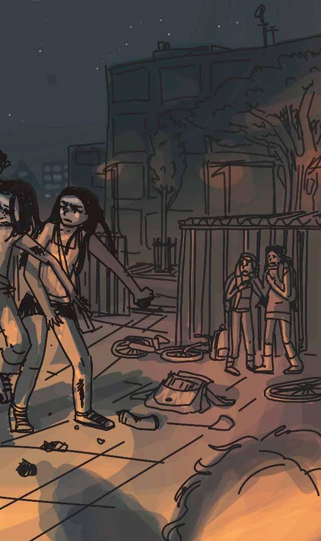
comfort of her touch means everything. Their bond offers warmth and strength in a world where the main character often feels unsafe and alone.
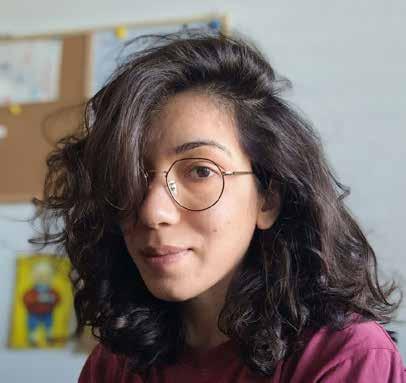
Hi, I’m Caroline. Drawing and animating are my greatest passions and life’s purpose. With a Bachelor’s degree in Illustrated & Animated Storytelling (St. Joost Breda) and a Master’s degree in Animation (St. Joost Den Bosch), I’ve gained extensive knowledge in writing and illustrating compelling narratives. I work in a variety of styles and enjoy exploring a wide range of subjects, but my favourite audience to connect with is teenagers and young adults. My work often delves into the confusing and sometimes uncomfortable aspects of teenage life. I’m drawn to meaningful themes such as love, friendship, difficult home situations, bullying, and insecurity — while also embracing dry humour and sarcasm when the story calls for it.
strraycat wixsite com / portfolio
TECHNIQUE USED This is a digital illustration created in Procreate on the iPad Pro. I use a simple round brush with varying levels of opacity.
JURY REPORT What makes this entry truly special is how the pictures and the story fit together so perfectly. The rough, sketchy drawing style might look messy at first, but it’s actually a smart choice that matches the theme. It’s not neat—but it’s interesting. Every line feels full of life. The creator dares to do something different with a picture book for teens: it’s bold, and it works. The drawings make you feel a kind of quiet tension that stays with you. Light and darkness are used in a clever way to create a mood that shifts between hope and something a bit scary. The result is powerful, deep, and honest—nothing extra, just pure emotion. Every picture has meaning. This book makes you stop and feel—and that’s something really special. It also makes you wonder: What exactly is a picture book? Maybe the answer isn’t always what you expect.
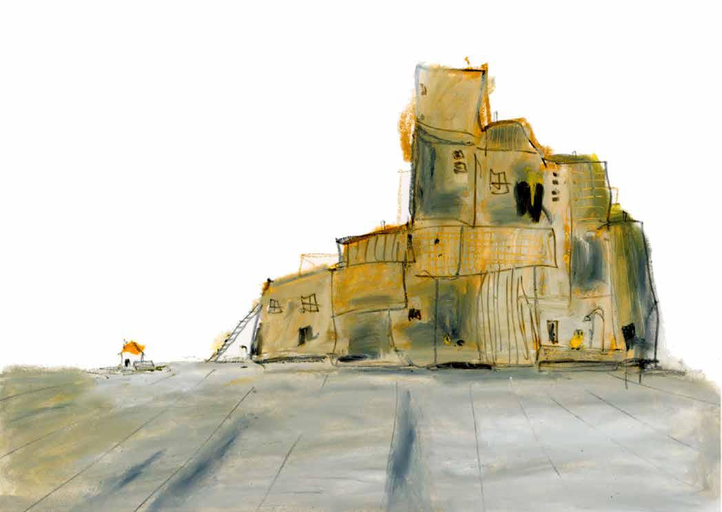
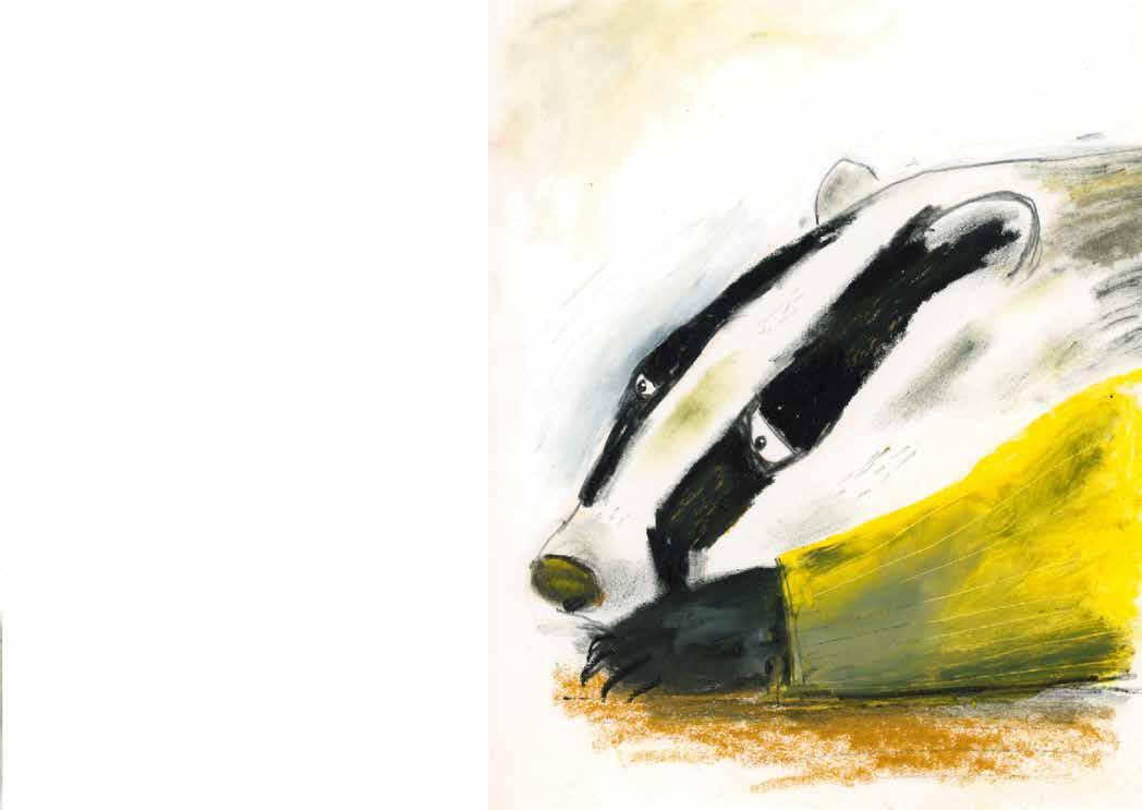
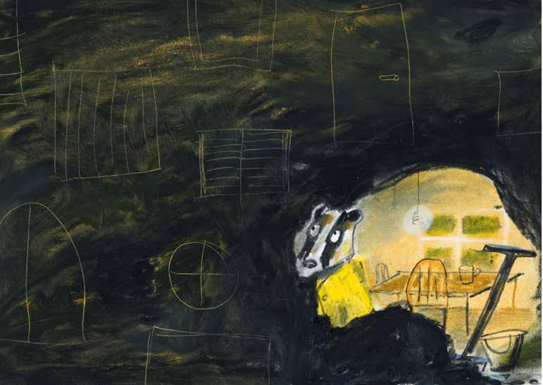
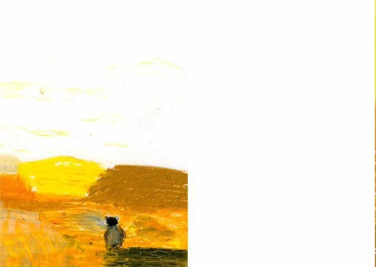
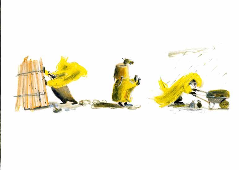
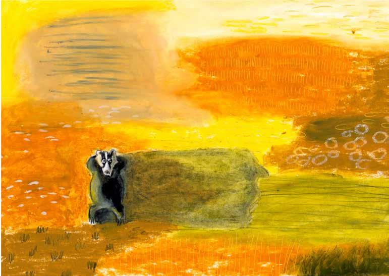
THESE ILLUSTRATIONS are based on a short story by Toon Tellegen from the book The Dearest Wish (De liefste wens ). Each chapter explores the deepest wish of an animal. I chose the story of the badger. Badger lives in a massive house with countless rooms and keeps building more. But one day, he realizes he would rather live in a small hut with just a bed, a door, and a bench outside to watch the sunset. So, he builds that hut on the other side of the forest. The next day, sitting on the bench, he thinks he needs a little shed to store his coat — and maybe another one for guests. Before he knows it, he’s built a huge shed with a hundred rooms. Exhausted, he finally realizes that he doesn’t want a house or even a hut anymore. He locks everything up and walks out onto the open steppe. That evening, he lies down in the grass, watching the small white clouds drift by. If someone had asked him then, “Do you live here now, badger?” he would’ve said, “Yes, come on in, put your coat down somewhere,” and pointed all around him.
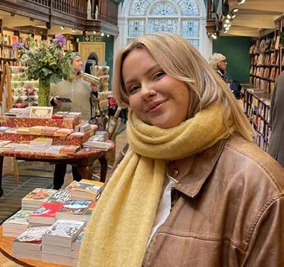
SUZANNE GUNNINK , A few years ago, I decided to return to something I loved as a child: I took my drawing materials out of the closet— and never put them back. I discovered books and podcasts about the creative process, and learned that drawing and painting are skills you can develop, and that making a lot of imperfect work is the only path to improvement. These insights helped me turn illustration into my creative outlet, gave me the confidence to experiment more freely, and taught me to enjoy the process itself. Unfortunately, I never attended art school, so I focus on learning by doing. Online platforms like Patreon are a great source of inspiration, and I’ve taken illustration
courses with Marijke ten Cate and Irene de Goede and a coaching trajectory with Sabine Wisman, both of which have helped me a lot. I’m drawn to expressive illustrations—not too polished, with occasional abstract elements— and work that allows me to put something of myself into it. For me, illustrating is a journey of discovery, one that I believe will never truly be finished.
www suzannegunnink com
TECHNIQUE USED For these illustrations, I used oil pastels and a black pencil.
JURY REPORT What makes this entry stand out is its bold, unique style and the rich, textured artwork. The pictures feel almost real— like you could smell the chalk or touch the paper. This gives the whole book a warm and physical
presence. The artist isn’t afraid of messiness or imperfections—and that’s exactly what makes the work so interesting. It’s allowed to feel rough, to breathe. There’s a lot to admire from a technical point of view: a strong storyboard
and brave colour choices that add tension and excitement. The whole thing feels original and daring. At the same time, the jury sees room for even more polish in the future. This style has great potential to grow even further.
But what we see now is already powerful, full of freedom, and bursting with personality. A striking and truly original piece of work.
MONICA HAJEK
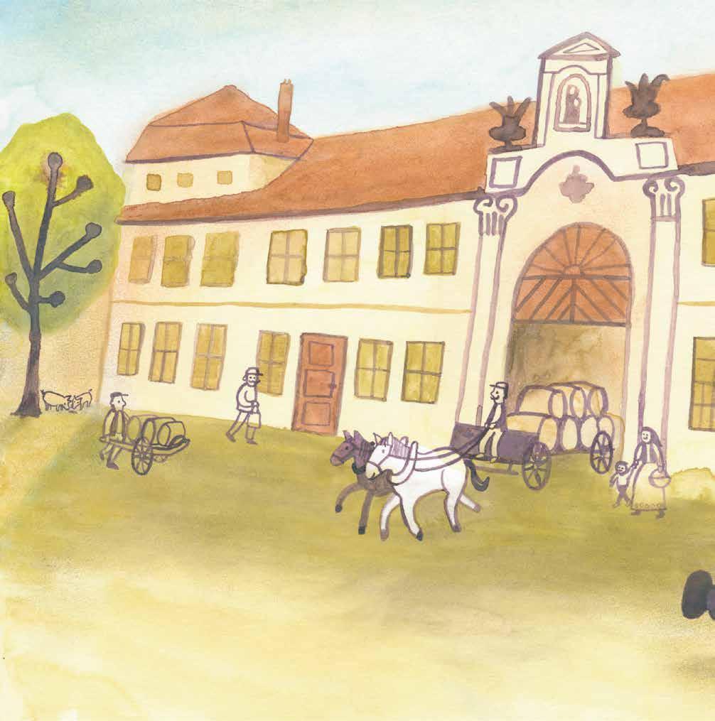
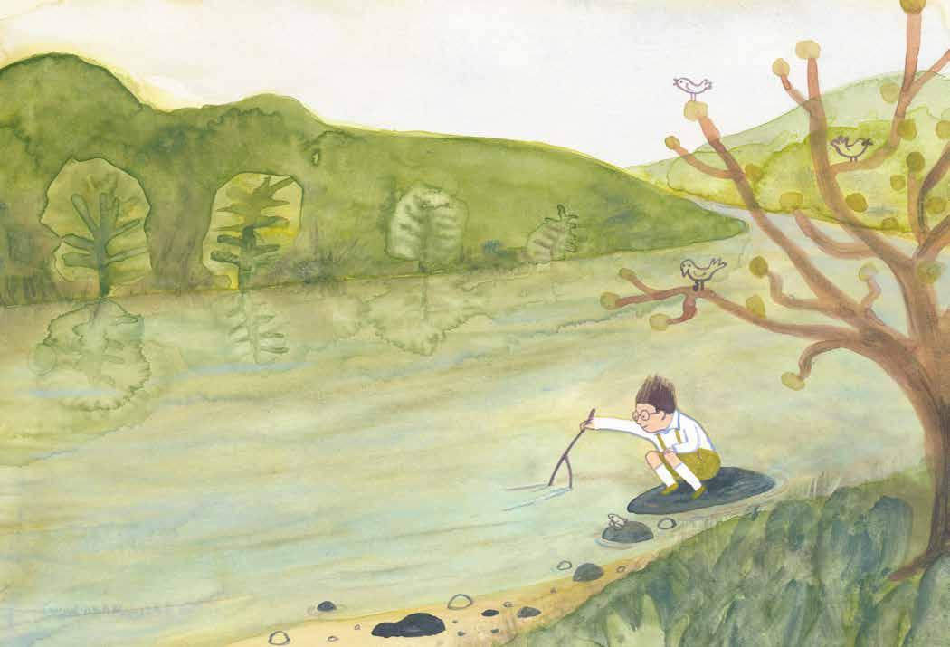
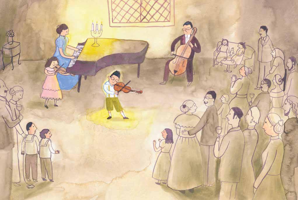
MY THREE ILLUSTRATIONS depict the childhood of Czech composer Bedřich Smetana. The inspiration came when I discovered a handwritten letter from Smetana among my
father’s belongings. That find sparked a journey into Smetana’s life and ignited my imagination. The story follows young Bedřich, who lives in the brewery where his father makes beer. On a busy
day, he sneaks away with his father’s violin to play the song he learned at school that morning. In class, he tries his best, but in his mind, there is always music. Outside by the river, Bedřich listens to the flowing water, birds, and wind—a whole orchestra in nature. Sundays are for celebration: the entire family makes music together. Bedřich and his sister play violin, their father plays
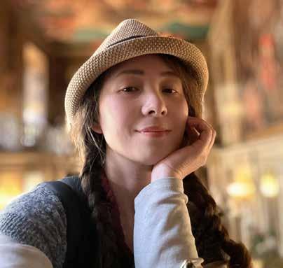
MONICA HAJEK I’ve been working as an illustrator for educational materials for quite some time. In that role, the focus is often on clarity and explanation. However, I’ve long had the desire to bring more imagination, atmosphere, and emotion into my work. That’s why, two years ago, I joined the Venster Academie, where I rediscovered my love for analog drawing and learned how to tell stories through images. Picture books are my true passion. They create worlds where children can get lost and make new discoveries again and again. By taking part in Picture This, I want to show that I’m ready to present my work to publishers.
www instagram com / mohajek
TECHNIQUE USED Watercolor, ink, and pastel.
the cello, and their mother plays the piano. Sometimes, the whole village comes to listen, and they give a real concert.
JURY REPORT This entry stands out because of its strong storytelling and unique, recognizable style. The artist uses a consistent visual language that brings the story to life in a powerful way. Every page is fully coloured—there are no empty white spaces—which creates a rich and immersive rhythm throughout the book. The compositions are well thought out and work beautifully within the picture book format. There’s a lot of movement in the images, which makes the story feel lively and full of energy. If you look closely, you’ll spot subtle figures in the background that add extra depth to the story without making it feel crowded. The main character is especially intriguing and stays with you after reading. Altogether, this entry gives off a strong sense of originality and style. It feels professional, bold, and truly one-of-a-kind.
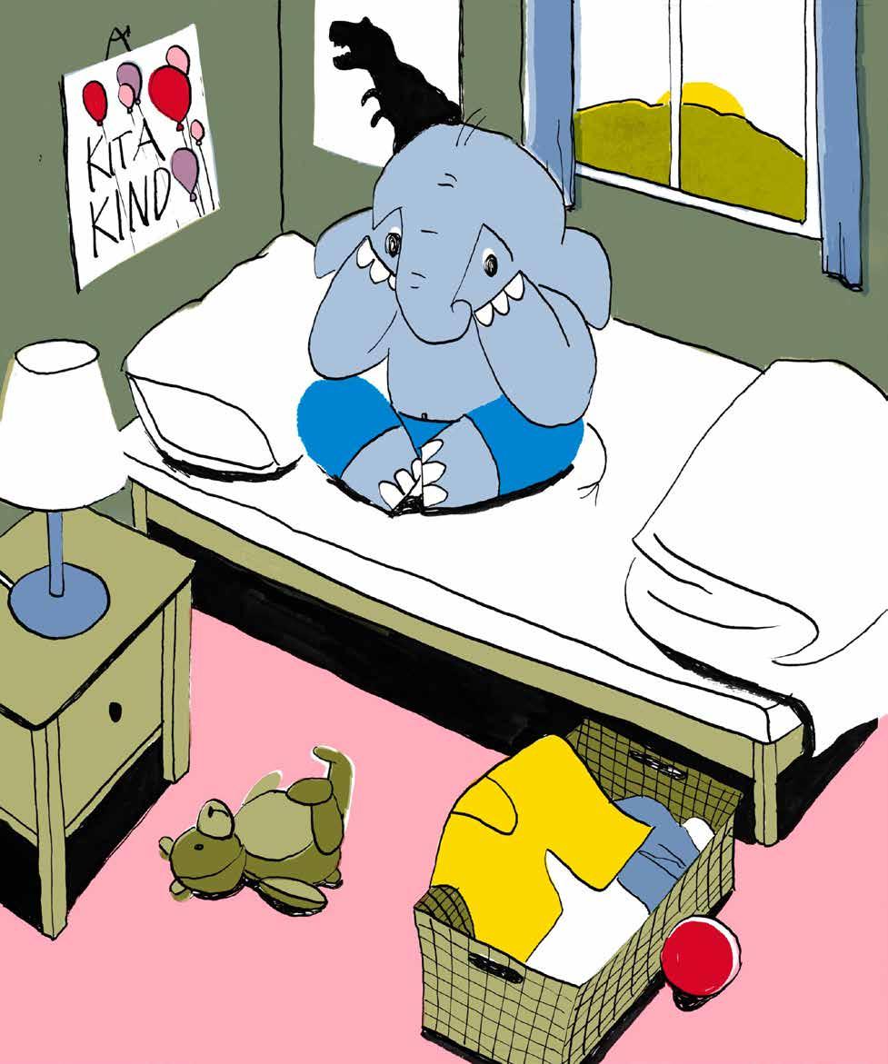
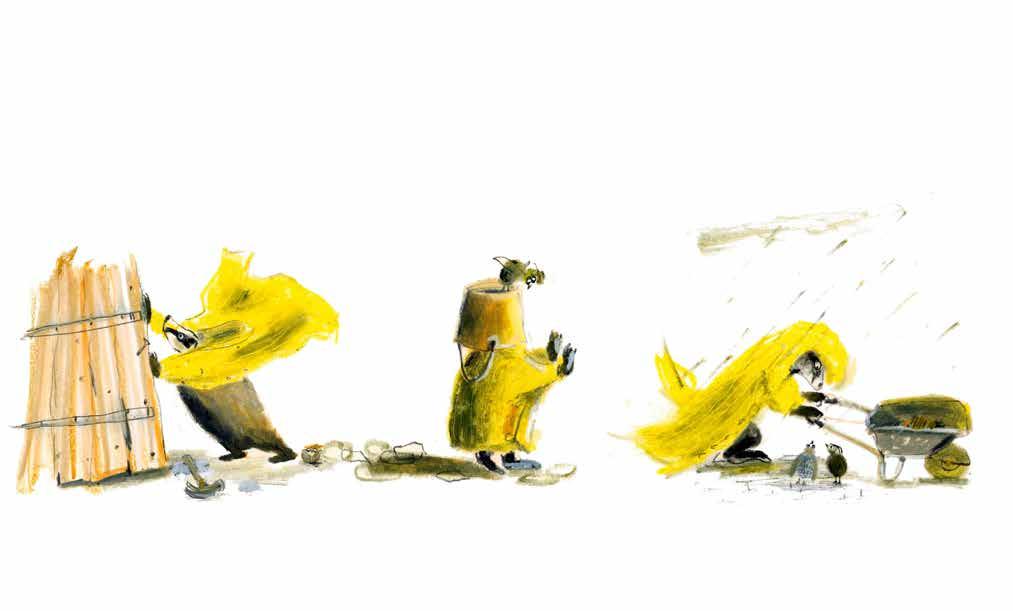
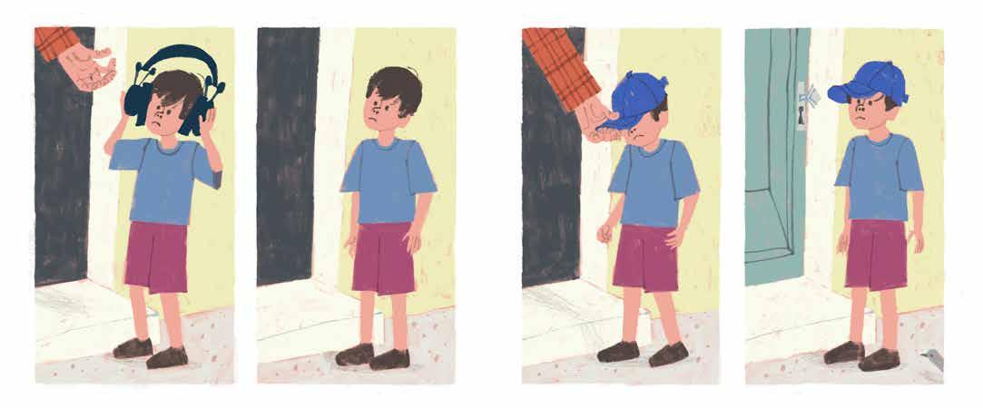
mochni finally wants to make a friend at his kindergarten. He takes a talisman to help him: a pair of yellow pants that he puts on his head like a magical crown. His mother has her doubts about this plan, especially as they are already being eyed sceptically on the way to kindergarten. At kindergarten, Mochni is laughed at first and, much to his chagrin, he has to continue playing alone. His magic crown doesn’t seem to work. However, something happened when the children laughed at Mochni’s crown - a piglet wet his pants and now hesitantly asks Mochni for help. Now Mochni has to decide whether to help the little guy and save him an embarrassment... In the end, Mochni has made a new friend, has become a pioneer in fashion and the next day the pig family’s household is missing another pair of pants...
CHARLOTTE LORBER I studied Drawing and Painting for one year at university, but I‘m mainly self taught. Being active in the Urban Sketchers Community while working in a German Publishing House I learned that most exciting styles are found in picturebooks. And so I decided to train myself as an illustrator through several workshops, reading books and doing first commission works (no published picturebook yet).
www charlotte - lorberillustration com
TECHNIQUE USED The lines were drawn in pen and ink, somewhat in the style of Roger Duvoisin, whose midcentury style books (Petunia, Happy Lion) I really like. There are only 6 basic colours, from which I have digitally mixed further colours by overlaying them, also similar to Duvoisin.
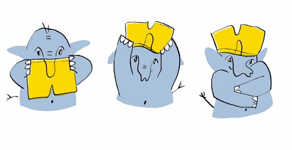
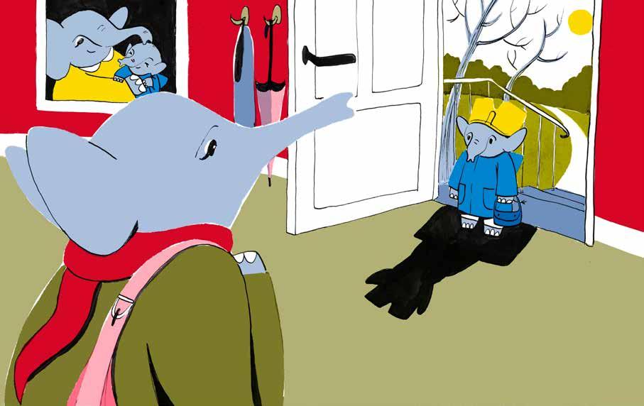
JURY REPORT Mochni is a little elephant who has been going to kindergarten for a few days. However, he hasn’t made any friends there yet. Determined to change this, he finally has a wonderful idea: he puts a pair of yellow shorts on his head to act as an imaginary, magical crown. Although Mochni’s mother doubts the success
of this endeavour, he does not give up his plan. He enters the kindergarten as an apparent king wearing a golden crown, and everyone stares at him. Was Mochni able to make new friends with the help of his magic crown?
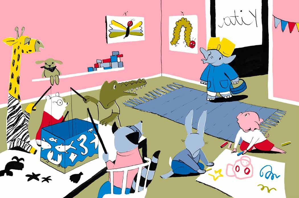
Charlotte Lorber’s artistic and stylistic role model is the American illustrator Roger Duvoisin. Inspired by his use of lines and surfaces, the illustrator adopted a similar approach. In Lorber’s work, for instance, outlines end unexpectedly and areas of colour lack contours. The colour areas themselves are greatly reduced and always
incorporate the colour white. Similarly to the colour areas, the shapes are also greatly simplified. In addition, elaborate book pages alternate with smaller, cinematically composed image sequences. This artistic formality is consistent with the story’s content: a little elephant who longs to find friends above all else.
CLARA GILOD
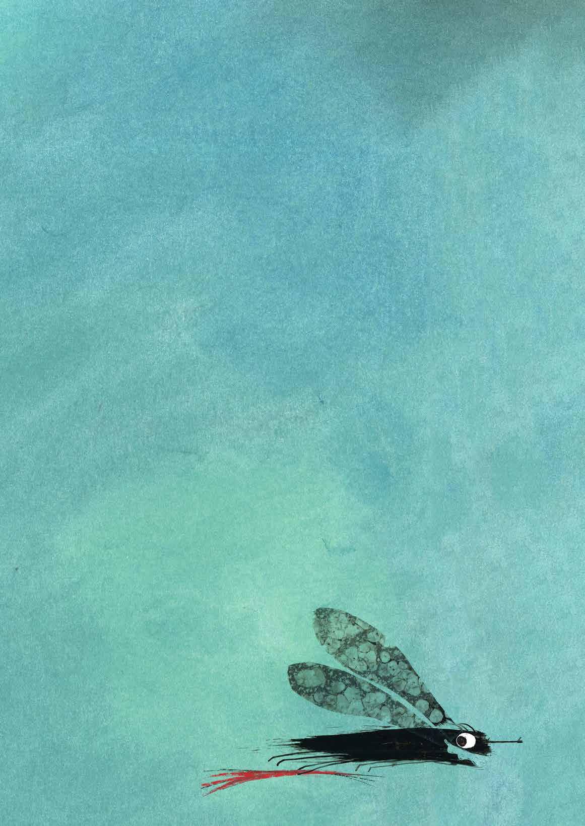
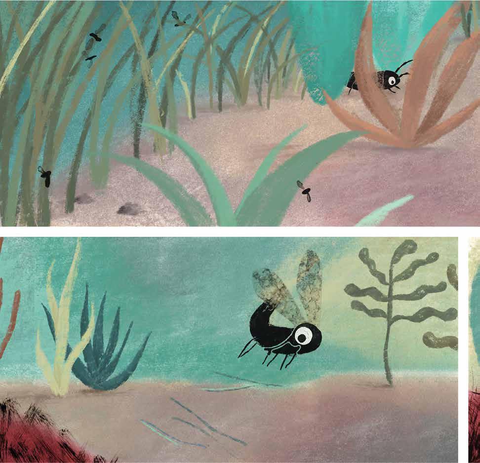
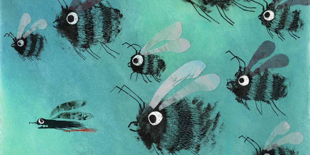
this wordless picture book tells the story of a cheeky little insect who, after being woken up by a group of tiny bugs, sets off on a busy day collecting leaves, twigs, and other bits of nature. Along the way, he meets different insects and learns from them, adding to his mysterious project. By the end of the day, we finally understand what he’s been up to: he’s built a large, whimsical musical instrument from all his gathered treasures—just in time to give his tiny bug friends a loud and playful wake-up of their own. Since this is a wordless book, no text accompanies the illustrations.
CLARA GILOD Hi, I’m Clara Gilod, a French illustrator and graphic designer based in Berlin. I started illustrating about four years ago and quickly found how much I enjoy it. I create both by hand and digitally, often combining the two, and I like working with everyday or recycled materials when I can. Lately, I’ve been developing picture book ideas, wordless stories, and card games. I’ve also started learning to write, with the hope of one day illustrating my own stories.
claragilod - illustration com
TECHNIQUE USED For this book, I wanted to stay close to my love for everyday materials. I started experimenting with transparent plastic foil and ink—rubbing, scraping, and layering to create unpredictable textures and movement. I combined this with soft pastels to bring warmth and contrast to the pages. The process was playful and intuitive, matching the curious energy of the insect itself.
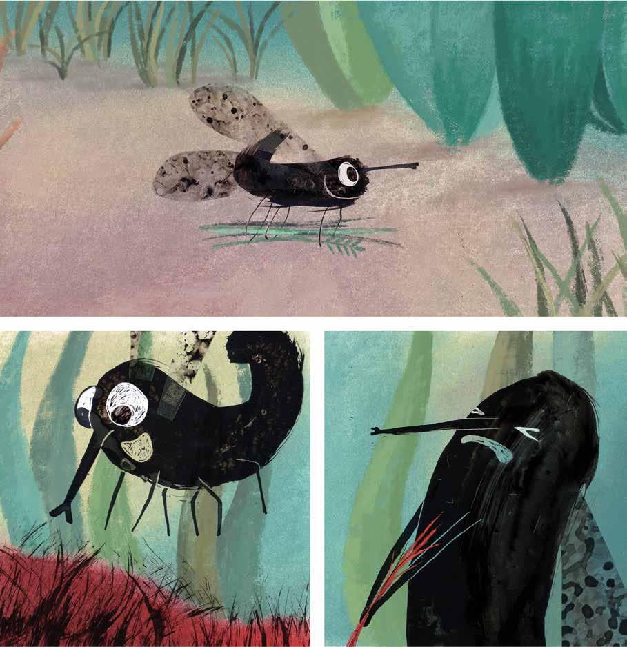
JURY REPORT Small. Black. Six legs. A pair of wings. Big eyes. Small proboscis. Definitely an insect. Which species? That doesn’t matter for the story. The small, not unlikeable, insect buzzes around, searching, finding and traveling. aaaaaau !, screams a red bird that has just had a small tuft of hair plucked out of it. But wait a minute. The bird isn’t screaming at all. It has its beak wide open and its eyes look like a loud, angry cry. But no sound comes out of its beak. Clara Gilod delights us with a silent picture book. No words, just pictures. Like in the caves of Lascaux.
No quatrains in unusual rhyme schemes. Only pictures. Like the masters of silent books, Clara Gilod trusts her illustrations completely and lets them tell the story. She skillfully combines double-page spreads with comic-inspired, small-scale picture sequences, together with dynamic scenes that take up an entire double-page spread. In Clara Gilod’s drawings, black ink meets muted colors. The ink is not simply applied flatly, but Clara Gilod scratches and rubs into the color application again and again and experiments with structures and textures, which creates dynamism in the right places. Silent stories tend to be a marginal phenomenon in publishing programs. Yet reading pictures is deeply rooted in us and is increasingly pushed into the background when reading texts. All the better when artists take on this topic and rely on the fact that their stories can only be told by their pictures. Thank you, Clara Gilod, for another quiet book.
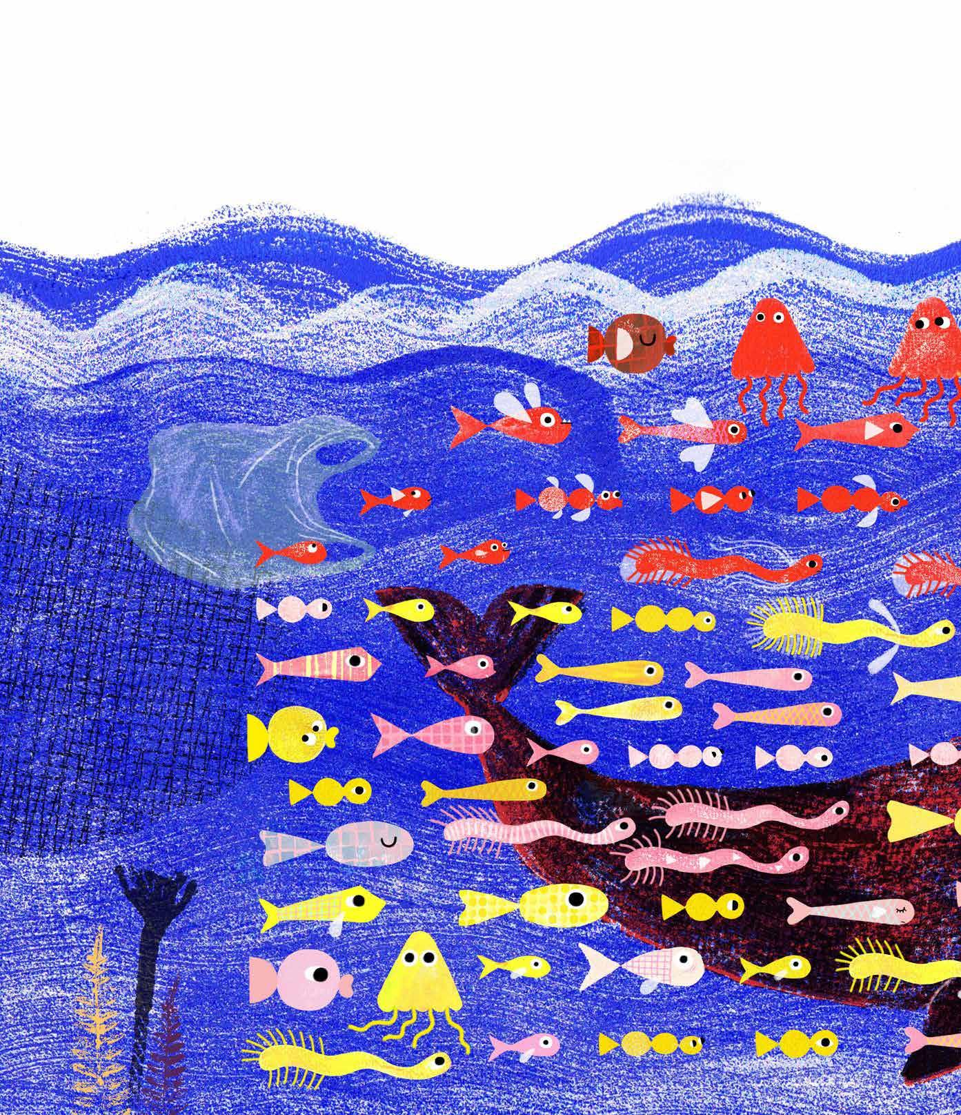
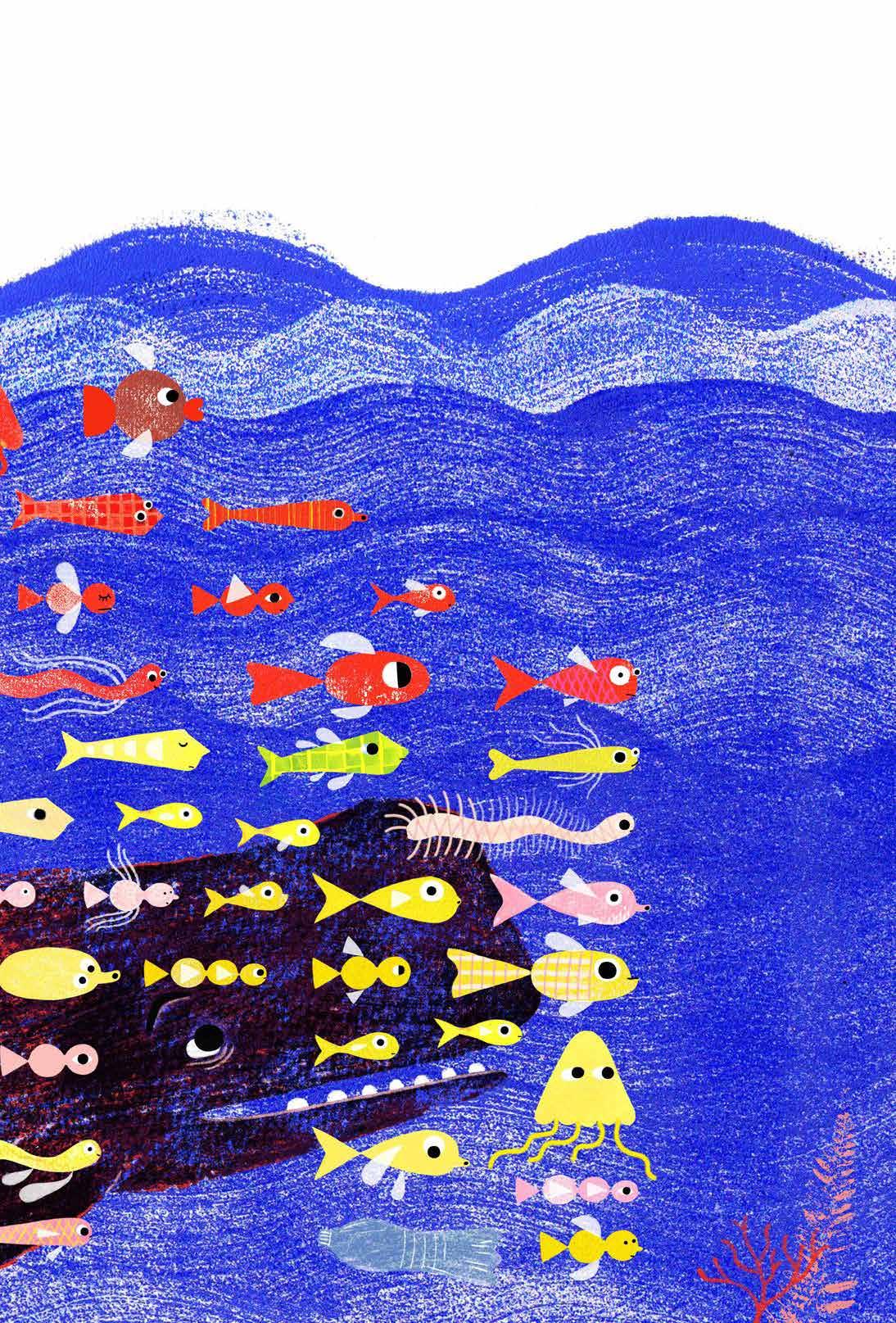
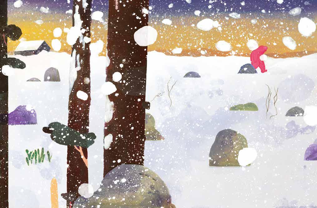
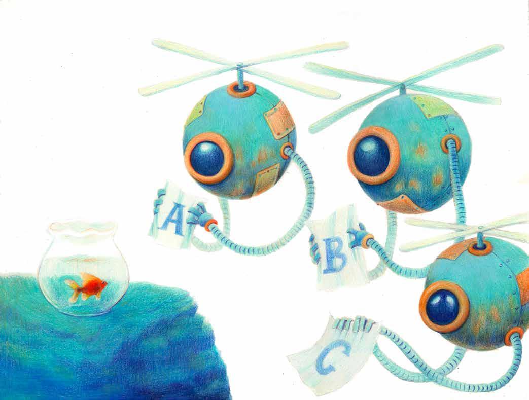
a story of migration: The whale lived in the sea. It became dangerous there, and it had to flee, leaving the water. So, the whale ends up in a city unfamiliar to it. It realizes that searching for a new home is not easy. It gets stuck in traffic, is trapped in a high-rise building, and also has trouble riding the bus. Despite these difficulties in adapting, the whale finds a place in its new world, within itself. “Home can be anywhere, because my home is where I am.”
ENIKÖ GÖMÖRI Born in Hungary in 1973, I emigrated to Germany, with my family in 1980. I studied Visual Communication/Illustration at the University of the Arts (UdK) in Berlin and earned my diploma in the illustration class under Henning Wagenbreth. Since then, I have been working as a freelance graphic designer and illustrator, mainly for cultural institutions and museums. In the meantime, I also lived in Amsterdam and Johannesburg, but have now
found a home again in Berlin with my family. So this story about Migration was obvious and is important to me.
www enikogomori com
TECHNIQUE USED I printed all the parts in monotype and with building little stamps. Then layered and arranged them digitally in Photoshop.
JURY REPORT The whale swims contentedly in the sea. But the litter in the water is increasing to such an extent that he looks for a new whale home. He moves to the city, where he soon realises that he is trapped between the tower blocks and is far too big for the traffic. After these initial adjustment difficulties, he finally settles down on the beach, because the water is not far away, he has space and the children start to play with him. The conclusion says: ‘Home can be anywhere, because my home is where I am.’
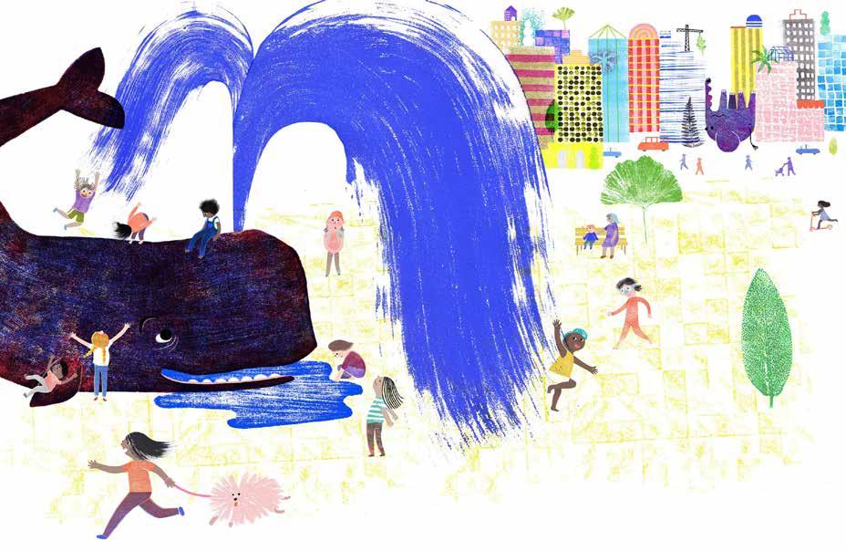
The german title Wa(h)lheimat is a clever pun, combining the alike sounding german words Wal (whale) and Wahl (choice) with the nearly untranslatable Heimat. The term ‘Heimat’ often has a deep emotional and cultural significance that transcends mere geographical designation. In the german language, ‘Heimat’ is closely associated with identity, belonging, and traditions. Home or Homeland do not capture this in full.
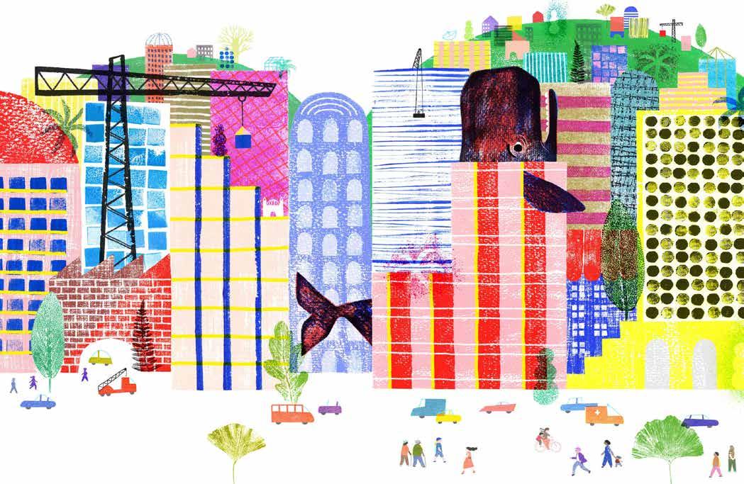
Illustrator Enikö Gömöri creates analogue designs using monotypes and small stamps, which she then collages digitally. In the printing process, the artist does not leave cleanly printed areas as desired, unconventional textures. She combines them with graphically reduced elements and a perspective that juxtaposes oversized elements with ones that are far too small. The result is a comprehensive artwork in which the technical expression of contrasts, simplicity and deliberate imperfection is sensitively combined with a story that convincingly captures the search for a new ‘Wa(h)lheimat’ on paper.
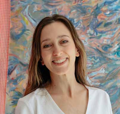
SARA CUPERLO
in a meadow , populated by very busy Hopscotches, the quiet is interrupted by a sudden shock. It’s the Gobbler! A huge and hungry creature, nothing remains in his path. The Hopscotches ee in terror and take refuge in a nearby cave, all except one. A quiet solitary Hopscotch is in fact so intent on enjoying his carrots that he doesn’t notice the great commotion and when he nds himself in front of the great Gobbler he doesn’t seem scared at all. The Gobbler asks him how to reach the river and the Hopscotch decides to show him the way. Thus begins the unlikely journey of the Hopscotch, small and wise, and the Gobbler, huge and clumsy. Along the way, they talk about food, life and carrot cake. At the crossroads they say goodbye as good friends with the promise to meet again. Many years later, now elderly, the Hopscotch receives an unexpected visit: it’s the Gobbler, back to keep his promise. A poetic story about friendship, waiting and the importance of seizing every moment of life.
I am SARA CUPERLO , author and illustrator and I live in Turin. I grew up in Rome, but after high school I moved to Florence, where I graduated in painting at the Academy of Fine Arts. Then I moved to Turin, where I studied screenwriting for film and television series at the Scuola Holden. I began working on small projects as a graphic designer and illustrator, collaborating with magazines and independent publishing outlets such as Carie Letterarie, Crack Rivista, Futura Corriere, Giunti Scuola, Rai News, and Risme Rivista — for the latter, I also worked within the editorial team. At the same time, I specialized in advertising graphics by attending a six-month course at the ITI Impera Institute in Turin. I decided to further my education with a Master’s degree at the Academy of Fine Arts in Bologna, where I graduated in Illustration Techniques for Publishing. Living in
Bologna allowed me to connect with inspiring organizations linked to the world of children’s literature, such as the Associazione Hamelin, the historic Giannino Stoppani bookstore, the Salaborsa Library, and the Bottega Finzioni school of writing for fiction and animation. Today, I continue to work as a freelance illustrator and author, and I lead art workshops in
preschools — currently at the nursery L’Acquarello in Turin.
instagram com / saracuperlo
TECHNIQUE USED Mixed technique, starting with oil monotype and then working with gouache and pastels.
JURY REPORT With her expressive brushwork and luminous palette, Sara Cuperlo delivers a visually stunning and emotionally rich narrative. Dialogue, mood, and character relationships emerge gracefully from posture, colour, and composition. A beautifully paced work conveying a profound sense of quiet emotion and poetic depth, and showcasing a talent as a true visual narrator.
SARA DE GIORGI
the animals are busy with their daily routines: some are scratching behind their ears, others are bathing or grooming their fur. But suddenly,
terrible news arrives: the Supreme Council has decided that, before sunset, everyone must become… just like humans! Flyers rain down from
the sky with detailed instructions: how to speak, how to eat, how to walk, how to hide your tail— and even your emotions. A race against time begins. The animals try their best, but nothing goes as planned. Some despair, some get angry, some feel ashamed.
All seems lost… until a little girl with two pigtails and a onesie with a tail shows up, ready to challenge the rules with a loud raspberry. She will be the spark of a sweeping rebellion, one that teaches everyone an important truth: our differences are our strength.
SARA DE GIORGI Inspired by animals and people, I bring them to life as protagonists of mysterious tales set in suspended spaces through the use of coloured pencils. I am an illustrator and graphic designer with solid experience in the editorial and digital fields, gained through years of work in visual communication. I am currently attending the Master’s Program in Editorial Illustration at Ars in Fabula, a course that allows me to deepen my knowledge of the techniques and languages specific to picture books, refining both my artistic and narrative skills. In 2023 and 2024, I took part in the Entry and Advance courses in editorial illustration at Ars in Fabula, where I honed my personal style—focusing particularly on the use of pastels—and developed skills in storyboard design.
www instagram com / sarasbarbiz
TECHNIQUE USED Coloured pencils
JURY REPORT Sara De Giorgi’s coloured-pencil illustrations stand out for their surreal charm, narrative clarity, and expressive detail. Her skill in visual storytelling shines through every scene, where character emotions and humour are conveyed with precision and wit. A visually rich and original work that celebrates difference through a playful yet thought-provoking lens.
guido doesn’t like going outside when there is something more fun to do. But today is a beautiful sunny day and dad insists. The park is already full of people so Guido goes to his favourite place where he usually plays with his friend Didi. And in fact, she is already there, carrying a ball that she had found on the street. Will they enjoy an afternoon of playing together, or will Lili, a girl that enjoys annoying the two friends, think of some way to mess it up?
MARKÉTA BRECHEROVÁ I studied illustration first in Czechia and then in Italy where I am based now. I have worked a lot with serigraphy and it influenced the way I make illustrations today. At the basis of my illustrations are drawings usually made with markers. Apart from making illustrations I enjoy animating them too!
marketabrecherova com
instagram com / marketa brecherova
TECHNIQUE USED Markers, pencil and gouache

JURY REPORT Markéta Brecherová’s soft palette and subtle use of light create an intimate, sunlit atmosphere, while expressive characters and textures add warmth and immediacy. The visual rhythm is spot-on: compositions follow the emotional arc with clarity and energy, and background elements enrich the narrative without distraction. A sensitive, well-paced project with a distinctive, coherent style.
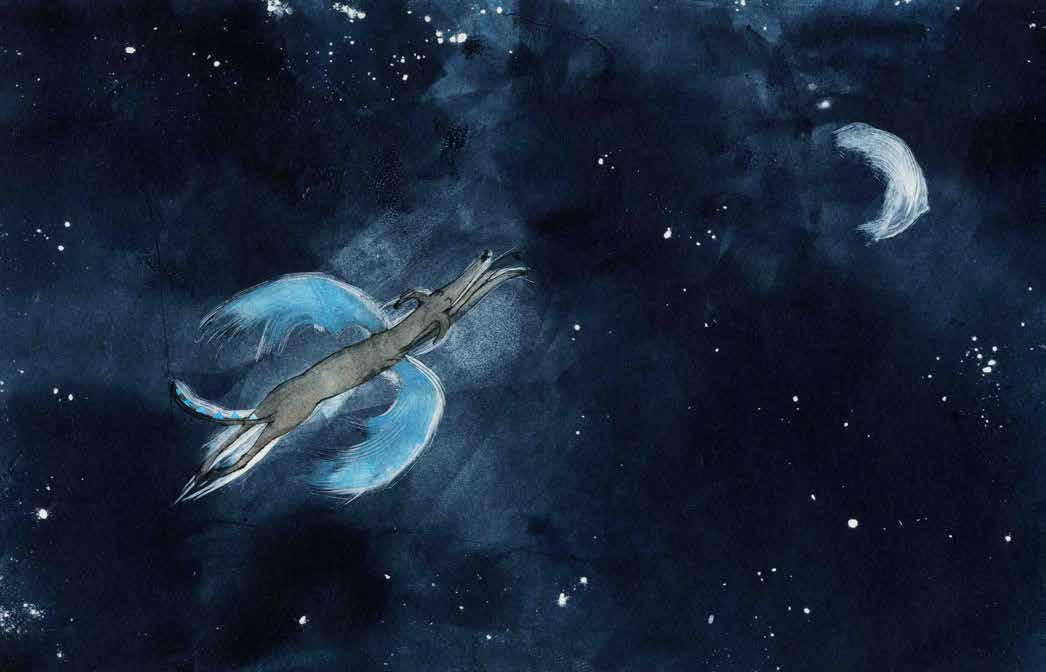
walter the dragon is a playful story about the magical bond between a boy and his pet dog … who is hiding a special secret. As they get up to cheeky mischief together, the boy begins to notice some rather unusual traits: spiky fangs, sharp claws and even pointy dragon horns.
With humour and warmth, this story celebrates the richness of a child’s imagination and the quiet patience it takes to let magic reveal itself in its own time. The boy doesn’t push or question too hard, he simply believes, watches and waits for Walter to share his secret. Imagination has always been central to my stories, and this book celebrates the richness of a child’s imagination – something to be nurtured, not doubted.
LAUREN SHARPLES is a UK-based illustrator and printmaker. She recently completed an MA in Children’s Book Illustration at Cambridge School of Art and is currently taking part in a mentorship with Picture Hooks, where she continues developing her practice.
Her work is narrative-led, drawing inspiration from nostalgic or humorous childhood memories, often illustrated with expressive line work that aims to capture genuine connections between her characters. Lauren typically works with traditional printmaking techniques and likes to incorporate recycled materials, such as Tetra Pak and reused paper to build rich, layered images.
www laurensharples co uk
LAUREN SHARPLES
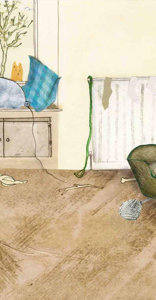
TECHNIQUE USED This book was created using a mixture of recycled materials and printmaking techniques. Walter is hand-printed into each scene using the magical quality of Tetra Pak printing, while the child and environments are crafted with recycled papers then hand-embellished.
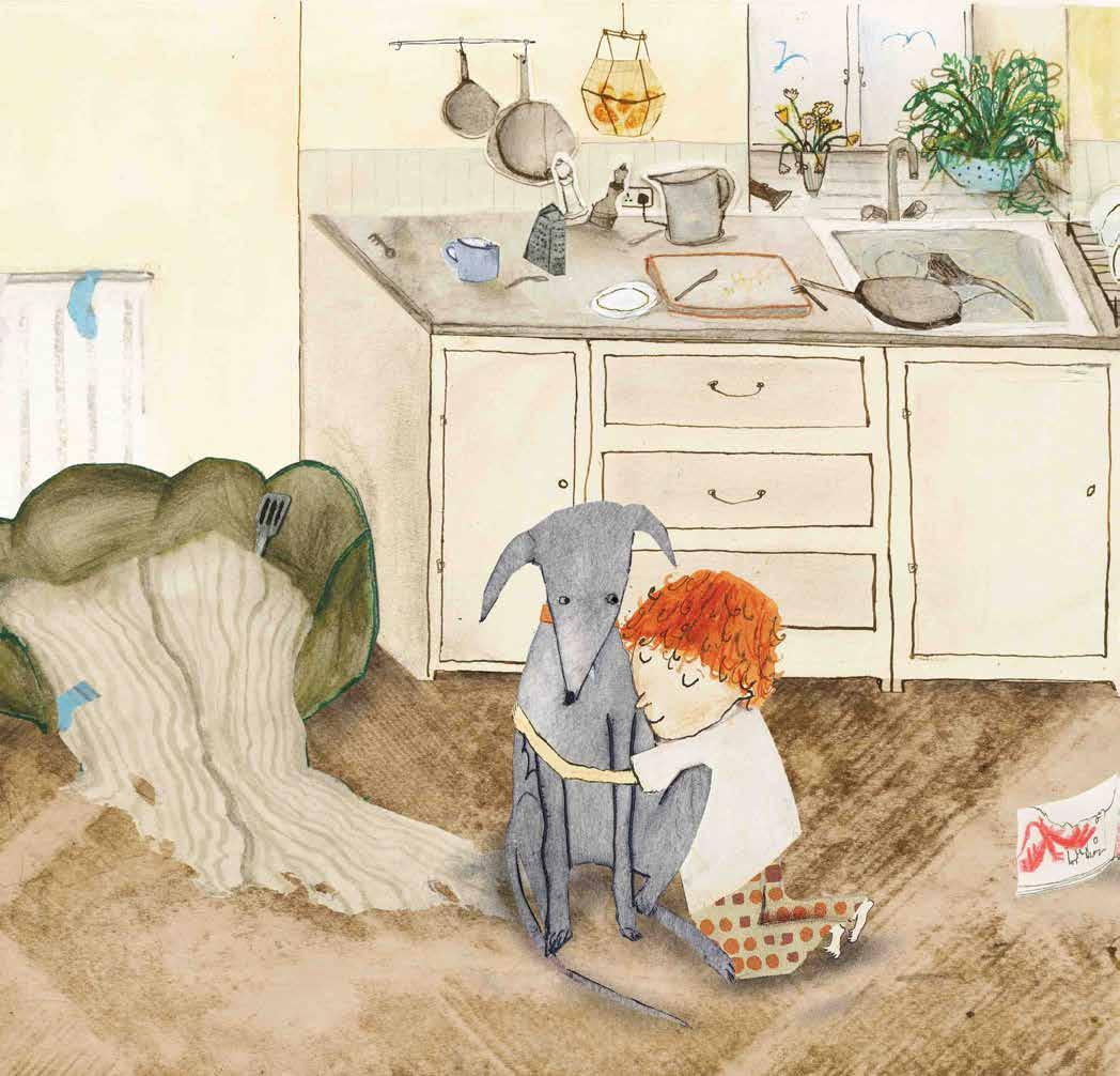
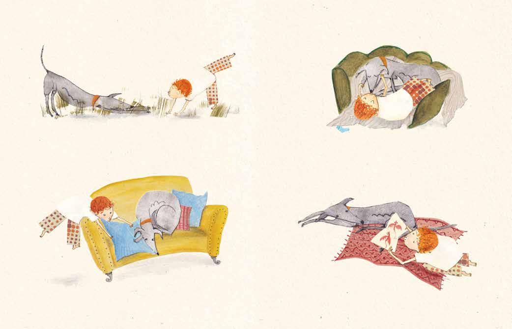
JURY REPORT The judges loved the strong characterisation and the carefully observed relationship between the little boy and the dog. The lively compositions are filled with small, everyday details that the reader will pore over, such as the socks on the radiator and the dishes in the sink. The muted palette sets the tone with occasional pops of colour. The rich use of texture and materials shows the creator behind the pictures, and will inspire children to explore their own creativity.
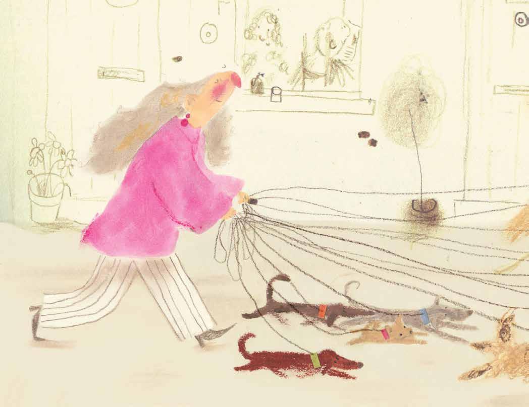
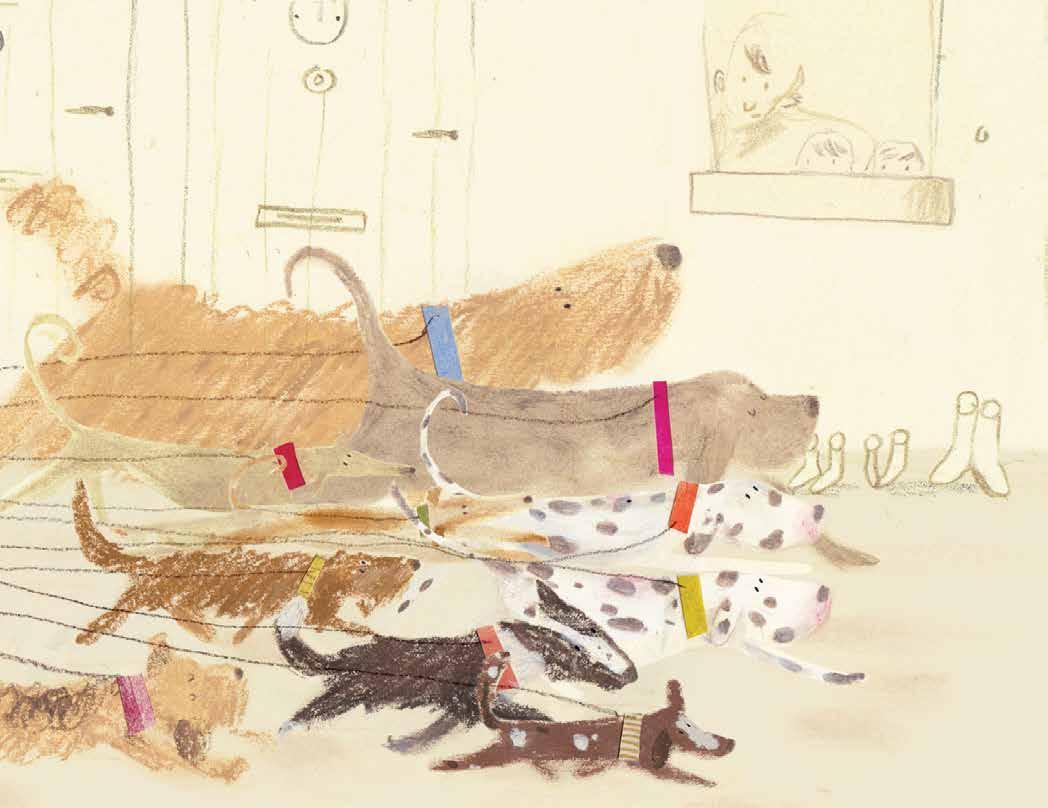
this story follows Miss Armadillo and Frankie on their dog walks. Frankie has a grand plan for her new roller-skates, but she needs some help from the people she meets In the Park. It is a fun story that encourages trying new things and offering a helping hand where you can!
MEGAN KNIGHT is an illustrator from Edinburgh, Scotland. She loves collecting stories from personal memories and moments in her life. Megan has just graduated from Cambridge School of Art with an MA in Children’s Book Illustration.
Her stories are influenced by her love of small moments that highlight friendship and connection. She observes people in real life and transforms them into kind and unique characters. Megan likes working in mixed media, and when she’s not drawing, she loves vintage
shopping, going for coffee with friends and saying hello to dogs in the park!
meganknight co uk
TECHNIQUE USED Soft and oil pastels, inks, collage and coloured pencils
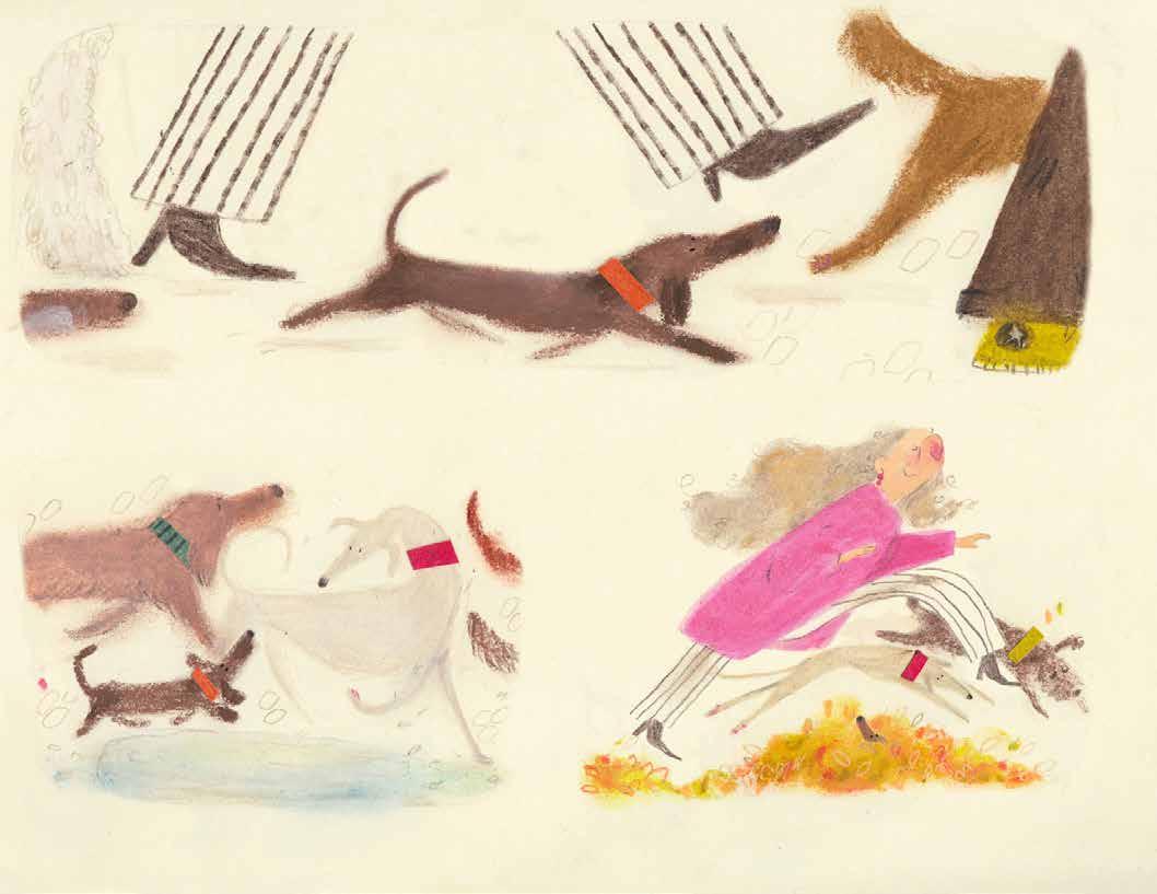
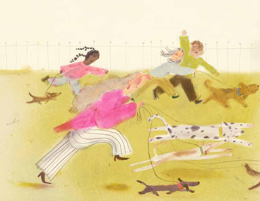
JURY REPORT This playful, joyful work uses a range of mixed media to create some exuberant storytelling spreads. The composition of the dogs pulling their owner across the page in a tangle of leads was particularly loved. The images fizz with energy, and the soft style and palette with the occasional flash of pink, and the use of soft line work, really made this stand out.
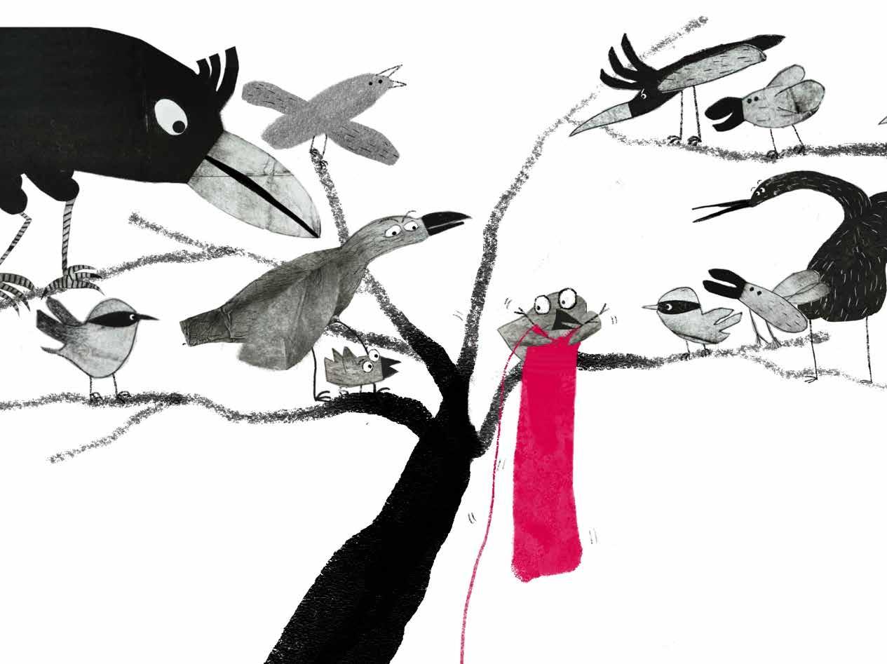
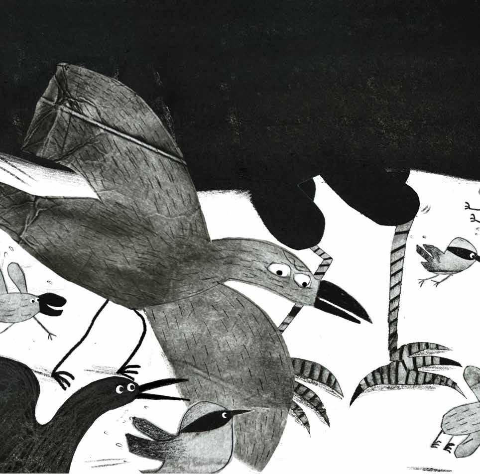
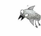
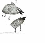
when a little bird discovers a mysterious pink yarn ball, it quickly becomes the centre of attention in the forest. Excitement turns to chaos as all the birds compete for it, but the largest bird chases everyone away and enjoys it alone. However, he soon becomes hopelessly tangled in the yarn. Seizing the moment, the clever little bird starts to knit, sparking the curiosity of the other birds. One by one, they gather to watch and join in. In the end, they all collaborate to turn the tangle into something wonderful, transforming conflict into community and fun.
QINZI is a picture book author from China, mother of two, and Taekwondo black belt. After a decade in tech and a life-changing world trip, she began drawing in 2014. She has since published several books in China and earned an MA in Children’s Book Illustration from Cambridge School of Art in 2025.
www qinziart com
TECHNIQUE USED Tetra Pak printmaking combined with digital techniques.
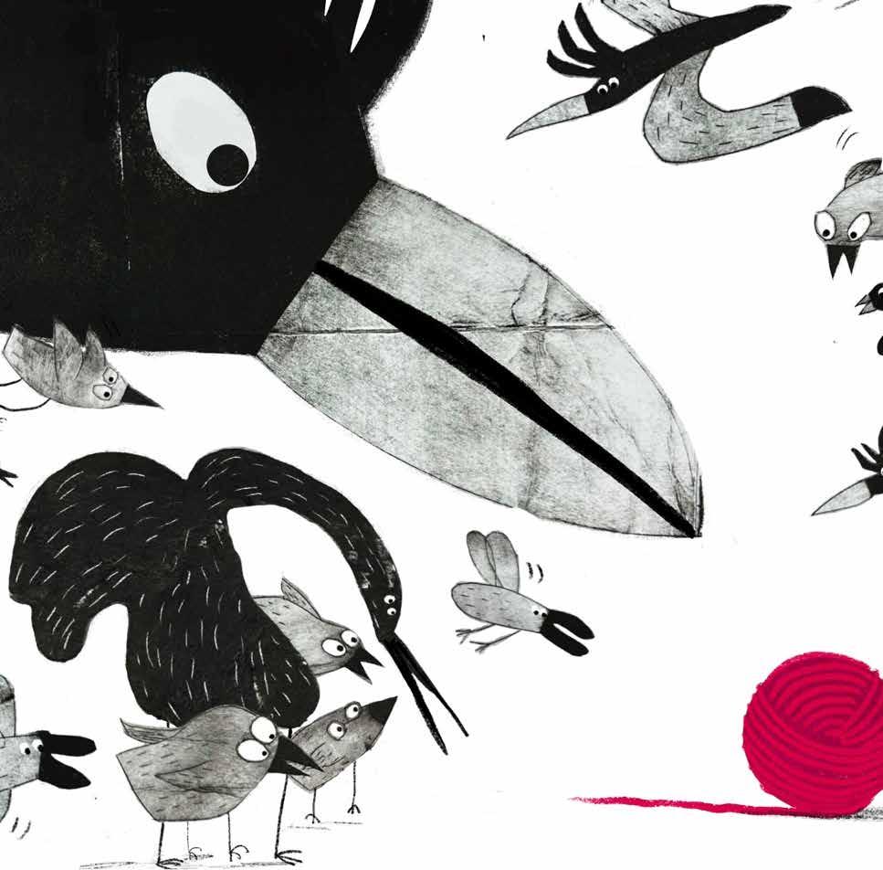
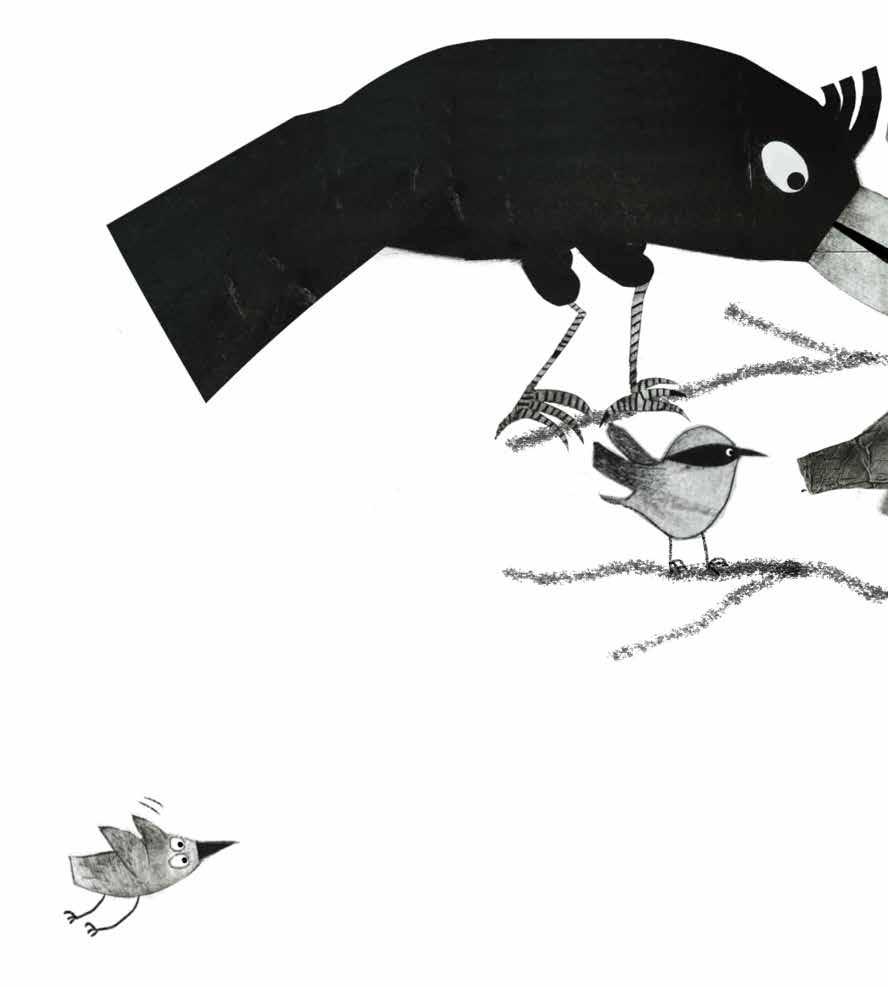
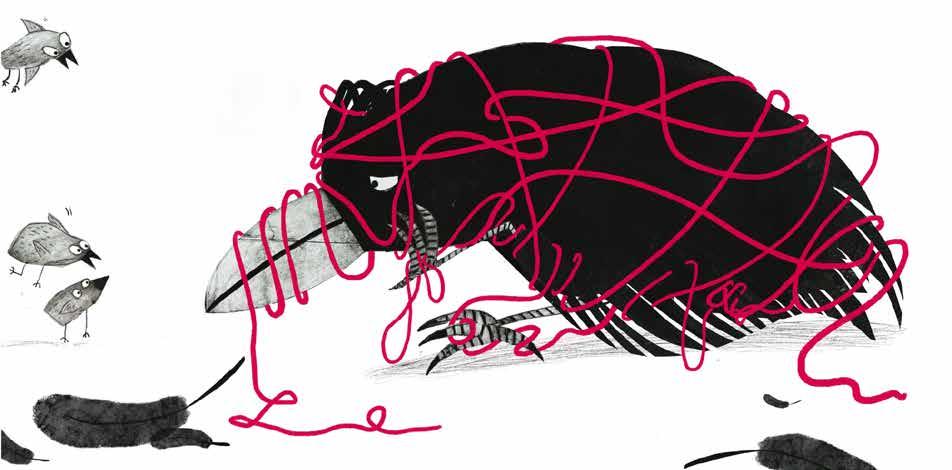
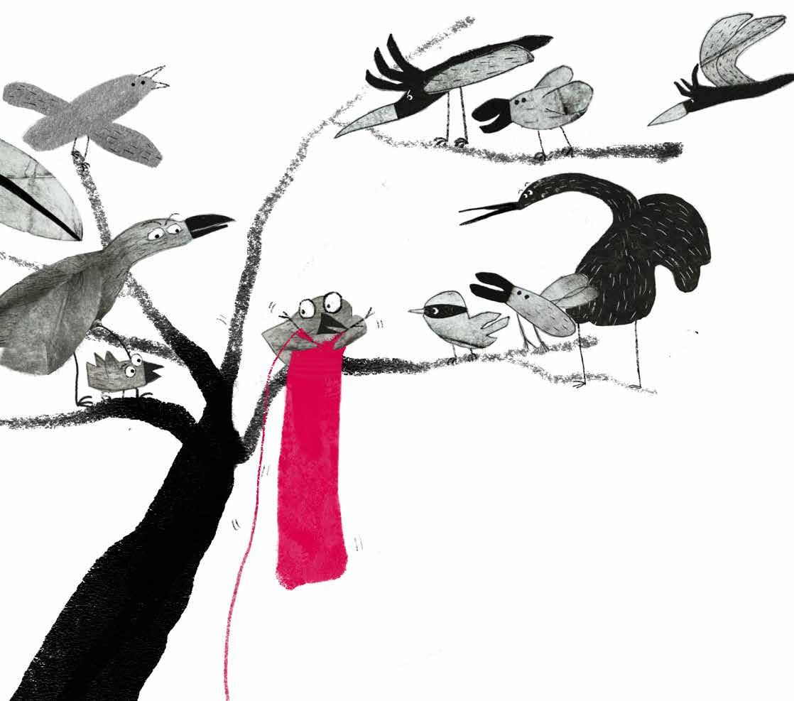
JURY REPORT This strong, graphic illustrative style with bold compositions and texture was loved, as was the way the artist used stark negative space, concentrating solely on the bird characters with little background or setting. The use of tones of black and grey to compose the art, with the additional pop of reddish-pink in the wool was used alongside crops to striking effect.
LULA PAUW
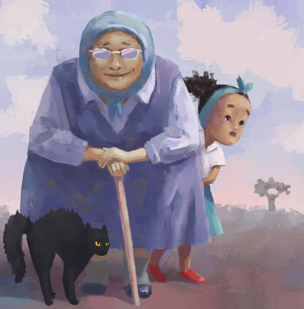
landi is a little girl with red shoes who loves to dance. She lives in a little thatched house in the desert with her kind nana, Grandma Elspeth, and a black cat named Rory. This is a story about how she uses her passion, dancing, to overcome her fears.
LULA PAUW I have always loved drawing and storytelling. I also enjoy nature and the outdoors, and up to relatively recently I was a researcher in the ecology field. I love creating intricate illustrations, especially those featuring characters within richly detailed environments. Until now I have mostly been working digitally and when I am not drawing, I am probably hiking, baking, sewing, or (most likely) chasing after my mischievous chihuahua friend.
www instagram com / lulapauw lulapauw com
TECHNIQUE USED Digital (drawn using a Wacom Tablet and the programme Clip Studio Paint)
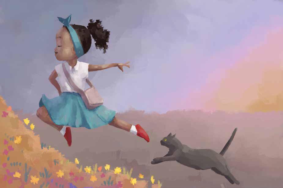
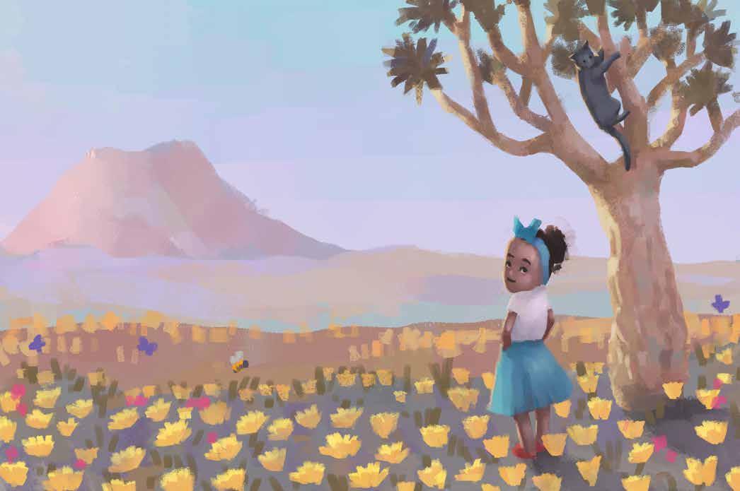
JURY REPORT Lula is an illustrator who works with remarkable self-assurance and a clear understanding of how to bring characters to life. Her ability to communicate subtle emotion through body language makes her illustrations deeply engaging. The characters she creates—such as the grandmother, child, and cat—are all convincingly portrayed, set against the backdrop of a typical South African landscape that feels both authentic and familiar. Her use of colour is particularly striking. Working with an interesting and thoughtful palette, she combines texture, light, and shadow to create illustrations that are both sophisticated and emotionally resonant. There is a poetic quality to her work; each piece is artful and harmonious, yet retains a sense of lightness and playfulness. Lula’s unique style and her talent for storytelling through visual expression make her illustrations truly stand out.
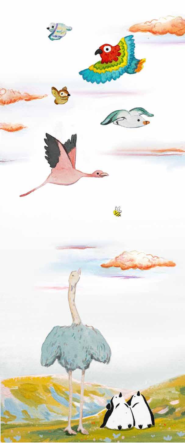
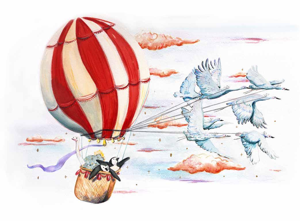
help from a friend tells the story of an ostrich and two penguins who dream of flying like other birds, but no matter how hard they try, their wings just won’t lift them off the ground. They attempt all manner of ways to try and get themselves up in the air, like building larger wings with leaves, or jumping with umbrellas and balloons. But after failed attempts they learn an important lesson, that it’s okay to ask for help. With the help of their crane friends, they soar through the sky in a balloon! They discover that even if you can’t fly on your own, you can still reach your dreams with a little help from friends. and fun.
ISABELLE SMIT holds a degree in Graphic Design and an honours degree in Art History from North-West University. She envisioned a creative career for herself, and after graduating created branding materials for small businesses. However, the birth of her first daughter in 2022 shifted that vision in a profound and unexpected way toward storytelling, meaning-making, and visual expression rooted in motherhood and childhood. Now a mother of two, she approaches storytelling through a more critical and imaginative lens. Reading classic tales has sparked a kind of righteous frustration (how to explain to a child that Goldilocks has actually committed a crime by entering the bear’s home?). This evolving perspective fuels Isabelle’s artistic practice: a pursuit of stories that offer deeper meaning and help us make sense of the world around us. Her illustrations are playful and light-hearted, beginning with traditional techniques and often evolving into mixed-media compositions. Her work is at home in children’s spaces but speaks just as easily to the adult viewer, evoking wonder, humour and curiosity. Her work invites curiosity, encouraging viewers to wonder about the stories behind each image.
instagram com / diesoepie
TECHNIQUE USED Gouache and colour pencil on paper, digitally edited
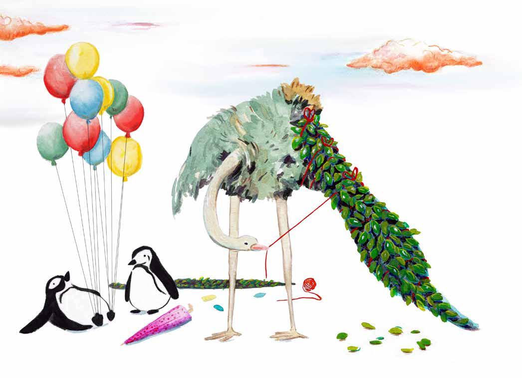
JURY REPORT Isabelle’s work is refreshing and full of subtle charm. Her illustrations feel spontaneous and light, revealing a distinctive voice that is both sensitive and confident. With a minimalist yet striking style, she brings characters—particularly birds—to life with humour and nuance, capturing their unique traits in a way that feels playful and sincere. Her visual language is special: it evokes a sense of nostalgia without appearing old-fashioned, and while her style may feel familiar, it remains
original and far from commercial or repetitive. There’s an emotional warmth to her work that resonates deeply.
Isabelle’s illustrations hold strong potential for children’s books—engaging, imaginative, and easy to connect with. A promising talent with a unique and memorable artistic voice.
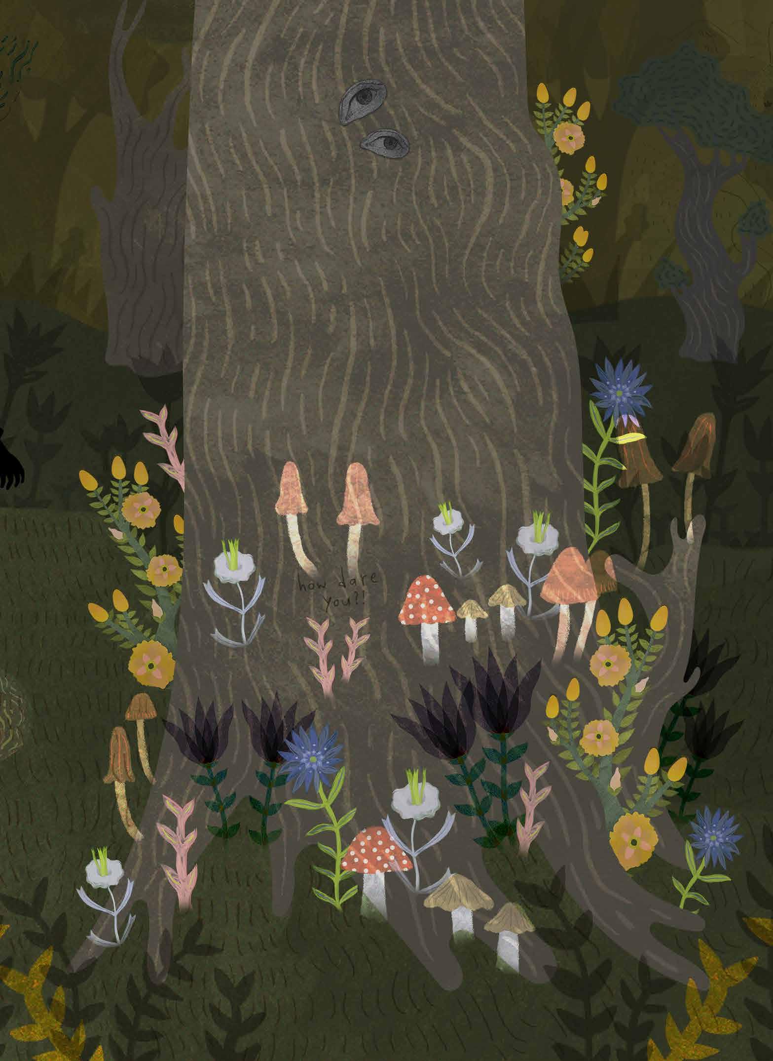
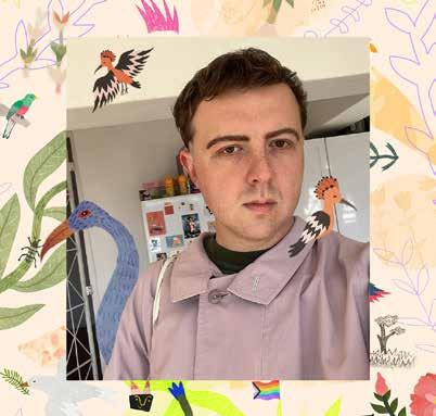
NEIL BADENHORST
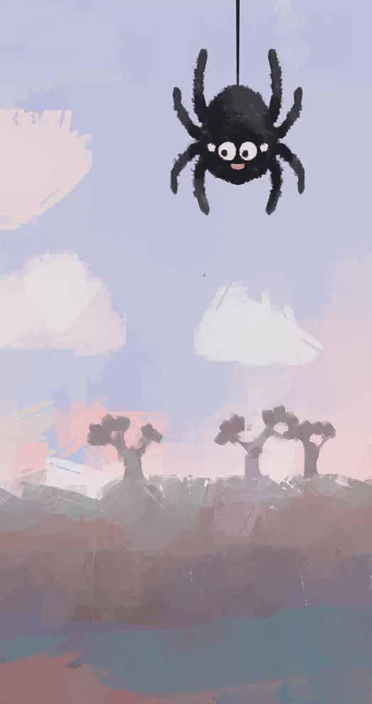
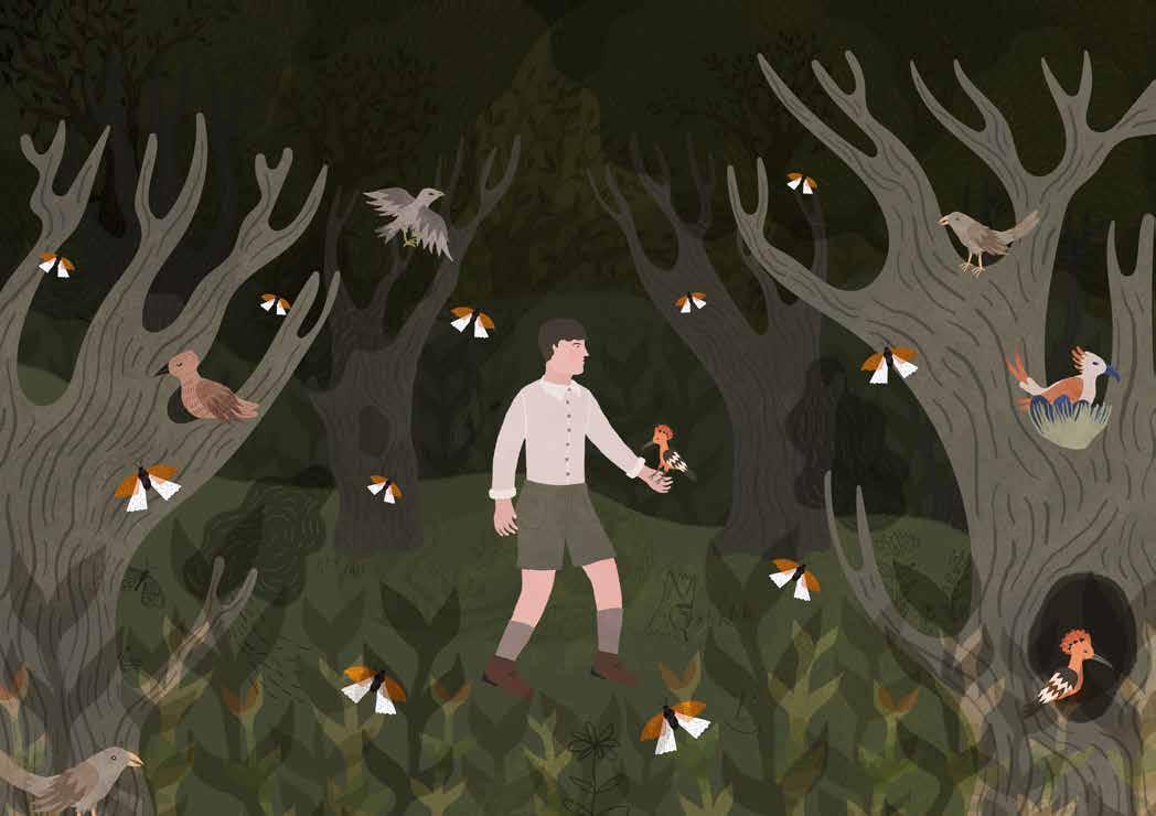
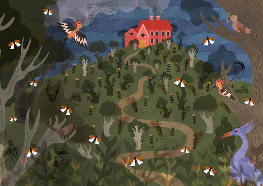
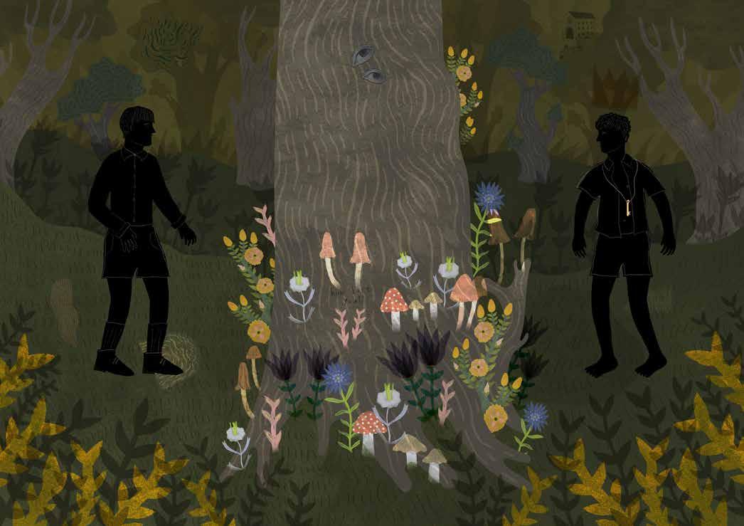
these three illustrations are from the picture book, between worlds, which I created for my Masters degree. The book contains four short illustrated narratives set in an imaginary world.
NEIL BADENHORST (b. 1995) is a multi-disciplinary creative, based in Johannesburg, South Africa. Badenhorst studied graphic design, majoring in illustration, at the Open Window where he obtained his Undergraduate and Honours degrees. He completed his Masters in Design (again specialising in Illustration) at the
University of Johannesburg. Badenhorst has previously worked as a graphic designer and illustrator, has lectured part-time at various tertiary institutions, and at present lectures full time in the Graphic Design department at the University of Johannesburg. He is currently studying toward his PhD, his thesis focuses on
All four stories relate in some way to rites of passage and transitional experiences. My three images are an excerpt from the first story that tells the story of two boys whose solitary journeys converge when they encounter one another in a wood. The boys’ friendship grows as they spend
time outdoors. Indoors, they are expected to behave in ways that are considered appropriate, but outside they exist in a world of their own, their togetherness being a natural, easy way of being. Themes such as boyhood, coming of age, queerness, and religion are explored.
collaborative worldbuilding in illustration as an alternative queer rite of passage.
www behance net / neiltheseal
www instagram com / stronganimals
www linkedin com / in / neil - baden horst - 126118167
TECHNIQUE USED Adobe Photoshop, although traditional media such as ink, pen, paper, gouache and collage was used in the textures and development of the illustrations
JURY REPORT Neil’s work stands out as a brilliant and truly exceptional entry, already on par with top international illustrators. His unique and striking illustration style feels fresh, modern, and emotionally engaging, immediately capturing the viewer’s attention. With a sophisticated design sensibility and an eye for fine detail, Neil creates visually compelling images that invite deeper exploration.
His illustrations feature intriguing elements—like the subtle eyes on a tree trunk or a key around a character’s neck—that evoke a sense of mystery and storytelling. The fine linework, almost inconspicuous at first glance,
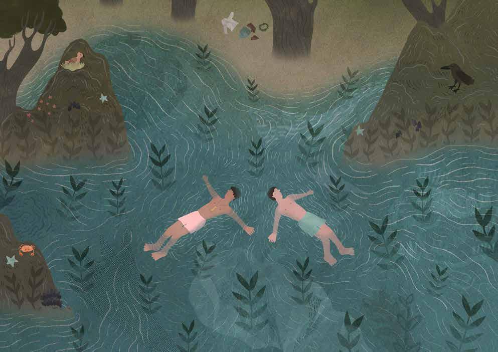
reveals hidden layers that reward careful observation. Two of his pieces demonstrate a masterful use of symmetry, highlighting his strong design skills and thoughtful composition.
What makes Neil’s work truly exciting is its originality combined with technical excellence. His style is not only aesthetically refined but also trend-aware, positioning him as a contemporary illustrator with significant potential. This is the kind of work that invites you to look again—and then again—always discovering something new. An exciting talent to watch, and without doubt, an extremely gifted illustrator.
THE COMPETITION IS S UPPORTED BY:
Lemniscaat Publishers (nl)
Camelozampa [it]
Walker Books (gb)
Protea (sa)
Burg Wissem Bilderbuch Museum Troisdorf (de)
Paula Peretti Literary Agency (de)