
MASON BRAND IDENTITY | MAIN LOGO
It all starts with the logo, which is made up of both typographic elements and a dynamic ribbon graphic. It represents the connection between our businesses and our homes. The ribbon shows that mason is a dynamic community that is moving forward. The mixture of the blues and greens of the logo are visually engaging while at the same time representative of the earth and the sky.
MASON BRAND IDENTITY | VERSIONS AND TAGLINE
The MASON Identity System has a primary logo, and two supporting logos that are used depending on the application and format.
A1. PRIMARY VERTICAL LOGO WITH TAGLINE
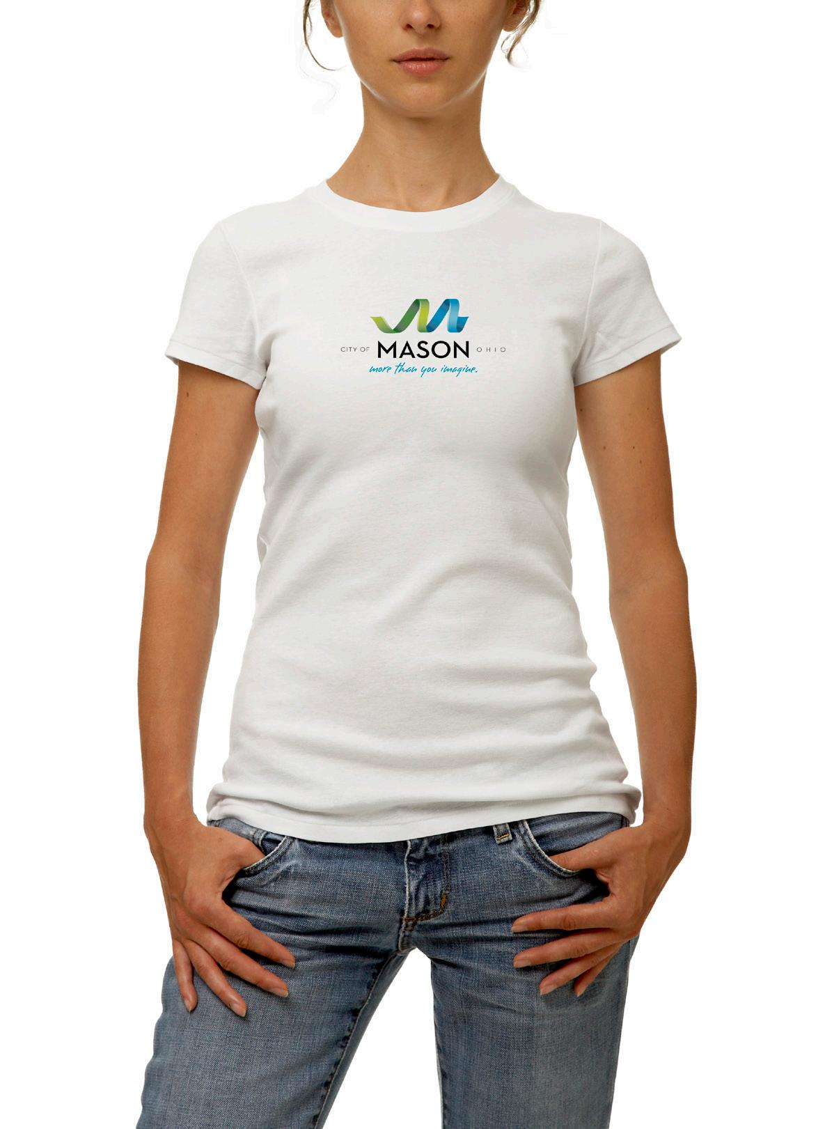
This is the preferred and primary logo for all top-level brand communications. It should be used whenever space and format allow.
A2. SOLO TAGLINE
The solo tagline can be used on pieces as a graphic element horizontally or vertically when the primary logo has already appeared prominently on a piece. It can also appear as a negative on a background that is darker than the light blue.
B1. VERTICAL LOGO WITHOUT TAGLINE
This is the supporting logo, used only when the primary logo has already appeared prominently on a piece.
B2.
HORIZONTAL LOGO
This is an additonal supporting logo, used only when the format of the piece is extreme horizontal, where it should be used with the solo tagline A2 elsewhere on the piece.
MASON BRAND IDENTITY | PROPORTIONS
The strength of the MASON Identity System lies in consistent usage of the logo across all mediums. The following are guidelines to aid in proper logo usage.
A. PRIMARY VERTICAL LOGO
Proper logo proportions for the vertical logo format are detailed in the following diagram. All proportions are based on the height (x) of the word “MASON.”
The letter “S” in “MASON” serves as a centerpoint for all logo elements. Logo elements cannot shi to the le or right when this version of the logo is used.
The shaded area must be kept free of any extraneous graphics or type.
The width (y) of the tagline “more than you imagine.” must remain consistent to maintain the logo’s integrity. A larger tagline will detract from the logo, while a smaller tagline may lose readability and significance.
B. HORIZONTAL LOGO
When the logo is being used in its shi ed format, the following proportions must remain consistent.
In this format, the ribbon must sit below and to the right of the type as shown [above/below].
The shaded area must be kept free of any extraneous graphics or type.
The center of the “O” serves as a guideline for placement of both the word “OHIO” and the ribbon graphic.
MASON BRAND IDENTITY | DEPARTMENT DESCRIPTOR LOCK-UP
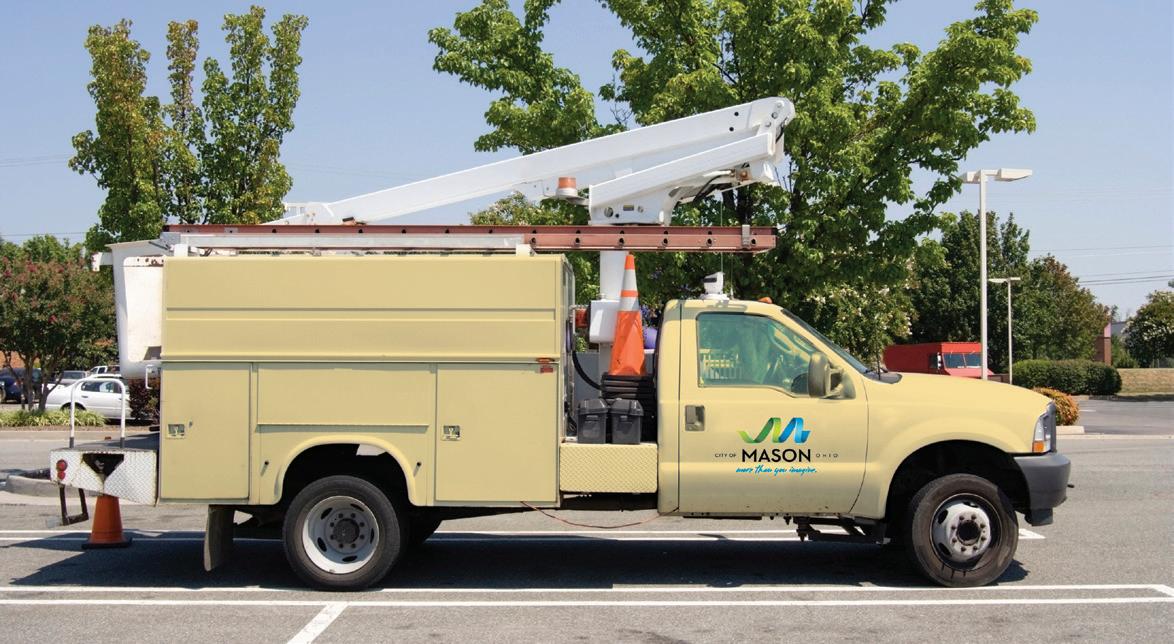
The department lock-ups are to be used as a secondary logo for department branding. Use this logo for items that need department distinction such as city trucks, directional signage, instead of the primary logo. Only the departments listed may be used in this manner. No words, groups, organizations or events may be substituted into this lock-up. The department names are to be set in Neutraface 2 Demi weight, with open letterspacing.
A. VERTICAL/MAIN LOGO
The distinct department branding is proportionally based off of the height (x) of the word “MASON”.
The letter “S” in “MASON” serves as a centerpoint for all logo elements. The department should be centered with the “S” centerpoint. The height (x) of the department is .25 of the height (x) of the word “MASON”.
The department name should fall within these bounds and never be altered outside of these proportions.
B. HORIZONTAL LOGO
The distinct department branding is proportionally based off of the height (x) of the word “MASON”.
The letter “S” in “MASON” serves as a centerpoint for all logo elements. The department should be centered with the “S” centerpoint. In this version of the logo, the height (x) of the department is the same height (x) as the word “MASON”. The department name should fall within these bounds and never be altered outside of these proportions.
MASON BRAND IDENTITY | LOGO SIZING AND CLEAR SPACE
A. CLEAR SPACE (WITH/WITHOUT TAGLINE)
The length of the top of “MASON” in our logo to its base is “x.” Keep the area equal to .5x around the logo clear of any graphic elements or text, so the logo can stand out.
B. CLEAR SPACE (CIRCULAR)
The safe area is equal to the height of the “MASON” in the logo, surrounding a circle with the same x height as the logo.
C. MINIMUM SIZE
Our logo must be at least 1.125” with the tagline lockup and .5” with just the ribbon/name lockup. To maintain legibility, do not reproduce the logo any smaller than the minimum size.
A.MASON BRAND IDENTITY | LOGO COLOR VARIATIONS & BACKGROUNDS
Color is a powerful means of recognition, so process colors with the gradient version of our master-brand logo is preferred. When you can’t use process colors with the gradient, as in newspapers, you can use the one-color version. Never reproduce the logo in any way other than what is shown on this page.
A. FULL COLOR (GRADIENT)
Use this version for most corporate communications, stationery and signage. This is the recommended logo.
B. FULL COLOR FLAT (NO GRADIENT)
You can use the full color logo without gradient with printing methods that do not allow for the gradient. Examples would be: screen printing, embroidery, and any other flat color printing.
C. TWO-COLOR
You may use this logo only with printing restrictions that limit the amount of colors to be used.
D1, D2. ONE-COLOR
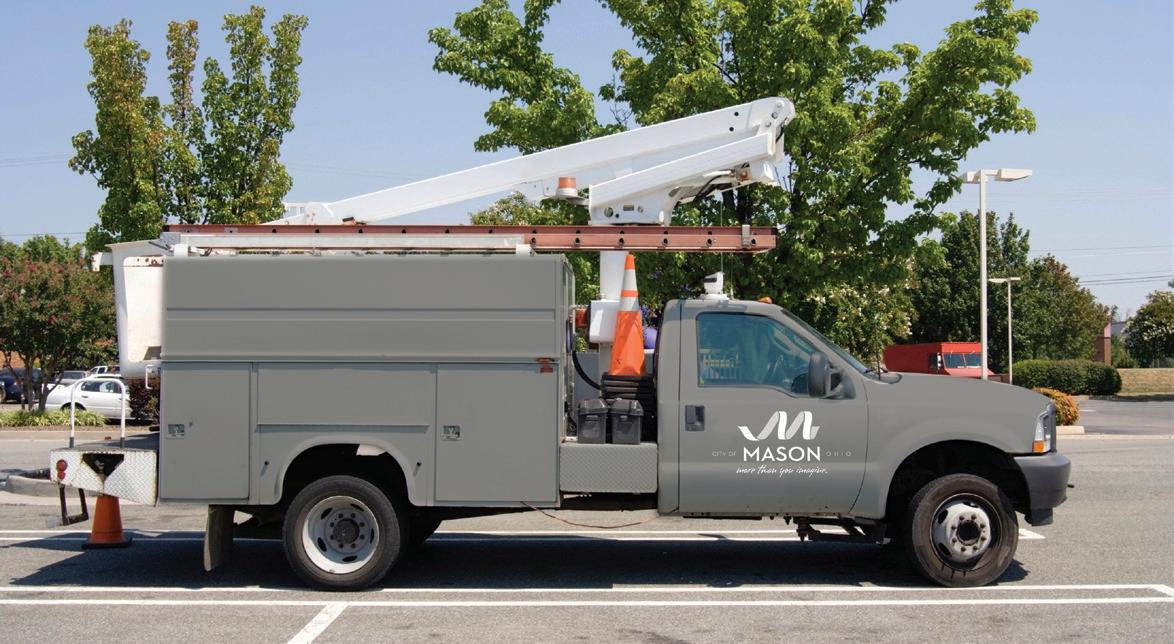
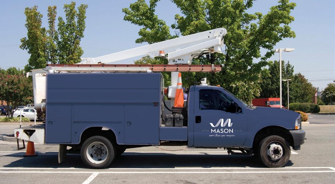
You can use either of the approved one-color versions in 100% white and 70% white or in 100% Black and 70% Black. Use these only when severely restricted by printing. When the background tone is lighter than the light blue use D1, when significantly darker use D2
A. B. C. D1.MASON BRAND IDENTITY | BRAND COLORS
The Brand Color Palate is comprised of a light and dark green, a light and dark blue, and a neutral gray. The darker colors and the gray are all appropriate for headlines and copy, the lighter colors for accent. A large proportion of white space is recommended to give colors maximum impact.
PANTONE® 376
C=50% M=0% Y=100% K=0%
R=141 G=198 B=43
PANTONE® 363
C=68% M=0% Y=100% K=24%
R=67 G=149 B=57
PANTONE® Process Blue
C=100% M=10% Y=0% K=10%
R=0 G=147 B=208
PANTONE® 305
C=51% M=0% Y=9% K=0%
R=112 G=105 B=227
BLACK
C=0% M=0% Y=0% K=100%
R=0 G=0 B=0
MASON BRAND IDENTITY | THE RIBBON
A. THE RIBBON
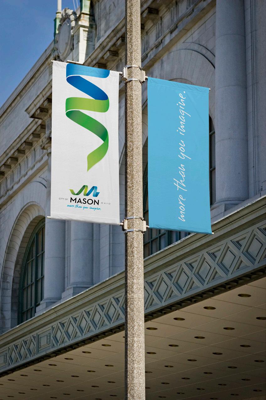
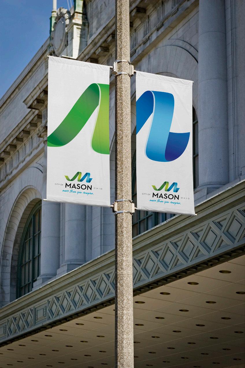
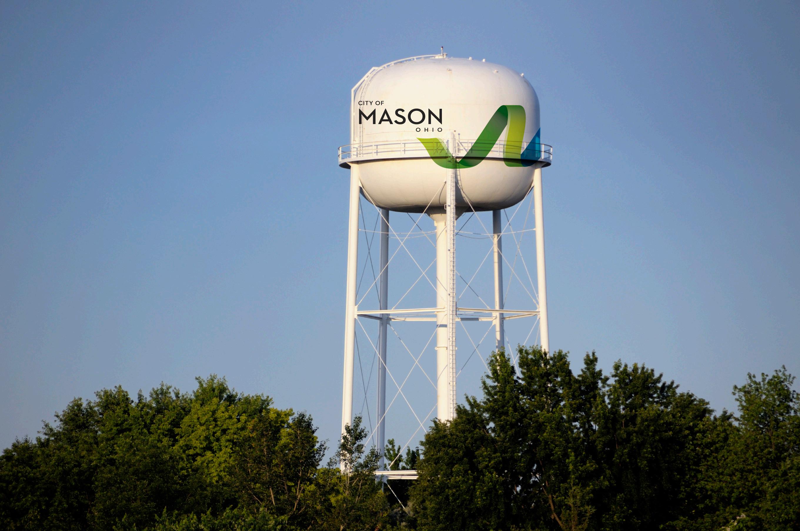
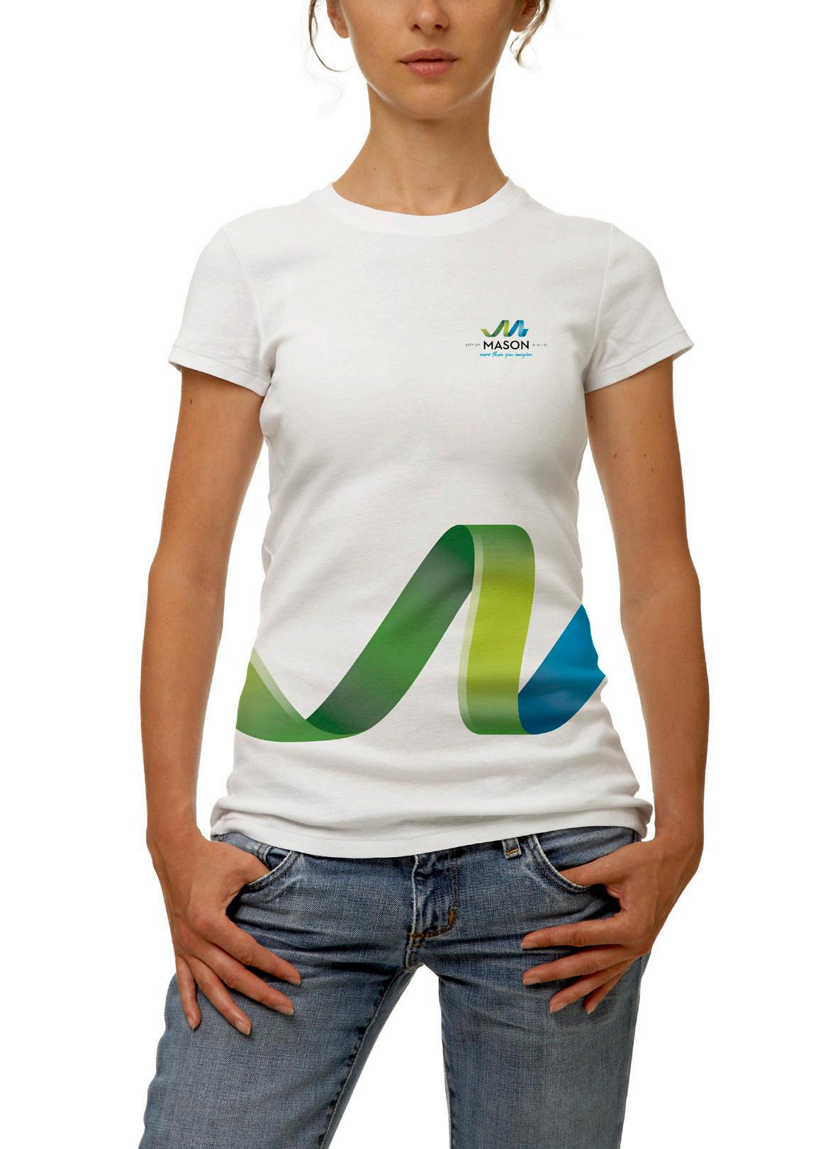
The ribbon graphic can be used as a supporting dynamic visual element, as long as the Primary or Secondary logo also appear on the piece. The ribbon should be used at a visually different size than the logos (smaller or larger), and can be cropped off the page.
B. PLACEMENT AND CROPPING
The ribbon graphic may be rotated as shown, but must remain in a vertical or horizontal position (not diagonal).
When cropping the ribbon, use one of the above as a guideline, being careful not to crop more than shown in these examples. Refrain from cropping the ribbon in a way that eliminates either the green or blue entirely.
Do not crop the ribbon vertically.
MASON BRAND IDENTITY | LOGO
MASON
To preserve the integrity of the logo, never change the approved configuration or substitute elements.
A. Do not distort proportions.
B. Do not change the color.
C. Do not change the logotype’s position in relation to the ribbon.
D. Do not change the angle.
E. Do not change the “MASON” typeface.
F. Do not place logo on dark or harsh colors - only on neutral colors that are lighter in tone than the brand light blue.
G. Do not place on busy or dark background images - only on open image areas that are lighter in tone than the brand light blue.
H. Do not use drop shadows, glows or bevels on the logo.
A. E. B. C. D.MASON
MASON
MASON BRAND IDENTITY | USAGE EXAMPLES
MASON BRAND IDENTITY | USAGE EXAMPLES


MASON BRAND IDENTITY | USAGE EXAMPLES
